
Last Seen Blogs
track-three
there between two astral worlds
track-three
there between two astral worlds
queermaliatate
Alright Babe

ultrakillblast
ULTRAKiLLBLAST

weightlossstrategies
Weight Loss Strategies
Text
final thoughts
I learn so much from this class, from the history of colors and that importance of lighting.
I found it so interesting to know how art was inspired in the past and the different meanings of each colors. It’s so interesting to know that when the use of different tones of color can represent either, high status or low status in society in the past.
When it comes to the application of the use of different shades of color, it creates a variety of effects. That makes a picture to come alive or look realistic, which I found that fascinating.
I really enjoyed learning the effect of a 3D Model, I will definitely be using that method in the future. A take away that took from this class was that failing doesn’t really have to be a bad thing, but that it’s a learning experience, which it’s needed to fail so we can reach success, that’s my take away!!
thank you for everything!!
0 notes
Text
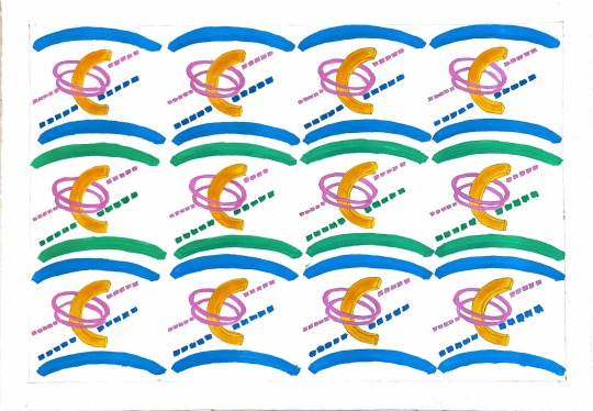
Final project
this project was a fun experience, I enjoyed coming up with my own pattern design. I always enjoy creating new things, and exploring how far my creative mind can take me. I like the pattern design I came up with. It also helped a lot to have an inspiration, from the artist I chose. It help me, to guide the process of creating my design! The challenging part for me is painting the pattern because there’s a lot of small details and I struggle in the process of applying the paint on the surface. Still a work in progress.
0 notes
Text

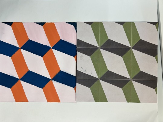
Pattern Color Swap
this project was really fun and creative to work on! I like the effects that it brings when using shades or light to the colors, it’s a cool illusion.
1 note
·
View note

Text
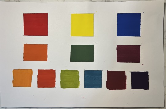
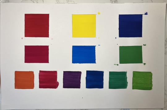
Color Charts
What I learned from this process was how to create new color combinations!!
I also found it helpful that some of the color that I had already made I could then to create the others. So that save me a lot of paint!!
1 note
·
View note
Text
Barnett Newman Final
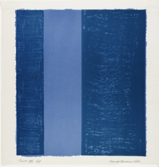

The painting I tried to recreate was The “Canto VII” painting. I chose this painting because blue is my favorite color and I also love the title of the painting! “Canto” in Spanish means singing. Singing is my favorite hobby and I am so passionate about it! If I look into the painting and the title, I can see the relationship that’s being portrayed, Which is singing can be smooth and one note, that's the light blue string. But it can also be rough, mixing different tones and rhythms! So I can see “singing" in the painting. That is if I am right of what Newman meant by this title “Canto”.
Trying to recreate this painting was not easy. The most difficult thing for me to do was painting in a smooth line. Mixing and matching the colors was fun but I don’t think I did a very good job, so I need to practice more on that.
Overall I enjoyed remaking this painting!
1 note
·
View note
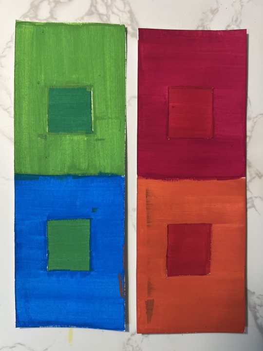
Text
Baby Barnett Studies
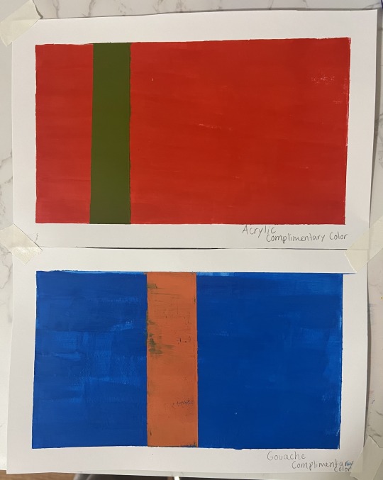

Making the Baby Barnett studies was fun and creative! I like how I was able to experiment with different colors and mix them to get a new color. I also enjoyed the freedom and flexibility of painting the split complementary paintings, it was fun!
A challenging thing was, painting the even lines with the Gouache paint. I found it difficult to keep an even layer with this paint, since it dried quick and it was not smooth at all. I keep trying different techniques to apply it but it didn’t work so I blended it in with a little bit of water.
1 note
·
View note
Text
Comparative Materials Chart
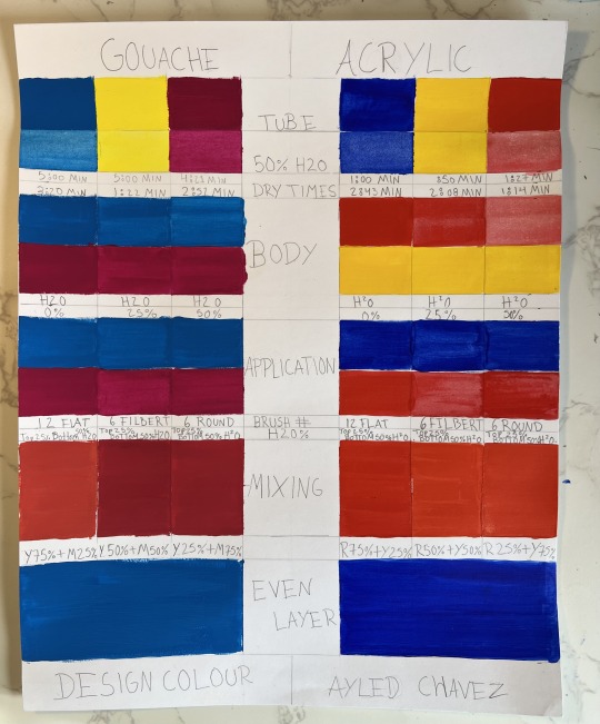
What I learn from doing this project is the difference between the paints. The Gouche paint, it’s much easier to work with! I found myself being able to manipulate the cleanliness and smoothness of the paint much easier!
The Acrylic paint, I found a little bit more difficult to work with. It was not smooth, it took me longer to make the paint create even layers.
with the color blue there was parts the have less color, I tried to put more paint in the certain area but somehow it want absorbed the paint.
I will say that the Acrylic paint took less time to dry than the Gouche paint.
1 note
·
View note
Text

Color Red
in the book "Color" in page 142, the author Findlay explains the different meanings of the color red. For some cultures it represents royalty. In other cultures, it represents bravery and also death. The Writer Victoria Findlay talks about the American cardinal Edward Egan returning home in 2001 wearing a red silk hat. Signifying the pope had named him prince of the Church. Then he went one saying that the red hat symbolize he will go to death to protect the faith. The author also mentions Mary queen wearing a red and black dress in her execution day. Black representing her death and Red her courage.
For this reason, I chose this painting of a firefighter. Firefighters are a representation of courage person fighting death. The color red reminds of being courage and also death.
2 notes
·
View notes