Text
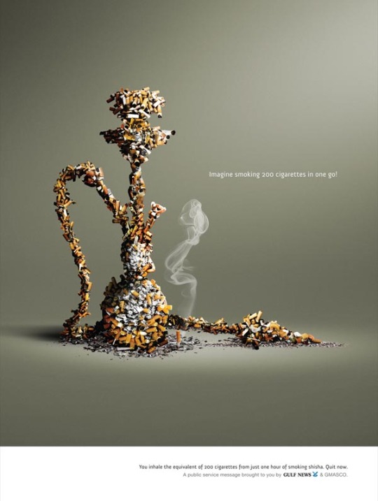
Session 14 Ad Analysis:
I was trying to catch up with this assignment and the Lost and Found, but was locked out of the Discussion when just finishing up so I’m posting it here just in case.
TOP 3
Shape: This ad creates good composition through shapes, as the shisha (the object portrayed in this picture here) is outlined from the cigarette that are creating the shape.
Value: A lot of shading can be found here with the shadows contrasting themselves with highlights and shadows here.
Line: This is actually a little subtle with the implied lines here. While the smoke can be an obvious example, the shape of the shisha itself be portrayed with the with simple line motions that could create a shape. (albeit the cigarettes make that shape itself look a little ragged on the edges.)
Scale and Composition: This ad I believe uses great scaling for example the cigarette themselves being used to scale something that is much bigger than the cigarettes (As you can see the 200 cigarettes are in one shisha smoke on the bottom of the ad.)
Focal Point: The focal point here is the shisha created from the cigarette butts and the shadows. But most importantly, it’s the unusual shape of the shape of the shisha itself.
Color(?): The color isn’t as vibrant most would be in terms of emphasis like I have described above, but there are hint of orange (from the cigarette butts in the picture) which contrasts from the dull background.
Texture: While this one isn’t as apparent for the as one might need to look harder since the ad doesn’t have much for size in the shape. But, the texture can be found on the floor, giving more detail in the dangers of the levels of tobacco that can be found in one.
Pattern: The pattern, while it doesn’t consist of the whole ad itself being filled with a particular pattern, the in the colors and shapes of the cigarettes do give it kind of a pattern from a far distance and it definitely shift the eyes over the the and pattern
Unity: Shape and Unity are two concepts that actually go hand in hand here. The shape here is apparent as the cigarette are creating that image, but the cigarettes I believe are becoming unified to create one object for the ad here.
(Shisha are pipes used for smoking and are alternative to smoking cigarettes, but give about 3 times as much tobacco in them 3 packs of cigarettes for one smoke.)
0 notes
Photo

Final Project 3
So the theme I wanted to do for this one was mostly for warmer colors and something to do with water. Most of the objects and colors are owned by me. The prism handbag (Bottom Picture) is actually from a friend of mine who I asked permission to take a picture from. Focal Point was one through texture or color here.
0 notes
Text
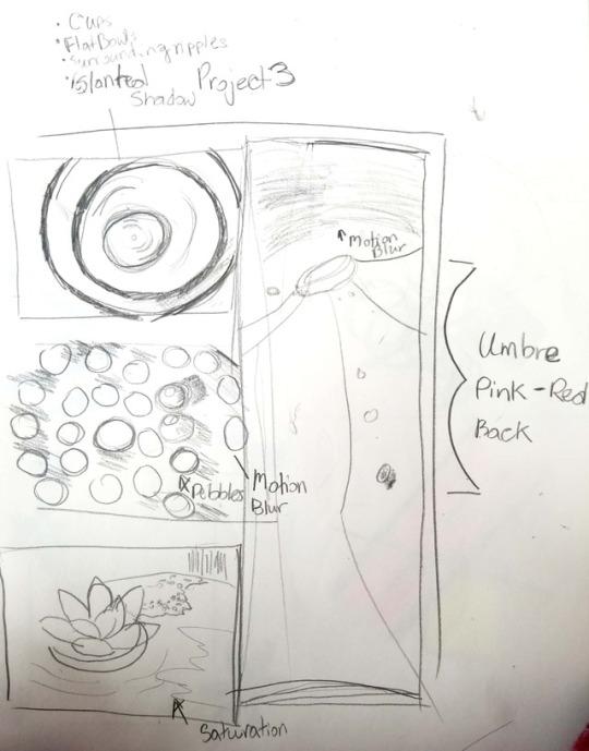

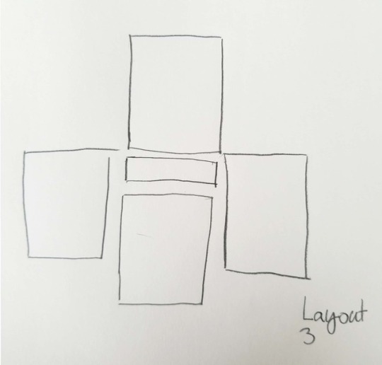
Session 14: Project 3 Sketches
I'm hoping to capture something natural but abstract with the materials that I do have. The first picture is what kind of ideas of what I would implement into my project. The other two pieces are just layout ideas.
0 notes
Text
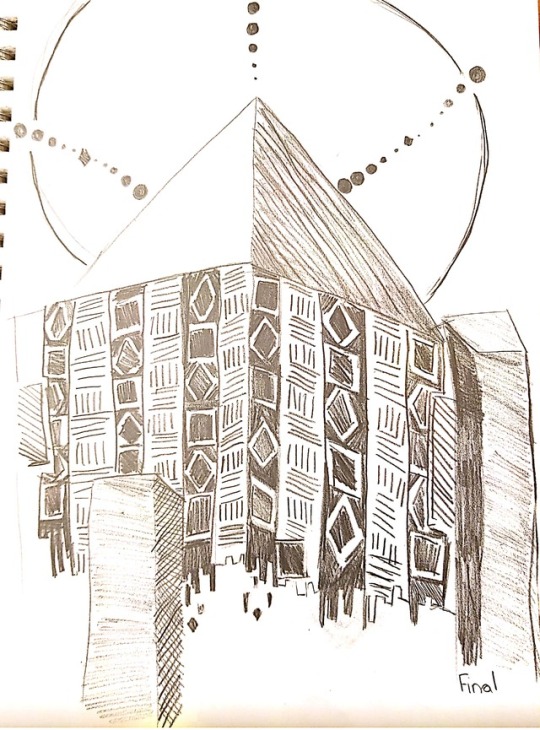
Finalized sketch of my project.
0 notes
Photo

Session: 10: Texture
https://digitalsynopsis.com/advertising/creative-art-direction-print-ads/
I actually fell in love with this one in particular because of the color and focal point. Giving the emphasis of the motion of the wood and the center focal point which is the silver screw. The combination of different along with the swirl nearing the screw gave attention to the wonderful patterns that the swirl of brown gave.
0 notes
Photo

Session 10: Texture
http://smashinghub.com/20-excellent-photoshop-texture.htm
While this image advertisement is small in what the message is in this one, but the texture of the Levi’s jeans are what make this texture really pop. But this mesmerizing texture of not only the product, but the definition of the intricate quality you get for Levi’s Jeans.
0 notes
Text
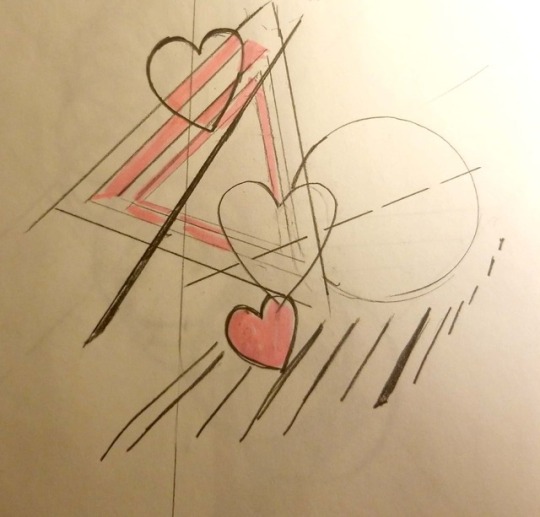
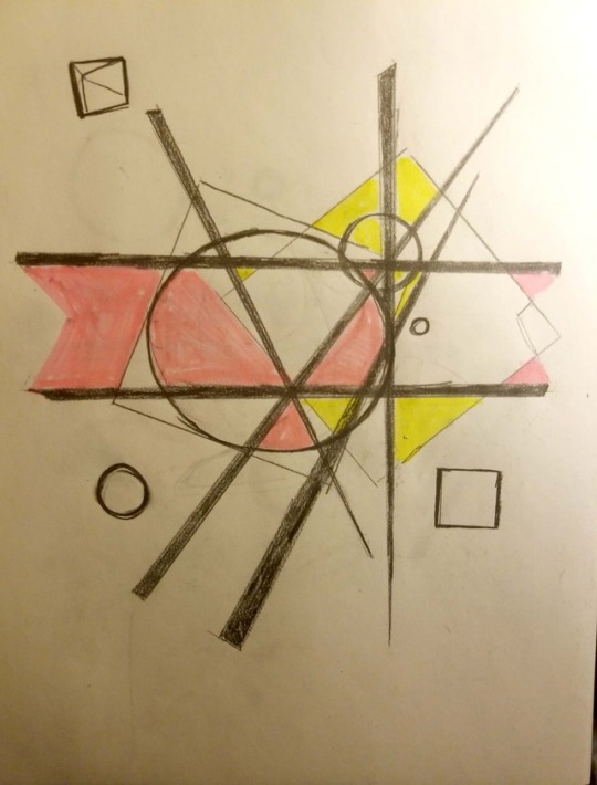
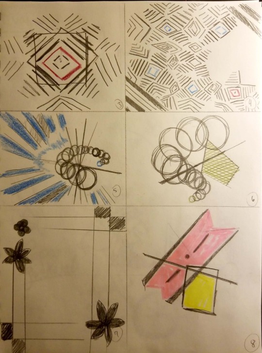
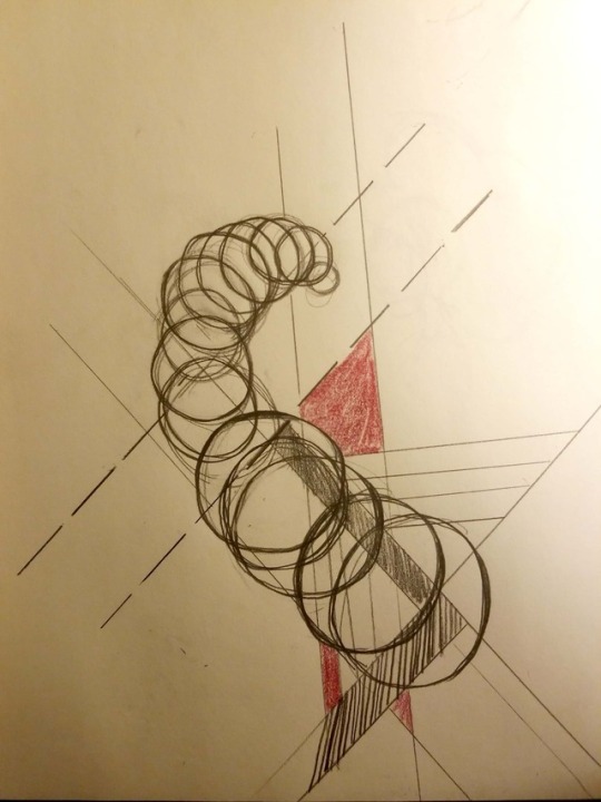
Refined sketch of some of my earlier ideas, including circles and floral patterns.
1 note
·
View note
Photo

Session 10: Texture
https://www.adsoftheworld.com/media/print/alen2_handmade_masterpiece_colosseum
I was hoping to find something like this while searching for some of the best textures to use here. This gives the illusion of the belt looking like it was made of wood. This picture truly caught my eyes because of the interesting textures that they gave for the belt. In fact, I’m not sure myself it this is either a leathery texture or like a wooden statue.
0 notes
Photo

Session 7: Lines
Source: https://www.adsoftheworld.com/media/print/aspirin_lines
While pretty basic in terms of line structures, this is actually a sense of unity and, while also using a pattern of unity for the different motions in the lines, giving the advertisement a sense of illusion as well; which works well with the Asprin advertisement here.
1 note
·
View note
Text
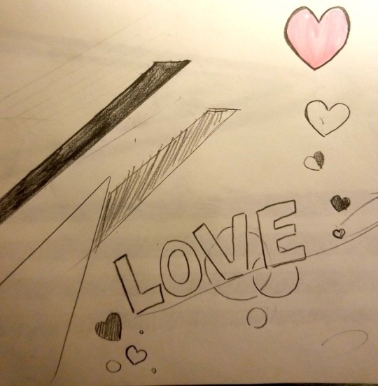
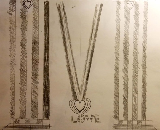

Sketch revisions of the Heart design.
0 notes
Text
Revisions of the Flower sketches.

1 note
·
View note
Photo

Session 7: Gaze Motion
Source: Wikipedia
This one seems kind of obvious but this I think is a classic movie trope that we see through many movie advertisements. Has the main male lead “Jack” as if giving a tell that he has some hidden emotions for the female lead “Rose” would is also looking away in the distance. These instances of gaze motion give an emotional tell for the main leads.
0 notes
Text
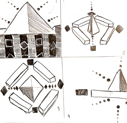
Revisions of the my initial pyramid sketch.
First 4 (bonus on the fourth drawing)
2 notes
·
View notes
Photo

Session 7: Line (Contour)
Source: https://qz.com/551682/the-coke-bottles-iconic-design-happened-by-sheer-chance/
While I tried to find something of the bottle brand that would show this off, I still thought this image might portray what kind of form and
This is the classic original design of the Coca-Cola bottle that encapsulates the original design of the soda product. While lines are not a refined here, it give some captivating design of the first coke bottle.
0 notes
Photo
Session 6: Balance (Asymmetry)
http://susannah-concepts.blogspot.com/2013/02/advertisements.html
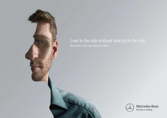
This one caught my eyes in using an interesting twist on asymmetry in art like this. This Mercedes Ad is classified as asymmetry. Not only with the man’s face here, but also in the focus on side of the face.
0 notes
Photo

Session 6: Balance (Symmetry)
https://www.adsoftheworld.com/media/print/mcdonalds_small_burger_1
This is a simple but effective way of portraying balance in an advertisement. While there’s a lot of focus on the macron, the hands also highlights that balance with the symmetry of the hands themselves.
(While I’m not a big fan of McDonalds’ food, their advertisements are a great example of composition, balance and color.)
0 notes
Photo
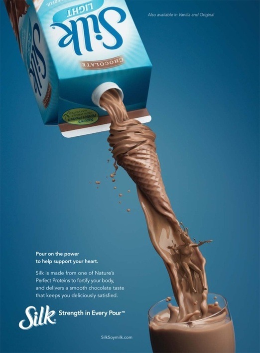
Session 5: Focal Point in Advertising
https://christiangarceau.weebly.com/emphasis.html
Focal Point: Emphasis
I actually think this one is pretty cool! I’ve never been a fan of Silk since as this advert actually does some pretty cool elements of emphasis. While some might be apparent little more than others, this ad focuses on the Chocolate milk stream while shapes also appear in the flow of the milk. What’s the first few things we associate with Chocolate? Ice cream, right? (Actually I did not notice the person in the milk until now. stuff like that always catches my eye!)
0 notes