Last Seen Blogs

ababysupernova
a baby supernova
burberryharold
living in a daydream
pinkpuppydinosaur
my new underwear

niemand-versteht
29062014

onetwo333
Untitled

Video
youtube
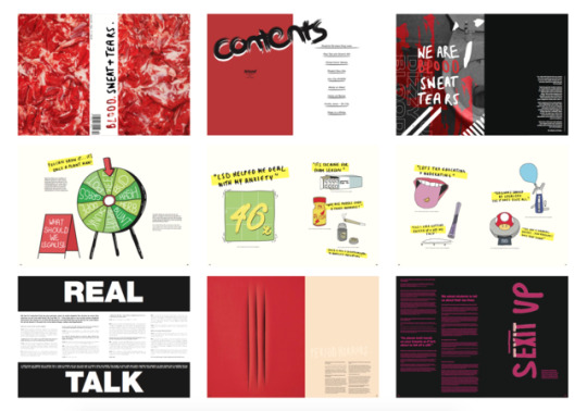
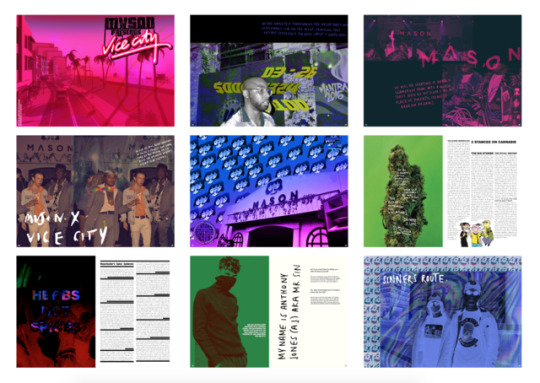
BLOOD SWEAT TEARS KICKSTARTER // DESIGNED BY WAKIL
0 notes

Text
FEEDBACK FROM LIZ AND DAN
After presenting our publication to Liz and Dan they agreed that we had many different aesthetics going on. They suggested that our magazine had a lot of editorials in. Therefore, trying to make my SIN CITY spreads more interview like, by breaking up the content by using white space. I totally agreed with the suggestion, when I looked at mine and Nina's work. As I and Nina have such similar aesthetic we like to try and break boundaries. They commented on changing the body typeface to a more known typeface such as Helvetica. Therefore, we decided to take the advice and edit each text to Helvetica 8pt for body text. Another suggestion that they had was on the front cover. They suggested that we shouldn’t be as literal in the way of presenting the rawness in our magazine. Nina and I knew exactly that the front cover had to change and make it more conceptual.
0 notes
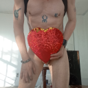
Photo
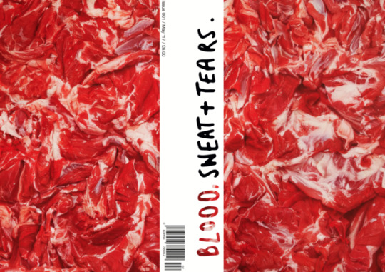
We were adamant to make the front cover a big stand out. Making people question what this magazine would be about. We thought that limiting the front cover would make a viewer walk past it and start asking questions why there was raw meat. As we were doing about a publication based around taboo subjects and the rawness of student lives, we thought we could include an HD image of raw meat. I found this standing out but I still wasn’t 100% sure on it, for the reason of it being quite literal.
0 notes
Photo
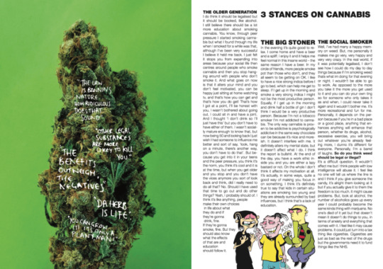
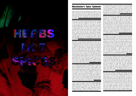
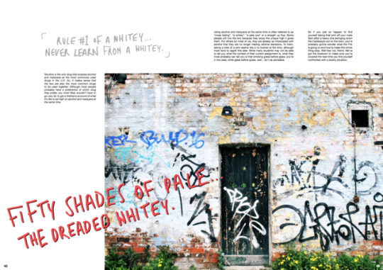
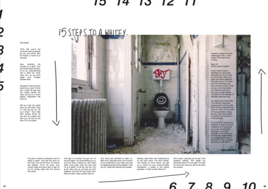
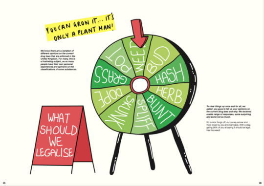
DESIGNED BY OWEN // 3 STANCES ON CANNABIS AND MANCHESTER SPICE EPIDEMIC.
0 notes


Photo
STUDENT RECLASS DRUG LAWS INTERVIEW SCOTT AND WILL // DESIGNED BY OWEN.
0 notes
Text
ANTHONY JONES INTERVIEW FOR SIN CITY
If you could start by telling us a little bit about yourself.
A: My name is Anthony Jones (AJ) A.K.A Mr Sin. I was born and raised (dragged up) on the biggest council estate in Europe... Wythenshawe. All I see around me is sin. You can only imagine...
So, what encouraged you to create a brand like Sin City?
A: Round here a lot of the boys take 1 of 2 paths… Try and get a trade or a decent 9-5 or take the sinners route which most are influenced by on the estate. Because when it comes down to it.. who the fuck wants to work for someone else?
Who or what would you say inspired the foundations of your brand?
A: Growing up on my estate we didn’t look up to the straight goers wasting their life away waiting for Friday night come round so they can go and talk broken biscuits to the same helmets in the local boozer week in week out. We looked up to the bad boys who were living life always having a buzz; Driving nice cars, motorbikes, wearing fresh clothes, the hottest chicks, flying abroad whenever, that’s what we wanted a piece of. Some of my good mates are paying the price, the rest are living nice. If you want the finer things in life you’ve got to roll the dice…that’s the same for every other estate and city in England.
Asides Sin City, what do you get up to day to day?
A: What do I do? I’m spinning a few plates at the moment. Working on the brand, making some music and doing bits and bobs as a fashion model.... (Long story how I got into that)
Tell us about your target audience.
A: I’d say the target audience is people who can relate the brand, our look and where we came from. I’d like to see all the other cool kids rocking it too (Bikers, Artists, Skateboarders, BMX'ers, Rappers, DJs, Boxers, MMAs, Surfers ETC)
And why did you choose to launch a clothing line in particular?
A: I’ve always been into clothing, and I think being a model also inspires me. I’ve always wanted to launch a clothing line and I’ve had the idea for Sin City for years. I wasn’t 100% sure as to how I was going to move with it. It could have taken the form of a music label, a clothing
line, a movie, but here we are and the ball is rolling but I want to get fucking stuck in with all of those creatives out there!
And why did you choose to launch a clothing line in particular?
A: A lot of things made me want to launch a clothing line. Model life, general interest and just general ambition. I always wanted my own business, and clothing is something I’m passionate about. Put two and two together, and you have a brand.
If you had to pinpoint what your influences were, what would they be?
A: I like to think that I take my influences from a lot of places. Mainly, it’s my surroundings, my crew, reality. Just everyday life in the city of Sin.
What do you think is ‘trendy’ at the moment for people our age?
A: Everything is trendy as we live in such a diverse world. Everyone has their own thing going on which is great. We’re a generation of creatives, with pure photographers, clothing lines, DJ’s, filmmakers. This is a proper creative generation and I want to work/collaborate with them all.
0 notes

Photo
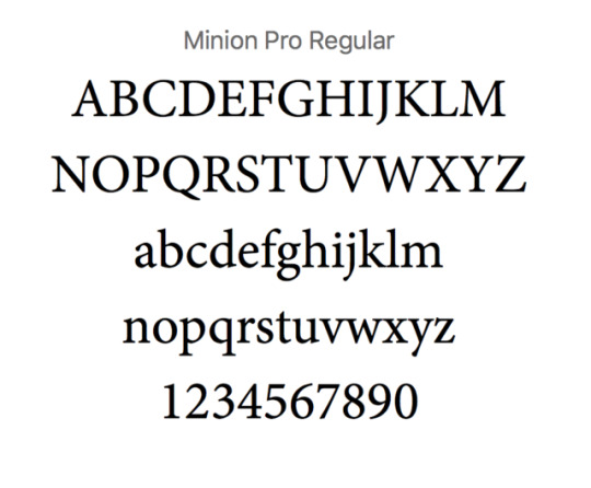
We thought that it would be essential to keep the magazine consistent with the typography, so we chose to keep the body text of the magazine to Minion Pro Regular. We wanted to have a clean typeface that was legible for the reader.
0 notes
Photo
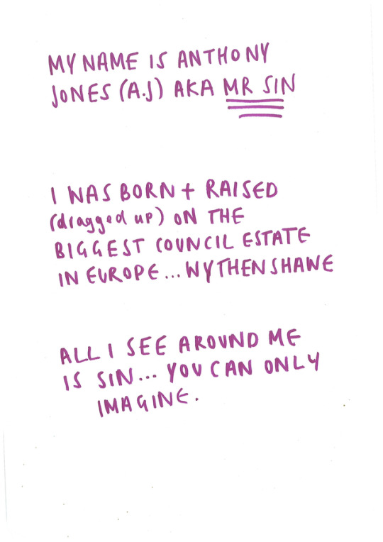


Handwritten type for Sin city spreads
When we looked at my magazine that I purchased from Magma-
System magazine’s 9th issue - Waiting for Rhianna we really liked how the designer included handwritten notes on every couple of spreads. This made us think that having a handwritten type throughout the magazine would make it more applicable to our target audience. The way we’ve worded our articles are in a loose tone of voice, making it more personal. I asked Nina if she could write down some quotes (as she has beautiful writing) and I scanned them in and vectorised them to include in the SIN CITY interview.
0 notes
Photo

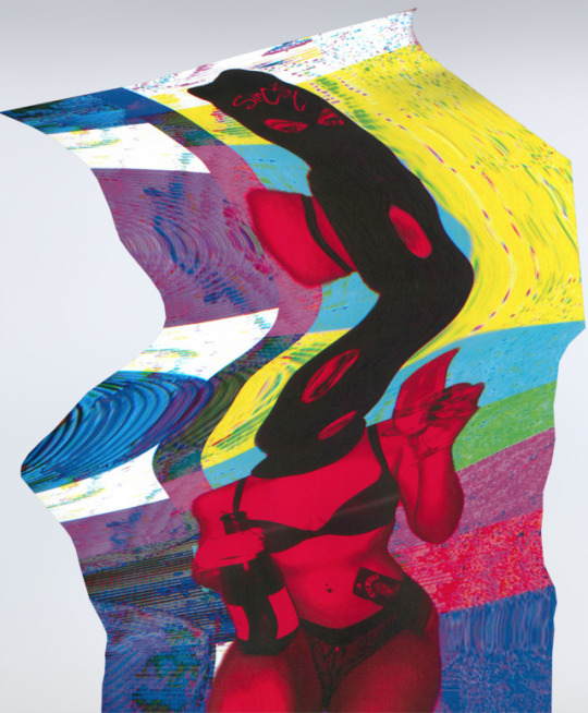
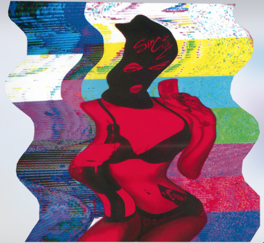
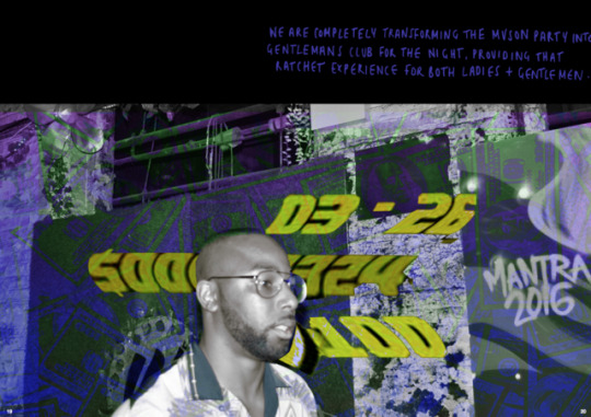
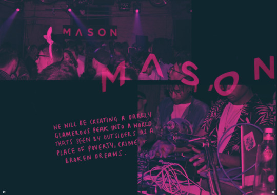
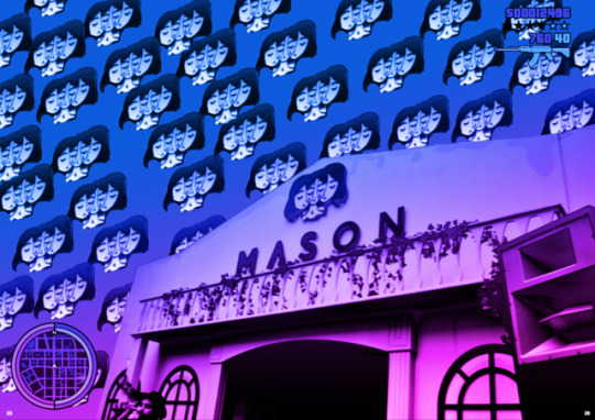
Scanner experiments
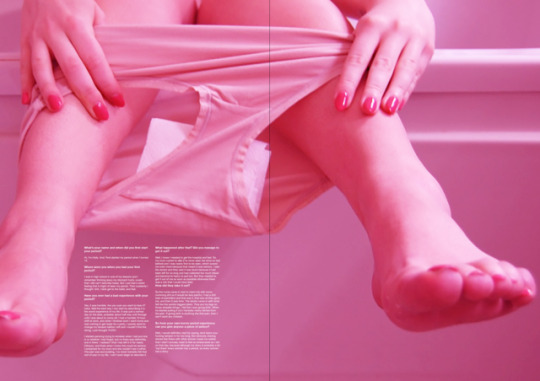
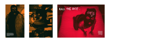
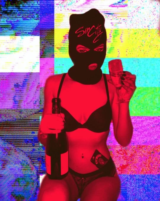
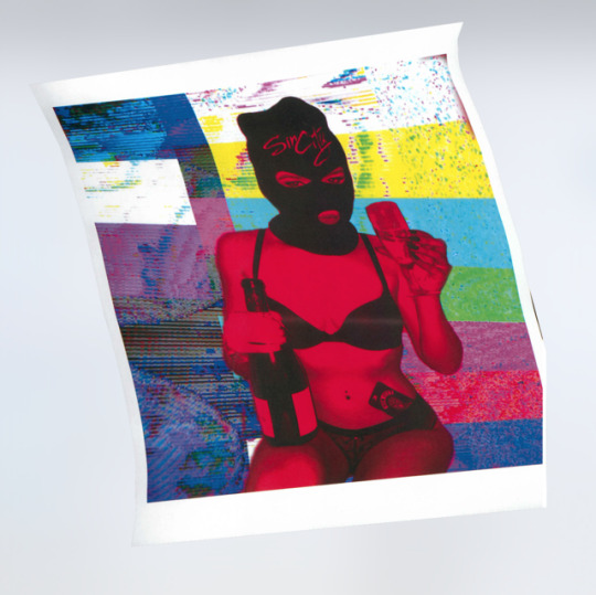
After editing the photographs with a duotone to fit the aesthetic of the magazine, and for it to remain consistent. I wanted to experiment with distortion. The reason behind me wanting to distort these images were to show the SIN CITY distorted sense of reality. I like how the outcomes of these came out. Another reason, for the distortion, was to show a glimpse of the theme taboo.
0 notes