
amccdesignblog
Alex McCormick
Second Year IXD Student @UUB
236 posts
Don't wanna be here? Send us removal request.
Last Seen Blogs

dokidobe
yellow.dr.monv

anythingandi
You survive. LR spoilers

asianmoviezone
sontu
lilapie
Pictures & Schtuff

nelufazafri
Giveaway24
Text
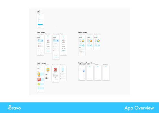
Project Reflection
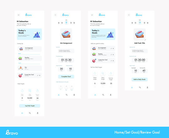
I really enjoyed working on this project creating a healthcare app that can help improve the physical and mental health of the user. When I began researching for this task I found the Topic of UX for Healthcare quite overwhelming as there was a vast amount of information available on this subject. Working with my group and narrowing down our research allowed us to identify an area in which we wanted to look at, which was preventative health care. I knew that an App couldn’t solve or prevent many medical issues however I wanted to creature something that would have a positive impact on the users physical and mental health in a small way that would effect every day.
I wanted to focus my time at the beginning of this project on research, not only on the topic of healthcare but also in UX. Looking at the Laws of UX weekly as well as looking further at UX research resources, such as the Nielsen Norman Group, allowed me to learn and understand more about the field.
Once I had conducted enough research both quantitive and qualitative I was able to start working in my project beginning on paper and working my way to the final project. I really enjoyed this module and I found that working in groups and getting feedback along the way made it much easier to steer myself in the right direction.
I am very pleased with the outcome of this project, I think that my app looks great but I also think it will allow the user to effectively improve their physical and mental health in their own way. I am very happy with the brand that I have created, I think that it is modern and clean.If I were to begin this project again with the knowledge that I now have I would definitely take the whole project through from start to finish in Figma. I have used Sketch for a while now and I feel that there are too many issues and restrictions that I encounter using it.
0 notes
Text
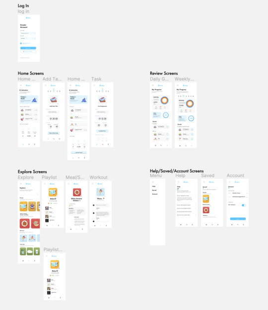
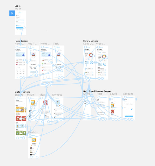
Prototyping
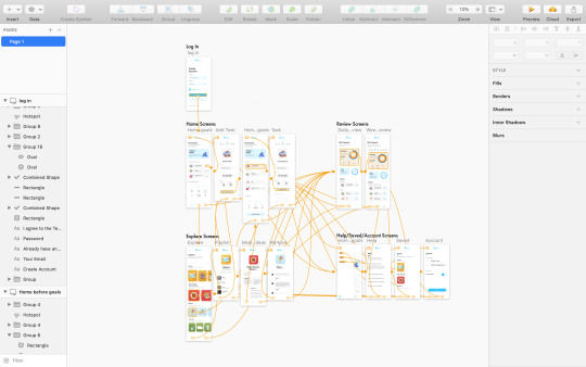
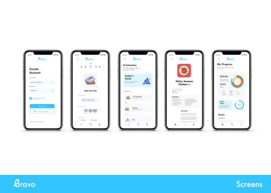
Prototyping app Bravo to allow me and others to see how it will function and flow between screens. This is very helpful as it allows me to identify any areas that need to be improved to make the app function properly.
After completing my project on Sketch I attempted to upload it onto the sketch cloud so that it can be shared and viewed by others. Unfortunately this feature of the sketch app was not working and the problem seemed to be very common when I looked online. I decided that I would import my artboards into Figma and that way I would be able to share my Project and upload it for submission. This is very easy to do as Figma allows you to import artboards and so I could quickly move this over.
I then prototyped my app in Figma, this was much easy and offered more options than Sketch so I’m glad I made the jump over in the end.I was able to add overlays which gives a better vision of how the app would perform in use. Here is my project prototyped in Figma.
https://amccdesignblog.tumblr.com/post/650522487037280256
0 notes

Text
Critique/Presentation Week 12
This week we had an informal presentation/critique of our projects up to this point. I like being able to share my work and get the opinions and feedback from others as it allows mw to improve my work and learn from what my classmates are doing.

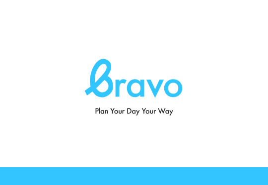
The first screen was showing my brand. I am pleased with the final outcome of Bravo and the brand that I have created for it. I wanted the brand to reflect the app and feel positive. I kept it simple and modern and paired the swooping B in Bravo with a classic structured Futura to compliment it. Plan Your Day Your Way is the strapline that I created that summarises the apps main features to help you achieve your daily goals and plans in the way you want to.
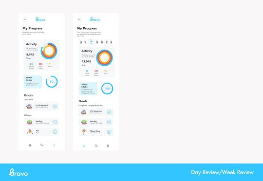
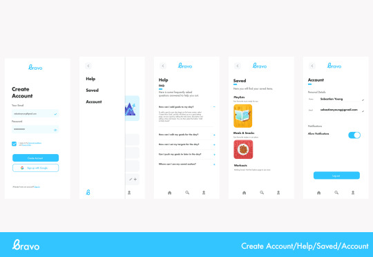
The second screen is a summary of the app to this point. I still have a bit to go in terms of fleshing out the apps content but I am nearly there and am happy with my progress to date.
The final screen of the presentation is some close ups of the final app screens. I am very pleased with these screens and how they are looking to date. I received very positive feedback for my app to date and was encouraged to keep heading in the same direction with my last few screens to be completed. Having these critiques in class is always very helpful it allows me to see what everyone else is up to and see what I can learn from them. It also allows me to receive feedback on my own work and know what works and what doesn’t.
0 notes
Text
Daily Inspiration
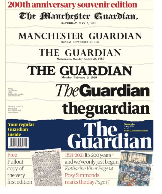
Yesterday the Guardian newspaper had published their 200th anniversary souvenir edition which featured a pull out of the first edition of the paper. I thought this was really cool to see the transition thats the typography has gone through and how it has modernised while keeping its traditional style.

0 notes
Text
Sherlock Holmes Figma Protoype
https://www.figma.com/file/ttYdZrZHFhD6ln32XnkqNK/sherlock-holmes-prototype?node-id=0%3A1
0 notes
Text
Sherlock Holmes Website
https://sherlock-holmes-25ad2b.webflow.io/
0 notes
Text
Project Reflection
This project was one of my favourites to date. A challenging one, but nevertheless one that’s tested and made me grow as a designer. I am extremely pleased with the outcome of my website.
The brief for this project being centred on the topic of Sherlock Holmes initially felt restraining to me. Being limited can sometimes lead to new opportunities and this is how I felt I approached this project. When I began this project I wasn’t interested in the classic 1887 ’Sherlock Holmes’ art direction that many designers adopt. I read a few chapters from ‘Art direction for the Web’ by Andy Clarke.
“The way to engage people, create desire, make them happy, and encourage them to stay that way, is by creating narratives.”
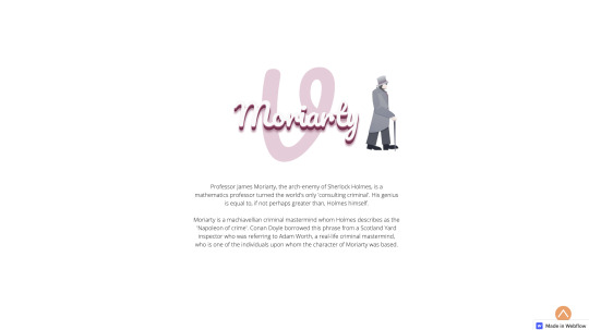
Good art direction is good storytelling. Clarke stresses the importance of storytelling in web design and how any successful product does this. Taking this information on board I decided that I wanted to approach this project from a different perspective on Sherlock Holmes. Rather than looking at the time period for inspiration I looked at the ‘character’. Sherlock is quirky, sharp and direct, and this is the approach I took to this design.
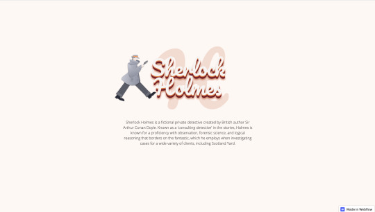
When creating this project I wanted to focus on the typography and I spent a lot of time working to perfect this. Not only in the titles but also in the body copy. In the beginning I didn’t know where to begin with the type, it took me a long time and a lot of failed attempts until I landed on the final typeface Pacifico. Experimenting with layering and colour allowed me to achieved the final outcome and I couldn’t be happier with how it turned out.
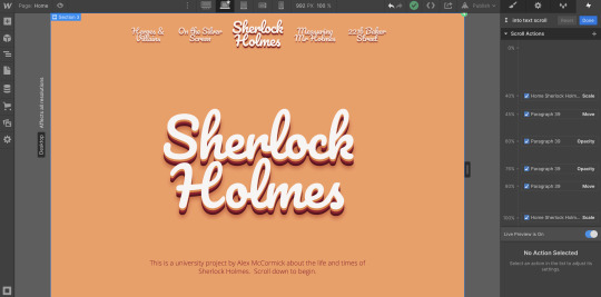
The navigation of this website felt very important to get right as this module was about storytelling. I decided that making a single page site would make the website feel more like a journey and take the viewer through the sections, which I thought of as chapters, immersing themselves in the story. I did this through colour blocking and titles, I’m very pleased with the effect this created.
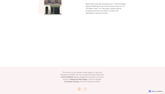
Looking back on this project I wondered what I would do differently if I were to do it again. One thing that I would have liked to be able to do is some advanced animations in my project. For example, I would have loved to have made Sherlock Holmes walk across the street in the 221b Baker Street Section and enter the house. This is something I want to look more at in the future and develop my skills in. I also would have liked to have made my ‘short stories’ graph interactive, like the first. I wasn’t able to find any online resources to help me out with this one and as the share wasn’t a basic square like before I wasn’t sure how to go about this, but in the future I will look at this interaction in more detail and work towards achieving it.
Overall, this project was one that was a joy to work on. After what has been a difficult university year this project was an enjoyable experience and I am so happy with the outcome that I feel proud of.
0 notes
Text
Footer
When creating my footer I wanted it to be simple and concise. I stuck to the content we were given and added link blocks to my own portfolio website and design instagram account. Adding a simple ‘pop’ interaction to these image links made them user friendly as it tells them that these are links.
When I asked a couple of people to use my website it was one of them that mentioned that my links should include some form of feedback to indicate they are links. Thinking that I had done this to these text links I checked it out and noticed that once I had added a hover state and a visited state it would remain in the visited state. This is not how I wanted these links to appear and so I changed this so work properly on the users screen.
Before:
https://amccdesignblog.tumblr.com/post/650384190302453760
After:
https://amccdesignblog.tumblr.com/post/650425472069632000
0 notes
Text
Peer Feedback
Wanting to improve my website and get a feel of how other people were experiencing it I asked some people on my course for feedback on my final website. This is the feedback Georgia Shared with me.

“The website flows so well, I love that the beginning of each section fills the whole size of the screen - makes it really immersive and means you have a visual pause allowing the viewer to understand which section they are on.
You’ve taken a really unique approach to this project and not gone for the standard Victorian Sherlock Holmes theme and went with a more 70s style of art direction. The typography is so nice, it really sets the narrative style for this website and the colour choices fit in with this perfectly.
I love how you have taken the content and displayed it in your own unique way, especially within the ‘On The Silver Screen’ section where the year the movies were released is placed on a low opacity behind the title. You have also been successful in highlighting the important information in bold, which draws the user to this part of the text.
The illustrations are consistent throughout using the same colour scheme. Also by incorporating the same Sherlock character illustration you used at the beginning in to walking on top of the books in the illustration in ‘Measuring Mr.Holmes’ section is really effective.
I would recommend aligning the Sherlock Holmes title in your cast of characters section to the centre to match the rest of the characters”
Receiving this feedback was great to hear and I was pleasantly surprised that my website had been experienced as I intended. Sometimes when we look at something for too long we aren’t able to identify issues that fellow designers can with fresh eyes. As I had been focusing on the height between the top of the section and the title I hadn’t noticed that this one character was different to the others due to the shorter paragraph of text. Changing this works much better and I’m glad this was caught by my Georgia. Sometimes it is more important to trust our eyes rather what the computer is telling you is right.

Here is the before compared to the next character which is centred followed by the after, in which the title is the same as the other characters. It is only a slight difference but small details like this are important in the overall consistency and feel of the design.
0 notes
Text
Macro & Micro Interactions
In order to create an immersive experience for the user I knew that it was important to include macro and micro interactions in my project. They give the user feedback and reassurance as they use the website making their experience more enjoyable. Animations can also make users experience more exciting and engaging and that’s exactly what I want to achieve through my website.
https://amccdesignblog.tumblr.com/post/650381063884046336
I started off by adding hover states to my nav buttons. This shows the user that these are buttons and they can be clicked on to bring them to that section. I also played around in my home section with my typography elements and added an on scroll interaction that fades out the intro text, and grows the main title. I’m really pleased with the impact this simple animation has on the project, it makes it much cooler and smooth and I think it compliments the art direction.
I added some simple moose hover interactions to my ’Silver Screen’ icons made them a little bit more interesting and fun as the user moves through the content.
https://amccdesignblog.tumblr.com/post/650381003546886144
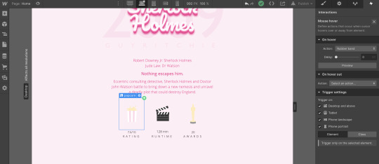
Creating an interactive map was a challenging experience but one that I think has a big impact on the chart. It was suggested to me in a group critique that an interactive chart would be a great addition to my website and I’m very glad I took this advice on board as it definitely made the website more user friendly and sleek.
https://amccdesignblog.tumblr.com/post/650380783468625920
Finally my favourite animation is the 221b Baker Street house illustration scrolling into view. I was inspired by the Big Apple Hotdogs website animations and I’m very happy with how this turned out in my project. I wanted my website to feel like a continuous story and I feel like this animation really reflects this and is exactly what I wanted to achieve.
https://amccdesignblog.tumblr.com/post/650381285166120960
0 notes