
Last Seen Blogs

hvordan
Hvordanbloggen

okemostjobb-blog
tenylegjobb

nyxportals
𝓓𝓮𝓪𝓭 𝓑𝓾𝓽 𝓟𝓻𝓮𝓽𝓽𝔂

ewolfsohn
Eggplant
pleasantbananafireprune
raviolo farcito
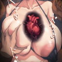
Photo


Artwork from Mohammad Noor.
SUBMISSION
Mohammad Noor is a Conceptual Artist working with photo manipulation to create surreal art. Mohammad is from Amman/Jordan
Instagram: @crossconnectmag
603 notes
·
View notes
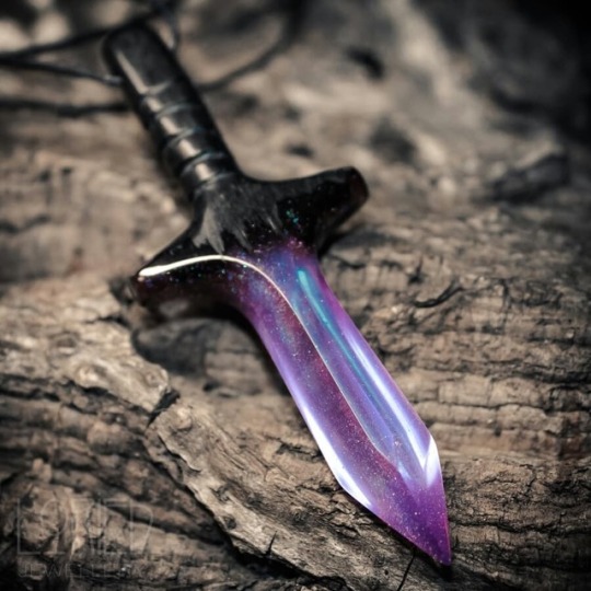
Photo


Necklaces / Bracelets
Vanillama Art on Etsy
See our #Etsy or #Dragon tags
2K notes
·
View notes
Text
Removing the nsfw art will NOT stop the bots and pedophiles. They will just label their blogs as sfw and change tactics. All you are doing is just removing most of your fan base and your income from ads.
A better, more positive Tumblr
Since its founding in 2007, Tumblr has always been a place for wide open, creative self-expression at the heart of community and culture. To borrow from our founder David Karp, we’re proud to have inspired a generation of artists, writers, creators, curators, and crusaders to redefine our culture and to help empower individuality.
Over the past several months, and inspired by our storied past, we’ve given serious thought to who we want to be to our community moving forward and have been hard at work laying the foundation for a better Tumblr. We’ve realized that in order to continue to fulfill our promise and place in culture, especially as it evolves, we must change. Some of that change began with fostering more constructive dialogue among our community members. Today, we’re taking another step by no longer allowing adult content, including explicit sexual content and nudity (with some exceptions).
Let’s first be unequivocal about something that should not be confused with today’s policy change: posting anything that is harmful to minors, including child pornography, is abhorrent and has no place in our community. We’ve always had and always will have a zero tolerance policy for this type of content. To this end, we continuously invest in the enforcement of this policy, including industry-standard machine monitoring, a growing team of human moderators, and user tools that make it easy to report abuse. We also closely partner with the National Center for Missing and Exploited Children and the Internet Watch Foundation, two invaluable organizations at the forefront of protecting our children from abuse, and through these partnerships we report violations of this policy to law enforcement authorities. We can never prevent all bad actors from attempting to abuse our platform, but we make it our highest priority to keep the community as safe as possible.
So what is changing?
Posts that contain adult content will no longer be allowed on Tumblr, and we’ve updated our Community Guidelines to reflect this policy change. We recognize Tumblr is also a place to speak freely about topics like art, sex positivity, your relationships, your sexuality, and your personal journey. We want to make sure that we continue to foster this type of diversity of expression in the community, so our new policy strives to strike a balance.
Why are we doing this?
It is our continued, humble aspiration that Tumblr be a safe place for creative expression, self-discovery, and a deep sense of community. As Tumblr continues to grow and evolve, and our understanding of our impact on our world becomes clearer, we have a responsibility to consider that impact across different age groups, demographics, cultures, and mindsets. We spent considerable time weighing the pros and cons of expression in the community that includes adult content. In doing so, it became clear that without this content we have the opportunity to create a place where more people feel comfortable expressing themselves.
Bottom line: There are no shortage of sites on the internet that feature adult content. We will leave it to them and focus our efforts on creating the most welcoming environment possible for our community.
So what’s next?
Starting December 17, 2018, we will begin enforcing this new policy. Community members with content that is no longer permitted on Tumblr will get a heads up from us in advance and steps they can take to appeal or preserve their content outside the community if they so choose. All changes won’t happen overnight as something of this complexity takes time.
Another thing, filtering this type of content versus say, a political protest with nudity or the statue of David, is not simple at scale. We’re relying on automated tools to identify adult content and humans to help train and keep our systems in check. We know there will be mistakes, but we’ve done our best to create and enforce a policy that acknowledges the breadth of expression we see in the community.
Most importantly, we’re going to be as transparent as possible with you about the decisions we’re making and resources available to you, including more detailed information, product enhancements, and more content moderators to interface directly with the community and content.
Like you, we love Tumblr and what it’s come to mean for millions of people around the world. Our actions are out of love and hope for our community. We won’t always get this right, especially in the beginning, but we are determined to make your experience a positive one.
Jeff D’Onofrio
CEO
275K notes
·
View notes
Photo
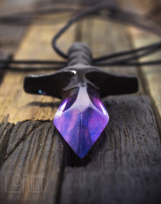
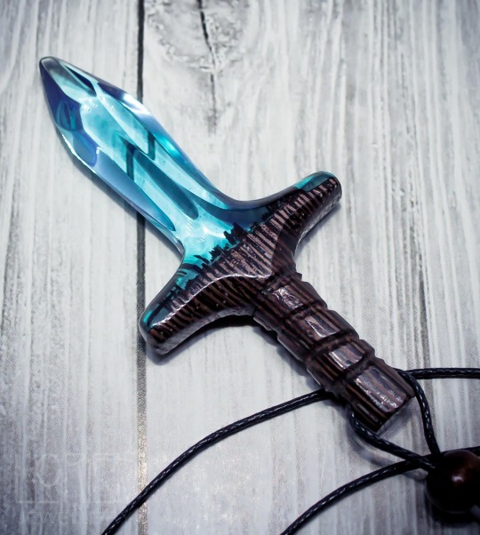


Crystal Sword Pendants
LORIEN on Etsy
See our #Etsy or #Wood and Resin tags
47K notes
·
View notes
Video
please watch jenna marbles fuck around with a green screen im literally pissing myself
254K notes
·
View notes
Photo
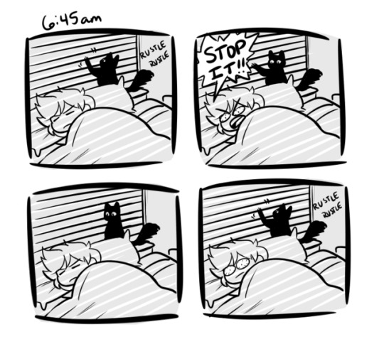
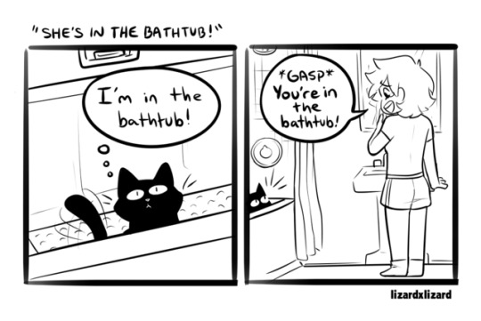
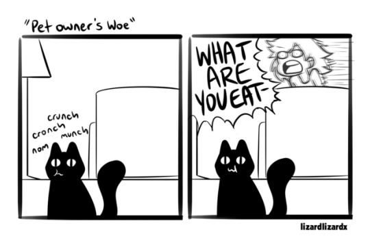
In honor of the first of Halloween, a master post of my diary comics that featured my black cat Buffy
33K notes
·
View notes
Text
i just found this website that can randomly generate a continent for you!! this is great for fantasy writers
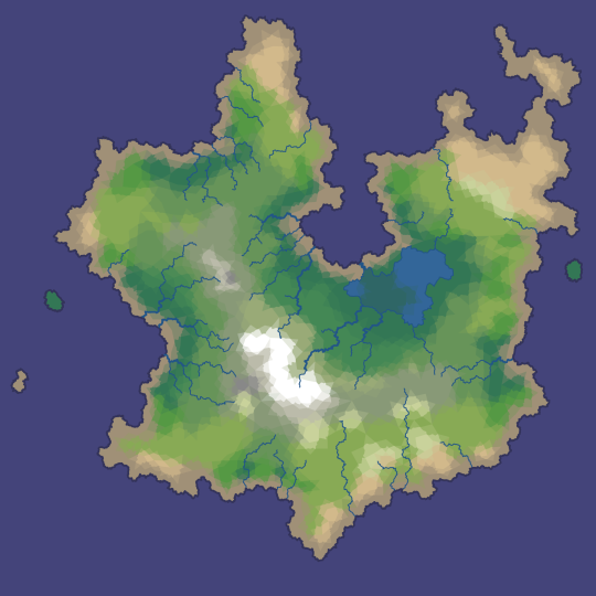
plus, you can look at it in 3d!
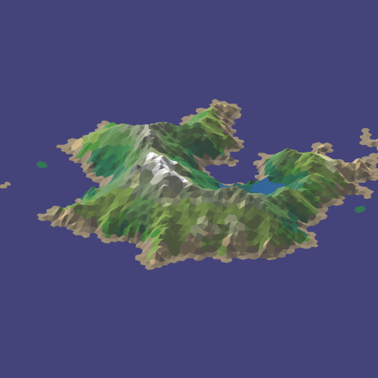
theres a lot of viewing options and other things! theres an option on-site to take a screenshot, so you don’t have to have a program for that!
you can view it here!
317K notes
·
View notes
Text
How I make book covers + tips for you!
Hey people of Earth!
Around this time last year, I mentioned I would have a video up on how I make book covers/cover making tips, and to summarize: I did not do the thing, and this year old script is still sitting in my drafts.
SO, I thought I’d kill two birds with one stone and post a written version of these tips! Going to get straight into this because I imagine this will be rather long!
This post will be divided into 6 parts: finding inspiration, concept art, incorporating elements of design, composition, tools and software, and resources. Feel free to skip around to whatever section interests you most!
***Before we get started, really quick disclaimer. I am in no way a professional cover designer. Cover design is merely something I picked up on my own, and I don’t have any formal education/credentials in graphic design. So of course take my advice with that in mind. These are also just my personal thoughts and opinions. So take everything with a grain of salt!
1. Finding Inspiration

What’s the deal?
A really great way to start out in design
Finding cover designs or designers you admire may help you see what works technically
Helps nail down a style you like
In turn, can help you find your cover design style
What should you do?
Look at covers in your genre!
Whenever I design a cover, I take a scroll through Goodreads to pick up some inspiration in designs I personally love
I also love walking around my bookstore and taking a look at physical copies
Find a cover design you like, and point out the specific reasons you like it
Example:
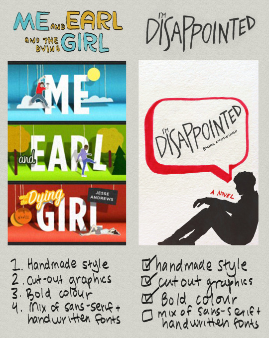
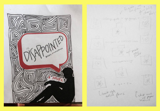
Me and Earl and the Dying Girl was actually not an inspo cover for this edition of I’M DISAPPOINTED, but as you can see, things I liked from it spilled over into my own design. By pointing out aspects of graphic design you like, you’ll better be able to understand your style as a cover artist.
Some personal thoughts:
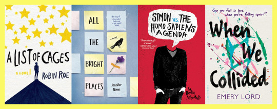
I like covers that include a textured backgrounds, as seen in the collage below:
So for the I’M DISAPPOINTED cover above, I included a textured background. I also love handwritten fonts/lettering, which I include in almost all of my book covers.
What I did:
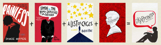
Off-white colour from A List of Cages and Holding Up The Universe
Silhouette from Painless and previous cover design of I’m Disappointed
Speech bubble from Simon VS the Homo Sapiens Agenda and Say What You Will
Marker texture from A List of Cages
Obviously my thought process wasn’t to put 4 covers in a blender and thus create my product, ha, this is just an example for the ease of understanding!
2. Concept art

What’s the deal?
Coming up with concept art is a super important part of designing a successful book cover.
Acts as the skeleton of your book cover
Your book cover’s roadmap
Saves time/effort
Similar to an outline for a novel.
Can be a very quick sketch, or full fledged design
I like keeping my concept art quick, but if this is your first cover, making a more detailed mockup can help.
What should you do?
Sketch out book cover ideas once you get them/take notes of concepts you’d like to explore
If you can’t come up with concepts, take a look at your inspiration folder and pull concepts/ideas from covers you love
This does not mean copying another book cover (this is notttt a good idea!). BUT, pulling inspiration from elements you like on a cover can be helpful in generating your own concepts
You don’t have to come up with concept art (sometimes winging it works!) but I do recommend jotting notes down, and drawing out loose sketches when applicable!
Keep a list of ideas for book covers as you accumulate them (almost like a little vault of concepts lol) and reference them in the future!
Take a look at as many book covers as you can and make a list of elements you like and don’t like
This is one of the easiest ways to accumulate ideas/concepts!
Example:
^^^ Concept art for two book covers
Likes and dislikes in book covers:
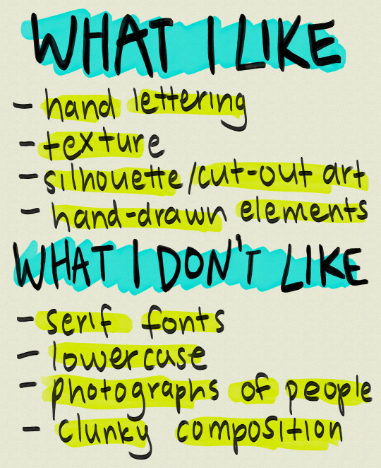
Of course this list is not my be all and end all (nor should it be), and obviously, I still use these things (besides clunky composition I hope!) in some designs!
3. Incorporating the elements of design
What’s the deal?
There are 7 elements of design: line, shape, texture, form, space, value, and colour.
These sometimes vary depending on where you look, but this is what I was taught, so I’m going to be working off that!
Examples:
I’m going to go through them really quickly via an assignment I did for my comm tech class
Keep in mind this assignment is 2 years old and is only meant to give you an idea of what these elements are
1. Line

Line is probably the most important element of design as every piece of art starts with one.
There are various types of lines. You can have curved lines, straight lines, vertical lines, horizontal lines and so on.
2. Shape
You can have more mathematical, geometric shapes, or more abstract, free form shapes.
3. Texture
Texture is the feel of a particular surface.
Texture in my opinion is one of the most important elements when it comes to graphic design, especially book covers.
My favourite thing to see in book covers is texture, whether that be paper textures like construction paper, crumpled paper, wallpaper, lace, wall textures, paint textures, or marker textures
Texture adds depth to designs, and if there’s any element of design you focus on in this post, I’d highly recommend it be this one.
(i’m biased but still)
4. Form
Form is almost like shape, except instead of flat objects, we’re dealing with 3-dimensional objects.
I don’t often use it in my covers since I like drawings and flat shapes in my designs, but if you want to include objects on your cover, or any sort of 3D shape, this would be form.
5. Space
The distance around an object, to put it simply
Space in covers can help emphasize what’s important, and what is less important, or can draw attention to a particular piece of your design.
Examples of space:
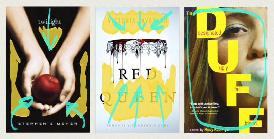
Colour coding: yellow = space, teal = focal point/movement of viewer’s eye
In Twilight, the black space helps emphasize the main image, the hands holding the apple.
This also occurs in the Red Queen book covers. The empty space around the crown draws attention immediately to the focal point
You can also lack space. In The Duff, the girl’s face is the only thing you can see on the cover.
6. Value

Is determined by how much light or dark is incorporated into design.
Example of value:
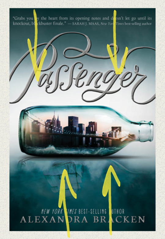
A great example of value in book covers is on Alexandra Bracken’s Passenger. As you can see, the green at the top fades down in a gradient as more white is added to the centre.
7. Colour
Light reflecting off objects
Can make certain elements of your design stand out
Why should you incorporate the elements of design into your designs?
Adds layers of depth to your work
Thus can take your cover-making skills to another level
Can help in producing ideas
4. Composition:
What’s the deal?
In my opinion, can make or break a design
Can mean clutter of things, OR too much or too little space between elements
Title placement
Composition is sometimes subjective from design to design
What you can do:
Pay close attention to detail and spacing
Look out for natural shapes in your design you can fit elements into
Watch the linked video from Mango Street (one of my favourite photography channels) on composition
While photography and design are two different things, the tips in this video can also be applied to various ideas in design such as headroom and leading lines
youtube
Examples:
*Before I get into this, I want to make it clear that these examples are exaggerations for the purpose of showing you good and bad composition. If you make these mistakes, that doesn’t mean your design is bad, and again, I’m no professional. This comes from what I believe could be considered bad composition, but trust your gut.
Example 1: Stick People
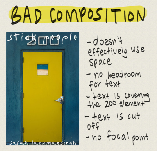
doesn’t effectively use space
no headroom for text
text is covering 200 element (looks very clunky)
text is cut off
No focal point
Can’t read the title
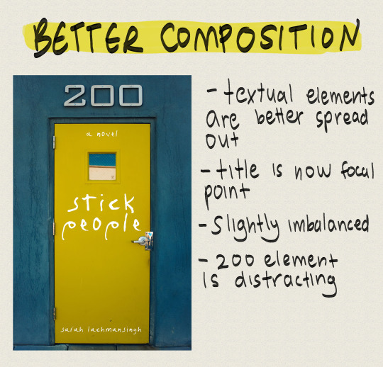
Textual elements are better spread out
Title is now focal point
Slightly imbalanced
200 element is distracting
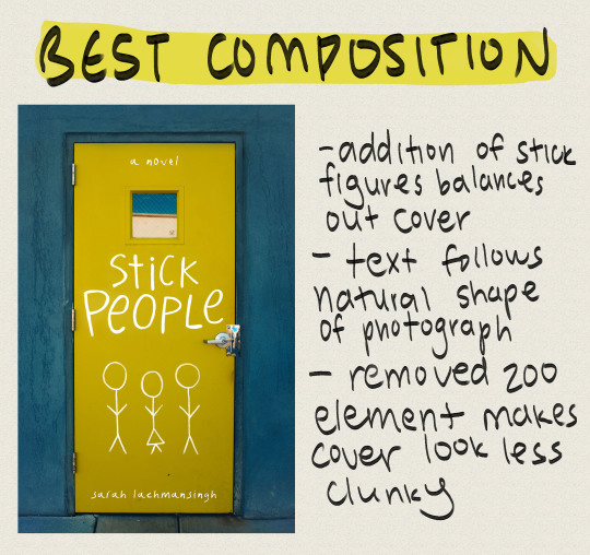
Addition of stick figures balances out cover
Text follows natural shape of photograph
Removed 200 element makes cover look less clunky
Example 2: Sixteen Cents
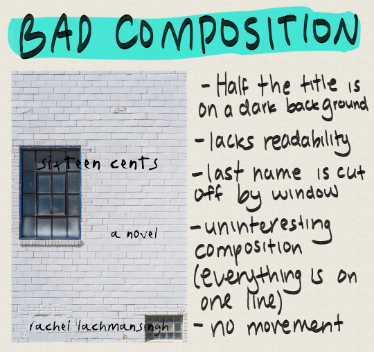
Half the title is on a dark background
Lacks readability
Last name is cut off by window
Uninteresting composition (everything is on one line)
No movement
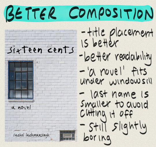
Title placement is better
Better readability
‘A novel’ fits under windowsill
Last name is smaller to avoid cutting it off
Still slightly boring
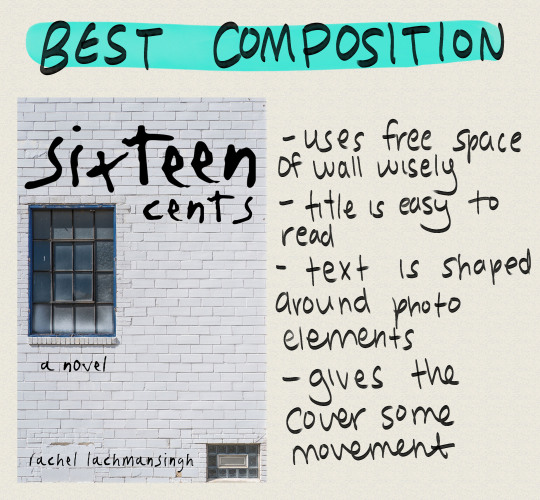
Uses free space of wall wisely
Title is easy to read
Text is shaped around photo elements
Gives the cover some movement
Example 3: Fostered
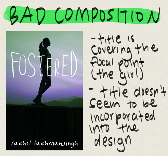
Title is covering the focal point (the girl)
Title doesn’t seem to be incorporated into the design
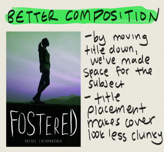
By moving title down, we’ve made space for the subject
Title placement makes cover look less clunky
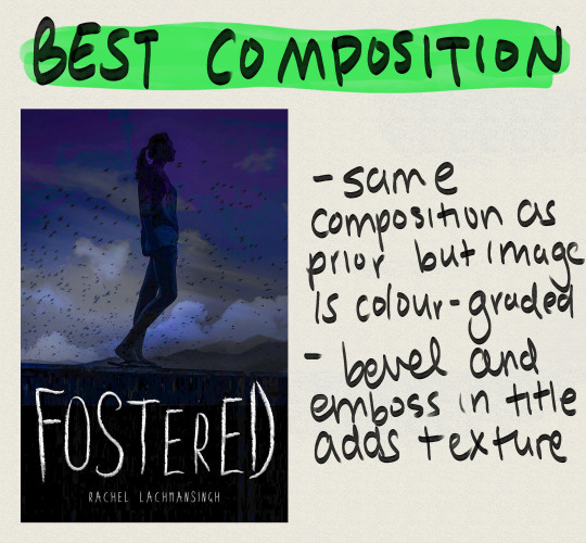
Same composition as prior but image is colour-graded
Embossed title adds texture/depth
I’ve mentioned this a few times in this post: focal point. What is it?
FOCAL POINT:
Is defined as the main attraction of your book cover
This is where you want your readers’ eyes to focus
Focal points can sometimes define themselves in areas where more contrast happens to be
Doesn’t have to be the centre of the page.
Keep focal point in mind for composition because if you put it in the wrong spot, you could end up drawing your readers’ attention to the wrong area of the cover.
The point of most interest in a cover is the focal point, so if you want a particular subject of your book cover, such as a person, to stand out make sure you don’t make the other areas of the cover too high contrast or busy.
Framing subjects also helps, so be creative!
The human eye tends to focus on areas with increased contrast so keep this in mind
Examples:
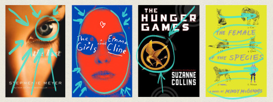
The Host
The camera has focused on the eye of the model, with the nose bridge and forehead shadowing each corner of the cover
Helps lead eye to focal point (the eye)
The Girls
Blue around the edges encircles the focal point (the girl), leading the viewer’s eye directly to her
Girl is also scarlet in colour, contrasting the background
The Hunger Games
Grey outlines on the cover lead straight to the mockingjay
Mockingjay is bright gold in comparison to the black background
Creates contrast, thus viewer’s eye is lead there
The Female of the Species
‘Straight’ composition
No particular focal point, viewer’s eye instead moves horizontally across the design
What should you do?
Use the natural shapes and outlines in your design/photo to fill your cover
Use your space wisely (see examples above)
Use leading lines to draw attention to your focal point
Manipulate text to fill empty spaces
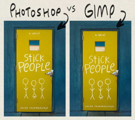
5. Tools and software
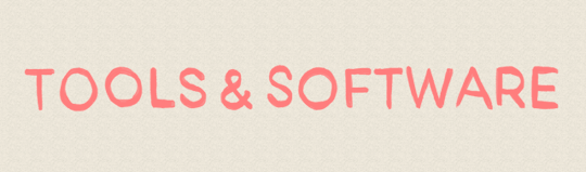
You do not need Photoshop to make a good book cover
I made my first book covers in GIMP, a free image manipulation program (kinda like Photoshop’s little brother)
This is the stick people cover I made in photoshop, and the same cover made in GIMP.
Other tools you may want to use are CreateSpace’s cover templates.
You can find these through CreateSpace OR Bookow (my personal fave)
OPTIONAL (what I use):
Graphics tablet
I use the Huion H610 which I really enjoy!
I use this to hand letter, draw silhouettes, create concept art, and so on
Paper and my Faber Castell India Ink Artist Pens.
These are fine tip markers, and are what I used to create the text on I’m Disappointed
Thin sharpies and pens will also do the job, and you can always clean any mistakes up in photoshop or gimp.
A scanner so I can transfer what I’ve hand drawn onto my computer
If you don’t have a scanner you can take a clear photograph on a camera or phone
I also use a few custom marker brushes that now come with the 2018 version of Photoshop
The main one I use is Kyle’s AM - Watercolour Paper from the art markers set (you have to load these into Photoshop, but if you have PS 2018, you should have access to ‘em).
(I’ve lettered everything in this post with that brush)
6. Resources

Here’s a list of amazing resources you might need when making your own book covers!
1. Stock image websites
Check out THIS post for a master list of my favourite stock photo websites!
Stocksnap.io
Unsplash.com
Pixabay.com
2. Dafont
Is my main source for finding fonts
3. Goodreads
A huge resource I use to find cover inspiration
I’ll often browse the new releases section to look at new covers and so on
Easy way to narrow down the genre of cover you’re looking for, as well as the age category
4. Keyboard shortcuts
Check out a masterlist for Photoshop HERE
GIMP masterlist HERE
Makes workflow super efficient
My fave I highly recommend in Photoshop is ctrl > shift > alt > e (merge all layers into new layer)
I’ve made TWO custom shortcuts: ctrl > shift > o is now open as layer, and ctrl > shift > alt > r is now rasterize layer (these save so much time!)
So to conclude this post, I’m going to list out some of my favourite tips when it comes to cover making (sort of a reiteration of this post)
Add texture!
Texture is a super easy way to add dimension to your book cover
Try lettering with a paper and marker when starting out
I find this a lot easier than digital lettering!
Google is your friendddd
If you can’t figure out how to do something in Photoshop or GIMP, the internet is a vast depository of information!
Pay attention to detail
Cover design is alllll about the small details. Making sure you’ve centred something properly can seriously help in making your cover go from amateur to whoaaa who made thatttt
Get a second opinion
Been looking at your screen for 8 hours straight? Ask someone you know what they think of your design! I find this has sparked a lot of secondhand ideas!
If it doesn’t work out, doesn’t mean it was a fail
If a particular concept just doesn’t work, don’t worry! As you practice you’ll get better, and you can always revisit the concept for another novel!
EDIT: a really great suggestion from @sarahkelsiwrites: print out your design if you need a fresh perspective! You’d be surprised by what you notice on screen VS off!
So that’s it for this post! I hope this was helpful for some of you guys, I know it was looooong overdue. If it helped you out, let me know, and if you have any questions, feel free to send ‘em my way! :))
–Rachel
13K notes
·
View notes
Video
Russian girl doing a traditional Cossack sword dance
157K notes
·
View notes
Video
This really neat video was captured in July while the eruption at Kilauea was more active - it’s potentially shut down or on hiatus right now. This video captures an earthquake at Kilauea Caldera, which at the time was associated with collapse events inside the caldera itself. You can see the ground at the Hawaiian Volcano Observatory vibrate, and a few cracks at the Jagger Museum overlook even open and close as the ground shakes.
-JBB
Video source: HVO
https://volcanoes.usgs.gov/volcanoes/kilauea/kilauea_multimedia_15.html
124 notes
·
View notes
Photo
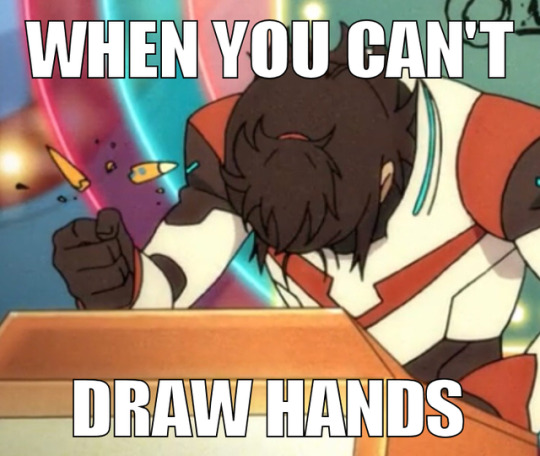
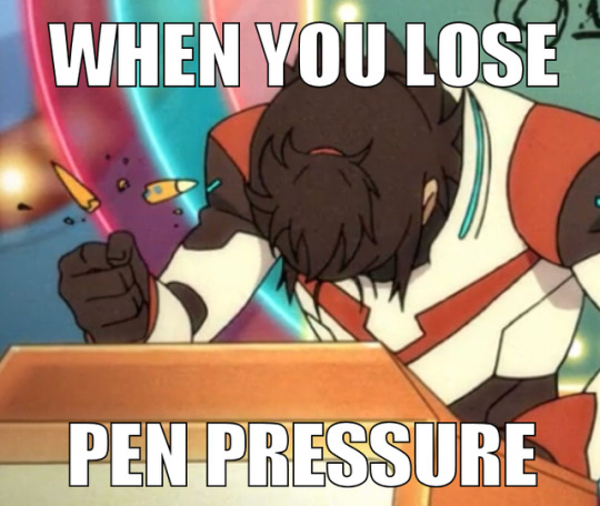
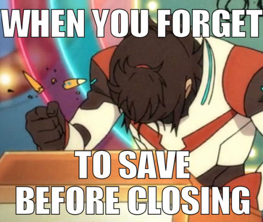
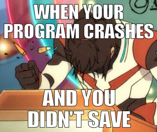
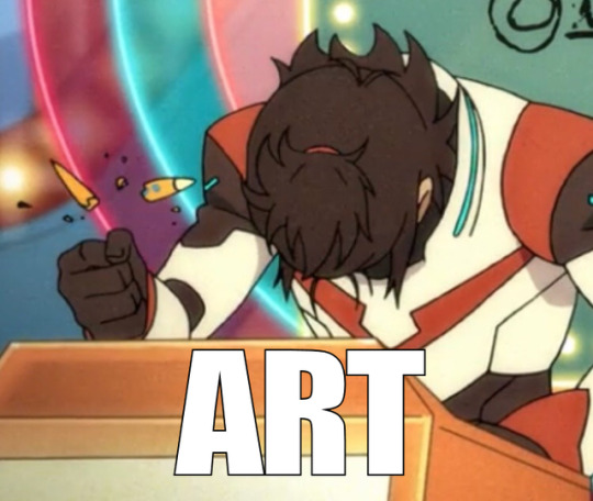
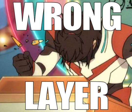
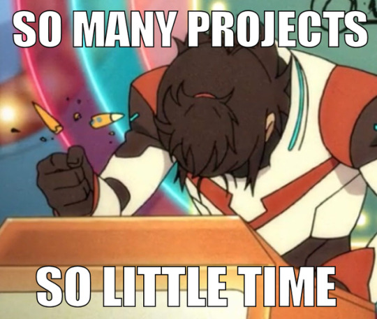
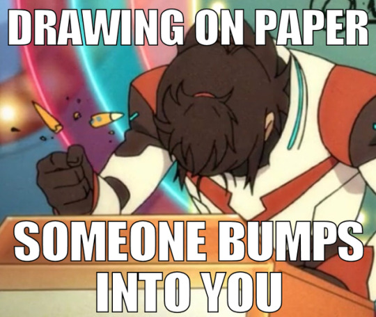
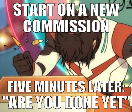
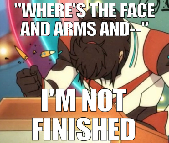
Thanks to the newest preview from S7, I present Frustrated Artist Keith™
Base image below
Keep reading
29K notes
·
View notes
Photo


Some Client work i did late last year/early this year. Was super happy with these. included some details.
3K notes
·
View notes
Photo

hello yes I worked on Spyro as a concept artist and I am responsible for the design of this beefy boy ty
7K notes
·
View notes