
Last Seen Blogs

devilishmango
Devilish-Mango

vencifer
'Ello 'Ello

mrdevsu
Untitled

art-pancake
ArtPancake

miniatureeaglefox
비아그라처방,비아그라25mg효과,
Text
Creating graphs
Output
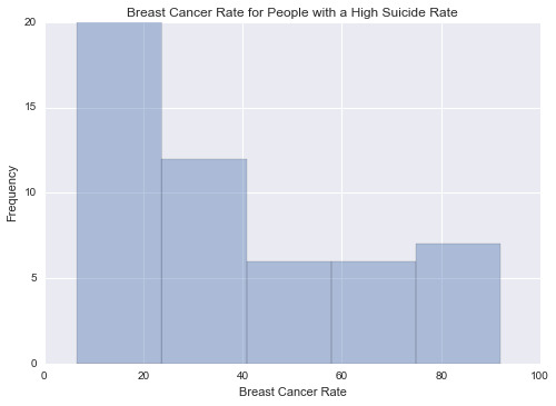
This graph is unimodal, with its highest pick at 0-20% of breast cancer rate. It seems to be skewed to the right as there are higher frequencies in lower categories than the higher categories.
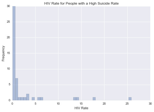
This graph is unimodal, with its highest pick at 0-1% of HIV rate. It seems to be skewed to the right as there are higher frequencies in lower categories than the higher categories.
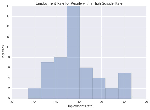
This graph is unimodal, with its highest pick at the median of 55-60% employment rate. It seems to be a symmetric distribution as there are lower frequencies in lower and higher categories.

This graph plots the breast cancer rate vs. HIV rate for people with a high suicide rate. It shows that people with breast cancer are not infected with HIV.
-------------------------------------------------------------------------
Python Program
"""
Created on Sun Oct 25 2015
@author: ali
"""
import pandas as pd
import numpy as np
import seaborn as sb
import matplotlib.pyplot as plt
# load gapminder dataset
data = pd.read_csv('gapminder.csv',low_memory=False)
# lower-case all DataFrame column names
data.columns = map(str.lower, data.columns)
# bug fix for display formats to avoid run time errors
pd.set_option('display.float_format', lambda x:'%f'%x)
# setting variables to be numeric
data['suicideper100th'] = data['suicideper100th'].convert_objects(convert_numeric=True)
data['breastcancerper100th'] = data['breastcancerper100th'].convert_objects(convert_numeric=True)
data['hivrate'] = data['hivrate'].convert_objects(convert_numeric=True)
data['employrate'] = data['employrate'].convert_objects(convert_numeric=True)
# display summary statistics about the data
# print("Statistics for a Suicide Rate")
# print(data['suicideper100th'].describe())
# subset data for a high suicide rate based on summary statistics
sub = data[(data['suicideper100th']>12)]
#make a copy of my new subsetted data
sub_copy = sub.copy()
# Univariate graph for breast cancer rate for people with a high suicide rate
plt.figure(1)
sb.distplot(sub_copy["breastcancerper100th"].dropna(),kde=False)
plt.xlabel('Breast Cancer Rate')
plt.ylabel('Frequency')
plt.title('Breast Cancer Rate for People with a High Suicide Rate')
# Univariate graph for hiv rate for people with a high suicide rate
plt.figure(2)
sb.distplot(sub_copy["hivrate"].dropna(),kde=False)
plt.xlabel('HIV Rate')
plt.ylabel('Frequency')
plt.title('HIV Rate for People with a High Suicide Rate')
# Univariate graph for employment rate for people with a high suicide rate
plt.figure(3)
sb.distplot(sub_copy["employrate"].dropna(),kde=False)
plt.xlabel('Employment Rate')
plt.ylabel('Frequency')
plt.title('Employment Rate for People with a High Suicide Rate')
# Bivariate graph for association of breast cancer rate with HIV rate for people with a high suicide rate
plt.figure(4)
sb.regplot(x="hivrate",y="breastcancerper100th",fit_reg=False,data=sub_copy)
plt.xlabel('HIV Rate')
plt.ylabel('Breast Cancer Rate')
plt.title('Breast Cancer Rate vs. HIV Rate for People with a High Suicide Rate')
# END
1 note
·
View note