
Last Seen Blogs

love2bcouture
Love2bcouture

landerers
landerers

theo-malkin-blog
Theo Malkin


ccycloneblogging
A side blog
Text
‘A war played out twice a week’
The Springboks were officially welcomed to New Zealand at Te Poho-o-Rawiri Marae in Gisborne (just as they had been in 1965) on 19 July 1981. Despite all the pre-tour rhetoric and debate, few anticipated that the country was about to descend into near civil war, ‘a war played out twice a week’ as the Springboks moved from game to game.

Hundreds were killed as the authorities ruthlessly suppressed protests in South Africa
An All-Blacks tour under such conditions was not only intolerable to many New Zealanders but also attracted international condemnation
GLENEAGLES AGREEMENT
In the Gleneagles Agreement, in 1977, Commonwealth presidents and prime ministers agreed, as part of their support for the international campaign against apartheid, to discourage contact and competition between their sportsmen and sporting organizations, teams, or individuals from South Africa.
https://ir.canterbury.ac.nz/bitstream/handle/10092/14533/Morrison%2C%20Melissa%20MA%20Thesis.pdf?sequence=1&isAllowed=y
Apartheid: It was a system that crushed people, that didn’t give them an opportunity, that was actually cruel. It was definitely morally wrong and it did need to go. IT needed to change. Christine Beardsley on the South African policy of apartheid.
New Zealanders who protested against the Tour did so primarily because of this racial policy.
0 notes
Text
Transcript
00:00:00 Speaker 1
Who was this arrogant little country with this upstart little leader who thought that they could do this on the world stage?
00:00:13 Speaker 2
Government has the authority under New Zealand law and the responsibility under the Gleneagles
agreement to stop this tour.
00:00:23 Speaker 3
I think that 1981 was the last great battle in the war to determine whose values were actually going to prevail?
0 notes
Text
squash and stretch
anticipation - moving and sudden stop
staging
straight action and pose to pose
follow through and overlapping action
slow in and out
arc
secondary action - one activity is supported by another
timing - easing in and easing out
exaggeration
solid drawing
appeal - likeness, character
0 notes

Text

Reflection:
While I tried to keep it simple, I realise now that it does not really incorporate much of an experimental factor when it came to the typography. During the process, I had to change parts of the layout as the map and the graph looked a bit cramped. I also had to change a few things about this poster - such as the paragraphs in white, margins, etc. The printing for some reason did not print the changes and so I decided to leave it alone as is. When it came to the map, I was hoping to do a bit more to it but was not sure how. Overall, this was a huge learning process.
0 notes
Text
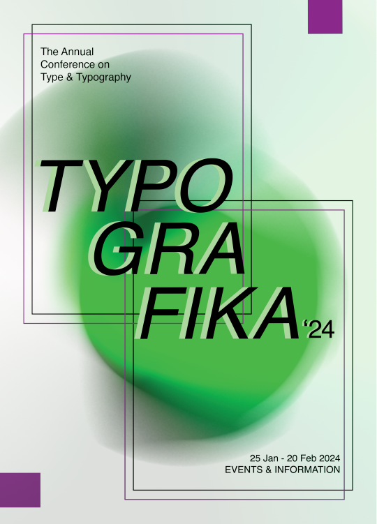

Throughout these development stages I think that a simple font works best as it looks quite messy when I try to play around with different designs. Working with photoshop became easier for me as I stuck with this design because I like how it is simple but it still draws the viewers eyes in.
0 notes
Text

First printed draft of front cover
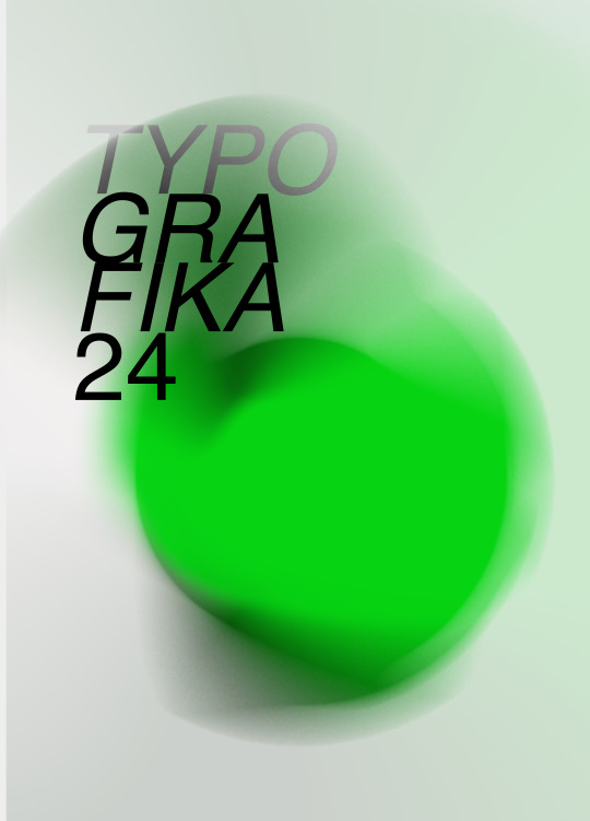
Printed my first draft in CMYK to see how it would look. Did not mind how this turned out but would like to experiment with alternative colours and perhaps even scratch the whole thing and redesign it. Chatting to past GRAD603 students really helped as they pointed out that neon colours might not show through as wanted on print. They also mentioned experimenting/adding more typography to make the cover more interesting.
0 notes
Text

Exploring folds:
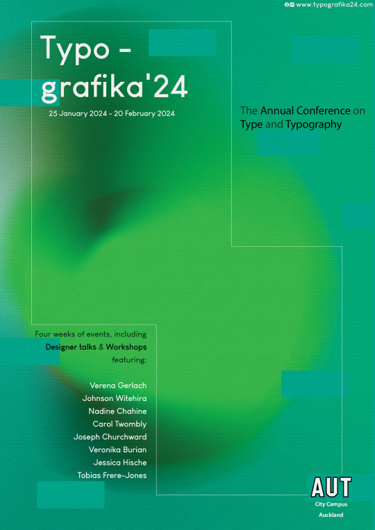
Final template for the brochure. I had attempted different folds but believe this to be the most coherent/easy.
0 notes
Text

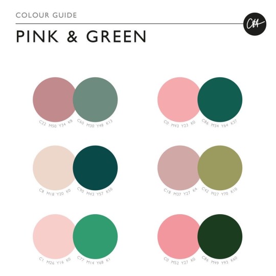
Colour:
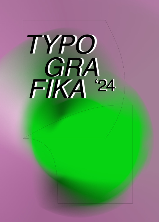
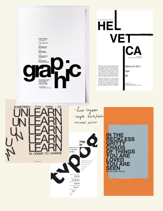
I want to continue with the use of green throughout my brochure as I see it as the colour of nature and Aotearoa/New Zealand. I also want to use pink as it can symbolise friendliness, positivity, etc. These are a few posters that I think look quite cool and am taking inspiration from.
0 notes
Text

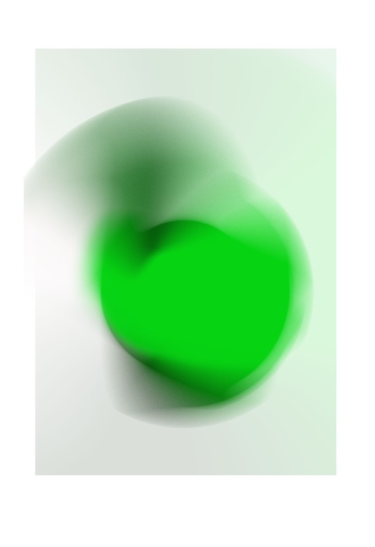
COLOUR
1. Experimenting with colour gradients:
I liked this design of gradient shapes that were depicted in other designs that I found. Following a YouTube tutorial, I was able to practice on photoshop and decided on the green design for my first draft.
0 notes
Text
Week 2 Studio Notes
Work space and Colour Modes on Photoshop
RBG - Red, Green, Blue: Used for anything that is to be displayed -> sub pixels.
CMYK - Cyan, Magenta, Yellow, Key(BLACK) - Used for anything used for printing -> subtracted. When printing, start in CMYK on an RGB screen.
Stick to RGB - change to CMYK in last minute
Grayscale RGB Colour
Adjustment Layers
Avoid destructive behaviours!
Utilise adjustments panel
Extra notes:
Ideal Websites to visit: Phlearn
0 notes
Text
Week 1 - Task A 1.2
Research on Speakers:
Joseph Churchward: Artist and Type Designer


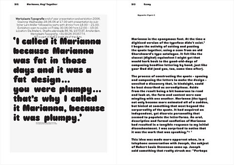
Specialised in creating alphabet fonts by hand.
Took him 150-300 hours
‘forged his own alphabets by reinterpreting the familiar forms of his daily work and endowing them with influences from his culture and surroundings’ – biographer David Bennewith
Names some of his fonts after his family
Tobias Frere Jones: Educator and Type Designer
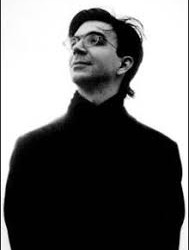
American type designer
Created Interstate, Poynter Oldstyle, Whitney, Gotham, Surveyor, Tungsten and Retina
Has lectured throughout USA, Europe and Australia.
His work is presented in the Victoria & Albert Museum in London and Museam of Modern Art in New York
Has received countless awards for his work in typography
Verena Gerlach: Type and Graphic Designer


founded her own studio (fraugerlach) for graphic design, type design and typography.
art directed several video clips and worked on the typographic production for international contemporary artists.
Her videos on YouTube are useful for me to look up and draw some guidance from
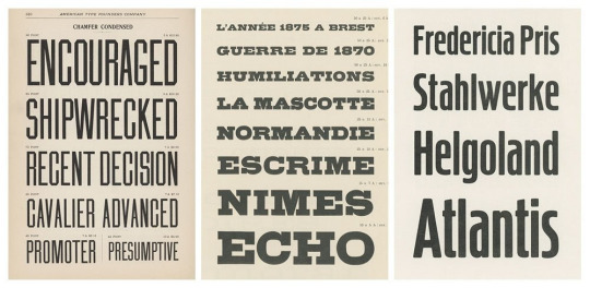
Nadine Chahine: Researcher and Type Designer

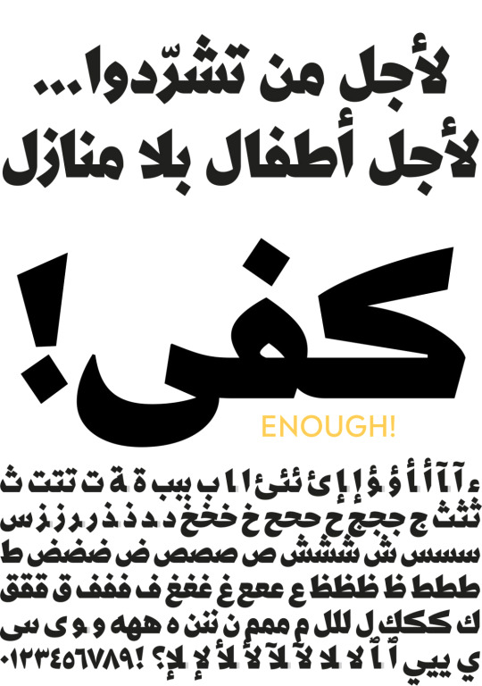
Nadine’s research focus is on eye movement and legibility studies for the Arabic, Latin, and Chinese scripts.
Her typefaces include: the best-selling Frutiger Arabic, Neue Helvetica Arabic, Univers Next Arabic, Palatino and Palatino Sans Arabic, and Koufiya.
Carol Twombly: Designer
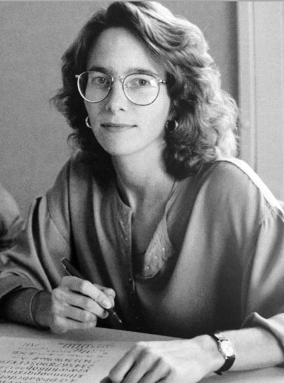
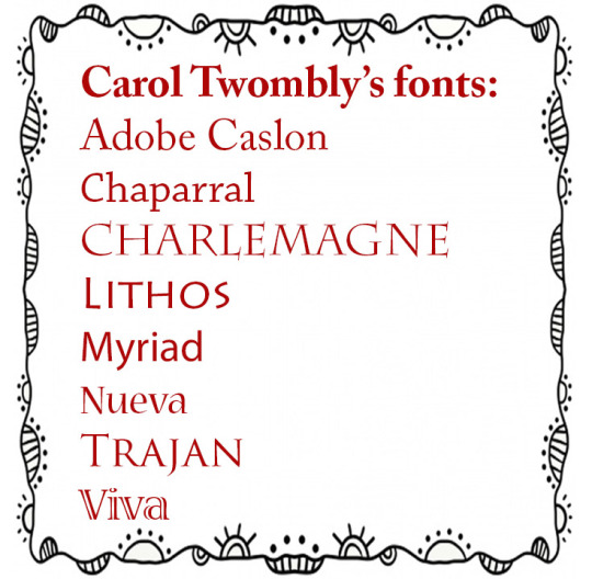
Best known for type designing
"I discovered that communicating through graphics - by placing black shapes on a white page - offered a welcome balance between freedom and structure"
Veronika Burian: Type Designer


founded TypeTogether together with José Scaglione
she is particularly involved in the mentoring program and for the GRANSHAN project for non-Latin fonts and typography
Her typeface Maiola received, amongst others, the TDC Certificate of Excellence in Type Design 2004.
Targeted Audience
Considering that the event is an annual conference at a University, I think it would suit to have the audience include university students, lecturers, high schoolers, and/or anyone interested in graphic design and type designing.
0 notes