
acountryivided
The Class Divide
Looking at my area and local community and how the class dived effects it.
36 posts
Don't wanna be here? Send us removal request.
Last Seen Blogs

diannacostadavey-blog
DiannAco

carapeace
stan kagami tsurugi (threat)

megassesdivass
MegaAsses Divas

fs136k
FS136K
karenfordonte
Caring For Donte
Text
OUTCOME TWO - Installation
Displaying my Pieces:
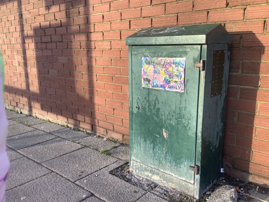
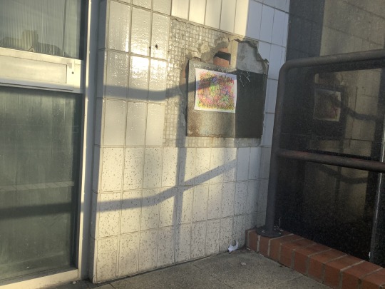
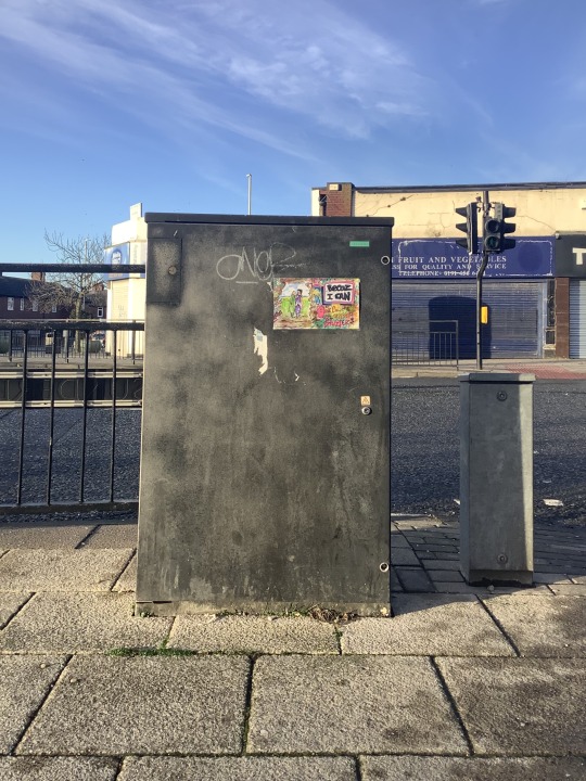
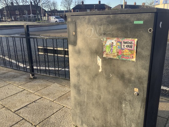
I decided to place my pieces along the street of local shops in my are know as The Nook, I placed the first not to Nook News a gazette shop. I think it looks really good though maybe a little small, I wanted to put on this box because I thought it would stick better than on the wall and liked the green background. I do however think it may have been better if the colour on the piece went all the way to the edges of the page.
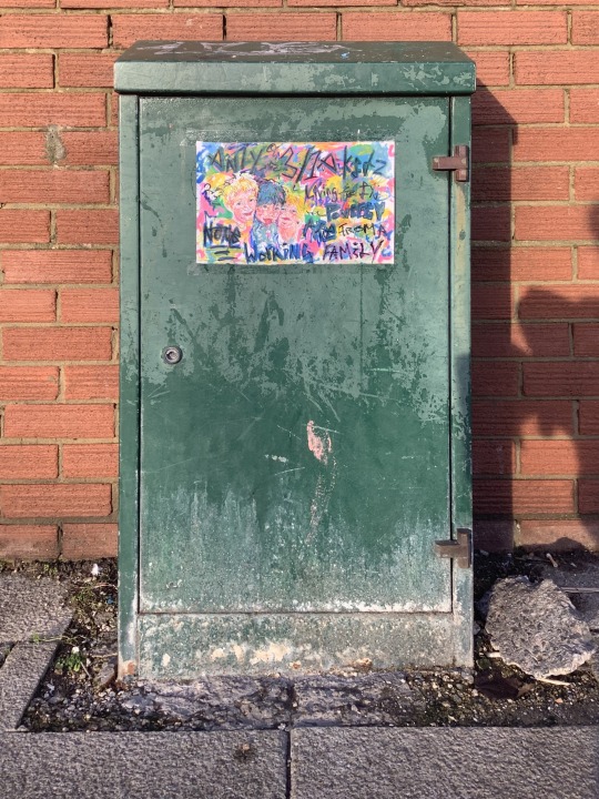
‘Only 3/10 kids living poverty are from a none working family.’
I thought for a while that some thing would look good here. Though I think the composition looks good on this particular photo when looking at the ones from afar I think it would have been better to put it in the bottom right hand corner. That being said I don’t actually mind it’s placement.
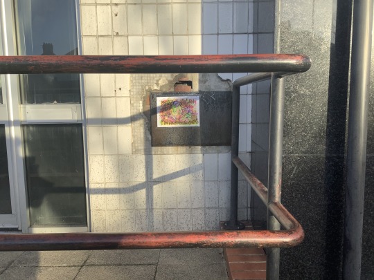
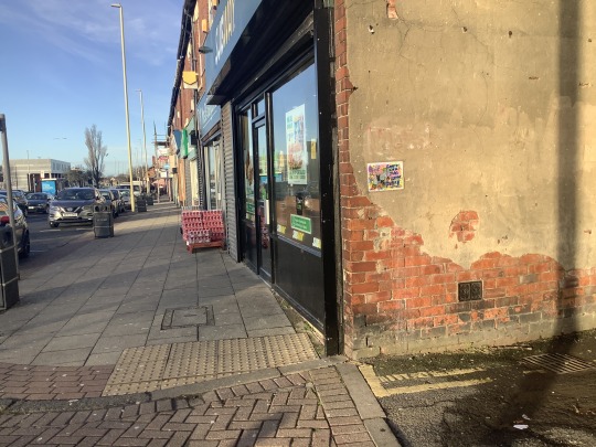
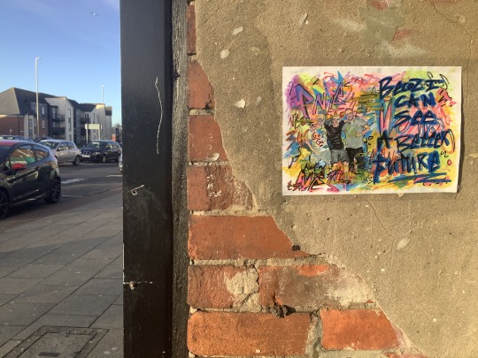
The old bank its self is not a high traffic area, but the corner it is on is; and thought it looks small on the photo it is actually quite eye catching in person.
I put the third piece up by the main crossing that joins the two sides of the nook, this was my smallest piece so I wanted it some where out in the open that was hard too miss and I think this has done the job. I wanted to put it at the top while trying not to cover the other tag out of respect though I did cut some of the bottom off it.
I think out of all of them this one looks the best as the colour goes all the way to the edges of the piece. I also think that it is the easiest to spot.
I moved this piece twice before settling on having it here. It was difficult to get the tape to stick on the textured wall however it worked well enough to hold the piece in place. I thought it would be good to put this at the entrance of the back lain we used to hang about in ‘doing nothing’ on school dinners as a kind of nod to that. It is also a wall that is quite visible while walking down the bottom end of the nook. Over all I think it looks quite good and I am really happy with the composition of these photos.
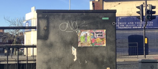
I decided on leaving out the ‘snot covered asbo’ piece as I thought that these pieces went better together, however I do wish that I had more ‘becoz I can’ pieces to put up.
0 notes
Video
instagram
unknow parasites
this is my final cut as of now and my final piece. I think that if I were going to exhibition this physically I would have a series of pieces set like my installation leading up to a wall with the film projected onto it, probably outdoors If possible. I had a lot of fun making this though it was testing at times and I am really happy with the out come though I may come back to this at a later date.
0 notes
Text
OUTCOME TWO - Installation
Cutting Changing & Choosing Pieces
Before selecting my pieces, I thought that it would be a good idea to attempt to develop my pieces a little further by making some of the changes I suggested implementing in my separate annotation of each of them. For example, I ended up changing the 7/10 text to fit the piece of the three children as I thought it would work better.
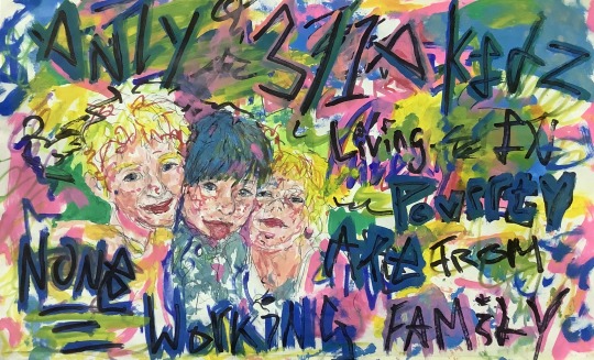
I do actually think it works quite well that being said I think the back ground looked slightly better, especially at the top, before I started adding to it. I think it looks a bit more messy now than I intended however I am still happy with it over all.
Becoz I can...
I also altered three other pieces: the ‘Becoz I can’ piece, the one of my mother and sister and the one of the three young men. The first one I cut down so that the piece had more of a focus on the text to stop it blending in too much with the background; I think that removing some of the outer clutter has really helped focus this piece the text is a lot easier to pick out.
The second two had ‘Becoz I can’ text pieces added to them. I did this as I kept coming back to the idea of having more than just one piece like that so I tried to fit ones from my list with each piece.
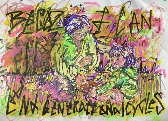
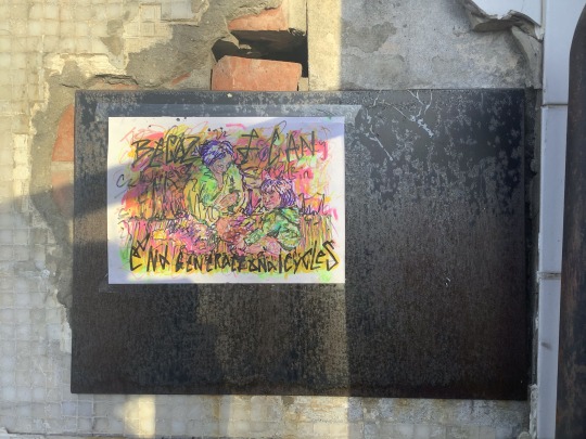
I had already started to change this piece as I had begun to paint over the existing text. This went a lot smoother than I thought it would and left a pretty good base to add text to. I used a mix of acrylic paint pens and markers to add in my chosen text ‘Becoz I can end generational cycles’. The word ‘generational’ is rather hard to read however I think over all this piece looks a lot better than I thought it would I like the yellow and black writing and think it fits better with the image than the original text.
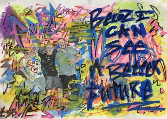
I think this piece has probably developed the most out of all the pieces I have changed. When I decided to add writing to it, I wanted to get rid of a lot of the white back ground as I wanted the writing to be layered over things. I added patches of colour to large areas by colouring the back of the paper with marker until it blead trough. I think, for getting colour behind already layered paint or pen, that this I pretty good technique it stops colour overlap and helps fill in gaps. I chose to add ‘Becoz I can see a better future’ to this piece as I feel the bright uplifting colours match the sentiment and I think it goes well with the image. Over all I think the addition of the writing improved this piece and made it look a lot more finished. I am really glad to have a collection of them even if it is just three.
I think I will be using all of the images shown in this post with the addition of the ‘snot faced asbo’ however I will see what looks good when I go to display them.
0 notes
Text
OUTCOME ONE - Film
Final edit for film piece
View this post on Instagram
A post shared by daisy manning (@1291653_ncuc)
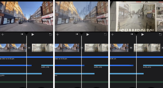
When re-editing my film I focused on the end, which I think has gotten as close to how I want it as it will. I am quite happy with how it has turned out over all for the equipment I had access to. I didn’t really change much in this edit except for add a small clip of a van at the end and move around some footage and photos. I think I could probably spend forever trying to get it just right so I decided to leave it like that as I think it is a good closing point. I tried to have the audio and visuals kind of fade of however I tried to add a kind of eco in the back ground notice that I think would have been better left out. That being said it does kind of trail of to an end.
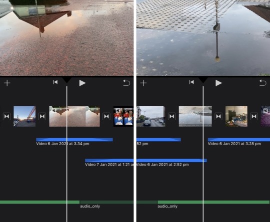
Though I think the end is a little bit of a let-down there are lots of parts to the film I think when quite well. Some of my favourite shots are towards the end of the film, shown in the screen shots above. I took these trying to respond to whitehead and though there not at his level of interesting composition and colour I think they came out really well and have a nice effect.
I also quite like the section shown above in three stills, when the street transitions to a photo, this was also kind of a let-down however as I couldn't get it to match up properly and the transition was not as smooth as I'd hoped. That being said I think it works well enough to get the point and connection across.
You can also see in these shots the different audio and video clips I used to make the film. I would like to take this time to say that the audio was the hardest part to edit and if I were to do something like this again, I would have to look into getting better soft wear or possibly enlisting help.
Above is the very end section of my piece, it shows my attempt at creating an echo in the blue, the clips used and my attempt at fading audio in the green. I wanted the talking to end and have the film fade to beach noise then black nothingness, I almost managed this though my addition of audio kind of messed it up that being said I am still happy with it as I think it does its job.
0 notes
Text
OUTCOME TWO - Response To New Years Message
‘In his New Year’s Eve message on Twitter, Gareth Baines suggested that A&E departements were full of ‘fat mums in Pot Noodle-stained leggings’ with their ‘snot-covered Asbo’ children.’ - The Metro
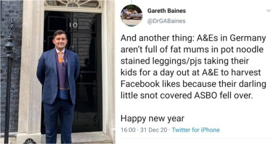
Read more at: https://metro.co.uk/2021/01/05/tory-said-fat-mums-in-pot-noodle-stained-leggings-are-filling-ae-13850016/?fbclid=IwAR3SwL6XGcm21LyF0UO1Sz5bhsolFRochF6qs23wgfTtGrq3oBMugfW0uiI
Though I had settled on using the 4 main pieces I had already finished, this head line really inspired me to do a piece in response to it. I decided to do a painting of a baby with a runny nose next to the text ‘snot covered ASBO’. I was unsure if I would finish it before the deadline however due to its small size and some what messy style I managed to get it done before going out to display them so I have decided to use this one too.
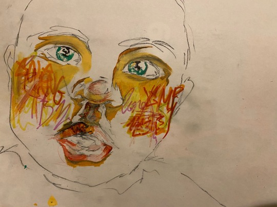
I did this piece in layers using a variety mediums. I sketched it out in black chalk pencil to begin with then began adding some tag like marks using coloured pencil and different types of pen on areas like the cheeks, lips and forehead. I used this kind of mark making mixed with a kind of block colouring technique to build up the colour and shading in the face. I really like how this came out on this this piece in particular, I think on some of the other pieces it didn't blend as nicely or work as well as this one but I think that is due to me being more familiar with the style.
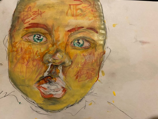
Above you can see where I have began adding patches of colour and various layers of acrylic paint over the pen marks. It is actually a more natural peachy skin tone however due to lighting it is appearing more yellowy in the photograph. Although this is not how the actual piece looks I really like how it looks, I think the more yellowy tone contrasts with the red well.
At this time I also began picking out a few highlighted areas with a white pencil, I also left bare paper in areas hoping that it would appear brighter. I think this went well and helped give my piece depth; it could have been highlighted more effectively if I had mapped out where I wanted them to be on the face. This being said I think that the ones in the eyes as well as on the nose and mouth area worked really well. I wasn't sure what to do with the clothing/body so I painted it an almost block colour hoping that when the background is added it will draw attention away from that area.
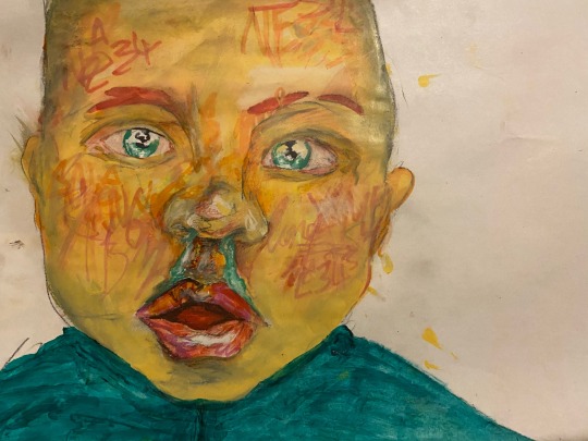
as i began adding in the background i decided to bring some of the tag like mark making onto the face when using pinks and oranges, I think this helped add more shading as well as allowing it aesthetically go with the backing. I think that it has also worked well in adding a little more detail to the body area. This being said it has also made it look rather flat when looking at the shoulders.
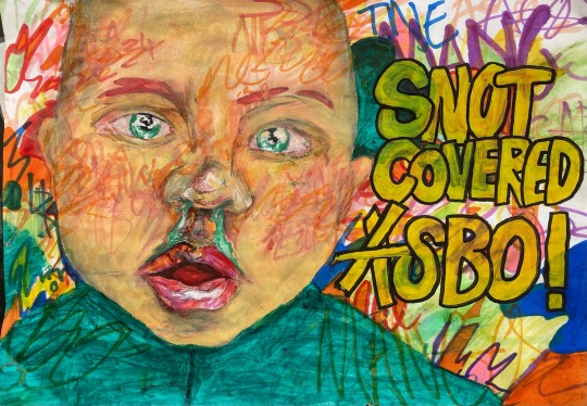
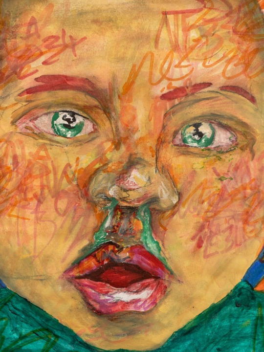
above is the finished piece. I am really happy with how it turned out although there are a few areas where I think I could have done better. for example the background in places like the top right side is not as aesthetically pleasing as other rest of the background. However as I mentioned above the marks made going over the body kind of flatten it. The actual text, in my opinion could have also been done to a higher standard however I did not want to mess with the piece to much in case I ruined the face.
0 notes
Text
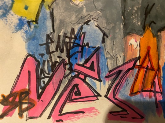
OUTCOME TWO - Installation The Nook Estate
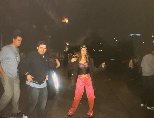
I wanted to do a piece responding to the youth subculture with in my area. I thought the best way to do this was by trying to draw photos of people I know, I looked on facebook for some stereotypical lads poses. I decided on an image of three men I know from the area, though I am not in touch with them all I have known the first two for a large majority of my life. I thought it was a good choice as it is not too posed but has the right feel to it. I am not going to post the photo here for privacy but I will post the photos of the work I did from the image.
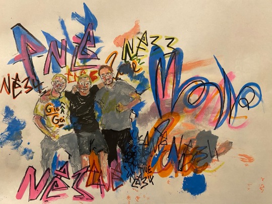
Mixed media painting - marker, acrylic paint pen, water colour and biro on paper
landscape A4
I think this piece responds well to the youth culture and tagging, however again I feel it would have been better if I had not added so much biro outlining, this being said I think that I have improved adding shadow with water colour. I am also really proud of the black shirt with white highlights. Usually I would just add the white with paint but I wanted to try and use the paper as the white highlights, to do this I used chalk to map them out then used marker to colour the shirt once o was done I wiped away the chalk and the highlights were there. I was really happy with how it turned out and think I will use that technique more often.
I wanted the graffiti to come from both in front and behind them to try and create depth so I did the people first and tried to layer the tags around them. Starting from the top left corner of the page behind the people working down and across I tried to surround them with various marks and tags.
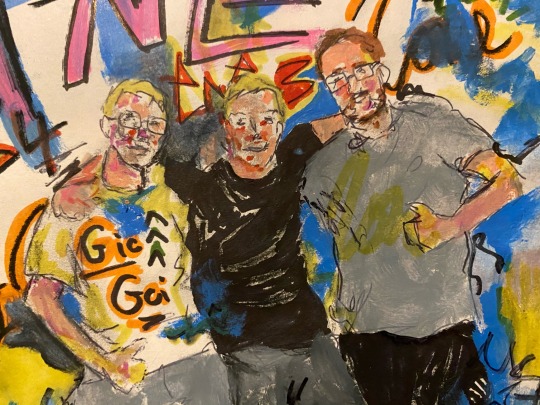
I think that this created a little depth though the blue and yellow on the people flatten it a little.
I also think I used the post codes as a tag too many times, I like how it looks but there is at least 5 visible to me. I may go back into this piece and try and cover a few of these as I think they are a it repetitive though I am reluctant to as I think the composition and colours are good as of now and do not want to risk adding to it.
0 notes
Text
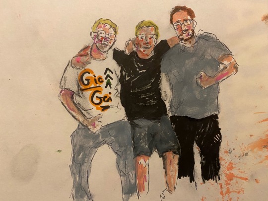
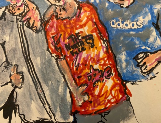
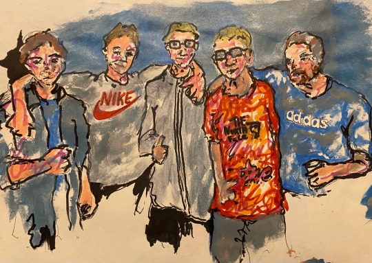
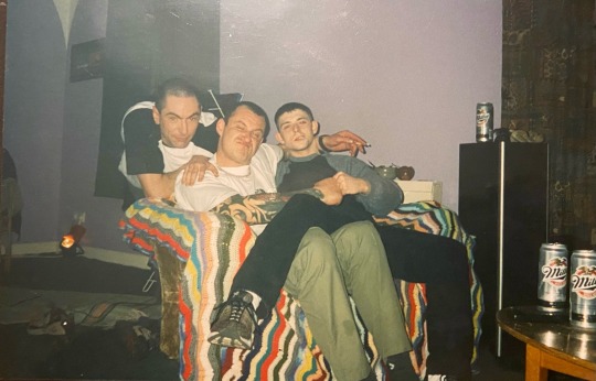
OUTCOME TWO - Installation The Boys
I wanted to do a piece that was showed a a group of teenage boys that might be subjected to stereotyping because of how they dress or talk but in a way that they look like good kids.
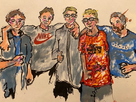
To do that I made this piece mixed media piece, I tried to draw a group of people in an impressionistic style. Over all, at this stage, I thought that the piece was going pretty well. Other than areas like the fifth persons face and the gap where the shoulder should be on the third person I think this piece did a good job showing these ‘boys’ in a nice light. I tried to include clothing I thought fit with the lower class culture while trying not to be too in your face about it. at this point I have also started trying to use tags to colour areas like the red t shit and i think it is actually the first time it has worked that well.
I decided to count this as a test pieces as when I attempted to add the background I drew a blank and added a lot of blue water colour. I was going to try going over it with other things but I decided to just start another as the thick black lines on the people started to look to cartoonish to me and I wanted something a little more life like and less flat.
0 notes
Text
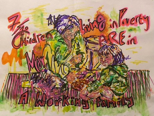
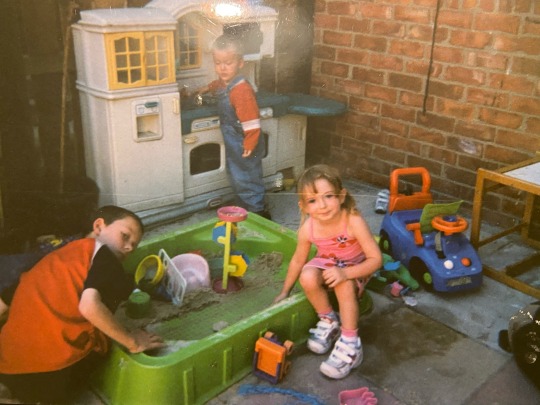
OUTCOME TWO - Installation Seven Out of Ten
mixed media - acrylic paint pen, permanent marker pencil, water colour and biro
landscape A4
This piece was in response to a something I found out while looking into the rise in work poverty. According to data from 2018, 7 in ten children living in poverty are from a family where a member is working, single parent house holds being hit the worst.
I decided to use a photo I also used in my film as reference as of my mother and sister as a toddler. However now looking at it I think this text would have gone better on my the piece of my mam and her friends as children. That being aside I am really happy with how this turned out, I might change over the text but I think on the whole it is good. I tried to use a mix of graffiti inspired colours and mark making with that of the impressionist style. I tried to stay away from defining everything as I wanted it to have a kind of a sketchy look which I think has worked well for this piece and gave a nice layered effect. I achieved this by combining lumps of tags or small layered tags mixed with various different mark making using a range of paint and pens.
Due to not having accesses to a camera during this being made I regrettably do not have any photos of the development but I basically layered different colours, mark making and mediums over a sketch of my family to try and build up the over all image until I was happy with it.
0 notes
Text
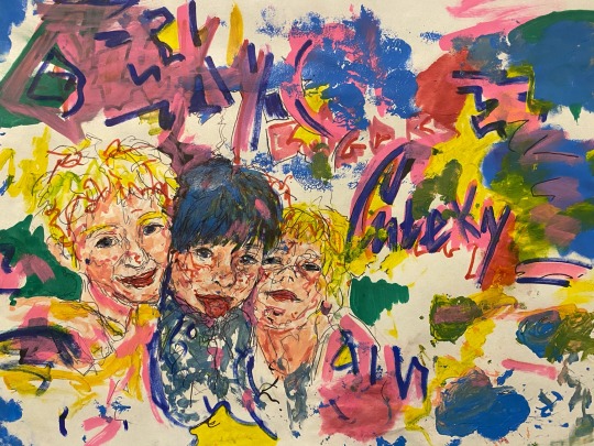
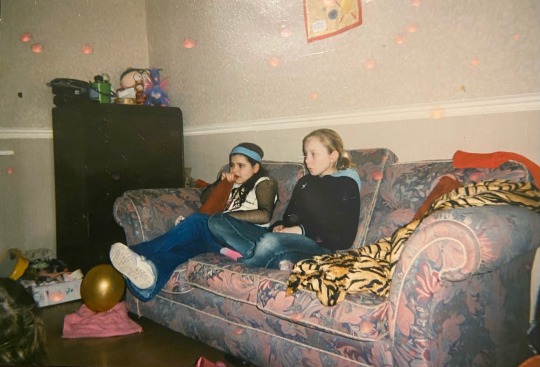
OUTCOME TWO - Installation Three Cheeky Buggers
mixed media painting - acrylic paint, paint pens, markers, pencil, biro and water colour
Landscape A4
I am really happy with how this piece turned out it is a lot less obviously tag / graffiti inspired than the other pieces I have done so far but still has the same kind of vibe to it. I wanted to write ‘three cheeky buggers’ on this but I kept messing it up and painting over it. Which has gave this piece its patchy look but I think it has worked in my favour. I quite like the over all look of the painted over writing, it reminds me of when tags or graffiti get painted over rather than removed. Technically i think this is one of the better portraits I have done in a while though I can not seem to pull my self away from adding outlines to things. Like the brio continuous line drawing on the faces. I do however think that the chin on the girl on the right is very flat and could have been done a bit better with more shading. I tried to use water colour to build up the body of this piece before adding other mediums so that there visible layers which I think has worked very well however I did not have accesses to a camera to take development photos. the only things I would maybe change or add are doing less biro lining on the face and possibly adding a piece of text.
I think that the addition of text could help add context to the piece literally however I think it has already done what I set out to do aesthetically (combine graffiti / tagging with a more classical approach).
0 notes
Text
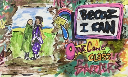
OUTCOME TWO - Installation Becoz I Can
This piece was inspired by a piece of graffiti I came across in the local skate park. It stuck out to me originally as it was something a large portion of my fellow peers said a lot in secondary school. It was usually used as a response when questioned about your motive for doing something, most likely something that shouldn't be done.
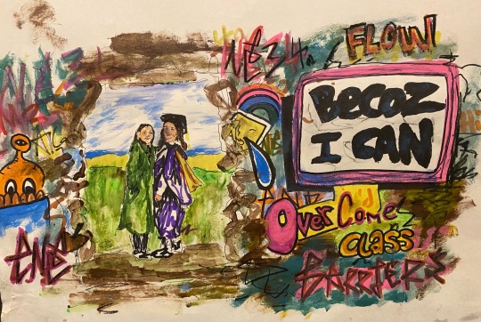
It is also a way of thinking that a lot of people, particularly in this area, subscribe to. This ‘Becaz i can’ attitude towards life is most likely the sentiment behind this graffiti however when I looked at it, it made me think of my sister Kayne .
Many people who have adopted this way of thinking use it to justify or explain doing things such as partying, tagging a wall or braking the law. There are a others however, like my sister, who use this way of thinking to improve their lives. In stead of using it to excuse actions, they use it to motivate.
I believe it is this same attitude that has allowed her to achieve so much for coming from very little. Kayne has always been academic, she is naturally intelligent and has fed her thirst for knowledge regularly and independently from a young age, she has motivated her self to do better for herself and achieved it. That being said this was not with out its obstacles imposed on her by class.
I knew that I wanted to responded to this in some way, either in my film or through my painting so began toying with different ideas. I tried cutting shots of my sister graduating along side shots of the graffiti piece however I felt I might be able to do more with it in a painting.
I came up with a few slogan like ‘becoz i can’ sentences to try and develop into pieces or use as just as text pieces. The best of which where: becoz I can brake the glass ceiling, becoz I can over come class barriers, becoz I can see a better future, becoz I can end generational cycles, becoz I can survive but not live & becoz I can be smarter than my accent.
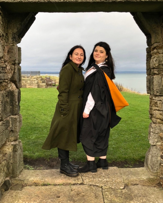
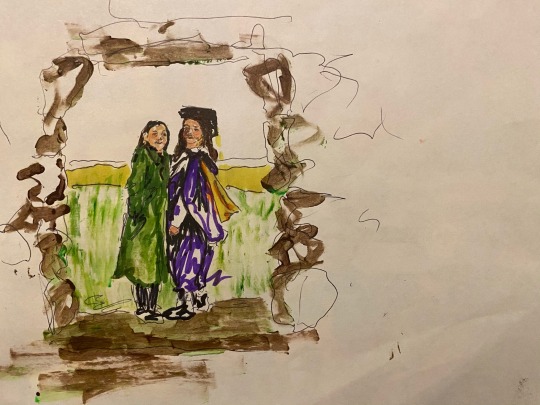
As of now i have only developed one into a piece. I decided to combine my sisters graduation photos the text ‘ becoz i can overcome class barriers’. I wanted to use these photos in particular because to me they are proof people can over come both physical and perceived barriers imposed or perpetuated by class and achieve what they want to. This photo was taken when she graduated st Andrews a university she worked hard to save for and once there discovered she was one of the few students in her class who had to work while studying. Many of the opportunity's she has had seem, to many, to be one in a million, but her hard work has been the root of her success.
When I started this piece I didn’t really have a plan for it other than that I wanted the image on the left and the text on the right. I began by sketching out the photo and refining it with biro before adding some colour with permanent marker. I decided to use this as permanent marker, spray paint or paint pens are often used to tag and due to the small scale (A4) I thought that permanent marker would offer more control. I then used water colour to add in elements like the faces and background. I didn't notice until after painting that I had made the left side of my sisters face to dark it was meant to be shading but it didn’t go very well the paper was slightly wet and the colour spread more than I thought it would as I usually use acrylic. I have quite liked trying to use water colour, I do not really have the techniques down however I like the opaque quality of the paint.
Since the photo was of an arch way I thought that I could put it in a graffitied wall using the photo of the skate park ramp as reference. However it was at this stage that I decided to stop to map out where my text would go. I had drew the box to large and left an uneven amount of space for the rest of the writing. For this I used a mix of paint pens, permanent marker and water colour, I also used these to added to the background behind the figures.
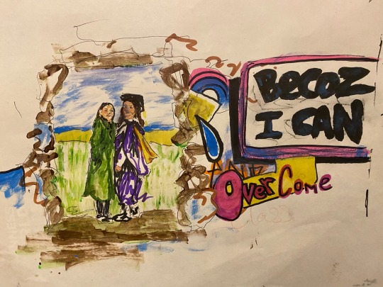
Once I got the text mapped out I tried to just add in some more colour as well as adding tags and little drawings. I decided to just try and have fun with it and I think it went rather well. Below is a photo of the piece as it is now, I am pleased with it however I do not think that the text stands out from the tags enough so I may cut it down so that it is more focused.
cropped image to highlight message:
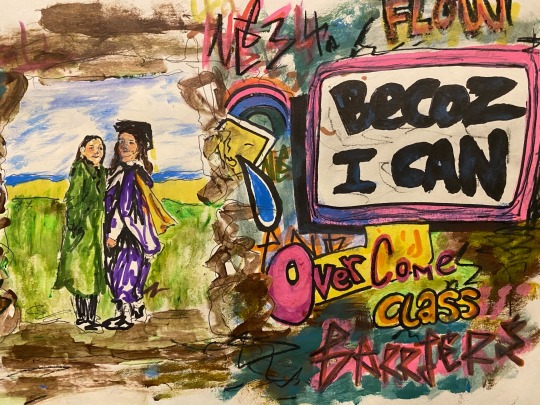
I think cropping it down has helped shift focus so I think that I will cut it down if I use it in my installation.
0 notes
Text
OUTCOME ONE - Film
View this post on Instagram
A post shared by daisy manning (@1291653_ncuc)
This was meant to be my final edit of the film. In this edit I fixed the audio levels and tried to extend the end of the film a little bit. I did this by adding in a few photos I thought would fit with what was being said to try and tie the beginning of the piece and end of the piece together. However after watching it back a few times and comparing the the end to that of the film to that of the cut before this one I have decided I want to re-edit to have something a bit more in the middle of the two.
0 notes
Text
OUTCOME ONE - Film
View this post on Instagram
A post shared by daisy manning (@1291653_ncuc)
Audio and visual re-edit:
This edit actually has a mistake right at the start in the audio that I did not notice until after I had posted it. Two pieces overlap, I need to remove the man’s voice or move it as it is actually a pretty good piece of audio. The rest is the same until around 2:20 the audio changes a bit with the addition of my voice as well as clips of a lady (Sue Holsby) dancing at bens park music festival, fireworks and family film clips. I also added a few more reflection shots as I thought they gave a nice effect. I think I will try to sort out the sound levels once and for all as well as adding in a few more photos to tie the start in with the end. I think that will be my last cut, though I will see when once I finish it.
3 notes
·
View notes
Text
OUTCOME ONE - Film
View this post on Instagram
A post shared by daisy manning (@1291653_ncuc)
Re-edit visuals and adding audio:
In this edit new audio has been added throughout the piece starting at around the one-minute mark. For this voice over I had to try and choose from a lot of things as I didn’t want the video to get too long but I think I picked out a few good bits in this. I have already added a short clip of the old town hall market however I am going to extend it again as I still have audio left, I want to use of both me and the interviewee. Once I have got a cut with audio clips that I am happy with I will alter the sound levels in my final cut.
All in all, I am extremely pleased with the out-come of this video so far. Especially for having none of my own equipment and various other obstacles. I think it is coming together well though I am unsure how to end it I have a statement in mind but I’m not sure if I will use it. I think in these final stages this piece seems more heavily influenced by konttinen than any of the other artist I have looked at, even though I set out to use a mix of all threes styles.
2 notes
·
View notes
Text
OUTCOME ONE - Film
View this post on Instagram
A post shared by daisy manning (@1291653_ncuc)
Re-edit of audio and visual piece:
This edit has no new audio however I have held of alter the sound levels until I have finished my final cut so that it is a bit smoother as they were all over the place. Though I have added new visuals. I tried to cut the footage I had of king street with a photo of it in the newspaper however this was as smooth as I could get the transition. Most of the changes are near the end, I have replaced me walking on the beach with me walking past some local graffiti and added in a few more shots I got from walking to and around the ‘reck’ Cleadon park such a smashed glass, gardens graffiti and burnt park equipment. This park holds a lot of meaning to many as people including myself as it is a place a lot of people around here tend to go hang around in their youth. It was because of this that I wanted to show it. I have also tried to take a few shots using puddles to reflect things like lamp posts and house in response to Craig Whitehead which I think look rather good though so far, I have only added one to the video. I think so far, I am liking the visuals better and I am planning on adding the audio and extending the visuals a little more to add more time.
2 notes
·
View notes
Text
OUTCOME ONE - Film
View this post on Instagram
A post shared by daisy manning (@1291653_ncuc)
Expanding on visuals:
I decided that the visual edit I did at the start seemed to help me decide what looked best together and built up an idea of the context and area without relying on audio and that I should make another as in the last edit with audio I ended up not liking the visuals as much. I tried to just develop the one I already had to contain newer clips and I think it went well.
I actually really like how this piece turned out. Though it was just meant to be a visual aid even the background noise cut together was some what relaxing and I think on a whole it does a good job of getting across the context. I am hoping to translate that into my next edit with a voice over.
I actually used a new shot from a back lain in the dark in this edit and I have to say it kind of made the video, in my opinion, a little grittier, though it does look a little out of place. I still think It could look good if I had more shots at night mixed in with the day time.
2 notes
·
View notes
Text
OUTCOME ONE - Film
View this post on Instagram
A post shared by daisy manning (@1291653_ncuc)
audio and visuals rough cut 2 minuets 33 seconds
After gathering both first and second hand audio clips I attempted to cut together a good length short film. I decided on using a recorded interview of Boris Johnson as well as a speech to supplement my own recordings. I think this particular edit it okay, though the sound levels need to be worked on and I think I might try moving a few of the shots around. It is, however, a very good idea of where I want my video to go. I think the addition of photos helps link visually with the audio. Near the end I was toying with the idea of cutting me clips of me walking into the video though now I play it back I am not to sure I want to go in that direction.
I think this piece is rather contextually strong it has a focuses visually on my area and the audio is talking about class or local life. The people I have shown it to have also seemed to have been able to interpret that I was trying to represent the class divide or our local are in some way. A peer who lived in south shields when they were younger said they felt ‘those pictures’ where her pictures so I feel as though I am heading in the right direction.
2 notes
·
View notes