
Last Seen Blogs

jamestinavicky
James

dearmirrorball
I wanna brainwash you into loving me forever

cachnhiet3m-proauto
Phim cách nhiệt 3m - Proauto

looskanal
Looskanal

lust4bust
Clothed Busty Cleavage
Text
Final Entry
Technology in the future will continue to influence every aspect of design making products that offer universality while addressing individual needs. Through the continuous advancements of technology, specifically to those of software, computers and material engineering the future of many objects in our daily lives will be changed. This is not a question of if but when, in the next 10 years? 20? 100? Technology advances at an exponential pace and design will follow directly with it along with how it changes our daily lives. For example, one such object that may see extreme change in design is the car. In the future we will no longer be tasked with operating our own vehicles, in the future our cars will drive themselves from A to B. Technology is already underway making this possible but the crazy part will be that these cars will need to be redesigned to address this. They will need to be able to communicate with each other on a sort of grid system, giving themselves the right of way, talking with each other and communicating where they are and where they will be. These cars of the future will be directly centered around the comfort of the passenger, much like a mobile living room but not quite as large. Seats will no long need to face the road ahead and can face the rear seat passengers in an open design with windows surrounding them in the shape of an orb or pod. Through the use of LED lights and fiber optics, passengers will be able to customize the vehicles color through a tablet like device located in the center of the vehicle. Entering and exiting can be more seamless in these vehicles, they can be taller, allowing people to walk in and out similar to a subway car. Magnetic suspension will ensure the smoothest ride possible and we will see car commercials of people doing this like eating spaghetti off a plate to showcase the cars smooth ride abilities. In all, the experience of traveling to work or around town will make people feel like they never left home, amenities will comfort people in what was once a time of day most people dreaded, now they will look forward to getting away and enjoying some time to themselves while commuting instead of going through unpleasantness aspects like traffic making daily lives better focused on productivity and leisure.
0 notes
Text
postmodernism

Postmodernism is a response and departure from modernism and the sort of blandness and utopian view on design that began in the late 20th century. Postmodernism is a term that can cover many styles that share a time period and often share some elements of design such as the use of bright colors. In postmodernism design isn't limited to using geometric or organic lines but often incorporates some use of both. Postmodernism often pushed the limits of possibility in design and architecture with the use of new technologies in computer software and laser printing at time incorporating the mix use of element from previously common styles such as dadaism. One of my favorite designers that uses the postmodernist approach is swiss architect Mario Botta. Marion Botto’s architecture is world renown for his use of both strong geometric and organic lines infused in his designs. His work is interesting to be because i've been aware of his work from a young age after researching him at a young age after visiting and being inspired by the the San Francisco museum of modern art which he designed. The museum is very geometric in form but is centered at the core around a cylindrical shaped room that extends upward and is diagonally sliced and made of different colored material that give it an excellent sense of rhythm and movement. At the top of this cylinder is a skywalk with a see through floor that looks all the way down, 5 stories to the main lobby. Elements of postmodernism can be found in the shapes used in the construction of the building and the alternating colors used.
0 notes
Text
Journal 10
Helvetica is a typeface that is the most commonly used today. We see it everywhere, on ads, street signs, labels and much more. It was created by swiss typographers Max Miedinger and Eduard Hoffmann in 1957 as a typeface to fit all needs and to be easily read by everyone. It was created out of the desire for a more simplistic, rational and universal typeface capable of conveying any message in a legible way. As stated in the video it was created out of the idea that the meaning should be conveyed in the text rather than the typeface. Helvetica was created by doing away with all of the accenting and small details in san serif to create a neutral and simplistic look. There was great detail and effort put into the look of the negative space to further the ease of legibility. Helvetica uses crisp clean lines. Helvetica grew to popularity through its use by designers in the creation of corporate logos such as American Airlines which still is in use today. Modernist designers used it because of its pure and simple form that can reach all audiences, its a font that can be used universally. After decades of great popularity it seems that helvetica has finally become a bit dated, it doesn't quite hold up to its values. The problem designers have with helvetica is exactly what made it so widely used in the first place, it's universalness. Helvetica is a typeface that is incapable of conveying a message on its own and lack personality. Its nearly impossible to use helvetica as an artistic choice to invoke emotion in the viewers. If typeface where to become architecture then helvetica would be the cookie cutter home in a new suburban cul de sac, it works for everybody but isn't crafted for anybody in particular.
0 notes
Text
Industrial design played a major role in making the US what it is today by changing culture in the mid twentieth century. Contributing greatly to the creation of commercialism consumerism industrial designers shaped the whole way people buy and consume in the US. This is the era when companies began to sell their products as a lifestyle rather than just a product. The idea of what your life could be if you buy this was greatly pushed to American consumers starting in this post war era. Products became being design with cool factor as a major consideration even for everyday household items. Brook Stevens is from our great city of Milwaukee, he was a successful and influential American Industrial designer who specialized in home appliances and automobiles. He did work for companies like Jeep, Harley-Davidson and Studebaker where he designed body work. Not only was well known for his automotive and home appliance design, he also did work in graphic design and created such logos as MSOE and Miller. After taking a look of a lot of his work the design piece that stood out to me as most impressive is the Skytop Lounge, a train car that was used in service between Milwaukee and Chicago. The train car contained 8 bedrooms and a gran lounge that sat at the back of the train and sat up to 24 people at one time. The lounge was built mostly of windows and has a truly incredible design showing balance and rhythm and screams postwar industrial design with its streamlined body.

0 notes
Text
Journal 8
Universal Design is the design of something, in the case of the article a building to fit the need of everyone. Universal design takes into account everyone's needs regardless of age, disability and gender. Buildings are designed to accommodate and be used by all. Roman architect Marcus Pollio created the first human archetype based on geometry to base and gave architects a scale to use for human size to base architectural design around. He is quoted in the article as saying “range of harmonious measurements to suit the human scale, universally applicable to architecture and to mechanical things.” Plato came up with the Idea of Essentialism, essentialism is the concept that everything, everything needs a set of attributes to define its identity and give it function as archdaily.com states “According to Plato, a singular essence/definition of any form or idea must exist aspatially and atemporally in order to attain universal applicability among its various representations.” The author of the article has several problems with universal design, specifically about the fact that universal design sometimes hinders variety and diversity in architectural design in order to fit a certain mold. The author states that there is “a disconnect between how some architects conceptualize universal design and the reality of the world” The author states this because he believes that most of the time when architects design they design based of a one size fits all basis that has been defined and not on an individual real world basis. The articles ends by explaining how architects by designing in a one size fits all way they are actually hindering the accessibility to all. I disagree with the authors statement that equality doesn't require the same environment but the same opportunity. I believe that equality does require the same opportunity but I believe that opportunity is defined in part by environment. I believe one such product that could benefit people using mass customization is the laptop. A laptop needs a certain level of computing power to be able to run today's programs and software but I believe physical aspect of the laptop can benefit different people in different ways such as track pad design and what's all accessible on the keyboard depending on a person's needs of use.
0 notes
Text
Week 7
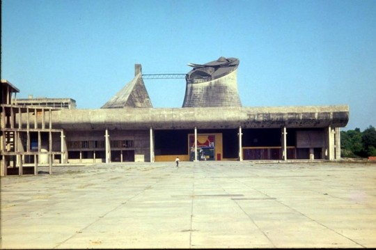
Le Corbusier was a french-swiss designer, painter, writer but most notably an Architect. His architecture is very well known for its geometric forms, purism, openness and connection to nature. Le Corbusier left a legacy behind in the field of architecture, he believed in the use of his own “5 points of Architecture” which served as design standards for his work. Today his 5 Points of architecture are still an influence for modern architecture, many buildings by architects all over the world have used his works as inspiration and creative spark. The 5 points of architecture are as follows; support, roof gardens, free design of ground plan, horizontal windows an redesign of facade. After a quick research into architectural works designed by Le Corbusier that stand today, one such example struck me as being a perfect representation of his 5 points of Architecture. This example is known as Palace of Assembly (Chandigarh) which is located in India and built in the year 1950. First of all we can see the support columns that free the walls from being load bearing which opens the possibility of a second point of architecture, horizontal windows which wrap almost all around the entire building. Build completely of concrete, The facade of this building has been clearly designed with great care, there are extras all around the outside of the building adding further shape to the external of the building. The last point of architecture that is immediately present here is the rooftop garden, from the ground there are visible sculpture structures upon the roof. Inspiration from Le Corbusier can be found much closer to home if you look for it, on campus there are a few examples of buildings that follow one or more of his 5 points. The best example for this is the UWM student union. The most notable of the 5 points used is the use of long horizontal windows, on the Student union they wrap all around the building. It could also be argued that the facade is inspired by Le Corbusier.
0 notes
Text
6
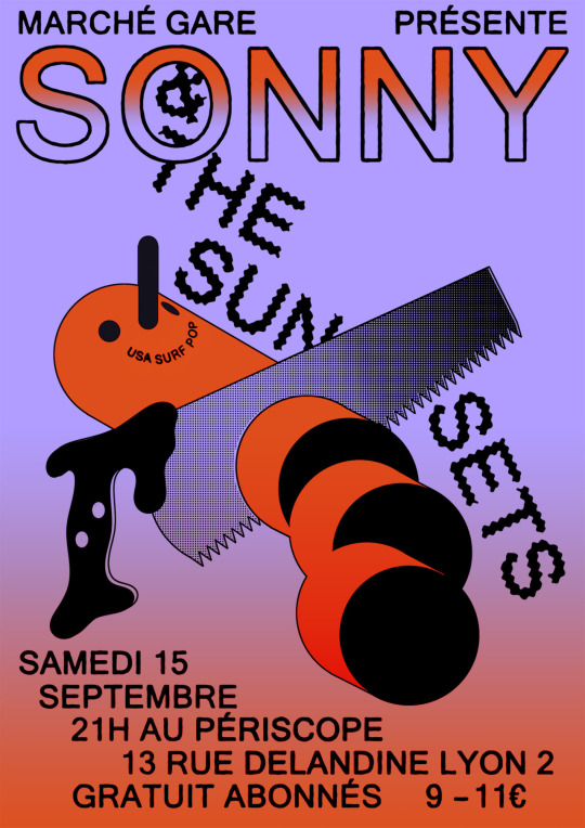
In this weeks readings, articles Madeleine Morley, "Celebrating the African-American Practitioners Absent From Way Too Many Classroom Lectures", and Madeleine Morley, "A Typographic Exercise to Readdress Design History's Gender imbalance", two artist stood out to me in particular. From A Typographic Exercise to Readdress Design History's Gender imbalance Félicité Landrivon and from Celebrating the African-American Practitioners Absent From Way Too Many Classroom Lectures Cey Adams. Félicité Landrivon’s work is colorful and really pops out at you. Her use of contrasting colors to make text and images stand out to the eye really defines her work. She also uses a lot of staggering text that reminds me of something from dadaism. Take her poster work for Sonny And the Sunsets for example as shown below, the word Sonny takes hierarchy here using bright contrasting colors of blue and orange and is placed centrally at the top of the poster with a bold bubble font that makes it the first thing you notice while & the sunsets falls diagonally around the image of something i'm not sure what is. The letters even are cut by a saw and seem to be ready to fall off the page, a really cool concept I enjoyed seeing. I choose Cey Adams because I have in fact seen his work in the past, As a kid I was a huge fan of a lot of the artists from Def Jam records such as LL cool J, Jay z and public enemy. In fact the Violator album was among my favorites when I was in middle school. While i've seen Cey Adams work on album covers before I had never really analized it. Looking at the Violator album we see a characterized version of Busta Rhymes right off the bat. His eyes are small and his mouth and hair are large in proportion with a mean expression on his face. The bright orangish red font states the album title “Violator” and is ment to be focused on standing out from the white background. The font is simple but bold and the bottom of the album is framed with a bar the same color as the font. Something about Busta Rymes face give the sense of motion but its hard to determine exactly what it is. What's cool to note is that there are actually several album covers for this album

0 notes
Text
Week 5 Journal Entry While reading our assigned pages for week 5 (chapter 2 pages 95-102) from the textbook i found a few examples of design id like to compare with object around my own home. The examples of design id like to include from the text for comparison are “Pan, portfolio reproduction from Les Maitres” by Josef Sattler, 1895 and “Otto Eckmann typeface from Schriften Und Ornamente ” by Otto Eckmann 1900. Pan was in fact the first periodical to promote art nouveau within germany and was certainly seen as avant garde at its time. “Pan was associated with creativity, music, poetry as well as dionysian sexuality and visionary nightmares and therefore expressed many of the favorite themes of art nouveau”(pg 93). On the cover we have gorgeous examples of how it fits the mold of art nouveau. Looking at the cover the first thing that catches the eye its this withered, whimsical flower with the title “Pan” growing from its stamen with these whiplash curves art nouveau is so well known for. The font is very much growing out of the flower itself. One such product of design I found laying around my bathroom stuck me as having very similar font and also clearly inspired by flowers, the glade air freshener. Take a look at the picture ive taken, the font follows suit with some of the same whiplash curves in the font and the overall design is very natural looking in form to promote the idea of hey, this should remind you of flower thus it will make your bathroom smell fresh and natural. Great use of design and marketing in my eyes. Back to the Pan cover, there are many instances of a sort of doomsday vibe with the erie sky and shovels struck into the ground and a creepy man in center of it all towards the background. Otto Eckmann typeface from Schriften Und Ornamente is a fantastic example of how typeface where combined in the era to promote creativity. But in Germany this also had political significance “Synthesising of new styles had significant political impact because by the twentieth century blackletter had become a important signifier of German Identity.” (pg. 97). Funny enough one such example of design i found comparable to Otto Eckmann typeface from Schriften Und Ornamente is the Wisconsin License plate. WHile the font is not with such curvature on the license plate, its bold black lettering with white background give the same effect of clarity when reading it. Also on Otto Eckmann typeface from Schriften Und Ornamente we see floral pattern smack in the middle of the page, like Otto Eckmann typeface from Schriften Und Ornamente the wisconsin license plate is very nature inspired and promotes that through its imagery next to the lettering as well.


0 notes
Text
Week 4 Journal

In a time where art forms were not treated with equality lived a man, an artist named Jules Cheret (1836-1932). Jules Cheret Was a well revered lithographer, painter, designer most famously known for his poster art. Art forms such as Architecture, painting, poetry and sculpture where of the category that people referred to of High Art. In the beginning of his career poster art was not held in such High Art status but Jules Cheret along with other great artists revolutionized the notion of poster work as High Art in the french art scene. Jules Cheret most notably is known today as the father of poster art. To get into explaining how this transformation in the art scene happened it's important to begin with a little context. “When Cheret’s career began, the lithographic poster was established as the main promotional device for the rapidly expanding French economy” (Collins, Pg. 18). While the poster was not seen as High Art in the early days of Jules Cheret’s career it indeed was a commonality around the streets of urban Paris and did hold a place in the design art scene. Cheret did not see immediate fame with his first work Orphee Aux Enters in 1858 but he soon would become known as one of the most prominent poster poster designer of France through his guidance and support by Rimmel whom helped him open his own printing establishments. Around this point in his career we see the major step how Jules Cheret elevated the Poster to Fine Art status. “Cheret’s strategy of focusing on popular entertainment posters was rewarded when art critic and novelist Joris-Karl Huysmans”(Collins pg 21). “Cheret and the poster where trust into the sphere of Fin Art”(Collins pg 21). This notoriety Cheret obtained in combination with the French industrial art reform as along with work by decorative art reformers revolutionized and elevated the status of poster art to the top of fine art hierarchy. After doing some art browsing of Jules Cheret, I have chosen a personal favorite, Jardin de Paris. With the motion illustrated by the lady in white along with the counter motion of the crowd in the background the sense of movement in the poster is extraordinary and makes you feel like you're part of the joyful and fun loving scene. I also enjoy how the warm colors give a sense of invitation and welcomeness. The font at the very top is bold and strikes a sense of playfulness.
Works cited:
Collins, Bradford R. The Poster As Art; Jules Cheret and the Struggle For Equality of the Arts In Late Nineteenth-Century France.
Poster by Cheret, Jules. Jardin de Paris, 1897
0 notes
Text
Week 3 Journal
Design the creation process or building of a product based on human centered needs and desire and how they may like or dislike aspects and how to optimise the positives between the two. A few examples of design thinking in products I use can be found and explained within the design of my mountain bike and DSLR camera. A functional mountain bike begins at the frame, it must be rugged and capable of taking abuse. In the mountain bike I bought, the design of the frame not only functions as a rugged frame it looks the part which is intentional by design to draw interest by consumers, it sure worked on me. Taking a look at my DSLR camera, the DSLR camera is usually considered the ultimate all in one camera by photographers around the world, it is in general the go to professional camera today. However there is a sacrifice in the form of weight and size. The design of my DSLR goes above and beyond to create a low weight body and large comfortable grip points to make up for this. Once again this design choice made it a top reason for purchasing for me. To em the most significant concept from this week's reading was the importance of collaboration in design. On page 87 it says “The increasing complexity of products, services, and experiences has replaced the myth of the lone creative genius with the reality of the enthusiastic interdisciplinary collaborator. The best design thinkers don’t simply work alongside other disciplines; many of them have significant experience in more than one” Is what I kept thinking about well after I finished the reading. IDEO using a human centered design process. This means they almost always work alongside the clients who will be using their products to design them. In doing this they gain real feedback from the field so to speak while in development. – Peter Skillman. “Fail often in order to succeed sooner.” is a motto used at IDEO that greatly correlates to this design process. While I respect the mission to build a better cart I don't particularly love the partitions from top to bottom. I believe that the partitions on the bottom look difficult to mobilize when needed and create a lack of space for extra large items many people may need to haul around.
0 notes
Text
Week 2 Entry
Week 2 journal entry
Much of the work, if not all work, done by the great William Morris can be viewed as a response to modernity. There are two specific examples I would like to use to convey this, first of which his stained glass work in 1870 “Minstrel With Clarinet” and secondly the Sussex Chair made in 1865. I think first and foremost we can use both of these pieces of work to highlight one major charistic of modernity, the rising middle class. With a rising middle class it becomes possible for average people to afford items of luxury. Stained glass had always been to this point a thing of high value and Luxury but now it could be used in many homes in urban environments rather than just those for the upper class and elaborate buildings such as churches.
The Arts and Crafts movement was a response to the lower quality less thought out mass produced everyday products that industrialization had brought into the urban environment. Morris in particular had a few key goals that helped shape the movement. He desired to bring back a golden age of craftsmanship and creativity in workmanship that he viewed mass production as destroying. With a specific focus on fusing art and function by bringing back creativity to everyday functioning objects such as furniture he believed would improve the living standards of the working class in doing so reshaping the everyday home environments to better everyday life. While I respect and agree with his goal to give luxury and improvements in living standards to the everyday working class individual or family, his methods proved to go against his stated goal. While the rising middle class could indead afford some of his work, the poor working class certainly would not have been able to which in my opinion defeats the purpose of his goal.
0 notes
Text
Week 1
Hello class, my name is Avery Schulze, I am a 4th year student here at UW-Milwaukee, while I originally was studying architecture I have switched paths and am now a Urban Studies major. I have strong interest and talent in 3d design programs, Photoshop and Autocad. In my free time I very much enjoy photography and biking as well as travel. I've always had strong interest in art and design and am taking this class to further my knowledge in design. My inspiration comes from my travels, both new urban environments as well as great natural landscapes propel my interest in photography. I have certainly chosen purchases based off design over another product many times over my life but most recently notable has to be my mountain bike. Admittedly I may have spend more on it than I responsibly should have, its sleek design combined with its performance had me sold to spend a little more. I find it a perfect example of when perfect form meets function.
0 notes