
2d-pixel-art-platformer-sw
2D pixel art platformer SW
112 posts
Don't wanna be here? Send us removal request.
Last Seen Blogs

nshm22-blog
Untitled
rawrlands
Seal Cultist

archived-kin
closed for (foreve)renovations
mercless
MERCILESS

Text
For my respawn animation I didn’t want the player to be able to live until the player had respawned. Turns out the code for this is very simple.
As you can see below, deactivate character movement disables the controls then there is a delay for the animation to play and then the character movement is activated again.
I liked this simple way of working with the controls. I definitely will use this in future projects and find it very useful.

0 notes
Text
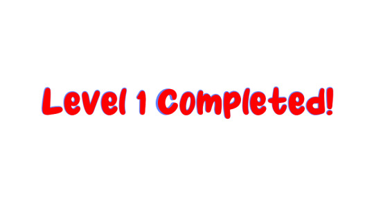
I created a screen for the end of level 1.
As you can see below, the screen is very simple. This is so that it is easy to read and understand.
The code to make this very complicated.
There is a lot of code for this to work. I only wanted level 1 to end when 3 cookies had been obtained so once the character has overlapped the end flag there is a branch. The beaches condition is for greater than or equal to 3 cookies have been collected. In the blueprint it is called coins because I haven’t changed the variable name form when it was first created. Then if the branch is true, a well done screen will be created and added to viewport and the characters location will be set to the start of level 2. Then all widgets will be removed and the HUD will be created and added to viewport and the cookies (coins) will be set to 0.
If the branch is false, need more cookies screen will be created and added to viewport then a delay to allow the player to read the screen and all widgets will be removed and then the HUD will be created and added to viewport. Then the characters location will be set to the start.
This was a complicated process but worth it for the extra understanding from the player. I think this is very effective and clear for the player.
0 notes
Text
I added a second level to my game. I did this to make the game longer and also so that I could add new mechanics gradually. I do not want the player to be thrown in the deep end. When I designed the second level I replicated the plans that I made on paper as much as possible. I only added extra platforms when a jump wasn’t makable.
As you can see below, the level starts with a few jumps and then a disappearing platform is added. I did this in the second level so the player is still learning new things after level 1. This shows that my intention would be (if I made a full game) to introduce new mechanics later in the game than the first level. This will make the game feel more unique and less repetitive.
0 notes
Text
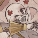
I made a death animation and added it to my game.
As you can see below, the dinosaur slowly turns black and then fades into nothing.
i chose to do this as my death animation because it is easy to animate and fast.
I did this because if you are a player playing a game, if the death animation is very long it can get very frustrating as you spend a lot of time waiting for it to be over.
I think that this animation is very effective and works well.
1 note
·
View note
Text
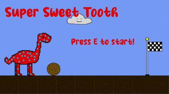
I named my game today.
I decided to go with Super Sweet Tooth. I chose this name for multiple reasons.
Firstly, I chose this name because I thought it suited the dinosaur character well. Tooth being a nod to the famous T-Rex and it’s incredibly scary teeth.
I also chose Thai name because Sweet Tooth is a reference to the Dino’s never ending appetite for chocolate cookies. Cookies are very sweet and I think this links well.
I also chose Super as a nod to New Super Mario Bros Wii. This is a game that ruled my childhood. Also the Super Mario series is the most popular platformer in the world.
1 note
·
View note
Text
I made a checkpoint animation. The animation is below.
I do like this animation as it is recognisable as confetti and it is a visual indicator to the player that they have passed a checkpoint. In this sense I think that the animation is successful. However, the animation is very jolty and isn’t as smooth as the others I have made. This is because I had less time to make this animation. I had originally planned to make the confetti shoot out of the top of the flag pole. This did not happen in the end because I had less time then I thought it would so the confetti appears and sinks to the floor instead.
0 notes
Text
Title Screen
I added a title screen to my game. I did this to show the player the character and give them a feel for the level design and the sprite design.
The title screen is the image below.
The code to make this work was to allow E to be pressed and then the level map will reopen to the level with the tilemap in it.
As you can see the widget is created and added to the viewport. This allows the player to see the title screen. Then when the E key is pressed, the level is opened and the HUD widget is created and added to viewport.
I think this is a good title screen as it is clear shows the name of the game and it gives the player an insight into the overall game.
1 note
·
View note
Text
Evaluation
In my project, lots of things went well and I did enjoy myself whilst making my game. I think the animation went well. I ended up with 7 working animations. These were walking, idle, jumping, death and respawn for the player. 1 animation for the cookie when it is being eaten by the dinosaur and 1 animation for the checkpoint flag when it is reached. I am proud of this because animation is very time consuming and I like all of my animations. I also think that the coding went well too. At the beginning of the project, the coding was difficult because it was new. However, as the project progressed so did my knowledge of Unreal and so did my confidence. I have now coded multiple different mechanics in my game completely by myself and they work. This is something that seemed unachievable on day 1 because Unreal was very overwhelming.
In my project several things could have gone better. For example, my checkpoint animation. I made an animation for my checkpoint and it is confetti falling next to the flag. This animation is recognisable as confetti but it is my least favourite animation that I have made. This is because of a multitude of reasons. Firstly, the animation is very jolty and there aren't enough frames for it to be smooth. This is because I had less time to make it as it was getting close to the end of the project. Secondly, in the animation, the confetti appears from nowhere and falls to the ground. Originally, my idea was to have it blast from the top of the flag pole. This would have made significantly more sense. I didn't have time so I had to change my idea to an easier one to execute. Also, I could have improved my project by, spending more time with bugs. I have a bug on my game where if you stand under a platform, you become invisible and fall through the floor. I did not take the time to try and fix this bug, because I spent my time on the look of the game rather than bugs. To improve I would have split my time more evenly and squashed more bugs like this one.
If I redid this project I would a few things differently. Firstly, I would start research sooner. This would have allowed me to spend time at home on Unreal fixing bugs in my game rather than just hours of doing research. I would also, have added a cut scene or some way of showing a story to the player. I think my game makes sense mostly, and is fun to play, however there is no reason for there being a dinosaur and no explanation to the player. I think that this would help the player become immersed in my game and it would help them engage and understand my game more. Lastly, I would think about checkpoints during level design. When I designed my first level, I added things without thinking about the level as a whole and this caused problems with the checkpoints down the line. When I added checkpoints, I didn't know where to put them and then I added the cookie system, and it caused a lot more coding problems to solve.
Overall, I really enjoyed making my game and am incredibly proud of the end result. my highlight of the whole project will always be the walking animation as it took me two days to make it and I had never made a walk cycle with four legs before. I am still proud of myself for how natural-looking this animation is.
0 notes
Text
Playtesting Feedback
Today we did more playtesting. I changed some of the questions on my questionnaire and the results are below. I won't show repeat questions.
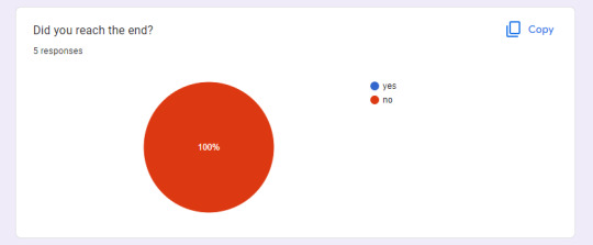
The image above is a question I asked about the end of the level. I asked this question so I could assess the difficulty of the game. The others only had 2 minutes to play my game but I was curious if it was so easy that anyone could. I am glad that no one could as this shows that my game is not really easy. No one should be able to complete a game in under 2 minutes. Even though my game is 2 levels long.
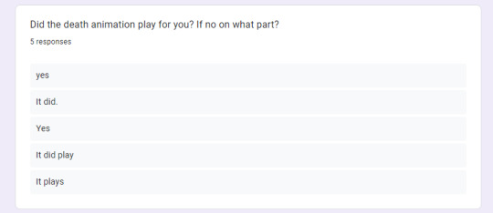
I added a death animation into my game about 10 minutes before playtesting. I was curious if it worked despite the fact that I had no time to test it. As you can see above, it worked for every person. I was very happy with this result.
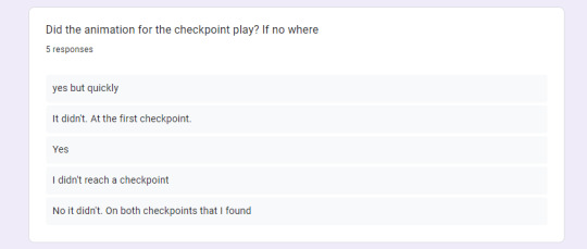
I added a checkpoint animation into the game and I really struggled to get the code to work for it. It only worked sometimes and it wasn't consistent at all. This is reflected in the results above. I am still working to make this animation reliable in the game. I will get it working consistently soon.
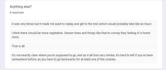
I added the anything else into the questionnaire because I was curious about any other bugs or comments the players of my game had to say. As shown in the bottom comment, one of my peers was unsure about the direction to travel in my game. If I have time I intend to add arrows to rectify this.
1 note
·
View note
Text
Launch pad
I added a launch pad to my game.
I made this launch pad by using the code below. As you can see it is very simple and this s very helpful for me as it is less likely to have bugs because there are less components.

The launch pad is white because I will not implement this into my final game. I feel that I have many mechanics and do not wish to confuse the player. Another reason is, I have no time to make a sprite for the launch pad.
In the next project I may use a launch pad. I think this is a fun game mechanic.
0 notes
Text
Genre of game
My game is a platform and adventure game. The platform is because the main focus of the game is the platforming. I think my game counts as adventure as well because the cookies have to be searched for and found.Even though this part of this game is platforming as well, there is some adventure in looking around for cookies in a level.
0 notes
Text
3 different fonts that fit my game
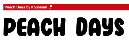
I chose the font Peach Days because it is square and reflects the pixel art element of my game. I like the font because it is clear and easy to read and understand.

The font cotton cloud I suits my game because I have a lot of clouds in my game. If the font was sky writing it may blend in with the clouds and look intentional. The look is also quite cartoon-like and has an outline like all of my tiles and sprites do. This font is also very clear and easy to understand.

Retrolight is the last font that I think fits my game. It is slightly harder to read than the other 2 fonts above, however I think it still would fit my game. My game is a platform with black outlines and is quite basic. So I think a font like this one could contrast that as well as stand out well on the just blue background.
0 notes
Text
Tilemap - Ultima V: Warriors of Destiny
Ultima V: Warriors of Destiny is a RPG game. It is the fifth game in the franchise Ultima. The tile map for this game is below.
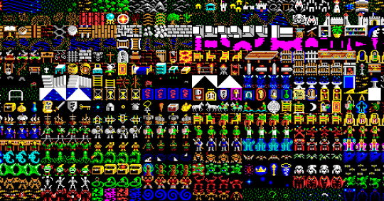
As you can see above, the developers of Ultima took a similar approach to Dungeon Crawl. This is because their sprites are on the tile map and will be extracted later. There are lots of environmental tiles like mud, stone and brick. These tiles will be used to make every environment that the character will be in. This is because the tiles can be painted anywhere that the developer wants them to.
This amount of different tiles will help the developer because they have lots of different options for sprites and the environment. This means that they can create very fun levels to play with variation in enemies and in the environment.
0 notes
Text
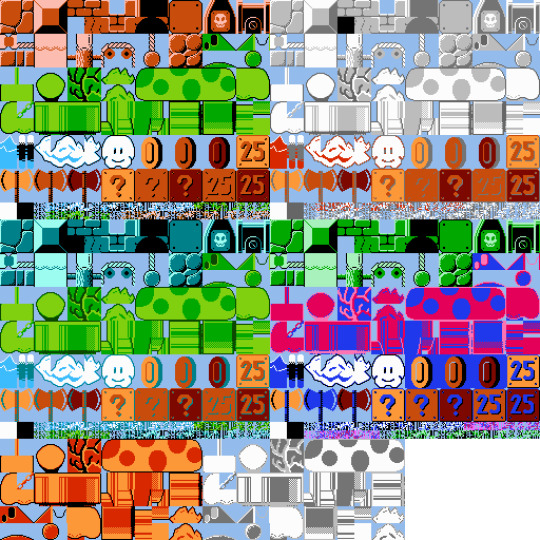
Tilemap - Dungeon Crawl
Dungeon Crawl is a 2D fantasy RPG game where the player has to navigate dungeons defeating monsters to find an orb at the end and complete the game. The image below is the tile map from this game.

As you can see above, the developers of Dungeon Crawl took a different approach to their tile map. All of the enemies will be extracted and used as sprites and all of the rest of the tiles are for the environment. The ground tiles can be painted wherever they need to be placed and this is a very fast way to make the level.
As you can see there are many different tiles for the environments. Lava, mud, stone and grass to name a few recognisable ones. This will be very helpful to the developer because it allows for a lot of variation in the level.
0 notes
Text
Tilemap - Mario
The image below, is the tile map for Super Mario Bros.
As you can see, a very big game like Mario has a surprisingly simple tile map. Got different levels, the tiles have different colours but the tiles are identical despite this. This means that a whole game can be created from a small array of elements. I think that this is a clever idea and I have tried to replicate this approach in my game with the platforms. They are all the same just different shades of brown.
0 notes
Text
How to create a flipbook in Unreal Engine
In Unreal Engine to create a flipbook you need a sprite sheet. Once a sprite sheet has been created, take the background away as this will ruin the flipbook. Then open file explorer and drag the file into the content browser in Unreal Engine. Once the file is in Unreal Engine add paper 2D texture settings. This will convert the image into a texture that Unreal can use. Then extract the sprites and change the grid from auto and set the width and height to the width and height of the sprites in my case 64. Then select all the sprites and click create flipbook then name it whatever you wish.
0 notes
Text
How to make a GIF
First to make a GIF you need an animation. In photoshop use the layers and the frames in the timeline window t make an animation.
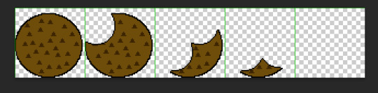
For this example I will be using my cookie eaten animation.
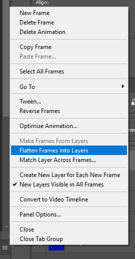
To make the photoshop animation a GIF the frames have to be flattened into layers. This is done because multiple layers might be in one frame and this makes the next part very difficult. This also puts them in order which is easier to deal with.
To do this click on the 3 lines in the top right of the timeline and select flatten frames into layers.
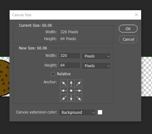
Then make a new document. For my example, the canvas will need to be 64*4. All of my frames are 64 by 64. There are 4 of them.
This is shown below.
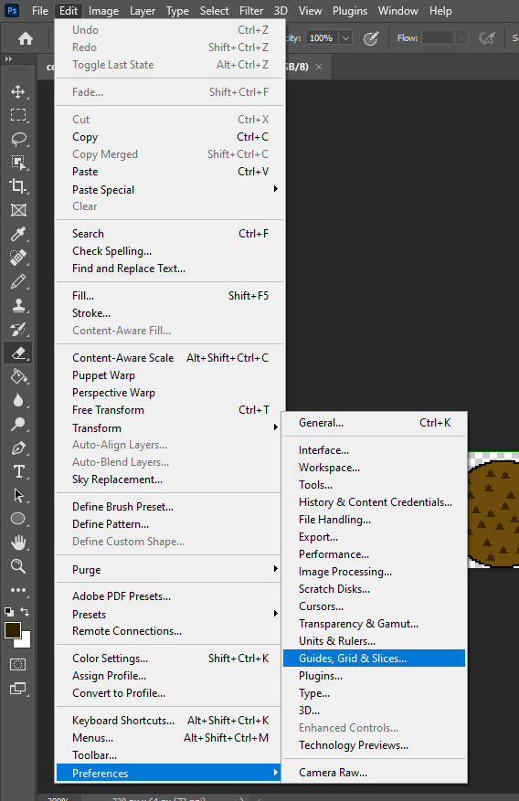
Then go to Edit and then Preferences then select Grids, Guides and Slices as seen underneath this.
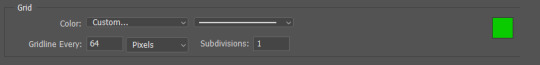
From this menu you can add a grid so the width of the frames in my case 64. Then add 1 subdivisions and click ok. This is shown in the image below.
Now go to View, Show and tick Grid. This will enable the Grid to be seen on the screen.
Now you can drag in your frames from the other file and line them up with the grid lines. This will have created a sprite sheet. Be sure to take away the background as this will be shown in Unreal.
The image of my finished sprite sheet is below.
Then go to File, Export then Save As Web (Legacy). This will save the file as a GIF that can be played in the photos app on file explorer or anywhere online.
0 notes