Text
A.D. After Death
Written by Scott Snyder (Batman, American Vampire) illustrated by Jeff Lemire (Sweet Tooth, Descender) and lettered by Steve Wands (Adventure Time, Scalped ). Published by Image.
A.D. After Death posits a world where the cure for death has been discovered. It’s an intriguing premise for a story and it’s brought to you by two of comics’ current superstars: Scott Snyder and Jeff Lemire. Adding an extra bit of intrigue is the fact that the book is half comic and half prose story, a novel approach which could easily be dismissed as gimmicky. Fortunately the story is in safe hands and A.D. delivers an introspective and thought-provoking piece of work which fully explores its high concept and justifies its unusual format.
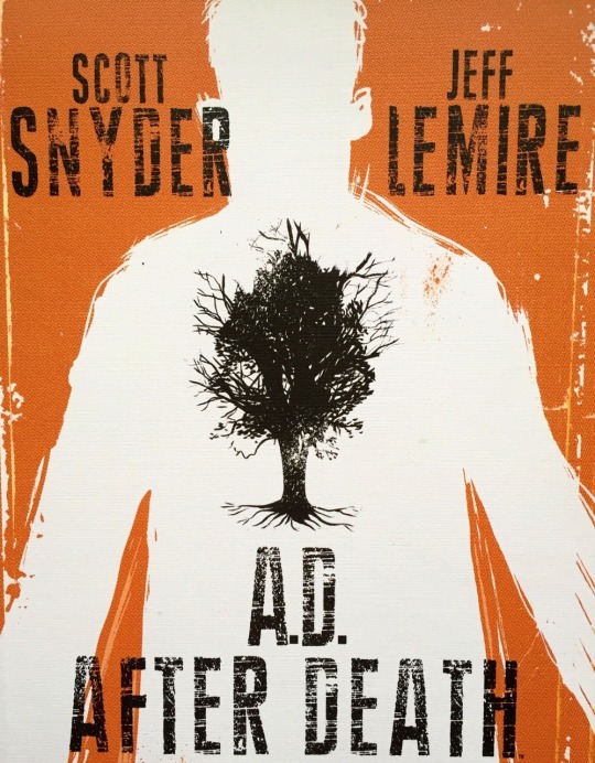
The story follows former thief Jonah Cooke and the role he played in finding the cure for death. The prose sections are written from Jonah’s perspective, in an evocative typewriter-esque font chosen by letterer Steve Wands. These detail Jonah’s life leading up to the cure’s discovery, while the ‘comic’ sections follow his life hundreds of years afterwards. Rather than feeling unnecessary or gimmicky, the prose sections give the story an incredibly dense feel. This allows the creative team to fully explore the concept and also dive deep into the character of Jonah, our window to this world.

Lemire is the perfect collaborator for Snyder on this project as he excels at developing characters in genre settings and revealing their humanity, something which is on full display here. While Synder is perhaps best known for the action bombast of Batman and American Vampire, his roots as a prose writer shine through here. Through his writing we get a full comprehension of Jonah’s fear of death as well as his regrets about the role he played in creating this new world order. Snyder’s plotting is also excellent, juggling multiple timelines and delivering payoff after payoff for small plot elements, including the seemingly abstract smudge from the first page of the book.

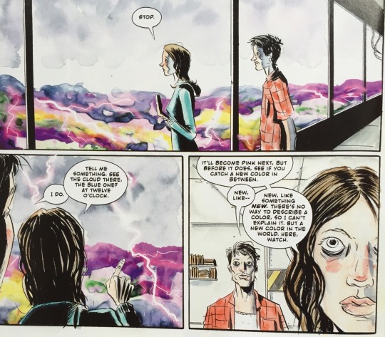
The comic book sections are where Lemire truly gets to shine and demonstrate what a truly accomplished illustrator he is. As ever, Lemire excels at character interactions, bringing out all of the requisite emotion even in wordless panels.

Lemire also colours the whole book himself in lush watercolours, leading to gorgeous pages such as the one below.
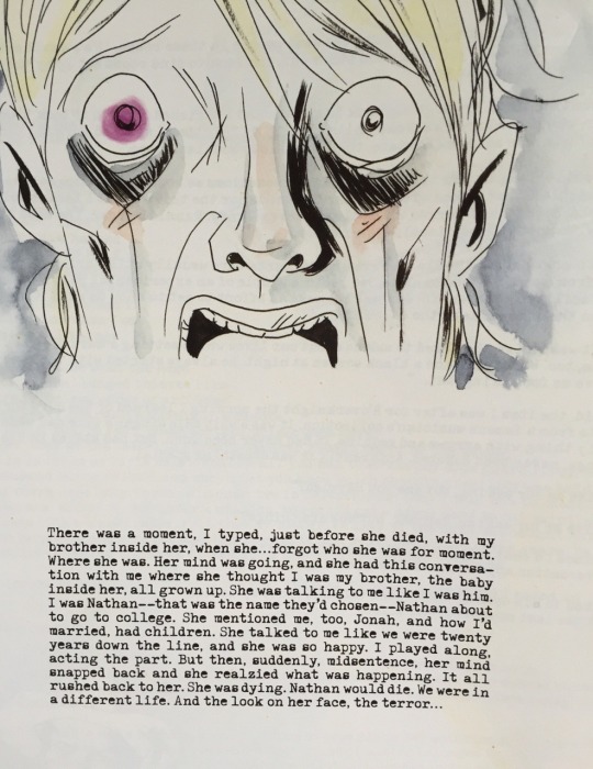
During the prose sections each page typically contains a single Lemire image reflecting what’s happening in the story. Over the course of the book it’s revealed that people who have taken the cure can only remember about 100 years’ worth of memories. This lends Lemire’s images more weight as you realise that they represent snapshots of a life that Jonah can’t quite remember but can only visualise through re-reading his journals. It’s a revelation that gives the prose sections a bittersweet tone and also casts Jonah as a decidedly unreliable narrator
The creative team never take a stance on whether the world would be better or not with a cure for death, and in the same spirit the book ends on a fittingly ambiguous note. The final chapter rockets to the conclusion and builds to a fitting climax. For some, the final revelations may not be as conclusive as they would like, but Snyder and Lemire’s ambitious story practically demands multiple readings to tease out meaning from that ambiguity.
Stray Thoughts
The book is filled which a bunch of neat ideas and concepts, from the futuristic world that exists centuries after the cure to Jonah’s life as an internet thief in the present day. One of the more interesting ideas Snyder introduces is the notion that civilisation is just like a person and has currently entered it’s old age. The connected world we’re currently living in has only served to drive us further apart and is ultimately going to lead to the slow collapse of society; the death of civilisation in other words. It’s a dark and cynical outlook delivered by a character who could be considered the villain of the piece, but it nevertheless resonates. Anyway, please follow my blog, here on the internet, it probably won’t lead to total societal collapse but no promises.
Recommended Reads
Sweet Tooth - The post-apoc tale of Gus, a human/deer hybrid is an excellent and moving example of how Lemire is able to create and humanise his characters in a genre setting.
American Vampire - Synder’s long-running Vertigo series is an exploration of American history in the 20th Century shot through the lens of an action horror comic. Featuring atmospheric and dynamic art from Rafael Albuquerque.
Black Hammer - Along with artist Dean Ormston, Lemire has created a world filled with superhero pastiches which are more compelling than the originals. Read my full review here.
#A.D. After Death#A.D.#After Death#scott snyder#jeff lemire#steve wands#Jonah Cooke#image#image comics#batman#american vampire#sweet tooth#black hammer#comics#comic books#reviews#comic reviews#recommended reads
2 notes
·
View notes
Text
Black Hammer
Written by Jeff Lemire (Sweet Tooth, Moon Knight), art by Dean Ormston (Lucifer, Sandman), colours by Dave Stewart (Hellboy, Fatale) and letters by Todd Klein (Sandman, Batman). Published by Dark Horse.
There are hundreds of superhero stories to choose from in comics, and to be honest a lot of them aren’t very good. Popular heroes are perpetually stuck in the second act of their stories and there is only ever the illusion of change. You can only watch Batman foil the Joker so many times before you start craving some variety. Here’s Jeff Lemire and Dean Ormston’s Black Hammer then, showing that there are still ways to breathe life into the genre.
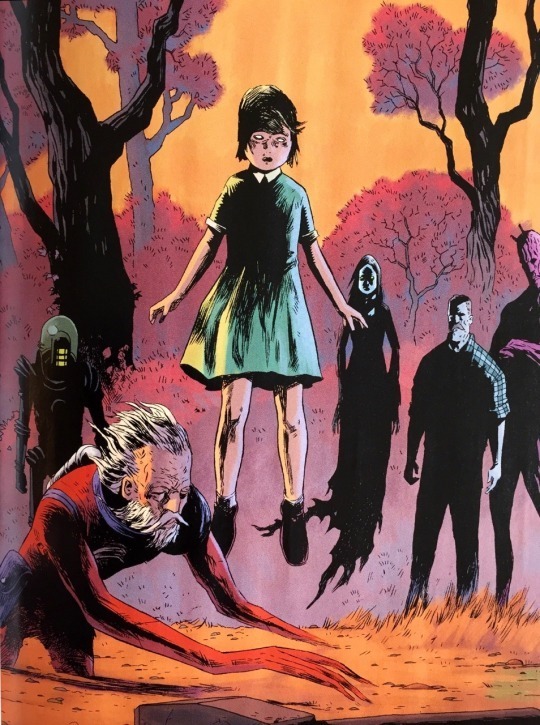
Black Hammer is about a group of heroes who become stranded on a mundane world similar to ours, after saving their universe from one of those cosmic cataclysms that superheroes are always pitted against. The story takes place 10 years after the heroes arrived and they have largely given up on trying to return to their universe. Lemire and Ormston’s story instead focuses on how the characters have adjusted to their new lives, trapped in a small American farming town.
The greatest strength of the series is the cast that Lemire and Ormston have created. The heroes are all pastiches of familiar characters and archetypes, though Lemire’s inspirations are delightfully diffuse and obscure. There are approximately 100 million ersatz Super and Bat men in comics so it’s refreshing to see Lemire draw inspiration from the likes of Adam Strange, Captain Marvel and 50s horror comics to name a few. Ormston’s style is also far removed from traditional superhero art. Once you add Dave Stewart’s atmospheric colours you’re left with something that looks very unique.

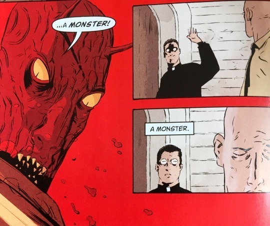
Though the character archetypes are familiar, Lemire adds wrinkles to their personalities which in some ways makes them more interesting than the characters they are homaging. Take for example, the Martian Manhunter stand-in Barbalien. Like DC’s character he’s a shapeshifting alien, but Lemire also writes him as being filled with insecurities as a result of being in the closet and having faced rejection the only time he ever acted on his feelings. This makes his tentative relationship with a local priest all the more tense; you’re rooting for romance but it could just as easily be him reading into the situation too much again.
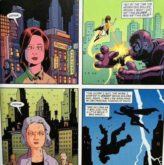
Another character, Golden Gail, is a Captain Marvel pastiche (the SHAZAM version). The difference here is that Gail is an adult who turns into a super-powered child whenever she says her magic words. Since arriving on the farm she’s been stuck in her child form despite being in her fifties and it’s driving her into a deep depression. Golden Gail is just a small part of the larger story, but Lemire and Ormston imbue her with so much pathos you could happily read a series dedicated to her.
Black Hammer touches on themes from Lemire’s previous work such as isolation and surrogate families. But it’s mainly about the characters’ relationship with the past. Some characters like Abe Slam and Barbalien want to move on from their previous lives and live as best as they can under the circumstances. Others like Gail and Talky Walky are desperate to escape back to their old universe. One character, Colonel Weird, is haunted by a past tragedy which he is constantly forced to relive due to his non-linear perception of time. This is beautifully realized by Ormston who filters Ditko-era Doctor Strange visuals through his own unique style. There’s a lot of different influences at work in Black Hammer and ultimately it’s Ormston who helps tie it all together and make it feel cohesive, which is no mean feat.
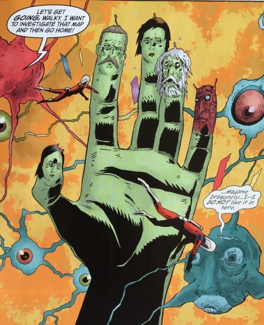
Though each issue focuses on one of the individual heroes, there’s a connecting plotline that suggests they may be able to escape the farm one day. But honestly, the characters that Lemire and Ormston have created could fuel years of stories, so I hope they are trapped there for a good long time.
Recommended reads
Plutona - This five-issue Image series from Lemire and Emi Lennox has a similar vibe to Black Hammer insomuch that it has superhero dressing but very much focuses on the compelling characters.
Sweet Tooth - Written and drawn by Lemire, this Vertigo masterpiece is a post-apoc tale about Gus, a boy with antlers and a penchant for candy. You will laugh and cry.
They’re Not Like Us - Another slightly off-kilter series about super-powered individuals, TNLU feels like a contemporary punk rock X-Men story, with gorgeous artwork from Simon Gane and Jordie Bellaire.
#black hammer#jeff lemire#dean ormston#dave stewart#todd klein#dark horse#abe slam#colonel weird#golden gail#barbalien#superheroes#captain marvel#comics#comic books#comics essays#comic book reviews#trade waiter reviews#recommended reads
2 notes
·
View notes
Text
Fatale - Deluxe Edition Volume One
Written by Ed Brubaker (Captain America: The Winter Soldier) and drawn by Sean Phillips (The Fade Out). Colours by Dave Stewart (Hellboy). Published by Image.
Spoilers revealed below.
A femme fatale is stock character in fiction; a woman whose seductive charms lead male characters to death and disaster. Femme fatales are often little more than two-dimensional bad girls. They rarely have inner lives of their own and exist solely to move plots with their inevitable betrayals. Their duplicity is often linked to their promiscuity in a way that demonises female sexuality.
Fatale’s lead character Josephine fits the femme fatale archetype pretty well. The men who fall in love with her usually meet a grisly end. But unlike your run of the mill femme fatales, we get to peek into the mind of Josephine and see what drives her. Her motivations and feelings are front and centre, separating her from her two-dimensional precursors. Oh, and she also lives in a world where lovecraftian horrors are real and she bears a curse that causes all men to fall dangerously in love with her. Her sexuality has literally been demonised.

Brubaker and Phillips have been collaborating with each other for a very long time now. They are perhaps best known for their neo-noir crime anthology Criminal. This strong association with the crime genre both informs the expectations for Fatale and works against it. The world of Fatale looks a lot like Criminal with a streak of horror painted through it. Phillips excels at creating a realistic criminal underworld populated with beautiful women, mean looking crooks and baby-faced journalists. But in Fatale there is something else lurking beneath the surface. The crime scenes are more gruesome. The pacing of the panels is more deliberate. The art will hint at something otherworldly. It can be quite jarring to see something supernatural-looking appear in Phillips’ signature style. But then again, maybe it should be. It’s jarring to the characters as well.

Josephine’s curse also gives her functioning immortality, and each arc in Fatale is set in a different decade. This structure means that Brubaker and Phillips are able to draw inspiration from differnt kinds of crime stories. The first arc feels almost like a boilerplate 50s noir if not for the supernatural elements, while the second arc has strong Charlie Manson vibes. The challenge with this structure is that the cast of characters changes between arcs, meaning Brubaker only has a short amount of time to make you care about them.

The characters are fleshed-out well enough but the story does leave you wanting more. Take Miles, wannabe actor and the co-lead of the second arc. Characteristics such as a fear of swimming, drug addiction and fame hunger are all introduced but completely fall by the wayside once he falls in love with Josephine. But y’know, maybe that’s the point. Phillips facial work and Brubaker’s concise narration tell us all we need to know about Miles. He was never meant to be the star, both in the story and out of it. By the end of the arc Miles is dead and we’ll never know him any deeper than these surface traits. And neither will Josephine, who loved him briefly and indirectly caused his death.

It falls to Josephine to tie the whole story together. Like your typical femme fatale Josephine manipulates the men in her life. Her curse makes it unavoidable. But she also loves them and is wracked with guilt when she inevitably ruins their life. The second arc sees Josephine in hiding to minimise the damage she inflicts. After her enemies resurface, she proactively works to bring them down, though it tragically ends in Miles’ death. By giving her agency, clear motivations and a worthy cause to rail against, the creative team are doing a solid job of deconstructing the titular archetype. It will be interesting to see how the rest of her story unfolds and if Brubaker and Phillips can stick the landing.
Recommended reads
The Fade Out - Brubaker and Phillips return to straight noir comics with this tale set in 1940s Hollywood. The team is on typically fine form working in this setting, and Elizabeth Breitweiser’s colours brings the requisite grit and glamour to the story.
Criminal: The Last of the Innocent - The Fatale team’s dark pastiche of the Archie universe. Last of the Innocent’s Archie stand-in is all grown up and unhappily married to Veronica. He decides to murder her and move back to his hometown to relive his glory days.
American Vampire - Similar to Fatale, each arc of Scott Synder and Rafael Albuquerque’s horror/ action comic takes place in a different decade throughout American history.
#fatale#ed brubaker#sean phillips#image comics#josephine#dominic lash#image#comic reviews#the fade out#criminal#comic book art#comic book review#review#comics#hp lovecraft#crime comics#horror comics#femme fatale#deconstruction#noir#women in comics
2 notes
·
View notes
Text
52
Written by Geoff Johns, Grant Morrison, Greg Rucka and Mark Waid. Art breakdowns by Keith Giffen. Art by various. Published by DC Comics.
In 2006, following the event series Infinite Crisis, all DC titles jumped forward a year into the future. 52 was a weekly series which detailed what happened in that year.
How does time progress in comic books? How many in-story years have passed since Superman first appeared? How does a time-jump work exactly? The answer to these questions are ‘shut up’.

52 sidelined Batman, Superman and Wonder Woman, instead spotlighting a bunch of lesser known DC characters. Is it any good? At times, absolutely. It’s a wild ride through the DC universe which is unfortunately marred by inconsistent and dated artwork.

52 was a collaboration between Geoff Johns, Grant Morrison, Greg Rucka and Mark Waid, all of whom are hugely popular writers in their own right. With four writers, 52 is rarely ever boring and is bursting at the seams with fun ideas. An island filled with all of the mad scientists in the DC universe. A bunch of were-animals who worship the religion of crime. Lobo as Space-Pope. There’s a lot of fun stuff going on, and if one storyline is getting a bit boring it won’t be more than a few pages before it jumps to another one. (Imagine if in Game of Thrones Bran’s chapters were only 4 pages long and you get the idea.) The downside of this writing approach is that each writer’s authorial voice is diminished somewhat. Through writing by committee no one unique perspective shines through, which is a shame when you’ve got a mad genius like Grant Morrison on board, or someone with Rucka’s knack for character development.

Due to the constraints of publishing a weekly comic, there are too many artists to list who worked on the series. To help speed the artists up, the page layouts were broken down by veteran DC artist Keith Giffen. This, and the fact that the artists hew pretty close DC’s house style, leads to a pretty homogenous look. The art is frequently competent in depicting fairly standard superhero action, which is a shame because the story frequently calls for more. That’s not to say that the art never delivers. There are a number of memorable moments that manage to stick the landing, such as this creepy splash of the Elongated Man cradling a wicker effigy of his dead wife.

One area where the art frequently fails is in it’s depiction of female characters. Starfire’s outfit is egregiously over-sexualised and indefensible. Isis, a love interest introduced for Black Adam is given an truly awful outfit which amounts to three bits of cloth draped over her, whereas her brother Osiris gets a stylish reworking of Black Adam’s costume. Over-sexualisation of women remains an issue in cape comics, but progress is certainly being made. Recent costume updates such as Captain Marvel, Squirrel Girl and Spider-Woman indicate that (some) creators are a bit more attuned to this issue these days. It would be incredibly disappointing, not to mention alienating, to see a costume like Isis’s debut in 2017. And to be fair, they should have known better in 2006.

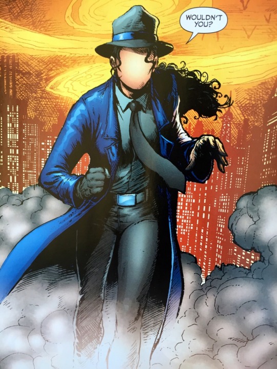
But when 52 is good, it’s great. Greg Rucka is able to continue writing Renee Montoya, the breakout character of the fantastic Gotham Central. Her arc here feels true to the character while bringing her deeper into the superheroic fold. Batwoman is also introduced in 52 and she’s one of the best new DC characters appear in decades. C-list characters such as Booster Gold and the Elongated Man get their moment in the sun and it's generally demonstrated that there’s more to the DC universe than Batman and Superman.
Overall then, if you’re looking to dig a bit deeper into the DC universe, you could do a lot worse than 52. It’s bursting with fun ideas which are so quintessentially comic book-y that you’re bound to find something to enjoy, even if the art is frequently underwhelming.
Stray Thoughts:
52 is not to be confused with ‘The New 52’ which was a line-wide relaunch and reboot of all of DC’s titles. I guess at some point somebody decided the number 52 was cool as shit. The New 52 has now been un/rebooted. I don’t even know.
As is often the case with Marvel and DC series, a lot of 52 can be baffling to the uninitiated, filled as it is with obscure DC characters. Even I was sent down a handful of Wikipedia wormholes to find out who was who and what was what.
Recommended Reads:
Final Crisis - Grant Morrison’s bravura DC event which is as fantastical as it is utterly impenetrable for newcomers. Just a wild, wild ride which benefits from repeated readings.
Batwoman: Elegy - Probably the biggest lasting impact of 52 was the introduction of Kate Kane as Batwoman. A minor character here, she would be greatly fleshed out in Elegy by Greg Rucka and the phenomenal J.H Williams III.
#52#DC#DC comics#geoff johns#mark waid#greg rucka#grant morrison#batwoman#booster gold#ralph dibny#kate kane#the new 52#black adam#isis#Renee Montoya#lobo#comics#comic books#comic book reviews#trade waiter#comic reviews#trade paperbacks#keith giffen#the question
13 notes
·
View notes
Text
Drinking at the Movies
By Julia Wertz (The Fart Party, The Infinite Wait). Published by Koyama Press.
Drinking at the Movies is an autobiographical account of Julia Wertz’s move to New York, where she tries to make it in the big city. Right out of the gate she acknowledges that this is a pretty cliché premise, but it’s her life so what’re you gonna do? Drinking is essentially the story of Wertz failing upward in life during her twenties, mainly depicted in one-page gag strips. It’s relatable and funny, but it’s Wertz’s candidness and cynicism that make it altogether more than the sum of its parts.

Anyone lucky enough to live past 19 and step into the existential vacuum of their twenties will probably find something relatable in Drinking at the Movies. Moving away from home into a shitty apartment. Working a shitty job to pay rent for said shitty apartment. Drinking at noon because you can. Feeling lost in a new city. Wertz charts all of these experiences and more, filtered through her own cynical worldview.

In many ways Drinking at the Movies can be a frustrating read. The frustration stems from Wertz’s brutally honest depiction of her many, many bad decisions. The title refers to a recurring habit Wertz has of going to the movies by herself and getting good and drunk. The book starts with Wertz waking up in a laundromat at 3am on her 25th birthday with no recollection of she got there.
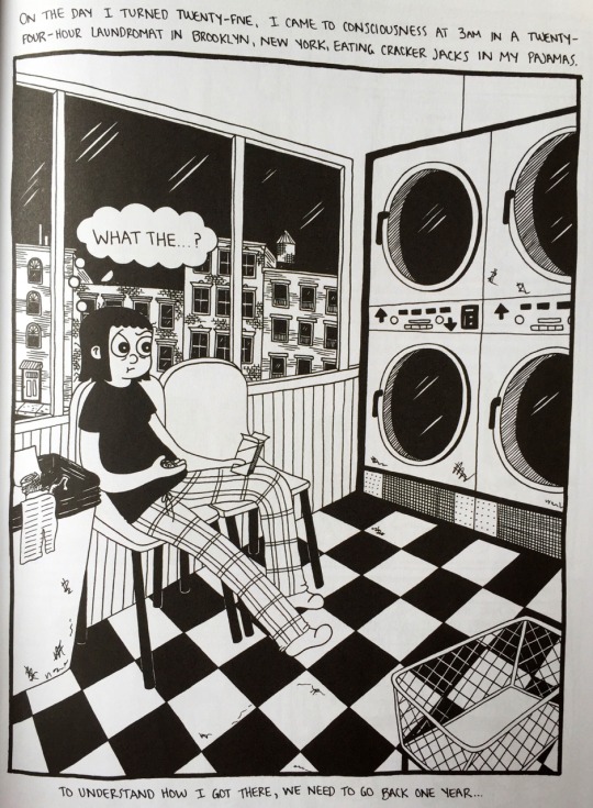
But the book isn’t about Wertz’s alcoholism. It’s just something that exists in the background as something she’s constantly struggling with/making jokes about. A running concern through the book is Julia’s brother who goes missing and overdoses while Julia is in New York. She spends a good portion of the book feeling anxious about her inability to prevent her brother’s overdose, while feeding into her own alcohol addiction. The worst part is that she is canny enough to recognize the irony here, which makes it all the more frustrating to watch her struggle.

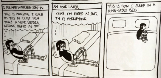
Wertz depicts herself with wide, cartoony eyes whereas the other characters almost uniformly have beadier, less expressive eyes. This makes cartoon Julia far more emotive than anyone else, which is great for selling a lot of the gags. But it also sets her apart from everyone else; an unintentional bit of symbolism representing the way she isolates herself, be it through staying at home to work on comics or heading off to the cinema to drink alone.

Drinking at the Movies is by no means a downer however. It’s consistently funny and like most autobiographical comics it charts the various ups and downs of life. But for all of Julia Wertz’s wit, it’s the panels conveying her sadness that stick with me the most.
Stray Thoughts:
Six panel pages are used throuoghout the book, with the focus placed strongly on people. Wertz also has a talent for cityscapes and environments as well and her apartment layouts and shopfronts create a fantastic sense of location. She has a book coming out in October 2017 called Tenements, Towers & Trash: An Unconventional Illustrated History of New York City which looks to be a great showcase for this aspect of her work.
Recommended Reads:
The Fart Party - Wertz’s original webcomic which brought her to the world’s attention. The name is a complete non-sequitur. Sadly there is no actual fart party.
The Infinite Wait - Wertz’s follow up to Drinking at the Movies covers three different stories and includes her battle with systemic lupus and getting sober. There are still jokes though, for real.
The Fart Party’s over - An article penned by Wertz discussing her alcoholism and featuring some unpublished and personal diary comics.
#Julia Wertz#drinking at the movies#the fart party#koyama press#comic reviews#comic book reviews#reviews#comic books#comics#indie graphic novels#graphic novels#tradewaiterreviews#alcoholism
1 note
·
View note
Text
Injection, Volume 2
Once upon a time, there were five crazy people who poisoned the 21st Century. Now they have to deal with the corrosion to try to save us from a world becoming too weird to support human life.
Written by Warren Ellis (Supreme: Blue Rose, Transmetropolitan) with art from Declan Shalvey (Deadpool, Venom) and colours from Jordie Bellaire (They’re Not Like Us, Batman). Letters by Fonografiks (Saga, They’re Not Like Us). Published by Image. Collects Injection #6 -10.
Spoilers revealed below.
The first volume of Injection was quite a slow burn, drip feeding the audience information about the titular Injection over the course of five issues. Ellis, Shalvey and Bellaire’s last collaboration was Marvel’s critically acclaimed 2014 Moon Knight revamp.This was a punchy set of six issues with each telling a standalone tale of vigilante weirdness. For Moon Knight fans, Injection, Volume 1 might have seemed a touch on the slow side. Injection, Volume 2 however gives readers a better sense of both the story and the characters, which leads to an overall more rewarding read.

Warren Ellis is an industry veteran who occasionally drops by Marvel to do short runs on B-list characters. His chemistry with Moon Knight collaborators, Declan Shalvey and Jordie Bellaire, was undeniable and they announced Injection soon after wrapping up the Marvel series. Unlike Moon Knight’s six issues, Injection allows the team to tell a much longer tale with 25 issues planned. This gives the story more breathing room and means we get to spend more time with the characters. Moon Knight, for all its madcap sci-fi ideas and lush visuals, was far too high-octane to delve into it’s protagonists thoughts and feelings.
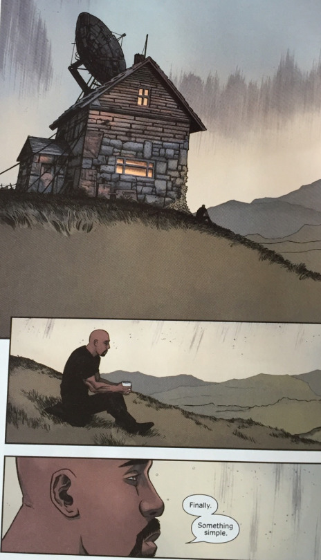
With all the stage-setting out of the way in Volume 1, Injection’s second story arc is able to better explore the characters. The way the story has been structured allows for one of the five protagonists to take centre stage for each arc. For this volume we have the pleasure of following Vivek Headland, a millionaire detective with shades of Batman and a heavy dose of Sherlock Holmes. Headland gives the creative team the chance to deconstruct the detective archetype, which suggests that they will do the same for other protagonists, such as the James Bond-esque Simeon, in later volumes.

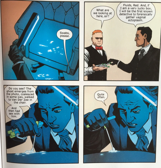
Headland is initially presented as a fairly stereotypical detective character. He’s basically a cold, abrasive asshole who can work out what you had for breakfast five minutes into meeting you. He is TV’s Sherlock, Hannibal’s Will Graham, House’s House etc. Gradually the story shows how Vivek breaks this mould. In a particularly memorable sequence Vivek monologues about how in fiction detectives are emotionless noticing-machines whereas he believes a true real detective needs to be able to understand human interaction and emotion. This monologue is delivered in a sequence of panels depicting Vivek having sex with a number of different partners of assorted genders and persuasions. Shalvey’s composition contrasts fantastically with Vivek’s speech, selling both the humour and humanity of the scene.

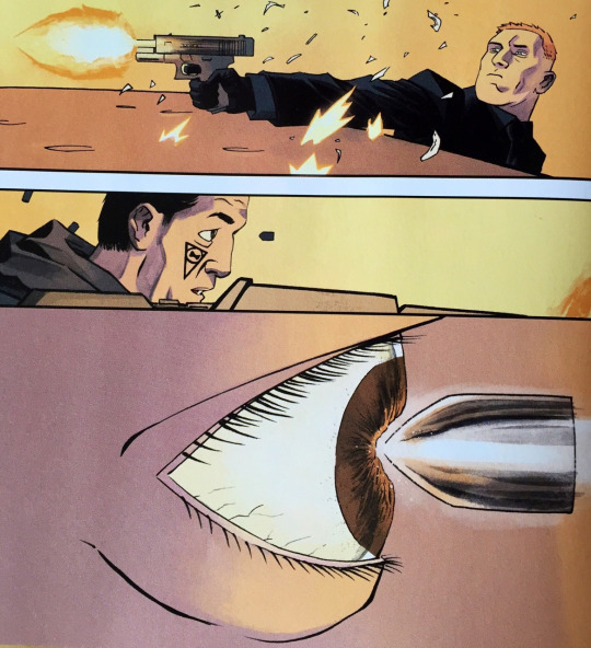
Ellis is well known for his cutting, witty dialogue as well as including a lot of well-researched technobabble. But he also knows when to let the artist do all the heavy lifting. In this volume Shalvey’s acting is at the forefront as Vivek’s facial impressions are often a source of much humour. He can also cut loose with some widescreen action and makes some particularly interesting choices. One panel sees Vivek’s marksman bodyguard take out a would-be assassin, in a way that is very memorable.
Jordie Bellaire is hands down one of the best colourists in the business. Her colouring in Injection infuses Shalvey’s art with a grit and grime that gives it a realistic touch and makes all the supernatural occurrences in the story look even more otherworldly.
Bellaire’s highlight this volume comes in the final issue, in a familiar scene wherein the detective reveals the mystery to the room of interested parties. This could easily be a very static scene of talking heads, which would be visually quite boring. To combat this, Bellaire uses a TV set in the background to alter the lighting of the scene from panel to panel, reflecting the mood and flow of the conversation. It’s a canny bit of collaborative storytelling which demonstrates the power of good colouring.

The main hook of Injection is that of a rogue AI, created by the protagonists, causing havoc in the world. In less deft hands it could be a dull premise, but Ellis, Shalvey and Bellaire make it something special. Volume 2 sees the story in full swing and brings the characters more to the fore, while at the same time exploring those gloriously drawn, madcap sci-fi ideas which the creators perfected on Moon Knight. Also, how could you not love a comic that contains this page?
Stray Thoughts:
Credit to letterer Fonografiks on the font used for the Injection’s narration. It’s distinctive enough to be noteworthy, but not noteworthy enough to ruin the reveal in Volume 1.
Recommended Reads:
Moon Knight Volume 1: From the Dead - See the whole Injection team cut loose and make Moon Knight interesting. In one issue he fights ghost-punks dressed in bird armour and in another he encounters some psychedelic fungi. A great showcase for the creative team..
Planetary - Warren Ellis and artist John Cassaday’s tale of three super-architects is as meta as its exciting. Features a great central mystery and excellent characters it is a deeply rewarding series that bears repeat readings.
Nextwave - A Marvel series by Ellis which I will never pass up an opportunity to recommend. Featuring art by the always inventive Stuart Immonen, Nextwave is twelve issues of D-List superheroes punching things until they explode.
#comics#comic books#comics reviews#comics essays#comic book essays#comic book reviews#warren ellis#declan shalvey#jordie bellaire#fonografiks#injection#vivek headland#fictional detectives#ghost sex#tradewaiterreviews#trade waiter reviews#Trade Waiter
1 note
·
View note
Text
Batwoman: Elegy
Batwoman is Gotham City’s newest protector and battling her at every turn is a crazed cult called The Religion of Crime. Led by a Lewis Carroll-quoting madwoman know only as Alice the cult have something that will show Batwoman everything she thought about her life as a caped crusader is wrong.
Written by Greg Rucka (Gotham Central, Lazarus) with art from J.H. Williams III (Seven Soldiers of Victory, The Sandman: Overture), colours from Dave Stewart (Hellboy, B.P.R.D) and letters from Todd Klein (The Sandman). Published by DC Comics. Collects Detective Comics #854-860.
Batwoman is a concept that could very easily fall flat. “There’s a Batman, how about a Batwoman?” sounds like a pretty lazy pitch for a new series. Doubly so considering there’s already a Batgirl. So how do you make Batwoman work as both a character and a series? Enlisting Greg Rucka and J.H. Williams III is probably a good start.

2009’s Batwoman: Elegy by Rucka, Williams and colourist Dave Stewart serves as an origin story for Kate Kane, the modern day Batwoman. Kate first appeared in the 2006 weekly series 52, for which Rucka was a co-writer. Kate Kane is a wealthy socialite just like her rhyming-couplet Bruce Wayne, but that’s pretty much where the similarities end (other than the fact they are both Batpeople). As revealed over the course of the story, Kate is a former soldier who was drummed out of the military for being a lesbian. Inspired by Batman and her own personal loss she begins a crusade against crime as Batwoman.
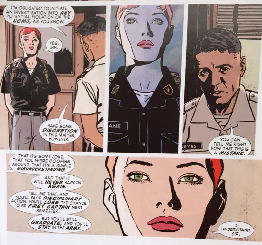
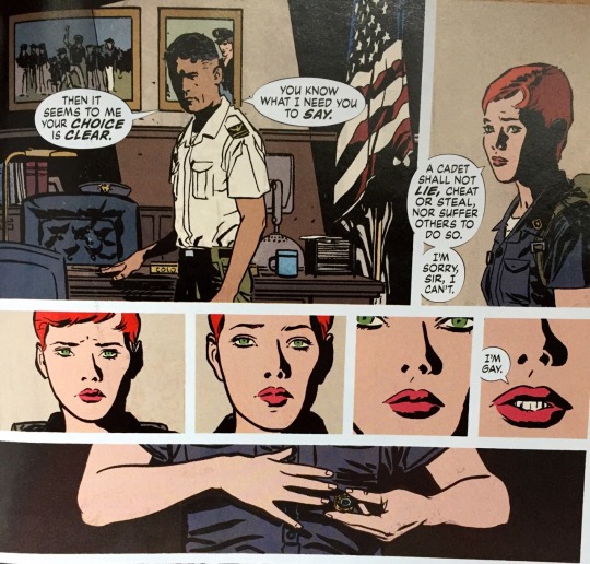
The story of Elegy largely takes place in the present day, chronicling Kate’s fight against a new villain in town. But as the story progresses Rucka and Williams delve further into Kate’s backstory, and it is these sequences that elevate both the story and the character. This isn’t the first time Rucka has written a LGBT DC heroine, but whereas Gotham Central’s Renee Montoya struggled with being a closeted Gotham City cop, Rucka’s backstory for Kate has her refuse to deny her sexuality, even though she will be expelled from the military for it.This aspect of the story is laregly based in fact, and takes it’s inspiration from the bizarre and shameful “Don’t ask don’t tell” policy, which meant that gay people could serve in the US military as long as they were not open about it. (DADT was repealled in 2010. Thanks Obama!)
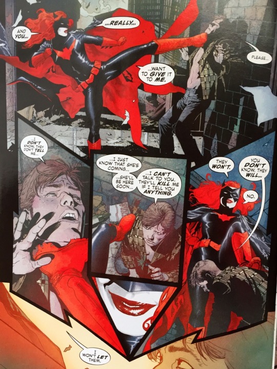
Despite the strength of Rucka’s character work, it is unlikely that Batwoman would have reached her current levels of popularity were it not for J. H. Williams III, who so stunningly provides the artwork for Elegy and who would later write the New 52 Batwoman series. Williams is a truly visionary artist, something which is immediately apparent from his dynamic page layouts, such as the one below, which is actually pretty straightforward by his standards.
Williams is joined by the inimitable Dave Stewart on colouring duties. Stewart is perhaps best known for his work on the assorted Hellboy titles but his work here is a world apart. Stewart deploys a highly textured and gradated colour palette for all of the sequences featuring Batwoman. These are frequently punctuated by flourishes of Batwoman’s signature red when the action starts. Gotham’s night sky, as depicted by Stewart is an incredibly atmospheric wash of watercolours which jive well with the gothic and Wonderland-esque nature of Kate’s current conflict.
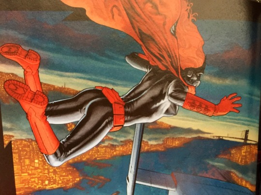
Meanwhile in the sequences featuring Kate’s civilian life, the colours used are brighter and flatter which make for an appropriate contrast. This gives the impression that after a sleepless night of cracking criminal skulls, the daytime is just a little too bright for Kate to handle.

Williams’ art style varies throughout Elegy, showing his supreme versatility. In the flashbacks Williams uses a less detailed art style with thicker inks and more subdued colours from Stewart. This marks the sequences as memories which aren’t as crystal clear as the present day. It’s a very subtle technique and as the flashbacks get closer to the present Williams art becomes more detailed with lighter inking. Williams is very fond of evoking other artists (see Batman: The Black Glove) and these flashback sections are clearly influenced by David Mazzuchelli’s unforgettable art on Batman: Year One, a very apt imitation given the subject matter.

DC recently announced that a new Batwoman series would be coming out in 2017. With the return of comics most prominent LGBT hero on the horizon what better time to revisit her first solo outing. Its a story with an absolutely killer creative team which will leave you thinking of Bruce Wayne as a male Batwoman.
Stray Thoughts:
Elegy follows a number of plot threads from 52 and it’s easy to get a little lost in what’s going on at first. I would encourage perseverance.
There’s a brief flashback sequence in one issue of Kate’s dad in military action where Williams’ art shifts from a Mazzuchelli homage into something resembling a Russ Heath war comic.
The 2017 Batwoman series is written by Marguerite Bennett with art from Steve Epting, which is an incredibly worthy creative team.
The original Batwoman, the similarly named Kathy Kane, was created in the 50s as a love interest for Batman. She fought crime using her lipstick and handbag. She wasn’t exactly a feminist icon and swiftly faded into obscurity. She’s experiencing a comeback in recent years however and is currently the head of a spy organisation. Comics!
Recommended Reads:
Gotham Central - Co-written by Rucka with Ed Brubaker. Rucka’s stories tended to focus of Renee Montoya, a closeted police officer who finds herself outed against her will by a supervillain. One of the best Batman series around and he only appears in like 5 panels.
Batman: The Black Glove - J. H. Williams drawing a Grant Morrison penned Batman murder-mystery. Typically gorgeous stuff. Read about it here.
Lazarus - Greg Rucka’s Image series drawn by frequent collaborator Michael Lark. Set in a world where the richest 1% control all the world’s resources, Lazarus follows Forever Caryle, the genetically enhanced daughter of a powerful family. Read about it here.
#batwoman#batwoman elegy#kate kane#kathy kane#greg rucka#J. H. Williams III#dave stewart#todd klein#detective comics#comics#comic book reviews#comics reviews#Trade Waiter#trade waiter reviews#lgbt comics#don't ask don't tell
6 notes
·
View notes
Text
Terror Assaulter: O.M.W.O.T. (One Man War On Terror)
As a response to the 9/11 terrorist assault on America’s freedom, President George W. Bush ordered the creation of a top secret team of foreign service agents: THE TERROR ASSAULTERS. Operating with a license to kill and a single mission – defeat terror – one such agent, codename: O.M.W.O.T (One Man War On Terror) will do anything to accomplish his goals. Is the price he pays too high? Lets just say… “No.”
By Benjamin Marra. Published by Fantagraphics.
NSFW!
What’s the one major thing missing from all action movies these days? Full penetration. Benjamin Marra’s Terror Assaulter is an 80s action movie taken to its logical extreme. It combines the kind of gratuitous action than is commonplace in movies such as Rambo and Robocop and juxtaposes it with incredibly pornographic sex scenes. In doing so Marra comments on the connection between sex and violence and how the two are portrayed differently in the media. He also makes you laugh so much you have to put the book down every couple of pages.
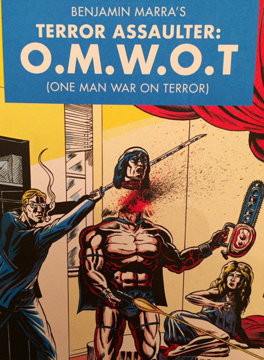
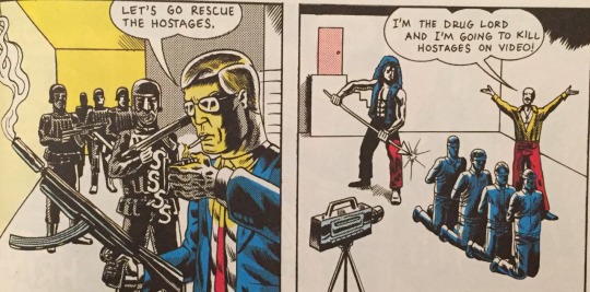
The plot synopsis provided at the start of Terror Assaulter provides some indication of the kind of world Marra has created. While planting itself firmly in reality, by namedropping George W. Bush and 9/11, it divorces itself from that reality basically immediately by introducing a main character whose name is O.M.W.O.T. (One Man War On Terror). The lead character is your quintessential action hero. He represents the type of male masculinity found in 1980s action movies (and indeed comic books) albeit ratcheted to the nth degree. He has no discernible personality traits apart from his omnipresent sunglasses and his need to kick ass. Despite his lack of charisma he is nevertheless adored by women and men alike. In short, he is every character ever played by Steven Seagal.

Beyond the initial premise the plot of Terror Assaulter is threadbare. Most issues open with O.M.W.O.T. mid-mission, stopping some form of vaguely defined terrorist threat with unparalleled bloodthirstiness. This involves a bunch of action movie clichés including fighting ninjas and drug lords. Marra also peppers the story with absurd little touches such as O.M.W.O.T. fighting a panther and the plot of the movie Red Dawn happening completely off-panel between issues 2 and 3. The fight scenes are gloriously depicted and riotously funny. Much of this is due to the general stiffness Marra imbues O.M.W.O.T. with, which gives the impression he is barely even trying to fight, despite his martial arts skills often entirely defying the laws of physics.

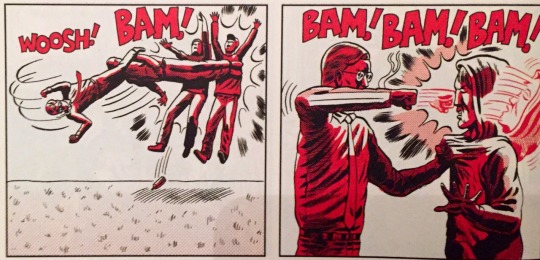
The dialogue is beyond stilted, and deliberately so. Characters essentially narrate what they are doing when they are doing it, despite the fact that Marra’s art makes it brazenly clear what is happening in each panel. For example a panel depicting O.M.W.O.T. chopping a terrorist in the neck will feature said terrorist saying “You chopped my neck”. This absurd stylistic choice is initially funny, then quickly becomes unfunny. Then it becomes funny again through sheer repetition. Then it reaches a comedic peak during the sex scenes.
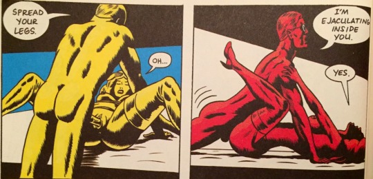
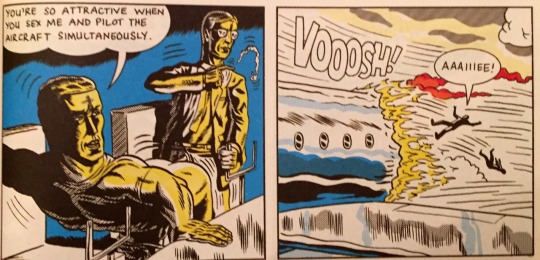
Sex is a massive part of Terror Assaulter. The violence on display isn’t especially surprising (the cover shows O.M.W.O.T. decapitating a He-Manesque chainsaw-wielding thug) but when issue one transitions into an extended sex scene it comes as a surprise. The graphic (like, medically graphic) sex on display is the kind of thing that would never appear in the kind of action films that Terror Assaulter is parodying. Audiences can handle heroes gruesomely murdering terrorists (and in O.M.W.O.T. ‘s case the occasional civilian) but a scene in which a protagonist has sex with a male air steward, whilst piloting a crashing plane, is something that no studio executive and no censorship board would ever allow. This is the kind of scene that can only be seen in the pages of a comic book.
By the final issue, in which O.M.W.O.T. is forced to settle down and marry his gender swapped former archenemny, the trademark violence has given way almost entirely to scene after scene of O.M.W.O.T.’s sexual escapades, all of which are mined for maximum comic effect. Marra draws a clear connection between O.M.W.O.T.’s sexual desire and his appetite for violence. In the end, despite engaging in as much sex as he can to fill the void, O.M.W.O.T. can’t fight his violent nature leading to the final page which is perfect in its absurdity. And that’s Terror Assaulter in a nutshell. Perfectly absurd.
Stray Thoughts
The book isn’t completely devoid of political commentary. O.M.W.O.T.’s gung-ho attitude towards collateral damage could easily be seen as a comment on the US’s approach to the War on Terror. Also the government of Terror Assaulter is controlled by a sinister Illuminati who want to keep the War on Terror going perpetually in order to better control the world drug trade. It’s probably the least absurd element of the story.
The colouring of the book is excellent in achieving the look of a cheap exploitation comic. Using risograph printing, Terror Assaulter is depicted solely in red, yellow, blue and black. Despite these limitations the colouring is beautifully deployed.
For the record, I bought this comic sight unseen based on the name alone.
Recommended Reads
Yeah, there ain’t no comic book quite like this.
#benjamin marra#terror assaulter OMWOT one man war on terror#terror assaulter#OMWOT#one man war on terror#traditional comics#fantagraphics#freedom warrior champion#comics#comic books#comic book reviews#comics reviews#tradewaiterreviews#trade waiter#trade waiter reviews
8 notes
·
View notes
Text
Secret Wars (2015)
Written and designed by Jonathan Hickman (East of West, Avengers). Art by Esad Ribic (Thor: God of Thunder). Colour by Ive Svorcina (Thor: God of Thunder). Letters by Chris Eliopoulos (Civil War) and Clayton Cowles (The Wicked + The Divine). Cover art by Alex Ross (Marvels). Published by Marvel Comics. Collects Secret Wars #0-9.
The multiverse has collapsed. Only two realities remain. Heroes and villains from the Marvel Universe and the Ultimate Universe will fight to save their homes. And they will fail. When universes collide all that remains is Battleworld. A patchwork planet formed from the remnants of lost worlds. And holding it all together is the iron will of Victor Von Doom…
Major Spoilers revealed below.
In 2015 there was no avoiding Secret Wars. It was the latest all-encompassing Marvel crossover which promised to change everything forever. But Secret Wars seemed bolder than previous events. Marvel cancelled everything from Avengers to X-Men and launched over 40 titles set on Battleworld, the main location for Secret Wars. The story was touted as the genuine destruction of the Marvel Universe which, though ultimately untrue, gave the story some gravitas. Marvel’s ambition got the better of them however. The main series was delayed, which had a knock-on effect of delaying a number of the tie-ins and also the post-Secret Wars titles.
But now that the dust has settled, with the main series and all of the tie-ins completed, Secret Wars stands as a creative success. Indeed it is likely the best Marvel event series of all time.

Right off the bat, it should be noted that this is not a comic for Marvel newcomers. For full appreciation it requires some knowledge of the intricacies of Marvel history. If concepts such as the Ultimate Universe do not feel familiar, then this probably isn’t the best jumping-on point for you.
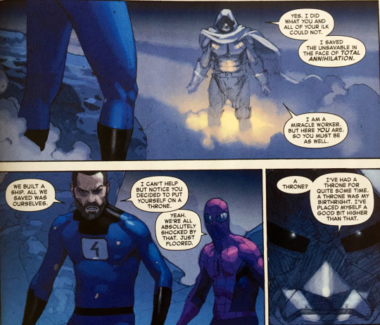
Secret Wars acts as a direct conclusion to Jonathan Hickman’s multi-year run on the Avengers which saw the multiverse begin to collapse. If you’re up to speed with that series everything is pretty understandable, and even if you haven’t you can pick up the broad strokes. In actuality Secret Wars serves as a perfect coda to the entirety of Hickman’s Marvel work. This is Hickman’s last major project at Marvel and he includes a number of elements from his other Marvel series, such as The Maker from his Ultimates run and Cyclops-Phoenix from Avengers vs. X-Men. The main continuance however is the Dr Doom/ Mr Fantastic relationship, which is the main throughline for the whole story. Hickman’s Fantastic Four run was critically acclaimed; it helped reinvigorate the title and marked Hickman as one of Marvel’s star writers. Hickman’s passion for these characters is clear and since the Doom/Richards rivalry is one of the oldest in Marvel history, it makes perfect sense for it to be foregrounded here at the ostensible end of the Marvel Universe.
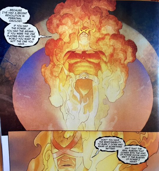
“Listen to me… You can’t kill an idea. It always comes back. Resurrected. Or reborn into a different form.”
Hickman isn’t just drawing upon ideas from his own Marvel work though. He’s incorporating elements from all of Marvel’s history. The above quote from the Phoenix-possessed Scott Summers encapsulates the repurposing of ideas which is Secret Wars’ stock-in-trade. Even the name, Secret Wars, is repurposed, with the first Secret Wars being Marvel’s earliest event series. For this story, Hickman completely mines all that is cool and interesting from Marvel comics and tosses it in a blender. The result is Battleworld, a patchwork of areas on a map representing different stories that have been told over the years. This includes iconic stories such as Marvel Zombies, Age of Apocalypse, Future Imperfect, Civil War and more.
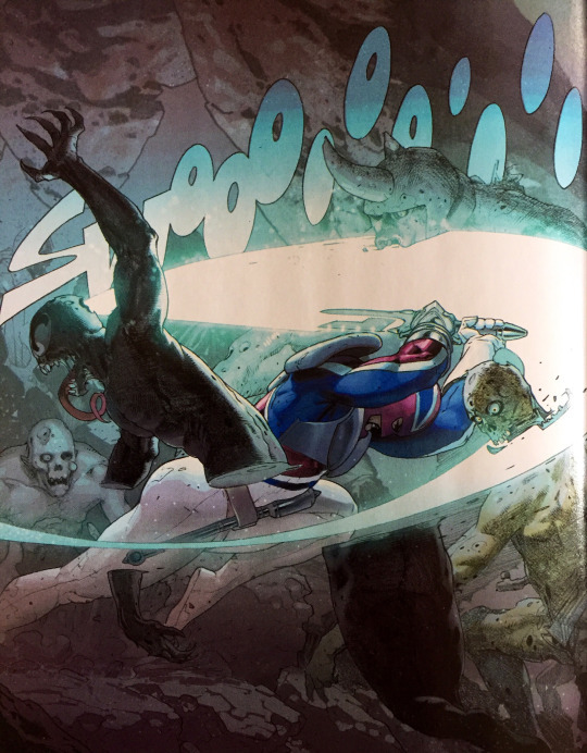
The fact that these stories don’t mesh together is kind of the point, with Battleworld always in danger of falling apart and only Doom’s god-like power holding it together. In some ways this reuse of ideas can be seen as a kind of meta-commentary on superhero stories themselves. Marvel stories never have a conclusion, with characters forever doomed to live in the second act of their tales. Eventually repetition will set in. How many times can Spider-Man fight Dr Octopus? But here Hickman shows that there is value in this huge history, and that there are still interesting things that can be done with it. The Marvel Universe is a crazy toy-box where anything is possible.
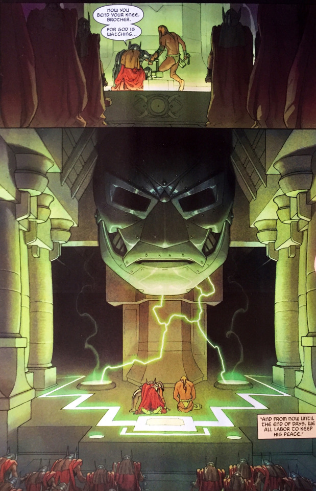
And bringing this mad toy-box to life is Esad Ribic, who previously worked with Hickman on The Ultimates. Dr Doom’s Battleworld is a kind of feudal monarchy with Barons, including Mister Sinister and Captain Britain, all pledging allegiance to Doom, their God and King. This gives the story some strong fantasy vibes. Ribic’s art is infused with a mythic quality that speaks to both the fantasy elements of the story as well as the grandeur of the tale being told. This effect is heightened by the work of colour artist Ive Svorcina. The colouring here eschews the typical bright popping colours of most superhero books in favour of a more painterly pastel look.

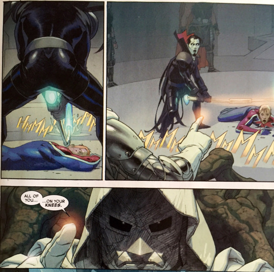
Ribic is also able to draft spectacular science-fiction and superhero action. As Battleworld is such a smorgasbord of different genres, it takes a skilled artist to combine all of the assorted elements into something that is cohesive. Hickman’s script gives Ribic the opportunity to create some truly crowd-pleasing moments as well. An army of Thors, Black Panther leading a contingent of zombies and Galactus fighting a 70ft Ben Grimm are but a few of the iconic moments from the story.

And like all good artists Ribic is equally comfortable with the smaller moments. Dr Doom is given a lot of panel time in this story and Ribic does superb work conveying his range of emotions from behind his metal mask. Despite only having his eyes and his body language to work with, it is nevertheless always clear to the reader what mood Doom is in, which speaks to Ribic’s effortless skills.
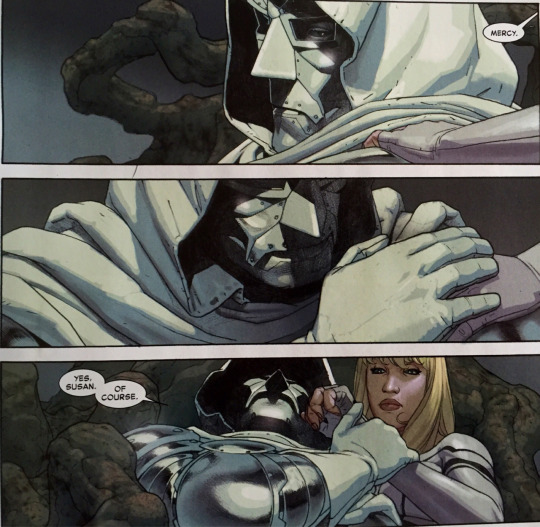
Secret Wars is a truly epic tale that both celebrates Marvel’s rich history as well as doing something new and fairly off-the-wall. It is an incredibly worthy finale to Hickman’s work with the company and an incredible spotlight for its artists.
Stray Thoughts
Ignoring the main series for a moment, Secret Wars was also incredibly ambitious from a publishing perspective. Marvel cancelled (or put on hiatus) all of their series and replaced them with titles set on Battleworld. Crossovers are a common occurrence but this was something else altogether. With over 40 tie-ins Secret Wars was truly all encompassing. This allowed for a bunch of weird and wonderful titles to emerge by a wealth of talented creators. Quality varied between titles but it was nevertheless an exciting time to see new concepts explored and old ones revisited.
A neat note on lettering. Characters from the Ultimate Universe have a different font to those from the main Marvel Universe. A simple way of conveying which universe characters are from.
Secret Wars features covers from cover-artist extraordinaire Alex Ross. Ross’s photorealistic work is all well and good but I can’t help but wish Esad Ribic did the covers for the series.
Secret Wars is my vote for best Marvel event. It is better than Civil War which has a poor sense of character and better than any of the many Bendis-penned events of the last decade or so.
Recommended Reads
Secret Wars – The original 1984 series. Written by Jim Shooter with art from Mike Zeck and Bob Layton, this unprecedented event series was mainly designed to sell toys. But it did give us Spider-Man’s iconic black suit. So that’s something.
Siege – The Secret Wars tie-in by Kieran Gillen and Fillipe Andrade. Not the lacklustre 2010 event. This ties strongly into Secret Wars and is also Gillen’s last major contribution to the Marvel Universe, featuring a number of his signature characters. A worthy companion piece.
Convergence – DC also did a 2015 series about universes smashing together. Or something. I haven’t read it. It might be quite bad actually. Some of the tie-ins were neat though.
#Secret Wars#Secret Wars 2015#Jonathan Hickman#Esad Ribic#ive svorcina#Clayton Cowles#Alex Ross#chris eliopoulos#Marvel#Marvel Comics#Civil War#Reed Richards#Dr Doom#Battleworld#Avengers#X-Men#Ultimate Universe#cyclops#Thor#Spider-Man#Thanos#Comics#Comic Books#comic book reviews#comics reviews#trade waiter reviews#tradewaiterreviews#trade waiter
6 notes
·
View notes
Text
The Superior Foes of Spider-Man: Omnibus
What’s better than being in the Sinister Six but only having to split the money five ways? C-List villains Boomerang, Shocker, Speed Demon, Overdrive and the new Beetle are the latest gang to adopt the name of Spider-Man’s deadliest foes. But will this questionable quintet prove themselves superior to any sextet? Nah.
Written by Nick Spencer (Captain America: Sam Wilson, Ant-Man), drawn by Steve Lieber (Whiteout, The Fix) and Rich Ellis (Memorial). With colours by Rachelle Rosenberg (The Red Wing) and letters by VC’s Joe Caramanga (Amazing Spider-Man) and Clayton Cowles (The Wicked + The Divine). Published by Marvel Comics. Collecting The Superior Foes of Spider-Man #1-17.
Spoilers revealed below.
The Superior Foes of Spider-Man focusses on a handful of obscure Spider-Man villains as they try to make a name for themselves in the criminal underworld. The main character is Fred Myers, aka Boomerang, whose powers include throwing boomerangs and telling lies. It has very little Spider-Man in it, features no easily recognisable characters and is more overtly comedic than most superhero comics. Unsurprisingly it wasn’t a great commercial success, but it is one of the best series Marvel has produced in recent years and it was a forerunner for many of the comedy titles Marvel currently has on its slate.

Superior Foes was made during the Marvel Now era, an initiative which saw the release of a whole host of new issue 1’s, partly in response to DC’s Nu52 relaunch. Marvel Now emphasised creative teams instead of crossovers and continuity, taking the same approach as the wildly acclaimed Hawkeye series by Matt Fraction and David Aja. SupFoes, to abbreviate even further, was something of an anomaly in the relaunch insomuch that it was a spinoff of The Superior Spider-Man. This was the main Spider-Man series at the time which featured Doctor Octopus living inside Peter Parker’s body for about a year (comics!). But SupFoes never so much as referenced this storyline and the creative team were seemingly given free rein to tell their story; a hilarious tale of hope and betrayal shot through the lens of working-class super-criminals.

These days Nick Spencer is one of Marvel’s biggest writers, working on Ant-Man and two Captain America titles. He’s been working at the House of Ideas for a number of years now but it was SupFoes that really put him on the map. Spencer’s story has it all. It’s funny, features a convoluted yet engaging plot and has substantive character development. Much of this comes from the character of Boomerang who serves as the story’s protagonist. As a professional criminal and liar Boomerang is the quintessential unreliable narrator which leads to a number of great narrative switcheroos. One of the joys of SupFoes is seeing characters like Boomerang and Shocker explored for once. These are inherently silly villains whose criminal credibility is only worsened by the fact that Spider-Man has been hanging them from lampposts for 60 years. Spencer makes their lameness and/or their denial of their lameness a source of comedy and, somewhat unexpectedly, pathos.


Comedy is a big part of the series from the get-go, owing to Boomerang’s snarky narration, but it becomes more pronounced as the series progresses. This is likely because the comedy skills of artist Steve Lieber became apparent and Spencer started tailoring his scripts to highlight this fact. One of the best examples of this is undoubtedly the recurring gags about Mach VII’s robotic wings.

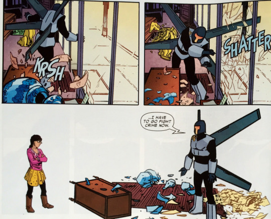
Lieber litters the pages with sight gags and it is often be hard to tell whether they were his additions or Spencer’s. This is the sign of a creative team working at the top of their game. Some comics are great because of the writing, others because of the art. Here Spencer and Lieber are working in perfect synergy. Spencer favours fairly dense panelling in his scripts with upwards of seven per page. This gives Lieber the opportunity to pack pages with a lot of character interactions and helps with the pacing of jokes, many of which are sold simply through Lieber’s expression work. One of the more memorable aspects of Lieber’s work is his use of dialogue balloons and thought bubbles which are filled with images instead of text. These are doubly effective in that they’re used both as gags and to convey information about the characters.

As funny as it is, SupFoes is also a crime story which occasionally features some bombastic superhero action. Again there’s often an undercurrent of humour to these scenes but it nevertheless gives Lieber a chance to cut loose and show his action skills. These scenes also give colourist Rachelle Rosenberg a chance to dazzle. Rosenberg uses a fairly muted palate for the series which helps accentuate the mundane aspects of being a super-villain, but during action scenes she is able to create an appropriately dramatic atmosphere.
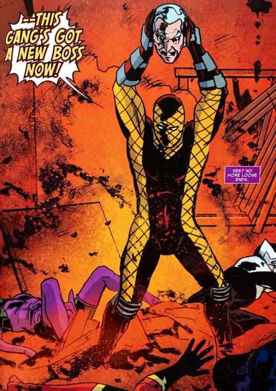
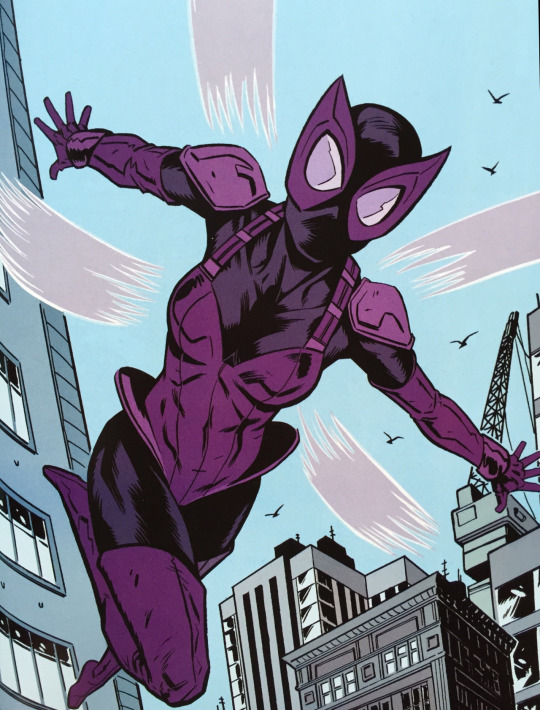
Longstanding villains like Shocker and Boomerang are incredibly well served by this story, but the creative team also spend time fleshing out some of the newer characters. Beetle and Overdrive have only had a few fleeting appearances prior to this series, and it’s quite exciting to see relative blank-slates receive this kind of character development. Beetle gets a spotlight issue, drawn by Rich Ellis, revealing her origin. She is a morally bankrupt lawyer who wants to break through the glass ceiling of the criminal underworld in order to become “the Hillary Clinton of drug-lords”. Spencer has taken a villain who appeared in two issues of Captain America and made her one of the best things about this series.
Looking at Marvel’s current titles it’s easy to see SupFoes legacy. Despite not being a huge commercial success it nevertheless showed that there was an audience for superhero comedy titles. Recently Marvel has produced comic comics (see what I did there?) such as Unbeatable Squirrel Girl, Howard the Duck and even Spencer’s Ant-Man. These all owe a debt to SupFoes. And also Deadpool, but that’s beside the point.
Superior Foes lasted for a brief but beautiful 17 issues. It told a self-contained story which included glorious elements such as the disembodied head of a cyborg gangster and a panel where Dr Doom says “I want you to draw Doom…like one of your French girls.” It is also a story that makes you care about a guy who wears a boomerang on his forehead. You should pick up the omnibus for that reason alone.
Stray Thoughts
Impossible to pick my favourite sight gag from the series but noticing Shocker’s sofa was the same design as his costume made me laugh more than it should have.
Shocker also gets the best moment of the series hands down in the final issue. I won’t spoil it here. It’s amazing.
Rich Ellis turns in some truly great work on his fill-in issues. He needs to be snapped up for an ongoing series quickfast.
Recommended Reads
The Fix – Spencer and Lieber have a new book coming out at Image. It’s not out till April, but I’m sure it’ll be great. Keep an eye out for it.
Ant-Man – Nick Spencer’s take on Scott Lang. Features many of the hallmarks of SupFoes including a supporting cast of reformed(ish) supervillains. It also features Spencer writing the Beetle again which is very gratifying. Read my thoughts on the first volume here (feat: terrible image quality!)
Unbeatable Squirrel Girl – The funniest book Marvel is putting out at the minute. Written by Ryan North and drawn by Erica Henderson. Its gag per page ratio might even surpass SupFoes. Read my thoughts here (feat: marginally better image quality!)
#superior foes of spider-man#superior foes#supfoes#spider-man#spiderman#nick spencer#steve lieber#rich ellis#rachelle rosenberg#joe caramanga#Clayton Cowles#marvel comics#marvel#marvel now#boomerang#shocker#overdrive#speed demon#beetle#fred myers#herman schultz#janice lincoln#mach vii#abner jenkins#comic books#comics#comic book review#comic reviews#comics recommendation#trade waiter reviews
7 notes
·
View notes
Text
Batman and Robin: Batman Reborn
The Dark Knight has fallen, sacrificing himself in the Final Crisis to defeat the ultimate evil. Now there’s a new Dynamic Duo in town. Dick Grayson, the original Robin, has taken up the cape and cowl of his former partner, and Damian Wayne, the assassin-raised son of Bruce Wayne, has become a deadly new Robin.
Written by Grant Morrison (Final Crisis, Multiversity), art by Frank Quitely (Jupiter’s Legacy, All-Star Superman) and Philip Tan (Spawn, Hawkman). Coloured by Alex Sinclair (Batman: Hush) and Pete Pantazis (Trinity). Lettered by Patrick Brosseau (The Omega Men). Published by DC Comics. Collecting Batman and Robin 1-6.
Spoilers revealed below.
Batman is dead, long live Batman. Following the death of Bruce Wayne, Batman and Robin: Batman Reborn kicks off the next chapter in Grant Morrison’s ongoing Bat-saga. Batman Reborn is the first of three trades chronicling the adventures of Dick Grayson and Damian Wayne, as they continue Bruce’s crusade against crime. Making the former Robin the new Batman is a simple premise, but Morrison thoroughly mines its storytelling potential to present a new kind of Batman & Robin dynamic.

This first volume wastes no time in establishing the status quo with Dick and Damian in hot pursuit of a villain. The strength of this series absolutely lies in the pairing of these two characters. Dick is a much less serious Batman whereas Damian is an ultra-stern Robin, determined to outdo his predecessors and live up to his father’s legacy. In a sense Batman and Robin looks at the concept of Batman divorced from Bruce Wayne, but in a completely different way to how Batman R.I.P. approached the same topic.

The first arc, comprising of issues 1-3, are drawn by virtuoso Frank Quitely. A long-time collaborator of Morrison and fellow Scot, Quitely sets a high artistic bar for the series, and his highly textured style makes this look unlike any previous iteration of Batman and Robin. Morrison plays to Quitely’s strengths and gives him a lot of weird character designs and action scenes to draw, the most impressive of which is Robin’s fight with conjoined triplets; no mean feat for any artist.
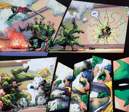
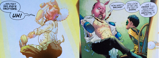
Morrison’s Batman run draws a lot upon past stories, typically repurposing them into something new. But Morrison is also due a lot of credit for introducing new elements to the Batman mythos. The most obvious contribution is Damian Wayne, but in this arc I appreciated all the weird one-off villains that Morrison populates Batman’s world with. The major addition from this storyline is Professor Pyg, a demented surgeon and visionary drug manufacturer, who has went on to appear in other Batman related media. Quitely’s character design is simple but effective and the sequence when Pyg has Robin captured is made all the more uncomfortable by the weird body language Quitely gives Pyg.
The second storyline in the trade is about former Robin Jason Todd, who returns as a villain. As the Red Hood, Jason is basically Batman but he murders people. This is a compelling hook as Jason’s attempts to be better than Bruce contrast well with Dick’s own attempts at living up to the Batman name. Jason also has a sidekick of his own, who has a personal connection with Damian from the first arc. It’s a small element but it helps to humanise Damian, which is significant because in his first appearances he was literally the most grating character ever.

This arc is drawn by Philip Tan and coloured by Pete Pantazis. Tan is a competent storyteller but it’s very difficult not to compare his work with Quitely’s from the first arc, which puts Tan at an unfortunate disadvantage. Tan’s art is reminiscent of the more traditional superhero artwork of earlier Morrison arcs. While this style can be effective (Tony Daniel was a great fit for Batman R.I.P.) it doesn’t seem appropriate for the tone of this story. Similarly the colouring is overly dark which lends the story a grim and gritty atmosphere that it doesn’t really need. Sure, the story is rife with murders, but so was the first arc and Quitely and colourist Alex Sinclair managed to execute the tone flawlessly. They strike a unique balance of darkness and lightness that is perfect for a story which is inherently absurd. Batman is an absurd concept! If you think otherwise I would direct you to the end of this arc which features a flamboyant assassin named the Flamingo who dresses like pop-music weirdo Prince.

Batman Reborn ably sets up the next chapter of Morrison’s Batman saga. The stories contained within feature some of the best art and unfortunately some of the weakest art of the whole series. In general however Batman and Robin is one of the high points of Morrison’s run, mostly due to the refreshing interplay between Dick and Damian.
Stray Thoughts
The first arc ends with Batman and Robin swooping in on Le Bossu, a minor villain from Batman R.I.P. This scene precedes the iconic “BATMAN AND ROBIN WILL NEVER DIE” page from that story, which is neat.
I just read the final Morrison Batman trade this week. Boy do I have some thoughts on that one.
Jason Todd has the weirdest history of any character in the DC universe. An edgier more temperamental Robin, Jason was not well loved by fans. DC gave readers the chance to vote whether he lived or died in the classic Death in the Family story in 1988. They voted die and the Joker beat him to death with a crowbar. Bear with me for this next part. In 2006’s Infinite Crisis series a character named Superboy-Prime from an alternate paradise dimension went crazy and punched a hole in reality. He literally punched it. This somehow brought Jason back to life because hey why not? Jason bounced around personas for a while, (Red Hood, Red Robin, Nightwing) before settling into the Red Hood role as a villain. There’s more of him to come in Morrison’s run which I won’t spoil, but under the Nu52 he headlines his own title as the anti-hero Red Hood. Comics!
Recommended Reads
Batman and Robin: Batman vs Robin – The next Morrison Batman trade. This features one of my favourite Batman stories of all time, for reasons that couldn’t be more subjective.
Robin: Son of Batman – Written and drawn by Patrick Gleason, this Nu52 series focuses on Damian Wayne. If you’re a fan of him, here’s where he’s at.
All-Star Superman – Morrison and Quitely’s most famous collaboration. Features an arguably definitive take on Superman and what makes him great. Basically imagine Man of Steel but different in every conceivable way.
#Batman and Robin#Batman Reborn#Batman and Robin: Batman Reborn#Batman#Robin#Dick and Damian#Dick Grayson#Damian Wayne#grant morrison#frank quitely#Alex Sinclair#Pete Pantazis#Philip Tan#Patrick Brosseau#DC#DC Comics#Bruce Wayne#Jason Todd#Red Hood#Professor Pyg#Flamingo#comics#comic books#comic book reviews#comics reviews#tradewaiterreviews#trade waiter#trade waiter reviews#dickbats
3 notes
·
View notes
Text
Russian Olive To Red King
When your lover may be dead, how long can you hold on to what remains? To whatever is left of you? A plane crash, a package, her dog, her voice. A notebook, his writer’s block, and his heat-distorted summer memories of a search for Jumbo the Elephant and an absent father.
By Kathryn Immonen & Stuart Immonen.
Spoilers revealed below.
Stuart Immonen has been a favourite artist of mine ever since his work with Warren Ellis on Marvel’s Nextwave: Agents of H.A.T.E., which is as close to a perfect comic as you will ever see. Since then, Immonen has worked a lot with Marvel, often on marquee titles such as Ultimate Spider-Man, All New X-Men, All New Captain America and most recently Marvel’s flagship Star Wars title, aka the best-selling comic on the stands right now. This poses a dilemma. Although I would love to see more of Immonen’s art, these are all comics I am not particularly interested in reading. Fortunately for me then, we have Russian Olive To Red King, a book beautifully illustrated by Immonen and scripted by his wife Kathryn.
Russian Olive is about as far from Marvel style superheroics as you can get. It’s a challenging meditation on love and loss that is completely devoid of the bombast found in Immonen’s corporate work and which defies conventions entirely for its final segment. It is a simple story of woman, Olive, whose plane crashes while on a work trip, while her lover, Red, wrestles with daily life in her absence.

The dialogue, presumably written by Kathryn, is fairly sparse, which allows much of the storytelling to rest on Stuart’s shoulders. The Immonens have described this story as agoraphobic, which is very apt as there is a tremendous amount of open space featured in the art. On one hand you have Olive who is trapped in a snowy forest, which allows Stuart to draw a lot of striking panoramic landscapes. On the other hand there is Red who remains in the city. Red is frequently depicted running errands about town, often coming into contact with other people. Despite this, Red seems equally as alone as Olive, separated from his loved one with an increasing anxiety that she isn’t coming back.
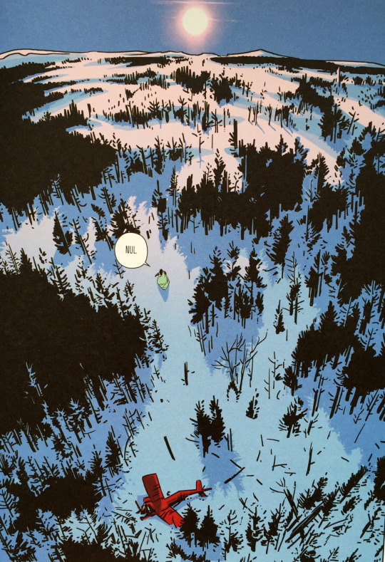
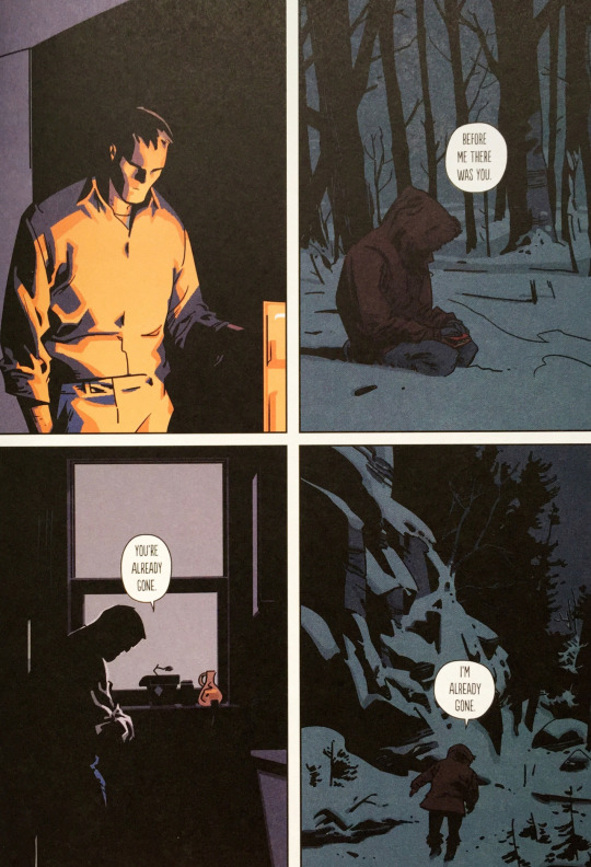
There’s a stillness to Stuart’s art that is particularly apparent in the scenes with Red. That’s not a criticism either. Immonen is more than capable of producing incredibly kinetic action sequences, but this is a story that benefits from a lack of motion and allows the reader to linger on each panel a touch longer. Red isn’t as expressive as Olive, instead having a face like granite, and the stillness of the panels invites the reader to dwell on what is going on behind Red’s stoic expression. This leads to a disquieting ramping up of tension, which is amplified by the scenes of Olive wandering the forest.

The story is also beautifully coloured by Stuart. The potency of his colouring choices are most apparent in Olive’s scenes, with the picturesque backdrops providing a jarring contrast with the bleakness of her circumstances. Again this serves to heighten the creeping sense of dread. Red is also depicted increasingly in shadows as the story progresses, which is a subtle way of showing his worsening fears.
The two characters ultimately come to terms with the eventuality of Olive’s fate, with both scenes heavily depicted in shadows. These moments of realization are pretty heart-breaking.
This leads to the final section of the book, which is both fascinating and convention-defying. For the last 50 pages, Stuart’s art is replaced by a text story written from Red’s perspective which is about him coming to terms with his absentee father. Red’s earlier lack of expression really pays off in this section as the reader is shown a glimpse of what is going on inside his head. This is bittersweet however as he dedicates the story to Olive, who will never get to hear it. Alongside the text is a series of black and white images of broken glass. It is left up to the reader to decide the relevance of these images, and that’s kind of the point. A lot of Red’s story is metaphorical; concerning a dead elephant and how that relates to his dad leaving, but it should really be viewed in relation to the rest of the story and how Red is coping with the loss of Olive. This section of the book is by far the most challenging and many readers may be put off by its seeming discordance with the rest of the story.
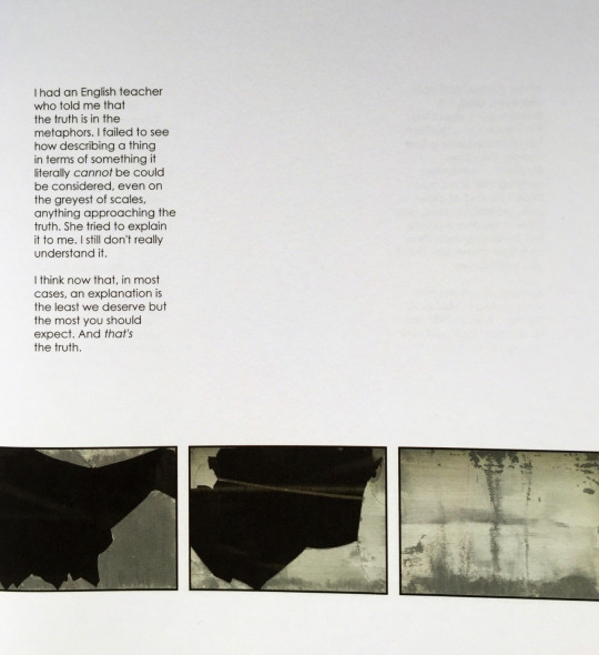
Russian Olive to Red King is clearly an incredibly personal story for the Immonens (in fact Olive bears more than a passing resemblance to Kathryn), and it is gratifying to see them working outside of the Marvel Universe. Overall Russian Olive is an achingly sad tale that sucks you in with its atmospheric art and then challenges you in a way most graphic novels don’t.
Stray Thoughts:
AdHouse Books have done a great job with the production of this book. It both looks and smells fantastic.
Something I really appreciated about the story was the absence of sound effects. I noticed it during the sequence where Olive’s plane crashes and the silent imagery was far more effective than if an obnoxious “neeeeeeeeown ker-asssssssssssh” was overlaid on the art.
Aside from being the names of the characters, the title refers to horticulture. According to Kathryn “’Russian-olive’ (Elaegnus angustifolia) is a kind of tree. It's thorny and fragrant and invasive. ‘Red King’ is a cultivar developed from the Russian-olive.”
Recommended Reads
Moving Pictures – The Immonens first graphic novel together. Set during World War II while the Nazis were pillaging most of Europe’s art collections.
Patsy Walker: Hellcat – Another collaboration between the Immonens, also featuring art from David Lafuente. An offbeat series that shows Kathryn and Stuart working on a more playful tale.
Nextwave – It couldn’t be more tonally different to Russian Olive but I would never pass up a chance to recommend it. It is superhero comics distilled to its core ingredients and it is amazing.
#russian olive to red king#russian olive#red king#russian king#red olive#kathryn immonen#stuart immonen#adhouse books#graphic novel#romance#plane crash#comic book#comics#comics review#tradewaiterreviews#trade waiter#trade waiter reviews#comic book review#graphic novel review#marvel#nextwave#moving pictures
1 note
·
View note
Text
Dead Drop
An alien virus which threatens to wipe out all of humanity has made it on to New York’s black market. It’s up to British Intelligence agent Neville Alcott to assemble a team to recover the virus. X-O Manowar, Archer, Detective Cejudo and Beta-Max have been chosen, but are this rag-tag team up to the task? Short answer: sort of.
Written by Ales Kot (Secret Avengers, Zero). Drawn by Adam Gorham (The Violent). Coloured by Michael Spicer (Mythic). Lettered by Dave Sharpe (X-O Manowar). Cover art by Raul Allen (Wrath of the Eternal Warrior). Published by Valiant Entertainment. Collecting Dead Drop issues 1-4.
Spoilers revealed below.
It’s been over three years since 90s mainstay Valiant was relaunched under new management and by now its established that it isn’t going anywhere. Despite being wholly and unreservedly devoted to telling superhero stories, Valiant has been getting bolder and more willing to take risks with its titles. To this end Valliant has drafted rising star Ales Kot to write the four issue mini-series Dead Drop which brings together an eclectic group of Valiant characters.

Like the relaunched Valiant, Kot has only been on the comic book scene since 2012, but in that time he has built up a reputation for being both wildly outspoken and also incredibly inventive. It’s easy to make comparisons to Grant Morrison as Kot’s work is similarly multifaceted and occasionally as confounding. By now Kot has worked for both Marvel and DC, but the majority of his work has been creator owned at Image. Kot’s Image work oscillates between the political and the personal and so it is very interesting to see how this filters into his corporate work.

At its core Dead Drop concerns a bunch of Valiant characters attempting to catch a woman in possession of a dangerous alien virus, with each issue following a different character. Despite its simple pulpy premise Kot manages to pack a lot of politically charged content into the story such as ethical hackers, military duplicity and an extended colonialist metaphor applied to an alien civilisation. Kot also takes the opportunity to spotlight some women of colour in his story. Kot is an incredibly vocal proponent of diversity and so it is perhaps unsurprising that the true hero of the piece ends up being hispanic character Detecitve Cejudo. Kot also chooses to make Archer and X-O Manowar, two blonde, white male heroes, unwitting pawns in an evil scheme while the black and Asian hackers, who are believed to be villains, turn out to be honest thieves.
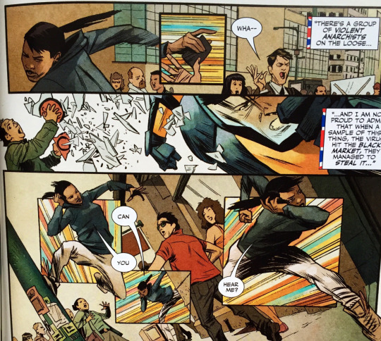
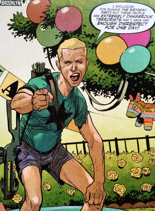
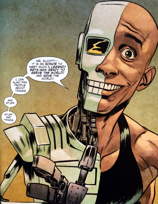
If this all sounds a bit heavy then don’t worry, I am probably reading into it too much. Above all Dead Drop is an action caper. A quick romp through the Valiant universe using some of their best characters. X-O Manowar is probably Valiant’s most popular character but Kot has brought together a great mix of heroes here, and the unequivocal star of the show is Beta-Max. Created by James Asmus for the Quantum and Woody series, Beta-Max is essentially a gag character, a cyborg from the 1980s whose robot bits are now woefully outdated. Despite this Kot still manages to mine a surprising amount of pathos out of the character who is striving to be taken seriously and is also endearingly earnest. Kot also seems to be enjoying writing Archer who spends the whole series with no pants on; a testament to the levity of the series.
One of the problems with some of Valiant’s earlier titles was that the art was fairly uniform across titles. Regardless of the story content a lot of it looked like fairly generic superhero fare which may have put off some customers looking for something different. (Equally it could have appealed to people looking for some fun superhero stories outside of Marvel and DC.) Increasingly however Valiant are attracting some very exciting artistic talent to their titles, such as Paolo Rivera, Doug Braithwaite and Dead Drop’s Adam Gorham. Gorham has worked with Kot before on Zero and their creative chemistry continues here. Chase sequences are not easy to depict in comic books but Gorham does very well here depicting the speed and movement of characters. Credit must also be given to colourist Michael Spicer who knows how best to emphasise certain moments within the chase through the use of colour. Equally fantastic is the artistic team’s rendering of the aliens and their homeworld. This includes a great character design which manages to easily convey emotion in a dialogue-less sequence despite their lack of human features.

Gorham also draws a great Beta-Max. Have I mentioned how much I love Beta-Max?
The cover art for Dead Drop is also uniquely striking. The strong graphic design not only helps set it apart from other Valiant books but other comics in general. Cover artist Raul Allen has a background in commercial art which has allowed him to create some gorgeous work here that looks unlike anything on the stands. Issue 1’s deceptively simple cover show X-O Manowar falling onto a stark blue map of New York with police cars rushing around the streets. This image conveys the chase based nature of the story very elegantly while the arresting cyan of the map background immediately catches the eye. Valiant have been making strides to improve the presentation of their books recently and have also employed graphic designer Tom Muller, himself a frequent collaborator of Ales Kot, to design number of variants for their titles. Raul Allen has been snapped up by Valiant to draw one of their premier titles, Wrath of the Eternal Warrior, and this commitment to design aesthetics helps put them a cut above many other superhero publishers.
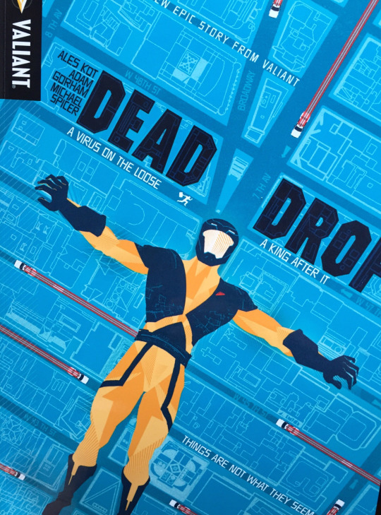
Dead Drop shows Ales Kot having a pretty good time in a corporate gig while still allowing him to inject some political ideas into his work. It’s difficult to say how much work-for-hire Kot will be doing in the future as his star rises, so this caper is a great way to ease yourself in before trying his more challenging work. It also serves as a great introduction to the Valiant universe as it is a self-contained story which shows a hearty cross section of characters all wrapped up in a very well designed package.
Stray Thoughts
Valiant are missing a trick by not putting out a Beta-Max ongoing.
X-O Manowar is literally the best name in comics. I can recommend it based on its name alone.
Recommended Reads
Quantum and Woody – The first appearances of Detective Cejudo and Beta-Max, this is Valiant’s premier comedy title which details the bizarre adventures of the world’s worst superheroes Quantum and Woody.
Secret Avengers – More weird offbeat superhero comics from Ales Kot, this time with a heavy dose of M.O.D.O.K., Marvel’s premier floating murder head. Kot’s been vocal about his displeasure working for the Big 2, so this is probably your last and best chance to see him working in this wheelhouse.
Change – This is Ales Kot at his most unfiltered, telling a psychedelic story set in Hollywood which is thoroughly impossible to do justice in a small synopsis. Drawn by Morgan Jeske with spellbinding colours from Sloane Leong.
#Dead Drop#Valiant#valiant entertainment#ales kot#adam gorham#michael spicer#dave sharpe#raul allen#zero#wrath of the eternal warrior#comic books#comics#comic book reviews#comic reviews#xo manowar#beta-max#detective cejudo#archer#archer and armstrong#trade waiter#trade waiter reviews#tradewaiterreviews
2 notes
·
View notes
Text
Lazarus
In Lazarus, the world has become a feudal state: a few wealthy families control all of the resources, while all other people amount to, if they’re lucky, loyal vassals or serfs. Most however are destitute, unprotected, and desperate — what the privileged call “Waste.” The “Lazarus” of the title is Forever Carlyle, the genetically enhanced daughter of a powerful family, who begins to suspect that she is little more than a pawn in her family’s plots.
Written by Greg Rucka (Gotham Central, Batwoman), pencilled and lettered by Michael Lark (Gotham Central, Daredevil). Coloured by Santi Arcas (Checkmate) with design by Eric Trautmann (Black Magick). Published by Image Comics. Collects Lazarus 1-9.
Spoilers revealed below.
Lazarus may very well be the best monthly comic book coming out at Image right now. It is most certainly the most underrated. Image has become a haven for creators who want to create new worlds which has led to huge hits such as Saga, Sex Criminals and East of West. While all of the above have constructed intricate and amazing universes, the world of Lazarus as created by Greg Rucka and Michael Lark is by far the scariest and most fascinating.

The most frightening thing about Lazarus is the plausibility of its concept. Lazarus takes place in a world where the richest people in the world, who control the majority of the world’s wealth, have overthrown governments and divvied up the world amongst themselves. We currently live in a world where billionaire Donald Trump is a serious contender for the Presidency of the United States, so Rucka and Lark’s dystopia doesn’t feel too far removed from reality. In the backmatter for the hardcover Rucka reveals that when Lazarus was first released he read a report citing that 86 individuals controlled the equivalent wealth of two thirds of the world’s population. A month later it was 82. As of this year it is estimated that the 62 richest people have as much wealth as the poorest 3.5 billion. It appears we are sliding towards the world of Lazarus. In his foreword, veteran comic writer Warren Ellis says that science fiction is social fiction, and it is certainly true that Rucka has latched on to a compelling contemporary issue as a basis for this series.
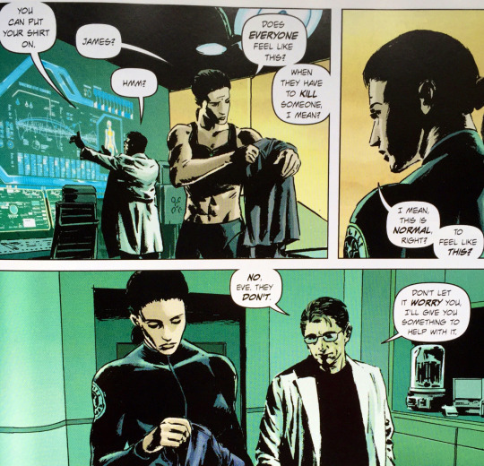
But Lazarus is not just a cautionary tale of what could happen in a world of ultimate wealth inequality. It’s also an exhilarating character-focused action-drama. In the first scene we are introduced to the protagonist Forever Carlyle as she is brutally gunned down by a raiding party. It is quickly revealed that she can heal from any wound due to biological enhancements and she soon dispatches her attackers. Forever is her family’s “Lazarus”, their main defence against the other families and “Waste” which is the name given to everyone in the population who isn’t a member of the ruling family or in their service. This opening scene sets the tone for the violent world Forever inhabits.


It’s an incredibly interesting approach for a story like this to have the protagonist be a member of the ruling class, as opposed to a plucky member of the oppressed like in The Hunger Games. This could be off-putting or jarring to some readers which may account for why the series isn’t as universally praised as other Image titles. Forever is different from her family however. She has been raised in isolation and it is constantly implied that she is not really a Carlyle by birth. What mainly sets her apart however is her compassion. She takes no joy in her work but does so only out of duty, which has been instilled in her by the manipulation of her family. Ironically by raising her in isolation Forever is separate enough from her family that she perceives the world differently. In the first arc we see her natural empathy at odds with her role within the family as she is forced to execute an innocent man. She also meets a Lazarus from another family and builds a unique bond with him that is ruined by circumstance and their roles as their families’ weapons. This scene in particular features excellent colouring from Santi Arcas. The two Lazari are enjoying a potentially romantic sunset before being interrupted by an attack from Forever’s duplicitous brother. In depicting the sunset Arcas shows the light fade from the scene as the violence escalates and the tone darkens.

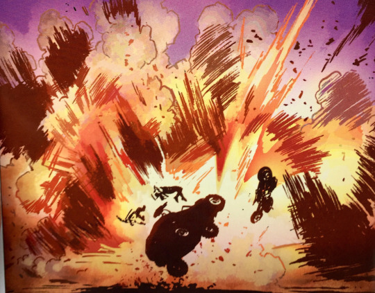
Forever is an ass-kicking female character in the vein of other Greg Rucka characters such as Renee Montoya and Tara Chance. But like all Rucka characters she is more than a one-dimensional badass murder machine. Forever is crippled by insecurities brought on by the manipulations of her father, which are documented via flashbacks in the second arc. It is easy to forget that Forever is only 19 years old as artist Michael Lark depicts her as an imposing Brienne Of Tarth style warrior, giving credence to her fighting prowess. Lark clearly has great chemistry with Greg Rucka based on their previous collaboration on Gotham Central, one of the best Batman titles of all time. Lark has quietly been one of the most capable artists in the business for years now, though his gritty understated style is not a great fit for most superhero titles. Lark is able to depict masterful action sequences as well as quieter character moments with ease. The scene mentioned earlier featuring Forever and her counterpart from the Morray family Joacquim shifts from explosive action to a melancholic conversation, both of which are expertly staged by Lark.
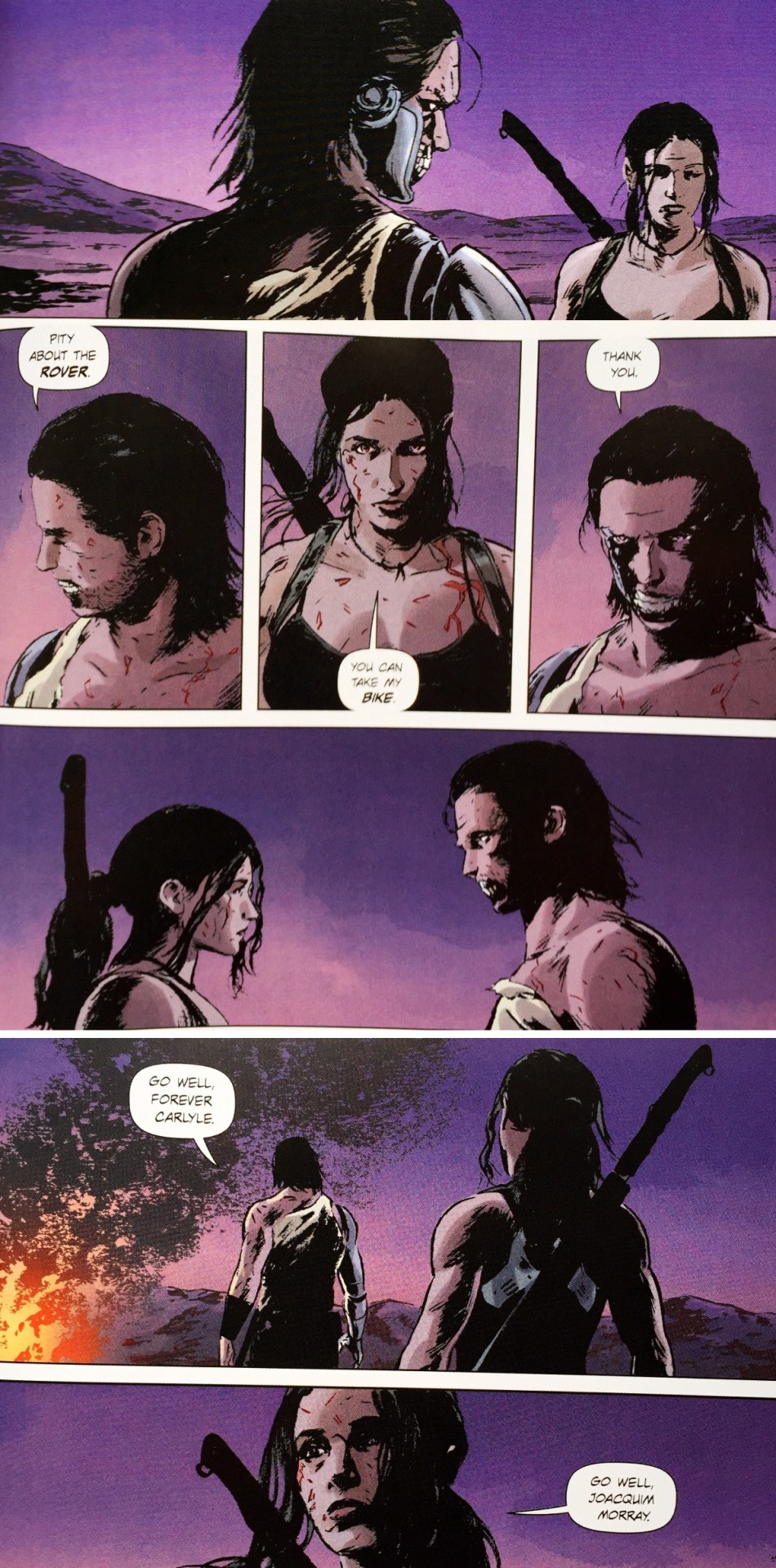
By the end of the second arc Lazarus has coalesced into something truly great. As well as flashbacks to Forever’s childhood the second arc also focuses on some regular people of this dystopian world. Giving the story characters other than Forever to sympathise with makes the story all the more engaging and also gives the creative team a chance to explore other facets of this fascinating world they’ve created. Lazarus has it all. A top-notch creative team, an interesting main character and a compelling hook which years of storylines can be built upon. Go read it.
Stray Thoughts
Lark’s design work is also great. The world of Lazarus looks very realistic while also including a lot of futuristic technology. His depiction of a dilapidated Los Angeles which has fallen to ruin due to the apathy of the Carlyle family feels particularly lived in.
Eric Trautmann is credited as designer on the book. He is responsible for the fantastic backmatter of the book which include in-universe adverts. The extra features of the hardcover are particularly fantastic, providing family biographies and a timeline of events. Design work is being given more and more emphasis in comic books these days, and with visually arresting results like this its not hard to see why.
Recommended Reads:
Gotham Central – Rucka and Lark’s most famous collaboration, with the amazing Ed Brubaker co-writing. This is a Batman series told from the perspective of the Gotham police Department. More like The Wire than Fox’s Gotham it shows what it’s like to be a cop in a city where most of the crimes are solved by a caped lunatic.
East of West – Jonathan Hickman and Nick Dragotta have created a vivid and imaginative world in East of West. It is far removed from the gritty realistic world of Lazarus but nevertheless takes full advantage of the world-building opportunities that Image makes possible. East of West is a futuristic tale of the apocalypse set in a world which diverged dramatically from ours during the American Civil War.
Deadly Class, Tokyo Ghost, Black Science, Low – Rick Remender is the one to beat at the minute with regards to world-building. His Image books are all unique and his collaborators are a murderers row of talent: Wes Craig, Sean G. Murphy, Matteo Scalera and Greg Tocchini.
#Lazarus#Greg Rucka#Michael lark#Santi Arcas#Eric Trautmann#owen freeman#forever carlyle#carlyle family#joacquim morray#image comics#image#comics#comic book#comic reviews#comic book reviews#comic recommendations#gotham central#renee montoya#tara chance#east of west#trade waiter#tradewaiterreviews#trade waiter reviews#100th post
2 notes
·
View notes
Text
Final Crisis
Following the final battle of the New Gods, Darkseid tumbles through time, coming to rest on Earth where he gathers together a vast army of super villains. Using the Anti-Life Equation he plans to enslave all of mankind. This epic battle against evil is the greatest challenge Earth’s heroes have ever faced with all of time, space and reality at risk of annihilation.
Written by Grant Morrison (Multiversity, Batman and Robin.), art by J.G. Jones (Wanted, Strange Fruit), Doug Mahnke (Seven Soldiers: Frankenstein) and more. Published by DC comics. Collecting Final Crisis 1-7, Submit 1, Superman Beyond 1-2 and Batman 682-683.
Spoilers revealed below.
In many ways Final Crisis acts as a swansong to the old DC Universe. Following the 2011 Flashpoint miniseries the old DCU ceased to exist and was replaced with the Nu52 continuity. This saw many of DC’s popular characters rebooted while others were more or less erased. 2008′s Final Crisis then is the last epic event which shows the old DCU in all its flawed glory. It is a sprawling tale which touches on practically every aspect of the Universe showing the fantastic storytelling possibilities that decades of continuity can provide, as well as how much of a barrier that can be to new readers.
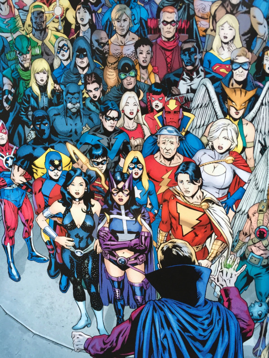
The basic plot of Final Crisis revolves around Darkseid rallying the world’s supervillains to his cause and using a mathematical formula, the Anti-Life Equation, to enslave all of humanity. In doing so Darkseid is able to defeat most of the Justice League with Batman and Superman both incapacitated for much of the story. As the world rapidly falls to Darkseid’s rule a resistance of largely minor heroes come together in order to battle the forces of darkness.
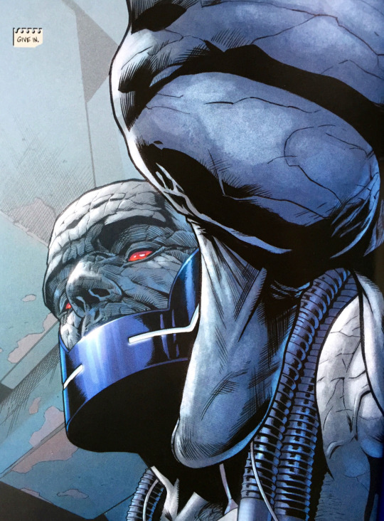
But this description does the story a disservice as Morrison has crafted a sprawling epic which includes everything from Anthro, DC’s prehistoric hero, to Kamandi, DC’s hero from the distant post-apocalyptic future. It also includes subplots as contrastive as The Question, a street level investigator, and a plot about the Monitors who curate the Multiverse. The expansive nature of the storyline demands a talented artist and J.G. Jones is an excellent fit for the story. Jones delivers impressive superhero spectacle as well as detailed expression work which keeps the focus always on the characters, weird and wonderful as they are. Unfortunately Jones was not able to complete the whole series alone, owing to the demands of deadlines, but he is more than ably assisted by a number of fill in artists and inkers including the fantastic Doug Mahnke who steps in for the final issue. Fortunately the story is immersive enough and that any artistic inconsistency can largely be overlooked.
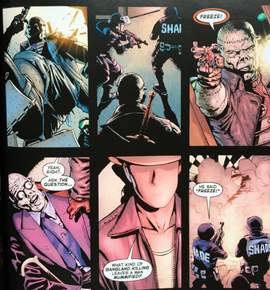
Morrison makes full use of the DCU and its storied history throughout Final Crisis. As mentioned, this leads to an eclectic cast of characters which spotlights minor heroes such as Mister Miracle, Green Arrow, Black Lightning and Captain Marvel Jr. to name but a few. There are also call-backs to numerous events in DC history which helps make Final Crisis feel like the culmination of decades of storytelling. The reappearance of The Flash, Barry Allen, is a direct link to the original DC event, Crisis on Infinite Earths, which saw the character perish. Whereas the original Crisis sought to fix the mess of continuity and multiple earths that the DCU had become, Final Crisis celebrates the complex web of storylines wholeheartedly, which the symbolic resurrection of Barry Allen attests to.
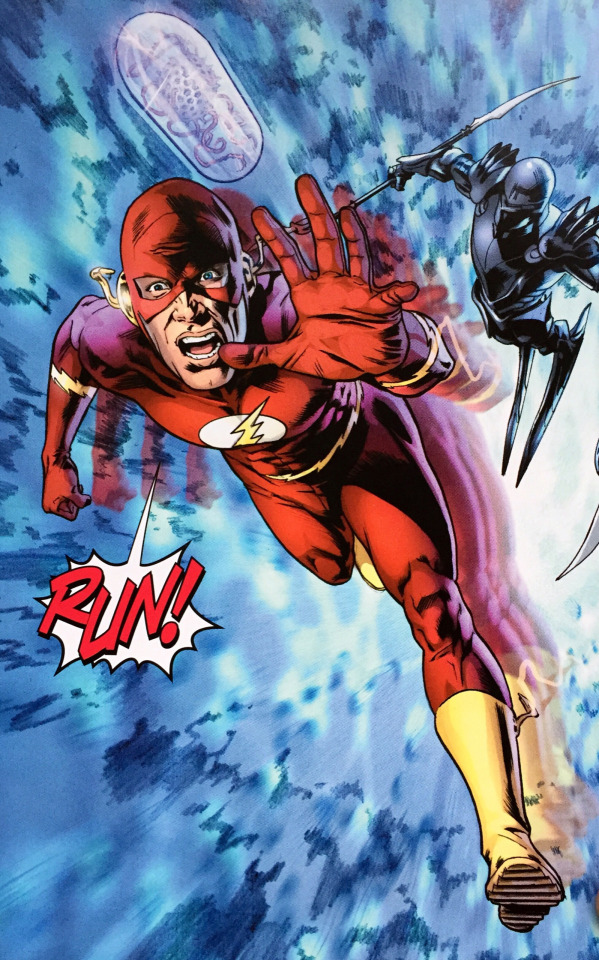
As you might be able to tell from all of the different story elements mentioned, Final Crisis is super dense. The trade has an especially nice heft to it as it also features a two issue Superman tie-in, a Black Lightning one-shot and two issues from the main Batman series. These tie-ins are essential to understanding the climax of the story and the Batman and Superman issues are great at spotlighting the World’s Finest duo who are largely absent from the main Final Crisis story.
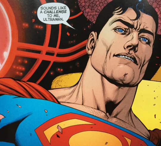
The Batman issues are also significant as they are a part of the larger Dark Knight saga that Morrison is telling and Final Crisis features the ostensible death of Bruce Wayne. Batman is side-lined for much of the story as a captive of Darkseid and the tie-in issues show Darkseid’s minions Mokkari and Mister Simyan attempting to clone an army of Batmen. To do this they hook him up to a parasite which catalogues his memories onto a database in an attempt to retrieve the necessary psychological information for their clones. This allows artist Lee Garbett to draw a concise history of Batman, giving him the opportunity to recreate many iconic moments. This story, though only tangential to the larger Final Crisis story, is fairly significant in terms of Morrison’s Batman run. It is a continuation of what he did so well in Batman R.I.P. insomuch that he is able to weave together the disparate incarnations of Batman that have appeared since 1939 into a cohesive whole. More specifically this entails retconning some of Batman’s wackier adventures into hallucinations brought about by repeated gas attacks from the likes of Joker and Scarecrow. Overall it makes for a surprisingly affecting story which distils Batman down to his heroic core: a superhumanly determined individual who can overcome any obstacle.
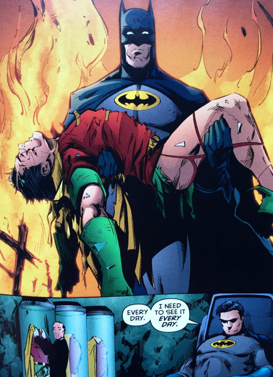
In the end Batman is able to turn his memories into a weapon (of course he is) and overcome the parasite. This results in his escape and reappearance in the main Final Crisis story where he shoots a God-bullet out of a gun in order to stop Darkseid once and for all. Batman’s use of a gun is meant to underscore the gravity of the situation and certainly feels in character, though Morrison faced some criticism about this choice at the time.
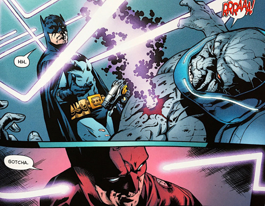
As sprawling and epic as the story is it does serve to highlight the accessibility problems that the old DCU suffered from. Morrison does not spare much time for exposition and concepts and characters are given little introduction or explanation. To the DC hardcore any explanations would be unnecessary but to someone who is only familiar with Batman, Superman and maybe Green Lantern, things like the Orrery of Monitors, The New Gods and why there are three different Flashes running about might require a bit of explanation. It’s more or less there in the text, but damn, to the uninitiated expecting to see Superman punch some goons this is basically gibberish. (Even I was sent down the occasionally wiki-hole trying to work out who characters were. Even I.) When a story which relies on this much insider knowledge is your tentpole story for the year, it’s not difficult to understand where the impetus for the Nu52 came from.
Despite needing a degree in DC lore to fully appreciate it, if you are able to get into the story it is an incredibly rewarding and satisfying read. It’s a grandiose epic that covers practically all the corners of the DCU and shines a spotlight on many minor players that don’t always get their chance to shine but are very compelling in their own right (here’s looking at you Tattooed Man). Following numerous harrowing defeats the heroes overcome the odds in a way that is inevitable but somehow still surprisingly unexpected. Truly Morrison’s story celebrates all there is to love about the heroes and villains of the DC Universe.
Stray Thoughts
The Superman Beyond story included in the trade is as dense and as filled with big ideas as the rest of Final Crisis and would probably take another 1000 words to unpack. Your best bet is just experiencing it for yourself.
Final Crisis kicks off with Darkseid having already won a great battle against the New Gods, something which entirely happens off panel. This recalls the original first issue of the Jack Kirby’s New Gods which began with the unspecified Old Gods dying in a fiery holocaust.
Morrison also builds upon a lot of the elements he introduced in his earlier DC work such as 52 or the fantastic Seven Soldiers of Victory. Keep your eyes peeled for some neat Seven Soldiers cameos in the story.
Spoilers: Batman totally isn’t dead. Haven’t you read Batman R.I.P.?
Recommended Reads
Crisis on Infinite Earths – From a time when DC continuity was even more convoluted. The original Crisis is perhaps best read with an understanding of its historical context of trying to fix the DCU’s manifold continuity problems.
Batman and Robin: Batman Reborn – Following the assumed death of Bruce Wayne who is left to keep the streets of Gotham safe? The Morrison Batman train keeps on rolling with art from frequent collaborator Frank Quitely.
Infinite Crisis - This is the one where Superboy goes mental and punches a hole in reality. Recommended on this basis alone.
#Final Crisis#Grant Morrison#J.G. Jones#doug mahnke#lee garbett#dc#DC comics#DC Universe#Nu52#continuity#Batman#Superman#The Question#Black Lightning#Darkseid#The Flash#The New Gods#Mister Miracle#Green Arrow#Grant Morrison Batman#comic review#comics review#comic book reviews#comic book#comics#trade waiter#tradewaiterreviews#Crisis on infinite earths#barry allen
6 notes
·
View notes
Text
The Private Eye
Years ago the digital cloud burst and exposed everyone’s secrets. Now in the year 2076 privacy is the most important aspect of life and everybody has a secret identity. The Private Eye follows an unlicensed P.I. who is thrust into the most important case of his career, which will threaten the privacy that society has fought so hard to secure.
Written by Brian K. Vaughan (Saga, Y The Last Man). Art and letters by Marcos Martin (Batgirl: Year One, Doctor Strange: The Oath). Colours by Munsta Vicente (She-Hulk). Published by Panel Syndicate & Image Comics.
Major Spoilers discussed below.
The Private Eye is set in a world where privacy reigns supreme. Years earlier for some unknown reason, everyone’s personal details that were stored online became widely disseminated. This led to people’s careers, reputations and relationships being ruined as things such as their personal search history became common knowledge. This caused a seismic shift in society where people’s privacy became of the utmost importance. It also led to the disabling of the Internet. Brian K. Vaughan and Marcos Martin have created an incredibly intriguing sci-fi world with The Private Eye; one that is rich with storytelling potential. Not only that, they’ve challenged traditional comic book and publishing conventions by initially releasing The Private Eye as a digital only comic on their site Panel Syndicate where readers can pay what they want for the book. That’s right. A comic about a world with no internet was originally only available online.

However it has now been released in a beautiful hardcover edition produced by Image. What this edition lacks in irony it makes up for in gorgeousness.
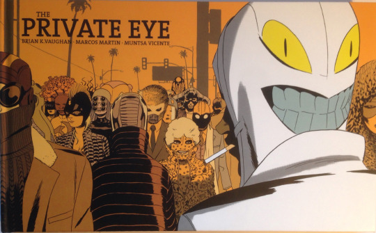
Brian K. Vaughan is a writer well known for delivering stories with compelling hooks. While he’s perhaps best known these days for critical and commercial darling Saga, he first rose to prominence with the release of Y: The Last Man in 2002. Published by Vertigo, Y’s premise was as simple as it was brilliant: all the men in the world die at once, apart from one. Similarly his 2004 Wildstorm series Ex Machina had an equally simple and inviting premise: the world’s first superhero becomes Mayor of post 9/11 New York. In terms of great science-fiction concepts The Private Eye easily ranks amongst these two.
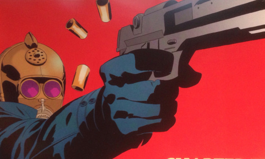
BKV’s work has always contained elements of social and political commentary and The Private Eye is no different. The concept of privacy is obviously front and centre here but BKV also addresses contemporary fears about the Internet and its effect on society. Indeed since The Private Eye was first released there have been a number of high profile data leaks such as Ashley Madision and Sony reminiscent of “the cloudburst” from this story. But it’s through the absence of the Internet that its effects are really explored. In a world without Internet people are seen to be reading a lot more books, advertising has returned to billboards in a big way and instead of building things online people have started making actual things again leading to many technological advances. Furthermore, without the Internet, the Press has become the most important institution in America and “The Fourth Estate” has supplanted the police as law enforcement.
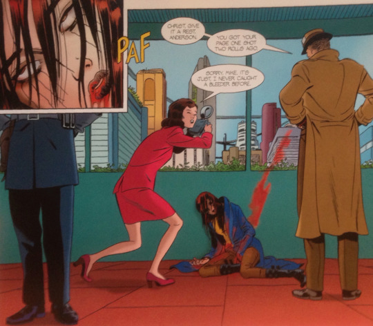
This Internet-free world is expertly crafted by Spanish artist Marcos Martin. The hardback edition features some private emails between Vaughan and Martin which give insight into the artist’s considerable contributions to the book. It was Martin’s idea to publish the story online as a “pay what you want comic”, and while this opens up a new potential avenue for creators it also means that pages do not need to conform to the typical page dimensions of a comic book. Martin has specifically drawn the book with digital reading in mind, which has translated to a very widescreen reading experience. This means that the hardcover looks more like Frank Miller’s 300, format wise, than most other comic books.
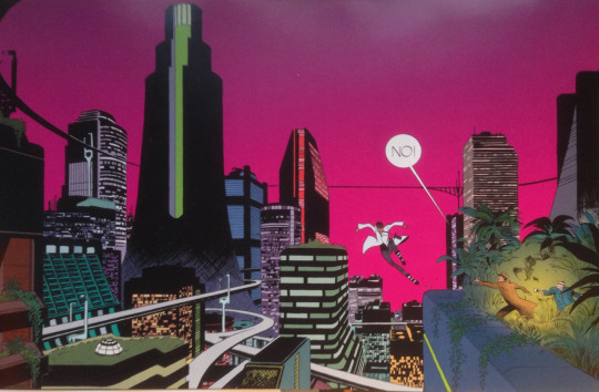
Martin’s art hugely benefits from the larger page size. The bigger dimensions mean that the creative team can pack more story onto a page and it also means that Martin’s art appears larger which makes for a more immersive read. Martin’s knack for drawing environments benefits the most from the widescreen page layout as it helps beautifully depict the neo-noir city landscape that the story takes place in. An inventive chase sequence in chapter 5 also shows Martin very cannily using the format to portray a scene which would be impossible to do in an ordinary comic.
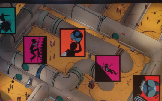
One of the main features of the Private Eye world is that everybody has a secret identity and a disguise to wear in public to protect their privacy. In our world people can create an anonymous username to do whatever they like online. The Private Eye has people doing this in real life due to the absence of the Internet. As long as they are over the age of 18 people can give themselves a new name, or “nym”, and disguise themselves however they like in order to explore any kind of religion, sexual practice or cultural trend that they are interested in without fear of people finding out about it. These nyms give Martin the opportunity to draw tons of weird and wonderful character designs, many of which are only ever glimpsed in the background of panels. This also gives colour artist Munsta Vicente the opportunity to really run wild with her palate and the multi-coloured people in the story contrast well with the occasionally noir-ish environments.

What is interesting about the story is that the creative team do not state that this Internet-less, ultra-private world is necessarily worse than the world we live in today. In fact the motivation of the main villain, Khalid deGuerre, is to bring back the Internet. He also murders a bunch of innocent people along the way to reach his goal. This has an interesting effect on the audience because we want to see the protagonist P.I. succeed in catching deGuerre but at the same time it’s easy to sympathise with the erstwhile villain who wants people to use the Internet to see the world for what it is and not just the way the Press portrays it.
With The Private Eye Vaughan and Martin have built a fascinating world to tell their story. At its heart the story is a sci-fi murder mystery but you don’t have to look far to see that it’s also a captivating exploration of the digital world we currently live in. It is also beautifully rendered by Martin who takes full advantage of the unique distribution method to create spectacular pages. Overall The Private Eye is a very thought-provoking read that comes highly recommended.
Stray Thoughts:
The story ends on a great final page which I won’t spoil here.
The best character is inarguably Gramps: a now elderly millennial. Covered in tattoos, riddled with ADHD due to all the pharmaceuticals he took in his youth, addicted to video games and prone to spouting pop-culture references. He serves as a great contrast to the main characters who have always lived in a world without internet.
Didn’t mention Munsta Vicente’s colour work much but she really does help the artwork pop and perfectly sets the tone for the story.
Recommended Reads:
Barriers – Vaughan and Marcos have released a new comic this week through their Panel Syndicate site. Just like The Private Eye its “pay what you want” so there’s really no excuse for not reading it.
Paper Girls – It’s early days for BKV’s latest with issue 3 having just came out. I can safely say I have no idea what’s going on thus far. It’s a bit like Stand By Me meets War of the Worlds but that description is probably only scratching the surface. Gorgeous artwork from Cliff Chiang
Doctor Strange: The Oath – Another Vaughan/Martin outing. Probably the best modern Doctor Strange story. Great Ditko-esque visuals from Martin.
#The Private Eye#brian k. vaughan#bkv#marcos martin#munsta vicente#panel syndicate#image comics#nyms#cloudburst#privacy#p.i.#khalid deguerre#patrick immelmann#raveena mcgill#barriers#comic book#comic book reviews#comics#comics reviews#trade waiter#tradewaiterreviews#trade waiter reviews
1 note
·
View note
Text
Miami Vice: Remix
Iconoclastic creators Joe Casey and Jim Mahfood take the ‘80s classic TV series Miami Vice and remix it for a bold new audience. A new drug is on the streets and it is zombifying its users. Luckily Vice Detectives Sonny Crockett and Ricardo Tubbs are on the case. Featuring alligators, voodoo crime lords, disco psychosis and the Godfather of Soul.
Written by Joe Casey (Sex, The Bounce). Art and letters by Jim Mahfood (Clerks). Colours by Justin Stewart and Steven Chunn. Published by Lion Forge Comics and IDW.
Spoilers revealed below.
Licenced comics are a strange beast. Comic books based on TV shows and films have existed since the dawn of the industry when Dell Comics used to publish Disney books. Nowadays most of the main publishers, outside of Image, have licenses of some form. These range from nerd appropriate fare such as Buffy the Vampire Slayer and Star Wars to more child-oriented titles such as Adventure Time or Looney Tunes. These licences make sense. The audience for these titles are easy to identify. Who is the audience for a Miami Vice comic?

Lion Forge Comics are a publisher who own the rights to a hell of a lot of eighties properties. These include Knight Rider, Airwolf and (bafflingly) Saved by the Bell. Since their business model seems to be “remember the eighties?” they also have the Miami Vice licence, perhaps the most eighties title of them all. In 2014 they put out a digital only Miami Vice comic which was more of a direct adaptation of the TV show and which didn’t make much of a splash. The announcement of Joe Casey and Jim Mahfood on the property managed to peak a lot of peoples’ interest however. Clearly the audience for this title is “people who like weird things”.

Both Casey and Mahfood are known for their unique sensibilities which makes them unusual choices for a licenced comic. Furthermore, the subtitle “Remix” indicates that this is not going to be be a straight-laced adaptation of the show. What Casey and Mahfood have done is create a kinetic, neon, disco-fied ode to the original Miami Vice, ratcheting everything recognizable about the show to 11. In doing so they push the boundaries of what licenced comics can be.
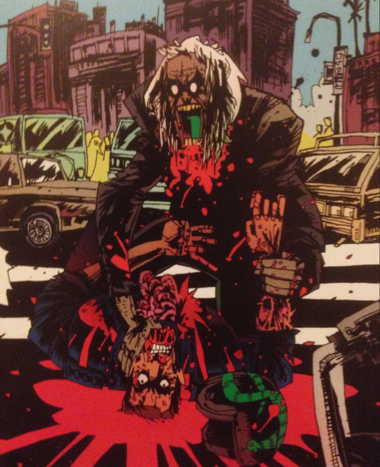
The basic plot of the Miami Vice TV show is that of two cops in stylish suits stylishly fighting crime in Miami. With that in mind Joe Casey’s script is very much in-keeping with the spirit of the show. He merely cranks up the weirdness. The plot includes a Voodoo drug lord, an ex-con out for revenge (who inexplicably gains a robotic hand over the course of the story), multiple decapitations and a sequence where a police lieutenant goes full Rambo on a pimp’s headquarters.
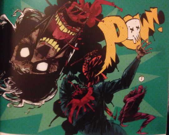
All of this carnage is fantastically delivered in Jim Mahfood’s heavily inked style. Mahfood’s work is like Gabriel Ba’s by way of Bill Sienkiewicz. Mahfood is unlikely to ever get a job illustrating the next arc of Marvel’s Star Wars but his style is perfect for the hyper-violent plot of Remix. He infuses every scene with a manic energy which suits the frantically paced storyline very well and his artwork has enough grit to it to prevent anything from becoming overly cartoonish. Mahfood also hand letters his own work which again gives his panels a frenzied look to them, albeit sometimes at the expense of clarity.

Justin Stewart and Steven Chunn are on colouring duties for the series and unsurprisingly considering the super eighties vibe of the series they opt for a lot of neon. Hot pinks and fluorescent greens punctuate the otherwise shadowy story, with the occasional bouts of kaleidoscopic colour appearing during big action scenes, which again adds to the kineticism of the art.

One of the main problems with licenced comics is that at the end of the story all of the toys have to be put back into the box. Han Solo is never going to die in one of Jason Aaron’s Star Wars issues because that’s the kind of story they would reserve for a film plot. So there is often a sense of licenced comics being fairly inconsequential. While Miami Vice: Remix certainly allows the creators more freedom than most licenced comics they nevertheless return the characters to the status quo at the end of it. Indeed the main story doesn’t even reach a satisfying conclusion with the main villain escaping. Whether this points to more Remix stories from the same team remains to be seen, but as it stands it leaves the story feeling anti-climactic.

In the end Casey and Mahfood have created a singularly unique read that is both recognizably a Miami Vice story but also unlike anything else the franchise has ever seen. The main attraction is undoubtedly Mahfood highly stylized artwork which helps emphasise the general craziness of the story that Casey is telling. Unfortunately Miami Vice: Remix falls into the same pitfalls of all licenced comics by returning to the status quo at the end of the story, but nevertheless it’s enjoyably manic while it lasts.
Stray Thoughts:
I have already written about the greatest licenced comic of all time: Archie vs. Predator, which has potentially ruined all future comics for me. Another great thing about AVP is that it definitely does not put the toys back in the box at the end of the story.
Since discovering a Saved By The Bell comic exists I am now supernaturally compelled to hunt it down.
James Brown appears in a sequence where Tubbs tests out the new drug. It is very weird but is apparently a callback to when the real James Brown appeared on the show as an alien. Or something
I have no idea if hard-core Miami Vice fans will love or hate this comic.
Recommended Reads:
Miami Vice – Fans of the original series, looking for a more traditional Crockett and Tubbs should probably check out Lion Forge’s less insane adaptation.
Sexcastle – Kyle Starks homage to 80s action movies. For people who both unironically and ironically love films such as Road House.
Saved By The Bell – Sure why not?
#miami vice remix#miami vice#joe casey#jim mahfood#justin stewart#steven chunn#idw#lion forge comics#lion forge#sonny crockett#rico tubbs#crockett and tubbs#don johnson#comic books#comics#comic book reviews#comics reviews#trade waiter reviews#tradewaiterreviews#Trade Waiter#saved by the bell
0 notes