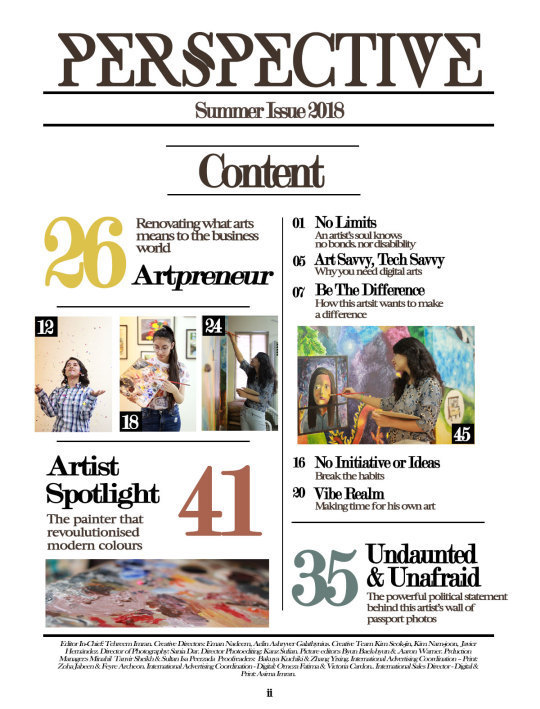
tehreems-portfolio
Foundation Portfolio
PLAN. EXECUTE. INSPIRE.
63 posts
Don't wanna be here? Send us removal request.
Last Seen Blogs


Text
Foundation Portfolio Pt. iii - Double Spread (Refined Version)
The only major change I made to the double spread was that to the content box. I felt that the content box was taking up a lot of negative space and so I decided to utilise the entire right side of the second page of the double spread. I opted for variating the the typography by using bright red and yellow to make the heading and sub heading of the content box stand out as well as add to the aesthetics.
For I had only needed to make minor change in the footer which I over-layered on the content box and changed the colour of the page number to make it visible and clear.
Foundation Portfolio pt. 3: Double Spread of my Art & Culture Magazine

0 notes
Text
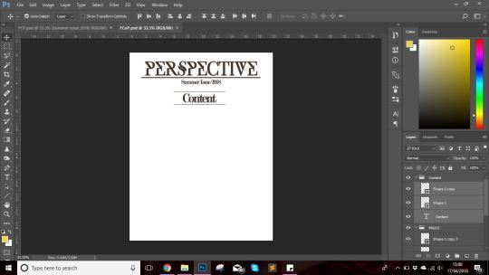
Foundation Portfolio Pt. ii - Content Page (Refined Version)
For the content page the first major change I did was that I incorporated the article title style that I had used on the left onto the bottom of the right column. This was because the right hand side seemed dull in comparison to the left hand side which had diversity in its design as well highlighted articles to make it seem interesting and draw the readers attention. Additionally both sides seemed too different from each other.
The second change I made was that I added colour to my content page as it seemed kind of text bookish due to the lack of colours. After discussing with my teacher, I followed his suggestion and changes the page number of the main articles to the colours nearest to it in the images for the highlighted articles to keep the colour scheme of the content page more aesthetically pleasing. For the cover story, however, I used the colour palette of the cover page to create a sense of familiarity and hence attract the reader’s attention.
Foundation Portfolio pt. 2: Content Page for my Art & Culture Magazine
0 notes
Text
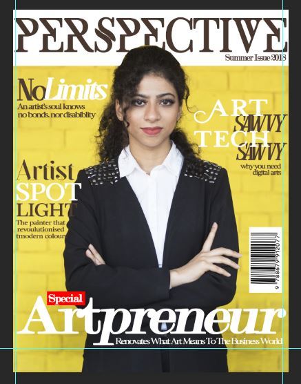
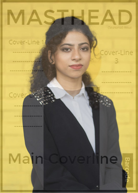
Foundation Portfolio Pt. i - Cover Page (Final/Refined Version)
Seeing though I was done with all three portions of the foundation portfolio, it was time add the final touches to it. In order to refine the it, a discussion was held in my class in which my teacher individually discussed and gave his input on our work and gave us recommendations of how to make it better and give it the fine finish that it needed.
Firstly, I added my magazine genre near the top left of the magazine below the masthead since I felt that the space felt empty. Moreover, this also helps readers immediately recognise the genre hence allowing drawing the target audience’s attention. Keeping with the house style I used Modern No. 20 as my typeface. Additionally, I decrease the size of the date/issue number since its conventional size is smaller than the one I had set.
Secondly, I made changes to the cover-lines. The cover on the right side ‘Art Savvy Tech Savvy’ was taking up too much space and looked crowded. Furthermore, it was somewhat disturbing the house style of the typography. Therefore I changed the alignment and the typeface by using the less flashier version of Lucy Rose font and by reducing the size. Besides that, I variated the typography of the second cover-line on the left as it had previously seem too congested, making readability poor. I also used the Line tool to create a divider between the cover-lines on the left to make both cover-lines stand out in their way without making it look haphazard.
And lastly, I reduced the size of the barcode since I had not realised earlier that I had made it too prominent and unnecessarily big.
Foundation Portfolio pt. 1: Cover Page of my Art & Culture Magazine

0 notes
Text
Foundation Portfolio Pt. iii - Magazine Double Spread
Starting with the third and the final part of the foundation portfolio, I was a bit nervous since I had never done it before and it seemed intimidating at the time. Nonetheless, I initiated the production of the final piece to my foundation portfolio.
Step 1:
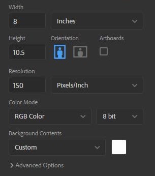
Opening up Photoshop, I clicked on ‘New’ from the drop-down File Menu on the left hand side of the horizontal bar at the top from where the following pop-up menu appeared. Since it was the double spread i.e., two pages instead of one, the height needed to remain the same while the width was doubled.

I was told that many had made the mistake of doubling both the height and width only to realize their mistake later on. Needless to say some of my classmates did not fail to disappoint much to my teacher’s dismay/amusement.
Seeing as though, I had kept the resolution to 150 pixels/inch for the content page and the cover page, I decided to stick with it for the double spread seeing as though it would otherwise be considerably heavy for my system. Moreover, I repeated this for Colour Mode as well by using standard RGB colours and a 8 bit depth. Once all this was sent and the background colour was set to white, I pressed ‘enter’ to create the base layer.
Step 2:
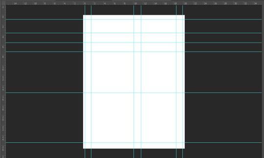
Once the base layer was made, I pressed Ctrl ‘R’ to activate the Ruler tool. Since I had two column layout for each page, I started by first dragging a vertical ruler to the center of the base layer, followed by dividing each page into halves to give a rough sketch to the placement. Then I placed vertical rulers ad a horizontal ruler (bottom) on the edges of the base layer to make sure that I would not accidentally write something beyond the line as it would get missed out in the print and would not look professional.
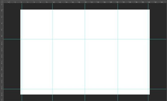
Since I had been called away for the Student Council meeting during my class, me and my co-rep were not aware that you had to make the lines differently i.e., for each line/ruler you also place one additional ruler on each side of the line to act as margin for the text. Nonetheless no harm was done either way and thankfully so, it did not hinder my project in anyway.
Step 3:
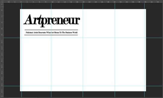
For the title and the stand-first, I followed my planned layout. Using the Type tool from the left vertical toolbar, I clicked near the top left of the base layer and typed the title ‘Artpreneur’ using Modern No. 20 serif font. The reason why I used this font was because I loved the elegance in its presentation and additionally to maintain house style to make audiences familiar.
I italicized ‘prenuer’ to match the title on the cover page and content page to create familiarity and to immediately catch reader’s attention.
For the placement of the stand-first, I had kept it conventional i.e., below the title of the editorial because it keeps the readability easily and does not create disturb the continuity of the editorial. To make the sub heading stand out I used the Line tool to create two vertical dividers to separate and highlight the stand-first, keeping a suitable margin so that the stand-first did not seem too conjuested
I changed the stand-first from ‘Pakistani Artist Renovates What Art Means To The Business World’ to ‘Business Major Sana Atta-Ullah, turned artist-entrepreneur, shows how vital it is to bridge the gap between art and business’ since that was what I had originally written as the description for the final article of the double spread and had mistakenly wrote it at first.
Step 4:
Next came the body copy i.e., the main text of my editorial. This was something that I had struggled with the most since I was not a hundred percent confident with the layout. However, after trying and failing to like any I chose to go with my mock up sketch for the double spread.
Since I needed paragraphs for the body copy, I selected the Type tool and instead of clicking to open the text box, this time I dragged to form a text box, giving it the dimensions I needed. This allows the typed text to be neatly arranged along the margins making the body copy’s appearance more sophisticated.
The typeface for:
Title/Heading/Caption: Modern No. 20
Stand-first/Sub-heading: Modern No. 20
Body Copy: Baskerville Old Face
Quotation: SF Kingston
Credits: Baskerville Old Face
Footer: Exodus
All of which are serif fonts to help maintain house style of the magazine.
Colour palette also was that of the cover page of the magazine. This makes the article unique and hence draws reader’s attention.
When I had copied and arranged all the text, it appeared messy and lacked the usual alignment that a magazine has. Therefore, I inquired from my teacher and from the Character icon on the right side of the screen, second last on the vertical bar, I opened up Character and selected ‘Paragraph’ from where I changes the text alignment from left align text to justify last left. This immediately changes the appearance of the double spread.
For the quotations, I again used the same procedure with the Type tool and used SF Kingston serif font. The different and bigger typeface makes the quotes stand out and also help to make the article more captivating and eye-catching. Which is why I had included one on both pages. Moreover I had used two additional type boxes so that I could overlay quotation marks for decorative purposes. I used the same hue of yellow as on the cover page to create an aesthetic look and to make it easier for readers to identify the cover story.
After I had written my body copy I used the Polygon tool to create the end of proof, or Q.E.D. mark "∎" to denote to my readers that they have reached the end of the article.
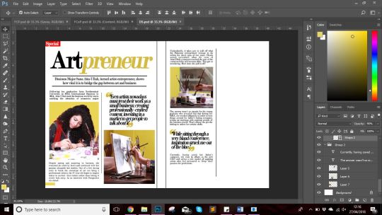
I had added the ‘Special’ in the left corner of the double spread seeing as though it would catch the attention of the readers even when the magazine closed, prompting the readers’s curiosity and hence captivating their attention. Additionally, it also helped fill up the negative space above the title and helped relate the article to the cover itself. The bright red of the rectangle immediately stands out against the muted tones of the magazine house style.
Step 5:
With body copy done, I added the photographs after editing them in Photoshop to match the colour scheme of my article. For the first anchoring picture, I used one that was quite similar to the cover page as sort of an introductory photograph before moving on to the passage itself.
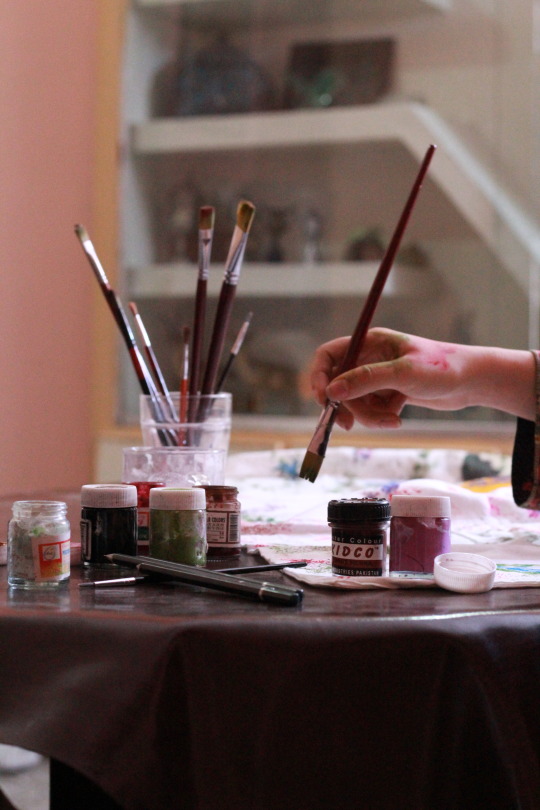
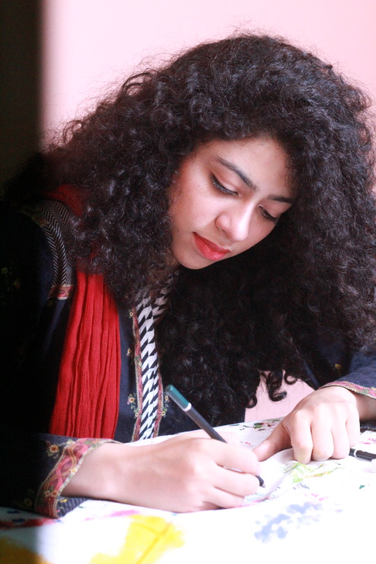
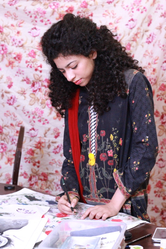
The second and third image I used as a sort of iconography and to add to the aesthetic of the double spread. This was also to show the side of the model that I had not shown on the cover page i.e., her artistic side.
The last image i used as part of the content box to short of develop a direct relation to the audience and to make it feel as if the model herself was delivering her message to the reader.
Step 6:
Since I had an entire column left on the right side of the right page, I decided that it was time to officially panic before realizing that I could utilize the space for a content box. Hence, I slightly deviated from my mock-up sketch considering that I initially had no plans for making one.
Regardless, I decided to make the content box more of a direct message/life advice related. For this I used the Rectangle tool to make a black rectangle (clearly differentiating it from the rest of the body copy) and used a blend of Modern No. 20 and Baskerville Old Face for the typography.
Step 7:
For the footer of the double spread, I followed conventions and placed the masthead on the left page in its house font and placed the page number on the right page, for repetition to create familiarity and for ease of navigation respectively.
Again I used the Line tool to create a line as the decorative along the footer to add to the visuals of the double spread while easily drawing the reader’s attention to it.
I also added a drop-cap later on to draw the attention of the readers towards the beginning of the passage and to help them navigate. For this I had to rearrange the text by creating a text box of a custom shape.

All that was left now was the refined version of each part of my foundation portfolio.
0 notes
Text
Foundation Portfolio Pt. ii - Magazine Content Page
Though I had not pre-planned my content page, I had a few ideas for my content page.
Step 1:
Again variables like the dimensions had be the same as the cover page because they were from the same magazine thereby it simply would not make sense for the content page to have different dimensions. I kept the resolution 150 inch/pixel and the colour mode of 8 bits since the content page it more about functionality than the aesthetic itself.

Step 2:
Once I press ‘enter’ I had my plain white base layer of 8in*10.5in before me. The first thing I did was press Ctrl ‘R’, which make the ruler visible. Next I dragged lines from the vertical and horizontal ruler to adjust my alignment and create a rough draft of what was in my head. (shown below)
Step 3:
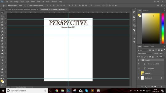
In my content page I had decided to include the masthead and the date/issue number, using the same typeface since repetition creates familiarity with the house style and the magazine itself. Additionally, it creates a more professional and sophisticated outlook, while drawing the audience’s attention as well. Using the Type (’T’) tool, I clicked at the top of the base layer and wrote the masthead ‘Perspective’ inside the text box using ‘Exodus’ font in a slightly smaller font than that i used for the cover page; 59.67 pt for content page and 73.69 pt for the cover page.
I opted for placing the date/issue number right below the masthead as it would captivate the reader’s attention. Further more following the house style I chose to keep the colour of the masthead and date/issue number on the content consistent with that on the cover page’s. This again creates a sense of brand and familiarity amongst readers.
Using Ctrl (;), I was able to make my rulers disappear for when I would need them later since they could easily reappear using the aforementioned keys.
Step 4:
Next I decided to place the ‘Content’ title. After sorting through different alignments, I opted for the center alignment for the placement of the title since I had planned to create a two column layout for the text (headings, page numbers, article descriptions and any highlighted article) present on the page. For the ‘Content’ title i used Modern No. 20 as the typeface.
Next I wanted to highlight and separate the masthead and date/issue number from the Content title hence I utilized the ‘Line’ tool (present in the vertical toolbar on the left near the bottom, above the ‘Hand’ tool) to create a sort of divider to make each element stand out without looking haphazard and mixed up.
I gave the ‘Content’ title two vertical borders so that it would immediately standout for the audience and it would help them navigate since they would immediately know that it was the content page.
I later changes ‘Content’ to ‘Table of Content’ only to change it back since it seems text bookish rather than something you would see in print media like magazines
Step 5:
Now it was time to move on to the arrangement of text on the content page. With that being said I pressed Ctrl (;), making the rulers visible and rearranged them. Following after, I started with my cover story by placing on the left side of the center partition, seeing as though it should be the first article to capture the any viewer’s attention. For the typeface I chose to use Modern No. 20 for the title/heading and page number, while using Luzia for the description. The reason behind this was to create brand familiarity by maintaining house style.
I useful tip that my teacher gave to my class was to zoom in and compare the file to the actual size of the print by holding the paper of our required dimensions next to it since often times, the text comes out looking too big or too small seeing as though the screen size varies.
I had opted to go with a two column layout in order to stick with the conventions seeing as though most of the Art & Culture magazine that I had come across had a very neat and minimal layout with text like letters from the editors absent. They had highlighted articles and anchoring images present which I plan on including; about four or five.
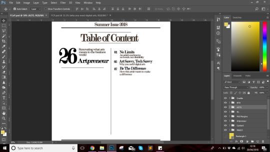
I had decided to keep the right hand more functional by including the articles whose titles and inspiration I had taken from my rejected cover story ideas.
Another thing I did, which was tiresome but rewarding was that I arrange each article title, its description, and page number with in its respective group. This made copying the layer to give the following look a lot easier.
Additionally, I had copied the layers by simply selecting it and drag it with the mouse while holding Alt. It definitely made my work easier considering the number of layers I would have had to make manually.
At the end result, I had a neatly arranged layout on the right hand side of my content page. I had left a space in between 07 and 16 so i could add an anchoring image to add some colors and aesthetic to the right side of the content page.
Right side:

Left side:

For the left hand side I kept a more aesthetic look, and kept the mid section empty so that I could later add to the three anchoring images that I had planned for. Keeping up with the house style I used Modern No. 20 for the article title and the page number and Luzia for the article description.
Step 6:
The next thing I added, was the footer; the team credits and the page number. For the team credits I followed conventions and placed it above the footer and separated it by placing a divider above it which I made using the Rectangle tool. I used the serif font ‘Baskerville Old Face’ which I italicized to make it standout individually and make readability easier and creating a professional look.
For the page number, I used roman numerials for the starting four pages to indicate that they are not a part of the articles and are simply preset for functionality and to aid readers in navigating to their article of interest.
For the team of my magazine, I chose individuals from various backgrounds as I had wanted my magazine to represent stories from all cultures, ethnicity and background, seeing as though I had chosen International audiences as my secondary audiences. Having a team with diversity meant that not only would it help my magazine to grow but it also be able to give a more accurate picture; through the eyes of a local rather than a stranger.

Step 7:

For the anchoring images on the content page, I conducted a shoot in school from 8am to 1pm on the 26th of April. I had used natural lighting or florescent bulbs as the key light source since I found it sufficient and used my Canon EOS Rebel T6/1300D and utilize my prime Canon EF 50mm f/1.8 STM Lens as it provides Aperture Priority and hence was able to complete my shoot with the help of my friends. For this shoot, I had come up with ideas some by taking inspiration from Pinterest and some off the top of my head.
Throughout my day I had conducted my shoot which I had split for each models i.e., my friends Manal, Khizra, Omeza. For each of the shoot I had come up with different ideas and had asked for my friend Sania and Khizra’s advice since their aesthetic sense its quite good.

At the end of the day, I short-listed the pictures and got this result:

This was the outlook for now, but like the cover page, a refined/final version was all that was left.
0 notes
Text
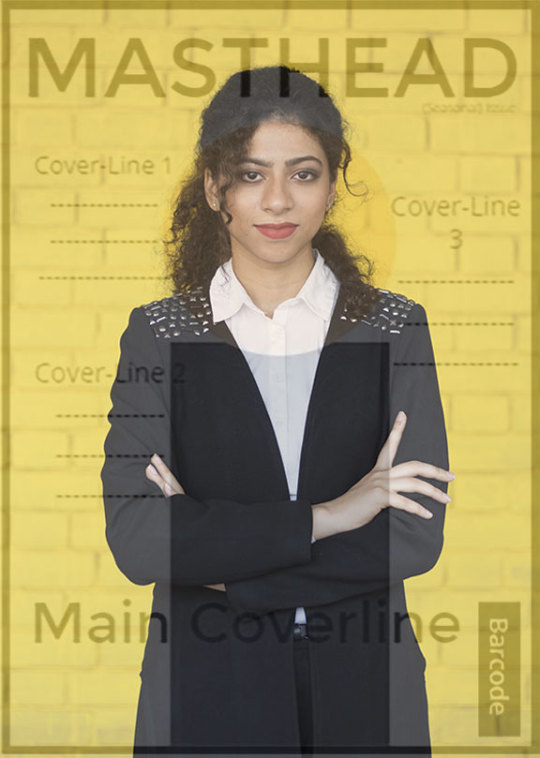
Foundation Portfolio Pt. i - Magazine Cover Page
After months of research and practice, it was finally time to start the first part of my foundation portfolio i.e., the cover page of my Art and Culture Magazine.
Step 1:
Opening up Adobe Photoshop, I clicked on the File Menu on the top left of the screen and selected ‘New’ (Ctrl N for shortcut) and the following pop up menu appeared.
Unlike last time, I had already decided on the dimension of my magazine i.e., 8 in by 10.5 in since I had been planning my project for months. I kept a resolution of 150 pixels/inch and RGB colour of 8 bits since I didn't want the file to be too heavy for my system and still retain good depth and colours.
Step 2:
After pressing ‘Create’ at the bottom of the pop-up menu, I had a file of 8in by 10.5in with plain white background.as the base layer for my cover page. The next step was to add the cover photo itself. From the File Menu I pressed ‘Open’ (Shortcut: Ctrl O) and selected my image from its allotted folder, which appeared as below.
Step 3:
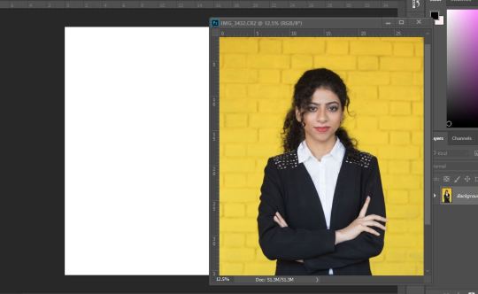
Next I selected the Move tool from the vertical toolbar on the left and clicked on my cover photograph. While holding it, I moved it to the white base layer. Given that the cover photograph was too large to fit in the base layer, it needed resizing. By holding Ctrl and pressing ‘T’ key, the transformation tool was activated (show below).

This allowed me to adjust my photograph to the one shown below.
While transforming the photograph, I had been careful to only drag it from the corner while holding the Shift key so that the ratio of the photograph would not end up distorted.

Step 4:

Once I had adjusted the photograph, I pressed Enter to close the transformation tool. After that I moved on to the typing the masthead of my magazine. For this, I utilized the Text tool (shown above in the lower half of the vertical toolbox as ‘T’).
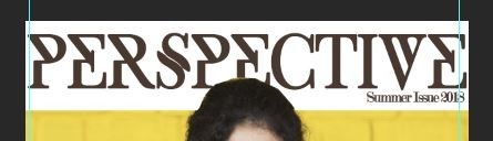
I had opted for ‘Perspective’ as the name of my Art and Culture Magazine due to the reason that it represented the ideology of giving a platform to individuals; allowing them to share their stories and their abstract view points.
After selecting the Type tool, I clicked on the top of the cover photo and wrote the masthead i.e., Perspective. Since the title of my magazine was lengthier than the norm, I went for a contrast colour (blackish-brown) to make the masthead stand out.
I had opted for a fixed colour palette for the cover page and the double spread; yellow ( #edda56 or Pantone 14-0756 TPG
Empire Yellow), black, white, and brown (#564434).
Its also worth mentioning that I had originally had the wall painted in Nippon’s Absolutely Yellow shade (given below) which was a bright neon yellow since the colour often gets dilated in the editing process. I had decreased the saturation as the colour scheme for my magazine was muted colours.

For the font of the masthead, I had finalised ‘Exodus’ because of the uniqueness of the font and how it complimented the title itself. Despite the fact that I had kept the size of the font large and had kept a strong contrast between the colour scheme of the background and the masthead, for me it was not standing out the way it should’ve even with the date/issue present to help highlight it. Therefore, I took inspiration from Huck Magazine and used the Rectangle tool to create a white background layer behind the masthead and the date/issue number which immediately made it stand out; giving me the result I needed. Then I used the Polygonal Laso tool to overlay the head of the model on the rectangle and type layer seeing as though the masthead itself was still clearly visible (results shown below).
Step 5:
Now that I was somewhat done with the masthead, I decided to move on to the the cover lines. For the cover lines I decided to use the article ideas I had shortlisted earlier.
I had opted for serif typefonts to use for the cover line and the magazine as a whole since they looked more sophisticated and are credited with increasing both the readability and reading speed of long passages of text because they help the eye travel across a line and are hence are usually associated with magazines.
First Cover-line: Since I had the rough sketch of the placement for the cover-lines, it was simply a matter of getting the typography right and making minor changes. The first cover-line I placed near the top left. Since there wasn’t much space and I did not want the cover line to look crowded, I opted for a two word cover-line that would easily catch the readers attention. I used ‘SF Kingston’ which I downloaded from befonts (with other fonts e.g., Exodus) at my teacher’s suggestion.
For all the cover-line descriptions I had kept the font unchanged i.e., ‘Luzia’ since they do not need to be too flashy and are simply present to further capture the reader’s attention.
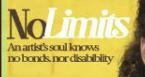
Second Cover line: Since I needed to make the best use of the space, I placed the second cover line below the first, using a variations in the typeface by using SF Kingston and Modern No. 20. However, for me the cover-line seemed to be missing something. Additionally, I did not want any cover-lines save for the main cover-line to overlap the model hence this line needed adjustment sthat I would make later.

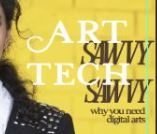
Third Cover-line: In my original plan I did not want to crowd the right hand side of the cover page as this was where I wanted to place the barcode as well. For this reason I chose to make this cover-line a bit flashier and with a larger typeface to make it stand out and make use of the space properly. For this I used Lucy Rose font as I found its typography elegant and artistic.
Main Cover-line: The title of the cover-line was something I came up with off the top of my head when I was making the cover page and I just absolutely loved the play of word on entrepreneur. I needed it to be short yet captivating to the audience hence ‘Artpreneur’ immediately won my approval. Since I needed good readability I used Modern No. 20 font, italicizing the ‘preneur’ part to make the main cover-line stand out. Another problem for me waht that although I had used a white colour to make readability convenient, it stilled seemed to lack that clear cut visibility. To solve this issue, I utilized the Burn tool from the near the bottom of the vertical toolbar on the left.
(The final result of this is shown below.)

Step 6:
With only minor changes left to make, I added on the barcode by downloading it off the internet, opening it in photoshop, moving it to my main file and transforming it to my required size.
Further, at my teacher’s suggestion I decided to add ‘Special’ with the main cover-line in order to fill up the vacant space and to also make it pop thanks to the red rectangle layer made using the Rectangle tool. Additionally, I decided to keep the font on the ‘Special’ the same as the cover-line because I felt that any other would look odd and not a part of the main cover-line.
With that being done, I left the minor changes for the refined version that I will mention in later post after consultancy with my teacher as it was now time to move on to part ii of the foundation portfolio i.e., the content page of my magazine.
0 notes
Text
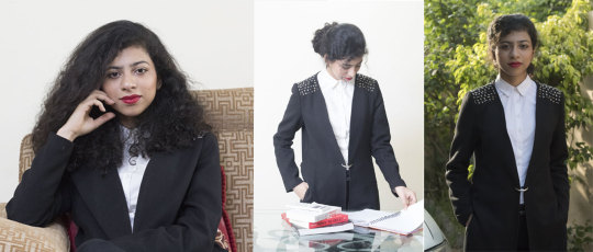
Shoot Analysis - Selection
Cover Photo:

The reason why I chose this as my cover photo was because it satisfied the image I had in mind for my final magazine cover page. Visually, I had wanted to break the norm/conventions of the art magazine genre by showing someone who at first glance looked nothing like an artist because I wanted to get my message across; that an artist can be anybody and everybody.
The mood that I wanted for my magazine was that I had wanted to show confidence, intelligence, creativity and boldness which is exactly what this photograph represents for me.
Double Spread:
1.
While I had chosen to break conventions for the cover photograph, I felt it was much more suitable to include content more visually related to the article and the genre itself in the double.
I was quite contempt this photo shoot as I felt it was quite close to my mise en scene for the double spread images. The lighting, facial expressions, mise en scene came out quite well and the coloured background meant I could easily change the colour to my theme while still retaining the professional look of the photograph itself.

2.
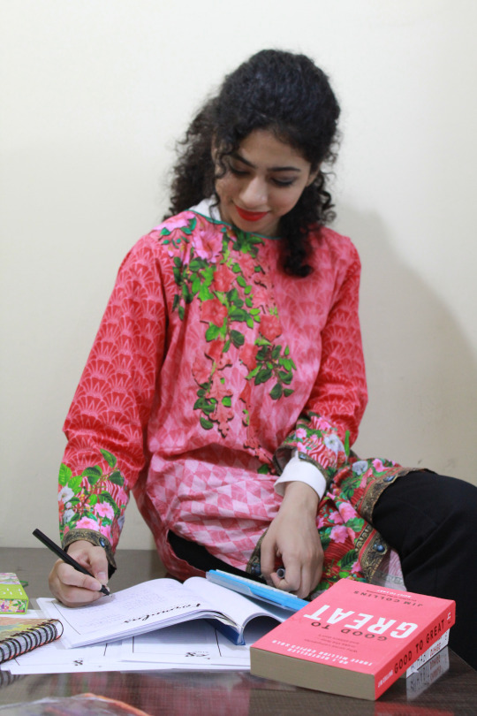
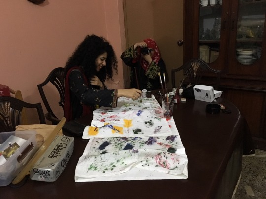
Since the story was inspired by my friend and model, I wished to included photographs of how she actually worked and what she has been working with to create her artwork as I felt that it a very important yet overlooked detail considering that these are the medium that influences the artist style. After three to four tries I was able to get it right.
3.
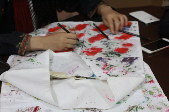
This is a piece that Sana herself worked on; it shows her preference to detailing while being visually pleasing which is why I opted for it.

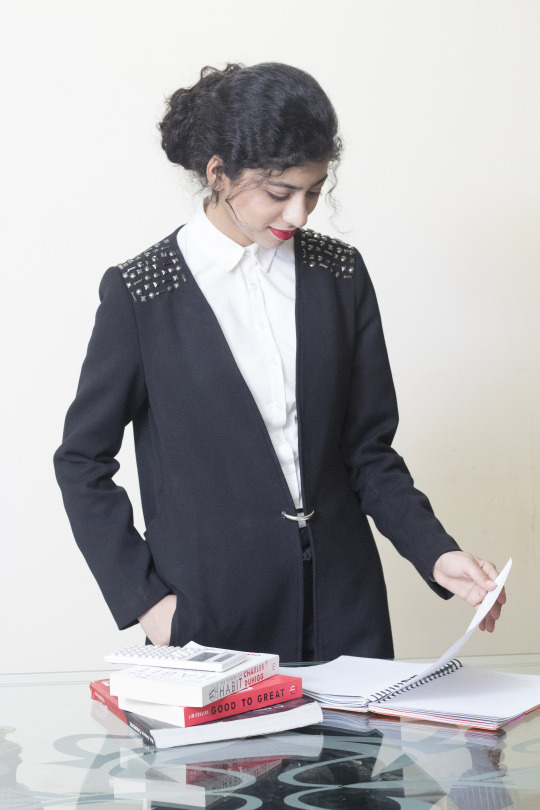
4.
What I loved about this picture was that I had asked my model, Sana to work like she usually did and her facial expressions; the focus and how visibly relaxed she looked absolutely nailed it for me.
5.
I loved the symmetry and the artsy feel of this picture. I liked how the lighting complimented the colours in the picture brought out a certain sharpness in the picture.
0 notes
Text
Shoot Analysis - Rejection
Cover Photo:
While I was quite happy with the composition and the colour dynamics of the photograph, it clearly lacked in terms of facial expressions hence failing to deliver the mood I wanted in the photograph.
Double Spread:
1.
While I initially liked it, I noticed some issues with the photograph. For one, any art related element was absent for the photograph. Secondly, it didn't have a very fine finish and hence failed to looked professional at all. A lot of elements just did not go together in this picture.
2.
I felt that the photograph had bad exposure and bad composition hence I rejected it.
3.
Again while I was quite happy with the colour dynamics of the photograph, it didn't have any art related element that I wanted in my double spread hence, I rejected it.
4.
It seemed like an everyday photograph not one you shoot specially for the double spread hence I rejected it.
0 notes
Text
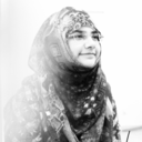
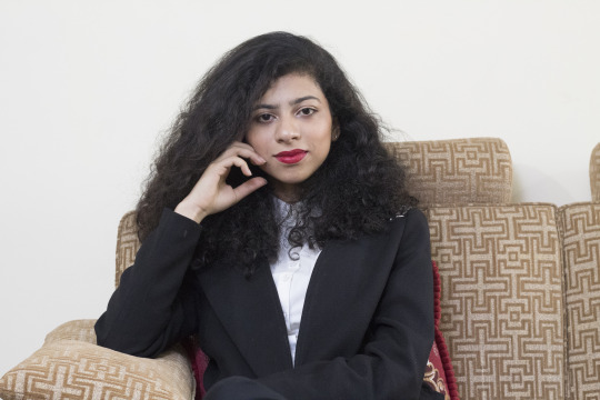
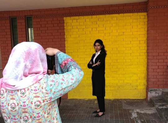
Choosing The Cover Photo
Photograph 1:
While I liked the composition and the colour dynamics of the photograph, it failed to get my message across emotionally as the model’s expressions/body language looked more relaxed rather than bold and confident hence, it was rejected.
Photograph 2:
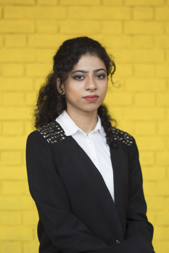
For me this picture was perfect for all the right reason. The composition was symmetrical, the shot was mid-long, my ideal for the shoot, the colour dynamics were well balanced and the facial expressions and body language radiated confidence and a ‘bring it on’ attitude. Thereby, I chose this as the cover photo for my magazine.
Photograph 3:
Visually, I felt, it lacked the mood I needed for the magazine. Additionally, I utilized a prop whose purpose I did not see working out with my concept for the cover photo, therefore I rejected it.

0 notes
Text
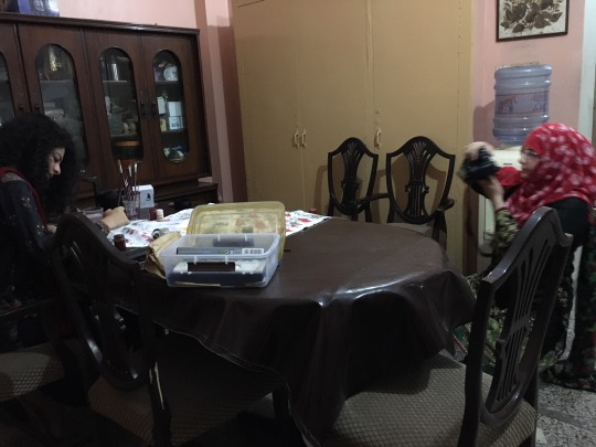
Production Log 3 Monday, 9th April 2018 (8pm - 11pm)
Documentation:
Lights & Equipment: Since the lighting at my location was low, I decided to use the external flash as a fill lighting in order to get better exposure and add a superior colour depth.
Camera Angles & Shot: Since I had the sample pictures and a image pf what I wanted, I used variations of mid-close ups, mid-shots, long shots and wide shots from eye level for the most part. I wanted to have variety for my double spread so I could get the best results for the what I had in mind for the final product.
Experience:
For the double spread photography, I had decided to portray an inside image of the model on the cover page to act as a contrast between her business/formal look and her artist side and to present a literal visual of “don’t judge a book by its cover”.
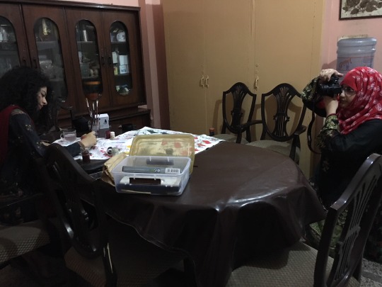
Since all the concepts were in my head and I had a clear idea of what I wanted I immediately rang up my friend around 7pm and told her I wanted to do the shoot at her place and to dress casually to which she readily agreed. Seeing as though she lives not far from me; about a 20 minute drive, I was at her place by 8.05pm with my equipment with me.
When I reached at her place, she was ready and had her paints and brushes out to use as props for the photoshoot so I got right into it. The first problem was setting up the external flash. After replacing its battery, I took me about 20 minutes to get the setting right because there seemed to be an black line on the left had side of the photograph. Once I modified my Canon EOS 1300D’s setting and my external flash’s setting, I was able solve the issue.
I was done with three of my five photographs by 9.30 and we stopped the shoot for a 30 mintues snack break during which I went through my previous photograph to see if any needed a redo; the answer to which was a negative, and explained the remaining two photographs to my model. After the snack break, I continued the shoot, which was done by 10.35pm after which I experimented with a few more shoot (one of which I finalised for the double spread).
Strengths:
I knew the working of the external flash hence I was able to get the desired colour dynamics and exposure without much trouble
I had pre-planned all the possible shots hence it saved planty of time
all the props were already avaliable so there was no need to spend time and money gathering them
since I needed a casual look for the shoot there was no need for elaborate makeup which saved time
Weakness:
The lighting was low hence it took time for me to adjust the flash’s setting to achieve my desired result
I had forgotten to keep spare batteries for my Apkina Speedlight AP600TTL flash hence, I had to wait for 15 minutes till new ones were brought
I originally desired a yellow background but this problem can easily be fixed in photoshoot either by replace colour or by changing the saturation
0 notes
Text
Production Log 2 Thursday, 5th April 2018 (4pm - 6pm)
Documentation:
Lights & Equipment: My source of key lighting was florescent lights for the indoor shoot and the sunlight for the outdoor one. Once again I used the remote-triggered external flash as fill lighting in order to prevent any shadows created by the key light, hence providing good exposure and a professional outlook.
I was quite comfortable with using the external flash this time around seeing as though I had time to practice it. Additionally, I had time research on the various sample images for inspiration for the shoot.

Camera Angles & Shot: Since I was finished with shooting the cover photo, its time to move onto the double spread photography. I had decided to use variations of close ups, mid-close ups, mid-shots and long shots from different angles since I wanted to experiment with the photo-shoot.
Experience:

Since it was a Thursday, I got off from college at around 11.30 and hence had plenty of time to rest and sort things out before my model, Sana, arrived. I had looked up sample pictures on Pinterest for inspiration and had a pretty good inkling of what to expect.
After lunch around 2pm, I decided to work with external flash to figure out why I had failed to make it work the last time around and after an antagonizing half an hour, I figured out my mistake after attaching it to the camera itself rather than the remote trigger. Turns out, I had been mistaking placing the flash on the wrong side of the remote trigger receiver and the flash would respond individually when pressed manually, but not together by the trigger attached to the dslr. After I had figured it out, I took several pictures in my first location to adjust the setting of my camera to save time for later.
My model arrived at the shoot location around 4:15pm and we got straight to work; taking both indoor and outdoor shoot for variety.
I was able to wrap up my shoot fairly quickly, however I later realized that I would need another shoot seeing though these photographs failed to represent ‘art’ in most ways as I had focused solely on ‘business’.
Strengths:
I knew the working of the external flash and the lighting hence I was able to get the desired colour dynamics and exposure
I had pre-planned all the possible shots hence it saved planty of time
There was no need for me to do my models’s makeup as she had done in quite well
Again since I was using my dslr I was quite familiar with the setting and had little issue
Weakness:
I had failed to notice at the time that I was too focused on the business element that I forgot the main part -art.
This meant that I needed to have another shoot

0 notes
Text
Production Log 1 Sunday, 1st April 2018 (3pm - 7pm)
Documentation:
Lights & Equipment: The reason why i opted for three o’clock in the evening as my starting time was mainly because of the fact that I have chosen sunlight as my key light as I felt that this would give me the optimum results in turns of exposure and colour dynamics. In order to add a complete and professional outlook to my cover photograph I utilized an external flash which i triggered using the digital radio transmitters (detail aforementioned here).
It was a bit tricky to work with the external flash seeing a though I had never used one before but an uncle of mine who happens to be a professional photographer; and hence had familiarity with the equipment, explained the main working before prompting me to try it out for myself.
Camera Angles & Shot: For the cover photo itself I had opted for mid-long/mid shots at eye level as it would give the best output in terms of my mise en scene.
As for the double spread photography, I had decided to use variations of close ups, mid-close ups, mid-shots and long shots from different angles since I wanted to experiment with the photo-shoot.
Experience:
I had asked my friend to come to my place i.e., the location of the shoot before time so that I could double check and ensure that her outfit and makeup meant my requirements. She arrived at my place around 2.45pm after I inspected her outfit and makeup. While her outfit did not require any changes, I had to darken her eye makeup to give her a visible smokey eye hence adding sharpness to her expressions and also changed the lip colour from burnt pink to nude to add a professional touch to her outfit.
After the retouching on her makeup, I set up the external flash in my garage where the shoot was to take place; I needed help setting up the flash as I was clueless seeing as I had never done it before which my uncle, Kamran, eagerly provided. After explaining the basics and linking the camera to the flash through the remote trigger, he handed the camera back to me and told me to experiment for myself. It took me about half an hour but once I had an inkling as to how it functioned, I started the portrait session.

Overall, the session lasted about an hour, experimenting with different poses, all the while continuously reminding my friend to ‘fix’ her expressions when she would either start frowning or smiling too broadly.
After the shoot was done by around 5pm, we decided to take a snake break during which we discussed my ideas for the double spread photography. However, despite conducting several test shoots, I was not satisfied with the output and hence, I needed another day to complete the shoot for the double spread.

Brainstorming ideas during our snake break
Strengths:
I was quite clear on what I wanted as my final cover photo thereby it was not difficult for me to attain my desired output
I was quite comfortable and familiar with my dslr as I have had it for over a year and have been shooting in manual mode since.
Despite not knowing the names of the different shots, angles and rules before opting for Media Studies, I knew about proper compositions and henceforth did have much of an issue
I was also quite aware of the proper usage of my prime lens and hence did not have difficulty setting up the aperture and colour dynamics
Both Sana and me knew how to do makeup well, so while she had already set her contour and highlight, all I needed to do was just add to her eye and lip makeup. Since my mother is a pretty talented makeup artist, she lent me a hand in her eye makeup. Furthermore, her outfit was already finalized before the shoot hence there was no need of changing hence saving time.
Weakness:
It was my first time using an external flash and therefore, it time for me to set it up and get the colours right
I did not know how to connect the flash to the trigger and put it the wrong side before eventually realizing my mistake after the shoot was wrapped up
I had failed to conduct a thorough research for the double spread hence needed another shoot so that I could get the desired results
After the double photography, I did not realize how much battery the external flash consumes and the four AA battery cells needed to be replaced near the end of the day

(experiment shoot for the double spread)
0 notes
Text
Equipment
Camera Used - For the photoshoot I will be using my dslr i.e., Canon EOS Rebel T6/1300D. The reason why I’m using this model is because I have been doing all my photography projects with this camera, hence I’m quite comfortable and familiar with all the settings and adjustments.
Lens - For the photo-shoot I’ll utilize my prime Canon EF 50mm f/1.8 STM Lens as it provides Aperture Priority (a key feature for my photo-shoot). Furthermore, it allows a more professional outlook than my Canon EF-S 18-55mm f/3.5-5.6 IS II (i.e., the standard kit lens).

Canon EOS Rebel T6/1300D with Canon EF 50mm f/1.8 STM Lens (with Lens Hood)
Lighting - While sunlight will be used as my key light, i will be using an external flash i.e., Apkina Speedlight AP600TTL as the fill light which will be activated by the remote trigger and diffuse by the umbrella.

Apkina Speedlight AP600TTL

Apkina Digital Radio Speedlite Trigger PT-04NE
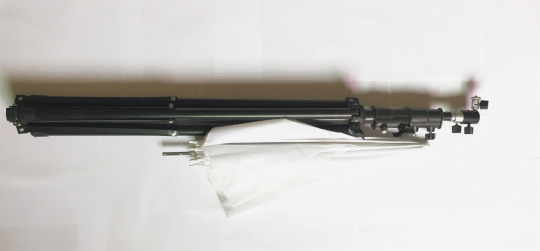
Light Stand and Umbrella/Light Diffuser
0 notes
Text
Schedule
Sunday, 1st April 2018 // 3pm - 7pm
Thursday, 5th April 2018 // 4pm - 6pm
Monday, 9th April 2018 // 8pm - 11pm
The reason why I chose these dates is because they suit best with both mine and my model’s schedule, hence allowing me to focus solely on my task without any interruption.
Seeing that mine was an outdoor (due to the presence of a brick wall) and indoor shoot, and keeping in mind the weather I opted to keep the time from 3pm till sunset at 7pm allowing me the optimum lighting and favourable weather conditions.
0 notes