#yes this is bad <3
Text
love when ppl defend the aggressive monetization of the internet with "what, do you just expect it to be free and them not make a profit???" like. yeah that would be really nice actually i would love that:)! thanks for asking
#yes i want things to be free like ??? that is not a weird desire#'but but it costs money to keep up' ok and? how is that my problem#the government has plenty of murder dollars they could reallocate a few to make internet services universal if they wanted#also these companies were perfectly capable of supporting themselves before the internet got drowned with ads so ¯\_(ツ)_/¯#edit: muting notifs on this post bc new additions have kind of petered out#so no one feel bad about adding something someone else has said‚ it is not bothering me im just trying to keep my#notifs page cleanish lol#also since i saw some people are being redirected to read my tags: firstly hiiiiii this is a special secret message for you:3#secondly i have learned since making this that the reason they were able to support themselves previously was because#of investors bankrolling everything#and theyre now finally realizing that theyre never going to actually make a profit and arent as willing to invest#however thats just a minor correction and doesnt change my overall point#once again. so many murder dollars#so thats why im just adding it here in the tags rather than making an actual correction#anyways . love yall 💕#origibberish#bigger gibbers
31K notes
·
View notes
Text
I think there's no greater indication that disco elysium is sympathetic towards communism when it literally says "communism is failure" and then the literal gameplay itself rewards trying and failing. The most obvious one being the Shivers check at the FELD mural, which is an Impossible 20 check BUT opens itself up again and again the longer you spend in the world doing things, but even just looking at sheer probabilities, for any given white check, rolling first and THEN putting a point into that skill upon failure is more likely to grant you success than putting a point first and then rolling, but that would require failing first.
Other things too: Precarious world saying you'll 100% fail red checks no matter what (not necessarily a bad thing, btw!! throwing the boule into the sea is a success but like. in some other ways one would want a perfect petanque throw instead. but people wouldn't typically assume that failure is desirable sometimes from the start) persuading you to accept that you'll fail some things that is irrevocable, for a world where everything is just a tiny bit easier.
The faux game over screen when you faint after reading Dora's letter— emulating a sense of failure on the scale of the entire game. When it rolls up most people go "What?? Game over?? No way, what did I do wrong!!" and waking up after that, with no huge or lasting impact on Harry's health or morale really tells the player, "Sometimes things will seem so bad that it all seems like it's coming to an end, but it's not the end, it's really not the end, go drink so water, you can still go on despite this failure"
I'm sure there are other things as well that are eluding me but like. The literal gameplay rewards failing and succeeding far more so than simply succeeding every single time, and I think you get a fuller experience of Elysium that way too
#just thinking thoughts...#disco elysium#idk man when did we get so scared of failing!!#people never want to speak in class because 'what if I'm wrong :((('#well then you are wrong... that is okay... it's normal to fail... sometimes saying the wrong thing is a great way to jumpstart a topic...#'getting a good grade in X is both normal to want and possible to achieve'#okay sure but have you made peace with the fact that getting a BAD grade in X isn't a bad thing?#a bad grade in being friends... okay... so you didn't check up on someone in 3 months... you failed... that's fine...#you can learn from it!! you can learn how to keep in touch with people. how to take care of them when they're sick.#how to resolve a dispute. how to communicate and compromise. these are all things you are not born with#and will fail first before succeeding at#Like yes I get that in the age of surveillance your failures may be recorded and preserved forever and that's not great#but if we don't normalize failure I really think we'll just suffocate and die
3K notes
·
View notes
Text
he says i hate everyone except you and that is addictive and that is kind of romantic and beautiful because you're young and you're kind of a sarcastic asshole too and you don't like bad boys, per say, but you don't really like good ones either. and you like that you were the exception, it felt like winning.
except life is not a romance book, and he was kind of being honest. he doesn't learn to be nice to your friends. he only tolerates your family. you have to beg him to come with you to birthday parties, he complains the whole time. you want to go on a date but - people are often there, wherever you're going. he's just so angry. about everything, is the thing. in the romance book, doesn't he eventually soften? can't you teach him, through your own sense of whimsy and comfort?
at first - you know introverts often need smaller friend groups, and honestly, you're fine staying at home too. you like the small, tidy life you occupy. you're not going to punish him for his personality type.
except: he really does hate everyone but you. which means he doesn't get along with his therapist. which means he has no one to talk to except for you. which means you take care of him constantly, since he otherwise has no one. which means you sometimes have to apologize for him. which means he keeps you home from seeing your friends because he hates them. you're the single exception.
about a decade from this experience, you'll type into google: how to know if a relationship is codependent.
he wraps an arm around you. i hate everyone except you. these days, you're learning what he's actually confessing is i have very little practice being kind.
#i used to think it was romantic too and then i was like. now i see it as a HUGE red flag#writeblr#it is also almost EXCLUSIVELY said by immature ppl who think this is normal#fyi even if u think it's funny and ur like 'im an introvert it's just TRUE' like. you need therapy (ily tho)#healed introversion is just ''i would prefer to be by myself'' not ''i hate every person'' ... hate is not normal. that is not healthy#im sorry. i know it feels accurate. but if you're walking around with that kind of rage....#1. you're making a LOT of assumptions about every single person u have ever met. which is often unfair and unkind#and also usually involves judging people based on their worst moments or little mistakes#2. you are being unfair to the person who is ur ''exception''#3. there is a VAST difference between ''ur my favorite person'' and ''the ONLY person i like.''#idk i think this is just a personal bias thing tbh#im sure there are people who have this experience normally#but i have YET to find a man who thinks like this and ISNT absolute DOGSHIT. although tbh.... like. im sure he exists#when u hit like 30 some of the things that were once kind of hot now just sound fucking exhausting. like ''im in a band''#edit in the tags: i used to kind of be like this too. but the thing is that like. my life became so much more peaceful#once i started believing that people are generally good. like yes i am mad at the world at large#but it's just.... a very hard way to live. you're not a bad person or wrong for the ways other people hurt you and taught you to be angry.#but that anger will continue to hurt YOU. it will punish YOU. it will prevent YOU from making new deep connections. it will protect you yes#but it will also cause MASSIVE blowback. bc if you lose the One Person... your life will fall apart. i know this personally.#i really recommend just trying to be... cautiously optimistic instead. like. yes#people can be horrible and cruel and there are some communities (incels for example) that aren't worth that optimism#but i think like... most people will hold a door for you . most people want to help you find your wallet .#i hope one day you are able to find peace. i hope that rage eventually smooths over. i know how hard it is PERSONALLY#and i know what must have happened to you. and im deeply deeply sorry we share the same wound.#but i promise - sometimes we all need someone else to help us carry the weight. eventually the rage has to die so that we can let help in#i had to spend years biting at outstretched hands. i still often do. im still very wary . and my heart breaks that you flinch too.#here's the thing: i don't blame you. but we were both acting out of fear and pain. .... not out of healthy behavior. and ... change#was needed. i needed change too. rage was useful for a while. then it just left me isolated and bitter. i had to (with effort)#choose to let that rage go. and let people in . VERY SLOWLY THO LOL
5K notes
·
View notes
Text
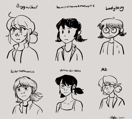
Drew a bunch of Marinettes in a bunch of different artists styles it was a lot of fun!!
Artists who's styles I mimicked: @buggachat @hamsternamedmarinette @ladybeug @sabertoothwalrus and @anna-scribbles all epic artists 🤟😎
#my art#marinette dupain cheng#miraculous ladybug#miraculous fanart#style mimic#sorry for the @s btw#yall should go follow those artists if you dont already also#this was sort of inspired by a post the three artists on the top row made#i think they all got together and drew with one another#which is really cool#but i was genuinely confused because i mimic styles a lot#and ive seen others do it too so i was just like#wow they really know each others styles really well#until i thought about it and read their posts some more#style mimicking is really freaking fun and i think its really good practice#and a good way to explore other ways of doing things#like you really have to learn new techniques and get out of your comfort zone#also anna scribbles i could not find a recent pic of marinette in her main outfit#so thats the only marinette i drew in different clothes cuz i couldnt find a more recent ref of you drawing it#anna scribble marinette has privileges thats the others dont#but ye#i also threw my own style in there as a frame of reference to what me draw like#ive drawn marinette before just not in a loooong while#sabertooth walrus was the hardest for me to mimic cuz they have a broad range in their style#so its like which sabertooth do i wanna be in this pic#Buggachat has such a distinct style thats very clean and consistent which is amazing so they were easy#being easy or hard arent bad things either it also has to do with like styles meeting up with one another#buggachats and mine arent too too different in some shapes and aspects#so yeah itd be easier plus they drew marinette like 3 sec ago so i have more recent of a ref#as opposed to sabertooth who i have a recent ref of ladybug but not marinette so we got two diff styles in one
3K notes
·
View notes
Text

#the magnus archives#jonathan sims#my anxiety went so fast over the skies because i listen to like 10 eps a day#me as an anxious and generally scared of everything girl: hmm yes mystic horror podcast right what i need#paranoing like jon <3#i feel bad drawing fanarts of relatively real people whom i dont know personally eh..
3K notes
·
View notes
Text


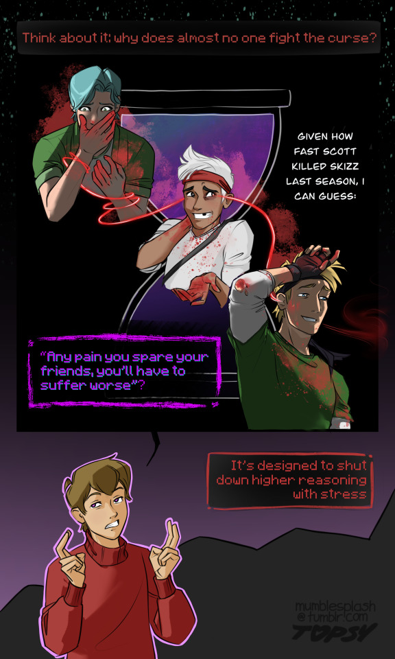
part 2!!!! [read part one here]
transcript below the cut arranged into stanzas to help show where the rhymes are:
“that’s why they brought gem in? as a failsafe?” as a pawn.
we were told to point her at whoever we need gone
“gem won’t hurt her allies. …yet.” the curse she carries will
it’s had its eye on her since she lost the other eye
she was specially selected for her hunting skill
it’s quite the high honor. “wow. how generous.” we try
think about it: why does almost no one fight the curse?
“given how fast scott killed skizz last season, i can guess.”
[“any pain you spare your friends, you’ll have to suffer worse”?]
it’s designed to shut down higher reasoning with stress
#if you still can't see the rhyme scheme try reading it out loud#if that doesn't work uh. idk. can't help you#my art#grian#geminitay#smajor1995#bdoubleo100#inthelittlewood#secret life#grian and his terrible horrible no good very bad eldritch coworkers: the sequel#cant wait to post the next part so i can be like 'my three secret life comics. and yes they all rhyme'#this one narratively doesn't work nearly as well as a standalone compared to part 1#however i accidentally went way too hard and could probably upload the middle page + second to last panel as their own separate art pieces#tbh i'm considering putting an explanation of everything below the readmore buuut i don't feel like it atm. :3 later maybe#me and my 20+ life series headcanons i only allude to without explicitly stating don't need to explain ourselves#still experimenting with this webtoon-esque vertical comic style#still not sure i like it#it gets long too quickly#among other things#but it's very easy to read on a phone so
3K notes
·
View notes
Text
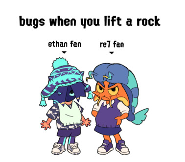
my sea urchin splat sona and his shrimp and sea slug friends... she goes by eef and gets really agitated when someone calls him ethan because HES not ethan, hes ethans FAN
#splatoon 3#splatsona#yes his name is legally ethan fan#ITS A COOL NAME!#NEVER call him ethan for short though#he will start attacking people#numbah one splat roller user...#thats a lie#im so bad#which means hes also so bad#HELPP#my gameplay is humiliating dont look at me
1K notes
·
View notes
Text
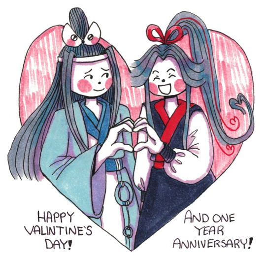
Happy Valentine's Day! (and this blog's first post anniversary!)
#poorly drawn mdzs#better drawn mdzs#mdzs#wei wuxian#lan wangji#Woah...it's been a whole *year* since I took the leap and uploaded my 'first attempt' art.#It's outdated now but it holds a special place in my heart for the fact it started all of this off.#Calling this 'poorly-drawn' was always about accepting that my art was going to be imperfect and messy - and doing it anyways!#There has been a staggering number of times I have drawn something I almost didn't upload because I didn't think it was 'good enough'#only for someone to say they liked it - or that it made them laugh. And it has helped me realize -#-The worst critic for my work has always been myself. If I listened to it all the time...well we would not be here now B'*)#And now that I have dabbled in other fandoms I can truly see how lucky was to start out with the MXTX fans.#The supportive messages and tags have truly been a guiding force toward my artistic and self improvement.#I really can't describe how grateful I am.#Thank you for seeing something worth rooting for when I was just figuring things out.#Thank you for being sweeter than the candy I have strategically hidden in the nooks and crannies of this house.#But watch out! If you forget to find them we will get ants.#I remembered to not hide chocolate in the bed this year. Yes I know it melted last time. Yes it did stain. I'm still sorry.#Thank you for loving me regardless <3 Even if it looked like I shit the bed real bad.
856 notes
·
View notes
Text

Lan Wangji of the Northern Water tribe and Wei Wuxian of Ember Island✨
this is what happens when you rewatch both shows simultaneously.
#mdzs brainrot so bad i start making fanart#i’m still very new at digital art#literally my first time making it#thats how much this show has affected me#i hope you like it <3#rip to the quality tho#yes wx is wearing a betrothal necklace !#and i gave him zuko’s outfit bc both my pookies#i cannot draw backgrounds for shit!#mdzs#mo dao zu shi#mdzs fanart#the untamed#the untamed fanart#wangxian#wangxian fanart#wei wuxian#lan wangji#mo dao zu shi fanart#fanart#cql#cql fanart#atla
860 notes
·
View notes
Text
If you expected a no option and wanted to vote no block me and leave my blog forever I hope you fall off a cliff
#i saw the poll#im MAD#People SUCK SO BAD#for context there was a poll like this wjth 3 options#“yes” “no” and “i dont wanna be involved”#it made me so fuck8ng mad#ill never be nice to people who exclude others#stiff talk#polls#aromantic
816 notes
·
View notes
Text

cozy summer afternoons
#fnaf#fnaf security breach#fnaf sb#fnaf ruin#five nights at freddy's#fnaf fanart#glamrock freddy#gregory fnaf#fnaf gregory#vanessa fnaf#fnaf vanessa#3 star family#ever since it was confirmed that the 3 star family ending was canon i’ve been itching to draw these guys again#i wanted to set this sometime after sb and before ruin!#i imagine that theres peaceful moments where greg is making comics and fred is talking to him and ness is developing code for mxes#also for mobile users i’m terribly sorry if the quality is super bad.. this got compressed bc of how large of a canvas it was </3#i tried encapsulating as much of gregory’s personality and interests as i could bc i rlly wanted this to feel like his room#(peep the lil mario and luigi statues above greg’s bed hehe)#and yes i did reuse the photo booth pic i drew a few months back.. just a personal lil easter egg :)#rin’s artchive
1K notes
·
View notes
Text
so i was thinking about how Howdy has eight legs bc he's a caterpillar - those have lots of legs. but butterflies? they only have six
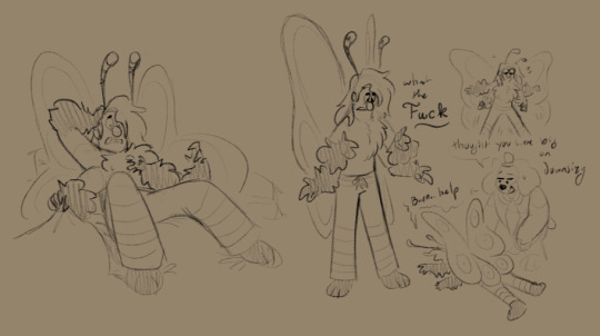
imagine he comes out of his chrysalis and he's down two limbs. mf would have to relearn how to Walk
#i had this realization and Lunged for my tablet#caterpillars when they're in the soup: you know what? these are unnecessary *discards limbs*#and yes i know i know Technically caterpillars have six true legs and four prolegs yes yes#However they still kinda count and i like to have fun#he'd wake up and have a total httyd1 hiccup moment#*lifts blanket* Ohhhhhhhh fuck where's the other two#lmaoooo later frank hands him a bottle full of leftover Caterpillar Soup like 'here they are... sorry...'#i gave him cute stripey pj pants bc i caaaaaaan <3#scribble salad#yassified howdy <3#i feel so bad for him...#he tries so hard not to pupate and then not only Does He but he winds up with only two legs. poor guy!#not sure if i wanna stick with this for yass!howdy tho! i so do love his four legs...
788 notes
·
View notes
Text
this is my brother and i need a shovel to love him
(prints)
#death note#meronia#mello dn#near dn#mihael keehl#nate river#nearmello#i have a disease named 2008 yaoi and it is terminal. sorry#their 15 minutes of screentime and cain&abel slay have captivated me#hits that compelling dynamic that canon gives you just enough to extrapolate about spot#you should be addicted to shutting the fuck up / you want to fuck me so bad it makes you look stupid etc etc etc etc im predictable#i've decided to be proactively problematic and interpret their relationship as a brotherhood but also they kiss. hope this helps#anyway flamecon is approaching so im trying to bang out all the illustrations i didnt finish in the past seven months#is it -- yes it's all nearmello. sorry#as usual have this at 3 am the artist's natural unhinged hour#artists on tumblr#illustration#horreurart
2K notes
·
View notes
Text
why Aurora's art is genius
It's break for me, and I've been meaning to sit down and read the Aurora webcomic (https://comicaurora.com/, @comicaurora on Tumblr) for quite a bit. So I did that over the last few days.
And… y'know. I can't actually say "I should've read this earlier," because otherwise I would've been up at 2:30-3am when I had responsibilities in the morning and I couldn't have properly enjoyed it, but. Holy shit guys THIS COMIC.
I intended to just do a generalized "hello this is all the things I love about this story," and I wrote a paragraph or two about art style. …and then another. And another. And I realized I needed to actually reference things so I would stop being too vague. I was reading the comic on my tablet or phone, because I wanted to stay curled up in my chair, but I type at a big monitor and so I saw more details… aaaaaand it turned into its own giant-ass post.
SO. Enjoy a few thousand words of me nerding out about this insanely cool art style and how fucking gorgeous this comic is? (There are screenshots, I promise it isn't just a wall of text.) In my defense, I just spent two semesters in graphic design classes focusing on the Adobe Suite, so… I get to be a nerd about pretty things…???
All positive feedback btw! No downers here. <3
---
I cannot emphasize enough how much I love the beautiful, simple stylistic method of drawing characters and figures. It is absolutely stunning and effortless and utterly graceful—it is so hard to capture the sheer beauty and fluidity of the human form in such a fashion. Even a simple outline of a character feels dynamic! It's gorgeous!
Though I do have a love-hate relationship with this, because my artistic side looks at that lovely simplicity, goes "I CAN DO THAT!" and then I sit down and go to the paper and realize that no, in fact, I cannot do that yet, because that simplicity is born of a hell of a lot of practice and understanding of bodies and actually is really hard to do. It's a very developed style that only looks simple because the artist knows what they're doing. The human body is hard to pull off, and this comic does so beautifully and makes it look effortless.
Also: line weight line weight line weight. It's especially important in simplified shapes and figures like this, and hoo boy is it used excellently. It's especially apparent the newer the pages get—I love watching that improvement over time—but with simpler figures and lines, you get nice light lines to emphasize both smaller details, like in the draping of clothing and the curls of hair—which, hello, yes—and thicker lines to emphasize bigger and more important details and silhouettes. It's the sort of thing that's essential to most illustrations, but I wanted to make a note of it because it's so vital to this art style.
THE USE OF LAYER BLENDING MODES OH MY GODS. (...uhhh, apologies to the people who don't know what that means, it's a digital art program thing? This article explains it for beginners.)
Bear with me, I just finished my second Photoshop course, I spent months and months working on projects with this shit so I see the genius use of Screen and/or its siblings (of which there are many—if I say "Screen" here, assume I mean the entire umbrella of Screen blending modes and possibly Overlay) and go nuts, but seriously it's so clever and also fucking gorgeous:
Firstly: the use of screened-on sound effect words over an action? A "CRACK" written over a branch and then put on Screen in glowy green so that it's subtle enough that it doesn't disrupt the visual flow, but still sticks out enough to make itself heard? Little "scritches" that are transparent where they're laid on without outlines to emphasize the sound without disrupting the underlying image? FUCK YES. I haven't seen this done literally anywhere else—granted, I haven't read a massive amount of comics, but I've read enough—and it is so clever and I adore it. Examples:


Secondly: The beautiful lighting effects. The curling leaves, all the magic, the various glowing eyes, the fog, the way it's all so vividly colored but doesn't burn your eyeballs out—a balance that's way harder to achieve than you'd think—and the soft glows around them, eeeee it's so pretty so pretty SO PRETTY. Not sure if some of these are Outer/Inner Glow/Shadow layer effects or if it's entirely hand-drawn, but major kudos either way; I can see the beautiful use of blending modes and I SALUTE YOUR GENIUS.
I keep looking at some of this stuff and go "is that a layer effect or is it done by hand?" Because you can make some similar things with the Satin layer effect in Photoshop (I don't know if other programs have this? I'm gonna have to find out since I won't have access to PS for much longer ;-;) that resembles some of the swirly inner bits on some of the lit effects, but I'm not sure if it is that or not. Or you could mask over textures? There's... many ways to do it.
If done by hand: oh my gods the patience, how. If done with layer effects: really clever work that knows how to stop said effects from looking wonky, because ugh those things get temperamental. If done with a layer of texture that's been masked over: very, very good masking work. No matter the method, pretty shimmers and swirly bits inside the bigger pretty swirls!
Next: The way color contrast is used! I will never be over the glowy green-on-black Primordial Life vibes when Alinua gets dropped into that… unconscious space?? with Life, for example, and the sharp contrast of vines and crack and branches and leaves against pitch black is just visually stunning. The way the roots sink into the ground and the three-dimensional sensation of it is particularly badass here:

Friggin. How does this imply depth like that. HOW. IT'S SO FREAKING COOL.
A huge point here is also color language and use! Everybody has their own particular shade, generally matching their eyes, magic, and personality, and I adore how this is used to make it clear who's talking or who's doing an action. That was especially apparent to me with Dainix and Falst in the caves—their colors are both fairly warm, but quite distinct, and I love how this clarifies who's doing what in panels with a lot of action from both of them. There is a particular bit that stuck out to me, so I dug up the panels (see this page and the following one https://comicaurora.com/aurora/1-20-30/):

(Gods it looks even prettier now that I put it against a plain background. Also, appreciation to Falst for managing a bridal-carry midair, damn.)
The way that their colors MERGE here! And the immense attention to detail in doing so—Dainix is higher up than Falst is in the first panel, so Dainix's orange fades into Falst's orange at the base. The next panel has gold up top and orange on bottom; we can't really tell in that panel where each of them are, but that's carried over to the next panel—

—where we now see that Falst's position is raised above Dainix's due to the way he's carrying him. (Points for continuity!) And, of course, we see the little "huffs" flowing from orange to yellow over their heads (where Dainix's head is higher than Falst's) to merge the sound of their breathing, which is absurdly clever because it emphasizes to the viewer how we hear two sets of huffing overlaying each other, not one. Absolutely brilliant.
(A few other notes of appreciation to that panel: beautiful glows around them, the sparks, the jagged silhouette of the spider legs, the lovely colors that have no right to make the area around a spider corpse that pretty, the excellent texturing on the cave walls plus perspective, the way Falst's movements imply Dainix's hefty weight, the natural posing of the characters, their on-point expressions that convey exactly how fuckin terrifying everything is right now, the slight glows to their eyes, and also they're just handsome boys <3)
Next up: Rain!!!! So well done! It's subtle enough that it never ever disrupts the impact of the focal point, but evident enough you can tell! And more importantly: THE MIST OFF THE CHARACTERS. Rain does this irl, it has that little vapor that comes off you and makes that little misty effect that plays with lighting, it's so cool-looking and here it's used to such pretty effect!
One of the panel captions says something about it blurring out all the injuries on the characters but like THAT AIN'T TOO BIG OF A PROBLEM when it gets across the environmental vibes, and also that'd be how it would look in real life too so like… outside viewer's angle is the same as the characters', mostly? my point is: that's the environment!!! that's the vibes, that's the feel! It gets it across and it does so in the most pretty way possible!
And another thing re: rain, the use of it to establish perspective, particularly in panels like this—

—where we can tell we're looking down at Tynan due to the perspective on the rain and where it's pointing. Excellent. (Also, kudos for looking down and emphasizing how Tynan's losing his advantage—lovely use of visual storytelling.)
Additionally, the misting here:

We see it most heavily in the leftmost panel, where it's quite foggy as you would expect in a rainstorm, especially in an environment with a lot of heat, but it's also lightly powdered on in the following two panels and tends to follow light sources, which makes complete sense given how light bounces off particles in the air.
A major point of strength in these too is a thorough understanding of lighting, like rim lighting, the various hues and shades, and an intricate understanding of how light bounces off surfaces even when they're in shadow (we'll see a faint glow in spots where characters are half in shadow, but that's how it would work in real life, because of how light bounces around).
Bringing some of these points together: the fluidity of the lines in magic, and the way simple glowing lines are used to emphasize motion and the magic itself, is deeply clever. I'm basically pulling at random from panels and there's definitely even better examples, but here's one (see this page https://comicaurora.com/aurora/1-16-33/):

First panel, listed in numbers because these build on each other:
The tension of the lines in Tess's magic here. This works on a couple levels: first, the way she's holding her fists, as if she's pulling a rope taut.
The way there's one primary line, emphasizing the rope feeling, accompanied by smaller ones.
The additional lines starbursting around her hands, to indicate the energy crackling in her hands and how she's doing a good bit more than just holding it. (That combined with the fists suggests some tension to the magic, too.) Also the variations in brightness, a feature you'll find in actual lightning. :D Additional kudos for how the lightning sparks and breaks off the metal of the sword.
A handful of miscellaneous notes on the second panel:
The reflection of the flames in Erin's typically dark blue eyes (which bears a remarkable resemblance to Dainix, incidentally—almost a thematic sort of parallel given Erin's using the same magic Dainix specializes in?)
The flowing of fabric in the wind and associated variation in the lineart
The way Erin's tattoos interact with the fire he's pulling to his hand
The way the rain overlays some of the fainter areas of fire (attention! to! detail! hell yeah!)
I could go on. I won't because this is a lot of writing already.
Third panel gets paragraphs, not bullets:
Erin's giant-ass "FWOOM" of fire there, and the way the outline of the word is puffy-edged and gradated to feel almost three-dimensional, plus once again using Screen or a variation on it so that the stars show up in the background. All this against that stunning plume of fire, which ripples and sparks so gorgeously, and the ending "om" of the onomatopoeia is emphasized incredibly brightly against that, adding to the punch of it and making the plume feel even brighter.
Also, once again, rain helping establish perspective, especially in how it's very angular in the left side of the panel and then slowly becomes more like a point to the right to indicate it's falling directly down on the viewer. Add in the bright, beautiful glow effects, fainter but no less important black lines beneath them to emphasize the sky and smoke and the like, and the stunningly beautiful lighting and gradated glows surrounding Erin plus the lightning jagging up at him from below, and you get one hell of an impactful panel right there. (And there is definitely more in there I could break down, this is just a lot already.)
And in general: The colors in this? Incredible. The blues and purples and oranges and golds compliment so well, and it's all so rich.
Like, seriously, just throughout the whole comic, the use of gradients, blending modes, color balance and hues, all the things, all the things, it makes for the most beautiful effects and glows and such a rich environment. There's a very distinct style to this comic in its simplified backgrounds (which I recognize are done partly because it's way easier and also backgrounds are so time-consuming dear gods but lemme say this) and vivid, smoothly drawn characters; the simplicity lets them come to the front and gives room for those beautiful, richly saturated focal points, letting the stylized designs of the magic and characters shine. The use of distinct silhouettes is insanely good. Honestly, complex backgrounds might run the risk of making everything too visually busy in this case. It's just, augh, so GORGEOUS.
Another bit, take a look at this page (https://comicaurora.com/aurora/1-15-28/):

It's not quite as evident here as it is in the next page, but this one does some other fun things so I'm grabbing it. Points:
Once again, using different colors to represent different character actions. The "WHAM" of Kendal hitting the ground is caused by Dainix's force, so it's orange (and kudos for doubling the word over to add a shake effect). But we see blue layered underneath, which could be an environmental choice, but might also be because it's Kendal, whose color is blue.
And speaking off, take a look at the right-most panel on top, where Kendal grabs the spear: his motion is, again, illustrated in bright blue, versus the atmospheric screened-on orange lines that point toward him around the whole panel (I'm sure these have a name, I think they might be more of a manga thing though and the only experience I have in manga is reading a bit of Fullmetal Alchemist). Those lines emphasize the weight of the spear being shoved at him, and their color tells us Dainix is responsible for it.
One of my all-time favorite effects in this comic is the way cracks manifest across Dainix's body to represent when he starts to lose control; it is utterly gorgeous and wonderfully thematic. These are more evident in the page before and after this one, but you get a decent idea here. I love the way they glow softly, the way the fire juuuust flickers through at the start and then becomes more evident over time, and the cracks feel so realistic, like his skin is made of pottery. Additional points for how fire begins to creep into his hair.
A small detail that's generally consistent across the comic, but which I want to make note of here because you can see it pretty well: Kendal's eyes glow about the same as the jewel in his sword, mirroring his connection to said sword and calling back to how the jewel became Vash's eye temporarily and thus was once Kendal's eye. You can always see this connection (though there might be some spots where this also changes in a symbolic manner; I went through it quickly on the first time around, so I'll pay more attention when I inevitably reread this), where Kendal's always got that little shine of blue in his eyes the same as the jewel. It's a beautiful visual parallel that encourages the reader to subconsciously link them together, especially since the lines used to illustrate character movements typically mirror their eye color. It's an extension of Kendal.
Did I mention how ABSOLUTELY BEAUTIFUL the colors in this are?
Also, the mythological/legend-type scenes are illustrated in familiar style often used for that type of story, a simple and heavily symbolic two-dimensional cave-painting-like look. They are absolutely beautiful on many levels, employing simple, lovely gradients, slightly rougher and thicker lineart that is nonetheless smoothly beautiful, and working with clear silhouettes (a major strength of this art style, but also a strength in the comic overall). But in particular, I wanted to call attention to a particular thing (see this page https://comicaurora.com/aurora/1-12-4/):

The flowing symbolic lineart surrounding each character. This is actually quite consistent across characters—see also Life's typical lines and how they curl:

What's particularly interesting here is how these symbols are often similar, but not the same. Vash's lines are always smooth, clean curls, often playing off each other and echoing one another like ripples in a pond. You'd think they'd look too similar to Life's—but they don't. Life's curl like vines, and they remain connected; where one curve might echo another but exist entirely detached from each other in Vash's, Life's lines still remain wound together, because vines are continuous and don't float around. :P
Tahraim's are less continuous, often breaking up with significantly smaller bits and pieces floating around like—of course—sparks, and come to sharper points. These are also constants: we see the vines repeated over and over in Alinua's dreams of Life, and the echoing ripples of Vash are consistent wherever we encounter him. Kendal's dream of the ghost citizens of the city of Vash in the last few chapters is filled with these rippling, echoing patterns, to beautiful effect (https://comicaurora.com/aurora/1-20-14/):

They ripple and spiral, often in long, sinuous curves, with smooth elegance. It reminds me a great deal of images of space and sine waves and the like. This establishes a definite feel to these different characters and their magic. And the thing is, that's not something that had to be done—the colors are good at emphasizing who's who. But it was done, and it adds a whole other dimension to the story. Whenever you're in a deity's domain, you know whose it is no matter the color.
Regarding that shape language, I wanted to make another note, too—Vash is sometimes described as chaotic and doing what he likes, which is interesting to me, because smooth, elegant curves and the color blue aren't generally associated with chaos. So while Vash might behave like that on the surface, I'm guessing he's got a lot more going on underneath; he's probably much more intentional in his actions than you'd think at a glance, and he is certainly quite caring with his city. The other thing is that this suits Kendal perfectly. He's a paragon character; he is kind, virtuous, and self-sacrificing, and often we see him aiming to calm others and keep them safe. Blue is such a good color for him. There is… probably more to this, but I'm not deep enough in yet to say.
And here's the thing: I'm only scratching the surface. There is so much more here I'm not covering (color palettes! outfits! character design! environment! the deities! so much more!) and a lot more I can't cover, because I don't have the experience; this is me as a hobbyist artist who happened to take a couple design classes because I wanted to. The art style to this comic is so clever and creative and beautiful, though, I just had to go off about it. <3
...brownie points for getting all the way down here? Have a cookie.
#aurora comic#aurora webcomic#comicaurora#art analysis#...I hope those are the right tags???#new fandom new tagging practices to learn ig#much thanks for something to read while I try to rest my wrists. carpal tunnel BAD. (ignore that I wrote this I've got braces ok it's fine)#anyway! I HAVE. MANY MORE THOUGHTS. ON THE STORY ITSELF. THIS LOVELY STORY#also a collection of reactions to a chunk of the comic before I hit the point where I was too busy reading to write anything down#idk how to format those tho#...yeet them into one post...???#eh I usually don't go off this much these days but this seems like a smaller tight-knit fandom so... might as well help build it?#and I have a little more time thanks to break so#oh yes also shoutout to my insanely awesome professor for teaching me all the technical stuff from this he is LOVELY#made an incredibly complex program into something comprehensible <3#synapse talks
740 notes
·
View notes
Text
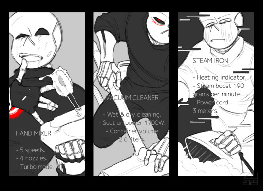
make teleshopping great again ♪
#zu art#killer!sans#cross!sans#error!sans#undertale#undertale au#utmv#don't ask an artist 'why'.... ask 'did you have fun' cause the answer is yes XD#I drew this late at night in a hurry and in the hope of freeing my head from this idea so to never return to it again#but after long battles with my brain it was decided that the game is worth the candle so here it is :)#after all what's so bad about boys advertising home appliances? <3#pure art. nothing wrong ♪#if you know you know#suggestive tw#cause it's too hot (outside) ε-(´∀`; )#pff I like how Killer and Cross both fit perfectly into the situation and Error just: 'Wh. What are you looking at?? Leave me alone' xp
1K notes
·
View notes
Text
the doctor really is just. character of all time. at their core they’re decent and truly appreciative and loving of the universe and everyone in it, but also a morally-gray, hypocritical bitch. they’re simultaneously a genius and an absolute dumbass. they’ve had upwards of thirteen personas who could ostensibly all be different characters except they’re also all exactly the same. puns. they could fight god and win and then be sad the next day about a restaurant being out of whipped cream. they’re a fool. they’re a criminal. they’re annoying to a point of pride. they’re occasionally terrifying. they care so very much. they’re an otherworldly being beyond comprehension but also they’re just a guy. they’re every gender and sexuality at once while also being none of them. they’re in love with the spaceship they drive around for a living. they can’t actually drive said spaceship
#[slaps the doctor] this bad boy (gender-neutral) can fit so many contradictions#yes they're a fucking mess but they *do* keep trying and that's what matters <3#doctor who#**#yeah im tangentially still caerdroia-posting why do you ask
5K notes
·
View notes
Last Seen Blogs

charliejean223
beautifully broken 💔

kursivbyuro
kursivbyuro

diego2289
Sin título
chemiosmotic
i just want to mow hay
cazarella
The Pursuit of His Admiration….