#want a style that's more solid but still textured for a project of mine
Text

day 71
test subject
#vampire cookie daily#vampire cookie#cookie run#playing with some brush settings#want a style that's more solid but still textured for a project of mine#i may just end up sticking with the brushes i always use anyway bc i've been told it's a defining trait of my style#lines being kind of crayon-y and light#and i love texture so getting rid of a lot of that seems very unlike me#i don't like drawing smooth as much as i like the taste of it in other peoples' work#i'll have to think abt it smore tbh
22 notes
·
View notes
Text
The Deer Church
This short is based on a dream I had last night. It disturbed me enough that I couldn’t stop thinking about it, so I wrote it down. I may expand it to flesh out the themes and context.
H. P. Lovecraft is known for “cosmic horror”—that is, his assumption that we live in an uncaring universe that feels nothing for us, so that its true nature is so alien that it is existentially dreadful.
My subconscious seems to be working with a kind of “ecological horror”—that is, that nature is uncaring, and if it ever felt something for us, it has now turned against us. And that an uncaring Nature can be as alien and dreadful as a cosmos that is wholly and perniciously “Other”.
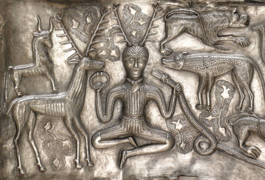
Image: "Cernunnos", or the “horned god” of Celtic polytheism, on the Gundestrup Cauldron, c. 150 BC
The forest beyond the town broke into a clearing. I could see the ravine that had once been a river, now dammed up to make way for work on the mines.
Old, metal-wire fences teetered on the edge, and dead trees that had long since fallen hung down the other side. The air smelled musty, and the mud stuck to the side of my galoshes.
I noticed where the fences curved away, hugging the only path out of the forest. There was a landbridge leading to the other side of the ravine. It seemed impossibly thin for its height against the river basin, like a sidewalk’s width, and moss-covered signs hanging on the fence were too dirty to be readable. I noticed a set of tracks leading across the landbridge—what looked like deer tracks, caked in the mud, still wet.
“Hello there?”
A voice echoed from across the river basin. At the other side of the landbridge, I saw an elderly woman who seemed to be dressed in black, with fine gray hair pulled in a bun. Her dress seemed to me vaguely reminiscent of a nun’s.
“Hello,” I said, projecting my voice. A faint echo came back.
“We have a church here,” said the lady. “Would you like to see it?”
“Across this path?” I asked. “Are you sure it’s safe to cross?”
“Of course it is—here, let me show you.”
The lady crossed part way across the dirt path, and I could see the grandmotherly wrinkles on her face. She seemed to traverse it easily, without even minding the closeness of the fences to the steep drops on either side.
“See? Come on over now. Lots of people come this way. We have a beautiful church just up the side of this hill.”
I had a soft spot for churches. Ever since growing up in New England and attending Sunday school as a child, I loved old Protestant churches—their pews, their well-worn hymnals, and the musty homeliness that came with them.
“Oh,” the lady said. “You’ll just love our church then. It’s by far the finest here in the west. What brings you out this far?”
“I’m surveying for the developers.”
“Mhm,” mumbled the lady, seeming unconcerned with my answer.
I minded my footing as we passed along the path. The wire fences seemed to hold the ground together, even as the path got muddy. The lady seemed unfazed, but I stuck my hand out to grasp the chainlinks as we stepped. The wire jingled in that dull, steely way, and I could see the waves travel through it as I clutched it with my unsteady hand.
“See? It’s not so bad.” The lady muttered again. And as I watched my feet, I saw in the ground again: deer tracks. Or, at least, deer footprints. Were deer this big? I didn’t know; I’d never been a boyscout.
“There we go. Up this way now. I promise, it’ll be worth it.”
I followed the lady up the hill where a loose footpath was made. The dirt, moss, and mud were held in place by wood planks that looked like they must’ve been placed there long ago. The lady held up her skirt against the mud, and I could see the hose beneath her dress.
“Here we are—the old, dear church,” she said.
I looked up, slightly winded. A few paces from us was an old, decrepit church. Vines covered the side of its walls and dark mold crawled up the sides of its brick foundations. The wood-step path led up to its threshhold. There were no broken windows and they weren’t boarded up—but they were too dark to see inside.
“It’s small,” I mentioned.
“Oh, but that gives it some charm,” she said. “We don’t need those big churches like some people do. You should see the inside—it’s quite special.”
Still entertained by the idea of nostalgia, I walked up the path, following the lady. A sign read “Dear Church” in metal lettering, nailed over the double doors—but the “a” in “Dear” was missing, and instead had been scrawled into the wood.
“Come in, dear,” said the lady. I entertained her as she opened the door for me, and I neglected to ask her name. I suppose I didn’t want to offend her.
I stepped inside, and the mustiness of the air outside was exponentially thicker beyond the doors. When my eyes adjusted, I could see the lobby of a normal, small-town church—much like ones I grew up going to Sundays in.
Except there was a pervasive mold. Not just the kind of mold you’d see in a condemned house—at least, I’ve never been in a condemned house before, or one like this before. It wasn’t the kind of mold you’d expect in a house—it was white, furry, with splotches of green in some places. It wasn’t quite the kind you’d see on a piece of cheese in the fridge before throwing it out, but something close to it.
And it was everywhere. On the seats’ cushions on either side of the doors as you walked in. On the tablecloth where greeters must’ve delivered their programs to visitors. On the carpets of the floor, trailing up the staircases, leading up on either side, onto the doors leading to the main room. On an old coffee dispenser that must’ve been there for decades.
“It has its own special charm,” said the lady. “Quite humble compared to other churches, don’t you think?”
I managed to hide a frown of disgust, careful not to touch anything, and instead nodded at the lady—still, wishing not to offend. She seemed unperturbed by the extreme state of growth, and, still daintily clutching the sides of her dress, stepped up the stairs, which split to either side of the greeting station.
“The architecture is… interesting,” I managed to comment without stammering too much. She nodded without looking at me, but still visibly smiling.
“Sister Mary? We have a visitor who wishes to see the church.” The lady announced as she reached the top of the stairs. A door creaked open, which I assumed must’ve led to a balcony in the main room.
Another elderly woman, not too different in complexion, but now in a gray dress rather than black, entered the lobby.
“Ah, how nice. Glad to see we can have another visitor.”
I proceeded up the opposite stairs, doing my best to play it nice and congenial. Surely this wasn’t a functioning church? Either that, or I’d landed myself into some kind of cult. Still, some impulse in me wanted to see beyond the layers of ruined upholstery and drywall, all caked in this thick, soft, white layer of fungi. Or, maybe, I wanted to entertain what the rest of it looked like as it was out of gross curiosity.
Until I noticed, on the upholstered benches leading up to the main double doors, where the main room would be, what looked like a mannequin’s head sitting on the cushions. It was completely covered in the white, moldy moss, so that its features were indistinguishable. The layer of organic gunk was so thick that it seemed to have solidified in place, like the fungi had hardened so that it had the visible texture of plaster. Next to it was an arm. I didn’t dare touch it.
“Ah, don’t worry about those,” the lady called Sister Mary said. “We like to leave things as they are here. Come on in—you have to at least see the auditorium.”
Sister Mary walked to the double doors and opened them, gesturing for me to enter.
I looked inside. It looked like a church’s auditorium all right, if a bit modern in style. A small flight of stairs, split on either side of an exit below, led down to pews in angled rows facing a central pulpit. The ceiling sloped downward, and the whole room had a pentagonal shape, roughly big enough for two hundred people.
It was a mess. The wood of the pews was so water damaged that it was discolored from brown to black. Scrap pieces of wood laid about, I took note, as I descended the staircase, feigning curiosity and amazement. After all—only two elderly women, right? And, of course, mold was everywhere.
I was taken to a figure to my left. Another mannequin—this time, seated, like where a deacon would be. Totally covered in white and splotchy green fungus, like someone had plastered it with the stuff. The features were totally indistinguishable, and even the hands were so coated that it had no fingers; they just looked like mittens. The stuff was covered on the seat too, like the head and arm was in the lobby. I had the visceral sense, whether incorrect or not, that the figure was part of the seat now.
And as I stepped downward and the floor creaked, I could see the pews from an angle; I could see more heads on the seats, as if they were fungi themselves, either placed there or growing out of the upholstery, but now indistinguishable either way. They all faced the pulpit, as if to receive a sermon.
Daring to look at the pulpit, I couldn’t make out the figure behind it. The felt-covered stage, the wood of the pulpit, was all completely covered in fungus. Instead of standing like a pastor would be, the figure was seated behind the pulpit on the floor, and I couldn’t see its face. All I could see was what must’ve been a pair of antlers protruding from its head.
“What do you think?” Said one of the sisters. “Please meet our brother, Hern.”
Out stepped from the balcony a large man in a patchwork sweater. He wore a mask that seemed to be caked, solid mold, carved in the shape of a rudimentary face.
My eyes darted to the exit, just below the balcony, as I watched this hulking man descend the staircase, coming to flank me.
“Hern is the custodian here,” a sister said. “He can take care of you.”
I stepped toward the exit, still feigning interest in my surroundings. Some scrap wood, fallen on a table at the back of the auditorium, was within my reach. I picked it up, flipping it in my hand like it was a toy, smiling innocuously. Hern slowly walked up toward my rear, and I could feel the floorboards give under his footsteps. I looked up at the balcony and noticed, behind the sisters, what seemed like child’s drawings of a series of faces. One had two sets of eyes beneath a mask.
“What’s with the drawing with the two sets of eyes?” I asked.
At that moment, Hern grabbed me in a headlock with one arm from behind. I felt a strong pressure at the left side of my neck. Was it a needle? Was I about to pass out? No. Was it a gun? No—it felt like just two massive fingertips, dirty, with rough nails, digging into my skin. He must’ve been feigning a gun. I gave a shove against the headlock, still gripping the wood scrap in my hand.
“Let me go!” I yelled. Hern was a head taller than me and the headlock held fast. So I reflexively did the one thing I could: I took the wood and slammed the sharp end above my head in an attempt to stab his face through its mask.
“Let—me—go!”
On the third try the headlock loosened, and I darted for the exit ahead of me, intent with all my might to make it to that thin little landbridge, the one with the oversized deertracks, and to get to the other side of the ravine.
4 notes
·
View notes
Text
S.I.S - Formative Notes
Imagery:
The idea and concept for this project was inspired and initiated through imagery. A friend of mine is an extremely talented artist, and my inspiration came from one of her projects she created for Splore.
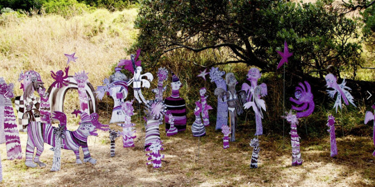
Freya Burnett, Friends in Paradise
I was mainly inspired by the “movement” the little creatures have. The colour and messy illustration internally (in my head) created a busy and loud atmosphere. I really liked this concept and looked at it from my own personal artistic style…
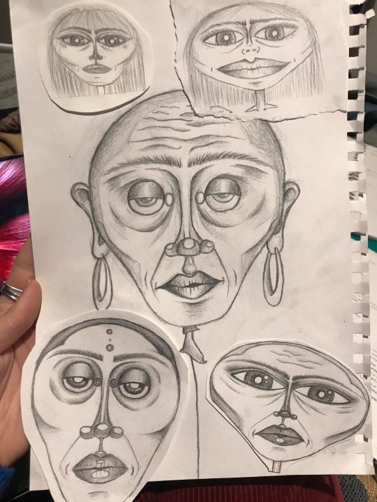
This led me to my first project idea consisting of an x amount of these little aliens, with an x amount of corresponding sound tracks that would act as their “voices”. This played on the idea of ‘identity’.
Even though I had the excuse of this being a passion project, I felt my idea wasn't strong enough conceptually. So I gathered my three favourite art styles; fine pencil drawing, textural abstract painting, and digital art. I (and crit session group) began leaning more towards the textural abstract paintings as the sense of touch could be an interesting addition.
Below is a piece I did that depicts “a mermaids home” - it is texturised with gesso (hard material) and cotton rounds (soft material)

Further developing on this art style, I really liked that it represented something through colour and texture. However, I ended up not liking the ‘busyness’ in terms of colour. When re-imagining the final project with 12 other busy paintings, I felt they would all look quite different - like stepping into an art gallery. So I decided to have each of the 12 art pieces of different solid colours and textures depending on the feelings of the memory.
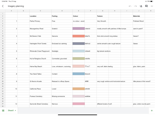
Below is a spreadsheet of the imagery planning. Each location contains a feeling and my interpretation of the feelings colour and texture.
The arrangement:
I thought a lot about how I would arrange the pieces. Initially it was on sticks and ‘growing’ from the ground/floor. I thought about different arrangements of how it would look in a space…
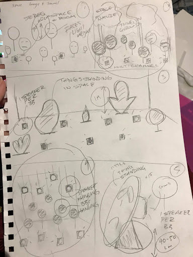
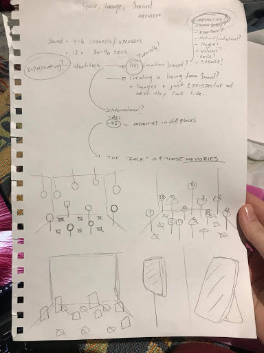
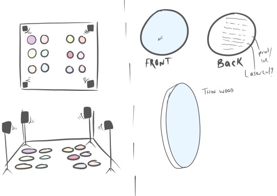
Eventually, I decided I wanted the pieces to be arranged on the floor in a perfectly formed grid with space in the middle for people to stand. This makes it easier for people to be fully immersed in the installation where they can experience all sounds and visuals from the centre.
Material:
As shown in the imagery spreadsheet above, each art piece has their own textures created from different materials. These materials were initially going to be glued to plastic or card as the canvas. This makes a decent and cheap prototype, however I feel this would be too light and weak to include in the final installation. I began leaning more towards some kind of wood that has a little more weight to it, and makes the pieces feel more special and valuable.
This can also be an opportunity to experiment with how the stories on the back of the pieces can be shown; laser cut, printed etc. I am yet to decide on how these stories will be printed - something not too costly but with a permanent and powerful outcome.
Sound:
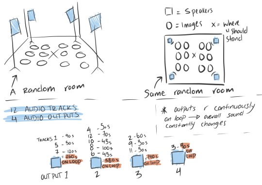
The audio tracks are to be arranged into four audio outputs (arrangement still being decided). The purpose of this (faux) multichannel aspect is for each output to be on a continuous loop while all at different lengths, making the overall audio continually change. See following image for better explanation.
The spreadsheet below shows the location, the relationship, the feeling and the sounds that represent these.

When developing a ‘sound’ for these memories, I analysed how those memories made me feel, and looked at different existing tracks or sound recordings that also depicted that feeling. I took the time to fully imagine the length, volume and layout etc of the individual tracks. The following are the first iterations of five of the memories so far.
Harrington Point Turrets
Mangawhau Road
McClarens Falls
Paihia Primary
Two Hands Tattoo
Matt and I spent a few days creating these and most of them depict exactly how I wanted them to feel and I couldn't be happier with them. The only track I am not so sure about is Paihia Primary. This track represents a childhood memory of feeling ‘free’, and after hearing the track on a few different speakers, I was not so sure if it matched the feeling that I wanted it to have, and will be revisiting the track. I am expecting this to happen a lot with this project, as sound is such an immersive experience. I really don't mind this as it is all part of the testing and refining process. This also further develops my skills and knowledge in sound design.
0 notes
Text
Major self directed Media based artwork.
Before starting my media based artwork I looked to my favourite artists; Wes Anderson and Nadia Lee Cphen, to gain some inspiration. I further looked at various installation artworks, one that stood out to me the most is Tracey Emin ‘My Bed’. With the help of these artists I was able to come to the conclusion of creating my own installation for my overall artwork. I knew I wanted to focus on portraiture and play with the theme surrealism by manipulating the time and situation within my work. Further, I think it would be interesting to incorporate a high fashion theme amongst my images to add individuality and character towards my series of photographs.
INSPIRATION
Wes Anderson is a American filmmaker who is well known for his distinctive visual and narrative styles. ‘Moon Rise Kingdom’ (2012), really stood out to me through the use of colours and composition that was used throughout the whole movie.
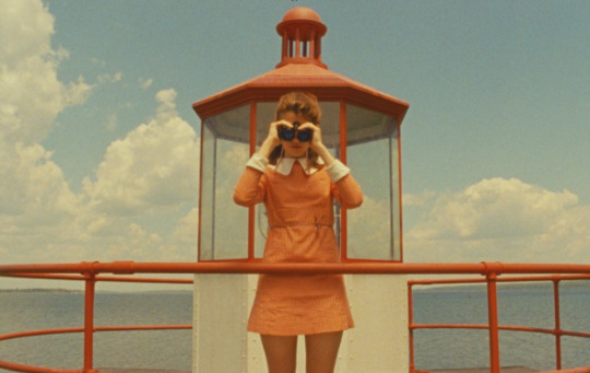
His techniques within filmmaking has always been intriguing to the public, I would liker to adapt such skills and intertwine them into my own images but still maintaining my own style. By indulging myself within the world of Andersons I’m able to gain a rich understanding of composition and the overall style that will help me in my final project.
Nadia lee Cohen is a British filmmaker and self-portrait artist. Her style mainly focuses on the 1950-70s American and British cinema that is portrayed specially through her series ‘Hello my name is’.

Cohen’s unique style of photographs and films has always been extremely satisfying to the eye. She creates captivating images through her unique skills in what seems like a materialistic world that she creates in studios and settings. In this series especially has inspired me to create my own bizarre portrait photos. Her use of hair, makeup and costumes are all factors that build a somewhat plastic/fake appearances in each image creating a doll like figure. The posture of these subjects is what builds a strong composition and character that I will have to think about very carefully as I will only be using one piece of item with each image. I will have to use that to my own advantage to create a solid composition within the frame.
Tracey Emin is an English artist known for her autobiographical and confessional artwork. I looked closely at one of her most famous installations of all time, ‘My bed’ (1998). She was inspired by the aftermath of her bed following a bad-breakup. Surrounding her bed was crumpled tissues, cigarettes, empty vodka bottles, through this image she believed that this was a work of art.
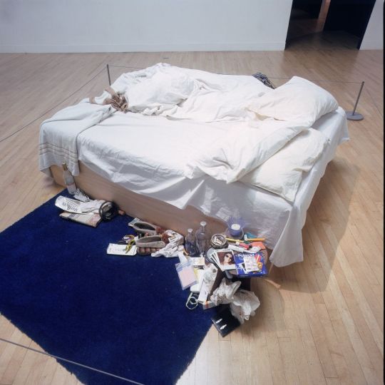
Installation view of Tracey Emin, My Bed, at the Turner Prize Exhibition, Tate Gallery, London, 1999-2000.
I was inspired by her use of various random objects and created it into a one large installation artwork. It makes you wonder all the little things that we own or collect over the years into one little section of your own home. I wanted to use this idea within my own work by incorporating one random object in my house to show our relationship with our belongings towards the audience. The messy and uncleaned bedroom creates a buzzer compositions as it is placed in the middle of a meusume. She expresses a personal response depicting vulnerability, a self-portrait that doesn’t veer from the messiness of depression and heartbreak. Where she comments the views and her own painful experience.
Mario Testino is a Peruvian fashion and portrait photographer whose work is found mainly in international magazines such as Vouge, V Magazine and Vanity Fair. High fahsion photography has always been an interest in mine through the use of set design, preprofessional models and the mood and styling of the overall photo. Testino creates emblematic images that have contributed to the success of high fashion brands while he challenges traditional views on gender by mixing masculinity and femininity and suggests sensuality rather than. sexuality.
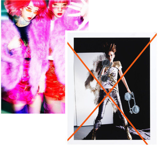
Right: Amiaya, Tokyo, 2018 Left: Mario Testino Document Journal, May , 2014
Above it is clear that Testino captures the moment in time and brings out the humanity of his subjects, creating a connection between the model and the audience. His images are captivating to the eye using bright bold colours, he also draws on his printed work to create a two layer image to exemplify the chaos within the image. Further I chose Testino as one of my artist of inspiration as his works have always stood out to me, especially for this task I want to create a my own inspired high fashion photographs to create an editorial series based on context and situation.
DEVELOPING IDEA
Before capturing any photographs I've decided to to sketch out each image that I will be taking, to gain a better understanding fo what my series will ultimately look like. As you can see each drawing has one coloured object item that will correspond with the outfits. I wanted to keep a colourful rainbow theme throughout each image to indorse a light-hearted mood for the audience.
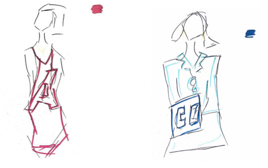
Red: In this image I will mainly focus on the the colour rose red. This strong vibrant colour will be structured by the object; Eiffel tower statue.
Blue: The image will have a striking electric blue tone throughout the photo. I will be using a phone box as my prop.
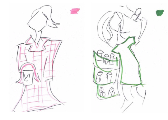
Pink: For this image I will be using a mannequin head wearing a pink bob wig as my prop. My model will be wearing a pink coat that will correspond to the wig.
Green: The green pop wad a little tricky to find as I will also be using toilet paper in the image as my main prop.
PRACTICE SHOOT
Proofsheet
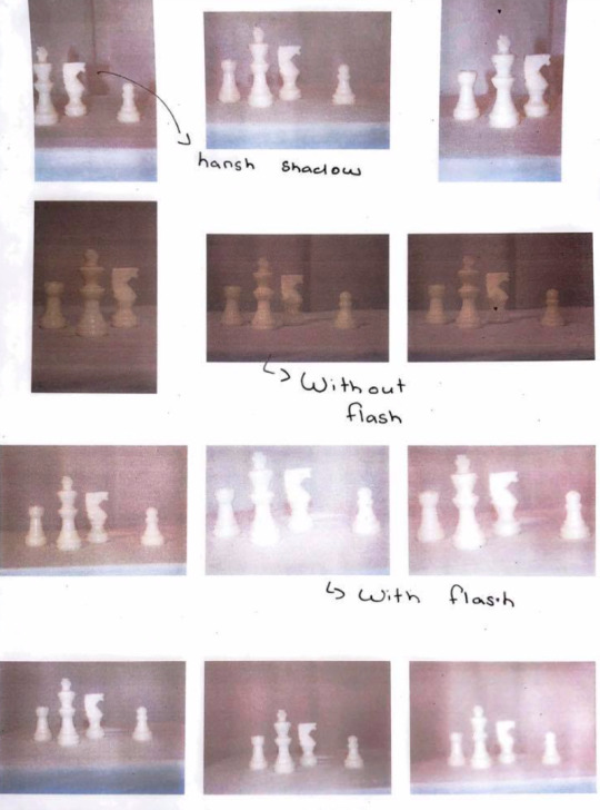
Evaluation: For this shoot I had to create my own little studio within my house. This was very tricky as I had to find multiple lamps and set them up facing towards the subject, however there was not enough lamps to achieve the studio lighting that I wanted. Resulting to using flash on my camera allowed me to get that bright image that I wanted. I worked with small colourful objects just so I can see how myself series will turn out. Overall I’m very pleased with my final mini practice shoot as it helped me know what camera settings I should use and how I should position my c camera for the actual shoots.
SHOOT ONE: BLUE
Proofsheet
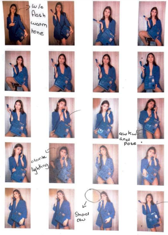
Evaluation: The blue images turned out exactly how I wanted and I’m very pleased knowing that there are potential images that I can use for my final series. I did have problem with the lighting as my flash was turning off and on. I did like the ones without flash but I would have to ensure all my other images have the same tone in colours to keep a theme throughout my images.
SHOOT TWO: GREEN
Proofsheet
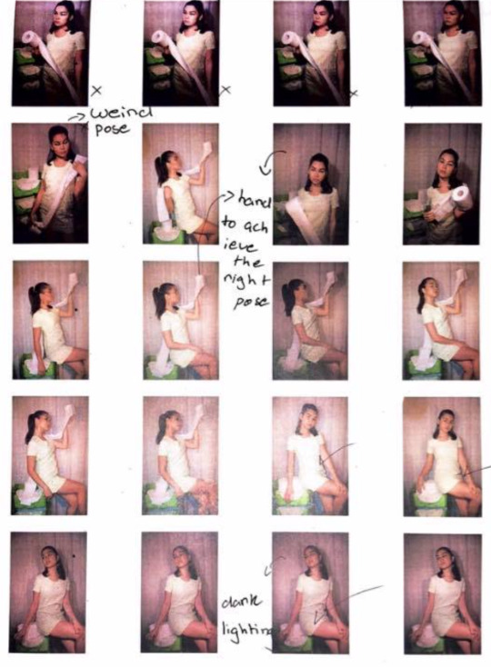
Evaluation: This shoot was very tricky as I couldn’t find anything in my house that was green except this this three layered holder for tissue paper. My whole approach to this series is suppose to express quriky and playfulness however use toilet paper was very hard create a structured composition. Once again the lighting was going all over the play due to the flash turning off and on which made the images seen dark. There are a few images that the subject is holding the toilet paper that covers the entire frame however there is something still very off about these images that don’t quite fit into my series. I will have to see how I go for my next couple photos if I was to incorporate a green image of not.
SHOOT THREE: PINK
Proofsheet
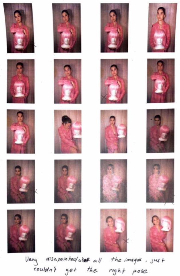
Evaluation: The test shoot did not go as well as I hoped it would due to the prop not suiting the overall image. I felt as if the mannequin head with the pink wig looked somewhat awkward and due to the flash it washed out the white face in an unpleasant way. Further, I used a flask but the i felt as if the small object did not justice and was failure once again. Thus, I’ve decided to not use these pink images in my final work and due to the short amount of time I have im enabled to repeat this pink shoot again.
SHOOT FOUR: RED
Proofsheet
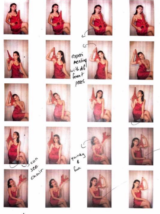
Evaluation: I am very pleased with this shoot as it turned out exactly how I expected. I was able to create new composition within each image by placing the Eiffel tower artefact around the photo. It was also very fun to shoot as it was quirky and random. As of right now the red and blue images are the only ones that turned out great but for the other ones I was very disappointed. I decided to do another photo shoot using the colour yellow that will hopefully stand out just the other primary colours.
WEEK FIVE
FEEDBACK FROM TEACHER
In today’s class I was able to discuss my overall idea to my teacher, Vicky and showed her my images that I have taken. Further, I discussed how I will be doing another shoot today with a yellow theme however we both agreed on just work on the blue and red images to create a more detailed image. She suggested to put a backdrop to add texture and more depth. I also decided to present my work in a large spacious room because it will allow the audience to move amongst the space and interact with the objects.
I further went to the printing room to meet with Josh, where he helped me set up my images on Lightroom, however we discovered the image quality is very low due to my camera setting. This meant my images will not print in a high resolution causing it to look burly and having a lot of noise. Since I will be doing another shoot today I will have ensure that my camera is on the highest pixel where next Tuesday I will be able to print them in a higher resolution photo.
Throughout the day I worked on my blog and edited a few parts. Later in the day I will hopefully be taking my last shoot for this task that will help improve my overall final work.
PINTEREST INSPIRATION
Before my shoot I wanted to look for more inspiration to really develop an idea throughout my images and to see what composition I’m aiming to create. I looked through Pinterest and found a couple of images that have really helped me gain an idea on how to develop my backdrop for my final images.
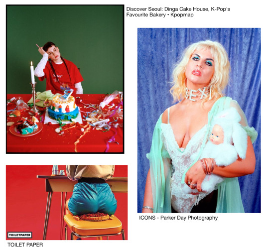
SHOOT FIVE & SIX
Set up: For todays photo shoot I was able to get a ring light from a friend of mine which allowed me to achieve that bright studio lighting without using flash on my photos. In the early photo shoots my flash kept going off and on due to the auto setting, however this time I kept it off. Below, the images show a set up off my mini studio that I’ve created. You can see I had purchased fabric for my background and had to tape it to my wall creating riffles to add texture.
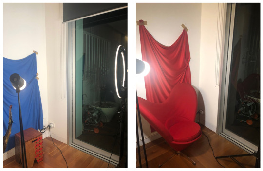
SHOOT FIVE: RED & BLUE
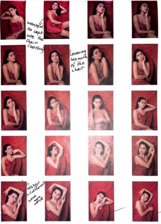
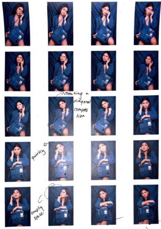
Evaluation: I was very pleased with this photo shoot as I was able to pick two images for my final work. I made a few annotations on the proof sheet that describe which images I liked my ticking them and others that I found awkward or out fo place.
EDITING & PRINTING
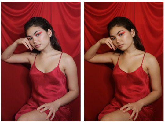
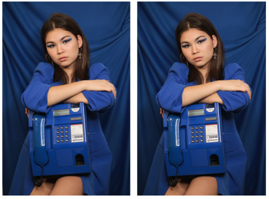
Below is the two chosen images of red and blue photos. I have placed my edits of the red photo as you can see the before and after image. Where skin tone is now warmer and will suit nicely with the blue skin tone. I also had to fill in the left bottom corner of the blue image to get rid of the white background.
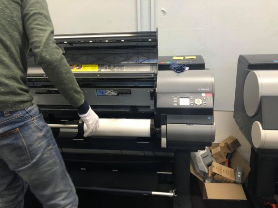
Then Josh helped me print test images on fine art smooth paper. This allowed me to view my printed images and see if the colours and tone on the screen matched with ones on the paper. Below is an image of the set up for printing the mini test prints.
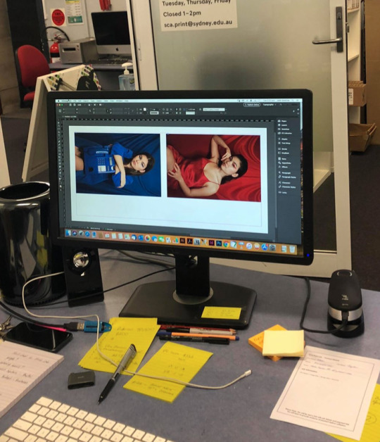
Here is a photo of Josh placing the art smooth paper A3 into the printer.
TEST PRINTS
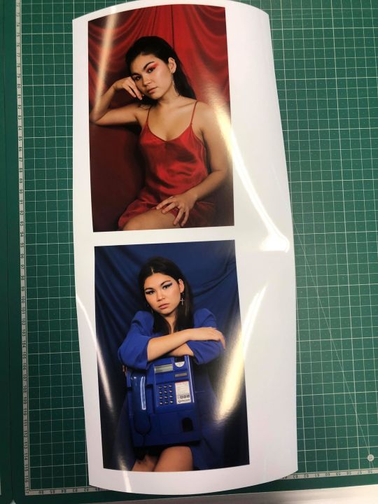
I’m very pleased how my test print turned out as they were both successful. The skin in the red image was really balanced and complimented the other blue image. This ultimately made a nice duo.
PRESENTATION
Below is my overall presentation setup. I had to pin up the print using a hammer however during this stage a couple of finger print marked my blue print. I then asked Izzy to help, we decided on taping a clear plastic seal at the edges of my image and hammer those down without touching my prints.
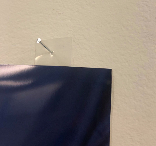
Further, I placed two pillars infant of my photographs and put the objects on it. As you can see I placed a miniature version of the red chair on the pillar because it would of been impossible too bring the actual human size form chair to the University. Hopefully this alternative still manages to bring a high quality installation.
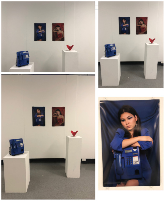
(I tried to upload my final images on a google drive but it wouldn't upload because of the photos resolution being too high. I could email you the images so please let me know.)
FINAL EVALUATION
Overall, I am very pleased with my final media based artwork, as it turned out exactly how I wanted. Throughout the long process I was able to finally achieve my final images. By the last shoot I knew that I have came a long way, and was extremely happy how they turned out. The editing and printing stage ran smoothly with the help of Josh as we were able to achieve it in less than a hour. I learnt how to use Lightroom where he helped me edit the red image skin tone to match the blue one. We printed on shiny gloss paper however when I was hanging it up I accidentally go my finger prints on the image. This made me question if I ever wanna use glossy paper again but the overall look was spectacular. On the presentation day I was able to locate two block stands where I placed my two objects. The outcome was nicely placed however, if I was given more time and resources I would of done a whole large series, to really complete my vision. Thus, despite the lack of photos and time, Im very happy how the overall presentation was put together.
ARTIST STATEMENT
My media based artwork, “What the eye can't see”, focuses on beauty found within the mundane as we look beyond the superficial standards of human perception. The images tells a story, of a young women possessing the objects; a vintage phone box and a love heart chair, that challenge our perception of beauty where these inanimate objects oppose our natural indications of beauty. Furthermore, the model becomes one with the objects where we start to associate beauty to a further extent than our natural standards.
Inspired by situation and creating a time and place, each setting compliments the colour of the object, forming an aesthetic appeal to the series. By brining these objects to life by presenting them directly in front of the audience it creates a layer of realism allowing us to maintain our focus on the bright vivid items. The interactive installation allows us to question our own individual associations of beauty, as we view two perspective; the images and the objects placed in front. Overall, by exploring humanities identities of true beauty and superficial perfection, my work looks beyond these standards viewing mundane items that provide its own natural beauty.
0 notes
Text
New Orleans: First things, first.
So yesterday was split into many parts. I woke deliriously tired at ridiculous-o’clock in order to catch my red-eye flight. In fairness, the over-tiredness was my own fault; having indulged in the prolonged-goodbye-love-fest with everyone I could manage to see throughout the day on Monday. (Which was totally worth it on that alone, but I also got so many lovely plane letters that I now have tucked in my journal). The idea was that I would have the better part of my afternoon to spend around New Orleans when I arrived- although it didn’t exactly end up that way. Being so tired did help me sleep on the plane, which I usually struggle with, but it dragged on into the rest of my day as well.
Katie & I joked the day before, that I was spending so much time packing (and struggling to cut down) that my bag was probably going to go missing. (She used to work for an airline & said “ I mean sometimes bag really do just get up and disappear! But not that often”) And what exactly happens? My big-yellow-perfectly-packed Backpack never shows up on the turnstile. Apparently, Air Canada has no record of it, besides it being dropped at the airport in Halifax. So I sat at the airport in New Orleans for longer than I normally would have, trying to draw out the positives of the situation. I guess, loosing your luggage is a right of passage, (And it’s happened to me before in university) but it’s kinda different when you’re not going to be in one place for that long. But I mean, this way I only had my teeny bag to walk around town with (and it would be less easy to pick me out as a tourist.) So I went with that.
There was something about landing in New Orleans that is so special. As you draw closer to the airport, you fly over the Mississippi River & watch it twist & turn towards the Gulf. It really is such a great view. On the ground, It is noticeably different. The air, even in the milder winter months is still so thick with humidity. I really can’t imagine what kind of sweltering heat sits in this city during the summer. I mean winter here is like late summer in Halifax & I will take it. It’s such a welcome change from the frigid, damp cold of Halifax winters.
Speaking of Halifax, New Orleans must be like Halifax’s stranger, older, long-lost cousin or something. The feeling of the city, is so strangely familiar to me in some strange way. Their are definitely threads of sameness in these two places. I mean, the first thing being the Acadian/Cajun’ connection- which is more palatable than I really expected -- First thing I noticed in the airport was a trio of (QTpa2Tis) playing french fiddle tunes. My heart panged as soon as I heard that & I ended up loitering just to soak it in.
Sitting on the bus (then streetcar) drawing towards the 7th ward, I found myself eaves dropping so hard. Not necessarily to what people were saying (although a VERY HOT TOPIC was the Saints recent loss. It made for very enthusiastic discussions.) but to the accents themselves. My lord, the rhythm in them is so beautiful. I found myself asking more questions than I really needed answered just to hear some people talk. Not that I really had to do that-- people are so incredibly friendly here. Like even more friendly than Nova Scotians. I’m talking People sticking their-heads-out-of-their-houses-to-say-hi-to-the-stranger-walking-down-the-street friendly. It’s kinda odd. Kinda awesome.
Another thing, that is obvious from the get, is my own racial identity. My whiteness definitely stands out, especially in the eastern part of the city. I mean, I knew coming to the southern states during the time of the Trump presidency, I was kind of coming into the belly of the beast in terms of racial politics. Halifax, being such a predominantly white (and racist) city, I navigate my whiteness in a different way. Honestly, I’m not forced to think about it that much- which is an inheritantly privileged act. Here, I find myself thinking about my otherness/privilege pretty much constantly. Which is a good thing- if I’m going to be someone who strives towards allyship for BiPOC. I’m sure this will continued to be explored throughout my entire trip.
------------------------------------------------------------------------------
The house I am staying at is actually too perfect for words. Asa is a friend of a friend of mine & was kind enough to let me stay with him & his roommates over the length of my stay. I’m grateful for that alone-- but landing in this place is such an honour, honestly. Asa is an artist, and that’s obvious as pretty much ever single thing in this house has a strange story attached. The walls are covered in brightly-coloured murals with a manner of strange imagery. I was mostly sad, having lost my luggage, but I was instantly brightened as I walked into the multi-coloured-walled bathroom and realized the colour/texture matched my odd 80s sweater perfectly. On top of that, my greeter, upon my arrival is the most sookie/charming/huge white dog named Kozmeaux, who was apparently rescued from a mountain in California. I definitely napped with him several times already.
I’m staying in the back house, where there are a few extra beds tucked in some nooks. Walking back there, I met one of Asa’s roommates named Monk & his dog Simba. Monk built this incredible tiny house (which still has an incredible amount of New Orleanian Style features. It’s taller & square in orientation- one of the keys being tall ceilings for the sake of the sweltering summer heat. He built it himself & wants to continue doing more projects like that in the future.
Currently, I am sitting in “the sad-clown room” cuddled up with Stubbs, the tailless cat. As you may have predicted, the walls are covered in painting, sculptures & other sad-clown artifacts. As it happens, Asa & his cousin Leon (who pulled up to visit a few hours after I arrived) had started a circus a few years back. Two of Asa’s roommates (who are currently away for business) are also clowns. A fact about me, which only comes up in very certain circumstances is that my siblings & I were actually kinda raised in the circus business. My father has been a professional clown/ performer his entire adult life. As a pre-teen & teen, I kinda struggled to talk about it. It’s kinda really fucking strange for people to understand if their parents just work in an office or are a doctor or lawyer of something. I just didn’t want to have to break it down for them. It was labour-intensive & quickly became kinda embarrassing for me. As an adult, though, it has lead to many funny & interesting conversations- including one refraining conversation with my father that goes something like “gosh, if you’d only let me train you in circus, I wouldn’t have to worry so much about you. I’d know you’d always have a solid act to fall back on!” I feel like joining the circus, is a parents worst nightmare for most people, but for mine, it’s his most vivid daydream. I mean, all my siblings are artists/musicians- so it’s not like we wandered toooooo far of from our family legacy. I think it would be more odd if we had decided to be accountants.
Anyways, it feels very comfortable to be around people that understand & embrace that kind of lifestyle. I feel like I’ve landed amongst my people, and I’m super, super grateful for Troy for setting me up like this. I’m glad to be around people who live & breath the creative lifestyle, as if their was no alternative, because living in the northend can definitely be like that too. On the subject of clowns- Asa also invited me to see a production of “Clueless” (yes, the Alicia Silverstone classic film) with an all clown cast. Not really sure what it’s going to be like, but Very much looking forward to it.
Asa, Leon & Sarah (neighbour & friend & fellow artist) stumbled into so many strange/wonderful conversations. I mean I guess it started with “so what brings you to New Orleans” which I gave the full-blown version of ... because I have to pick my audience with that one, & I figured that of all the people I will meet over the course of this trip, these people will probably understand it most. Of course, that conversation quickly turned into a winding conversation about art & aliens & paganism & the paranormal. Leon, is also kinda on a quest himself. He arrived having driven from New York (where Asa is also from) all down the east coast of the country. His next destination is Roswell, New Mexico (Mare! New Mexico!) “to pay his respects.” I didn’t really get to investigate what that really means. Eventually, he’ll wind up back in Southern California, where he currently lives. During one of our conversations, I happened to briefly mention swamp thing & Asa enthusiastically directs me towards one of the back rooms. It’s completely dedicated to the Swamp thing. I’m talking paintings, tchotchkes & memorabilia all dedicated to the swamp thing. It’s out of this world.
0 notes
Text
Personal Portfolio Week 4
This week is continued development on looking at different portfolios for inspirations and seeing what makes a professional showcase.
Website:
https://www.pnowacki.com/
This website belongs to artist Peter Nowacki who specialises in shading, lighting and rendering which is fascinating to look at the portfolio of a renderer this time. The front page of his site showcases the various projects he’s worked on which I do like, it shows off to the people what clients/companies you’ve had that does include work for some big gaming studios.
He has a page for his WIPs which I really like, as a renderer you gotta work to make the scenes look as nice as possible so it’s interesting to have a look at different shots of the same location what have a different look each time possibly to showcase the power a good render can do to really complete a scene.
Other than that the basics are there too such as nice clean layouts for site navigation, the choice of them being in the top corner was pretty cool to me. Might try that out myself for my website.
Website:
youtube
This an interesting one to me, while it only showcases a couple of environments with its own models it still has a very clear identity as both environments shown have a fantasy/historical vibe to them. While some may say that it’s not a good idea to showcase off only style of work as opposed to a variety maybe he just knows what he wants to do and has a specific studio in mind who specialises in that setting as that is rather common in the video game industry particularly.
I personally think he was able to take the lack of visual variety and play it to his advantage such as the music choice which fits well with the tone and setting he goes for. The visual style matches the setting tone with the semi-realistic look. I also like the turnarounds of his models showing what textures he used and how complex it is.
While yes it definitely could have used more things to show off (whether it was fantasy historical or not) it still manages to present a solid personality and showcases of his interests. I can see it landing him an intern role at a studio who specialises in that particular setting.
This week has been continued solid progress on analysing different portfolios, getting some more variety in there now with more than just modelling ones. Thinking more about how I will develop mine with different ideas and designs. Need to start thinking about what I will be making myself for the portfolio in terms of original work.
0 notes
Text
Build & Destroy
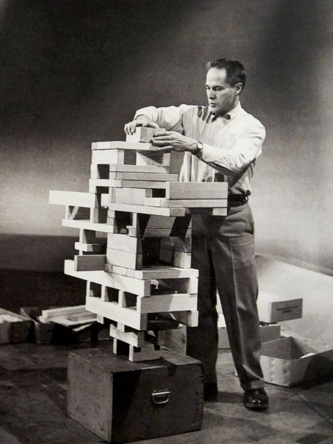
This workshop was to develop an understanding of balance in structure within modernism architecture. This task will get me to strip back to the basics and remember the autonomous mind within design, by not over thinking each task and worrying about what the outcome is but start to understand the shape and from, to then make connections to structures and how they could help in the designing process. The workshop has been based in the work by Eliot Noyes with his project Neutralises balance this task was to use building blocks to make 3d abstract sculptures that have similar characteristics to structures, I was asked to use the same colour to limit my design however this also gave the potentiality to explore the tonal value with one colour, possibly identifying another design within the tone.
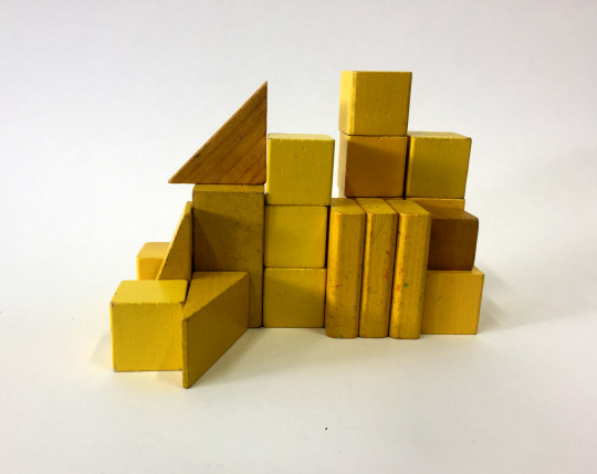
Using my sketchbook I was given different observational drawing techniques by using a range of medias and different viewpoints of the sculpture to record. The first task was to use either crayon or charcoal to observe the vertical lines within the piece; for myself I decided to use crayon to follow in the theory of Noyes’s the autonomous mind linking to how children just build to play around, so by using crayon I found that I was drawing without thinking, also it made me to start to not see my sculpture as a structure I found this to be important as it allowed me to over complicate the drawings.
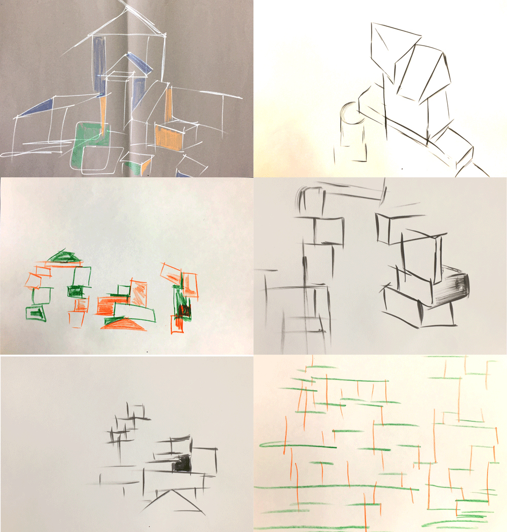
From these drawings there is that child like appearance just through the texture and the consistency given off by the crayon. Although it is very rough there is similar characteristics and qualities to the sculpture, however from speaking with my tutor the purpose of this task was to be loose and free with the drawings by looking for a second then drawing either extending the lines bigger than they are or thicker, and smaller this would then change the subject with different inter crossing lines; following these drawing exercises it would allow there to be the element of development as these new lines could allow me to produce a different project through a 3D method or in a detailed technical drawing.
The next task was to do the same as the first but instead of drawing in the vertical lines I had to draw the horizontal lines using a different colour. There was two options for this next stage we could have draw the horizontal lines over the top using a different colour or on a separate sheet of that could be layered over the top. I went with drawing over the top on the same page as at the time I thought this would be the best option however now upon reflection I can see there being more potential in having them on separate pages as I found myself drawing to the vertical lines trying to have more consider lines connecting to each other, trying to have order in the observations and not having freedom. By also having the drawings on a separate page it would allow me to combine the different lined drawings of this sculpture with another to see if I could then identify something new within that mix and match.
With the continuous drawing task I decided to change my viewpoint and draw from above to see if there was another outcome in a different position, from doing this I found that there is the possibility of finding another structure in a structure, this got me thinking in how this could relate to actual existing buildings can we identify another building in the Empire state building, Buckingham palace, The Effie tower etc, they could be found in the smallest areas within a window for example it doesn't have to be another building as a whole it could be separate individual pieces that need to be put together.
The effect this task had was more bold and prominent as for the choice of media I went with by using a permanent marker I wanted to have the opposites in consistency by having a solid unified line to the broken rough crayon line. I feel this showed more diversity in my drawings and enabled me to pick out different aspects within both that could possibly be collaged together, to see if they could form one united image with the juxtaposed features. One designer/ architect that I found this task could be linked to was Frank Gehry as his sketches for building designs were loose, for example the continuous line drawings he produced when designing the Walt Disney concert hall are really basic but have a vast amount of detail when observing the sketches to the actual building showing these organic curved shapes that don’t follow the usual order a building has when being designed and produced.
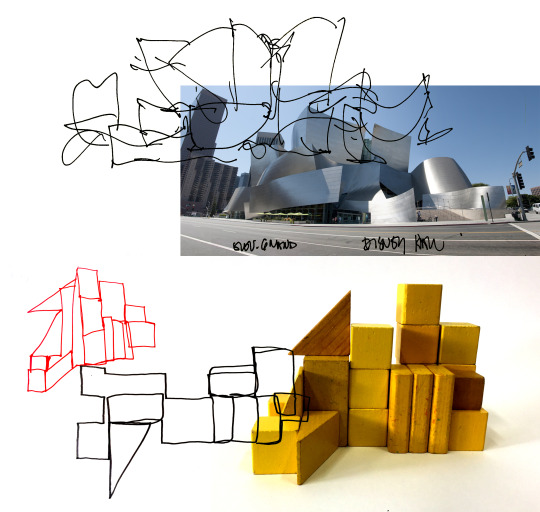
This image shows a comparison of continuous line drawings done by Frank Gehry and myself.
The final drawing task was to use ink to record a smaller section within the sculpture to capture the tonal value, also by taking smaller sections of this sculpture it allowed me to identify imagery in the structure that could be made by a combination of the shadows and blocks to form something new. I started by doing this task in my sketch book but I found there to be to much control which wasn't the purpose of the task, so I decided to work on a larger scale as this would mean there would be times I would have to reach over and stretch to complete my observations this was what I was intending for as it meant there was more possibilities for mistakes which could then lead onto creating something new and different with the similar features to the block work.
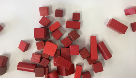
In this follow up task we were asked to knock down our structure we produced to try and identify if there was anything formed in the rubble; possibly another building or simple forms.
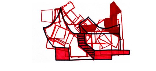
With the scattered blocks I was able to use my recent research on Zaha Hadid and used a rather geometric task by turning it into a curved/angular design; this was successful as I was able to this gradually starting with one drawing layered over top and sketching out around the design I could see within. The next step was to repeat this again until I found something that was obscure and completely different from the original image, this was to show the progression that occurs in the design process.

Looking at mine and Freya’s work there will instantly be connections as the processes are the same, however there are some differences in how we approached the drawing tasks. With the first task I opted to draw the vertical line and horizontal together whereas Freya decided against this, the reason behind why I did it together was because I felt there was more potential in finding a structure within this lines, but I also see the positives of doing it the other way as you can still layer the lines on top of each other but with this way it gives the designer more freedom in how these lines could be allied together or in different positions.
Whats interesting about having these two outcomes lined up against each other shows the similarities in shapes within the both drawings even though the models built are different. Where I see this connection the most is in the continuous line drawings this is because they have the most detail but also they are the easiest to understand what the subject is that is being drawn, when comparing the contentious line with the inks there is more tonal value in them possibly giving the opportunity to identify a ‘structure with in a structure’ however in the inks they both give the subject back the childish element that there was in the building phase.
Whats the potential of repetition of this task? What would different or the same every time this workshop was repeated. I feel if I was to repeat this task there would be a cutoff point because I believe the designing process would become very limited as my model making will end up being to similar almost identical outcomes each time.
Following this workshop I developed this further by using the work of Theo Van Doesburg on his life drawings of a ‘Cow’. When observing my scattered building blocks they had similar characteristics to the break down work of living objects into simple geometric forms.

When observing both of these images I can see the shape and form are very similar having a range of different sized square and rectangles; something that I notice about Doesburg’s work that is similar to the work of Vladimir Malevich’s is that they both looked at the simple forms of art and graphic design by breaking each idea to the bare minimum. For example this drawing Doesburg done of a cow can be identified throughout all four images as the positioning of each shape and colour also relate to the original form it started at.
what is modernism and what drawing techniques/styles epitomise’s this
After completing this workshop I wanted to develop this further by printing out all of my different drawing techniques to cut them out and layer all together. I wanted to see if there was any other imagery that was being produce when having all the drawings together.
I was starting to see different structures in this task; this made me to think about this idea again of identifying ‘structures in structures’, this allowed me to rotate each piece and record the different positions, In the first image the two triangles together looked similar to a roof of a building that I spotted on a trip up to London. So I believe this task was a success as I am able now identify these small features in my work that can be identified in existing buildings or designs.

After using this mash up of all the line work I created a series of imagery from the blocks stage by stage, which then formed a building in the end. In the picture below it shows the series layered on top of each other having a chaotic appearance but you can still following the shapes that outline the from first block work to the finished image.

0 notes
Link
(adsbygoogle = window.adsbygoogle || []).push({});
As someone who primarily games on PC, my advice to anyone who’s looking to get into PC gaming is usually going to be to build their own. Up until recently, I would have written that my advice would be to always go the custom build route, but thanks to that thorn in the side of the gaming enthusiast known as cryptocurrency mining, that may not be entirely realistic for a while. In turn, this makes buying pre-built PCs a better proposition than it usually is, and there are plenty of manufacturers ready and waiting to fill the gaps. Lenovo is once such manufacturer, with its Y720 offering solid mid-to-high-range hardware in a mobile package.
Design
The Y720 looks much like the array of gaming-centric PCs from Lenovo, sporting a black color scheme accented by red. If you’ve seen a Legion-branded machine before, you know what to expect: something a little more subtle than your average gaming notebook, but still decidedly a laptop made for gamers.
There isn’t much in the way of external lighting on the Legion Y720. The Legion logo on the reverse side of the display lights up, but other than that, you’re left with an all black machine (save for another patch of red on the underside of the device that no one is ever going to see). I like the look of it overall, but one thing that’s become an annoyance for me is that the smooth and glossy finish on the outside of the laptop seems to be particularly good at attracting fingerprints and oils from your skin.
Obviously, even though this is an endlessly frustrating thing for me, it’s not a deal breaker. If I judged a laptop’s value by such a small annoyance, no machine would ever get a passing grade. Still, this might be something worth keeping in mind if you share this particular irrationality with me.
In the end, the Legion Y720 has a fairly unremarkable design, but that’s honestly the way I prefer it. If I’m going to carry a gaming laptop with me, I don’t need it to act as some kind of shining beacon that lets everyone know I’m using the computer. The black and red color scheme looks nice, and the limited external lights give this laptop a fairly mainstream look that doesn’t overdo it. If I had my way, more gaming laptops would practice subtlety in the way Lenovo has here.
Like every other gaming notebook out there, the Legion Y720 weighs a fair bit more than your standard notebook. There’s good reason for this, of course, as it’s packing more serious hardware than your standard notebook as well. With a weight that starts as 7.05 pounds (and goes up depending on your configuration), this isn’t exactly a light machine. Nor is it small – its 15.6 inch display and full-sized keyboard see to that. You’ll need to make extra consideration for space if you’re going to lug the Y720 around with you, but such is the life of a PC gamer with a preference for laptops.
Performance
Obviously, if you’re buying the Legion Y720 for anything, it’s not for looks, but to play games (or do other graphics-intensive projects like 3D rendering). For this, hardware obviously counts more than anything, and a gaming notebook that is lacking in suitable hardware will quickly be left behind and forgotten as manufacturers move to cram their machines with better and better parts.
In terms of power, the Legion Y720 is no slouch. The model I was sent for review is Lenovo’s top-of-the-line Y720, with a Core i7 7700HQ CPU clocked at 2.80GHz and a NVIDIA GeForce GTX 1060 6GB. This model also boasts 16GB of RAM, a 1TB 5400RPM Hard Drive, and a 512GB SSD.
The result of all of this hardware is a speedy little machine that’s fast to boot up and manages to avoid lag when doing most tasks. While the GTX 1060 isn’t NVIDIA’s best 10-series card (far from it, in fact), it’s more than likely going to be capable enough for whatever modern games you want to play on a laptop.
Does this mean that you’ll be able to max out graphics settings in each and every game for years to come? No, but for now, the GTX 1060 is a solid card that should allow for some very pretty games. For instance, the GTX 1060 is enough to meet the recommended requirements for the upcoming Final Fantasy XV Windows Edition, and I imagine that’ll be the case for a lot of graphics-intensive PC games for another year or two. In short: While the GTX 1060 may not offer as much power as its big brothers within the 10-series, it’s probably going to be a while before you begin to feel that rift in capability.
Indeed, for the time being, the GTX 1060 is a solid graphics card. In Divinity: Original Sin 2 – a game with no lack of impressive (and intensive) graphics – I found that cranking everything up to Ultra settings gave me a framerate that topped out around 100 in indoor environments without much on screen and bottoming out in the mid 70s during times when the PC had to render a bunch of objects and characters or when Original Sin 2’s wonderful particle effects filled the screen. The Ultra profile in D:OS 2 includes the highest settings for textures, lighting, and shadow quality; settings like ambient occlusion, god rays, and bloom turned on; and finally, 16x anisotropic texture filtering and SMAA.
So, the GTX 1060 certainly isn’t a slouch, though it won’t melt your face to the degree that the GTX 1080 can. Obviously, you’re going to want to keep the Y720 plugged into a power source as you’re playing, as trying to run a game while the laptop is running on battery will cause a significant drop in frame rate.
You can, of course, drop your graphics settings to compensate for this, but even then it still isn’t the most efficient way to play games on the Y720, as I only made it about an hour and 40 minutes from a full charge to the point where I was getting 10% battery life warnings while playing They Are Billions. Don’t let that give you anxiety about a potentially short battery life, as I got about 4 hours of life on a full charge when I was streaming video with the display at half brightness.
As an aside, it’s a bit confusing that Lenovo chose not to offer a Legion Y720 variant with a GTX 1070, even just for those who don’t mind paying extra as a means of future-proofing their notebook a little more. Regardless of which configuration you go with, you only ever have the option of a GTX 1060 with this notebook.
The review unit’s Intel Core i7-7700HQ and 16GB of RAM both help keep things going smoothly. With a Core i7, you’re not really going to have to worry about your CPU acting a bottleneck to gaming performance at any point in the near future, and unless you’re going to be doing things like video processing on this laptop in addition to gaming, you can honestly go for the base model, which ships with a Core i5-7300HQ.
While the base model only comes with 8GB of RAM, the good news there is that it’s also customizable, meaning that you can upgrade to 16GB for $100 more. This, I think, is worth the extra money – there was a point not too long ago where 8GB of RAM was suitable for a gaming rig, but we’re quickly approaching the point where 16GB will be considered standard. With many new and upcoming games suggesting 16GB in their recommended specifications, it’ll be much easier to pay a little extra than it will be to deal with the frustrations of hitting that ceiling later on.
The 15.6-inch IPS display Lenovo has outfitted the Y720 with is fairly solid as well. Though it isn’t matte like I would prefer with a gaming laptop, glare is not nearly the problem it is with other glossy finishes. Lenovo has treated the display with an anti-glare coating, and while it doesn’t stop glare from being an issue entirely, it does still cut down on it significantly. If I can’t have a matte display (which I understand doesn’t look all that great on a gaming laptop that is otherwise supposed to look sleek), I’ll definitely take something like this instead.
The 1080p LED display probably won’t blow your mind like a 4K desktop monitor will, but it’s perfectly suitable for this machine. Colors look rich and visuals are sharp, which is all you can really ask for at the end of the day, isn’t it? Anything else is just icing on the cake and borders on unnecessary when we also have to make concessions for battery life.
The trackpad and the keyboard are similarly “good enough.” Lenovo managed to resist going all-in on the RGB craze, and while the chiclet-style keyboard does have RGB backlighting, it’s zoned so you can’t make each individual key a different color or set up these crazy lighting patterns. You backlight is managed through Lenovo Sense, and even though the keyboard is zoned you still have plenty of options when it comes to customization, so I honestly can’t really say I miss having a backlight for each individual key.
The two-button trackpad does fine when it comes to browsing, but if you’re using this laptop for gaming (as is its stated purpose), you’re almost never going to use it. Get yourself a decent Bluetooth mouse and use that instead, because trying to play games with a trackpad – especially ones that require quick reactions – is really just inviting frustration.
Finally, we come to the Y720’s JBL speakers. These are something of an anomaly within the word of laptops, gaming or otherwise. The speakers seem to provide somewhat fuller sound than most laptops can (though bass is still lacking, unsurprisingly), but one interesting thing to note is that these bad boys can get loud. I think you should still get a nice pair of headphones or a headset to use while you’re playing games, but if that’s not an option after dropping the cash required for the Y720, the included speakers at least do a serviceable job.
Wrap-Up
In the end, the Lenovo Legion Y720 is a fine laptop, though it doesn’t really have much that makes it stand out from the crowd. As I said earlier, that isn’t necessarily a bad thing, because hardware – not software or design – is most important when it comes to gaming, and the stuff that’s packed inside this laptop is enough to ensure most games run well.
So, while I’m not about to sing the Y720’s praises from the mountaintop, I don’t have a problem suggesting that you at least consider the Y720 if you’re looking for a gaming notebook. This, of course, would normally be the time where I recommend that you build your own gaming PC instead of buying a pre-built, but there are two problems with that.
This first is obvious in that if you’re specifically looking to buy a gaming laptop for the portability factor, suggesting that you build a desktop instead is silly. Even if I could convince you to build a desktop instead, though, the second problem is that PC hardware is ridiculously overpriced at the moment. This means that pre-builts have a rare moment in the spotlight among enthusiast PC gamers, and the Y720 benefits from that.
Even though laptops aren’t my preferred form factor when we’re talking about PC gaming, those seeking one out should consider the Y720. Assuming you start with Lenovo’s base model – which is currently $1099 on Lenovo’s store – and make some tweaks from there, you should walk away with a solid gaming machine without ever having given the absurd prices of PC parts a second thought. Personally, I think that’s worth a lot at the moment.
(adsbygoogle = window.adsbygoogle || []).push({}); http://ift.tt/2BZQw3k February 15, 2018 at 06:29AM
0 notes
Link
Beautiful Homes of Instagram Happiness has arrived! I honestly feel extra happy when I share a new “Beautiful Homes of Instagram” post with you. I find these posts are so helpful if you’re looking for inspiration because these talented homeowners are always full of incredible ideas and many DIY projects. Today, I am honored to feature Selena from @middlesisterdesign. She and her husband are a DIYers and I am sure your jaw will drop as much as mine did when you see all of the projects done in this house. I hope you guys have a great time and get some inspiration here to apply to your home! I am definitely sharing this post with my husband! “I am so honored to have our home featured on Home Bunch! When Luciane contacted to ask if she could feature it, I was quite shocked and beyond excited! To have our humble little home that we’ve poured our hearts and souls into displayed next to some of the most beautiful homes on Instagram is just such an incredibly exciting gesture. Thank you Luciane. And thank you all for visiting! Welcome to our home! A little intro to myself. I’ve had a passion for Interior Design and Décor for as long as I can remember. It was merely a “hobby” of mine for many years. Until 2 years ago I worked part time as a bank teller. One day my husband suggested that I pursue my dreams of having my own Interior Styling business. After a lot of deliberation, I decided to go for it and Middle Sister Design was born. I specialize, and take pride in being a more budget friendly, less complicated, savvy stylist for the homeowner who desires a well-dressed home without the large price tag. Simple, Smart and Savvy; that’s my motto! I began a Blog, have had much success with local clients and have loved every minute of it. (And have not once missed wearing heels to work, counting dirty money or trying to upsell. There’s still so much for me to learn and I have big plans for the future of my Blog and Business. When my husband and I decided to build our home nearly 10 years ago we had just been married less than a year. We had viewed many homes in the area’s “cookie-cutter” neighborhoods and while we were uncertain of exactly what we wanted, we knew these were not it. We decided to scour the internet for land as well as for house plans. My husband found a 2 ½ acre piece of land that was only 5 minutes from my childhood home and I found the house plans (we disagreed on LOTS of them before finding the “perfect” one.). We both liked the bones of the house plan I’d found, however there were many things we didn’t love and so we sought help from a local Architect and custom home building company. With their assistance, we made changes to much of the main floor plan. I would describe my design style as somewhat eclectic. Growing up in the South and in a more traditional style home, you will find a bit of it throughout my own. However, being a lover of trends, I do enjoy bringing pieces of trendy items into the mix. Neutral, natural, earth inspired elements are my favorite. My Grandparents lived on a farm and from my memories of spending the summers there stem an adoration for that lovely, cozy farmhouse feel. My take on modern farmhouse industrial and boho chic also play a part in this eclectic style of mine. I truly do have an appreciation for all the styles.” Beautiful Homes of Instagram We kept to the original plans for the exterior of the home aside from choosing much larger windows shown above as well as the Stacked Stone veneers from Eldorado Stone in the color Alderwood. We loved that stone so munch in fact that we decided to carry it over to the entire foundation all around the entire house. The siding is Vinyl in the color ivory and all gutter work and trim are vinyl as well in white. We have designed and installed all of the landscaping ourselves and while that is a job in itself, the toughest part is keeping the multitude of deer from eating all of our hard work. Porch Front Porch stain is James T Davis solid stain in the color Tree Bark. The swing is from Hayneedle and the wicker conversation chairs are from Pier 1. Rugs are from Target. Front Door Front door color is basic black exterior paint. Welcome Home! The front door opens to the Great Room which was actually 3 rooms on the original floor plan; Living Room, Kitchen and Dining Room. This, even on blue prints, looked incredibly cramped and we all agreed that an open concept would be a more unique and inviting look for this space. Another favorite unique feature of mine is the little “shelf” above the foyer’s close/master bedroom door. I chose to display the driftwood pieces my sister has collected from a nearby river for me over the years, knowing my love for it. Living room Sectional Sofa and chair in this space are the Ikea Ektorp Slipcover Series, both in Bleking White. DIY DIY Inspo: Bookshelves, side tables and coffee table were all built by my husband. Rug is Bleached Jute from Overstock. Fireplace We decided to take the fireplace all the way to the top of the high ceilings using the same stone used on the exterior – Stacked Stone veneers from Eldorado Stone in the color Alderwood. Paint Color Paint color for the entire main floor is Benjamin Moore HC-173 Edgecomb Gray. DIY Shiplap Kitchen The shiplap wall was added by us last year. We used 4×8 wood floor underlayment from Home Depot, cut into 6” strips and installed using liquid nails and a small brad nail gun, using nickels as spacers. It was such an easy project that creates such dramatic results. And best of all, incredibly inexpensive. Paint color is White. This open concept would require reconfiguring the entire kitchen layout which was tricky but in the end, we chose a unique island style and designed using Kraftmaid cabinets all the way to the ceiling to utilize every inch of this small space for storage as possible. Cabinets are solid maple in the color Biscotti. Dining room The table is a found item made from 100 year old barnwood. It was in bad shape when I found it but I put a little love into it and she’s as good as new. The bench at table, sideboard and industrial shelves were built by my husband. The two captain’s chairs are from Ikea. Rug is the bleached jute from World Market. Grasscloth shades are from JC-Penney. Doors The French Doors in the Dining Room were not a part of the original plan. In fact, there was only one small window here as well as in the kitchen area. The French Doors open to a large deck, also not part of the original plans. Landing Upstairs are two bedrooms and a full bath. The landing at the top of the stairs houses a chair that is a family heirloom. Another favorite space of mine. All flooring throughout the home is oak with the exception of two upstairs bedrooms. Neutral Bedroom Paint Color Our daughter is grown and no longer lives with us. When converting her bedroom into an office for myself, I wanted to keep a bit of “youth” to this room but also wanted it to be a place for guests of all ages to feel comfortable. I chose fun, on trend patterns and lots of textures for this space. The chair rail was installed when the home was built. Last year I installed the faux board and batten using 1 ½ inch lattice strips. Paint color on walls is Khaki by Valspar. Board and batten and all trim and doors are basic white paint. Simple. Bedding is from Pottery Barn and all furniture is the Ikea Hemnes series. Guest Bedroom The second bedroom has always been a guest bedroom but it too got the board and batten treatment last year. Wall paint color is also Khaki by Valspar. Bed & Bedding The bed is an antique, Amish made, chalk painted with Valspar chalk paint in the color Kid Gloves. French Provincial nightstand and dresser were mine as a child, painted the same as bed. Bedding is from various stores. I like to pay extra attention to detail as well as cost into the bedding of the guest beds. Linen, high quality cotton and extra down comforters are a great way to give that 4 & 5 star hotel feel. Master Bedroom The Master Bedroom layout is original to the plans. Of course, as mentioned before, with the exception of making those windows much larger. This is one of my personal favorite changes that we made. Paint Color Wall paint color is Benjamin Moore Edgecomb Gray HC-173. Shiplap Bed The shiplap bed, nightstands, bench and large mirror were built by my husband. The jute rug is from World Market. Bedroom Chair This slipcovered chair brings a relaxed feel to this farmhouse bedroom. Lamps are from Target. Antique Door Hung with barn door hardware, this salvage door adds so much character to the master bedroom. Master Bathroom When built our home we’d installed a jetted garden tub. Four years ago though, we decided to rip it out and replace with this Clawfoot Slipper Tub from Vintagetub.com. This is the Randolph Morris 67 Inch Cast Iron Slipper Tub. I cannot express how much I adore this tub. Also in this space, we designed a much larger window here than the original floor plans. One of my favorite pastimes during the snowy season is soaking here while watching the snow fall. Laundry room We reconfigured what was intended to be a mud room/powder room off of the kitchen area into a small powder room and laundry room. There were two reasons for this. One, taking square feet from this space allowed us to add them to the Master Bedroom’s Closet opposite the wall of this space. Two, making this space smaller meant there would be no place for an exterior entry door to enter the mudroom which worked well by adding a larger deck and doors in a different area, which I will describe below. We had decided earlier in the planning that a mud room was not necessary for us. The home has a full basement with garage. This is perfect for bringing in messes from long days of gardening or yard work. The industrial shelving were built by my husband. Powder room Here is the powder room. I decided to separate the powder room and laundry room with a pocket door which easily hides any laundry messes from potential unexpected guests- or when I simply want to “hide” it from myself! :). Towel ladder was built by my husband. Backyard Our backyard is currently getting a small makeover but I thought I’d share a photo of our firepit from last summer. I hope you enjoyed the home tour. If I can answer any questions, please feel free to contact me over on my blog. Interiors & Photos: “Selena Campbell“. Make sure to follow Selena from on Instagram @middlesisterdesign to see more photos of her beautiful home! See more “Beautiful Homes of Instagram“: @sweetthreadsco: Beautiful Homes of Instagram. @becky.cunningham.home: Beautiful Homes of Instagram. @Cynthia_Weber_Design: Beautiful Homes of Instagram. @theclevergoose: Beautiful Homes of Instagram. @cambridgehomecompany: Beautiful Homes of Instagram. @thegracehouse: Beautiful Homes of Instagram. @blessedmommatobabygirls: Beautiful Homes of Instagram. Click here to see all “Beautiful Homes of Instagram”. Posts of the Week Tuesday: Modern French Chateau Style Custom Home Design. Wednesday: Modern Cape Cod Home Design. Thursday: Coastal Farmhouse Interior Design. Latest Interior Design Ideas: Latest: New & Fresh Interior Design Ideas for your Home. More Interior Design Ideas: More Interior Design Ideas on Home Bunch. Trending on Home Bunch: Interior Design Ideas – a weekly series on Home Bunch. Popular on Pinterest: Interior Design Ideas. Popular on Home Bunch: Beautiful post featuring a collection of Farmhouse Interior Design Ideas. Follow Home Bunch on Pinterest, Facebook and Instagram. You can follow my pins here: Pinterest/HomeBunch See more Inspiring Interior Design Ideas in my Archives. Popular Paint Color Posts: The Best Benjamin Moore Paint Colors 2016 Paint Color Ideas for your Home Interior Paint Color and Color Palette Pictures Interior Paint Color and Color Palette Ideas Inspiring Interior Paint Color Ideas Interior Paint Color and Color Palette New 2015 Paint Color Ideas Interior Paint Color Ideas Interior Design Ideas: Paint Color Interior Ideas: Paint Color More Paint Color Ideas What a pleasure it was to share this inspiring home and story with all of you today. Selena truly has inspired me in so many levels and I hope you feel the same. Did you guys have a good weekend? We’re busy trying to decide what to do with two rooms we don’t use much in our basement. I have so many ideas and I wish I could do all at once but we will have to take it slow, especially after our busy (read $$$) summer. Either way, it should be fun! Sometimes you learn to appreciate even more the things that take extra time and planning to be done. Have a Blessed week, my friends and thank you for being here. This means so much to me. with Love, Luciane from HomeBunch.com Interior Design Services within Your Budget Come Follow me on Come Follow me on Get Home Bunch Posts Via Email Contact Luciane Save Save Save
0 notes
Text
What Your Zodiac Sign Says About Your Money: May 2017 Edition
May 2017: Monthly Money Horoscope As the earth explodes into blossom during Taurus season, we’re invited to feast at the luscious table of our own self-worth. Can you trust into the earth’s endless supply and quiet any voices of scarcity or repression? The zodiac’s bovine bombshell tells us there’s more than enough to go around. Mercury is retro for the first half of May and then stations direct on May 15th. With the energy of Mercury direct and Venus in Aries, it’s a luxurious moment for harnessing the pure power of pleasure in all its forms. So want what feels good to want. Wear it like haute couture. Drink it all the way down into your precious, gorgeous body. 'Cause, baby, you are absolutely, always, worth it. Money mantra of the month: "I trust in the value of pure pleasure." Taurus (Apr. 20 - May 20) Mercury re-enters your sign mid-month, and you’re being asked to excavate old narratives around security. Release the story you’ve always told yourself about your earning potential. Luxe Activation: Savor boss-lady memoirs and documentaries that detail triumphant tales of self-made success. Gemini (May 21 - Jun. 20) With Mars in your sign this month, the financial forecast is all about curious collaboration and invigorated creative inspiration—tap into your capacity for invention and uncommon ideas. Luxe Activation: Sign up for a class where you get to sample and blend all the possibilities like perfume making or painting, or wander a new neighborhood and delight in the unexpected collisions between colors and textures. Cancer (Jun. 21 - Jul. 22) While you sometimes tuck too far into your clamshell, this month is all about valuing this retreat and laying the groundwork for the kind of security that happens on a soul level. Investigate long-term investments that will keep giving for years. Luxe Activation: Celebrate solidity with fortifying nut milks and root veggies, or sink your hands into the dirt for a gardening project. Leo (Jul. 23 - Aug. 22) The moon’s north node moves into your sign this month, you delicious little kitten, and it’s all about dreaming even bigger and bolder, and mining your creative passions for solid gold value. Let full-throttle, expansive imagining pave the way to pragmatic money magic. Luxe Activation: Deck out your living space with some over-the-top luxe accents—think jeweled adornments, fake fur, and marble coasters, or take an impromptu weekend getaway to someplace sun-soaked. Virgo (Aug. 23 - Sept. 22) Though you’d sometimes rather forget it, you’re an earth sign, baby! This month is all about indulgence for you—notice where you hold back from material pleasure and take your foot off the brake. Luxe Activation: Savor sumptuous chocolates, classically rich scents like rose, and decadently soft fabrics. Libra (Sept. 23 - Oct. 22) With your ruler, Venus, in the driver’s seat this month, balance the urge to splurge on decadent delights with a little healthy restraint that still feels delicious. Luxe Activation: Check out an art museum or botanical garden where you can take in the gorgeousness without having to purchase. Scorpio (Oct. 23 - Nov. 21) No more hoarding! This month is all about the free flow of goods and resources and letting financial generosity lead to greater prosperity. Luxe Activation: Take unworn pieces to a clothing swap, give sweetly prepared gifts to your besties, and practice letting it all go with a ritual burning of old papers. Sagittarius (Nov. 22 - Dec. 21) With Saturn in your sign aspecting Uranus this month, it’s all about radicalizing your money game with a little risk taking while still being mindful of future effects. Find outlets for financial speculation without blowing it all. Luxe Activation: Try low-stakes gambling in AC or an edgy new style that’s equal parts unruly and office ready. Capricorn (Dec. 22 - Jan. 19) Pluto has gone retrograde in your sign and this energy invites you to completely transform your relationship to resources—rediscover financial independence and self-sufficiency in unexpected places. Luxe Activation: Reactivate a skill you’ve used in the past and ask to get paid for it, take a wilderness survival course, or go digging in your closet for a power suit you haven’t worn in a while. Aquarius (Jan. 20 - Feb. 18) While you're not always comfortable on the earthly plane, this month you’re asked to lose some of your intellectual money "strategy" and get back to the basics of gut instincts. Luxe Activation: Get super sensuous with a belly dancing class or tasting menu where you can tap back into simple sensation and figure out exactly what you crave. Pisces (Feb. 19 - Mar. 20) With Chiron in your sign being challenged by Saturn in Sagittarius, it’s a month to really feel into your financial wounds—where have you given your power away or not owned it completely? How can you use this tender place to wield newfound strength? Luxe Activation: Tap into tough tenderness with bold floral essences or listen to ballads that are both emotionally exposed and badass. Aries (Mar. 21 - Apr. 19) With Venus direct in your sign, it’s time to straightforwardly state what you want your bank account to look like right this very moment and to recognize that frictional challenges can sometimes give birth to your sweetest success. Luxe Activation: Play with mixing sweet and spicy flavors and stripping down your beauty routine to a few simple steps to inject a charge of financial clarity.
0 notes
Text
Where I Work: Aaron Edwards of The Charles
Aaron Edwards is one half of the award-winning digital agency, The Charles, which he co-founded with his sister, Samantha Edwards. The New York City based firm, which also has offices in Chicago and London, are the brains behind the advertisements of some the most notable brands in the business, like Cartier, MINI, The Wall Street Journal, Bloomberg Media, as well as fashion related brands, such as Misha Nonoo, Ellen Tracy, and Armando Cabral. They also won the digital design award for Cocainenomics via the Wall Street Journal for Netflix’s show, Narcos. Wanting all of their employees to have a voice on some of today’s most controversial subjects, the duo encouraged each of them to write an article for their recently launched online magazine, Charlie, including topics like race, censorship, and fear culture. For this month’s Where I Work, Aaron takes us through his work days, creative processes, and the design behind The Charles’ NYC offices.
What is your typical work style?
I’d say my work schedule is pretty regimented but my best work is usually done at 7.00am when I am in the shower. I like to set one large overarching task for the week and on my walk to work, break those larger objectives into more bite-sized goals per day. My hours aren’t set but I’m usually in the office at 8.30am and out the door by 7pm but this can change especially if I have client engagements.
What’s your studio/work environment like?
Music is a staple here at The Charles. We spent months tinkering with sound levels, playlists for office mood / vibes and in every nook and corner lies a Sonos speaker gently massaging our creative juices. In general it’s a friendly welcoming environment with lots of natural sunlight, light textures and greenery. We love plants and believe in “nurturing our nature” so whether its one of our half a dozen fig trees or table top terrariums there’s not a space you won’t find some sort of living breathing organism.
How is your office organized/arranged?
I sit in a glass fish tank surrounded by piles of papers, pens and scribbles on notepads. I call it organized chaos, some people call it a mess but it works for me and I wouldn’t have it any other way. I do miss being in the action and previously I always sat with the team as I felt it was important for them to know how invested and involved I was in the day to day. As the agency has grown it’s no longer possible but I do try to float around the office as much as I can being “that” guy looking over colleagues’ shoulders and throwing in my two cents.
The remainder of the space is divided into 4 areas, creative team area, technology workspace, client entertainment / waiting area and last but least our new content studio, Jane. For furnishing we turned to a Red Hook-based friend and designer, Kevin Burns to build sustainable modular desks made from recycled bowling alley stock. These desks were built to age, add a sense of warmth and character to the stark white walls, gradient Pantone books and tchotchkes collected over years of travels.
We’ve got 2 closed off areas, one serves as the formal conference room for client meetings and the other as a telephone booth for private calls.
Finally and most importantly, we designed a custom 12 foot solid maple wood bar with rotating wheels, which allows us to create a multipurpose area for entertaining.
How long have you been in this space? Where did you work before that?
We started off in an 800 square foot space on Broadway one block up from Canal St, it was a decried textile building with a not so friendly elevator guy. There were no windows and during summer time it was pretty unbearable.
We then moved to our current building and took up a photography studio which was larger than our needs, we really made it ours but with the exponential growth of the team and our client base we quickly outgrew the space.
Skip to our current space which was an old lawyers’ office untouched since 1970, we gutted the space and kept some items for memorabilia, most notably the rotary phone now hung on our monolith and an executive leather chair.
If you could change something about your workspace, what would it be?
Privacy areas. We lack multiple areas to lounge and do work in private. We use our secondary conference room as a haven but it would be great to have dedicated areas for collaboration that were in a more open environment. A basketball court and a winding staircase leading to a second floor full of games and activities… that’s for Charles 5.0 – we are currently on 3.0.
Is there an office pet?
Sadly our office dog left and headed to Chicago with her owner when she relocated. She was a border terrier and named after my favorite drink, Stella.
Do you require music in the background? If so, who are some favorites?
If you do not like music you will simply not fit in here. We have a full spectrum of tunes that are played throughout the week from instrumentals / jazz vibes in the morning to the afternoon being more focused around indie / minimal tech / house and on a rare occasion garage. Solange, Sampha, badbadnotgood, Joy Orbison, King Krule are a few to mention.
How do you record ideas?
We have Charles Moleskines and I’m notorious for filling them in days with chicken scratch. Writing things down has always worked for me and it’s the only way I can keep on top of my tasks.
Do you have an inspiration board? What’s on it right now?
Pinterest and Instagram are my hourly sources for visual inspiration and the television in my office playing everything from Billions to Hitchcock on gloomy uninspiring days.
What is your creative process and/or creative workflow like? Does it change every project or do you keep it the same?
Talking and writing my way through a creative idea is relatively standard practice. It’s almost like therapy and allows me to escape the perpetual churn of P&L, forecasting and business planning / client strategy which is my day to day.
I’m a believer in collaboration and some of the best ideas come when you can bounce them off other people. You find weaknesses, strengths and promise in telling people your ideas and that feedback is invaluable.
I have a very diverse group of peers and collaborators whose unique cultural / business experiences provide tremendous value.
What kind of art/design/objects might you have scattered about the space?
I like small objects that have quirks for example lead paper weights in the shape of classic brogues, or my gold organic tree stump coffee table. I also have a piece created by a friend and client of mine, Austyn Weiner, that lives in our client entertaining space.
Are there tools and/or machinery in your space?
There are plenty of computers and cameras.
What tool(s) do you most enjoy using in the design process?
Pencil and Paper. It’s so important to sketch out and write down concepts. There are tools that can assist greatly in the efficiency of the work but they can’t influence the effect great design work can have on any environment. Pencil and paper are the second to the greatest tool on earth, the human mind.
Let’s talk about how you’re wired. Tell us about your tech arsenal/devices.
Hardware – iPhone, MacBook Pro, iWatch
Software – Photoshop, Excel, Dashlane
mint.com – I manage my personal finances through this app
stashinvest.com – I manage all my investments through this app
What design software do you use, if any, and for what?
Excel. Its great for designing creative businesses!
Is there a favorite project you’ve worked on?
Charlie, the internal culture-based publication we released was one of my favorite things we’ve recently worked on. I think enabling your team to have a healthy balance of discussion, debate and opinion shows that you trust them to make the right decisions. Furthermore, encouraging them to communicate these issues in a way that makes sense – not just for shock value – reinforces that point. It enables them to think critically.
Do you feel like you’ve “made it”? What has made you feel like you’ve become successful? At what moment/circumstances? Or what will it take to get there?
This is just the beginning. I’ve always been a dreamer, I’m wildly ambitious and so I’ll never be satisfied. Most people think financial gain is the barometer to success and whilst it is still a goal for me and the agency I really believe in the idea of personal growth, knowledge sharing and a desire to not stop learning.
Tell us about a current project you’re working on. What was the inspiration behind it?
We are now working with a hotel group Sixty Hotels. It’s an exciting project because it’s not a traditional design and build project. We are involved in a much bigger strategic capacity where we can flex our content strategy and content production legs whilst providing aligning KPI’s within data and analytics to the creative process. Plus the hotel sector has been an area I’ve been very interested in for a long time. I have a dream to eventually start and run a hotel group but as they say, one step at a time.
What’s on your desk right now?
Airpods
iPhone
Checkbook
Cereal, Man about town, Laphams Quarterly
Do you have anything in your home that you’ve designed/created?
Does my 2 year old count? My proudest achievement yet by far.
via http://design-milk.com/
from WordPress https://connorrenwickblog.wordpress.com/2017/04/25/where-i-work-aaron-edwards-of-the-charles/
0 notes