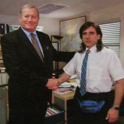
#tssm norman osborn
Text

spectacular spiderman is a good show
180 notes
·
View notes
Text


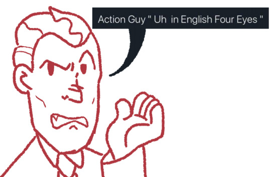
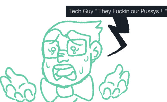
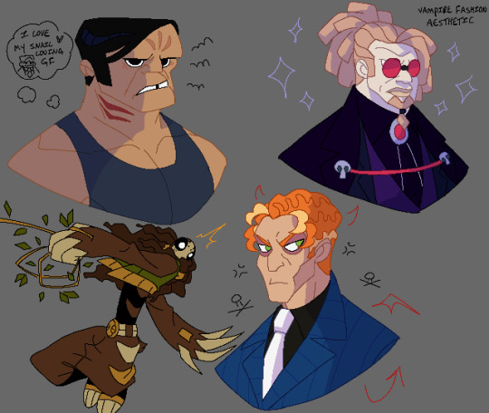
Redraw funny post made by @president-alpine thank you again to let me draw it
The original post [ X ]
#marvel#the spectacular spider man#tssm#tssm sinister six#tssm norman osborn#tssm electro#tssm doc ock#tssm mysterio#tssm vulture#procreate#procreateart#procreatedrawing#drawing#doodle
189 notes
·
View notes
Text

Nightmare
#spectacular spider man#the spectacular spider man#tssm#norman osborn#tssm norman osborn#harry osborn#tssm harry osborn#art
45 notes
·
View notes
Text


A quick doodle comic for TSSM, I've had this idea bouncing in my brain
Below is the inspiration
youtube
#artist on tumblr#tssm doctor octopus#tssm#tssm doc ock#tssm electro#tssm mysterio#tssm vulture#otto octavius#doctor octopus#electro#max dillon#mysterio#quentin beck#the vulture#adrian toomes#marvel fanart#marvel#Youtube#tssm norman osborn#norman osborn
90 notes
·
View notes
Text
goofin around with some more bases
56 notes
·
View notes
Text


assorted gobby sketches
#tapwaterx#octogoblin#spiderman#green goblin#tssm green goblin#norman osborn#tssm norman osborn#tssm#ssm#the spectacular spider man#the spectacular spiderman#spectacular spiderman#spectacular spider man#tssm octogoblin#tssm gobby#tssm doc ock#tssm doctor octopus#tssm otto#tssm otto octavius#tssm norman#otto#otto octavius#dr otto octavius#doc ock
458 notes
·
View notes
Text
more tssm styled "doodles" <3
3 busts and a little vine swinging sloth!
original images: [X] [X] [X] [X]
#my art#phone art#spidersona#tssm hammerhead#tssm norman osborn#tssm tombstone#hammerhead#joseph martello#norman osborn#tombstone#l thompson lincoln#still don't know how to tag that man
108 notes
·
View notes
Text
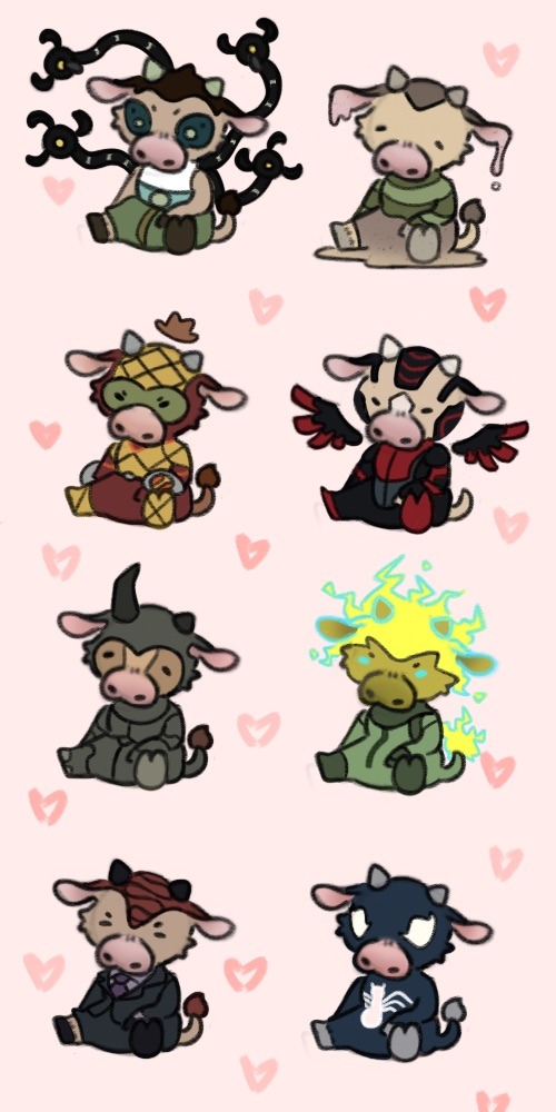
💖🐄
#But cows#Tssm#the spectacular spider man#tssm sandman#tssm shocker#tssm electro#tssm norman osborn#tssm venom#tssm rhino#tssm sinister six#Cows
180 notes
·
View notes
Text

More baby dragons
+ a big dragon
#myart#tssm#the spectacular spider man#tssm flash thompson#tssm Mj#tssm harry osborn#tssm norman osborn#tssm Liz Allen#spider dragon au#dragons#dragon
64 notes
·
View notes
Note
I really love Vulture's design from TSSM.
Using red instead of green works for him and makes him stand out more. Spider-Man has a lot of enemies that wear green.
I'm glad they kept him an elderly man. Some versions try to make him younger and more attractive because they're worried that Spider-Man beating an elderly man makes him look bad or stupid. Let him be older and bald!
I love his long nose that looks like a beak.
And his eyes! They have slit pupils! Even though it doesn't make much sense because he's not an animal hybrid like Spider-Man, Lizard, or Kraven. Slit pupils aren't really a vulture's thing or any bird of prey. They're the ambush predator thing, like cats. But it looks cool!
Too bad they didn't add his neck feathers. But it wouldn't work with the more robotic/realistic design.
What do you think? What's your favorite design from the show?
Bro I really have to agree. One of my favourite things about TSSM is the art style, they made each male character look so unique and accentuated realistic features, Adrian is a prime example. So I have to completely agree.
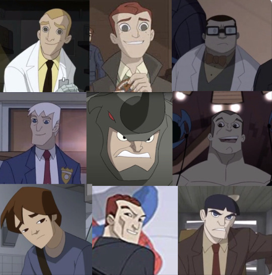
Also here’s a collage I made last year explaining that very subject.
#spiderman villains#marvel#marvel comics#spectacular spider man#marvel shitpost#tssm#tssm mysterio#tssm sandman#tssm lizard#tssm vulture#tssm rhino#tssm harry osborn#tssm green goblin#tssm kraven the hunter#tssm montana#tssm otto#tssm norman osborn#tssm peter parker#male beauty#the sinister six#tssm quentin beck#tssm sinister six
145 notes
·
View notes
Text

I Misssscchhssssscchh Them💖
((I haven't drawn them for nearly 5 MONTHS BRUV))
#maryvioletiquearts7708#harry osborn#norman osborn#tssm harry osborn#tssm norman osborn#tssm#the spectacular spiderman#The osborns#My time offline just made me fixate on different things
23 notes
·
View notes
Text
Just a warning, the audio is kinda loud
This is probably the best thing I've ever made
#marvel#spectacular spider man#spiderman#spiderverse#green goblin#tssm green goblin#tssm norman osborn#norman osborne#norman osborn#the spectacular spider man#lip sync#tssm harry osborn#harry osborn#harry osborne#tssm
471 notes
·
View notes
Text

pls buy from oscorp
#spectacular spider man#the spectacular spider man#tssm#norman osborn#tssm norman osborn#art#redraw of that poster from the dream i had
25 notes
·
View notes
Text

average Harry Osborn and Cassie conversation ‼️
( I wish we had a season three of Spectacular Spidey, because I see Norman getting thrown in jail after /hopefully/ getting caught as the Goblin!!)
#please laugh#tssm norman osborn#tssm harry osborn#harry osborn#norman osborn#green goblin#tssm green goblin#self insert#i think I'm so funny please laugh
23 notes
·
View notes
Text

fooball head and da green grabber...
#tssm#the spectacular spider-man#tssm norman osborn#tssm green goblin#tbh creature#autism creature#Val art
93 notes
·
View notes
Text

this has probably been done before but i needed to draw it
based off this image
#tssm#tssm otto octavius#tssm doc ock#tssm norman osborn#tssm green goblin#tssm octogoblin#the spectacular spiderman#otto#otto octavius#doc ock#norman osborn#green goblin#spiderman#octogoblin#ottosborn#norman x otto#otto x norman#tapwaterx
815 notes
·
View notes
Last Seen Blogs

imtheproblemsorry
I'm the Problem

dj127
BIENVENUE

cerwcerw
Apple*.^°-'~

explorers-camille
Explorers
highheelsandhosierygal
HighHeelsandHosieryGal