#this was so messy but i wanted to try saturated coloring
Text
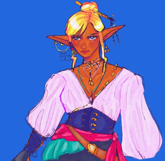
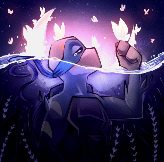
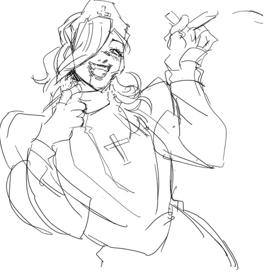
Pirate king tetra go brrrr
#this was so messy but i wanted to try saturated coloring#meep meep#the legend of zelda#tloz#tloz fanart#the wind waker#tloz ww#ww fanart#tetra#tetra fanart#telink#spirit tracks#phantom hourglass#legend of zelda#legend of zelda fanart#the legend of zelda fanart#wind waker fanart#ww tetra#wind waker tetra#my art#zelink#zelink fanart#telink fanart#phantom hourglass fanart#spirit tracks fanart
2K notes
·
View notes
Text
The great shift: Swap Sindrome 1
In a dimly lit room, I was masturbating with my fingertips in front of a pale white monitor. As I watched the images of boys around the age of high school students lined up on the screen, I fantasized about taking off their clothes and touching their naked bodies.

-ahh, ahh… ahh-
I closed my eyes as I fantasized about the scenes that were still etched in my memory, the memories of my body and my Gymbros in the locker room flooded my mind, At this moment there was nothing erotic about looking at my best friends or touching their oily and muscles to feel The Progress we had made in the gym, but now it was different, I was different.
I continued looking at the photographs that were shown on the Instagram profiles of my former friends, while the desperation and excitement with which I moved My small cock increased more and more.
I kept changing the photos until a photograph of my old body was displayed on the entire screen. I enlarged the photograph just so I could rotate the most erotic parts of my old body. I focused my gaze on the armpits that still had a couple of drops of stinky and sticky sweat running down towards my abdomen.
-FUUUCK! What I wouldn't give to smell those musky holes again-

The shameful and perverted words that came out of my mouth really embarrassed me, but right now I had no control over myself the only thing I wanted was to fantasize about my old hairy armpits, lick his hard biceps and play with his grazed nipples, The memory of the last time I could smell a sweaty t-shirt from my original body made me ejaculate violently, the semen spread across the keyboard of the old computer that was in front of me.
At that moment my head cleared, from one moment to the next the animal instincts that dominated me a few seconds ago immediately disappeared... and then only remorse.
I took a piece of paper that was within my reach and began to clean up the mess that I had caused myself. When I finished cleaning my little cock, I threw the ball of paper into the trash can that was saturated with balls identical to that one in a yellowish color. And they left a disgusting smell in my room.
I stood up, pulled up my pants and slowly walked towards the kitchen, avoiding looking at my fat old face on the relevant surfaces that were in my messy apartment. After doing this, I feel disgusting, but no matter how hard I try to stop thinking about my old life and in my old body.
-The swap syndrome…-
I said quietly trying to justify my depraved obsession with my old life, I had all the symptoms I had read on the internet:
“ Swap syndrome is a disorder characterized by a persistent and overwhelming obsession with a person's past life after experiencing a body swap with another. This syndrome manifests itself when two individuals involuntarily exchange their bodies thanks to the event known as “The great shift.”
People affected by SS experience intense longing and nostalgia for their previous life. They feel a deep disconnection from their new body and struggle to adapt to their new physical identity. Meanwhile, they constantly long to return to their old lives, including their relationships, daily routines, and everyday activities.
Symptoms of SS may include episodes of obsessional love, masturbation, anxiety, depression, and dissociation, as well as a decrease in social and occupational functioning. Affected people may manifest compulsive behaviors related to the search for ways to reverse the body exchange and recover their previous life.“
I've been trapped in the body of this overweight middle-aged man named Hiroshi for two years, and one day I just woke up in a room full of trash and on the other side of the world. It had been a few hours since all this had started So it was easy I searched what was happening on the internet I tried to contact my parents, but none of them responded to me even now I haven't seen my parents after so long, maybe they have They've gotten better bodies and now they're having fun. Or maybe they're in one of the many prisons trapped in the body of some convict, I don't know...
At least they can put me in contact with the Old Hiroshi who was now on the beach in Miami enjoying that new teenage body. At first, we wrote to each other every day, trying to go unnoticed among all the chaos of the world. I had to eat. So I decided. Not to tell anyone that he was actually a 16-year-old American teenager instead of a Japanese man my father's age.
The real Hiroshi helped me adjust to my new life, while I naively believed that this was something that would be resolved in a couple of days. But over time I got used to my new job in a restaurant as a dishwasher, I didn't understand the language very well. , but he didn't need it, the real Hiroshi was a quiet and submissive guy, Very different from what the real Hiroshi is like in his new life, as a popular teenager. That he spends his afternoons tanning on the beach and flirting with beautiful girls.
I used to talk to the real Hiroshi every day, but over time he took longer to respond to the messages, then to look at them and just not respond and over time he started ignoring my calls, now the only thing I know is because of the photographs I uploads to Instagram and social networks of my former friends, I didn't dare tell them the truth, that their former friend was now trapped in the body of a 45 year old obese loser…
I've been saving everything I can to be able to travel back to America and reunite with my old life. Although the salary as a dishwasher is shit, it's better than nothing, but once I'm in front of my old body I don't know if I can control myself... look down and a tiny bulge formed again in my pants from just being in front of my old body.
-Shit….-
Hello, if you liked this story, and you want more, you can take a look at my new Ko-Fi page to see my most recent stories, see my new stories and support me to continue creating this hot content.
248 notes
·
View notes
Text
So! The evil art challenge!
Thank you everyone who gave their input, you wrote really nice things💙💙 and you've definitely picked out my habits pretty well, lmao. Below I'll write a breakdown of my style and thoughts behind the "evil" version.
Aesthetically I love pastel and saturated colors and I'm 100% biased toward cooler tones. Regardless of color, whether it's red or blue adjacent, I'll always pick the cooler variable of it. I tend to avoid using black and I particularly have an aversion toward basic red.
I have a short attention span and limited reserves of energy, so I try to work fast and stick to simple techniques; hence the sketchy linearts and mostly flat colors. I also just visually like smooth surfaces and gradients.
I want to convey the shapes and weight of the things I draw but with a minimalistic amount of lines and shading. This ties into putting emphasis on anatomy and muscles. I do tend to spend a lot of time sketching, because I usually have a very specific pose or vibe in my mind, and I want to be able to capture it.
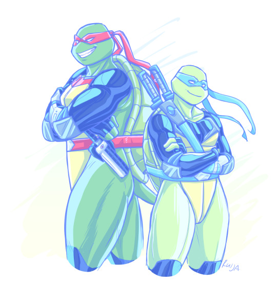
For the "evil" version:
- I sketched Raph and Leo a lot faster and attempted stiffer poses than in the normal one.
- Thick and non-sketchy lineart
- Dark and reddish color scheme
- More rendered, airbrushy and kinda messy shading (I suffered)
- Slightly less defined muscles...?
At some point I thought I should make them sharper, but then I just forgot lol.
Also, here's a flat colored version of the evil art because I like it 100% better. (Works better with the lineart style)

I picked Leo and Raph for this challenge for the opposing red and blue color schemes. As an extra, I put them in Fast Forward gear, as its blueness and the season's more saturated look are very fitting for my style. And then I'd get to make it work in a warmer tone.
Anyway, hope you enjoyed my ramblings and art~
179 notes
·
View notes
Note
May I ask on how you choose your colors when you color your art pieces? It is so pretty to look at the colors of your art, and I want to color like that, but color picking is very hard q-q
here's!! uh, the general areas in the color wheel where i try to pick depending on the vibe
highly inaccurate because tbh i just color pick directly or try to guess the colors from my references and just adjust them to be a little bit more pastel or to the atmosphere
and if i have their colors memorized (such as ink or dream), i just pick by memory or by my modified colors LOL

color your scrunkly!
set your line work to multiply and lock opacity
i use warm tones for white ish colors so uhhh idk whatever warm color from here
color the line work!!!!! ofc, shift the hue depending on the undertones of the surrounding colors
the skull color is a warm off-white, the undershirt is a blue-ish off-white, scarf is warm brown, so on and so on
the multiply function rly helps just blend things into the palette a little more, but if ur confident enough, you dont have to set it to multiply at all for extra variation
minimal shading by just taking the surrounding colors n adjusting the hue slightly n its value n saturation
gives it a very messy cel shaded look! been into it lately and stuff

and then i add a few overlays using the pin light layer mode!
i usually use these two colors together, it gives the right amount of pastel colors that really appeals to me
if you have access to gradient maps, i recommend using them lots!
it makes the pieces look a little more cohesive
the pin light layer mode imitates it n is very versatile if u cant use them though (like me when im just doodling on sai)
that's it!!! that's the basic rundown of how i color
i'm not very well versed in color theory so i can only do very basic color picking tips, but maybe next time i can offer ways on how to color more atmospherically!
have a nice time coloring your blorbos ✨
#Anonymous#tutorial#ref#ink sans#kia doodles shit#i hope this heeeeeeelps somewhat!!!!!#art tutorial#coloring tutorial#art help#art tips#art advice
371 notes
·
View notes
Note
Thanks for answering! Could you go into how you paint? It's always the trickiest part for me
Hehe sure thing! I even recorded some of it, bc for me personally, i learn a lot easier when it's visualized like that, aha.
So first off, we'll start off with our base!

Personally, I like a lot of gradients and color variations to start off with, but these can be solid base colors of you prefer :3. From this, ALL layers are gonna be merged down into one, no separate layers here yet :D
Going forward, I have a video done here kinda showing what I do :DD. I'll explain below the video in more detail what I do
First the base shadiws and highlights — for the shadows I'll usually pick from the color wheel (a darker, more saturated tone, plus I'll also shift the hue some) and draw right on the canvas. For the base highlights, i'll almost always use a bright orange on whatever adjustment layer makes your color nice and bright and glowy (for PTS it's Luminosity, and for CSP and Procreate I usually use an Add layer).
THEN I DO SOME MESSY BLENDING OUT, nothing pretty yet, just getting some of the colors blended out hehe
Afterwards, the drawing usually looks like this :0 very messy lol
NEXT !!! PAINTING TIME !!! As show in the video, it's allllll about color picking and going over what you've already done. For a lot of it I use a softer brush, letting the colors blend together more softly, and then for other portions I'll use a harder pen for where I want more of the color that I picked to show through. Sometimes I'll draw over the line art all together if I don't think it's needed, or i"ll draw the line art back in after painting over it if I want those lines still :0
And there's just a looooot of drawing over and painting over. The 20 seconds you saw of painting and blending usually goes on for like 3-6 hours, depending on the drawing XD.
After ALLLL of that, I get smth like this

AND this was pretty much just working on leo. Now to work on the background elements >:3c same progress, just for the atmosphere and not the character!

YAY NOW THAT'S DONE !! Now all the paintings done soooooo
Color correction and final touches >:3c no more painting, now there's just a bunch of fun glowy layers we add on top of this heheheeh
AND WE DONE >:DDD
I hope that helped some djejwjww. Tbh, the way I learn the most is if an artist im trying to learn from straight up just streams what they’re doing, but I don't rlly know anywhere i could stream or who would be interested ;w; but I hope this helps enough anyway!
If there are any other questions, I'll be happy to answer! Ive said before I rlly like playing art teacher heheheheh <33
218 notes
·
View notes
Note
HI UM i really admire you and your art and i was wondering --
so i really love the way you format your comics, its really straight-forward and lets the reader process every word with ease (which i think adds to the impact of the writing), and that one rue comic with the split colors for the parentheses... how do you do it without making it look so messy?? to bring up another example, the hide-and-seek comic- i love how subtle and genius the call back to hiding behind the door was, it blew my mind... i take a lot of inspiration from the way you format and lay out your comics but for some reason i cant wrap my head around how you do so much with so little
(in reality this might just be the result of me wanting to add so many little details for others to find , while being conflicted on keeping it simple, and,,, AGH...)
for context : im trying to make a comic about isolation, but i keep filling up the page because i want to add things - when really i know i should be keeping it simple... but other than removing unnecessary details, i want to know what else you do to make your comics so clean and simple yet it rips out the emotions from your heart and has you stare at it as it beats. like... i want that type of impact!! i want to affect others on such an intense level!! i want to induce emotions!!! but how?
(sorry this was long, HAHAHA i just want to drive my point home- again with the 'wanting to add a lot of stuff to prove a point' thing but i digress)
ok first of all that is a huge compliment and it means v much to me, thank you 😭🙏❤️❤️
tbh for me the answer of keeping things uncluttered is paying attention to spacing and eye direction. Spacing depends on timing, if you want an action to happen slowly for instance you can make the space between panels longer, or take more panels for someone to complete an action. There's tricks for directing your eye, if you ever read anyth about focal points (eg biggest contrast, triangular shapes pointing towards what's important), but really with comics I keep in mind you're reading left to right and top to bottom.
The ruehob comic is actually simpler than you think 😅 I already knew which text had to be on the left and right with august's text post. And after that the "lanes" were so narrow there weren't a lot of complicated things I could do, just make sure you still read left to right and saunter vaguely downwards.
when you talk about putting little details, that doesn't necessarily have to distract people. Like I honestly applaud you having the drive to do detailing. You just have to make sure your compositions allow for it. Like if you think about ghibli backgrounds, they're elaborate and beautiful af.
For smth about isolation, my first thought was that you can draw a person in a setting alone among a bunch of objects, for instance. If you keep the person small but surround them with a bunch of detailed objects, it could feel very lonely. Just make sure the person still stands out b/c they're what's important, so for example the background stuff is a less saturated colour, or the person is the least detailed thing on the page. I think that's the main thing, you just have to make sure the things important to what you're saying stand out. Clarity is rlly half the battle when I'm laying things out haha
In school our teacher called this "killing your babies" because it sucks when you work hard on a cool drawing and it just doesn't work out😂This also still happens to me, it's actually partly why I keep things simple so I can work fast and throw out less
Here is a timestamp from supereyepatchwolf's video about Chainsaw Man, which has some of the coolest fuckin layouts
He's got other stuff that talks about manga and how eye direction can work and what cool stuff has been done. Off the top of my head his vid about one piece and his vid about gantz have helped me understand how to cause Emotions. Also I think he has one about Junji Ito that specifically talks about how details can make you scared, if you're into that 😂
hope this helps!
54 notes
·
View notes
Note
Can you give like, a "style guideline" for how you do the unique magic posters? It can be as rough or developed as you want, I'm just curious about your thought process
I'm not sure if I can explain it very well, but I'll try! there's definitely a skill to being able to explain The Process in a way that makes sense to other people, so apologies in advance if this just ends up a confusing mess of words!
since these are about each character's unique magic -- though some of them are. looser. than others -- that's a pretty obvious starting point. I try to stay away from a literal "here's a picture of them using their magic" and go for more of the tone and feeling of it. like...the ones I did for the twins don't really have anything to do their magic at all, because I decided it was more interesting to make it about their twinny-ness and their eyes, and having them bookend Azul. so...their magic got relegated to the background as the teeth/tails from the kanji, rather than anything relevant. :') but they look nice and creepy, which was more important to me!
I always start by doing a bunch of thumbnails to get the idea down and figure out what exactly I want to do. for these I go to colors straight off the final thumb instead of doing a tighter sketch; things tend to change a lot and get moved around and shapes and silhouettes get refined as I go, so I just try to get the idea and the important shapes down and worry about fixing my wonky anatomy later. the style is so flat and minimal that it's fun to lean into that, use a lot of symmetry and lack of depth to push the shapes a lot further than with lines! my only rules for it are that 1) the character should be prominent, and 2) facial features are in limited supply and only to be handed out when necessary (both eyes? don't be greedy). other than that it's anything goes!
here are the final thumbs I went with for each if you're interested! some of them stayed pretty close, and some of them still ended up changing a lot during painting:


once I feel good about that, I come up with two or three main colors + an accent color + a "black" and a "white". (I don't use pure black or white for these, I use dark and light shades of other colors. like for the poms, the "white" is a super pale green and the "black" is a super dark blue. it looks richer and blends better with the rest of the palette that way!) I try to use the same colors within the dorm groups (except for the scaras) to keep some internal consistency, but they don't have to be exact or anything.
color is something I tend to really struggle with so I like to have a palette to start with, even if I end up getting away from it. :x I don't restrict myself from adding more shades and colors as necessary, but I try to be mindful about it -- pops of contrasting color immediately become a focal point, so I don't want to overuse those and make it distracting. the little rimlighting highlights are in the "white" color, and just there for fun and to make things a little less 100% symmetrical for some of them! they're easy to overdo though so I try to use them sparingly.
the actual process of painting is mostly thinking about shapes and silhouettes. because there's no lines and no real depth, clarity is really important; a lot of it is making sure the shapes all look satisfying and there aren't any weird little messy areas or anything. and pretty much all of the fonts I go over to add bits too or change slightly, to make it less stock-looking and integrate it more! there's just a lot of trying different stuff and havin' fun, seeing what happy accidents happen. (like...the heart shape in the milk on Trey's was not planned, it came out kind of heart-shaped by accident and I went YESSSS PERFECT and cleaned it up to make it look more intentional. stuff like that!)
uhhh what else. I do everything with one brush (except for some of the little grungy font touchups on the twins), constantly check my values with an adjustment layer on top at 0% saturation, and horizontally flop the canvas to make sure it isn't looking weird or skewed. the paper textures are a final thing, they're a couple of paper layers on top set to soft light and are mostly the same across the board (just slightly adjusting for each) so they don't take a lot of thinking about. the nice thing about doing a series like this is I only have to figure out sizing/borders/etc once. >:)
so...yeah! I don't know if that all made sense or was satisfying, but that's the way I can think to express it! and if nothing else you can enjoy my stupid doodle of Rook making a weird clown face. 👍
#art#sketch#long post#twisted wonderland episode 6 spoilers#twisted wonderland book 6 spoilers#twisted wonderland episode 5 spoilers#twisted wonderland book 5 spoilers#i think eng players are past episode 4 so that's all?#what to tag this hmm#i have never known what i'm doing and that's not about to change#(i am aware i forgot a word in vil's but i fixed it in the final okay)
873 notes
·
View notes
Note
what's your process for coloring like? the look of that elendira is so textured and interesting, i can't figure out how you do it
AA THANK YOUU ^__^ !! textures & brushwork are my favorite things abt my art, so im happy you find it interesting hehe . its SOO cool to look at & so much fun to draw imo
i prefer to color by building in layers , if that makes sense 🤔!! hundreds of them !! such that i'm always drawing on Top of previous layers, working from big & messy blocks of color to, eventually, small and refined blocks of color until it feels processed enough. as a result, i rarely ever erase (!!) and i rarely ever draw lineart aside from the initial sketch
a rough, patchy textured brush is key here, as it'll give you dimension and variability w/ your colors. i recommend "Brush and various sets of fountain pen style (万年筆風ブラシと色々セット)" on Clip Studio (ID: 1679706) !! :3

im terrible with explanations though, so i'm going to show a step by step of that elendira drawing if you dont mind :3
sketch layer !! because i mostly render through color alone, i try to make this as close to the finished thing as possible . ^__^ i hateee drawing the same thing over and over and like the expressivity and movement of my sketches anyways , so the more i can preserve at this step, the better. if u were to look at a side by side of my sketches and finished pieces, youd notice a lot of those og lines are present in the final drawing :3

2. flats !! pretty self explanatory, but the solid background gives me an idea of where the figure begins & ends while the colors themselves help distinguish whats what . i stick to ambient lighting @ this point because im usually not sure what i want to do with the overall palette or lighting yet . having two tones (ex, dark and light in her hair or dark and light on her skin) can also help in identifying key features early on that u wanna preserve. as you build layer by layer, sometimes these areas will remain untouched and i think it makes for a rly lovely feel at the end

3. start blocking !!! to be totally honest with you, i dont really know what i do here HAHAHA. like i just scribble the shit out of it, usually focusing on what i might want to do with lighting (ex: grey areas to accentuate folds in her costume). i think i like to start "erasing" the sketch where possible by coloring on top of it .. like if you look at her hat or her arm , you can tell i'm starting to get a sense of the shapes i like vs the ones i dont. it's at this point that the final image starts to emerge in my mind , like im gradually pulling her from a tarpit of scribbles until shes recognizable lol. chipping away at the marble until i can free her. tbh.

4. keep blockingg...when u think u are done , block some more . as you can probably see, the brushwork becomes more intentional as i add more shape, with specific focus on line weight. this is also where the patchiness of that textured brush comes in - notice how none of the colors seem totally uniform (ex: the red cross or the original sketchlines for her waist). you can see bits and pieces of the layers underneath pushing through and i really like that !! ^__^ its very fun and sketchy to me, so i try to keep them around. those areas are also great to colorpick from, because it'll give you "new" colors to work w/ that are already part of your palette.

5. GRADIENTS & GRADIENT MAPS !! TONE CURVE !! COLOR PICKER !! this is the best stage tbh. flatten your image so its all on one layer and just go crazy with all the color settings in ur program. add gradient layers and set them to darken, or overlay, or subtract, orrr. lighten or dodge glow or divide or soft/hard light.! OR!! edit the hue, saturation, luminosity and contrast.and then color pick from these edits, block even more on top of ur image, flatten, color edit again, etc. etc. until u feel satisfied.
ANYWAYSS . i hope that makes sense @__@ sry i wrote this out and deleted it like 23 times trying to make it make More sense but thats what ive got HAHA i hope its useful though :3 !
#SRY I STRUGGLED 2 EXPLAIN THIS#dude its like my brain bcomes stuffed w/ cotton anytime i try 2 write#i hope it makes sense tho..#it also probably sounds so redundant to make new layer one after the other for just a few brushstrokes#but those brushes i linked have a multiply property so if you draw on top of prev lines they'll create dark patches#and so if im working over a large area ill generally need like . 5 layers each with one brushstroke :sob: if that makes sense#this one had . 84 i think. total. layers i mean. the merylvash one had 300+ HAHAH so it rly depends#like YEAAH i could just use a normal brush but i really like the way this looks#andd sometimes the multiply function works really well or will give me the proper shadow tone im looking for#anywas.wanywaysn anyways#asktag#anonymous#long post
58 notes
·
View notes
Note
How do you do the colourful lineart and rendering?
I've given 2 other rambling answers to this if you wanna check the tag (actually explaining this stuff is difficult). So this time I'll try to keep it to some epic Dizzy color tips.
Study Muse Dash Artwork (my inspo) . Just like. Look at it a lot.
High brightness, mid saturation for base colors. Lineart's generally more saturated and/or darker version of the base. Not a universal rule of course.
Limited palette. Basic color theory knowledge needed. Take the palettes from other art or irl, but you should be able to give them roles (main color vs accent, high vs low distribution, etc). The colors will likely change roles throughout.
I've found it *really* important to be deliberate and varied with your shapes. I knew some colors look nice together, but couldn't distribute them interestingly. A lotta things I do, giving the eyes an outline, or the lineless elements, were done specifically to add color with clear purpose. Take em for yourself if you want. Always try envisioning your art in 3D and expose your mind to weird shapes you come across. The limited palette may push some creativity too.
Lineart and lineweight is also pretty important in all this. Let it be thick, thin, or even nonexistent if it benefits the color distribution. Let it be messy too (I'm still learning this)!! It makes everything feel 'funner'.
27 notes
·
View notes
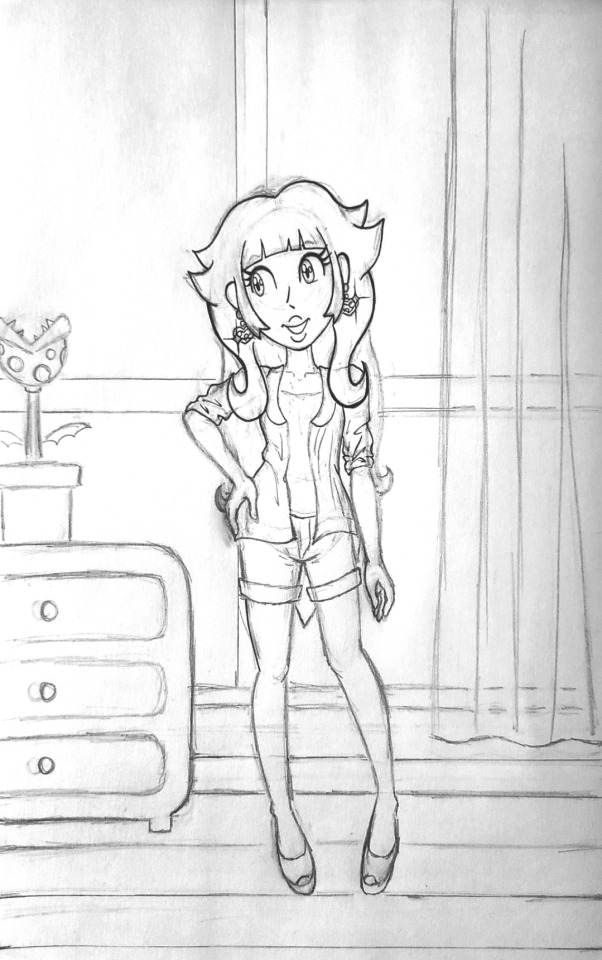
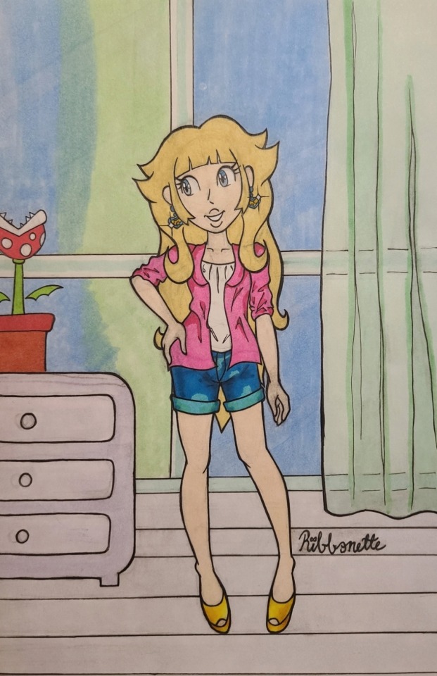
Text


A request for something a little different than usual 🍑👑
Progress stuff below:
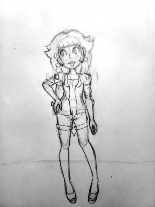

I haven't done progress shots in a bit and I think it's something I want to do more often because I like talking and blogging I guess haha.
Now that I have more experience illustrating digitally, this kind of direct reference drawing is MUCH easier to do digitally 😫honestly this felt like a self imposed challenge lol. BUT I did want to do some more traditional stuff because I feel that I had been doing a little too much digital, if that makes sense. It's nice to play with my markers and color pencils once in a while too!!
Doing the line art on this piece ESPECIALLY felt easier to do traditionally than digitally. For some reason, trying to do line art on a tablet screen feels too smooth or slippery or something. Lining traditionally feels easier, probably because I put so much pressure on the paper in the sketch phase that when the lining phase comes next, it feels like I'm just following the lines on the page like a train on a track ^_^
despite uploading a couple of illustrations colored with marker now, I still feel a bit like a novice when it comes to marker. I got a new pack of markers that I wanted to play with, which was even more motivation to return to paper for a bit. But honestly, I feel like I fudged the window color blending. I watched tutorials and stuff on blending with markers but I guess I still need more practice ^^;;; at least it looks a bit messy to me. This is how this piece came to be a mixed media illustration, since I tried using color pencils to make that transition from blue to green on the windows a little smoother.
I think the pot holding the piranha plant came out a tad too saturated and it's calling too much attention compared to the very light floor and dresser. I was trying to follow the colors on the reference closely as an easy re-intro to traditional art, but next time I do something like this, I think I'll take more liberties with color and see what happens.
Overall, I'm quite happy with how Peach turned out. I don't draw humans too often since I typically draw Sonic characters lol. Sometimes it feels like I have to re-teach myself to draw people as a result. I really liked using the gelly roll for the highlights on her face and the polka dots on her shirt :3 I highly recommend using that pen as my previous experiences with other white gel pens don't compare to this one (not to sound like a commercial I'm just really happy it worked as well as it did!).
And finally, although redrawing a creation from a dress up game screenshot is probably not the most imaginative exercise I could be doing with illustration, I think it's fun and it's pushing me to do things outside of my comfort zone. I'm using new art tools (I'll get better with marker I prommy) and I drew a background! I'd like to do more backgrounds like this as a practice to encourage more original stuff. Maybe. One day. Probably.
If you read all of this until the end, thank you! Have a wonderful day, and thank you for following me and supporting my art :3c 💝
#princess peach#super mario bros#the dress up game is called 'pink cutie' in case anyone wanted to know
30 notes
·
View notes
Note
Sunny, is there anywhere we can watch your drawing process? Lines and colours are sooooo cool
just my really old speedpaints on YT! I kinda stopped trying to record my process bc whenever I do it ends up either being a pic I never finish or I get tired of opening the recorder every time I work on the pic across multiple days/weeks/whenever 💀
but basically 1. I choose a bg color I want depending on what the picture is gonna be, if there's no specific setting/lighting I choose neutral colors r de-saturated pink/yellow blue etc depending from what would suit the scene more, otherwise I choose something based on what I'm gonna put in the bg if anything (unless I'm referencing a specific palette, all my colors are just chosen based on what I think would look nice and then I tweak them with the hue and saturation tool if needed)
2. I do the sketch, most of the time it's also going to be my lines once I clean it up a bit, if it's a complicated pose it's possible I will do a separate very messy sketch just to get the poses down and then I sketch again over it
3. coloring: if it's an illustration it's possible I will be coloring random parts of the sketch before I'm even done with it just to see what's it going to look like moving forward since usually the coloring is part of the main focus, if it's a simpler pic or a comic panel where I use flatter colors anyway, I usually make sure my lines are fully done first so that I can use the wand selection tool and fill in each part faster
4. fixing/painting over parts of the pic on a separate layer if I need to (it makes it faster to edit something rather than tweaking the individual layers)
5. sometimes there will be an overlay layer on top or I use the curve tool in PS to tweak the contrast and some hues (also the gradient map tool in clip studio is interesting for tweaking colors a little, I use that sometimes)
hope this helps! :>
99 notes
·
View notes
Text
Moon Knight City of the Dead Issue 1… why…?
So. New MK side run has begun, the hyped up full on debut of Layla/new Scarlet Scarab in the comics, with a premise that most writers would twist into an epic and breathtaking journey.
We don’t get that here.
And I have a lot of thoughts on why and how I feel so frustrated with what we got. There’s pieces of something awesome, potential to go to some really fascinating places, and yet it is held back in almost every aspect, creating something messy and clunky that makes me mad to read.
(This is long btw)
First off though, some things I did enjoy!
I really love the art and coloring of this issue. The anatomy and movement and shadows, the stylization of character’s faces and costumes, the sprawling city with its deep reds and blues that feel saturated and weighty. It’s great. Besides a few moments that it comes out of left field with some bad stuff (Layla’s whole face at the end or the MK mask w teeth during the memory slideshow like whaTtt is that), it’s super solid and made for a very enjoyable looking comic.
It was also really fun to see Badr for a little. I think it would’ve been cool to get more, and the pacing of things as I’ll get to later sapped his importance in the story for me some, making him feel more like a prop or a plot device to get it going, but overall it was lovely to see him again. And it was cool to see him being a doctor as well, as we haven’t seen that as recently in MacKay! Always a joy my dear sir please come back soon.
The story in concept. Going to the underworld, detaching a headmate supernaturally to journey to a different plane of reality to save one life, and meeting a dead ally along the way is fascinating stuff, an idea that inspires me to want to explore it myself.
Because (and now it’s time to get into the stuff I didn’t like) the writing doesn’t do this idea justice at all.
This is not the worst MK comic ever rn, not their worst writing. It’s not as violently ableist or antisemitic as things like Bemis or making a joke out of MK like some others, but it’s just stupid, and what it glosses over or gets wrong is weird and uncomfortable and harmful in its own right.
To start this isn’t my Marc. His guilt is not one of punishment for penance, of believing he’s sinned and needs to be washed clean by pain. He is a man stuck in bad coping mechanisms and trying to pretend he’s not. He’s a man who hates himself and uses violence as what I would describe as a form of self harm. But it is not with the goal of erasing his past.
Yes, he runs from the person of Marc Spector, he runs from the idea and the responsibility, but Marc doesn’t try to forget. He holds onto things with a vice grip and never lets himself drop it. He believes in his own mythos and is grappling with his complicated and traumatized history to remember he can love and care and trust people again, that the work of making his life better is not solely on his shoulders. That’s what MacKay’s been dealing with.
MacKay Marc is guilty and self flagellating but in a way he tries not to think about, that he brushes over. He puts on an air of confident collectedness and has more hate for Marc as a concept then specifically his actions, and he’s still able to move forward and find a type of momentum and bravado in the MK suit.
Or in simpler terms: yes Marc has guilt. He does not have this kind of guilt.
The first few pages read so strangely, just this over dramatic spiel that feels more like daredevil than moon knight, like a rehashed dramatic intro to a moody sad 90s comic. And not in a good way. It’s not deep it’s just annoying and tedious and the prose is clunky and again, extremely off in its vibes and message. I think it could’ve been alright, if some of the talk of his guilt had been shifted and the narration hadn’t continued constantly throughout the rest of the issue (which I’ll get to later), but as is in its full context it’s just… weird.
In addition to the weird guilt vibes, there’s further issues with the Khonshu religiosity in this.
Khonshu isn’t something Marc worships, he’s something he uses for his own means. He’ll call on him or talk about being the priest of the mission, but that’s because Khonshu doesn’t have oversight, he’s a tool and form of direction and theming, and at the story’s core Marc is the priest for his mission, not this god’s.
At points in this issue he genuinely sounds dedicated though, and it shifts the flavor of earlier pieces more in line with his usual monologuing to seeming more like strange spiritual devotion. Especially calling Khonshu the greatest of great gods, or saying that him being in the underworld is Khonshu’s mission. It changes his actions from that of Marc to that of a real Khonshu follower and its…. Just weird. It’s all just weird and very ooc.
On top of that, there’s no mention or interrogation or even presence of discussing Judaism alongside all of this. I’m not Jewish myself but have had multiple convos around the topic w those who are n who have made their own posts discussing it and can add on more nuance n info to this should they like (bc more thoughts for discussion are always awesome), but just on a surface level it’s strange. It’s strange to have a plot revolving around going to another belief system’s afterlife and not at all bringing up how it clashes or relates to Jewish beliefs. Yes Marc isn’t really actively practicing anymore but I’d hazard Jake probably is, and Marc has still talked about his connection to his faith and how it’s impacted his time as moon knight and serving Khonshu.
The text treats the Egyptian pantheon belief system as the True and Accepted default here, with Marc not even discussing anything about going to an afterlife he doesn’t belong in (and shouldn’t even have) as a Jewish man, or even thinking about how Badr discussing Ka conflicts with Jewish beliefs on the soul and how Neshamah differ.
And yes, Marc works regularly with the very real Egyptian pantheon and mystical systems but it’s in a different way, and under a different context and understanding by readers of his acceptance of it.
A whole other layer of depth, conflict, and exploration could’ve been added by really digging into the theological implications of this plot, of a Jewish soul in the Egyptian afterlife, and yet it’s not brought up at all, not referenced or mentioned and it makes it all feel weirdly out of place, or like stuff is being glossed over.
That, on top of Jake and Steven (not to mention the entire rest of the main mission cast) being completely absent in mention, consultation, presence, or anything just feeds into this strange sense of Pepose wanting Marc to be the idea he has of him in his head, this guilty, sad, and violent merc serving a moon god with not a ton else. And yes again those are all aspects of Marc, but there is nuance to each of those aspects and treating him as a singlet with no thoughts on the conflicts in faith of his present is… just weird.
I don’t know if he’ll be treated as a singlet the whole run, but the fact that the body’s soul being sent into the afterlife has not already brought in any system conflict at all is an issue. Is it their collective soul? Is it just Marc’s? How does this comic understand alter soul distinction? Has it thought about it at all? I mean the answer is no but the thing is it should’ve.
That’s where so many of my issues with this come from though: choices just being… not good. Not thought out or in line with the characters and world. The writing is off and out of place and gOD THE CONSTANT NARRATION IS GRATING!!
I don’t know why it was chosen for Marc to novel write his thoughts and observations the whole issue but it’s bad. It goes past introducing plots or observations that can’t be shown in text to either:
1. Filling space that doesn’t need to be filled
2. Restating what has just been said or shown in a panel (“we have the power of the four horsemen” “wow they just got the power of the four horsemen”)
3. At worst, telling us stuff that was not indicated at all by anything else (“oh I know something is wrong here even though I have not been given enough reason to pique that suspicion” “oh I reunite with Layla and hold her and take her in but haha you don’t see that ig”)
It’s annoying and makes reading things difficult because he’s blabbering on the whole time in places he DOESNT NEED TO!! And it makes the action and emotional movement feel awkward and forced. I don’t need to know every second of Marc’s thoughts Pepose I can parse out things with my eyes I promise you that. Also can he stop talking about penance for TWO SECONDS!!!
The worst part is narration works when done well! When it highlights things that can’t be shown in art or gives some bits of exploration into feelings or exposition, but we don’t need it in every panel. It actually confused some parts of where to look for me by telling me what was about to happen before it did. Stop being like “I thought it was over but—“ JUST LET US SEE ITS NOT OVER!!
Another moment (similar ish to the start) where the narration would’ve worked for me (if it was not surrounded by just more constant narrating monologue) is when Marc first arrives in the Duat. The prose is pretty, it’s vibrant, it describes things the audience wouldn’t be able to pick up from static pictures and helps to set the scene. The only issue is that it doesn’t stand on its own, it’s not an interjection of observations and thoughts, it’s another entry in the never ending cycle of Marc just talking. And it loses some of its luster because of that.
There’s also just a handful of pieces of either dialogue or thoughts that (in the context of Steven and Jake being absent at the moment despite not being absent at the point in time this should be taking place) make me feel very uncomfortable with Pepose’s vibes on their mental health. Some lines that rubbed me the wrong way in context include “The rage fills within me—and suddenly I have a plan. That said, it would help if my plan wasn’t dangerously insane.” “You know me Badr, mental discipline is my middle name.” And a few similar ones I don’t want to reread again for.
They’re just unnecessary man. We don’t need vaguely or directly ableist vibes in words with MK anymore. It works if it feels like it’s coming from Marc’s internalized ableism IE when he was talking about being called crazy during the discussion with Steven and Jake and Jake called him out for it, but when it’s obvious it’s just how the author sees things it sucks!
Stop using insane, stop using crazy, stop being like “oh I’m so good at keeping myself in check,” WE DONT NEED IT!! ALSO THEY R AT A GENERAL POINT OF SYSTEM COMMUNICATION N HARMONY RN!!
Which also just… man this feels like it’s trying to introduce MK instead of continuing an already established and well under way arc. Yea, this isn’t MacKay writing it, but it’s still in the continuity and set up for his run and like… sorry not sorry but I think you should take that context into account if you’re going to be working within it???
Instead the story props itself up by trying to introduce everything at once and Marc feels like he’s starting from the bottom of development.
And speaking of introducing everything at once! Oh boy the pacing!
No one besides Badr is consulted before Marc goes into the Duat, Badr just. Sends him there. There’s no real build up for why there’s a need go that far, for what the threat is or why Marc would go to these lengths so suddenly. Like yeah I know he wants to save a kid who’s a traveler of the night, but like… Others have died or almost died on his watch and he’s never gone to this point before, even though it seems like it’s always something they’ve had as an option. Like… ok ig if Soldier hadn’t been vamped he would just be dead lmao (though also hey! Why and how do souls end up in this afterlife? Do they have to believe in the gods? Do they have to be in some way tied to the pantheon? Is it just where souls go if they’re near moon knight lmaO? If you want to have your afterlife plot you have to do the worldbuilding for it)
And while yes, a lot of this is because This Plot Wasnt Thought Up During Earlier Parts Of Mackay, it also isn’t introduced in a way that feels natural or makes sense.
Events just Happen. Mysteries or drives are just Said without a good basis for why they’re there. Again, this cult was talked about as just kinda a sadistic gang but then they’re a big deal? And oh the kid is dying and oh he’s worth going to the afterlife for and OH WERE JUST HERE NOW and “oh there’s a conspiracy I’ve decided with no real evidence” and HEY FOUND THE GUY and—Suddenly a whole lot of what is happening. God heart full on cult horsemen of the apocalypse memory flashback and BOMBS NOW APPARENTLY and LAYLA and MK BIG PAST BADDIES BOSS FIGHT INCOMING!!
Like ohhhh my god stuff is so rushed and happens so inorganically and with no time to really understand what’s happening. It’s a type of story where my suspension of disbelief isn’t there and it fully just feels like seeing the writer trying to get to the end goal of what they want to write about (moon knight fighting old villains) as quickly as possible. And it SUCKS! Like this genuinely should’ve been more than one issue, there should’ve been at least sOme more build up to gEtting to the city of the dead in the first place, no matter additionally uncovering a plot of some sort happening and Layla turning up.
It’s just…. It’s so rushed and strange and forced and it didn’t have to be and IT MAKES ME MAD IT IS and it’s just not enjoyable to read. It all feels so shallow and stilted and weird, all while having this underlying idea with so much weight, some generally gorgeous art, some moments that could’ve been really awesome, and last but not least…. Literally a good reference to doing a Duat plot well.
This whole mini run is for MCU synergy, bringing Layla in, exploring the Duat and it’s lore, and again yes, the run isn’t done, but it just…. Compared to the MCU plot for the Duat this feels so…. GraaggHhggh. Especially when it comes to system interaction and exploring different painful memories that effect headmates in different ways.
It’s just. It was an extremely frustrating read from both a technical writing standpoint and a character exploration standpoint, and it worries me and doesn’t excite me at all for future issues. Like we’ll sEe but goddamn this is not a good start no matter how it plays out and it doesn’t give me confidence if it turns out I have to read several more issues of this kind of stuff.
Petty nitpicks speed run because there wasn’t enough enjoyable padding for them to not stand out!
I don’t know if Pepose could’ve specified or not but Marc’s not drinking vodka in the opening scene, it looks more like whiskey or something similar by the bottle, again nailing home how strangely off this Marc is from the Marc he’s meant to be with how Mackay has built him up.
Why do they use Duat and City of the Dead like they’re interchangeable titles it’s just the Duat like I get calling it “the city of the dead” since it is that but like. Let that just b the run title they shouldn’t be calling it that like it’s a final name.
They misspell Dr. Alraune’s name lmao
How did the kid get… hurt..? The only point in the opening fight I can think he maybe got hit was with the gunfire but it didn’t seem like that was aimed towards him and there wasn’t any moment of having a detail in the background showing him get injured. And he wasn’t lethally injured at the start so ???
What… is the continuity between the Hydra vs Karnak Cowboys fight we see in MacKay and the flashback here. They were on an empty road there when they crashed? And now they’re in the heart of the city? AlsO bOMBS???
Anyway all I’ll wrap it up with is when the only thing I genuinely smile at is the cameo and namedrop of Apocalypse you know something is wrong with your story lmaO
#moon knight#moon knight comics#moon knight city of the dead#the fruit is talking again#marc spector#mikes mk meta
29 notes
·
View notes
Text
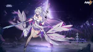
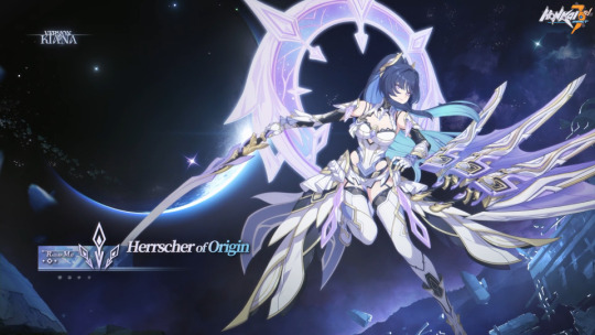
Ranking the “mostly white + 1 main color and maybe gold” designs because I’m trying to collect my thoughts and see which I want to redesign. Also, I’m only going to ranking ones that are currently in game (both because I’m taking how the gameplay interacts with the design into account and because I think lore + execution of lore should be taken into account when judging designs), so no Susannah.
Disclaimer: I’m trying my best to look at these objectively, but this is still art and my subjective biases will probably factor in. I’m not trying to convince anyone to feel the same way as me about these designs. Feel free to argue why you think something should be placed higher or lower. Also, spoilers lie ahead
S tier (excellent, wouldn’t change a thing)-
Strategic placement of black, more battle suit like parts saves all the parts from blending together
Keeps bits of the more mech-like armor seen earlier in game. Helps her look thematically consistent with the rest of Kiana’s designs
Nice range of values. The strong red cape really helps the white dress (?) stand out, while the little splashes of orange help keep it feel unified
Lovely evolution of the Void Drifter design
In actual battle, her mostly white outfit saved her from getting lost in all the glowy fire
I think having most of the colors being reflected off her is a fun application of her moon motif
Lines up well with the lore
Free pass on just wearing a regular dress since in lore, she was never a fighter
White dress with splashes of paint on it plays into the “Griseo is like a blank canvas that takes on other people’s colors” motif nicely
The dark blues and black are eye catching and contrast nicely with her dress and hair
A tier (good design, minor changes could make it a great design)
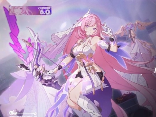
So the thing about white is though it is used as a wedding color in the west, in a lot of East Asian countries, it’s actually used as a funeral color. Idk if that was hoyo’s intention here, but the double meaning is fun none the less
The purple of the dress and pink of the hair keep the suit looking vibrant and colorful
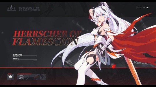
Same thing with Flamescion where all her skills are very bright and colorful (mostly in origin form? I think that’s what it’s called?), so I think the white keeps her stand out
There is very little variation in tone between the pink and purple. One of them needs to be more saturated
I feel like it could use more variation in fabric texture
B Tier (good design, muddled lore)
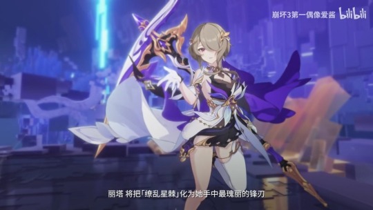
Would be ranked higher if I didn’t have to google why this battlesuit exists. Her in game intro was messy
Has the unfortunate timing of being introduced in the middle of a bunch of other lore dumps and buried underneath the more important to the plot ones. I think it’s introduction would be much more powerful if it was just Rita becoming the Herrscher of domination (I am willing to elaborate via asks)
Like, imagine if she got some sort of a string weapon instead of the sword? I think that’d be neat
So basically I was just confused by the space theme till I googled it (and based on my Reddit findings, I wasn’t the only one)
Beginning of the not looking like a battle suit era, but the inclusion of gold bits and a couple under layers keep it from being a full departure from the usual motifs, but it does lack the mech bits
I think there’s more Rita battle suits that lack the mech bits than actually have the, so I’m fine with them being missing here
Good tone variation, clear segmentation
Elegant design for an elegant lady
C tier (saved by the gameplay)-

Her knight for straight up looks like lingerie, but her guardian form looks great
Having her armor switch to black in guardian form was a good call
Unlike Rita, most of Durandal’s battlesuits look like armor, so it’s weird this one doesn’t.
I’m ok with the mostly white color palette since it contrasts nicely with the horse
Speaking of the horse- I have no idea where he came from, but it looks sick so I’m completely fine with it being here
Though for a rewrite, I think a potentially fun explanation would be “unlocking both of her stigmata allowed her to use a divine key at its full potential and said key just so happens to have a horse/armor mode” (cuz if you need weird shit to happen, Vill-V is always a valid excuse)
It’s inconsistency in comparison to Durandal’s other designs + my very mixed feelings about her being the original Kiana and that process of awakening the Kaslana stigmata are mostly why I put her bellow Rita. I don’t really have any huge problems with this design
D tier (even great gameplay can’t save this)-
So for the design where Kiana is “no longer just reflecting others light, and instead becoming the sun itself” (or something like that), the decided to give Kiana the coolest color palette we’ve ever seen her in, take away her signature orange and Himeko’s red, and have her primary colors be Mei’s purple and Brongo’s blue… ok
Yes, I know blue stars exist and that they’re very hot. Honkai is a story set on earth though so it’d make more sense if she was becoming like our sun, not some one billions of light years away
The inclusion of HoV’s magenta accents is kinda nice though
That is a junior prom dress, not battle suit (the Fanny packs are based though). Where’d her mech parts go?
Instead of the skirt and wings by legs, I think it may of looked like a cleaner transition if the put wings it the same shape/area as HoF’s cape
After seeing how brights and glowy her abilities are, I’m ok with this design being mostly white
This designs just a whole lot of “ok, but what does that have to do with Kiana?” Why the junior prom dress? Why the flowers? Why she so urple?
F tier (the only one on this list I actively dislike)-
Since I’ve been pretty vocal about my dislike of Dr.MEI, I just want to start by making this clear: I like Raiden Mei. She’s cool. I don’t just have some anti-Mei bias. She’s at the bottom of this list though because she deserved so much better than this design and story (and I’ve been using her a lot in ER lately, so I’ve had a lot of time staring at her design)
Designs like these are why I have the “wait till it’s introduced in story” rule. I was sorta just “meh” on this design until I saw it in game
I hate this designs introduction. It’s just another case of the writers retconning the PE and glorifying the flame chasers/ forgetting why they existed in the first place
Mihoyo, Elysia’s been dead for 50,000 years! You can stop shooting her now!
Also another instance of Mihoyo forgetting Mei is an independent person and centering her narrative around her relationship to another character. Why’s it gotta be about becoming like Elysia and the other flame chasers instead of acknowledging their mistakes and learning from them so Mei can avoid their pitfalls and forge her own ideal future
Mei is so much fun to watch when she’s thinking for herself and forging her own path, so it’s frustrating to watch the narrative force her to walk down the path Elysia laid.
If I keep talking about this point I’m gonna go into rewrite/fanfic territory, so on to the design from a more technical standpoint:
There is next to no variation in tone (aside from her hair). Everything is just incredibly light. Her abilities in game are also incredibly pale, so she ends up getting lost in all the flashy lights
There’s so much texture throughout the outfit that there doesn’t really end up being a place for the eyes to rest
Though I understand why she’s blue, I think it’s inclusion was incredibly clunky. Including it as gems on the outfit or the underside of the skirt(?) may have helped the distribution look more even
If I went with the underside of the skirt being blue, I’d probably also say make her boots black (or just give her black tights or leggings with white ankle boots)
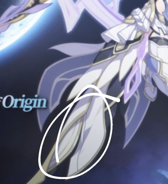
Orange (or at least Kiana’s shade of orange), blue, and purple are admittedly hard colors to make look good together, but there really needs some orange in there. Maybe sort of a deeper rose gold could’ve worked
I’m thinking like edae98 or fbbc93 (two on the top right)
^These things just need to go. The white skirt(?) over white boots just causes the whole bottom half to bleed together. Having so much weight on the bottom of the outfit also causes her movements to look incredibly clunky. Removing these parts would help to streamline it a bit
I like the idea of Mei sorta becoming Kiana’s dragon, but the wings and tail in the skirt get lost due to all the overlapping textures, and the wing sword doesn’t do anything. Girl has 3 swords but only uses 1. Why
Rather than basing her off a western dragon, I think they should’ve made her an eastern dragon. (Turn her HoT hands into Claws instead of wings, keep the “tail” of the skirt streamlined with a little flair at the bottom, turn her HoT horns into antlers). This way, they could keep the iconic elements of HoT while reframing them into something positive (for those who don’t know: it’s a lot more nuanced and complicated than I can really explain here, but eastern dragons are generally associated with good fortune)
So, ya- that’s all I got for now. If I left anyone off the list, they’re ranked lower than HoO for being that forgettable just let me know and I’ll add them on. Again, this post is mostly just me trying to collect my thoughts
#honkai impact#honkai rambling#they did Mei so incredibly dirty#I think it was softsapphic who suggested Kiana and Mei should’ve split finality?#and Fu Hua should’ve gotten origin#anyways I really like both those ideas and will probably run with them for rewrites#kiana kaslana#raiden mei#honkai elysia#honkai griseo#honkai durandal#I’ve gotten 4 hours of sleep it’s 3am and there are plows outside and my neighbors are partying#someone please just give me a concussion so I can sleep /j
64 notes
·
View notes
Text
PLEASE READ ALL
Hey there Puparoonies! With December fast approaching and a new 101 Dalmatian Street trending party set up for Jan 2- Jan 3, I figured I should make some ART! I've made an all new drawing grid just for Drawcember and made it vague so people can reuse it for whatever fandom they want! (A shout out back to me so I can see your art would be great if you do btw!)
HOW ITS GONNA WORK- I have made a grid of aesthetics that will be the theme of the piece. Basically I'll draw a characters in an outfit that matches the aesthetic provided. They will get a hat, a bag and a piece of jewellery and I'll try to make it match their personality if I can! (For example, if Dylan got the Space Aesthetic I'd go more sciency. For Dawkins, more sci-fi show. For Dolly, cool aliens!)
HOW DO WE PICK THE CHARACTERS TO AN AESTHETIC?! - I'll be holding polls to decide now that Tumblr can do that. We have an A team and a B team. So we'll be voting on two Aesthetics at a time. I'll post the Aesthetic and a description so you know what to expect.
WHAT ARE THE AESTHETICS?!
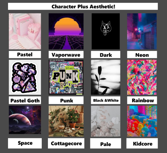
(Photos just grabbed off of google. All pictures here are not mine.)
Descriptions
(Please note that aesthetics can very from person to person on what they mean, and what they include!These are just my takes.)
Pastel- The pastel aesthetic is just as straightforward as its name, focusing on everything that's less saturated and in lighter hues. In particular, the word “pastel” refers to a soft and delicate shade of a color produced by adding more white.
Vaporwave- The Vaporwave aesthetic incorporates early Internet imagery, late 1990s web design, glitch art, and cyberpunk tropes, as well as anime, Greco-Roman statues, and 3D-rendered objects. VHS degradation is another common effect seen in vaporwave art.
Dark - Dark aesthetic covers a wide range of different things. If its dark and edgy , it can fall under this same system. Sometimes there's horror elements, but it can also be cutesy. All you really need is black, greys, and sparse uses of blood red and neon green. Some spikes can't hurt either!
Neon- The Neon aesthetic (Or Glowwave.) Is the use of bright, almost glowing colors on darker scenes. Reflective surfaces, sparkles and bright 'neon' pink can dominate this aesthetic.
Pastel Goth- Pastel Goth is an aesthetic that is a result of mixing goth or grunge with the sweet pastel elements of the kawaii aesthetic. Think if horror was cute, or cute was horrific if that's easier. Lots of black and pastel colours here.
Punk-Punk aesthetics determine the type of art punks enjoy, which typically has underground, iconoclastic, and satirical sensibilities. Punk can be as messy or minimalist as you want. It also tends to be more focused on the handmade, reused and recycled. Newspaper collages, safety pin, metal spikes, oh yeah!
Black and white- Contrast. That is the core of the Black and White aesthetic. Using only grayscale to convey detailed images. Tends to be fancy, simple and clean!
Rainbow- COLOUR, COLOUR, COLOUR! Rainbow is all colour all the time! With clear, fun shapes and fun splatters, rainbow is just... colourful fun.
Space- Spacecore is a type of aesthetic that is centered around astronomy, stars and planets. It can also be called astrocore or cosmic core. Spacecore uses lots of stars and planet type things in clothing or decor. Many spacecore aesthetics will have pictures of the sun, the moon or the stars.
Cottagecore- Cottagecore is an aesthetic that celebrates simple living, particularly in the countryside. It encourages a lifestyle rooted in traditional skills—like baking bread, gardening, and sewing your own clothes. Basically you live in a modern day Jeremiah Puddleduck book.
Pale- Palewave centers around muted and pale colors with a very relaxed and comfy vibe. Think light, easy, breezy and gentle designs. Nothing pops out right off the bat in this muted aesthetic.
Kidcore- Bright colours, cartoon designs, nostalgia, and fun! Its somewhat similar to rainbow, but you can't escape consumerism in this aesthetic usually! Toys, games, anything to do with just being a kid and enjoying life is included!
NOW WHAT?!
Now you vote in the polls! Just pick whichever character you want to see in the aesthetic listed. Please note that in order to draw this all in one month, I will be making the polls quick! The first one I'll have last a week, to help spread the word, but after that they will likely only last a day! That being said, each character will only be used ONCE. So once they're picked for an aesthetic, their off the voting board. Were you hoping a character would get a different one? Well don't worry! I may do this again, or you can try it yourself to! Just have fun!
Make sure to follow @bks-blogs for more 101 Dalmatian Street news and updates for the trending party!

16 notes
·
View notes
Note
So i am so embarrassed to send this in an ask but i really want some tips on outfit design because you’re really good at that! So i have been thinking of a goofy deltarune style adventure for class 78, but the one thing im really stumped on is their outfits. I want them to be very loosely based on their talents, but more over the top and neon

Thing is i kind of suck at designing this stuff (and also i suck at having decent handwriting haha) do you have any tips? For like design and colour schemes? Sorry if this is a lot to ask, i just really want to improve, and you’re really good with character design!!!
Ohhhh!!! No problem!! If you’re going for Deltarune colors, I’d recommend taking their canon color schemes and brightening them/saturating them and building a limited color palette off of that? Danganronpa’s color schemes are very muted in general, so try playing with your color wheel based on what you’re given to make it Neon. ALSO!!! Don’t be afraid to do complimentary colors either, like colors that are opposite from one another i.e. Kris to shake it up a little? Like it would be cool to have an Asahina in blue and pink hues resembling a mermaid of sorts rather than her usual warm colors.
For some design aspects regarding talents and dark world things- since the dark world outfits are sort of “fantasy-ified” versions of the characters everyday vibes, like Susie, a bully-type character being a “barbarian,” keep that in mind too! Like what if Makoto looked a bit more like an Angel (Angel of hope?) and kyoko was a sorceress, but a bit more tailored? Like a trenchcoat maybe? And byakuya with a little silly crown and red robe ? Those are my thoughts!!
One thing I keep in mind while designing characters is “less is more,” and that’s in regards to the number of colors and elements in the outfit/features itself. If you overcomplicate designs, they wind up looking crowded, messy, and they’ll be hard to draw.
I hope this helps!!!
29 notes
·
View notes
Note
Hi, I love your art so much! You've inspired me to take up digital drawing again! I was wondering how you chose your poses and colors? Your art looks AMAZING, and I struggle to come up with those things. And, if it's not too much of a bother, any tips on messy sketches? I struggle so much with sketching because my silly brain wants everything to be perfect. Sorry if that was a lot of questions. Again, I love your art. You've been a huge inspiration to me!!!
Ahhh thats awesome!! So with poses i usually just imagine it jfjs sorry thats not helpful i have a really clear imagination so i can like very clearly pose characters BUT if im really having trouble with angles ill remake the pose in magic poser to try make sure i get the forshortening. If you are trying to get poses tho absoloutly get references and just work from them! Colours i will usually just play around until i feel it clicks together, understanding colour theroy defonaitly help.
Its good to just experiment with colours and poses, ill usually try to stay away from extreme saturation, so no going right into the corners i like to be a little off so like off whites, off blacks just makes it a little more realistic for example black hair is never true black it can be a blacky blue or blacky brown!
Dor doing messy sketches i used to be like SUPER perfectionist when it came to sketches till a games company absoloutly read me being like....that isnt a sketch...thats a fully rendered character it looks finalised i was like 8U having inperfect sketches is very good its about getting the idea down not the final product, you feel like your sketch has to be perfect final render but it doesnt its the sketch its suppsoed to be sketchy! It took me a while to undo that idea that it has to be perfect but just let yourself be messy, let yourself get down ideas its fun being messy 💕
Im so sorry if none of this is helpful i don't actually know what im doing jshs and im not the best teacher cause im bad at putting stuff into words, but im so glad youre getting into digital art again and i hope you have a lot of fun doing it 💕
60 notes
·
View notes
Last Seen Blogs

msccocogreen
Ms.CCOCOGREEN
katakuna64
Fighting Dreamers
basilquesadilla
BasilQuesadilla
absbatteries-blog
Advanced Battery Supplies Ltd

sainitourstravel-blog
Best taxi service in Chandigarh