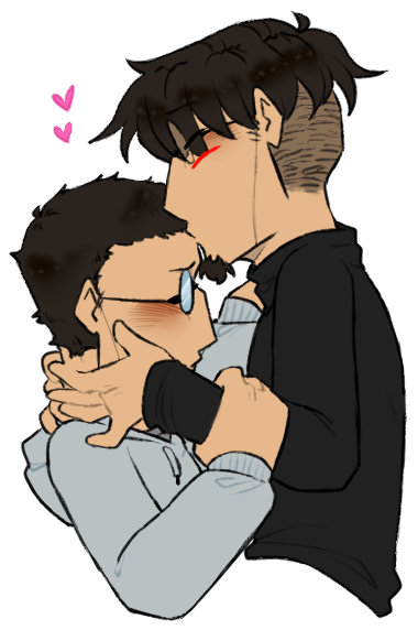
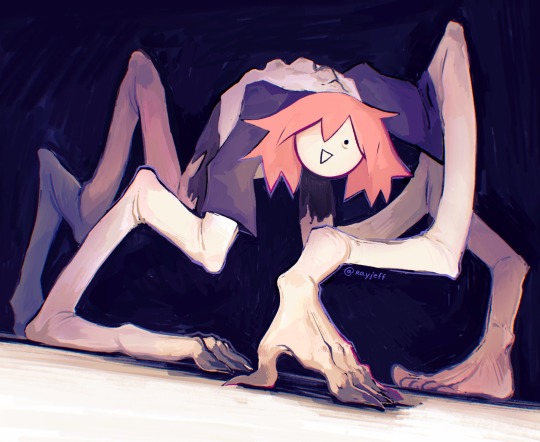
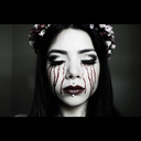
#this is the less saturated version
Text

🌱
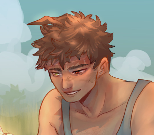


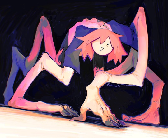
#Hajime hinata#Fuyuhiko kuzuryu#Sdr2#Super danganronpa 2#Danganronpa 2#Danganronpa#Kuzuhina#An art#This isnt FROM the thing I'm writing but I'm putting it in there hehe#The more saturated version I dont like LESS but I think maybe the colours are a bit bright...#Also face details bc that's my favourite part. Also a little something ... extra in there!#🪱
1K notes
·
View notes
Photo

x x
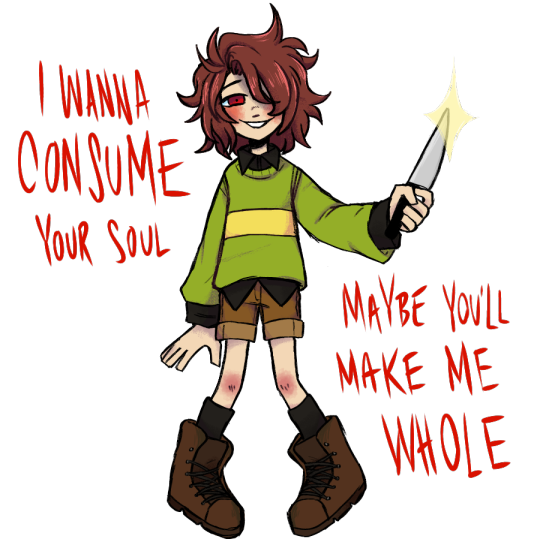
#chara#chara dreemurr#undertale#undertale anniversary#utdr#thers another version i did with less saturated colors but i think i made it work out#frsk.txt#written lyrics are from the first song linked there#then pictured lyrics are from the second
354 notes
·
View notes
Text
guess who drew another slutty close
yes Bill Close was an awful father . but consider . she could have been a decent mother if she had stopped repressing her transgender tendencies . if you even care .
#my art#i love her so much#also realized that transferring from procreate to my drive takes the saturation WAY up and had to edit the drawing#has it been doing this the entire time#has everyone been subjected to really saturated versions of my art#is it just my phone ????#idk my guys#yeah i think its just my phone nvm guess my wierd desaturating edit thing wasnt at all useful#anyways#dndads#dndaddies#dungeons and daddies#bill close#bill close . the only close family member with less than three possible tags
28 notes
·
View notes
Text
redraw of an old piece of omori fanart :-P
old (2021) version and the moments that inspired it under the cut
#acenestuff#omori#omori sunny#omori something#to be honest i like the hand texture better in the old version#but i used a different drawing program at that time#and i think the more saturated + less realistic look#makes it look more like nightmarish#more like it came out of the head space#idk#i really like the color on this one#redraw#omori redraw
9 notes
·
View notes
Text

I’m glad you’re safe (and I’m so, so sorry)
…
(Sketch-only version under the cut)
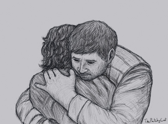
#Andor#Andor Spoilers#Cassian Andor#Brasso#Star Wars#Had to draw my favorite moment from the season finale#Brasso. What a guy. Solid as a ROCK.#I aspire to be so dependable and so good a hugger#Also I'm quite enjoying Rebelle 5 as an art program even though I know absolutely nothing about paint#I think I actually like the pencil-only version of this best#Probably 'cause I need to learn more about color balance Cx#Especially with darker and less saturated palettes#I’ll probably try recoloring this at some point#Patchy Doodles#ID in alt text
62 notes
·
View notes
Photo
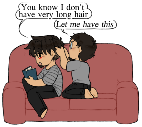
Apparently sweetness was on the menu
#💟#Digital art#Art#Edgar#Scriabin#The requests from the stream ♥ Thanks for coming and hope you enjoy the final version ♪#I do like how the requests were very general haha#Like the first one was ''Fave ship being sweet'' - Oh so all the favourites all at once lol#And the second was just ''Something to do with the couch'' - yes can do#Although no one specifically requested short hair Scriabin that was all me lol#Played a bit more with leaving lines out for the first one - skin contact ♥#Edgar being sweet and offering affection in what can be read as platonic or romantic makes my heart happy#And both holding on to each other - Scriabin tightly and pulling him forcefully and Edgar gently surrounding him ahh#It was fun to draw ♪#Oh yeah and I did something I've been thinking about for what feels like ages!: Scriabin's glasses in colour After#Since I desaturate them in B&W doodles but how would full colour work?? I decided to just make them closer to Edgar's haha#Ever so slightly less saturated ♥#And then a slightly more silly/painful one for the couch hehe#Braiding would be a good exercise for Scriabin! It would encourage his fine motor skills and he'd be able to use it when his own hair grows#Unfortunately there's no one he can get close to that has particularly long hair so there's only so much he can do#Short hair is so much harder to braid haha well he'd get to practice on a higher difficulty so coming back to it on easy mode would be nice#Edgar just putting up with it since it makes Scriabin happy ♪ Or at least closer to it lol#And it's way they can be close together without being tooooo combative hehe#Good ideas all 'round
155 notes
·
View notes
Text
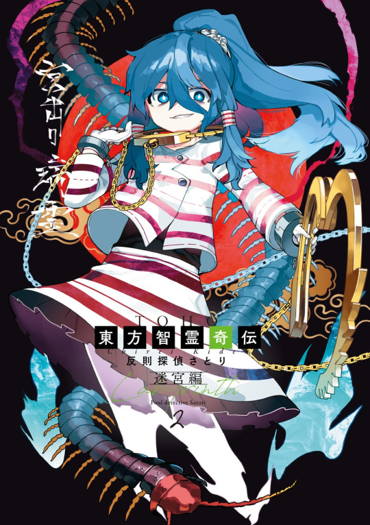
Oh hey, on Amazon theres a version of the Mizuchi bonus card art but without the big “SAMPLE” text over it, very very nice
The colours are also more saturated, i like the more blue/cyan hair lol its closer to what i like to colour it as
The red stripes are also much more red i think, very cool
Also, interestingly, it seems less cropped than the actual card, you can see her whole handcuffs and the centipede
#i wonder if these are the colours that were intended#was it colour conversion stuff for printing that made it less saturated? Or was it just an early version?#maybe this is the early version lmao idk#nice to have the full art though its very pretty
33 notes
·
View notes
Text
Modding the shit out of my stardew hehe
#long story hopefully shorter: gender neutrality‚ platonic relationships all the way to 10 hearts‚less saturated palate‚a to do list‚#LookUpAnything‚NPC Map locations‚ and hopefully a swimsuit mod!#gonna download the newest version of sampi and test it out wish me luck#I LIED THERE'S MORE#scarves‚ other acessories‚ hair‚ better skintones‚ hair a second time because the mod is small‚ fashion sense‚ more shirts if i can find an
2 notes
·
View notes
Text
@angelbeamz / @pureposer | seasonal goodies [ accepting ]
If it's Okay - Good Tidings We Bring! 🎁

// :3 hab a promo img (or two) homie :D
ft. that cruelty squad quote i mentioned in dms uwu
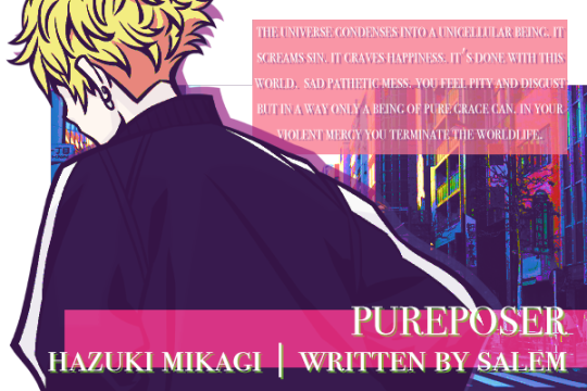

#[ stars above that we can't see | ooc ]#[ mun's art/edits ]#❖ || HAZUKI MIKAGI | 𝐭𝐫𝐲𝐢𝐧𝐠 𝐧𝐨𝐭 𝐭𝐨 𝐥𝐞𝐭 𝐲𝐨𝐮 𝐠𝐞𝐭 𝐢𝐧 𝐦𝐲 𝐡𝐞𝐚𝐝 | pureposer || ❖#//#or uh....two versions of it#one's a touch less saturated#keep leaning towards pink in aesthetics lately and i hope thats oki :3#|[ ART / EDITS | a rising sun at daybreak ]|
3 notes
·
View notes
Text
drew a lil pattern out for vash’s tristamp coat. and also ordered some muslin to make a mockup with it :)b
#supergroupies too expensive upfront now im gonna sink both time and money to make a version that fits me the way I want it#journal scribbles#also thinking of getting a deeper red. that’s less saturated for the outer layer. prob will keep the inner layer dark
1 note
·
View note
Note
The Pan Flag actually doesn’t have that great contrast, it’s that the colors are overly saturated. But if you decrease the saturation, it makes the flag inaccessible to people with visual disabilities (because that decreases the contrast)


Tbh with eyestrain friendly flags, the whole point is to be lower contrast as to, y'know, not cause eyestrain. Eyestrain related issues are visual disabilities too so having a low contrast version available is just as important as a high contrast version.
Like, this is what I'm imagining when I say eyestrain friendly pan flag:


versus the regular pan flag

The darker flag does pass the contrast test but the paler one doesn't.
(I just made these in 2 minutes in ms paint so they aren't hard redesigns but they're not supposed to be)
tbh, I wanna make eyestrain friendly flags for myself cause I need them, I'm not looking to make something that's accessible for every single person with every kind of visual disabilities, I'm looking to accommodate my own. No single graphic design by a lone designer can accommodate all visual disabilities, I'm just making stuff for myself here.
#like eyestrain is a serious problem#and some disabilities have conflicting needs#which is why we need both eyestrain and contrast friendly versions#also these are done specifically as to not fuck up the color as much#because color is an important part of flag meaning and language#you could make an eyestrain AND contrast friendly version#but that would mean using waaaay different saturation and the like#which -again- isn't the goal of eyestrain friendly flags#I aint looking to do hard redesigns I'm looking to make it hurt less when I look at certain flags#like the polyamory or intersex flags#oh my god the pain#pride flags#not mad btw#but tbh high contrast hurts#it causes migraines#it can be debilitating!!#I have no clue what contrast perameters your using#I can only find text-based ones
1 note
·
View note
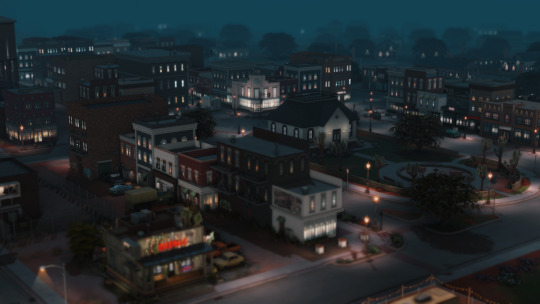
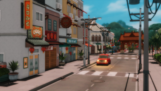
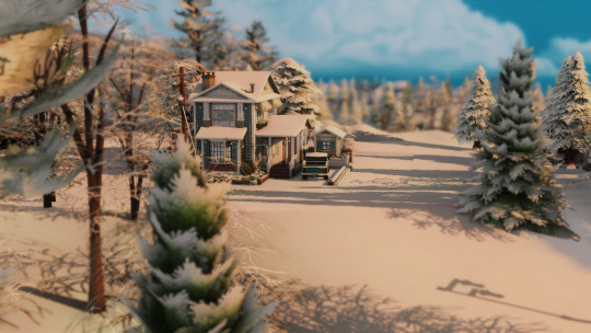
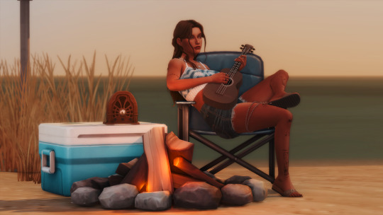
Photo
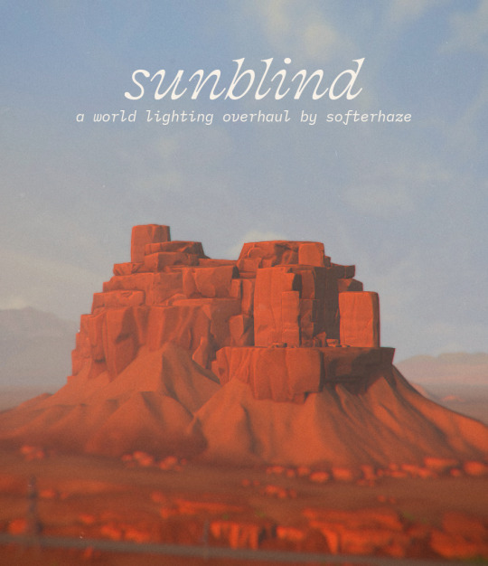


sunblind;
*The landscape images above, excluding the title image, were taken with only dof, edge smoothing, and mxao enabled. none of the coloring has been edited in any way*
Created with patch version 1.95.207.1030
Sunblind is a fully custom, realistic lighting overhaul created for The Sims 4. Unlike my previous mods, none of the lighting in this mod is based on existing EA lighting and each world is individually tuned to ensure the best possible fit. Some other features include:
∴ Vivid color shifting sunsets and sunrises, with deep, saturated shadows and a unique summer sunset
∴ More realistic daytime lighting - less blue than ea's default, but still somewhat saturated to better emulate light bouncing (Unlike no-blu mods, which entirely desaturate daytime lighting and shadows)
∴ Ultra dark, desaturated lighting and shadows late at night
more details and download over on itch! (free)
PS: This was a pretty massive undertaking and required a lot of testing on my part. I feel pretty confident that I caught all of the weird little lighting bugs (that I caused <3), but if you see something that seems off when compared to the various previews I’ve posted, please let me know! Even if you’re unsure if what you’re seeing is odd lighting, send it my way and we’ll figure it out ✨
Update 2/13/2023: fixed sunrises having the wrong shadow color during spring, added files for EP11 (cottage living) which were not present somehow (?!?!?!?)
Update 2/19/2023: fixed overly bright daytime lighting on Mt. Komorebi’s summit and base camps, fixed “negative shadow” bug that sometimes occurred late at night in seasons other than summer
s/o to @/pictureamoebae for helping to find this bug and testing these changes out!
8K notes
·
View notes
Text
after 76 hours over the span of several weeks, it's finally done! behold, all hermits + emperors + life series members
design notes under the cut:
beef: his classic apron is over his current outfit, except it's paint instead of something that's definitely not blood
cleo: she's got flowers growing out from her seams, also flowers inside her?
cub: i draw him with slitted pupils, also vex :D
false: empires false is less saturated than hermit false
gem: her empires dress is sunset coloured on the inside, also her hair is a slightly different shade
impulse: wasn't a demon initially, made skizz an angel and he had to match
jimmy: empires skin has more saturated skin and hair because toy, also blush
joe: his green hair from last season is growing out (ignore the fact that it'll probably should be more grown out)
joel: did you know his classic skin's pants are orange?? like shrek's pants are kinda orange but it's much more subtle
lizzie: i think i saw it somewhere before but lizzie's ears are hidden by her buns, also she's got big anime eyes and blush on her mask
martyn: he's weirdly angry? maybe it's cause i've mainly watched his life series videos
pearl: her empires self is more tan from farming and being in the sun, also her hair is more golden
pix: he's carrying his regular jacket since he's not really playing a character, official verdict from friend:
scar: he's got a bit of blue in his eyes from vex magic, also it's helping him push his wheelchair but the colour's not very visible
shelby: her hair is messy bc she cut it herself. she seems like the type of person to do that
skizz: same incident scarred his skin and blew up his sleeves, he tore off the sleeves of all his other shirts for fun
tango: he's a shapeless mass under his ice coat, both versions are rocking eyeshadow, offical verdict from friend pt 2:

#hermitcraft#empires smp#trafficblr#bdoubleo100#vintagebeef#bigbst4tz2#zombiecleo#cubfan135#docm77#ethoslab#falsesymmetry#fwhip#geminitay#grian#empires hermes#hypnotizd#impulsesv#iskall85#ijevin#jimmy solidarity#joehillstsd#smallishbeans#joey graceffa#katherine elizabeth#keralis#ldshadowlady#inthelittlewood#mumbo jumbo#orionsound#pearlescentmoon
5K notes
·
View notes
Text
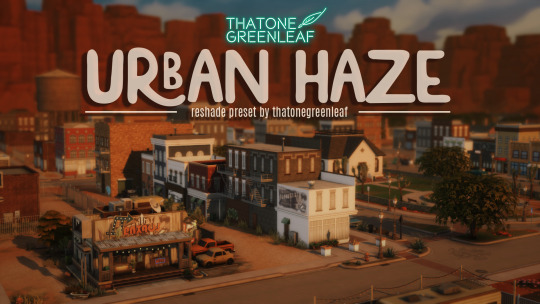

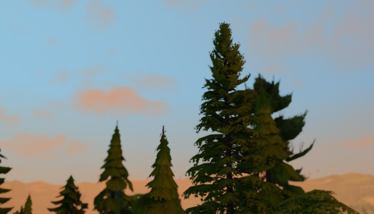
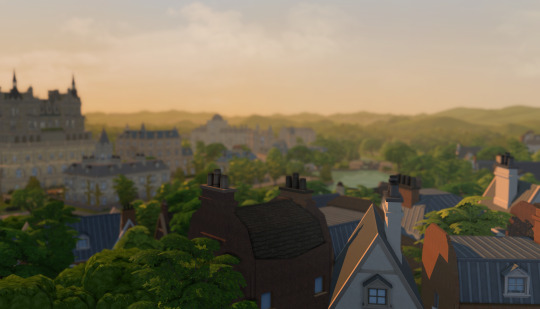
~urban haze~ reshade preset!
I've been using this preset on my twitch for a bit now, and i've finally gotten around to releasing it!! I'm very happy with it and I currently use it for everything😅
Urban haze has a focus on realistic lighting with a slight hazy and warm feel. Less blue in shadows, darker nights, deeper afternoon shadows, saturated sunsets, balanced greenery. Use it in any world, I've tested them all :)
__________________________________________
How to download:
♥ Download Reshade: (I use reshade 5.7.0, I can't say how this preset will behave with other versions of reshade, or G-shade.)
♥ During Reshade Installation, select The Sims 4, choose DirectX9 as the rendering API.
♥ Effect Packages to install: standard effects, sweetFX by CeeJay, qUINT by Marty McFly, color effects by prod80, and Legacy effects.
♥ Download urban haze below, drop it in your Sims 4 installation's "Bin" Folder
♥ Open the Sims 4, Disable edge-smoothing in your graphics settings if it's not already, In the reshade menu, set RESHADE_DEPTH_INPUT_IS_REVERSED= to 0 in global preprocessor definitions if it's not, and MXAO_TWO_LAYER= and MXAO_SMOOTHNORMALS= both to 1 in qUINT_mxao's preprocessor's definitions.
♥ If you're struggling with installation, I suggest you check out @kindlespice's installation tutorial! It was made for reshade 4.9.0 but the instructions remain the same.
__________________________________________
Notes:
♥ Both Depth of field shaders are off by default, you can enable them using their shortcuts: ctrl + Q (MagicDOF), ctrl + W (MartyMcFlyDOF) or enable them manually.
♥ MXAO.fx also has a shortcut (ctrl + R) bc sometimes the DOF blur makes the shadows weird, most of the time it's fine!
♥ Could potentially be gameplay friendly, depending on your GPU! The MXAO and DOF shaders will be the most performance heavy, feel free to adjust to your liking.
♥ The pictures above were taken with this preset and no further editing, but I do use a few lighting mods that will affect how my game looks:
♥ NoBlu by Luumia
♥ NoGlo by Luumia
♥ twinkle toes by softerhaze
URBAN HAZE RESHADE PRESET ↠ download on sim file share!
Follow me on twitch!
Support me on patreon!
TOU: do not redistribute, reupload, or claim my cc/CAS rooms/presets as your own! recolour/convert/otherwise alter for personal use OR upload with credit. (no paywalls)
492 notes
·
View notes
Text
i got the highest grade for this thing lol
just look at this monstrosity
less saturated version
465 notes
·
View notes
Note
Just wanted to ask, please forgive me if you've already answred this, what program do you use? Your art fucks HARD and like. I was looking at your art of the two moths over the city they die in and I was hit with the wave of "oh that looks really fucking fun actually." Like i know my art program can't do some of those effects and like, I'd love to try fucking about with them.
hi there, thank you! all my art is done in procreate and paint tool sai
because you mentioned that drawing in particular i thought it would be fun to break it down and show ppl what exactly went into each part of it so check this out
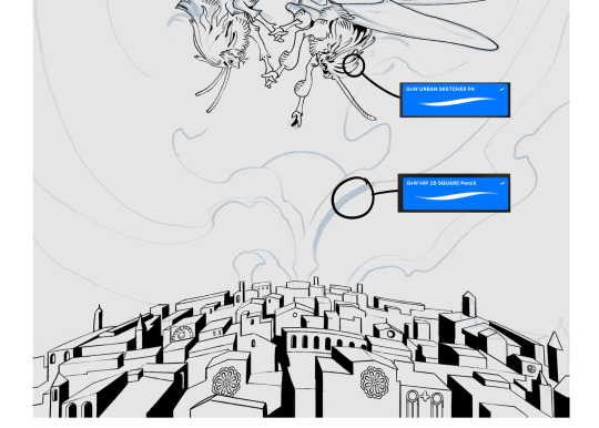
sketch & lineart - the brushes come from georgbrush.club and the urban sketcher is my most commonly used lineart brush, it has a nice irregular shape. the square brush is nice for big blocky sketches.
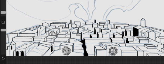
the cityscape was REALLY hard but basically I got a photo of the skyline of florence, traced some basic building shapes, then bullshitted the rest using the vertical symmetry/mirror tool to cut down on the amount of work (so i only had to sketch one half of the city). then for lineart I turned off vertical symmetry, turned on the two-point perspective tool, and got this:
the rose windows were made using the radial symmetry tool.
I didn't like it being so flat, so I used the liquify tool to make a kind of fish-eye effect (limited success tbh). I liked how it looked but the buildings in front needed something to cover them up to make the liquification less obvious...
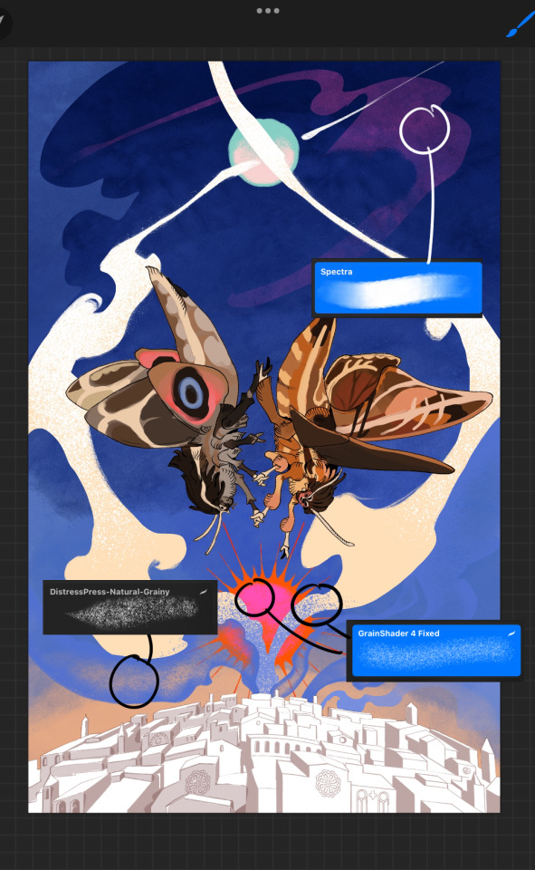
first pass colours. I felt they were very washed out, aside from the sun which i loved. I use the spectra brush (default procreate) for skyscapes a lot, I love the texture. Although the clouds were filled in using the lasso selection tool, I softened the edges using the square pencil again and added texture using true grit sampler grainy brushes. The translucency effect comes from my setting the brush as an eraser. The sun rays come from the radial symmetry tool.
Blocking in the moths' colours was done with the urban sketcher again.
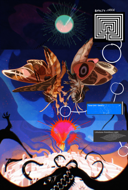
Something people may not have noticed is the labyrinth hidden in the sky! yeah I had a bunch of versions where it was more obvious but I found that it clashed a bit and was too busy, so I made it subtle. But yes. I searched for "royalty free labyrinth" and picked one.
The toner grit brush is one you've seen before if you've looked at any art on tumblr lately (this is such a popular brush) and it's from the true grit fast grit set. The pointillism brush is from the true grit free sampler pack, like my grain brushes.
I added shadows to the moths, increased saturation overall, and changed the clouds to a translucent blue (you can even see in the sun where I forgot to block in the sun itself because the clouds over it used to be opaque lol). Moon rays were drawn using the radial symmetry tool but this time with rotational symmetry off. I also moved the moon down closer to the moths because I felt that it was a bit far away, and this served to visually divide the drawing into three equal parts, so I chose to lean into that and divide the sky colours too, to show passing time, or an endless moment - morning, evening, night, etc.
And then the oroborous, I tried a few different effects on it because I wanted it to be very clearly separate from the main scene - I settled on a dot matrix newsprint texture, using procreate's onboard tool, and some heavy chromatic aberration. This is because the oroborous isn't real, it's purely symbolic and the moths' demise started when they became photographers so I liked the print media aspect there as well. The story itself is about grief without closure, cyclical violence, and sunk cost fallacy, while everyone explores an endless labyrinth, so an oroborous fits I think
what makes art fun to me is thinking up ways I can tell a story using just a single image. and sure a lot of it will be lost to an audience who isn't familiar with the characters or backstory but i want to leave enough in there that even complete strangers to my work will be able to construct a narrative about what's happening here, rather than it just being a cool image. that's my goal.
Finally I exported it to sai on my pc to give it a once-over. this is really important because the retina display on an ipad is oversaturated on purpose, to make everything look amazing and vibrant. but what this means is that on other screens, your work might look washed out. it's especially bad at displaying yellows! so i look at it in sai on my pc and i make minor adjustments, in this case I actually added another multiply layer on the moths and an overlay on their non-shadowed parts to increase the contrast there.
finally if you've read this far, I played a little trick with the caption of the drawing. yeah, THEY die... but only one of those moths is a theythem pronoun haver... the other has to survive. he isn't given a choice in the matter.
#fr you will never catch me trying to mystify my process i will explain literally everything#brushes
455 notes
·
View notes
Last Seen Blogs
whiskyandwonder
Whisky and Wonder
aiolos-sagittarius
Aiolos
to-you-i-seem-perfect-blog
A Day In The Life Of A Fucked Up Teen.

tutoriage
Tutoriage
choi-gayeong-blog
K-Pop!