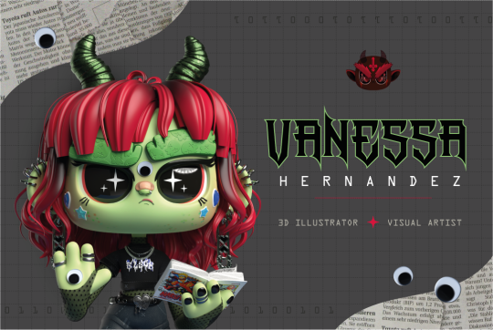
#this is my first time making a full thing on adobe illustrator!!!!!
Note
How big of a threat do you think AI Art is to the employment of concept artists? Given how artists like RJ Palmer and Bogleech are panicked about it, you've worked in fields adjacent to that, and you've worked extensively with AI art, I'd presume you'd have some perspective on that.
AI art is going to shake up the art field, any new art tool worth its salt can and will.
I was training as a graphic designer when InDesign was finally starting to hit its stride in the late 90s, but I learned on QuarkExpress and learned old-school techniques in high school Newspaper club. I'd been dealing with dot-matrix printers and photocopier work since I was 8 at my dad's office.
So I got to see the graphic design industry in a state of panic through my professors and our various industry guests. All the EM-dashes and the declaration that the " on the keyboard is the inches mark and not the quote were protective measures for the industry so that talented amateurs wouldn't know the secret handshakes and couldn't "fake" their way into being seen as real graphic designers. And they were PISSED that Adobe InDesign was easy to use and automatically converted the measure-marks into "proper" punctuation.
Yet there's still a graphic design industry.
That said, I'd be curious if the ones that are actually freaked out have ever actually used the products. Because I"ve been in a down slump and I'm prone to stim, I have done pretty much nothing but dig into Midjourney and Stable Diffusion's brains and my experience doesn't match the observations of the terrified.
I think part of it is because people only see the results and they don't see the work. And there is work involved.
Iteration and Curation: I've posted a couple hundred pics from Midjourney so far. What do you don't see is this:
Now, in Midjourney parlance "image" also includes 4-grid previews used while developing final images.
For each panel of "Glitch"/"The Bethesda Epoch", for instance, I generated at least eight options (usually more) and evolved several of them across many generations to get what I wound up with. The Bethesda Epoch took me days to put together and garners me feedback and response roughly equal to a 3d modeled piece I'd put together in the same time frame.
Truth of the matter is, you rarely get anything perfect first try, everything needs modification or massive amounts of reiteration to pass for final work.
Promptcraft: Spend even a little time on the discords and you can tell who is playing and who is trying to make art. Play is an entirely viable application of this technology (more on that later) but while this levels the technical skill barrier for a lot of people, it does not cover for a lack of vision or ideas, and it requires its own skill.
There's a big difference between "in the style of D&D art" and "as a D&D monster, full body, pen-and-ink illustration, etching, by Russ Nicholson, David A Trampier, larry elmore, 1981, HQ scan, intricate details, inside stylized border" in terms of what you get.
Play: Most people are just having fun. It's real easy for artists to take the ability to express the ideas in our heads for granted. Most of what you're seeing is people playing with ideas they've been unable to express before. A lot of what I do with it is play, too.
Accessibility: My hands cramp when I draw these days, depression and other problems frequently knock my motivation and energy out of me, but I can use AI to put my ideas out there when the other parts of me aren't cooperating.
Limitations: The tech looks miraculous, but it can't do everything. In fact, it can't do a lot of things. The artist is still needed for the vision, for the ideas, to work the outputs into something meaningful, to supplement the outputs with human intention so a copyright can be involved, the list goes on.
Even Rembrandt used a camera obscura.;
180 notes
·
View notes
Text
50 Follower Special Surprise
Hihi besties, so I've officially hit 50 followers which may not seem like much but the fact that there's 50 of you that listen to my insanity is wild so first off, thank you all!!
Second, I promised a surprise, and I am following through. So for those of you who don't know, hi I am currently studying fashion. I have been for the past four years, and in my studies, one thing we've learned is how to do flat sketches. I found that I loved doing these, so sometimes I do them on my own for various ideas I have. One of these ideas that had come to me was to make gown concepts based on all of the BVB albums and eventually the EPs, so, that's what this is. You can view the full collection below, and under the cut are close ups of each gown and some insight into my thought process for each, enjoy!
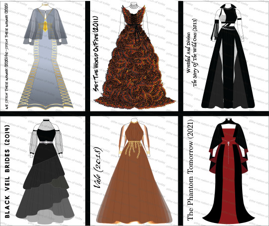


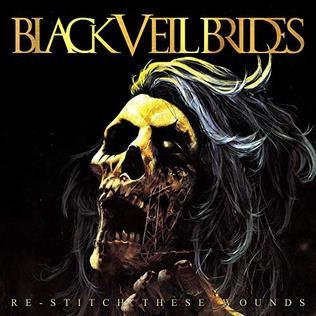
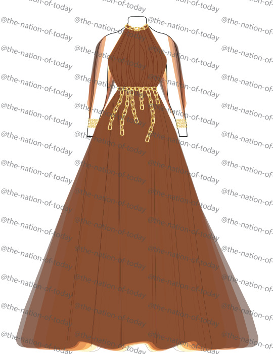
First up is We Stitch/Re-Stitch These Wounds. Since these albums are companions to each other, I wanted to make one gown that combined aspects of both. Fun fact this was actually one of the last gowns I conceived because oh boy did I struggle with the silhouette on it. Anyway, to the gown itself, the most obvious motif is the lacing calling back to the idea of stitches, featured on the side panels, the neck, and on the corset belt. Then, on the detachable cape and matching choker are embellishments made to look like eyes, which relates to the eye motif found on the original We Stitch cover. The colors are then picked from the Re-Stitch cover, since by the point I did this gown I had already done quite a bit of black and wanted to go in a different direction.

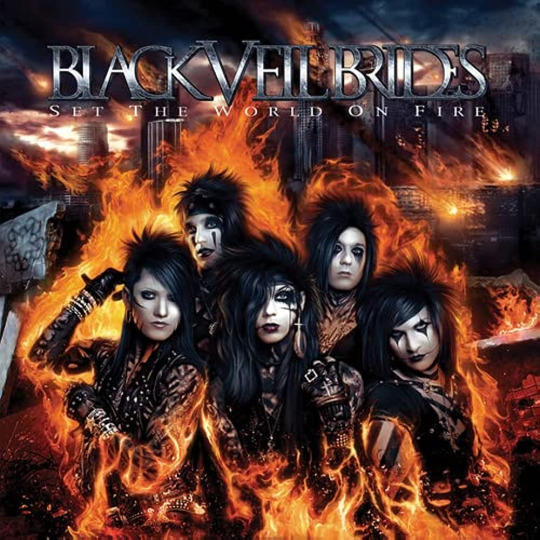
Next is Set The World On Fire, or as I have lovingly dubbed this gown, Set My Computer On Fire because Adobe Illustrator crashed a grand total of three times while figuring out this gradient. Now my ORIGINAL plan for this one was to have the entire gown be one gradient from black at the top to fire colors at the bottom (think Katniss' Mockingjay dress but like mid-transformation). Illustrator uh... did not like that because each of those wing shapes is separate and complicated, hence the crashing. Instead, each wing shape has the fire-colored gradient which I ended up liking better. Obviously the wings are a reference to both Fallen Angels (obviously) and The Legacy ("on leather wings"). Then, the sort of tattered belt and choker are there to be callbacks to the acrylic paint the band wore on their bodies during this era.

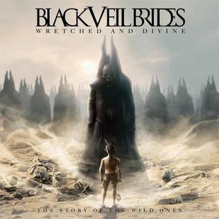
Next is my beloved Wretched And Divine. For this one, I didn't take inspiration from the album cover so much as I did the Wild Ones' outfits, particularly the Prophet (to the surprise of no one). In those outfits you obviously see use of mainly black with a lot of asymmetrical elements. The collar of the gown, for example, references the collar of the Prophet vest in the In The End MV. The armpiece, on the other hand, is a twofold reference. It references both the strips hanging off of his belt in the In The End MV but it also references the feather armband Andy wore during I believe it was Download 2012 if I'm not mistaken. This one was very fun to play with the various elements and just kinda go nuts.


Next is Black Veil Brides from 2014. I will be the first to admit I struggled heavily with this one. I feel like this album is one of their most stripped back, so I was struggling on how to represent the different aspects. I eventually turned to the album cover again for inspiration. The tired skirt is a reference to the rubble pile that the gargoyle stands on, while the mesh sleeves and chest are reminiscent of the skyscraper ruins in the background, using a large, square mesh to evoke that building skeleton look. Finally, the silver belt with the circle clasp is a reference to the eclipse happening on the cover, and the color scheme is evoking the album's grayscale.

Next we have bestie beloved Vale. Now stick with me, this is the most conceptual of all the gowns. So with Vale, whenever I listen to it, I always get two kinda ideas from it: the idea of feeling like a ghost and the imagery of being chained down to something. It’s hard to translate into 2D but if it were real, it would be made of some really light and flowy fabric (something like a semi-sheer chiffon for anyone else who knows fabric) and each layer of fabric is a different color from the album cover (you can see it at the bottom there as well as on the open sleeves). This is where that "ghost" idea comes in, that weightlessness. Then, being weighed down is represented by the chain belt, with the sleeves are connected in the back to that top chain detail on the collar and I imagine there would be chains back there too. Essentially, I wanted to play with those dualities of feeling like you're floating away while still being chained down by something.

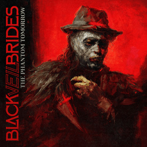
Finally for the full albums is The Phantom Tomorrow. This was actually the first gown that I made in this mini collection because I had such a clear idea of what I wanted since TPT has some of the most obvious visual motifs in the form of the scarlet cross. This gown is actually two parts, the gown itself and the cape/collar. The silhouette is based off of both the girl's dress in the TPT music videos and of Andy's jacket in the Scarlet Cross MV. You then obviously have the motif of the cross cutting through the center of the gown. The cape is then a result of me wanting to allude to the idea of wings (because of the Blackbird) without wanting to do something obvious like feathers. Then, of course, I needed to incorporate Andy's slutty priest collar as a crucial element. Finally, the rosary belt was added to both break up the red and to add a little extra blasphemy because we can always do with more (sweet) blasphemy (Get it??? Wrong album I know but I had to)
Now, onto the EPs. So I actually did not do these at the same time as the albums. I did the albums in October 2022, before The Mourning came out. Once I finished those, I didn't really have any ideas for the EPs so I just let them be. Then in March of this year, I had basically an epiphany about them, like I got out of bed specifically to do a janky sketch so I wouldn't forget my ideas. So, here they are.


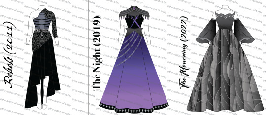
First off is, of course, Rebels. Since this is Rebels, I wanted it to look different from every other gown so far, hence the silhouette. The asymmetrical skirt and sleeve allude to going against the grain and not being perfect (y’know, rebelling). The damask pattern on the top of the skirt and sleeve comes from the Coffin video, the women with the candles wear veils that look like they have a sort of damask (tbh, couldn’t tell exactly but they’re Ornate). The center panel of the bodice also has a distinct coffin shape, while the slashed stripes across the bodice reference the chest paint they all wear in that video, it’s sorta striped and almost looks like a ribcage. Hard to tell on here, but it would be almost sliced open with like a peekaboo black fabric beneath it. The colors of the rest of the bodice are then color picked from the jacket on the EP cover. Finally, the chain details come from the chains on the EP cover, and the upside down cross allude to both the crosses in the Coffin video and the fact that Unholy is a song on there, y’know the upside down cross being the opposite of a right side up one.
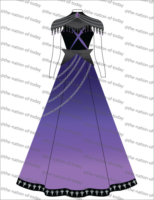

Next up is The Night, aka the first one I had an epiphany on in regards to this set. The purple comes from the EP cover and the videos, obviously. The chains are a part of Andy’s outfits in both MVs, which is also where the crosses on the hem come from, both are on his jacket in both videos. The neck piece is a callback to the streaky paint/makeup Andy has on, and then the X on the bodice is a reference to Lonny’s makeup since it was his first record with the band, I wanted to ensure there was a reference to him. I wanted the X to be a little sharp and almost look painted on. This whole EP has always sounded very sharp to me, so I wanted to channel that in this gown. Kinda just went with the vibes on this one, ended up with this gothic armor sort of look for the neck piece, but it slaps so we're sticking with it.


And last but certainly not least, The Mourning. I wanted this to be a very big and ornate gown, almost looking heavy. The color scheme, obviously, adheres to the grayscale of both the cover and music videos. The skirt is made to look like panels or pieces of a stained glass window, referencing the rose window in the Saviour II video. The neckline is a modified sweetheart, with the two extrusions made to look like devil horns (cause, Devil, get it). Then the sleeves are twofold- they are reminiscent of angel wings (both Better Angels and the angel on the EP cover) and they represent Saviour II because they’re meant to be big and sweeping, like the song is. Finally, the studs are taken directly from Andy’s jacket in the Saviour II video
And that's it! I hope you guys enjoyed these. I am very proud of how these all came out, definitely one of my biggest projects to date but one that I'll always love!
#black veil brides#bvb#black veil army#bvb army#we stitch these wounds#re stitch these wounds#set the world on fire#wretched and divine#black veil brides 2014#vale#the phantom tomorrow#rebels#the night#the mourning#maeve.png#this is my first time sharing my designs to a wider audience so be kind to them#i put a lot of effort into these so
46 notes
·
View notes
Text
Where I Got Low(er) Cost Art for My Indie TTRPG Setting
So I thought I'd make a small post about where I sourced art for Street Wolves and maybe it could help you.
1. Stock art
What I mean here is art you can just purchase and use. Unfortunately there wasn't a lot of art that I personally could use, because my setting, Street Wolves, doesn't fit the most common genres of ttrpg (fantasy or horror). I did find some pieces on Shutterstock that I could use, but Shutterstock is a bit more expensive than buying a piece or two on Drive Thru RPG. You usually have to buy a subscription to Shutterstock and you might not need that many images.
I managed to find a coupon online that actually worked when I subbed, so if you go that route be sure to Google for deals first.
2. Photo/Art Bashing
I'm not the worlds best at Photoshop or Illustrator, but I do have some skills. Lots of times I could take a piece of stock art I found and alter it to fit my needs. Or take a photo, run it through Illustrator's live trace, throw some filters on it, and it's good enough.
Yes, this does take time and skills if you want to do this. Start working on them now. Look up tutorials and follow along. If you can't afford Adobe products, which are ridiculously overpriced, there are far cheaper alternatives out there now!
3. Commissions
While searching for artists to commission, I found a couple that were really reasonable and within my budget. Just look at their prices, ask for their commercial rates and see what you can find. It may take a lot of searching, but you might find someone out there that matches your small budget that has a style you like.
4. Artist Pals
This might be the most controversial one here, but a couple of my friends offered me a deal on their art. Note: I did not ask for this. I also attempted to refuse. But they are kind and generous people. And I still try to give them things in trade or cut them in on merch sales, or whatever.
It's entirely possible that if you're networking, being a genuine human being, helping others, and being a friend that talented people may want to help you out if they really like your ideas. I'd never *ask* them for a favor or a discount though, and I believe that is key.
5. Decorative Accents
Art doesn't have to be illustrations. It can be little symbols, decorations, and other accents that help make the work more "art full" than it is. In my case, I combined a lot lot of stock elements to create synthwave flavored bits to toss around the book, to help fill it out a bit more.
And there you have it. Hope this helps you in some way. Oh yeah, notice I didn't mention AI art. Because it is poopy.
29 notes
·
View notes
Text
Wild Grinders: The Fan Analysis (Pt.2)
Previous
Hooooooo boy. This is the one that everyone wants to talk about. The haters and the fans. But the haters mostly want some sort of fuel to hate Wild Grinders. Don’t.
3k+ words
This is criticism, not the bashing reviews you see on YouTube where the speaker goes on a tangent and use every swear in the book. This critical review of Wild Grinders will be slightly more professional and come from my visual fine arts background. (Long sentence, but basically this is from 4+ years of training in art criticism).
The point of criticism is to discuss, not to attack the artist. In art you can’t just say a piece makes you mad (and it’s complaining by that point), you have to actually tell your reason WHY you feel mad. Not only that, but you have to understand the construction of the art before you make critical comments (usually the artist’s jobs is to decide whether or not they accept your criticism). Critique also requires a basic understanding of the medium itself (and taking account of the artists’ circumstances as well) for it to be fully developed.
Anyways, the one who is writing this criticism…. Is literally a fan of Wild Grinders. My money? It went to buying episodes and toys. My blog? It is a Wild Grinders themed fandom blog. My hyperfixation since 2013? Wild Grinders.
But just because this series has a special place in my heart, that doesn’t mean it’s free from faults. Flaws exist in everything.
Because this will be critiqued in an artistic way, it will include bits of the positive things about the series. Reviews and criticism are not always a full-blown hate rant that people make it look to be. You’re allowed to say what you enjoyed about the subject during a critique.
Enough of the foreword rant about art critique, it’s time to evaluate a TV series from 2012. This critical review will be split into 2 major themes that the show is often criticized for; animation and story.
Animation
Everyone’s shouting that Wild Grinders has bad animation. We get it. But that sentence needs to be elaborated. Why was it bad?
My expertise really isn’t in animation because ‘animating is hard.’ It takes days and years of practice and self-study to have some of the best animation most Disney media has. But the reason why Disney have some of the best animation is due to a rigorous process of rejecting mediocre and only taking the best. That, and also most of their animators graduate from CalArts. And most of the time, they usually want to keep their “bests” and pull them into contracts where they cannot work for other studios or share their work to the public.
Wild Grinders was a spur of the moment that Nickelodeon wanted out of nowhere for their sports-themed branding of 2012… And most of the early animation were 2-minute promotional shorts to advertise the toys. Also Tracy Tubera’s artwork was made for toy design and 2D illustration.
Not to be that guy, but Rob Dyrdek and Tracy Tubera simply didn’t have huge backgrounds in animation. Rob Dyrdek ended up hiring a group of various freelance animators and expected them to work their magic on Tubera’s style. The results gave him an animated show at the end of the day, but it wasn’t high-quality.
My reasoning for this lack of quality was due to multiple factors. The first factor was Rob Dyrdek hiring random freelancers to make something fast. Not only that, but some of their experiences in animating were different. Some of them worked on more professional projects while others… were Flash Adobe Animators. You can even go to the search engine to see who worked on the show as well. (Fandom is a hobby that doesn’t pay, don’t expect me to write formal letters to these storyboard artists/animators. They can share whatever information they want to).
Overall, flash animation would be favored due to it being cheaper and spit out episodes faster. There is an entire phenomenon of broadcasting stations that also favor it for the same reasons.
...After contemplating over this critique on the animated aspect of the series, it’s been decided that animation is NOT my field of expertise and my brain cannot comprehend the way it works. From most of my research, animation is something that always has a great amount of discourse about what’s best and worst.
Some of the most award-winning animation comes from studios where the artists are treated horribly (making people claim that good animation comes from abusing workers). MEANWHILE unsavory shows, for example Big Mouth surprisingly treats their animators way better. There are other discourses that involve the animation studio just being lazy.
But here’s the thing! Flash animation can be used to create phenomenal works! It just depends on the way it’s used. Flash animation discourse makes everyone believe it’s the “wrong” of animation, but the reality is that animators have to put effort to use it to full potential. The best example that used flash animation and had a sharp, blocky art style was Motorcity. (Honestly please just watch it, it’s insanely underrated).
Back to the animation Wild Grinders… Yeah. It wasn’t as phenomenal. It was blocky and not as dynamic. A majority of the cartoon is fairly flat, save for some small details if you look closely. (My life has been dedicated to finding these short moments where the animation did a thing, expect a video of those moments). And the animation was all done in flash and a recruitment of various freelance animators. Nickelodeon most likely didn’t provide a professional crew for it either. And again, Nickelodeon was never looking for a masterpiece CalArts cartoon. They wanted to have a sports cartoon and called up the man who helped built a giant skateboard and made a few animation shorts. (Nickelodeon also did the same thing for Making Fiends, the first cartoon that came from a webisode series).
After skimming through some sites of the animators (who worked on Wild Grinders), a lot of them were varied in experience and what skills they had. However, some stuck out having only experience in Flash animation and not really doing it for the art. Safe to say, there were plenty of issues behind the animation of Wild Grinders. Some of them were minor issues, while others fumbled the animation. At the end of the day, it slanders the energy in Tubera’s non-animated art and everyone wants to complain that the cartoon looks bad. A lot of the things that people hate about the animation are due to what Nickelodeon wanted. An exciting, mindless cartoon about skating for the alarming generation of kids who would be Instagram-saavy influencers. (Trust me on this. In 2012-2015, Instagram was the only social media that my class and generation would use and it was normal for everyone to have one).
Anyways, that’s what my take on the animation of Wild Grinders. It just didn’t reach for a higher bar based on the way the animation is. And it wasn’t just the animation where the bar was set low. The writing of Wild Grinders is something that never reached its potential for similar reasons.
Writing
There’s an ongoing trend that bad animation means bad writing for cartoons. Unfortunately, Wild Grinders makes this claim to be true. Honestly, it’s complicated and difficult to comprehend it. The writing was full of jokes and punches rather than having a linear story. The more you watch it, sometimes the lines can be funny and understandable. However, it’s difficult to enjoy it on the first watch of an episode.
In 2023 (the year this was written), a lot of lines have aged well compared to the 2014 audiences. Some lines in the writing will make me cringe, do a double take, or laugh alone hysterically. (In short, there were plenty of subtle jokes meant for mature people who have seen everything on the internet). However, most of this is humor and not the actual story.
…There never was a true story in Wild Grinders. A lot of the episodes were kept the same and did not become epic stories like Steven Universe and Star vs. the Forces of Evil. Around this time, more western animation were becoming greater narratives and cartoon fandom was at its peak (especially on Tumblr). It’s not surprising that people were demanding “more” from western animation. They expected thrilling plots like Adventure Time. They demanded their cartoons to raise the bar because My Little Pony: Friendship is Magic had top-tier writing that past series wouldn’t even attempt.
Wild Grinders was always meant to be short, wacky episodes to watch after school. Rob Dyrdek clearly didn’t have a plot in mind when creating it. He simply wanted to focus on creating characters for the toy line. He had their personalities fleshed out, but didn’t seem interested in story narrative. In the early days of Wild Grinders, there were 2 short movies that Dyrdek was most likely involved in. (He didn’t play a huge role in the writing for the TV series). And from the writing, there was an attempt to create a good plot. The plots of both movies weren’t bad. They involved an outside force to take the crew on an adventure and they’re all friends.
Golden Grinders was not my favorite. (And it still isn’t). It felt very… Hollywood glamorous. It’s am ‘instant’ rags to riches story where it relies on celebrities as the importance. The Wild Grinders were put into a gold filter and they lied. In the end, they learned their lesson (kinda). Honestly, it was really was a boring story. It focused on gold and famous figures that society puts on a pedestal. In a nutshell, it’s not relatable to the crowd that doesn’t care about the tabloids.
Next we have “The Lost Skate Spot” or the movie that actually felt like it belongs to Wild Grinders. It’s hard to explain, but the outfits to the setting to the humor just nailed the characters perfectly. It introduces characters more naturally compared to the TV series where every side character NEEDS to insert themselves into the situation. This movie uses the right timing for humor and involving supporting characters when they are actually relevant. Not only that, but it actually focuses on the skate crew as a whole! In the TV episodes, the crew is always together, but Lil’ Rob often steals the spotlight. He does play the hero in this movie, but his role as the hero is better. Why? It’s because he watches out for his friends in the movie and lends a hand to them. He also gets snarky responses from his friends as well (while the TV series constantly makes him praised by his friends, save for a few episodes).
These movies are honestly the closest vision we have of what Wild Grinders was meant to be. Rob Dyrdek was more involved. The characters weren’t like their comical, zany TV counterparts. They felt far more natural as a friend group. However, that’s enough praise for the earlier works in the series. This essay is meant to cover the TV series.
In the TV series, there was an obvious lack of a narrative. Most likely due to Rob Dyrdek’s lack of experience in writing. He dropped out of high school when he was sixteen and got lucky enough to gain a sponsorship for skateboarding. This man was clearly not a bookworm gifted student who could write 200k+ word stories that included a fantasy plot. Instead of doing things the introvert way, he mainly relied on experiences to write Wild Grinders. After all, the idea of Wild Grinders came from his childhood skate crew. But he didn’t put 100% focus on that aspect. And Dyrdek ended up pulling more inspiration from the present (2012-2014). Wild Grinders became less grunge-like and more glamorized to fit his current TV lifestyle. His love for skateboarding was still important to him in those years and he’s done a ton of work for children’s charities. However, that couldn’t help him have the skills to write a good narrative for his series.
And honestly, a lot of the show’s writing wasn’t actually done by Dyrdek himself. Instead, there were multiple script writers. Do you get the idea? My guess would have to be that the writers would send Rob Dyrdek the scripts/ideas for episodes and he would usually greenlight them (he was working on his projects like Fantasy Factory and Ridiculousness). Not only that, but Rob Dyrdek would give a quick description of what he wanted and the writers would carry it out. This is what he had done when designing the characters for Wild Grinders; he hired artists to draw their styles of his characters and rejected multiple artists until he reached out to Tracy Tubera. It’s not surprising if he did something similar for writing the TV show. If it seemed okay and outlandish enough, he’d probably agree to it.
And that’s where many problems in the writing become visible. Some of these cartoon writers were adults who didn’t understand kids. Or they hated kids and tried to insert jokes to make fun of the younger generation. Either way, some episodes were good. Others were… bad. Like. After seeing everything on the internet and learning about the psychology of child development, there are some unsavory scenes that were insanely uncomfortable to watch as an adult. We are talking about deviantArt fetishes being slipped into some frames. (Literally screamed in agony when seeing Jack Knife’s feet in that one spooky episode and died a bit inside from other moments like that). Yes, it can off be played off as toilet humor for kids, but there were some moments where it went to places it didn’t need to go. (Or it just seemed heavily pushed into the episode when it wasn’t needed). Especially for too many episodes.
There’s a whole discourse about this happening in many kids’ shows. The animated series who got the worst of it was Totally Spies. Even the Powerpuff Girls Reboot got hit by multiple fetish writers (it’s a lot worse than you think). If there’s anything to take out of this, Wild Grinders isn’t the only show that had this inappropriate writing slipped into production. The reason why it’s still a problem is that it just that it can make anyone walk out the room because it’s uncomfortable to watch.
The TV writing department for Wild Grinders messed up in various ways. Some made the script too gross, while others decided to copy from other cartoons to be “funny.” Yes, this is referencing to Johnny Test. One of the writers thought it was real funny to parody off of other cartoons instead of just being creative and working on what characters they were given. One of the other “too real” adult internet jokes that made its way into an episode involved bronies (like the grown men stereotype). It’s doesn’t reference it one-to-one, but seeing a fat unicorn man on the couch as the song goes “but we don’t talk about him” and it just clicked. One of the writers really wanted to make fun of bronies in this skateboard show. There are a lot of internet meta moments that will ‘click’ if you pay careful attention to the writing. Not only does it ruin the watching experience, but it shouldn’t have been there at all. It just makes the writing joyless to know that the adults wanted to insert their commentary instead of focusing on the story. Like, it does happen in other cartoons. But it’s just the way it’s told in the story that matters.
That being said, there were some episodes that weren’t always this bad. (Usually, those are my most favorites episodes). There were some episodes that were pushing for a better narrative and character development. However, a lot of it gets drowned out because they weren’t wacky enough for kids.
In the second season of Wild Grinders, some of the later episodes felt more experimental and even different from the early TV episodes. “The Big Sleep...Over” was very ominous for an episode because it centered around a mysterious character known as Stubford’s mother. Like, she wasn’t treated a joke either. She was written in a way that took her character seriously. And it ended in Lil’ Rob hugging his mother at the end and being grateful to have a loving mom. “Demolition Man, Man” featured a character that was also very negative compared most of the characters in Wild Grinders. He actively mistreats and torments Jack Knife, but not in the quirky style of Wild Grinders. He belittles Jack Knife, literally the kindest character of the crew, and gives him a wedgie in public. Not only that, but this character was definitely older than everyone. Like damn, they actually had a character being a full-on asshole to an 11-year-old. “Midas Touch” was definitely another experimental episode as well and honestly. That episode needs an essay on its own.
A lot of the faults in the show was mostly due to Rob Dyrdek’s and even Tracy Tubera’s lack of experience in creating an animated series. While Tubera consumes a lot of comics and animated movies, he was the artist for Wild Grinders and didn’t have the role as writer. Even Rob Dyrdek didn’t have a major role as a story writer either. He’s a busy man and seems to throw vague ideas to make an episode. They didn’t work with a professional animation studio. They were hiring freelancers who worked on various cartoons (multiple to be exact, but they weren’t usually working on the cartoon for that long). And again, the plan for Wild Grinders was to create 11 minute story in an episode. Creating plot was not on anyone’s mind. They were just expected to make random adventures for each one. And you know what they did. They used those 10 minutes to shove whatever wackiness, Instagram, and mainstream internet they could.
The next part of essay will cover improvements for Wild Grinders. (Brain tired).
Next
3 notes
·
View notes
Text
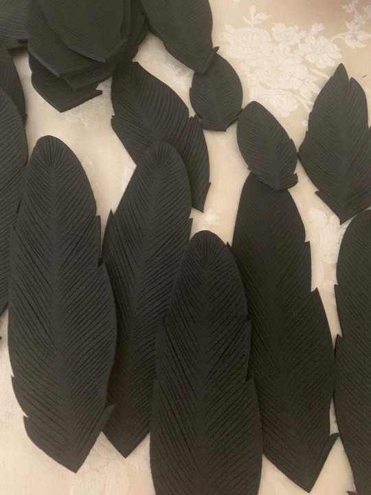
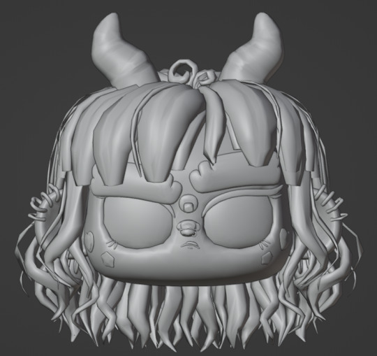
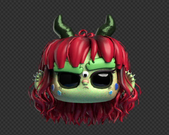
Harpy Eda Progress (random stuff because wow this project has been pure chaos)
Progress has been made but it’s all over the place since I’m procrastinating willingly on some things and forced to wait on others. So here is a bit progress update of random stuff
1. Wig
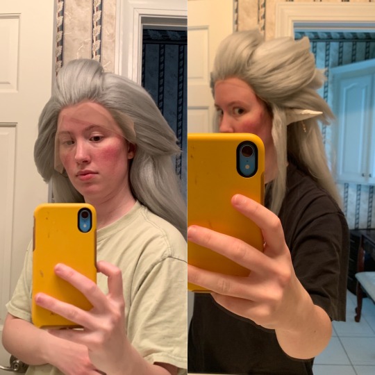
I bought a lace front in gray from Arda Wigs and one of their long white clip-on ponytails. I crimped both the ponytail and the wig, dismantled the ponytail’s mesh base, and took out the white wefts to glue them onto the main wig. Then I went back and teased almost the entire wig and steamed it to tone down the flyaways. I actually went through the spiking process twice because I hated the first version and didn’t account for the ears. (First version on the left, semi final version on the right)
2. Ears
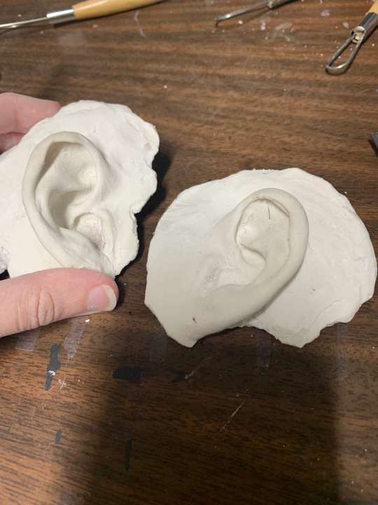
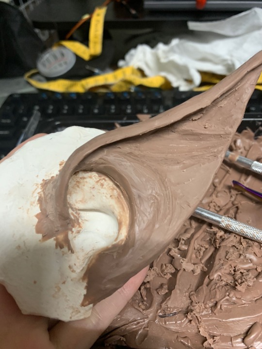
I have tiny baby ears so I wasn’t sure I could find prosthetics in my size that weren’t custom made (aka expensive). So naturally I decided to spend a lot of time- and some money- to make them myself. I went through the long process of live-casting my ears with alginate (the goopy stuff they use to take tooth impressions at the dentist) and made a plaster cast of my small baby ears. I did a sculpt with Monster Clay and did a second alginate mold and plaster cast to have a nice base for the final latex ears. For the actual ears, these are liquid latex tinted with white acrylic paint and they are brushed/dabbed onto the base ears in thin layers. After 15-20 layers, I have to apply a stupid amount of baby powder to keep the latex from sticking to itself, and then I can carefully peel them off the plaster masters. They just get glued on with Prosaide afterwards and are pretty comfortable to wear.


3. Feathers
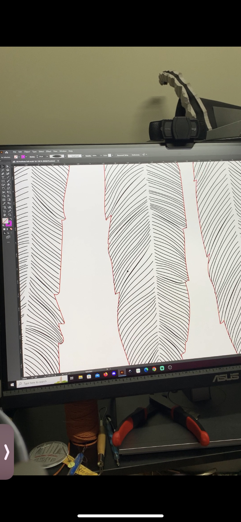
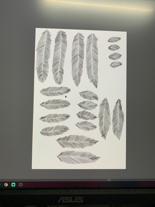
I have been in Adobe Illustrator hell creating feather SVGs for the laser cutter software Lightburn so that I can have a machine cut EVA foam feathers for me while I’m busy avoiding my corset mock-up by doing a full fabric stash inventory. There are five feather sizes with four variants of shapes in each size. Every feather has a red outline and dozens of detail texture lines drawn as tapered lines. These are plopped onto appropriately sized art boards that match the cutting area of the laser cutter which is 15x15 inches. Adobe also exports SVGs at 72 ppi (pixels per inch) and Lightburn treats everything as 96 ppi so I had to rescale everything. (Yes, me and the owner of the laser cutter found this through trial and error). The end result is a gorgeous bunch of feathers that I did not have to engrave by hand. There’s currently about 120 out of over 400 feathers cut so far

Everything else is still in early stages or waiting to be done after something else finishes (like the dress or corset that will support the wings’ backplate)
3 notes
·
View notes
Text
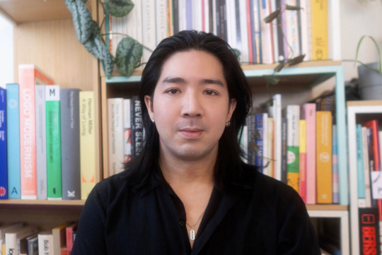
I am YEG Arts: Ray Dak Lam
Since taking the plunge into freelancing, Ray Dak Lam has made big waves as a graphic designer and illustrator. Known best for his signature geometric designs and vibrant colour palette, Ray is sought after locally and internationally with some big-name clients under his belt. In just a few years as a freelancer, Ray has embraced new opportunities from his first mural project to taking part in Adobe’s Global Creator series — this week’s I am YEG Arts story puts the spotlight on Ray Dak Lam.
Tell us a little bit about yourself and about why you’ve made Edmonton your home.
I'm an illustrator and designer from Edmonton. I graduated from the MacEwan Design Studies program in 2014. I got my creative career started working at a couple of advertising agencies and at a smaller design agency. Since then, I’ve become a full-time freelancer — that's what I've been doing for the past few years. I really like the creative freedom of freelancing, and that I get to explore more of my own personal style as well as choose my own clients and hours.
I was born in Edmonton and have lived here all my life. All my friends and family are here, I feel like Edmonton will always be my home. Edmonton has also shaped who I am as an artist in many ways — the people, especially those I went to school with and have worked with, all my coworkers, friends and experiences growing up — I think it all inevitably influences the subject matter in my work and the themes that I introduce into my illustrations. And now I hope to contribute what I can to the city's creative culture.

What drew you to graphic design and illustration? How did you get your start?
During my first year of high school, I took a graphic arts program, and my very first project was to recreate a font or typeface. It was through typography that I discovered my love for graphic design. And that's when I began considering it as a career for myself.
As for illustration, drawing has always been part of my life. I was always drawing as a kid, and I was never really good at any other subjects in school. Art was the only subject that I was passionate about. It is what motivated me and pushed me to pursue it all through childhood until now.
Tell us about someone who mentored you or helped set you on your path.
One of my first mentors was Andrew Benson. I worked with him at my first job at an advertising agency. He taught me a lot about branding, design, and the advertising industry in general. He’s passionate about print design and illustration and taught me their importance when it comes to design. He really inspired me when he went off to start his own studio and I hoped for myself I could follow in his footsteps.
Tell us about a big professional risk that you have taken and how it has influenced where you are today.
I would say taking the leap into full-time freelancing. It was scary in the beginning. I got laid off during the beginning of the pandemic from my advertising agency job. And at least for me, it was hard to find another full-time position. I was only able to land various short-term contracts, and some freelance projects here and there. In that moment I saw it as an opportunity to try this freelancing thing full-time since it has always been a dream of mine.
The pandemic and getting laid off were the push I needed to take the full leap into freelancing. It really changed my career for the better and it has opened up a lot of opportunities that I never would have thought possible. I have had a chance to work with and collaborate with a lot of clients that I had thought were unattainable. And I’ve gotten to collaborate with many other incredibly talented designers and creative people in Edmonton.
Who's someone inspiring you right now?
Someone who is really inspiring me right now is an illustrator from Vancouver, Tom Froese, he makes Skillshare courses, through which he teaches his approach to commercial illustration; YouTube videos, podcasts — all on the topic of illustration, and aimed at people interested in the creative industry. I've done a couple of his Skillshare courses and I'm attending one of his workshops at the RGD DesignThinkers conference coming up May 30 -31 in Vancouver.
He inspired me to find a focus and explore it as deeply as I can. His style has a very distinctive voice and he mentioned in his videos that it was the result of repeating a set of techniques over and over again once he found something that worked for him, so this really inspired me to seek a similar path for myself in terms of finding my own unique stylistic voice.
What does your creative process look like? Where or how do you usually begin?
For me, it always begins in my sketchbook. I try to bring my sketchbook with me anywhere and everywhere I can. Especially when I'm traveling, during those long plane rides and train rides where I can just let my mind wander and draw freely — whatever comes to mind. After that I pick my favorite sketches and vectorize the artwork, then bring it into Photoshop where I use my drawing tablet to add texture to bring more of my own personality to the artwork.
I enjoy creating abstract and geometric compositions because it's a meditative and calming process for me. I started a personal project during the pandemic called "Shape Studies", and it's been an ongoing project ever since. With a focus on the fundamental elements of shape, line, and colour, I explore freely within those basic fundamentals to create the most interesting compositions that I possibly can. I also use similar principles of geometry and abstraction when I'm illustrating other subject matter, such as animals, landscapes, people, etc. I'll continuously remove any unnecessary details and distill them into their most essential and fundamental forms.
Tell us about one of the most exciting projects or opportunities you've had.
One of the most exciting opportunities I had last year was the chance to collaborate with Adobe on their Global Creator series. It was a series where they featured different artists from around the world and they decided to feature me. They had me self-shoot a ton of footage around my studio, capture shots around Edmonton, and create a short tutorial explaining some of the techniques that I use to create my illustrations.
It was both exciting and nerve wracking appearing on video, but I'm glad I did the project because I love the way it turned out in the end.
Tell us about a favourite local project and a favourite international project.
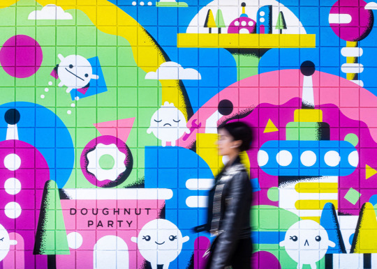
One of my favourite local projects was for Doughnut Party. They had me create a mural for their Ritchie location. I collaborated with Jennifer Konanz — she's a local mural and sign painter. She's incredibly talented and I feel grateful to have collaborated with her. She helped translate my artwork into a large-scale mural. It was really cool to see my artwork on such a large scale, which I don't get to see very often.
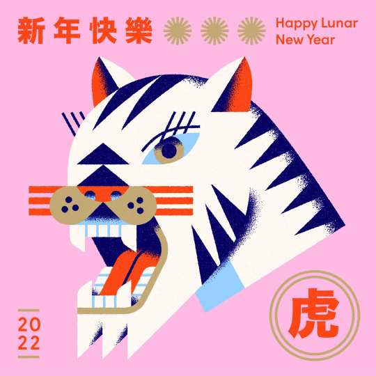
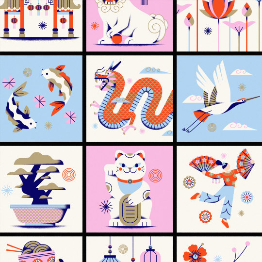
A favourite international project would be a commission for GoDaddy to create a set of illustrations centered around Asian Heritage Month and Lunar New Year. The project was really special to me because I got to express my own cultural background and upbringing as an Asian Canadian. Also, it was fun to illustrate dragons and dumplings in my own style.
What are you currently working on and what do you hope to explore next?
I've just completed the 36 days of type challenge on Instagram yesterday and it was really satisfying to see it through from start to finish! The project invites designers, illustrators and artists from all over the world to create a letter or number each day for 36 days straight. It was my first time taking part in the challenge. I really love to explore creatively, and I feel it’s important to work outside of client deadlines and budgets. It’s somewhere I can freely express my voice and craft and refine my style.
It was great seeing all of the other work from artists and designers that I follow, as well as discovering new artists to follow. Freelancing can be isolating at times, so participating in this challenge made me feel like I was part of this larger community all undertaking this daily activity together.
What excites you most about the Edmonton arts scene right now?
All the projects centered around Edmonton's Chinatown like Chinatown Greetings, created by Emily Chu and Shawn Tse, and Jordon Hon’s A Portrait of Chinatown documentary series. And many other creative projects that are supported by the Chinatown Transformation Collaborative (CTC). All these projects play a really important role in the revitalization of Edmonton's Chinatown. It's really inspiring to see so many people from different creative backgrounds coming together for a common cause.
Want more YEG Arts Stories? We’ll be sharing them here and on social media using the hashtag #IamYegArts. Follow along! You can keep up with Ray on Instagram, Behance, Dribbble or visit his website.
About Ray Dak Lam
Ray Dak Lam is a designer and illustrator from Edmonton, Canada. His work is characterized by its simplicity, utilizing vibrant colours and bold geometric forms as the basis for direct, communicative imagery. He works primarily on brand and illustration focused projects with clients around the world, such as Asana, GoDaddy, and McDonald's.
3 notes
·
View notes
Text
Final Project 1 - Making
Project 1: Self-Portrait
To start working on the interactive card in Spark AR, I first needed to design the card I was going to use as a target in Spark AR, so I went to Adobe Illustrator and worked on that. This is what my card design ended up looking like, I really liked it and I am very happy with how it turned out.
Once I had this ready, I started exploring and experimenting with Spark AR. After exporting my 3D model as an FBX, I proceeded to add it to the project on Spark AR, but I found myself with a setback: my full-body model was too heavy for Spark AR to support, because of all the image-based textures and numbers of geometry it has it was just too much information for the software to process. So, I went to Google to try and find a solution, and I found out there was a Blender add-on to optimize your models and export them directly to Spark AR. I downloaded, it installed it, and started optimizing my model, but I found myself with another issue... optimizing my model meant decreasing the geometry hence the detail of the model, so my model started to look very low poly and different from what the original model was; you couldn't even distinguish many of the little details anymore.
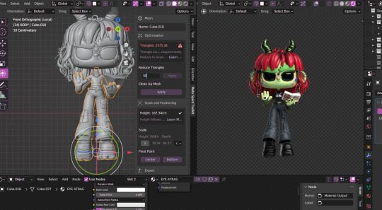
I found out later that Spark AR couldn't support the image-based materials my model had, so I would have to use normal materials and plain color for it to work better. I was a bit discouraged at this point because I had spent a great amount of time and effort working on my model and textures and it was what made my model look the way it did and it was part of the whole card idea. I really wanted the model to pop out and have an animation, but I just kept hitting walls and I didn't have that much time to create another thing, so I decided to focus on just the head, and try to optimize it the best I could without compromising too much of the details.
So I optimized the head with the help of the add-on and it ended up looking like this. You can see that the geometry isn't as smooth as the original one, but it still looks like the model and doesn't lose as much detail as it did when I was trying to reduce the geometry of the whole full-body one.
After having this, I was ready to return to Spark AR and start working on the interactive card.
Making the card work was actually a really fun and easy going process. I added the card target and started adding my optimized model and some extra things to make the AR design a bit more interactive with the user.
After having my AR interaction designed and ready, the filter was ready to be exported and tested on Instagram and/or Facebook, so I did that. But before printing my cards I wanted to make sure that everything was working out great, so I tested the filter with just an image of the card in my computer screen and it worked.
0 notes
Text
Final Reflection
Task 2 was a rollercoaster ride (it was a lot of fun, but I was also scared that I wouldn’t make it to the end). It was a big project, so I will break the reflection into parts.
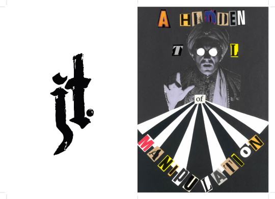
First up was the collage for which I presented Neville Brody’s quote “typography is a hidden tool of manipulation in society.” I chose this quote partly because I believe it, partly because I love how seriously designers take themselves, and mostly because it sounds cool. I cut the quote down to just 5 words “a hidden tool of manipulation” as the full quote was too long and cluttered the page. I knew I would probably lean towards Postmodernism and grunge in my collage, so when a classmate brought a collection of old art magazines to cut up, I plundered accordingly. I was picky with my letters, collecting letters with a handmade/printed look that were similar sizes and colours. Initially I wanted to make a collage like a hidden objects game so that I could use details as features on different pages of the zine. I tried many iterations of the collage but ultimately felt the images I had weren’t cohesive, so I decided to cut back to only the fortune teller since he tied in nicely with the quote. I followed Constructivist influences when creating the sunburst and positioning the words. Overall, I love the way the collage turned out, although it is off-centre which really frustrates me – in future I’ll be sure to measure things out properly before cutting them up or gluing them down.
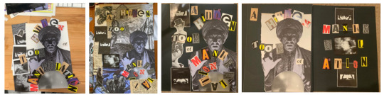
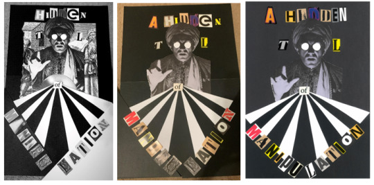
Collage evolution (#DesignIsAnIterativeProcess)
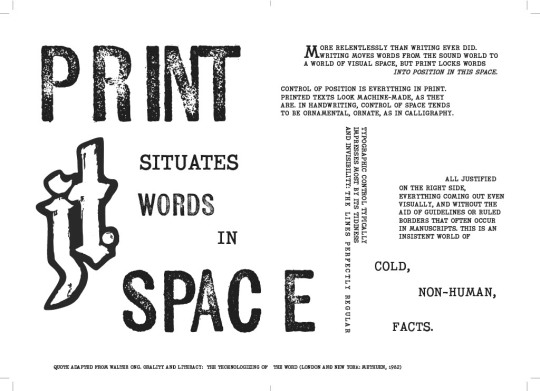
Next up was the monogram, which was the section I struggled with most. Silly as it sounds, I don’t like my name, so I wasn’t keen on investing time into portraying it. Still, I gave it a go- I do appreciate a good monogram (and it was mandatory). I found myself drawn to older monograms; those made by creatives who used traditional making techniques like printing or engraving to sign their works. Our first monogram exercise tasked us with hand drawing 2 monograms inspired by 3 different font styles.

Dodgy attempts at hand lettering
Of the styles I experimented with I wound up really liking the blackletter designs, so I sent it to Illustrator using the Adobe Capture app, where I edited it to improve the quality of the vector and position the letters more nicely together. I kept some of the texture of the original drawing to maintain the handmade feeling, but edited enough so it felt refined. My monogram was well made, but could have been more interesting – I really struggled to find ways to weave the letters J and T without it looking like a stick. I am interested in pushing myself on this front to improve my typography and hand lettering skills.

Brainstorming alternative monograms

Process of designing final monogram
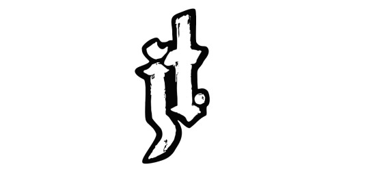
Final monogram (in a container)
Finally, all the pieces came together for the zine. I got Covid right in the middle of this project so it was a little hectic for me. Regardless, I thoroughly enjoyed the making process and felt that it was a great creative exercise. My font choices were Kiln Sans (sans-serif)- a textured font styled to look like a wood-block print; and P22 Typewriter (serif). Both of these fonts came from the Adobe Fonts library, and both emulated the handmade look that I love. I enjoyed playing with the layouts of the text and tried to develop a look that blended the geometry of Constructivism with the chaos of post-Modernism. That being said, after looking more carefully at the magazine spreads of Greiman and Carson, I could have done with a more careful use of grids in my layouts (particularly on pages 4 and 5). I enjoy learning the Adobe suite so most of the issues I faced during the creation process felt like learning opportunities – except for the problems that made me feel crazy... I'm looking at you printing set-up. It took me four tries to get all the pages printed in the right order, I had to add an extra collage in the middle to make the pages divisible by 4, then the pages printed unaligned. I cut them to size as best as I could, but realised that I definitely need some practice with using bleeds/slugs/etc to achieve the desired results.

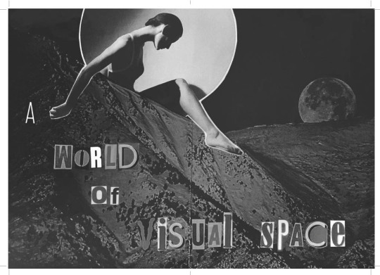
(Bonus collage/mini-poster in centerfold!)

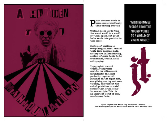

Final zine spread, cover to cover
This project (and class overall) has helped me to further develop my own art style, while encouraging me to see a project through to completion – something I really need to work on outside of uni. This process has also deepened my understanding of the history of design, giving context to and (I think) improving the overall quality of my work.
0 notes
Text
Evaluation for the term
I feel this term has been my favourite out of all of them so far, I’ve genuinely enjoyed creating work and have had fun with the process to getting to the final piece. I think something that helped this was the multiple units at once, at first, I thought it was going to be stressful but how the units were laid out and how I managed my time my it was nice to not just focus on one project.
My skills in using the different adobe software, I feel, have increased massively. I am now so much more confident using InDesign and have learnt a new platform. Adobe XD I really enjoyed using, already knowing my way around the other adobe platforms made learning XD much easier. In my previous units I have kept it quite digital, so for this unit I wanted to explore more practical imagery techniques which I feel I have achieved in Place of Words. That was one of the things in Place of Words which I had fun with was creating something in real life, like the leaf prints and the paint transfers and then further editing it digitally.
My favourite and I think most successful project was Judge a Book by It’s Cover. The progression from my very first sketch to the final piece is very satisfying to now look back on. The illustrations, combined with the colour schemes and fonts, I think, worked perfectly. Binding the book with the perfect bound binding was another skill I learnt this term and felt very rewarding when making the final book.
For our first group project I would say There’s an App for That was very successful. One thing we got down straight away was assigning everyone jobs which made the rest of the design process flow easier. If one of us had a problem, it was easy to talk about and get it resolved. I would say we all took part evenly in the jobs and all had an equal part to play in the final designing stage of the app.
The jobs that I was assigned and chose to do I did enjoy and felt that I had full creativity over even though we had decided to on a style to stick to. I enjoyed making the line art icons and the logo as those are commonly the same style of illustrations that I use in my own pieces of work. I think what helped us bring the app together and all work equally was going away and each designing a few pages to convey our style. This not only made sure that all our styles were considered and involved in the final app but also gave us loads of material to work off when coming to the final stages.
Overall, I feel that the group worked well together to create an app that not only fitted the brief but also made something that we can all be proud of. As far as group projects go, I really liked this one and look forward to more in the future.
1 note
·
View note
Text
REFLECTTCELFER
• What process(es) did you use?
During this course of fundamentals I used indesign, photoshop, illustrator and tumblr to create and show my understanding in an online workbook. I should’ve been better with my organising processes to keep track of all my work and tasks still needing to be done.
• What did you know about this process before you started?
I had a small understanding of image adjustments and a couple selection tools.
• What problems did you encounter?
I encountered lots of issues with saving my files on the same computer and I kept losing saves and work when sharing between different adobe accounts. This meant I was having to inspect computers I had been on to try and find my lost files and images and screenshots of work I had for my tumblr. This was because I was not prepared with a hard drive to store everything correctly for this course and kept switching computers.
I also encountered problems when using the mask tool, at first it was hard for me to get my head around using the coloured brushes and coloured background and being aware of what each did
• How did you solve these problems?
Because I got them mixed up a lot of the time I decided on using only two opposite end colours and matched them to either the subject or the background so I associated each colour with the parts of the image I was editing. I couldn’t properly solve my file loss situation as the damage had been done at the start but I retrieved some of my files and images of my work from the computer by goin in to see what I had saved. After this I mde sure I had folders set up properly and was sticiking to one computer to work on as I still hadn’t bought a hard drive to freely work across devices.
• What did you learn during the process?
I learnt lots of helpful skils and techniques on how to be accurate and efficient on the software’s we used.
Illustrator: I am very confident on illustrator when creating vectors and objects with the shape and pen tool. I have used the knowledge I learnt in fundamentals to go onto create vectors and illustrations for other classes and other projects. I have enjoyed using vectors the most as they can be scalabe, easily changed, coloured and can be pasted very easily onto other softwares.
• Who/what influenced your process and how?
Toby did as he taught me lots of new and cool things to develop my current skills. My flatmates also influenced my process as I created vectors and edited images for them and they would have a say in what I would make with what I crated in class. Such as the lamar drawing and backwoods poster. Instagram also influenced me as I would see something on how to make a cool graphic and then I would take into account what I learnt from the video into how it could help for in class.
• One thing I would like to improve on ...
Is practicing the keyboard shortcuts more and developing a good dictionary of shortcuts in my head to result in efficient and comfortable working.
• What resources did you use to investigate/complete this project?
moodle, teams, tumblr, classmates, Instagram, adobe hwo to, youtube and google search.
• How would you use this process again?
With a lot more organisation with my notes and what I learnt and next time to focus on using the skills I learnt and new shortcuts on my own for a personal project so that I have a full undertstanding of what I learnt and still need practice on.
• What were some of the most challenging moments?
The very tedious tasks such as selection with images as this can get very time consuming to try and get your selection the most accurate and not having parts cut out. It will also quite hard to match what I cut out with the image im placing it on as sometimes ill need to blur out the edges to make it look realistic
• What is the most important thing I learnt, personally?
How to use the pen tool how curves and shapes go together to create an image or an illustration. This was the most important thing I learnt as now I can make all sorts of graphics and posters and images without having to use someone else image. I can now create what ever illustration I like. This skill is create for me to have as now I can focus on my ideas for projects and not have to worry about my skill level in what I can draw because now I can make it how I want using points and curves.
• What most got in the way of my process?
My Time management and keeping track of what I had done. It was very hard for me to mentally keep track of the processes I had done and what I learnt the day and then reflecting on it. Sometimes what we had learnt was overwhelming and I was not able to reflect on each step as I had forgotten what we had done earlier
0 notes
Text
Image source: @0xCharlota on Twitter
Reading Set 3
Skeuomorphic design has been a part of our culture for centuries, but it has been recently revitalized with the advent of digital technology. We can now create virtual objects that are so realistic, it's almost impossible to tell the difference between real and faux. The ability to move between physical and virtual worlds has enabled us to explore new possibilities for interface design. Digital interfaces allow us to create a unique combination of elements that can be tailored to individual user preferences and even provide an enhanced user experience. With the right combination of form and function, we can take full advantage of the visual power of skeuomorphic design.
From the reading, I discovered that Susan Kare, who was a doctor of art history, coined the phrase "metaphor shopping" to describe the job of an icon designer where she draws a comparison between the tile mosaics of the Romans and bit-mapped graphics, as well as medieval weavings and tapestries. Her original macPaint design was heavily influcneced by this and she created an infinite palette of fills.
This simply shows that the virtual world reflects the physical world through metaphors of use, such as the example given of a virtual pencil that can draw with pixel-precision and make ruler-straight lines. This I completely agree with. Take for example, the adobe illustrator software. The little icons and feature are designed to replicate real life paint brushes, pencils or pens to aid the digital experience of the artist. This is why a first time user might not struggle so much with it. There are icons designed to aid your digital drawing experience.
In addition, Alan Kay explains that screens should have understandable magic, and that the user interface design should attend to this. As new things arrive in the virtual space, some fall away and some persist even though they may no longer be necessary. An example of a skeuomorph is a fake-fur leopard-skin coat, which has no insulating qualities but has other qualities such as a capacity for social signaling. This brings back my example of using illustrations of physical objects to suggest the features of virtual icons or objects on digital softwares.
Other ways we can also see skeuomorphs in everyday applications are the sound of a shutter when taking a photo with a phone, the paper-like texture of the digital notes app, or the user interface of a modern website mimicking the layout and design of a physical book or newspaper or the buttons and icons on a smartphone. Skeuomorphs help make digital experiences more familiar to users, bridging the gap between physical and digital spaces. It's fascinating to think about how these metaphors of mobility are used to create immersive digital experiences that are both familiar and unique.
0 notes
Text
Best screen printing logo creator software

#Best screen printing logo creator software how to#
#Best screen printing logo creator software full#
#Best screen printing logo creator software pro#
Join our 30,000+ members to receive our newsletter and submit your design work.
#Best screen printing logo creator software pro#
Price: $29.99 (there’s also a pro version for $79.99 annually) Make sure this is pressed in well and the screen is tight. Turn the screen over so the lip is down and you can see where the screen is attached to the bottom. Then peel back the backing paper leaving the vinyl on the transfer tape. Step 1: Select your niche and design style. Burnish over the top with a squeegee or scraper.
#Best screen printing logo creator software how to#
It has various customization options such as defining your own hotkey, modifying how to take a snapshot of the screen, etc.
#Best screen printing logo creator software full#
It captures images as per the user-defined area, full screen and saves the images in JPEG, PNG and GIF format. Inkspace Logo Designing SoftwareList of best Logo Design Software for designers. SnapCrab is a free screen capture tool available for the Windows platform. The logo making process is easy and intuitive. List of best Logo Design Software for designers. The app is pressure sensitive, works with a variety of drawing tools and everything you create is in a high-resolution format.įor illustrators that want to create digitally with the look and feel of doing it by hand, this app is a great solution. Shopify is a one-stop platform for professional templates, icons, typefaces, and colors for crafting a unique emblem. Some of its most crucial features are: Simplicity: It must be simple, without any unnecessary decorative elements. The logo has to be one of the first items established in the brand creation process. This app is the best it help me With my YouTube channel and when I used it not one. Price: Free, but does have in-app purchases Download: App Store. Logo Maker & Design Creator Software Features and Description. For Adobe Creative Cloud users, everything you create in the app will sync with your libraries for use across devices. Its not easy to get a brand recognized by a symbol it requires a lot of time and perseverance. From Adobe: Just tap your mobile device screen to transform the things you see into creative building blocks for all your designs. You can see exactly what you are drawing with mirror images on both screens, unlike those pads that leave a lot to the imagination.Īstropad works with any app on your Mac computer and syncs via Wi-Fi or USB. Online free logo maker with editable templates. It works by allowing you to use an Apple Pencil or stylus to draw on the iPad and which move that design right to your desktop computer. T-Shirt Maker is a free T-Shirt design software that lets you design t-shirt by adding different types of cliparts present in its gallery or by adding your own logos. It’s got stellar ratings – 4.5 stars with more than 1,200 reviews in the iTunes store – but does require that you have a Mac computer. This is the most expensive paid tool on the list but is packed with features for those who are doing a lot of iPad-based illustration. Astropad helps turn your iPad into a graphics machine. Label design software can range from free to pricey, with varying levels of tools and features.
0 notes
Text
Reflection
Michaela Rimmer
Include a .PDF or Voice Recording via Canvas Studio of your overall learning about your Typeface and Design — Submit as Attempt 5.
Rationale - 300-400 words (typed or verbal) explaining the development of your design.
The development of my design started out with picking a colour palette. I decided to go with different variations of browns and tans to make my work look professional clean and cohesive. I was given the front and typeface spectral which I believe is a cool looking font that has footers and can be used in all variations from extra lights to extra bold. When first creating my work I started to use Adobe Illustrator I made my type on there as I wasn't too familiar with InDesign. when working on this I found that as we needed to start switching over to InDesign I needed to be able to move my work from Illustrator to InDesign and found that it would just be easier to do all of my work on InDesign. This meant I had to restart my work and redo it all on inside which was actually a good thing as I was able to gain new ideas and knowledge and change my designs from previous. I decided to start with a more busy and filling of the page look then found that once I had my feedback from my lecturer that I needed to take advantage of negative space more and use this more my book. I wanted to create the look of a full page with the context but once I got feedback from my lecturer I realised that I needed to take advantage of Thin Line text and then lines. This mean I made smaller text and use negative space more. I also use grids throughout my process making on InDesign as I wanted all of my work to match and be cohesive. By using this I felt that it definitely made my workbook flow more and I found my book looked better than without using it. I also used grids when I made my glyphs and I put a grid on one of the pages to show spacing and linear lines. I made many different developments of my book and even came into the problem of realising I couldn't just make 22 Pages as this is an off number when it comes to the booklet which meant I had to quickly come up with an idea for 24 Pages. By Thinking Fast and just making I was able to think of some cooler ideas that I was able to put in my type face book. Overall I was able to make a cohesive book that I am proud of the I believe works together and flows well. Next time I will start generating ideas early in the process so I am able to implement them throughout.
0 notes
Text
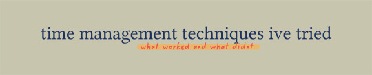
managing your time is something v v important! especially now that we're all at home, it's really easy for us (or for me, at least) to lose track of time. with this, here are some of the time management techniques i've tried including what worked and what didn't!
i very vaguely explained each time management technique, so here are some additional links you can check out if you wanted to know more about them:
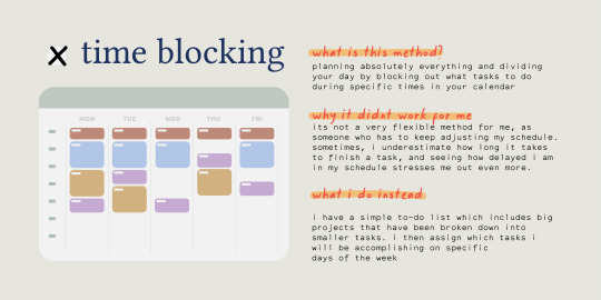
time blocking
time blocking method by werelivingarts
flexible time blocking by eintsein
calendar blocking // time management for students by mariana's corner
getting more done with calendar blocking by amy landino
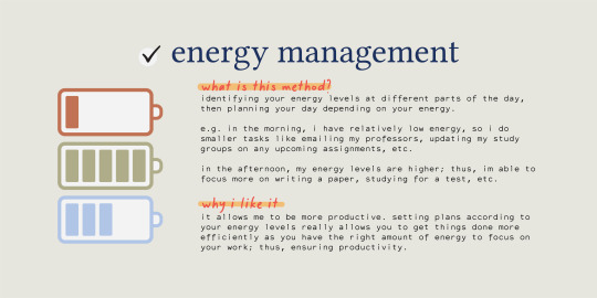
energy management
energy management by @eintsein
the one productivity system you need: time vs energy management by rowena tsai
5 tips to manage energy for higher productivity by mariana's corner
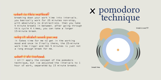
pomodoro technique
pomodoro technique 101 by werelivingarts
the pomodoro technique by mariana's corner
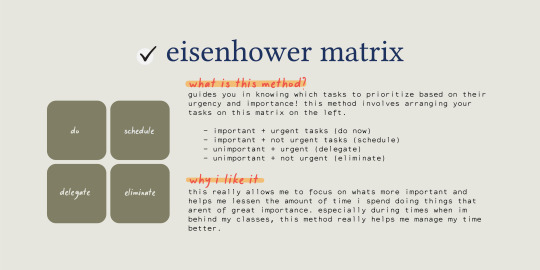
eisenhower matrix
time management for college students and the eisenhower matrix by mariana's corner
how to be more productive by using the eisenhower box by james clear
#time management#mine#studyspo#eintsein#werelivingarts#intellectys#heypat#heycoral#pltuo#bulletnotestudies#sonderstudy#jeonchemstudy#lookrylie#myhoneststudyblr#studyvan#athenastudying#tbhstudying#i havent done a post like this in so long :0#this is my first time making a full thing on adobe illustrator!!!!!#kinda proud of myself even tho this isnt like a full on artsy thing sljkfkjs
4K notes
·
View notes
Text
Things the Sims 4 Community Can Do About Paywalls...A Post...
[This is going to be a bit long, so you may want to save it and read it when you have time, or just...you know, buckle in.]
I thought I would ring in the new year by talking about something that I feel we as a community need to finally decide on. (It’s been debated since 2017 or so, and it’s now 2021...) I’d like, if possible, to try to suggest some real solutions and choices that we can make that will hopefully create a better and more honest community out of all of us.
Now I would like to start by making some postulates. In geometry, postulates are facts that do not need proven with a mathematical proof. They are assumed to be true. Thomas Jefferson and the founding fathers would call these “Self-Evident Truths”. I would like to use these as a bit of a basis for my arguments.
Truth: The Sims 4 has been enough of a cash cow for EA.
If you buy the base game ($40) plus all expansion packs (40 each x 10) + all game packs (20 each x 9) + all stuff packs (10 each x 17) you would come to a total of seven hundred and 90 dollars ($790) plus tax. This is of course, without sales, bundling, etc, which many people DO take advantage of, but STILL. That is a TON of money for EA’s pockets.
EA makes a majority of its money on the fact that the Sims 4 is an “incomplete game”. It “completes” the game further and further by adding more “expansions” to the game to the point that it seems almost useless to buy the base game alone without adding to it.
Even with sales and other things, it’s easy to spend over $500 dollars on the sims 4 game + expansions. Still a lot of cash for a game that is years old. This is just money that is spent on the game that goes to EA. This does not account for:
* Money spent to buy a new computer because your old one wouldn’t run the sims.
* Money spent supporting CC artists who have donations open or early access.
* Money spent on access to sites that have ads/paywalls/exclusive sims 4 CC such as Leosims, etc. (Which are the problem, frankly)
We should be able to respect the fact that a majority of us paid a hefty amount for this game. It is unfair, and frankly greedy to REQUIRE people to pay MORE just to unlock or gain access to specific user created content.
I am not talking about a VOLUNTARY support or donation because they like what you offer. I am talking about FORCING people to pay if they want to ever be able to use the CC or mod you offer.
Now, the typical defense for this is “Well, I’m an artist! I spend time/effort/etc working hard on these meshes, the code, etc to make this content!”
Which leads me to point #2.
Truth: Mods, CC, and other content for the Sims 4 are useless without the game. Once they are created/uploaded to the game, all copyright to those objects IMMEDIATELY transfers to EA.
I teach art in a Missouri public school. Our state standards dictate that when art students are in middle school grades, they have to learn about copyright, fair use, and creative commons. While I am not a copyright lawyer, I have had to learn enough about this subject to teach it. So allow me to break down a few facts about copyright:
First, when ya make it, ya own it. There’s not a process to apply for a copyright. The moment you create something that is 100% your own work, you hold the copyright to it.
Second, when you make something that is created based off of or USING someone else’s intellectual property as a reference or resource it is a fan creation. In art, we call this “fanart”. It is not 100% your own work. Someone else’s intellectual property is involved.
Fan creations always have tread a very thin and shadowy line when it comes to different companies and the legality of them. You can easily search google for various articles explaining it, but to summarize it in a short method:
Most companies do not actively go after those who create fan creations unless they are making profits that could instead be going to the creators of the intellectual property. If the fan creation is discovered to be making profits and/or taking the intellectual property in a direction the creator does not approve of, they have legal options to pursue (court, cease and desist letters, etc).
Third, Copyright can be transferred from person to person. In most cases this is done through a written document that both parties sign, however there IS an exception to this that EA uses to allow itself to transfer your copyrights to your content to them:
EA’s agreement with you is non-exclusive, meaning that the moment you hit “agree” on the sims 4 terms and conditions, you have handed over your rights to any CC you create for the game.
If you want to maintain full creative rights over the mesh/mods/etc you make then, you have to not make that content for the sims 4 and make your own platform to host it on. This is way easier said than done.
Truth: There have been various examples in the past of CC creators who have stolen meshes, bases, bits/pieces of work, or “inspiration” for CC from other sites/companies, who have been called on it publicly.
The most recent event concerning this was drama concerning itsbrandysims and their use of meshes from imvu/secondlife (you can see my opinion on the subject HERE), but there have been other documented cases. Leosims, for example, has been listed as an example of someone taking meshes from secondlife creators and reuploading them (when it was told to me, I was shown THIS thread as evidence). Another well known creator was accused by a former sims 4 cc creator (who now makes content from second life), and was called out in THIS post in 2019.
The horrible part of this? Many of these creators are charging people (often at not so great rates as well), for STOLEN content. Content they don’t even own, that they ripped from another place. This should not be accepted by a community that loves a game as much as the Sims 4 community.
Truth: EA has provided a way for people to make money while not hiding content behind paywalls entirely, and the INTENT of this was to OFFSET COSTS.
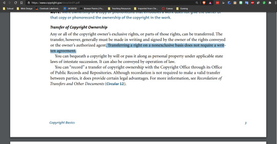
Almost every post about content locked behind paywalls features this post found on the Sims Forum from 2017. In it, SimGuruDrake, who was the community manager at the time (she has since left the Sims 4 team for another job).
Most of you who have seen this discussion topic before know this post by heart, but I’d like to highlight one important aspect of it:
One thing that is always important about communication is the intent behind it. The intent for people to be allowed to make patreons and allow early access wasn’t so people could just make money for themselves, the idea was to offset costs to buy programs to make the content. For example, a yearly subscription to Adobe Creative Cloud (which has photoshop, illustrator, etc) costs a couple hundred dollars US a year. If someone was using photoshop to help them create their CC in addition to blender or other free programs, EA/Maxis wanted to allow the creator to not have to pay for making the CC out of pocket.
Can EA/Maxis control what people spend the money they make off of patreon on? No. But it should be noted that the intent of this action was to help people pay for supplies for their hobby more than to make a business out of it.
Onto the next truth!
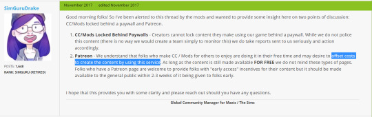
Truth: There is an image that disputes this post above, however the authenticity of it and timing of it are very disputed.
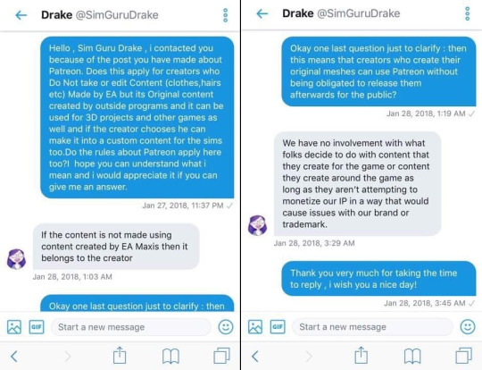
This image is often thrown around by people who lock content behind paywalls, but I would like to take a second and try to provide an honest assessment of it.
First of all, I have a bit of a problem with the fact that the original person who “messaged” SimGuruDrake this question has not been identified. This image was not posted on the tumblr of a CC creator who claimed “Hey I reached out to a sims guru and this is the answer I got!” The main pages that have this image are either tweets from CC creators using it to defend their stance on paywalls (ex: here), or tumblrs/tweets “debunking it” (ex: here, here).
I even reverse image searched this image using google, and another platform and could not figure out where this originated from. Of course, I’m not an expert, but...still.

The fact that the origin of this picture is unknown casts doubt on it. If it were a well known CC maker who is known for being honest, that’s one thing. But the fact that we don’t exactly know where it came from is suspicious. Because frankly, anyone with some decent editing ability could photoshop this.
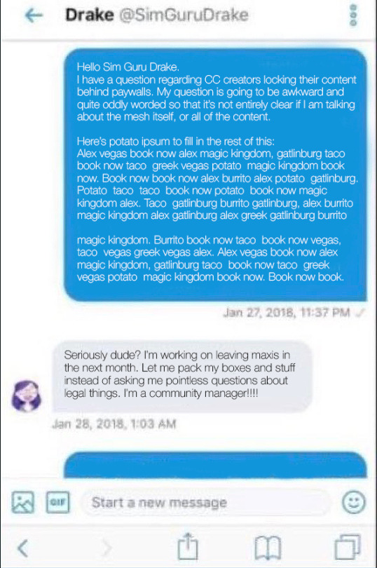
Here’s my imperfect edit, but I’m just a self-taught graphics nerd and I am not as dedicated at faking screenshots as some. (And the crap photo quality didn’t help.)
Another common issue is that at the supposed “time” that this question was being asked, some state that SimsGuruDrake had already left the Sims 4 team. I will admit, this photo is within the correct timeline, as SimsGuruDrake did not officially depart the sims 4 team until February 2018. (There is a post on the sims forums that has a timestamp that confirms this.) But, if you were in the process of leaving your job within the next month (as a two week/30 day notice is common when leaving a job), would you REALLY be answering questions in DMs on twitter, or be focusing on packing up, and training your successor?
The last thing that really makes me doubt the validity of this picture is the fact that it’s not really easy to message the sims gurus on Twitter. This appears to be twitter from the screenshot (although there are some things that are a little out of place from the current UI): But when I attempt to direct message a sims guru I get this message:
I even tried seeing if I could reach out via DM to Drake herself, (who now posts under a different twitter) to see if it was possible:
Could the policies have changed since 2018? Possibly, but I feel that opening up direct messages is just asking for Sims 4 team members to get angry messages, so this could very well be a long running EA policy. I have also reached out to her via a twitter tag (as of 1/2/21), and will update y’all if I get a reply:
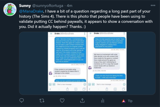
Okay, so now that we’ve gone through all of this, let’s talk about the last truth that’s really important:
Truth: Putting content behind paywalls has generally been considered disgusting by many in the sims 4 community, and TAKES AWAY the choice of people to support CC creators they love/appreciate WILLINGLY.
A few notable posts sharing the disgust with this practice can be found: HERE, HERE, HERE, HERE, HERE, HERE, HERE & HERE). And these are just what I can find from a simple precursory search.
Okay, Brainiac. So what can we do to solve this problem?
Well, there’s a few methods we can employ, and sadly, it’s going to take a bit of a commitment and concentrated effort from the community.
Step #1: Make the COMMUNITY the VICTIM instead of EA.
Now when I say this, I don’t mean we’re actually victims, but mean that instead of constantly saying things like “WHEN YOU DO THIS YOU VIOLATE EA’S TOU!”, thus making EA the “victim” of the crime. We change the dialog to saying “When you lock stuff behind paywalls, you cheat the sims 4 community and disrespect their choice to support you or not.”
Because let’s be honest. Maxis/EA really doesn’t give much of a care about if people aren’t following this rule. You can report people to the team, but as far as most people have seen, it doesn’t get anywhere. But if we make it where the community is the party being “wronged” it is much harder for those who have paywalls to not be scared. Because the community, in the end, has to be with them.
DepthofPixels had a really amazing post about this HERE.
Step 2: Decide to not support anyone who puts their content behind exclusive paywalls and do not hesitate to spread the word about why you choose not to do so.
By that, I mean
not paying any patreon accounts that don’t offer either their content 100% for free, or offer early access.
And sharing about why you choose to do that on your social media. Something I might suggest would be to make it a bit personal and share something like:
Instead of spending $15 a month to get exclusive content from Leosims (or any other patreon/paywall creator here) I’m spending that $15 supporting creator x, creator y, and creator z, who don’t put their work behind paywalls!
Link their patrons, share why you like their content, and why you take the stance to make the community better. Make it a positive thing, praising the people who are doing RIGHT by the community.
Yes, you may not get their content for a while (although there are some different places (
x
,
x
) to find them *cough*. But in the end, is it worth supporting someone’s content when they’re treating the community badly?
Step 3: Report creators who actively steal content from IMVU/secondlife to those respective companies, and all others to EA. (Even though nothing may happen.)
Here’s the deal. When people steal from either of those sites, they are infringing on someone’s copyright, as well as Imvu/secondlife’s copyright as well. It’s not okay, and they should be held accountable for it. Here’s the LINK for submitting a ticket to Secondlife. I haven’t been able to find one for IMVU, but maybe someone else will find one. Let those companies know and allow them to handle those specific creators.
As to the other creators, EA may not handle them at the moment. But IF (and this is a wishful thinking “if”) there were suddenly a flood of messages about certain creators...? I think they might have to pay attention to some of those messages. There is an official report form, but it might even be worth tweeting to SleddingGuruFrost, who is the current community manager asking about their stance on paywalls.
And last but not least:
Step 4: Make sure that those who are doing the right thing and not putting their work behind paywalls feel appreciated. Show them some love via a tumblr ask, or by tagging them on twitter, or by going up a tier on their patreon (or pledging for the first time). Celebrate these heroes who are creating content and not forcing it on us.
Us asking for people to give us a choice to support them isn’t being greedy, or disrespecting their time. We just want transparency, and respect from those who create content for the game we love so much versus them treating us like we’re just a source of income.
I know it might seem a bit hard to do this for some of you, and for some it may seem like I’m preaching to the choir, but we have to decide where we stand on this issue and stop letting those who abuse this system keep doing it. We can make a difference if we decide as a COMMUNITY to work together.
With commitment,
~Sunny
#sims4cc#sims4mm#maxismatch#sims4alpha#sims4cccommunity#paywallssuck#downwithpatreon#EA#maxis#TOS#thievessuck
345 notes
·
View notes
Text

After writing out the entire story of that segment of the comic, it is translated into script form:

Roughly planning all dialogue, composition, and action in the scene. This is how you make sure you have enough space to give all the information that you want and don’t end the scene on an awkward crowded or over-paced page because you didn’t plan ahead. You can deviate from this later!

I begin in Clip Studio with the page border. It’s a transparent black rectangle that I copy/paste from the previous page so it stays consistent. Use this page for reference on page and border sizes.
On a new layer, sketch out a thumbnail for your page. This is honestly more refined than most of mine look, usually just stick figures and border outlines. You can see that I cut out one of the panels from the script while drawing the thumbnail. Save this file as a clip file, then duplicate the file and save it as a PSD.
Pop on over to Adobe Illustrator. This is my template setup. The white artboard on the right is 2100x3150px, and the black bar on the right is 800px wide, with a second artboard that is 800x1280px, which is the maximum image size for Webtoon. The speech bubbles and text in the middle are just reference so I keep the bubble stroke width and character size consistent. (My print text size is 37, stroke size 4, and webtoon is text size 26, stroke size 5. Personally I find the print text size much bigger than necessary but for the sake of consistency I’m keeping it that way)

On a new layer, use File > Place to insert the PSD file onto the big artboard. It will snap into place to fill the entire board. Lock that layer by pressing the box next to the visibility toggle:

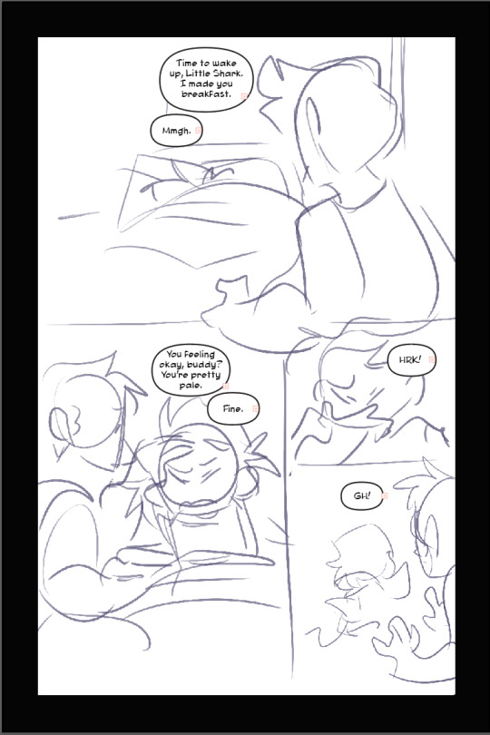
Use the oval tool to draw in speech bubbles and adjust the line width with the properties window. Using the text tool, click and drag to create a designated text box for each window, and copy/paste dialogue from the script. (Be sure to make a text box instead of just pasting the text, it’s a pain otherwise). Center the text. and if you have the text selected and hold control, it will let you round off the edges of the text box, making it fit better into the oval shape. Use the “align” window by selecting the text AND the bubble it fits in and press both the second and he second to last buttons in the top row to center the text on the bubble. (Fine tune this if necessary with the arrow keys)

You add the text this early on in the process because if you need to rearrange panels and make more room any where, this is the easiest way to do it. Head on back to Clip Studio and make any necessary changes.

Back in clip, once you’re happy with your layout, use the “create frame” tool to make one big frame around the entire drawing.

set the layer mode on the panel layer to “multiply” so you can see through it.
Then take the “cut frame” tool, right next to the create frame tool.

and adjust the size of however thick you’d like your frame borders to be. I work pretty large for my pages, so you probably won’t need them to be as broad as 155.
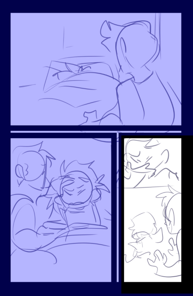
Using this tool, you can cut directly across the big panel you made and cut it up into smaller, even panels. If you hold the shift tool while using it, the lines will be perfectly straight vertically or horizontally. I broke up the first and second half of the page with my first stroke, and with the second, I further broke up the second half. It’s works very intuitively!
The end result leaves me with four border layers. Select all of them, right click, and press “merge selected layers”. Fill in the white space between the layer borders with black (if you want!) and press edit > convert brightness to opacity to get rid of the white and just leave the black. The end result should look like this:
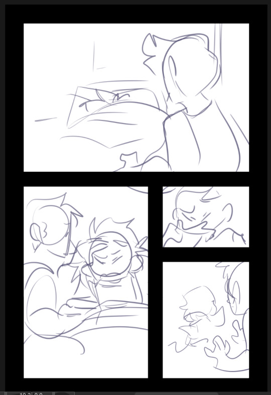
Killer moves! Now lower the opacity on your sketch and refine it on a new layer.

Save that baby and then overwrite your PSD document with the new sketch. It will automatically update itself in Illustrator.
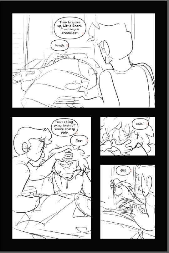
Check your work one more time in Illustrator, this is your last chance to move things around if you need to. (Looks good to me!)

Lineart in clip on a new layer!
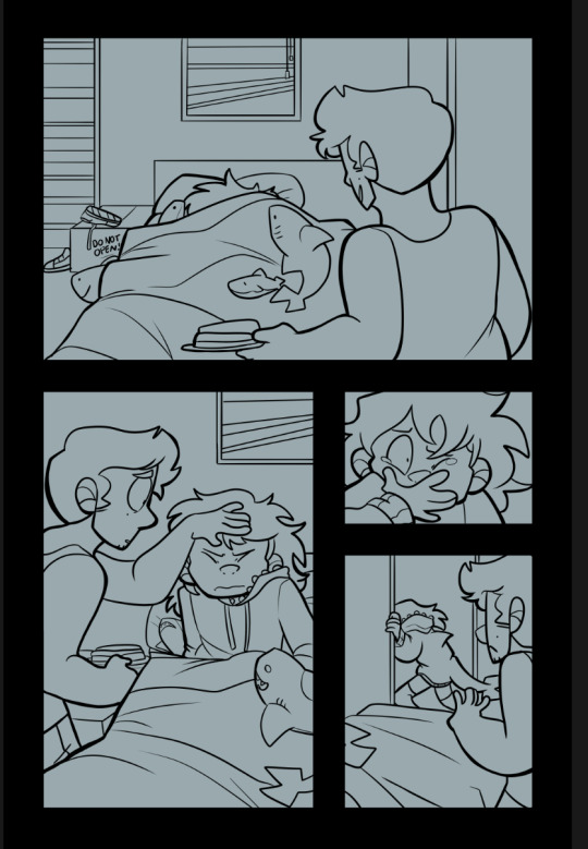
Fill in a new flats layer with a solid color (this ensures you won’t have any white spaces peeking through if you accidentally miss filling them in.
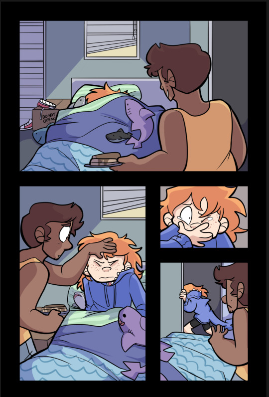
Unfortunately I don’t have separate images for flats/shading because I do them all on the same layer like a hooligan but hey! make it pretty.
Bucket tool is your friend! With “Refer other Layers” selected, and “Area scaling” enabled, you can fill in almost the entire flats section with the bucket tool! Saves a lot of time.
Using Select > Select Color Gamut, You can select all instances of a color on a canvas, and I use this all the time for shading or for quickly adjusting all instances of one color, and if you add “Show border of selected area” to your command bar, you can hide the border of the selection. (You’d have to google how to do that one i have no memory of how)
I shade with the same brush tool I use for lineart because I like the texture and I pick the colors by hand, but do feel free to use a multiply layer for shading!
Once you’re done, crop and export each one of your panels individually for webtoon. You can just save these as pngs!
Overwrite your Photoshop document once again with the full image and head back into Illustrator
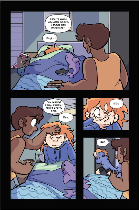
That’s lookin REAL FINE fellas gj
Using File > Place again, select all of your cropped webtoon size files and place them on the black bar you made earlier.
Like so! Copy the text and bubbles from the print page and resize them to whatever size you’d like for the webtoon format and arrange them on the strip.
Now to add the tails to the bubbles. Click on one of the speech bubbles you’ve made to set those colors and stroke width as your current settings.
Pen tool
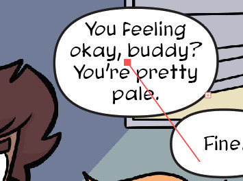
tap once inside the speech bubble

click where you want the tail to end and drag to create your desired curve. (straight tails are valid too!) Press Enter on your keyboard.

Tap the dot at the end of the tail you just placed, and click and drag back inside the bubble to curve your new line going back into the bubble.
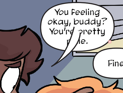
Voila! It’s hideous. Click the bubble or the tail, then shift click to select the other half. Do not select the text!

In the pathfinder window, press the four lines in the top right corner to open a sub menu. Select “Make compound shape”
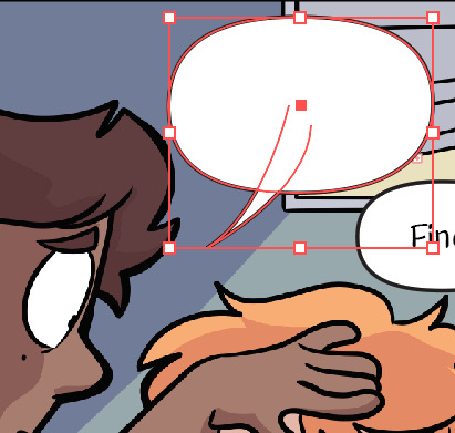
Goshdangit now your text is gone, thanks Em.

Not to be alarmed, the compound shape you made has just been moved to the top of the layer set. Just drag it back down under the text layer.
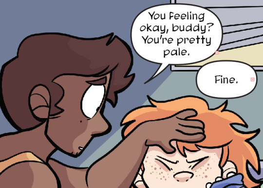
And you made a text bubble! Nice!

Repeat! And wow! You did it! You illustrated an entire comic page man!
Now to export. Using the artboard tool, you can select the artboards individually.
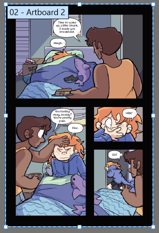
Select it and hit File > Export as

These are my settings. The image size can be set to whatever you want! I used to work with a much smaller canvas and scale up the webtoon strips as needed, but now I just make them the correct size in the canvas. Save that baby.
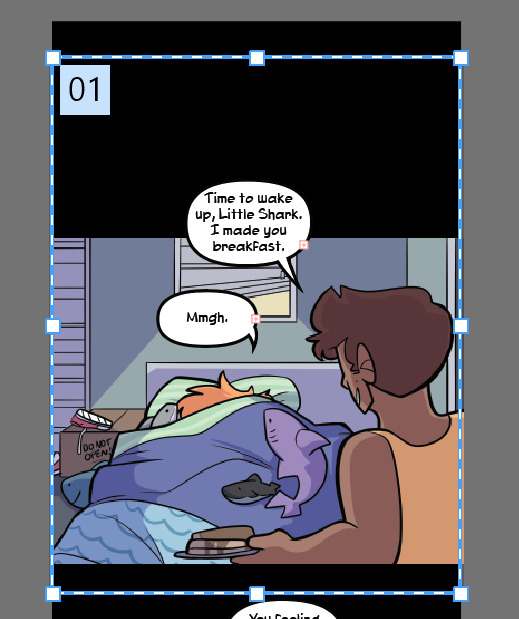
Repeat for the webtoon images, but remember, no bigger than 800x1280px. Once you export the first image, grab the top square to transform the artboard and drag it down over the next panel

If you drag from the top and don’t touch the bottom squares, it will make your cuts seamless because both Webtoon and Tapas will stitch your images together seamlessly. (Illustrator will show you how big your artboard is as you scale it so you won’t make it too big!)
And well.. that’s that! You did it! Uploading to Webtoon is super easy

You just need a preview thumbnail, a title, and you can plop all the images onto the site in order!
38 notes
·
View notes
Last Seen Blogs
twistedwonderlandsimps
twistedwonderlandsimps
life-and-love
Good Vibes Or Go Home 😘

fujihara-org
タイトルはまだ
pineconeinatree
pine
noneatnonedotcom
There's no real theme here