#that i used csp assets to help me
Photo
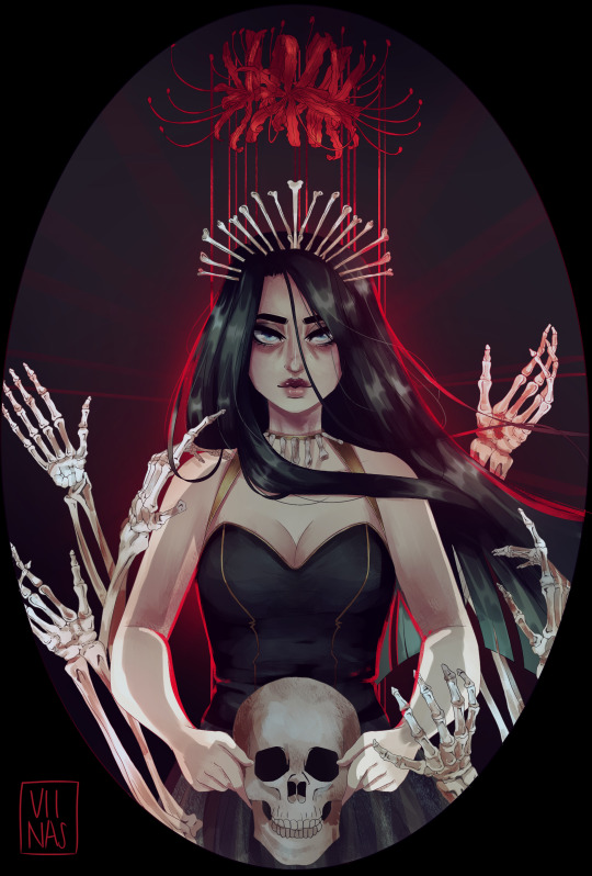
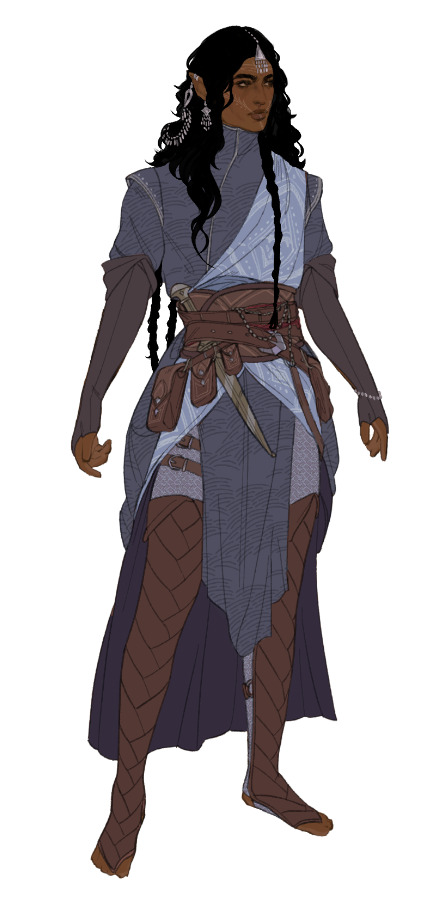
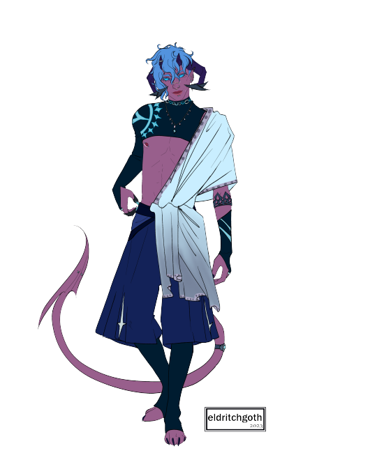
it occurred to me recently that I’ve never actually drawn my necromancer OC looking particularly Necromancer™ so here’s Charity with some bones.
#i also just haven't drawn charity solo in a hot minute#i abandoned my girl#she gets to be hot and powerful as a treat#oc#getting a few compliments on the skeleton hands and i need to be fully transparent#that i used csp assets to help me#work smarter not harder kids
354 notes
·
View notes
Note
Hi there! Your pieces often have this hazy, glowy quality and it’s beautiful! Do you use any overlays? I love your art!!
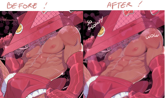
Oh yes I actually use a filter!
So here is how I add that slight glow to my drawings:
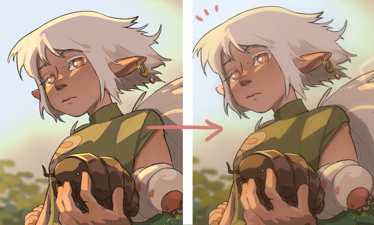
(This is for Clip studio paint users)
Easy version: Have your art as a png. Duplicate your only layer so you'll have two layers (the two same pictures). Select the upper layer
Go to:
Filter > Blur > Gaussian blur
Choose how much blur you want (not too much) and....BOOM!
You have a nice glow!
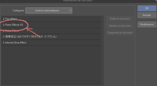
For CSP folks who know about Auto actions and want to be able to do it in one simple shortcut (with other cool effects):
So first you need to download the auto action retro effect v2:
(bear with me because everything is in french for me so I'm roughly guessing what it must be in english)
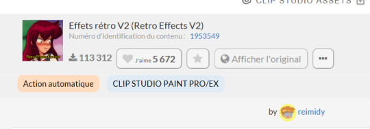
(Number: 1953549)
Then you are going to check your downloaded assets for that effect and click on this small thing at the bottom of your screen
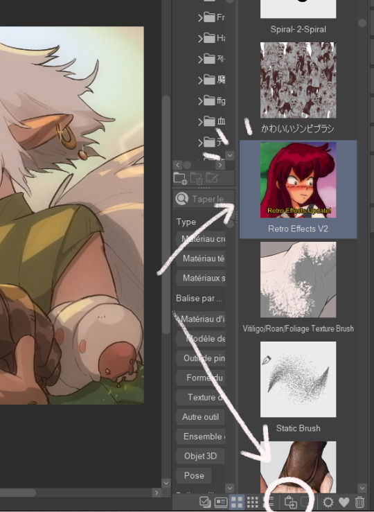
This will add your effect into your automatic actions. To reach it, you need to click: File > shortcuts settings > Auto action
(this is for any auto action you might download so remember to do that each time)
This will open and you'll have your effect:
You'll have several actions available (which I invite you to test), but the one that's important is retro blur with a little bit of the others (sometimes I only use that blur)
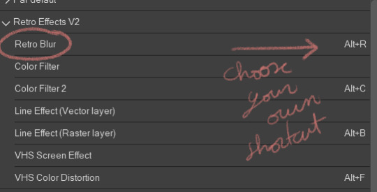
Choose a shortcut of your choice (click on it and just tap it down) then click on "ok".
NOW you should have the blur effect. What I advise you is that once you finish a drawing, you make it into a png, jpeg, whatever file you want to post and use the effect on it (that way all the drawing is affected)
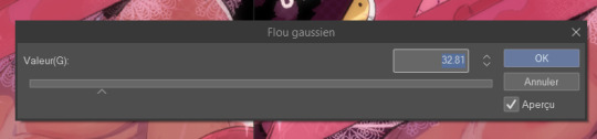
This will appear and you can play with it if you want more or less blur. If you don't want to hurt your eyes too much I would advise not put too much of blur. I also add a little bit of overlay (pink or purple, very little opacity)
And here you go!
Hope this helps ∠( ᐛ 」∠)_
1K notes
·
View notes
Note
Hey! I love your art a lot, and you've helped me learn a lot about other things aswell. I just wanted to thank you for all that! ❤️
(This part is optional: I was wondering if you have any process videos of the full body character designs, you do? Like with the different outfits? I love the texture of that particular style of yours so much and would love to learn to integrate some aspects into my own art, If you would allow for that?)
Hi and thank you! It's much appreciated and I'm glad you stuck around :)
That's totally fine! Unfortunately, I don't think I have any process videos of the character designs (they take me a while and I go back and forth a lot with outfits so I never have space for them on my computer) but I can give a run-through of what I do!
- this is only applicable for CSP -
Step One:
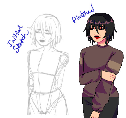
First Image: So I start with the base, I go about these like those paper dolls. I sketch these out, line them, and color them in as I would any other lineart - however I merge the layers after I'm done. They are always bald because if I'm going for an outfit lineup I can change up the hairstyle depending on the clothes. Second Image: After I merge all the layers and lower the opacity, I can sketch the outfits on a different layer - If there are smaller details I want to include I usually sketch them in a different color so I can see it clearly.


Step Two:
First Image: after sketching out what I want, I turn down the opacity for the sketch layer and line over that. I use a really high stabilization because I have shakey hands and it always looks clean with a high stabilization. For things like jewelry, I don't always do line art (mostly depends on how small it is) but I save it for later. Second Image: I don't always do hair as a solid color but In this case, I painted the hair on a layer above both the lineart, base, and coloring layer. Coloring the lineart is pretty standard, nothing fancy (I use the fill tool to speed up time often). Just make sure the colors are differentiated enough so you can use the color gamut tool in the next step.
Step Three:
Images One & Two: With the lineart fully colored, you can select individual colors and add or draw patterns. Most of the patterns I use are from the Csp gallery (bunabi has good ones up I use often). If you have the selection on a different layer, you can change up the layer filter or even do another select color gamut on the pattern and shade/color it yourself (this is how I do metallic fabrics). Once you're done adding patterns, merge everything except the base layer and lineart.

Step Four:
Images One & Two: For things like jewelry that would be too small to line, I freehand a silhouette of the jewelry with a bright neon color, then select the color gamut on the neon color, and then select the color outline so it has the appearance of me doing itty bitty lineart for it. I go back in on the color layer, shade it, and color it as metal, and then bam. You are all done!
Smaller things: After everything is done sometimes I'll go back in with a dark pen and go over some of the lineart where fabric creases just to give it more depth or I'll put a color filter over the final drawing just to make it all a bit more cohesive.
This is the brush I use for softer lineart:
And this is the brush I use for more thin, detailed, lineart:
Hope this helped a little, happy drawing!
166 notes
·
View notes
Text
Tutorial: How I Render Accents
PART 2: COLORS
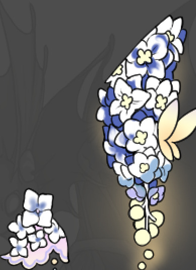
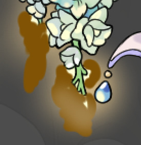
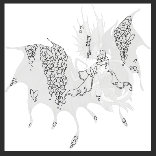
I usually do not recommend 'pixel hunting' aka going over your work with a fine tooth comb and picking out stray pixels to erase. However, for setting up a proper base layer for accents it is imperative to do so.
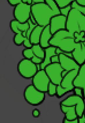
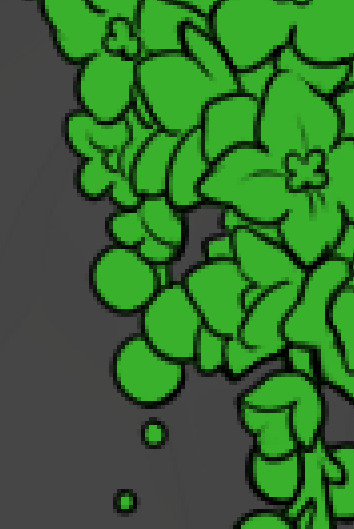
To explain my method of color blocking: I select everything outside of the lines, invert that selection, then fill in. This does a more accurate job than going into each and every section and filling them all in individually, and is also significantly faster. Only downside is small sections like above where you can see bits of the green (which I use bright green against a dark grey background to contrast the base color, lines, and background) poking out, as well as the inner section where it filled in a spot I did not want filled in. Getting all of this right in this stage will make your life easier as you go. (It's also the method I use to color block all my work, even beyond accents)
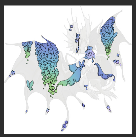
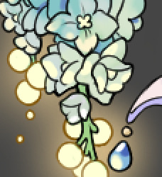
Now this where my style of rendering color may come off intimidating and, tbh it might be. I do gradients first and then I color over them with "normal" blend layers. I typically don't use multiply layers unless I'm shading something that has a lot of textures. If this scares you, it's okay I'll keep walking you through it. Here, my gradient goes from a pastel but deep periwinkle, to a soft more cyan blue, then to a lighter pastel green. Skipping steps and going from the periwinkle to green will give it a different look. There's also hints of a pinkish tone as an accent color.
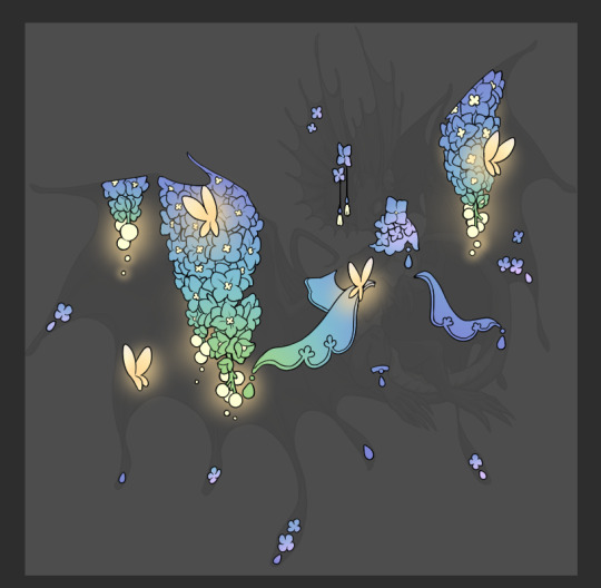
So as I said, these additional layers are done with regular "normal" blend mode layers. I've placed one in between the butterfly line art and the line art for the rest of the flowers, and then an additional layer under everything else. This allows me to create a glow effect specifically around the butterflies, and then specifically under the flowers. Going back and forth with the proper amount of opacity (by using the airbrush transparently) helps to make it glow but not be Too Loud. Also checking it against a dark background can help to check for spots where it spills past the borders, as well as really gauge how Bright it is. I've also color matched the butterflies with the flower pits and the bulbs. This adds extra cohesion and makes them all look uniform but different enough with the gradients.

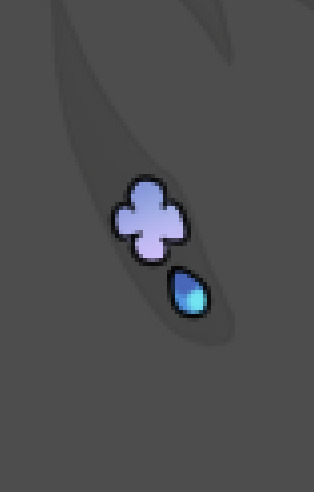

The stages of how I render gems/dew drops. Take the base color, make it a bit darker and less saturated (as well as changing the hue a bit depending on what the default color is. For yellows I go more orange/red, for blues I go more purple or even pink. It depends), add a small drop light at the bottom thats a fairly saturated version of the base color, and then a stark white/ near white highlight. That's it. Don't over complicate it, it will not matter when it gets shrunk down. Note that I do not use multiply/overlay/screen layers for these types of things as it adds too much bulk to the files and doing it manually helps to strengthen your color theory skills.
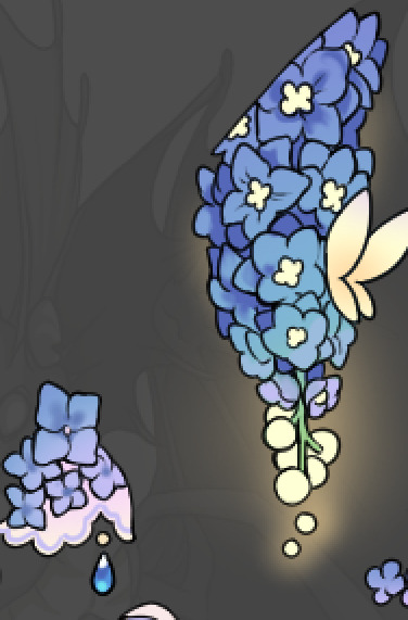
For shading and rendering, again, I create a "normal" layer and simply. Draw over what exists. Color picking and hand blending allow me to create the exact shades and effects that I want that multiply/screen/overlay layers may not be able to achieve. (which isn't to say I dont use them! i just don't use them for the main meat and potato part of my coloring) All of what is shown here is also achieved with the CSP asset SOIPEN (which can be found for free in the asset store)

another example. The one on the right is showing how the layer looks without the gradient base layer under it. All of this is rendered by hand. I also specifically put a highlight color around where the butterfly is sitting to give a better illusion that it is properly sitting on the flowers rather than just in front of them.
Next is changing the color of the lines, if needed. A method i'll use is I color just the sections I want (on a separate clipping layer) then lock that layer's alpha setting to them add in a gradient. It's a small and subtle effect that adds more depth without doing a lot of effort. (work smarter not harder)
Now we get to the Polish Layers!
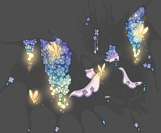
first image is how it looks as a base. second image is with an overlay layer applied. I've used some dark purples and mid tone desaturated greens to push the values a bit further (especially evident on the top left wing) Third image is with a screen layer applied, highlighting the inner most part of the flowers and adding some additional bounce light.
An important thing to note about making accents vs making full coverage skins: OPACITY AND LAYER TYPES MATTER OVER TRANSPARENT SPOTS. What I mean by this is that if you use a soft, light grey to shade with a multiply layer, don't clip it to anything, and have it go outside the lines - that will no longer appear as a 'shadow' when it comes to the final result. Instead you will have a section of soft light grey that is simply laid on top of whatever the image under it is. The same applies for overlay/screen/add layers and so on. If i use a very dark color on a screen layer (to give a soft highlight) and airbrush it over a bunch of stuff and don't clip it, it will end up with this horrible dark splotch over everything that isn't opaque. To this end, mastering normal layers is imperative to having well rendered and convincing accents.
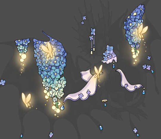
Another thing of note: when it comes to sparkles/small details, note how 'large' the sparkles behind the butterflies are. They seem a bit chunky, yeah?
this is what they look like at proper size. If anything, I could have gone larger on the small metal beads connecting the dew drop jewels to the lace.
Another trick I also like to do is this:

a slight hint of transparency! It's just enough to let the dragon's lines underneath show through but not enough to be super noticable. I like to do this a lot when it comes to sparkly and magical effects.
Next is the worst part of all: destroying all that beautiful hard work with the shadow and line art layers! (sobbing)
This stage always agonizes me. This is my first pass of the shadow/line layers and let's hope it's dark enough.
But yeah that's a start to finish look at how I create my accents. Unfortunately a lot it devolves into needing to know, yknow, line weight and silhouette importance, color theory and the ways that drawing applications actually apply color to a png vs how its rendered in app. All of these things impact the finesse of the accent, and are things you do have to learn gradually over time, but hopefully this has given yall some additional insight and perhaps some helpful tips.
And this should also explain why I get so mad when people go 'hey can I get this accent in another color' no! no you literally can't!
125 notes
·
View notes
Text
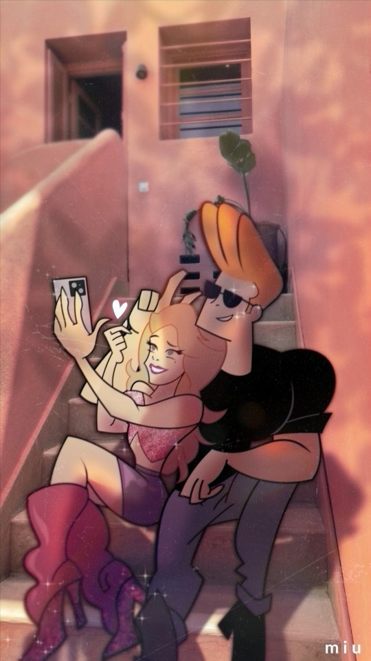
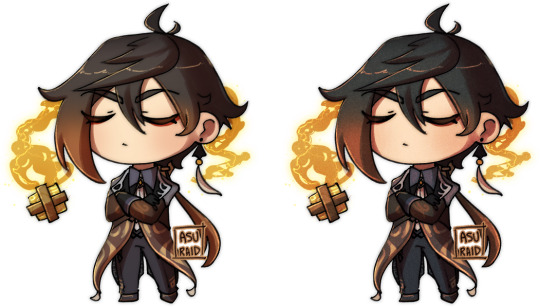
Im so obsessed with @gamma-gal-24 's selfship I just have to draw them 🤧🤧💕💕
Also plugging myself here heehee Im open for commission :3
timelapse undercut!
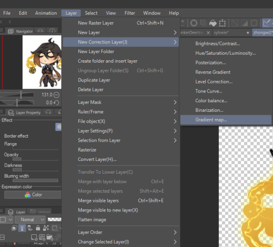
Im attaching a timelapse of me adding the effects because @wisp-herr wants to see how I did the shadows heehee
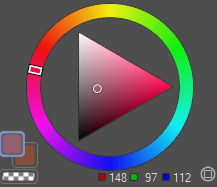
Its basically just me figuring out where tf the shadow suppose to hit and a lot of trial and error lol I use tons of blending mode here. Mostly its multiply and screen. Also for the color adjustment I used correction layers (color balance, gradient map).
For the blur I used gaussian blur on the shadows and motion blur for both Johnny and Emma after I finished painting the shadows on them and merging the layers together. I also made a new layer that i filled with orange, set it to multiply, gaussian blur it and then put it at the back of Johnny Emma layer to soften the lineart edges.
As for the leaves shadows you see me put at the end, I used a bushes template from csp asset that I bought. I lowered the opacity and gaussian blur it before readjusting it to my drawing heehee.
I don't think it really helps but this is basically what I usually do when I draw. I hope you're able to understand my process 🤧💕
#i will not shut up about how obsessed i am with this ship like theyre so perfect for each other#he deserves someone that would not treat him like a joke and loves him equally like this man puts his heart on his sleeves#he needs someone that would do the same for him uwaaa 😭😭😭😭💕#i hope you like it! i never draw johnny before tbh this is my first time ahaha _(:3」∠)_#asukart#selfship#selfshipping community#selfship art#selfship community#oc x canon#other's selfship#self insert oc
112 notes
·
View notes
Note
May I ask what plataform and brushes you use?? :0
Also your art is so cute omgg!! 💜✨✨
thank you so much aaaa!!!
i use clip studio paint ex and pro (i have pro on my pc, ex on my ipad) :- ) i use a handful of brushes from the CSP asset store! they're all free
for lineart, shading and rendering, i use the SU cream pencil by yuriki! it's my go-to brush for basically everything, it has a little texture around it and if you press softer with a bigger size it's great for rendering!! i don't like my paintings super smooth so it's nice for that crunch
i also like to use clip studio's paint and apply brush to soften my hard edges when i'm shading! this one's a default, i've just tweaked the setting a little bit so it's less soft

this one's a more recent find that was recommended to me, but for more sketchy stuff i use the crunchy pen by moonimews ! it's become my go-to as well for the sketching phase, it has a subtle line texture around it, it's also become my brush for laying down flat colors :-) for furry characters specially i like using it when laying down markings, makes it look more organic and fur-like
for background rendering and texturing, i use this set, 厚塗りブラシセット by ×ェ× (roughly translates to thick paint brush set, i think) it has SOOO many good texture brushes that really helped spice up my backgrounds and also painting in general
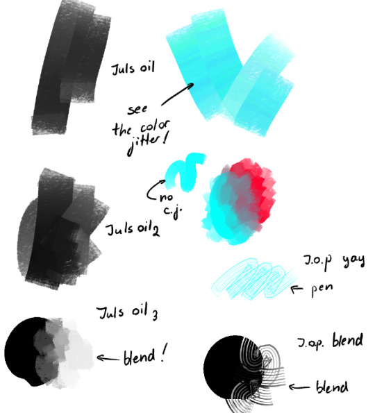
lastly, i also use juls oil brushes by júlia maslová! i use these both for laying down rough colors and rendering backgrounds, i think it's my favourite brush set because it also has a rake brush (swatch taken from the brush page!)

39 notes
·
View notes
Text
AYO WANNA HELP A STARVING ARTIST?
my roommate and I have been out of work for a good while now due to some health issues and while I've just returned and they're close to doing so, we still have bills to pay and copays/med bills galore in the meantime, and could use some help via commissions!
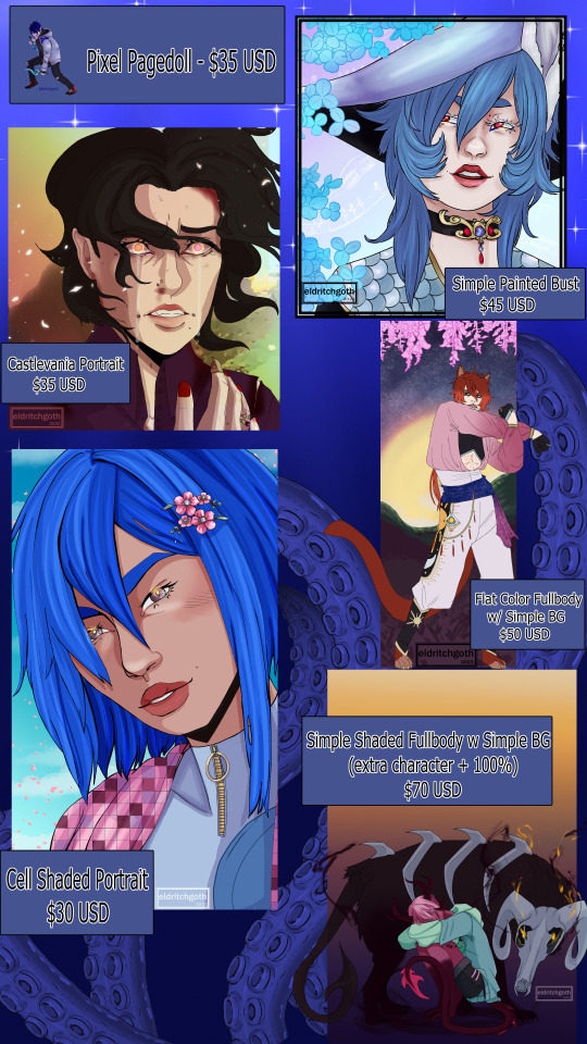
@eldritch-goth is opening the above commissions, as well as design commissions! (see examples below)
Current Offerings:
These are the currently available items from nyx! If you have questions or want to order, please DM me (@kingxxlink)!
Pixel Pagedoll : $35 USD
Simple Painted Bust : $45 USD
Castlevania-style Portrait : $35 USD
Flat Color Fullbody w Simple BG : $50 USD
Cell Shaded Portrait : $30 USD
Simple Shaded Fullbody w Simple BG : $70 USD (extra characters [people or animals] are +100% base price)
Custom Designs:
These can be outfits for existing characters/designs or entirely new designs! Backgrounds can be included but will be simple/CSP assets! If you have questions or want to order, please DM me (@kingxxlink)!


Custom Design: $70 USD (simple to complex)
Simple Prop $10 USD (see ice in second example)
Complex Prop: $20 USD
If you have questions or want to order, please DM me (@kingxxlink) instead of nyx and I'll pass along the message!
I'm also available on Discord as KingxLink!
#friend art#friend commissions#friend commission#commissions#commission#commissions open#signal boost#please boost#emergency commissions#open commissions#art commissions#design commissions
20 notes
·
View notes
Note
Hi! What’s your process for creating lineart? Your art is INCREDIBLE and it’d be amazing to see how you do it! I’m trying to learn how to draw poses and anatomy, but it never works out too well…
Could not recommend this enough. Prior to this, I actually bought a couple of morpho books, and it improved my anatomy greatly.
Honestly, I'm no teacher, I can't really teach you, only give you tips. In my opinion, good lineart depends on your a.) muscle memory, b.) strokes, c.) the brush itself, d.) your lineweight, e.) the stabilization (if you're on digital)
MUSCLE MEMORY
Preferably, you'd do practice on traditional paper, with a pen. This forces you to avoid erasing and instead makes you think before you make the stroke. Draw straight lines, circles, but don't use your wrist to make the stroke, but your arm. You can search this online. If you've built up your muscle memory over the years, you'd quickly create 3d shapes using lines.
STROKES
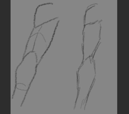
You've definitely heard of a sketchy art style. But that's different from an amateurish chicken scratch. Preferably, you'd make clean, singular strokes - which shows confidence and clarity. It's common for beginners to use several smaller strokes to create a line, instead, practice to do it in one:
BRUSH
finding a good brush that works for you helps with the process. Because I'm gonna be honest, a LOT of the digital pens I have difficulty with. The greater the stabilization means the stroke is smoother, but most brushes will have you struggling against pushing it, because the stabilization at any lower will have your lines pick up the slight tremor of your hands. This is up to research, discovery, luck, and preference.
Me, personally, I use these:
One is from the CSP assets store, the other is from greg rutowski free brush pack, and the last is one of the default CSP brushes, under thick paint.
LINEWEIGHT
Lineweight is the thinness and thickness of lines. You'd have better understanding if you searched this online, but typically, the closer an object is to light, its lineweight is thinner, while the farther away it is, it'd be thicker:
STABILIZATION

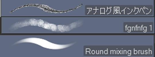
aka this guy. The higher it is, the smoother the line, and depending on the brush, the more difficult it is to move the brush. But yeah, when I use the ink pen, I have it around 45-60, if it's the fgnfnfg I have it around 0 or 15, the round mixing brush I have around 15-30.
11 notes
·
View notes
Note
how do you do lining so nice? i don't know how to describe it.. what pen do you use? :D your work is so nice btw
thank you!! i love doing lineart it's one of my favorite aspects of drawing [it's why i'm so relieved to finally be on my cleanpass for this student film cuz all i really have to do now is lineart+color^_^] but geez all these questions out of nowhere lately about how i do art is almost gonna make me paranoid someone's trying to impersonate me LOL
OK basically i just use a modified version of clipstudiopaint's default lineart pen? i don't even remember the exact changes i made plus i don't know/don't want to bother with exporting a brush to put on the CSP asset store but here are the most most important:


plus i always do all my lineart on a vector layer cuz i have weak+shaky hands so the additional Ease Of Correction is nice^_^ i don't Exactly have a concise rule for brush sizes, but i always set the number to a multiple of eight, and generally use the thickest brush for the outline with the lightest weight going inwards, then all the details are a size About four times thinner. do not use the same brush size for detail as you do thick outlines, i used to do this when i was younger because i didn't get that thick lineart looks best when it's CONTRASTED by thinner lines

in toonboom though for animation since it's a different software i gotta use a totally different brush, and toonboom's brush settings are pretty good though not As robust as i'd like for example solid vector brushes are locked off from any of the textured brush settings, and what they Call "textured vector" actually seems to just be a raster brush because it's all pixelated and sucks. anyway here's my toonboom settings


my advice for good lineart is generally:
A) USE THE STRONGEST STABILIZER YOUR PROGRAM OF CHOICE WILL ALLOW FOR IT WILL MAKE YOUR LIFE SO MUCH EASIER
B) if your software also has an option for vectors that lets you easily modify control points, USE IT! CSP;s vector layers also let you set it so that any line you erase you just have to swipe across a line Once and it'll delete the whole thing up to where it intersects, it makes illustration Way more efficient cuz otherwise i start to obsess over erasing imperfectly pixel by pixel
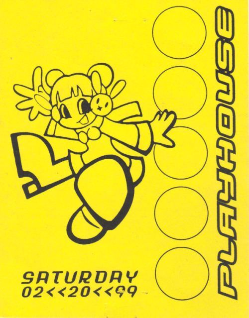
C) have a zen-like patience about it you gotta treat it as a relaxing meditative thing it's probably The most boring and tedious part of the art process because the focus [for me at least] is making it Clean and Sharp without any rough edges, i REALLY like excessively clean weighted thick lineart such as in 90s rave flyers like this:
and since i have such shaky hands that is near Impossible to achieve without the help of a heavy stabilizer, which REALLY slows the process down, so you gotta enjoy it, listen to something that'll occupy 80% of your brain in the background and only use the other 20% for cautiously tracing over your sketch
D) you also kinda gotta get Really good at manipulating pen pressure cuz i only do everything in mostly just a single stroke, i don't like going over shit again to thicken it or fix the weight, i prefer starting the line where it's gonna be the thinnest, with the lightest pressure my hand can manage, and then pressing down harder the thicker it should be
OK happy lining^_^ [<-says guy who intended to start lining this shot an hour ago but got Mega distracted]
#art tutorial#why have i been asked to do more art tutorials in the past week than ever before in my life. where are you all coming from
15 notes
·
View notes
Note
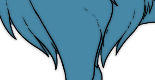
Hi jez! I wanted to say that im really in love with your art! its so inspiring! i found your profile due to your brushes at csp assets and i have to say im really in love with them especially the watercolor one that i have been trying to use. If its not too much do you have any tips about how to use this brush for painting? im still getting used with texture brushes so it kinda confuses me
hi anon!! thanks for writing to me! if you mean my brush, ulle, when it comes to painting I tend to start with color blocking with the watercolor edge turned off because it can get really convoluted otherwise.
then when it's time for the detailed shading and highlighting stage, that's when I turn on the edge and it becomes more prevalent in the final result. don't be afraid to paint over or smudge edges you don't like!
here's something quick i put together to (hopefully) help visualize what I mean lol I haven't painted in a while so I'm sorry if this is sloppy


as a bonus here's how i use it for coloring work with lines.
of course this isn't the only way to use it! feel free to go wild and creative with it. best of luck!
you can find my ulle brush here
465 notes
·
View notes
Text
aid’s collection of neat art tricks
aka I wanted to compile all the neat things I’ve learned and picked up over the years across various sources; I wish I knew some of these, but they’re scattered across a variety of social medias and some from conversations.
of course, these are not a must and just have helped me! I just wanted to put them all in one place in hopes that maybe it’ll click something in someone like it has for me. c: I’m not the best at explaining, but I hope it makes sense!
some may use Clip Studio assets but can be replicated through other methods (or done by hand in the case of how I do my lineart colouring), but do keep in mind all of these are written with CSP in mind.
this is pretty heavy in images and gifs, and is quite long.
how to quickly fill your outlines (CSP tool)
this is a CSP specific method, but this tool has been my absolute saviour for making colouring so much easier for me (even if sometimes it still does require me to manually fill in some holes or erase sections). the bulk of how it works is explained in the tool as well, but I’m going to show a gif example for myself!

you have to make sure your lineart is set as the reference layer to ensure this tool does work; with messy outlines (like my own) you may need to manually fill in holes as can be seen in the gif above; with cleaner outlines, you don’t need to worry as much, but you may have some bleeding out of the lines for places that are a bit too close together (as you can see below, those areas would need to be erased).
the tool can also help to close ‘gaps’ between colours!

I usually tend to have a ‘base’ colour that I just clip a folder of flat colours to, so it doesn’t bleed outside of it, but I’m also a nested folder freak to make sure everything is cleanly separated and doesn’t get ‘destroyed’ while I work on it. this tool just makes it so much easier to get that base down and just jump right into adding flats.
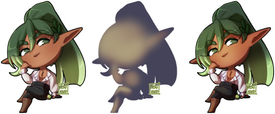
adding a little pop of depth
this one is thanks to a clip studio article itself where I saw it from, and I’ve been using it in practically all my drawings so far; all it is, is a simple blue-ish overlay layer with some muted yellow/red shading to give it a bit of a “3D” effect, for me I enjoy more that it adds a bit more colour variation underneath (usually lowered to 20-50% opacity, depends on the drawing)
the article definitely explains it a bit more nicely, but this is an example of having it at 50% opacity over one of my drawings
making your lineart feel less ... boring?
of course, boring is subjective from person to person, but I’ve always found my lineart to be too boring by itself

like this is fine, but it’s missing some kind of oomph. there are two tricks I use when it comes to sprucing up my lineart: using the watercolour edge effect in CSP, and a combo of coloured outlines + black outlines
first things first, the watercolour edge option: by default it’s a bit too strong, so I usually find the sweet spot to be at 1 range and with an opacity of ~20


this can be replicated through duplicating your lineart, and if the option is available, using gaussian blur on the duplicated lineart to achieve around a similar effect.
coloured outlines!
when it comes to colouring my lineart, truth be told I do use a wonderful auto action for it which can be found here, and there is this alternative one as well (which i’ll be trying now!!!).

it is a little different since it uses the flats, vs the one i use which just requires you to have the lineart selected, but as you can see it is a very quick way to colour your lineart ... this isn’t perfect by itself and will require you to have your flats finished.
this is my process: outlines done, autoaction, cleaning up by adding black outlines where they’re required and fixing up sections where the colours don’t quite make sense (like the sleeve area).

as you can see with the last drawing, I also tend to add a black outline around the outside of the piece, I personally found I really enjoy the contrast of the dark outside and coloured interior lines, as you can see in this little sample; it just adds a bit more visual interest for me!

unfortunately, outside of manually doing it, I cannot think of alternatives for this specific action (perhaps duplicating + flattening all your colours and placing it on top of the lineart may be a start)
crunchy textures and pretty colours ...
the texture i use on top of my drawings can be found in this CSP asset pack (though the marker brushes themselves are very lovely, and I’ve used them myself). this can be replicated through adding perlin noise, but I just find this texture to tickle the good spots in my brain, and it’s why I use it on pretty much all my drawings for some additional visual goodies.
yes, i am also a person who uses gradient maps. I usually tend to use them as finishers and more subtle ways to add more colours and variations to keep my shading from looking too flat, but they do have to be handled with care lest they become overwhelming. vampbyte does a wonderful introductory thread on gradient maps, how they function, and how they can be used.
they can be found through layer > new correction layer > gradient map -- or at least that’s how i usually access mine!
i often place mine at 20% opacity on the colour mode, though soft light and overlay also do their own fancy things! really depends on which you like most and works with your piece.
an example of my chibi w/o texture and colour gradients vs the texture + colour gradient ... as you can see it does change the colours quite a bit, so usually it does take me a bit of playing around to find a colour gradient I like (I’m a gremlin who has downloaded a lot of them) and to play with opacity values.
and to top it off, here’s the combination of all of these vs one with them all off.

how i personally shade (multiply layers)
i usually tend to either go for multiply shading over the whole drawing using one colour (and a few lil tricks to add more depth) for smaller pieces, or hard light shading for bigger and more complex pieces since it has more value depth.
my multiply layers are usually just one or two layers using around the same off-purple shade (though i shuffle it around pending on how it looks on the drawing

the second layer is a duplicate of the first, and i usually use an airbrush to either erase or expand areas to give it a softer shade (as you can see in the gif, the second layer is definitely missing chunks), or to add a different colour to the shading that isn’t the off-purple
how i personally shade (hard light mode)
this one’s a bit more of a mouthful, and thanks to a friend who introduced me to it! my second method is hard light shading, which, at its simplest, is greyscale shading and feels like it leans more into ‘painting’ your shades (as it works best with a brush that blends colours).

although I’m obliterating my own art here, it’s to show that most of your work will be in the greyscale/muted colours! it is inherently a non-destructive method of shading, so any changes to the colours underneath will maintain the shading regardless. normally I do have to duplicate the layer a second time since I don’t go too close to black shades, and it gives me a bit more control over how ‘hard’ I want my shading to be.

the middle is your ‘neutral’ shade, aka what you want to fill your entire hard light layer with, then your lighter greys will be your highlights, and darker greys your shading!
alternatively, you’re looking for this when you want to find your ‘neutral’ shade.
once you got your hard light layer filled with your base/neutral shade, grab your favourite painting/blending brush and go ham!
as a heads up: when it comes to skin or warm colours in general, you may need to get out of the greyscale range otherwise it will look too desaturated and grey, as you can see below. for any other tones, the greys usually work well.

as of the moment, I think that’s all the little tricks I use when doing art, I hope it helps you guys!
(unless I somehow remember something else, but these are usually my default tricks I use for everything)
#art tutorial#clip studio paint tutorial#digital art tutorial#clip studio paint#tutorial#art tricks#mine.txt#10#20#50#100
222 notes
·
View notes
Note
tangentally about your art, do you have any tips for drawing hands and faces?
for faces im not really sure how i can explain it since faces tend to be like the first things people learn to draw, so ive been drawing htem for yrs yk? In real life though, faces arent symmetrical. but in anime and cartoons we tend to prefer them to be perfectly even, for front facing images its easy to just flip the canvas or even flip the lineart i youre working digital. if youre on paper using a mirror or taking a photo can help.
eyes GENERALLY should be one eye apart from eachother but they dont have to be in all art styles. to keep the eyes looking focused you should be a little more in the middle, not too much because theyll look cross eyed, but slightly in the middle
right here, in the first pic is what im talking about, her eyes are closer to her nose. then i took dianas eyes and moved the irises to be centered in the eyelids, she looks like her eyes are looking in diferent directions lmao.
for noses it really depends on your style but it is 100% possible to translate different nose shapes into even anime styles, the best advice i can give is to just practice drawing different faces and trying to translate them into your style, you'll figure out what looks cutest to you.
and then after i said this i actually remember making a specifically regarding black people that had a section on noses hold on
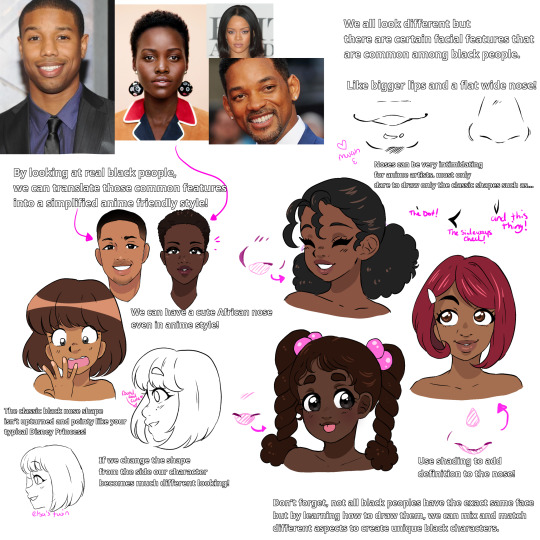

for hands it again you gotta do a lot of referencing. unfortunately for me, i have chunky fat baby hands, so when i reference myself the hands tend to all be fat baby hands too lmao. but it does help at least in figuring out the composition of a hand and where all the joints go
for my projects ill be honest and say i heavily rely on a lot of assets and stocks, these are all made for artists to use freely and are even okay to trace. Adorka stock has literally been carrying a lot of my art lmao I also use Hato Kings hand references and CSP 3d models for really hard poses. speaking of Hato king they have a book for kindle that has even more hand references and lots of information on how to draw them, in both english and japanese so if you like their references please buy the book
Although when it comes to tracing stocks its very important imo that you adjust it to suit your style, use it as a tool but also a reference for learning. if your art isnt going for realism you dont want to have a perfectly realistic hand and then a toony body lol
42 notes
·
View notes
Text
Amber's Art Resource Compilation (The Return!)
Once upon a time, I used to regularly share link collections of helpful art resources here that I would stumble across on my various feeds and timelines, both to keep track of them for myself for later reference, and to share them with others who also might find these resources useful or interesting. And considering how many websites most folks are spread across nowadays? It seems like as good a time as any for me to start doing this again! Feel free to share and reblog to whoever you think will benefit!
(I would recommend that if there's any links that you find particularly helpful, perhaps save the image or video to your computer for safekeeping. I have no idea how long Twitter links will work because of obvious site shenanigans, even with Nitter as a workaround...)
TIPS, TRICKS, AND TECHNIQUES
Drawing easy straight lines in CSP with line variance! (I use this one all the time now):
https://nitter.net/PharanBrush/status/1573559518830940160
Every layer blending mode explained in detail!
https://nitter.net/DanHollick/status/1583080119068807168
A digital inking tip for unsure artists: use a blurred sketch!
https://nitter.net/quasimaddi/status/1585011119277555712
Tips for drawing motion blur by hand:
https://nitter.net/stardustjarr/status/1553140493462241280
Divide layer trick for removing unwanted colours for a picture! (Works great for cleaning up scans)
https://nitter.net/DaveRapoza/status/1513918096922226694
Quick perspective tip: think in several layers of depth!
https:/nitter.net/toni_infante/status/1530209210558042114
A trick for handling 1-point perspective in backgrounds:
https://nitter.net/djamilaknopf/status/1478738291386204160
And another interesting perspective insight from someone else in the same thread:
https://nitter.net/Masa_Ikku/status/1478747970233585667
Easy architectural facades for buildings: paint it flat, skew, and expand!
https://nitter.net/DevinElleKurtz/status/1481791432490815489
Sinix Design: Anatomy Quick Tips. A playlist of videos focusing on how to break down and draw specific parts of body anatomy. (A favorite resource of mine!)
https://www.youtube.com/playlist?list=PLflflDShjUKH4EfZyf0vuKEuqeqvlV0Qd
EDITED TO ADD: Thank you to Honeybees for a wonderful link to some additional book resources!
https://drive.google.com/drive/folders/1vEv0qEQKeGuWI4MPUcX8adWtNuGtTgSB
This folder contains:
"Anatomy for Sculptors", "Anatomy of Facial Expression", and "Form of the Head and Neck" by Uldis Zarins. An invaluable set of resources for understanding the 3D volumes of the human body from all angles! Goes into detail about skeletal structure and musculature, with photos and 3D models to help break down structures.
Volume 1 through 6 of "Hamm Tips", an amazing PDF archive of knowledge from the late Jon Hamm's art advice Twitter. Covering a wide variety of topics from inking to composition to visual narrative, there's a little bit of everything to learn here! (These PDFs are also still available to purchase on https://jessehamm.gumroad.com/ Proceeds go towards supporting Hamm's wife.)
The Morpho Series by Michel Lauricella: "Clothing Folds and Creases", "Fat and Skin Folds", "Hands and Feet", "Simplified Forms Anatomy for Artists", and "Skeleton and Bone Reference Points". A collection of detailed drawn figures and studies covering a variety of essential topics. Especially helpful if you find it easier to learn from seeing drawings rather than photos or 3D models!
DOWNLOADABLE TOOLS AND ASSETS
Baydews shares their favorite CSP brushes:
https://nitter.net/baydews/status/1607413330444169219?t=wH2Ijop-0llRr_HUF-0PTA&s=19
Master list of CSP brushes and assets!
https://cspmasterlist.carrd.co/
CSP Perspective Box asset:
https://nitter.net/PharanBrush/status/1687876570764238848?t=82DGi0khF8qtZTrndemHhg&s=19
Extensive 3D prop resource (Models can be imported into CSP and more!)
https://thebasemesh.com/
REFERENCE MATERIAL
Line of Action, a figure drawing resource tool! Most folks probably know this one, but it's still worth pointing out as a favorite for gesture drawing practice of many kinds:
https://line-of-action.com/practice-tools/figure-drawing/
AdorkaStock, another great resource for pose photos:
https://www.adorkastock.com/sketch/
A reference search resource for finding photos of human heads from specific angles:
http://referenceangle.com/
A similar resource to above, but for animal heads from specific angles:
https://x6ud.github.io/#/
And another, for finding photos of poses with limbs in specific positions:
https://x6ud.github.io/pose-search/#/
Japanese terms for certain eye shapes, with photo examples:
https://nitter.net/authorkurikuri/status/1597780432526925824?t=45tt1w6XFisqf53wLpW4TQ&s=19
Need pose inspiration for a mermaid? Try photos of skaters!
https://nitter.net/BelgharbiHouda/status/1521578742203752453
Actual mermaid poses, in 3D model form, with multiple turnaround angles:
https://nitter.net/kingcholera/status/1466065821835403271?t=QOTTQ_NaM4lC67hjaIWHKw&s=19
KingCholera's Patreon is a great resource for free 3D model poses! (Select "public" in the Tier dropdown at the top of their Patreon post feed to get a list of currently available free resources):
https://www.patreon.com/kingcholera
Another example from KingCholera's public ref collection: shoe refs (turnarounds)
https://www.patreon.com/posts/480-shoe-pt-2-70970957?utm_medium=social&utm_source=twitter&utm_campaign=postshare_creator
PAID RESOURCES
Eco-friendly bubblewrap substitute (helpful if you sell merch):
https://www.ecoenclose.com/shop/greenwrap/
Plushie sewing templates and tutorials from an awesome plushie artist, NazFX:
https://nazegoreng.gumroad.com/
MISC RESOURCES
Font help: good title and body typeface pairings:
https://nitter.net/Unenthuser/status/1539391099919224837
Font: SS Pretzel comic-friendly font:
https://nitter.net/salinsley/status/1445752040123092998?t=JqHW97mq0Zsie84vddCkPg&s=19
Rarebit: a Neocities webcomic website template:
https://nitter.net/spellsquad/status/1537116379706298368
13 notes
·
View notes
Text
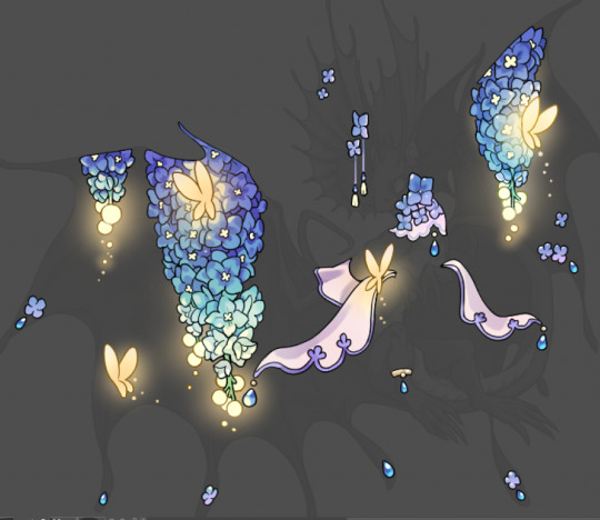
Tutorial: How I Render Accents
PART 1: LINES
a quick disclaimer: as stated on the title, this is how I render accents and obviously a lot of it will not apply to whatever style/method/etc that you may use. Another thing is there are some aspects of my style that will seem obvious to me that I may overlook explaining. please consider this a more generalized guide than a step-by-step.
So, first things first: the lines themselves.

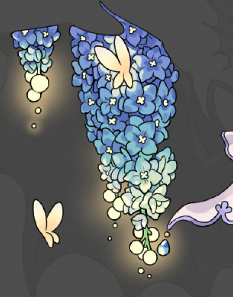
I'm going to be making an entry for Brightshine for this tutorial, so it'll be the example i use. I use Clip Studio Paint for all of my accents and I specifically use the asset found in the CSP asset store called SOIPEN for my lines, specifically on a size 3. I feel it does a good job of getting crisp yet soft lines and matches well to the line weight of the dragons line art. I typically do not zoom in very far and try to focus on making the outer silhouette ares bold and the inner lines soft. This gives a crisp edge to the work and a definitive line that makes it easier to color later on.
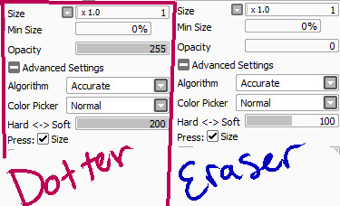
Something to note if I utilize the line method of going back and forth between opaque and transparent colors. It's a hotkey you can set that effectively turns the same brush you're using into an eraser. It allows me to carve away segments to create that negative space (as seen on the middle of the flower above) rather than trying to perfectly draw in that specific circle shape. Negative space is a huge tool to master that can give a lot of depth to your work. It also helps to sometimes fill in segments or widen out segments that are just Barely touching. The less complications in the lines the better.

For the main feature, the flowers, I will typically find a reference showing a good clear outline of how the flowers look and simplify the shapes. The flowers in question here are Delphiniums and I've decided to render them upside down as if they're hanging. Simplifying the shapes and giving the illusion of the petal bunching is more effective than genuinely drawing each and every petal in a 100% accurate way. (also since it's for Brightshine I've replaced the flower bulbs at the ends with light bulbs)
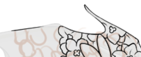
When doing line work that goes right up to the edge of the dragon, I'll typically start with the line for the edge, then build from that. Also when it comes to narrow areas (like the tip of the wing there) I'll leave it blank and typically fill it in with gradients or other small things to not make it too busy.
A very important rule for making accents is: Do Not Invest In Details That Will Get Lost In Resizing. I don't make super small details that don't matter, for example if you look at the innermost part of the flowers they are blocky and somewhat large compared to how they actually are on the flowers. When they get resized they will barely maintain that level of detail.
With all of the linework done I'd like to point out how I do composition for my accents. I tend to have 2-3 main focal points (in this case it's the two major draping areas on the wings, and the flowing lace on the arms) and everywhere else is filled in with evenly distributed small bits. Originally the butterfly on the bottom left wing wasn't there in the sketch but when I looked at the accent lines for what I had I noticed an empty spot and filled it in with a matching motif.
Some main points of how I craft my accents include: keeping the main focal points and number of thematic motifs limited and deliberate. I could add a bunch of like, jewelry trinkets or more lace and really clutter the accent but by not doing that it gives the flowers room to breathe and be the star of the show. Also using references for flowers creates a much better image than winging it.
In the next part I'll go over my coloring/rendering process!
27 notes
·
View notes
Note
Your drawings and stories for RisingClan are always so detailed and pretty! I really have no clue how you do it, I’d have devolved to sketches like 5 posts in 💀
Thank you so much ^w^ I'm gonna be honest, I have no idea either. Something about this has just grabbed me and I've run with it haha
When I'm struggling, I draw over photographs of cats, or I sketch very loosely then draw on top of that. I also cheat a lot when it comes to backgrounds. All of the grass is a brush that comes with Clip Stuido and I use an outline layer style with several layers to get it to look like i outlined it all by hand. I use dirt brushes and tree brushes, etc. If you have CSP, I seriously recommend using the asset store, there's a lot of free stuff on there that is SO helpful. You can even download 3d Cat Models to pose and draw on top of if that helps you.
I also have a 'gaming pad' that i have all my shortcuts bound to so i can very easily switch layers and tools and merge them and paste and etc etc
But yeah i have no idea when I'll just suddenly lose interest haha. ADHD is a fickle mistress and for now she is gracious and has blessed my RisingClan adventures. Fingers crossed we can at least get to the end of the year!!
22 notes
·
View notes
Note
hi! do you happen to have any tips/advice for creating pixel art? i'm a huge fan of your work and have always wanted to do pixel art myself but i've found it pretty difficult to understand x_x
Hihi!!!
Giving advice is hard because I kind of live by the "fuck it, we ball" way of life but I'll try my best!!!
Not necessary in all cases but I think page sizing is important!! I used to draw on like 3000x3000 canvases now I think I only reach that with refs... I think in general it's easier on smaller canvases, and if you need to size up for posting sake, Photoshop can do it [or I think there's sites that can as well?]. If you're wanting to do certain things [icons/icos, rpgm assets, whatever], they do tend to fit into certain constraints so thats important!!
Similarly, there's nothing wrong with drawing something on a 1000x1000 canvas and then scaling down the image to 100x100 and lining over it!!
I tend to sketch with non-pixel brushes first unless I'm lazy, just because I feel it makes it easier!!
A small thing that I'm trying to take heed of too is going back over artwork and deleting some pixels to make the lines less "clumpy" (ofc, it depends on style too! I like thin lines usually though, especially on things that are 48x48 to maximize space!!)
I draw (mainly) in Sai and MediBang (for mobile). Things like MediBang and CSP also have downloadable brushes, which for things like screentoning I find important!! [Usually, I'll draw in MediBang or Sai, edit further in CSP].
For Sai, I just use the standard Binary brush and an edited version as an eraser:
For MediBang, I just go into settings and check "Turn off anti-aliasing" and use the normal pen brush and eraser; Only word of advice though it it does create some not fully solid pixels, but you can either go over them or duplicate the image a whole bunch and then combine the layers.
As for further stuff I think it's also just important to look at things you like!! What started me into pixel art was playing a lot of rpgmaker games [Ib, Yume Nikki, Mad Father, The Witch's House, ectect]
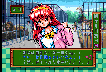
Now I also like things like the art of older systems and games, like TokiMeki Memorial 1994 has some beautiful artwork:
And the pixel sprites in all the BlazBlue games has been really inspirational in the last couple of years for me as well!!!
I hope this helps in some capacity 'w'999!!! For me, I think experimenting and playing around with stuff is the most important and having fun!!! [Which is why I'm so inconsistent bc it's just fun to try new things n see what sticks, what you like, can improve on, ectect!!!]
#i know some ppl say theres a right n wrong way to do pixel art but to me u get the same result#brie rambles#non art#anonymous#brie replies
8 notes
·
View notes
Last Seen Blogs

triggerhappychildren
Happy Havoc

walkingtaetrash
walkingtaetrash

filmyvideoz-blog
Untitled

filthypiratehooker
Moved to thejackalhasarrived

j0hn4
Untitled