#taplinger publishing company
Photo
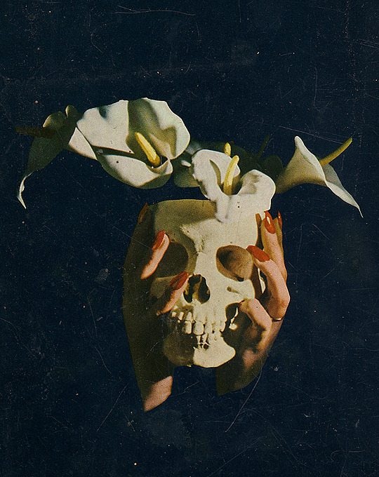
Walk in Dread: Twelve Classic Eerie Tales (cover detail)
Taplinger Publishing Company, 1972
#cover art#horror literature#70's#1970's#taplinger publishing company#horror#book covers#hands#flowers#*
3K notes
·
View notes
Photo
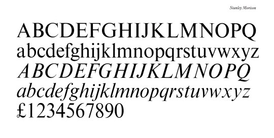
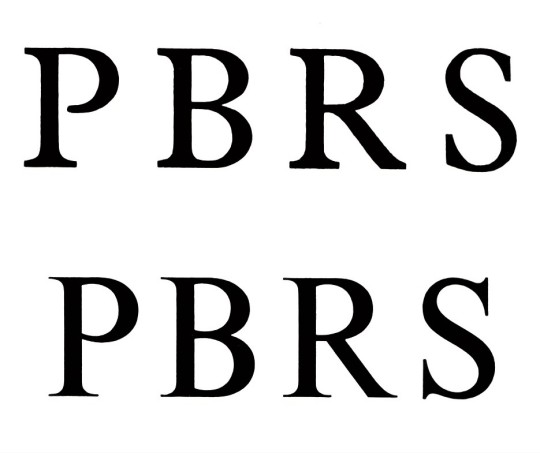
Typography Tuesday
TIMES NEW ROMAN
This week we present the iconic typeface Times New Roman, commissioned by the British newspaper The Times in 1931 and designed by the British type designer, type historian, and major typographic consultant for the Monotype Corporation, Stanley Morison, in collaboration with The Times's lettering artist Victor Lardent. The images here are taken from British type historian and Rampant Lions Press proprietor Sebastian Carter’s 1987 book, Twentieth century type designers, published in New York by Taplinger Publishing Company.
Morison began his crusade to reform The Times's typeface in 1929 by “pointing out how badly the paper’s design and printing compared with current standards of book production, and he impressed the management with a legibility study” conducted with Monotype Platin, Baskerville, and Perpetua. In considering a new type design, these three typefaces were considered as basic models. Morison wrote that a new typeface for The Times:
would be selected not with a view to their being of striking, but rather subtle allure, The face would be chosen for its effectiveness as much as for its “beauty”; the criteria of the effectiveness being a maximum of legibility to the reader who neither knows nor cares, one way or the other, for the mysteries of typographical minutiae.
After some review, Baskerville and Perpetua dropped out as models for not being condensed enough, and Plantin became the preferred choice to model a new font. The new typeface, Times New Roman, was designed and cut in 1931 and finally released to the public in the October 3, 1932 issue of The Times. The rest, as they say, is history. Sebastian Carter writes,
Times is the most successful type of this century, and outsold its nearest rival in the Monotype list by very nearly two to one. . . . the type exemplifies the way the best modern faces, though based on historical models, can leave their origins behind them and look completely of their age.
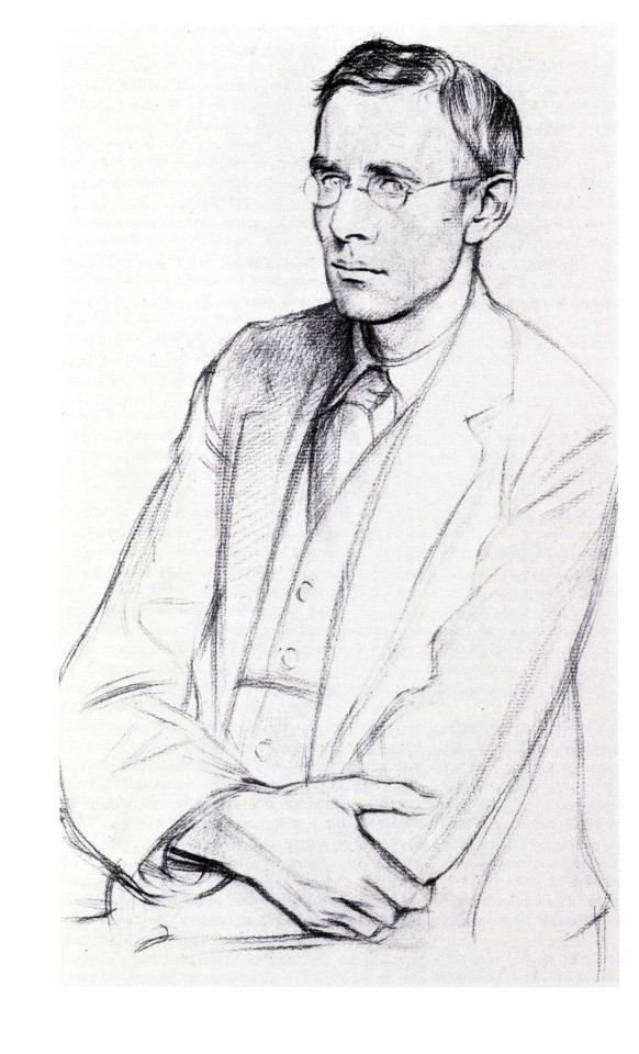
The images above show the full font set, a comparison of Plantin (above) and Times capitals, and a portrait of Stanley Morison (1889-1967) from a drawing by William Rothenstein as reproduced in the 1924 issue of The Fleuron, the influential British journal of typography and book arts co-founded by Morrison in 1922. Our copy of Sebastian Carter’s Twentieth century type designers is another donation from our friend Jerry Buff.
View our other Typography Tuesday posts.
#Typography Tuesday#typetuesday#Times New Roman#Stanley Morison#The Times#Victor Lardent#Sebastian Carter#Twentieth century type designers#Monotype Corporation#William Rothenstein#The Fleuron#Plantin#Baskerville#Perpetua#Jerry Buff#type design#typefaces#Typography Tuesday
94 notes
·
View notes
Photo
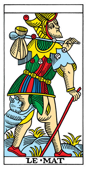
Alfred Douglas in his The Tarot: The Origins, Meaning and Uses of the Cards aligns The Fool with the Court Jester through the symbol of the bag. Douglas writes that the bag originally may have been a depiction of a pig's bladder and goes on to explain that the pig's bladder was a primitive balloon and an important prop for the Jester.
Douglas writes about psychology and the formation of identity; he goes on to write:
"His bag contains those elusive memories of what he is leaving behind,
memories that will urge him ever onwards in his search to recover what he
is about to lose--his primeval innocence." (48)
The Fool has been seen as both an innocent/childlike identity and also The Fool has been seen as a Joker -- the card has amazing flexibility depending on the spread.
Cheers,
Rhianna
Citation for above:
Douglas, Alfred. The Tarot: The Origins, Meaning and Uses of the Cards. New York: Taplinger Publishing Company, 1972.
13 notes
·
View notes
Text
Bibliography
Bibliography
Bermel, A. and Bermel, P.E.A. (1977) Artaud’s theatre of cruelty. New York: Taplinger Publishing Company.
Bertolt Brecht (2017) . Wikimedia Foundation. Available at: https://en.wikipedia.org/wiki/Bertolt_Brecht#/media/File:Bertolt-Brecht.jpg (Accessed: 13 January 2017).
Brecht, B. (2002) Fear and misery in the Third Reich (Methuen modern plays) (modern classics). London: Methuen Drama.
Esslin, M. (1965) Absurd drama - Martin Esslin. Available at: http://www.samuel-beckett.net/AbsurdEsslin.html (Accessed: 10 January 2017).
Fielding, H. and Aristotle (1957) Aristotles Poetics. Cambridge, MA, United States: Harvard University Press.
Grafton, A., Most, G.W. and Settis, S. (eds.) (2010) The classical tradition. Cambridge, MA: Belknap Press of Harvard University Press.
Keefe, J. and Murray, S. (2007) Physical theatres: A critical reader. London: Taylor & Francis.
Martin, W. (1986) Recent theories of narrative. 2nd edn. Baltimore, MD, United States: Cornell University Press.
0 notes
Photo


Typography Tuesday
JAN VAN KRIMPEN
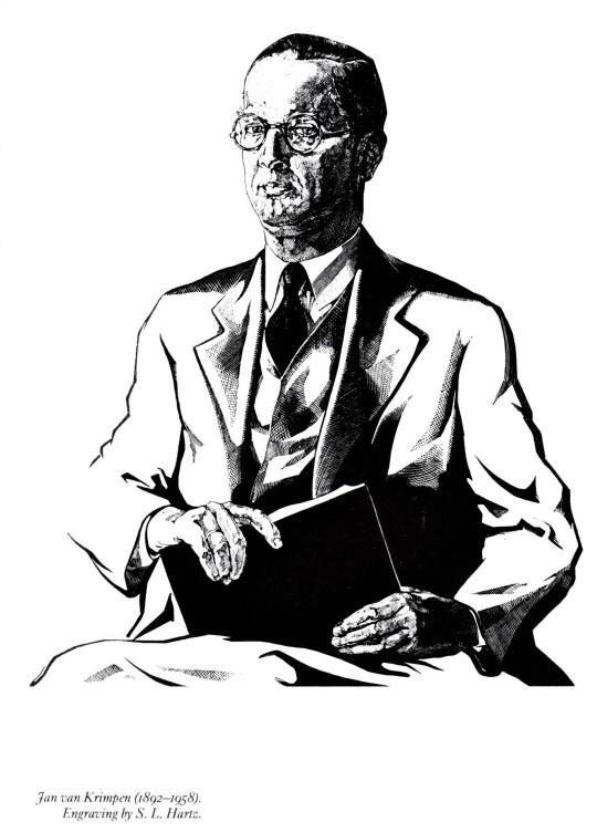
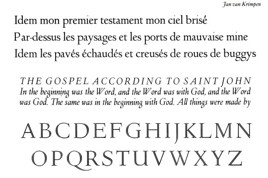
This week we focus on the type designs of the noted Dutch type and book designer Jan van Krimpen (1892-1958) as presented in Twentieth century type designers by Rampant Lions Press proprietor Sebastian Carter, published by Taplinger Publishing Company in 1987. Van Krimpen spent nearly his entire working life at the great Haarlem printing house of Joh. Enschedé en Zonen beginning in 1923.
His first design for Enschedé was his Lutetia in 1925 (shown here in roman, italic, and open capitals just below his portrait), named after the Roman name for Paris and cut by the German punchcutter Paul Helmuth Rädisch. This established the long working relationship between the two. In 1928 Lutetia was recut for the Monotype Corporation to van Krimpen’s specifications, also beginning a long and important relationship between van Krimpen and Monotype. Lutetia was so successful that Enschedé made van Krimpen their house designer, which he remained until his retirement in the 1950s.
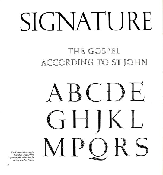
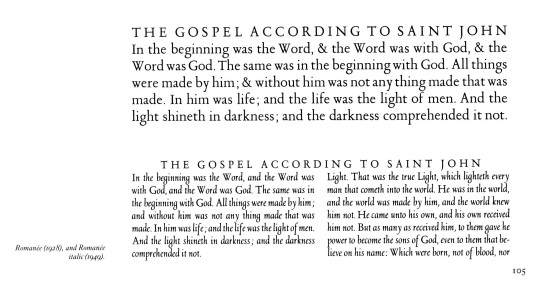
Van Krimpen did accept commissions from others besides Enschedé, such as the titling for Oliver Simon’s graphic design periodical Signature (1947) and the decorated capitals for Simon at the Curwen Press (1929), shown here with van Krimpen’s Open Capitals (1928) in between. His next typeface for Enschedé was his 1928 Romanée typeface, named after an encounter with a particularly good bottle of Burgundy, for which he designed an italic over 20 years later in 1949. He produced his Romulus type face in 1931 at the suggestion of Monotype’s Beatrice Warde. It is shown here just below the Romanée in roman, italic and open capitals, along with an alternate italic, a cursive Cancelleresca Bastarda suggested by Monotype’s Stanley Morrison.
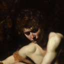
Perhaps van Krimpen’s most noted typeface is his Spectrum, originally designed for the Spectrum publishing company of Utrecht between 1941 and 1943, and later adapted for Monotype setting in 1955. Shown here also are Juliana (1952-8) and Molé Foliate (1960) designed by van Krimpen’s colleague and successor at Enschedé, Samuel Louis (Sem) Hartz, although there is some dispute over how much credit Hartz should get for the Molé Foliate, as another colleague Pieter Wetselaar appears to have had a considerable hand in its design. The portrait of Jan van Krimpen shown here is by Sem Hartz.
View our other posts about Enschedé and Jan van Krimpen.
View another post from Twentieth century type designers.
View our other Typography Tuesday posts.
#Typography Tuesday#typetuesday#jan van krimpen#Joh. Enschedé#Twentieth century type designers#Sebastian Carter#Paul Helmuth Rädisch#Monotype Corporation#Oliver Simon#Curwen Press#beatrice warde#Stanley Morrison#S. L. Hartz#Pieter Wetselaar#Jerry Buff#Typography Tuesday#type design#type designers#Lutitia#Romanée#Romulus#Signature#Spectrum#Juliana#Molé Foliate
17 notes
·
View notes
Last Seen Blogs

serotonineateryexerciseeducation
Serotonin Eatery

wardsalon
Ward Salon

cleake
20 854514

dre4amies
𝖏𝖆𝖊
chaoticnimrod
carpe noctem