#oooh this is so cool i love how the background is the focal point
Text
SERPENT & DOVE 2: ELECTRIC BOOGALOO (also blood and honey)
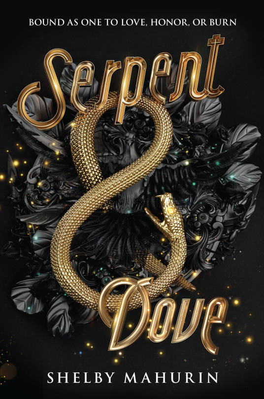
I originally covered (pun intended) SERPENT & DOVE in February 2019, and I wasn't complimentary. While the black and gold color scheme is appealing and there's a nice sense of depth and texture to the snake, beyond that, it is a hot mess. The rendering is plasticky, the imagery is mostly vague ~ AESTHETIC ~ nonsense, the whole thing has an off-center awkwardness, and what, for the love of god, is up with that midcentury typeface. An eagle-eyed blog reader even clocked weird crop mark.
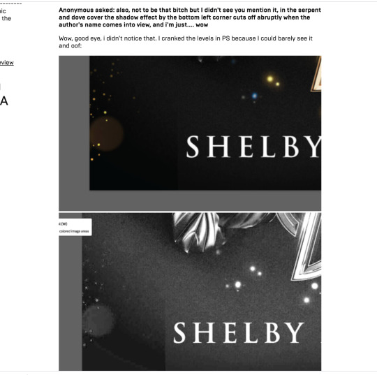
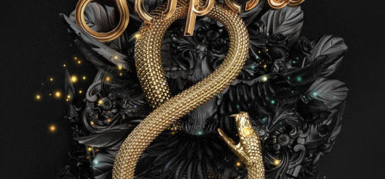
Since then, I've been pointed to the online portfolio post of this cover by the designers, which has some very cool (and enlightening) process shots:
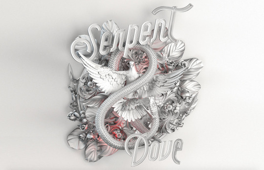
You may notice that this looks better than the actual cover! The serpent and dove figures actually share hierarchical dominance here as a single unit, and their overlap is dynamic and interesting as a focal point. So what happened? Since there's so little color in the comps, I have to assume that either it was originally intended to have a paler overall palette, or the question of color was intentionally punted down the line, but either way, this seems to have been created before the stark black and gold was decided upon. Because that's where we lose the dove completely.
She's also been pushed fully behind the snake, losing any sense of the interaction between them and making our general sense of depth and "physical" space sort of... confused. Knowing how design processes typically work, I would think they tried the dove in gold in that original lockup and for whatever reason, it didn't work: maybe it overwhelmed the cover with too much gold or maybe it interfered with readability too badly. This explains my original discomfort with the size of the snake and weird emptiness of the design between the dramatically spaced type: originally, it was supposed to be (more) filled, and it hasn't been adjusted for the loss of that element.
Full disclosure: the first time I made a post on this cover, I didn't even realize the dove was there. My eyeballs lost it in all the nondescript foliage and flourishes so badly that the meaning-making part of my brain didn't translate those shapes into a specific object. And I spend a lot of time looking at covers when I review them! So that's embarrassing for me, yes, but this is also a failing of the cover itself. Regardless of my other issues with it, I think it's really disappointing that the (interesting! relevant! aesthetique but in a good way!) visual focal point that the entire iterative process centered around ended up completely dismantled in favor of....... ugh, I dunno, the 1950s diner type? Pinterest board trimmings of leaves and sparkles, like turkey trimmings but even less appealing?
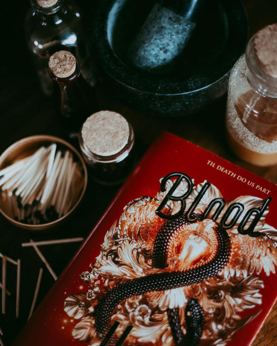
Because I didn't know the dove was there, I was, uh, confused when I first got asked about how EXTREMELY similar BLOOD & HONEY is, a sentiment I've heard a number of times now, because BLOOD & HONEY, shall we say, overcorrects on the "bird loss" front.
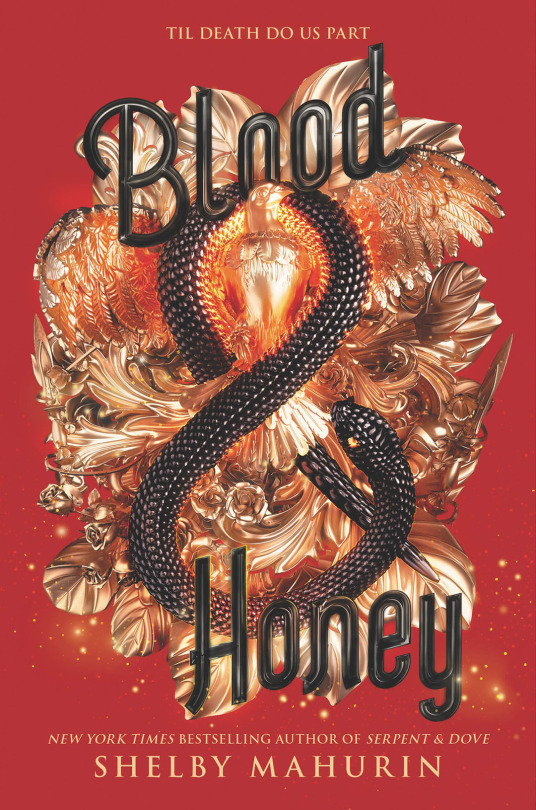
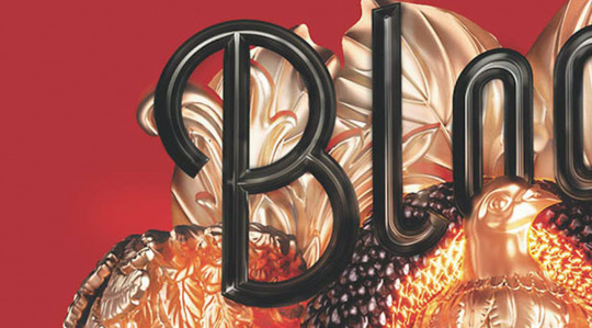
HELLO, SAM THE EAGLE. LET FREEDOM REIGN, BITCHES. MY COUNTRY TISSSSS OF THEEEEEE-
[Edit: I have been informed that this is probably still a dove, not an eagle, based on the face, but i’m not changing this joke.]
First of all, yes, the red is Bad. The black background of S&D matches the dark coloring of the objects, thereby hiding some of those Rendering Sins and lending a sort of subtlety to the mishmash of Aesthetique Things. It's all out in the open here and no less of a hot mess. The highlights are blindingly shiny and feel arbitrary as hell, like every single spear and leaf is being lit independently of anything else, and the almost pure black shadows that contrast them make my eyeballs burn-- it looks like it's a color being reflected from somewhere, rather than native shadow, because of how metallic objects reflect light, but there's nothing here but a perfectly flat, untextured field of red. I appreciate the emphasized presence of the bird (I'm ASSUMING it's an eagle, but I haven't read it, so correct me if I'm wrong) from a hierarchy and space-filling standpoint, but it is goofy as shit, and I have no idea why its chest has been so aggressively lit and filtered that it looks nearly on fire with saturation.
The primary offense of S&D's cover, that it's a tangled mess of meaningless and poorly crafted flourishes meant to be aimlessly Fancy that ends up being kind of ugly in the process, has been cranked up and the knob broken off here. An "Oooh, shiny!" from a dumb character who is about to trigger a trap manifested through a hypertrendy YA goth lens.
The text is also Still Bad. Compare the font to the one the Fairyloot book box uses for the book:
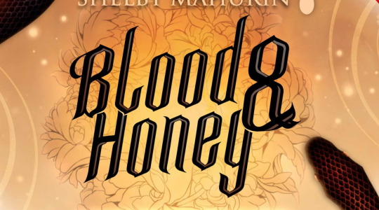
Although this isn't rendered in the metallic style, which it would have to be to match, it has a dramatic blackletter quality that matches the edgy medieval tone of the story far better than. Whatever the hell this B is doing.
So round!!!! So friendly!!!! So Un-witch-hunt-ey!!!!
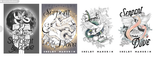
To be clear: no, B&H is not a full, exact recolor of the S&D cover-- most of the elements, though the same, are arranged differently, and that's a completely different bird and at least a nominally different snake.
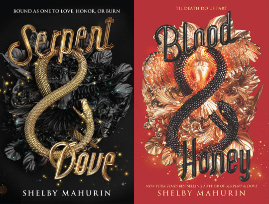
However comma I see why people think it is, because someone got lazy with the bottom left lol.
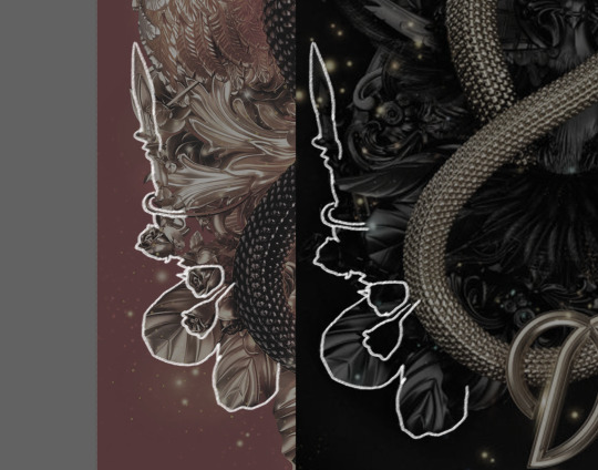
There is a Behance post for this one, too, although there's noticeably no process work, because the process was quite clearly "do it again but slightly to the left," and that doesn't involve much iterating.
Here's the thing, though; I'm not convinced any of this matters, because the truth is that hot, high-contrast messes photograph well.
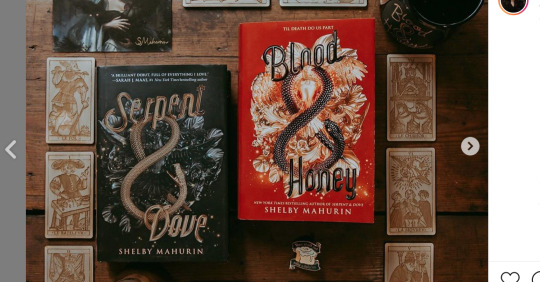
Particularly when paired with a moody setting or editing, the red that comes across as kind of a nightmare in the jpeg pops, and the Escherian snarl of detail becomes more a texture nonspecifically indicating luxury and romance than an object theoretically representing something concrete about a story. And I personally may not Love This For Us, but honestly, that's half of a book cover's job these days: look pretty and do nothing.
If there's something to be learned from BLOOD & HONEY's cover, it's that better or worse, instagram filters matter. (Also true of Shelby Maurin's immaculately aesthetically curated, goth-trendy personal brand, which has increasingly been mimicked by other authors since S&D listed, although the author-brand-as-book-marketing-tool has always been a thing to some degree). A book isn't just a book, it's a prop for the countless ongoing performances of book-consumption-as-identity done both for fun and for clout in this particular subculture. I'm not passing moral judgement, here-- anyone buying a new YA fantasy book, no matter what they want to do with it or what my feelings on the book itself are, is a win. But this is the industry moment we live in, and it's savvy of publishers to have it in mind in regards to marketing and design.
Like what I do? Want early access? Support bookcoversalt on Patreon
39 notes
·
View notes
Last Seen Blogs

catnine99
OUCH!

tina-jeanne
Wer bist Du? Eine die glaubt.

hotyoko
V+V=Y

switpineapple-lewa-blog
Kai Viti 🌴