#next part sometime idk
Text
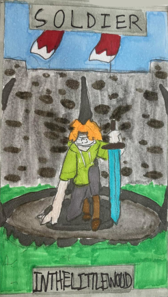


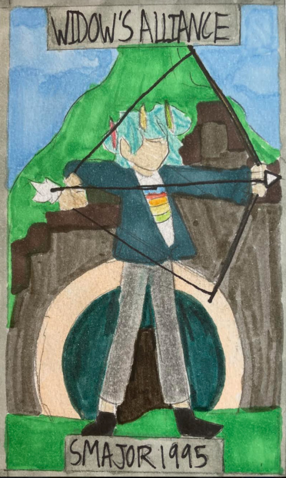
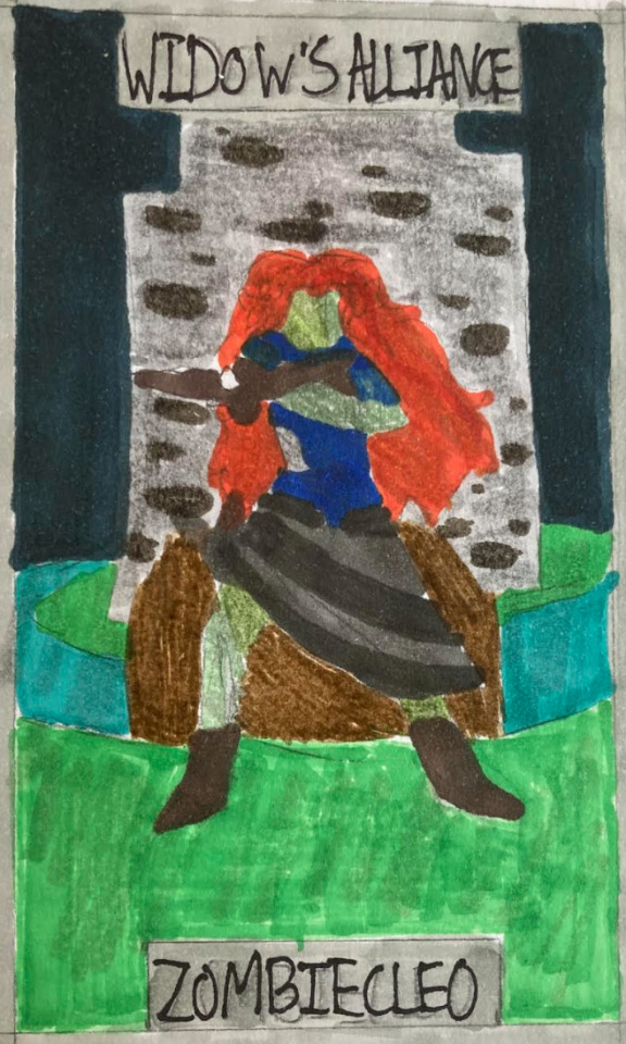
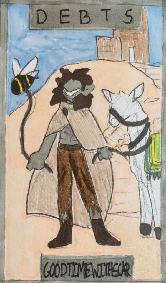
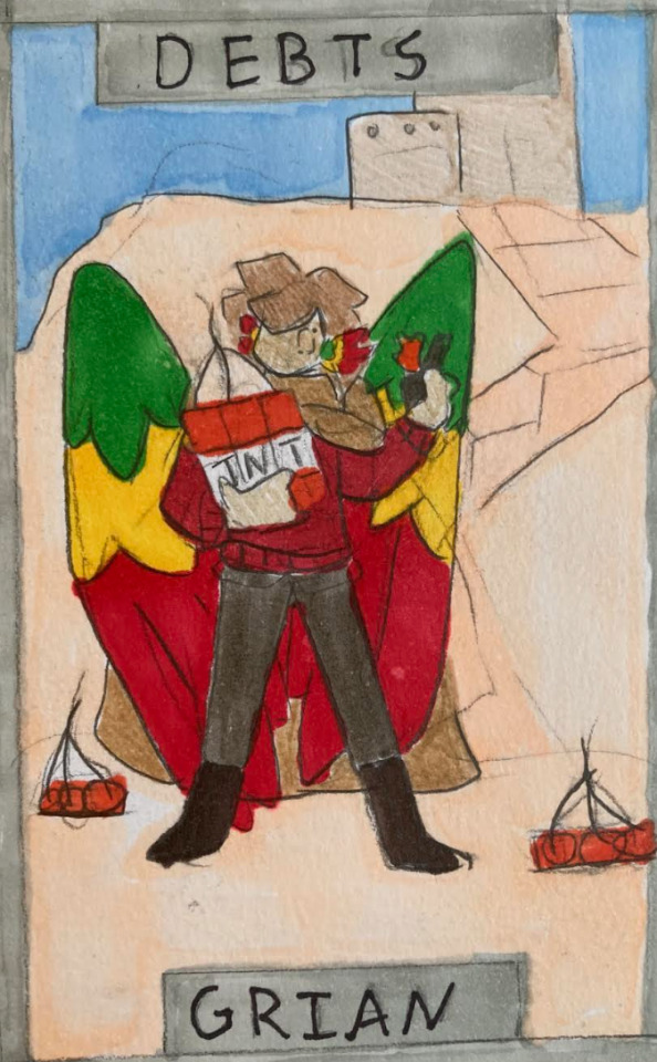
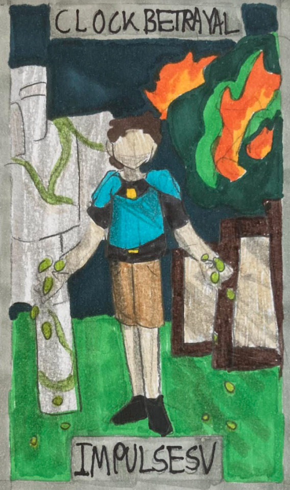
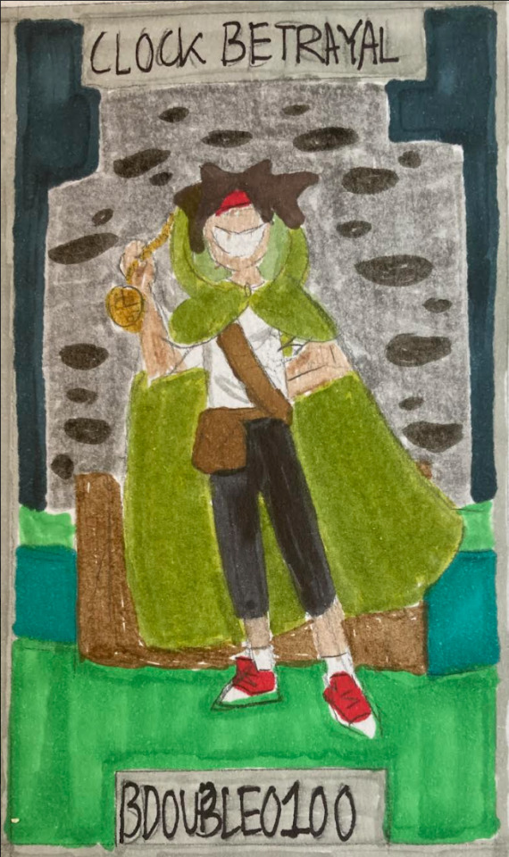
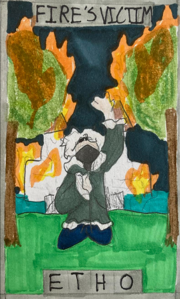
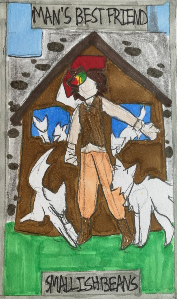
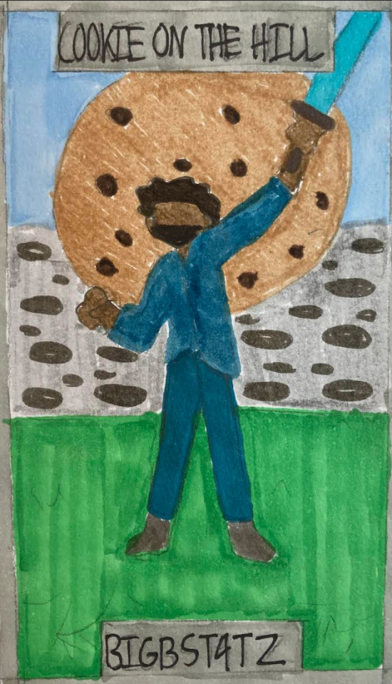
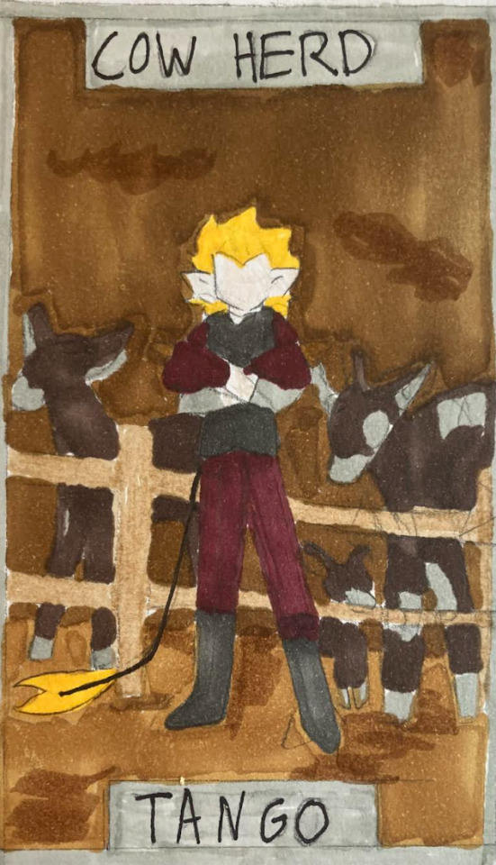
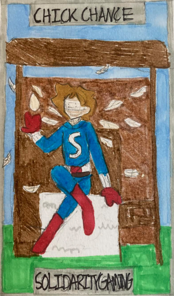
The Life Series Crypt, Part 1- Third Life
#yes i put in the evo symbol im sorry you can't stop me#also i feel listener jimmy may have been implied with 'make the voices stop' 👀👀#next part sometime idk#third life#life series#my art#inthelittlewood#third life martyn#skizzleman#renthedog#the red king#rendog#scott major#smajor1995#zombiecleo#goodtimeswithscar#grian#impulsesv#bdoubleo100#bdubs#ethoslab#etho#smallishbeans#joel smallishbeans#bigbstatz#tangotek#tango tek#solidarity gaming#jimmy solidarity
79 notes
·
View notes
Text
AU where Leo is trapped in the Prison Dimension for months instead of minutes and the only way he gets by with his sanity intact is through recording himself talking to his wrist comm.
When they finally manage to get Leo back and make him rest up to heal, Donnie can’t help but listen to the recordings left behind.
He’s not sure what exactly he’s expecting, only that his subconscious is screaming at him that it has to be heartbreaking, that it has to be torturous.
Instead, what Donnie is subject to is a full thousand hours’ worth of Jupiter Jim and Lou Jitsu crossover fanfiction. More than one part in the series. Spanning well over a million words.
(The worst part is that it’s actually good.)
#rottmnt#rise of the teenage mutant ninja turtles#rottmnt headcanons#donnie keeps the comms going on in the background as he works#when he gets to the end he’s like what the hell…where’s the rest#donnie: leo where’s part nine#leo barely cognizant after not needing sleep for months: whuh-#donnie: you can’t leave it at a cliffhanger. leo. leo where’s the next part.#listen leo has a great memory for his special interests this is CANON plus he’s a great talker so he would totally be able to do this frfr#whenever he needs to be quiet he’s SILENT but otherwise he’s regaling the exploits of his idols to the captive audience that is The Photo#sometimes Krang sneaks up on him and just listens to him talk like ????#it starts both as leo trying to comfort himself with his favorite things PLUS comfort himself with thoughts of his father#as splinter makes his own crossover fanfiction when sick lol plus he’s Literally Lou Jitsu#and yes krang ALSO gets a bit invested#leo notices the reduction of Ouch but hey more time for rambling fanfic for him 👍#idk leo’s a damn good actor/liar/planner/schemer and I genuinely think that can pivot into storytelling so well#the literal second mikey’s hands heal donnie zooms to his side with hand stabilizers and a request to draw ‘scene 82 from recording 3’#mikey’s like what#so obvs now HE needs to listen as he works#he too gets invested#he comes across raph who mentions having trouble sleeping#mikey: have I got the podcast fanfic for you!#it only somewhat helps raph sleep#somewhat bc sometimes he forces himself to stay awake to hear the rest#yes these recordings go to the whole fam and leo is none the wiser#they don’t even mean to hide it it just never comes up lol#it’s only when donnie FINALLY makes it to the end of the recordings that he confronts leo to continue the story#leo: oH YOU HEARD ALL THAT HUH-
3K notes
·
View notes
Photo
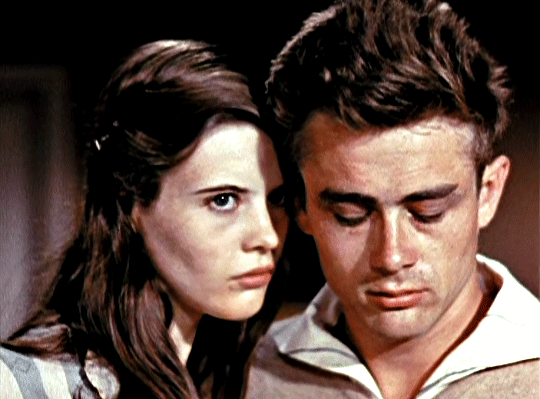
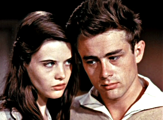
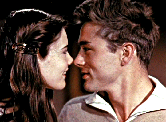
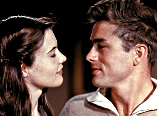
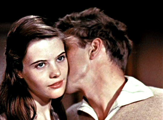
LOIS SMITH and JAMES DEAN
in a wardrobe test for East of Eden (1955) dir. Elia Kazan
#oldhollywoodedit#classicfilmedit#filmedit#movieedit#James Dean#Lois Smith#East of Eden#1950s#1955#idk how to tag this#mygifs*#requested*#anon i'm sorry it took me so long to get this up 😭#like you literally requested this in december and it's february!!#also i'm not sure how exactly you wanted me to gif the test so i just did a part i thought was cute#so if there's any other part of the test you want me to see let me know#and if the anon who requested sunset boulevard gifs ever reads this i'll try to get to it hopefully this weekend or sometime next week!!!!!
1K notes
·
View notes
Text

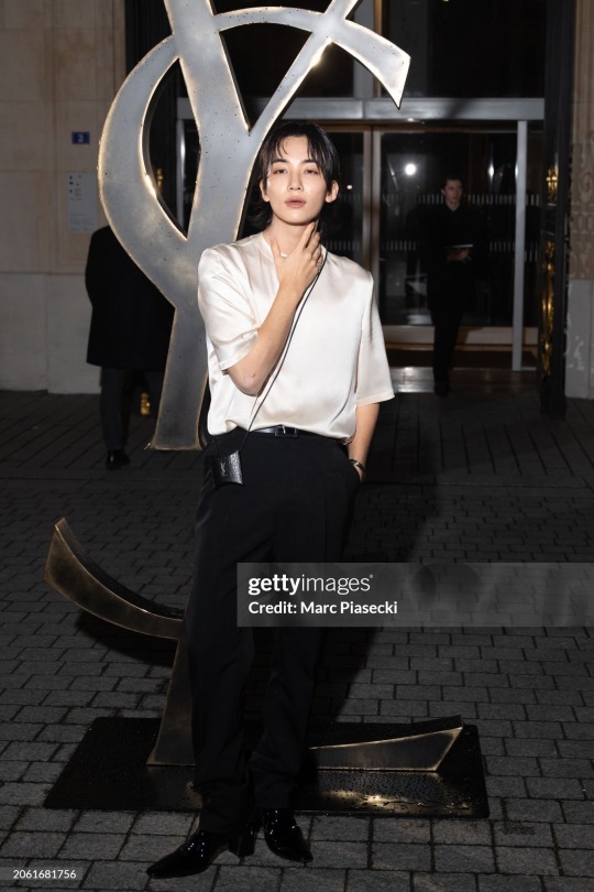
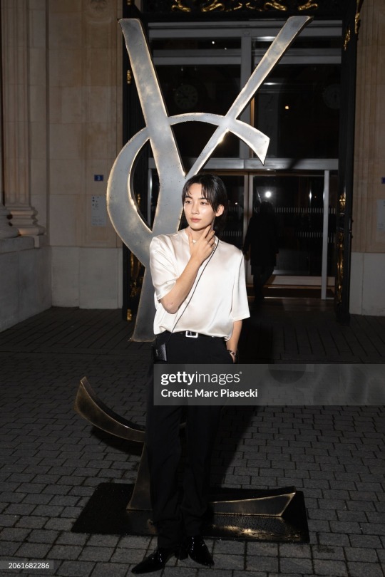
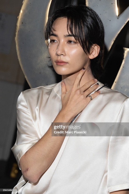
jeonghan x ysl
#HIS HEELS GETTING HIGHER AND HIGHEEEERRRE the fit is so simple and understated but the materials are so lux and fit is perfect this is sooo#right up my alley. Now that we are finished with sweet talking The scar. Tha hair.#hair on the idk what’s that part of the hand I JUST WOKEKWKSJDJE ammm sorry we are so back btw jjongjjongism never dies#fingers. already talked about it how zay said it’s very primal of me oh myyy we are all driven by lust sometimes#i know i am when i see my jeonghan. Anyway. Next thing -> ig story with crni cerak as a bg#jeonghan#seventeen#svt#tt
31 notes
·
View notes
Text
okay not that anyone asked but I feel like I'm just in a really odd state of calm like I'm detached just enough that whilst I am still invested it's more of a "I'm just gonna sit back and be a part of the ride and see where this all ends" I know I've used this metaphor a million times but yes the world is on fire but I'm waiting to see what will come from the ashes
#idk I just feel like. this is definitely the end of a chapter. but I'm very willing to see what the next chapter will bring y'know?#also I think that nothing from this situation could be as emotionally devastating to me as the w//lbur situation sooo#that's probably playing a part in my reaction tbh#anyway sorry for yapping about this a lot maybe I should take up journaling#oh also I'm so serious literally all this could've been handled privately#I doooo get anxious bc of this sometimes though but that's just side affects of my anxiety disorder I'm getting anxious daily anyway lmao#stella rambles
17 notes
·
View notes
Text
I don't think there's anything wrong with making a series for middle class home chefs with nice kitchens and disposable income who want to cook better...but I do think it's a little shitty to pretend that's not what you're doing.
Like I'm sorry if your "basic" meatloaf recipe calls for ground beef, pork, AND veal I think you've gone beyond what can reasonably be called basic.
#I live in a big city and I could not even find veal when I made that meatloaf#and you know what ngl the recipe kinda sucked! I'm going to have to make a few changes next time I make it!!#and the best part of the meal was the onion gravy I made legit legit with just a yellow onion#some store brand beef broth#and I think garlic? and then half and half#and the mashed potatoes that were literally just two russet potatoes and some butter and half and half#so like......hmmmm idk man#sometimes things that are complicated and fancy....are worse
60 notes
·
View notes
Text
Character Design Fundamentals - Shape Language
There are a lot of guides out there for making "better" characters- but what exactly does better mean in this context? Art is subjective. There is no good or bad art, so there's no universal way to make art better. The only objective quality in art, how I see it, is effectiveness. How well does the art fulfill the creator's intent?
So rather than talk about how to create better characters, I want to give you folks tips on how to design effective characters, with your intent in mind. Starting with the most fundamental of fundamentals- shape language.
There's a famous linguistics experiment that feels relevant here. Which of these shapes is called "bouba," and which one is "kiki"?

You probably knew instinctively that the shape on the left feels like it should be "kiki," and the shape on the right feels like it should be "bouba." This seems to be true regardless of your language or background. Why is that? Humans associate everything from colours to character traits to shapes to sounds, instinctively correlating them. So when they said that Kirby is shaped like a friend, they were being very literal. Luckily, this part is hard wired in your brain, so you shouldn't have much trouble with it.
In general, a "round" character might come off more friendly and easygoing, or more lazy and weak willed. A "square" character might come off more strong and grounded, or more intimidating and less smart. A "sharp" character might come off as more witty and energetic, or more stern and cruel.
This advice is often demonstrated in cartoony ways, with characters whose bodies are built out of triangles or circles in a way that doesn't seem to apply to more realistic art. It can be tempting, then, to think you can ignore it. But you absolutely can't.
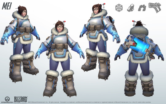
Overwatch is a great example of using this kind of shape language to great effect without becoming super cartoonish. Compare two of their character designs, Tracer and Mei:
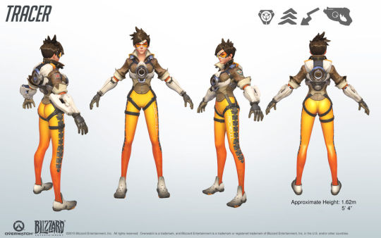
Tracer is a witty, energetic character whose gameplay is very fast paced. This is portrayed in her very sharp and angular design. Her hair comes to sharp points, her collar and sleeves are angled, and her body is lean and angular. Even her goggles and the belts around her thighs create triangular shapes.
Mei, on the other hand, is a sweet and friendly character whose gameplay is tanky and powerful. Her design combines those elements into both round and square shapes. Her jacket, boots, and the pockets on her belt all have rectangular silhouettes, while her body, hair, hood, and weapon all have rounder silhouettes.
See how effective this kind of design can be? And it doesn't have to be restricted to just one kind of shape. Like Mei's design, you can mix and match strategically to get closer to the effect you want. A love interest who's got both round and sharp elements might read as invitingly sexy and a little dangerous, while a love interest who's got both round and rectangular elements might read as down to earth and kind.
Before you lay down a lick of paint, you've gotta have a sketch. And before you come up with the details of your character designs, you've gotta know what shapes you're building it out of. So think hard about your intent with this character, and how best to get that across with the language of shape.
#idk why but i've been ITCHING to write some character design tutorials so here ya go#the next part is going to be talking about value and i have some very choice and kinda rare tips about that!#but gotta get shape out of the way first. it's the most important#even though i so often neglect it myself lol#i just want every character to be sharp because every character is very tall and very mean... that's okay too#sometimes you just have a Thing and you need to embrace that#character design#character art#art#design#art tutorial#art resources#art tips
292 notes
·
View notes
Text

sillest reporters to exist ever ❤
#m art#mine#welcome to the game#clint edwards#amelea lewis#also amalea sometimes but idk#i loevvv them#first part of wttg designs btw... adams next maybe
7 notes
·
View notes
Text
on another note...cannot figure out if im a monster fucker or not
#like sometimes im like all for it#other times im like eh#idk im just super picky about the scenario i guess#also when fics mention like slobbering all over you#i want to scream because slobber and saliva is like my worst nightmare#get it away from me#thats just me personally#i cant do it#anytime anyone gets it on me or near me i want to die#so when i read about a werewolf slobbering all over reader im like internally screaming and skipping to the next part#UGH IDK#i cant figure it out maybe im like an occasional monster fucker#okay now that im reading all of this back its making me laugh like#talkative today are we?#just shut the fuck up dude go back to your cave#vics thoughts
16 notes
·
View notes
Text
swashbuckler rogue my beloved
#i would never regret the storm sorc/tempest cleric combo that i chose for Bonk because they're an absolute damage MACHINE#but sometimes i wonder who i would be if i had gone down the martial road instead#bonk literally has a pistol and a sword and they're pretty fucking good with both of them. you normally don't see that in sorcerers.#i think my attack bonus with the sword is higher than my spell attack bonus which is kind of insane#next time i level up i have to go through all my spells because honestly im starting to get a little tired of the same old lightning bolt#PLUS now i have transmuted spell so i can just take pretty much any damage spell i want and turn it into lightning damage#for my sweet sweet bonuses#there is just some part of me that needs to play a rogue though. swashbuckler. arcane trickster. soul knife. phantom. anything#normally i don't like playing stealthy characters but there are so many good rogues out there#even a “ruff boi” a la magnus burnsides (fighter/rogue)#multiclassing my beloved too i guess#so hard for me to make a character that i don't multiclass#i might even go paladin/bard with one of my newer characters eventually#inspired by calliope petrichor#but he's different. he'd be a bard because he's a theater kid#but also i want to play a straight up paladin because i want to explore with being a character who has a connection to a god#because i've never done that before#and the themes and motifs are too strong#idk man we'll see how it goes :)#i love dnd#ALSO i feel like i cant make him a bard because i already have TWO OTHER FUCKING BARDS#GUYS (sweating) IM NOT A BARD MAIN I SWEAR#maybe for my paladin i could just take magic adept and learn some bard spells or something? like beverly naddpod? maybe#but it's not about the spells... it's about the performance checks...#i really should be working on my finals right now#im so serious if you've read this far down 1 hi :) and 2 if u have dnd characters PLEASE tell me about them. bats my eyelashes. please
10 notes
·
View notes
Text
love being 25 and not knowing how to socialize bc i’m autistic and off putting and cringe so no one wanted to talk to me/wanted to be my friend growing up so now i’m an adult with very few friends or ppl i talk to on a regular basis bc i never learned how to socialize or text properly bc no one taught me how
#abc shut it#vent#i’m so lonely it’s not even funny#my talking to myself has just gotten worse in the past few months alone#i just want some friends i can do watch parties with and play games with damn it#i’m so bored and lonely all the time#my life has just been work sleep and chores and it’s driving me insane bc i have nothing breaking up the routine#like it doesn’t help no one texted me bc i was poor and had didn’t get a smart phone until is was basically too late :)#like i know part of it is the depression but#idk i just don’t do anything when i get home#sometimes i do art sometimes i game but usually i just lose track of time staring at tumblr and the next thing i know my few hours—#after work are gone and i have to go to bed#like don’t get my wrong i LOVE my coworkers but i need some more friends within my own age bracket#like is it to much to ask for a group of friends that will watch anime and movies with me in our own discord server#like is that literally to much to fucking ask of the universe can i be allowed to feel like an actual normal human being that’s connected#to the human experience for once in my fuckkng life#and not feel like some sort out outlier that doesn’t fucking exist to anyone#i’m to a point where i think and feel like i’m not even real! lol#like idk i would just like there to not to be days where i literally don’t communicate with anyone#and know what to say when ppl DO text me bc when ppl do text me i half the time don’t even know what to say#and forget the message is there and get to scared to reply after too much time has passed like#i know it’s a me problem that therapy would help but im terrified that it won’t#that i’ll just be going therapy and still be a lonely autisic looser who doesn’t know how to communicate without being off putting#or being too much
10 notes
·
View notes
Text
I don’t think many of you that follow me on here actually keep up with or read my fics but for those of you who do I just thought it’d mention that the reason I haven’t updated anything in weeks is because I started working on a renkaza one shot that was supposed to be short except now it’s over 6.5K words and the initial scene I was writing it for has not even happened yet. So
#AND NOT TO MENTION THE SMUT PART OF IT THAT GOT ADDED LIKE JFJDDKDKDKSK#it’s not even the hanahaki one shot either#my fic updating ‘ schedule ‘ is a fucking mess#it’s not even a schedule idk what it is#not important the point is you should hopefully be getting a sizable treat sometime soon#hopefully by next weekend#that’s my tentative goal of having this finished up#it will be a v fun fic though it’s very self indulgent#it is lovingly called the teef fic between me and my friend that is encouraging and betaing it#kaz rambles
11 notes
·
View notes
Text
Okay look I love Kitty and Yuri together but I don't actually think they should end up together. Because I think Yuri is genuinely in love with Julianna and she won't just give that up. So far from what I've seen they are very much in a good relationship with each other and plan to stay that way. They are cute, they are happy, they have plans for the future and they fought so hard to be together so it would be really unfair and also out of character to just take that away from them especially since they are finally back together now. And I do think Kitty deserves do find a cute girlfriend but it doesn't have to be Yuri. There are for sure so many other cute girl Kitty hasn't met yet that will also be perfect for her. I think Yuri is very important for Kitty because she is part of her self discovery. Kitty found out she was into girls through Yuri and that's great!! But that doesn't immediately mean that they have to be together, especially when Yuri is already in a committed relationship. I do think they are very cute together and would be amazing as friends tho!!
#xo kitty#idk i just wanted to say my opinion#to me it just feels like yuri isn't into kitty#but she is still important to kitty#and this show is all about self discovery#and yuri is part of kitty's self discovery#also i don't want this to sound like yuri is just a plot device for kitty's story#because she's not#she has her own life with her own issues and things she meeds to figure out#but i just don't really feel like she could be a potential love interest for kitty ever though kitty does have a crush on her#and that's fine#because as we've already seen: you don't have to be with everyone you crush on#you can be but sometimes it's also just kot right#also i Love julianna#she's so cute just look at her#i am a yuri x julianna shipper<3#i love them#and i want kitty to find a very cute girlfriend next season because that's what she deserves after all this relationship drama♡#but also#she's bi (or pan idk it hasn't been said specially)#so it would also be totally fine if she ends up with a boy#idk i just want all of them to be happy okay?#anyways i'm done rambling now i hope i made my point clear#i'm gonna go make some yuri julianna and q florian fanart now♡#xo kitty spoilers
13 notes
·
View notes
Text

crawls out of my hole and chucks this into the open and scurries back in (ocs)
#my art#do not copy trace or steal#mrb#IM SORRY ABT NOT POSTING WHAT I SAID I WOULD if i post actual wc fanart will that make up for it (slash half joking)#IM rlly happy with how drawing people is turning out bc then it makes everything less complicated bc i have been religiously drawing all of#my mrb ocs as cats and then when i am talking about them/writing stuff they are like. humans . i make it so confusing AHBDFLGHB#but oh well im getting there#BUT YEAH these r my ocs kaden and kamryn and the thing abt kaden is she exists as her own character and as a sona and . that is also#unnecessarily complicated BAHAHA#i also draw my mrb like furries IDK IS THAT THE RIGHT TERM?? like cat people IDK AJNDJLHFGFDGB#lots of love to my close friends who understand#anyway i got my classes figured out for next semester and a part of me is like. i dont even know how to explain it im having a lot of#weird feelings but overall im hopeful and sometimes that is the best i can be
24 notes
·
View notes
Text
My journal is not cutting it today Lol ummm I want to reconnect with my friends from high school so bad cos I literally stopped talking to them all for no reason because of a traumatic event that happened to me in high school I just cut everyone off and disappeared like I just ruined my own life and I regret it so much now but at the time I was just in so much pain and I think they would all understand that except it's been like 10 years now it's just gone on so long that I haven't spoken to them and it just fucking sucks because I don't know why I haven't tried earlier but I guess just cause I was scared but I feel ready now but it feels like it's too late. Ummm. FUCK!!!!!!
#And now they've all moved back to the same city and hang out all the time and I'm just still awkwardly. not a part of the group cos I just.#Left and it's my fault. Anyway I'm just so so so so so sad about it today#The person from that group I talked to most recently ~5 years ago who was totally open to reconnecting is my ex but like we always have bee#On good terms and I could definitely contact her again and ask to get coffee and I want to but I'm scared and it's like#Its just so awkward cos I'm never gonna be a Part of that group in the same way but. At least I could still see them sometimes idk#Like but I'm just so. It feels so humiliating#But I just have to do it like I have to go crawling back to them like a little fucked up lizard#It just entails texting her to get coffee next time I'm there but I'm so fucking scared
8 notes
·
View notes
Text
Had a dream last night that I found John Green @sizzlingsandwichperfection-blog sitting in a field of wild grasses looking contemplative. I sat beside him and, without glancing my way, he recited a poem that amounted to the concept that "we have to persevere when things get difficult because the easy is all too fleeting and unreliable, but by facing the hard stuff, you can *become* the thing that is reliable." I nodded seriously and we just watched the sky for a bit.
10/10 Green brother interaction. Thanks John, guess I'll go persevere today? 💪
#the next part of the dream involved me going on an epic journey to the local grocery for sunscreen#because sometimes you persevere and sometimes you get tools to make it a little easier#or something profound like that idk I'm not john green#i should go reread the anthropocene reviewed again......
2 notes
·
View notes
Last Seen Blogs
daughter-of-inklings
Ink’s Scribbles

viajeenmarruecos-blog
VIAJE EN MARRUECOS
x-gotham-rogues
X's Gotham Rogues

duplisea
Duplisea