#new vibe new coloring new editing process etc
Photo
discographies by lyrics — MELODRAMA by lorde
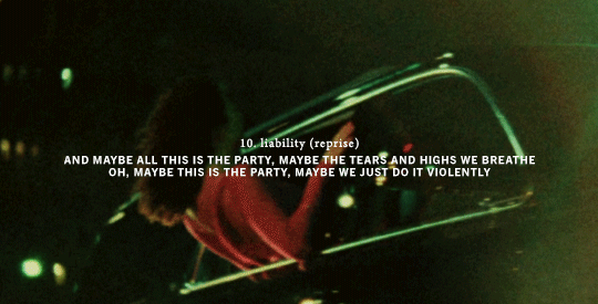
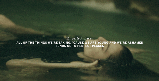
L2: green light // sober // homemade dynamite // the louvre // liability // hard feelings/loveless // sober ii (melodrama) // writer in the dark // liability (reprise) // perfect places
#*#*gif#flashing gif cw#lorde#lordeedit#womenedit#musicianedit#melodrama#melodramaedit#userjacinta#userjjessi#tuserdana#ive been watching a lot of wong kar wai lately and thinking...thoughts...#new vibe new coloring new editing process etc#i know this bitch was watching chungking express when she made that green light mv...#btw if anyone reading these tags wants to be tagged in future albums/artist discographies as i work thru them lmk lol
2K notes
·
View notes
Note
Hello there! I'm Eden :D I LOVE your renders! I've been rendering for well over a year at this point, however I only stuck to the super basic stuff since it took me a year before that to even know how to do it at all. I've wanted to up my game and get to where you are now. I'm SO SORRY if this question was asked already (I haven't gotten too far in your posts yet), but;
How do you personally edit your renders? I understand you use photoshop, but how do you do it exactly? Your renders have that kind of digital art style, like you drew them yourself. Feel free to be as descriptive or brief as you'd like!
Hi Eden!!! Thank you so much! 🥹😍♥️
I've followed you back and glad we're moots! I'd love to see some of your work!
I'm not sure if I've answered this before but I'm happy to answer it again! Also I haven't advertised it in a while (and I really need to try to get up a new tut, maybe soon), but my alt account is a Render School where I post tutorials, with plans to post editing tutorials in the future!
But honestly as far as my editing, I really don't do much.
Actions are my secret weapon, and I have a few favorites/go-tos I'll link! A few are by simmers and a few are just action sets. I'm in a family of photographers, so I have access to a wealth of resources for my editing.
Sonder set by @intramoon
Cold Water set by @intramoon
Retro Prime photoshop actions
Indie camera photoshop actions
But my "secret weapon," as it were, and the set of actions that I think most helps me accomplish that digital art style is a set of actions that are sadly expensive and hard to find now.
My favorite set is by Totally Rad! and I think in recent years it's been folded in to this Pixel Sugar product on their website. I know that's a steep price point but it's possible you can find it around the corners of the Internet for less, or if you can't, you might be able to find "dupes" of the better ones, which imo are:
Technicolor dream world
Super Fun Happy
Bullet Tooth
Grandma's Tap Shoes
As for my method, I know a lot of simmers paint over their renders, and I've done that a few times but find I'm too impatient tbh. My goal is always to have to do only minor touchups over my renders and some color/vibe adjustments before the finished product. My "raw" files are always exactly what blender spits out for me, unaltered in any way except to resize them for Tumblr.
To get that digital art style, I'd recommend rendering with alpha details if you don't already. If your computer can't handle alpha cc in the game, DM me and I can give you some pointers (sneak peek info for a future tut lmao) on how to accomplish it without bogging down your game.
When I go into photoshop I adjust the brightness and contrast, as I tend to personally prefer high contrast pieces that contain dark subject matter but you can still see the details. Then I'll paint/blur/clone/adjust anything that needs it, then I'll "stack" and adjust a handful of actions before applying edge blur and vignette and any other color adjustments (levels, curves, etc).
That's a very oversimplified rundown of what I do, but really overall my editing process is simple. The bulk of my work happens in blender itself. I find that the more time I take to perfect the lighting and shadows and angles in blender, the less frustrating the editing process and the happier I am with the end result. So, that said, be sure you're spending a lot of time in blender getting the light and shadows to be exactly where you need/want them to be before running it.
I know this is a bit long I'm sorry! If any of it is super confusing or you'd like a more in-depth look at any of it please let me know! I do plan to do editing tutorials for my side blog, but the latter half of this year has kind of run over me like a train, and for now I'm just trying to get by day by day. But I'm happy to help if you have more specific questions!
& thank you again!! ♥️
#replies#thank you so much this literally made my day#I was having a bad one too ugh I needed this#mini blender tutorial#tutorial ish#sims 4 blender tutorial#sims 4 render tutorial#sims 4 editing tutorial#I can't tell yall how happy it makes me when yall love my work#legit holding back tears#♥️♥️♥️
18 notes
·
View notes
Text


Vibrant Outrage
This is the new vibe.
-
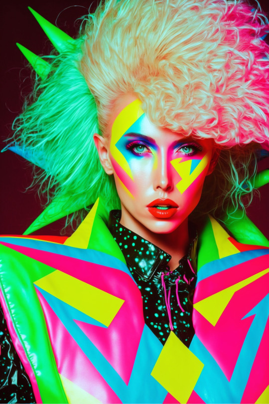
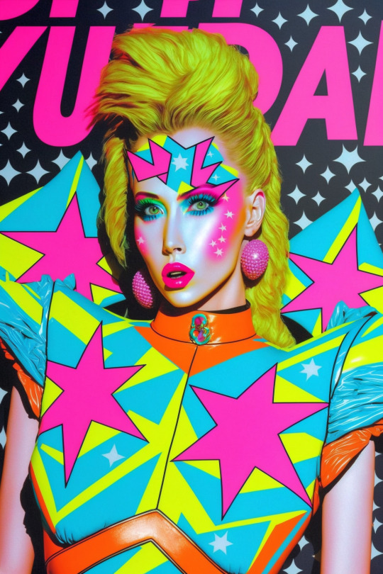
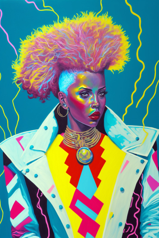
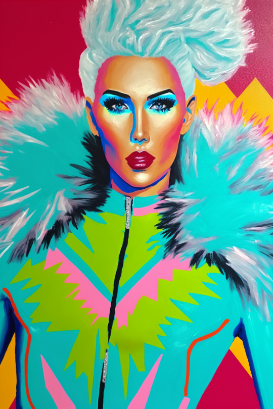
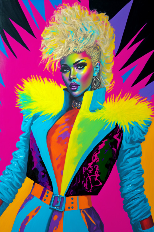
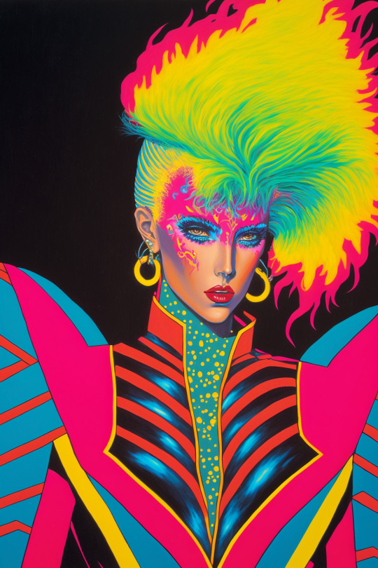
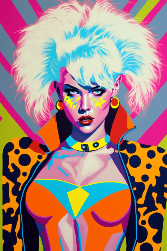
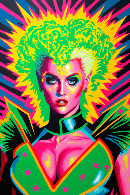
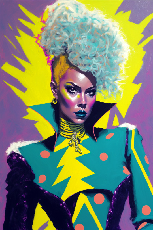
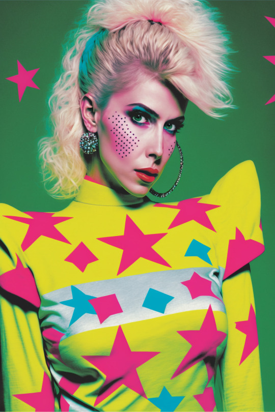
Free-to-Use character portraits and fashion inspiration made in Midjourney V4. Tag yourself as you desire, details on the process under the fold.
Much like the dinofolk, there are minor edits, mostly to fix color and tone balance, incomplete borders, etc.
Prompts were mostly variations of:
painting of a person wearing a costume, by Fujiwara Nobuzane and Sharon Knettell, tumblr, pop art, 80s color scheme, <celebrity here*>, no background, neon hooves, zig zag, star, curvy accentuated figure, very fashionable, with shoulder pads, banner, kitsch fashion, synthetic fur, born this way, young idol, new wave chaos, very dynamic, starry, fashion icon, image
Long time followers may notice that's not quite my normal prompting style. That's because this was an experiment with using Clip Interrogator 2, an image-to-prompt AI process.
It's still early days and isn't terribly accurate beyond vibes, which is fine for my process. It's like the early days of google translate, where you could get wild, strange stuff by passing a text between multiple languages. relatively easily.
It also fills in nicely for image prompting, since its basically the same process but converts the token language back into a prompt rather than leaving it tokens. This allows for editing, and also helps get around Midjourney's hair-trigger NSFW filtering, which often finds leotards and legwarmers downright obscene.
Given the nature of the above pics, it shouldn't be hard to guess what I started with.
Sharon Knettell's work is right there with Earl Norem and Hector Garrido in downright iconic 1980s toy package art, her Jem work has beautifully subtle shading that makes everything look half-real, half-fashion sketch. I wanted to see what the AI made of it.
The solo Pizzazz (I think) produced this:
a close up of a person wearing a costume, by Fujiwara Nobuzane, tumblr, pop art, 80s color scheme, kylie minogue, neon hooves, zig zag, star, very fashionable, with shoulder pads, banner, kitsch fashion, kermit, synthetic fur, born this way, young idol, very dynamic, starry, fashion icon, image
Which I modified in various stages and combinations. Blending with my own phrasing, chunks from other CI2-derived prompts, and changing references associated with color and celebrity. You'll note that it didn't identify Knettell. This isn't uncommon with CI2, it picks up on "vibes" more than specifics because that's how the AIs work. the mix of influences of Fujiwara Nobuzane, tumblr, pop art, and every other part of the prompt blend and iterate off each other to create something new.

Early results were too cartoony in a traditional 1960s comic book fashion until I blended the intent (Knettell) with the guess (Nobuzane and the rest), which still produced a lot of wild offshoots. A more comic-booky set of these gals is coming, to be sure.
#ai nerdery#midjourney v4#midjourney art#midjourney ai#jem and the holograms#ai fashion#80s retro#extreme 80s#retrowave#synthpop aesthetic#1980s fashion#vibrant art#free art
98 notes
·
View notes
Note
hi!! sorry if this has been asked before but i wanted to know if u had a specific editing process? ive read before that u edited ur fics for 6-8 hours and wanted to know what those hours consisted of, technically speaking, if its not too much trouble!!
hello!!
this is a really good question. i want to do it justice but breaking down every single detail of my editing process would take a VEEEERY long time. so i'll give more of an overview
some fics have a Much more involved editing process than others. so i can walk you through what both "processes" look like, step-wise. my most involved process produces the best work but is also the most time-consuming and exhausting.
to start, though: you gotta understand my first draft process. because whenever i tell other writers about how i draft, their responses range from "that's insane" to "that's so smart" to "that's insane. again."
i don't reread anything when i draft.
and i mean Anything. i don't reread a single sentence. i don't reread my phrasing as i'm writing it. i don't even check to make sure that my sentences make sense.
i just write out the entire story as i'm hearing / imagining it in my head. whatever moments, beats, dialogue, Whatever is most important to me. i don't edit as i go, i don't look back. if i can't think of details or lose my flow, i put [add X here] and keep going.
i usually have a bullet-point outline before i draft -- that's my scribbled concept sketch. my first draft is the equivalent to the slightly less scribbly concept sketch. it takes a MAXIMUM of one-third of my entire writing time.
the other two-thirds (or more!) are editing.
so basically. editing is where i reread what i wrote, identify weak spots and pacing issues, revise my dialogue, improve my metaphors, bulk up my imagery..... it's like doing all of the painstaking lining and coloring and shading of a very involved art project.
with my Most involved editing process, i open a new document beside the first draft. i write an entire second draft from scratch, using my first document as reference. that lets me keep all the important beats, rearrange stuff, go more in-depth with detail, etc. THEN i reread that second draft and do all of my fussing.
with my less involved editing process, i just reread and edit the first draft instead of creating an entire second draft. i also do fewer editing passes.
(the involved process includes editing the whole document once, putting it down for a few hours, then starting over from the beginning and editing the Edited Version all over again.)
it might be easier for me to show you the differences in fic quality, for you to get a sense of how the editing process affects things.... rather than trying to describe exactly what i look for / change / do / etc.
so. here's three recent (ish) toh fics
humans are friends. AND food - no editing.
why did love put a gun in my hand (and all other parts of this series) - basic first draft editing.
what we are is the sum of a thousand lies - 2 to 3 full drafts per chapter, 3 to 5 editing passes per chapter, ~30,000 words of outtakes beyond that.
with that vampire AU fic (#1), you can see that it's short, it's quick, it's silly and fun. it's not emotionally deep. it doesn't make much sense. it's very clearly based on Vibes instead of a fully considered story.
the princess luz fic (#2) is Significantly more involved. the increased detail here is partially because this is a horror series instead of a stupid humor romp, but the principle is the same.
all of luz's internal narration about her fear, the pacing of her interactions and confrontations with belos n hunter alike, the ugly body horror and the way she comforted the dying grimwalker... that's all from the editing process. the bare bones were there in my first draft, but my edits were where i got to make things Effective.
basically, i wrote the horror story the way i saw it in my mind. and then during the edit, i could ask questions like - what would make this worse? what is she really afraid of? what is the most LUZ reaction that she could have in this situation? what's the most effective way to show the differences between this luz and canon luz, and the similarities? etc etc etc. all those little details!
then you have wwaitsoatl. which is by Far the most energy-intensive fic i've ever written. that's part of why updates are so sporadic despite there being well over a thousand subscribers at the moment (FAR more than any of my other fics have ever had).
the reason that this fic requires so many drafts and editing passes is because of the sheer complexity of the characterization. the plot is pretty generic, as toh fics go - hunter gets kidnapped away from the castle and learns how to be loved, this fic has been written 100000 times before in 100000 different ways by 100000 different authors.
BUT. every single one of the four narrators in this particular story is unreliable in different ways. every single one has different priorities, motivations, baggage, feelings, levels of emotional intelligence. all four of them are in massive conflict with one another.
the conflicts Between the characters are similarly complicated, so i have to spend a LOOOONG time on all of the dialogue & interactions. these guys do a LOT of projecting, and arguing, and talking at cross-purposes, and making incorrect assumptions, and lying, and obfuscating, and on and on and on. clear communication is basically impossible.
the internal narration also requires a similar level of care. hunter and darius in particular have incredibly challenging POVs to write because all of their narration is tied up in denial, self-delusion, and facades.
hunter's nightmares, cognitive dissonance, and slow breakdowns take Hours And Hours And Hours to get right. same goes for darius's feelings and the things he says and the things he Doesn't say. i literally study every single individual sentence and rewrite it like 15 times, then study every individual paragraph and rewrite and rearrange them like 15 times. and if a scene isn't working, i cut it entirely, even when that adds up to 30,000 words of outtakes.
it's my most ambitious fic by a longshot and i'm confident in saying it's my best work to date. but hoo boy, it is WORK.
so. that's my editing process, basically! and how my editing process changes my final product.
#replies#writing#writing advice#i guess?#toh#my writing#long post#REALLY long post#always a pleasure to get to talk about the process behind the scenes tbh#it is not easy. wow
19 notes
·
View notes
Note
do you have a guide to making your animated comic edits?
i don't, actually! in part because i'm relatively new to these parts and no one has asked for one, and in part because every gif i do is kind of a unique little adventure into teaching myself a new skill, so there isn't just one approach. but! i'm delighted that you want to know! so i'll try and walk you through a couple of them.
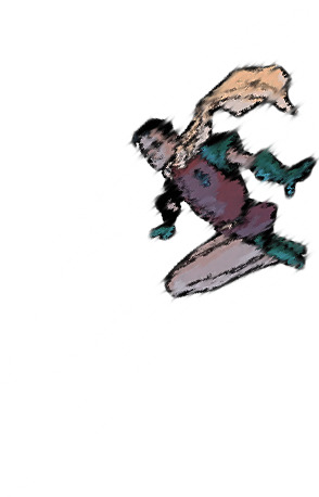
we'll start with this guy, because he's a favorite of mine and showcases a lot of the steps that i usually have to do:

tools you'll need: photoshop CS6; digital versions of the comics you'd like to edit.
(i assume you can use any version of photoshop or any editor capable of creating gifs, but CS6 is my preference. photopea is a fantastic free alternative, but figuring out timing and transitions is a lot harder there and requires more effort.)
step one: find your panels and elements
it's worth noting here that i cannot - and i mean this - cannot draw. at all. a lot of my life would be easier if i could, but here we stand. as such, nearly every element of these gifs is pulled from the comics themselves.
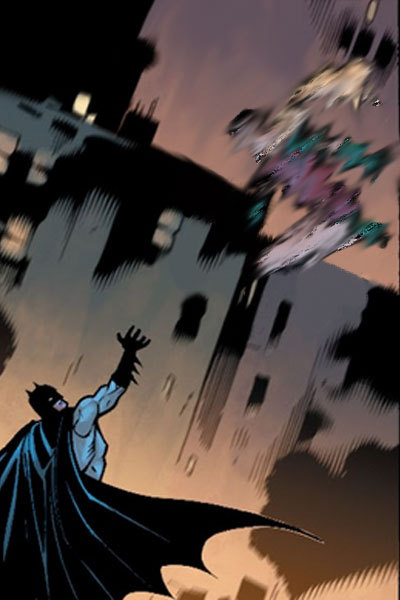
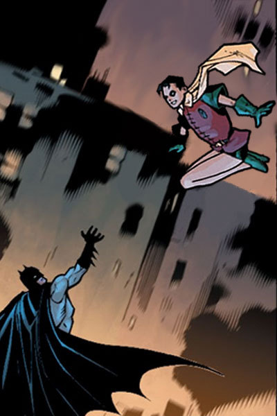
for this particular gif, which is admittedly on the simpler side, i needed two things: the initial panel, of jason leaping into the air, and a still image of jason as robin. preferably from the same run with the same artist, because that way, the art matches. i found these:

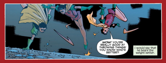
and that's all i needed for this one. sometimes i need to pull several panels for the vibe i want, or for specific things -- leaves to drift through the frame, magical elements, text and sound effects, speech bubbles, etc -- but adding those in follows pretty much the same processes either way.
step two: prep them!
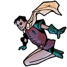
easier said than done, really. what i needed to do here was make myself a blank canvas around the elements that i would be messing with. this varies from project to project, but for this one, it goes as follows: remove the narration box and jason from the first panel; create an isolated version of jason that can be pasted back in; create an isolated version of robin that can be pasted in the same place at a similar angle.
this is a lengthy process, because i work off my laptop and have a touchpad and no artistic skills. here, it requires drawing in a lot of building and making a successfully blurry, ombre sky. and, because robin!jason's toes are cut off, i have to draw those in and try to match the shading.
(there's also some work here with color balance and photo filters to match coloration; i had to add some highlighting and change the colors on robin!jason a bit to match the background lighting of the overall image, but not by much. sometimes, this step is more involved.)
after some fiddling, i usually end up with things i'm happy with. for this gif, those are as follows:


(this is done through the blur tool, the magic wand selection tool, refining the edges of a selection, or -- in many cases, because comic lineart is my enemy - erasing every pixel of the background or character by hand. yes, there are easier ways to do this, but i like my time-consuming methodologies. they're soothing to me.)
and now we're ready for the fun parts.
part three: assembly!
so we take that background we just made and we paste hood!jason back on it on a new layer. silly that we have to, but yknow. it's fine. he's in there. and now the goal is to find a way to successfully transition from hood!jason to robin!jason in a way that's satisfactory.
i follow a lot of standard gifmaking practices, i feel like? but i'm also self-taught, so i actually don't know how true that is. i create a timeline in photoshop and set it to have a delay of about 0.2 seconds to start with, just to see how the transitions go. i usually start with 10 frames, and then add or remove depending on what seems right.
(the variations here can be broad, by the way. i have a green arrow gif with 140 frames with no delay and a wonder woman gif with six frames on a one-second delay, for example, but those are for another time. starting with 0.2 seconds' delay across 10 frames is just a comfortable starting place for me, is my point.)
this is what the timeline looks like for this project:
(it's that bar at the bottom. you can see the settings and all that as they appear in the final product: 0.1 second delay over 12 frames, so not too far off from my default. nice.)
operating within that 10-12 frame range, i mess around with photo filters and the blur tool to both make hood!jason disappear and make robin!jason appear. this involved a heavy use of the "accented strokes" setting in the filter gallery and smudging and blurring until they looked how i wanted them to, which is to say, rather silly.
here's red hood vanishing:


and here's robin appearing:

there are a few additional versions of these, but i think you get the idea. these are all the bits and bobs, and i just have to lay them out in the timeline in order to get the transition as i'd like it to be.
so i start with jason as hood, and then i move through the timeline and click and unclick the little eye to view them. this is also a heavy process; this gif has about twenty layers, and i'm revealing/hiding each one individually. that is actually not as bad as it could be; one of the poison ivy gifs i've published has about 600 layers that i did that with, and i have a green arrow gif with about 800 layers and 70 frames that i didn't even end up publishing because i wasn't happy with it. c'est la vie.
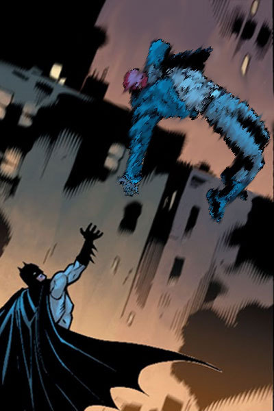
the end product should look something like this:


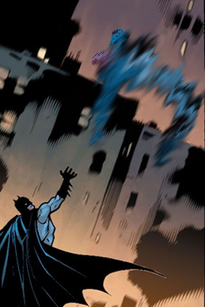


which, when played at 0.1 second delay and looped, looks like this:
part four: in conclusion...
i recognize this "guide" is messy and skips over quite a bit, but that's because every gif really is its own beast. i am very familiar with trial and error, and with trashing things that don't end up working out. each gifset takes me about 10-12 hours, depending on complexity, without even counting the time to track down panels or read the comics themselves.
if you want to start with something simple, i suggest animating text bubbles. all you have to do for those is erase them from the background and then drop them back in over the top for about 0.5 or 01 seconds apiece for readability. this gif of mia, for example, was just isolating her from her background, creating a new background from a different panel, and then flipping the text on and off. it's got five frames on a 0.5-second delay.
basically... fuck around and find out. a lot. once you know how the gif timeline works and how to hide/reveal layers, the world is your oyster, because that's all this is.
again, i know this is messy and all over the place, but i hope it helps! have a little fun with it, and don't be afraid to mess up. it's fun either way. <3
#tbanimations#how to#ask.tb#elioherondale#i am always down to talk about how these got made so if there's a more specific one you had in mind...#feel free to ask about it#i am an open book i like discussing the things i make
9 notes
·
View notes
Text
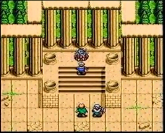
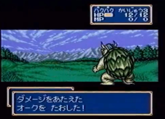
Shining Force 2 Pre-release Coverage
Post on the first game here
Let’s continue our deep dive on old magazines. Again most of my info here are from the Beep! Megadrive magazine, but I did manage to find some footage from old Sega videos as well.
For context again, the game released in Japan on October 1993.
June 1993
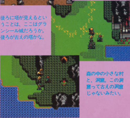
Unlike the first game, which showed very few regions during pre release, this one is eager to show a bunch of new places, probably because it can’t generate hype about a unique battle system anymore. Bowie and a parade of peculiar placeholders take a good tour around the continent.
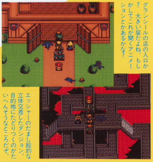
Save for the wall decoration and possibly the colors, it’s hard to judge on print, New Granseal’s castle is pretty much the final version. Same for Arc Valley's escher-like dungeon, as the magazine puts it.
Volcanon’s shrine is also here, and the magazine claims to have seen “a huge monster” on the top of the shrine, so Volcanon is likely already there as well. They wonder if it could be a boss but I think it’s just baseless speculation since it’s clearly not a battle scene, and little story was revealed at this point.
The monument looks wack, the shop signs are huge, and doors are different, but otherwise Hassan looks very close to the final version.
Bedoe is dark, that particular torch is also not in the final version, although there are torches in the town. Would be a pain in the ass to navigate, but might be just a test of the dark effect.
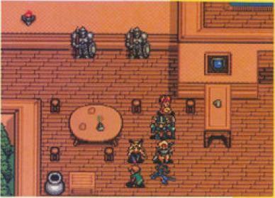
HQ already has the same vibe, but lots of different details, like different tables, cups and flowers vases on them, no stone walls, etc.
But enough of that, let’s stop pretending the Placeholder Force isn’t the wackiest and most amusing thing in these screenshots. What do we have there.
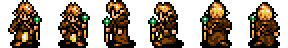
Bowie seems mostly complete, which makes sense as I’ll show in a second that his design was already announced. There are still a couple differences though, his clothes are blue instead of white and his cape has a golden line. His design might have been quickly revised at some point?
There’s a bunny girl NPC. Because of course the first thing these devs hopped to make was a bunny girl NPC. I’m actually more shocked that they did not keep her. Also I’m saying NPC with some certainty because as you can see comparing with Bowie, playable characters tend to have one less pixel between the eyes. So I don’t think she’s a scrapped character or anything.
Mae is here! Because of course it makes sense to use a character from the previous game as placeholder. As opposed to, you know, drawing a whole bunny girl. Her lower body was recolored to orange/yellow for some reason though.
There’s a wyvern sprite that does make it to the final game as an enemy. Curiously that shot of New Granseal shows more wyverns flying around as well. It makes no sense to use flying placeholders for the soldiers that should be there, so I wonder if there were supposed to be birds flying in the scenario or something, it would be neat.
There’s a cute little girl NPC with twintails who sadly didn’t make it. I don’t have anything to say about this.
Finally, true nerds like me fans of this blog will have certainly recognized the warrior sprite as an unused sprite from the first game:
From the side however, it was clearly edited, the helmet losing detail, getting shorter horns, and the whole guy getting shorter as well. My theory is that this guy was on the process of becoming this:

and maybe later Jaha, as this NPC is already very similar to him, and his design was already announced as well. In fact, that’s what we’ll talk about next. Besides these screenshots, there are four characters introduced in this article.
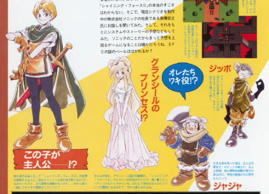
This kid is the protagonist!?
He is the protagonist who will represent you and travel through the world of Shining Force II. It seems he lives in the castle town of Granseal, but has no adventuring experience yet. From here on the both of you will have an exciting journey together!
The princess of Granseal!?
The princess of the country of Granseal, where the protagonist lives. She seems to be the main female character for Shining Force II. Her long hair and beautiful dress are nice. How will she get involved with the protagonist? We look forward to see it.
Jaha
“We’re the side characters!?“
Wielding a huge axe, he’s a bad influence for the protagonist, and a hobbit warrior. Just like the protagonist, he’s still in training and has no adventuring experience. Really bad at studying in school.
Slade
The greatest thief in Granseal. He shares the stolen treasures with poor people. Clearly a kind of Nezumi Kozo.
As the link above says, Nezumi Kozo (rat brat) is the nickname of a japanese thief who later became a kind of Robin Hood-esque folk hero as it was assumed he helped the poor as well with his crimes, and also apparently never hurt a victim. There’s an obvious inspiration here.
Producer Hiroyuki Takakashi doesn’t reveal much of the story at this point, only that it will be a different continent than the first game, and also have more events happening one after another unlike SF. He also says that there would be battles different than the army vs. army setting of SF. There are also talks of how certain details of the system and graphics were being reworked, and already talks of being able to choose between promotions, but it’s all very vague.
Later in this month, a demonstration of the game was presented at the Tokyo Toy Show. I couldn’t confirm it as there doesn’t seem to be a recording of it anywhere, but it’s likely a lot of the footage from here on is from that.
July 1993
Article opens up with an interview with the Takahashi brothers, but there’s not much to note. They mention being in the point of writing the game’s ending, and when asked about the presence of robots and such in the previous game, mention that while the Ancients are always a part of the Shining Series since SitD, this game would lean more into the fantasy vibes.
Also, up to this point, they had been working on both SF2 and Gaiden 2 at the same time. Gaiden 3 released in early July so from here on they’re free to focus on SF2. Or maybe not, because there’s already talks of a Gaiden 3 being planned. For better and for worse, these people could not stand still a second.
(To digress a bit, it’s also peculiar because the Final Conflict strategy guide mentions the game was originally planned for the Mega Drive. The Gaiden series was a Game Gear thing, so perhaps there was a whole different game being considered at this point which got shelved to make way for Final Conflict.)
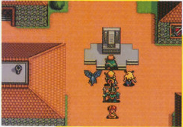
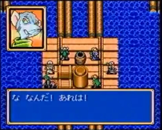
Back to the topic, we get a few more screenshots with the Placeholder Force.
Most places seen like the final version, but this house/village in front of the ancient shrine was removed.
We then get pictures of what is likely a later build with more familiar characters being worked on.
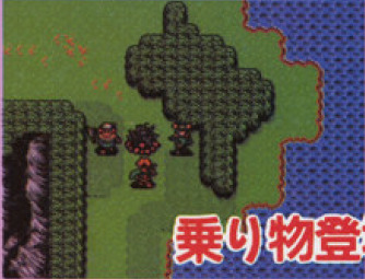
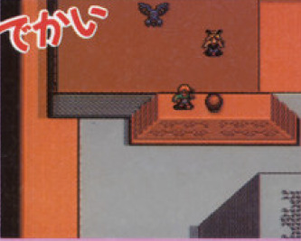
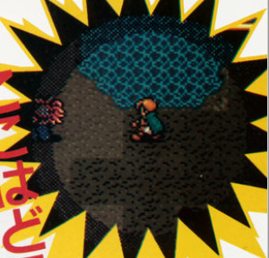
The Caravan debuts, and we also finally get the first battle scenes.
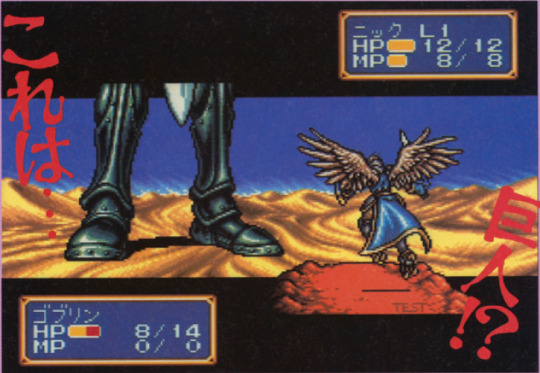
Taros is already here as the most eye-catching part for the 90′s kids. I on the other hand am loving a lot more how the platform neatly informs you it is a test only. The UI also does not show the character’s class, even though it will in the final version.
And Luke is here! Except maybe not. His name onscreen says Nick. Obviously this could be an issue of them using the rename cheat, but that doesn’t happen for any other character in these pre release footages, and would be a bizarre move. It’s possibly a placeholder name derived from Sonic Co., (like Max is likely derived from Climax Entertainment, now you know). The interesting thing is that this sprite and its palettes in the final game don’t quite match Luke nor Skreech’s design, and Luke is also the only character to not get a sprite change upon promotion, so it’s easy to believe that was some delay or complication in finalizing these guys.
We also get a look at the Grans-Parmecia Shrine map, which is very much done as well. The monsters on the top however is frustrating me to no end because they look very familiar but I can’t remember where from. Anyway, definitely didn’t make it to this game at least.
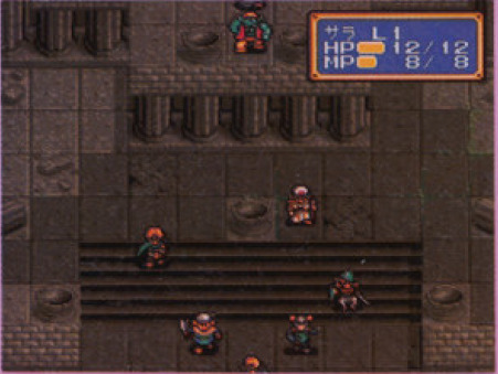
We also get our first look at Sarah and Kazin, except Kazin is so cut off on this screen it’s not worth mentioning him now, there will be plenty of time to talk about Kazin later. Sarah on the other hand is easy to see, and she’s clearly not herself yet. Her outfit is what will become hers and Karna’s vicar outfit in the final version, but she also has a hat, which only the vicar battle sprite will have in the end.
It’s okay, she’s an important character so i’m sure they will sort this out in a timely manner. Anyway! We do see someone else there who is also from the starting gang and with a complete design. Chester’s design is indeed announced at this point, though with little character info. There’s also a small synopsis of the story by now, which is basically “Slade steals a treasure in the shrine and bad stuff begins to happen”. We then get a map of Parmecia.
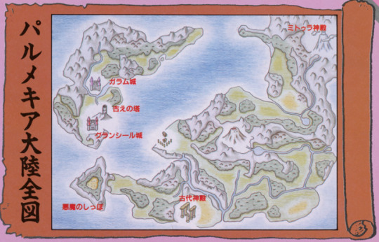
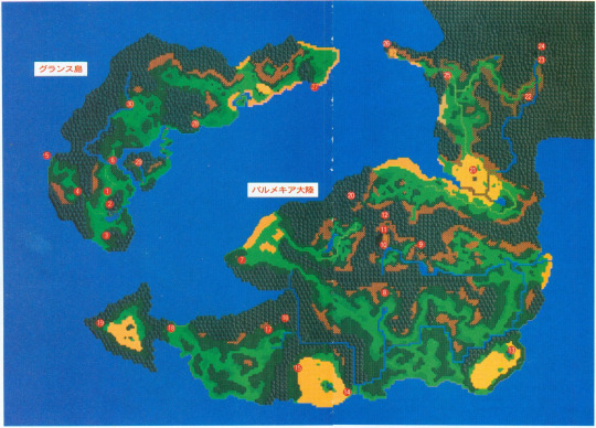
I don’t think I’ve posted an official map of Parmecia before, so here it is for comparison. They do look pretty much the same already. Volcanon’s shrine is weirdly not marked in the map, but is mentioned in the text. Lemon and Creed’s names are mentioned as well.
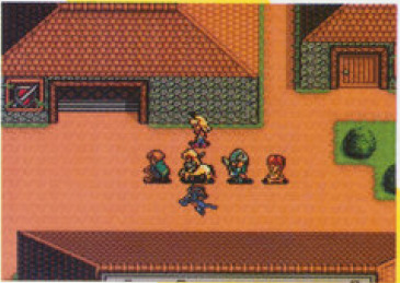
August 1993
The article of this month explicitly mentions the Tokyo Toy Show so that’s nice for reference. While I couldn’t confirm it, by comparing the footage I also think this Sega video (the Shining Force part starts at the 6 minute mark) is from the same month, so I’ll be using footage from there as well.
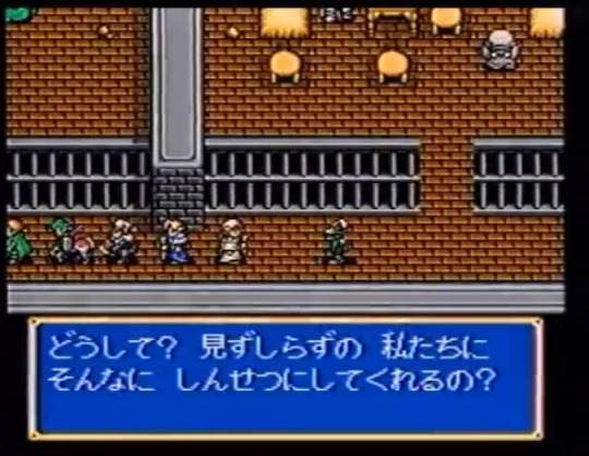
The demo showed an early version of the jail cutscene with Slade. While the dialogue seems to be same as the final version, Sarah does not have her portrait nor her final sprite yet, and the other characters seem to be just following Bowie in line as opposed to having their own places in the cutscene. The old man NPC also has different colors, and there seems to be someone else in the room.
If you watch further in the footage you’ll see everyone keeps following Bowie, even hilariously clipping through walls at points. I’ve joked about it before but turns out I was right, they did put some good effort into coding the followers’ movement, because they might have intended to use it more, if not through the whole game.
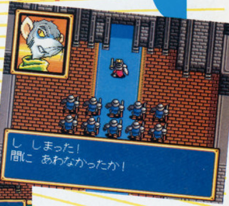
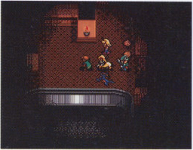
Lemon’s sprite was not done at the time, and the event of the Galam army’s departure was likely simplified since the final version involves not only Lemon, but the king as well, who seems to have no placeholder here.

The Caravan scene is also shown, although using the dwarf village theme, and having Jaha instead of Peter. Given that it’s just one character as opposed to the big team you would have at this point, it’s possible he’s just standing in for Peter and not actually intended to be in the scene. The next one raises further questions though.
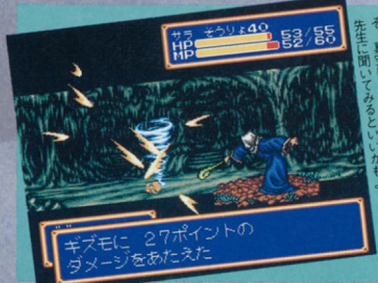
The Kraken scene is also shown, and the whole starting team is here. Slade’s text is very much in same vein as Oddler’s in the final version, warning everyone of the Kraken’s appearance, but it’s still different text, as Oddler speaks more politely, so this version was written for Slade himself, no placeholding.
It deeply hurts my heart to consider Slade was supposed to have a bigger role and got scrapped, though I feel I know why this happened. This series really likes to take its gameplay deaths seriously for some reason, and it would probably be too costly to constantly check which characters are alive and have alternate versions of a cutscene to adjust for that. That’s why the first game mostly has just Nova talking (though characters still show up for the ending at least). The Gaiden games go around this a bit more by reviving everyone at the start of every chapter and on endings, and also using characters who just joined the force in the cutscenes as they can’t have died already.
This game made Peter and Lemon, two immortal characters who carry most of the conversations from the moment they join alongside Astral. It also seems to delay some characters joining as playable characters for this reason. For example, Kazin is not playable through the path to Hawel’s house even though he’s following you, because he has to be alive for the cutscene there. Pretty much every instance of a character following you instead of joining the force seems to be because of this.
There are a few instances that show they might have considered other approaches though. There are numerous instances at the start of the game where characters revive automatically, since there’s a lot of dialogue with them. After the first battle, before the jail scene, upon leaving Grans Island, and during the one year timeskip. Of course, they all resurrect during the time Princess Elis is asleep in the ending as well. There’s also as far as I remember a single instance where you must have a particular character alive to progress, if Elric is dead he won’t open the passage to Creed’s mansion.
Of course, they might have felt that characters would have to be constantly revived for do more scenes with that, and it would ruin their game design, and it’s not intuitive to know that you must revive a particular someone to proceed, so they might just have scrapped this kind of plot. Still sucks given that it’s kind of a self imposed limitation, plenty of games just treat defeat in battle as different to death and let the characters take part in the story as needed. But alas, back on topic.
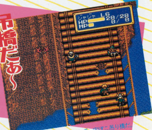
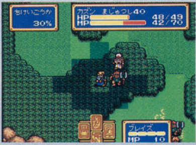
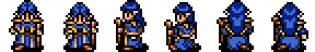
Plenty of other battle maps are shown, albeit with different enemies and different stats. A very minor detail is that the golem sprite has red eyes. In the final version they have green eyes except for Claude.
Sorcerer spells are in, although they don’t seem to be fully implemented yet, in the footage Kazin uses them through the attack command as opposed to an actual spell. Perhaps because of that it is also single target.
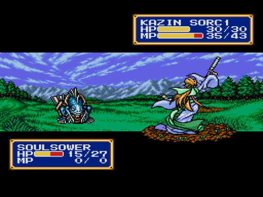
Speaking of Kazin, I did say we have to talk about him, now’s the time.
His sprite seems to be much like the final one, but blue. It is possible there are small differences though, because his staff, not in the final version, seems to use at least three colors besides black and white, when all final weapons in the game use only two. This is because the game loads the character and weapon colors into a single 16 color palette, so to have more colors in one you sacrifice colors of the other. Weapons in the first game did have three colors so this might be a leftover.
Small details for big nerds though, as I said the design is pretty much complete, including details like the bag and the feathers he carries around, which are less generic than I’d expect for a placeholder. Perhaps he already had a tentative design floating around.
More than that, the map sprite seen in all these pictures did make it to the final game. As his sorcerer sprite.
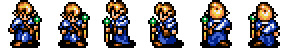
It looks nothing like the sorcerer design, so it’s easy to accept it was designed for something else. Let’s compare with the final mage sprite.
Hair changed to be spiky, but everything else is basically the same, including the green staff which matches his final artwork. It’s likely he had some concept art already around, though it wasn’t officially revealed so perhaps there was some intention of changing it. But it’s noticeable that he shows up in plenty of footage while nothing is seen of Sarah, who is not finalized either. He was at least further in the development.
The color thing is also interesting. Kazin does get to be blue as sorcerer, and also as wizard... in the map, and the game’s cover, a rare case of official illustration of a promotion. In battle however his sprite is brown. That palette, though? Is the last one set for the wizard sprite, even though he should be the first wizard. And the first palette for it? That’s right, blue. In the final version it is used for Chaz, who does have the exact same clothes but is the last wizard in the game. It would not surprise me if there was a swap at some point. And of course it makes sense to not use two blue palettes for the same sprite. The question is, why design the characters with the same colors then? I would love to get an answer.
September 1993
Signs of progress, every picture is this article is from a different build, since character classes now show up in the UI.
Sarah still does not have her map sprite.
Her battle sprite and finished design do finally show up in the next pages though, so they might have just not got to it at the time, even if it feels silly to me as map sprites are simpler, perhaps exactly because of that they weren’t top priority. Either way, it just feels wild to me when compared to how Chester and Jaha and even Kazin seem to have been done.
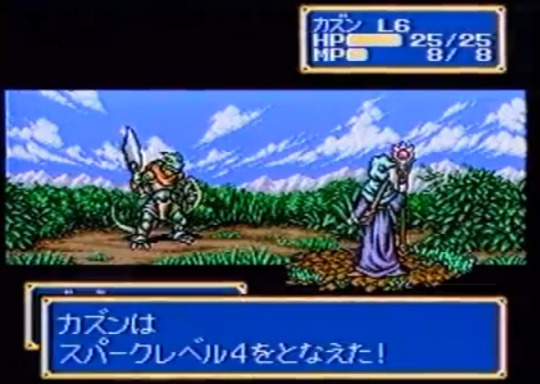
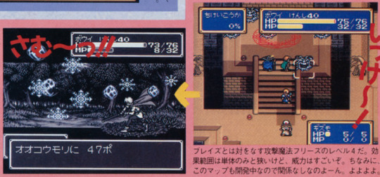
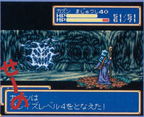
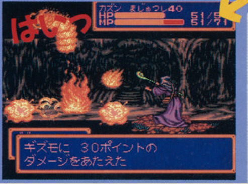
As for the actual point of the picture, that’s Bowie casting Freeze level 4. Normally I’d chalk this up to debugging shenanigans, as the first game and Gaiden I as well give the heroes extra spells in debug mode, but, that generally also comes with jacked stats including 99 MP. Bowie here is at max unpromoted level but his stats look normal.
For further consideration here’s another screenshot of him at level 4 knowing Egress and Blaze level 1. Everyone’s stats look normal so this looks like his actual intended progression. Also while drafting this post and having it blasted to oblivion because tumblr can’t save properly apparently, I realized this explains a bit of the wackiness when it comes to magic progression in this game. Did you know that the Kraken is weak to ice? Have fun trying to exploit that weakness. In the final game, you go a big stretch of the game without access to Freeze. If you promote Kazin to wizard and don’t pick Tyrin at Creed’s, you’re basically locked out of ice spells for most of the game, until you finally find Chaz. That always struck me as very weird, and I’m realizing now it might be because they might have stuck with magical Bowie here for a good time, and didn’t rebalance things when changing it.
Sarah debuts with a proper sprite for once.
Blue Kazin however remains undeterred. You might also notice his staff is switching colors weirdly during animation. I’ve had this problem on my first hacking attempts of the game due to not setting up proper Mega Drive colors, and it’s amusing me to no end that it happened to the actual devs as well. Though I don’t know that much on how animations are done so the problem might have a different origin as well. Anyway, fun.
We also get to see Kazin’s full spell list, and while mostly the same, he has the Attack spell instead of Desoul, much like Tao was the only wizard to have it in the first game. In the final version, only Frayja learns this spell, making this the only classic Shining Force game where it is a priest spell instead of a mage one, so it doesn’t surprise me at all that Kazin was meant to have it.
It’s also worth noting that in the final game, Kazin is the only character who learns Desoul. Either the spell wasn’t in (the article mentions every other wizard and priest spell except for it), or someone else was meant to learn it, or they hadn’t even planned that far ahead.
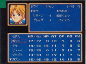
We get our first character bios in a long time.
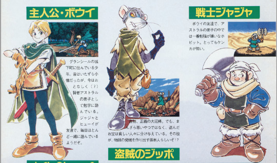
Protagonist - Bowie
A boy who lives in the castle town of Granseal. He used to be a mischievous boy, but nowadays is well behaved (?) and studying hard as Astral’s pupil. He’s friends with Jaha and Chester, and they play together almost every day.
The thief Slade
The self proclaimed great thief of justice. But he’s not much of a bad guy, and shares his stolen treasures with poor people. He seems to main culprit behind the story’s beginning!?
Warrior Jaha
Bowie’s friend, and a hobbit who hates studying the most out of all of Astral’s pupils. Really strong in battle.
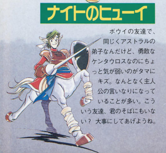
The knight Chester
Bowie’s friend, and another pupil of Astral’s, but while he’s a gallant centaur, his one flaw is that he’s not very assertive. He often comes up as just a yes-man to Bowie. Don’t you have friends like that too? Treat him well.
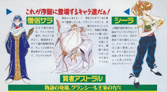
Priest Sarah
An elf girl and also Astral’s pupil. She’s helpful and likes taking care of others, being kind of a big sister to Bowie and the others. Pulling out that sisterly authority at times, she might be kind of annoying?
Sometimes I wonder if Sarah went through some kind of rewrite during development since none of her official descriptions bring up her being the actual mischievous kid who plans to sneak into the castle and is not even apologetic about it, but then I remember that this series is uhhhh, ah, erm, oof, hmmmm, about women, so yeah, I don’t think that’s what’s going on here.
Sage Astral
Currently retired, he has now taken Bowie and the other kids as pupils. He’s also a notable person who knows the king personally. At the story’s beginning, he berates these troublesome kids while also giving them a chance to go on the adventure.
Sheela
A mysterious and beautiful human girl. She used to train under Astral, but left for some reason. While she doesn’t have much relation with the story, we look forward to see just how will she and Bowie meet. She’s quite sexy!!
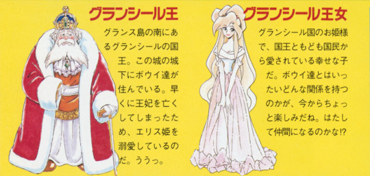
King Granseal
King of the country of Granseal at the south of Grans Island. Bowie and the others live in its castle town. Because the queen passed away too soon, he dotes a lot on Princess Elis. Ooh.
Princess Granseal
The princess of Granseal, she’s a happy girl loved by the king and her people. We’re quite curious to know how she’ll be connected to the heroes. Maybe in the end she’ll be a party member!?
OOF
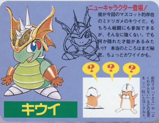
Kiwi
A new character appears!
The green turtle Kiwi is the mascot-like character this time. Of course he can take part in battles, but he’s not very strong. But he seems to hide some special talent!? What exactly is still a secret for now. He’s kind of cute, maybe.
-The previous game had Yogurt, of famous sayings (?) like “do you like my helmet” and “I don’t get it”.
After the magazine, we get more Sega footage (starts around the 4:45 mark).
The intro seems pretty much done, except for a Gizmo attacking the king instead of Geshp. And it’s easy to think “oh it’s a placeholder”, but in the final version the king is really possessed by a Gizmo and Geshp doesn’t show up until much later, so I’m not sure? It’s not a very important change at least.
Sarah finally has her final sprite and portrait, so this is a different build. This does mean I can finally go bully the final graphics of this game a bit more.
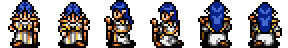
Sarah’s final priest sprite is not based on her artwork, and is instead just a recolor of the vicar spritesheet, which as I mentioned, is from the placeholder sprite we’ve seen all this time. You can even notice some leftover grey shading that doesn’t quite fit with the blue. Compare it with Blue Kazin’s robes that I’ve posted earlier, which use only the two shades of blue in the palette.
This sprite was a massive rush job, is what I’m saying. A lot of map sprites in this game feel the same, learning how to edit graphics is both a blessing and a curse because you can’t unsee these things.
This footage shows up a lot of final battle sprites not seen until now, especially promotions, like Wolf Baron Gerhalt, Hero Bowie, and so on. I find it hilarious that it also brings up Kiwi when everywhere else they were trying to be coy about Kiwi’s promotion.
The weird thing though, is that the footage ends with the sorcerer spell display from the old builds. Did they not have footage of the final sorcerer graphics? Likely. Let’s bully the final graphics some more.
No fingers! Misplaced weapon! His ass was not designed in a sane and timely fashion!
So yes it is fully possible that the sorcerer sprite was not done even as the game was already like halfway through the door.
The funniest part? In this later build footage we only get a vague glimpse of Kazin.
I’m sorry the screenshot is horrible since it goes by fast, but that’s Blue Kazin.
Of course, most characters in the scene seem to be promoted, even special promotions like Brass Gunner Elric. At the same time May and Slade remain unpromoted. So is this Blue Kazin already repurposed as the sorcerer sprite? Or is the mage sprite still not done?
We might never know the truth, but the fact is that the pre release coverage ends here, and we didn’t get a single glimpse of his final artwork. In a sense he might have been a bigger mess than Sarah.
I have more to write but tumblr has already messed up this draft four to five times and I’m tired, so I’m splitting this into two posts even though i didn’t want it just to see if the problem is post size.
#shining force#shining force 2#shining series#sf2 bowie#sf2 jippo slade#sf2 jaha#sf2 huey chester#sf2 kazin#sf2 sarah#this was fun to research but tumblr is making me want to kill something very hard not gonna lie
11 notes
·
View notes
Note
Hey, Can I ask how you edit your gameplay pics? I am a mac user and my ss' are bad and I struggle so hard cause I've never used photoshop before starting a simblr and I can't use reshades to assist me :\
I'd really appreciate any help esp how you blur the backgrounds and make everything look so pretty. TYSM
hi! thanks so much for the compliment!
this is specifically for gameplay posts, but what I do in ps is pretty much using actions then I play around with those settings.
here's a not so little tutorial for you:
here are some actions I've downloaded and use:
smooth by earlygrape // perfect for smoothing out pictures
avonlea // another action that's good for smoothing out pictures, you need topaz clean for 2 of them, but the other 2 you don't (like smooth sharp -- use that one)
sonder by intramoon // these actions will change the color of your pictures and there's a lot of options! it might be a little advanced but these will give you a chance to play around with the style of your pictures once you're more comfortable
sunbloom by fairyfang // these are old but I used them when I was first starting to edit posts myself and they're good to use when playing around and getting the hang of using actions, these are other actions you can play with to change the color/overall vibe of your pictures
how to load actions: you load actions by locating 3 tiny lines on the top right hand of your actions window then drop down to load actions. this will open up finder so you can select the files. the files will have the title.atn, select that and they'll load into photoshop
where to find actions in ps: you find actions by going to window > then select actions, it should be the 2nd one listed after 3D. a little box will pop up and once you have loaded some actions, that's where they will be
how to use the actions: so you downloaded, you located them in ps, now its time to use them. how you do this is by finding the one you want to use > selecting the folder > pick a specific one > then at the bottom of the actions tab will be a little triangle, click that & you will have used the action. it'll either be added on top of your picture in a new layer as a folder, or it'll just change the picture.
tiny tip: if you don't like how it changed your picture, there's a tab called history that you can go to and delete what you did
another tip: it helps to just always make a new layer or copy a layer bc if you make a mistake it's easier to locate where the action started or you can just delete the layer and start over. to copy, it's command+j, for a new layer there's a little + inside of a box at the bottom of your 'layers' window. if you don't have a layers window, you can also find that in window >layers
that's pretty much the basics for actions, now onto blurring:
for starters, there should be a little tool bar on the left side of your screen (that's where mine is) you'll know it's the tool bar bc it'll have a little + with arrows on each corner, a dashed box, a lasso, a magic wand, etc. the tool bar has what you need to begin the blurring background process.
there are multiple ways to blur backgrounds but here's my basic version: right click the magic wand > select quick selection tool.
like in sims, you can make the brush bigger and smaller with [] depending on how big the area that you want to blur is.
then go over the area you want to blur, it'll have the moving dashes around the area once its selected. now go to filter > blur > lens blur (or any other selection you want to play with) > then go to radius & adjust the number to make your selection more blurred or less blurred > hit ok & you're done!
that's pretty much the basics, so I hope this helped! please feel free to reach out again if you need clarity or more help or send me a little chat! ♥️
14 notes
·
View notes
Text
2022 Creator’s Self-Love Extravaganza
Rules: It’s time to love yourselves! Choose your 5 favorite works (fics, art, edits, etc.) you’ve created this year and link them below to reflect on the amazing things you’ve brought into the world in 2022. If you don’t have five published works, that’s fine! Include ideas/drafts/whatever you like that you’ve worked on/thought about, and talk a little about them instead! Remember, this is all about self-love and positive enthusiasm, so fuck the rules if you need to. Have fun, and tag as many fellow creators as you like so they can share the love!
Tagged by @bubblesthemonsterartist tho I daresay I am fashionably late at this point, more than two weeks into the new year. Did I forget? Maaaaybe. Which brings us right to the main problem;
I barely remember. Like. 2022. At all. Things happened, I’m sure, but it’s as if there’s a fine layer of mist atop my memories, stopping me from really seeing them. Last year wasn’t really very kind to me. For every up, three downs followed, and between two failed surgeries, a bout of covid, and then whatever the hell kind of flare happened in the autumn… yeah. Idek. It is what it is.
As such, I can’t really comment on my art as like, a whole process, this year. It just existed in the ‘now’, which is presently the ‘then’. I know I beat my submission record from last year, but it felt like a meaningless victory. Despite everything, I can feel it in my hand now, when I draw, that some progress has been made. Subconsciously perhaps, but it’s there.
Onto the ranking then! (I just had to pull up the archive cuz fuck if I remember what I posted, and when)
1.
*deep sigh* we all saw this coming, didn’t we? As much as I love, I curse this image, for in hindsight it felt as if all my creative energy for the entire damned year went into this one piece! Like how dare! But yes it is one of my best redraws ever, and more so than the characters, I feel like I added to the background something even better than the original. There, I said it.
2.
Omigod this entire thiiiiiing. Were it not for the redraw, this would be the top spot. I can’t explain, so many ideas are left in the brain for countless hours, days, months, YEARS. This was two years in the making, and never before did I manage to recreate something that had the exact same vibe as it looked in my imagination. Especially because I’m not a comic creator, hashtag compulsive disclaimer lol. Also while I was drawing it, seeing people go from “hmmm what’s this?” to “wait is that-?” and then “ooooooh it is the lead-up to The Thing” was priceless.
3.
A last-second outlier comes in third. I admit to making this in a hurry, just to have something really nice to show for december (a month which is usually a highly productive month to me, but 2022 didn’t let me have that either) and as such, since I was struggling, both with a deadline, and a lack of real inspiration, I feel like. I managed to improve, somehow. Call it magic, but this looks noticeably different to many of my other colored pieces.
4.
To be perfectly honest, this was a sketch. People might not think it one, for it has details, a color scheme, and even effects - but at the time I posted it, this was just a colorized sketch in my mind. Tumblr disagreed. And I was left in awe watching this first get reblogged within the fandom, then beyond, then go through a hanfu appreciation blog, and finally reblogged with a truly tender chinese poem attached that said person felt gave them the same vibe as what I had drawn. The people spoke, and I was both awed and humbled, and I learned a valuable lesson in humanity relating to art.
5.
Unlike the others, this was a conscious attempt at something different. I can’t really say why it should go in the fifth spot, but it does; i spent a lot more time than usual on composition, colors, and most importantly, mood setting. And putting characters so solidly into the middleground can be a challenge in itself for me, as I run the risk of getting storybook-ish. Which would’ve been disastrous for a scene like this.
Honorable mention;
Coping through art. @bubblesthemonsterartist has the honor of inspiring this, or like, being the one to “give me” the go-ahead to channel some of my experiences through the characters and story-telling in general. Back pain is something I know all too well, and it was well and truly therapeutic. I also got to do another test of “can I retell this scene, even if I switch part of the cast and premise?” And it seems I did. I will always remember @what-plant-metaphor-am-i ‘s tag; ‘# I feel like I just watched an entire episode XD’ <- never has my inner storyteller been more validated.
There, that wasn’t so hard! Sometimes I’m really thankful for the internet, and timestamps, and kicking my memory back into gear etc… anyway, since I am so woefully late to the party, I’m not tagging anyone specifically; if you wanna be fashionably late too, you know who tagged you~
12 notes
·
View notes
Text
jokest3r's Masterlist & Basic Info
Hiya ! Welcome to my main blog where I post art and talk about things I'm interested in or current "life" things but I really just post about the games I'm currently playing.
This is my one and only social as I don't like most social media beyond Tumblr. So if you see anyone that's saying they are me on any other platforms... (they are definitely not me /ᐠ.ᆽ.ᐟ \) This masterlist will update and be edited as new art is made or I create fics though most of my fics will only remain on AO3 or here though that will depend on their length ! Empty links will be updated as I post art, fics, etc. I will add more as time goes on. Thx for passing by !
Call of Duty
Matvey-Lukyan Volkov-Makarov ☀ :
Matvey's Ref Sheet & Short Bio , Psych Eval(+Ficlet) , OG Matvey
Classic Version : (New Hair Classic Look) , (Old Classic Matvey & Retired Older Info) , (Old Cute Recolor of Classic Matvey)
Tags : #cod oc: matvey-lukyan volkov-makarov , #oc: matvey-lukyan volkov-makarov
R.O.O.T. Days: Month One
Lobo : Lobo's Ref Sheet & Short Bio , Chibi Lobo
Mutual's OC's & Others OC's: Chibi Matvey & Jack , Fancy Meeting You Here(Matvey & Arjun) , Cousins in Arms(Matvey, Nikita, Kolya) , Valentine's-Day Card from Amara for Revnah
Personal Goal(s): New Banner !
Fandoms I am In in No Unique Order !
I decided to list them by (+) meaning I will post fanart of characters or more likely to and (++) for posting art of an oc or two ! Rest I might just talk about offhandedly if I'm playing them currently.
Call of Duty (Pretty Obvious.) (++)
COD Zombies (I've LOVED zombies since I was younger. A true Misty and Buried Stan(✿◠‿◠)) (+)
Fallout (I haven't posted art for the games in a very long time but that may change depending on when I get into a Fallout vibe again. Just don't ask me about Fallout 4. I will usually ONLY post about New Vegas but Fallout 3 every once and a while but usually to complain about game economy LOL.) (++)
Saints Row (++)
Silent Hill (I have an attachment to most of the characters so I may post fanart sooner or later !) (+)
Watch Dogs
Bioshock
Cyberpunk 2077 (+)
VTM/VTMB (++)
POSTAL (++)
TES: Skyrim (++)
I am into a variety of games but usually will only post art of these if not at all.
Also short disclaimer but not really ? I just think it's sorta important to know. I have OCD and like not ina joke sorta way, like diagnosed. And unfortunately, with Perfectionism OCD it makes it harder to post art. So I take breaks between fully rendered and colored pieces that usually last two-three days so I don't get burnout. But if I don't answer your ask very quickly sorry >.< I'm probably working on drawing it but it may take a bit longer to complete ! Same goes for any art trades I may do in the future.
Rules for Asks: If you're asking me anything specifically, please nothing uncomfortable or suggestive at all/ or related to my personal life. I think that's self-explanatory but just in case ! Though I'd be very happy to talk about the process I do when I make/made my OC's.
DO NOT REPOST MY ART !
1 note
·
View note
Note
omg advice on having a good theme i beg!!
AHHHHHHHHHDHSHDHS THIS IS SUCH A SWEET ASK STOP 😭😭 first of all im extremely thankful and flattered that you would come to ME for theme advice ☹️
I HOPE this post is helpful in some way, i'm trash at giving advice 🥲 keep in mind that this is all from my experience and this is all my opinion 🙌🙌
Honestly i dont have much to say. What i keep in mind for my themes is that i have to follow a certain style or a vibe. Like for example my current theme (and the themes i've had for the past.. idk how long) looks like a video game! Usually the ideas pop up in my head themselves, but there are times when i look for inspo on pinterest or simply search stuff up on google. Do not be afraid to look for inspiration and don't feel discouraged when your theme doesn't turn out the way you initially thought it would.
I also usually find it easier to focus on one part of my theme and put the most effort into it. Most of the time the most detailed parts of my themes are my pinned posts/navigations. Specifically, the parts where i introduce myself! Therefore, my thought process usually goes like this:
Choose a certain vibe (video game, magazine, diary, etc.)
Think of a way i could write a short about me in a way that would fit the style i'm going for.
This step is optional, sort of 😭 but if nothing pops up in my head i just search up "*insert something* character introduction/info". Like "video game character introduction" "diary character info". Having a visual example is always good. You don't have to necessarily copy it, but looking at different variations and piecing them together in your head definitely helps! That way you can come up with your own idea while using certain parts of certain images you found.
EDIT EDIT AND EDIT!!!
Personally for me, it takes extremely long to get something to look decent. I switch through different apps and ideas. Sometimes i take days to find what i like, and most of the time it looks completely different from how i wanted it to. Just know that you should take as many breaks as you'd like, take a few days if you want to! Looking at something with fresh eyes helps you see the "flaws" you couldn't see when you were frustrated and/or tired. Also helps you get new ideas as well, or interpret the idea you initially had in a completely different way! Delete everything and start from scratch if you want to. Experiment. Please just experiment, trust me. AND AND AND WATCH A LOT OF TUTORIALS !!! YDK THE AMOUNT OF STUFF U CAN DO WITH UR EDITING APP. ESP IBIS PAINT X. OH MY GOD.
The apps that i use are: ibis paint x (this is my main one frrr), picsart, canva, polarr. Also use the website ezgif to make the gifs, if i have to ofc! Trust, that website is a life saver if you don't have Photoshop (dw im broke too HELPP 😭😭)
I sometimes use capcut as well, then convert the video from mp4 to gif with the ezgif website. Literally promoting that website like my life depends on it, sponsor me :////// slash jay
Also, if you find pictures but want to adjust the colors, use polarr. Absolutely one of my top 3 editing apps, it has helped me a lot!
I've also seen a lot of people put far more effort into their headers instead of navigations, their themes look absolutely stunning as well! Some don't even have headers!
I think it's important to have that balance: having some simple parts and some detailed parts. I keep that in mind for my overall theme and also for the navigations as well. If you put a lot of detail into the header and the navi/pfp/whatever, it just becomes too much.
If you put a lot of detail into your about me part of the navi (if you are even planning to make an about me part), then you should keep the links more simple! If you're putting more details into the links and the way they're placed, the symbols and fonts you use, etc. then keep the about me + pics less complicated!
Themes don't have to be complicated for them to look good, you don't even have to use pictures in the pinned if you don't want to! You can just keep everything short and sweet. Sometimes simple themes are the best ones, if done well.
Also quick tip: I don't recommend using crazy fonts, it becomes harder to read if you overuse them.
1 note
·
View note
Text
Moving Image - Evaluation
So, the aim of the moving image project was to produce an at least 90 second video on our cameras or phones that is coherent and uses our researched camera techniques and movements.
The part of the project that I enjoyed the most was for sure the shooting as I found this fun, coming up with cool shots and having a relaxed shoot with someone I knew was fun. I also really liked the editing part as I could make the video look exactly how I had envisioned it.
New techniques I learnt were mostly in the editing process, I have previously edited videos but doing this refreshed and added to my skills. For example, I learnt how to put color grades on my videos and split clips. Something I’d like to develop further would be using my camera to get a better video quality, but I would firstly need to invest in a gimble as mine was not stable enough, so I had to use my I phone.
Researching different camera movements and techniques really helped me during the shooting and planning as I used my story board when I was shooting and had all my techniques for each shot written down, so I remembered to use them and the different ideas that I had come up with. I would have struggled to remember these without researching and writing them down on my story board. I remembered looking at the snickers advert and remembered the fast-cutting low angles and sequences that added interest to each scene.
As I’ve said I enjoyed the editing the most and cutting up the clips to go with my music and make sequences that looked cool and flowed well. I also liked using the music climax to suddenly show my product.
Some issued I encountered during this project were that the I movie editing software I was using was quite slow which made it frustrating to edited and this blocked some of my though process during the edit. It also added significantly to the amount of time I was taking to do basic tasks like cropping videos etc. However, this stopped lagging towards the end of the edit, and I managed to achieve my desired results. I think overall the video was a success and it really looks like your typical daisy perfume advert with the same vibes, look and fun feel.
0 notes
Text
Commission Information
I am typically working through a queue of commissions. I devote my attention to my current commission, so while I will be in close contact during the time when we are actively working together, I may not be in touch as quickly before then. Please be patient with me!
- - Commission Prices - - - - - - - - - - -
Baby Pokemon | $15+ (includes free egg design)
Pre-Evolutions | $20+
Dual-type Eeveelutions | $35+
In-Progress Evolutions (or redos) | $20 - $30 (one) | $30 - $40+ (two)
Mega Pokemon/Regional Forms | $30 - $40+
Your Fakemon | $30+ (one) | $45+ (two)
For others, just ask!
(I also take non-Pokemon commissions, I just don't post them here)
*All prices may vary depending on the complexity of the design and how much designing I need to do for you.
- - How does the commission process work? - - - - - - - - - - -
I require payment upfront, however, I only accept payment once I am ready to begin your commission. I use invoices to keep a record of our transaction. If for some reason I can’t finish your commission, the invoice serves as proof of our transaction and I’ll issue you refund (full or partial, depending).
You can be as involved as you would like in the commission process. Some people would like to be very involved with every step of the process, some people just want to see my take on something and want to be surprised with the final result - it is up to you.
After you share any drawn or written references with me, I will ask any questions I have, as well as general questions like: What pose would you like it to be in? What kind of character/attitude/vibe would like it to have?
If you would like to be involved in the process, I will start by creating a sketch based on the information you provide me, which I'll share with you for your feedback. I'll make any changes you'd like and can provide multiple edit options (within reason). Once you're satisfied with the sketch, I will do the final, clean linework and send you flat color options to choose from. You can mix and match colors, ask for new options, etc., until you've settled on the colors. After that, I will do the final shading and coloring and will send you the finished piece.
For backgrounds you can choose from any of my usual backgrounds designs.
For the information included in the post, I welcome you to supply as much or as little as you'd like. I can provide flavor text/dex information if you prefer.
Please note that if the commission features your own character or design, you will of course be credited for that, and I am happy to link to a source for people to check out.
- - Payment Process - - - - - - - - - - -
I will send you an invoice from PayPal, which you can pay through your PayPal account, or, if you don’t have one, with a credit or debit card. I will need an email address to send the invoice to.
- - Contact Me - - - - - - - - - - -
Email me: [email protected]
You can also send me an ask (off anon) or chat me on tumblr first :)
19 notes
·
View notes
Note
Rereading TBTP. Might be crying.
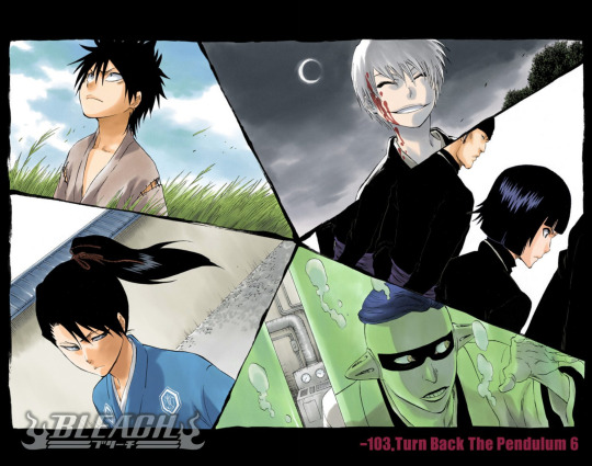
IT'S SO GOOD.
I love that we got a flashback arc, and learned so much about Soul Society in the process (tidbits about captain turnover, promotion ceremonies, Vizards pre-banishment, Den of Maggots, etc. I loved getting to learn more about the youthful origins of the above (+ Akon, Aizen, Tousen, Urahara, Yoruichi, Tessai, etc.). And Shinji and Aizen's dynamic(s) are just fascinating.
I haven't personally spent a lot of time thinking about the Vizard characters, but I adore this arc and I think its culmination is both heartbreaking and infuriating--especially since it was apparently so INTENSELY REDACTED from Soul Society's history (even at the level of Gotei 13 leadership) no one is allowed to speak of it and anyone who wasn't around during that time doesn't seem to know about it at all, even as a vague thing that happened? Right? Even though--not even getting into personal losses--it resulted in the condemnation of a whole swath of basically irreplaceable captains and some VCs and anyone worth anything in the Kidou Corps Kidou Corps leadership. At a point where they already didn't have a 10th captain! And then suddenly they're down another, what, four? Five?? SIX?! And this just never??? comes up?? Even after Aizen gets "killed" and there's some kind of ambiguous ryoka invasion afoot.
(On that note, I think it says a lot that even though the Ryoka special edition of the SC gets published, it says almost nothing about the nature of the defection/betrayal, or the whereabouts of Aizen, Tousen, and Ichimaru. Gotta luv the fictive semblance of freedom of the press and transparency of leadership!)
(It also makes me wonder how much history Byakuya knows as Kuchiki head that he just never bothers telling anyone else about. I have a deleted scene from the first Bleach fic I wrote where Ukitake and Hitsugaya do a history deep dive post-Aizen--Ukitake takes the Council of 46 library records and Hitsugaya gets permission from Byakuya to go through the Kuchiki records. And Byakuya is just like "Good. Someone else should also read them" but at no point does he 1) explain what he means by that, 2) offer an explanation of what he thinks is worth finding, or 3) assist, lol. But I ended up taking it out because Ukitake had already gotten his "ffs Byakuya, I know you're being less beneficial to my aims than I know you are capable of being" vibes from other scenes.)
Last summer when we learned that they'd e-published color versions of Bleach manga, we were like, "eh, it looks fine in BW"--but then I looked it up on AmazonJP and was like, oh heck this looks very nice. This is a whole new experience vs. grainy illicit scanlations. (Much love to scanlation teams, who are talented manifestations of divine intent, just like fansubbers. <3333)
So anyway, we went through this whole overinvolved rigamarole of making an AmazonJP account with a fake JP address and a VPN and the Kindle Apple App in order to buy Bleach カラー tankoubon.
The book I chose was TBTP (well, the first half of--because of course it's split across two separate books lmao rip), because it had a bunch of characters in it that I didn't/don't know that well, and I thought it would be fun to see how they interacted and what their dialogue was like in Japanese. I think mostly what I learned is that Shinji and Hiyori talk way too much because a lot of my translation notes are "idk some kansai shit" lololool but that was a lot of fun.
All told, extremely worthwhile ¥528, even though my credit union then flagged my account because it detected potential fraud because of an international purchase, and I had to go deal with them. XP
I mean look at these babies, these children:
These tiny, tiny feet abutting fresh entrails:
Look at the pain of dramatic irony:

The terrifying panic and sadness:


And then to be condemned to death??? For your service? Your sacrifice? As your reward for not dying outright while carrying out your ~sacred duty~ to the ~Soul Society~??? OKAAAAAY THEN.
Ugh, now I wanna reread the second half of TBTP and/or rewatch the whole sequence. ToT <3
#longpost no cut we die like tbtp kings#bleach tbtp#turn back the pendulum#vizards#soul society#bleach manga#bleach カラー
50 notes
·
View notes
Text
#showyourprocess
From planning to posting, share your process for making creative content!
To continue supporting content makers, this tag game is meant to show the entire process of making creative content: this can be for any creation.
RULES — When your work is tagged, show the process of its creation from planning to posting, then tag up to 5 people with a specific link to one of their creative works you’d like to see the process of. Use the tag #showyourprocess so we can find yours!
sabrina @lanwangiji, my love, tagged me to share my process of making this typography edit! check out her explanation of her the untamed edit and her edit tag.
1. PLANNING
i once opened lyrics edit requests so i can learn and practice typography. this edit was a request as well. i asked them which lyrics they wanted to have and the colors they’d like. since i got several requests and it was hard to keep tabs on them, i made a trello board so i could organize everything. i’m still using the trello board for every edit idea i have, the board makes my life easier.
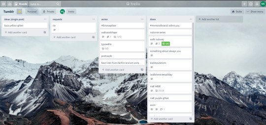

above is what i filled the card in the board with. basically just information of the requests.
1.1 INSPIRATION
once i got the request, my first thought was to find the vibe the song/lyrics exude. “it’s an old curse” screamed witchy vibes to me, so i went to pinterest to find some inspirations. at first i was looking for witchy poster designs and i came across this. i liked how it has smoke-ish graphic and i thought the smoke suited the “old curse” lyrics. and tbh pinterest is a rabbit hole, they gave me suggestions after suggestions, like this and this which became my inspiration for the color palette (i added the gold from those pics) and the sun moon design gave me the idea to incorporate space stuffs too. i somehow landed on this too, and because i wanted to include space theme, i made a simple phases of the moon. ultimately the hero of this edit was the lyrics, i didnt want the graphics took the center stage. i was inspired to make a crystal ball and do this kind of typography but after several trials i couldnt get the the typography right, so i scratched that idea and went with the space theme instead.
1.2 PICKING COLORS
after i was feeling inspired enough, i went looking for the right colors. i usually just type “color name” and “palette” on pinterest. example “dark grey color palette” and i chose the one i liked best. when the request only asked for 1 color, i always searched for either a complimentary or contrasting color to give it a jushz, to add sprinkles. that’s why i added gold on top of the dark grey.
1.3 FINDING FONTS
this is the hardest part. the fonts play important role to the design. they need to convey the vibes of the lyrics, in this case witchy/magic vibe. i needed to find fonts or font just as magical and a bit whimsical. tho i hoard fonts... i like to use new font for every typography edit lmao sue me.
i highly recommend going to creativemarket free goods site, pixelsurplus font freebies and behance to search for fonts. i always use 100% free fonts, that means i can use it personally as well as commercially. creativemarket gives me desktop license for the fonts, which means i can use it for commercial as well. the reason i do this because i want to open an etsy shop someday, and i want to have the right license when i sell my stuffs. i almost never buy fonts bc they are expensive lmao.
the fonts in used are “Vintage” for the main typograpy (i think i was a freebie from creativemarket) and “Morganite” for the title of the lyrics and the name of artist.
2. CREATING
once i have my materials and ideas, i open my illustrator and hope it doesnt crash every 5 min.
for this kind of typography edits, i use 600x700 px. tbh i dont like using 540px, the suggested tumblr size, as the width bc to me it doesn’t look as good in quality, so i up the px. but more on this sizing later. i utilize the artboards function in illustrator, and i use 2 artboards.
i use illustrator (ai) bc i’m working with vectors. when i work with vectors, the graphics/texts or whatever im making in ai wont become blurry or lose its quality when i enlarge or shrink it. in compare to photoshop, i need to make for example the moon graphic very big, so i wont lose the quality when i reduce and enlarge it again. with vector, i can start small and when i expand it, it’s still as good as when it’s tiny.
2.1 GRADIENTS
i started with the gradients first. i created a rectangle as big as 600x700px and with the “freeform gradient” tool in ai, i played with the colors. below is the color palettes i used
2.2 LYRICS AND GRAPHICS
once the gradients are done, i worked with the lyrics and graphics right away. when i first doing this edits, i made typos a lot lmaooooooo. so i copy and pasted the lyrics on top of my artboard, so i wouldnt have any typos.
i had 3 layers in my ai. one for the inspo pics and the OG lyrics. the rest for the edits themselves. i broke up “It's an old curse/dreamers diving headfirst” into to parts, hence the 2 more layers
i almost always started with the lyrics first then the graphics. but for this edit, i made the smoke first so i can layout where my text would be.
tbh the process of making the lyrics is a trial and error. i tried bunch of different stuffs and i chose whatever the best. but i worked like methodically, i made sure i finished the first part of the lyrics first then i could move on.
i was lucky with this font “vintage”. the font offers me several glyphs like these
and i chose the one at the bottom. you’re very lucky if you find a font and they have glyphs.
excursion: glyphs vs fonts
glyph is an individual character. It might be a letter, an accented letter, a ligature, a punctuation mark, a dingbat, etc.
A font is a digital file which is used to display a typeface, which contains the entire upper- and lowercase alphabet as well as punctuation, numbers, and other special characters.
after i was finished with all the lyrics i added some graphics to make the edit pretty like small stars or dots. i added the song title and the artist too, sometimes at the bottom sometimes at the top. and i added my watermark put it as small as i could and made it a bit invisible but still can be seen.
2.3 EXPORTING
exporting! this is where i’m going to go deeper with the dimension of my work. in ai, i always choose to save with “export as screens” function. it automatically divides the artboards i have and save them separately. i always save as png, bc the size is smaller than jpg but can maintain the quality.
now the export tab looks like this
see the formats? i always scale up my edits, 2-3 times the original artboard size. reason is, to maintain the quality. i have tried to save it as original, 600x700 px, but it turned out a bit blurry. bc everything in ai is vector, when i scale up it doesnt lose the quality. BUT once i save it as png, it’s not a vector anymore, and when you zoom in until a certain degree it’ll be pixelated. that’s why i always scale up, to avoid it becoming pixelated when it’s just zoomed 1 or 2 times.
2.4 FINAL TOUCH
i opened my photoshop and also pray it won’t crash. import the png of my edits, add some grains/noise. the reason i use photoshop is, the noise filter is way better than in ai. it’s smoother somehow. and then i export my edits.
(i have a timelapse of how i made one of my edits, it’s not this one, but it’ll give you a better visualization. find it HERE
3. POSTING
now the hardest parts are done, we go to posting!
i uploaded the 2 posters on tumblr as photos then i wrote the captions. for this typography edit, i always chose another lyrics that i like from the same song for the caption. i bolded the lyrics, add link to all of my typography gradient edits.
i always use this link to color my caption. i usually choose 3-4 colors, and i took the colors from my edit. but this was not until recently lmao. before i just took a guess and looked for similar colors that match the edit, but then i thought “why didnt i just use the color in the posters lmao”
ok after i have my html code for the caption, i go to this site to replace the “;” with “ “ so tumblr can read the code.
i’m not one who puts their edits in draft, bc i just cant wait to post it. i have to option here, either i post it immediately when the time is right (i usually post between 4-8) or i schedule it, if im finished before 4.
i put all the necessary tags and click post! i am done finally!
i’m tagging:
@thetriangletattoo for this amazing series
@deludedandlostcause for this impressive gif
@half-lightl for this spectacular edit
@gayndrew for this stunning drawing
@thechampagnelovers for this cool collage
@cloudslou for this incredible edit
@heyangels for this incredible edit
35 notes
·
View notes
Text
gif maker appreciation tag: skamverse edition
tagged by @yaraaimsakul thanks for starting this it’s so cute 🥺🥺
rules: answer these questions and tag anyone you’d like (gif maker or not!) to help spread the appreciation. if you’re not a gif maker, ignore the first part
if you’re a gif maker...
a gifset you’re really proud of: this kieutou set from alt er valentines week i think turned out rlly nice and it was a very tedious process but i was super happy with the result 🥺 also this clip is an all time fave can’t believe i forgot about it for favorite clip day the other day 🤧🤧
a gifset of your favorite remake: i don’t know that i even have one? i have favorite seasons but they’re all over the place skdjfj so let’s go with skamfr s3 the classic ellie favorite 😌 this eliott coloring set turned out looking like cotton candy and i just love him and i usually struggle with big gifs bc i’m obsessed with giffing really long shots sjdjfj but im glad i went with it for this 🥺
a gifset that you wish would get more notes: this lil kieutou set was a lyric from a song my sister loves that she played for me and said this line was her favorite 🥺 and i just love the lyric so much like clicked your heels! and found your hand in mine! like you click your frickin heels and the ruby slippers take you home but home is !!!! a person not a place pls i cry 🤧
a gifset where you tried something new: i’m really proud of this glitch effect set i made the other day i just messed around and did lots of trial and error with textures and coloring etc that i’d never tried before and i think it turned out really cool 🥺 honorable mention to this kieu my set that i tried clipping masks on for the first time :D
spread the love!
a gifset of your favorite remake: let’s keep going with the skamfr s3 thing i present to you miss @luxandobscurus using those braincells to the max with this elu + xo set that genuinely gives me chills it’s soooooo good
a gifset of a remake you haven’t watched/don’t like/isn’t your favorite: i haven’t watched italia nor am i a big fan of noora seasons in general but whew is this eleonora set by bestie @lucasotteli stunning like . wow the colors n clarity are simply beyond comprehension also haven’t watched nl yet ik im ridiculous kajdjf but @rorygilmcre u popped off with this set like i haven’t even watched yet and the vibes feel Right like that’s the aura i get from that remake
a gifset with a cool layout: everything @tsjernobyl does is siiiiiick but the hotel patterns layout is just sooooo interesting!!!! also this polaris set by @smblmn !!!!!!! literally sooooo big brained and incredible like the story unfolds through the gifs i can’t imagine being that patient and talented
tag someone who does beautiful coloring: we don’t really know each other but @alinok 🥺 every one of your sets has such stunning and rich colors they’re all so so beautiful i don’t even think i could pick just one to highlight 🥺
tag someone who inspires you to make gifsets: jovana @yasminasrobbe does such clean yet complex sets and the coloring and the shapes and textures and little details are always so good every set of urs makes me want to open up photoshop and experiment 🥺
tag someone who you’ve discovered recently: @birthdaysentiment obvs i’ve been mutuals with u for a lil while but i feel like u started giffing really recently (correct me if i’m wrong) and you’re already making some seriously gorgeous sets n ur so good at coloring!!! idk if this counts aksjfj but i feel like i haven’t properly “discovered” someone in the past few weeks and my goldfish brain can’t think earlier than that lmao
tag someone who you’ve admired for forever: @nooraevas basically is the queen of everything and i’ve always looked up to her so much as a content creator 🥺 so so talented and lovely ily valentina 🥺💛💛💛 (also tutu i admire u a ton too tehe i hope u notice this all the way at the end of this insanely long post rip sorry for rambling as always)
tagging everyone mentioned + @vexedtonightmares @ijzerengels @buckywilsn @yasminaselamrani @arzkiya-hai @fatoudixon @genjasafin @lifeisevak @hidden-joy @sandersyasmina but pls ignore if ur not feeling like it 🥺💓
32 notes
·
View notes
Text
tagged by @skyeventide! BRO THANK YOU <3
Rules: Choose your favorite works you created in the past year (fics, art, edits, etc.) and link them below to reflect on the amazing things you brought into the world in 2020. Tag as many writers/artists/etc. as you want (fan or original) so we can spread the love and link each other to awesome works!
1) Right at the beginning of 2020 (*can we even count the January-February Era as part of 2020? It feels like a separate timeline lol) I designed a homebrew D&D campaign around an extended-universe Watership Down world, where all player characters are rabbits. :3 I designed it over the winter and DM’d my first test game with my family! It was so, so fun, and I had high hopes of continuing to playtest it and refine the rules this year.... ah, the best laid schemes o’ Buns and Men gang aft agley. U_U
Some samples:


2) I got a truly awesome commission from a client on FR to do some stained glass window designs for their D&D campaign’s pantheon of gods. I got 4/6 done with them before my computer staged a revolution amongst our household electronics and went into a coma, taking BF’s laptop, a backup disk, and for some reason the toaster, with it. Then after that, the 2020 vibe got really uhhhhhh, shall we say, intense, and even after I found solution for my computer trouble I basically had zero creative fluid in the tank, so this was the last serious art I did for most of the year. :(
But! I do really like these pieces, and I will eventually get to the remaining two...... sometime. I don’t want to jinx it. >>;

3) Got into a SUPER JUICY and EXTREMELY DENSE long-form RP with @salmaganto over on the Tolkien Blog. It involves so much research into historical and logistical minutiae about running a Big Evil Fortress, surviving sieges, uh... managing thrall labor, transitioning between war and peace... It is absolutely my favorite shit lol, just,,, 100% gratuitous worldbuilding nonsense, with my favorite micro-rarepair ship (or rather, its platonic counterpart). Again, this level of creative output, especially dealing with some controversial topics and in-depth analysis of like, authoritarian regimes, lost a looooooooooootttttttt of its um, escapist appeal. I desperately want to pick it back up, but man, this year was a lot, and I’m still recovering. _( :’| 」∠)_ We’re all still recovering.
4) Did some nerdy fanart for two of my favorite actual-play shows:
5) Attended a Zoom life-drawing session hosted in Perth, and it was a blast!
6) Okay so this is a weird one, but, I edited a font??? I’m disproportionately pleased with this niche accomplishment. I had ZERO working knowledge of font design programs, and I went with a free, super nuts-and-bolts shareware application, taught myself how to use the basic functions, and then muddled my way through editing one of my favorite fonts, HamletOrNot:
“Well, this font isn't really Blackletter, but it has a certain historical touch, so it is welcome on these pages. The typeface Hamlet was designed by Edward Johnston for a Shakespeare edition, Cranach Press, 1929. The award winning book Hamlet was considered “the most beautiful book of the year 1930”. HamletOrNot – digitized by Manfred Klein & CybaPee.“
If you hunt down the mysterious user “CybaPee”, you find typographer Petra Heidorn and her many, many preserved, historical fonts, which have been painstakingly digitized and made available for free on... well, pretty much every free font website ever, which made it a real pain to source.
I love this font with my whole heart, and I very much wanted to use it for parts of my comic (you know, the one) but HamletOrNot has a couple of readability failings that made it a bad match for small dialogue, and worse for ME, SPECIFICALLY: it does not include most diacritic marks. *cries in Tôlkíën*
So I embarked on this fool’s quest to do some touchups and add the diacritics and special characters I’d need to spell all the crazy bullshit for the comic, because HOW HARD COULD IT BE, HAHA, TO ADD A FEW MARKS AND CLEAN UP A FEW TANGENTS? HAHAHA. HAHA. .....Anyway, I think I actually started this process sometime in like, 2019, but I FINISHED IT IN 2020, and I’m proud of myself.
I’m calling the modified font ArdaOrNot, and it looks something like this:
7) Oh yeah, about that comic (you know, the one):
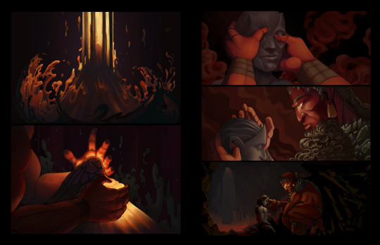
‘Ey, would you look at that! Progress! :D Slow, agonizing, unoptimized progress! I was hoping I’d have the first six full color pages ready with lettering and everything by the end of 2020, but.... well, here we are. Wow, I am SO TIRED OF BEING SICK, I HAVE THINGS I WANT TO DO SO BAD HAHAHAA FUCK
8) Another minor accomplishment that I’m disproportionately proud of, I made some new baller playlists and polished up a few old ones to a fine gleam.
Anyway-- I don’t know who has and hasn’t been tagged, but consider this an invitation to anyone who has the energy to post your highlights from the last year. It was actually pretty therapeutic to see some things I DID manage to accomplish, because so much of this damn year felt empty and lonely and barren. But there they stand: the weird little triumphs that were sprinkled throughout the months, somehow improbably blooming in the wasteland. :’)
27 notes
·
View notes
Last Seen Blogs
chrishohl
Let's draw!
iiqueen
Sibel
meetsko
m e e t s k o
paleocristiano-blog-blog
Arte Paleocristiano
crabkillah
Crab Killah!