#modernist woodcut
Photo
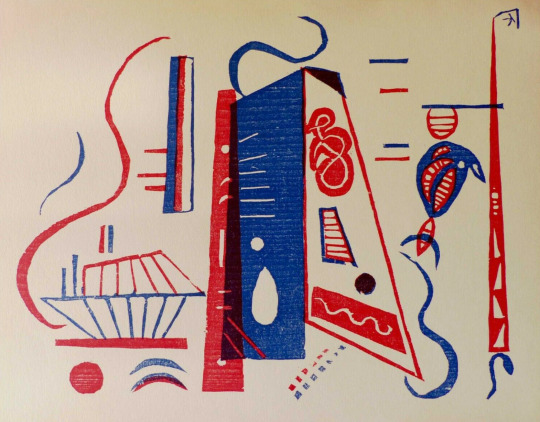
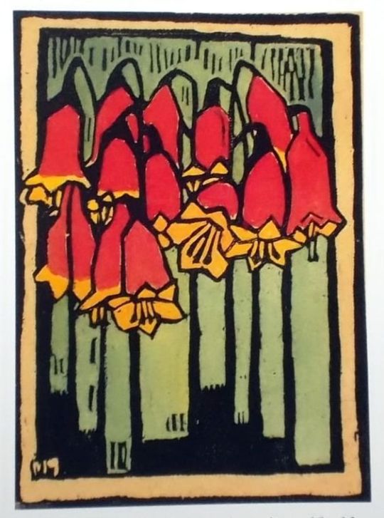
Wassily Kandinsky Colour Woodcut ‘Composition’ 1936.
(via amelie1800)
#art#kunst#wassily kandinsky#colour woodcut#modernist woodcut#abstract woodcut#holzschnitt#european artworks#modernism#20th century print#wood engraving#woodblock print#1936#russian artist
1K notes
·
View notes
Note
Do you have a favorite artist or movement?
i'm flaky and it's hard for me to pick a favorite anything, but lately i have been kind of obsessed with illustrators from the late 19th & early 20th century - this period is called the "golden age" of illustration because technological advances in printmaking, paper production, and rail transport made it more efficient to produce and distribute accurate color reproductions, so there was a boom in illustration work for books and periodicals. it also coincided with the modernist/postimpressionist rejection of naturalism and realism in favor of expressionism, symbolism, and proto-surreal (even proto-psychedelic) styles (and of a bunch of European artists becoming obsessed with & straight ripping off Japanese Ukiyo-e woodcuts) and i think there's a dreaminess, macabreness, whimsy and mysticism about a lot of the illustration work of the time.
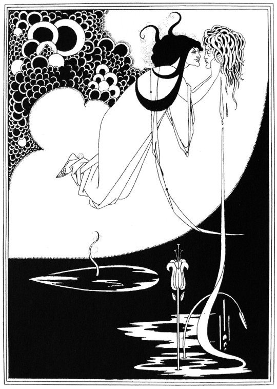
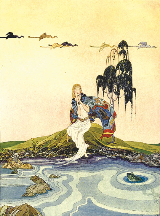
i really like illustrators who were influenced by art nouveau design, like Kay Nielsen:

and Nakazawa Hiromitsu:

and Aubrey Beardsley:
and Virginia Frances Sterrett:
and George Wolfe Plank:
thank you so much for the art asks, anon, and sorry i have taken so long to get to them!
30 notes
·
View notes
Text
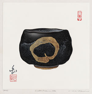

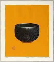

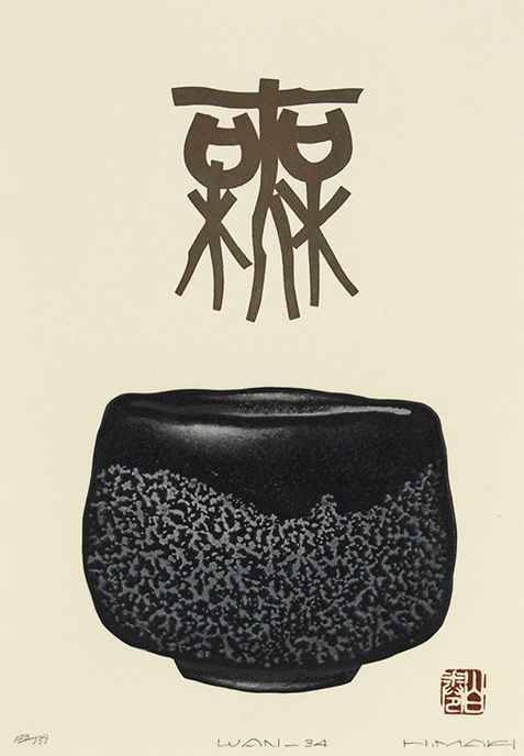

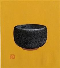
Maki Haku (巻白) is the art name of Maejima Tadaaki who was born in Asomachi in Ibaragi Prefecture. He had no formal art training, although after the Second World War he did involve himself in meetings guided by the visionary modernist Onchi Kôshirô at the Ichimoku-kai (First Thursday Society: 一木会), where he learned much from the master and interacted with other "creative print" (sôsaku hanga: 創作版画) artists. Although his earliest work was strongly influenced by Onchi, Maki gradually developed his own style, particularly when he turned to calligraphic motifs and introduced embossing in his mixed-media designs.
Maki used various printing techniques and media, but he is best known for his combined woodcut, stencil, plastic-and-paper lamination, and cement-relief block prints in which the cement-paste (cement mixed with water and chemical bond) was carved, scored, sandpapered, and chiseled. The blocks were then rubbed and pressed onto paper, first with hand pressure and then with the aid of an etching press to produce a laminated, raised relief or three-dimensional effect. He used both water-based and oil-based pigments. His style was sometimes abstract-calligraphic, sometimes representational. When he used calligraphic elements he attempted to use traditional ideographs while introducing modernist aspects to their shapes, sometimes abandoning their traditional forms, adding or subtracting elements, and rearranging them for aesthetic or expressive effect.
https://www.viewingjapaneseprints.net/.../sosak.../maki.html
14 notes
·
View notes
Photo

On this day, 11 December 1900, radical artist Gerd Arntz was born in Germany. He became a council communist and was a core member of the Cologne Progressives, along with Frans Seiwert, Heinrich Hoerle and others. A modernist, renowned for black-and-white woodcuts, Arntz is perhaps most famous for his developing thousands of isotypes: simple images for use in infographics to communicate ideas clearly to a mass audience. The Cologne Progressives were involved with revolutionary organisations such as the council communist Allgemeine Arbeiter Union, the anarchist Free Workers Union (FAUD), the Communist Workers Party (KAPD) and the Communist Party (KPD). Martyn Everett described that in their art they "were anxious to de-individualise art, and tended to concentrate in their work on groups and classes, and not on individual characters. Individuals are represented only to emphasise their powerlessness, or their subject position, concepts such as solidarity by grouping people together." And Arntz commented that with his art, rather than caricature capitalists as ugly individuals, like other left-wing illustrators at the time, he instead "sought to show the position of the capitalist in the system of production". This is a collection of Arntz's illustrations: https://libcom.org/gallery/gerd-arntz-illustrations https://www.facebook.com/workingclasshistory/photos/a.296224173896073/2157614311090374/?type=3
104 notes
·
View notes
Text
the goldfinch would have been such a perfect book for some late 19th early 20th century modernist bitch to illustrate. they would have gone off with the woodcuts i just know it.
3 notes
·
View notes
Photo
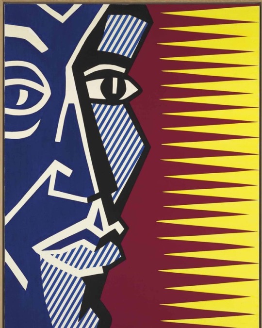
By the 1970s, seeking new challenges after the #comicbook idiom that had made him an overnight success, Roy Lichtenstein turned to the realm of “High art” for inspiration, beginning with #futurism , then moving into #Cubism, #surrealism and in the present work, #expressionism . Painted in 1979, Blue Head belongs to a small series of portraits inspired by a collection of German #Expressionist #woodcuts that Lichtenstein encountered in 1978. Lichtenstein’s work from this era can be seen as a critical - or even parodic - reinterpretation of #modernist art history. ⠀⠀⠀⠀ ⠀⠀ ⠀⠀⠀⠀⠀⠀⠀⠀⠀⠀⠀⠀⠀⠀ ⠀⠀⠀⠀⠀⠀⠀⠀⠀⠀⠀⠀ Lichtenstein, Roy (1923-1997) Blue Head 1979 oil and Magna on canvas 121.9 x 91.4 cm. ⠀⠀⠀⠀⠀⠀⠀⠀ ⠀⠀⠀⠀ ⠀⠀ ⠀⠀⠀⠀⠀⠀⠀⠀⠀⠀⠀⠀⠀ ⠀⠀⠀⠀⠀⠀⠀⠀⠀⠀⠀⠀ #roylichtenstein #lichtenstein (at Gagosian) https://www.instagram.com/canvas.tube/p/BwOpUYdlfk0/?utm_source=ig_tumblr_share&igshid=1jxadglztgctp
#comicbook#futurism#cubism#surrealism#expressionism#expressionist#woodcuts#modernist#roylichtenstein#lichtenstein
2 notes
·
View notes
Text


2021年8月20日
【新入荷・新本】
Peter De Potter The Vanity of Certain Flowers Part Two, MENDO, 2021
156 pages. 326x246x18 mm. Hardcover. English. Limited to 750 copies.
価格:8,800円(税込)
/
The Vanity of Certain Flowers Part Two is the fourth monograph book by Belgian artist Peter De Potter and the conceptual follow-up to his The Vanity of Certain Flowers book from 2016. Again the theme of this book is the act of retreat as an invigorating force and method for self-improvement.
「The Vanity of Certain Flowers Part Two」は、ベルギーのアーティスト、ピーター・デ・ポッター(Peter De Potter)の4冊目の作品集で、2016年に出版された「The Vanity of Certain Flowers」に続くコンセプトブックです。この本でも、自己改革のための活力および方法としての退却行為がテーマとなっています。
/
In an elaborate, feed-like series of images, De Potter explores the idea of retreat in his now signature, instantly recognisable way, constructing images through resolutely blending his own photography and video work with his poetry, language, artworks, appropriations and graphic design.
Staged in suburban strips of nature or homely, everyday spaces, the images here often have a contemplative, ceremonial quality, hinting at devotional practice. Ascesis and abandon, mystery and frisson, tension and elation: they all co-exist in this visualisation of a mind – and body – in retreat. In that light, The Vanity of Certain Flowers Part Two is a fully-rounded story in itself, with the images functioning as a series of instructions, warnings, allegories, visions and daydreams.
The body, a constant element in De Potter’s work, is agile, unhindered, unhurried. Yet the proverbial worm in the apple is exposed as well. Shot throughout the book are visual elements that speak of dread, unrest and menace, especially in the images De Potter calls his ‘sinister club flyers’, stark graphic works composed with snippets from a multitude of downloaded, cut-up and deconstructed medieval and pre-20th century woodcuts, cartoons and illustrations.
Within this book De Potter more than ever wants to acknowledge he’s an artist from the Lowlands. Seemingly deserted Antwerp suburbia, medieval town squares in Ghent, a modernist chapel in his birthplace Kerselare-Oudenaarde: in The Vanity of Certain Flowers Part Two these all feel like humble landmarks that pinpoint his narrative. The Dutch language is also prominently used, with each of the 112 plates accompanied by an absurdist ‘flower name’ written in Dutch.
/
Peter De Potter is a Belgian artist who currently lives and works in Antwerp. In his work he has developed his own unique method, blending his photography and video with his poetry, slogans, graphics, montage and appropriations into an idiosyncratic visual language that resonates in the fields of art, fashion and contemporary online culture. De Potter is notable for choosing not to follow a traditional path in the art world, preferring to showcase complete series and projects directly on the internet.
https://www.instagram.com/peterdepotter/
https://www.mendo.nl/
23 notes
·
View notes
Photo

Rain of Blood is Falling into the Garden, Friedensreich Hundertwasser, 1972 (published 1973), Minneapolis Institute of Art: Prints and Drawings
abstract image; central blue rectangle with darker blue stripes with radiating blue and red lines; pink and blue freehand rectangles around center rectangle; silver, red, and green fence picket-like elements around edges; some yellow and green inside picket forms; blue at edges, with some red dots; two red seals in URC, one red seal in LRC; Japanese inscription in silver, URC; received matted Friedensreich Hundertwasser (born Friedrich Stowasser) was an acclaimed Austrian painter, printmaker, architect, and designer whose work was strongly informed by the example of Gustav Klimt and other artists of the Vienna Secession, a modernist art movement that rejected traditional academic art and instead promoted aesthetic innovation in contemporary art and design. Like the secessionists, Hundertwasser expressed a passion for asymmetry, labyrinthine spirals, and arabesque lines, assailing the modern industrial “straight line” world that he called “the rotten foundation of our doomed civilization.” For both his visual art and architectural projects, Hundertwasser incorporated asymmetrical designs, intense color, elaborate ornamentation, and organic forms as a prominent features.
Size: 15 1/2 × 19 1/2 in. (39.37 × 49.53 cm) (image) 16 13/16 × 21 7/8 in. (42.7 × 55.56 cm) (sheet)
Medium: Color woodcut
https://collections.artsmia.org/art/136971/
5 notes
·
View notes
Photo

Margaret Preston One of Australia’s most significant artists, Margaret Preston was a key figure in the development of modern art in Sydney from the 1920s to the 1950s. Renowned for her paintings and woodcuts of local landscapes and native flora, she was an outspoken public voice on Australian culture and championed a distinctly Australian style, based on the principles and motifs of modernist, Aboriginal and Asian art.
63 notes
·
View notes
Text
Viv Reviews #9
Seven Surrenders, by Ada Palmer
Looking back on this a few months after having read it, I don’t think I actually know what the hell happened in this book. Gender, I think? Politics, maybe? A war started? A god blipped himself out of existence? Something about Achilles??
Whatever. I liked the gay parts and I think I would be a Utopian.
Dubliners, by James Joyce
This collection of short stories about the lives of ordinary Dubliners is emblematic of all the parts of modernist writing that people make fun of - middle aged men feeling dissatisfied with life, that sort of thing. And I enjoyed the hell out of it. Would I have enjoyed it as much if I hadn’t had it narrated to me in audio form through the delightful Irish accent of Ralph Cosham? Probably not, so I’m glad I read it the way that I did.
After Dubliners I tried reading Ulysses, and utterly failed to get through more than a dozen pages. Oh well. They can’t all be winners.
Contact, by Carl Sagan
Pleased to report that the book has everything I loved about the movie without any of the things I hated. Pleasant and enjoyable to read about a female science hero, and the ultimate message - about valuing the relationships in your life and having love in your heart, rather than solely drawing meaning from knowledge and discovery - could easily have read as irritating and sexist, but I don’t think it did.
Given the protagonist’s relationship with her father, and the vibe I got that Sagan was writing the story with his own daughter in mind, I personally #related a lot.
The Left/Right Game, by NeonTempo
This isn’t my favorite piece of online fiction of all time - that’s probably still Unsong - but it’s a really solid second-place. I rarely see supernatural suspense stories manage information as well as this story does. Every spooky thing that happens makes good mechanical plot sense, and good character sense - the spooky things, beyond merely being effectively spooky, have emotional salience, and reveal character information. Other than an annoying straw-rationalist character I have no complaints; I read almost the entire thing in one totally-engrossed day.
Pirates! by Celia Rees
I was so excited to read this book. It had a cool woodcut-style picture of the two main characters. It seemed very well-researched. The plot conceit - a plantation owner’s daughter and her ex-slave run off together to become pirates - sounded to me just edgy enough to be interesting. I had almost no complaints about the prose. I even shelled out the extra $7 at my local used book store for a signed copy, because it seemed like exactly my type of book.
Unfortunately, it is pretty goddamn racist!
I generally have a high tolerance for “problematic” content. But in this case, the extent to which the narrative focuses on Nancy’s romantic troubles and centers her suffering as a rich white woman really left a bad taste in my mouth, because Minerva, her slave, is right there.
Minerva, despite allegedly being a protagonist, rarely gets to speak for herself. Instead, what she thinks and feels is frequently related to us via Nancy’s narration. We never see events from Minerva’s point of view. We get no insight into her romantic arc with another pirate--only Nancy’s feelings about Minerva abandoning her. Minerva goes to bat for Nancy constantly, even risking death in a duel to defend Nancy’s honor. She’s even willing to give up her happy life with her husband and newborn child to stay with Nancy at the end of the story--and only stays behind when Nancy graciously allows Minerva to be happy without her.
Also, it turns out that they’re half-sisters, because Nancy’s father Fell In Love with Minerva’s mother. He loved her so much, in fact, that he lovingly left her enslaved on his plantation! This is presented strictly as a positive thing for Minerva’s mother, who considers Nancy--who owns her--totally blameless, privileging her even over her own daughter.
I’m not opposed to a narrative where a white daughter of a slaveowner forges a genuine relationship with an enslaved girl she frees. I was initially hopeful about this relationship, even after some questionable early moments, when Nancy murders an overseer to prevent him from hurting Minerva. Except immediately afterwards, Minerva then tells her that she shouldn’t have done that, because what if poor Nancy gets in trouble? Because that’s what was always most important in this book--Nancy, Nancy, Nancy.
There was room here for an anti-racist story. But a story where Minerva has no voice? No negative feelings towards the girl who owned her? Not even any complicated feelings? Where she defers to and serves Nancy in all ways even after she’s freed, and this is never portrayed as anything but an expression of loving devotion between sisters?
Awful, disappointing, and all the worse for how good it could have been.
12 notes
·
View notes
Text
Reading Response 1 - Postmodernism
Postmodernism is a art category full of variety. Through it’s ability to expand to multiple mediums that can reach a wider range of people all of the world. Whether it sits in a park or is on someone’s t-shirt, this ability allows more people to see it than those who can only see certain art by visiting a specific museum.
Escaping the Confines of Museums:
The best example of this is art installations in public places. Allowing for the artist to move the piece to widen the audience it can reach overall. Jenny Holzer is a good example of art that is mobile while still having a great impact. With her series VIGIL she shares the stories of those affected by the reality of gun violence. With their words displayed brightly on the sides of buildings, their stories are reaching further and effecting more people all over these cities.

‘VIGIL’ Project
Projection on Building
Jenny Holzer
October 2019
Collapsing Boundaries Between “High” and “Low”:
Postmodern art allows for artists to break boundaries that modernist artists put in place to separate their “high art” with things experienced in ‘ordinary life’. Postmodern artists push to break this narrative by including everyday things in their art that allow their art to appeal to a wider range of audiences, whether they are from this “high art” culture or the lower culture. Jeff Koons is a great artist that goes against the “high art” culture with him installation pieces that are often very common/well known objects that he makes in a larger scale. Such as his piece ‘Play-Doh’ which is a very well known child’s craft item that most people can recognize with ease.

Play-Doh
Installation
Jeff Koons
1994-2014
Rejecting Originality:
Since their is a high value for art to be very original in the eyes of modernists, postmodernists challenge this by questioning the concept of originality in these times. The idea of making a completely original piece is a difficult feat. Since a majority of ideas have been explored in some sense even if you’ve never personally seen it. With a postmodern approach art in a much more liberating way that pulls themes from other sources before adding their own spin. Artists like Damien Hirst uses animals suspended to push a new narrative and allow for an interesting up close and personal perspective that many would never see in their life. Making his pieces simple but very unique.

The Physical Impossibility of Death in the Mind of Someone Living
Glass, painted steel, silicone, monofilament, shark and formaldehyde solution
Damien Hirst
1991
Jouissance:
Acting as the postmodern aesthetic experience, joussiance allows the viewer to become lost in a piece through the pleasure derived from viewing it. Compared to the modernist experience which is done at a distance, postmodernists allow for a very personal experience.
Jouissance
Painting on canvas on stretcher
Damien Legrain
2019
Working Collaboratively:
Compared to modern times, where individual contributions are a lot more valued, in a postmodern environment there is a lot more collaboration in many art pieces. There is now the ability for several artist to contribute to a piece from all over the world, adding many more cultures and interesting perspectives in postmodernist art. In the example I put, the piece is a large collaborative piece consisting of 22 separate layers that come together into one piece. Each layer being made by a different artist.
First Supper
Collaborative Piece (22 layers)
Artists Include: Alotta Money, Blackboxdotart, Coldie, Connie Digital, Hackatao, Josie Bellini, Matt Kane, Mlibty, Rutger van der Tas, Shortcut, TwistedVacancy, VansDesign, and XCOPY
2020
Appropriating:
This approach is the exact opposite of the modernist views of originality through the use of imagery that already exists. Whether that media be from other artists or generalized imagery (like from the grocery store). Appropriating is a form of manipulation of the previously stated media, and is able to shift and make a new message through borrowed images. The example put is from Richard Prince and his exhibition called Portraits. Where Prince uses Instagram selfies for his own artistic message.

Portraits
Photography/Screenshots
Richard Prince
2014
Simulating:
Simulation art is an imitation/copy of other pieces. Simulacra are copies of things that no longer have an existing original, or perhaps they never had one at all. Another example simulacra is when a cartoon/representation lasts longer than the real person they were based on. Like Betty Boop or Helene Stanley who was the live action model for both Cinderella and Sleeping Beauty from Walt Disney’s famous animated movies. The example put is a photograph taken by Jean Baudrillard who is a prominent figure in the postmodern would in simulacra.

Saint Clément
Giclée print on pure cotton paper
Jean Baudrillard
1987
Hybridizing:
This postmodern art form is a way to mix various diverse cultural influences in a single piece. These pieces can pull from cultures that the artist is part of personally, or maybe just parts of separate cultures that interest them. Examples of these were western style art mixing with non-western style art. The posted example picture is from Masami Teraoka, who pulls themes from Western and Eastern cultures to make traditional Japanese art prints and adds his own western spin to that Japanese theme.

Hawaii Snorkel Series/Longing Samurai
Twenty-four-color woodcut, etching, and aquatint printed from one copper plate and eleven woodblocks on natural Fuji paper
Masami Teraoka
1993
Mixing Media:
Mixing media is just that, mixing media! The postmodernists like to explore the limits of a media and how they can mesh with other medias to enhance their piece. Even just small mixing like adding glitter to a piece can change the meaning to an art. The piece show is from the artist Robert Rauschenberg who combines many different mediums on paper and sculpture to make dynamic and interesting pieces.
Buffalo II
Silkscreen
Robert Rauschenberg
1964
Layering:
Layering is an art form that many artists can preform due to it being inexpensive to mass produce pictures and nowadays there is a lot of images and media available to use without too many issues. The artist shown below is Gabby Frank, who made a piece that is a excellent example of a postmoderist collage. Layer images on newsprint/some sort of print piece.

Postmodern Collage
Paper media
Gabby Frank
(Date not listed)
Mixing Codes:
The code being refers to the postmodern approach of mixing societal codes and using those codes to push an alternative narrative. Whether the codes be cultural, or commonly agreed upon. The example shown is from the artist Michael Ray Charles who uses the code mixing to show the viewers the racial biases they may have. Which is an excellent example of the mixing to show an alternative view/narrative.
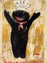
(Forever Free) ‘Servin with a smile’
Paint on canvas
Michael Ray Charles
1994
Recontextualizing:
Through the use of previously familiar images, recontextualizing in the postmodern view is a way to change the meaning of the imaging being borrowed through repositioning and the use of addition/added on media to give the pieces a new meaning and significance. Fred Wilson is considered a master of recontextualization and his work is an interesting look into his views on the world.
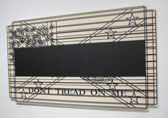
Don’t
Painted wood
Fred Wilson
2010
Confronting the Gaze:
Confronting the gaze originally refers to the identification of the ‘male gaze’ which a lot of media is made around. Many works of western historical art that depict women are a result of the male desire to stare at and sexualize women. Worse than that, there was some blame from these men towards the women that were the subject. Since then, there has been some artists and pieces that have begun exploring the ‘female gaze’ and used their art to depict what females may actively desire. Tracy Emin is an example of the artists who explore the female gaze and has made many pieces in her simple style, a lot of which follow a similar romantic or sexual narrative.

The Kiss
Polymer gravure printed in blue
Tracey Emin
2011
Facing the Abject:
The abject in question is referring to the less than lovely aspects of life. Especially things that involve bodily functions. It also involves things like the hatred of food, trash, waste, even animal dung. Facing the abject in art is usually letting piece involve things that are usually considered on the ‘ugly’ side. Kiki Smith, the artist whose piece is featured is something that shows the original abject towards bodily functions. Pushing for people to accept the reality of bodily functions.
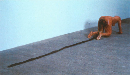
Tale
Fiber glass, wax, mix media
Kiki Smith
1992
Constructing Identities:
People tend to form opinions on those around them based on how they may look, or even surface level information that they may have on them. Due to their own personal ideas on things like race, gender, sexual orientation, etc. Since people tend to have a certain opinion/ideas on people based on these things, whether they mean to or not. Gran Fury was a group of activists that teamed up with ACT UP another group to bring awareness to the problems in the LGBT community and the AIDS pandemic. The piece show below is one of the graphics created in response to this lack of awareness towards AIDS.

Silence = Death
Graphic
Gran Fury
1988
Using Narratives:
Telling stories is something people have been doing through all of history. Historical works of art often depicts stories whether they be biblical or otherwise. Many pieces of art, even now, have a story to tell their audience. Especially things like modern movies, cartoons, and books. They all usually aim to tell a story to entertain an audience. Artists like Eric Fischl uses his paintings to tell pieces of stories. Like the piece shown below.

A Visit To/ A Visit From/ The Island
Oil on canvas
Eric Fischl
1983
Creating Metaphors:
To attribute the qualities of something to something else is to create a metaphor. Generally all images can be considered metaphors in some sense, although some postmodern artists work to make imagery of a particular narrative. Such as Chuck Close, who has a self portrait of himself which can act as a persona that the artist is wanting the audience to see of him.

Self-Portrait Screenprint
Silkscreen
Chuck Close
2012
Irony, Parody, and Dissonance:
All three of these are intertwined with each other in life. Artists are using these three themes/ideas to provoke a new questioning of the viewers previous knowledge. Sometimes these can fall short in the grand scheme of things and be taking literally. Resulting in a great misunderstanding and cause issues for the those involved. To understand the impacts and purpose intended behind the work, it is important for the viewer to understand the original unironic content that has been shifted an challenged. James Luna is an artist who uses irony,parody, and dissonance to convey his political views as a half Mexican, half Indian man.
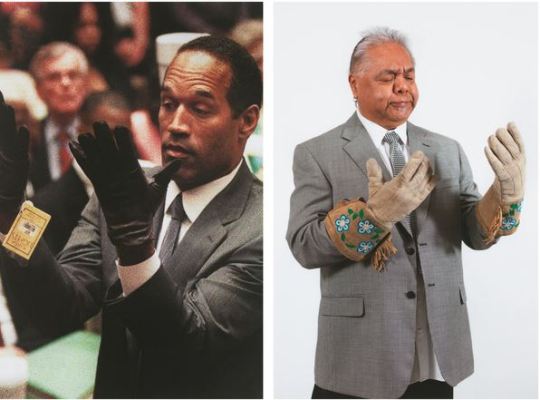
Trial and Error
Photography Print
James Luna
2011
-----------------------------------------------------------------------------------------------------------
5280 - 3 Mixed Media Artists Reading Response:
This article is honestly wonderful to look at to explore the processes of artists from Colorado, one of which going to the same school as me! It overall makes me hopefully for what my future has in-store and my hope to one day find where I belong in the artist community.-Tya Alisa Anthony’s collage was dynamic and interesting. Allowing for an interesting perspective into BIPOC stories and their history. Adding color to the piece through the shorts allows for a pull back to modern times and how their are still stories that need to be told!-Mario Zoots was the artist I was the most interested in from hearing that he went to MSU Denver. I like the collage he made, it feels like something one would make in a journal of their travels. It also made me feel like I may have stumbled upon the journal in the woods, adding an eerie feeling to what’s on the page. That is such an interesting dynamic to encounter!-Kelly Duffield’s pieces are overall the most interesting for me to look at. Since the previous two were a lot different in theme and the overall feel they gave off a bit more of a mature feeling. Duffield’s work really tips into a feeling that I would describe as “a weird dream I once had”. The piece is definitely one that can be interpreted in many different ways by different people and that value in a piece is something that can be hard to achieve. Overall these three artists are great at what they do and I hope to see more of their work in the future!
5 notes
·
View notes
Photo
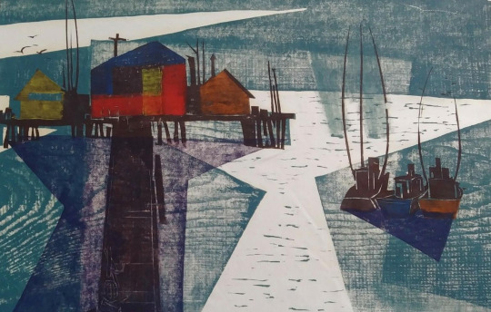
Danny Pierce Modernist Woodcut ‘Harbour Squall‘ 1959.
(via eBay)
#art#colour woodcut#farbholzschnitt#danny pierce#modernist woodcut#vintage print#printmaking#woodblock print#20th century print#wood engraving#fine art woodcut#artwork#1959#landscape print#seascape print#modernism#mid-century modern#american artist
80 notes
·
View notes
Text
Bardfield Cookery Collection - Vol I - Eric Ravilious
This is the first part in a series of posts I have been working on about the cookery books made by artists of Great Bardfield. This first volume is on Eric Ravilious.
Eric William Ravilious (22 July 1903 – 2 September 1942) was an English painter, designer, book illustrator and wood-engraver. He grew up in East Sussex, and is particularly known for his watercolours of the South Downs and other English landscapes, which examine English landscape and vernacular art with an off-kilter, modernist sensibility and clarity. He served as a war artist, and died when the aircraft he was in was lost off Iceland. ◊
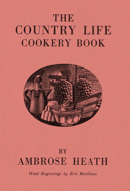
Dust Jacket for The Country Life Cookery Book by Ambrose Heath, 1937
The Country Life Cookery Book was published in 1937 and illustrated by Eric Ravilious. Country Life to some may just be the magazine, but at this point in history they were a major publisher about architecture, craft and a style of country life that would appeal to the new middle and upper classes of Britain. The publications normally contained lots of high quality photography.
In the same year as the Cookery Book was published were many other books, here are a few others for adults: Where To Catch Salmon And Trout, Elements Of Stabling, Morning Flight A Book Of Wildfowl, Gun For Company, Victorian Street Ballads. For children there were: Skilled Horsemanship, The Golden Knight and Other Stories, Peter & Co, Knight in Africa and Rajah the Elephant... as part of the ‘Junior Country Life Library’.
The books are countryside propaganda in the age of travel by train, omnibus, charabanc and car. They were promoting Britain in the way they wanted to see it. It is fair to say when people talk about the ‘Golden Nineteen-Thirties’ that Country Life had a great deal in the legend.
The Title-Page
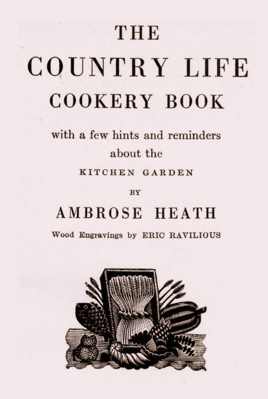
Eric Ravilious - Title-page of the Country Life Cookery Book, 1937
We know Ravilious got the commission for the cookery book in July 1936 as he wrote in this letter to Helen Binyon:
This book is now begun and begins to be promising. †
The wood-engravings follow a seasonal theme, month by month rather than chapters on food or following the text - this calendar style is like the other Ambrose Heath books for Faber & Faber that Edward Bawden had illustrated for the previous five years. Only 12 blocks were cut by Ravilious for the in the book, so with the title page decoration, two of the months (January & December) used the same image. One can only assume this was how many images they thought they needed and so how many images they paid for.
Having the chapters as seasonal months would also hurry the project along from the illustration front - as in April of 1937, nine months later, Ravilious wrote to Binyon:
I don’t believe Heath has written his text yet. ‡
But not having the text as a guide would mean Ravilious could invent the illustrations from his mind and use past works. He worked on the illustrations from July 1936 - February 1937 while taking on other commissioned work and finishing a series of watercolours.
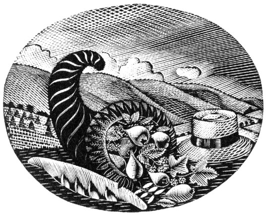
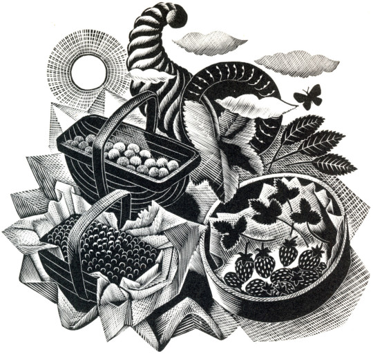
Below is the title page wood-engraving of a framed cornucopia, a wheat-sheaf and food produce. This illustration is a reject from another job.
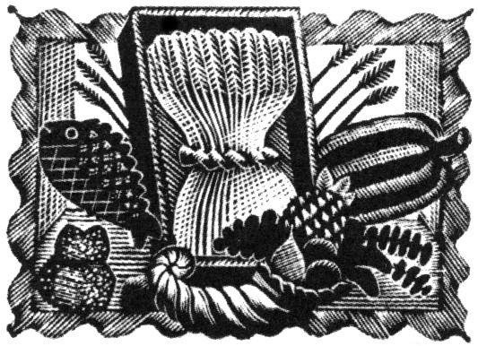
Eric Ravilious - Title-page (Harvest Festival), Wood-engraving for the Cornhill Magazine, 1936
Ravilious was completing a commission for The Cornhill Magazine in the later part of 1936 and the project overlapped with the Cookery Book. So when one of the wood engravings was rejected by John Murray (editor of The Cornhill) he used it on the cookery book. I thought this engraving was a bit surreal and over the top until I discovered a drawing of it below.
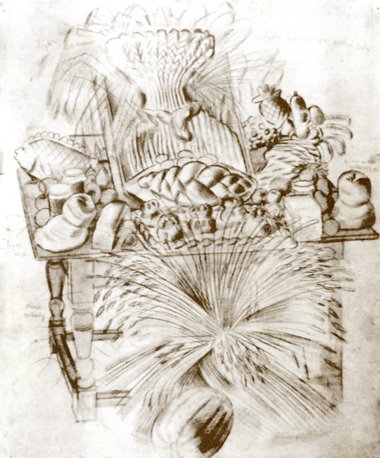
Eric Ravilious - Harvest Festival and Loaves, 1936
I’ve been drawing the bread table in the church - dead and fancy loaves, barley and corn, apples and eggs - and I thought it too beautiful not to place on record. ♠
Having been rejected for one job Ravilious cut away the framed backdrop of the table and submitted the wood-engraving below for the Cookery Book project instead.

Eric Ravilious - Title-page (Harvest Festival), Wood-engraving for the Country Life Cookery Book, 1937
Below is another woodblock based on the same image made for The Writings of Gilbert White of Selborne in 1938. It’s a new version and not an edited restrike. Likely cut in 1937 as the job was commissioned in May of that year and the book published in 1938.

Eric Ravilious - (Harvest Festival), Wood-engraving for The Writings of Gilbert White of Selborne in 1938
January and December

Eric Ravilious - January & December, Wood-engraving for the Country Life Cookery Book, 1937
January & December is the block that is used twice in the cookery book.
Ravilious would also find inspiration in the past. He owned a copy of The Frugal Housewife published by J Fairburn, 1838 and below is the meat guide on animals. I think this Ravilious woodcut is one of the defining moments in cookery illustration and helped re-popularise this old fashion key to animal flesh. The meat guide is now a typical image to see in cookery books to educate what meats can be gained from an animal. It is used three times in this book. He mentions the idea to use old cookery books below:
I’ve had what you would call a cleaver idea, and Mrs Beeton has been a help. †
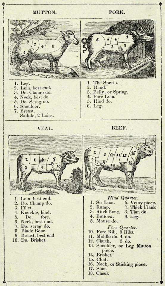
Frontispiece - The Frugal Housewife, J. Fairburn, 1838
February

Eric Ravilious - February, Wood-engraving for the Country Life Cookery Book, 1937
In the August of 1935 Edward Bawden and Ravilious went on a painting trip to Newhaven and in the wood-engraving above, the basket of fish emblazoned with the name of the town.
The idea for the wood engraving would also pop up again in another format, this time a print for Contemporary Lithographs, a company working with artists to make large runs of lithographic prints that would be cheap for the public to buy from the Zwemmer Gallery. Below is one of the watercolours from 1935 that could have been the inspiration for the commission. (The watercolour was also sold via Zwemmer Gallery).

Eric Ravilious - Newhaven Harbour, 1935
The print that Ravilious completed is very similar to the Cookery Book print as the jobs overlapped. The official title of the print is Newhaven Harbour but Eric referred to the print as ‘Homage to Seurat’. Helen Binyon wrote that the print has a:
scene of sensitive clarity and beautiful luminosity ♦

Eric Ravilious - Newhaven Harbour, Contemporary Lithographs Ltd, 1937
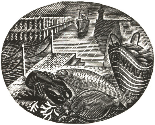
Eric Ravilious - February, Wood-engraving for the Country Life Cookery Book, 1937
March
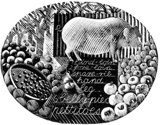
Eric Ravilious - March, Wood-engraving for the Country Life Cookery Book, 1937
A pig surrounded by the fruit of choice, apples, and to the left of the wood-engraving a garden sieve with berries upon it. The watercolour below comes from the same year as the Cookery Book’s commission, but is now one of the lost paintings of Ravilious, it was also damaged when last seen having had the top left corner ripped and creased.
Trugs with Fruit is a lost watercolour by Eric Ravilious, damaged. In the corner it may have been framed and sold or just disregarded and thrown away, but it appears in the wood engraving in this commission for John G Murray, editor of the Cornhill Magazine. It was made for publicity for the Magazine but so far has only ever been seen on the compliment slips they had for a short time.

Eric Ravilious - Trugs with Fruit, 1936
April

Eric Ravilious - April, Wood-engraving for the Country Life Cookery Book, 1937
Rather like the Title Page, the wood engraving for April came at the same time as the Cornhill Magazine commission. Below is a watercolour, now presumed lost of trugs of fruit and the same trug appears in the wood engraving next to a glass of mint - these are red currents and mint, said to be the good sauces for Lamb.
Eric Ravilious - Trugs with Fruit, 1936
The wood-engraving below would have been copied from the painting and in the printing process it appears reversed, it comes with the same cornucopia from the title-page engraving.

Eric Ravilious - Autumn Fruits, 1936
And here you can see the wood-engraving in use on the Cornhill Magazine compliment slip.

Eric Ravilious - Cornhill Magazine Complement Slip with Autumn Fruits, 1936
May
The wood-engraving for May looks to be the most original of all of the illustrations, I can’t think of having seen any element in past work.
Eric Ravilious - May, Wood-engraving for the Country Life Cookery Book, 1937
June

Eric Ravilious - June, Wood-engraving for the Country Life Cookery Book, 1937
The June illustration features a bee-hive. A variation of the image would be used two years later on The Garden Implements Jug that was also designed by Ravilious for Wedgwood. The bottom most vignette.

Wedgwood Garden Implements Jug, 1939
July

Eric Ravilious - July, Wood-engraving for the Country Life Cookery Book, 1937
The wood-engraving for July has roots in many places. The finished wood block has a hat, cornucopia of pears, a hat on the backdrop of hills and cornstooks. In an early drawing for the wood-block the hat is in the same place (reversed when printed) but many of the other elements have changed.
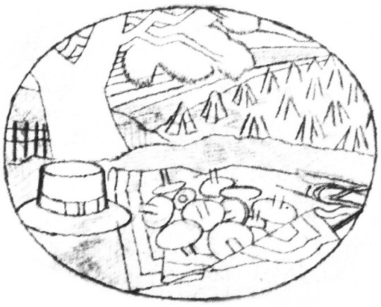
Eric Ravilious - Proposed July Block, Drawing made on tracing paper for woodblock, (reversed for printing), 1936
It is likely that the print Ravilious drew out was inspired by the Harvest theme of the month he was illustrating and he looked back on older work. Below the wood engraving from 1934 is one of many Curwen Press Stock Blocks. They are woodblocks and prints the press has paid artists to make so they can be used without the need to hire an illustrator for a job, so production times can be quicker and still have illustrated items.
The tree and setting of cornstooks reminded me of the drawing he made above and even the way the stooks flow uphill.
Eric Ravilious - July, Wood-engraving for the Country Life Cookery Book, 1937

Eric Ravilious - Curwen Press Stock Block 985, 1936
The booklet the block was used upon happened to be called Spectator Harvest, for the Spectator Magazine.

Spectator Harvest, 1952
It was also re-cut in mirror image for The Writings of Gilbert White of Selborne in 1938.

Eric Ravilious - Selborne Tailpiece Volume 2, 1938
But back to the cookery book - the cornucopia below (that appeared next to a hat and a baguette) has been seen before in this post - in the wood-engraving in use on the Cornhill Magazine compliment slip.
Eric Ravilious - July, Wood-engraving for the Country Life Cookery Book, 1937
One above the other, it isn’t hard to see a link.
Eric Ravilious - Autumn Fruits, 1936
August
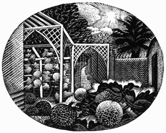
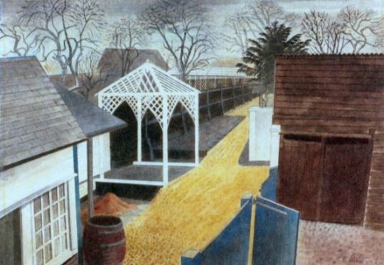
Eric Ravilious - August, Wood-engraving for the Country Life Cookery Book, 1937
For the August vignette Ravilious chose to illustrate the garden of Brick House in Great Bardfield. Ravilious and his wife Tirzah had shared the house with Edward Bawden and his wife Charlotte from 1932 until 1935 when the Raviliouses moved to near-by Castle Hedingham.
In 1936 Bawden painted the garden in the winter of the Cookery Book commission showing the wood gazebo that was up in 1932 as it was a wedding gift from Eric and Tirzah to Edward and Charlotte. The arches must have been added between then, around 1936.
Edward Bawden, February 2pm, 1936
Eric Ravilious - The Garden Path, 1933

Eric Ravilious - August - Drawing made on tracing paper for woodblock, 1936 (reversed for printing)
September
Eric Ravilious - September, Wood-engraving for the Country Life Cookery Book, 1937
The illustration for September shows the game shooting season and a brace of birds, maybe a goose to the left and pheasants to the right in front of a country lane. Below is the original trace drawing for the block, reversed for printing.

Eric Ravilious - September, Drawing made on tracing paper for woodblock, (reversed for printing), 1936
Followers of my blog would not be surprised to see that the illustration bears a similarity to another one, the wood-engraving for London Transport, this is confirmed in a letter to Helen Binyon again:
The jobs, cookery and Green Line advertisements - are all done and sent off and very glad am I that hard work is finished. ♣
Counter to the letter I can’t find another reference to them in print.
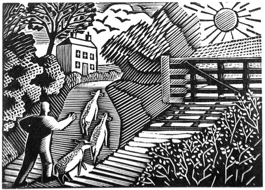
Eric Ravilious - The Shepard, 1936
The Shepard is one of the most lively engravings that Ravilious made for London Transport. The Sheep and their ears with the hillside up to the house are pleasing. The technicality of the halftone shading are some of his best. ♥
The Cookery Book’s version of the engraving is more detailed, I think because the printing was likely to be finer than the press adverts the London Transport one would be reproduced in.

Eric Ravilious - September, Wood-engraving for the Country Life Cookery Book, 1937
October
Eric Ravilious - October, Wood-engraving for the Country Life Cookery Book, 1937
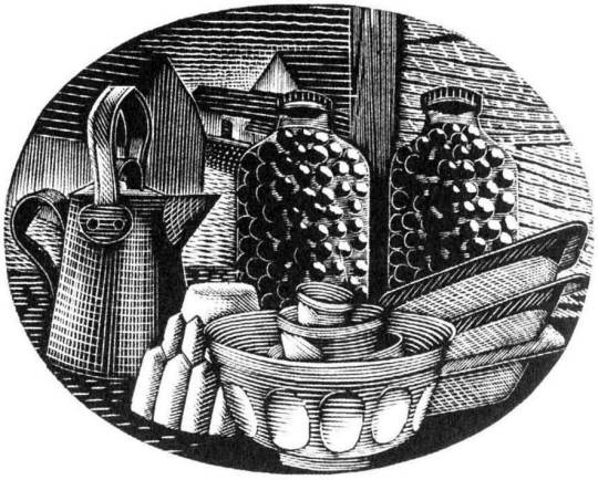
October sees kitchen items, a jug, copper jelly mould stacked mixing bowls and baking trays with two jars of preserved items.
November
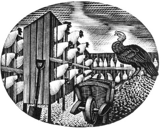
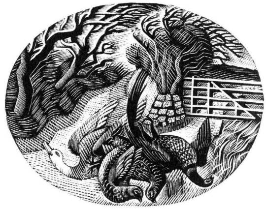
Eric Ravilious - November, Wood-engraving for the Country Life Cookery Book, 1937
The last work of a chicken farm and a turkey with wheelbarrow gives the Christmas feeling and may have been marked to have been the December illustration but January’s wood-engraving was also used as December.
† Eric Ravilious to Helen Binyon - 19th July, 1936
‡ Eric Ravilious to Helen Binyon - 14th April, 1937
♠ Eric Ravilious to Helen Binton - 6th October, 1936
♣ Eric Ravilious to Helen Binyon - 17th August (1936)
♦ Helen Binyon - Eric Ravilious: Memoir of an Artist, 2016
♥ Robjn Cantus - A Journey of London Transport with Eric Ravilious, 2018
◊ Wikipedia - Eric Ravilious
#Eric Ravilious#great bardfield#Cookery Books#woodcuts#wood engraving#Ambrose Heath#helen binyon#Edward Bawden#GtBardfieldCookery#cookery
4 notes
·
View notes
Photo
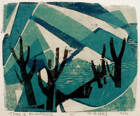


Hildegarde Haas (1926-2002) was born in Frankfurt, Germany in 1926. Her family immigrated to America when she was a child, settling in Dallas, Texas in 1938. She enrolled in an accelerated study program at the University of Chicago; earning her B.A. and graduating with honuors within 2 years. In 1946 she attended the Art Students League in New York City on a scholarship, where she studied under American modernist Vaclav Vytlacil.
Hildegarde was a self taught printmaker who began experimenting with the woodcut art form during her time at ASL. Throughout the late 40's and early 50's she continued to hone her woodcutting skills, gaining national recognition for her prints. However, by 1953 the rigor and physical demands of carving became too much and she exchanged her gouges for a set of paint brushes.
Most of her pieces were influenced by her love of the outdoors; when asked to describe what inspires her she replied "I am primarily interested in landscape as a theme in order to discover the underlying patterns and hidden order in the world around me". Hildegarde's work is in the permanent collections of the Museum of Modern Art, The Smithsonian American Art Museum and the Library of Congress.
7 notes
·
View notes
Photo

On this day, 11 December 1900, radical artist Gerd Arntz was born in Germany. He became a council communist and was a core member of the Cologne Progressives circle of artists: perhaps the most radical artist collective ever. A modernist, renowned for black-and-white woodcuts, he is perhaps most famous for his developing thousands of isotypes: simple images for use in infographics to communicate ideas clearly to a mass audience. This is a history of the Cologne Progressives: https://libcom.org/history/art-weapon-frans-seiwert-cologne-progressives-martyn-everett And this is a collection of his illustrations: https://libcom.org/gallery/gerd-arntz-illustrations https://www.facebook.com/workingclasshistory/photos/a.296224173896073/1289429954575485/?type=3
62 notes
·
View notes
Photo
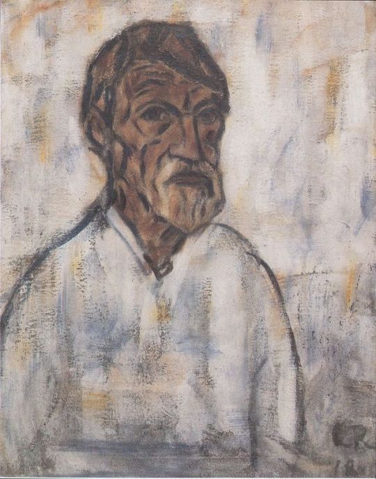
Christian Rohlfs - Self-portrait (1918)
Christian Rohlfs (November 22, 1849 – January 8, 1938) was a German painter, one of the important representatives of German expressionism.
He was born in Groß Niendorf, Kreis Segeberg in Prussia. He took up painting as a teenager while convalescing from an infection that was eventually to lead to the amputation of a leg in 1874. He began his formal artistic education in Berlin, before transferring, in 1870, to the Weimar Academy. Initially he painted large-scale landscapes, working through a variety of academic, naturalist, Impressionist, and Post-Impressionist styles. In 1901 left Weimar for Hagen, where the collector Karl Ernst Osthaus had offered him a studio in the modern art museum he was setting up there. Meetings with Edvard Munch and Emil Nolde and the experience of seeing the works of Vincent van Gogh inspired him to move towards the expressionist style, in which he would work for the rest of his career.
In 1908, at the age of 60, he made his first prints after seeing an exhibition of works by the expressionist group Die Brücke. He went on to make 185 in total, almost all woodcuts or linocuts.
He lived in Munich and the Tyrol in 1910–12, before returning to Hagen. In 1929 the town of Hagen opened a Christian Rohlfs Museum. In 1937 the Nazis expelled him from the Prussian Academy of Arts, condemned his work as degenerate, and removed his works from public collections. He died in Hagen, Westfalia, on January 8, 1938.
Degenerate art (German: Entartete Kunst) was a term adopted by the Nazi regime in Germany to describe Modern art. Such art was banned on the grounds that it was un-German, Jewish, or Communist in nature, and those identified as degenerate artists were subjected to sanctions. These included being dismissed from teaching positions, being forbidden to exhibit or to sell their art, and in some cases being forbidden to produce art.
Degenerate Art also was the title of an exhibition, held by the Nazis in Munich in 1937, consisting of modernist artworks chaotically hung and accompanied by text labels deriding the art. Designed to inflame public opinion against modernism, the exhibition subsequently traveled to several other cities in Germany and Austria.
While modern styles of art were prohibited, the Nazis promoted paintings and sculptures that were traditional in manner and that exalted the "blood and soil" values of racial purity, militarism, and obedience. Similar restrictions were placed upon music, which was expected to be tonal and free of any jazz influences; disapproved music was termed degenerate music. Films and plays were also censored.
45 notes
·
View notes
Last Seen Blogs

godlike-housecat
Between millions of people around the world I found you.

ao-no-exorcistfanfiction
Ao No Exorcist Fanfiction
phesmu
Egregious

bizarrerobo
World of Randomness
majinscosplay
Majins Cosplay Blog