#low quality photos can't distort this beauty
Text


Why is he so handsome??
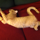
#my kiki!!#low quality photos can't distort this beauty#kihyun#monsta x#this kibebe is starving she is dehydrated she is shriveling#cr. yooham1122#those eyebrows boi! too much character too much rizz as the kids would say
8 notes
·
View notes
Text
the thing people point out most often in my paintings is usually my use of color. it's definitely my favorite part of painting, so hearing this always makes me happy. but it's weird, because it's really hard to articulate exactly why i choose colors the way i do, aside from basic color theory principles. HOWEVER, i've recently come to the realization that i have one significant influence that i don't often register consciously: IMAGE COMPRESSION. the way colors are compressed is really similar to the way i choose all the colors i use. here's an example of what i mean:

see on the left it's just a normal, white hallway. but when you start to reduce the number of colors through posterization, you see that there's BLUE! and RED and YELLOW! there's all these vibrant, glowy, low-contrast rings of color banding around the walls, comprising an overall 'white' image. they're like little halos of light. the photo obviously looks 'uglier' when you compress it like this, but i can't help but appreciate how unique it looks. it almost looks iridescent. you would never think to use color like this if you weren't a computer trying to crunch together the closest available colors.
there's a lot lost in a camera's translation of raw sensor data to pixels, but the distortion created can be equally beautiful if you look at it through the right lens. i remember zooming into heavily artifacted art when i was little and thinking "how do the artists know when to use white pixels or very slightly bluish-white pixels??" i ended up trying to replicate this a few times, assuming the reason my drawings didn't look as good was because i was using the wrong colored pixels. this initial misunderstanding definitely paved the way for my fixation on the subject, once i was old enough to know what a "jay-peg" is.
the different containers that data, particularly images and sound, are encapsulated in, always define them in some way. the idea of lossless quality—seeing/hearing something the way it was 'meant' to be perceived, free of distortion—is an ideal that i've learned to stop striving for. there's value in compacting things, and conveying them less than perfectly. this concept isn't anything new, of course. the warm fuzz of record players, the blurry imperfection of polaroid photos... these things are genuinely gorgeous, despite their 'ugliness'. it's almost strange to think that effects like these were compromises with the technology available rather than deliberate aesthetic choices.
dithering, reduced color palettes and artifacting are all obviously more modern forms of 'ugly', and thus less often reminisced about. but i really wonder if we'll see more appreciation of them in the future, and i kinda hope we do... i've been showing my appreciation for this somewhat abstractly, but it's undoubtedly still apparent as an influence in my art. i can't help but love it all, honestly.
there's something undoubtedly charming about images so compressed that it's obvious they've been passed around websites for a while, as well as slightly sped up, 128kbps versions of songs uploaded over a decade ago. yes, sometimes it hurts that you can't covey things with lossless clarity—there is always a distortion; a compromise made to compact raw data into something comprehensible by human eyes and ears. these little bits of 'ugliness' are unavoidable and inevitable, because they define the data itself. even your flawless FLAC files become distorted by the speakers that play them. perceptual perfection is always fun to strive for, of course... but sometimes learning to love the limitations of a medium is the best you can do for it.
#tl;dr: i love Images.#i have SO many thoughts on this subject but it popped into mind again today for no reason in particular LOL#i have another post in my drafts with a similar subject matter but pertaining to 2D vs 3D in particular. maybe i'll post that eventually...
85 notes
·
View notes
Last Seen Blogs