#just added in those that aren't a sketch or just vaguely in the background
Text
Started working on this February 16th and got too busy to get back on it so </3 i just gave up
#art#a-narcissists-warren art tag#digital art#ibis paint x#osc art#osc#object show community#object show#osc fanart#pmv#inanimate insanity#ii lightbulb#lightbulb ii#she's the main gal but like.. theres other characters so-#ii suitcase#suitcase ii#ii paintbrush#paintbrush ii#ii mephone4#mephone4 ii#just added in those that aren't a sketch or just vaguely in the background#unfinished
283 notes
·
View notes
Text


Design Rationale
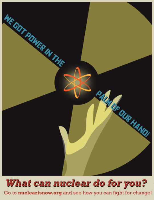
My goal with the Nuclear is Now campaign is to get younger, climate conscious voters interested in the idea of nuclear power through accessible information and an eye-catching design style. Nuclear is much more polarizing than other forms of energy production; mainly operating facility disasters and the association with weapons of mass destruction linger in people's minds and create unease at the thought of a nationwide nuclear power grid. In reality, nuclear energy already provides a majority of the United States’ emission-free power. 20% of all our electricity comes from nuclear plants. It is as safe as renewable energy sources while being vastly more efficient in regards to the space it occupies, wind and solar power don’t come anywhere close in the land necessary to power output ratio.
When researching I came across atomic age Soviet posters used during the early years of the Cold War. They were propaganda posters designed to get the public interested in science behind the nuclear arms race. They are all recognizable in a way only propaganda posters can be, and I focused on a selection that stood out for their distinct vibrant oranges, dark reds, and pale yellows, along with still strong but toned down mid to dark blues as a base. This was the final palette I chose to work off, along with blacks and dark grays for added contrast. Most of the designs used the atomic symbol as a focal point and I wanted to incorporate both the recognizable atom and nuclear logo, I knew that I absolutely needed to include these for clarity.
I wanted to create a striking design that used similar mid-century staples but also mixed them up for modern audiences. The discussion of nuclear power today is reminiscent of the original atomic debate, so I wanted the design to harken back to the past without overtly copying content from that time.
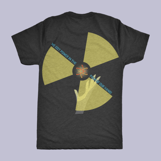
When I’m creating designs I rarely if ever have one idea and stick to it throughout the entire process. I don’t work rigidly within the stages of research, brainstorming, and final production, and if an idea strikes me late in the process, I will take time to sketch it out and see how it compares. I’ll often discover more designs that emulate what I want to create and give me more inspiration. Early wireframing helps me see how ideas are developing but those aren't always what make it to the final. For this project I knew I wanted light from an atom to illuminate a dark space and cast shadows on vague but discernible human silhouettes. I started with faces but saw other designs that utilized hands and decided that would be the better choice for this composition. I originally had the yellow nuclear logo providing all of the luminosity but then added a central source of light coming from the atom itself and that helped the atom become even more of a focal point. For the brochure I wanted it to feel different enough from the poster but still maintain the similar elements. Since I included almost no information on the poster, I knew the brochure had to contain everything important enough for someone interested to know. The poster was intended to function as the attention getter, and the brochure would be the supplementary material to actually learn. Even though it had to contain mostly information I didn't want the brochure to feel mired in text. I opted to portray the most important statistics as graphics, or just larger text visually distinct from a normal paragraph. The deathprint statistic I immediately knew I would include and the bar graph highlights just how massive the disparity across energy sources is.
The design I felt most satisfied with was the poster. I had found multiple posters that I was using for reference and liked different elements from each but wasn't totally sure how to incorporate them all in a cohesive way. Once the elements were assembled, I started to fine tune the color scheme. I wanted a dark background and ended up going with a very dark gray instead of a black as pure black often feels too heavy. With the number of light elements I included it wouldn't have been enough to offset a true black. I downloaded a typeface called Fyodor which was perfect for emulating the bold Russian style of letters that dominated these kinds of posters. Overall, I’m very satisfied with how this campaign turned out and I feel more experienced creating and working within one cohesive palette, and also working simultaneously across the different Adobe programs on one project.
0 notes
Last Seen Blogs

saraeelisejohansen-blog
17, Norway
poetrybranded
Seph ༄

eground01
Eground - Курсы бесплатно!

onii-shortie
Orojas
campbell-rose
Can i get uhhhhhhhh