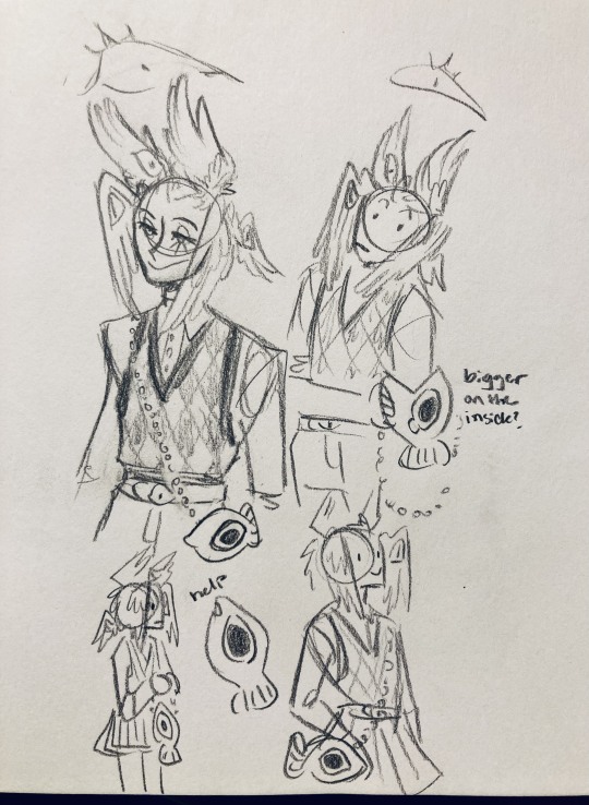
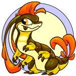
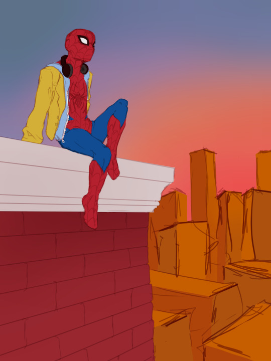
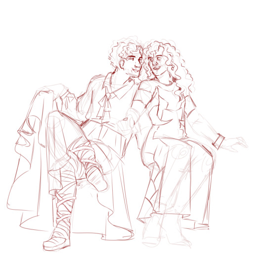
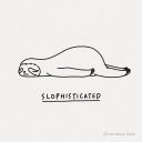
#idk how to lineart so this is how its gonna be
Photo
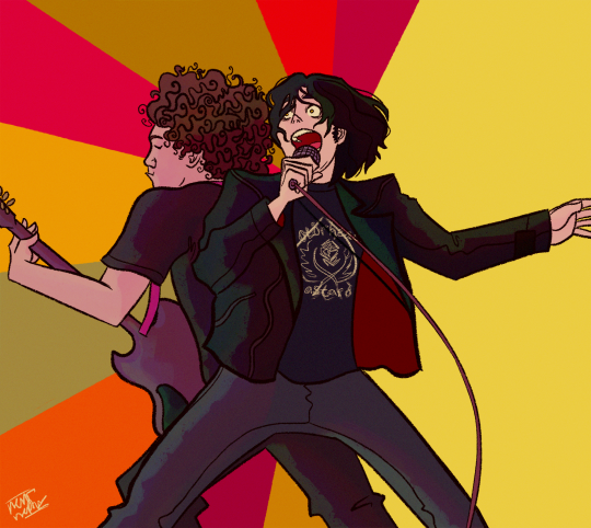
“you and i, we’ll fly home!”
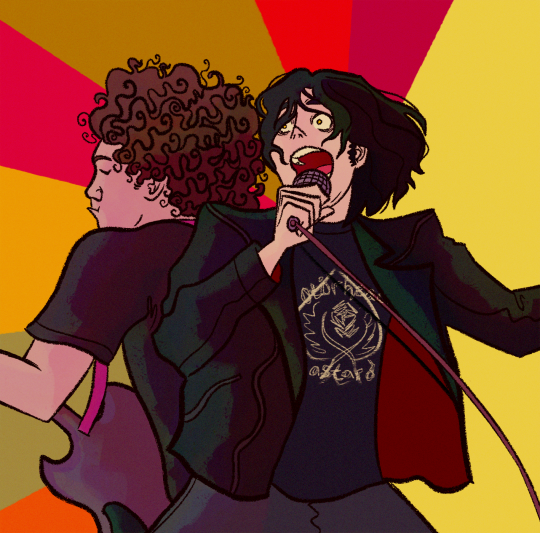
#aka guitars?? the continued saga of me drawings wacko instruments#idk how to lineart so this is how its gonna be#my chemical romance#mcr#mcr art#mcr fanart#gerard way#ray toro#my art#i brought you my bullets you brought me your love#this would've had another part to it but. like i said. idk how to lineart
3K notes
·
View notes
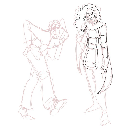
Text
Orb...
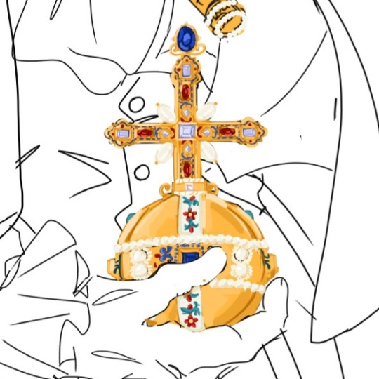
+ process kinda

#istg lineart is just a horrible terrible thing LOL#i sketch and it goes very well and i am very happy and i feel very creative!!!#i have to do lineart and it makes me want to give up the piece .....#i get to paint and im like omg i could do this for hours !!! this is so fun !!!!!!#thus: orb#im very happy w it so thats why im posting#idk how long the actual piece is gonna take so might as well post a little sneak peak ig#lmfao i gave up on the crown bcs it was too complicated and then drew this. maybe the crown will come back. prob not#im surprised w the process of this. i usually struggle a lot w accurately referencing real life things#and i usually end up tracing them just to understand how the form works#and god ive drawn so many complicated things for this piece and havent had to trace at all???? okay?????#i mean ofc its not entirely accurate bcs the craftsmanship on the original orb is actually insane#but i think ive got it down p well :)#ill have to try to make the gold look a bit better at some point later on but for now its !!!#i like how half my art i post here is either chibis#or just the most brainrot intense historically detailed shit ever#yes no one i talk to probably knows what a globus cruciger is but GOD DAMN IT IM GONNA DRAW IT ACCURATELY#had this thought ^ when i looked at my top posts and my last post was those nando chibis#and then after a week of not drawing after that im like yeah let me draw several imperial relics#catie.art.
9 notes
·
View notes
Text
i want to work on art rn but i have like three separate drawings In Progress currently and theyre all at different and frustrating in the process so instead im just gonna keep wasting tjme probably
#how the fuck is it 7:30 already thats so messed up. ive done nothing today#okay technically two of the drawings are both in the Lineart process but theyre like different aspects of it ig#one requires actualy fucking like anatomy knowledge or whagever and also i gotta figure out how to draw this stupid jacket#its frustrating and different parts of the drawing are starting to piss me off so idk what to even Do With It#the other one the shoes are giving me trouble and then i gotta line the last character in it.. colors are gonna#be a breeze for it since its a redraw of an older piece (its almost a year old now wtf..) and i have a very specific vision of how i want#it all to be stylized or whatever too. with the last one ive lined and colored it but little things still feel off and the colors look weir#i cant decide if i wanna shade it and how id even go about doing it if i did.#okay sorry for rambling (not really) i like talking and explaining my thought process even if im not very good at it#part of me is also tempted to start working on a different drawing idea…. help me /silly#inquisitivewaltz.txt#normally i dont have so much stuff as wips but ibispaint having an actual. gallery thjng + me getting more ambitious#with the ideas for my drawings is kinda making me have a Lot more random files i dont finish before moving in to smthn else
2 notes
·
View notes
Text
my gillion design has been on my brain and I think my favorite little detail I gave him is the scarring on his lip (on the right side of his face). the bits that expose his gums/teeth more. idk WHY I did it but it makes me happy
#like i literally dont know how he got them. training accident probably. but they spark joy so they stay#also i think its funny how the left side of his face is almost totally unscathed#i WAS gonna put the kuba scars there but idk i feel like it clutters his face too much#we'll see#also also i love changing the lineart color of his teeth/eyes. it makes them look glow-y#marble mumbles
4 notes
·
View notes
Text
The temptation to draw Derek and Randy fighting... 👀❤️
#shut up 🐁#randy#my oc#idk if i should tag this as tpof since its such a small thing... 😔#i think it's so funny how ive been working on this one gore piece on and off again for the past two months or something-#-and even though im like this close to finishing the lineart im just getting ready to put it on the backburner to draw tpof fanart spdjfspfj#the tpof brainrot is coming in full force and i am welcoming it with open arms#im not sure what im gonna draw first. but its probably either gonna be bear trap dan or randy vs derek 👀
11 notes
·
View notes
Text
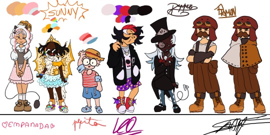
The full lineup is almost done!! (just needs some touch ups and a Chunsik design👍) FEEDBACK IS GREATLY APRECIATED!!
Design process under here (whole lot of yapping)
General thoughts: Ive given them in my previous design sheet (you can find it in my blog)(tldr: designs match characters but still childish, 8-12 years old). Only thing different here, is that these eggs were eggs who I had less of a clear idea of what I wanted to do with them (though I still really liked where I ended up!!)
Empanada: Didnt want to go for the full sweet lolita route, mostly because I thought it'd take away the "little kidness" of it all, but something that still resembles the aesthetic. She's wearing "carneirinhos" (idk the name in english) which is very cute little girl to me, and shes also a demon! Her tail resembles a frying pan!! Though I might change her fringe (it was supposed to be baby hairs but now that I think about it, her type of hair probably wouldnt have them) and put some argyle pattern in her sweater vest. I just forgor💀 to do that...I also wish I had made her shorter, but unfortunetely I drew this before the eggs did the height check (YES ITS BEEN THAT LONG).
Sunny: My beautiful baby girl. She means the world to me. I love this minecraft egg with all my heart. Shes wearing Light up sketchers and some fairy wings like Pomme, and shes actually wearing a swimsuit, she just put a tutu over it. The diamonds they're always holding are rings, they have a "terere" in their hair (idk name in english😭😭) and the beads were inspired by an artist on twt (@\BLUETOMATOSODA). Also if you are wondering why her hair looks like tentacles, its because I had originally made it puffy, but changed my mind after doing the lineart, so i had to get creative with me covering it up. Just pretend she has a fan, shes a star after all!
Pepito: Basically, he is very smoll. Chiquito even. He has strawberry hair and MASSIVE glasses that take up his entire face. Hes wearing a swimsuit aswell (dont ask how it works idk either), and has floaties since he cant swim. Hes got crocs, since flip flops hurt his toes, with a spider man charm on them! Also hes got a sunhat, mostly cause I wanted some other accessorie but didnt want to go with gas mask since it'd kinda kill the whole swimming vibe (since his model is wearing a swimsuit). sorry if its not too accurate to his character. Side note: Him, Em and Sunny all have freckles! Him and Sunny all over their bodies while Em just has on her cheeks.
Leo: Cute sporty vibe, love her shorty spiky hair. Wanted to try to make her face spiky aswell, for the whole shark dad thing. Shes got a necklace with a shark tooth (I guess she got it from Foolish??). He changes tshirts randomly, and opens and closes his attack on titan hoodie depending on the tshirt's expression (basically my version of Leo changing her player heads constantly). His trainers have dragon wings and also: whealies!!
Dapper: Im gonna be honest: did not expect to like his design THIS much. The colouring really elevated, with the long blue hair (the same colour as the ghosties!). Wanted to make them, y'know, dapper, so I had to sacrifice some of the "little kid vibes" unfortunetely, but I think it fits her still. The hat has part of the helmet that they used to wear a lot, demon horn to match Pomme, and a suit that is VERY inspired by Death the Kid from Soul Eater (very fitting for a reaper in training imo). Might be my favourite design!
Ramon: Jesus fuck you'd think designing your fav egg would be easy BUT NO. I struggled long and hard. Again, he doesnt have that much "little kid" vibe whatever man😭😭 Im just happy that I even managed to make SOMETHING. Hes got Create googles, his meathead is a massive hat that completely hides his hair. Very simple, very Ramon, though I will probably end up making a version with an ugly sweater just like he likes instead😔. I still like it but. man...
ANYWAYS IF YOU READ ALL THAT MWAH, YOURE A REAL ONE, THANKS FOR ENTERTAINING MY THOUGHTS🫶🫶🫶
#qsmp#qsmp fanart#qsmp eggs#qsmp empanada#qsmp sunny#qsmp ramón#qsmp ramon#qsmp pepito#qsmp leonarda#qsmp leo fanart#qsmp dapper#qsmp sunnysideup#ramon the egg#ramon qsmp#leonarda#leonarda the egg#leonarda fanart#leonarda qsmp#pepito#empanada#sunnysideup#sunny the egg#empanada the egg#empanada fanart#sunny fanart#dapper the egg#dapper fanart#breakfast trio
52 notes
·
View notes
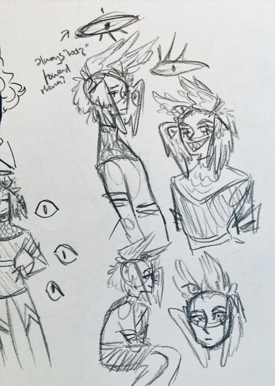
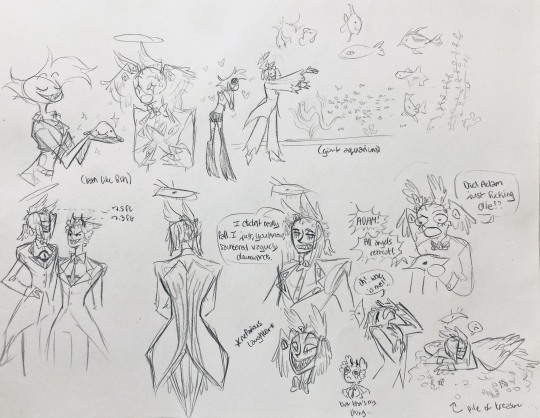
Text
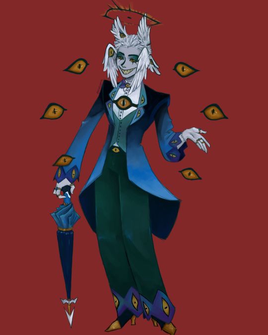
I finally finished the piece for @prince-liest's OC, Tzafael! this really reminded me of how fun character design is (and also that I've completely forgotten how to make digital art, but that's besides the point...) <3
credit to @hogbogglerspirits for the umbrella design! I kind of butchered it so please look at the original and throw lots of love at them
LOTS of notes, draft sketches, brainstorming, etc. below the cut. enjoy!
(note: a lot of what I'm talking about is based on posts prince made under their #tzafael tag, so take a look at those if you haven't yet!)
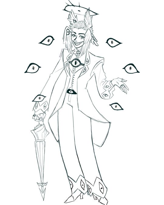
thanks for joining me below the cut! here's the sketch without the colors as a treat (in case you want to color it yourself or something, idk).
notes about making the digital drawing:
holy shit this took me forever -- I was not kidding about forgetting how to make digital art lmao. I forgot how much less forgiving digital lines are and genuinely lost the spoons to even attempt lineart, hence just a sketch below the colors.
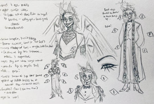
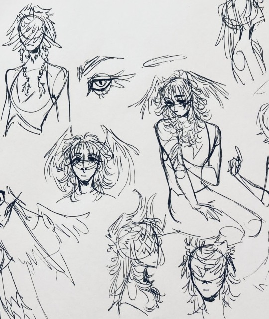
some of you might've seen the original sketch I sent to prince, which the digital version diverges from just a little. it's mostly the halo which I'll explain later, and I finally caved and drew the sixth eye (you can tell I drew and erased it multiple times in the sketch lmao -- still don't know if I prefer it with or without)
here's the original color ref by the lovely @gendermeh! my color scheme ended up looking really different, so some notes about that:
I was looking at references for magpies like this
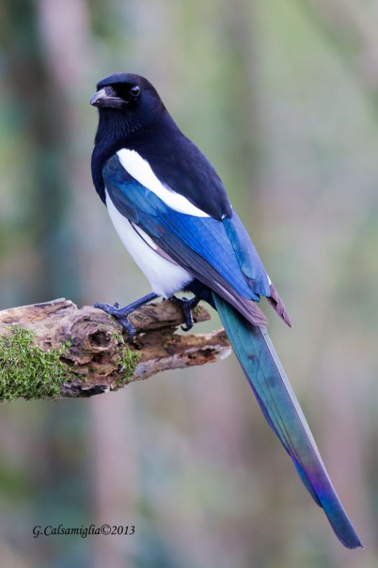
and I wanted to basically follow that color scheme while also being somewhat similar to the original -- dark head/shoulders --> dark top of the jacket, bright blue wings --> bright blue bottom of the jacket, greenish tailfeathers --> green pants, hints of purple --> purplish sleeve and pant ends
I also tried (and mostly failed, let's be real) to capture the iridescence of the feathers -- they look like oil spilled on the pavement or iridescent hematite to me! I think the key ended up being adding bright greens/purples and roughly blending them into the blues or vice versa but I didn't really figure that out until I got to the pants lol.
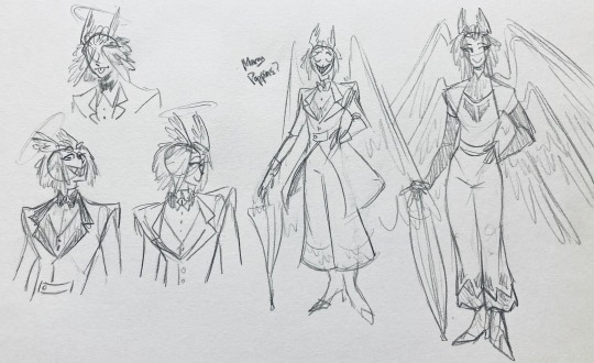
I'm gonna be honest; I don't remember why I went with this shape for the tailcoat. I just remember being unhappy with the sketch and then trying a bunch of different shapes that mostly looked worse lol -- I think I landed on this because a split tail kind of looks like wings?
KEPT the shoes -- absolutely magnifique. I wish I knew how to color gold better.
added lots of jewelry! they like shiny things :)
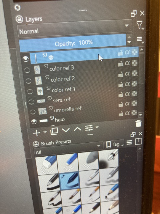
ALSO PLEASE LOOK AND APPLAUD ME. I FINALLY REMEMBERED TO LABEL MY LAYERS!! NO I DON'T REMEMBER WHY THE HALO HAS ITS OWN LAYER.
alright, time for some more design notes/explanations + draft sketches!
but first, a couple disclaimers:
I want to make it very clear that I LOVE everything about the original design. I made a lot of changes based on personal preference/the way I interpreted the character. I was actually planning on making a digital piece that was more faithful to the original design too, but I was just out of spoons for it cause of life stuff.
you probably shouldn't try to read the notes I made in the sketches I'm about to show you unless I say otherwise. most of it is incoherent brain vomit in illegible artist handwriting and I'll transcribe/explain the stuff I think is important :) (the stuff in quotes are direct transcriptions of my notes)
I know my sketches are very messy lol. I only draw for fun, so I usually don't force myself to make stuff any neater than necessary unless it's supposed to be a formal piece. try to bear with me.
1:
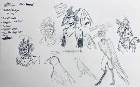
my first few sketches of them! (I think?) this was before I sent prince a laundry list of questions so I was still trying to get a vibe
"magpie -- beak lips?" -- you'll see this in a few sketches; I considered giving them the lipstick design that velvette has since it looks like a beak. I still kind of think it's cute, but 1) I'm pretty sure velvette is the only character that has them, so I didn't want to make it seem like they were related somehow and 2) I thought it might be distracting with how much other crazy stuff I ended up including in their head/face
also, sidenote since it's relevant to what I said about vel: something I realized was important is how one character's design relates to the designs of the rest of the cast. I wasn't sure how much I should've gone for what looked good in a vacuum, how much should be based on what other characters looked like canonically, or what other characters would look like if I also designed them. it ended up being mostly the second option, but it was honestly still a struggle. should I take away some of the tumblr-sexyman-ness (no shade to tumblr sexymen; I love them) because there are other characters that already have it? should I relate their design to sera's and emily's in the show or should I think about how I would've designed sera and emily? should I follow some of the design philosophy of the original show and just throw stuff on there because it looks cool (the answer is yes btw)? decisions, decisions ...
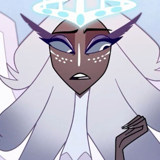
I don't think this showed up really well in most of the drawings, but they actually have a black line down their nose! let's take a look at sera:
since they're siblings, I wanted to include some similar facial markings. the nose line ended up being the only thing I kept though -- I was going to include freckles, but I have a compulsive need to give every character giant bottom lashes so there ended up being no room T.T I like that the magpie's hints of purple kind of match hers tho!
the wingification of the hair begins! I was still unsure of it at this point, but it was an idea I had since I was kind of struggling with how straight the feathers were in the original.
"maybe the ones on their head count as wings (so only one main pair)" -- I originally just had the 2 pairs of wings on their head, so I was thinking of just giving them 1 pair on their back so there would be still be 6 total. also this middle drawing of them is meant to be their exorcist outfit (I wanted it to be a cross between what the other exorcists wear and sera's outfit)
at this stage, I was thinking of giving them more magpie-like characteristics, so I looked at some references and tried to emulate them in a more human design. this ended up being really awkward so I scrapped it, but I still like the idea that their exorcist mask looks like a bird (kind of like a plague doctor's)
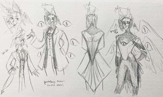
2:
peekaboo! I love the idea of them using the wing hair to cover their eyes lol. (ended up using that idea for my own seraph OC since that's their biblically accurate purpose: to cover their eyes/faces in reverence/humility -- doesn't really fit with tzafael tho lol, so they show their face most of the time)
an eyeball in the bowtie -- pretty self-explanatory. the eyeball motif is important.
the one in the middle is just me practicing drawing the original design, and the one on the right is another exorcist outfit I think. I wanted to include the diamond motif/points that sera has on her dress (the diamonds on the bottom turn into eyeballs, which is why the final design also has eyeballs on tzafael's sleeves/pants)

3:
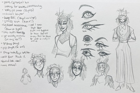
lots of notes on the side based on what prince said in response to my ask
"localized omniscience (power of sight) -- cool + ironic that their sight was supposed to serve God but made them see Heaven for what it really is instead"
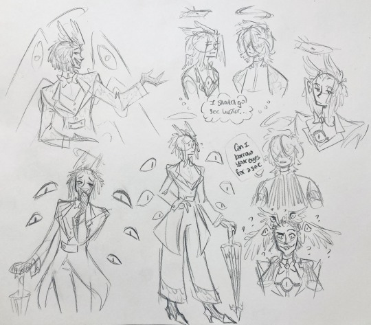
another exorcist outfit, this time including the feathers
I was also experimenting with the halo; I was trying to make it look sort of like sera's crown, but that didn't feel right ...
some practice with eyes -- my style is pretty flexible with eye shapes, so I try to make them suit the character. I drew lute's eye and also an actual magpie's as references -- lute's because of the exorcist background and also because they looked appropriately sharp, magpie's for obvious reasons. once again, my compulsive need for giant bottom lashes strikes
there was honestly a lot to balance with the eyes -- I wanted them to look condescending/bored (lowered top lid) but also amused (raised bottom lid) and like a magpie (round) but also harsh/mischievous (sharp, maybe slit pupils like a snake) and similar to sera's (but not too decorated -- also does it make sense for them to look like sera's if emily's don't even look like sera's?)
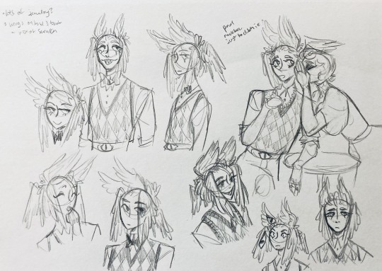
considered having wings on the shoulders -- the magpie pattern is super cool, so it would've been nice to have that somewhere more explicitly in the design. I still think that might fit in an outfit they would wear in heaven (maybe for formal occasions)
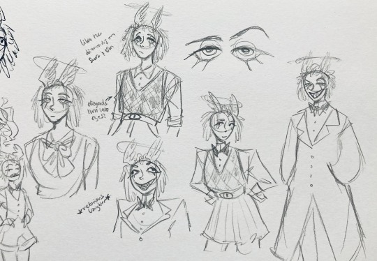
the introduction of the sweatervest! honestly I kind of love this for the way it captures more of the preppy, spoiled old-money upper-class vibe some heaven residents have, but it was scrapped since I couldn't imagine them wearing that while trying to scare the denizens of hell. maybe something they wear casually though.
"yes nictating membrane (on every eye!)" -- AHH I'm so sad I didn't end up putting this to use. I just feel like the whole effect is based on actually seeing them blink, and I don't animate lol.
4:
ugh, the nefarious laughter one ... don't worry I tried harder on a sketch later on lol.
"like the diamonds on Sera + Em" + "diamonds turn into eyes?" -- I draw the diamonds on the sweatervest turning into eyes later.
tried an actual bow instead of a bowtie -- very cute but didn't fit the vibe.
a skirt! I think they would wear a skirt sometimes.
5:
"FUCK ASS BOB" -- asghdk the wingification of the hair continues. unfortunately, I'm realizing at this point that the silhouette of the hair is starting to look a lot like alastor's. I gave a very half-hearted attempt at mitigating this, but it goes back to the thing of how much I am obligated to the original show's designs and what looks cool to me -- I think the wing hair fits them and I didn't want to change it because of alastor, plus my alastor design actually has completely different hair anyway. I did add a third pair to the back to look like a ponytail though.
introduction of the scarf! I was actually going to include this in the final design but uh,,, I forgor. are you starting to see a pattern.
the reason for the scarf is that the "tzafael going to places they know they'll draw attention/can incite chaos" reminded me of that scene in avengers where loki walks into a fancy building looking pretentious af and just casually stabs a guy's eye out. not really the same thing but I felt like the vibe matched. hence, loki's funny little scarf fit.

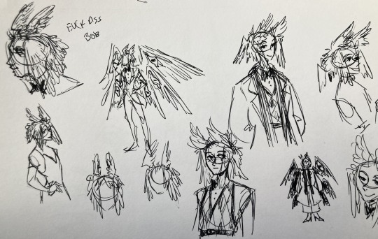
6:
uaoughdfjh it was SO FUN to draw the wing hair, and it was at this point that I realized they had to stay even though I wasn't sure if it was too different from the original.
gossiping with rosie cause that's the first person I thought of -- tzafael also summoned a pearl necklace to clutch because of the sheer drama of it all (your ex-husband did what??)
also started drawing the rings on their hands. magpie like shiny.
7:
lots of notes cause I was trying to compile the things I still needed to think about/incorporate into the final (I thought this was gonna be the last draft ... haha)
trying to include more bird/eye motifs
"fish ... purse?" -- ha! I forgot I was gonna give them a fish purse. I think I drew that in a later sketch, but not them wearing it.
"picked up Hellish traits bc of extended stay -- existential crisis?" -- I asked prince about the sharp teeth, and their answer implied that they became sharp as they stayed in hell longer, which got me thinking ... I feel like that's actually a great body horror concept. lucifer falling and looking like a normal angel at first, eventually waking up to more and more devilish features and feeling more and more like he's lost his home and his past self ... spooky.
another exorcist outfit -- I actually really like the eyes on the ribs! I never made a final draft for the exorcist uniform, but it would probably look close to what I drew here.
the one on the bottom was meant to be similar to the feathered shoulder pad idea, but this time with the whole magpie (with giant eyes). tried putting the "freckles" (really just dots in this case) over their brows, but that ended up looking kinda weird.
the eye is pretty close to the final design
the one on the right was supposed to be the full final design, but I was totally off lol -- the long trench coat really doesn't give off the right vibe at all
8:
playing around more with the loki vibes of the scarf, also added an eyeball to the chest
I never got happy with the design of the back of the coat -- I think it should probably just be blank at this point. but the sketch here is meant to look like wings/tailfeathers.
yet another exorcist outfit, this time with more magpie motifs. I actually like this one a lot, but I probably should've added the eyes on the ribs from the last sketch. I think I also considered giving them actual tailfeathers at this point.
9:
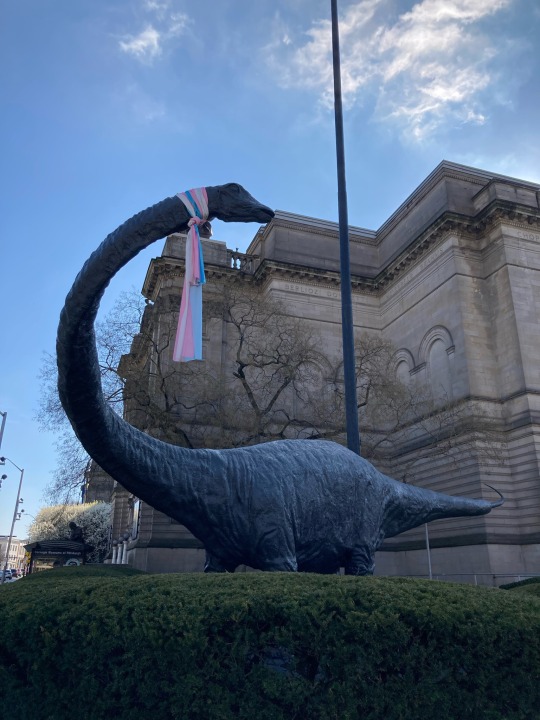
thanks for sticking with me! I promise we're almost done. have a trans dinosaur I saw while I was travelling as a treat <3
10:
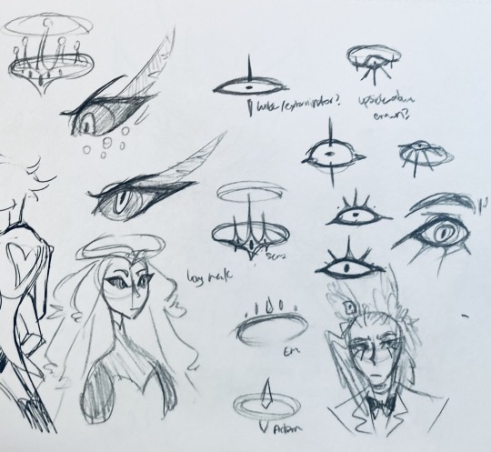
this is after I finished the sketch for the final piece and realized I didn't like the halo design. I drew lute's, sera's, em's, and adam's as refs. (honestly I love the show's idea that each person/people of each rank have a different kind of halo -- I wonder if they can switch them out?)
my main inspiration ended up being the exorcist halo, but I made it look more like an eyeball -- since it always points toward heaven, we can say it's always "looking" at heaven.
(also sera's feather lashes! they're so cute)
11:
EVEN MORE EXORCIST DOODLES
12:
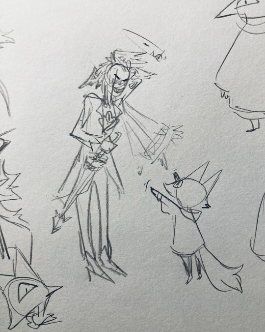
tzafael shooing away my fox demon OC
13:
these are actually sketches for my own seraph OC (raguel), but I wanted to include it since it has even more wing/feather hair variations. I also think the idea of the eyelashes being feather-like could've been cool for tzafael.
14:
some more OG design doodles
tzafael and raguel together because self-indulgence is the name of the game babey (also wanted to draw tzafael freaked out with their wings flared)
(raguel's blind btw, hence asking for eyes -- tzafael has so many!)
you can probably read the dialogue here so give it a shot. I believe in you.
15:
you know what? the fish purse deserves some doodles
16:
putting them in Situations! I was reading over prince's posts again and I realized there were some funny things I could draw them doing/saying
again you can probably read the words here
angel dust also loves fish (but is apparently bad at taking care of them, hence the suffocating blobfish), so tzafael shows him their aquarium (complete with live fish and flora ofc)
I thought alastor was 8 ft but apparently he's 7.3 ft? so tzafael is enjoying the .2 ft they have on him
trying and failing again to come up with a design for the back of the jacket lol
THE crowley quote
apparently the halo still sends signals from the exorcists -- thought their reaction to the battle at the hotel would be funny
the nefarious laughter (take 2) that I promised -- based on a doodle of alastor viv did that I found
them being sad and curling up in a pile of shiny things like a dragon
OKAY I'M DONE. huge, huge thank you to prince for sharing their OC! this was a lot of fun and clearly inspired me a lot haha. please check out their writing; it's literally so good that I can't read anything else these days. I am chewing on their thoughts constantly.
this was an absolute monster of a post, so if you're still reading, I am both impressed and bewildered at your patience. I hope you enjoyed! (I certainly did!)
#prince (because they are very sweet): I'm excited to see your thoughts!#my thoughts: magpie like shiny hehe#hazbin hotel oc#prince-liest#hazbin hotel#my art#character design#sera hazbin hotel#em hazbin hotel
43 notes
·
View notes
Note
hii sorry if you’ve already answered something like this in the past but how do you shade? ur art is always rendered so nicely and the colors are chosen so well!!
HELLOO THANK YOU! SO let’s start from the basics
when something is white or black you can change that to something else, here’s an example (for black you can just pick any colour and make it darker)

2. if you have space (in the background? idk how you call it) you can put a showy colour

3. colour picking - i tone it down / take the saturation
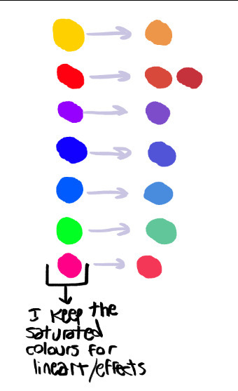
i dont add lighting unless there's something like glass
separation line cuz its gonna get a bit long
1.
you get your base colours ( i revived my oc for this ) (now after the basics u know where the white, black and [in this case] yellow came from)
2. i hope you know how to use layers
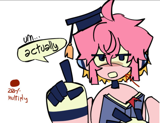
specific art style thing, i dont know what that is
3. if you arent the type of person to stick all the layers of your base colours then CHANGE IT!! for this tutorial
so what you are going to do is create a gray layer, all gray, fill it, the layer has to be on top of the base colour layer
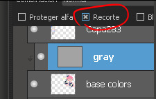
u click that button, it has to look like this
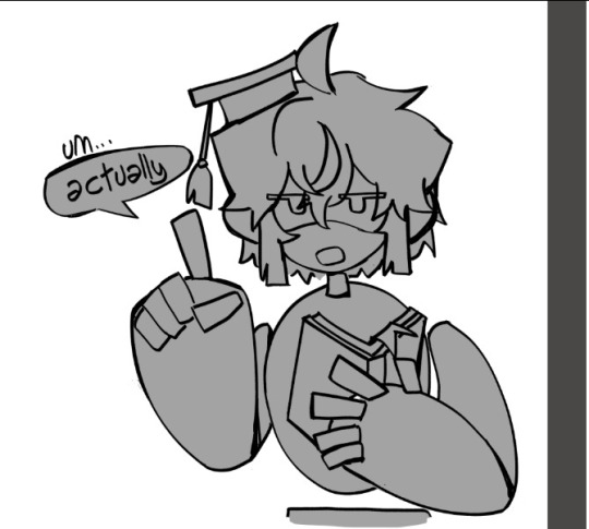
4. you create another layer (above the gray one) (it has to be on the same layer mode with the second button so what you do doesnt go out from the base colors)

then you put your shading, I use red
+ i like to remark around the lineart bc yes
5.
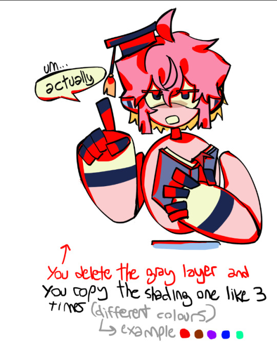
trust me
[extra unnecessary info = a good mix is red + blue, and purple or brown are good on their own (in multiply)]
6.
you experiment with the layers, adding or deleting until you like it (i usually dont like if the shading ends up too not-colourful or too heavy) (the modes for these layers are multiply and SUBEXPONER) (I DONT KNOW THE TRANSLATION BUT ITS THIS ONE)
7. once you get what you want you merge the shading layers one per one to the base colour layer, so its all gone, you have all in one layer

8. BORDERS
you make outlines around the shading, in a colour that is more ?saturated? / showy <- you can use these same lines you are doing to just remark what you want (like the speechbubble, bad example but u get it)
in the black color i used (here its darker blue) i didnt use a lighter saturated colour like everywhere else, i used a darker blue
9. SECOND ROUND OF BORDERS
whats the difference between these and the ones from before? in this step your starter color is the base color (in the other you picked from the shading) , you dont go too far to make it outstanding
all of this it makes it more solid
10. AND LAST you colour the lineart (in the same layer mode you used before where what u do doesnt go out of the layer)
very saturated here and i randomly added orange bc reusing colors is cool (since the filling behind the hair was yellow it ended up like this)
edit: i dont like to change much from the outlines, more the inside because i like it when it looks like a sticker
thank u for reading
#art tag#adding in the tags that this is only a way of the many to colour#you can stop at any step#add more#modify anything#i guess what i keep the most is that in the shading there are outlines#also its better to have a grey-darker background colour while picking colours#bc if its white you will be like 'naah these colours are too strong' and you wont dare to try more#tutorial
76 notes
·
View notes
Text
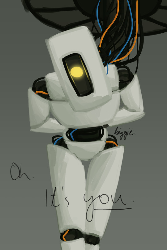
cringetober - hot villain/video game
(asexual voice) hmmm. have i captured what makes glados hot? i mean. evil robot obviously. "big lady looking down on you" is always a safe bet. and the condescending head tilt is so quintessentially glados i couldnt not include it..... idk. take it or leave it lmao
also i hope this quote is iconic enough for people who have played the game to recognize it, but if not - its from the scene in portal 2 where you accidentally revive glados and she recognizes you and then monologues about how shes gonna torture you for the rest of your life. honestly shes so iconic for that
anyway trying out a bit of a different style (i mean. when am i not lmao) - kinda messy but i like how it turned out! i dont mind doing lineart, but i find it never turns out how i want, so. i just went without it for today. tomorrow? who knows :)
#goddammit. one day i will remember to sign my art before i export it but. today is not that day#biggie draws#cringetober 2023#portal#portal 2#glados
41 notes
·
View notes
Text
long post talking about making neopets style art, but not in a way that's useful or coherent or proofread
idk why of all the things that i struggle to do, the thing i keep coming back to trying to pull off is 'imitate the neopets art style circa 2004-2007'. i'm really proud of the stuff i make in that style, but i've always got a nagging feeling about how there's like, very few applications for this very specific skill i'm building, and i could be spending this time improving at anatomy or perspective or anything else. i guess that's just the power of 'wanting to learn something really bad' combined with, critically, 'believing im really close to figuring it out'
there's something about the line weights on a lot of old pets that's really hard for me to capture, and i've gone through a bunch of different ideas of why that is- like, maybe its easier to do in flash, or its something about the way i have the pressure sensitivity set up on my pen, or maybe the official artists also carefully shaped and weighted their lines while scaling the drawing down every so often to make sure they 'feel right' on a small scale (lol), or maybe its that shit that artists who've been inking shit for a long time learn how to do intuitively that i'm just not at the level of yet.
i'm looking at this smug bastard like. how do they decide which lines should be thick vs thin. my instinct is to go thicker on the corners of points like the ear tips, but this artist went thinner, and i think weighted the lines heavier on the undersides of shapes where the shadows are? neo artists aren't immune to stuff that frustrates me when i'm making pet art either, almost every pet has some part of their lineart that makes a weird tangent with the damn Circle. the linework on the hands straight up isn't clear at all, but i can tell what the pose is from how the shoulders are positioned and the expression of the character, so i guess that doesn't really matter at the end of the day
im pasting the lines i'm working on next to existing pets with varying levels of detail, but it might be too early to tell if they have the right level of clarity. i'm also i'm back in photoshop because that's easier for me, but maybe i should have tried flash again- doing the art in vectors does give the finished image that hard to detect Crispness that i'm always chasing


in order, these were drawn in photoshop in 2019, photoshop in 2022, and Flash in 2024. i was going to be like 'oh god, the Vully DOES look sharper than the centibyte, it must be Flash' but honestly i got the halloween one to look pretty close?? maybe i scaled down my photoshop images differently in 2019............ i think i've also gotten better at mimicking the lineart style, so it could also be that, but that doesn't account for why the top one looks kind of blurry in comparison. am i crazy. is it visible to anyone else.
anyway ive gone off on a tangent. for some reason this is what i'm obsessed with doing so i'm just gonna keep on trucking until something else seizes my attention instead i guess
#i'm not trying to put down my own work here#i am proud of the neostyle art i've made#i'm talking about that feeling of like.#knowing that there's a few things i don't quite grasp and wanting to figure them out#i need a text post tag#neopets
29 notes
·
View notes
Note
your soul design is so yumilicious I need all the details now on my dinner plate
fr tho I want to know all the soul design lore how did you create such a creature /vpos
OKOKOHHHHHHOKOK BUCKLE IN. YOU’RE GONNA GET THE FULL DESIGN PROCESS
I struggled the most with Soul ngl. I couldn’t really think of anything I could add that would differentiate him from the fanon standard. I’m a lil upset I couldn’t think of something more original, but nonetheless he turned out quite lovely !!!
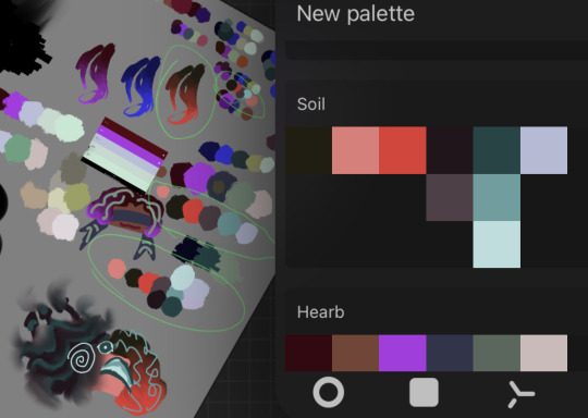
I started with the color picking. I was very insistent on making everyone’s colors proportional to eachother. The main colors should have (about) the same saturation/brightness, contrasting colors that are the exact opposite hue of the main color, respective black/grey/white values (soul’s ‘grey’ color is more teal bc color theory but yea), shit like that i guess. The final palette is on the right, it’s what I use today.
Soul never got fully fleshed out concept sheets like the other two. I guess my brain just filled in the rest of the gaps without having to draw them. (I apologize for never finishing these btw. It’s been months man. I hope the blorbo doodles in the corner make up for it) The second image was done a lot later than the first btw. Idk if that matters but I’m bringing it up anyway.
His fit inspo came mostly from Pinterest. I just compiled a bunch of shit I think he’d wear. Plus a majestic cape because it makes him look plenty more epic.
OK MOVING ON. I decided that his main gimmick would be my take on his shaded side. The idea was to make it represent dissonance, and how it affects Soul. The shadow is basically just this fuckin void. It has no physical form, and you can just stick your hand in there if you’d like (he sometimes stores the trident there). However I wouldn’t recommend it. The feeling is indescribable, but very uncomfortable. The void has a life of it’s own in a way. It does not stay confined within the Soul’s physical form (or in my case, his lineart). When conflict is at a high, like, tridential regicide level high, the void will get very close to fully overtaking him. It only fully disappears once true concord is reached, and starts reforming when the next cycle starts.
Also, the mask !!!!! Throughout cacophony, Soul is having a huge fucking identity crisis and shit. He doesn’t really have a physical organ like the other two. He doesn’t know why he’s here, or what he did to deserve this, or why nothing he’s trying works, and just. What is he if he’s failing at his main purpose???? I think because of this, he doesn’t like showing his face around the other two. He needs to assert is power, and thinks that showing his face will make him come of softer and less of someone to obey, if that makes sense. He only really takes it off when he’s alone in his room or pocket dimension (still trying to decide if they have a mock ‘apartment’, or ever did at one point). But once he has the character arc in Two Wuv, it permanently comes off !!! Wahoo!!!!!!! If only the next cycle weren’t to start, resetting his newfound self image to its previous state !!!!!!!!!!
Ok this is getting long im putting a read more thing
This image was very helpful for designing the tine shapes!! Guess which one is Soul’s !!!!!! (Spoiler alert, im pretty sure its either the 2nd or 6th ones in the 2nd row. However i genuinely dont remember. This may not even be the right image)
Soul also has a strange tie with eyes. If the halves have pissed him off to the point of no return, he does this fuckin analog horror stare that freaks the shit out of them (although heart cant see he remembers it very well. Plus, he just k n o w s that extra eye is there). I haven’t really played around with this, but I like the idea of a freakishly absurd amount of eyes hidden within the shadow. I should maybe like. Draw that sometime.
Also, expect a Soil patch update in the future!! I’d like to make his fangs more deranged, and maybe add an earth pattern to the cape. Right now, he has no symbols on him that represent him in the astronomy metaphor.
Uhhhh i hoped this helped??? If i missed anything you were hoping to know about, do let me know !!!!!!!
#i need a tag for posts like this#i shall call it#design lore#cj rambling#chonny jash#cccc#chonnys charming chaos compendium#taps asks#cj soul
45 notes
·
View notes
Text
who's lila yammerings (i should be asleep
thinking about Who's Lila again and i really do love how the three layers of the mystery as broken down by Flaw Peacock includes kindof commentary to the "all interpretations are equally valid/correct" writing copout that isn't just the opposite statement or a rebuke of it, but also something that ties it all in with the rest of the game's infohazard/memetic properties themes. like yes, broke = all interps are valid + woke = there IS a correct answer as this is a mystery, but also bespoke = the correct interpretation comes from the unconscious mind of all people, a zeitgeist, et cetera.
it can be equally as much of a copout- because break it down, what tf does that imply? that the interpretation that takes us at large is the most correct? so the most popular theories, and that the most widely accepted aspects of the game, are what is true? whichever red herring that turns out to be when it is handed to the public? it can totally be a copout. not for lack of effort or intelligence or artistry, as FP's video is nearly 8 hours for a reason, but also it can be copout. a REALLY COOL copout though. i can't picture of any other story that i know that does this, nor could i think of a better story to do it.
because it's all about the cultural zeitgeist and memetic properties. beliefs and feelings and ideas and superstitions that trend. Lila is the mystery but she is also a demon, she is also a trauma, she is also a metaphor, she is also a delusion, she is all of these things, but above all else she is what YOU hear she is. the most popular, most widely accepted interpretations are what get shared, and spread the furthest. unrelated people hear about it, maybe give these opinions the time of day for a quick read, and Lila has fully cemented herself in those people's brains as that interpretation, even if alllll that information they just took in winds up being dead noise that the brain scraps entirely with time. she WAS there, however fleeting, as is her abiding by her, or the, laws of memetics
and to me, this is the interpretation. but that doesn't change how people at large are viewing her and i certainly wouldn't know better as i haven't bothered looking into it. idk yall im not gonna ask. regardless she is whatever we first thought she was, and unless you dig deeper and find out more, she's infected you thus. just like how the Dada Dog was originally just some guy's silly drawing, but evolved into an alt-right symbol of actual genuine murderers. somebody took the Dada Dog and maybe unintentionally recontexutalised it when putting it next to their personal dangerous rhetoric, and their ilk ate it up like flies to the point that there was nothing left of the Dog but the picked clean, bare bones of its lineart and sombre expression
my best guess are that there are three layers to the current zeitgeist of Lila as well. 1. the unknowing crowd, who have maybe seen a few pictures at most and maybe a little bit of the game, assuming she's a trauma metaphor characterised as a paranormal thing possessing dear William. 2. the initiated, knowing a little more and who may lean towards her being a demon taking advantage of kids with issues. and 3. whoever was insane enough to dig this deep and grasp that she is exactly what we think she is
Conclusion: Poor William
#ikildaman shut the fuck up#who's lila#infohazard#unreality#i dont know if this needs any more tags but the game is very egodeathy mindfucky by design#if people are freakt out by allat stay away from that game and probably this post as well#i say that last paragraph as someone who has REWATCHED flaw peacock's WL video multiple times#and i get a better grasp of what Lila is each time#not bc im studying it or am a megafan of WL either i just really REALLY like this video idk. idk dont look at me#also yeah i know william is just as much of a killer as he is not a killer but idc. im on his side#he did not deserve none of that none of those kids deserved that#justice for william. justice for wheeliam#i should draw them all alive and happy and as friends and it will be just as canon and real to me as everything else
24 notes
·
View notes
Note
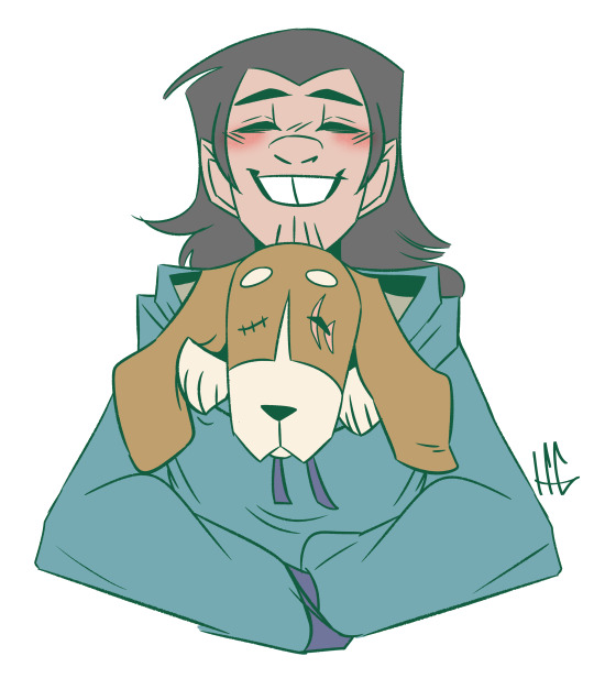
Hey, I don’t know if you answer asks and you don’t even need to I just wanted to send this. I had seen two artist also draw Casey jr with a service /emotional support dog(one I asked for cause its my favorite hc) but I want you to know YOU MADE MY DAY WITH THAT CASEY JR ART. I was having a really bad day and went on my feed and there it was. THAT ART LEMME TELL YOU. MADE MY FREAKING DAY. I WAS SO HAPPY. AND HOW THE LIL DOG HAD SCARS TOO AND WAS SO FLOPPY AND HAPPY. AHHHH I LOVE THEM AND HOW YOU DREW THEM. First of your art is amazing and YOUR LINEART. Idk how you do it but you are but SO GOOD at art. AND THE SPLINTER HUG ART. AND JUST HOW YOU DRAW. YOUR ONE OF THOSE PEOPLE THAT MAKE ME WANNA PULL OUT MY SKETCH BOOK AND GET BETTER TO BE LIKE YALL. Anyway I’m rambling but thank you that made my day
(Sorry also all the caps I got excited and I’m terrible at tone)
im going to read this message over and over and over and over cuz its just gsdhgsvfsjhsbdjhbsjhbs oh MY GOD youre gonna make me cryyyyyy (SPOILER ALERT IT ALREADY HAPPENED AHHH)
THIS IS WHY I ENJOY MAKING ART, ITS SO CATHARTIC, I LOVE THE EMOTIONS IT INVOKES OUT OF PEOPLE AND MYSELF
YOU GET ANOTHER CASEY JR AND HIS DOG DRAWING ON THE HOUSE I INSIST 💖💖💖💖💖
#the cryptid talks#rottmnt#my art#im crying but giggling but kicking my feet and flapping my arms#this makes my night so muchhhhh#<333333333
48 notes
·
View notes
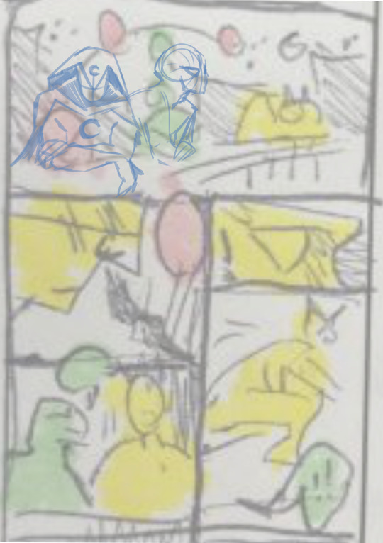
Text
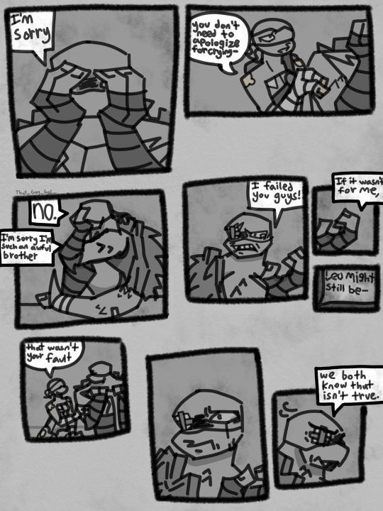
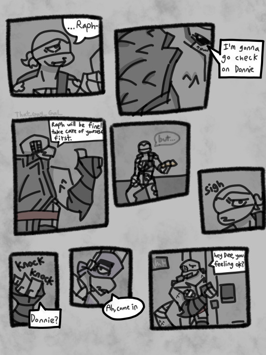

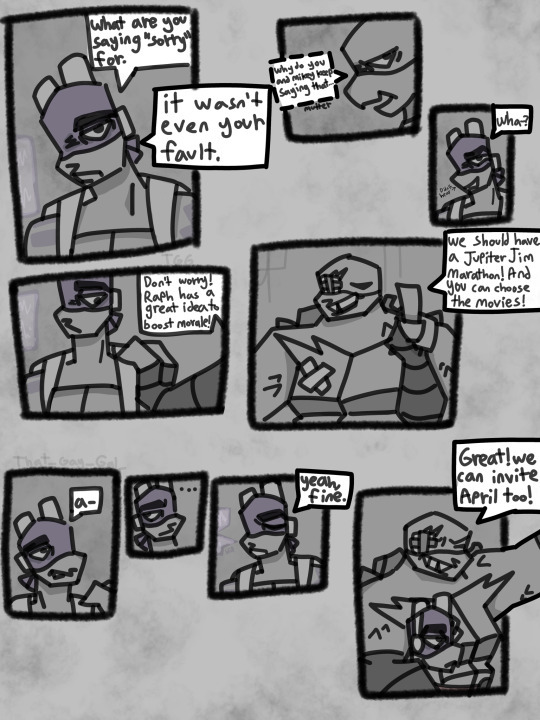
Ta-Da! Part 2 is done, and only after like… 10 hours
Prev -> Part 2 -> Part 3
It’s worth it for my emo little children
Is this cringe? Yes. Do I care? I mean yeah I do, but imma pretend I don’t cuz I’m having fun.
The coloring and lineart is gonna be SO inconsistent you have no idea
Idk how long this dumbass comic I’d gonna take, but however long I just hope y’all have fun
Also, wtf am I gonna name this AU 💀 like actually I have no idea what to call this - this is harder than naming an OC without a baby name website I swear-
Donnie is the easiest to draw since he's shaped like an asthma inhaler, but Mikey is now the hardest for me (I've gotten better at drawing Raph) so sorry that he looks a little janky
But yeah, hope you guys enjoy
(Lets just hope my motivation doesn’t fizzle out and I give up)
Also, there's no plot for a while (even the plot is barely there tbh) so this is more slice-of-life emo stuff. (I'm improvising all this shit off the top of my head its wild)
if you saw this already no u didn't (I posted it from drafts originally due to some link issues but I think that messed up something cuz it got a lot fewer likes- maybe Tumblr is having a stroke idk)
#rottmnt#rottmnt fanart#i love rottmnt#rottmnt comic au#comic#rottmnt comic#rottmnt au#au#bring back rottmnt#art#digital art#drawing#rise of the teenage mutant ninja turtles#save rottmnt#rottmnt raph#rottmnt donnie#rottmnt mikey#i may be cringe but i am free#raph my son#rise mikey#rise donnie#rise raph#rise of the tmnt#raph#donnie#mikey#rise#tmnt 2018#tmnt fanart#tmnt
18 notes
·
View notes
Text
Art dump 👍(16 drawings, roughly chronological)

first/second digital drawing on PC! been using ibispaint since birth. I used to constantly be like "oh drawing on your phone isn't that hard it just takes practice!" like girl you're not gonna know that you're in hell if you were born there 😭
Art fight for ritterdoodles oc, Calaca, my favorite art fight from this year. First digital drawing in half a year, then immediately forgot how to do line art afterward and stopped drawing digitally for another half a year.
Steven at his desk, tried to replicate the shading from my art fight attack but… lord it's kinda ugly
trying rendering out on PC for the first time, eurgh


Sketch for a fake Daredevil comic cover? Looks like I'm the floor and he's about to death-drop on me
a sketch for a comic about daredevil being emo and being like “No… I only work alone...” Moon Knight and spider-man are there of course
Harvey from Stardew! My go-to spouse, going for Krobus in my current save though. Practice for a school club, I'm making pixel art for our game! large gap between this and the previous one
I like this drawing a lot and drew it specifically for Instagram, but I don't want to post it there because Peter B. looks pregnant. I NEED to practice drawing chubby people


Digital rendering attempt #2. mmph. its questionable. tried really hard on the composition too lol
steven and layla in their hero suits but they're also in dresses... muah... this was very hard to draw I do not know how to draw two people looking at each other without them looking flirty
spider miku comic book cover! drew it to try and relearn digital art! her webs are music notes! large gap between this and the pervious one
trying to reteach myself line art, halfway through I realized it kinda looks like that "all or nothing" Tumblr post and stopped in fear


large gap between this and the others. I was digitally lining a sketchbook spread and had to crunch out some lineart warmups because I was struggling so hard, idk why lineart is so stressful for me lol
this is gorgeous this made digital art click for me again I love layla shes so pretty shes my wife
realized if I wanna do lineart warmups I should do... just lineart... wow. I'm like plato.
tried to recreate the beauty of number two, not same vibe but still very pretty!!!
hmu for commissions 😘deviant art points only tho <//3
#moon knight#art#digital art#marvel#steven x layla#layla el faouly#moonscarab#steven with a v#steven my beloved#steven grant#men in dresses#marc spector
7 notes
·
View notes
Text
choosing violence and haterism here tonight but so much of art tutorials are like. "heres how to make bad art good! *insert built in preset digital filter or brush or setting*" instead of actual advice on how to do shading or lighting or lineart or coloring or like. anything. like dont get me wrong, i get it, digital art popular, art program have useful tool, consumerism create push to churn out art fast as possible, create push to cut corners and use as many hacks as possible. using those hacks and doing the easy thing is morally neutral. i have no beef with people who use purple filters on their lineart (just as an example) or even rlly with those who make instructions for how to do so. im mainly just frustrated that more and more recently its flooding results for all art tutorials, and making it more difficult for me to find real material on how to do anything but that. it also strikes me as such a shot in the foot...? bc like theres a massive pressure to make your art look realistic (and ive absolutely got beef with that, bc it kills your fucking creativity over time to always feel obligated to pripritize realism over experimentation, but i digress) but like if you never actually learn the *why* behind all these hacks for stuff like line weight, shading, coloring, etc...youre gonna hit an upper limit to how far you can really go before youve got all these admittedly neat tricks and tools, but dont actually know how to utilize them, bc you dont understand *why* it is what they do makes your art "look good"
idk. like. i promise im not being an eletist snob here, you relying solely on pinterest tutorials that tell you how to slap specific art program filters on your drawings does not hurt me, you, or your grandma in any way, i have no quarrel with you. but also like if you ever find yourself hitting a wall with your art, i do suggest learning to not rely on them and like. go learn a little about shading and color theory as it stands on its own outside of digital presets. the knowledge is a learning curve to absorb but not inaccessible i promise. just use youtube
5 notes
·
View notes
Last Seen Blogs
javomr
@jmr

suficienciatala
Krystal_Suficiencia
iwamimimimi
iwamimimimi
free-mind1984
Enjoy the silence
oolongteay
rinn