#i would have done it vertically but when i originally drew it on paper it was horizontal and i liked it like that so
Text

#wanted to wait a couple days before posting but i couldnt help myself. here we are#much needed comfort for klav bc we never really got that kind of closure in canon#also idk what to title it so hoy. just drawing be upon ye#the colours were fun to do ehehe#very red sunset gives off melancholy vibes.........#lines are a bit fuzzy bc i used pencil brushes so feel free to zoom in on the mf to read/see it#i would have done it vertically but when i originally drew it on paper it was horizontal and i liked it like that so#idk what to do w the insane amount of negative space so just pretend i knew exactly what i was doing :)#ace attorney#sketchbook🧡#aa#aa fanart#art#klapollo#apollo justice#klavier gavin#eyestrain tw#just in case
129 notes
·
View notes
Text

“ The art of transmutation is the definition of Alchemy. You have learned your elements. You have created new elements. You have altered the energy of these elements. You have changed their very structure. There are many quadrants to this rune of alchemy that you have explored, and at it’s most anticipated center, trasmutazione della vita: the science of the transmutation of life.”
“ It is a condemned path. The center of the most desired aspect of Alchemy. This lecture today will be a lesson, but you will not be completing it. You will learn from what I have to show you, and that is all. Just your eyes, and an open mind. Clear your workstations. No books, no writing utensils. Nothing. Should I observe you with any means of taking notes, you will leave this hall. ”
The firm voice of the professor did well to make his commands law. He was not as full of wonder and delight like their first year Alchemy professor, Professor Alrune. She got them seasoned into being able to harness the energy and create simple compounds with ingredients. Professor Creon Marx was the one who taught them what Alchemy is at it’s raw and unconstrained core. His strict and intense courses challenged the students to such a degree that more than fifteen percent of the beginning populace of interested students would leave the major in pursuit of something else. It was a demanding subject on both the mind and the soul. The latter, to it’s very extent, was what Creon planned to teach them today.
Hands were folded behind his back as he made sure to watch each of his students put away their books and pencils. Once the desks were clear, each student knew to put their hands on the desk idly as if he had asked them to. The room fell quiet before Creon then stepped to the side. The entirety of the demonstration stage was constructed from a dense stone rather than a wooden platform. The reason was for the professor to be able to use the material of the stage should he need a raised or shaped surface. A snap of his fingers ignited a spark of his inherent golden alchemic energy and with a fluid motion of his hand, he raised a 4ft squared platform of stone up to his knee level. He set upon it’s surface a small and loosely wrapped pouch, and a potted plant. The plant was a blooming orchid. Since this class was a smaller one, each student was seated closer so they could see the professor’s demonstration. It allowed them to see that the contents of the paper wrapping held a urania ripheus, the butterfly Sunset Moth. The insect was just a corpse, however. It’s vibrantly colored wings were delicately laid out in the middle of the platform. Creon looked up at his students while he rolled up the sleeves to his dress shirt.
“ Within each creature that roams this planet is a level of life energy. Some call it vita, some call it mana, some call it the soul. In Alchemy we call it however we see it. By experimenting on the energy that lets us walk upon this earth you are accepting that you see life as nothing more than an aspect of science. I don’t want any of you to see it that way. Which is why I will take that weight upon my own heart to show you why this final branch of alchemy is forbidden.”
“ It’s a curse upon nature itself. Watch closely to the behavior of my alchemy while this is done. You will see what I mean. ” Creon looked to his platform and drew a long breath. Using his finger he drew his transmutation rune. The butterfly laid in the middle, circles and triangles in specific vertices within. As his finger dragged on the surface the stone indented slightly to create a visible rune. It made the details hard for the students to see despite some of them craning their necks to do just that. Once the rune was in place, Creon set the potted plant within the top circle. Another long breath and Creon clapped his hands once in front of his chest and an aggressively electric-alchemic energy came from his palms. Even his eyes, too, were glowing. He stepped forward and placed his hands on the platform, and concentrated.
There was a small shockwave of energy that went through the room like a breeze once his power flooded through the alchemic rune. The lightning was erratic and unnatural. It centered in on the corpse of the butterfly and surrounded the orchid flower. Slowly the flower began to wilt, but at a speed that was, too, very unnatural. The flower was soon a brown wilted stick devoid of color and life. And by the time the students noticed the butterfly, it was engulfed in a redish alchemic light, before it then suddenly dispersed. Another breeze drifted through the room and then it was silent. Creon visibly stood up from being bent over the platform and took a step back. When the small cloud of dust faded, there was a butterfly standing there, slowly clapping it’s wings. Some of the students gasped, but there was murmuring. The butterfly’s colors were dulled out, and the main of it’s body that was once black was now a deep, gradiented crimson. In a way it was even more beautiful than before.

The butterfly took to the air and began to flutter around. It flew over the heads of some of the students, even, and briefly landed on the ear of one of them to cause a small laugh before flying around again. They were almost in wonder. How could this be so cruel like Creon made it out to be? The answer was seen soon as the butterfly landed on a student’s desk. It started to move strangely, twitching, then crawling and struggling. The student moved back, her hands to her chest as she saw the wood beneath the butterfly begin to darken beneath it. The poor insect was now in a seizure-like fit of what one could only feel was sudden agony.
Creon stepped over to it, watching dark cracks emerge from the origin of the butterfly into the wood beneath it. It split with a crimson outline to it, and it spread while the butterfly had then turned solid black with a shroud of darkness around it. The student watching this in front of her was terrified, frozen in place as she witnessed it. Creon’s hand entered the space of the writhing butterfly and cupped his hand over it. He blocked the student from staring at it.
A golden alchemic spark and a small flash of light. He removed his hand silently and the butterfly was dead. The faintest air of breath made it fall into dust. Creon had put it out of it’s misery.
Silence filled the lecture hall for a moment before Creon swiped the dust off the student’s desk, leaving nothing to remain of the homunculus butterfly. He stepped back onto the stage, setting the flowerpot of the wilted orchid on his desk before transmuting the floor back to normal.
“ By going against the will of life to manipulate it of it’s fate, you will only create an aberration. You will create a curse. A horror. It is a simple lesson, my students. ”

“ The end of all things is set in stone. The one element you must never harness is life itself. No man or woman of alchemic studies would have made you witness what I just showed you. That is because I want to instill the reality of the science you study. May you remember this lesson throughout the rest of your lives.”
#♦ || ic. (Creon)#♦ || drabble. (Creon)#|| hi this is literally the biggest thing i have ever written#it's also a little graphic and includes an insect (butterfly) so be wary#this is to show the kind of professor Creon is#and... his experience in things.#u.u
5 notes
·
View notes
Text
Outlining
I’m not sure about all of the other writblrs out there, but I have a lot of trouble with outlining my novel. I’ve tried several methods that I thought might be helpful, and so far nothing has stuck. So today, I went on a mission. I opened up YouTube and put in: Outlining a novel. I wasn’t disappointed.
The reason why I went to YouTube is that I’m mostly a visual learner, so I learn best by reading and watching videos (even better if I can watch a video with subtitles), and I’ve already looked at some tips written on Tumblr.
For each video I will provide a brief summary and my thoughts. WARNING: MY THOUGHTS ARE JUST MY OPINIONS AND ARE NOT FACTS. Before moving onto the next video I will post a rating (this rating is based on how useful I found the video, so again, this is just my opinion. You could very well prefer a video I gave a 3 star to than a 5 star).
Here is what I came up with:
1. HOW TO OUTLINE - Katytastic
youtube
I loved Katytastic, I already followed her before I went looking for an Outline video, so I was pleasantly surprised when her video popped up first in my search. Her outline is simple and pretty easy to understand: It’s a 3 Act, 9 Block, 27 chapter example. The video not only explains how she charts out this diagram, but also uses an example novel to show the watchers (readers) how it works with a novel. It was easy to listen to her explanations, and her example was delightful. She also goes into more depth on the example, as the original was a quick (like you would do in a first draft) write down, which was extremely helpful. Overall, I believe this to be a very good example of an outline (One I might try for another novel of mine).
Bonus: Now I really want a white board to write an outline on.
Rating: 5 out of 5.
2. #HowlWrite- Alessandra Torre
youtube
Alessandra Torre is a New York Time’s Bestseller. I haven’t personally read any of her books (although, from looking at her website, I’m considering trying out her Deanna Madden Series), but what drew me to her video was that it was different from Katytastic’s, both are physical outlines (which I’m always drawn to). I also like that she takes the time to show us her way instead of just talking about it (a few of the videos I’ve found do that, and they don’t really work for me).
For Alessandra’s outline technique you need: Note cards (different colored cards are most useful) and a pen. She uses a well known story (Cinderella) as her example with this method, which makes it easy to follow.
I’m going to start off with what I liked about this outline. I like how physical it is. Unlike with Katytastic’s method, if we want to change something around we just move our cards around (with a pen/pencil/marker and paper/white board we would have to erase and I don’t know about you, but that can get a bit frustrating when you’re moving things around too much).
So here’s the thing. It is a very simple technique. I don’t mean this in a bad way, but to me (yes, this is my opinion, and in no way a fact), this seems to be a useful way for brainstorming your story. I brainstorm a bit too much, when I originally come up with an idea for a story I almost automatically have 5 characters off the bat, so this method could get a bit too confusing for me. I do get the advantages for this outline though, so I thought it would be useful to share.
As well, I think Katytastic’s pace was better (for me that is), and Alessandra is a bit slower (so I lose concentration faster). I do have ADD though, and don’t respond well to slow videos. This is in no way a dig on Alessandra, just a preference and completely my fault.
Rating: 3 out of 5 (However, this method might work for you, just not for me).
3. Beat Sheet Method- Iasmina Edina
youtube
First, I want to mention that I picked this method 1. Because I really liked her hair. 2. Harry Potter. 3. Different from both methods mentioned above!
While this video doesn’t show a physical representation of the method, she does showcase the beat on the side of the video (I don’t know what they are called, but I’m going to leave it at that). According to the summary of her video, the beat sheet method is from Blake Snyder’s Save the Cat (and now I’m considering getting the book), so this is her way of explaining the method to the best of her abilities. Let me just say: She does a fantastic job. She uses the Harry Potter film as an example when she explains each beat, which can really clear up what is done in said beat.
The beat method, from what I’ve gathered, is similar to the 3 Act structure (which I believe is what Katytastic used), but as Iasmina says, is more of a plot structured template. Instead of being 27 chapters, it’s 15 beats.
The trouble I have with this method is that I have trouble figuring out how to structure this into what I need to fill with each chapter (15 chapters seems to little, and I’m pretty positive that the beats don’t equal the amount of chapters). I need a structure that tells me what I need to do for each chapter, so far, the 3 Act method seems to work best for me.
This method should work well for most of you though, I’m just a little special when it comes to outlines.
Rating: 4 out of 5: I like it, it would definitely help me flush out my story, but it’s not the exact method I see myself using.
4. SnowFlake Method - Brit Poe
youtube
Brit Poe is super cute, which was definitely my main reason for picking this video... just kidding. It was partially why. The main reason I picked this video was that I wanted to know more about the SnowFlake Method. I’ve heard about it before, but never looked into it, but now I have! I can’t say if I’m super into or not, because I haven’t figured that out yet. One reason may be that it still doesn’t help me with the chapters issue that I mentioned with the Beat Method. Another reason may be because it wasn’t very visual.
What I did like about this video was that she explained it very well, even if I checked out about halfway through. The best part about Brit is that she realizes that some may be more visual learners (*cough* like myself *cough*), so she leaves several links in her summary- one of which leads to her blog post where she has everything she said written out (which helped me a lot). She also leaves links to the SnowFlake Method website and a free resource to a character chart template (this girl is so sweet, she kills me).
The last thing I want to mention is that... I ended up creating an account with Trello because of her blog. At the end of her blog post that goes along with this video, she offers a Trello Outlining of the SnowFlake Method (MORE VISUALS), if you’re a member (you can sign up, its free, and you join a the Scribe Community- which is pretty cool). I should mention that this is not at all a promo, I get absolutely nothing out of this, I just thought this was really cool and kind of works with the Act 3 method (but not completely as the boards are vertical and I can’t seem to change it to horizontal)
Rating: 4 out of 5: I really liked it, I loved the resources she gave, but when it came down to it, I still wasn’t 100% sold.
Overall, I think my favorite method out of these 4 is the 3 Act method.
That is the end of my search. If you want more methods, you might want to try out this video:
youtube
It showcases a bunch of ways you can outline your novel. I’m not going to give a review for this video, as I find it’s a bit much to unpack. I will say that I think Michael La Ronn, or Author Level Up, does really well at giving you the information and resources needed to find out which outline might work best for you. He includes a bit of visuals, so I don’t get completely lost.
So there you go, the videos I found (that weren’t Part 1, 2, 3, etc.) that might be helpful in your journey of outlining.
Maybe I’ll make another post on helpful sites or apps that I use when building my novel?
#writing#creative writing#writing outlines#youtube#youtube outlines#outline your novel#lets get started#lets outline#author struggles#aspiring author#aspiring writer#research#I watched youtube videos for 3 hours#what is my life#my life is writing#constantly writing#just sometimes#I hope this helps#tips#writing tips#resources
8 notes
·
View notes
Text
Artwork by Julia Couzens, Richard Hoblock, Farzad Kohan on Display at Tufenkian Fine Arts
New Post has been published on https://armenia.in-the.news/culture/artwork-by-julia-couzens-richard-hoblock-farzad-kohan-on-display-at-tufenkian-fine-arts-73672-18-05-2021/
Artwork by Julia Couzens, Richard Hoblock, Farzad Kohan on Display at Tufenkian Fine Arts
“A New Day” Exhibition at Tufenkian Fine Arts
LOS ANGELES—Tufenkian Fine Arts is honored to present “A New Day,” an exhibition featuring bright uplifting works by Julia Couzens, Richard Hoblock, and Farzad Kohan. The exhibition opening reception will take place on May 15, from 2 to 6 p.m. and will be on view through June 26.
It’s A New Day, with Thanks to Nina Simone
BY CAROLE ANN KLONARIDES
Reconsideration, repurposing, recalibration, call it what you like, for artists Julia Couzens, Richard Hoblock, and Farzad Kohan, it is an ongoing process. Layering, marking, moving the paint (the eye never rests), weaving, wrapping, scraping (the hand keeps active), a cyclical loop of rediscovery. An inspiration, perhaps, is to reconstruct a new consciousness from the salvage of our yesterdays. Sometimes the old is reinvented yet the roots remain, and new growth appears, and as cliched as it sounds, a new day begins.
Birds flying high, you know how I feel
Sun in the sky, you know how I feel
Breeze driftin’ on by, you know how I feel
For Richard Hoblock, it began with writing screenplays commissioned as portraits; each portrait was an imagined cinematic scene, the patron as the protagonist with underpinnings of personal details they provided. As a skilled writer, he could have several subplots at variance with each other all happening at once. After a series of screenplay portraits, he began to make abstract drawings while looking at Baroque paintings, focusing on a gesture or detail. Referring obtusely to the act of writing, his leftover pencil stubs would be ground down using a Cuisinart into a fine carbon powder which was used as a ground and drawn into. When finished, they were photographed using an 8 x 10 camera, a digital file is created, and the original drawing was then destroyed (unintentionally so was the Cuisinart!) Each photographic print was unique as part of his “Baroque Series.” This practice of layering materials and procedures, several times removed from the original, began a cycle of deconstruction and improvement, a reauthoring with each transitional stage. Yet, it was not quite an appropriation as the original source of inspiration is not apparent. It is more a process of cite and re-citing.
Farzad Kohan’s “Blue Blossom,” Mixed media, 60×48
According to the artist, he started painting seriously after seeing the Willem deKooning painting “Excavation” at the Art Institute of Chicago. An obsession with the work inspired many revisits to view it. The painting has an intensive build-up of surface that has been scraped to reveal underlying layers of paint and gesture, hence the title of the work. Starting with a color or off-white ground of paint, Hoblock also would build up layers and then scrape the surface with a palette knife or kitchen utensils, leaving the residue of previous layers along the edges as a visage of the process. Not quite a revival of gestural abstract painting, Hoblock puts it, “I went from concrete as a language to abstract as a gesture.” With such a calligraphic gesture, perhaps a screenplay is hidden within. However, it is up to the viewer to project their own, as his is not revealed with the exception of an occasional hint hidden within the title.
The most recent incarnations are vertically oriented abstract paintings that have dramatic virtuoso paint strokes of discordant colors. These seemingly would not go together but with his deft precision are found to abide on the same canvas. Fleshy pinks, cranberry reds with lipstick orange, and dull browns. Acid Green! White cutout shapes are held in front of the canvas to help the artist’s eye create the blank space needed to find the relationships within and around the gestures and forms—there can be no signature image as there is always contingency in the shifting relationships. The trajectory of this thought process finds a way for intuition to play; the outcome is not set. The work “Champion” was painted listening to the Miles Davis’ recording “Bitches Brew,” which similarly gives dead air and timing to punctuate each note creating a jarring, yet magnificent composition of discordant sounds. Replace sound with color and form and the same can be said about these gnomic paintings–what shouldn’t work comes together in a harmonious celebration of defiance.
Blossom on the tree, you know how I feel
It’s a new dawn
It’s a new day
It’s a new life for me
Farzad Kohan prides himself as a self-taught artist always in-flux. His signature process of building up bits of ripped paper collaged on board or canvas, then distressed by sanding the surface, exposes layers of the passage of time and history of application like the age rings of a fallen tree. Ghostly bits immerge; gestures of automatic drawing, cursive lines of Farsi or Persian, the edges of torn magazine pages come forward and recede, much like distant memories. Having left his family and country of Iran at the age of eighteen, escaping first to Pakistan, then migrating to Sweden and later, settling in California, he weaves all of his past into the layers that make up his paintings and drawings with gradual transformations that sometimes hide the stories or hint at untold truths. As an émigré, a desire to be part of something bigger than himself drew him to art making; his work is imbued with a desired sense of belonging and new beginnings. The use of repellent materials, such as oil and water, perhaps metaphorically reflect the difficulties of assimilation, and his labor intensive procedures, the process of migration.
An art instillation from the “A New Day” exhibition
Inspired by a homeless man who creatively repurposed found objects, Farzad found his own economy of artistic material by using everything in his studio and surroundings. He taught art to children and learned from them, made his own paper, repurposed regional maps, created drawings and then ripped them to shreds along with discarded magazines (most commonly the local Iranian magazine Javanan), and then adhered them with water and glue in layers. For an additional pièce de résistance, in which an occasional fragment of fabric would be woven.
Lately, a series of works has turned more recognizably figurative. In each, he has firmly rooted a blossoming tree in a pot, with branches appearing to reach out of the confines of the perimeter of the rectangle. The arrangement of the carefully orientated strips of paper and the use of color is driven by form and texture. Slowly, he stopped sanding the surface, letting the paper bits layer like the bark of a tree. Underneath is evidence of the artist’s personal history, tangled lines that appear like the roots of many years of drawing automatically from the subconscious. As we walked out of his studio, he pointed to a cypress tree so tall it looked like it touched the sky. “See that, it was here the whole time and I never noticed it until recently.” I immediately thought of Van Gogh’s painting of cypress trees reaching to the sun and moon, with signature swirls and whorls in the heavy impasto. Van Gogh painted many trees, and in retrospect, the trees influenced by Japanese woodcuts are the ones that Farzad’s trees most resemble, with their minimal canopy and heavy outlines, a mastery mix of many historical and cultural influences. Not rooted in the ground but in a vessel, they are ready for transport to a new home.
Dragonfly out in the sun, you know what I mean, don’t you know?
Butterflies all havin’ fun, you know what I mean
Sleep in peace when day is done, that’s what I mean
And this old world is a new world
And a bold world, for me
As she approached the Little Flower Café in Pasadena, Julia Couzens eyed and then scooped up a doggie toggle pull toy left behind, a tight bundle of many colored strings that actually resembled some of her own sculptures. “Oh, this is so perfect for what I am working on!”, she exclaimed to me as she quickly stuffed it into her bag, a catchall for similar urban detritus she finds as she walks about. Her sculptures, which she calls “bundles,” are obsessively wrapped asymmetrical masses of rope, wire, string, yarn, bungee cord, fabric, and plastic, that have a textural physicality that gives the expression “tightly wound” a whole new meaning. Gathering, twisting, weaving, sewing, tying, all make up the form. The resulting structure, in its solidity with an occasional sharp angle, seems architectural, but is actually derived from a long history of drawing from the model or nature. Each sculpture begins like a drawing, starting with a line and continues until the intuited end with an aim to visually and physically build up layer after layer of contained energy. Like the Japanese tsutsumi (“wrapping”), used as protection for precious temple objects, one wonders if something worth protecting is contained within the sculpture’s inner core, but the contents (if there are any) are safely secured and hidden.
In making the bundles, process and materiality is something Couzens privileges over the conceptual. Whether conscious or not, her work counters the historical patriarchy of monumental sculpture. Sculptors Eva Hesse and Jackie Winsor, process and materials artists a generation before, offered a more organic approach in comparison to the minimal and conceptual work of Donald Judd and Robert Morris, whereas Couzens’ work is closer aligned to the work of Michelle Segre and Shinique Smith. Replacing the chisel with a needle, and casting with weaving, each work has a sculptural monumentality that comes out of craft traditions. They are light of weight, and if I were to wax poetic, I could see them strapped on the body as one’s total belongings carried on a nomadic sojourn. The use of color is as a force, one different from contemporary sculpture primarily made of wood, stone, and metal, with a simultaneity of color combinations that express the ineffable.
Given a rotation of 360 degrees, each side of the sculpture provides a new vantage point with a new face. There is no totality or instant read, they operate in the space like alien forms whose origins one can’t quite define and are so self-contained that they seem natural on the floor, hung from the ceiling, or protruding from a wall. It is the bringing together of these repurposed and disparate materials tightly bound in all their brilliant splendor that sends off a charge like a bundle of electrical circuitry ready to combust.
To paraphrase Couzens from a recent online response to our times, “Art’s nature is exploratory, peripheral to linear progress and predetermined order. I think its meaning sprouts from the cracks in life.” A bundle titled, “Sweet,” has a long shoot of bright green yarn that escaped and at its end is hanging a smaller bundle as if to say from the entanglements we make, there is always the possibility of something new thriving from the mess.
It’s a new dawn
It’s a new day
It’s a new life for me
And I’m feeling good
Read original article here.
0 notes
Text
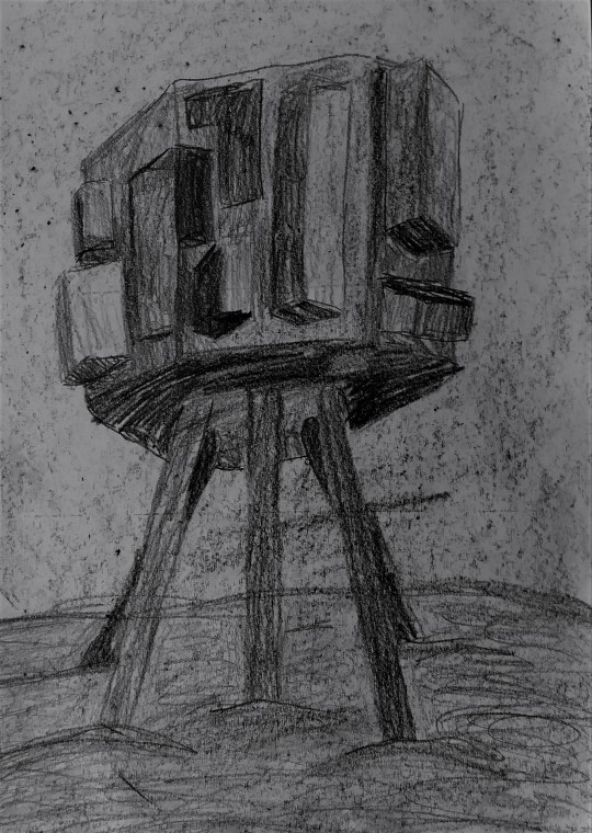
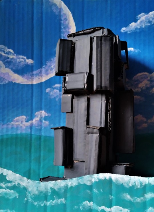
Towers Evaluation
I have used many different materials in this project. I started by making a tower out of cardboard and hot glue as I could not figure out a way to stack objects to look like my references. I think the tower came out good and looking like it was supposed to. I managed to get my tower to give off a blocky and angular effect with lots of shadows and depth.
I then took my tower and drew it digitally in the ocean using the software FireAlpaca®. I started with the background by sampling similar colours to the biome in game that I was trying to replicate, and then blended it out to get a smooth gradient.


Then I drew in two different layers of seabed to give it atmospheric perspective effect and then added different sand looking textures over the seabed too.
Then I drew in my tower and gave it tubes linking into the ground for support and power. I also added glowing sections to give off an alien like futuristic effect.
Finally I added lots of different effects to the foreground of the piece to try to make it look like it is under the water, some of the effects I used were white beams of light on add to make them glow, a dark blue layer on multiply to make the whole piece fit together, and some bubbles made with the particle brush on various different modes to make them transparent and varying in depth.
After this piece I did some additional experimentation by drawing more natural formations rather than manmade creations. I used acrylic paint, graphite and even tissue and glue to create natural scenes.
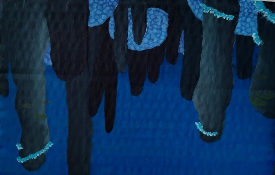
- Acrylic painting of floater island
- Alien style Army base made with Graphite
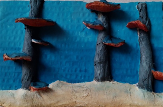
- Mushroom Coral made with tissue and glue
I really like how my Floater island painting turned out as it has lots of depth and has an unusual composition as it looks like it should be upside down.
Once I had done those experimental pieces I decided to turn my original cardboard tower into a big piece of art, so I painted it to look like a mix of the brutalist tower and the alien tower from subnautica. Then I got a big piece of cardboard and painted a background and foreground to the tower.
Whilst doing this project I came across a few issues such as running out of canvasses to paint on, so I used lots of cardboard instead. And when making my tower I could not figure out how to stack books and DVDs in a way to look like it was made of vertical beams without it falling over, so in the end I made it out of cardboard as well. However, if I had small blocks of wood like from the game Jenga I think I might have been able to make a tower that looks less scrappy and more finalised.
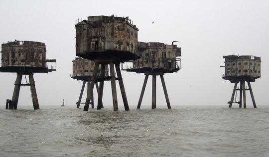
From my initial work of my plain cardboard tower, my research and development took me through many different landscapes and locations. In almost all cases the surroundings that generate the atmosphere in the pieces and scale, this can be seen in these examples:


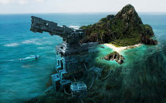
I wanted to bring similar techniques into my pieces. I wanted to make it look ominous and foreboding and highlight the natural vs unnatural. I bought this together digitally using FireAlpaca® which I placed my tower into the ocean, with different perspectives. I like the perspective in this piece as it really shows the tower looming over you, however I struggled to make the ocean surface texture look right and this ended up making it look 2d.
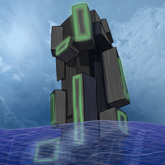
For my final piece I used my original tower and made a scene using it and a background and foreground. I made the background deliberately tranquil which contrasts the towers looming presence. The foreground I made quite rough and adds movement and drama to the piece. I’m happy with my final piece although I think I was constrained by a lack of materials and wasn’t able to make the sea more alive and frothier. I would have done this by using wool and scrunched up tissue paper which would have given it the texture it needs as right now it looks quite flat. Similarly, with the background, I’m very happy with the painting however the texture of the cardboard is very noticeable and can detract from the piece itself, I would have preferred to use canvas instead.
0 notes
Text
Ann Arbor kitbash
It’s time to provide a bit of an update on this project.
After some e-mail conversation with Craig Wilson, author of Freight Cars of the Ann Arbor Railroad 1947 - 1985, I'm coming to know my prototype better. He pointed out that the pre-’47 roster was described in Rob Adam’s article “Modern Double Sheathed and Single Sheathed Boxcars of the Ann Arbor Railroad”, published in Ted Culotta’s Prototype Railroad Modeling, volume 2. It is still available, and you can find it by clicking on the link. It contains more in-depth history and higher quality photos than I was able to find on line.
So what have I been up to?
Craig let me know about Smokebox Graphics, makers of a very accurate set of decals suitable for the Ann Arbor boxcar fleet. Their decal DF0487 is in the mail, on its way here.
I’ve discovered some errors in my original modelling approach. First, shaving off the bulge plates (grain clips?) along the side sills may be a mistake! Rob Adams’ article shows cars include 73839 (taken in 1946) with the plates. I started my project relying on the Jim Parker maintenance of way photo of AA73788. It shows no evidence of bulge plates. The plates were an addition during the car service lives and were applied early enough to be appropriate for my model. So, from here on, I will rely on in-service photos for this model. I have gone back with .005″ styrene sheet, cut a bunch of tiny rectangles and glued them into place. Mine will not be neat and tidy like the Accurail kit design. I’m still wondering about removing them for the clean look since some cars appear to have never received them . . .

I needlessly sanded off the polling pocket details on the car ends. I’ve had to re-build those with bits of styrene. A strap of .005″ thick styrene was glued across each end near mid height, to indicate the overlap joint between the top and bottom end panels. The height was approximated. I wanted it higher than the horizontal brace across the doors, and then used rivet counts on the corners, and scribe lines on the sides to set the position.
The ladders (shortened as shown in previous photos) might have been alright, but having gone so far, it seemed right to add really nice ladders. So I shaved them off.
The prototype ladders are 7 rung ladders, on fairly short vertical spacing. On the ends, the left ladder stile is an angle iron, while the right stile is a strap. I used a scale rule to approximate the rung spacing. [edited update November 17th/20] Having removed the top plate of the framing, Yarmouth Model Works YMW-304 is an 7 rung ladder with 18″ spacing from rung to rung. It looks a little long. YMW-302 is a 7 rung ladder with 16″ spacing, and I think a little short. Perfect would be in-between. I made the mistake of using YMW-306, which is an 8 rung ladder with 15 3/8″ spacing, trimmed to 7 ladder length. It is too short.
The door is another challenge. It has different bottom rollers than used by Accurail - almost exactly like the Tichy part. I drew up some 3D versions of the rollers and have them coming from Shapeways. Not sure how useful they will be, so will decide when I see them. Either they will be fit onto the model, or I will carve off the existing doors and use the Tichy instead.
I added the Yarmouth Hutchins roofs and then went to work on the tops of the side ribs. Those are fiddly. I have been using a mixture of Bondo Glazing and Spot Putty (not very useful), Aves Apoxy Paste and CA’d styrene glued in place. The Aves Apoxy was allowed to set for over 3 hours, so it becomes very firm but still workable. Then tiny bits were picked up with a knife blade and pushed into position creating a slightly large version of the side brace top shapes. A couple of days later, it is hard and can be trimmed like styrene. So easy to work with. Before it dries, it is relatively easy to clean off surfaces if you get some in the wrong location. Some low spots were further filled with bots of strip styrene CA’d in place and trimmed. These shapes were fine tuned with a knife and sand paper.
Something I neglected: there is a metal shape running in place of the top wood board along the car sides. I’ll have to back and add that in. It would have been easier to do before the roof was added. Also, I observe that the upper diagonal straps should be narrower than the lower ones. Will have to re-do those as well.
I’ve added Tichy door stops at the top of the door track. The two grab irons are not glued in place yet - just pushed into their holes.
Like so many projects, I'm sure a better job could be done next time . . .
0 notes
Text
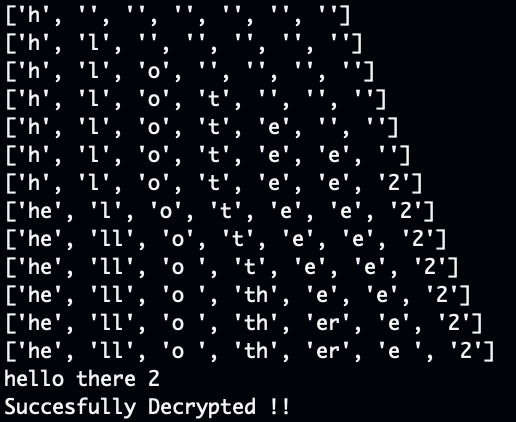
Something Awesome | Transposition Cipher
My second coding project was to come up with a transposition cipher. Let me reiterate that, in this attempt I did a columnar transposition cipher. There are in fact a whole lot of types of transposition ciphers and I find transposition ciphers to be a lot more interesting than Caesar Ciphers which I did last time.
As a brief introduction to this famous form of a cipher, unlike substitution ciphers, which replaces the letters in the message, transposition ciphers messes around with the order of the message but leaves the actual letters and values of the message unchanged. So I suppose, if you’re good enough with anagrams then transposition ciphers would be pretty easy to decipher.
A Lil History
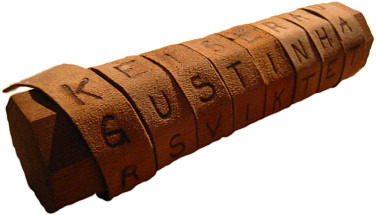
In this case, a bit similar to the Caesar Cipher, the first uncovered use of the Transposition Cipher was from ancient Mediterranean History, this time the Greeks. The example shown above is the ancient iteration of our our modern day columnar transposition cipher. In this example, called a scytale, a stick is used as the key. The paper wrapped around the key when unwound makes no sense. However given the key, and then wrapped around in this manner we can see a message.
Explanation
I suppose some explanation should be warranted about transposition ciphers. As previously mentioned, there are actually a whole lot of different types of transposition ciphers. The one I implemented is actually extremely similar to the one above.

Basically, what a simple transposition cipher does is, is it uses a number as a key to represent the amount of columns we need. We then lay our message across this table as we can see done above with the message ‘hi richard buckland’. The subsequent encrypted message is the vertical message, in this case with a key of 5, our encrypted message is ‘hc lihba aunrrcdidk’. Which is completely incomprehensible and works pretty well. But it’s still pretty easy to decrypt something like this, with modern computers, the greatest key we can use is equal to the length of the characters in the message and so is pretty easy to brute force.
That’s why there has been improvements to this, namely in the form of the Myszkowski transposition. (I like to call it the Mike Wazowski transposition). This form of the transposition cipher has a keyword, using the alphabetic ordering of the letters in the keyword to order the columns of letters

If we use a keyword such as motor, with the same letter length, we then sort ‘motor’ into its alphabetic order and the subsequent columns. As such we can see that the keyword is ‘hc lihbarrcdidk aun’.
Analysis
While decidedly more difficult to implement in code than a Caesar Cipher, in general, transposition ciphers are in no way more secure than substitution ciphers. We can see that while substitution ciphers such as Caesar are quite easy to brute force, substitutions have literally thousands of implementations whereas transposition no matter what, still have the same original letters. There’s only so many ways we can reorder these and it’s easy to see that we only need to rearrange the letters no. of letters! amount of times. Which with our modern computation power, is not hard at all.
Coding

Coding this required a bit of difficulty in the logic department. While it’s easy to see and understand when looking at it in the form of a table, it was rather difficult to wrap my head around writing the code in vertical columns.
But once I drew a sample text out into its table and thought about how to implement it, i realised there was a pretty simple implementation just involving an array of strings.

The way I designed this was separating it into three different functions, the first one being encryption. To encrypt it, we follow the same logic as was explained above. We have columns of the same number as our key. And while we are in column one, we add every multiple index of our key to the string so that we are changing our string to follow the order of the column rather than the row. Hence we return the resulting string, which is our encryption.
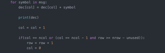
Decrypting became a bit more complicated. For this we needed to calculate how many rows there were in the column so that we could tell when we reached the start of a new column. Once we reached the start of the new column we could add it back to the first array index. Forgot to mention that in both cases we used an array of strings which we joined at the end to create the full string. In any case we keep adding to these array of strings like so. At which point we join them all together. Pretty cool right?
Conclusion
I learnt a lot more about ciphers and different varieties. I also learnt that transposition ciphers were not all that secure and that any variation of it could be brute forced pretty easily. So I want to now focus on harder substitution ciphers. I believe that the more complicated substitution ciphers such as the one time pad would be more interesting and harder to implement. We must remember that ciphers must be reversible, so that we as humans can interpret them again under the right condition and they must be respectable from both sides. So I’m also keen to look at private and public keys which is more of a modern type of encryption that at this point, cannot be brute forced.
0 notes
Text
Artist’s Commentary
Rather than a new page this week, I will instead be reviewing and providing commentary for the previous 10 pages published. For the most part I will be going over my own mistakes, as well as explaining some of the choices made, and whether or not they worked. Before we start however, I would like to note these pages are not complete, but more of a rough draft. There are several reasons for this. One major reason, is that it has been several years since I have drawn with any regularity. Producing a page each week will, I hope, shake off the rust. Additionally, neither my or my brother's hardware is up to the task of rendering RFO. One day, RFO may see an updated version that better fits our mutual vision of this project. And so, the commentary begins. RFO 1 -Jude Anderson lives in a poor neighborhood; identical row houses with unkempt lawns and no decoration outside. -My first mistake was leaving the sky blank. Its meant to be near midnight, but the bright sky and lack of shading imply otherwise. -Jude's front door and the paneling on it will change in scale just about every panel. Partly, this is because there was no consistent model. -Jude's house -interior and exterior- were modeled in Lego Digital Designer. -Jude's house number is 616, a less popular interpretation of the number of the beast. -My original attempt at this was painted in photoshop. The foreshortened fences were an absolute nightmare. I'm still not too happy about them as drawn now, but its still better than it was. -I forgot to shade the first floor window shutters. Oops. RFO 2 -Jude is whistling the ever popular 'Happy Birthday'. I’m not totally certain about the notation here, because I haven't had to read music since middle school. (side note: This song recently entered the public domain) -Jude's outfit was inspired by Back to the Future's Marty McFly. -I forgot to put a candle in the birthday apple pie. -You may notice Jude has no visible fridge in his kitchen. Jude cant afford a full fridge, or fit it in his kitchen. Instead, anything he needs cold is kept in a basement mini-fridge. -Jude’s facial features and hair take inspiration from Norville 'Shaggy' Rogers of Scooby Doo. -You may notice the quality of characters hands changing. Hands are still difficult for me, but I'm hoping to improve. -My brother pointed out that the carpet in Jude's living room looks like grass. I'm not really certain how one draws carpet. -The leftmost painting depicts two figures with an arm around the others shoulder. A third figure appears later, but there is no story significance, I just forgot what it was supposed to be. RFO 3 -The overly enthusiastic individual at Jude's door is meant to be androgynous. I feel I made them a little too masculine -The design on the handbag clearly denotes a christian denomination, although not any specific one. I wanted it to be generic, but evocative of several things. (a cross, a sword, an angel, a shooting star, etc) -While it was done primarily to help them stand out, the white outline around the stranger nicely implies a holy glow. -I'm most proud of this page, and how uncomfortable and annoyed Jude is by this stranger interrupting his birthday and asking about religion at midnight. -Several of these pages were first sketched in faint colored pencil. Its not meant to show up when scanned, but clearly that didn't work quite as advertised. -You may notice proportions are inconsistent, especially regarding head size. Like most of my mistakes, I did not notice until it was already too late to fix without starting the whole page over. -The handbag is unshaded in the last panel. RFO 4 -I'm not sure how I feel about these sound effects in retrospect. I'm still toying with how they work. -One habit I need to break is placing speech bubbles too close to the papers edge. The scanner sometimes cuts them! -As Jude gets more confused and frustrated by strangers popping up at or in his house, his hair gets wilder. -Jude's house layout is similar to several I personally have been in. RFO 5 -I'm not happy at all with the posing of the officer; they're so stiff and lifeless. While I could try to pass it off as part of the stranger's idea of how a police officer asks, the truth is that even when my skills weren't rusty; posing was never my strong suit. -Some panels have blank backgrounds partly due to laziness on my part, and partly so the paper could be held without smearing -The officer's nametag reads 'GATES'.This, along with his unusual badge and emblems, indicate that this is still the same person who was at Jude's door only a minute before. RFO 6 -I don't have much to say about this page, except that the officers uniform is visibly becoming simpler by the panel. This is because drawing those details was hurting my wrist. In the future I will try to be more economical with character design. RFO 7 -If the past ten weeks have taught me anything, its that I should plan out what I'm going to do more thoroughly. Jude's speech balloon was drawn first, and ended up over the other man's crotch. Now it looks stupid. -The officer (stranger) tends to be to Jude left, while the other man tends to the right. -The middle left panel is another I'm proud of, not for any major thing, but because tilting the head is difficult for me to do on purpose; especially when the part of the head where the jaw meets the neck is visible, but I think I did okay here. -The hard angles and edges of the final speech balloon show the officer is stern and serious. It is also shaped like a stop sign. RFO 8 -While the officer is still left of Jude (to the viewer), he is now right of the other man. Left positioning in RFO signifies benevolence, right signifies malice. It could have been the opposite just as easily, but sometimes you have to make an arbitrary choice for theming purposes. -The other man's hair forms horns on the sides and a tail in the back whereas the officer's (stranger's) hair is more flowing and wing-like. -Jude only owns one other jacket, as seen in his barren closet. -The officer's proportions in the bottom left are so off, I'm not sure why I thought it looked okay. -The other man's outfit and personality are meant to evoke a stereotypical used car salesman. Also Rodney Dangerfield! RFO 9 -Not much to say here. I will continue to simplify the style until an equilibrium is met between making things look good versus not destroying my wrist. -Also, the other man's sleeve in the first panel is missing its vertical stripes. RFO 10 -Jude's face in the last panel seems off to me. I don't quite know why, and I'm the one who drew it. -When I originally planned this page out, there was too much vertical space. It would have left me either having to draw their legs (which would been difficult with the furniture in the scene at leg height) or leaving a terrible amount of dead air above their heads. Instead, I tried to do something more visually interesting with that negative space, by making the last two panels more diagonal than horizontal. Jacob Birmingham
0 notes
Photo
Binding does look out of place, but there are also quality problems with some strips
After buying volumes 1-4, I pre-ordered the 5th volume to complete my collection. I agree with the other reviews that note a glaring difference between this edition and the previous four volumes with regards to the color of the lettering on the binding, but that's not the reason for my rating it 4 stars even though it does stand out when all 5 volumes are placed together. There were reviews for the first volume that complained about an inferior quality of some of the strips, not how the artist drew them but how it looked like they had been copied from a newspaper while better quality strips were available in previous collections. I recognized some panels in that volume where lines were blurry or had bled together but considering it was his earlier artwork I expected that. But in Volume 5 there are strips that stood out to me as noticeably lacking the quality of strips even on the same page (e.g. middle strip pg 151, middle strip pg 227). Whether this is because of the lack of the artist's original work or he just rushed the day he drew that particular strip, those instances were enough for me not to visually enjoy this volume as much as the others.
Go to Amazon
Something the likes of which you won't see in the Comic pages anymore. Thank you dehtaerB
There are very few things that I will give 5 stars to but Burke earned every one and then some. Awarding 5 stars to water softener salt just isn't the same. I've purchased every volume in the series and it's been a wonderful journey. I had forgotten all about the Trump references and Breathed's digs at him. It's maintained it's relevance even to this day. Wonderfully done and would be a great companion to Calvin and Hobbes in anyone's library. Opus "Another Day, Another Segue!" into the rising sun. Now it's time to reread them all starting with Volume 1...
Go to Amazon
Volume V of basic naughtiness!!!!
Well, volume V is out and I have the signed limited edition hardcover to go with my first four volumes. The only problem I have with them is that this by no means complete. In the previous volume, they omitted a cartoon for a specific date (as was done in many newspapers) due to suggestive content, opting to replace it with the same previously printed strip the newspapers ran in its place. This should NOT have been done. They should have made note of the original event in the margins, but printed the intended strip. Not only did they NOT include it elsewhere in that volume, but they also did NOT include it in this volume either, the last of the line. So, volume V is complete in and of itself, but the series collectively is NOT "The Complete Library" as the title suggests. This is unfortunate in an otherwise enjoyable look back at a different time. Whether you get the standard editions or the Limited Edition Signed and Numbered (YEAH!!!! GOOD LUCK THERE!!!! I think I got the last one being offered by a NON-AMAZON seller), you need to get cracking or you will miss out completely on first prints (I have no idea what the print run was on the standard editions, in fact it may already be too late for you to get first prints at all). Good luck, and PHHHBBBTT!!!!!!
Go to Amazon
Great fun for Bloom County fans
What's not to love? Classic Bloom County strips. The book is well bound and printed on heavy paper stock. It also includes the occasional note, often humorous, from Mr. Breathed about certain strips. A terrific little time capsule of pop culture and politics gone by.
Go to Amazon
More of a good thing
What more is there to be said. Bloom County was quite possibly the greatest comic strip ever created (along with Calvin & Hobbes). This fifth volume does not disappoint for those who have collected the previous volumes. And given the current political landscape in the US, the final few pages of the volume are worth the price of the entire volume itself! Recommended for both the casual reader and the collector!
Go to Amazon
Five Stars
My all time favorite comic strip.
Go to Amazon
Very disappointed
This version of the book is not as good as the first three. Owning the first three volumes and being able to read them in landscape mode, not to mention being a Bloom County fan since it was in the papers, I immediately bought this volume. opening it up in landscape mode and finding it going back to vertical mode was surprising. I was further disappointed to find that the larger Sunday strip is cut off in zoom mode and does not allow you to read the two right panels. Do not buy this until Amazon and the publisher fixes this.
Go to Amazon
great reading, and the notes from Breathed(I consider it ...
The final volume of the most prolific political comic strip to feature a penguin. Same as the others, great reading, and the notes from Breathed(I consider it the printed version of a dvd commentary) are fun to read and insightful. If you loved the 80s, grew up in the 80s, or just love penguins with a heart of gold and the naivete of a wide eyed child, you'll never want to leave Bloom County.
Go to Amazon
Looks like new. Completely satisfied
Five Stars
Five Stars
Cannot be viewed in Landscape mode.
Five Stars
Bloom County is hilarious and the topics covered could just ...
Format fixed in Comixology, Amazon purchases open there, great comic!
Binding Falling apart
0 notes
Text
Illustrated Face and Illustrate Face Comparison
Another piece of work I have done is an Illustrated ‘face’ practice. I did this by using different sheets of tracing paper to layer up different colour sections. The face I chose to use was a wax work of Rey from star wars, I chose this image as all of her facial features could be seen clearly, and therefore I would be able to recreate Tom Whalen’s style easily. Looking at my outcome of my own response to Tom Whalen’s work I am extremely happy of how it turned out as it looks very much like the style of Tom Whalens. I ensured that I stuck to a limited colour scheme pallet, these colours being, black, brown, yellow and red. I used black for features like the hair, eyes and noses as I believe that it was the most suitable as Tom Whalen doesn’t use much detail therefore just by using these colours kept it basic. I used brown for the left part of the face and the shadows and a yellow colour for the lighter side of the face. I chose these colours as I think they are most like skin colours and allowed me to keep it looking realistic. I also used red for the lips and her clothing, reason being why I used red for her clothing was to follow Tom Whalen’s style of using limited colours, therefore I thought that instead of using a white colour I would just use red as it was already used for her lips. I found selecting which colours I would be using fairly simple as I looked at the original photograph and selected the four main colours. I began by printing off an A3 sized image of my photo and traced each section of her face on separate pieces. I began with the outline of the hair and her clothing as they were the bottom layers and had the less detail. I chose the colour of the hair to be black as it was a suitable choice. After this I then moved onto the face, I had to use two different sheets of tracing paper for this so I would be able to achieve Tom Whalens style. Tom Whalen creates a 3D effect by having each half of the face a different colour, I ensured that I did this. The left side of the face was the darker side, therefore I used the darker brown for it. I drew round the outline of the face as well as the outline of the nose and lips. I also did the shapes in the kneck to show the shadows. The other section of the face was the lighter; I did this in a lighter colour so that I achieved Tom Whalen’s style. I only did the outline of the face for this layer as when I would put the pieces onto of one another the darker layer would overlap onto the lighter allowing the nose to come through, I also coloured the rest of the neck in this colour. The next section I began to trace was the eyes. Usually when I would draw eyes I would do them in a lot of detail so that they would look very realistic, however this time I drew them using very limited detail so they would look like how Tom Whalen does his. I think that the eyes went very well, I coloured the eyebrows and pupils in using black and also added a line of the shape of the eye at the top on the left and beneath on the right, I did this as Tom Whalen uses this technique as it still allows the eye to look like an eye. The next section was the nose and the dark line in the lips; I did the outline of the entire nose as Tom Whalen usually keeps the entire detail of the nose in his own pieces of work. The final section I did was the lips; I used two sheets of tracing paper for this. The first sheet was the entire lips, I coloured them in using the same red colour I used for the clothing. The second piece of tracing paper had the light that was shining onto the lips, I did this by drawing a few vertical lines using the red but I shaded in much lighter so that it was lighter. This allowed me to create tone and depth, which Tom Whalen does. Looking at my own work I think I did actually achieve using Tom Whalens style.
The next step was to then cut the tracing sheet designs out onto colour card so I could make a paper cut out version. This is the part I found the most difficult as I found it very hard to cut the shapes out onto card therefore some sections were cut wrong and they didn’t quite stick together well enough. I also found that some sections like the eyes were to fiddly therefore I just ended up drawing them parts on. I think I need to practice doing this as it didn’t go very well at all.
0 notes
Text
Squeezing Secrets from the Peutinger Diagram
Do all roads lead to Rome? Not with the Peutinger Diagram. In neither sense of the phrase.
In Africa on this remarkable late antique geographical chart, the roads do not even point toward Rome. They run from east to west, ending at dusty forts on the desert's edge. I have simplified their layout to a system diagram, showing how the chart-maker emphasized an array of parallel routes and inserted only occasional connections between these main lines.
In Italy, nearly all the highways lead to (or depart from) Rome. That appears to have been a guiding inspiration when the chart-maker was laying out the routes from the Alps to the gates of Rome. But as will see from my new system diagram for Italy (it has just gone online), there are some important exceptions.
To make these system diagrams, I squeeze the Tabula like a concertina. The Tabula (surviving in a single manuscript, Vienna, Österreichische Nationalbibliothek, Codex Vindobonensis 324) is a very long roll, to be read in the horizontal. Eliminating that longness and adding some height enables us to see the network structure at a glance and comb apart the manuscript's jagged thickets of connections.
The horizontal scale is thus reduced and the crooked lines are regularized into a grid, but no other re-arranging is permissible.
One use of this assay procedure is to test how proportionate to the geographical landform the Tabula is. In the following version (anchored to Milan: press the radio button next to "landmass" to "on"), you can see that at one-fifth the width, the match is surprisingly good.
The grey shape you can see here is an outline of the Italian coast which has been given a one-eighth turn so that the peninsula aligns horizontally. Look for the spur, heel and instep of Italy (the toe is out of sight).
The limit of my squeezing is always the point where the slightly sloping lines in the original rear up to an angle of 45 degrees from the horizontal, since the most useful outcome is a spider diagram that resembles the London Underground network diagram. In the image above, you'll note that Naples (Neapoli) has been pushed too far downwards, and Rome and Benevento are placed too far to the right, but all in all, this mapping is closer to the real thing than the Underground diagram is to the real London.
I began with a proverb, all roads lead to Rome, which signifies that a variety of methods produce the same result. That is of course untrue in information visualization, where two different renderings of the same data - a scale map and a network diagram - often produce a very different impression on us.
The purpose of reflowing the Tabula in this fashion is to reveal some of its subtler graphic characteristics, which tend to escape notice when we stare at the roll-form original. Reflowing may reveal if you have misconceptions about the data. Often it will also make features you have overlooked pop out visually.
The great Theodor Mommsen did something similar in 1851 before he became Germany's most famous professor. In his paper, ‘Die Unteritalien betreffenden Abschnitte der ravennatischen Kosmographie’, he drew the Tabula layout much as I have done. (It must have caused extreme stress to the printer.)
My systemic view is both more useful (with overlays and links) and more rigorous. You will notice in my analysis is that I have classified the roads into major (colored) routes with many stops (which I would argue derive from the original Tabula) and minor (black) cross country routes with few stops, which are much more likely to be casual additions to the chart by later readers.
My first attempt at this stratification did turn out to involve a misconception. This concerned three land routes in southern Italy. The original Tabula shows Roma - Corfinio, Nares Lvcanas - Vibona Balentia (both olive green) and Erdonia - Gnatie (dark blue) as sinuous, fragmented, error-ridden routes. I mistook these for write-ins by a later user or editor.
The compressed version shows that if these routes are straightened out, they fit snugly enough into the available space. The road to Corfinio is a fairly important path across the Apennines, while the Nares - Vibona and Erdonia - Gnatie connections run parallel to (and quite close to) their respective coasts.
Of the remaining thin black lines, some represent now indeterminate sub networks, such as near Hostilia, where the Tabula's original layout has been lost, or one or two borderline cases, such as a detour through Todo (Tvder), which may have been part of the first layout. But for the rest, I would argue they are no more than ancillary mark-up, not part of the primitive design.
I have already hinted at a related discovery: compared to the Mezzogiorno, a disproportionately greater width of the Tabula has been allocated to the parallel tracks from the Alps to Rome. Perhaps the chart-maker started at the left and ran out of room, but whatever the reason, the Mezzogiorno ended up being a crowded part of the chart where the three connections above had to be folded up to fit.
That in turn is a main reason why I could not compact the Tabula's southern Italy by a factor of more than 5, whereas it was feasible to compress the Tabula's Africa by a factor of 10. Compressing is done by opening an image of the Tabula in the Inkscape graphics program and using its Transform > Scale command to reduce the drawing to a stated percentage of its original width. Attempting to take Italia below 20 per cent caused some of the gently inclined paths to go nearly vertical.
B. H. Stolte (see my missing manual) proposed nearly 70 years ago that the original Tabula was originally drawn scaled to one quarter of its present width. I am not entirely convinced by his argument, let alone his further claim that this is a global rule, although my system diagram demonstrates that this compression is a possibility. I think it is simpler to assume that the chart-maker preferred to lay out most of his Italia lines either horizontally or at an incline of 11 degrees, which would suffice to account for the neat compass rose of directions when we compress that area of the diagram.
We know now that the Tabula is not a "map" of the Roman Empire's road system. It leaves out too many major roads to merit that description. Its over-selects roads that run lengthwise on the roll.
I imagine the chart-maker planning his design with ostraca - old scraps of pottery or writing material - writing names on each from the itinerary texts and laying his scraps out in lines across the ground, a hypothesis I have already applied to the genesis of Great Stemma history diagram of antiquity.
Adopting the same approach as he had employed in Africa, the chart-maker drew the routes of northern Italia as parallel tracks. These are the five or six main strands north (to the left) of Rome. The Great North Road, the wine-red route from Rome via Fano and Bononia (Bologna), necessarily has kinks, since it crosses to the Adriatic coast, then turn north-west. These parallel routes shift and join like channels in an estuary, but the parallel reticulate pattern, as I call it, prevails.
The routes in the Mezzogiorno turned out to be less parallel and more reticulate than in the north of Italy. In my spider diagram, the shore roads and a road parallel to each in the hinterland are easy to see, but it is the cross-peninsular routes that stand out.
Two of these cross routes (purple and red) lead northeastwards from the port of Salerno to the "spur" of Italy, ending at Pescara (Ostia Eterni) and Siponto. These are not roads to Rome, but roads to use when avoiding Rome! If my hypothesis that the Tabula was drawn in Africa is correct, these would instruct any travellers from Africa heading over to the Adriatic coast.
There's another enhancement to my spider diagram which you may find useful. We only possess a single manuscript of the Tabula, but we possess a text that is half useful: the so-called Anonymous Cosmographer of Ravenna wrote a dreary listing of world place-names, probably in the 8th century, in which large sections match the name series in the Tabula.
The Cosmographia, which is the topic of Mommsen's paper already mentioned, does not directly help us to reconstruct the primitive version of the Tabula, which dates from five centuries earlier. But it does flag possible omissions or alterations in the Vienna manuscript. Because of its usefulness, I am offering an overlay where a brown line traces on the Tabula the places the Cosmographia mentions.
If you haven't found them yet, there are three controls in the top left corner of my system diagram (link again) which show and hide the layers: the spider layout, the outline of Italy, and the Cosmographia order. You simply need to click or tap the radio button controls. Try not to display more than one at once.
And where does "All roads lead to Rome" come from? The librarians at Notre Dame say:
The proverb "All roads lead to Rome" derives from medieval Latin. It was first recorded in writing in 1175 by Alain de Lille, a French theologian and poet, whose Liber Parabolarum renders it as 'mille viae ducunt homines per saecula Romam' (a thousand roads lead men forever to Rome). The first documented English use of the proverb occurs more than two hundred years later, in Geoffrey Chaucer's Astrolabe of 1391, where it appears as 'right as diverse pathes leden diverse folk the righte way to Rome.'
Mommsen, Theodor. ‘Die Unteritalien betreffenden Abschnitte der ravennatischen Kosmographie’. Berichte über die Verhandlungen der Sächsischen Akademie der Wissenschaft zu Leipzig, Philologisch-Historische Klasse 3 (1851): 80–117.
via Blogger http://ift.tt/2zIv8dv
0 notes
Photo

Binding does look out of place, but there are also quality problems with some strips
After buying volumes 1-4, I pre-ordered the 5th volume to complete my collection. I agree with the other reviews that note a glaring difference between this edition and the previous four volumes with regards to the color of the lettering on the binding, but that's not the reason for my rating it 4 stars even though it does stand out when all 5 volumes are placed together. There were reviews for the first volume that complained about an inferior quality of some of the strips, not how the artist drew them but how it looked like they had been copied from a newspaper while better quality strips were available in previous collections. I recognized some panels in that volume where lines were blurry or had bled together but considering it was his earlier artwork I expected that. But in Volume 5 there are strips that stood out to me as noticeably lacking the quality of strips even on the same page (e.g. middle strip pg 151, middle strip pg 227). Whether this is because of the lack of the artist's original work or he just rushed the day he drew that particular strip, those instances were enough for me not to visually enjoy this volume as much as the others.
Go to Amazon
Something the likes of which you won't see in the Comic pages anymore. Thank you dehtaerB
There are very few things that I will give 5 stars to but Burke earned every one and then some. Awarding 5 stars to water softener salt just isn't the same. I've purchased every volume in the series and it's been a wonderful journey. I had forgotten all about the Trump references and Breathed's digs at him. It's maintained it's relevance even to this day. Wonderfully done and would be a great companion to Calvin and Hobbes in anyone's library. Opus "Another Day, Another Segue!" into the rising sun. Now it's time to reread them all starting with Volume 1...
Go to Amazon
Volume V of basic naughtiness!!!!
Well, volume V is out and I have the signed limited edition hardcover to go with my first four volumes. The only problem I have with them is that this by no means complete. In the previous volume, they omitted a cartoon for a specific date (as was done in many newspapers) due to suggestive content, opting to replace it with the same previously printed strip the newspapers ran in its place. This should NOT have been done. They should have made note of the original event in the margins, but printed the intended strip. Not only did they NOT include it elsewhere in that volume, but they also did NOT include it in this volume either, the last of the line. So, volume V is complete in and of itself, but the series collectively is NOT "The Complete Library" as the title suggests. This is unfortunate in an otherwise enjoyable look back at a different time. Whether you get the standard editions or the Limited Edition Signed and Numbered (YEAH!!!! GOOD LUCK THERE!!!! I think I got the last one being offered by a NON-AMAZON seller), you need to get cracking or you will miss out completely on first prints (I have no idea what the print run was on the standard editions, in fact it may already be too late for you to get first prints at all). Good luck, and PHHHBBBTT!!!!!!
Go to Amazon
Great fun for Bloom County fans
What's not to love? Classic Bloom County strips. The book is well bound and printed on heavy paper stock. It also includes the occasional note, often humorous, from Mr. Breathed about certain strips. A terrific little time capsule of pop culture and politics gone by.
Go to Amazon
More of a good thing
What more is there to be said. Bloom County was quite possibly the greatest comic strip ever created (along with Calvin & Hobbes). This fifth volume does not disappoint for those who have collected the previous volumes. And given the current political landscape in the US, the final few pages of the volume are worth the price of the entire volume itself! Recommended for both the casual reader and the collector!
Go to Amazon
Five Stars
My all time favorite comic strip.
Go to Amazon
Very disappointed
This version of the book is not as good as the first three. Owning the first three volumes and being able to read them in landscape mode, not to mention being a Bloom County fan since it was in the papers, I immediately bought this volume. opening it up in landscape mode and finding it going back to vertical mode was surprising. I was further disappointed to find that the larger Sunday strip is cut off in zoom mode and does not allow you to read the two right panels. Do not buy this until Amazon and the publisher fixes this.
Go to Amazon
great reading, and the notes from Breathed(I consider it ...
The final volume of the most prolific political comic strip to feature a penguin. Same as the others, great reading, and the notes from Breathed(I consider it the printed version of a dvd commentary) are fun to read and insightful. If you loved the 80s, grew up in the 80s, or just love penguins with a heart of gold and the naivete of a wide eyed child, you'll never want to leave Bloom County.
Go to Amazon
Looks like new. Completely satisfied
Five Stars
Five Stars
Cannot be viewed in Landscape mode.
Five Stars
Bloom County is hilarious and the topics covered could just ...
Format fixed in Comixology, Amazon purchases open there, great comic!
Binding Falling apart
0 notes
Last Seen Blogs

starspangledbara
Home Of Fujoshi

brawladesigns
Brawla

hsalomoni
Heloísa
glitchperyton
who is this

tommmmmmble
Untitled