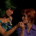
#i only know funky little geometric backgrounds now
Photo
part 2.
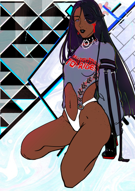
#➢ visage .#now taking applications for who tryina ride who tryina find out#we accept bfs / gfs / husbands / wives / and my personal favorite the dearly beloathed#DJSKGFHJLK#suggestive /#tag is just to be safe ... just to be Sure#i only know funky little geometric backgrounds now
3 notes
·
View notes
Text
answers for the prev reblog (artist ask) because it looks fun
1. Art programs you have but don't use
💚 clip studio, i used it like 3 times in total because its not really for my win7 so its too buggy for me to use right now
2. Is it easier to draw someone facing left or right (or forward even)
💚 facing left for me
3. What ideas come from when you were little
💚 probably anything to do with bugs or dinos
4. Fav character/subject that's a bitch to draw
💚 certain clothes like tech wear and shoes but i still love it
5. Estimate of how much of your art you post online vs. the art you keep for yourself
💚 i post a solid 95%
6. Anything that might inspire you subconsciously (i.e. this horse wasn't supposed to look like the Last Unicorn but I see it)
💚 for human art its dmmd and bleach, at times pswg
7. A medium of art you don't work in but appreciate
💚 anything i dont do goes, animation, comics, sculpting (3d as well),...
8. What's an old project idea that you've lost interest in
💚 anything to do with 3d stuff, im not good with that (i could still learn though)
9. What are your file name conventions
💚 hfhshdhshhdh.png or the rare 0827464.png
10. Favorite piece of clothing to draw
💚 shoes? and tops like tees or hoodies.. but i also like drawing jeans, thanks to gorillaz
11. Do you listen to anything while drawing? If so, what
💚 anything im in the mood for, music, podcasts, true crime stuff, ... lately its yass stuff (like slay. bad bitch vibes. idont know how else to describe this music ✌️), nightcore, hyperpop and abba. yeah
12. Easiest part of body to draw
💚 is there one? ...ears? ik those are hard for some ppl but thats the thing i do in 3 seconds
13. A creator who you admire but whose work isn't your thing
💚 kinda beats the purpose for me or i just cant think of anyone here...
14. Any favorite motifs
💚 dunno if this is motifs, but first thing that pops up in my mind is wuxia theme... or funky angles, also anything y2k inspired
15. *Where* do you draw (don't drop your ip address this just means do you doodle at a park or smth)
💚 my bedroom pc 99%
16. Something you are good at but don't really have fun doing
💚 rn most furry anthro art? as i prefer doing sonic style anthros but i still like doing it its just connected to only work now for me. so i think that affects it as well cuz work = no fun
17. Do you eat/drink when drawing? if so, what
💚 rarely now, it taught me to only use one hand while drawing which i hate, cuz i rather click the undo button than go ctrl z. its either popcorn or fruit or nacho chips
18. An estimate of how much art supplies you've broken
💚 my main thing is digital But i have broken several promarkers on purpose to dye some stuff with the ink especially cosplay wigs etc
19. Favorite inanimate objects to draw (food, nature, etc.)
💚 hmm aside from clothes maybe nature background (if i can keep it messy) like shrubs, clouds. but i prefer characters. and hate anything geometrical
20. Something everyone else finds hard to draw but you enjoy
💚 probably hands and aforementioned (human) ears are easier for me
21. Art styles nothing like your own but you like anyways
💚 theres so many i cant even name, but to choose one, anything overly retro cartoony and like don bluth style... i would love to draw like that but i would have to rewire my brain
22. What physical exercises do you do before drawing, if any
💚 i should stretch but i rarely do :( sometimes i do wrist exercises
23. Do you use different layer modes
💚 if it means like like overlays and stuff, yes, i use those and shadow+light for shading bigger pieces, sometimes lumi if needed
24. Do your references include stock images
💚 if im lost on the idea then yes.. or i use my own reflection/shitty webcam photos, you know (but senshistock has a place in my heart)
25. Something your art has been compared to that you were NOT inspired by
💚 definitelly happened but i cant remember
26. What's a piece that got a wildly different interpretation from what you intended
💚 uhh if its meant from others, then one picture i drew of murdoc and noodle. meant to be harmles father daughter fun. but. people online are gross creeps and you can imagine what they said :/
27. Do you warm up before getting to the good stuff? If so, what is it you draw to warm up with
💚 i cant warm up as i will spend hours on the warmup and waste time and energy i could put into the main thing (and most of the time i end up liking the warmup more)
28. Any art events you have participated in the past (like zines)
💚 some collabs ages ago.. i would love to do more but people never bite when i ask around
29. Media you love, but doesn't inspire you artistically
💚 cant think of anything, i usually get inspired by everything, even if just a little
30. What piece of yours do you think is underrated
💚 many of my commission works but, as long as the customer loves it, its enough
0 notes
Text
Inspiring Graphics
gy≥Here are 5 inspiring graphics that I feel relates to the multiverse theme, however with this broad theme they can range from futuristic and simple to retro and psychedelic. As I am learning graphics design it is extremely important that I find examples of graphic art, because it will help me understand how to create my own graphic and hopefully inspire me with ideas etc.
To find these designs I used Pinterest as it’s a place full of unique and inspiring art, and because the theme is so extraordinary I was able to use strange and ‘out of this world’ imagery.
The first graphic I have chosen has a geometric and fiction aspect, which mixes with the realistic desert landscape. This combination creates an uncertainty which I think is intriguing, these shapes that float within the sandy dunes look to be reflective and therefore adds more lines, shapes and colours. They also look quite futuristic and alien to earth, however they somehow really work well with the landscape thanks to its crisp shadow edges.
Overall this design is quite simplistic in terms of composition, however the concept keeps it interesting. The imagery itself is really unique and creative, where it plays with large and small objects to really show how big these mirror shapes and dunes are.

This piece incorporates both text and illustration, using a combination of only 3 well matched colours. What I like about this graphic is the effective use of negative space and the contrast it brings, this brightens the colours and illustration completely so it stands out. In the purple colour there are black grainy parts to display shadows and contours, but because its used in this way the piece overall isn’t effected and doesn’t hold that old/rough texture, rather looking bold and clear.
The illustration itself is a symmetrical drawing that brings so much wonder, its a concept that you can't completely grasp but understand the feeling you should be getting from it and that is curiosity. It changes your view on the universe when looking at this graphic, and it does this by messing up the proportions we know of, like a human head being larger than planets. This also links to the text shown that I read as ‘nothing matters but now’ and this message could be seen with the worlds falling into the head, showing that everything is in your head and almost like nothing really exists. I want to be able to have this kind of an impact on the viewers with my own work, making people wonder and think but still not completely know.

This graphic is another symmetrical piece, and I think the reason they work so well in the multiverse theme is because symmetry is universal. You see it everywhere in plants, the human body, planets etc. however perfect symmetry is hard to come by. That is why we often relate it to the universe, especially the beings we sometimes believe lie within, whether its an aliens face and body or a UFO they’re almost too perfect which is threatening to us.
The image itself holds an incredible illustration that instantly grabs my attention, I really like the idea of having a detailed drawing as part of a graphic design because I feel it adds a certain type of fascination. The colours used are also intuiting as they have used blue to colour the skin, another indication of alien life. The colour blue also is used in the background but to differentiate everything, the artist has used an array of blue hues and shades.
This next graphic is focused mainly on text, however it’s just part of a design that involves much more. You can see the use of repetition has been used effectively where the words ‘open mind’ display motion, I think this brings the piece to life a little and therefore is more interesting to look at. Another aspect that has movement is the linear pattern inside of the square, it has a variety of distances between the lines so it can represent sections that look close or far away, and creating a wave of rectangles.
Even though the objects are busy and filled with movement, the layout makes it a bit more simple. This overall square has been placed in the middle of a plain grey background, minimising how much it stands out. Another simplifying aspect was having the object made completely out of turquoise lines only, this allowed you to process the techniques and effects clearly and easily.

Finally I chose this graphic for its psychedelic style and clever use of text, however this wouldn’t be as eye-catching if it didn’t display such bright and vibrant colours. The artist has used these colours because they slightly clash and makes it ever so slightly hard to focus on, but I believe that any effect your art gives the viewer, good or bad, is positive because you're making a connection. You don’t tend to see this effect as you're used to looking comfortably at imagery, whereas thanks to the bold clashing colours you really have to put all your attention to find whats involved.
I’m also fan of the composition as they have incorporated text within the swirly shapes, that when you put together creates a unique illustration of a woman's face wearing sunglasses. Its these swirly shapes of which fit together perfectly that create the psychedelic and retro style that I’m always really attracted to, as well as display funky typography that’s cleverly incorporated together.
0 notes
Text
Hello everyone I wanted to create a post about something I noticed recently.
Now Im a pretty big nerd for sci-fi so it was natural of me to stumble upon Netflix’s “Stranger Things”. As I was watching I found this concept of there writers choice for the story to be set in the early 80’s therefore I thought it would just be an modern attempt to dress up the kids in 80’s clothes but NO I was pleasantly surprised as the titles appeared and it left the audience with a cinematic nostalgia.
Click to view the opening.
The Directors and graphics team really put a lot of effort in making his title not only is it simply red and black to emphasise something scary it approaching but for me personally it felt like I was watching an old video tape I had inserted into my VCR due to the graininess of the titles like the image was cracking. Automatically I became very invested in the visual execution of this series.
Throughout season one I was very sceptical as to when this series was set looking into the surrounding characters style and environment I could only assume the 70’s as for some reason they had this “citrus” colour pallet consisting of brown, orange , white , yellow , beige, red, white and black.
So since the interiors were like this and the camera which was used seemed grainy as well to mimic this era I had no choice but to think it must be set in the late 70’s. There was even a punk scene going on in another town which looked very 70’s which backed this theory up however the punk era also continued to thrive from the 70’s to early 80’s.
7
But this could of also been reflective of lost boys which came out in 1987 which I began to get this type of vibe off of.
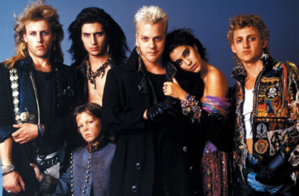
As I was continuing to watch this series in the beginning I noticed chopper bikes particularly rally bikes now this may be hand downs as some of the boys bikes are defiantly not new since theres gaffer tape/electrical tape on some of the handle bars but these bikes were developed and sold during the 70’s so it could be second hand ones from the late 70s that the kids were given towards the early 80s but again the level of detail I found was so interesting.
Not to mention the Marty Mcfly jacket that Will wears^^^
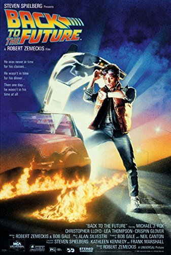
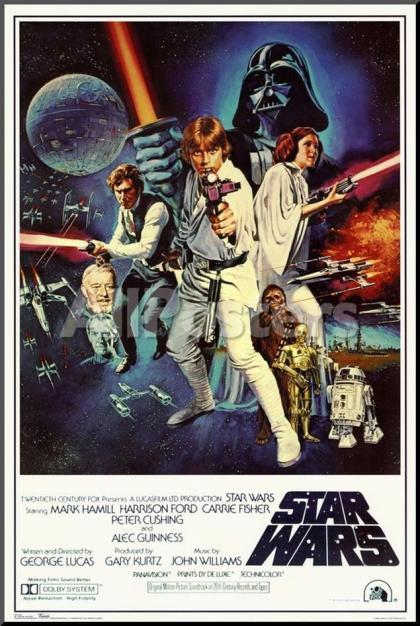
Speaking of Marty Mcfly film posters back in the day seemed like they were illustrated as it has this vintage look of what appears to be a painting which is recreated in every single stranger things poster campaign but each poster you can visually tell the different the eras in each season which I find gives the viewers a good atmosphere and mindset to base the show from.
The graphics team did a good job of this type of nostalgic poster which could also be inspired from the infamous star wars poster New Hope.
So not only have I noticed the change of style progressing each year through interiors and fashion hair seems to change and progress into the 80’s we know and love. With through backs to mullets, bowl cuts and perms; these overgrown cuts seemed to be a fashion statement and even more so towards todays hair style with messy bed hair and loose curls and waves… maybe not as extreme as the big hair but we do see the occasional back comb look on cheeky night outs!
As the show progressed the style progressed not only in fashion but also vibe and cinematography and lighting. From the ironic colours of red, brown/beige, black white and yellow that was seen during the beginning of the film as the character and years progress so does the style, lighting and tone.
For some reason a lot of pink is used in the lighting and even in clothes that the characters wear; it is very reminiscent to save by the bell a very iconic “cult show”.not to mention a lot of strange geometric shapes in the background. Not sure what thats about but it was pretty rad a the time. But I find the 80’s style coming back now with the hipster pattern shirts and bright coloured scrunches.
STRANGER THINGS
Lastly what makes the series of stranger things isn’t just the scary monsters and the storyline for me what ties it together is the cinamatography and lighting is a very powerful thing. This is something that inspires me in my own photography as those intense colours that reflect on the characters creates a very retro vibe and defiantly creates an intense emotional atmosphere. Again neon is a very stereo typical 80’s glam rock image similarly creating a some what Las Vegas vibe. Truly stunning.
Overall the cinematography is so inspiring to use even using such things like gel lighting or having coloured agitate would give this effect to the simplest of photographs but I feel we need this nostalgia even thug it is at times overlooked. I understand that perhaps an over use of pink was used but since this tv show was based loosely around the Cold War and Soviet Union and using pink to either calm or scare the Russians I feel this pink was used purposely. It seemed like a fun, creative free era were people could wear funky patterns, big hair and be utterly saturated in neon but why can’t we be nostalgic. We are constant on our phones a lot and back then there was the brick phone (how far we have come). Over the weekend I went to the Linda McCartney photography exhibit and was sp amazed by her manual and Polaroid work and how low tech can become the highest of quality and capturing this vintage style and memory. If we can capture this “vintage” memories to create an atmosphere using design and not just for the purpose of “fad” having more definition and meaning then perhaps this could be a way to bring everyone into normal conversation even if it is a little outrageous.
In the immediate future I do intend to use this style in my practise as I begin to slowly introduced this concept of coloured lighting in my photography. During my time doing my masters course I did a project experimenting with coloured light in arcades. To view this click bellow:
coloured light photography portfolio.
Defiantly an inspiring time so save this space for more content on the 80’s style.
How we can use Stranger things as an example to create inspiring design. Hello everyone I wanted to create a post about something I noticed recently. Now Im a pretty big nerd for sci-fi so it was natural of me to stumble upon Netflix's "Stranger Things".
0 notes
Link
Florida's Walt Disney World park has a lot of beautiful walls that are perfect for taking photos in front of.
Some of the park's most Instagramable walls include the purple one near Tomorrowland in Magic Kingdom.
Another popular photo backdrop is the colorful floral wall at Disney's Pop Century Resort.
Visit Insider's homepage for more stories.
Walt Disney World is home to countless magical spots, but have you heard about the many unique walls of Disney World?
Yes. You read that correctly. There are a variety of different walls scattered throughout the Florida-based theme parks and resorts that can serve as picture-perfect backdrops.
Here are 12 of the most Instagrammable Disney walls to snap a photo in front of during your next trip.
SEE ALSO: THEN AND NOW: Vintage pictures of Disney and what it looks like today
FOLLOW US: INSIDER is on Facebook
The purple wall is a popular choice.
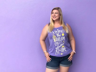
It only makes sense that the top photo spot goes to the Disney wall that started it all — the purple wall.
What started as a hidden gem amongst social media influencers and fashion bloggers has boomed into a bustling must-do photo opportunity that is so popular even Disney has created merchandise and a specialty slushy in honor of it.
So, don't be surprised to see a crowd or even a Photopass Cast Member ready to snap a photo.
The purple wall is located at the entrance of Tomorrowland in the Magic Kingdom. Although the purple wall is now old news, this classic photo spot is always on my list whenever I visit.
The galactic purple wall is unique.
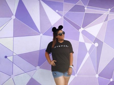
Recently, the purple wall has undergone a cosmic transformation. Directly next to the original purple wall at the entrance of Tomorrowland in the Magic Kingdom is the brand new galactic purple wall.
This wall features a unique geometric pattern with different hues of purple and white. It is a funky way to spruce up your feed and show off the latest and greatest Instagram hit.
The popsicle stick wall is in Toy Story Mania.
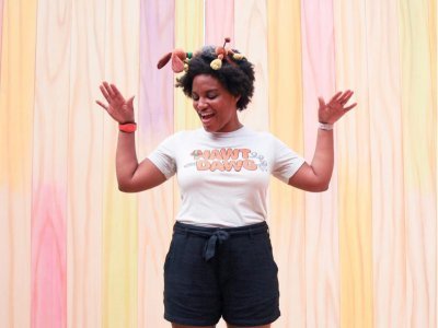
Take a stroll through the exit area of Toy Story Mania in Disney's Hollywood Studios and you will stumble upon the colorful popsicle stick wall.
I think this is one of the best photo spots in Toy Story Land because it captures the whimsy of "Toy Story."
The rose-gold wall is in Epcot.

Rose gold has been a huge phenomenon at Disney World over the past few years. There's no better way to get in on the trend than by snapping a photo with the rose-gold wall by the entrance of Mission: Space in Epcot.
Of course, this wall looks even cuter if you dress to match it. The traveler pictured above matched the wall with rose-gold Minnie ears and a matching shirt from Oh Yeah Apparel.
The bubble-gum wall is great for fashionistas.
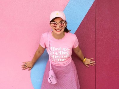
Tucked away at both exits of Spaceship Earth in Epcot is the vibrant and gorgeous bubble-gum wall.
Lovingly named the bubble-gum wall for its shades of pink, this wall is a huge hit amongst influencers and fashionistas.
The blueberry wall is for those who prefer subtlety.

If pink isn't your thing, have no fear. At the exit of Spaceship Earth, directly next to the bubble-gum wall, is the blueberry wall.
Shades of bold and pastel blues make the perfect backdrop — especially if you feature it on your feed alongside a photo of the bubble-gum wall as a contrast.
The toothpaste wall is in Epcot.

Right after you hit up the bubble-gum wall and the blueberry wall, before you leave Epcot you might as well hit up the third Instagram-friendly wall: the lovingly nicknamed toothpaste wall.
Although this is called the toothpaste wall for its notable colors, these fresh pastels and wavy lines remind me far more of the ocean. That's probably why you can find it at the exit of The Seas with Nemo and Friends.
The moss wall is in Disney’s Animal Kingdom.
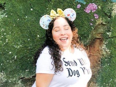
Take a walk on the wild side and head over to Disney's Animal Kingdom for the picture-perfect moss wall. You can find the earthy wall straight across from the entrance of Satu'li Canteen in Pandora.
The flower wall will get you a groovy picture.
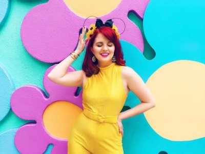
If you're feeling a little groovy, Disney's Pop Century Resort has a wall that's all about flower power located right by its Hippy Dippy pool.
The "Tangled" wall will make you feel like Rapunzel.

One of my favorite places in the Magic Kingdom is the "Tangled"-themed restroom area in Fantasyland. I know that sounds crazy that a rest area would be one of my favorites, but, this area is intricately detailed and feels straight out of the movie.
Along the exterior walls of the ladies' room are beautiful murals of golden flowers that look exactly like those Rapunzel painted in her tower. It's a beautiful way to get in touch with your inner princess.
The vibrant triangle wall will add color to your feed.

Disney's Art of Animation Resort captures the magic of Walt Disney and Pixar animated films. Aside from the larger than life storybook landscapes, there are vibrant walls in the front of the resort that will add a dash of color to your Instagram feed.
These colorful triangles are the perfect background and feature a variety of different colors so you can take multiple pictures.
The Morocco wall isn't easy to find.

Epcot is home to World Showcase — a chance to explore magnificent countries from around the world in the span of a day. Each country offers an immersive experience that almost feels like the real thing.
In the Morocco pavilion, there a beautiful mosaic wall tucked away that offers a gorgeous backdrop. As a bonus, this area is typically very quiet and relaxing.
from Design http://bit.ly/2POQtza
0 notes
Text
Rose’s Turn: Costuming the 2008 “Gypsy” Revival
I’ve been on a bit of a Patti Lupone kick this year, as my reviews of War Paint probably showed, so I decided to take a look at a few of the costumes from her Tony-winning turn as Mama Rose in the 2008 revival of the musical Gypsy: A Musical Fable. I’m focusing on just the Mama Rose costumes this afternoon because I think that they deserve special attention, but in the future, I think I will go back and take a look at the other costumes.
Gypsy’s revival was costumed by the late Martin Pakledinaz, best known for his Tony Award-winning costumes in Thoroughly Modern Millie and the 2000-era revival of Kiss Me, Kate. Mr. Pakledinaz did a fantastic job capturing the original feel of the musical while still managing to infuse the dramatic, overbearing Rose character with rich, beautiful colors.
For those unfamiliar with the musical, Gypsy is the story of Rose Thompson Hovick, the mother to burlesque pioneer Gypsy Rose Lee (from whom the musical takes its title) and the very definition of a stage mother. You think the moms on Dance Moms or other reality shows are a little crazy? They’ve got nothing on Mama Rose. Take a read through Gypsy: A Memoir if you ever have the time or inclination. A dear friend of mine from college did her capstone on the influence of Gypsy Rose Lee on burlesque as an art form, and the story of her is absolutely fascinating, especially the domineering nature of her mother.
The role of Rose was originated on Broadway by a woman whose name is synonymous with theatre stardom, Ethel Merman, and has been since played on stage in New York by Dame Angela Lansbury (who won the 1975 Tony for her performance), Tyne Daly (who won the 1990 Tony for her performance), Bernadette Peters, Patti Lupone (whose revival is the subject of the review, and who won the 2008 Tony for her performance), and will be once again revived by Imelda Staunton in 2018 following a wildly successful West End revival. In other words, this is a role that commands an actress with power and the ability to belt out a melody that will be heard in the rafters. And any role that demanding deserves costumes that match. Let’s take a look:
The musical as a whole is set in the 1920s and 1930s, and follows a family of vaudevillians as they try and make it big, led by the domineering and overbearing Mama Rose. As a result, the costumes that Mr. Pakledinaz designed tend to be dramatic and showy, a little risqué, and intended to wow the audience without overpowering the character or actress (though, frankly, I’m not sure one can overpower Patti Lupone).
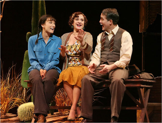
This first number is in a color palate I haven’t looked at much before, which is the golds and browns families. Typically, a designer will not mix two different patterns in fabric, but on occasion there can be a very good reason for doing so. Here, Mama Rose is wearing a brown-and-white checked jacket over a gold, orange, and white blouse and a slightly softer orange skirt. The overall effect that’s given off is one of the character being a bit off, like there’s something that isn’t quite right or expected about who and what they are. But that’s not a flaw in the costume design; it’s a feature in my book given that the musical follows Rose’s journey into losing everything--family included--in her quest for fame-by-proxy.
The color choices add to that overall effect, I think. Later in the musical, the palate Mr. Pakledinaz uses gets a bit darker and more muted, but here, it’s almost manic, clashing just a little bit without being unpleasing to the eye. The clash in the dual geometric patterns draws the eye, especially in comparison to the much plainer designs given to the supporting characters in this scene and in others. Clearly, this is where the attention should be, words or music be darned, and it’s a great effect. And, as I said, it’s not unpleasing to the eye. It’s just unusual.
I find that when I mention Gypsy to a person who isn’t a theatre fan, they don’t necessarily know what I’m talking about. But bring up the manic, show-stopping number “Everything’s Coming Up Roses,” the light of recognition tends to cross their faces. In part, that’s because this is one of those showtunes that managed to get into the public mind because it’s a great phrase, and because of Bette Midler’s performance as Mama Rose in a mid-1990s television version of the musical. For those who might not know it, let me give you a taste of this number and why the costume gets some special attention in this post, with this clip of Patti Lupone performing it at the 2008 Tony Awards ceremony; the dialogue is important, but if you want to skip right to the music, it starts at the 1:12 mark:
youtube
This number closes the first Act of the musical, as Rose’s younger daughter June has eloped and left her stage-obsessed mother behind. The family (including older daughter Louise, the titular Gypsy, and Mama’s fiancé Herbie) believe that this will finally compel Mama Rose to give up her obsession with making it big and let them settle down. Instead, in the blink of an eye, Mama Rose transfers her dreams from one daughter to another in a show-stopping number that is as manic as it is memorable.
For this number, Mr. Pakledinaz has costumed Patti Lupone in a number of layers that can be seen both in the clip above and in this still from the stage production itself; it’s far more somber than the piece which started out this review, and that reflects that despite the new plan to make Louise into Gypsy Rose Lee, the character of Mama Rose is still in a darker place herself and is now clinging to one last hope of stardom. In full, the costume looks like this:

The coat she wears at the train station in this scene is a rich, deep maroon purple that almost drinks up the shadows while providing a contrast to the Mr Lupone’s skin as it’s illuminated by the stage lights. The fabric is heavy and woolen in a rare exception to the general rule that you avoid heavy fabrics in live theatre (even when the setting requires it), and I think you can read a little metaphor into it: the character is literally being weighed down by keeping out the cold, the way she is figuratively weighed down by her dreams of stardom even if it’s only by proxy.
Beneath that is a gorgeous blue dress with a cream scarf/collar that, unfortunately, has not been photographed much in the right lighting. I was, however, able to find one still that offered a little more perspective on it, however:

As you can somewhat see, the dress underneath the maroon coat is blue, with a wild and Bohemian paisley and swirled pattern that is alive with color, busy, and designed to catch the eye. As with Mama herself, a simple exterior embodied by the coat gives way to a much more complex interior, as embodied by this dress. The blue manages to not fade into the background thanks to the coat acting as a barrier, and I like the addition of the scarf/collar itself as a way to lighten up the whole ensemble, as well as to draw the eye down to the skirt; in the theatre, I do believe it would be much easier to see the pattern, at least from center orchestra.
The scarf/collar combination itself is a gridded white chiffon, as seen in this closeup which also lets us look at the dress’ hem in a tiny bit more detail:

More of a cream than a pure white, it’s there to provide covering on the bust as well as to lighten the ensemble, as I stated. It does that job well, and the use of a rougher fabric design as compared to the smoothness of the dress itself is a wise one. It adds just a little bit more contrast when viewed up close, and I like that. We can also see the Bohemian influence in the hem of the dress, with the somewhat funky and rule-less design in blues and oranges.
The final costume that Ms Lupone is outfitted in during the 2008 revival is also her simplest of the production, but that in no way makes it less impressive. As the show winds down, the 11 o’clock number, “Rose’s Turn,” represents Mama Rose coming to grips with the idea that not only will she never make it big, but that she’s lost everyone she might have cared about: June (the daughter who eloped), Louise (Gypsy Rose), and Herbie (Rose’s fiancé). She tries hard in this number to justify everything she’s done, and finally admits that it was all about her in the end. It’s a sad, powerful, memorable number and it has a costume to match:
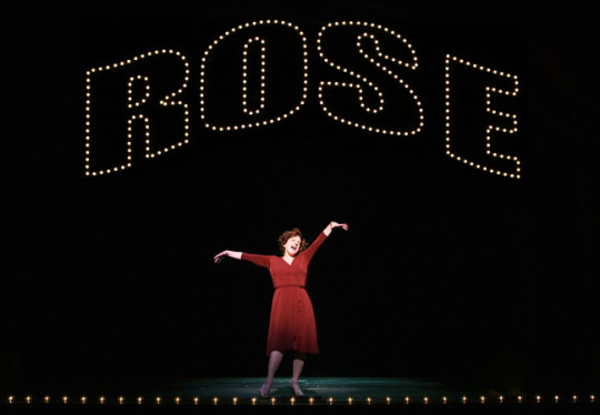
The giant ROSE in lights is in fact part of the production; part of the sequence for this number is Rose fantasizing about seeing her own name up in lights and hearing the crowds applauding and cheering her name. But as she fantasized, she’s outfitted pretty plainly. The deep, burnt red that she wears here is far different from the manic pattern of the blue dress from the end of Act I. Instead, it is simple, cleanly cut, and even makes the character seem a bit small on the darkness of the stage. That’s obviously intentional: the designer wants the focus to be on this character, and this character alone, with no design elements to distract. The color has to do the work, not the costume.
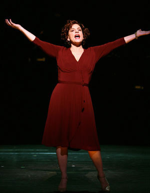
The A-line cut of the dress, interrupted only by a band of satiny or silky fabric at the waste, is classical and believable as simply a dress that a woman in Mama Rose’s station would own and wear. The plainness is once again a feature rather than a bug: there is nothing to distract from the character, from the words, from the music. There is simply the deep red color against the blackness of the character’s fantasy, and the audience is left--in my opinion--a little bit haunted by the overall effect.
Mama Rose is one of the most challenging roles on Broadway, not only because of the need for belting vocals and a powerful voice, but because of the personality of the character. There is a reason, I think, that only the Broadway Greats have been cast in the role throughout the musical’s history; Merman, Lansbury, Lupone, all are the definition of a leading lady, and have been costumed to fit the part. For the 2008 revival, I think the choice of colors and styles was absolutely spot on, and the Tony nomination for Mr. Pakledinaz was well-deserved.
Gypsy is a fantastic musical that drips with classic Broadway style and flair, not to mention costuming. I highly recommend it as an entrée into the world of musical theatre, and especially recommend the 2008 recording of the production. Treat your ears to the show-stopping, powerful, bittersweet melodies and enjoy it for what it is: beautiful theatre.
That wraps up this review of the 2008 revival of Gypsy. As I said, I may come back to look at some more of Mr. Pakledinaz’s designs for this production later on this year; there certainly is a lot to work with. On a personal note, this was the last production that I was able to enjoy before I took my hiatus from the theatre fandom, and it’s one that has always left fond memories in my mind. It’s worth looking into!
Later on this week, I’ll be posting some more full reviews and have a couple mini-reviews queued up. So stay tuned, dear readers!
Edit: A kindly Anon noticed that I had inadvertently reversed the birth order for Louise and June; June is, by a year, the younger of the two daughters, and this post has been updated accordingly!
54 notes
·
View notes
Text
What’s New for Designers, June 2018
Sourced From: https://www.webdesignerdepot.com/2018/06/whats-new-for-designers-june-2018/
No summertime blues here. With so many new tools, the dog days of summer will be filled with playing with new elements and expanding your design portfolio.
If we’ve missed something that you think should have been on the list, let us know in the comments. And if you know of a new app or resource that should be featured next month, tweet it to @carriecousins to be considered!
Cool Backgrounds
Cool Backgrounds is a pretty nifty tool to help you create a trendy background element with color and gradients and shapes. You can create images for blogs, social media and full website designs as well as desktop wallpapers. The options are beautiful without any changes but you can also create customizations in the still, and animated, background options. Just make what you like in-browser and download.
Record Label Logos
Record Label Logos is a great collection of visual inspiration. The project by Reagan Ray is a curated collection of some of the best record label branding and logos of all time. Some of the old-school logos are just phenomenal. Browse and feel inspired.
Beagle
Beagle is a security tool that is designed to help secure your website before hackers break in. You can test security and see all the results in an intuitive dashboard that details each security scan.
Priority Nav Scroller
Priority Nav Scroller is the tool for you if you want to prioritize website navigation and works particularly well with a large number of links or if you need additional inline controls. The simple script is easy to use and install and has a clean design.
Codacy
Codacy helps you improve code and automate code reviews. It’s designed as a productivity tool for software dev teams. Check style, security, duplication, complexity and coverage on every change while tracking code quality.
Bokeh Effect
Bokeh Effect is for everyone who loves trendy faded background bubbles or blobs. This CSS animation includes a soft effect that’s interesting without being overwhelming. Check out Louis Hoebregts project on Codepen.
Rainbow Hover Buttons
Rainbow Hover Buttons are a groovy little bit of code that creates a fun hover state for clickable elements. Check out the code from Varun Vachhar.
Critters
Critters is a Webpack plugin to inline critical CSS and lazy-load the rest. What’s different about this library is that it doesn’t use a headless browser to render content. It is fast and lightweight and is great for single-page applications.
Solna
Solna is the world’s first invoicing platform that is powered by credit score data. Designed for small business owners and freelancers, the tool helps you automate cash flow and reduce exposure to risk. The tool allows you to create custom invoices, automated reminders, upload bulk data, track invoices and see reports and it is free to use. Right now Solna is made for users in the UK, but you can sign up to be notified as the international launch expands.
Fathom Analytics
Fathom Analytics is a new alternative to website data collection without sharing or selling collected data. It tracks everything you expect – users, key actions, etc. The tool is open-source and is in the pre-launch stages, but it looks like a great start to a new kind of analytics product that you can take a look at on GitHub.
Wallpaper Generator
Wallpaper Generator is a simple tool to create different wallpaper and background patterns. Just toggle the controls in the pen by Tim Severien to create something for your project.
Goat
Goat is a tool that teams have been needing: It is a URL shortener that’s made just for private teams or groups. And it is designed so that only your team can access links, such as those in shared folder. Plus you can great link groups and integrate it with your team on Slack.
Roast
Roast is a static web host that “just works” for plain HTML (Jekyll, Hugo, etc.) and React/Angular/Vue. It includes secure HTTPS, fast AWS CDN, SEO reporting and server-side rendering with free and paid plans.
Wired Elements
Wired Elements is a kit of UI elements in a hand-drawn style. While there aren’t a lot of projects where you can likely use this, it’s pure fun. The elements are drawn with randomness so that everything looks like you just sketched it out.
Optic
Optic is an artificial intelligence pair-programming tool to help automate ordinary tasks to improve workflows. Use it to connect projects with similar code and files, ask questions from your IDE and to highlight code and get suggestions.
Lord Icon
Lord Icon is a set of 50 SVG animated icons. They might look simple, but these little gems can add a lot of spark to buttons and elements throughout your design. Customize them with color and scaling to fit your design.
12 Languages Icons
12 Languages is an icon shot that shows personas to match languages in your design. Each illustration is featured in a simple cartoon style.
Clothes & Shopping Icons
Clothes & Shopping Icons is a set of line-style vectors that could work great for online shops or ecommerce. Each icon file comes in multiple file formats for ease of use and quick customization.
Libmoji
Libmoji is a tiny library for making Bitmoji avatars. It uses the Bitmoji avatar-building API to render previews with certain characteristics and allows you to integrate this style of avatar without a Bitmoji or Snapchat account.
Winds
Winds is an open-source RSS and Podcast app. Use it to listen or play with the code to customize your own listening or reading experience. It includes machine learning that will help find content that matches your tastes. (Plus, there’s already a UI/UX stream to get started.)
Tutorial: 1 Element CSS Rainbow Gradient Infinity
CSS Tricks has a fun tutorial to create a 1 Element CSS Rainbow Gradient Infinity. The quick tutorial walks you through creating the shapes and gradient in CSS with step-by-step instructions and code snippets so you can walk through it with ease.
Tutorial: Building a Responsive Image
Still not exactly sure how to create a responsive image or logo in the most efficient manner? Nils Binder has a great tutorial (with demo content) to get you through it. From the designer: “I got the idea to build a logo file for our company, that not only reacts to the browser width but instead adapts while respecting its aspect ratio. So you can use it anywhere, and the file itself chooses which version to show depending on the size it’s given.”
Cannes
Cannes is an art-deco style typeface with neat ligatures. This display typeface includes a modern stroke style and is free for personal and commercial use.
Delicious Adventures
Delicious Adventures is a simple novelty font in a clean, almost-handwriting style. It comes with upper- and lowercase letters and numbers. The stroke widths are thick enough to hold up in a variety of display uses.
Kotori Rose
Kotori Rose is a fun geometric sans serif typeface that can work for display or slightly smaller blocks of text. It has bold letterforms and includes upper- and lowercase letters, numerals and punctuation.
Lash
Lash is a display typeface in a rough style with an extra-high x-height. It includes sharp edges in two styles with an uppercase character set, numbers and punctuation.
Megan June
Megan June is a full collection of characters in a thin style. Use it as an uppercase font for display or use lowercase as well for blocks of text. The simple strokes are highly readable.
Quiet Meows
Quiet Meows is something fun for all the cat lovers out there. The funky font replaces some characters with cats for a silly style. Use it for your feline-fab friends.
Sunset Beach
Sunset Beach is a modern script with swashes. It includes a full character set without numerals. There are also ligature options and some extended symbols.
Add Realistic Chalk and Sketch Lettering Effects with Sketch’it – only $5!
Source
p img {display:inline-block; margin-right:10px;}
.alignleft {float:left;}
p.showcase {clear:both;}
body#browserfriendly p, body#podcast p, div#emailbody p{margin:0;}
The post What’s New for Designers, June 2018 appeared first on .
from https://ihelpsell.net/whats-new-for-designers-june-2018/
0 notes
Text
What’s New for Designers, June 2018
No summertime blues here. With so many new tools, the dog days of summer will be filled with playing with new elements and expanding your design portfolio.
If we’ve missed something that you think should have been on the list, let us know in the comments. And if you know of a new app or resource that should be featured next month, tweet it to @carriecousins to be considered!
Cool Backgrounds
Cool Backgrounds is a pretty nifty tool to help you create a trendy background element with color and gradients and shapes. You can create images for blogs, social media and full website designs as well as desktop wallpapers. The options are beautiful without any changes but you can also create customizations in the still, and animated, background options. Just make what you like in-browser and download.
Record Label Logos
Record Label Logos is a great collection of visual inspiration. The project by Reagan Ray is a curated collection of some of the best record label branding and logos of all time. Some of the old-school logos are just phenomenal. Browse and feel inspired.
Beagle
Beagle is a security tool that is designed to help secure your website before hackers break in. You can test security and see all the results in an intuitive dashboard that details each security scan.
Priority Nav Scroller
Priority Nav Scroller is the tool for you if you want to prioritize website navigation and works particularly well with a large number of links or if you need additional inline controls. The simple script is easy to use and install and has a clean design.
Codacy
Codacy helps you improve code and automate code reviews. It’s designed as a productivity tool for software dev teams. Check style, security, duplication, complexity and coverage on every change while tracking code quality.
Bokeh Effect
Bokeh Effect is for everyone who loves trendy faded background bubbles or blobs. This CSS animation includes a soft effect that’s interesting without being overwhelming. Check out Louis Hoebregts project on Codepen.
Rainbow Hover Buttons
Rainbow Hover Buttons are a groovy little bit of code that creates a fun hover state for clickable elements. Check out the code from Varun Vachhar.
Critters
Critters is a Webpack plugin to inline critical CSS and lazy-load the rest. What’s different about this library is that it doesn’t use a headless browser to render content. It is fast and lightweight and is great for single-page applications.
Solna
Solna is the world’s first invoicing platform that is powered by credit score data. Designed for small business owners and freelancers, the tool helps you automate cash flow and reduce exposure to risk. The tool allows you to create custom invoices, automated reminders, upload bulk data, track invoices and see reports and it is free to use. Right now Solna is made for users in the UK, but you can sign up to be notified as the international launch expands.
Fathom Analytics
Fathom Analytics is a new alternative to website data collection without sharing or selling collected data. It tracks everything you expect – users, key actions, etc. The tool is open-source and is in the pre-launch stages, but it looks like a great start to a new kind of analytics product that you can take a look at on GitHub.
Wallpaper Generator
Wallpaper Generator is a simple tool to create different wallpaper and background patterns. Just toggle the controls in the pen by Tim Severien to create something for your project.
Goat
Goat is a tool that teams have been needing: It is a URL shortener that’s made just for private teams or groups. And it is designed so that only your team can access links, such as those in shared folder. Plus you can great link groups and integrate it with your team on Slack.
Roast
Roast is a static web host that “just works” for plain HTML (Jekyll, Hugo, etc.) and React/Angular/Vue. It includes secure HTTPS, fast AWS CDN, SEO reporting and server-side rendering with free and paid plans.
Wired Elements
Wired Elements is a kit of UI elements in a hand-drawn style. While there aren’t a lot of projects where you can likely use this, it’s pure fun. The elements are drawn with randomness so that everything looks like you just sketched it out.
Optic
Optic is an artificial intelligence pair-programming tool to help automate ordinary tasks to improve workflows. Use it to connect projects with similar code and files, ask questions from your IDE and to highlight code and get suggestions.
Lord Icon
Lord Icon is a set of 50 SVG animated icons. They might look simple, but these little gems can add a lot of spark to buttons and elements throughout your design. Customize them with color and scaling to fit your design.
12 Languages Icons
12 Languages is an icon shot that shows personas to match languages in your design. Each illustration is featured in a simple cartoon style.
Clothes & Shopping Icons
Clothes & Shopping Icons is a set of line-style vectors that could work great for online shops or ecommerce. Each icon file comes in multiple file formats for ease of use and quick customization.
Libmoji
Libmoji is a tiny library for making Bitmoji avatars. It uses the Bitmoji avatar-building API to render previews with certain characteristics and allows you to integrate this style of avatar without a Bitmoji or Snapchat account.
Winds
Winds is an open-source RSS and Podcast app. Use it to listen or play with the code to customize your own listening or reading experience. It includes machine learning that will help find content that matches your tastes. (Plus, there’s already a UI/UX stream to get started.)
Tutorial: 1 Element CSS Rainbow Gradient Infinity
CSS Tricks has a fun tutorial to create a 1 Element CSS Rainbow Gradient Infinity. The quick tutorial walks you through creating the shapes and gradient in CSS with step-by-step instructions and code snippets so you can walk through it with ease.
Tutorial: Building a Responsive Image
Still not exactly sure how to create a responsive image or logo in the most efficient manner? Nils Binder has a great tutorial (with demo content) to get you through it. From the designer: “I got the idea to build a logo file for our company, that not only reacts to the browser width but instead adapts while respecting its aspect ratio. So you can use it anywhere, and the file itself chooses which version to show depending on the size it’s given.”
Cannes
Cannes is an art-deco style typeface with neat ligatures. This display typeface includes a modern stroke style and is free for personal and commercial use.
Delicious Adventures
Delicious Adventures is a simple novelty font in a clean, almost-handwriting style. It comes with upper- and lowercase letters and numbers. The stroke widths are thick enough to hold up in a variety of display uses.
Kotori Rose
Kotori Rose is a fun geometric sans serif typeface that can work for display or slightly smaller blocks of text. It has bold letterforms and includes upper- and lowercase letters, numerals and punctuation.
Lash
Lash is a display typeface in a rough style with an extra-high x-height. It includes sharp edges in two styles with an uppercase character set, numbers and punctuation.
Megan June
Megan June is a full collection of characters in a thin style. Use it as an uppercase font for display or use lowercase as well for blocks of text. The simple strokes are highly readable.
Quiet Meows
Quiet Meows is something fun for all the cat lovers out there. The funky font replaces some characters with cats for a silly style. Use it for your feline-fab friends.
Sunset Beach
Sunset Beach is a modern script with swashes. It includes a full character set without numerals. There are also ligature options and some extended symbols.
Add Realistic Chalk and Sketch Lettering Effects with Sketch’it – only $5!
Source
from Webdesigner Depot https://ift.tt/2LVNdLe
from Blogger https://ift.tt/2JYkeJD
0 notes
Last Seen Blogs
paigesekusudoru
Paige Sekusudoru
cryptid-scribs
Magical Girl Enthusiast
sychellebanda
#sychventures

pltsnd
PLUTO Sound
senshinochikai
Moonlight legend