#foundtype
Text
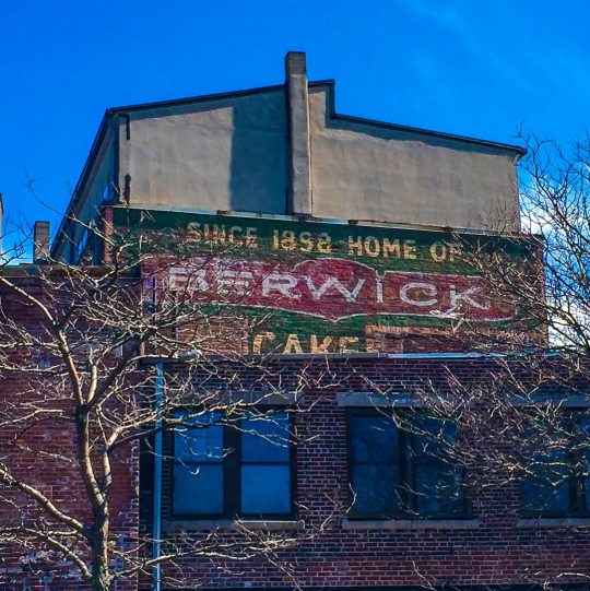
The Berwick Cake Company went out of business in 1977, but made a significant contribution to the world back in in the 1920s. According to food historians, Berwick was selling a product with 2 mound-shaped pieces of chocolate cake with a sweet filling sandwiched between them. They were not selling well. As a marketing stunt, the company had the actors of the Broadway show "Makin' Whoopee," then playing in Boston, toss the cakes into the audience at curtain call. They were an immediate hit, and the Whoopie Pie was born.
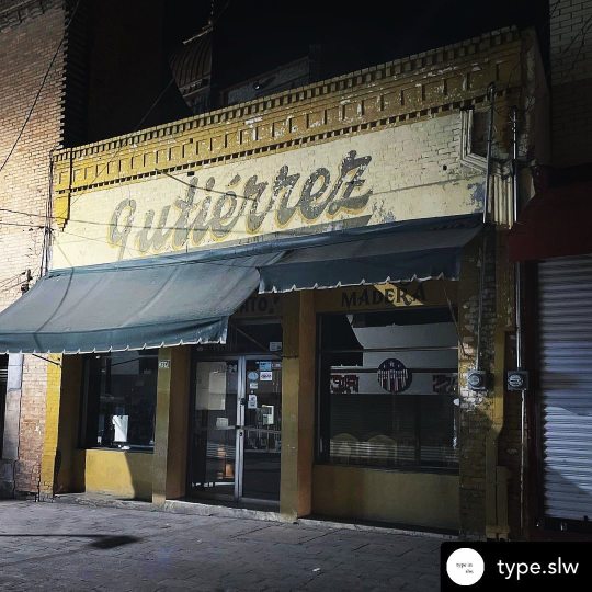
BOSTON SIGNAGE PROJECT (98 of #100bostonsigns)
#sign#signs#signage#signporn#signgeeks#signofthetimes#signart#vintagesign#vintagesigns#retro#type#typography#jj_project#jj_challenge#jj#ad#oldad#igsignage#foundtype#boston#bostonsigns#roxbury#brick#paintedsign#ghostsign#ghostsigns#100bostonsigns
3 notes
·
View notes
Photo
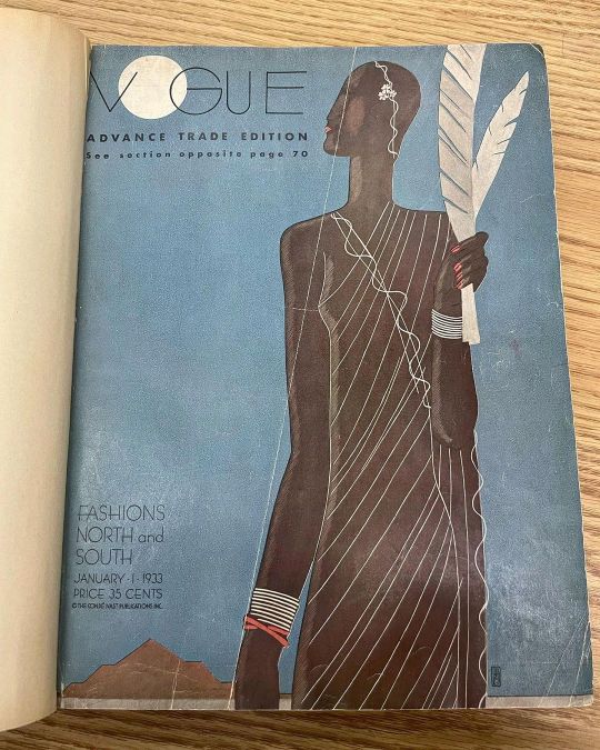
Students had their #library #research presentation. Afterwards I browsed around & explored the bound #magazine #collection . Original @voguemagazine issues from 1933. #magazinedesign #graphicdesign #typography #foundtype #layout #illustration (at Fashion Institute of Technology Library) https://www.instagram.com/p/Cod58vRuDLY/?igshid=NGJjMDIxMWI=
#library#research#magazine#collection#magazinedesign#graphicdesign#typography#foundtype#layout#illustration
0 notes
Photo
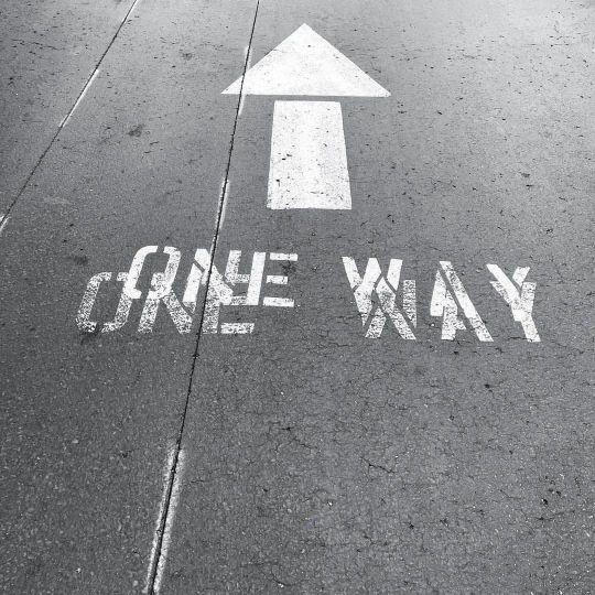
One of my favorite Master Chris Ashworth, aka. Swiss Grit, from RayGun Magazine, Typographer. 2nd only to @thechrisdo , my master Sensei. California Grit: Road Marking (Details). La Jolla, San Diego, CA. _ #Repost - @ashworthchris by @get_regrammer #stop #handmade #oneway swissgrit #foundtype #typebeat #typographyart #typo (at Miami Beach, Florida) https://www.instagram.com/p/CcrAW6JLhyT/?igshid=NGJjMDIxMWI=
0 notes
Photo
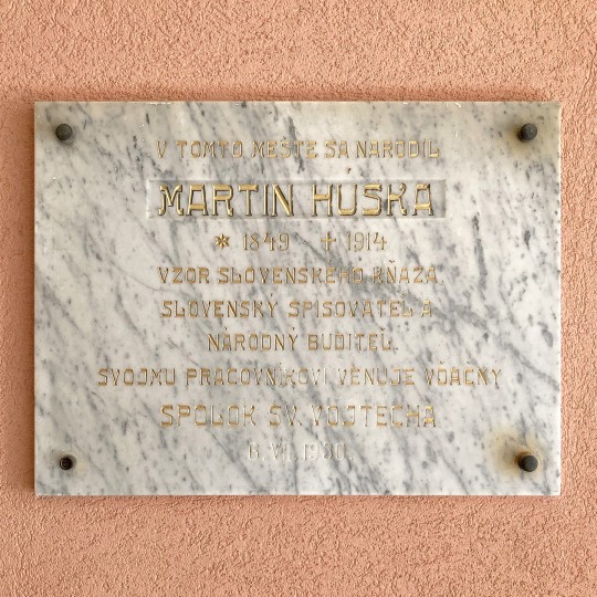
Martin Húska stone-carved gold-plated memorial plaque in Ružomberok, Slovakia. #Ruzomberok #Slovensko #Slovakia #stonecarving #gold #foundtype #street #type #streettype #streettypography #typespotting #letterspotting #typography #letters #lettering #design #graphicdesign #dailytype #inspiration #sign #signage — by Urtd (Also on Instagram and Flickr)
1 note
·
View note
Photo

3 No. 86 (NFT)
#3#cryptoart#cryptotype#cryptotypography#found#foundtype#nft#nftartist#nftcommunity#nftnumber#nfttype#nfttypography#number#photography#pulptype#three#type#typography
98 notes
·
View notes
Photo
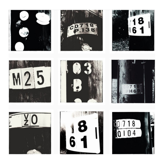
A series of close-up photos of telephone poles in Falls Church City, Va.
3 notes
·
View notes
Photo
Typographic semiotic #mextasy‼️ 👁👁 ————- Posted @withregram • @type.slw 🪵 #typeslw #typography #typesoftheworld #tipografia #saltillo #mexico #urbanlettering #urbantype #typehunter #foundtype #foundtypography #typeinspiration #urbantypography #signspotting #signporn #signjunkie #streetgraphics #letteringaddict #signfixation #signsofinstagram #signaddict #letteringlove #signs #coahuila https://www.instagram.com/p/CTqjckIlcuT/?utm_medium=tumblr
#mextasy‼️#typeslw#typography#typesoftheworld#tipografia#saltillo#mexico#urbanlettering#urbantype#typehunter#foundtype#foundtypography#typeinspiration#urbantypography#signspotting#signporn#signjunkie#streetgraphics#letteringaddict#signfixation#signsofinstagram#signaddict#letteringlove#signs#coahuila
4 notes
·
View notes
Photo

#typespotting #reims #foundtype #french #janspotstype (at Reims, France) https://www.instagram.com/p/CQ4Fhz2hqdg/?utm_medium=tumblr
2 notes
·
View notes
Photo

BOM, seen on Stadhouderskade 127, Amsterdam
4 notes
·
View notes
Text
Type in The Wild
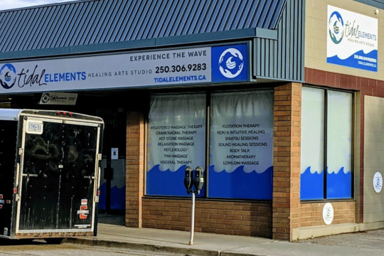
This is a business I used to drive by fairly often downtown Vernon. I find both signs to be very cluttered and the hierarchy is hard to follow.
I didn’t realize until I started researching the business for this exercise that the logo is supposed to be cupped hands, arranged like waves.
While the logo and name look far better online there is still too much going on. the font used (cannot identify) for tidal is hard to read, and the size differences between the two words in the studio name is too much. It doesn’t really read like a full name, more like elements is a tagline, and the words underneath are just something else entirely.

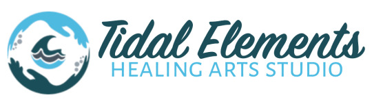
I changed the script font to a similar but much more readable and consistent typeface.
Changed it so that “Tidal” and “Elements” have the same typeface, colour, and size so that they have the same hierarchy and read as a name.
I gave “healing arts studio” more hierarchy overall, so it will be easier to read from the street. I think this tagline is important because Tidal Elements gives nothing away about the business. Although I still don’t really know what a “healing arts studio” is supposed to be without reading their website.
I created a balance between the colours of the logo and the colours of the type, I think it helps guide the eyes over the sign.
I’ve also made the logo smaller so it looks like it fits with the text, and they aren’t competing for attention.
I think it creates unnecessary clutter for the phone number and website and second logo to be on the sign.
It should be eye catching and easy to read, the contact info can be displayed on the door or window if they feel it’s necessary to have on the store front.
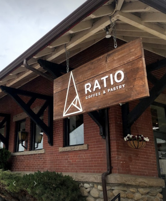
This example is also from back home, it’s a modern cafe and bakery and I think the clean sans-serif typefaces capture that perfectly. It’s readable and recognizable, and appeals to the varied demographic of our small town.
1 note
·
View note
Text

The grand finale of the Boston Sign Project is the landmark Schrafft’s sign which is mounted atop the company’s former factory in Charlestown’s Sullivan Square. Schrafft’s was a candy, chocolate and cake company founded in 1861, and had stores and restaurants along the east coast up until the business was shut down in 1981. The old factory was converted into commercial office space, and in 2016 the famous neon sign was reconstructed exactly as it was with a high-efficiency, energy reducing lighting system. The sign remains an icon, and at night the pink neon glow can be seen for miles in all directions.
BOSTON SIGNAGE PROJECT (100 of #100bostonsigns)
🎉 All 💯 signs can be seen on my portfolio site: sliney.com/signs
#sign#signs#signage#signporn#signgeeks#signofthetimes#signart#vintagesign#vintagesigns#retro#type#typography#jj_project#jj_challenge#jj#igsignage#foundtype#boston#bostonsigns#neon#neonsign#pink#shraffts
0 notes
Text
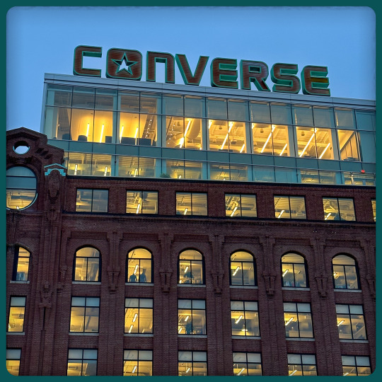
In 2015, when Converse relocated its headquarters from the suburbs to a century-old restored property in Boston’s Lovejoy Wharf, they wanted to make a statement with their signage. Installed on the roof of the 9-story building is one of the most impressive signs in the city. Extending 10-feet tall and spanning 80-feet wide, the letters were designed to match the building’s rust brick facade and copper patina trimmings.
BOSTON SIGNAGE PROJECT (99 of #100bostonsigns)
#sign#signs#signage#signporn#signgeeks#signofthetimes#signart#vintagesign#vintagesigns#retro#type#typography#jj_project#jj_challenge#jj#igsignage#foundtype#boston#bostonsigns#neon#neonsign#brick#converse#allstar#patina
0 notes
Photo
Final collection of photos from my trip that I’m posting. Another #miscellany – this time from my #walks around #rotterdam . No particular theme, no particular order. #typography #foundtype #architecture #design #streetart #graffiti #architecturaldetail #art #urbanexploration (at Rotterdam, Netherlands) https://www.instagram.com/p/ChcHz0hu7gI/?igshid=NGJjMDIxMWI=
#miscellany#walks#rotterdam#typography#foundtype#architecture#design#streetart#graffiti#architecturaldetail#art#urbanexploration
0 notes
Photo
Back in Brooklyn, but this is a collection of #miscellany from my #walks around #Amsterdam . No particular order. No particular theme. #design #architecture #foundtype #architecturaldetail #sculpture #publicart #art #graphicdesign (at Amsterdam, Netherlands) https://www.instagram.com/p/ChZfMScu4SD/?igshid=NGJjMDIxMWI=
#miscellany#walks#amsterdam#design#architecture#foundtype#architecturaldetail#sculpture#publicart#art#graphicdesign
1 note
·
View note
Photo
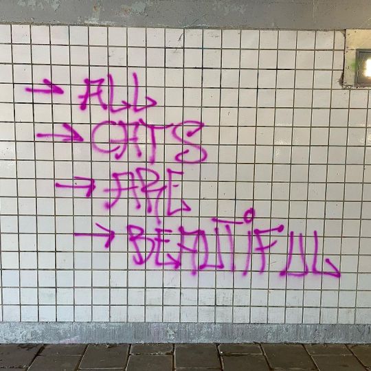
The Dutch know … #catsofinstagram #foundtype #graffiti #letterforms #allcatsarebeautiful (at Amsterdam, Netherlands) https://www.instagram.com/p/ChJ91myOsWX/?igshid=NGJjMDIxMWI=
1 note
·
View note
Photo

An afternoon of #bikes & #brews! #foundtype #typography https://www.instagram.com/p/Cc_F9ADuqQt/?igshid=NGJjMDIxMWI=
0 notes
Last Seen Blogs

nap-with-me
Veronika

winderness-explorer
Status: probably napping

dragoncookiesdraws
I draws what I likes and I likes what I drew

kerink
♔ kurry's blog

imsofy
Sofia