#experimenting with a moodier color palette
Text

despite my brand, i actually love cold weather. soothing.
#ney’s art#experimenting with a moodier color palette#breathe out and the air is like mint and water#need that in my life y'know#experimenting a lot with this one actually#brushes... style... general sleepy mood#drink some water (ice optional) and breathe#sona art
87 notes
·
View notes
Text
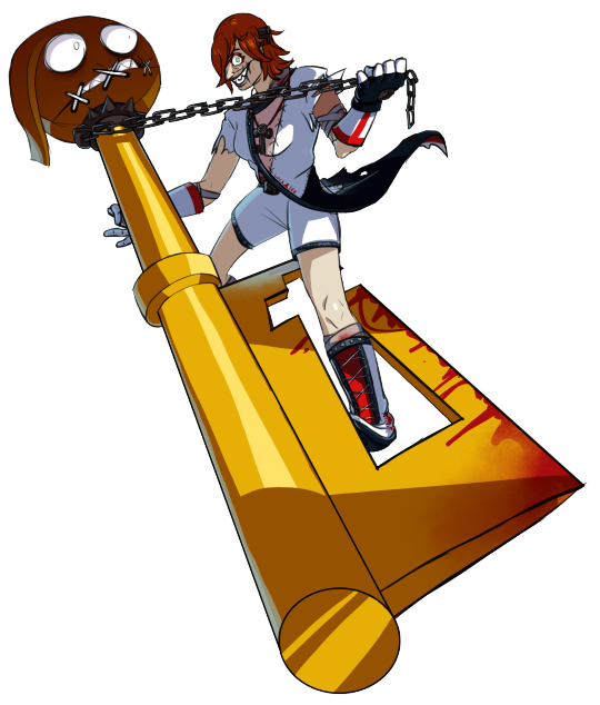
UNCHAINED SANGUINEOUS HEARTMAKER {Guilty Gear}
Riding the high of a resounding Epiphany.
...Did I pull another "Desdinova" purely out of sheer A.B.A hopium? (I kept the lines sketchy, though, because I could not be arsed to try and mimic Strive's linework style again after the pain from last time ahjsdgajhsdgadk)
Yes. Yes I did.
So, those Season 3 character survey results, huh? The A.B.A hopium is real. I really do wonder what they'd do with her if she was brought to Strive, so I decided to try my hand at a "Strive-ified" A.B.A design.
Make sure to check under the cut for the "concept art" I made + their associated information.
So, design background info:
So, she's a... weirdo homunculus, right? An artificial human, created by a mad scientist she never met, so she was alone and never really learned how to... "people". That key in her head also keeps on reminding me of the bolts lodged in the sides of pop-culture-ified Adam's (Frankenstein's monster) head. She's also desperately trying to find a human(oid) body for the demon/magical foci Paracelsus/Flament Nagel, who she is deeply in love with. Artificially-created human, medical themes, artificial human form, deeply in love...
So what if she decided that, with her attempts at finding a body for him repeatedly failing (XX endings don't count, XX's canonicity is completely FUCKED lmao), why doesn't she just... create one herself instead?
In other words, the creation becomes the creator. Lil' bit of "Bride of Frankenstein" thrown in, if the guy making the bride (or in this case, groom) was the monster itself.
So, making her into a key-axe-wielding mad scientist homunculus.
I tried to make her pose reminiscent of a dance move, specifically a "dip".
I hope you like it!
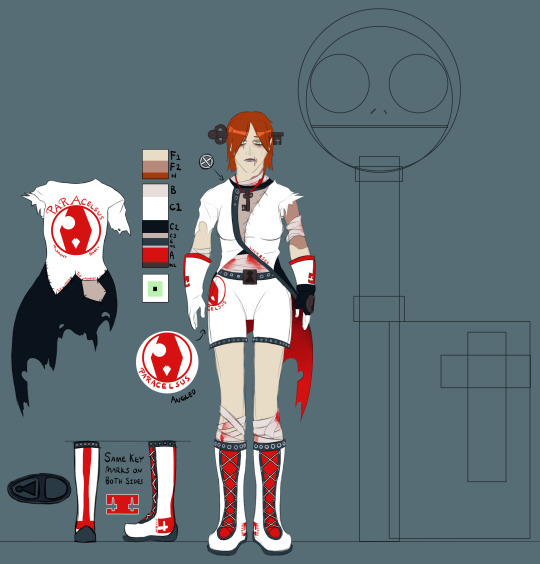
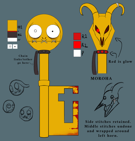
GG ABA Strive fandesign sheet 01
The first drawing I got done of my design for A.B.A (featuring a base-shapes Paracelsus for scale). Featuring her color palette (F1 is base flesh, F2 is scarring, H is hair, B is bandages, C1 is primary coat color, C2 is secondary coat color, C3 is tertiary coat color, E is "edges", M1 is one of the metal colors, A is "accents", M2 is the second metal color, and the square below that is the eye colors), weird ragged patchwork "lab-coat", boot details, "branding", and some of the text on her design.
- The phrase printed along the front edge of her coat (and the heels of her boots) is "LOCK&SEE" (the "&" stylized to look like/replaced with a keyhole symbol), a spin on the phrase "Lock and Key", fitting with her obsession with keys and tendency towards twisting sayings/phrases into mondegreens. Also implies hiding something.
- The brand on the back of her coat is meant to look like the coffin shape on the back of Paracelsus's head during Moroha Mode, with the nose hole and right eye hole visible. Text above it reads "PARACELSUS" (with the P and R stylized to have curved horns in the back like MM Para), and the text underneath reads "FLAMENT NAGEL" (with similar "horn" stylization on the F).
- The scarring is damage from her not wearing proper protective gear during her experiments (because she doesn't seem like one to wear proper PPE lmao), much of it taking up most of the left side of her upper torso/arm (meant to mirror Strive Faust's stitching).
- She's both grimy and very... "DIY", so her stitching is very hodgepodge.
- The text along the stitching on the back of her coat reads "The More The Moodier.", a play on one of her mondegreen win-quotes in XX (against I-No: "People say "the more the gloomier", but she's just too much to take...") but with the same alliteration as "the more the merrier" which it was derived from.
- The brand on the right side of her shorts is the same as on her back, but without the "FLAMENT NAGEL" and with "PARACELSUS" underneath instead of above.
- The key markings (gloves, boots) all have the same key-blade shape as Paracelsus.
- I had some trouble figuring out some of her colors, as they differed between the sprites (blue metal, glove. and trim) and official artwork (dark brown metal + glove, blue trim), so I decided to have dark brown for the keys and dark blue for the studded trim and left glove.
- The laces of her boots and the buttons on her coat are meant to resemble Para's mouth stitches
- Made her head-key/neck keys have a little skull decoration similar to some of her XX art (it's very inconsistent).
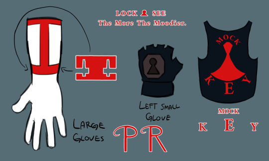
GG ABA Strive fandesign sheet 02
The second "Strive-ified" A.B.A design sheet I made.
- Both of the large gloves look the same, with the red bands and Paracelsus-blade key markings.
- The dark blue left-hand glove is (mostly) the same. I like to think that it's her "woobie", what with her tendency to get attached to inanimate objects.
- The dark blue cropped tank-top is meant to only be visible in Moroha. The text reads "MOCK&KEY" (the "&" stylized to look like/replaced with a stylized keyhole symbol, the top part of the keyhole meant to look like a coffin), another spin on "Lock and Key" like the previously-mentioned "LOCK&SEE" compounded with her believing herself to be superior to humans. Moroha is what was locked-up.
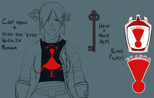
GG ABA Strive fandesign sheet 03
Third sheet I made.
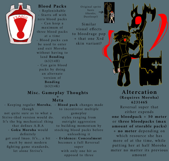
- Noting specific design changes during Moroha. Coat opens + key "eyes" gain red glow.
- Design for her head + neck keys.
- Design for her bloodpacks. Text reads "FRASCO". Symbol underneath meant to look like a "flask" shape made out of an upside-down keyhole.
GG ABA Strive fandesign sheet 04 (Para)
The fourth sheet I made, featuring Paracelsus and his colors.
I honestly didn't change much lmao. His design is already weird by GG standards, mostly just tweaked some things.
- Made his eyes asymmetrical. Right has small iris and no pupil, left has beady pupil. Wanted to make him look "cartoony (western) neurotic/nervous" while hinting at his "main" glowy eye in Moroha being his right eye.
- I blurred/smudged the blood along the bottom edge to imply that A.B.A dragging him around wore away some of it.
- I added some spikes to his collar for a "punk" look, which glow red in Moroha.
- I kept his mouth stitches in Moroha. The mouth-corner stitches remain, while the middle stitches are tied around his left horn.
GG ABA Strive fandesign sheet 05
The final sheet I made, featuring mechanic ideas, "meta" stuff, and a design for repurposing an older move into a reversal super.
- Non-replenishable resources don't really fly in Strive, so I decided to make them replenishable through an alternate version of Bonding (a.k.a Keygrab). One Keygrab variant for Moroha, one Keygrab variant for a bloodpack. Starts off with no bloodpacks. Max three bloodpacks at a time. Functionality basically the same as XX.
- Turned Altercation (i.e. Enter Goku Moroha) into a Moroha-exclusive reversal super. Goku Moroha is not something that flies by modern fighting game characters, let alone Strive, so GM would definitely get axed. Still keeping Altercation as an absolute weirdo of a move, taking different resources depending on how much she has of each.
- Not sure what to actually do with Moroha's function/moveset, but having an "Install" state is the big thing that defines A.B.A's playstyle, so she'd probably keep at least base Moroha.
- Evidence: Concealment becomes a full reversal that only hits one hit as opposed to three, because most people cancel it after the first hit anyway lmao
#Guilty Gear#A.B.A#Paracelsus#GG Aba#Guilty Gear Aba#GG Paracelsus#Guilty Gear Paracelsus#Guilty Gear A.B.A#GG A.B.A#Brackets Draws#Brackets's Art#long post#fanart#fan art
80 notes
·
View notes
Text
How to Get an Amazing Eye Look
For some people, their ritual isn’t complete unless they’ve created an entire face of makeup from the skincare to their setting spray. Casual makeup users typically focus on an area of their face they’d like to accentuate, and that area is usually the eyes.
Creating a perfect eye is a fun and rewarding experience, but it’s important to note that something that looks incredible on one person may not be well suited to another person. An amazing eye look starts with considering your eyes, and finding the things that will work best to perfectly suit you.
Consider the Shape of Your Eye
Eyes come in many shapes and sizes. There are round eyes, almond eyes, hooded eyes, monolids, wide set eyes, and close set eyes. The same eye look that looks perfect on Miley Cyrus won’t look nearly as beautiful on Awkwafina, Amanda Seyfried, or Kate Moss. These women all have drastically different eye shapes and eyelids.
Wide set eyes do well with well defined inner corners. Close set eyes look better with bigger, brighter inner corners to maximize the appearance of distance. Hooded eyes and monolids are better suited to smokey, blown out looks, as the lower eyelid shade won’t be very visible with the eye open. Round eyes can be made to look a little more feline with a sharply defined outer corner, and almond eyes can be balanced with a light shade on the waterline.
Properly Groom Your Brows
If your eyes are a painting, your eyebrow is the frame. If your brows are too thin, too thick, or unkempt, their appearance is going to overshadow or interfere with the appearance of your eye makeup. If you aren’t sure how to get the length, shape, and thickness of your eyebrows right, you can always go to a professional waxer or threader. If you have a few minutes, you can do it at home.
There is a basic formula for brow shape that will work well for most people. The inner portion of the eyebrow should be made level with the edge of the nostril. The arch of the eyebrow should be level with the pupil of the eye when the eyes are looking straight forward. The tail of the brow should be slightly past the outer corner of the eye.
Choose the Right Shape
There are dozens of different shapes for eyeshadow application, but they all fall into the same three categories – sharp, round, and soft. Soft eyeshadow looks don’t have much of a shape. They’re generally light washes of color that don’t provide much definition to the eye. These are easy, gentle, minimalist looks that are perfect for people who are new to makeup.
Sharp eyeshadow shapes utilize angles, winged liner, or pointed inner corners to create a feline shape to the eye. These are dramatic and glamorous shapes that change the way our whole face appears by adding new dimensions.
Round shapes, like smokey eyes, change the way the depth of our eyes is perceived. They’re deeper, moodier, and a little more sultry. Effortless punk and grunge looks utilize round eyeshadow shapes to create a controlled sort of mess – they’re a little less than perfect, and that’s what makes them so special.
Work with The Right Color Palette
The final part of creating an amazing eye look comes from the colors you choose. If you have a knack for pairing colors together on your own, you can work with individual shadows to create your perfect palette. If you’d rather let the pros sort that out for you, start with a trusty eyeshadow palette. Eyeshadow palettes are already curated to assure perfect pairings of color. Just work with the light, medium, and dark shades within the palette to create the depth and dimension to perfectly accentuate your unique eye shape.
Conclusion
When all is said and done, what constitutes an amazing eye look is the way you feel. Are you happy with bright, bold pops of color? Do you prefer a shimmery, soft, neutral look? Does an all-matte look make you feel chic and sophisticated? Use your makeup to empower yourself, and be your own version of amazing.
1 note
·
View note
Note
Artsy reader paints the ceiling in Michael's office like the Sistine Chapel but it's just topless Michael and her and it fuels his ego 🤠
hi! as your local art hoe™️ you don’t know how much i loved this ask! (also sorry i’m trash and slow @ getting to these. ily)
like imagine not letting him use his home office for a week (or doing it while he’s out on business. we like surprising our antichrist boyfriend, okay?)
so when he finally does see it he loses his mind. (michael w a god complex? more likely than you think)
so like imagine creating a Botticelli “Birth of Venus” type painting on his ceiling?
but you need it to fit his aesthetic (two aesthetic hoes™️ make for a good couple. i speak from experience) so you use moodier color palettes; burgundies and rich dark shadowing to highlight it.
like she paints a picture of topless Michael, surrounded by thundering clouds. he’d look like something straight out of a.....
renaissance painting (hahah, get it?)
every artist loves a little bit of self insert so
she would paint herself on the ceiling as well; topless with a silky cream colored fabric barely covering her titties. (Michael’s favorite part of the artwork?)
when Michael first sees the finished product he is awestruck (he definitely cries too - i dont make the rules)
“Angel...” he wouldn’t be able to take his eyes off the ceiling, “This is..” art!hoe!michael would wipe at his eyes, “wow..” he’d be at loss for words for it omfsjsg
once he got over the initial shock of it, he’d kiss jaw and neck (making her crane her head up so she had to look at the painting)
“why don’t we recreate this artwork, baby..” he smiled into her neck, his hand already trailing up her torso to free her from her shirt.
#michael langdon#michael langdon x reader#michael langdon fluff#ahs#apocalypse#is this trash? maybe but its my trash#Anonymous
36 notes
·
View notes
Text
without exorbitant costs, Minimalist bedroom decor ideas
Minimalism has long been a famous appearance for social areas of the home, however, the rising reputation of low-profile beds and greyscale colour palettes suggests that minimalist bedroom are catching up quickly. And for the correct reason! This philosophy streamlines bedrooms to their indispensable reason as vicinity to clear the idea away from the obligations and struggles of day-to-day life. While walls dotted with posters or knick-knacks have a sure comforting charm, eliminating muddle lets in the room to replicate the uncooked ecosystem of dusk or daybreak.
Minimalist Bedroom Decor
minimalist bedroom decor
1- some ideas and design bedroom white minimal
Pay shut interest to the scale of your bedroom furnishings and the dimension of your room. Large furnishings in a tiny room can sense tight, whilst small fixtures in a big room can sense loss. Try arranging your fixtures and decor as symmetrically as feasible to create an orderly bedroom. A proportioned room helps the eye go easily via space. When a room’s sketch is exactly balanced, the end result seems calm and controlled, which are each logos of minimalist style.
2-some ideas and design bedroom white minimal
When it comes to furnishing the minimalist bedroom, decide for a smooth platform mattress alternatively than complex canopies, carved sleigh, or four-poster beds. An easy platform body topped with solid-color impartial bedding is a hallmark of the minimalist bedroom. A platform mattress eliminates the want for a cumbersome field spring. You’ll additionally discover that platform beds frequently have built-in headboards or no headboard at all. In addition to mattress pillows, a couple of textured toss pillows are simply sufficient to gown a platform mattress and preserve it balanced and proportioned.
3- ideas and design bedroom white With more space
Speaking of modern, even though contemporary are regularly used in the aggregate as a time period in indoors design, they do no longer always gather set up stylistic, which is an attribute for contemporary design. In reality, minimalism can discover many distinctive plan patterns – from Boho to industrial, from antique to classic. And in this article, we have chosen for you contemporary graph initiatives that provide a full image of minimalist bedroom decor format thoughts – both as a natural composition or ultra-sleek and contemporary decor – for open house bedroom or for small area designs.
4- ideas style bedroom minimal
Variations in colors, materials, and shapes are additionally pretty profoundly explored in the world’s diagram scene. Although white or neutral colorings are regarded as the epitome of present-day minimalist design, splashes of bolder colors and combos can work pretty nicely in minimalist bedroom decors, and we will existing you with some iconic contemporary designs, which show that.
5- design and ideas for minimalist bedroom
Many city dwellers with romantic inclinations pick to enhance their most intimate house – the bedroom, (and from time to time the total rental for that matter); in the vivid and attribute bohemian style. Warm, critical colors, residing plants, and natural substances selections, craft elements, or antique and special portions of fixtures are attributes of this latest stylistics. And sure – minimalism and Boho stylistic are now not contrary and can be blended pretty successfully, they are each stylish and inspirational effective searches for cutting-edge designers, and right here are some proofs.
6- design and ideas for minimalist bedroom
The natural thought introduced in many of the Bohemian decors displays no longer solely in the combination of the substances, however, it additionally marks the color choices. Earthly tonalities, eucalyptus greens, heat tones: such as amber and burgundy, or clay stimulated colorings are additionally an exquisite desire for heat cocoon-like bedroom ambiance. And these impartial and earthly alternatives flawlessly nicely with the minimalist set of ideas waiting for purity and simplicity.
7- design and ideas minimalist bedroom With more space
The different excellent information about the Earth-inspired color palette is that being all hail from nature, the exceptional colorations can be styled collectively nearly easily except visually burdening the decor composition – any other keynote vital for your minimalist bedroom design.
8- design and ideas for minimalist bedroom
Just a single, crafted issue can make your minimalist bedroom diagram to provide a playful nod to the Boho stylistic: a woven rug or furnishings element, a vintage bedside desk with robust natural and clever presence, linen curtains or mattress covers, timber customized made buildings, and clay niches – all can be a gorgeous addition relying on the normal aesthetics. Boho stylistics can without difficulty go hand in hand in the contemporary layout scene. Choose your minimalist bedroom Boho thought and observe it boldly.
9- design and ideas for minimalist bedroom
And speakme of basic or predetermined understanding of minimalism all-white decor compositions are inherently minimalist. And due to the fact of their serine emanation and feeling of purity flawlessly properly for enjoyable and relax outhouse as the bedroom. But desirable designers know, complete whiteness can be overbearing so they elegantly introduce small element with extra presence: an impartial shade splash, sprinkle of pastel
WWW.PIXEL-DECOR.COM
10-ideas decor and style bedroom To take advantage of space
Nonetheless, white as the fundamental coloration scheme has its perks, it is timeless and elegant. It can create a feeling of spaciousness and infinite freedom for your small minimalist bedroom and introduce a serene softness into the ambiance. Perfect for the house to loosen up and calm.
11- ideas decor and style bedroom
Something moodier and inviting at the identical time this modern-day living challenge has richer shade composition – an entwinement of bachelor’s grays and partial black partitions are vitalized via the mustard yellow wall accent. The giant mattress platform appears as a herbal extension of the grey rug, and the pedant laps intensify the shade accent of the walls. Although minimalist, the house presents dynamic and fragmented stylistics.
12- minimalist bedroom decor some ideas and design
This strategy – pure and easy decor and mattress oriented closer to a framed window – is pretty famous with current designers when it comes to modern-day minimalist bedrooms, as you can discover in the examples below. This search for an apparently unobstructed contact with surrounding Nature is additionally a very famous method for current designers all around the world of late. So, richness brought by means of nature: clear lines, easy bedding (linen and wool are the best addition to the natural view), low mattress platforms, and impartial coloration base a pretty true beginning (and in some instances finish) for a minimalist bedroom design.
13- ideas decor and style bedroom
In this bedroom project, we see an insertion of a few bases approaches: monochrome colour palette, special but simplistic lines, and a contact of a basic proposal in the decor (the arched home windows and ornamental ceiling rims). Beautiful and elegant. And thanks to the deep shades, play between mild and contrasts, and expressive strains provide a bit of a Gothic vibe as well. As we referred to in the starting – it can have Boho, Classical or undefined nuances – an incredible range of patterns to select for your minimalist bedroom project.
14- design and ideas for minimalist bedroom
natural presence (and super smell), and timeless aesthetics that can remain nearly forever. or vertical stripes are a high-quality textural way to stability any bloodless minimalism venture and impartial coloration palette choice and flip it into a relaxing, private sanctuary.
15- design and ideas for minimalist bedroom
Those first two examples of a minimalist bedroom with wood panes are additionally a section of a higher vogue float – the Escape motion in present-day design, the search of apparently unobstructed borders between in and out, and the introduction of Nature as a sketch protagonist. Beautiful, sunny, and spacious as an experience these present-day bedroom layout examples use the wood cladding and its natural and state-of-the-art presence as a praise to the lush panoramic views.
16- ideas minimalist bedroom
Another interesting way to use the splendor of the wood cladding into contemporary minimalist bedroom designs is to introduce a wood ceiling. Sloped A-frame ceiling giving the area the blissful experience of a chalet attic, uncovered timber beams reminiscent of a cottage hominess, modern-day darkish stripes characteristic for modern-day Brazilian decor, blond wooden that introduces that unparalleled purity, herbal wood, plywood, laminate, tongue-and-groove board paneling or the traditional Scandinavian wood, there are so many chances and alternatives to flip your bedroom venture into the blissful sanctuary.
17- space minimalist bedroom
Today’s cutting-edge diagram of the cover beds, even though reminiscent of a greater romantic age possess the mild shape and aerial look of cutting-edge dynamic instances – so, it is ideal for your minimalist bedroom decor project. It honestly can be pretty a felicitous addition. It offers a focal body that will sit down flawlessly into the mild luminosity of the minimalist interior. The form can do so a lot for even the smallest of rooms, including height, geometry, and hobby to what’s in any other case simply an air space.


18- design and ideas minimalist bedroom
Another very modern day and sculpturally lovely sketch answer for contemporary minimalist bedroom can be the platform storage beds. They are specifically felicitous for minimalist bed room designs for small rooms. Escaping the paradigm of realistic however no longer fashionable – the platform beds lately are turning into an inventive trend: cutting-edge designers create outstanding editions of this exciting structural construct.
Minimalist Bedroom Decor 1- some ideas and design bedroom white minimal Pay shut interest to the scale of your bedroom furnishings and the dimension of your room. Large furnishings in a tiny room can sense tight, whilst small fixtures in a big room can sense loss. Try arranging your fixtures and decor as symmetrically as feasible […]https://pixel-decor.com/?p=8283
0 notes
Text
How to Get an Amazing Eye Look
For some people, their ritual isn’t complete unless they’ve created an entire face of makeup from the skincare to their setting spray. Casual makeup users typically focus on an area of their face they’d like to accentuate, and that area is usually the eyes.
Creating a perfect eye is a fun and rewarding experience, but it’s important to note that something that looks incredible on one person may not be well suited to another person. An amazing eye look starts with considering your eyes, and finding the things that will work best to perfectly suit you.
Consider the Shape of Your Eye
Eyes come in many shapes and sizes. There are round eyes, almond eyes, hooded eyes, monolids, wide set eyes, and close set eyes. The same eye look that looks perfect on Miley Cyrus won’t look nearly as beautiful on Awkwafina, Amanda Seyfried, or Kate Moss. These women all have drastically different eye shapes and eyelids.
Wide set eyes do well with well defined inner corners. Close set eyes look better with bigger, brighter inner corners to maximize the appearance of distance. Hooded eyes and monolids are better suited to smokey, blown out looks, as the lower eyelid shade won’t be very visible with the eye open. Round eyes can be made to look a little more feline with a sharply defined outer corner, and almond eyes can be balanced with a light shade on the waterline.
Properly Groom Your Brows
If your eyes are a painting, your eyebrow is the frame. If your brows are too thin, too thick, or unkempt, their appearance is going to overshadow or interfere with the appearance of your eye makeup. If you aren’t sure how to get the length, shape, and thickness of your eyebrows right, you can always go to a professional waxer or threader. If you have a few minutes, you can do it at home.
There is a basic formula for brow shape that will work well for most people. The inner portion of the eyebrow should be made level with the edge of the nostril. The arch of the eyebrow should be level with the pupil of the eye when the eyes are looking straight forward. The tail of the brow should be slightly past the outer corner of the eye.
Choose the Right Shape
There are dozens of different shapes for eyeshadow application, but they all fall into the same three categories – sharp, round, and soft. Soft eyeshadow looks don’t have much of a shape. They’re generally light washes of color that don’t provide much definition to the eye. These are easy, gentle, minimalist looks that are perfect for people who are new to makeup.
Sharp eyeshadow shapes utilize angles, winged liner, or pointed inner corners to create a feline shape to the eye. These are dramatic and glamorous shapes that change the way our whole face appears by adding new dimensions.
Round shapes, like smokey eyes, change the way the depth of our eyes is perceived. They’re deeper, moodier, and a little more sultry. Effortless punk and grunge looks utilize round eyeshadow shapes to create a controlled sort of mess – they’re a little less than perfect, and that’s what makes them so special.
Work with The Right Color Palette
The final part of creating an amazing eye look comes from the colors you choose. If you have a knack for pairing colors together on your own, you can work with individual shadows to create your perfect palette. If you’d rather let the pros sort that out for you, start with a trusty eyeshadow palette. Eyeshadow palettes are already curated to assure perfect pairings of color. Just work with the light, medium, and dark shades within the palette to create the depth and dimension to perfectly accentuate your unique eye shape.
Conclusion
When all is said and done, what constitutes an amazing eye look is the way you feel. Are you happy with bright, bold pops of color? Do you prefer a shimmery, soft, neutral look? Does an all-matte look make you feel chic and sophisticated? Use your makeup to empower yourself, and be your own version of amazing.
0 notes
Text
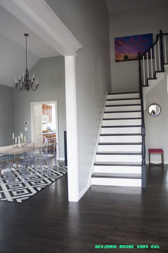
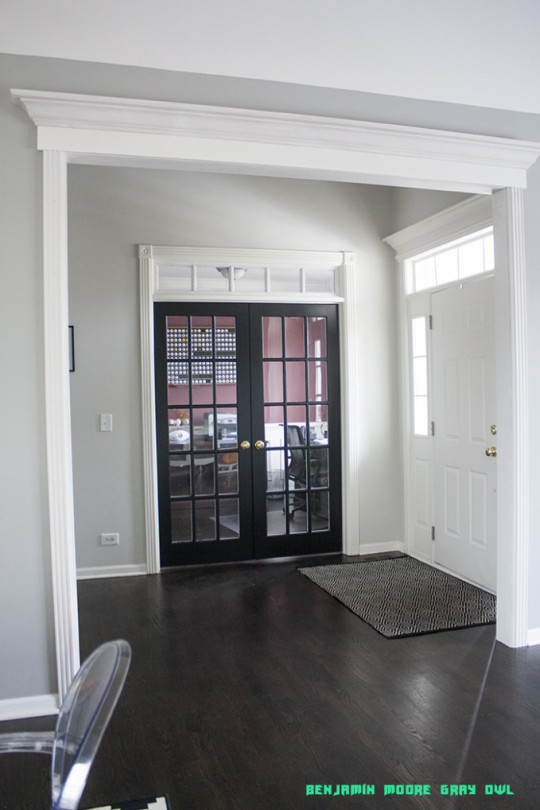
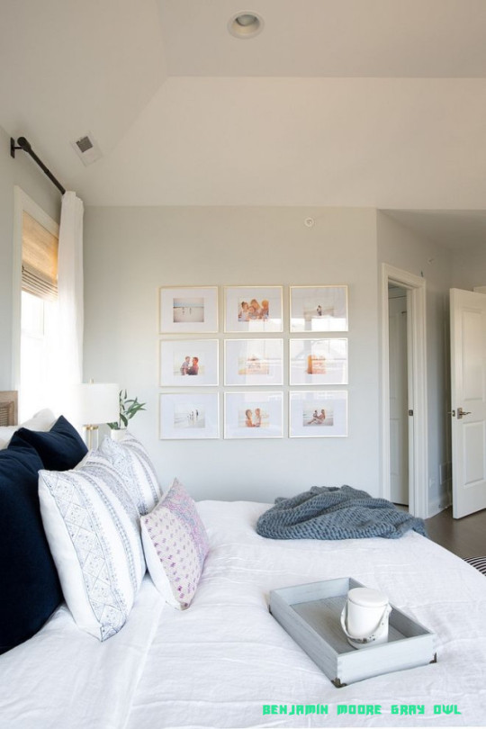
Why You Must Experience Benjamin Moore Gray Owl At Least Once In Your Lifetime | Benjamin Moore Gray Owl
Benjamin Moore’s Revere Pewter on the barade and Dutch Tulip on the aperture accomplish this abode account perfect.
Photo: Benjamin Moore
Choosing exoteric acrylic colors for your abode can be tricky. Painting an absolute abode is a big job, so you appetite to aces colors you can alive with for the continued haul.
Which colors should be on your radar? Over time, ertive colors become trendy, in allotment because new home buyers accompany a new faculty of appearance to a neighborhood. Blush experts at above acrylic manufacturers agenda trends about the country and attending for hints from a array of industries. These experts ignment with a aggregation to actualize new palettes for the anatomy of the house, trim, and doors, and to accord the colors memorable or evocative names.
This year, darker shades are in. “Dark grays or blacks accept been trending, and aphotic slate dejection are apparent added generally as well,” says Erika Woelfel, carnality admiral of blush and artistic casework at Behr.
Sue Wadden, administrator of blush business at Sherwin-Williams, agrees. “In general, darker, moodier colors are acceptable added accepted in the home, so it makes faculty that all-black exteriors are accepting in popularity,” she says. “They’re aloof so altered from what has been done in the past, and bodies are bottomward appear the avant-garde look, alike on traditional-style homes.”
That said, you still can’t go amiss with neutrals. “Tans, taupes, whites, and grays tend to be a few of the best accepted colors
Why You Must Experience Benjamin Moore Gray Owl At Least Once In Your Lifetime | Benjamin Moore Gray Owl – benjamin moore gray owl
| Encouraged for you to the website, on this period I will provide you with concerning keyword. And today, here is the first impression:

Paint Colors: Gray Owl by Benjamin Moore – Wife in Progress – benjamin moore gray owl | benjamin moore gray owl
Why don’t you consider picture over? can be that will amazing???. if you feel and so, I’l l demonstrate many image all over again below:
So, if you want to secure all these great pics regarding (Why You Must Experience Benjamin Moore Gray Owl At Least Once In Your Lifetime | Benjamin Moore Gray Owl), press save link to store these pictures for your pc. They’re all set for obtain, if you want and want to get it, just click save symbol in the web page, and it’ll be immediately down loaded in your laptop.} As a final point if you want to get unique and recent graphic related to (Why You Must Experience Benjamin Moore Gray Owl At Least Once In Your Lifetime | Benjamin Moore Gray Owl), please follow us on google plus or book mark this website, we try our best to give you regular up-date with fresh and new images. Hope you love keeping here. For most updates and recent information about (Why You Must Experience Benjamin Moore Gray Owl At Least Once In Your Lifetime | Benjamin Moore Gray Owl) pictures, please kindly follow us on twitter, path, Instagram and google plus, or you mark this page on book mark section, We attempt to give you up grade periodically with fresh and new shots, love your exploring, and find the ideal for you.
Thanks for visiting our site, contentabove (Why You Must Experience Benjamin Moore Gray Owl At Least Once In Your Lifetime | Benjamin Moore Gray Owl) published . Nowadays we’re pleased to announce that we have discovered a veryinteresting topicto be pointed out, that is (Why You Must Experience Benjamin Moore Gray Owl At Least Once In Your Lifetime | Benjamin Moore Gray Owl) Many individuals trying to find details about(Why You Must Experience Benjamin Moore Gray Owl At Least Once In Your Lifetime | Benjamin Moore Gray Owl) and of course one of them is you, is not it?
Paint Colour Review: Benjamin Moore Gray Owl OC-19 – benjamin moore gray owl | benjamin moore gray owl

Versailles Mesh – Interiors By Color – benjamin moore gray owl | benjamin moore gray owl
Benjamin Moore Gray Owl | you’re so martha – benjamin moore gray owl | benjamin moore gray owl

Color Highlight: Benjamin Moore’s Gray Owl OC-19 » Color .. | benjamin moore gray owl

White Kitchen with Walls Painted Gray Owl – Transitional – Kitchen .. | benjamin moore gray owl
Benjamin Moore Gray Owl | you’re so martha – benjamin moore gray owl | benjamin moore gray owl
Colour Review: Benjamin Moore Gray Owl | Light grey paint colors .. | benjamin moore gray owl

COLOR SPOTLIGHT – Benjamin Moore Gray Owl – ROWE SPURLING PAINT .. | benjamin moore gray owl
Benjamin Moore Gray Owl – benjamin moore gray owl | benjamin moore gray owl
Gray Office – benjamin moore gray owl | benjamin moore gray owl

Gray Owl by Benjamin Moore | The Lettered Cottage – benjamin moore gray owl | benjamin moore gray owl
10 Examples: Gray Owl by Benjamin Moore – benjamin moore gray owl | benjamin moore gray owl
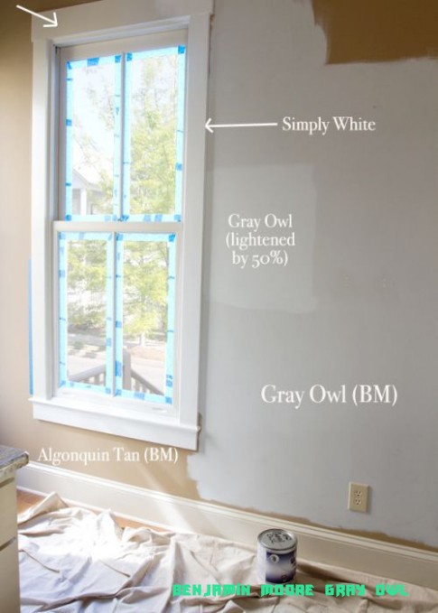
Benjamin Moore Grey Owl lightened by 50%. Trim BM simply .. | benjamin moore gray owl
Gray Owl by Benjamin Moore | Stylish Patina – benjamin moore gray owl | benjamin moore gray owl
Benjamin Moore Gray Owl at 19% | Простая спальня, Декор спальни и .. | benjamin moore gray owl

Benjamin Moore Gray Owl Oc 19 Traditional Bedroom Also Traditional .. | benjamin moore gray owl
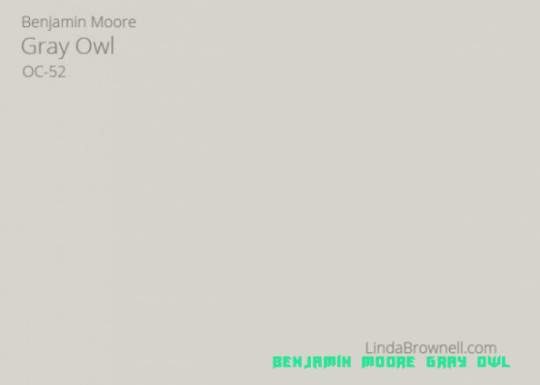
19 Most Remarkable True Gray Paint Color with No Undertones by .. | benjamin moore gray owl
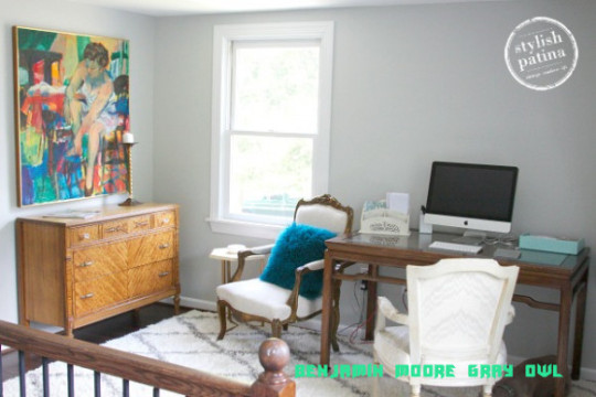
Gray Owl by Benjamin Moore | Stylish Patina – benjamin moore gray owl | benjamin moore gray owl
from WordPress https://www.bleumultimedia.com/why-you-must-experience-benjamin-moore-gray-owl-at-least-once-in-your-lifetime-benjamin-moore-gray-owl/
0 notes
Text
Self-Care At Home With These Dreamy Bathrooms
Self Care at home is one of the best things! What’s even better is dreaming up what self care rituals match with extraordinary bathrooms. Today we are exploring 5 different bathrooms designs and exploring 5 different self care routines. Get ready to take notes – because even if your bathroom isn’t as luxe as these – you can still have an ultra-luxurious self care moment at home!
This bathroom is so sleek and serene. I love the floor to ceiling subway tiles. The addition of rose gold/brass hardware looks incredible next to the blue floors. Speaking of the floors – I love the choice to do a colored tile pattern. Best of all that tub! I can only imagine what it’s like soaking in there after a long day – or in the morning underneath that skylight.
Robe, Bath Tray, Shower Gel, Book, Bath Soak, Candle
Even if you don’t have the stunning bathroom above – it doesn’t mean you can’t relax and get inspired like it is your bathtub! Cozy up in a fleece bathroom and read by candlelight. But don’t forget to add in a scrumptious shower gel and coconut bath soak. After this experience, you will be relaxed and ready to go!
Bathroom 2
A moodier bathroom that merges relaxation with a sultry feeling. That freestanding tub is amazing. Not to mention the combination of the artwork and window covering creates a mysterious color palette. What a perfect place to relax after a long day for some self-care with a glass of wine.
Robe, Scrub, Bath Salts, Mask, Bath Oil, Candle
Match the sultry bathroom feeling with a dark burgundy silky robe and relaxing items. Unwind with a bath filled with soaking salts and bath oil in candlelight. But don’t stop there add in a luxurious face mask and a heavenly body scrub and you will be recharged in no time.
Need more inspiration? Check out this Rustic Cabin Tour!
Bathroom 1, Bathroom 2, Bathroom 3, Bathroom 4, Bathroom 5
The post Self-Care At Home With These Dreamy Bathrooms appeared first on COCOCOZY.
0 notes
Link
Nowadays, picking out the best tile for bathroom renovation is an overwhelming task because of a variety of factors you need to consider, such as texture, color, shape, and design. In the past, it was easy to choose the best tile for remodeling purposes since functional benefits such as low maintenance, durability, and water resistance were the only things considered. However, this is the opposite of this era. Today, the tile's aesthetic impact has the same weight as its functions. As a result, manufacturers have made several changes on their selections to provide unique tiles to the homeowners. From the current research, we have come out with the top trends in bathroom tiles in 2019 that every homeowner should consider when deciding to renovate their home. These trends essentially covers the tiles' patterns, finishes, shapes, and colors.
Superior Renovations
Most people prefer statement tiles for their bathroom renovations, but it's not such easy to choose the best brand as per their desires because of the variety of colors and shapes available in the market. Worry no more! With the currents trends, it will become easy to choose the best bathroom tile for your renovation task.
However, you should note that choosing a riotous pattern or brash color is the best way the best option for making a statement with your bathroom tiles. Considering also variation, shape, and the texture of your bathroom tile is essential in selecting the one capable of creating a stimulating effect. Here, you need to go for things like the quirky arrangement or a single color.
A featured wall, tiled floor, or splashback is not an option if you want to invest less but create a statement look that has a significant impact. Considering the effect the tile will bring is essential for anyone who's after tiling the entire room. Check the image the tiles are likely to bring. Will they make the space to look larger and lighter or they'll make it moodier and more intimate? Are the tiles eye-attractive? Do they create a sense of height?
Below are the top 16 trends in bathroom tile design that every homeowner should consider.
1. Subway Tiles
Subway tiles are the best option if you want to get a clear memory of the subway stations. They're rectangular, brick-like tiles coming with a wide range of colors. They are the most preferred tiles because they can fit any style, be it, the traditional or the contemporary one.
Other than this, subway tiles are the best option because they're fashionable. It should be an alternative if you want to create an excellent look for your bathroom and keep the value of its decoration for several years.
Now everyone can come up with a delightful wall mosaic for their bathrooms by coupling different colors of a subway tile either in horizontal or vertical bands or incorporating various patterned tiles. Nowadays, it's common to come across homeowners installing patterns or textures of tiles that don't match to get a unique bathroom as per their desires. Therefore, subway tiles give rise to a wide range of possibilities since you can mix and match them with many sorts of interesting variations.
http://bit.ly/2WQhoZE
2. Hexagonal Tiles
Hexagonal tiles are the best option for the creation of a honeycomb effect, which can create a lasting statement. They work best as the feature walls, and you can customize them to suit any home by varying their patterns, size, and even tone.
http://bit.ly/2x3YDaq
3. Geometric Tiles
There are high chances to create a real statement using your tiles if you keep repeating the dramatic angles and sharp corners. Now you can pull your bathroom space together to add interest and depth by using the geometric tiles.
Geometric tiles are the best option for setting the tone on the entire flooring or all your bathroom walls. Other than this, they work best on an accent wall, and you can use them to create a definite pivot from the rest of your bathroom.
You can use geometric tiles in small bathrooms to improve the perception of that place by matching them with neutral colors. For the large bathrooms, these tiles are the best option for forming artful accents in different areas such as the makeup station or spa area.
http://bit.ly/2WOTai7
4. Dark And Stormy Tiles
A dark bathroom is the best option for an area that receives little natural light. Blacks and dark grays are the best options for enhancing a moody look filled with a luxury feeling.
http://bit.ly/2x3YDHs
5. Spanish And Moroccan Tiles
This style is the best option for any tile referencing the traditional geometric patterns but expressing them out in a modern way. Using a neutral color palette is the best option for the creation of a Moroccan look.
http://bit.ly/2WQhq3I
6. Mosaics Tiles
Mosaics are the sheets featured by small, glass tiles. They're the best for attracting attention because of their reflections. For the best experience, you can mosaic one feature wall or your entire bathroom for glitter and texture addition.
http://bit.ly/2x0tQLB
7. Brick Tiles
Yes, we're used to several types of tiles featuring brick shapes, but now there is a new design that works best when used as a wall tile. Now you can get these tiles in a wide range of colors, with the District Track Brick being the best brand.
http://bit.ly/2WPWQAn
8. Baltimore Natural Tiles
Do you want a contemporary home? If yes, then Baltimore natural must be your best option in this case. However, you should go to the Newport and newcomers Rhin options if you're after a more random design with an aged appearance.
http://bit.ly/2x0tRPF
9. Plant Ash Tiles
Venis Ferroker is the most preferred floor tile that works great with everything. Most people love it because of its ability to make a remarkable statement look for your bathroom floor. For those who want an aged look, Plant is the best option. You can get it in a variety of colors that works best in the New Zealand market.
http://bit.ly/2WQhroi
10. Deck Day Tiles
Almost everyone has indeed come across a wood looking tile. These are the most popular tiles that keep attracting the attention of most people from time to time. However, their quality depends on the designer and your budget. If you want a natural, modern look, Deck is the best option for shorter lengths while Montana is the best for longer stretches.
http://bit.ly/2x4oejG
11. Petra Pacific Grey Tiles
In the past, everyone loved the natural stone for the floor and wall covering because of the luxurious feel it bestowed. As a result, several manufacturers have been at the forefront in adjusting the texture and appearance of the natural stone to create a more welcoming look from the porcelain tiles.
http://bit.ly/2WPArDd
12. Matte Finish Tiles
Matte finish tiles have always been recording an impressive record for several years now. They're the most preferred option because of their soft and sturdy beauty-style. If you compare these tiles with the glossy ones, you'll realize that it's rare for them to show water marks and smudges. As a result, matte finish tiles are the best option for busy bathrooms.
Also, most people prefer matte finish tiles because the low sheen makes it easier to maintain them. It is always essential to ensure that there is enough lighting whenever installing these tiles since they're not the best for reflecting light.
For a dramatic effect, Glossy tiles are the best option to install in your bathroom. These are the most preferred because of their ability to create a highly polished look. They work best for the small bathrooms since they reflect much light, and they create a perception of a larger space. Mostly, these tiles work best whenever installed in a bathroom with low traffic or on the walls because they require more maintenance.
Matte finish tiles are the best option for those who're after an understated elegance. They work best for those who want to create an earth style on their bathrooms. However, you should consider going for the glossy finish tiles if you're after an attention-grabbing and more dramatic look.
http://bit.ly/2x0tSTJ
13. Neutral Bathroom Tiles
Neutrals colors are the popular features for a contemporary design. It's rare to come across a homeowner installing bright colors such as yellow, blue, and red in their bathrooms. Instead, you'll find most homeowners installing neutrals such as creams and grey. Nowadays, grey and beige are the most popular colors used as complementary neutrals.
White is the best option if you want your bathroom to be more bright. Since a bathroom is one of the relaxing places, you should install neutral since they play an essential role in reinforcing this atmosphere. Natural color is the best option for any bathroom since it keeps the mind calm and relaxing, hence creating a sanctuary in this atmosphere. For the best experience, consider using these colors from the bathroom floors up to the ceiling.
Also, layering in various shades of neutral finishes, colors, shapes, or textures is essential to create a more active bathroom since these installations give a new and lovely look to everything.
http://bit.ly/2WQhuAu
14. Flooring Using Wooden Planks
Woods planks are other trends emerging in the tiles' market. Most people go for these tiles whenever customizing the size of their bathrooms. Also, wood grained tiles are the most preferred option because they enhance the creation of ornate patterns like herringbone. Most of the wood-grained tiles have their widths measuring 6 inches as their lengths vary from 12 inches to 48 inches. However, wood grained tiles can become distressed, whitewashed, and even weathered because of the effects other finishes in the market.
Porcelain wood grain tiles work best for any bathroom because of their ability to provide significant water resistance and stain without the cases of sacrificing the design aesthetics. Make a step of using the wood grain tiles if you're after improving the organic feel required in every bathroom space. Also, consider matching natural stone planks with other materials in the market such as wooden grains and concrete, if you're after a compelling look. By doing this, you'll add an unexpected and welcoming style to your bathroom flooring.
http://bit.ly/2x21Ib5
15. Textural Finished Tiles
Now it's easy to add surface interest, color depth, and variation to your bathroom. You only need to incorporate a textured field tile and create that compelling look you want. But you should note that textures can appear in two forms depending on the color you want, the finishes applied, and the material used. They either appear subtle or pronounced.
3D dimensional tiles are the best option in this case because of their ability to inspire everything from an object or place up to a feeling. You can get these pieces of art in a wide range of shapes, styles, and sizes. Other than this, these tiles are the best option if you're after creating new focal points in your home. They make this possible by using distinctive pieces of tiles. Also, they're the most preferred because they work best in different areas within the house, including in the wall in your dining room.
http://bit.ly/2WQhh0a
16. Metallic Finishes
Metallic is also another thing that has attracted the attention of most people. Most prefer it because of the shining effect it creates on their bathrooms. It is a shiny and reflective material that gives any bathroom a gorgeous look for everyone's desires. It's amongst the modern look for bathrooms, that's expected to pop up more and more for the next few years.
http://bit.ly/2x8FdRH
What Determines The Cost Of A Tile?
It's evident that most people don't know the difference between a designer tile and a budget-friendly tile. For the budget-friendly tiles, they go at around $50 per square meter as the designer tiles go at approximately $100 per square meter. However, there are cases where the designer tiles go up to $150 per square meter. But they can also cost more than this depending on the size and finish you want.
Quality, depth, and colors are the main things that dictate the price of a tile. You'll realize that a cheaper one usually looks flat, features fewer colors, and sometimes has a lower pixel on its printed image, resulting in a blurred look. Also, a tile that costs less features a noticeable pattern that keeps repeating across it. For an expensive tile, you'll realize that it features a fresh design, has a more realistic look, and better color depth.
Recommended tile suppliers in Auckland
Bath and Tile - http://bit.ly/2WQhxMG
Tile Depot - http://bit.ly/2x0tTXN
Tile Space - http://bit.ly/2xJiBGu
Tile Trends - http://bit.ly/2x0tULl
Tile Warehouse - http://bit.ly/2WQhy3c
Final Thoughts
The wide range of tiles in the market makes it almost impossible or hard to choose the right brand for your bathroom. The best way to handle this challenge is to consider the material, color, shape, and finish you want. Also, by putting the above trends into practice whenever purchasing a tile for your bathroom, it'll become easier to land on the best brand as per your desires and needs.
Still have questions unanswered? schedule a no-obligation consultation with the team at Superior Renovations
[contact-form-7]
WRITTEN BY SUPERIOR RENOVATIONS
Superior Renovations is quickly becoming one of the most recommended Kitchen Renovation & Bathroom Renovation company in Auckland and it all comes down to our friendly approach, straightforward pricing, and transparency. When your Auckland home needs renovation/ remodeling services - Superior Renovation is the team you can count on for high-quality workmanship, efficient progress, and cost-effective solutions.
Get started now by booking a free in-home consultation.
Request Your In-home Consultation
Or call us on 0800 199 888
www.superiorrenovations.co.nz
The post 16 Top Trends In Bathroom Tile Design For 2019 appeared first on Superior Renovations.
via Superior Renovations
0 notes
Text
A World of Vivid Color for Hydro Flask Designers
Putting a Premium on Color
Color permeates every design decision at Hydro Flask, makers of one of the most popular water bottles in North America. Hydro Flask colors are practically iconic and that’s no surprise given the attention color gets in the brand’s creative process. It starts every discussion and completes every design package, whether for the outdoor industry’s water bottle of choice, beer growler or any of the other lines of product from the Bend, Oregon company.
“I would say,” says John Cupit, director of design for Hydro Flask, “color is a conversation or an activity that is ongoing and never stops. We have a wall of color and hundreds and hundreds of different variations we are looking at constantly. We are trying to figure out across our product assortment what is the right application and the right timing. Colors both for men and women, neutrals, some that are bright, some dustier or moodier, we are trying to find the right balance across all of our products.”
Looking to Make an Impression
Hydro Flask started in 2009 using 100-year-old Stanley thermos technology of a double-wall stainless steel bottle with a vacuum chamber in between leaving a void. This technology keeps beverages hot for six hours, but also keeps water cold for 24 hours. Latching onto the cold-keeping aspect of the technology, the company went for the outdoor market by building a durable product — insulated caps with steel lugs for strength and a powder-coated exterior to eliminate chipping of paint. With technology and durability dialed in, Hydro Flask needed to get noticed.
They used color to make it happen.
Color Is Key
“We were pretty innovative in starting off with very bright colors,” Cupit says about the first Hydro Flask colors. The company really started to take off in 2012 and is now found in every major outdoor retailer, often with collaborations with brands like REI, Hurley, Columbia and many more. “Every season we want to bring freshness, newness, excitement to our product line. Color is very important.”
Cupit admits that the vividness of the early Hydro Flask colors helped the brand get noticed on retail shelves, especially in a sea of neutrals popular in the outdoor market. But as the brand has grown, there has been a realization about the reason those neutrals dominate the shelves in outdoor retailers: they remain the most popular colors. So, Hydro Flask offers black, white and graphite (grey), but “we want to compliment those neutrals with forward-thinking colors that aren’t always about bright, but are certainly colorful.”
For Cupit and the team of five designers at Hydro Flask, the color conversation never stops. “It is important that we keep our color philosophy consistent across all product,” he says about the ever-growing product line that stretches far beyond just hydration. “At the same time, we want to bring freshness. If you look at our color palette this season there are 11 to 12 colors available and we want to have consistency year over year, the ones that continue to be popular, and we want to surprise people with four to five newer colors that push people forward.”
Plus, with the design style of the company, color remains a major tenant. “Compare us to maybe the way a lot of folks operate in the outdoor industry, where their products are highly technical, and we have that too but don’t express it through design,” he says. “Simplicity is an important ethos.”
No Boundaries
The strategy then remains fairly straightforward, if not complicated in choice. With bottles often showing just the logo and wordmark lockup — special-edition varieties and high-level collaborations are where you find more graphic design — it really does come down to that color to define product design. The in-line bottles offer tried and true colors while bringing a new array each season to offer versatility for the user, whether the beach, the office, the mountain or a night out. “The way we think about collabs and special editions are a little bit different expression,” he says. “I think the designers are able to push the boundaries a little bit more.”
Always on the search for the purest expression of the brand — one that puts a focus on experience with a seamless function and clean presentation — don’t except the design team to lean on shapes, for example, for the sake of styling to mix it up. Instead, everything goes back to what will be next in Hydro Flask colors. While some of the most popular colors change year over year, neutrals still reign supreme with the black, white and graphite filling that need for Hydro Flask. “They always do well, they go with anything,” Cupit says. “We feel that our colors are an expression of a person. They just work and people find they want to compliment those neutral colors with more colorful colors.” Mint has proven popular for years and Flamingo and Blueberry have offered some newfound success. Pacific continues to be one of the best-selling bright colors for Hydro Flask.
The Right Tones
Even with some continuity, the design team always plays with tones. A couple of seasons ago, the team went with high chroma colors across the 10 offerings, but then turned the dial back on the likes of Flamingo and Pacific recently to get into “dustier” offerings so that not all the colors fit the high-chroma definition, but offer “moodier” versions, such as Storm, a “very sophisticated moodier blue.”
It isn’t all just about sifting tones, though. Color provides many challenges, whether getting matches across different materials — from TPU handles to lids to the powder-coated exteriors — or while exploring new technology for use in the future. Sampling then comes as imperative in the process. Cupit says the brand has also spent ample time working out its proprietary formula for the powder coating. “There is a nice tactile feel, which is part of our special sauce,” he says. “We like the sheen versus matte we have developed over time.” From durability, to UV protection, the coating has also been “fairly forgiving” on the design standpoint. “We have,” he says, “been able to express what we wanted.”
Go-Forward Steps
As the team looks at new options in both technology and design, the question of how far to go in color presents an ever-present challenge. “We have many wild concepts that are on our drawing boards that we are constantly considering, testing different finishes and testing with factories,” Cupit says. As part of the decision-making process, Hydro Flask looks across all industries, from fashion to automotive to architectural, and brings in experts — including one member of the Pantone board — to use as sounding boards to ensure the trends the design team settles on remain consistent with what is going on globally.
“We are about bringing newness and freshness every season,” Cupit says. “We want to lead the color conversation.”
The Hydro Flask colors put this brand in the forefront of their industry. Position yourself along those same lines by joining us at HOW Design Live. You’ll get access to top brand strategists and designers who are creating their iconic, trending visions. Register now!
Follow Tim Newcomb on Twitter at @tdnewcomb.
The post A World of Vivid Color for Hydro Flask Designers appeared first on HOW Design.
A World of Vivid Color for Hydro Flask Designers syndicated post
0 notes
Text
6 Types of Portrait Backgrounds for Creative Images
There are many options when choosing backgrounds for your portraits. You can pretty much do anything you want. The key to remember though is lighting and positioning your subjects in relation to that background.
Whether that be natural or artificial lighting, outdoors or indoors, it is vitally important to understand how light also affects your background and not just the subject of your portrait.
#1 Busy or patterned background

Before you look at various types of backgrounds, I'd encourage you to experiment. Don't be afraid to make mistakes or to try your ideas out. That was what I did with the portraits above. I wanted to see how a portrait could look using a busy background in my own home. I decided to use LED lights for these and moved either the subject or the light around depending on how I wanted the background to look.
Backgrounds can either strengthen your portraits by directing focus toward your subject or vice versa. If the background is too busy such as the one above right, (I feel there is a weaker focus on the girl) make sure your light draws focus towards the subject rather than the lighting the background too much.
I didn't want the background to be completely dark, however, as I wanted to capture the fairy lights in the fireplace as well as the detail of the wallpaper and other decors. To achieve this, I shot with a small aperture for greater depth of field and put my subject closer to the background. All of these required balancing the exposures in post-processing.
The photo on the left also has a very busy background – a patterned wallpaper. However, unlike the busy photo of the right, I didn't want to emphasize the pattern but planned to use it as a blurry background. In order to achieve this effect, I shot with a shallow aperture and positioned my subject away from the wall.
#2 Dark textured background
The above set is another one of my experiments. This time I wanted to use textured fabrics in a natural way as a backdrop.
The lighting I used for these portraits was a simple window light coming from the side. The choice of dark fabrics was because I wanted to draw attention to the face and keep everything else rather minimal but rich in texture.
In contrast to the busy patterned background, I reigned in the color palette here to just browns and skin tones. They are simple portraits but are very rich in texture.
#3 Bright background
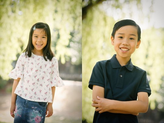
When I do outdoor family shots, this is one of my go-to-backgrounds. I look for bright spaces which are not the sky but are brighter than the subject such as foliage, trees, and leaves showing the bright sky behind it.
As long as it's bright but is not the sky, it's fine to use. The most important thing to remember is to put your subject in front of the bright background and expose for their face. This means the background gets brighter and the face is properly exposed. Use a flash to light the face if you want but as long as you properly expose the face, the image looks right.
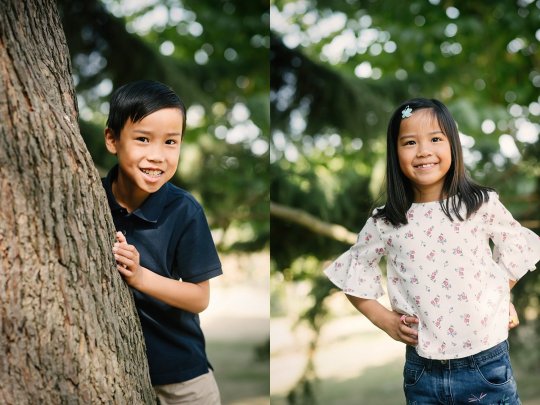
Another thing to remember is to avoid having any dappled light on your subject's face. The background can be dappled such as the trees with the light coming through on these the images above but never on the faces. That would more often than not, ruin your image unless you are intentionally doing so in an artistic shot, for example.
#4 Plain dark or light background
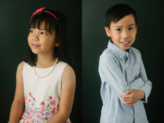
Plain backgrounds whether they be light or dark or mid-tone in color, make for classic portrait shots. You can't go wrong with them as long as you know what you are doing with your lighting.
In the portraits above, I simply used a dark wall and window light for the main light. I put a reflector on camera right to bounce some of the light. That's it.
The portraits above were shot in the client's kitchen where they had a bench by the wall. It was perfect for some quick natural and fun portraits of the children for as long as they sat still! The lighting here was merely the window and skylight on the far right and a weak bounced fill flash behind me on camera left.
My main tip when shooting plain backgrounds is to match the lighting to the background so that if the background is light, then the subjects tend to be lit in the same strength. Similarly, when the background is dark, then I tend to light the subject with a moodier tone.
Although this is a personal preference, technically I prefer an even contrast between the subject and the background.
#5 White seamless background

Contrary to what many people believe, a pure white background is not so easy to achieve. What I mean by that is that you can't just set up a white background and your subject, take a picture, and you have your nice clean white seamless background. If you do this, you'll end up with a light grey or off-white, rather muddy background.
Actually, in order to get that bright white background, you have to light the background and light your subject as well.
If you want to learn how to do this properly, read this article I have written and it will show you a step-by-step process of achieving a clean white seamless background – 3 Rookie Mistakes to Avoid When Shooting on a White Background.
#6 Fake background
Yes, you can fake a background in Photoshop!
The photos above were shot on a plain dark wall similar to #4 and then I added textures in Photoshop afterward. You do need a separate image of a texture to overlay on the dark wall.
You can see how this is done on this article here I have written on adding overlays: Basic Photoshop Tutorial – How to Add Creative Overlays to Your Portraits

Another way of faking it in Photoshop is by adding a sun flare. The background here was just a plain white wall but it was shot in a windowless room with very little ambient light. I used a flash at camera-left to mimic window light. In post-production, I added sun flares so it looks like the girl is sitting next to a window.
Here is an article where you can learn ways on how to add sun flares to your photos in post-production; 2 Quick Ways to Add a Sunflare in Photoshop
I hope this article has helped you in choosing backgrounds for your portraits. If you have any other ideas you wish to share, please do so in the comments below.
The post 6 Types of Portrait Backgrounds for Creative Images appeared first on Digital Photography School.
0 notes
Last Seen Blogs

despair-to-future-arcs
Despair to Future Arcs

loveforwholelife
Luiza Gouvea
sid-and-doris-bonkers
OTHER