#but this time i had enough layers to duplicate them all and merge a copy
Text

Allright, finally got around to writing another part of my tutorial. In this part I will go over how I paint shadows on the body and some other stuff. Let’s just get into it!
Open this in dashboard for best view of the screenshots.
Disclaimer: I have no formal training for any kind of graphics stuff, I work in an office as a receptionist - I serve coffee for a living. I am absolutely self taught and while I consider myself pretty comfortable with photoshop, that doesn’t mean that there isn’t about a gazillion of other things that can be done that I have no idea about. There are people far superior than me in the Sims community. This is just how I do it, with techniques I have picked up through the years. Some things I go over in these will be pretty basic, some things a little more unorthodox.
Disclaimer 2: My edits take time. This is what I do to relax, one edit takes several hours for me. Sometimes days :)))
Disclaimer 3: My photoshop is in Swedish, which is my first language. I tried my best to find the English translations for every step that I do.
Tools used: The Sims 4, Adobe Photoshop 2020, One by Wacom Pen Tablet (very basic and unfancy).
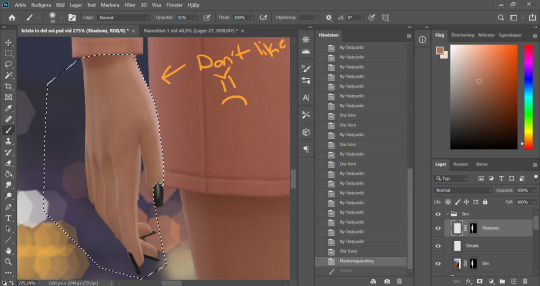
When we stopped the last time we had just painted some shadows on the face and chest area. Now I continue with all other parts that’s showing skin. The hand has some of that wrongly places highlight thing going on, so I use the pen tool to section the hand out.
On the Sim layer, I choose a color of the hand that suits my purpose and I go over the area I want to "correct". I also removed the shadow on the wrist because I wanted to add my own.
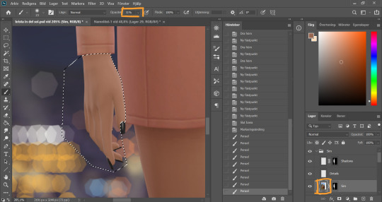
Going back to the shadow layer, I use my shadow color and go over the part of the hand that would be facing away from our imaginary light source, as well as the part just under the clothing line. Then I blend by going over with a low opacity eraser brush again.
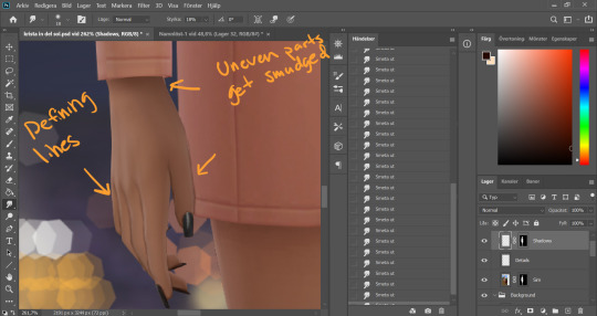
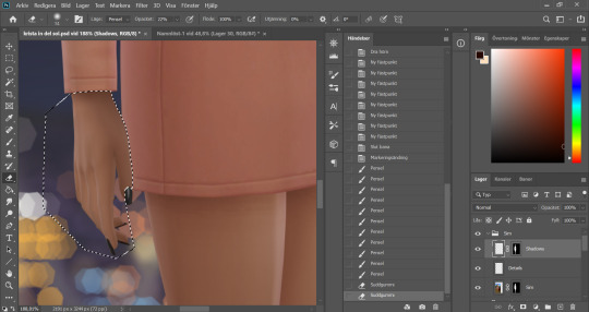
Between and around the fingers I usually add some extra definition with a smaller soft brush, using the same shadow color. Any uneven parts gets blended with the smudge tool.
The other hand just needed some shadow.
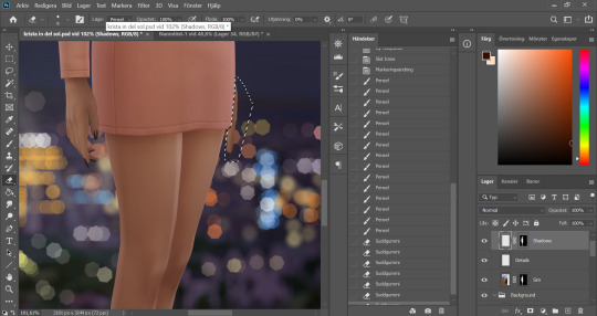
She's got leeeegs… Anyone else old enough to remember ZZ Top? No? Just me? Ok. I section out one of the legs, yes, using pen tool again.
I "color correct" the highlighted part on the front of the leg that I feel is in the wrong place.
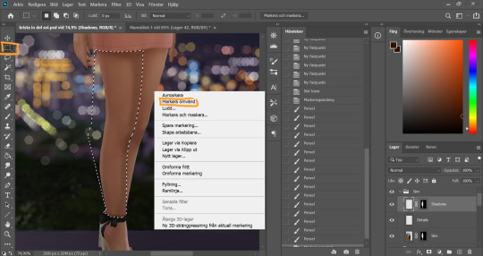
I add my shadows on the front of the legs and under the skirt. Then I reverse my selection by clicking the Marquee tool, and right clicking in my picture. The english option should be called "Inverse Selection" or something like that.
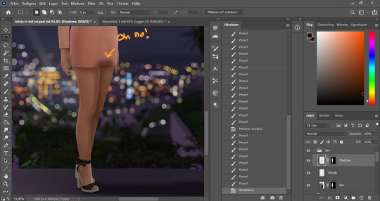
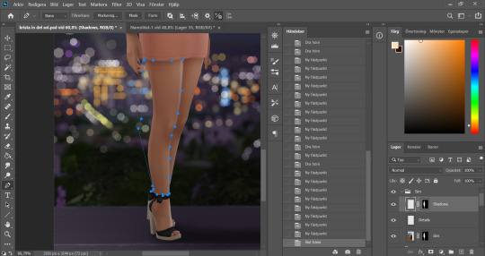
I paint my shadow on the other leg, building up a little more color closest to the other leg to add separation between the two. And now since my selection didn´t section off the leg from the dress we've got some bleeding because I can´t be bothered by being precise.
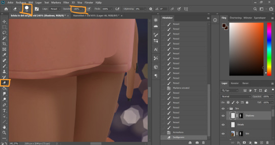
I deselect and use the eraser tool with a hard brush and 100% opacity and start erasing the shadow parts I don't want, I'm careful not to go over any skin parts on the leg and hand.
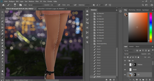
So this is a perfectly good method to use if you don’t want to section off using the pen tool all the time. I switch between the two depending on the size of the area.
I blend the parts of the shadows that I feel are too harsh with a low opacity soft eraser brush.
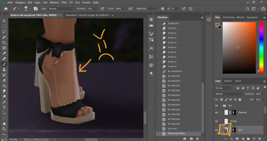
The foot had a little of that mucky highlight thing going on as well, so I mark that part of (pen tool) and go to my Sim layer.
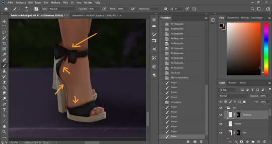
I go over with an eyedropped color, and go back to my Shadow layer to start adding shadow with my shadow color. I draw shadows along the shoe part and underneath the sole of the foot. This is just to add some dept. Since this was such a small area I opted to not section the skin parts off, I just painted over the whole damn thing and went back in with an eraser to remove any unwanted shadow from the shoe parts.
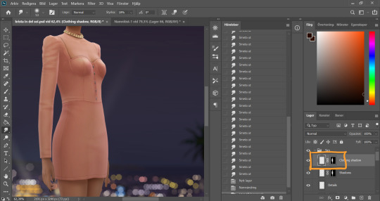
I make a new layer for my Clothing Shadow, and copies the Sim layer mask onto this one as well by holding Alt, grabbing the layer mask and dropping it onto my new layer.
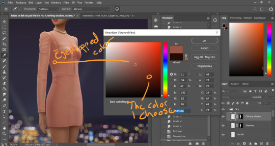
I eyedrop a color from the darker part of her dress and choose a darker more saturated version of that color. Usually I go with black for the clothing shadow, but it depends on the original colors of the clothes. With bright colors like this dress I go for a darker version of that color.
I definitely did not do myself any favours when I decided to have the light come from the back of this sim. Straight from the front is always easiest but hey, challenges is how we grow. I use a big ass soft brush and go over the front of the dress.
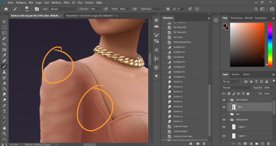
Aaaaand the pen tool is back again. I section off the arm of the dress.
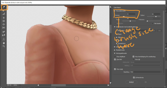
I chose a slightly smaller brush than before (still pretty big though) and go over the part of the arm that´s facing away from the light. Then I invert the selection and paint shadows on the body under the arm, I build up a little more color here.
I deselect and now we´ve got a pretty sharp line around the shoulder where there naturally would not be. I go in with the eraser brush (low opacity, soft brush) and blend it out. I also blend the shadow that was on the front of the body since it was to harsh.
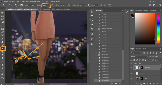
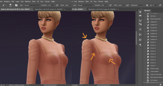
Now I realized that the light would not hit the hip that directly since the lower part of the arm is in the way, so I section off a big of the hip.
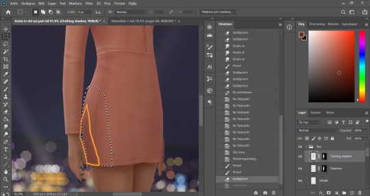
Since I don't work with especially harsh shadows, and since the arm is not directly in touch with the hip, I draw sort of a cone shaped shadow here. Not letting the tip of the cone reach all the way to the edge of the back.
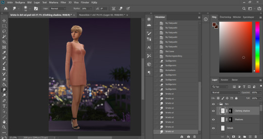
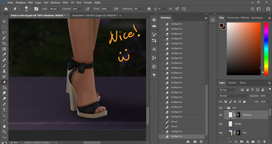
I clean up a little more using smudge and eraser tool. She´s starting to look pretty good eh?
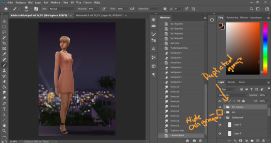
Now I want to merge all my Sim layers, but since I suffer from anxiety and can´t committ fully I want to keep all the layers as well. So I mark the Sim layer group and duplicate it (ctrl+ J), and hide the original Sim layer group.
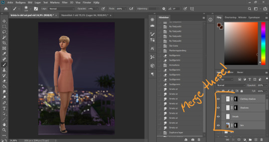
I select all the layers in my new Sim layer group and merge them by pressing ctrl + E.
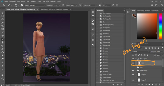
Now they´re one layer, without any layer masks. For the purpose of this tutorial I rename this layer Sim (when merging the way I do the new layer will take the name of the top Layer). Now this is our new Sim base layer, the old one is hidden away and hopefully we don´t have to touch that again because that would mean I would have made a major mistake somewhere that I can´t correct on this new layer. It’s very unlikely, but it feels nice still having those other layers as backup.
Since Sims is a video game we have some parts that are pretty square in our picture even though they wouldn´t be in real life. Time to smooth things out.
I go to Filter -> Liquify. This is like the smudge tool on crack. There´s a lot of things that can be done in here but in this particular case I'm going pretty simple. I use the smudge and go over any pointy bits that are'nt supposed to be pointy. I change the brush sizes to fit the area I'm working on. Some places need smaller brushes, some benefit from bigger ones.
Here's a comparison before and after of some of the things I corrected in Liquify. It's not a huge difference but it does looks nicer.
And that concludes part 4 of this tutorial. Don’t hesitate to message me if you have any questions.
115 notes
·
View notes
Text
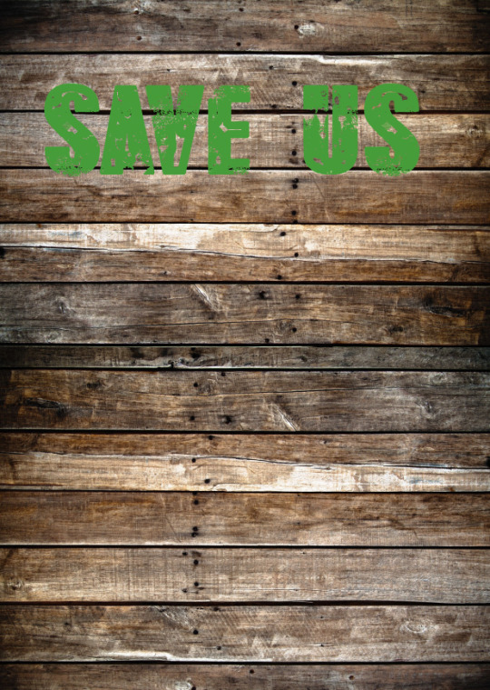
Creating Neon Sign Typography
Now that I have researched into the artist, Kate Bush, I will be moving onto creating my own piece. For this work, I’m hoping to create some artwork using typography where I will try to make it look as realistic as possible. To do this, I will be using Photoshop.
To start, I went to the ‘horizontal type mask’ which you can find under the type section of the left side of the page. The next step is to click anywhere on the page, to which this will change the colour of the background to pink as this means it has actually worked. After this, I went to Dafont to find a suitable font. I wanted a font that reflected my theme so this type would connect even more. I feel that the overall look I will create from task wont properly match with my ideas. However, I tried to get around this problem as much as possible by using this rough sort of type. To me this reminds me of scars that are from the bark of the wood or on the ornangutans effected. This is because it looks like slashes from a weapon. Carrying on the process, the next thing I did was to type out a word, to which I chose ‘SAVE US’. My thinking behind this is that it relates to the orangutans. I also feel that this phrase feels quite personal. Once I have wrote this out, I increased the size of the text so that it was larger when presented on the page. Now to get my text as an outline like below, I simply just went to the ‘move tool’ which is the on the left panel.
Here, I have then added a new layer and gone to ‘edit’ and ‘stroke’. Doing this brings up a new tab where you can now change the ‘width’. I chose to put it at 40px but this depends on the type of font and size you chose for your type to be. As you can see, I have also changed the colour to this green. I chose for it to be this colour as it reminds me of the concept of nature. Additionally, you need to make sure the ‘location’ is set to ‘inside’. Once you have done this, you can click ‘ok’. Doing this will show some outlines of the of this type now.

After this, I then went onto google chrome to find a suitable backdrop to add to this type. Before, I had even started this task, I knew I wanted to have some sort of old wooden background. There are two reasons for this, one being that wood relates to the idea that this material is getting cut down for palm oil plantations. The other is that Kate Hush used this kind of thing in one of the pieces I analysed. So overall, I thought this was the best option. As well as this, I did think of having an old barn where I could show it at night with the sign lighting certain areas up, revealing this. Although, when I tried searching up for this, all the walls of the barns were flat enough to look realistic.
When I was searching for an image on google, I had to change a certain setting so that it was a high quality image. To do this, I went to ‘settings’, ‘advanced settings’ and on ‘image size; I changed it to ‘larger than 1024x768′. This way all the images I won’t be looking pixilated once placed onto Photoshop where I will resize it.
Next, I would copy and paste this image into Photoshop where I will resize it enough to that the two sides are covering that certain part of the page. I then moved this to the top of the page where I would duplicate the layer by doing ‘CMD J’. After this, I did ‘CMD T’ to transform it so I could drag it down. By doing this, it will hopefully line up better so there is no obvious line. Although, I found mine still didn’t properly line up so I had to slightly move the position so that it wasn’t so noticeable able.
I have now double-clicked on the layer to which the type is on. This brings up the layer style tab, where I first went to ‘colour overlay’. I started by changing the colour to this slightly lighter green. Once I had done this, I went through all the ‘blend modes’. I think I ended up choosing ‘multiply’. Then I went to ‘outer glow’ where I have chose this dark green colour. Although this sign needs to be bright, I felt that have another shade of green would help to make the overall piece to seem more interesting. After this, I then just experimented with all the options to see what each one does. I ended up increasing the ‘spread’, ‘size’ and ‘range’.
After this, I went to the ‘drop shadow’ setting, where I could another shade of green along with lots of other options. This includes, the ‘blend mode’, ‘opacity’, ‘distance’, ‘spread’ and ‘size’. This setting being called ‘outer glow’ means that it will slightly add another colour to the outside of the letters.

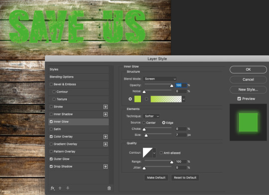
Once I have done that, I will then went to ‘inner glow, to which I think this was the most effective setting. The reason for this is because it really finished the piece off. I also think the shade I chose was very effective too. As you can see below, I decided on this very light green/yellow. In this screenshot, it is showing this very clearly. Again, I have thought about the settings and what effect it has on the overall design. This time, I chose to not add too much and just change the ‘blend mode’.
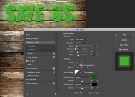
This screenshot beneath is presenting where the last step I have done is to use the ‘bevel and emboss’ setting. Using this option also had a massive effect on my end result as this gave a 3 dimensional look as this created the shadow. I also got to change the direction which the lighting was coming from too. As my type has some detail already from the font I thought this looked really appealing as it has enhanced this a lot more. As a result from doing this, it has added in some highlights but also shadow too.
Here, I have then changed the lighting of the background, but to do this I had to merge two layers together. These two layers are the type and background which I did by holding down ‘shift’ and clicking these two layers. Doing this means you can select more than one layer at a time. After this, I did ‘CMD E’ as this actually merges them. The next step would then to be click your background layers and go to the circular icon that is located at the bottom right hand side. It should be half filled white white and other as white. Click on this and then select ‘levels’. Below is showing the tab that will come up. I then just played around with the bar, to which it will change the lighting of the background.

Next, to get this glowing effect where the backdrop has been lit up around the sign. I used the ‘brush tool’ to which I chose a brush with the ‘hardness’ setting set to low as possible. this mean that I wont be adding a hard line. When picking the colours, I would either choose black or white. The black erases and the white reveals. So the black creates this lit up effect.
Another this, I have then added this metal texture to the type. The way is which I have done this is I have found a high quality image of a metal surface on google chrome. You will then need to copy and paste this image, to which you can add a ‘layer mask’ to the ‘type layer’. I feel this creates a massive effect on the overall text as it now has some more interesting element in each letter. As well as this, the green this is highlighted around the edges too, achieves this really striking effect on the viewers.

As a result, I think that this type loos really striking. Although, one mistake I made was the composition of where I have placed this type on the page. At the start of this task, I wasn't properly thinking about as I was more worried about what I was actually doing. However, I have just had an idea to add another element into the design which I thought could be a an orangutan. This way the type will be relating to the image below.
0 notes
Text
Fire Emblem Heroes Sprite Edit/Recolor Tutorial
This is a continuation of this: https://generichero.tumblr.com/post/164187282249/fire-emblem-heroes-sprite-assembly-tutorial
So you may want to check that one out first.
Alright, so... say one day you decide that you want Lucina with pink hair. Or... Lucina with Lyn’s hair in pink. Or maybe you decide that Wrys is just too bald.
Well in this tutorial, I’m going to show you how to make that happen!
Keep in mind- this tutorial is only for Photoshop because that’s what I use.
A few important things to keep in mind (copied from my last tutorial):
-Save often! Crashes happen and they suck.
-Be very careful before merging your layers/saving your work as a PNG file! If you close the document after merging layers, you WILL NOT BE ABLE TO RECOVER THEM. I would recommend saving one version as a TIFF or PSD file with layers and another as a PNG file when you’re finished. Otherwise you may want to go back and… say… give Ike an axe instead of a sword only to find out that you’ve merged the files and he now has a sword glued to him. Don’t be like me guys. Keep two separate documents.
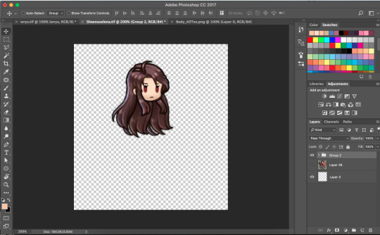
So the first thing you might want to do is to assemble a sprite using the first part of the tutorial, like so.
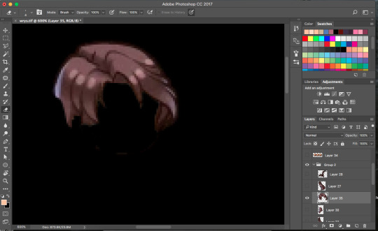
So we’ve got Wrys here in all his bald glory. If you’ve been playing a lot of Heroes like me, you’re probably sick of seeing this man.
What we’re going to do is give Wrys here some fabulous hair.
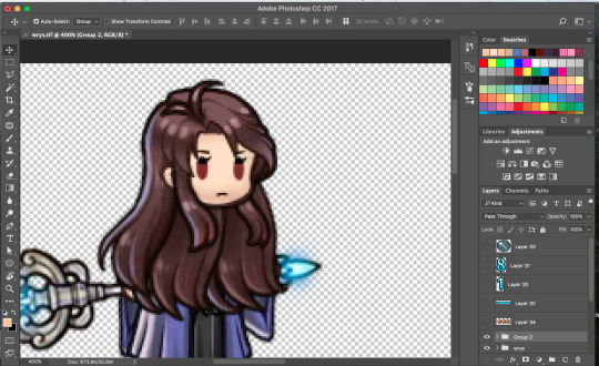
First off, we’re going to need to chose whose hair we want. I’m going with Sheena’s.
First off, if you’ve got a character whose hair is separated in to multiple parts (like Sheena) you’re going to want to put it together.
Then drag it over on top of Wrys, and using the layer visibility line up Sheena’s eyes on top of Wrys’. This is the easiest way to make sure you’ve got it in the right place.

Now we’re going to want to select Sheena’s face with the polygonal lasso tool and delete it. Or, if you’ve got a steady mouse hand like me you can try your luck with the eraser tool.
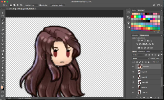
If you use the lasso tool, you’ll probably end up with a messy cut and you might want to go back in with the eraser tool and fix it up a bit.
Try using different color backgrounds to help you see what you’re doing better.

Next up, we’re going to want to adjust the hair to fit Wrys a bit better.
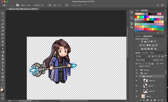
And there you have it! Wrys is now sporting a fabulous new hairstyle.
But brown is a kind of dull color for him, don’t you think? So let’s say we want the same hairstyle but in lime green.
This picture isn’t part of the tutorial, but I had to see this monstrosity so you do too.
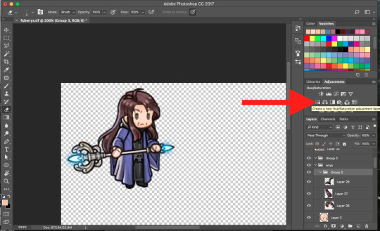
Anyways, you’re going to want to click on Hue/Saturation.
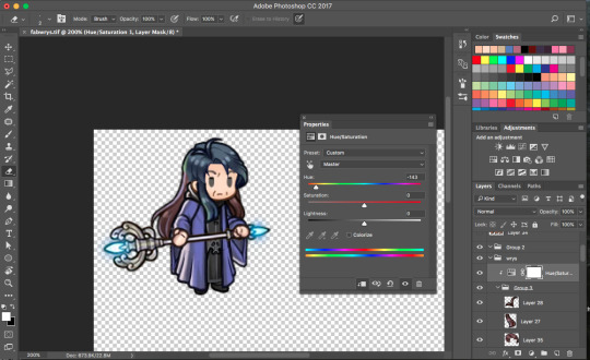
A little dialogue box will come up. Here we have three sliders: Hue adjusts the color, saturation adjusts... well... saturation, and lightness... well, it’s pretty self explanatory. It may seem limited at first, but if you mess around with these sliders enough you can almost always get the color you need.
The first thing you’re going to want to do is option click Hue/Saturation layer and hover over whatever you’d like to change until a little arrow shows up. This makes it so the Hue/Saturation is only affecting this layer and not the whole thing.
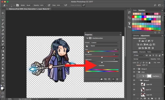
So we move the hue slider over little bit, and wala! Wrys is well on his way to becoming a Fire Emblem protagonist.
There’s one more thing I want to talk about here, and that’s the Colorize button. Sometimes just messing with the sliders just won’t cut it, or you might end up with downright ugly results. When this happens, just click this little button. It will turn everything in the layer into a shade of whatever color you choose. Ultimately it’s up to you whether to use it or not, sometimes it looks better not to.
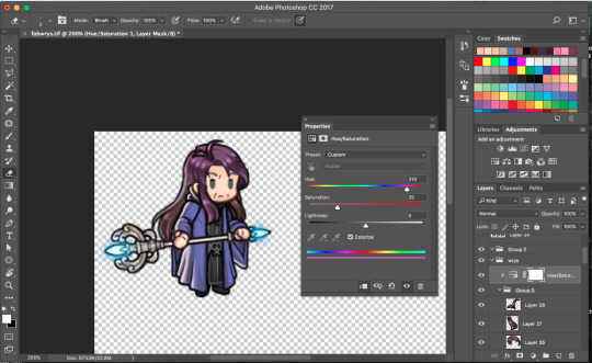
Here’s an example of what the colorize tool can do. For this project, I think I’m going to keep it turned on.
So move it over to green (or a different color if you choose), and then you’re going to want to duplicate the Hue/Saturation layer and apply it to all of the other hair parts.
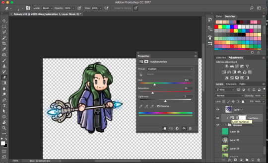
Well, now he’s got green hair, but it’s not exactly lime green, is it? Well, we can fix that! ...Next time. Sorry, I think I’m going to cut this off here before this post gets too long, but I’ll hopefully be able to post the next part before long.
As always, thanks for reading and feel free to let me know if you have any questions or need clarification on anything.
75 notes
·
View notes
Text
GIF Manipping Tutorial
I couldn’t really think of anything to do when I passed a follower milestone, so, belatedly--and because @dreamofspring suggest-requested it--I’m going to write up a tutorial on gif manipping/merging/whatever you want to call it/the process I use to make gifs like the ones below.


Some notes before we begin:
I use Photoshop CS 6 on a Macbook Pro.
I use @patchface‘s gif making process by and large, with some additional tweaking. I’m pretty attached to using smart objects in the gif making process so this tutorial relies on that, rather than keeping frames in a timeline form. I won’t be explaining how to make gifs. @patchface‘s tutorial is pretty solid, and there are plenty of others out there if you want to dip your feet if you search around Tumblr.
I’m also going to be using Layer Masks, but not explaining how they work so much as why I use them. Here’s a tutorial that explains them, and I’ll link it again below when relevant.
Thanks to the members of the creatorsresourcenetwork for looking this over before I posted!
I. General Process
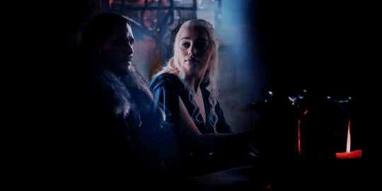
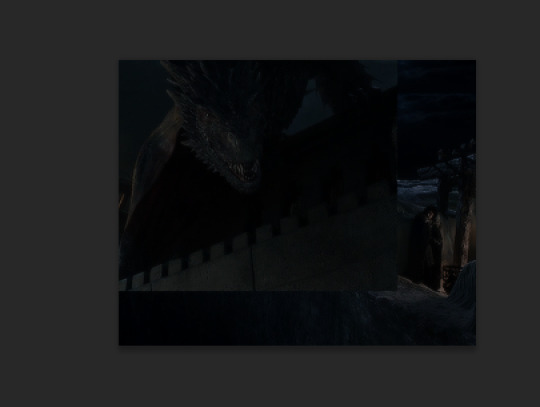
Since the reason for this is because Sarah asked, I’m going to show my process for making the last of the four gifs above--Jon & Drogon on the Wall.
1) Select your clips. This is challenging and things don’t always fit easily. The number of times I’ve had an idea, set out to make it work and then given up is very very high.
If you want, you can work with individual caps first before making your gifs. I don’t usually do that but if I’m feeling particularly frustrated I do.
Here is what I came up with for Jon (in S1) & Drogon (in Meereen) respectively

2) Crop, Make & Sharpen your gifs in two separate photoshop files.
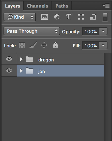
3) Here’s where the fun begins. Depending on how you make your gifs you should put them in a folder (if you do a copy & gaussian blur technique).
Pick the gif of the two gifs you want to be your “home base” gif and drag the other one into that base gif’s canvas. Photoshop lets you have two canvases side-by-side (this is something I find useful generally for gifsets since you can see colors side-by-side before saving and exporting for tumblr). You click on the file name section

and drag it down or to the side. When you hit the edge of the photoshop window--before your tools begin or your timeline--it should highlight. Release the file and you should now see both files side by side and you can easily click and drag files from the layer section of one canvas
on top of the other canvas, which will add it to the second canvas’ layer section.
Doing so should maintain the size of the gif, based on how you cropped it, but the cropping won’t be maintained. But that’s ok-- you can click-drag the gif around on the canvas until you get it to line up the way you want it to:
I dragged Jon a little bit to make room for Drogon on top of the wall, which mean there was a gap in the top of the gif:
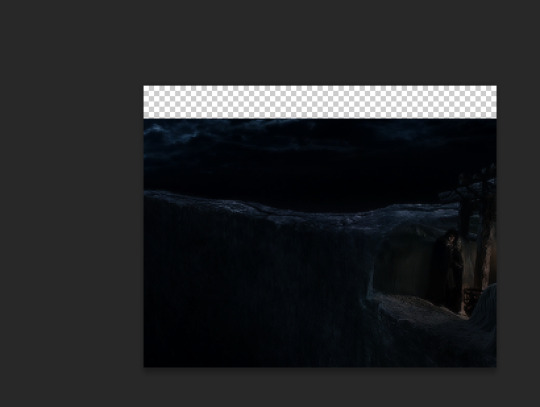
I duplicated the Jon gif and moved the bottom of the two gifs up to have some sky consistency. It made a texture in the upper-right corner in the final gif that, six months later, I’m annoyed at, but that’s what I did and you live and you learn.
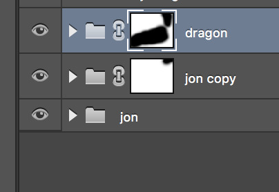
4) Layer Mask time! As I said above, I won’t necessarily be explaining how to use layer masks, but you can read about that here. Layer masks aren’t just great for this way of manipulating gifs but also wonderful for coloring since it lets you “hide” part of your layer. In coloring that means that you can really make some colors vibrant, or dark, or desaturated, or whatever you’re going for. For this, it means you can work on blending the two gifs together.
I applied some layer masks to both gifs/gif folders to make it a little smoother. This was an initial stage--a way to get it rolling before coloring so I could see vaguely what I was aiming for. I definitely went back in after I colored and did some cleaning up:
5) Coloring time! This isn’t a coloring tutorial so I won’t go into the details of how I colored. Here’s a solid list of the psds I use most frequently (though some have been taken down unfortunately!) As I mentioned above, I definitely went back in and played more with the layer masks after I’d done my coloring to make sure that things looked as good as I could make them.
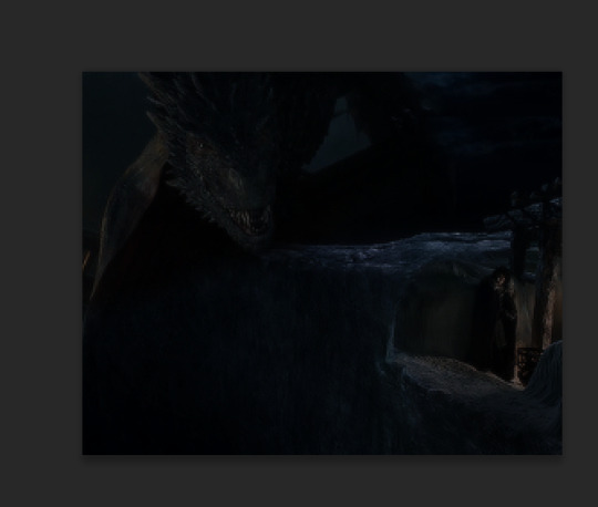
I ended up with this gif from there:

II. Some Tips
Some general tips I’ve found that are helpful for gif manipping:
1) Layer Masks--this is a personal taste thing: I tend to use a very low hardness % when I’m using my brush on layer masks. This tends to be because I want to allow for movement since it’s rare that gifs are perfectly static--it lets things fade in and out imperfectly rather than having something choppy and jarring. It’s really hard to make something line up perfectly and I tend not to aim for perfection so much as my own level of “good enough,” which tends to get more precise each time I do this. Coloring can really help ease the transition between gifs. The seams between gifs also look the smoothest in dark sections (in the above, the darkness of the wall and the night helps hide a good amount of the seam) but that’s not always possible.
2) It helps a lot to pic footage where characters don’t move a lot. It makes it easier to paint your layer mask without accidentally cutting out part of a face or something. If you do end up picking something with a lot of movement, you may want to use a frame-by-frame technique rather than this one which relies heavily on smart objects.
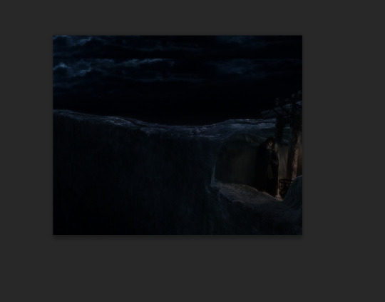
There are some fantastic manips out there that I think are done in frame by frame animation form. For this you’d have a layer mask on each individual frame hiding the parts of the gif you don’t want to include in the final manipulation. I choose to manip the smart object rather than the frame by frame because I think it looks smoother. That’s a personal preference thing--it’s also a...laziness thing. It’s definitely easier to manip one smart object than to go through each frame and try and make it look smooth. When I was first trying to manip gifs (which would have been two years ago at this point lorddddd) I tried the timeline thing and this was what I was able to pull off:
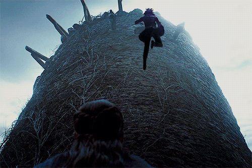
For a gif like this, I think the only way to have done it was frame by frame (since Bran’s falling from the tower and the tower is shifting underneath him and the perspective of the video is shifting) but it was very painstaking to the point of not being fun for me and I want to enjoy myself when photoshopping or else I wouldn’t do it.
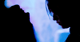
3) As with any gifset for which you want the color scheme to look cohesive, it helps tremendously to work with gifs whose scenes have the same general coloring. That doesn’t mean you have to, obviously. I’ve done a lot of manipping of Jon & Daenerys together. Jon tends to be filmed in cooler scenes (since he’s in the North) while Dany’s tend to be warmer in Essos.
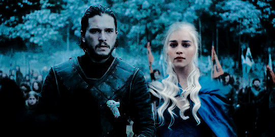
Dany is lighter than Jon in this gif, and there is more of a yellow hue to her, even beneath the cooling filters and color adjustments I put there. And while I still think it looks good (obviously, or else I wouldn’t have posted it), I think it’s less of a smooth manip than this one:

where the coloring of Dany’s scene is originally much cooler and wintery. Having the same baseline color saves a lot of energy in terms of coloring.
4) You don’t have to crop the gifs to the same size. This took me a while to realize. I was worried about preserving image quality, but I realized that frequently it’s manageable and so gifs like this
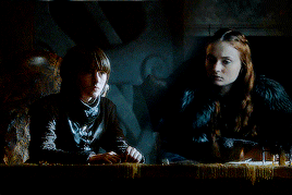
where Sansa and Bran seem to both be sitting at the same table even though in their original clips they’re taking up different amounts of space on the screen are possible. If I’m trying to get something right, I’ll sometimes save the actual gif making process until I’ve worked two caps together to the right proportions. Or I’ll go back and undo a resize in the revision history.
5) If you really want to get courageous with your coloring, you can change the blend mode on one of your gifs. I....don’t do this a lot, but one of my all time favorite gifs that I’ve ever made entailed this so I can’t say don’t ever do it ever:

I was an idiot and didn’t save this psd so I don’t remember how I did it :sigh: oh well, but it’s why the whisps of her hair are whispy.
274 notes
·
View notes
Text
OFF THE CUFF HOMESTUCK THOUGHTS #3: THE SELF PILE DOESN’T STOP FROM GETTING TALLER OR: THE PROBLEM OF DEAD MARIOS
DISCLAIMER
IMPORTANT THEORETICAL FRAMEWORK
[CHECK THE TAG FOR MORE THOUGHTS]
So, a long-ass time ago, Rose and Dave had a conversation like this:
TT: After you go, what do you think will happen to me?
TT: Will I just cease to exist?
TG: i dont know
TG: i mean your whole timeline will
TG: maybe
TT: Maybe?
TT: Is there a chance it'll continue to exist, and I'll just be here alone forever?
TT: I'm not sure which outcome is more unsettling.
TG: the thing with time travel is
TG: you cant overthink it
TG: just roll with it and see what happens
TG: and above all try not to do anything retarded
TT: What do you think I should do?
TG: try going to sleep
TG: our dream selves kind of operate outside the normal time continuum i think
TG: so if part of you from this timelines going to persist thats probably the way to make it happen
TT: Ok.
TG: and hey you might even be able to help your past dream self wake up sooner without all that fuss you went through
TT: I think the true purpose of this game is to see how many qualifiers we can get to precede the word "self" and still understand what we're talking about.
This is the most important sentence in Homestuck.
I am dead serious.
Well, OK, I mean, it’s pretty important for understanding some major Homestuck themes and shit or something like that.
Also, I totally should have said: Pre-Retcon Doomed Timeline Non-Dreamself Rose but ultimately about to become Dreamself Rose who semi-merged with Pre-Retcon Alpha Timeline Rose and Doomed Timeline Dave aka Davesprite AKA future Davepetasprite^2 or as we all call them around the office, Davepeta, had that conversation.
Maybe you begin to see what I’m going to talk about here.
One of the major frustrations a lot of people had with the retcon was that the characters we ended up with at the end weren’t the ones we’d come to love and know throughout the story. Was it even worth it, to lose the characters we loved to the tyranny of Game Over? The victorious kids, with the exception of John and Roxy, were other people, with other histories, other goals, and other choices.
Allow me to submit that that may be the whole point.
SBURB is cruel. We’ve known that for a long time. It’s cruel not as Caliborn is cruel, but as the cosmos is cruel, as a supernova is cruel. It wants what it wants, and doesn’t care about how that intersects with the needs of humanity. It wants to make universes through a complex game-playing method, and drags hapless, vulnerable adolescents along for the ride. And most of the time it doesn’t even succeed, leaving its champions to rot in a doomed timeline or similar! Skaia’s victory is an amoral creation myth where individual human beings are just the carved pieces on the chessboard. (I mean, the other ones. Not the carapacians.)
Again, let’s consider the theme of VIDEO GAMES vs. REAL LIFE.
Homestuck, let’s be real, is basically some postmodern horror timey-wimey Jumanji. For a generation way more familiar with pixels than cute little tokens It’s easy for teenagers and in fact, basically everyone, to fantasize about escaping their life and slipping into some game world forever, where they get to do awesome things and be a heroic person.
Homestuck makes that literal. Congratulations, everything you ever knew is dead. You will never see it again, except your internet friends, who turn out also to be your family and other important people. I mean, from a distance, SBURB sounds like an awesome game, right? You figure out who you are and get to wear a cool costume displaying that identity. You get to make anything you want and enjoy this hyperflexible mythology tailored to YOUR CHOICES. HS fans talk all the time about how cool it would be to play a real version of SBURB. That’s a big part of the appeal of SBURB fan adventures. They put you and your friends in the story. Or your favorite characters! It sounds like a fantasy come true.
The thing is, as fantastical as it is, it’s also really fucked up, and ultimately you and your friends are being used. By a giant frog to let it have its babies. By the universe. By a smug blue cloud thing that doesn’t care about you at all.
SBURB does not care about you at all.
The funny thing, SBURB features a mythology with so many layers and nuances and seemingly human motifs about growth and self that you might search for some grand ultimate meaning behind it, but it’s not even human enough to have a personality, to be something you can argue with or fight. It just is. It’s all the cruelty and power of a god without any of the dazzling personality. It’s empty. It just wants to make universes all day long, or fail trying. It is a great, weird tadpole-making machine that eats children.
One of the big ways it doesn’t care about you is its attitude toward the self. Humans and trolls and whatnot prefer not to be relentlessly duplicated. SBURB says, oh yeah, let’s make tons of copies of the player characters and use them for a lot of different purposes.
There’s the dreamself, an essential bifurcation of identity (you are now and were always the dream moon princex) that sometimes gets merged into god tier but sometimes doesn’t. There’s doomed timeline selves, who exist ultimately to augment an Alpha timeline whose Alphaness is decided very arbitrarily and frequently by Lord English. There’s the you who exists before a scratched session and the you who exists afterward, who are two different people but started as one baby in an act of ectobaby meteor duplication, your player self and your guardian self. Dead timeline yous fill up the dreambubbles made by the horrorterrors and get endlessly confused with each other. Any one of these could be the you experience being at any given moment, and which one it is entirely arbitrary. Don’t like being Dead Nepeta #47? Tough hoofbeast leavings, kiddo.
To top it all off, in Terezi: Remember, we learn that every single time we thought someone changed from one self to another, was resurrected or something like that, it was another act of duplication. For every time someone’s died, there’s another version of them waiting in the Dream Bubbles, surprised that they’re not the main character anymore. And we have no way of knowing which is which. Even John, good old everyman John, may or may not be the person who died three or four times. It’s really impossible to say whether we’ve been following the same person throughout our story, or just the illusion of the same person, like a horrifying cosmic flipbook.
The retcon is a return to this same theme. Ultimately, there’s very little new in the changes John makes to reality except that they drive the point home.
John’s friends all died. John and his friends won the game. These things are both true at the same time, except those things may not have happened to the same people. There was a happy ending. Hooray! For, um, some folks who may or may not be the ones we care about. In fact, it’s very confusing, because from Rose’s perspective, Roxy is dead but came back to life, and from Roxy’s perspective Rose is dead but came back to life, except also she came back to life as a weird tentacle catgirl of pure id and self –indulgence. So there’s that. Um. Which Rose are we rooting for again?
Or wait: is it none of them, because the first Rose died in a doomed timeline, hundreds of panels and a number of years ago?
There’s a tension here which one experiences between saying it’s okay because it’s still the same people, and saying it’s not okay, because it’s not the same people at all. This tension is exactly what we’re meant to wrestle with. To put it another way, Homestuck asks if identity can work in aggregate. Are all Johns John, all Roses Rose, and do they all share in what they accomplish? Or are the final victors only accidents created by the whims and needs of the frog baby machine?
What I’m saying, basically, is that the retcon, in the sense that it pointed out our confused relationship with these characters, was already here.
In interviews and questions put to him over the years, Hussie constantly compares HS and SBURB to other video games, particularly Mario, which he frequently returns to as a baseline of comparison that most of his readers will know. One answer, from a recent Hiveswap interview, is particularly revelatory. To the question of “Why do you kill off all your characters?” Hussie replies:
[…]HS is supposedly a story that is also a game. In games, the characters die all the time. How many times did you let Mario fall in the pit before he saved the princess? Who weeps for these Marios. In games your characters die, but you keep trying and trying and rebooting and resetting until finally they make it. When you play a game this process is all very impersonal. Once you finally win, when all is said and done those deaths didn’t “count”, only the linear path of the final victorious version of the character is considered “real”. Mario never actually died, did he? Except the omniscient player knows better. HS seems to combine all the meaningless deaths of a trial-and-error game journey with the way death is treated dramatically in other media, where unlike our oblivious Mario, the characters are aware and afraid of the many deaths they must experience before finally winning the game.
The big man hass the answer.
Homestuck is the story of those dead Marios.
Other works, like Undertale, have engaged with this topic as well. But one of the major differences between Undertale and Homestuck is that in Undertale, between “lives,” one’s consciousness is preserved. In Homestuck, it’s discontinuous, and the value of the overall trial-error process is called into question by the fact that you, the player, may not even get to experience the victory. What meaning does victory hold if that is the case?
So, to put it in a nice thesis format:
One of the central themes of Homestuck is the challenge of reconciling an arbitrary and destructive pattern of growth and victory with the death and suffering you experienced along the way. Homestuck asks: is victory worthwhile if you’re not you anymore? And would you be able to know?
What even is the self? Is there such a thing?
If you were left feeling somewhat disconcerted by our heroes’ tidy victory and departure to their cosmic prize, or by how which Rose gets the spotlight is so deeply, deeply arbitrary, there’s a good reason for that. You’re supposed to be.
The philosophical problem of Wacky Cat Rose is insignificant next to the bullshit of SBURB.
And don’t forget—John and Roxy’s denizens helped them achieve the retcon. Ultimately, the victory they achieved was mediated by the same amoral system of SBURB, and was a victory over an enemy, Caliborn, whose power was created, perpetuated, and ended by that same system.
Okay, so here’s where it gets contentious. There’s an argument to be made, which I’m not sure how I feel about, that some of the character development that could have been in post-retcon Act 6 was left out precisely to push this feeling and play up this tension. Note that this is not the same thing as saying that they were deliberately badly written, but that they’re deliberately written to make us uneasy.That Hussie deliberately played with the balance between making these retconned characters feel familiar and making them feel eerily different to leave us feeling uneasy with the result.
I’m not sure I like that idea. It smacks a little too much of that “everything is perfect” thinking that comes sometimes from the far Metastuck camp. Some of the differences may also be the result of flawed writing. (See: Jane and Jake’s character arcs, which I might talk about later.) And I want to be able to critique those flaws. Ultimately, I think we still needed more time and development to figure out who these new people were—even if our goal was ultimately to compare them to their earlier selves. And again, more conscious acknowledgement of the problem from our heroes—especially John, the linchpin in this last and biggest act of duplication—might have helped drive this theme home.
Still, I think the Problem of Dead Marios is one of the most fundamental questions of Homestuck, maybe THE biggest question. It’s essential to understand it to understand what Hussie’s doing—or attempting to do— in the retcon and the ending.
I don’t know that Homestuck offers us a clear answer to that question. There are some confusions around the issue, too. Where do merged selves fit in, exactly? Clearly they’re a big part of the discussion, because Hussie spends some time in Act 6, especially near the end bringing the identity-merging powers of the Sprites to the forefront. (See also: the identity-merged nightmare that is Lord English.) Can we even come up with a clear answer to what it means when a dead Mario returns to life grotesquely fused with Toad? How does he beat the game? Does he tell himself that the princess is in another castle? Or what if he merges with Peach? Are they their own princess? How do they know if they’re in the right castle?
Um. Anyway—
Interestingly, it’s not all grotesque—spritesplosions suggest that personalities that are too different don’t stay together long, so a fusion might rely on some inherent compatibility between the two players. Erisol’s self-loathing, sure, but also Fefeta’s cheerfulness. Davepeta seems to be a way of bringing out the best in their players, a way of getting Davesprite past his angst and Nepeta past her fear. Honestly, I know a lot of people don’t like Davepeta as the ending of these two characters’ arcs, but I can’t help but love it. They’re the ultimate coolkid. Cool enough to know they don’t have to be cool. Regular Dave got there, too, of course. But was his retcon assist from John ultimately any different?
Then, of course, we come to Davepeta’s speech to Jade in one of the last few updates before Collide. Davepeta suggests that there is such a thing as an ultimate self beyond the many different selves one piles up throughout the cosmos. A set of principles that describes who you are that’s larger than any individual instance of you. Your inherent Mariohood. (Maybe this is comparable to your Classpect identity, which attempts to describe who you are?) Davepeta even tells Jade, strikingly, that one might learn to see beyond the barriers between selves. Be the ur-self, in practice, rather than theory. This would be incredible news for Jade, who wrestles with the issue of different selves perhaps more than any other character. (There’s a lot to say about Jade.)
Honestly, I wish this ur-self idea had been developed more, and I honestly expected it to be. It doesn’t fully come to fruition, I feel. (Same goes for Davepeta’s character. Ohhhh, ZING!) I’m not sure it entirely makes philosophical sense, especially with fusion—I mean, doesn’t Davepeta themself disprove it? Or at least complicate it? Like, are they part of the ur-Dave or the ur-Nepeta? They seem to imply they’re BOTH? Does that even work? Does that mean that Marieach is all the Peaches and Marios at once?
(In fact, Bowser/Peach/Mario are but the three manifestations of one eternal principle. Also, Bowser/Peach are the true power couple. Read my fanfiction plz.)
And what, say, of Dirk, who ultimately ends up rejecting aspects of his other selves? It feels like there’s a lot more you could say here, and I wonder if Hussie would have said more, if he’d had time. What’s weird is, none of our victorious kids never reach an ur-self (though to their descendants, they become archetypal to some degree), which one might have expected. They’re just individual selves who happened to get lucky. Does that make them representative of the whole? It feels like something’s missing here, or like something got dropped at the last minute.
Same goes for the idea of the Ultimate Riddle. You’d be forgiven for missing it, but there’s been this riddle in the background lore of SBURB that seems to have something to do with personal agency in this overwhelming, overarching system. Karkat called it predestination, saying something like “ANY HOPE YOU HAD OF DOING THINGS OTHERWISE WAS JUST A RUSE.” But others have interpreted it more positively. My favorite interpretation, from bladekindeyewear: the answer to the Riddle is that YOU shape the timeline through your existence, personality, and choices, even when it looks like it’s all predestination. Ultimately it’s your predestination, your set of events, based deeply on your nature, that you are creating. Someone like Caliborn can use his innate personality to achieve power; someone like John might be able to use it to achieve freedom.
I definitely expected something like that to be expressed more explicitly. Like, a big ah-ha moment that helps John or Jade or whoever understand how to escape Caliborn’s system. Something like that would have been very helpful for a lot of our heroes, actually, who’ve been pushed around by Skaia and SBURB together, in finding a cathartic ending. Once again, I wonder if something was dropped or rushed because there wasn’t time to put it all in. There’s places where you can see hints of that Answer being implied, maybe? But it’s kind of ambiguous.
You can see how the Answer to the Ultimate Riddle ties into some of Davepeta’s ideas. If your personality, the rules of your behavior are a fundamental archetype that goes beyond each individual self, then the answer to whether it matters if one self of yours makes it through to victory is an emphatic YES. You are all of those people, and by winning one round with Skaia, you’ve won the whole game, despite all the arbitrary challenges and deaths it heaps upon you along the way.
This may strike some as too positive for Skaia’s brutality, or again, some way of excusing flaws in many characters’ arcs, or unfair things that happen to them. To be fair, I don’t know that Davepeta’s necessarily meant to be taken as authoritative or the voice of Hussie. They may simply be offering a purrspective.
Hussie not choosing to come right out and engage with the Ultimate Riddle leaves the question of Dead Marios and what they mean for the victorious versions of our cast very open. I like that in some ways—let the reader decide—but I can’t help but wish we had more to work with in making that decision. Plus, it might have brought the thematic messages of Homestuck all the way home to tie them more closely to our characters and their experiences—character development being one of the things most people found most lacking in the ending.
NEXT TIME: All that wacky gnostic stuff probably
#homestuck#off the cuff homestuck thoughts extravaganza 2017#homestuck meta#homestuck theory#homestuck analysis#The Ultimate Riddle#dead marios#ugh why is tumblr basically unusable#pictures and text can go together TUMBLR#GET YOUR SHIT TOGETHER IT'S 2017 WE HAVE HYPERCOMICS#HOMESTUCK COULD TEACH YOU A THING OR TWO ABOUT COMBINING MEDIA
2K notes
·
View notes
Text
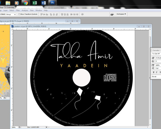
Ancillary Task-Making our own Digipak and rough sketch
Arooj constructed three digipaks initially but we did not like any hence were all rejected! I decided to give it a try, thus I set to work. However Arooj made the inlay again as mine was rejected, for they did not like it! Cover, back cover and CD were made by me.
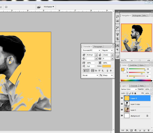
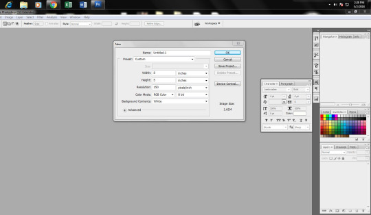
I set to work in ADOBE PHOTOSHOP.
First of all I built the front cover.
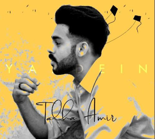
For the front cover I set dimensions to 5 by 6. I then opened the image of Talha and adjusted it in a new layer using ctrl T and then stretching dimensions while holding shift. Having adjusted the dimensions of his picture, I gave it a yellow blotch because color palette of our website and music video is yellowish.
I gave the album name “YAADEIN” a faded out white effect to symbolize nostalgia and placed it in center.
Below instead of writing Talha’s name with some simple font, I copied his signature from the photograph of his signature that Arooj took for me and rubbed the white area.
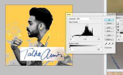
At the end I took a picture of kites from google and ingrained it in the cover on top of Talha’s head, again rubbing off the un needed one.

Hence cover page was ready.
Back cover
For the back cover too I set dimensions 5 inches by 6 inches. I searched up google and found the following image to set it as background; it is background of our website too.

Then I opened up the cover page folder in Adobe Photoshop and copy pasted the yellow layer effect to this background and opened his picture to cut it and apply it to this background.
Then I fit in Talha’s picture on the page by clicking CTRL+T and setting the dimensions with help of ‘Shift’ key. Then I cut around his photo to keep the guitar part and him with help of ‘lasso’ tool.
Then I copy pasted the title from cover page file and typed in album songs giving them white color.
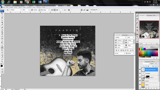
Having done this I copy pasted the record label company’s logo and pressed CTRL+I to rub off the un needed white background. Using shapes tool I added a black banner at bottom to write the record label company’s copyrights on it and website name too.
At the end I added a bar code on top right side, copy pasting it from google. Hence the cover page was ready as well!

CD:
For CD I opened up new Photoshop folder and set the dimensions 5 inches by 5 inches.
I drew a large circle using shapes tool giving it black color and another smaller circle giving it white color, to give effect of the CD hole.
I opened the cover page folder here too and copied the album name and protagonist’s signature to the CD, fitting them in following positions:

Then I added copyrights around the CD.

I copy pasted compact disc logo from google pressing CTRL+I to invert it so to change the color to white, so it would be visible on the CD.
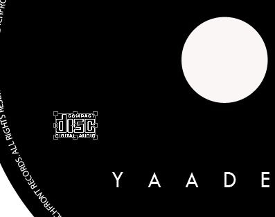
Then I copy pasted the kites layer from cover page, inverting them too, so they became white.
Lastly I shifted the album name below protagonist’s signature and gave it our signature yellow shade thus to create a sense of branding in our products.

This is Arooj’s experience of making inlay in Adobe Photoshop
According to the digipak color scheme I decided to go for the yellow colorvfor the inlay. Though there wasn’t any clear image of digipack in my mind. All that I had in my mind was the story concept of my music video.
I decided to come up with some color effect image of my artist including some blare images of different things regarding her past. So for that first of all I downloaded some images from the google. Alike, stair, watch and a cloudy image.

For my artist pictures I selected two images with the eye contact to the corner and another viewers and another on with the side angle towards the left side.

First of all I opened a new file and selected the dimension 11X5 for a double inlay cover. I opened the clouds image in the file and adjusted it in a new layer using ctrl T and then stretching dimensions while holding shift according to the size.


Using the selection tools, The magic wand tool, the lasso and magnetic lasso tools, I selected the right part of the image of the artist and dragged them to the files as separate layers.
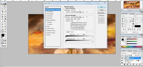
I pended the layers properties of these layers and changed their opacity properties. I also applied some other effects to these layers like inside glow to make the edge of these layers brighter.

Then I opened the watch image and used magic wand to select and remove the white background part. Then I placed the watch behind the main image on the left side and changed its opacity so that it merged right with the background. The watch symbolized the time that had watch according to the theme of the album.
After that I opened the image of the stair case and did the same with it placing it to the right of the main image. It was used to symbolizes the journey and growth from ones childhood to teenage as one goes higher.
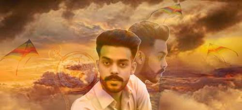
After that I selected the images of the kits and applied similar kids of effects on it before placing it in the background. I made duplicate copies of this layer and placed them randomly. The kites also symbolizes the memories of the childhood.
I made some minor adjustments and the inlay was ready and goes enough for my liking. So I saved a jpeg image of it for further use.
This is the inlay.

0 notes
Last Seen Blogs

zunkstujects-tterings
zunkstujects-tterings

cinnamonnommingbrooke
Untitled
askslenderproxies
Ask Slender’s Proxies
dadieh
Berbagi Kisah
emsjun
em | 21 & learning