#but they evidently are not and the description of Supracolor is
Note
Am I crazy or do Cats makeup designs seem to slowly be losing their more vibrant colors over these past few years, at least with certain productions?
You're not crazy at all! That seems to be exactly what's happening. I can only speculate as to why, as I am not part of the production team.
And it's not in a "our colour palette is more muted" kinda way in that it's meant to be grungier or more cohesive with its surroundings (see, say, Vienna or Broadway). It's a...it just seems...they took the 2016 beauty guru "blend blend blend" far too literally. Maybe there's a production issue, maybe they've halved the makeup budget, maybe they *are* using water based paints for details which take a lot more for opacity and bleed far easier, or maybe Napier's updated deigns are just not bold enough in how they are being executed, honestly at this point who knows.
The issue, I feel here, is that when I squint at literally any of these faces or consider spotlight washout/eliminate the contrast, they disappear. And you'd think "Jemi why are you doing that what does that matter" - because if I'm in the audience at a seat anywhere other than first or second row, the faces become this:
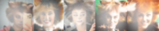
And obviously that's an exaggeration (but maybe not enough of one) because the current UK designs and such others aren't perfect in this department either so don't get me wrong here, but contrast is *important* in theatre makeup. Lines when attempting to create face shape and "catify" human features are important for illusion - otherwise they just look like people with ears anyway. It's not Instagram makeup - it's not meant to be. The lighting techs are probably pulling their hair out.
#jellicles ask because jellicles dare#look-how-the-lights#negativity#just in case#It's funny because I thought - maybe#it was because they were using a more water based paint to be more skin friendly#but they evidently are not and the description of Supracolor is#well known for its outstanding covering qualities#lol evidently not#and as much as i don't love the white triangle eyes that has also been floating around in the us tour at least that exaggerates the eyes#at least it helps create a more feline shape#at least the black lining gives an obvious as yes the shape is different
26 notes
·
View notes
Last Seen Blogs

womosecurity
Womo Security
rachaelssecretplace
I Like Wario Games

drug-none
Untitled

feelingcoffee-blog
Feeling Coffee
lifeasafail
call me bitch