#because sure i sketch or do some digital work from time to time but if i haven't sat down to draw for hours
Text
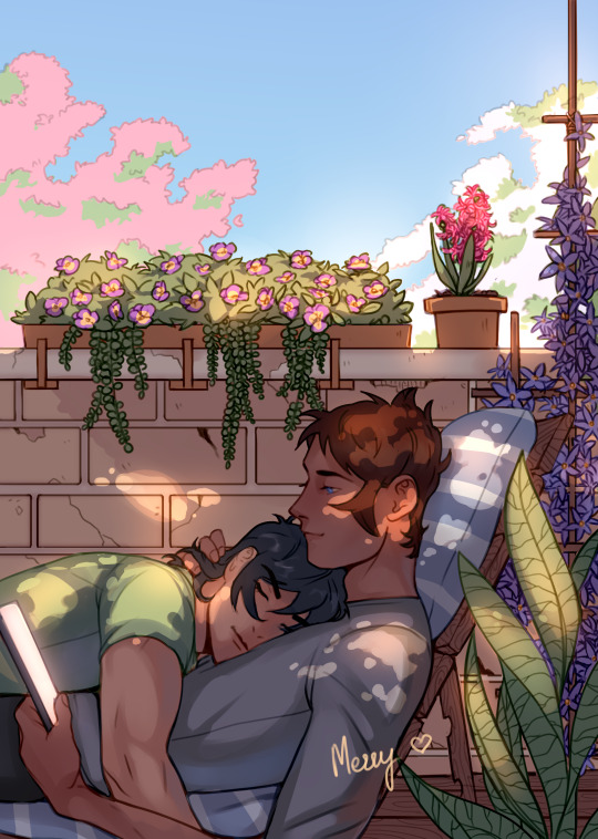
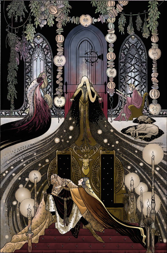
Last piece ❤️💙
There are still leftovers of the Calendar as well as some A5 prints with calendar pieces 💞
linktr.ee/Mezzy (or check my Tumblr for links)
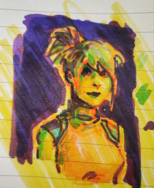
#klance fanart#klance#voltron legendary defender#ooofff you ever feel like you keep doing things and things are still to get done???#i keep saying this every five posts#i start to think loving getting in the 'art zone' is my biggest vice#because sure i sketch or do some digital work from time to time but if i haven't sat down to draw for hours#until eyes sting and neck cant move and brain sleepy af? is it drawing anymore? is it living anymore? yeah i thought so#im the main person making grocery shopping in this house did you know? for three people#there is always something running out and like let me tell you i already answer business emails while eating#i cleaned the windows today before my first coffee#okay to be fair i started it but apparently i used the wrong bottle and i smeared anti grease all over the windows#and then finished my coffee staring at the curvy roads of a thin film painted between me and the world promising myself to never do anythin#before first coffee#either way i feel like i havent been very present or entertaining lately#by which i mean on and off for months#am i correct or am i partially correct or reimagining things? who knows#but i keep having so many things i want to do it just keeps on going#i'm starting with commissions now#BUT THEN!!#haha yeah i hope you are having a great November and enjoy this piece!!#sending hugs <3 if you like them if not#a gentle wave from a far
2K notes
·
View notes
Text
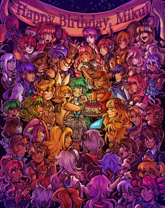
Happy birthday to the number one princess in the world!! 💖
~from her biggest fans :)
ramble of my scattered thoughts on the piece under cut as usual cuz i love talking 😋
This has been an idea I've been cookin for a while, and it was so cluttered and unlike any other ensemble piece I've made... and I decided I oughta do it anyway. I love Miku, I love Vocaloid, and I wanted to do something really ambitious and crazy for her anniversary. Crazy that she's turning her "canon" age this year TwT
I had the idea floating around since like, May...? And then finally started acting on it around June 18. I'm terrible with deadlines, obvious with how I can never make a silly birthday post in time, so I started wayyyy ahead to make sure I have some room to be lazy lol, especially with an idea as ambitious as this.
This was finished on July 12! So I had to sit on this for an annoying amount of time. Very difficult for someone like me who just wants to talk about everything I'm working on to the masses. But at the very least, that gave me the time to work on the draft for this post.
~~~
Here's some ~behind the scenes~ scribbles leading up to the finished piece!
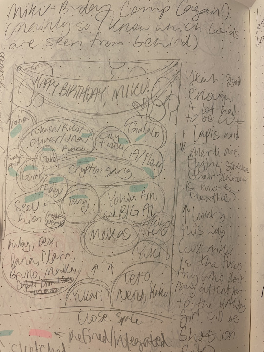
Left is the chicken scratch plan i made in my handy dandy notebook (whenever things are getting real and ambitious, i always made a rough ROUGH plan in there. Usually I'd do a rough pass of the full thing, but this was too complicated for me to do traditionally. I majorly benefited from digital tools to make this possible). CyberDiva and CyberSongman were considered, but I ended up cutting them cuz I just didn't feel like drawing them sorry-- (just pretend they're off to the side. They gave Ruby and Clara the pizza lol).
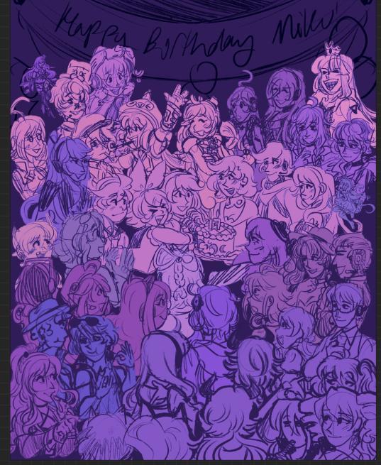
Right is the "final" completed sketch (before I decided to include Chika mid-way through coloring and VY1 and VY2 near the finish line). I started by drawing the main "groups" separated on a different canvas so I can plop them into the main canvas for easy rearranging and transforming. However I got lazy and ended up drawing everyone in the bottom right corner directly on the canvas since I liked seeing the big picture of everyone's positions. Y'know.
Almost excluded Chika! But I like her design so much that I just felt like including her last-minute. You win this time, Chika fans.
VY1 and VY2 were very close to being cut! I added them when I began doing the banner and thought "eh why not". I figured their non-human designs would be pretty easy to include pushed back in the bg. Ik VY1 is more commonly associated with the fan design, but I referenced the hairpin cuz it was simpler and the fan looked very annoying to draw 😭
Sorry to the fans of many Vocaloids I had to cut because this composition was insane enough as is. I promise I wanted to include fellas like CUL, LUMi and Sachiko 😭 I will admit I was a little biased on who I wanted to include over others. Like, I don't normally care for Bruno and Clara, but I wanted to get some more international 'loids in the mix. Also wanted to stick in the realm of official designs and not fan-designs since, as much as I can appreciate those, are just a whole "wait who is that guy supposed to be" situation I didn't wanna deal with.
I also did wanna include even more character references through the balloons, but they ended up being kind of ugly and overcomplicated the BG :,)
(Oh, and while this was originally planned to be a Vocaloid-only piece, I did end up including Teto, Neru, and Haku 'cuz those are Miku's besties dude!!! They may not be Officially in the club but they're her girls and it would be criminal to not invite them to her birthday).
Anyway, this project marks the first time I've drawn a lot of Vocaloids. Lily, Piko, Rana, Yuki, Yukari, Miki, Maika, and many more lol. All of 'em I've heard or seen in passing, but now I actually drew them, and some have really cool and fun designs!! I got into a habit of drawing Merli after this since I just love her design for example. And I'll probably be drawing more lol!!
Oh and the last thing I'll add for now!! The cake is indeed made up of various song references!! I wanted to reference the "big four" producers, just absolute icons in Vocaloid history. The pink/black checkerboard is "World is Mine" (Ryo), the crescents on the side is "Rolling Girl" (Wowaka), the smiley faces is "Matryoshka" (Hachi), and the three hearts on the side is "The Vampire" (DECO*27, which is sort of a symbol of his whole Mannequin album tbh). I know "The Vampire" is a bit modern but I couldn't think of anything else off the top of my head. I'm a fake DECO fan I know 😔 "Matryoshka" was originally going to be referenced in the colors of the candles but believe me it looked like shit so I just went for something else last minute 😭
That's all I have to say!!! Hope you didn't mind the text wall if you made it here. I hope you like it as much as I do!!!! Happy freakin' birthday Miku!!!!
I have to deal with tagging all these characters now for my page,,, in the drafts my tags got cut off after a certain point so I think I'm massively breaching the tag limit 😭 um... I'll figure that out later...
not losing sleep that i can't tag everyone, even for page organization purposes because some characters have pretty generic names and some are a little hard to see in full yknow. If you're one of those people who tag every character in the art piece you reblog... I am very sorry.
#mayor doidles#fanart#vocaloid#hatsune miku#miku#kagamine rin#kagamine len#rin and len#meiko#kaito#megurine luka#gumi#kamui gakupo#ia#vflower#mayu#kaai yuki#oliver#otomachi una#fukase#sf-a2 miki#utatane piko#yohioloid#big al#sweet an#kasane teto#i literally dont think i can tag everyone. um. so you get the idea right#digital art#cell shaded
2K notes
·
View notes
Text
How Do I Do Stuff
The question was phrased a little strangely, and I don't want to embarrass the person by posting exactly what was said, but I'll answer it and hope this clears everything up.
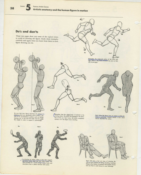
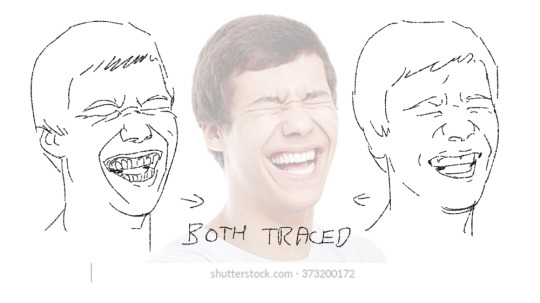
I do almost all of my drawing by hand. No, I don't trace in Photoshop. Not a judgment on those who do, but I come from a generation of artists who did not use Poser programs or other digital tools. We learned to draw using a technique called the Sight Size method. I know a lot of people assume everyone - including the old masters - traced everything using optical tools, but while it is true some people did, it is just as true that most didn't, and you can draw with great accuracy if you learned how to draw the old fashioned way.
Sight Size breaks everything down into its barest components of geometric shapes and you build from there. Once you learn it, you never forget, and it applies to everything you will ever draw.
I learned it using a set of Famous Artist Course books my mom had since she was a kid, and they are still the gold standard. They're often on ebay. If I were you, I'd buy them.
I actually find using figure reference really annoying because I like exaggerations and modifications from reality in my final work.
This page from Neil Gaiman's Chivalry was drawn and painted without figure reference of any kind.
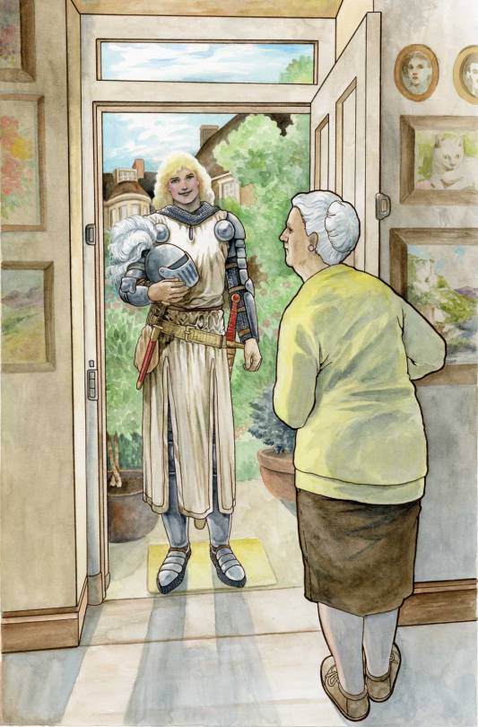
I don't know why people assume I trace all the time. If you were to try to use photographs to replicate these figures, you would find they are slightly off. There is no tracing here.
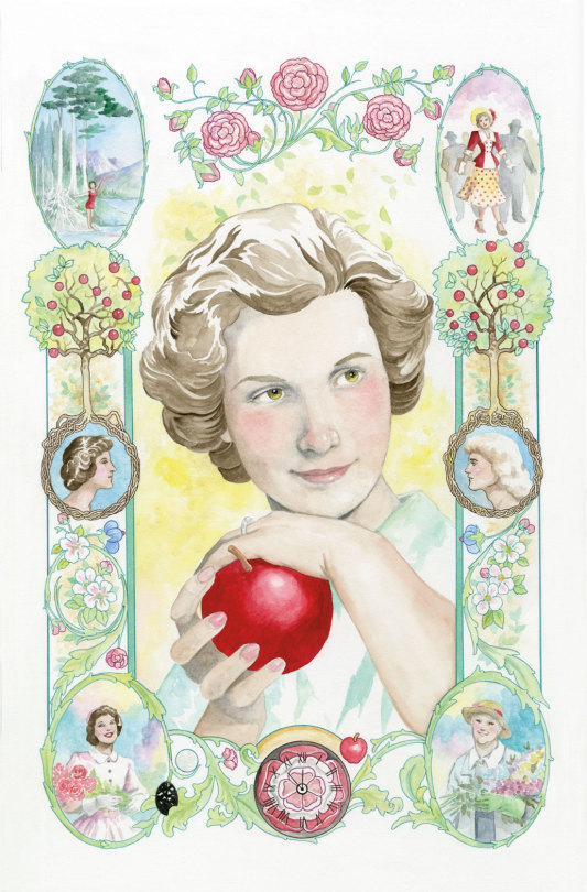
This is not to say I never use reference. This page, for example, was referenced from a photo of my mother. Isn't she pretty.
But this page of Sir Galaad was drawn and painted without reference.
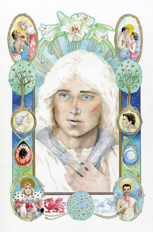
He's pretty, too.
If he were real, I'm sure a lot of people would be very happy about it. But he's not. And had I reference, the art would have gone a lot faster. I had a time trying to nail this face that is very alive in my head but doesn't really exist.
Back in the ancient days, all cartoonists had to learn to draw and paint extemporaneously because reference was limited and digital tools didn't exist. While some high end artists had photography studios and professional models with costume and sets on hand, small fry like me were limited to what was in the house or available at my small local library, which was no bigger than a few rooms of my current house.
Artists kept extensive "morgue files" or "swipe files" which were collected from magazine clippings and photographs so we would have as much of what we might need on hand for quick reference. These ephemera collections could get unwieldy. I have thousands of photographs I've simply never sorted. I finally dumped most of my files this past year.
Have I ever traced anything? Of course, especially if I have to re-use a shot or setting over and over. Making extra work for myself is just silly. It's my job to make pictures, not to perform magical feats, like copying one shot after another over and over without making a mistake.
However, for almost 15 years of my career, I refused to copy or trace anything, and did not even own a lightbox. On the one hand, that forced me to learn to carefully examine what I saw. On the other hand, it was a stupid hill on which many deadlines died.
Only after I realized many professional artists had lightboxes and overhead projectors did I finally break down and get one.
The one thing I use my lightbox for more than anything is for tracing my thumbnail sketches to the final drawing paper. Instead of trying to capture the liveliness of the original sketch by copying what I see - only bigger - I blow the thumbnail up to the size I want the final art to be, then I trace over the thumbnail using a lightbox onto the final drawing paper.
Here's a look at thumbnails from the graphic novel Neil Gaiman's Snow, Glass, Apples.
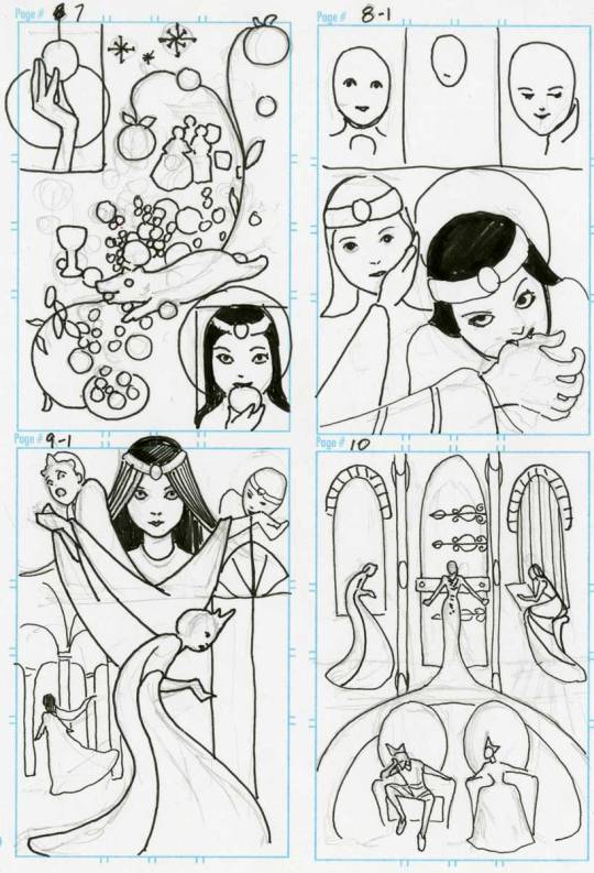
I enlarged these on my computer to fit onto 11"x14" paper, and traced the thumbs before finishing the art which was drawn in pen and ink and colored in Photoshop.
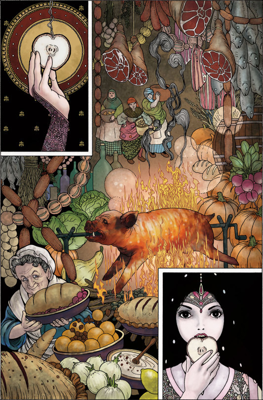
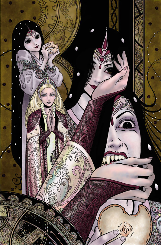
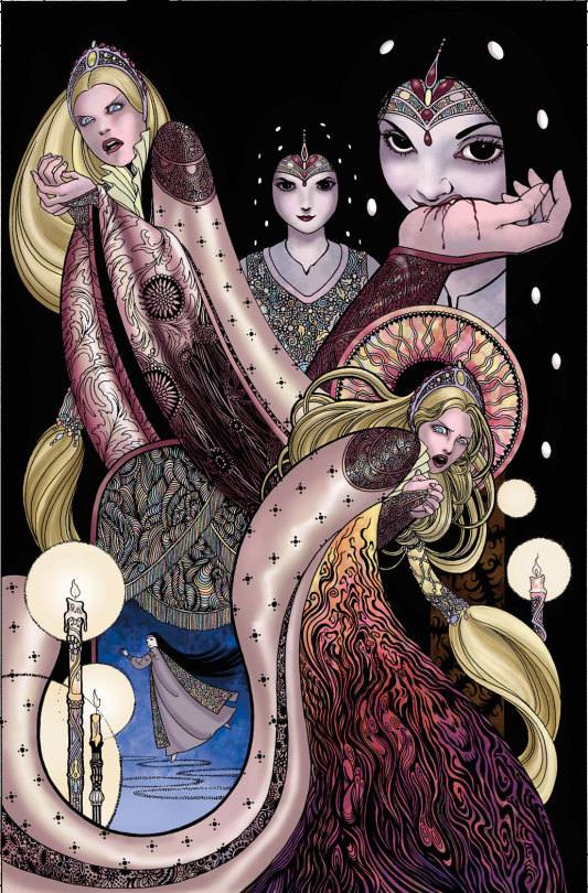
While I obviously made some changes, the essence of the thumbs is there in the final work. Tracing my thumbs retains some of the looseness of the original sketches, which is often lost otherwise.
So, there is a valid purpose to tracing at times, though in my opinion, too much tracing can weaken drawing ability, substitute for developing skills, and make the work kind of stiff.
If you want to, I'm not your judge. But it's weird to me that people think I must be faking my skills in some way.
Ironically, the word cartoon comes from the Italian word cartone, which is a large heavy sheet of paper - also, the origin of the word carton.
Preparatory sketches were made on this paper which was then transferred to the final work surface via either tracing or by stamping little holes in the paper through which dust was sprinkled, recreating the contours of the drawing for the artist to follow.
So the origin of the word cartoon comes from a process often used...for tracing.
3K notes
·
View notes
Text
Model- 141+ König NSFW
Based on requests:
1.OKAY BUT 141+KÖNIG WITH A READER THAT DOES DIGITAL ART🏃♂️
2.Can you write about TF141+König with an S/O what draws, animates, etc? I was thinking more digital art, but traditional is cool too. If you only wanna do one character, can it be Ghost? Thank you!
GN!reader, digital artist/painter!reader, established!relationship, civilian!reader, smut, 18+, MDNI, Sub!Male, Dom!reader
A/N: Some will be short...and you'll definitely notice who is my favourite on this one
As someone with the talent and skills to create art with your hands and a clean canvas, you always find yourself looking for a model. Thankfully, he is there now, in that position, just for you.
Price:
You mentioned before that you needed a model to help you with proportions for your art. Your strong and bulky boyfriend decided to be just the right model you needed. For months you and him work late at night, and he props himself up for you, wearing whatever you need to bring your ideas to life. The people who buy said art always admire how realistic your art looks, and how no other artist does what you do. And it's all thanks to him.
At the moment, he is on the sofa, dressed in a black suit, a collar around his neck, eyes looking at you, pleading for you. "Stay still, I have to get this angle." You sketch his body onto the canvas of your tablet. You had been teasing him since he woke up, vibrator to his sensitive cock. You had tied him up before this session, mainly because he kept touching himself for some release. Now, staying still and obeying was his punishment. And for him, it was the worst one so far.
"How...much...more...please..need-.." he said in between whimpers and moans. You approach, looking at him, taking in how needy he was being. You get down on your knees, and he moves a little only to find you sketching this position. He whines and closes his eyes, whimpers getting louder by the second. "Stay still or do I have to teach you another lesson?" The masochist in him wanted to be taught a lesson, "Please..please do" You grin, and slap his face lightly causing him to whimper in response. "Don't make any noise, I'm busy.." For an hour, he stayed still, cumming from just the way you teased and looked at him. For sure, this site would end up in someone's dungeon.
Gaz:
When he and you started to get more intimate and he'd make you look at what you and he were doing through the mirror, that's when you knew he had to be the model you'd use for your creations. It took time to mould him into who he is for you but it was all so worth it. Currently, he is leashed to your canvas' stand. Looking up at you, the bite marks and hickeys you had done hours prior still worn proudly on his neck. He was wearing nothing but the collar on his neck and the fishnets you made him wear. His face is slightly red from the heated makeout session you two had since he was a good boy for you.
Your paintbrushes colouring the canvas in front of you, he looked up at you. How sexy you looked when you were so focused on your art. You know he likes it when others watch as you fuck him. How well you can ride and how well he can listen to you. So, you brought a mirror into the art studio. Made him look at his reflection as you ride him, each time he would ruin a line in your art, it was another slap to his already abused face. Tears ran down his cheeks but a wide smile as he enjoyed the thought of how others would look at the canvas and see a moment where you once more made him yours.
Paintbrushes used to mess with his already-hardened nipples. His hands gripped your hips, guiding you to go faster, but you resisted, not wanting to ruin the creation you were making. Some paint smudged to his chest, your hand prints on them when you'd get carried away and ride him faster.
Soap:
He was the one who offered himself up, wanting to please you not just physically but visually. You had made him wear his kilt, war paint on as he spread his legs open for you. Hands in between his thighs, he leans forward, looking up at you with puppy eyes. You had been working with him in this position for too long now and all he needed was just some attention, physically. You knew you wanted this painting to feel more personal, needed a touch of yourself and him in it. So, you picked out the paints that were safe for the next activity you had in mind. You laid the cloth of a canvas on the floor and commanded him to go to it and get on his knees to wait for you.
Poured some of the safe paint on his chest, and you and he began to make out. The cloth filled with paint, art made from your bodies. By the time you and him were done paint was all over your bodies. He requested, as a reward, that you and him take a shower and if you wanted, he could also pose for you in the shower.
Ghost:
He loves to be your sub so when you mentioned that you needed a model for your art, he wanted to be the subject of all your attention. Currently, you have him tied up with leather ropes. A cock ring on him as you paint his position. He looks up at you with puppy eyes, his mask lifted only far up for you to see his lips. Every now and then, he closes his legs to get some friction, only to have his inner thighs spanked by you. He whimpers a little, asking for forgiveness since he knows what you will do to him after you are finished painting this position.
He looks at you, doe-eyed. "Please, please just touch me...just once." But you ignore his pleas. He shuts his eyes and begins to think of how you would touch him. That was the only way he could find some release while he was tied up. You look at the canvas, paint and figures finally making sense, and then you hear his loud moans and cries of pleasure. He was cumming at the thought of you, no one around to touch him, just his mind playing for him.
His whimpers were louder as he couldn't stop cumming, it all leaked everywhere, spurting out as he bucked his hips. "Oh...yes...oh..mmm." he moans. Leather leaking his own mess as you watched with a pleased smile.
König:
It all started with asking him for help in a position you weren't quite sure you knew how it worked or looked. He offered to help and now months later, he has become the man you please and base your art on. Tonight, you had a sudden idea, a man in a suit, touching himself as he wore some rather rougher ropes around his suit. König, is never opposed to the idea, he loves to listen to you and if he knows he can please you this way, then as your good submissive boy, he will obey. The tie he was wearing was now used as a choker that you pull any time he moans too loud.
When you finish sketching his position he looks at you, brows furrowed. "Can I please be touched now? I was a good boy...please" his voice soft, whimpers low. You stand up, the pen which you used to sketch his position in hand. You trail the cold pen along his skin, reaching his sensitive parts. He begins to move his hips, hoping you could go faster, to touch him sooner. Your hands are on his hip when his already hardened cock begins to throb, pre cum leaking as he looks at you. "Meine liebe, I'm so..." he moans. "I'm your messy boy..." he whimpers.
A/N: Maybe this was not part of the request...but a girl has her own needs...anyway..bye
#cod mw2#cod x reader#cod 141#cod#mw2 141#mwii#task force 141#ghost cod#141 x reader#141#gaz my beloved#gaz x reader#gaz cod#gaz mw2#gaz call of duty#modern warfare#kyle gaz garrick#cod gaz#konig x reader#konig call of duty#konig mw2#konig cod#konig#konig modern warfare#cod konig#soap x reader#john soap mactavish#cod soap#ghost hc#ghost call of duty
816 notes
·
View notes
Note
Shags get obsessed with a girl that works at an art store where he gets his supplies. She's laid back and chit-chats with him about any projects he's working on.
[Okay but what if you had a really strange thing going on?]
You like this little freak.
Yeah, okay, that's a bit of a mean thing to say. But can you be blamed? There's no word that fits him more aptly than freak. Not even in the physical sense, there's a lot of variety in mushroom monsters, you know some of them can be tall and gangly like Shags. He's just bizarre.
The way he speaks, moves, conducts himself. You swear, not a single mannerism this monster makes feels natural or reflexive. Even the way he seems to intensely wait and make himself an obstacle until you initiate conversation with him... God, even the fucking topics of conversation, it's like he makes an effort to speak in riddles.
In this rather boring dead-end of a job, seeing this weirdo bend and squeeze through the doors like Samara about to crawl out of the TV is the highlight of your shift.
That's why he's your favorite client.
He's been standing still in the same supplies isle for too long, you already know what he wants.
" Having trouble finding something, Mr Shags? "
As if, he probably knows this store better than yourself.
In fact, he outright told you he used to be a client before you started working here.
He murmurs a response too quietly to interpret, forcing you to come closer. And, predictably, as soon as you are within grabbing distance (not hard to achieve when you're a lamppost of a monster featuring branch-like arms), a spider hand slithers onto your shoulder. It's cold, he's always a little cold.
You're urged in front of a shelf, his head looming over yours.
" Ahh, I need your honest opinion on something... If you don't mind? "
This is the paints section, a mural of hues that hurt the eyes.
" Sure. "
" What shade of orange do you think I should get? "
You love these questions. Because never once does he elaborate on what he's creating or why he wants you to choose. It's happened many times before. What size of canvas should I get? What pen should I get? What sketch books should I get?
You like the strange autonomy of getting to pick, offering him the same level of context he does to you.
Absolutely none.
" Alloy. " You point.
Shags reaches towards it with little effort, snagging several little containers with his root-like digits. The hand on your shoulders tightens.
" What a choice. Thank you very much, my dear. "
" No problem. "
It takes a bit of shifting before the hand on your skin is lifted.
You stroll back to the cash register with a small smile and occasionally observe the monster in the same way you'd study an animal at the zoo.
It's strange how little he moves sometimes. Initially, you thought it was just so he wouldn't drip ink everywhere, but it seems to be a part of him now. Blending in with all his other vaguely creepy mannerisms. Mr Shags gets all his items at a snail's torturous pace and finally, finally approaches you.
" How are the latest projects going, Mr Shags? " You start while scanning the paints first.
The shroom actually seems to frown for a second. Fingers busy on the balcony. " Not as smoothly as I wished... "
Tap tap tap.
" My latest muse and I, our chemistry, I'm afraid it has no substance. "
" Oh? " Your eyes deviate to his face for a moment.
" Yes... Something tells me it's time to move on. But I do want to honor our time together with one last, preserving piece. "
Tap tap tap.
" Mhm. Sounds good, I hope the next one works out. " Frankly, you're not sure what he's talking about, but you usually never are to begin with.
" Me too. " Then he smiles again, and you get the distinct feeling his stare has turned into a more scrutinizing one.
Far from the first time, it doesn't scare you like it did initially.
It's pretty funny, actually. You started out thinking this guy was some kind of loser looking to harass you, to intentionally make you uncomfortable. Nowadays he's more of an entertaining almost-friend.
Tap tap tap.
" Will that be all, Mr Shags? "
" Shags. "
He's told you to call him just by his name a couple of times. You always ignore it, but he keeps trying anyway.
There's a silent beat.
During your first years of work, the lack of action would have made you antsy enough to break the silence, which is what you know he wants you to do. But now, you have no trouble staring back placidly until he continues the conversation.
Apparently, the shroom enjoys that continuous challenge, because his grin widens slowly.
" You have a peculiar facial definition. " He eventually rasps.
A nothing statement, not quite a compliment, not quite an insult, definitely said to confuse and prompt a question. One you don't give him the satisfaction of hearing.
" Thanks. " The customer service smile has an edge of playful smarm this time.
Tap tap tap.
" ... I would enjoy sketching you sometime. Your facial expressions are intriguing. "
This is essentially his way of asking you out, you presume.
" You've drawn me before. "
He's even given you the pages, pencil depictions of you caught in a selection of moments. Mostly bored to tears and staring at the little universe between the cracks in aged walls.
Shags tuts. " It's quite different when the muse in question is part of the experience. I much prefer it that way. "
You can't help the hint of a snicker that tugs at the corners of your lips as you bag his items to hurry things along. Not that there's anyone else inside right now.
" Mm. And what if we don't have good chemistry? "
The shroom monster hands you his card, not even caring about hearing the total.
" I think we both know that wouldn't be the case. "
Tap tap tap.
It's only a few moments of intentionally creating suspense until you hand him all his new belongings and card.
" See you soon, Mr Shags. "
His grin only twitches for a delightful glimpse of a second before he carefully takes his possessions and leaves.
Playing with fire is fun.
One day, you'll get burned.
111 notes
·
View notes
Note
hello. i'm an art nerd and as such do art nerd things like study art. you are one of my favorite artists for your smooth and organic lines. is your style of line work something you've developed unintentionally over time or is it a matter of intention and technique? ive noticed you're able to do a lot with very little, which is something i strive for in my own art. happy late easter if you celebrated btw
oh this is an interesting question! I've never really stopped to think about this before.
I think it's a bit of both, but mostly unintentional and developed over time as a characteristic of the way I prefer to draw.
I draw quickly, erase minimally, like continuous lines, and enjoy the actual physical feeling of drawing messy, and I think that's helped me be more confident in my lines in general and contributes to how it looks. Being precise and accurate is usually not my goal, so it's ok if something is off (please never flip my sketches haha). I like the way drawing like this feels.
But there are also a lot of styles I love that use fluid lines, like ukiyoe art and artists inspired by those same styles, or others' quick gestural drawings. Seeing those inspire me to stay loose, or not care about accuracy, simplify things, etc, and folding these concepts it into my work is intentional, because it loops back into enjoying the way it's done.
I don't really have much advice or technique for how to achieve this deliberately because I guess I'm not really sure myself LOL but based on how I approach things myself, these are tips to try (which it looks like you're doing some already!):
draw with pen on paper. If you mess up just go with it, or try again from the beginning. Don't get hung up on erasing and fixing things, just keep drawing
practice speed, with timed gesture drawing or other methods of practice you're comfortable with; try it without picking up the pen
turning stabilization off while drawing digitally for a more natural line (entirely subjective, but stabilization trips me up so bad and feels weird)
draw from life. It can be random objects around the house, or random photos, but draw things you normally wouldn't - train your hand to follow your eye, as this will help you see the way you use line, and is an easy way to practice what kinds of lines you want without getting hung up on idea generation, or if the character looks right, expectations, etc.
It's okay to be impatient and lazy sometimes LOL. Sometimes doing the bare minimum helps you to learn where you want to simplify or stylize things. "Good enough" is also a pretty useful catchphrase sometimes
I hope something in this post helps! And sorry if it doesn't, I'm not very good at articulating my own art or thought processes.
Thank you for your kind words and for enjoying my work. happy late easter!
102 notes
·
View notes
Photo


u guys wanna see more WIPs... similar to the last post, here are Some WIPs
all of these were started in sai before going on to procreate. before going back to sai again in the case of the strength card
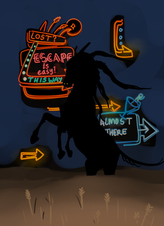
so Blue Sky/Out Of Time... yeah it’s extremely self-explanatory, it’s very obvious what this scene depicts and i’m sure everyone gets it (this is a joke i’ve had multiple people dm me asking wtf this even is). the one element that absolutely NEEDED to be there was the LED digital clock with a bullshit time on it, and i decided to replace it with an AIRE warning sign instead and put the LED readouts in the bg. the warning sign in this setting serves the purpose of informing ppl when there are hostile faeries around. i knew what the colours would be from the beginning, but it took a bit for me to realise what sort of shading style i wanted (it took forever). but i did know i wanted to contrast the very sketchy black void against the cleaner and almost cartoony/comic book style rest of the drawing, to emphasise the fact that the foreground sky and background void are made of two very different things. again i used a colour shifting brush to quickly make all the shards of sky different colours, but originally i planned to have some of the shards be dark or night time (with stars or the moon etc). unfortunately it didn’t work, it was too dark and pascal got lost against it.
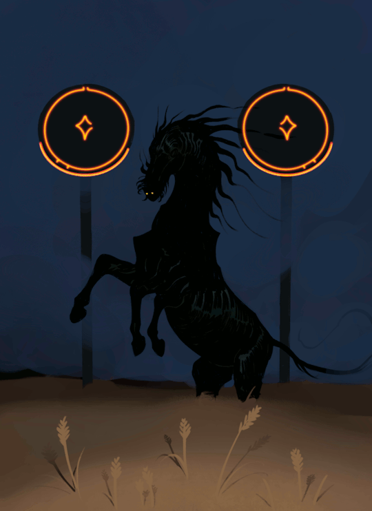
My Eyes Are Up Here is pretty obviously the exact same scene with the same character, in the same field, but with a different sort of atmosphere. i sketched this in sai then did the final in procreate. originally it was going to have a black background

i really like this version tbh but the blue works better. i think he looks good against dark backgrounds where it’s kind of hard to see wtf is even happening there
so about the neon signs..... i’m well aware that the sketch has way more promise than what the final ultimately was, and that’s because i found that i didn’t have the technical or artistic ability to pull off the complex neon signs like i wanted to. i couldn’t get it looking good enough so i had to scrap them. but these signs will be back, i want to draw them properly and do them justice. the gif was unplanned too but i thought it would be fun to have the flicker be very intermittent so that if you scrolled past it you might not even realise, or you’d have to stick with it just to catch it looping. i used GIMP to make the gif and change the frame rate, and this actually took a very long time because i had to preview it over and over. anyway if you WERE to get lost in the púca’s field, in this story, you would see neon signs like this encouraging you to follow them.
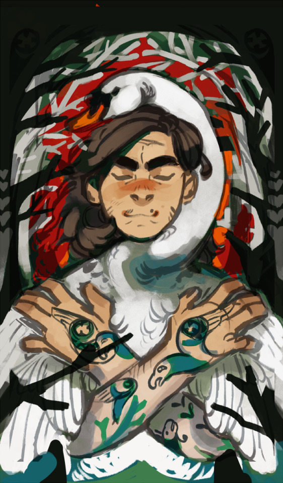
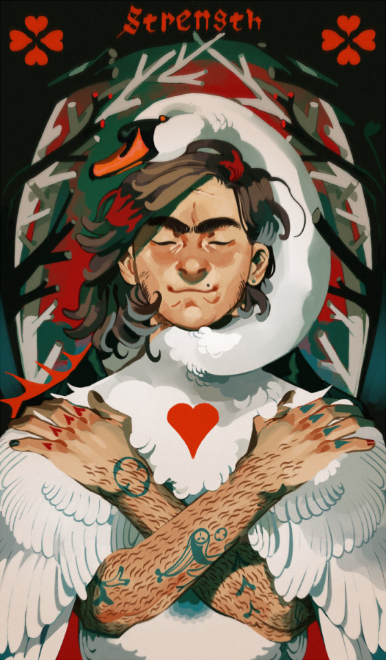
Strength is actually the last drawing i ever made that ended with a paint-over in sai, and the oldest drawing here. as such i actually don’t think it’s representative of my current ability but i do have a soft spot for it for sentimental reasons lol. the reason for the paint-over in sai was because i drew this at a time when i still did not trust procreate to be able to place the level of finish on it that i wanted
the background took me a thousand years to figure out. literally it was so annoying that i considered scrapping it for something simpler. but the idea was for it to be a kind of fairytale-ish lost in the woods sort of look while also appearing like the blood vessels around the human heart. the branches were also supposed to be heart-shaped in cross-section but i spent so long zoomed in painting them that i forgot to zoom out to see if all those fine details were actually visible, and it turned out they weren’t. i was disappointed that i couldn’t get félix’s tattoos to look right but that’s what i get for making a character with shit tons of both tattoos and body hair. i also got rid of the foreground branches really soon because they weren’t adding anything and muddied up the readability of his pose
the swan is from a daemon au and bears no relation to my other swan characters. i just like swans a lot
2K notes
·
View notes
Text
Hello! I got a new sketchbook and I decided to try it by drawing a Danny with my markers. I might try doing something with gouache too, because I honestly really enjoy the process and the look of painting with it.

I also have some things to ramble about under the line, which isn't strictly dp related, more so me comparing how I work with different mediums and being a little analytical about it, you know, as a treat to my brain because it needs it. •^•
So, to start with the Danny above, it's nothing overly ambitious, I was just vibing, but I think it looks nice. Here's the thing though, it looks weird to me, and the reason, probably, is that the process I use with the previously mentioned gouache doesn't translate well to markers.
Here's the process in question btw, a smol sketch to illustrate the way I work with paint but with markers:


See, that's a process that's clearly a bit more suited to painting imo. So it looks good but a little off with markers. And it's not just to markers. Here's what I mean:
This is digital. With the same process.
It's even weirder than the markers imo, but you can still tell that there's a process going on that's shared.
And the gouache version of this process looks like this: this is my most recent painting ( literally yesterday )
This was done in flat brush, and I think you can clearly see that the process I used across all these paintings started with my gouache work. Which also might be why Danny looks a bit different than them because I had to adjust my process. Rather than starting with colouring my canvas and starting the face with a contrasting colour, both Danny, and as far as I can remember the digital dude, started blank and I had to do the glow effect thing a lot less naturally - especially with the lack of brush strokes. The scratchiness of them is aesthetic. Like, brush stroke and direction is important guys, it adds a lot.
I think if I try to draw this Danny in gouache and explain my process better this would all make sense, but I haven't had the time to get back into art because of uni, and I rather like to. I especially want to try doing digital art again, but I've been doing it so rarely that I haven't really got a process anymore, so I'm a bit intimidated to do anything but portraits.
In any case, if anybody has good Sai brushes that could help me get that painterly vibe there, I'd be very grateful •^•
I want to start drawing and creating things for the Phandom again, but all I have currently are sketches, which I know aren't traditionally the easiest things to interact with visually, especially without colour. Still, I'm just going to share things I make and vibe, I suppose.
I have some interesting designs I'd like to try to make digitally, like that mermaid lady ghost from a while back, and her sister who I decided was Pariah Dark's fabulous ex. Still not sure on Queen's design, but I just want to draw a regal lady.
Yes, I am dumping previous designs here so I can share them again, partly to remind myself of them without scrolling back my Tumblr for a thousand years.
Also my Bois, the clones, who I still want to write into a story and don't know how, but like - I love them and want to show them to more people.
Well, that's all for now. Hope you all have a good day. •^•>💚💜💚
#danny phantom#dp fanart#dp art#phanart#danny phantom art#ft.my art rambles#and also my other art because i went crazy thinking about#the difference medium can have on an artist's process#like legit#my guys#try it#if you're an artist try this experiment#use the process you have on digital with trad and vice versa
110 notes
·
View notes
Text
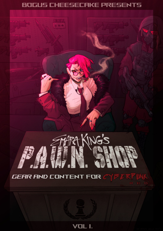
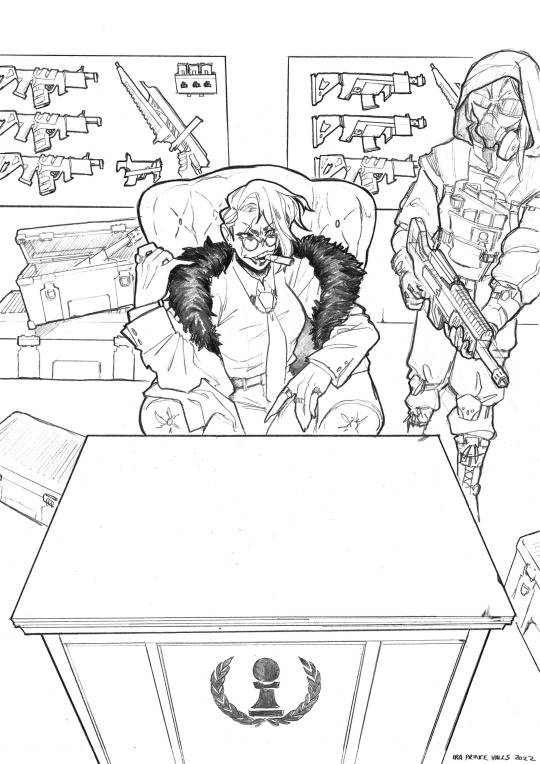
TIME FOR A PROCESS POST let's talk abt getting from this (client sketch - which, btw, i know other artists have talked about this plenty, but i LOOOOOOVE a client sketch as early direction on a commission. LOVE it)
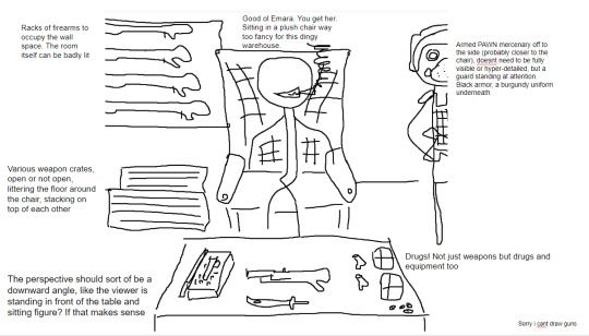
to this!
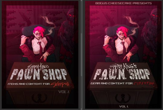
at first we didn't know if the title was going to go across the desk, or over the central figure (emara's) head against the back wall. so there was a 1st version where we were favoring a higher title, then we started favoring the desk so we scrapped the clutter + centered it more

i used clip studio's 3D models (particularly for the chair, guard, + weapon crates) and perspective rulers to help with laying everything out at this stage, tho i abandoned the 3D pretty early on bc it's a bit too clunky for me. maybe i'll find it quicker to use w more practice!
(the rest under the cut!)
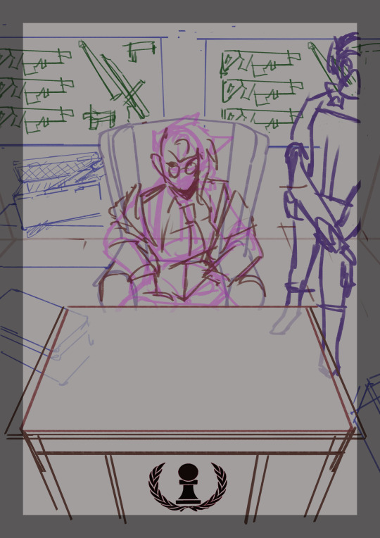
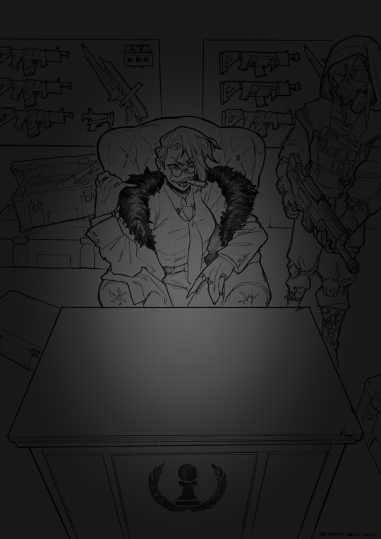
once the basic layout was approved, i threw together a value study to explain how in the final image all the clutter of the bg detail would be unified and pushed back. lately i find myself thinking abt value earlier + earlier in the process; planning ahead saves me a lot of time!
i fiddled with starting to refine things digitally, but then i got A BRAND NEW LIGHTBOX delivered in the mail with perfect timing (lmao) so i just ended up printing off the digital sketch, finalizing in pencil, + scanning back in

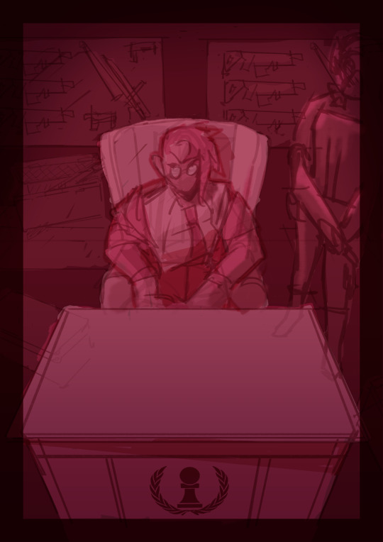
then comes five billion different steps of locking in values, again. i did everything greyscale first, but i didn't worry abt getting things super polished at this stage bc i knew color would factor in a lot to later decisions

this is the point at which presenting these wips "step by step" is kind of misleading; i didn't do these stages one at a time, but rather had a BUNCH of different lighting/shading layers that i kept toggling on and off as i worked to make sure everything was coming along well.
(to get some of these caps i actually went into the main file again and turned a bunch of stuff on/off just for the sake of getting specific examples, because actually when i was actively working on it there was rarely a point where i was actually working on something with "all lighting turned off and just the shading on," or anything like that; but i AM interested in showing what effects different lighting/shading changes had on the base colors, even if i wasn't really making these changes in a rigid order.)
i.e., just for the sake of interest, here's how the flat colors look without those adjustments!! but i honestly never looked at it like this on its own for long...i had all the shading/lighting turned off so i could see what i was doing while flatting, but i was constantly checking back and forth.
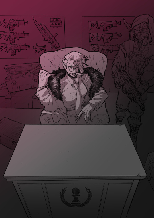
then tones added on top (which were actually just two copies of the tone folders in the above posts, set to linear burn and overlay) -
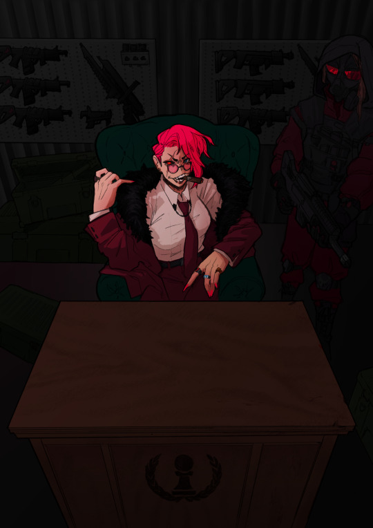
which makes it get HORRIFYINGLY dark, but that's when we go in and add a bunch of lighting adjustments.

the most obvious lighting change above is the big burst of hot pink light from the corner, but there was also some masked overlay + burn layers to pop out the guard + emara and make sure they were pulled out from the bg. if this were a standalone illustration, i maybe would have let the bg (and all that painstakingly drawn detail..........) stand out a little more, but a cover functions differently, and i wanted to make sure the eye goes to the title first. that means sacrificing bg detail even if it looks sick lol
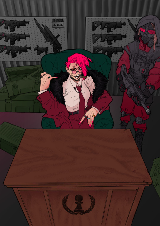
then final touches! a lot of my very last touches are things that are close to invisible; gradient maps on very low opacity, noise, a little bit of scribbling on upper layers. the typesetting was all by the client, except for the lettering for "emara king's," which i did myself!
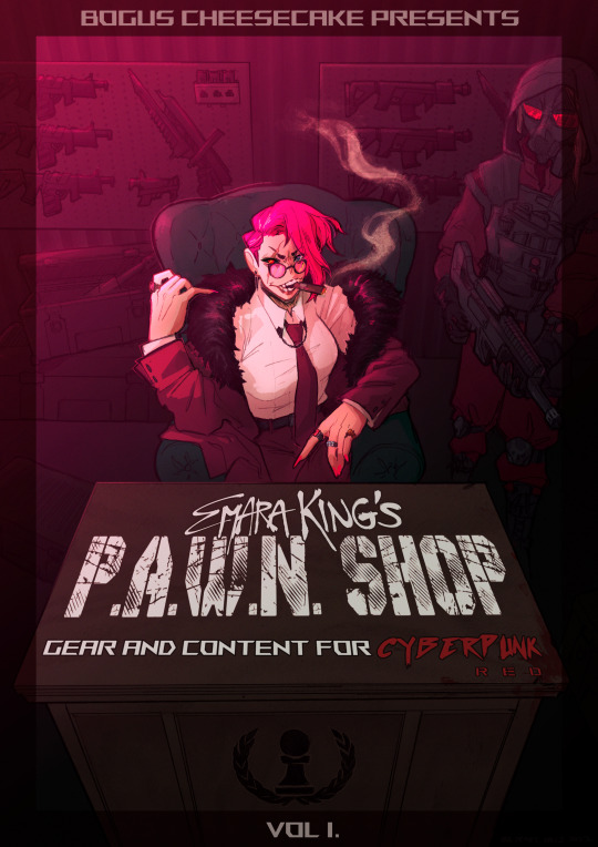
finally, here's a comparison of ⬅where i left off one night close to the deadline thinking "it's probably done, but i'll sleep on it just in case," then all the adjustments i made the next day with fresh eyes.➡ and that's it!!! phew!!! that's how i make a cover!
#my art#process#wip#tutorials#<- not really but. i just figure someone browsing my tutorials tag might be into this#i am so so so so so fucking mad that i didnt think to turn timelapse recording on for this#bc a timelapse wouldve been so fucking sick. but i can at least share this
596 notes
·
View notes
Note
Hi! I absolutely adore your art and I wanted to ask if you had any tips/advice on how to get lineart in facial expressions right? You always nail it and I struggle everytime even if the sketch looks good :')
Thank you so much!
HM! This is tricky- and kind of two questions, so I’ll answer it in parts. I think getting the essence of a sketch across perfectly into lineart is impossible and I rarely manage it, even if the result looks good, it’s still USUALLY different. Often I don’t do a real sketch and it means my lineart is more lively, because it’s got the energy of a first try instead of a stiff copy over a sketch? (though, I’m not certain I’d consider that ‘lineart’ as opposed to sketches in a solid pen?)
I feel like kind of a bastard showing this first one haha, you can be assured there were a number of undo's.

You can see that my lines are never really the same as the sketch, and I know a lot of artists myself included leave some of the thinking for the ink stage. However, some are really really tight in the sketch stage, and I think if you aren't confident with putting down solid lines then that way might work better. It depends though, and digital art has an undo, so.

I definitely gained line confidence through drawing straight in pen into my sketchbook, I like drawing expressions from ref over and over until they feel right lmao. (idk if this is good advice for all the time sketchbooking though, it definitely makes me less likely to try new poses or expressions from imagination because I can't erase)
--------
Some general things to consider- is your sketch fuzzy, is your eye reading a lot of loose lines as having potential- and dimension, and then narrowing it down to One Line flattens the finished version?
Is your brush the same size, are you drawing in something thicker and losing the vibes because the lineart is thinner? Same vice-versa, are you losing detail because the lineart is thicker than the sketch?
Facial expression wise…I feel like choosing where to draw the lines is tricky and you have to really learn which ones work well with the opacity of a sketch, and Dont work well in a solid line.
Here’s a terrifying example LOL. Outlining everything on a face vs choosing which lines I think sell the expression. (The teeth are extreme but…) Often I put full cheek creases on just one side even if I know they would be on both, and just hint at the other side. It’s often a darker crease on the side furthest away anyway, so it works pretty good.
I honestly only learned to ink in the last few years and it's been a struggle to go against my painting roots haha, I’m sure other more experienced artists have better tips than me!
115 notes
·
View notes
Note
Hi! I made an account just so I could follow your work. Your art is brilliant and honestly and inspiration to where I want to be. I’m an older artist who has all the anxiety when it comes to improving my process. I’m trying to get into digital portraits and I have so many ideas in my head, but it’s frustrating because I’m not where I want to be to make this happen. What are some tricks that help you/software do you use? Of course, you don’t have to share anything that makes you uncomfortable. I currently have procreate and an iPad, but I feel a little lost. Wondering if I need a different writing tablet and photoshop. Not sure. I just eventually want to find that 3D, but also artistic look you are able to achieve.
hey there! thank you so much!!
ultimately, I will sound like a broken record but I always recommend you sign up for local figure drawing or painting classes. have people pose for you at home and sketch with charcoal and paper. go to the zoo and sit down in front on an exhibit for an hour and try to draw the animals in front of you as fast as you can and fill a couple of pages, move on to a new exhibit and do it again!
nothing is more powerful of a tool to learn than whatever writing utensil you have in your purse and the back of a napkin when you see something you'd like to capture. I've spent quite frankly my entire rememberable life doing this. I used to spend every single day in middle school/high school/my brief failed stint in community college with a pack of cheap sharpies and a beat up binder full of old worksheets and homework to draw on the backs of.
drawing/painting from life will teach you better than anything.
I use a very outdated version of Photoshop, and only got a "nice" tablet in the past 7 months.
Also, a huge tip to you and anyone else reading this: do NOT get too focused on a "style" that you want. Obsessing over that just ruined me for years and years. I wanted so, so, so badly to be the next Matsuri Hino when I was a kid. I copied her work religiously and it NEVER looked right. Frustrated me to no end. And you know why my stuff never looked like hers? Because I'm not her! You can't force your art to come out any way that isn't natural, and the sooner you can accept the art your hand wants to create, the happier you'll be and the easier art will get for you.
The past couple of years before I started diving into this more realism based work, I was just shoving myself through trying to make what art I envied of others. Very stylized/textured watercolor comic book style stuff. And I just was NOT getting any better at it. I have always been more inclined toward realism work, but I've hated it and yearned for stylized work. Yoshitaka Amano? God, I just drooled over that artstyle and beat myself up for never being able to capture it in studies or otherwise.
I finally essentially restructured my entire career around making the art that makes me happy instead of what I "wanted" it to look like. I was extremely depressed, my life was falling apart, and I still needed to make art to survive but I couldn't "art" if I was depressed and hated doing it, so I just had to step back and stop worrying so much about what I thought I wanted to make, and started making what felt most natural.
there's no easy way, and art can be a soul destroying path at times, truly. your software and hardware should come very last place compared to practicing from life (it doesn't matter if you want to paint cartoony stuff of realistic stuff, always start from life). naturally you will find what makes your heart sing the most.
I get a lot of messages from people telling me similar stuff "oh your art is EXACTLY what I want to do!" but I promise you that kind of thought process is chasing a dragon that is likely to harm or drag your creative process down. art style is such a deeply personal thing, so of COURSE it's important to find inspiration, but the second looking at someone else's artwork stops inspiring you and starts frustrating you, put it away.
There are some artists who I love, that I do not check up on often because their artwork ignites, like, serious bitter jealousy in me. It's the truth. I get so mad at myself for not being more like them, and it's such a poison. I think more artists should be transparent about this feeling because I KNOW the art community has a lot of jealousy and ugliness in it.
A fact of being an artist is that you will never be completely happy with a piece you make. You are always going to see the flaws, and that doesn't change whether you'd been drawing for 2 months or 20 years. Occasionally, you will get one piece that you are like "how did I make that???" and then get frustrated that you can't recreate it lol! It's a tough beast.
It's just really important to step back and work on yourself and where you are at, because at the end of the day, the way your soul wants to express artwork might be WILDLY different from what your brain wants, and it can be really detrimental to let those two go to war.
I hope this helps. I'm very passionate about this, and when I started out I ALWAYS ignored the artists who gave the same exact tips as above. I thought they were so annoying and unhelpful, but now I /get it/.
60 notes
·
View notes
Note
Hiya! Hope this message finds u well :3 I absolutely love your art; found you from insta! Quick question also; I’m not sure if you’ve answered this before, but which brushes do you use for ur digital art? I love the textures they’re so crunchy (endearing)!! Have a lovely day!! :D
hello!! here's a little brush tour ft. this half rendered martin.
also, a great app for ipad artists who really want to dig into texture is art set 4. i swear by it and i've been using it for about two years. none of my more recent art uses it, but that's just because i'm experimenting with my process rn
so here's a list of my most used brushes lately, and there will be links to all of them at the bottom of this post.
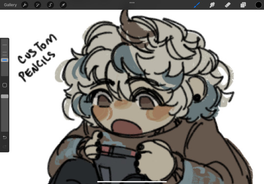
the two labeled "custom pencil" are both my own personal modified pencils (both sourced from the 6b pencil) but the narinder pencil and the vanilla 6b pencil are both very similar to them. i use these two for sketching and flat color specifically, and if you do specifically want these two brushes then i'd be happy to upload them somewhere for you to download, but they're not really necessary for texture
i also use G&B halftone brushes sometimes! but i greatly prefer the RSCO sample pack, and i cannot find the link to the G&B brushes no matter how hard i google, and pretty much any halftone brush set will do the same job
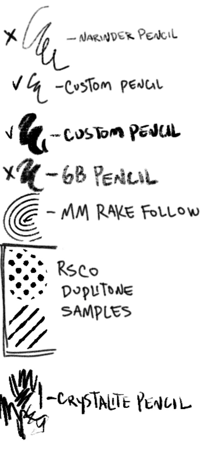
and here's what they look like in practice!
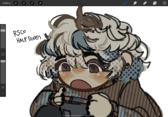
(i like to set these halftones to color burn. color burn is my most used blending mode, even for shading)
and then i hit "copy all," paste, and duplicate it. so you should have two layers of just your entire canvas. then import a paper texture
i'm partial to the set i'll link down below, my favorite is #5. you should absolutely check out the rest of the free texture packs on their website if you're wanting to diversify your texture process btw, all of their stuff is fantastic.
to use that texture, your layers should look like this!
on the layer set to the linear burn, i also like to go into the adjustments menu and bump up the brightness until all of the colors are at similar values to what they were before. and the normal layer on top is just to control the intensity/opacity of the paper texture!
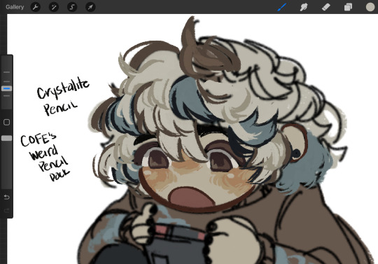
after all of that, sometimes i'll go in with brushes like MM rake follow, or more from COFE's weird pencils, on top of all of those layers for finishing touches.
definitely play around with it, try new free brushes all of the time (i heavily recommended subscribing to Manero. they have a lot of free stuff and it's all fantastic) and see what works for you <3
here are the links to the brushes in this post, as well as some extras! some of them are paid and some of them are completely free. + it wasn't mentioned here, but i use the tatyworks linen fabric brush for blending! for any of the paid brushes, i'll try to link some free alternatives
paid brushes:
alternatives to paid brushes:
free brushes:
extra goodies:
#procreate art#procreate brushes#art tutorial#artists on tumblr#digital art#digital artist#art recommendations#art resources
40 notes
·
View notes
Note
I’m not sure if you’ve answered this before, but how do you do you pages? Do you use one program or several? I wanna use the format but I’m baffled XD
It’s so good! Also Pinemorant FTW!!🏳️🌈
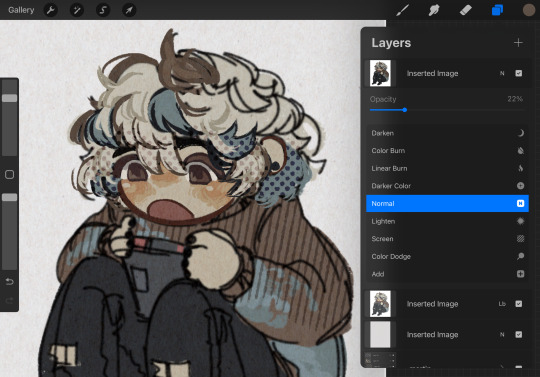
I've briefly discussed my process in making issues, but I can go through the whole thing for anyone who is interested in making a comic like this. It's not complicated at all - I only use one program (technically two, if you count Google Docs), Medibang Paint Pro. It's free to download and I've used it for years, it's a medium-level digital art program.
I'll take a page from the last issue, 26, to demonstrate. So if you haven't read it yet, do that before reading this.
My first step, which is already completed for every issue, is to write a basic summary of the things I want to happen. If I have a specific dialogue I want to use I'll include, but normally it's just descriptions.
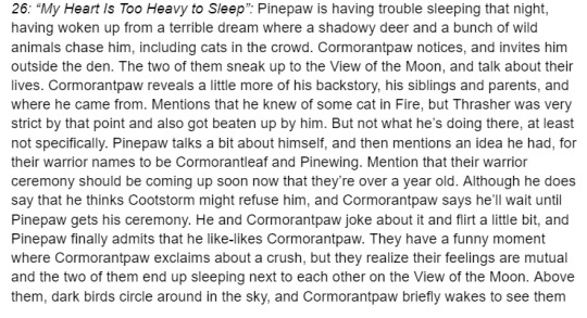
I don't always use everything from my summary, or I'll add things in the final written draft. You may notice a line about "he knew of some cat in Fire", which was about Cormorantpaw knowing of Rainhaze but not actually who he was. I took it out because I couldn't seamlessly work it into the conversation.
2. The stories themselves are written in Google Docs, in the format of any short fiction. My process is pretty short - I'll write out a rough draft, leave it alone for a day, then come back and clean it up. Here's the section from the page I'm showing.
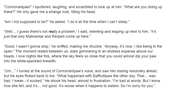
If I use speech bubbles on a page, like this one, sometimes there will be descriptive language in the story that's not in the page, like "I said, relenting and leaping up next to him."
3. My first compositing step is to lay down the text and sketches, so I know where everything goes and ensures the page flows nicely. Medibang has a feature called the "Text Tool", which is what I use to lay down text. I can't say my fonts exactly since they're mostly Korean characters, but they're part of the default Medibang font set.
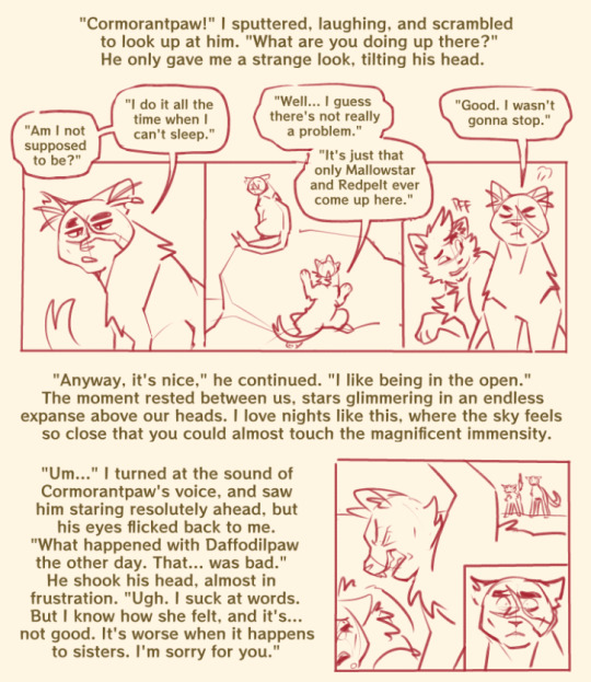
4. After this, I add lines and colors. It's pretty simple.
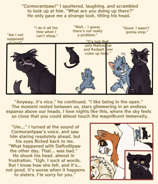
I have a specific color scheme for borderlines; black is normal, present drawings, reddish-pink is flashback, blue is fantasy/imagination.
5. After color, I draw the backgrounds. All of my backgrounds are painted using the Pen brush and the Watercolor (Wet) brush, sometimes with Acrylic or Chalk for texture.

6. My final step is to add a gradient multiply and overlay layer, since I don't cell shade or paint shade the characters. It saves a lot of time! I also add final cleanup like sound effects, whiskers, and speech bubbles, if they're needed.
And that's a page done!
115 notes
·
View notes
Note
for a while since i got into transformers 3 years ago and i loved the franchies instiantly even since i was a kid especially the designs of transformers and Seeing fan arts and fan Designs and fans make thire own continuity made me me want to start learning to draw when im ready but i don't know how to draw cybertronians so do you have any tips and advices for someone who want to learn to draw transformers characters both Traditional & digital art?
Biggest advice I can give is: "Break a character apart into simple components!"
Drawing bots is honestly not that difficult, I find it much easier than people because you can more easily break a character apart into simplified blocks.
When it comes to designing characters it can take a few times to get one you're happy with so doing lots of basic sketches can help. References are always useful too! Every artist uses references.
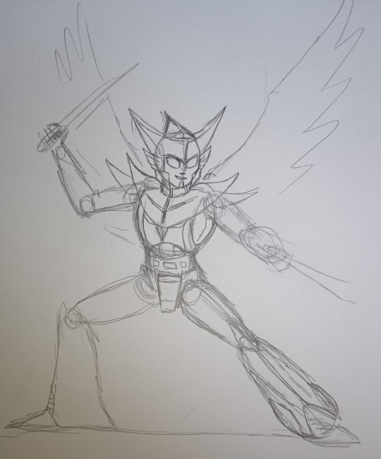
Here's how I do it (In this case I'm doing an alt design for tfe Nightshade):
(It's not a definitive guide as you kinda have to figure out what works best for you both in terms of technique and art style. I'm aware my art style is definitely not for everyone, as it veers more on the cartoony side. I've had comments about how my faces all look effed up etc XD)
Initial sketch

Break a bot down into basic shapes, circles and sausage shapes for more rounded characters and boxes for squarer ones. I normally start with the head and draw the rest of the body down from it (torso and arms then legs then any back kibble that might be visible) Think of it like the protoform beneath the armour.
To help with figuring out a pose I'll often use my toys. It can help you visualise where their arms and legs etc go along with whether part of a bot is actually visible from a certain angle. For example in this case:

(Yes that's my cat chilling in the background)
This can help you to figure out if a certain design can pull a given pose, for example would a bot with kibble on their hips or arms be able to move their legs or arms a certain way. I used POTP Elita one as a reference for my SG Megatron a lot for example as they've got very similar builds. But this is not essential.
(There are mannequin apps on mobiles etc. you can use to help with pose references too, and image searches are always useful for references.)
For more dynamic poses it helps to think about how the character is moving, so add a curve to the torso/spine to add to any implied motion etc.
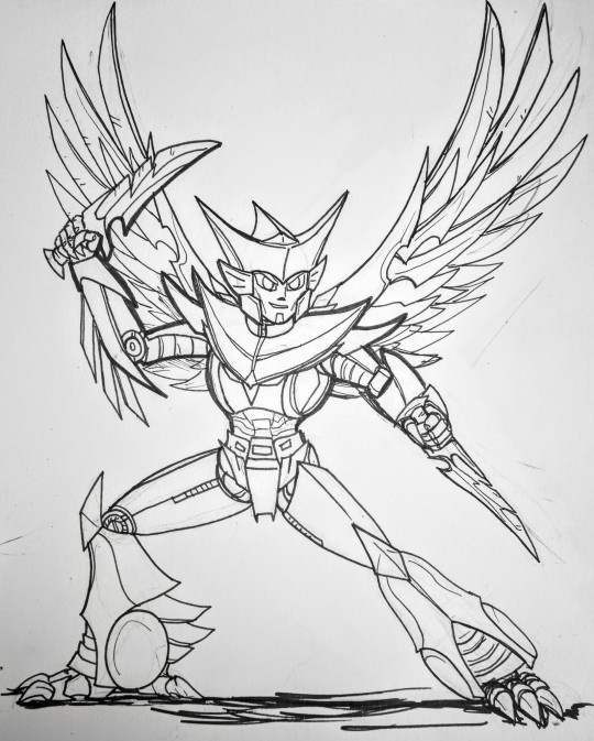
Details
Once I'm happy with the basic shape and pose I typically add the armour over the top. Again the head is usually the first bit I do. You can see I got a bit lazy with their left hand and just did a scribble here XD
Inking

Normally when inking I do the edges of each armour piece first then add any details on afterwards in a finer pen. Generally I'll do one body part at the time eg. fully ink the arm before doing the head etc. Its best to make sure you do parts that are in front first!
Here's the finished picture:
Though it'll need some digital cleaning up at another time.
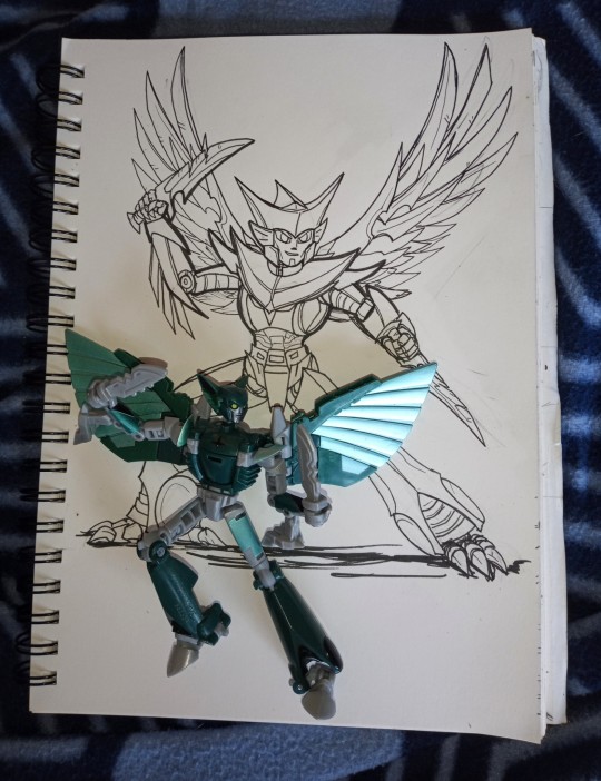
As for digital art...
I can't really give much advice on starting a drawing digitally as I never quite got the hang of it (colouring and corrections I do digitally but all my line art is traditional), I need the feedback of a pen in my hand and pressure on the paper to get it right.
These days the Hardware I mainly use is a refurbished huion art tablet (it was about £120 when I bought it) that's probably the cheapest your going to find a graphics tablet with a screen. BUT it's really not essential to get one especially if you're just starting out. Basic graphic tablets without a screen (just a pen and a pad) are much cheaper or you can use a mouse. I used a mouse for ages when I was first starting out.
In terms of software, for colouring and edits on the PC I use GIMP (I've been using it since like 2009 so I'm not really going to change any time soon!). It's freeware software and can do a lot of stuff, but it's user interface isn't the most user friendly especially if you're not familiar with graphics software but there are plenty of tutorials available for it. I'll try to remember to make a post showing how I use that another time :) as I'm not at my computer at the moment.
There are plenty of alternative image manipulation/graphics software to use as well, some free, some free but with ads, and some paid for (either one off payment or subscription). It's best to see what other artists have to say about them though as I've never really used them!
#my asks#my ask box#fan art#art stuff#how i draw#my ask is open#ask me stuff#nightshade#transformers nightshade#earthspark#transformers Earthspark#tfe#tfes#nightshade malto
45 notes
·
View notes
Note
Hey, what pens do you use to draw? And do you start with a pencil sketch before you start using the pen or do you jump right into using ink?
Hey! I use all kinds of pens actually: gel pens and fountain pens most often. I've written about my favorite gel pens some time ago, btw. Recently I've started using oil-based ballpoint pens a lot though, both for sketching and doing cleaner line art. It's a bit tricky, because they don't work well with alcohol-based markers, but I think I'm starting to get used to it. I love how the lines they produce look softer, similar to pencils, so it's very easy to do a colorful lineart with smooth gradation.
Normally I do a rough sketch of the basic shapes with a light colored marker or oil/gel pen, rarely pencil. I don't like using pencils at all tbh, so I try to avoid it as much as possible. If it's something complex and I'm not sure I can handle this w/o lots of erasing, I prefer doing a rough sketch either on a separate piece of paper with a pen or digitally, and then transfer it into the sketchbook/other paper through light table. I hope someday I'll be able to jump right into drawing with ink and not regretting every single line I do, but it's a loooong way to go from now 😅
For fun, here are some sketches/lines I have left done with different mediums: 1 is colored pencils + fountain pen, 2 - markers + gel pen, 3 - oil-based ballpoint pens.
Warning: unedited scans!
146 notes
·
View notes
Note
Hi! I have a random question about your art, if you don't mind!
How do you go from your sketches with all the construction lines to the cleaned up finished drawing? Are you using a light table to transfer the piece onto new paper?
I really love your art btw it's always such a treat to look at!!
I absolutely don't mind! I love getting asks about my process, I'm delighted that you're curious enough to ask so I'll try to not over-explain too much.


To keep from screaming and pulling out what's left of my hair and lose track of what my lines are doing, my construction lines are always color coded with Col-Erase based on background, character and the gear and props they wear. Not unlike how plenty of digital artists will color code their layers (and I'll probably end up doing that when I dive more into digital myself).

After I've added the pencils over the construction lines, if it's complex enough I'll often have to give it a second pass with pen just to make sure everything is clear, and do as much erasing as I can. Then once this is done, THEN it's transfer time. I have to do this extra prep because otherwise my lines by this time are so muddy and impossible for even me to read what the hell is going on with them.
To directly answer the second part of your question, I do the lion's share of my transferring via lightbox yes. (a very nice Huion model in fact that I can adjust the brightness with, and the work area is quite large). I love my lightbox, it's probably one of my favorite tools in my traditional artist arsenal. The amount of freedom I have with being able to manipulate elements of the piece (like how you'd manipulate layers and lines in digital art) is pretty huge for my process. Seriously for anyone reading this if you do any kind of analog and you don't have one I HIGHLY recommend having some kind of lightbox even a cheap one, they come in thin and very portable LED varieties now, it did wonders for me years ago when I made the switch.
Sometimes though, if I have the final art transferred on thicker paper (anything that's over 90lbs/147gsm) or on most colored paper I have to use graphite transfer paper instead. I have the graphite stuff for light paper, and for darker paper I have white transfer paper instead so that the transfer lines are bright.
Once again, thank you for the ask and the interest! I do hope it wasn't too long winded. And thank you so much for the kind words, it means more than I can coherently express.
21 notes
·
View notes
Last Seen Blogs

offtothedoctor
Off to the Doctor, sorry
offtothedoctor
Off to the Doctor, sorry
bowserchap
Random Opinions From A Cranky Nerd
wccknd
+

rubbercache
RubberCache