#architectural guide
Text
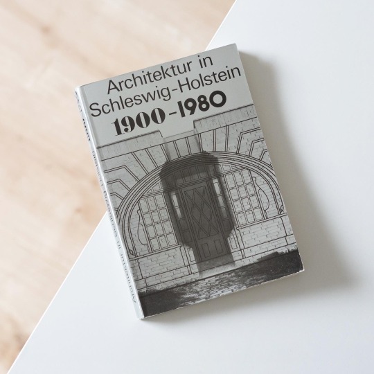
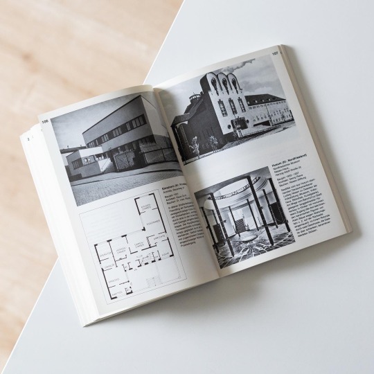
Germany’s northernmost Federal State Schleswig-Holstein to this day plays a rather peripheral role in modern architectural history, mainly due to the fact that the progressive developments of the 20th century haven’t gained a strong foothold in the largely agrarian and small-city setting of the territorial state. But on closer inspection it is possible to dig up local examples of exceptional architectural quality that demonstrate the architects’ ability to align tradition with modernity: one such example is Rudolf Schroeder’s work in Kiel, the state capital, who combined traditional brickwork with modern forms in a range of public buildings and schools before and after WWII. Due to its long history and easy availability the brick remained a staple in Schleswig-Holstein‘s architecture that during the interwar years inspired a number of very interesting buildings in the style of a restrained Brick Expressionism: although not as highly expressive and dramatic as e.g. its counterparts in the City of Hamburg local architects attuned expressive brick forms to existing contexts in a masterful and creative manner. From the 1960s onwards brick lost in importance and gave way to a modern architecture very much in tune with the overall stylistic developments in Germany.
In the present architectural guide, edited by Hartwig Beseler and published by Wachholtz in 1980, the progress of architecture in Schleswig-Holstein is illustrated by means of countless exemplary buildings built between 1900 and 1980. Each building is presented in a brief text, a plan and one or more photographs, a traditional but handy layout. Although the ravages of time might have is likely to have gnawed on the postwar buildings included the book nonetheless is a convenient vade mecum for architectural explorations in Schleswig-Holstein and a nice addition to my already large collection of architectural guides.
48 notes
·
View notes
Text
Fantasy Guide to Interiors

As a followup to the very popular post on architecture, I decided to add onto it by exploring the interior of each movement and the different design techniques and tastes of each era. This post at be helpful for historical fiction, fantasy or just a long read when you're bored.
Interior Design Terms
Reeding and fluting: Fluting is a technique that consists a continuous pattern of concave grooves in a flat surface across a surface. Reeding is it's opposite.
Embossing: stamping, carving or moulding a symbol to make it stand out on a surface.
Paneling: Panels of carved wood or fabric a fixed to a wall in a continuous pattern.
Gilding: the use of gold to highlight features.
Glazed Tile: Ceramic or porcelain tiles coated with liquid coloured glass or enamel.
Column: A column is a pillar of stone or wood built to support a ceiling. We will see more of columns later on.
Bay Window: The Bay Window is a window projecting outward from a building.
Frescos: A design element of painting images upon wet plaster.
Mosaic: Mosaics are a design element that involves using pieces of coloured glass and fitted them together upon the floor or wall to form images.
Mouldings: ornate strips of carved wood along the top of a wall.
Wainscoting: paneling along the lower portion of a wall.
Chinoiserie: A European take on East Asian art. Usually seen in wallpaper.
Clerestory: A series of eye-level windows.
Sconces: A light fixture supported on a wall.
Niche: A sunken area within a wall.
Monochromatic: Focusing on a single colour within a scheme.
Ceiling rose: A moulding fashioned on the ceiling in the shape of a rose usually supporting a light fixture.
Baluster: the vertical bars of a railing.
Façade: front portion of a building
Lintel: Top of a door or window.
Portico: a covered structure over a door supported by columns
Eaves: the part of the roof overhanging from the building
Skirting: border around lower length of a wall
Ancient Greece
Houses were made of either sun-dried clay bricks or stone which were painted when they dried. Ground floors were decorated with coloured stones and tiles called Mosaics. Upper level floors were made from wood. Homes were furnished with tapestries and furniture, and in grand homes statues and grand altars would be found. Furniture was very skillfully crafted in Ancient Greece, much attention was paid to the carving and decoration of such things. Of course, Ancient Greece is ancient so I won't be going through all the movements but I will talk a little about columns.
Doric: Doric is the oldest of the orders and some argue it is the simplest. The columns of this style are set close together, without bases and carved with concave curves called flutes. The capitals (the top of the column) are plain often built with a curve at the base called an echinus and are topped by a square at the apex called an abacus. The entablature is marked by frieze of vertical channels/triglyphs. In between the channels would be detail of carved marble. The Parthenon in Athens is your best example of Doric architecture.
Ionic: The Ionic style was used for smaller buildings and the interiors. The columns had twin volutes, scroll-like designs on its capital. Between these scrolls, there was a carved curve known as an egg and in this style the entablature is much narrower and the frieze is thick with carvings. The example of Ionic Architecture is the Temple to Athena Nike at the Athens Acropolis.
Corinthian: The Corinthian style has some similarities with the Ionic order, the bases, entablature and columns almost the same but the capital is more ornate its base, column, and entablature, but its capital is far more ornate, commonly carved with depictions of acanthus leaves. The style was more slender than the others on this list, used less for bearing weight but more for decoration. Corinthian style can be found along the top levels of the Colosseum in Rome.
Tuscan: The Tuscan order shares much with the Doric order, but the columns are un-fluted and smooth. The entablature is far simpler, formed without triglyphs or guttae. The columns are capped with round capitals.
Composite: This style is mixed. It features the volutes of the Ionic order and the capitals of the Corinthian order. The volutes are larger in these columns and often more ornate. The column's capital is rather plain. for the capital, with no consistent differences to that above or below the capital.
Ancient Rome
Rome is well known for its outward architectural styles. However the Romans did know how to add that rizz to the interior. Ceilings were either vaulted or made from exploded beams that could be painted. The Romans were big into design. Moasics were a common interior sight, the use of little pieces of coloured glass or stone to create a larger image. Frescoes were used to add colour to the home, depicting mythical figures and beasts and also different textures such as stonework or brick. The Romans loved their furniture. Dining tables were low and the Romans ate on couches. Weaving was a popular pastime so there would be tapestries and wall hangings in the house. Rich households could even afford to import fine rugs from across the Empire. Glass was also a feature in Roman interior but windows were usually not paned as large panes were hard to make. Doors were usually treated with panels that were carved or in lain with bronze.
Ancient Egypt
Egypt was one of the first great civilisations, known for its immense and grand structures. Wealthy Egyptians had grand homes. The walls were painted or plastered usually with bright colours and hues. The Egyptians are cool because they mapped out their buildings in such a way to adhere to astrological movements meaning on special days if the calendar the temple or monuments were in the right place always. The columns of Egyptian where thicker, more bulbous and often had capitals shaped like bundles of papyrus reeds. Woven mats and tapestries were popular decor. Motifs from the river such as palms, papyrus and reeds were popular symbols used.
Ancient Africa
African Architecture is a very mixed bag and more structurally different and impressive than Hollywood would have you believe. Far beyond the common depictions of primitive buildings, the African nations were among the giants of their time in architecture, no style quite the same as the last but just as breathtaking.
Rwandan Architecture: The Rwandans commonly built of hardened clay with thatched roofs of dried grass or reeds. Mats of woven reeds carpeted the floors of royal abodes. These residences folded about a large public area known as a karubanda and were often so large that they became almost like a maze, connecting different chambers/huts of all kinds of uses be they residential or for other purposes.
Ashanti Architecture: The Ashanti style can be found in present day Ghana. The style incorporates walls of plaster formed of mud and designed with bright paint and buildings with a courtyard at the heart, not unlike another examples on this post. The Ashanti also formed their buildings of the favourite method of wattle and daub.
Nubian Architecture: Nubia, in modern day Ethiopia, was home to the Nubians who were one of the world's most impressive architects at the beginning of the architecture world and probably would be more talked about if it weren't for the Egyptians building monuments only up the road. The Nubians were famous for building the speos, tall tower-like spires carved of stone. The Nubians used a variety of materials and skills to build, for example wattle and daub and mudbrick. The Kingdom of Kush, the people who took over the Nubian Empire was a fan of Egyptian works even if they didn't like them very much. The Kushites began building pyramid-like structures such at the sight of Gebel Barkal
Japanese Interiors
Japenese interior design rests upon 7 principles. Kanso (簡素)- Simplicity, Fukinsei (不均整)- Asymmetry, Shizen (自然)- Natural, Shibumi (渋味) – Simple beauty, Yugen (幽玄)- subtle grace, Datsuzoku (脱俗) – freedom from habitual behaviour, Seijaku (静寂)- tranquillity.
Common features of Japanese Interior Design:
Shoji walls: these are the screens you think of when you think of the traditional Japanese homes. They are made of wooden frames, rice paper and used to partition
Tatami: Tatami mats are used within Japanese households to blanket the floors. They were made of rice straw and rush straw, laid down to cushion the floor.
Genkan: The Genkan was a sunken space between the front door and the rest of the house. This area is meant to separate the home from the outside and is where shoes are discarded before entering.
Japanese furniture: often lowest, close to the ground. These include tables and chairs but often tanked are replaced by zabuton, large cushions. Furniture is usually carved of wood in a minimalist design.
Nature: As both the Shinto and Buddhist beliefs are great influences upon architecture, there is a strong presence of nature with the architecture. Wood is used for this reason and natural light is prevalent with in the home. The orientation is meant to reflect the best view of the world.
Islamic World Interior
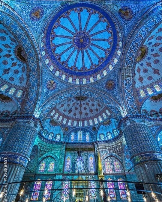
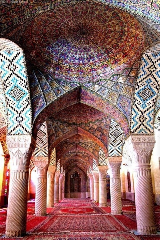
The Islamic world has one of the most beautiful and impressive interior design styles across the world. Colour and detail are absolute staples in the movement. Windows are usually not paned with glass but covered in ornate lattices known as jali. The jali give ventilation, light and privacy to the home. Islamic Interiors are ornate and colourful, using coloured ceramic tiles. The upper parts of walls and ceilings are usually flat decorated with arabesques (foliate ornamentation), while the lower wall areas were usually tiled. Features such as honeycombed ceilings, horseshoe arches, stalactite-fringed arches and stalactite vaults (Muqarnas) are prevalent among many famous Islamic buildings such as the Alhambra and the Blue Mosque.
Byzantine (330/395–1453 A. D)
The Byzantine Empire or Eastern Roman Empire was where eat met west, leading to a melting pot of different interior designs based on early Christian styles and Persian influences. Mosaics are probably what you think of when you think of the Byzantine Empire. Ivory was also a popular feature in the Interiors, with carved ivory or the use of it in inlay. The use of gold as a decorative feature usually by way of repoussé (decorating metals by hammering in the design from the backside of the metal). Fabrics from Persia, heavily embroidered and intricately woven along with silks from afar a field as China, would also be used to upholster furniture or be used as wall hangings. The Byzantines favoured natural light, usually from the use of copolas.
Indian Interiors
India is of course, the font of all intricate designs. India's history is sectioned into many eras but we will focus on a few to give you an idea of prevalent techniques and tastes.
The Gupta Empire (320 – 650 CE): The Gupta era was a time of stone carving. As impressive as the outside of these buildings are, the Interiors are just as amazing. Gupta era buildings featured many details such as ogee (circular or horseshoe arch), gavaksha/chandrashala (the motif centred these arches), ashlar masonry (built of squared stone blocks) with ceilings of plain, flat slabs of stone.
Delhi Sultanate (1206–1526): Another period of beautifully carved stone. The Delhi sultanate had influence from the Islamic world, with heavy uses of mosaics, brackets, intricate mouldings, columns and and hypostyle halls.
Mughal Empire (1526–1857): Stonework was also important on the Mughal Empire. Intricately carved stonework was seen in the pillars, low relief panels depicting nature images and jalis (marble screens). Stonework was also decorated in a stye known as pietra dura/parchin kari with inscriptions and geometric designs using colored stones to create images. Tilework was also popular during this period. Moasic tiles were cut and fitted together to create larger patters while cuerda seca tiles were coloured tiles outlined with black.
Chinese Interiors
Common features of Chinese Interiors
Use of Colours: Colour in Chinese Interior is usually vibrant and bold. Red and Black are are traditional colours, meant to bring luck, happiness, power, knowledge and stability to the household.
Latticework: Lattices are a staple in Chinese interiors most often seen on shutters, screens, doors of cabinets snf even traditional beds.
Lacquer: Multiple coats of lacquer are applied to furniture or cabinets (now walls) and then carved. The skill is called Diaoqi (雕漆).
Decorative Screens: Screens are used to partition off part of a room. They are usually of carved wood, pained with very intricate murals.
Shrines: Spaces were reserved on the home to honour ancestors, usually consisting of an altar where offerings could be made.
Of course, Chinese Interiors are not all the same through the different eras. While some details and techniques were interchangeable through different dynasties, usually a dynasty had a notable style or deviation. These aren't all the dynasties of course but a few interesting examples.
Song Dynasty (960–1279): The Song Dynasty is known for its stonework. Sculpture was an important part of Song Dynasty interior. It was in this period than brick and stone work became the most used material. The Song Dynasty was also known for its very intricate attention to detail, paintings, and used tiles.
Ming Dynasty(1368–1644): Ceilings were adorned with cloisons usually featuring yellow reed work. The floors would be of flagstones usually of deep tones, mostly black. The Ming Dynasty favoured richly coloured silk hangings, tapestries and furnishings. Furniture was usually carved of darker woods, arrayed in a certain way to bring peace to the dwelling.
Han Dynasty (206 BC-220 AD): Interior walls were plastered and painted to show important figures and scenes. Lacquer, though it was discovered earlier, came into greater prominence with better skill in this era.
Tang Dynasty (618–907) : The colour palette is restrained, reserved. But the Tang dynasty is not without it's beauty. Earthenware reached it's peak in this era, many homes would display fine examples as well. The Tang dynasty is famous for its upturned eaves, the ceilings supported by timber columns mounted with metal or stone bases. Glazed tiles were popular in this era, either a fixed to the roof or decorating a screen wall.
Romanesque (6th -11th century/12th)
Romanesque Architecture is a span between the end of Roman Empire to the Gothic style. Taking inspiration from the Roman and Byzantine Empires, the Romanesque period incorporates many of the styles. The most common details are carved floral and foliage symbols with the stonework of the Romanesque buildings. Cable mouldings or twisted rope-like carvings would have framed doorways. As per the name, Romansque Interiors relied heavily on its love and admiration for Rome. The Romanesque style uses geometric shapes as statements using curves, circles snf arches. The colours would be clean and warm, focusing on minimal ornamentation.
Gothic Architecture (12th Century - 16th Century)
The Gothic style is what you think of when you think of old European cathedrals and probably one of the beautiful of the styles on this list and one of most recognisable. The Gothic style is a dramatic, opposing sight and one of the easiest to describe. Decoration in this era became more ornate, stonework began to sport carving and modelling in a way it did not before. The ceilings moved away from barreled vaults to quadripartite and sexpartite vaulting. Columns slimmed as other supportive structures were invented. Intricate stained glass windows began their popularity here. In Gothic structures, everything is very symmetrical and even.
Mediaeval (500 AD to 1500)
Interiors of mediaeval homes are not quite as drab as Hollywood likes to make out. Building materials may be hidden by plaster in rich homes, sometimes even painted. Floors were either dirt strewn with rushes or flagstones in larger homes. Stonework was popular, especially around fireplaces. Grand homes would be decorated with intricate woodwork, carved heraldic beasts and wall hangings of fine fabrics.
Renaissance (late 1300s-1600s)
The Renaissance was a period of great artistry and splendor. The revival of old styles injected symmetry and colour into the homes. Frescoes were back. Painted mouldings adorned the ceilings and walls. Furniture became more ornate, fixed with luxurious upholstery and fine carvings. Caryatids (pillars in the shape of women), grotesques, Roman and Greek images were used to spruce up the place. Floors began to become more intricate, with coloured stone and marble. Modelled stucco, sgraffiti arabesques (made by cutting lines through a layer of plaster or stucco to reveal an underlayer), and fine wall painting were used in brilliant combinations in the early part of the 16th century.
Tudor Interior (1485-1603)
The Tudor period is a starkly unique style within England and very recognisable. Windows were fixed with lattice work, usually casement. Stained glass was also in in this period, usually depicting figures and heraldic beasts. Rooms would be panelled with wood or plastered. Walls would be adorned with tapestries or embroidered hangings. Windows and furniture would be furnished with fine fabrics such as brocade. Floors would typically be of wood, sometimes strewn with rush matting mixed with fresh herbs and flowers to freshen the room.
Baroque (1600 to 1750)
The Baroque period was a time for splendor and for splashing the cash. The interior of a baroque room was usually intricate, usually of a light palette, featuring a very high ceiling heavy with detail. Furniture would choke the room, ornately carved and stitched with very high quality fabrics. The rooms would be full of art not limited to just paintings but also sculptures of marble or bronze, large intricate mirrors, moldings along the walls which may be heavily gilded, chandeliers and detailed paneling.
Victorian (1837-1901)
We think of the interiors of Victorian homes as dowdy and dark but that isn't true. The Victorians favoured tapestries, intricate rugs, decorated wallpaper, exquisitely furniture, and surprisingly, bright colour. Dyes were more widely available to people of all stations and the Victorians did not want for colour. Patterns and details were usually nature inspired, usually floral or vines. Walls could also be painted to mimic a building material such as wood or marble and most likely painted in rich tones. The Victorians were suckers for furniture, preferring them grandly carved with fine fabric usually embroidered or buttoned. And they did not believe in minimalism. If you could fit another piece of furniture in a room, it was going in there. Floors were almost eclusively wood laid with the previously mentioned rugs. But the Victorians did enjoy tiled floors but restricted them to entrances. The Victorians were quite in touch with their green thumbs so expect a lot of flowers and greenery inside. with various elaborately decorated patterned rugs. And remember, the Victorians loved to display as much wealth as they could. Every shelf, cabinet, case and ledge would be chocked full of ornaments and antiques.
Edwardian/The Gilded Age/Belle Epoque (1880s-1914)
This period (I've lumped them together for simplicity) began to move away from the deep tones and ornate patterns of the Victorian period. Colour became more neutral. Nature still had a place in design. Stained glass began to become popular, especially on lampshades and light fixtures. Embossing started to gain popularity and tile work began to expand from the entrance halls to other parts of the house. Furniture began to move away from dark wood, some families favouring breathable woods like wicker. The rooms would be less cluttered.
Art Deco (1920s-1930s)
The 1920s was a time of buzz and change. Gone were the refined tastes of the pre-war era and now the wow factor was in. Walls were smoother, buildings were sharper and more jagged, doorways and windows were decorated with reeding and fluting. Pastels were in, as was the heavy use of black and white, along with gold. Mirrors and glass were in, injecting light into rooms. Gold, silver, steel and chrome were used in furnishings and decor. Geometric shapes were a favourite design choice. Again, high quality and bold fabrics were used such as animal skins or colourful velvet. It was all a rejection of the Art Noveau movement, away from nature focusing on the man made.
Modernism (1930 - 1965)
Modernism came after the Art Deco movement. Fuss and feathers were out the door and now, practicality was in. Materials used are shown as they are, wood is not painted, metal is not coated. Bright colours were acceptable but neutral palettes were favoured. Interiors were open and favoured large windows. Furniture was practical, for use rather than the ornamentation, featuring plain details of any and geometric shapes. Away from Art Deco, everything is straight, linear and streamlined.
#This took forever#I'm very tired#But enjoy#I covered as much as I could find#Fantasy Guide to interiors#interior design#Architecture#writings#writing resources#Writing reference#Writing advice#Writer's research#writing research#Writer's rescources#Writing help#Mediaeval#Renaissance#Chinese Interiors#Japanese Interiors#Indian interiors#writing#writeblr#writing reference#writing advice#writer#spilled words#writers
3K notes
·
View notes
Text
I always love the Winchester House investigations because Ryan is shooting Ghost Files but Shane is shooting an after dark Architectural Digest tour talking about beautiful hinges, hallways and Queen Anne style houses
#that Hinge really was BEAUTIFUL!!!#i wish there was a guided tour of the architecture of the House :(#Winchester Mystery House Architectural tour by Ghoul Boys when#watcher#ghost files#if i ever go to America i gotta see this house for myself
1K notes
·
View notes
Text
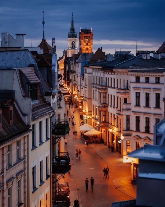
Toruń, Poland by opal.i.chabry
#toruń#torun#poland#europe#travel#architecture#wanderlust#tourism#eurotrip#traveling#travel guide#explore#beautiful places#travel destinations#places to visit#travel blog#travel bucket list#central europe#travelgram#slavic
674 notes
·
View notes
Text
The art of Daniel Danger
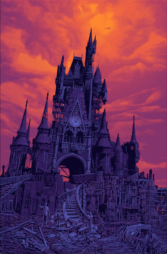
[Image ID: Daniel Danger's art print, 'To all who home to this happy place,' depicting a ruined Disneyland castle in a post-apocalyptic landscape with a statue of Walt and Mickey in the rubble.]
There’s this behavioral economics study that completely changed the way i thought about art, teaching, and critique: it’s a 1993 study called “Introspecting about Reasons can Reduce Post-Choice Satisfaction” by Timothy D Wilson, Douglas J Lisle, Jonathan Schooler, Sara Hodges, Kristen Klaaren and Suzanne LaFleur:
https://www.researchgate.net/publication/240281868_Introspecting_about_Reasons_can_Reduce_Post-Choice_Satisfaction
The experimenters asked subjects to preference-rank some art posters; half the posters were cute cartoony posters, and the other half were fine art posters. One group of subjects assigned a simple numeric rank to the posters, and the other had to rank them and explain their ranking. Once they were done, they got to keep their posters.
There was a stark difference in the two groups’ preferences: the group that had to explain their choices picked the cartoony images, while the group that basically got to point at their favorite and say, “Ooh, I like that!” chose the fine art posters.
Then, months later, the experimenters followed up and asked the subjects what they’d done with the poster they got to take home. The ones who’d had to explain their choices and had brought home cartoony images had thrown those posters away. The ones who didn’t have to explain what they liked about their choice, who’d chosen fine art, had hung them up at home and kept them there.
The implication is that it’s hard to explain what makes art good, and the better art is, the harder it is to put your finger on what makes it so good. More: the obvious, easy-to-articulate virtues of art are the less important virtues. Art’s virtues are easy to spot and hard to explain.
The reason this stuck with me is that I learned to be a writer through writing workshops where we would go around in a circle and explain what we liked and didn’t like about someone’s story, and suggest ways to make it better. I started as a teenager in workshops organized by Judith Merril in Toronto, then through my high-school workshop (which Judy had actually founded a decade-plus earlier through a writer in the schools grant), and then at the Clarion workshop in 1992. I went on to teach many of these workshops: Clarion, Clarion West and Viable Paradise.
So I’ve spent a lot of time trying to explain what was and wasn’t good about other peoples’ art (and my own!), and how to make it better. There’s a kind of checklist to help with this: when a story is falling short in some way, writers roll out these “rules” for what makes for good and bad prose. There are a bunch of these rulesets (think of Strunk & White’s Elements of Style), including some genre-specific ones like the Turkey City Lexicon:
https://www.sfwa.org/2009/06/18/turkey-city-lexicon-a-primer-for-sf-workshops/
A few years ago, I was teaching on the Writing Excuses cruise and a student said something like, “Hey, I know all these rules for writing good stories, but I keep reading these stories I really like and they break the rules. When can I break the rules?”
There’s a stock answer a writing teacher is supposed to give here: “Well, first you have to master the rules, then you can break them. You can’t improvise a jazz solo without first learning your scales.”
But in that moment, I thought back to the study with the posters and I had a revelation. These weren’t “rules” at all — they were just things that are hard and therefore easy to screw up. No one really knows why a story isn’t working, but they absolutely know when it doesn’t, and so, like the experimental subject called upon to explain their preferences, they reach for simple answers: “there’s too much exposition,” or “you don’t foreshadow the ending enough.”
There are lots of amazing stories that are full of exposition (readers of mine will not be shocked to learn I hold this view). There are lots of twist endings that are incredible — and not despite coming out of left field, but because of it.
The thing is, if you can’t say what’s wrong, but you know something is wrong, it’s perfectly reasonable to say, “Well, why don’t you try to replace or polish the things that are hardest to do right. Whatever it is that isn’t working here, chances are it’s the thing that’s hardest to make work”:
https://locusmag.com/2020/05/cory-doctorow-rules-for-writers/
But if I could change one thing about how we talk about writing and its “rules,” it would be to draw this distinction, characterizing certain literary feats as easier to screw up than others, having the humility to admit that we just don’t know what’s wrong with a story, and then helping the writer create probabilistically ranked lists of the things they could tinker with to try and improve their execution.
Which is all a very, very long-winded way to explain why I bought a giant, gorgeous art-print at Comic-Con this weekend, even though I have nowhere to hang it and had sworn I would absolutely not buy any art at the con.
I was walking the floor, peeking into booths, when I happened on Daniel Danger’s booth (#5034, if you’re at the con today), and I was just fuckin’ poleaxed by his work.
http://www.tinymediaempire.com/

[Image ID: Daniel Danger’s ‘It stopped being about the panic,’ depicting a ruined mansion interwoven with the skeletal branches of a tree, with a weeping statue and two human figures]
Now, see above. I can’t tell you why I loved this work so much (and that’s OK!), but boy oh boy did it speak to me. I just kind of stood there with my mouth open, slowly moving from print to print, admiring works like “It stopped being about the panic.”
https://tinymediaempire.myshopify.com/products/2022-sdcc-it-stopped-being-about-the-panic-v4
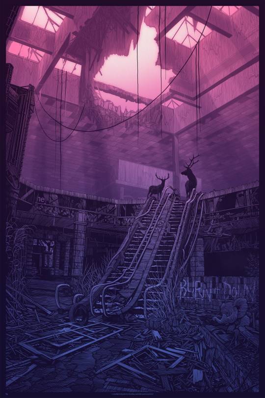
[Image ID: Daniel Danger’s ‘headlight in the path of,’ depicting a ruined mall with a pair of stags standing at the top of the escalator.]
On the surface, this is moody, post-apocalyptic stuff, heavily influenced by classic monster/haunter tropes, but it’s shot through with hope and renewal and the sense of something beautiful growing out of the ashes of something that has toppled. There’s real “(Nothing But) Flowers” energy in “Headlight in the path of”:
https://tinymediaempire.myshopify.com/products/sdcc2023-headlight-in-the-path-of-v2

[Image ID: Daniel Danger’s ‘We are no longer able to protect you,’ depicting a ruined factory with a coming-apart sign reading ‘We can no longer protect you forever,’ and a statue of a sword-bearing angel.]
Danger isn’t just a
very
talented artist, he’s also an
extremely
talented craftsman. As a recovering pre-press geek, I was (nearly) as impressed by the wild use of spot color and foils as I was by the art, like in “We are no longer able to protect you”:
https://tinymediaempire.myshopify.com/products/sdcc-2022-we-can-no-longer-protect-you-forever-v3

[Image ID: Daniel Danger’s ‘made of smoke and chains,’ depicting a ruined landscape with a pair of derelict subway trains at the foot of a hill on whose peak is a rotting mansion. A pair of human figures, holding hands, are approaching the mansion.]
Danger himself calls this work “weird sad hyper-detailed artwork of dreamy buildings of ghosts and trees,” which is a very apt description of this work, as you can see in “Made of smoke and chains”:
https://tinymediaempire.myshopify.com/products/made-of-smoke-and-chains-mist-preorder
So I looked at this stuff and sternly reminded myself that there was no way I was going to buy any art at the con. Then I walked away. I got about two aisles over when I realized I had to go back and ask permission to take some pictures so I could put a little link to Danger in my blog’s linkdump, which he graciously permitted:
https://www.flickr.com/search/?sort=interestingness-desc&safe_search=1&tags=danieldanger&min_taken_date=1687478400&max_taken_date=1690156799&view_all=1
[Image ID: Daniel Danger’s art print, ‘To all who home to this happy place,’ depicting a ruined Disneyland castle in a post-apocalyptic landscape with a statue of Walt and Mickey in the rubble.]
But then I got all the way ass over to the other ass end of the convention center and I realized I had to go back and buy one of these prints. Which I did, “To all who come to this happy place,” because fuckin’ wow:
https://tinymediaempire.myshopify.com/products/sdcc2023-this-happy-place-v6-foil
This was unequivocally the best thing I saw at this year’s SDCC, but I also got some very good news while there, namely, that Emil Ferris’s long, long-awaited My Favorite Thing Is Monsters Vol 2 is finally on the schedule from Fantagraphics:
https://www.fantagraphics.com/collections/emil-ferris/products/my-favorite-thing-is-monsters-book-two
It’s coming out in April, which gives you plenty of time to read volume one, which I called, “a haunting diary of a young girl as a dazzling graphic novel”:
https://memex.craphound.com/2017/06/20/my-favorite-thing-is-monsters-a-haunting-diary-of-a-young-girl-as-a-dazzling-graphic-novel/
If you are or were a monster kid or a haunter, this is your goddamned must-read of the summer. It’s a fully queered, stunning memoir for anyone whose erotic imagination intersected with Famous Monsters of Filmland.
(Also, if you’re that kind of person and you’re in the region, you should know about Midsummer Scream, a giant haunter show in Long Beach; I’ll be there on Sunday, July 30, for a panel about the Ghost Post, the legendary Haunted Mansion puzzle-boxes I helped make:
https://midsummerscream.org/
Now Favorite Thing book two was the best news, but the best experience was watching Felicia Day get her Inkpot Award and give a moving speech:
https://en.wikipedia.org/wiki/Inkpot_Award
And then learning that Raina Telgemeier also got an Inkpot; I love Raina’s work so much:
https://memex.craphound.com/2016/10/04/ghosts-raina-telgemeiers-upbeat-tale-of-death-assimilation-and-cystic-fibrosis/

[Image ID: A photo of me with Chuck Tingle, who wears a pink bag over his head on which he has written ‘Love is Real.’]
To cap yesterday off, I also ran into @ChuckTingle, which is as fine a capstone to a successful con as anyone could ask for:
https://www.flickr.com/photos/doctorow/53065500076/in/dateposted/

If you’d like an essay-formatted version of this post to read or share, here’s a link to it on pluralistic.net, my surveillance-free, ad-free, tracker-free blog:
https://pluralistic.net/2023/07/23/but-i-know-what-i-like/#daniel-danger
#pluralistic#writing#haunters#dancing about architecture#spooky#daniel danger#behavioral economics#introspecting#talking about art#gift guide#timothy wilson#tiny media empire#san diego comic-con#posters#sdcc#monster kids#art#raina telgemeier#felicia day#emil ferris#my favorite thing is monsters#inkpot award
530 notes
·
View notes
Text

Minneapolis via Jeff Schad
#minneapolis#minnesota#twin cities#downtown#travel#midwest#aesthetic#wanderlust#landscape#scenery#city guide#architecture
88 notes
·
View notes
Text
Replenishing the Nonfiction Stack; or, We're Calling the Book Buying Ban a Wash, Officially.
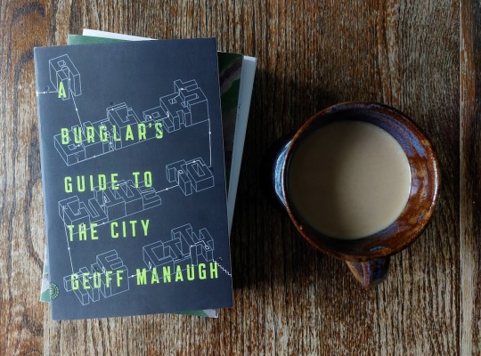
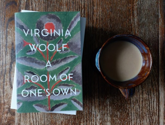
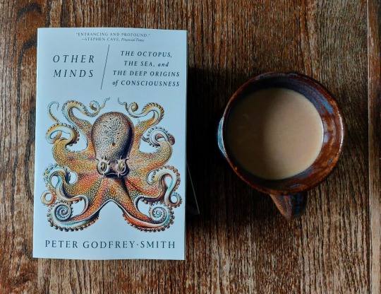
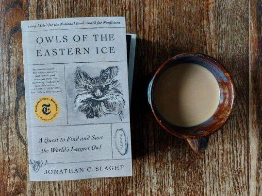
I am not, apparently, immune to coupons for niche nonfiction that's directly up my alley (octopus minds and RUSSIAN OWLS, hello??? Thanks, bookshop!).
I thought perhaps the BURGLAR'S GUIDE would also be covered under said coupon, since it was publisher-specific (alas: it was Not, but we might as well bundle for shipping purposes). And then while I was shopping IRL for gifties I found a copy of ROOM, which has been on my list for...ever? So! Hopefully these will hold me over on the nonfiction front for a minute!
#books#book photography#nonfiction#tbr#a burglar's guide to the city#geoff manaugh#a room of one's own#virginia woolf#other minds#peter godfrey-smith#owls of the eastern ice#jonathan c. slaght#it was an FSG/Picador coupon that bookshop sent me lol#and i knew burglar's guide was also FSG but apparently the coupon was only for Specific Books on their List#(owls and minds)#so. those were impulse buys.#burglar's lowkey was too tbh#ROOM was 'if i cannot literally buy myself a room of my own right now i will purchase this book about it'#(the housing market will be the death of me i stg)#i saw a snippet from burglar's on this hellsite and thought 'ah architecture and thievery YES please'#seriously all my niche interests right here lolol#and yeah okay i really did think i was going to moderate a book ban (read 5 buy 1)#but i've been failing at that since. january. and i will not catch up at this stage :(#so we'll just call that dead to the world and pretend it didn't ever exist :)#ANYWAY PLEASE BEHOLD MY PRETTY BOOKS!!!#i had a spine shot but i didn't love what it did to the photoset composition lol#might as well post that separately here i goooo
11 notes
·
View notes
Text


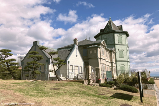
A triplet of bits of architecture down by the Akashi crossing in Kobe.
The first one is a marriage hall.
The last is a museum.
Not sure about the one in the middle.
#photography#japan#kobe#original photographers#My Photos#Architecture#Buildings#Not Ready To Be A Tour Guide
13 notes
·
View notes
Photo
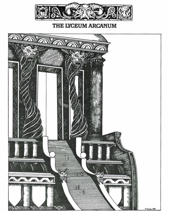
“The Lyceum Arcanum is widely renowned as the foremost institute of magic on the continent.” (Patty Sechi art for Sorcerer’s Guide, Talislanta supplement by Stephan Michael Sechi, Bard Games, 1988)
#Talislanta#Patty Sechi#Sorcerer's Guide#wizards#mages#magic school#sorcerers#fantasy architecture#Bard Games#The Lyceum Arcanum#Stephan Michael Sechi#stairs
193 notes
·
View notes
Text

Some 70 kilometers from mainland Northern Germany lies the small archipelago of Heligoland, an island with an interesting history: on 1 July 1890 it was ceded by Britain to the German Empire which in the decades following developed the island into a major naval base and a popular retreat for intellectuals and wealthy people.
During the 1930s the National Socialists further fortified Heligoland and also established a submarine base, a circumstance that sealed its fate during WWII: on 18 April 1945 it was the target of a massive air raid that completely destroyed the inhabited areas and required the evacuation of all inhabitants. After the German capitulation the island fell within the British occupation zone and on 18 April 1947 the Royal Navy detonated 6,700 tons of explosives to destroy all military installations.
In 1952 Heligoland returned to German control and a competition was organized to obtain plans and ideas for the reconstruction of the island. The competition was won by Hamburg architect Georg Wellhausen whose plan left the landscape as found and changed by the war and who retained the historical density of the built-up areas. Together with Ingeborg & Friedrich Spengelin, Helmut & Traute Bunje as well as local engineers and other architects a number of experimental housing projects as well as reinterpretations of the traditional colorful „Hummerbuden“ at the inner harbor were realized. All of them are connected by gently sloping steeped roofs and a color concept designed by Johannes Ufer.
These aspects, Heligoland’s history as well as its most significant buildings are covered by Jan Lubitz in his architectural guide „Architektur auf Helgoland“, published in 2014 by Rickmers Verlag. Beyond a comprehensive account of the history as well as the reconstruction of the island Lubitz gathers 50 buildings from the postwar years up until the present and thus offers a cross-section of Heligoland’s architectural development. At the same time the author also discusses the heritage status of the architecture but also doesn’t omit the problems hotel and house owners face in view of touristic developments. THE book on Heligoland’s architecture.
#helgoland#architecture#germany#nachkriegsmoderne#nachkriegsarchitektur#architecture book#architectural guide#book
30 notes
·
View notes
Text
#i feel like i am alone in this world….. like as long as its not the ass crack of dawn i am going like 2 hours early turning my brain off#and letting that architecture slowly guide me like im a rat in a maze#polls#mine
33 notes
·
View notes
Text
Guide to the less known museums of Thessaloniki, housed in beautiful preserved mansions!
#greece#europe#travel#travel guide#tourism#architecture#museum#buildings#thessaloniki#macedonia#mainland#greek history
17 notes
·
View notes
Text
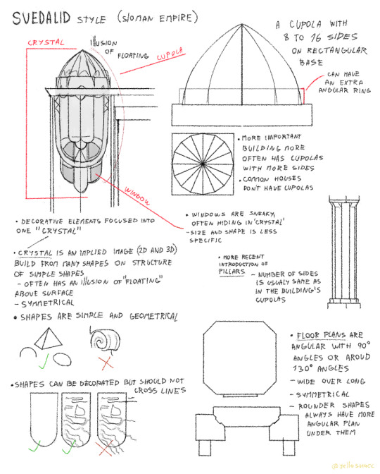
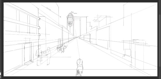
More as a guide for myself for bigger scenes involving buildings, here is the current popular style of architecture originating from Neal's city (emperor's main city I have yet to name).
It's fairly recent and not many buildings are following these rules but many are being reconstructed to fit the new norms.
The main ideas of this new style are to be more practical and minimalistic while still being very nice to look at. The previous era's architecture also presented itself as a show of power and is generally seen as a reminder of worse times for the elven.
This style has some elements inspired by the dominant style in O.'s great power and in a way is a symbol of peace between the two "empires". (the name is just a combination of "bring together" and "people")
The name "crystal" has nothing to do with rocks. It's a dumb name given to it as it can have slight resemblence to a crystal. But it can also look like an animal, face etc.
I'm making an illustration that would show some of these elements but it's a bigger one so don't expect it anytime soon (it also has Neal in it!).
I do plan to make illustrations for all the main region's cities.
#sloman#elven#architecture#fantasy#speculative fiction#guide#neal#art#artwork#worldbuilding#digital art#artists on tumblr
46 notes
·
View notes
Text

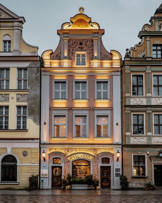
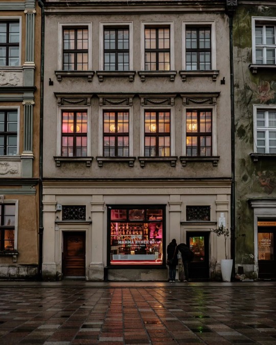
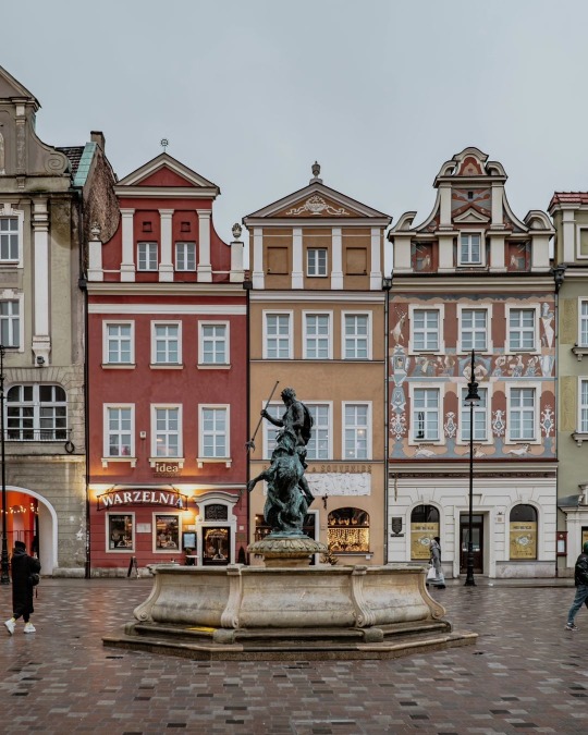
Poznań, Poland by rzemygraphy
#poznań#poznan#poland#travel#europe#wanderlust#architecture#tourism#explore#traveling#travel europe#travel guide#travel destinations#travel bucket list#solo travel#solo trip#european culture#rainy#rainy day#rainy aesthetic
339 notes
·
View notes
Text
me crossing my fingers hoping it makes youtube revanced work again
#it shit the bed so im reinstalling#but also the guide says 'your phone needs any architecture BUT this one' and thats the one my phone has so.#eh fuck it ill try again from scratch and if that doesnt work ill seek other solutions#im just constantly manifesting to myself like 'i am the one in this family that knows technology i can do this'
11 notes
·
View notes
Text

Gold Bond Stamp Company and the Milner Hotel, Minneapolis (1959) via HCLIB
#minneapolis#minnesota#twin cities#downtown#history#travel#midwest#aesthetic#wanderlust#vintage#architecture#1950s#gold bond#city guide
23 notes
·
View notes
Last Seen Blogs

shima-draws
only in the darkness can you see the stars
xmoonlightprincess
Femme Fatale

ghostyheaven
✨🌿Ghosty Heaven🌿✨

bakedcrispss
kelly supremacy

dadokid
Robin