#and then I had to add two more legs to the pattern because I'd originally made it with just four legs as a bunnybee
Note
“Allergying myself multiple days in a row” reminds me of how I keep taking deep sniffs of my secondhand fabric (AFTER washing!) to see if it still smells and starting to sneeze a bunch right after. Surely the two are not related 🤔😂
That is an absolute mood lol
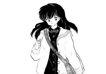
#ask away!#itsbumblebunnybee#I think I recognize your username!#unless there are multiple bumblebunnybees on tumblr#I saw your username years ago and was like oh I have to make a bunny bee#this was before I learned to sew back in my only crochet days#and I made a little prototype and was like oh it's too cute as just a bee I totally missed the bunny part#and then I had to add two more legs to the pattern because I'd originally made it with just four legs as a bunnybee#so your username inspired what became my tiny bee pattern! :D#(at least I think it was your username? it was several years ago)#idk if I ever actually mentioned that on tumblr since it ended up not being a bunny bee#it's also entirely unrelated to allergy-ing I just saw your username and was like hey!! bee!!!
8 notes
·
View notes
Text
kagome higurashi, occupation: it girl
We're constantly talking about what a fashion icon Kagome is, but I haven't seen many actual analyses of her style or how it got translated from the manga to the anime, so I thought it was a fun, innocuous discussion to have this @inuvember. I'm not an expert on the subject by any means, but here's a compilation of my observations.
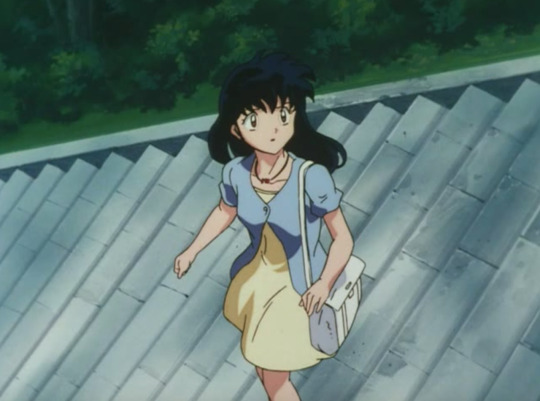
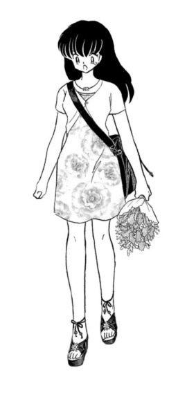
The first thing I noticed is probably the most obvious: she thoroughly enjoys showing off her legs, which she does by wearing an obscene amount of skirts, rarely jeans and never shorts, not even as a PJ.
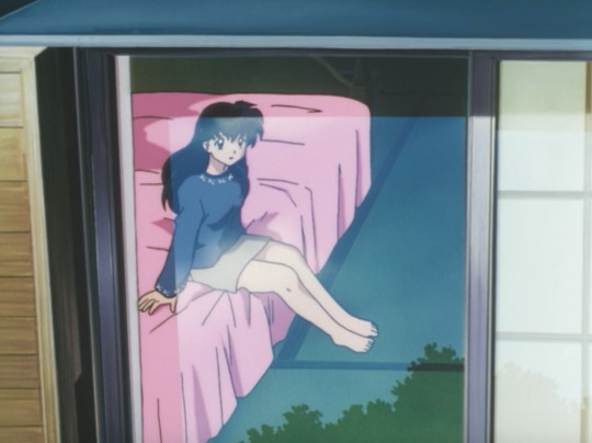

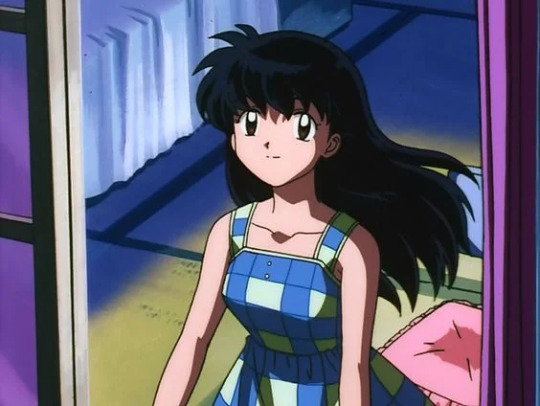
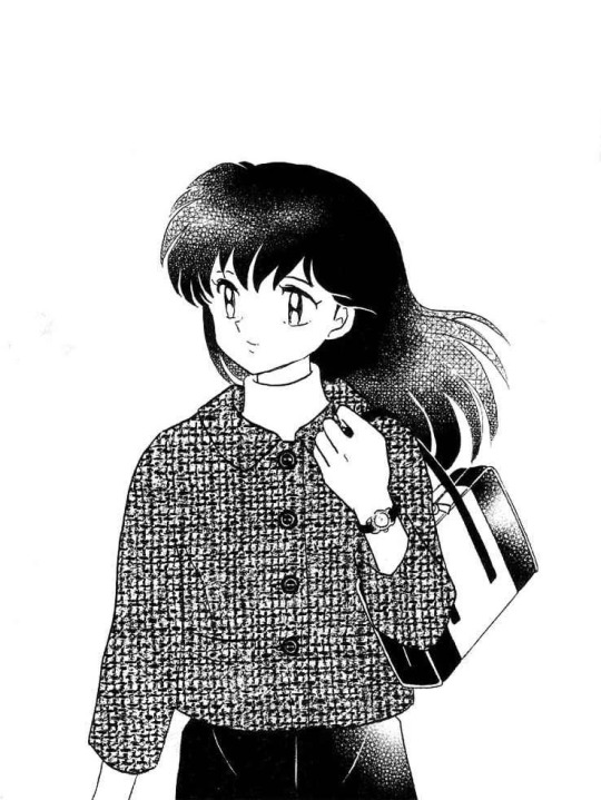
The interesting detail is that she mostly pairs them off with a top that would completely cover her arms and shoulders, which is smart because puts her legs even more in evidence and brings an elegant balance to it. Sundresses seem to be the only exception to that rule:
Now, when it comes to prints, the anime left me the impression that she favors solid blocks of colors rather than especific patterns, but comparing to the manga it's easy to see that's just not true.


Not only does Kagome rock any print she wears, she also seems to have a preference for plaid variations.


Sadly we only got to see in the anime through the sundress above and the iconic Day of Days outfit (the high school uniform doesn't really count).


She likes her flowery patterns as well, although that's only really a thing in the manga. Of course, I understand Sunrise probably toned down this aspect of her clothing choices to make them easier to animate, but we can still mourn it.

The next one is particularly sad to me because it was one of my all time favorite manga outfit of hers and they replaced it with one she had used before in The Soul Piper and the Mischievous Little Soul.
The same outfit was recycled again in Sota’s Brave Confession of Love. It was literally copy and past, except for the colors.
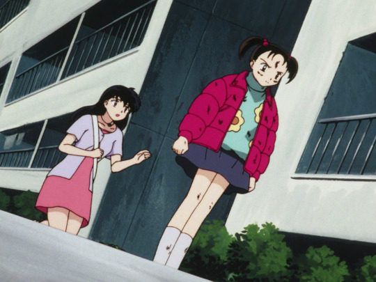
And to add insult to injury, this was the original look:
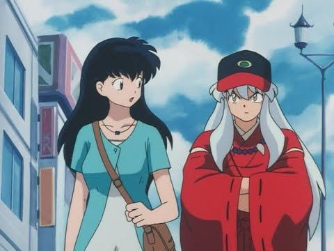
Another thing that was pointed out by @kagomehigurashi in this amazing post is that her "stay at home" clothes are incredibly versatile: she can go from very fashionable sweaters to her fun SHAM shirt collection just like that. But when she goes out, she goes all out.
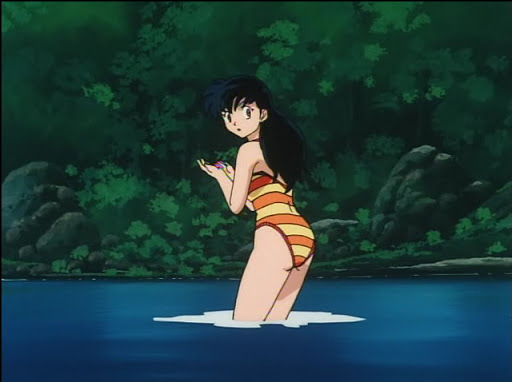
Overall, I think we can conclude that her wardrobe was pretty colorful. Especially in the anime, there's not a lot of black, if any, and Kagome tends to go for pastel. She also seems to be a big fan of overlaying: her outfits are often completed with cardigans, coats or jackets.


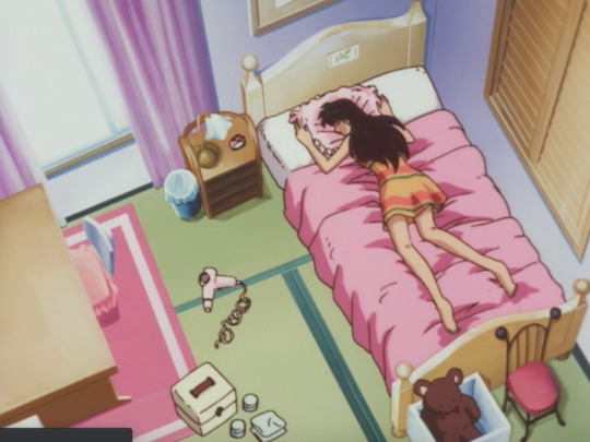
Plus, I'd say comfort is a priority for her. The vast majority of her clothes don't seem restricting at all and her shoes consist basically on loafers, sneakers and ballet flats. Even the heel we saw her wear once was of a wedge type.
She rarely uses accessories, but she limits herself to one or two when she does. It's usually a purse and some jewelry or belt (at least in the manga). Her hair is always down except for the occasional braid (also only in the manga), PE ponytail and bath bun.
It could have been interesting if Takahashi had also used Kagome's fashion sense to showcase how much she changed during her journey, but Kagome's style remained extremely consistent. I guess she found it very early on what she was about. I'd describe it as romantic boho, but I don't even know if that's a thing.
What I do know is that it was far from basic, that she appeared to be having a lot of fun expressing herself throught it and that it felt more mature in the manga, even if most of them are just covers or bonus art.


#Inuvember#Inuvember 2023#Inuyasha#Kagome#Kagome Higurashi#I think Kagome has very similar taste to Lara Jean Covey#I wish there was a Kagome doll with all of her manga clotes so we could buy it and play dress up like the Barbie she is#Sidposting
240 notes
·
View notes
Note
Would you mind talking about the Spinarak line if you haven't already? If you have, I'd love your thoughts on Skorupi! (And vice versa; I did some searching but I didn't see it)
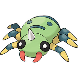
Spinarak is a cute little guy! It's probably the simplest spider design we've ever gotten in Pokemon, but that's a not a bad thing. The blank-ringed eyes convey a sort of compound eye without being too literal with it, and the little fangs and random horn (following in the proud Gen 1 tradition of slapping horns onto things for no reason other than that it looks cool) add just enough detail to prevent it from being too bland. I also love the stripey legs, a feature found in many spiders.
The main draw of Spinarak is the concept of it having a second face on its abdomen. Not only does this make logical biological sense (it would confuse predators), but it also makes for a fun little theme, and increases the cuteness by 20%.
My only real nitpick with the design is that the red fangs feel a bit out-of-place; they could've easily been yellow. Then again, it ties into Ariados' radically different palette and many IRL spiders have different-colored pedipalps, so I'm willing to give it a pass.
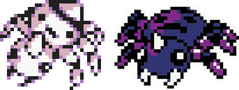
It's also worth nothing that Spinarak had a completely different palette in general originally, sporting a mostly purple look. Ariados was also purple originally, which created more design coherency between the two stages. I'm not sure why they changed this. Maybe they thought it made them look too much like poison-types?
While it's a shame that there's little color consistency between the two, there's at least some visual consistency—the horn, the stripe and spots on the abdomen, the fangs, and the striped legs all remain. Meanwhile, the body shape has changed in a way that makes it look appropriately stronger, and its gained a really pair of false legs on the back that no other spider 'mon sports.
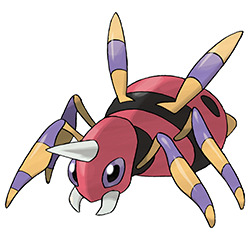
Unfortunately, what doesn't remain is the theme. Spinarak's most noticeable feature was its false face, so it's baffling that Aridos drops that in favor of... nothing really. Aridos is nicely designed, sure, but it doesn't really have anything specific to make it stand out. I point this out mostly because this was Aridos' beta sprite:
Most of Aridos' design has been improved from this design; the finalized design sports a much more interesting body shape that looks much more different than Spinarak's than the beta's does, and the face feels a lot more complete in the final with its thinner head and larger eyes.
However, the loss of the face on the back was honestly a travesty. Like I said, the face on Spinarak was its main theme, so using the evolution to advance the face from being a simple smiley face to a full-brown vicious pattern ala Arbok would've made the line much more memorable, and would've created a greater sense of increase between the two stages. Even the final Pokedex entries for Aridos still blatantly reference this earlier design:
If they had kept Aridos' final design but allowed it to keep the false face of the beta, the line would've been dang near perfect. As-is, they're both still enjoyable spiders—just not nearly as memorable as they could've been.
As a final side note, I could see potential in revisiting this line. I don't think a third evolution would be out of the question; maybe play back into the face theme or expand upon the false legs by giving it the ability to flip itself upside-down or rightside-up on a whim.
72 notes
·
View notes
Text
Project Shadow Theory Thing: the Silvquel Part 1
A continuation of my last post regarding this theory here. I'll also add a link to where this whole theory begins to make it chronological here. I split this sequel into two parts because it got too long and I reached the picture limit.
Quick Recap: I believe that Gerald Robotnik created another Ultimate Lifeform hedgehog after Project Shadow was shut down, and that this 2nd lifeform is Silver the Hedgehog.
For this post, I'll dive into some observations about Silver that may help support this theory. I'll use as much evidence from the games as I can, but this is still just speculation.
Silver Wasn't Born in the Future
Well, "born" as in brought into existence. There are a couple things that conflict with Silver originating from the distant future.
By all accounts, Silver shouldn't exist. Silver being born in the distant future would mean that these numerous and drastic changes to the past should've affected how he came to be. It's already a huge stretch to say that his hypothetical family tree remained exactly the same after preventing the world's destruction in 06, but to say it stayed the same every time he goes back is absurd. This goes for him being artificially created in the future as well.
Even IF he came to be created in every single timeline, he shouldn't be the same Silver every time. If the events leading up to Silver's future dictated Silver's life, he should be a completely different person every time, with no awareness of previous timelines or time travel adventures. And yet, he recognizes Sonic and friends in Rivals 2 and every appearance onward.
Believe me, this time stuff is hard to explain in a way that makes sense. Silver not only existing, but staying completely the same despite frequent drastic changes to the future, suggests that the future has no bearing on how he came to exist at all. Because he was instead created back before Sonic's present time.
Remember that the farthest back Silver has ever gone was 10 years before the events of 06. Even then, his life was never rewritten. Every other time period he came back to was the Modern present, where Sonic is a teen.
We've never seen how far back in time is too far for Silver. At what point does it begin to affect him? And in what ways?
(Actually, there was an instance where something changing in the past also changed parts of Silver's life, but that's a topic for part 2)
Silver's Gloves
Many fans have had at least a passing curiosity as to how Silver's gloves work. After rewatching various cutscenes and gameplay, I think I finally figured out what they do. I've gotta say, they're more complex than I gave them credit for.
Firstly, I'd like to take a look at the circular markings on Silver's palms.

They're always there, right? Constantly emitting light, even when his powers are inactive. The line connecting the glowing circles to the cuffs shows that the two are connected in some way.
Especially when you consider that the glowing marks disappear when the cuffs are off, as shown by his nutcracker outfit.

I'd also like to make it known that in Sonic Forces Speed Battle, Silver is still able to use his psychic energy while in this costume, without the cuffs.
So if the cuffs aren't giving Silver his powers, then what are they for? I've heard some people say that they're the same as Shadow's inhibitor rings. What if that was true, but not the whole truth?
Let's focus our attention to the cuffs in Sonic 06. I specify 06 because there's actually a key detail that changed between how they looked back then and how they now present themselves in later games.

This was Silver whenever he wasn't prepared to fight. Look at how thin the line patterns on the cuffs are. The ones on his wrists are still glowing just the tiniest bit, but the ones around his legs are just dark.
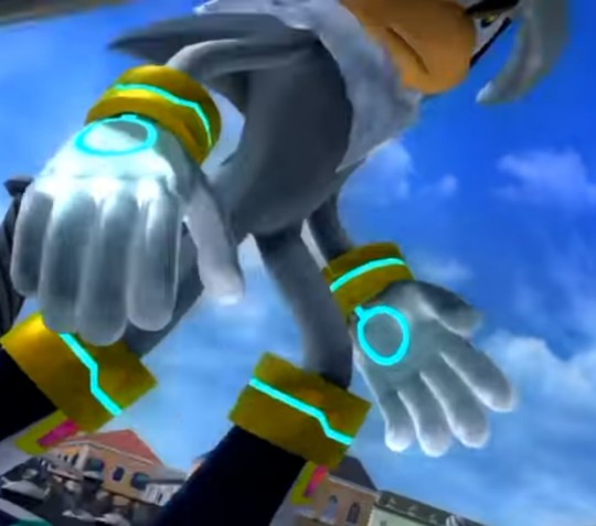
Now look at this screenshot taken just seconds after the previous one. This was Silver as soon as he saw Sonic, or "the Iblis Trigger". The lines on all of the cuffs are much wider and brighter than before. Physical patterns in metal don't just get thicker and thinner because of light.
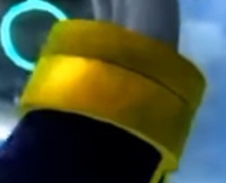

These aren't just patterns. This is the cuffs opening and closing. These are vents.
I believe that Silver, like Shadow, has difficulty controlling his chaos energy without these devices around his wrists and legs. But Silver's cuffs are adjustable, whereas Shadow's aren't.
Shadow's inhibitor rings help him to conserve his chaos energy, but they're kind of basic in design. They limit his chaos energy usage, but he can't change that limit. If he needs to release more power, he needs to take the rings off entirely.
Silver's cuffs, on the other hand, are adjustable. They can open and close to varying degrees depending on how much power he needs to conserve or use.
This is also why the markings on his hands never dim like the cuffs do. The cuffs not only assist in the flow of his chaos energy, but also in directing it. They constantly keep a portion of his energy focused in the hands and legs in preparation for immediate use. When the cuffs are off, the energy is no longer being drawn to his outer limbs, so it's then distributed throughout his body instead.
It's not that the cuffs being closed or off prevents any energy from escaping at all. Otherwise, he wouldn't have any abilities while playing as him in the nutcracker outfit. Not having the cuffs on just means that his body could eventually build up more power than he can expel, and that his energy is harder to channel externally.
Anyway, to sum it up:
Silver was created in the past, not the future.
Silver and Shadow both have rings/cuffs around their arms and legs to regulate they're chaos energy flow, with Silver's being an upgrade in functionality.
Both of these potentially point to Silver being designed as a later version of Shadow. This isn't mentioning Silver's power rivaling that of Shadow's, and at one point even surpassing Sonic's. Strength like that must come from somewhere.
I'll be covering my thoughts on that in part 2 of the Silvquel.
#sonic the hedgehog#silver the hedgehog#shadow the hedgehog#theory#project shadow#stay tuned#part 2 is on the way
15 notes
·
View notes
Text
On cats and comfort
I'm in bed right now lying flat on my stomach with my legs slightly spread apart and my white cat, Snow, sandwiched between them. She's been so clingy to me these days. She'd literally follow me anywhere—to bed, outside the house, to the kitchen, and even to the restroom. She'd even sit on my lap everytime I sit, especially when I sit to eat 😂
It's so quiet here right now except for the constant chirping of birds and the sound of our neighbor's television (I literally can hear it from my room). It's Friday and classes are over, so I don't have to go to work anymore except if something came up and I have to report to work. So now I'm the most homebody I could ever get. My introverted self is the happiest at times like this, especially when it rains a little outside and I have coffee, blanket, bread or cookies, and a feel-good movie to watch. Now it's just partly sunny and not really hot. It's halfway past July and August is coming in just less than two weeks. It had been really hot the preceding months here. Hopefully, August won't be like that. I am looking forward to more drizzly days than hot, sunny days. I am seriously tired of the hot weather because I sweat a lot and when I sweat a lot, I get conscious a lot, so yeah—that just makes it even more annoying 😂
So okay, I was talking about my cat. I have three cats in total: two adult females—white one named Snow, calico one named "Marikit" (a Filipino word similar to the English word "pretty"), and one two-month old male kitten named Garlic (I originally wanted to name him Ginger but for a change, I preferred Garlic instead, and he's Marikit's son). Snow, my white female, is the clingiest of them all. Right now she's between my thighs just casually cleaning herself (the other two sleeping somewhere in the house) and that just adds to my comfort. You know the feeling when your cat's fur brushes softly against your skin, their body heat radiating off them, and their breathing pattern almost matching yours? Not to mention the sound they make when they lick their fur that you swear you could hear even in your deep sleep. Cat owners would relate to me. It's just so soothing, so peacefully satisfying. If I could make an ASMR video, I'd do one with the sound of my cat licking their fur just cos I find that so relaxing. The comfort our pets bring to us can't be compared to anything else. They're angels in animal form indeed, aren't they?
#cats#diary#spilled heart#prose#original prose#comfort#homebody#journal#jes#spilled ink#on cats and comfort
1 note
·
View note
Text
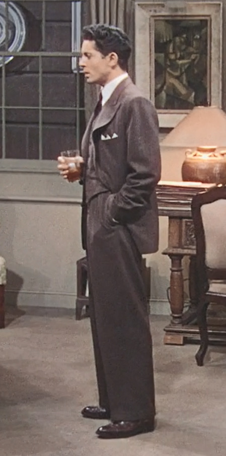
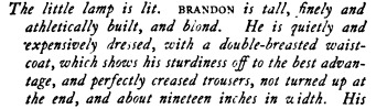
The significance of clothing in Rope
I think its very interesting how clothing was used in Rope (1948) to underline certain character traits of Brandon and Phillip, or more specifically, the differences between the two characters. I might as well be interpreting way too much into this, but I had fun while doing so and that's what matters to me.
Lets start with the most obvious difference: Colour.
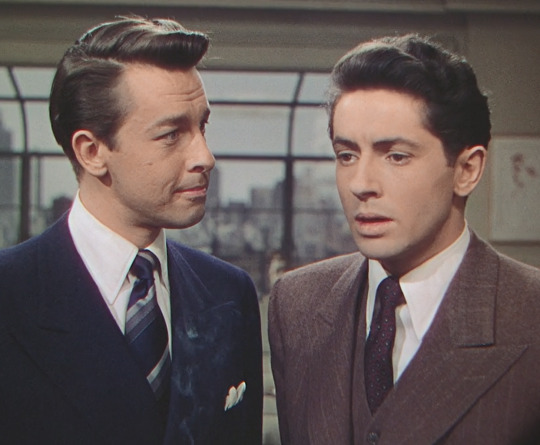
Brandon wears a plain, solid-coloured suit in Bright Gray (Hex #333748). His tie is made of different shades and tints of the same colour. This creates an image of tidiness, perfection and coldness. It lets the viewer know that Brandon is someone who prefers a clear, simple structure over disarray, cold authority over sentimentality.
Phillip wears a lightly striped suit in Don Juan (Hex #5A4F51). His tie is primarily made of an Eggplant purple with smaller patterns to be found inside. This, as opposed to Brandon, creates an image of warmth and openness. It lets the viewer know Phillip isn't a cold nature such as Brandon is. He's someone who likes a little variation, pays more attention to detail and doesn't mind when something isn't perfectly structured and without a flaw.
In short, what we have here is a simple Cool/Warm-Contrast. Brandon is the character who comes over as dismissive and 'cool', whereas Phillip is supposed to make a more open and 'warm' impression.
The second aspect is other details of the clothing, or in other words, the way they're wearing the clothes.
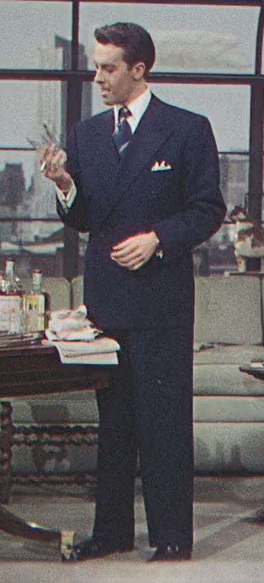
I couldn't find full body shots with them standing in the same position, so I settled on the closest I could find. But keep in mind that I'm not only going off these two specific pictures, but the whole movie.
Brandons suit appears very straightly cut and fits him perfectly, possibly because it was custom-made. It lies very close to his body and doesn't fold much around the chest, arms and legs. Again, this adds to the image of someone who maintains a very perfect image of himself.
You'll find a similar description of him in the original play script from 1929:
Phillips suit doesn't fit him as well, instead it seems somewhat too big for him. The lapel visibly stands out, and the suit folds in some parts of the legs and arms (in this picture its due to the position of his arm but you can see it in other parts of the movie as well). This adds to Phillips image of someone who doesn't feel like everything needs to be perfect- or, depending on how you want to see it, is neglectful of himself.
As for Phillip, his counterpart in the play (Charles Granillo) is described a little differently than what he looks like in the movie (It says things like "blue suit, ornately dressed" etc.) However, this makes sense when you keep in mind that Phillip and Granillo are both equally interesting, but quite different characters.
Again, I don't know whether these details in clothing were intentional or not, but considering how much work and love for detail was put into the movie, I'd like to think so.
#rope 1948#phillip morgan#brandon shaw#john dall#farley granger#james stewart#movies#I am fucking obsessed with this movie#oh well#my post
103 notes
·
View notes
Note
If you still do pokemon reviews can you do my 4 all time fav pokemon magnezone, chesnaught, decidueye and serperior?
I already did Decidueye and Serperior, but as for the other two:
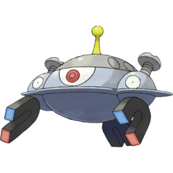
I like Magnezone better than Magneton on the grounds that Magneton is just three Magnemite stuck together and nothing else, whereas Magnezone is at least trying to do something. Don't even know how much it succeeds design-wise, but at least its trying.
It's also nice because you can still kind of tell it's three Magnemite, but the designs have been radically altered so they look like they're fused together. So it still conveys the same concept as Magneton, but with an original design instead that adds a bit of a UFO theme.
The design itself is good overall, but there are some questionable elements around the head. The antennae on top comes out of nowhere and adds another color for no reason; you could've dropped it and not lost anything. The "cap" that runs across the middle head is the same way; it would've been better just with a single round eye and dot like a regular Magnemite and nothing else. Other than that, however, it's solid.
Side note, I love its BW animation. Someone had way too much fun with it.
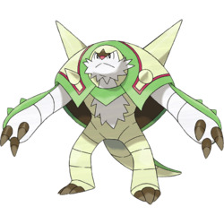
Chesnaught got a lot of dislike when it first came out, but honestly, I dig it? It has something things I'd change, but for being a warrior hedgehog chestnut it looks pretty slick. It's one of those Pokemon that does a good job at not being super literal with its concepts.
In terms of things I like, I love the pattern on the shell and the overall look of it, with the two giant spikes and four smaller spikes. The arms have a really neat look, with three claws and some extra spines on the back, and the color palette is really appealing.
However, there are some elements of the design that I feel could've used a bit of refinement. First, something about the body looks off to me; I think the legs and tail are a bit too long and thin for something so back-heavy. Compare it to the similarly-structured Blastoise and you'll see what I mean. The limbs don't have to be that short, but just shorter and stockier than they are here.
Secondly, the chestnut shell feels weird because it has a random green bit on the front cutting over the beard, seemingly for no reason other to make it look connected to the body. I feel like the green piece in front should've been removed, and instead have the shell wrap around the arms more. Same idea, just doesn't interrupt the other design elements as much. Also, shrink the front spikes slightly so they don't overlap the red outline and create tension.
Thirdly, it's got a bit of anime face going on. I would've dropped the random white section on top of the head and made the entire area brown, so the color is carried through more and you don't have so many random elements in there. Then give it a bit longer of a muzzle. Maybe add a row of spikes on the head as well, just to carry over the theme from the shell and arms.
And finally, while I like the colors a lot, it does make it feel very disconnected from Quilladin and Chespin. I'd argue that Quilladin isn't a good transition between the first and final evos in general, but the colors aren't helping. It's even stranger because the shiny is brown and green, and it does indeed match the rest of the line much better like this. I would've made the legs brown as well, or at least tan, but otherwise it feels like this should've been the main palette and the white should've been the shiny.

At the end of the day, though, I do like what it's going for, and it still has a pretty good design. It's just one of those Pokemon that's held back by a bunch of finicky details that keep it from quite nailing the landing as well as it could have.
74 notes
·
View notes
Last Seen Blogs

somosmamas
Somos Mamás

pohjanneito
Đặt Vé Xe Hòa Liêm
somosmamas
Somos Mamás

luv2spewge
Mankind’s Fall

semalu-berduri-blog
Untitled