#The way i as i scrolled down i assumed these were paul's sketches and when i got to the last one.........lord help me
Text
15 Hardest Sega Genesis Games of All-Time
https://ift.tt/3uvcQZW
There are a lot of reasons to love the Sega Genesis, but in my mind, the console’s best feature was its library of arcade-like titles. At a time when the idea of playing arcade games at home involved winning the lottery, the Genesis gifted gamers with title after title that captured the spirit of those unforgettable experiences.
As Genesis fans know, though, that library of arcade-like games meant that the average Genesis title was often as brutally difficult as the arcade games of that era that set standards for hard video games that some fans argue (much like the games themselves) haven’t been beat. I won’t reignite a console war here, but if you were a ’90s gamer looking for the biggest challenges, you usually found them on the Genesis.
But which Genesis game was the toughest of them all? Well, there’s a good chance retro gamers everywhere know exactly what our number one pick is, but it’s joined by a host of titles that most of us probably wouldn’t stand a chance of beating to this day.
15. The Adventures of Batman and Robin
Not to be confused with the excellent SNES game of the same name, Adventures of Batman and Robin for Sega Genesis was actually a fast-paced side-scroller similar to the Metal Slug series. It’s about as awesome as that description makes it sound, and I highly recommend you play it if you’ve never done so.
Just know that this game’s difficulty level is as surprising as the quality of the game itself. What you’re basically dealing with here is a side-scrolling shooter that incorporates the hardest elements of a particularly tough side-scroller beat-em-up. Remarkably, the game proves to be even more difficult than that description may lead you to believe thanks to some surprisingly long levels that often require you to memorize complex patterns. Oh, and the bosses are absurdly tough across the board.
I would love to see a sequel to this idea, but maybe that game could turn down the difficulty just a couple of notches.
14. Robocop vs. The Terminator
While this game is arguably best remembered for its gore (enemies explode in a way that would make Paul Verhoeven’s squibs guy proud), I feel like its true legacy should be its simply ridiculous difficulty level.
Much like the Super Star Wars series, the problem with this one is that enemies can absorb a hilarious amount of damage before dying. I have no idea how even basic thugs can eat so many bullets, but the fact that they die in comically violent ways is often the only thing keeping you from throwing your controller out of the window in frustration at the sight of another goon with the health pool of a miniboss.
If this game wasn’t such a fun love letter to two great action franchises, I highly doubt anyone would find the patience to finish it.
13. Phantasy Star 2
I struggled with whether or not to include this one. It’s not challenging in that “arcade” way that so many Sega Genesis games are, so there’s a chance you could play it for a while without realizing what you’ve gotten yourself into.
You’re in for a rude awakening the first time you enter a dungeon, though. Phantasy Star 2’s dungeons have to rank high among the most confusing labyrinths ever constructed in an RPG. Most dungeons are either shaped like Final Fantasy X’s skill tree or something MC Escher might sketch on opium. It’s not like you really have time to figure them out organically either as enemies are tough enough to wipe you out while you’re just trying to understand where to go next. It makes grinding for levels a near necessity simply so you’re able to survive long enough to find a dungeon’s exit through trial and error.
While modern walkthroughs make this game much more manageable, trying to beat this one the “original” way with or without the cryptic hints in some of the game’s instruction books will wear you down and drive you mad.
12. Streets Of Rage 3
We’re going to talk about this a few times during this countdown (just you wait), but one of the most interesting things about the Sega Genesis era is how often Sega decided to make a Genesis game more difficult for its U.S. release. The reasons varied, but many major U.S. Genesis titles were significantly more difficult than their international counterparts.
Few games suffered (or benefited, based on your perspective) from that difficulty bump as noticeably as Streets of Rage 3. I can only imagine how confused Sega Genesis fans were when they discovered that the third Streets of Rage game was noticeably harder than the games that came before it. The developers basically utilized every difficulty bump trick in the book for this one, and it makes the game nearly unenjoyable at times.
You can’t even beat this game if you play it on “Easy” as it just ends on Stage 5! It’s a hilarious reminder of how unforgiving old-school game developers could be.
11. Fatal Labyrinth
The pure dungeon crawler genre fell in and out of popularity during the 8 and 16-bit console days, but if you do find a console dungeon crawler from that era, you can pretty much guarantee that it’s going to be ridiculously difficult.
Few games embody that philosophy as well as Fatal Labyrinth. Essentially an early roguelike, Fatal Labyrinth confused many players with its complex mechanics that often left your hero feeling woefully unprepared for the challenges ahead and left the player feeling uncertain as to why they just couldn’t seem to kill even basic enemies.
The thing about this game, though, is that enemies swarm you so consistently and aggressively that you really don’t have time to figure out what’s happening before you’re quickly overwhelmed. For that matter, I’m pretty sure you could have designed this game’s mechanics and still struggled to master the unique dances required to even survive even early encounters.
10. Shadow Dancer: The Secret of Shinobi
While I don’t believe I’m going to settle the debate over which Shinobi game is hardest here today, I’d like to suggest that we all agree that Shadow Dancer at its hardest difficulty levels is easily one of the most punishing action games of its era.
Technically an adaptation of an unrelated arcade game called Shadow Dancer, this title advances the spirit of Shinobi’s punishing difficulty thanks to some customizable difficulty levels that allow you to make this game nearly impossible. Think Shinobi is hard? Well, imagine trying to beat Shinobi without shurikens while facing a small army of enemies as challenging as some bosses in other games.
I’ll go with Revenge of Shinobi if we’re talking about the best Shinobi game, but this one deserves a nod as the hardest.
9. Ecco the Dolphin
I grew up a Nintendo kid, but I love Sega, and I’ll always respect the way that they made the early days of gaming a much more interesting place. That being said, I will always hold a grudge against them for making Ecco the Dolphin one of the most promoted Genesis games and how that promotion encouraged young Nintendo fans everywhere to test the Genesis waters by playing this absolute nightmare.
Ecco the Dolphin highlights most of the elements that make underwater levels so annoying in the first place. You’ve constantly got to manage your character’s breath while navigating maze-like levels that Phantasy Star 2 thinks are unintuitive. In case you weren’t certain this game’s developers hate you, some levels even throw in a time limit so suffocating that I’m pretty sure you can hear the designers laughing on this title’s excellent soundtrack.
Simply put, Ecco should be on any shortlist of the most frustrating games ever made even if you don’t define it as “hard” based on what that word means to you.
8. Gaiares
I suspect that the developers of Gaiares looked at every other nearly impossible shooter title of this era and thought “What can we do to really make fans hate us?” Enter the “TOZ System.”
TOZ basically replaces traditional powerups in these games with a mechanic that requires you to “siphon” abilities from enemies. That means that the abilities you rely on to kill many of those enemies in the first place have to be gathered from the enemies you’re trying to kill. Mind you, acquiring these powerups leaves you somewhat vulnerable, so you’re constantly required to keep track of your current and desired power while trying to stay alive through waves of projectiles.
Even without that system, the speed and design of Gaiares would make it one of the most difficult entries into a genre synonymous with experiences that demand superhuman reflexes.
7. Kid Chameleon
Any game can throw a tidal wave of enemies at you and call themselves difficult. It takes a special kind of game to break you on a spiritual level while offering an otherwise standard (and quite good) platforming experience. That’s what Kid Chameleon brings to the table.
Kid Chameleon‘s 100+ levels would be objectively impressive if it weren’t for the fact that there is no password or save system in the original title. That means you’ve somehow got to beat this absolutely massive game in one long sitting. While there are ways to skip large segments of the game (you only need to beat about half its levels), the fact that there’s almost no in-game indication of the best path forward (aside from confusing instruction book guides) means that most gamers just assumed that something had gone horribly wrong and they just bought a game they couldn’t actually beat.
Read more
Games
15 Hardest NES Games of All-Time
By Matthew Byrd
Games
15 Hardest SNES Games of All-Time
By Matthew Byrd
What’s really impressive is that even modern walkthroughs do little to diminish the spectacle of this game’s confusing structure and the mechanical challenges of its most demanding levels.
6. MUSHA: Metallic Uniframe Super Hybrid Armor
Along with having one of the best names in Sega Genesis history, MUSHA is widely considered to be one of the rarest Genesis titles ever made. Unless you’re a glutton for pain on the level of a human in the Hellraiser universe, though, I can safely advise you to save your money and resist the urge to seek out an original copy of this one.
MUSHA is relentless in a way that even the most challenging top-down shooters of the ‘80s and ‘90s have to pay respect to. There aren’t a lot of gimmicks that separate this from other examples of the genre, but you don’t really need gimmicks when you’ve got a game that is fundamentally difficult in ways that only the best entries into this genre can be.
Call this the resident “SHMUP” entry if you must, but I think that there’s something about this game that just feels crueler than even some of its most infamous companions.
5. Comix Zone
Can a game be too difficult? The answer to that question is obviously debatable, but in the case of Comix Zone, I feel like we may have one of the rare examples of a title that’s difficulty undermines so many of the things that should make this game legendary.
As much as I love Comix Zone for its unique visual style that sees you jump between comic book panels, I can’t think back on this game without eventually remembering how its difficultly makes it unenjoyable most of the time The idea here is that you’re a regular guy in a comic book world who has to defend themselves however they can. That’s a neat concept in theory, but your paper-thin defenses mean that you can die in an instant despite the fact that you actually do have a health bar. To make matters worse, you actually lose health whenever you attack an enemy. I don’t know who the developers hate more: their protagonist or the people playing this game.
I know some defend this one for its comical difficulty, but I feel like Comix Zone could have been so much more if its relatively short length wasn’t hidden by mechanics designed to quite literally punish you for playing it.
4. Target Earth
Target Earth looks like a standard shooter, but this one earns its high spot on this list by virtue of some truly befuddling (some would say “bad”) controls that make this game harder than it arguably needed to be.
Imagine playing a Contra game where you move much slower, can only jump in certain areas, and tend to have to rely on a weak machine gun that needs to be reloaded from time to time. Before you’re done dreaming up that fresh hell, be sure to roughly double the number of enemies and death traps you’d expect to see in each level. Oh, and there’s a difficulty spike around the second or third level that essentially demands you to have already mastered the game by that point. That’s roughly what Target Earth brings to the table.
While I understand that this game is trying to replicate some of the awkwardness of controlling a giant mech rather than a more agile individual, I also understand that many players will need to rely on the built-in invincibility code just to see the end of this otherwise great game.
3. The Immortal
I really tried to resist talking about The Immortal again after including it on a list of the hardest NES games, but how can you talk about the most difficult Genesis titles without giving this one a nod?
The Immortal is much better on Genesis than it is on NES, but this title’s troll gameplay remains roughly the same. The Immortal is still a game where even the most seemingly innocent step can mean your immediate death. This game recreates the fun of walking through a minefield, and while I appreciate that going through a mythical dungeon would probably not be a walk in the park, there comes a point when you’ve got to ask yourself “Why am I playing this?”
I don’t know if we’ll ever see a game quite like The Immortal again. It practically exists to boil your blood whenever you play or think about it.
2. Chakan: The Forever Man
Any young Genesis fan needs to know the name Ed Annunziata. As a famous producer reportedly obsessed with ensuring kids didn’t beat games too quickly, he’s partially responsible for some of the hardest Sega games ever made.
Chakan is rightfully considered to be his masterpiece in that pursuit. Years later, I can’t quite tell if this game is a brilliant piece of game design or a complete failure. It’s this strange blend of Mega Man-esque action and a more methodical adventure/puzzle title that’s stiff controls and limited defensive options often leave you woefully unprepared to best even the most basic enemies. The game clearly doesn’t want to send you on a power trip, but I’m not sure the developers intended for you to feel quite as helpless as you so often are.
The ways in which Chakan is so difficult make it the likely breaking point for many gamers who otherwise crave such experiences. It’s difficult in ways that have never been replicated, which I both love and hate about it.
1. Contra: Hard Corps
The Contra series is obviously synonymous with difficulty, which I actually feel is a bit of an unfair reputation. Yes, these games are tough, but much like Dark Souls, boiling the series down to that element means you often overlook the ways that difficulty level enhances so many of the other things that this franchise does well.
Then there’s Contra: Hard Corps. That game can jump right into the fire of the rage it inspires in me whenever I think about it.
Hard Corps is a departure from every Contra game that came before (and most that have been released since). It let you carry multiple weapons, it featured four playable characters not previously seen in the series, its story allowed you to choose between branching paths, and it’s actually closer to a bullet hell shooter than a traditional Contra game.
As you’ve probably guessed, it’s that last element that earns Hard Corps a place on this list. I don’t care if the word “hard” is literally in the title: nothing can prepare you for how fast Hard Corps really is. The game’s speed is mind-blowing and requires you to stick to safe zones smaller than anything you’ve likely seen outside of rarely released arcade games built specifically to challenge veteran bullet hell players.
cnx.cmd.push(function() { cnx({ playerId: "106e33c0-3911-473c-b599-b1426db57530", }).render("0270c398a82f44f49c23c16122516796"); });
If you’re one of the many who couldn’t beat Contra on NES without cheating, let me tell you that you haven’t seen anything until you’ve played Hard Corps. Even the “Contra isn’t hard” crowd pays homage to this game.
The post 15 Hardest Sega Genesis Games of All-Time appeared first on Den of Geek.
from Den of Geek https://ift.tt/3cU7128
0 notes
Photo

THE HI-TOUCH
I like to joke that on February 14, 2020, I met the love of my life.
I didn’t, of course. But for a second, I fumbled my way through a half-high-five-half-handhold with the K-pop boy group Monsta X and absolutely did not cry, no matter what Rolling Stone attempted to imply. (Yes, that’s me in the foreground of the final photograph.)
The hi-touch is an extremely weird event, to say the least.

Anxious because this was the first time I’d ever attended a fan event, I’d managed to show up four hours early. About three of these hours were spent nervously reading Orfeo by Richard Powers at the Coffee Bean down the street, occasionally looking over trying to figure out when people queue up.
The final hour was actually spent in the line. I tried to make small-talk with the fan in front of me, but soon gave that up when she grimaced in disapproval after finding out I’d been a fan for “only a month” then literally took me by the shoulders and shook me while insisting, “MAKE SURE YOU MAKE EYE CONTACT WITH THEM! MAKE EYE CONTACT OR YOU’LL REGRET IT!”
It was while I was worriedly scrolling through my phone that Monsta X rolled in in sports cars.
Just as I began to recover from the absolutely mind-boggling spectacles I’d already been forced to face, I was ushered into the venue--which housed six enormous cut-outs of the members’ faces. Which, frankly, was terrifying.

(Photo: Michelle Kim. Two of the “six enormous cut-outs,” featuring Hyungwon and Joohoney, set-up at Tower Records for Monsta X’s meet-and-greet on Feb. 14, 2020.)
I’d probably been waiting in there for around 15 minutes when the employees desperately trying to hype up the room (mostly full of nervous young girls) introduced Monsta X, who suddenly burst through the curtains on the opposite side of the room and rushed up to the table before hurriedly taking their seats (Kihyun, their main vocalist, barely had time to shrug off his jacket) and sticking out their hands.
After that, it’s just a blur.
Writing this approximately a month after the event, all I can remember is the first member possibly smirking at me, the second holding my hand more firmly than I’d expected, the third smiling broadly, and the last two seeming tired.
And then I stumbled out of the venue and called an Uber and was back home, largely unchanged.
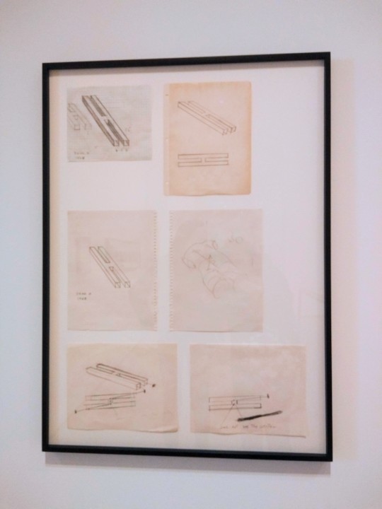
(Photo: Michelle Kim. Paul McCarthy, Dead H Drawings, 1968-69; graphite and ink on paper. Paul McCarthy, Dead H Crooked Leg, 1979 and Dead H Crooked Leg Maze, 1979; graphite and ink on paper. On display at the Hammer Museum in Los Angeles, CA. Photo taken Feb. 22, 2020.)
The Gaze
When recalling the original myth of Orpheus and Eurydice, the first thing that usually comes to my mind is Orpheus turning around to look at Eurydice and to lose her. It’s the climax of the story. And though that Orphic gaze is translated differently in different iterations of the myth, it always seems to be a focal point.
Gazing at something implies a strange binary--it reveals that there is that which you can see and that which you cannot. Paul McCarthy captures this in his Dead H Drawings, a series of sketches of said letter with the space in the center horizontal line highlighted. If you were to look through the legs, you would never be able to see the inside of that portion; you could only see out the other end of the leg like a tunnel. Hence, it’s a dead space.
Even when just looking at a specific object, it becomes clear that you can only focus on one thing at a time. Everything in your peripheral is less easily accessed--forget whatever’s happening behind you.
In Orpheus’s case, the gaze is about confirming Eurydice’s presence yet also losing her. It’s both a moment of relief and of grief, of catharsis and of catastrophe. The nature of his tragedy is that he can’t have the first without the second; if he did, he will have succeeded.
For Scottie, the protagonist of Hitchcock’s Vertigo, it’s exactly this sense of conflicted intangibility that attracts him to Judy/Madeleine, the Eurydice-figure. Even when he believes she’s just Madeleine, there’s an element of fantastical unreachability to her--the fact that she is supposedly possessed by Carlotta. And then when Judy falls back into the Madeleine role, Scottie continues to push her to the edge until she dies a true and final death.
Perhaps this is what makes celebrities such easy objects of affection and what motivates paparazzi. Celebrity sightings, celebrity photos, and two-minute interviews--they’re all small glimpses of a desirable person that we wouldn’t otherwise be able to access.
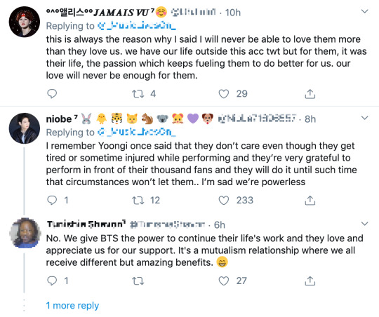
(Screenshots of replies from Twitter on a tweet regarding how the original poster believes BTS loves ARMY more than ARMY could ever love them, taken on March 11, 2020. Twitter handles and personal information have been blurred for the users’ privacy.)
A persistent phenomenon in BTS’s fanbase is ARMY seeming to think that BTS’s members genuinely love all of their fans.
K-pop is particularly adept when it comes to commodifying celebrities. It’s why they’re referred to as “idols” and not just as normal performers. Their jobs are to record songs and dance at concerts, but they’re also expected to vlog, feature on variety and reality shows, film practice videos, take and post selfies, consistently interact with fans on Fancafe (a blog platform for K-pop idols), be gracious and friendly in public--and on top of all this pressure, maintain their appearances and memorize choreography and lyrics.
Because there’s hundreds of hours of content featuring them available, it’s easy for fans to believe that they truly, personally understand their favorite idols. But idols are first and foremost entertainers. Everything they do is in the interest of gaining more fans, who turn into consumers and therefore income. When taking into account their motivation, does that still make idols genuine?
In Sarah Ruhl’s play Eurydice, Eurydice loses her memory upon death. She must relearn who she was when she was alive through her father, also dead, as he reteaches her how to read, her favorite past-time when alive.
By the time Orpheus arrives to guide her out of the Underworld, it’s unclear if Eurydice has regained her previous sense of self. And if she has, it’s been filtered through her father.
Similarly, the return of “Madeleine” in Hitchcock’s Vertigo is a hazy recollection of the original woman.

(Vertigo (1958) dir. Alfred Hitchcock.)
Though Judy is dressed as Madeleine, talks like Madeleine, and walks like Madeleine, she’s only playing the Madeleine that Scottie wants to see. She’s putting on an artificial performance of what he expects in an effort to appease him. The Madeleine that he wants is a cool, refined, and feminine lady. Though not playing hard-to-get, she’s always out of reach as a woman both disconnected from reality and married, therefore unavailable.
Judy can’t always be that. In the car, when Scottie drives her to the bell tower where the true Madeline died, Judy slips through her Madeleine veneer as she acts just a shade too coy.
Eurydice can’t always be what Orpheus expects her to be. The Backwards Look that ultimately causes him to lose her is an act of attempted confirmation, to be sure that he has her: the “loan” that Hades had promised him.
This Backwards Look manifests in many ways among BTS fans.
First, there are the sasaengs and fansites. They’re in some ways comparable to paparazzi--fansites especially, who consider it their (unpaid and unasked for) jobs to photograph idols at their every public appearance, even if they’re just going to catch a flight, then to share their professional-grade photographs online. Sasaengs take this a step further; they’re essentially stalkers who will buy an idol’s personal information to, for example, share a flight and book a neighboring hotel room to be as physically close to them as possible.
Though less extreme, there are also fan artists and fanfiction writers. Both attempt to capture the BTS members’ personalities and internal lives and manifest them in portraits, comics, and elaborate stories (often novel-length or longer). Artists and writers have to assume something about BTS when creating such content. There’s no way anyone could fully understand what’s happening in another person’s head. And when BTS is constantly presenting stage personas while acting like reality shows, filmed by dozens of cameras and producers, represent who they truly are, it’s difficult to say who the artists and writers are trying to capture.
Even a fan’s desire to stream music and videos and look at photos of BTS is a form of the Backwards Look. They’re constantly revisiting a moment and trying to recapture that first instance of experiencing it. This is the Eurydice moment--the experience of falling in love with a piece of art in a brief glance, and losing that feeling as soon as the moment is over.
These experiences are by no means limited to just BTS. Many fandoms, especially other K-pop groups’ fandoms, all experience this overwhelming amount of content consumption. But because BTS is the current Orpheus--dominating their music genre--they have the most fans, the most fanart and fanfiction, and the most streams. They are constantly under the pressure of the Backwards Gaze.
And they are constantly beyond it at the same time. In Ovid’s telling, Eurydice disappears as soon as Orpheus looks back (“she was gone, in a moment”). In Ruhl’s, the lovers “turn away from each other, matter-of-fact, compelled” as soon Orpheus sees Eurydice. When Scottie finally sees the Madeleine he wants, she dies in the next scene.
Eurydice is always beyond reach. And for every minute of content BTS releases, there’s still hours where they’re beyond the camera’s gaze. Are they the same in front of it as they are apart from it? Would they still profess how much they love ARMY if no one was there to record them? Would RM be as well-spoken? Would Jin’s laugh be the same?
It’s only been a month or so, but it’s difficult for me to recall what exactly happened when I gave Shownu, the leader of Monsta X, a horrifically awkward half-high-five-half-handshake. I tried to record what happened right after the event, but I was so shocked that all I could write for him was “funny little smile,” which doesn’t help much when I’m trying to piece together the memory.
Even in the moment, it was difficult to parse exactly what that “funny little smile” meant. There’s only so much time to think when you’re given just a split-second glance. Had Shownu been teasing, playing the flirt that loves all his fans as idols are expected to? Had he been genuinely excited to be there? Had he been embarrassed? (I know I was.) Maybe the smile hadn’t been funny, or little, or even a smile at all--maybe I’d read the moment all wrong.
Funnily enough, Shownu features on a song called, “Don’t Look Back.”

[« prev] · [next »]
0 notes
Photo
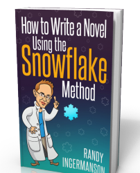
The Snowflake Method For Designing A Novel
Writing a novel is easy. Writing a good novel is hard. That’s just life. If it were easy, we’d all be writing best-selling, prize-winning fiction.
Frankly, there are a thousand different people out there who can tell you how to write a novel. There are a thousand different methods. The best one for you is the one that works for you.
In this article, I’d like to share with you what works for me. I’ve published six novels and won about a dozen awards for my writing. I teach the craft of writing fiction at writing conferences all the time. One of my most popular lectures is this one: How to write a novel using what I call the “Snowflake Method.”
This page is the most popular one on my web site, and gets over a thousand page views per day, so you can guess that a lot of people find it useful. But you may not, and that’s fine by me. Look it over, decide what might work for you, and ignore the rest! If it makes you puke, I won’t be insulted. Different writers are different. If my methods get you rolling, I’ll be happy. I’ll make the best case I can for my way of organizing things, but you are the final judge of what works best for you. Have fun and . . . write your novel!
The Importance of Design
Good fiction doesn’t just happen, it is designed. You can do the design work before or after you write your novel. I’ve done it both ways and I strongly believe that doing it first is quicker and leads to a better result. Design is hard work, so it’s important to find a guiding principle early on. This article will give you a powerful metaphor to guide your design.
Our fundamental question is this: How do you design a novel?
For a number of years, I was a software architect designing large software projects. I write novels the same way I write software, using the “snowflake metaphor”. OK, what’s the snowflake metaphor? Before you go further, take a look at this cool web site.
At the top of the page, you’ll see a cute pattern known as a snowflake fractal. Don’t tell anyone, but this is an important mathematical object that’s been widely studied. For our purposes, it’s just a cool sketch of a snowflake. If you scroll down that same web page a little, you’ll see a box with a large triangle in it and arrows underneath. If you press the right-arrow button repeatedly, you’ll see the steps used to create the snowflake. It doesn’t look much like a snowflake at first, but after a few steps, it starts looking more and more like one, until it’s done.
The first few steps look like this:
I claim that that’s how you design a novel — you start small, then build stuff up until it looks like a story. Part of this is creative work, and I can’t teach you how to do that. Not here, anyway. But part of the work is just managing your creativity — getting it organized into a well-structured novel. That’s what I’d like to teach you here.
If you’re like most people, you spend a long time thinking about your novel before you ever start writing. You may do some research. You daydream about how the story’s going to work. You brainstorm. You start hearing the voices of different characters. You think about what the book’s about — the Deep Theme. This is an essential part of every book which I call “composting”. It’s an informal process and every writer does it differently. I’m going to assume that you know how to compost your story ideas and that you have already got a novel well-composted in your mind and that you’re ready to sit down and start writing that novel.
The Ten Steps of Design
But before you start writing, you need to get organized. You need to put all those wonderful ideas down on paper in a form you can use. Why? Because your memory is fallible, and your creativity has probably left a lot of holes in your story — holes you need to fill in before you start writing your novel. You need a design document. And you need to produce it using a process that doesn’t kill your desire to actually write the story. Here is my ten-step process for writing a design document. I use this process for writing my novels, and I hope it will help you.
Step 1) Take an hour and write a one-sentence summary of your novel. Something like this: “A rogue physicist travels back in time to kill the apostle Paul.” (This is the summary for my first novel, Transgression.) The sentence will serve you forever as a ten-second selling tool. This is the big picture, the analog of that big starting triangle in the snowflake picture.
When you later write your book proposal, this sentence should appear very early in the proposal. It’s the hook that will sell your book to your editor, to your committee, to the sales force, to bookstore owners, and ultimately to readers. So make the best one you can!
Some hints on what makes a good sentence:
Shorter is better. Try for fewer than 15 words.
No character names, please! Better to say “a handicapped trapeze artist” than “Jane Doe”.
Tie together the big picture and the personal picture. Which character has the most to lose in this story? Now tell me what he or she wants to win.
Read the one-line blurbs on the New York Times Bestseller list to learn how to do this. Writing a one-sentence description is an art form.
Step 2) Take another hour and expand that sentence to a full paragraph describing the story setup, major disasters, and ending of the novel. This is the analog of the second stage of the snowflake. I like to structure a story as “three disasters plus an ending”. Each of the disasters takes a quarter of the book to develop and the ending takes the final quarter. I don’t know if this is the ideal structure, it’s just my personal taste.
If you believe in the Three-Act structure, then the first disaster corresponds to the end of Act 1. The second disaster is the mid-point of Act 2. The third disaster is the end of Act 2, and forces Act 3 which wraps things up. It is OK to have the first disaster be caused by external circumstances, but I think that the second and third disasters should be caused by the protagonist’s attempts to “fix things”. Things just get worse and worse.
You can also use this paragraph in your proposal. Ideally, your paragraph will have about five sentences. One sentence to give me the backdrop and story setup. Then one sentence each for your three disasters. Then one more sentence to tell the ending. Don’t confuse this paragraph with the back-cover copy for your book. This paragraph summarizes the whole story. Your back-cover copy should summarize only about the first quarter of the story.
Step 3) The above gives you a high-level view of your novel. Now you need something similar for the storylines of each of your characters. Characters are the most important part of any novel, and the time you invest in designing them up front will pay off ten-fold when you start writing. For each of your major characters, take an hour and write a one-page summary sheet that tells:
The character’s name
A one-sentence summary of the character’s storyline
The character’s motivation (what does he/she want abstractly?)
The character’s goal (what does he/she want concretely?)
The character’s conflict (what prevents him/her from reaching this goal?)
The character’s epiphany (what will he/she learn, how will he/she change?
A one-paragraph summary of the character’s storyline
An important point: You may find that you need to go back and revise your one-sentence summary and/or your one-paragraph summary. Go ahead! This is good–it means your characters are teaching you things about your story. It’s always okay at any stage of the design process to go back and revise earlier stages. In fact, it’s not just okay–it’s inevitable. And it’s good. Any revisions you make now are revisions you won’t need to make later on to a clunky 400 page manuscript.
Another important point: It doesn’t have to be perfect. The purpose of each step in the design process is to advance you to the next step. Keep your forward momentum! You can always come back later and fix it when you understand the story better. You will do this too, unless you’re a lot smarter than I am.
Step 4) By this stage, you should have a good idea of the large-scale structure of your novel, and you have only spent a day or two. Well, truthfully, you may have spent as much as a week, but it doesn’t matter. If the story is broken, you know it now, rather than after investing 500 hours in a rambling first draft. So now just keep growing the story. Take several hours and expand each sentence of your summary paragraph into a full paragraph. All but the last paragraph should end in a disaster. The final paragraph should tell how the book ends.
This is a lot of fun, and at the end of the exercise, you have a pretty decent one-page skeleton of your novel. It’s okay if you can’t get it all onto one single-spaced page. What matters is that you are growing the ideas that will go into your story. You are expanding the conflict. You should now have a synopsis suitable for a proposal, although there is a better alternative for proposals . . .
Step 5) Take a day or two and write up a one-page description of each major character and a half-page description of the other important characters. These “character synopses” should tell the story from the point of view of each character. As always, feel free to cycle back to the earlier steps and make revisions as you learn cool stuff about your characters. I usually enjoy this step the most and lately, I have been putting the resulting “character synopses” into my proposals instead of a plot-based synopsis. Editors love character synopses, because editors love character-based fiction.
Step 6) By now, you have a solid story and several story-threads, one for each character. Now take a week and expand the one-page plot synopsis of the novel to a four-page synopsis. Basically, you will again be expanding each paragraph from step (4) into a full page. This is a lot of fun, because you are figuring out the high-level logic of the story and making strategic decisions. Here, you will definitely want to cycle back and fix things in the earlier steps as you gain insight into the story and new ideas whack you in the face.
Step 7) Take another week and expand your character descriptions into full-fledged character charts detailing everything there is to know about each character. The standard stuff such as birthdate, description, history, motivation, goal, etc. Most importantly, how will this character change by the end of the novel? This is an expansion of your work in step (3), and it will teach you a lot about your characters. You will probably go back and revise steps (1-6) as your characters become “real” to you and begin making petulant demands on the story. This is good — great fiction is character-driven. Take as much time as you need to do this, because you’re just saving time downstream. When you have finished this process, (and it may take a full month of solid effort to get here), you have most of what you need to write a proposal. If you are a published novelist, then you can write a proposal now and sell your novel before you write it. If you’re not yet published, then you’ll need to write your entire novel first before you can sell it. No, that’s not fair, but life isn’t fair and the world of fiction writing is especially unfair.
Step 8) You may or may not take a hiatus here, waiting for the book to sell. At some point, you’ve got to actually write the novel. Before you do that, there are a couple of things you can do to make that traumatic first draft easier. The first thing to do is to take that four-page synopsis and make a list of all the scenes that you’ll need to turn the story into a novel. And the easiest way to make that list is . . . with a spreadsheet.
For some reason, this is scary to a lot of writers. Oh the horror. Deal with it. You learned to use a word-processor. Spreadsheets are easier. You need to make a list of scenes, and spreadsheets were invented for making lists. If you need some tutoring, buy a book. There are a thousand out there, and one of them will work for you. It should take you less than a day to learn the itty bit you need. It’ll be the most valuable day you ever spent. Do it.
Make a spreadsheet detailing the scenes that emerge from your four-page plot outline. Make just one line for each scene. In one column, list the POV character. In another (wide) column, tell what happens. If you want to get fancy, add more columns that tell you how many pages you expect to write for the scene. A spreadsheet is ideal, because you can see the whole storyline at a glance, and it’s easy to move scenes around to reorder things.
My spreadsheets usually wind up being over 100 lines long, one line for each scene of the novel. As I develop the story, I make new versions of my story spreadsheet. This is incredibly valuable for analyzing a story. It can take a week to make a good spreadsheet. When you are done, you can add a new column for chapter numbers and assign a chapter to each scene.
Step 9) (Optional. I don’t do this step anymore.) Switch back to your word processor and begin writing a narrative description of the story. Take each line of the spreadsheet and expand it to a multi-paragraph description of the scene. Put in any cool lines of dialogue you think of, and sketch out the essential conflict of that scene. If there’s no conflict, you’ll know it here and you should either add conflict or scrub the scene.
I used to write either one or two pages per chapter, and I started each chapter on a new page. Then I just printed it all out and put it in a loose-leaf notebook, so I could easily swap chapters around later or revise chapters without messing up the others. This process usually took me a week and the end result was a massive 50-page printed document that I would revise in red ink as I wrote the first draft. All my good ideas when I woke up in the morning got hand-written in the margins of this document. This, by the way, is a rather painless way of writing that dreaded detailed synopsis that all writers seem to hate. But it’s actually fun to develop, if you have done steps (1) through (8) first. When I did this step, I never showed this synopsis to anyone, least of all to an editor — it was for me alone. I liked to think of it as the prototype first draft. Imagine writing a first draft in a week! Yes, you can do it and it’s well worth the time. But I’ll be honest, I don’t feel like I need this step anymore, so I don’t do it now.
Step 10) At this point, just sit down and start pounding out the real first draft of the novel. You will be astounded at how fast the story flies out of your fingers at this stage. I have seen writers triple their fiction writing speed overnight, while producing better quality first drafts than they usually produce on a third draft.
You might think that all the creativity is chewed out of the story by this time. Well, no, not unless you overdid your analysis when you wrote your Snowflake. This is supposed to be the fun part, because there are many small-scale logic problems to work out here. How does Hero get out of that tree surrounded by alligators and rescue Heroine who’s in the burning rowboat? This is the time to figure it out! But it’s fun because you already know that the large-scale structure of the novel works. So you only have to solve a limited set of problems, and so you can write relatively fast.
This stage is incredibly fun and exciting. I have heard many fiction writers complain about how hard the first draft is. Invariably, that’s because they have no clue what’s coming next. Good grief! Life is too short to write like that! There is no reason to spend 500 hours writing a wandering first draft of your novel when you can write a solid one in 150. Counting the 100 hours it takes to do the design documents, you come out way ahead in time.
About midway through a first draft, I usually take a breather and fix all the broken parts of my design documents. Yes, the design documents are not perfect. That’s okay. The design documents are not fixed in concrete, they are a living set of documents that grows as you develop your novel. If you are doing your job right, at the end of the first draft you will laugh at what an amateurish piece of junk your original design documents were. And you’ll be thrilled at how deep your story has become.
Source: Randy Ingermanson at Advanced Fiction Writing
26 notes
·
View notes
Text
20 Best New Portfolios, November 2018
Welcome back, readers! My favorite thing about you all is that you’re all much too classy to put up Christmas decorations this darned early. Yes. You are. I insist.
I could also insist that you have a look at these portfolios, but you already clicked, and we all know what you’re here for: a mix of minimalist, corporate, and super artsy designs!
Note: I’m judging these sites by how good they look to me. If they’re creative and original, or classic but really well-done, it’s all good to me. Sometimes, UX and accessibility suffer. For example, many of these sites depend on JavaScript to display their content at all; this is a Bad Idea, kids. If you find an idea you like and want to adapt to your own site, remember to implement it responsibly.
Justin Jackson
Justin Jackson’s portfolio does that rare and beautiful thing of making use of monospace fonts in a way that doesn’t look too brutalist. Okay, so maybe it looks a bit “grunge”, but it’s grunge and it’s usable. What’s not to love?
Platform: Statamic
Paul Macgregor
Paul Macgregor’s portfolio brings us to our first (but probably not last!) uber-minimal design of the month. And it’s a fantastic example of the principle, too, with all the important information right up front, and quite literally center. Other than my usual issues with JS-dependent navigation, I can find no fault.
Platform: Static Site
Mawla
Mawla is an app development studio, and I’m slightly in love with their site design. All the colorful blobs remind me of fliers from my childhood, but better. Yeah, they actually made blobs work.
Look, I’m not saying everyone should adopt colorful blobs as a strategy. That way lies madness and/or blindness. But running across these sites that let their designers go a little wild without sacrificing general usability is always nice.
Platform: WordPress
Ethan Tennier-Stuart
Ethan Tennier-Stuart brings us back down to earth with a very type-and-whitespace-focused design that keeps things simple. This one is an absolute master class in spacing out elements.
Platform: Static Site
Owl
Owl is a Russian design agency, but maybe don’t quote me on that. You know typography is good when you can’t read a word of it, but you don’t mind just staring at it for a bit. Their graphic design skills are impeccable, too.
It reminds me of that brief moment in time when photomontages were everywhere.
Platform: WordPress
Jack McDade
Jack McDade bills himself as the “Ultimate Web Master”, a title as full of nostalgia as his site’s aesthetic. It’s simple, but colorful.
I have to say that Jack is pretty confident in his work’s ability to speak for itself. He lists some of his former and current projects in paragraph form, and leaves you to decide whether or not to click. Considering that he built the CMS known as Statamic, I’d say he can afford to be confident.
Platform: Statamic (Probably)
Future Comes
Future Comes is an interesting case. It’s a one-page website, but the studio seems to do a lot of different things. They don’t really bother to explain what they do in simple terms. They assume that if you need what they have, you understand what they’re telling you.
Since it all seems to be fairly technical, and geared toward corporate customers, the site is highly corporate in its aesthetic. There is sans-serif type, subdued reds and blues, fun with gradients, and a little tasteful animation.
Platform: Static Site
Cyber-Duck
If the last site whet your appetite for some clean corporate goodness, look no further than Cyber-Duck. It’s simple, it’s solid, it has a ton of blue. It’s strangely comforting.
It also has a page that details their accessibility principles, which includes such delights as big text, their commitment to making the site accessible without JavaScript, and many other things that made me happy.
This is how you do it, front-end devs!
Platform: Undetermined CMS
double take
double take goes for the good-old black, white, and yellow approach that just stand out so nicely. There’s a bit of asymmetry thrown in for good measure. Still not a fan of cursor replacement, but otherwise, this one’s worth a look.
Platform: Static Site
Paul O’Rely
Paul O’Rely caught my eye with those thin diagonal lines, and the highly expressive type in his one-page site. Overall, it creative and stylish.
My only complaint is that the contact form really doesn’t look like one. To balance that out, I’ll say that I love the auto-generated ice-breaker feature. And the fact that you can send him drawings made right on the page. That’s pretty cool.
Platform: Static Site
Jack Watkins
Jack Watkins’ portfolio features some lovely typography, and a generally solid aesthetic. The part I really like, though, is the layout. In a world of mobile-first layout—which is important—it seems like big screen often get underutilized. This site bucks that trend.
Platform: Static Site
K2
K2 brings us a design that feels rather “Medium-ish”. For all that, it’s pretty, stylish, and a pleasure to browse. What can I say? Medium has good taste.
Platform: Static Site
Rubxkub
Rubxkub brings us back a few months to an age when everything was artistic and collage-ridden. Good times. Don’t take my joking the wrong way, it looks beautiful. It’s some good old artsy minimalism.
Platform: Static Site
New Need
New Need is a furniture design studio with an emphasis on the modern aesthetic. Their website matches their work with a very PowerPoint style design.
Platform: JS App
Great Design
Great Design is a boldly named studio with bold black lines everywhere. It’s just how they roll, apparently. I also like how they used independently scrolling columns in their portfolio. I’m not saying we need to be using iframes for everything again, but I will say that I rather like the look of the thing.
Platform: Static Site
Thomas Williams
For something easier on the eyeballs, look no further than Thomas Williams who comes at us rather gently with a dark design. It’s still trends toward the modernist, but it’s more “solid” than “artsy”.
Platform: WordPress
Netrix
Netrix uses a lot of building-block-style imagery, and the masonry layout of the portfolio will cement that concept in your mind in a slightly more subtle way. It does all of this while looking quite classy.
Platform: Static Site
Wonderland
Wonderland is one of those sites that transitions from PowerPoint style to fairly standard minimalism, with a healthy dose of animation all throughout. It also makes nice use of the Lydian typeface, which makes a refreshing change from a lot of the usual typefaces.
Platform: VueJS
Koysor Abdul
Koysor Abdul’s photography portfolio keeps things simple with earthy tones and a lot of off-white space. Browsing this one is an almost peaceful experience.
Platform: Webflow
Aristide Benoist
I love to see the trends I’ve known and named evolve over time, and Aristide Benoist’s portfolio is a prime example of that evolution. It has a touch of both the modern and the post-modern, each helping to smooth out the edges of the other. There’s a little asymmetry, but everything still feels intentionally placed. It just feels good.
Platform: Static Site
Add Realistic Chalk and Sketch Lettering Effects with Sketch’it – only $5!
Source
from Webdesigner Depot https://ift.tt/2QVwIBO
from Blogger https://ift.tt/2A0V7i4
0 notes
Text
20 Best New Portfolios, November 2018
Welcome back, readers! My favorite thing about you all is that you’re all much too classy to put up Christmas decorations this darned early. Yes. You are. I insist.
I could also insist that you have a look at these portfolios, but you already clicked, and we all know what you’re here for: a mix of minimalist, corporate, and super artsy designs!
Note: I’m judging these sites by how good they look to me. If they’re creative and original, or classic but really well-done, it’s all good to me. Sometimes, UX and accessibility suffer. For example, many of these sites depend on JavaScript to display their content at all; this is a Bad Idea, kids. If you find an idea you like and want to adapt to your own site, remember to implement it responsibly.
Justin Jackson
Justin Jackson’s portfolio does that rare and beautiful thing of making use of monospace fonts in a way that doesn’t look too brutalist. Okay, so maybe it looks a bit “grunge”, but it’s grunge and it’s usable. What’s not to love?
Platform: Statamic
Paul Macgregor
Paul Macgregor’s portfolio brings us to our first (but probably not last!) uber-minimal design of the month. And it’s a fantastic example of the principle, too, with all the important information right up front, and quite literally center. Other than my usual issues with JS-dependent navigation, I can find no fault.
Platform: Static Site
Mawla
Mawla is an app development studio, and I’m slightly in love with their site design. All the colorful blobs remind me of fliers from my childhood, but better. Yeah, they actually made blobs work.
Look, I’m not saying everyone should adopt colorful blobs as a strategy. That way lies madness and/or blindness. But running across these sites that let their designers go a little wild without sacrificing general usability is always nice.
Platform: WordPress
Ethan Tennier-Stuart
Ethan Tennier-Stuart brings us back down to earth with a very type-and-whitespace-focused design that keeps things simple. This one is an absolute master class in spacing out elements.
Platform: Static Site
Owl
Owl is a Russian design agency, but maybe don’t quote me on that. You know typography is good when you can’t read a word of it, but you don’t mind just staring at it for a bit. Their graphic design skills are impeccable, too.
It reminds me of that brief moment in time when photomontages were everywhere.
Platform: WordPress
Jack McDade
Jack McDade bills himself as the “Ultimate Web Master”, a title as full of nostalgia as his site’s aesthetic. It’s simple, but colorful.
I have to say that Jack is pretty confident in his work’s ability to speak for itself. He lists some of his former and current projects in paragraph form, and leaves you to decide whether or not to click. Considering that he built the CMS known as Statamic, I’d say he can afford to be confident.
Platform: Statamic (Probably)
Future Comes
Future Comes is an interesting case. It’s a one-page website, but the studio seems to do a lot of different things. They don’t really bother to explain what they do in simple terms. They assume that if you need what they have, you understand what they’re telling you.
Since it all seems to be fairly technical, and geared toward corporate customers, the site is highly corporate in its aesthetic. There is sans-serif type, subdued reds and blues, fun with gradients, and a little tasteful animation.
Platform: Static Site
Cyber-Duck
If the last site whet your appetite for some clean corporate goodness, look no further than Cyber-Duck. It’s simple, it’s solid, it has a ton of blue. It’s strangely comforting.
It also has a page that details their accessibility principles, which includes such delights as big text, their commitment to making the site accessible without JavaScript, and many other things that made me happy.
This is how you do it, front-end devs!
Platform: Undetermined CMS
double take
double take goes for the good-old black, white, and yellow approach that just stand out so nicely. There’s a bit of asymmetry thrown in for good measure. Still not a fan of cursor replacement, but otherwise, this one’s worth a look.
Platform: Static Site
Paul O’Rely
Paul O’Rely caught my eye with those thin diagonal lines, and the highly expressive type in his one-page site. Overall, it creative and stylish.
My only complaint is that the contact form really doesn’t look like one. To balance that out, I’ll say that I love the auto-generated ice-breaker feature. And the fact that you can send him drawings made right on the page. That’s pretty cool.
Platform: Static Site
Jack Watkins
Jack Watkins’ portfolio features some lovely typography, and a generally solid aesthetic. The part I really like, though, is the layout. In a world of mobile-first layout—which is important—it seems like big screen often get underutilized. This site bucks that trend.
Platform: Static Site
K2
K2 brings us a design that feels rather “Medium-ish”. For all that, it’s pretty, stylish, and a pleasure to browse. What can I say? Medium has good taste.
Platform: Static Site
Rubxkub
Rubxkub brings us back a few months to an age when everything was artistic and collage-ridden. Good times. Don’t take my joking the wrong way, it looks beautiful. It’s some good old artsy minimalism.
Platform: Static Site
New Need
New Need is a furniture design studio with an emphasis on the modern aesthetic. Their website matches their work with a very PowerPoint style design.
Platform: JS App
Great Design
Great Design is a boldly named studio with bold black lines everywhere. It’s just how they roll, apparently. I also like how they used independently scrolling columns in their portfolio. I’m not saying we need to be using iframes for everything again, but I will say that I rather like the look of the thing.
Platform: Static Site
Thomas Williams
For something easier on the eyeballs, look no further than Thomas Williams who comes at us rather gently with a dark design. It’s still trends toward the modernist, but it’s more “solid” than “artsy”.
Platform: WordPress
Netrix
Netrix uses a lot of building-block-style imagery, and the masonry layout of the portfolio will cement that concept in your mind in a slightly more subtle way. It does all of this while looking quite classy.
Platform: Static Site
Wonderland
Wonderland is one of those sites that transitions from PowerPoint style to fairly standard minimalism, with a healthy dose of animation all throughout. It also makes nice use of the Lydian typeface, which makes a refreshing change from a lot of the usual typefaces.
Platform: VueJS
Koysor Abdul
Koysor Abdul’s photography portfolio keeps things simple with earthy tones and a lot of off-white space. Browsing this one is an almost peaceful experience.
Platform: Webflow
Aristide Benoist
I love to see the trends I’ve known and named evolve over time, and Aristide Benoist’s portfolio is a prime example of that evolution. It has a touch of both the modern and the post-modern, each helping to smooth out the edges of the other. There’s a little asymmetry, but everything still feels intentionally placed. It just feels good.
Platform: Static Site
Add Realistic Chalk and Sketch Lettering Effects with Sketch’it – only $5!
Source p img {display:inline-block; margin-right:10px;} .alignleft {float:left;} p.showcase {clear:both;} body#browserfriendly p, body#podcast p, div#emailbody p{margin:0;}
20 Best New Portfolios, November 2018 published first on https://medium.com/@koresol
0 notes
Text
Edinburgh Fringe: My Reviews
I've just come back from The Fringe and these are my thoughts. You can scroll down to see play-by-play reviews but I have a short pre-amble first. Theatre has been a passion of mine for quite a long time so I'm surprised it's taken this long to get up to Edinburgh. On the basis that I didn't know when I'd next be up I took full advantage of my trip and saw as much stuff as I could; and as varied stuff as I could. I like taking risks with theatre because in my experience, for every 3 shit things you see, you see 1 thing that stays with you for a very long time. I've rated what I saw below but it comes with two very strong provisos: 1. These are personal opinions shaped by, among other things: my life; my hopes and expectations of theatre; how I felt during the show and the particular performance I saw. A high grade means I enjoyed it and is no guarantee you will do the same. 2. Everybody who came up to Edinburgh to put a show on is amazing for contributing to the cultural hotpot. A poorer review does not reflect on my views on the people behind it. They are all genuinely great artists for throwing so much into the melting pot. I've given 'A' to three shows, all very different. This is as close as I'll get to giving you my 'pick of the fringe'. * Michelle McManus: The Musical. A great crowd pleaser for lovers of cheese and musicals. * The Last Resort. A dark semi-immersive examination of Guantanamo Bay. * John Robertson (Dominant). Do not go if you are at all prudish or shy, but if you are not this is a anarchic comedy tour de force. With that, on to the reviews: (Monday August 7th) The Dark Room: B+ Comedy based on getting audience members to play an impossible 80s retro text-based game. It had built a cult following - which did not improve the show for first time viewers. The formulaic game portion was surely innovative and hilarious at one point, but now felt like an inside joke with the repeat audience chanting along from the start. That said, the new material and the improvised audience interaction was great and kept it fast-paced and snappy. 5 Guys Chillin': B- A drama exploring the gay 'chill'/sex party scene using verbatim quotes from interviews. This felt like it wanted to be eye-opening and expose a subculture. The problem is that it was exposing a subculture I'm well aware of. I knew the people they speak about and their words. It was certainly interesting and well-acted, but (for me), it slightly outstayed its welcome. This is not culturally significant: D A naked one-man character-driven show that seemed to build itself on the brief 'emotional whiplash: the sketch show.' It seemed to be well-received by many in the audience so it's possible I missed something. The problem for me was that the humour never hit hard enough and the vulnerability felt quite contrived. The actor and especially the technical team were excellent, but the content felt like it was at 60% of what it needed to be to make an impact. (Tuesday August 8th) Briony Redman: B A traditional 'Harold' comedy sketch show exploring screenwriting and modern genres. It was an gentle show, never offensive, often giggly. However, it lacked the bite to be hysterical. None the less, it was sweet and fast-paced and always had something interesting to say. The Canon: B A comedy sketch show based around the literary canon. There is nothing groundbreaking or truly original about this show, but it does present a lot of interesting scenarios and garners a steady stream of laughs. Bonus points for Taylor Swift/Shakespeare mash-up. Shame: B+ A drama about female sexuality told half through vlog and half through live action theatre. This was a really interesting medium that added to the story, made up of likeable but distinctly human characters. The ending packed an emotional punch but the moments leading up to it were slightly too expositionary and fell a bit tepid. Michelle McManus: The Musical: A Actual Michelle McManus from actual Pop Idol puts on a Glaswegian Hyacinth Bucket character for her fictional comedy musical revue. This is a riot from start to end. The songs (ballads from broadway) add to the show and are delivered powerfully and comically. The numbers are linked by an extremely funny and well-delivered performance that surprised a lot of the audience. Evocation: E A retelling of Giraud poems through the medium of gothic puppetry and drone music. This mark may be very harsh, and reflects more my inability to interpret what the hell went on than any mistakes the production team made. It looked gorgeous and chilled me out. It turns out watching theatre has a hard mode and this is it. Reformed Whores: B Musical comedy duo, satirising country and western through sex-positive messages. I like country music and the songs here were definitely catchy. There was a danger they relied a little too strongly on shock humour at times. The biggest problem here was the venue. These are performers that need interaction and raucousness. You're never going to get that in a sterile, small conference room. (Wednesday August 9th) Heroes: B+ A drama from an Icelandic company about how demonising enemies of war impacts young communities. This was well-acted, and the young cast clearly had a great time putting it on. There were definitely scenes in this that had strong impacts on the audience, and this made it well worth watching. However, the characters and fictional backdrop of the play were so one-dimensional and far-removed from reality. I feel like this eroded the social commentary they wanted the play to take on. The Last Resort: A A dark and invasive play, in which you play residents of the recently converted Guantanamo Bay holiday resort. This is excellent and a key example of why it's worth taking risks with theatre. The semi-immersive approach is a great way to make you laugh and relax before the show takes a dark and eye-opening turn. You will feel uncomfortable and you will love it. Oxford Imps: C A standard improv troupe from Oxford Uni. I saw them a lot whilst I was there and enjoyed them, so I went in with high hopes. Despite a few great moments, this was generally a disappointment. Enough of the troupe felt like they were trying to get their own ideas heard at all costs. This made the scenes feel messy and loose because they didn't agree on a reality. Monster: B+ A one man show about toxic masculinity as it relates to domestic abuse. An excellent character actor explains how tapping into unsavoury characters to method act leaks into his every day life. The blurring of all the characters builds into a heavy momentum. There's no payoff here - though I wonder if possibly that's the point. It's an interesting piece of theatre with a great actor but one that feels a little unsatisfying at the end Paul Sinha (Shout out to my ex): B Chaser/Comedian/Former GP performs a stand-up set about the annus horribilis since his partner left him. Stand-up comedy has a different job from a lot of the other work I've seen. First and foremost it's about making you laugh: and the show did that. The audience was in a good mood and the personal anecdotal style kept the laughs rolling. It may not have made me cry, or think, or challenge my beliefs but that's likely beyond its brief. John Robertson (Dominant): A This was billed as stand-up, by a crude and acerbic Australian (host of The Dark Room). In reality, none of it was scripted and instead we got a loose collection of thoughts inspired by the audience and his S&M past. It was a small audience (15ish people) and so all bets were off. Anarchy reigned and all audience members were involved. It was shocking, anarchic and unsubtle but constantly hysterical. He is a master of his work. We're All Going to Die: C+ An ensemble comedy about a group of scientists dying one-by-one on a remote research station. This had a young cast, and I assume this was scripted by them as well. The script was trite and lacked direction or purpose. The constant quipping removed anything but facile humour from what we watched. The characters were all one-directional. That said, it was enjoyable enough. There were some fun one-liners and set ups. It was a perfectly pleasant way to pass an hour. Thief: B+ A dramatic monologue by a queer sailor who puts a brave and defiant face on being forced into sex work. The acting deserves considerable credit here for bringing this complex character to life. In lesser hands this would surely fail, but it was a captivating if invasive performance. The show never knows what it wants to do with the character, though, making his backstory almost comically dark. There is an attempt at moralising at the end that feels a little too neat and tidy. At the end, I left feeling impressed at what I watched, but wondering why I watched it. (Thursday August 10th) Salome: D A one-man production of the Oscar Wilde epic. In typical Wilde fashion the dialogue is clever and knowing and that pulls you through this otherwise ropey production. Production values are low; characters are barely distinguished (Salome speaks falsetto and wears a scarf) and audiences are left questioning whether Salome really needed a one-man production. Kafka & Son: B A dramatic monologue adapted from a letter Kafka wrote to his father explaining his fear. The aesthetics of the play were beautiful and the team clearly had a great deal of respect for Kafka. It was an interesting and relevant biography: I feel like I'll see Kafka's works very differently now. The issue was the content of the show was dry, and at multiple times I found myself looking at my watch. The Odyssey: B+ A highly energetic physical performer reads the story of the Odyssey with pep, gusto and silly noises. The energy and tightness over the whole 70 minute show was impressive and brought a lot of life to the performance. The problem was, I felt like nothing was added to above the story. It brought back feelings of sitting cross legged on the floor in primary school being read classics. It was certainly charismatic and enjoyable but unmemorable. Noose Women: C- A comedy-drama about a TV production company who are convinced by a charismatic cult leader to host a reality show where the prize is death. It was perfectly watchable but a deeply flawed production. The story was paper thin and all drama was resolved within seconds. The central conceit took a back foot to meandering subplots that went nowhere. None of the characters were likeable or consistent; and unfortunately the humour did not make up for it. You could do much better than this at The Fringe.
0 notes
Last Seen Blogs
takemesomewherefar-away
•Prenditi cura di me•

donaruz
Io infinitamente

gxthiqlxlita
gxthiq

litratistartsy
Remember Me Through Flash and Screams

alcordraws
I am the Host