#ErrantScience
Photo
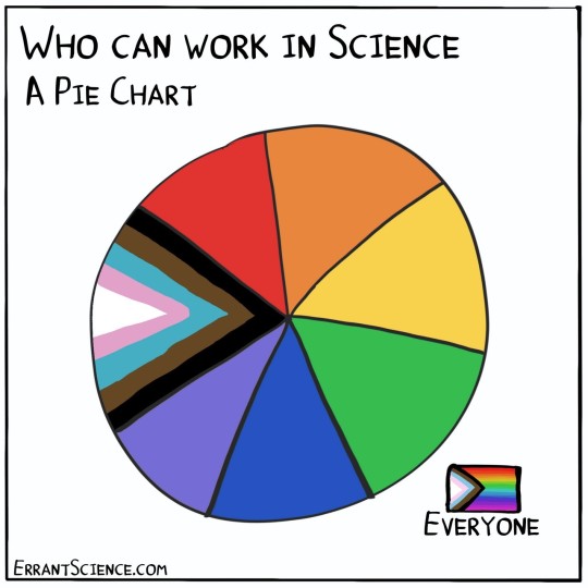
One of our most popular cartoons of all time is the "Who can work in science" pie chart. We felt that it was long overdue a small update. Happy #PrideMonth everyone #LGBTQ
1K notes
·
View notes
Text
Source
From @errantscience
#errantscience#linguistics#linguisthumor#academia#academic work#classic academia#phd life#phd program#academia memes#phdblr#phd stuff
10 notes
·
View notes
Text
https://twitter.com/errantscience/status/1555811150855634944?s=21&t=39MZyUp-AgXOuyX98D6I3w

1 note
·
View note
Photo
🤔📝😅 📷: ErrantScience https://ift.tt/2NlngLv http://goo.gl/sMMHak
0 notes
Photo
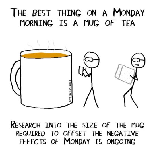
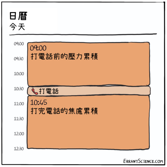
It's Tuesday today but this is still accurate. 😭☕
Comic by @errantscience.
41 notes
·
View notes
Text
From the 21st to the 29th October Norwich holds the Norwich Science Festival. During these two weeks activities, talks, and stands are run for all members of the public from kids to Grandparents.
It is an opportunity for scientists to take their work out of the lab and show to the public, to initiate debate with the public, and to show kids how cool science is!
https://twitter.com/NorwichSciFest/status/921686497887162368
This year a new event was held as part of the festival- the Science communication conference.
Science communication is an area of huge importance. And sometimes we as scientists, get stuck in our little science bubble, and forget that 99% of people don’t know what we are doing, why we are doing it or how. Science isn’t always accessible- we use a lot of terminology, and don’t always explain the basics before launching in to our research in more depth, which can make it seem extremely complex. In addition, there are a lot of scientists that just aren’t good at communicating their science- even to other scientists!
Luckily there are lots of people who are very good at communicating science- and who are willing to share their knowledge and expertise with us, and a few of them gave masterclasses at the science communication conference.
At the conference there was an opportunity to go to two masterclass sessions out of:
Visual Communication: Peter Moore Fuller (Infohack)
Social Communications: Chris Bennett, Earlham Institute
Marketing and Brands: Michael Motskin, Pint of Science Founder
Cartoon your Science: Michelle Reeve and Matthew Partridge, Errant Science
Science and Technology Writing: Lauren Razavi, Fibl Labs
Science Communications- James Piercy, John Innes Institute
I went to the visual communications and cartoon your science sessions, and will share with you some of what I learnt from these 2 classes:
Visual Communications: Poster Making 101
This session was all about how to visually display your science well. If you have been to a science conference you have most likely seen a lot of science posters- some are really good, but others… So Peter shared 5 top tips about how to display your science the most effectively:
Content
Think about what is needed- what is the essential information? You do not need to display all off your results (exciting as they may be). Think about what the most important points are that you want to make- and use this as a basis for the content of your poster.
Who is your poster for, what is it being used for? Is it for a outreach event for school kids? Is it for other scientists? This will impact what you put on your poster, and the level of detail you go into about the actual science.
Image Quality
Don’t use clipart!! There are lots of other sites like Flickr and Wikimedia that you can get good quality basic images from.
Use an Image with at least 300dpi for printed posters- anything less will have a horrid resolution and appear blurry and out of focus, which is not a good look.
Vector based images are the best. With vector based images you can change the size easily without compromising on image resolution.
You can’t add resolution to a image- if you make an image larger, you will lose resolution- so make sure that your image looks good at the size it is before sending your whole poster to print!
Logos of your university/institute/funders are important, and so should be treated with respect! Make sure they are in focus, are the correct shape (not squashed) and that if using multiple logos- that they are lined up evenly, with even spacing in between.
Use Grids
Grids can easily be added to many software documents- and should be used! These enable you to line up elements of your poster evenly, and its the details like this which can really make a difference to the overall appearance of a poster.
When using text boxes make them the same sizes- If with an extra 6 words one text box end up longer than another- remove those 6 words!!
In text, make sure you don’t have orphan words. Orphan words are where one word appears by itself on a line of text- this will give lots of extra unused space, and can also give added importance to words.
Legibility
Make sure you can actually read what is on the poster!
Good contrast between text and the background- a busy background can make it very hard to read. Also think about the colour contrast between text colour and background colour- think blue text on a yellow background (Not good!)
Larger font doesn’t mean it will be easier to read: The width of the text box and paragraph setting is more important to consider.
Justification of text may not be good- it can alter the spacing between words, which can make text difficult t read. Also you loose your point of reference in text- where the next line is.
Don’t have words hyphenated across lines
Think about line spacing- this can be altered in most software. Some elements of letters such as the bottom of g and the top of h can merge into each other if the line spacing is not enough.
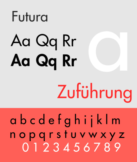
Fonts should be seen and not heard! Don’t use too many fonts- and make sure the fonts are easy to read! If you know the audience will have members with dyslexia try to use fonts where letters are not mirrored such as Futura.
Titles:
Keep titles short and snappy- but don’t take it too far, it still needs to make sense…
Centred titles don’t always work: consider using left justification instead.
Cartoon your science
(led by Errant Science)
Drawing and art have always been a part of science: for example Leonardo Da Vinci, who did many detailed anatomical drawings across his life, and Robert Hooke who drew images of the things he saw down his microscope. Of course cartoon science art doesn’t need to be as detailed as this- instead an exaggerated art style, simple drawings and a interpretive design is used.
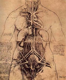
Leonardo Da Vinci: The principle organs and vascular and Urino-genitals of a woman. source: wikimedia
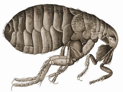
Robert Hooke: Robert Hooke’s drawing of a flea in his Micrographia. source: wikimedia
Often when we think of figures used in science we think of graphs, charts and flow diagrams, but, this doesn’t often show a concept in a way that people will remember. Using cartoons, and drawings you are able to take out the key points you want to make, and put them into a form that people will remember.
https://twitter.com/ErrantScience/status/914822341418536960
A few things to know:
You don’t have to be good at drawing to cartoon science.
You can draw what you want, how you want.
How to begin cartooning science:

Thank you so much to all the speakers who gave masterclasses at the conference, I will add a few additional links for everyone to check out, and I hope that for those who couldn’t make it what I have shared here may be of use to you! Hopefully after this years success, scicomm conference will be at #NorwichSciFest next year, and will become a permeant fixture in the future.
If you ever see a scicomm conference advertised, I would highly recommend going- you will always learn something new, and come away with cool new ideas to help in your communication of Science.
Extra Links:
James Piercy TedX talk: https://www.youtube.com/watch?v=jJ3BwZPhyMM
Errant Science Blog: https://errantscience.com/
Pint of science Website: https://pintofscience.co.uk/
Lauren Razavi: slide share from #NorwichSciFest https://www.slideshare.net/LaurenRazavi/how-to-write-about-science-technology/1
Featured Image source: https://www.flickr.com/photos/michaeljohnbutton
New blog about the Science Communication Conference which was part of @NorwichSciFest #scicomm From the 21st to the 29th October Norwich holds the Norwich Science Festival. During these two weeks activities, talks, and stands are run for all members of the public from kids to Grandparents.
7 notes
·
View notes
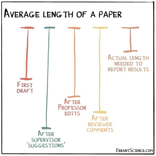
Photo
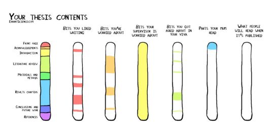
The truth about PhD
Amusing poke from @ErrantScience on what a PhD thesis might contain
1 note
·
View note
Photo
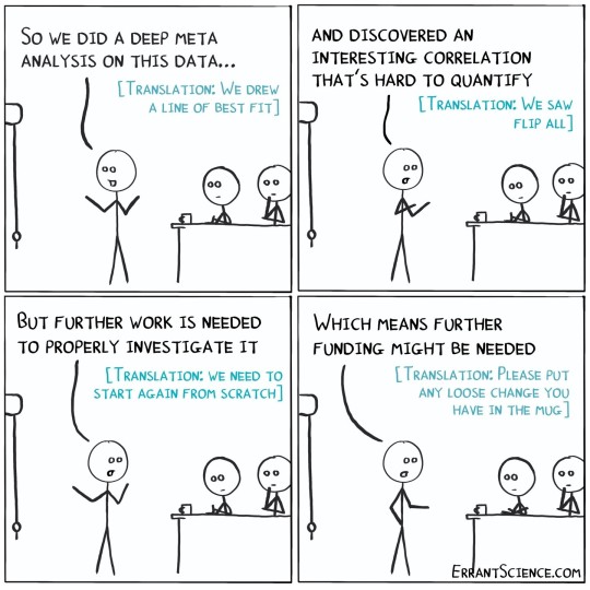
In science presentations, some translation is often required #cartoon #cartoons #comic #comics #instacomic #instacartoon #academia #science #research #errantscience
378 notes
·
View notes
Text
Source
(from @errantscience )
11 notes
·
View notes
Text
Part 1 of scientific life advice from @drclairemurray #Clutter #PhDChat https://t.co/r2vr5FZixi pic.twitter.com/DsbOgk7nEQ
— ErrantScience (@ErrantScience) June 25, 2018
from Twitter https://twitter.com/nichi_yes
0 notes
Text

https://twitter.com/errantscience/status/1443517386716557312?s=21
3 notes
·
View notes


Last Seen Blogs

larabar
ceo of chip :]

zhongliologist
your tired and broke office girlie

cirqueimaginaire
Imaginary Circus

reaper-the-jellyfish
Reaper the Jellyfish
hondanamiseteyo
ホンダナミセテヨ