#-'Well it's hard to color black people in yellow shades/sepia'
Text
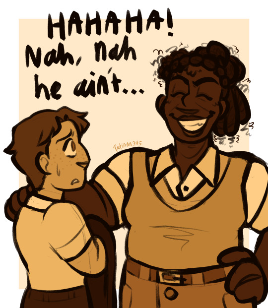
I know a couple of people have already redrawn that one panel, but fuck it we ball-
This is roughly how I thought Norman would look in canon (and Buddy <3) but uh, yeah that dream is squashed ig fml
Reblogs > Likes, Thank You!
#norman polk#Buddy Lewek#batim#dreams come to life#the projectionist#bendy and the ink machine#bendy dctl#bendy graphic novel#bendy and the dark revival#batdr#boris and the dark survival#bendy lone wolf#bendy the cage#my art#digital art#reblogs > likes#artist on tumblr#I was actually gonna color this normally and not in sepia#But I know I KNOW someone's gonna try to defend the white Norman stuff with-#-'Well it's hard to color black people in yellow shades/sepia'#When one that's just. not true? You absolutely can?? It's just a limited palette??#And two BATIM and BATDR stray from yellow into colors of orange and borderline red. And on the opposite end BATIM had slight greens#just sayin'#Also yes I did change what he said in that graphic novel panel back to what he actually said in the og book#So glad you noticed :)
79 notes
·
View notes
Text
ejucated immigrant
((AUTHOR’S NOTE: @eene-fangirl For the Fanfiction Weekend Challenge! I should probably wait to post this for Rolf Appreciation Month, but there’s a lot of Jonny backstory/headcanons in here, so I thought it would count. Basically, it’s a poem from Rolf’s POV but it’s technically about Jonny, or rather, Jonny was my muse for this.
I haven’t written a poem in Rolf’s ‘’voice’’ since 2014 but believe it or not, that one little line that Edd says in ‘’A Case of Ed’’ inspired the poem (you know, the one), and as I was reading Ntozake Shange’s for colored girls who have considered suicide/ when the rainbow is enuf, it produced said result. A turnip for your thoughts? I don’t normally write Rolf like this, it’s actually more like Rolf emulating Ntozake Shange for those familiar with her style. As an Indian Immigrant girl who’s considered suicide, that book changed my life, she’s my idol. Hence, the poem is written in ebonics and all lower case to pay homage to Shange (and I consciously dropped third person redundancies, it wasn’t a mistake). Three non-EEnE characters are briefly mentioned: the first one is Vanessa, my friend who’s half African-American and half Haitian. The second one is Ice, who belongs to my friend, Dani. Ice, in her world, is a black and white cat who becomes Double D’s pet. Rolf fears him because he’s not only black and white, but he shares the name of Immigration and Customs Enforcement by pure coincidence. Dani didn’t plan this, as she created Ice before she met me but she liked the idea of giving Rolf a reason to fear the cat, and so we came up with that story together. The third one is Dr. Feelgood who was my therapist, it’s not her real name, it was an affectionate nickname I coined for her in my years battling Bipolar Disorder Type 3.
As a closing thought, much apologies for the length, also tumblr’s going to mess up the format.))
‘’ejucated immigrant’’
dear gods,
i be 14 wit skin as rough as treebark & hands dat look old
i waz the dark skined immigrant wanting to bathe in bleach
Brown Black / Blue Black / Amber Beige / Bister Brick Bronze / Chestnut Chocolate Cinnamin
Copper / Drab / Dust / Ginger / Fawn / Ochre / Coffe Colourd Caramel
Tawny / Terra-Cotta / Henna / Sepia / Umbre
lookin in the thesurus eddward wit two ds give me when i come to dis country
everything spell Brown but nothing spell White
White sound nice like pearl like snow like milk like golden skined white skined light skined
honey dipped / lemon kissed / but begging for ivory / fair frosted silvery ashen boy jimmy
your white hands on my brown skin
i waz the dark skined immigrant botherin to drag you round
you stand there like a closed mouth statue & you insult my way of life
think you know everythin / rolf just some ignorant third world peasant or somethin
but we be livin dis way longer than the foundin of your land
your country young my country old
numbers & poppy / it just to give you illegitimately born breeds of donkeys
somethin to hee-haw over / science say there no gods either but who know dat
you cannot contain lightning bugs in a jar
i waz the dark skined immigrant dreamin of shakin the mr presidents hand
the former mr president wit eyes like a tired old man & Brown his Brown like a mud bath
it really too bad you know / rolf like your former president
dat black man who dont check dixtionaries for validation of his blackness
he not so bad / he waz sympathetic to the plight of the immigrant but his hands tied
not blame him / he not god he not have all the power in the world to fix dis weather
dis cloud dat hang over your land & who the hell is perfect?
it really such a shame / i dream to see the Hill / see the pearly house painted white the place where he live meet him shake his large brown hand / one brown hand to another
cept i not black / rolf not have to be / not pass / rolf european he is white not bloodless
he not pass he not be white enough for your country
cept i be white on the inside look coloured on the out but i aint no coloured
under my skin i am more than a colour
whoever herd of white passing for person of colour
but suddenly i get to dis country & i be treated no different than jonny
so alls i got is coloured dreams
poor grate nano lived & died on silly dreams / well they not exist
there be only reality & reality not kind to the dark skined indigenous immigrant
no one know what i supposed to be / take a wild guess
indian pakistani mexican romani rolf herd it all & none suppose right
they only looking at my face / the outside the outside not matter
cuz i waz the dark skined immigrant not italian not irish but the other kinds
& no one will see unless rolf cut open his veins & bleed
a Wood Nymph have my colour & if i check off the box dat say caucasian i get a funny look
from the lady sittin behind the counter wit the yellow nail polish & beaded eyeglass
spose if jonny do the same they wont believe him neither
jonny be good
yous see him dancin / wearin his stomach out / dark skined bare feet / swayin his hips
& grate thin arms but he not care dat he gots splinters in his fingertips
his nails turnin all black & blue & those chapped lips look like eyes starin out atchu
the gods make dis child the way he is
wit skinted knees & all & elbows pointed outwards readin you like a map
always wit the label on the left side
but he bootiful & he know it / beauty sometime come in the empty coffee can
not in the paper lillies or plastic pearls
you cant make a silk purse from a sows ear / even if dat ear be made of wood
of wood widda crayon drawn smile
jonnys mother the madwoman in the attic
rolf be certain jonny the wood boy some kind of elf from the passage of Valhöll
the mother of the Tree Sprite she not like rolf / well she not like any child it seems
weepy jimmy-boy & rolf invited to jonny-boys abode for a meeting of the Urban Rangers
& tho his mother never says so we feel she not like us very well
she never ast us to stay for lunch
even tho rolf personally would not eat a morsel of what these people eat
& we always been so polite to her but still she build walls
rolf believe she jealous of us becuz jonny likes us
she come out to the parlour / barefoot / flowers in her wild tangled mess of black raven hair
like yoko ono & wearing a long paisley skirt / she bootiful in an earthy sort of way
but she has a wild look in her eyes like a tigress
a violently insane expression like a german vampire dat make rolf think of bertha mason
she looms over her son like a dark older sister becuz they look so alike
altho her skin much darker / a deep chocolate brown / her complexion remind rolf of vanessa maybe she is haitian / she like the demon in nanas stories the one we all have widdin us
who comes out when we try too hard to be good children
she look at white as snow jimmy & myself like she disprove
either she not like us the uniforms or both
rolf forget tho these hippies wit their anti-establishment
they think every uniform represents what jonny calls ‘’the Man’’ & dats what it is rolf think
she not want jonny in the organisation
becuz she think it goes against their opposition to social norms
rolf could tell she wanted to ast us to leave / she not like jonny spending so much time wit us
becuz then he not at home meditating wit her or whatever it is they do
jonnys family is strange / they not eat meat & walk around shoeless
rolf has been called a gypsy by the children at school but flower child jonny seem to rolf more of a gypsy if there ever waz such a thing
he is almost ethereal / his family must be from a clan of faeries the kind nana warns rolf about but brown-skinned jonny seem harmless enough
i watch his mama put a daisy in the pocket of his jeans
i not know if his daddy be white or black but what difference does dat make
rolf understand it is important for a child to love their family no matter their faults
i know The Giving Tree still love his mother
even if she would prefer him to leave the Urban Rangers
of us three jimmy be the whitest of white jonny the blackest of black & i somewhere in between
but any one of us can walk into a puerto rican bar & start speakin spanish
& no one would know what we are
race too complicated & people too narrow minded / want everything boxed in
one day we waz layin on dat grassy knoll / jonny & i
where the trees whisper to us & we whisper back
cuz you know the boy talk to trees & i listen to his voice / & i be lookin at our hands you see
cuz we waz layin inches apart a flower between us & i tuck it behind his ear
then i look & see my skin only one shade lighter than his
tho the sun make me browner than i really be
out in the sun for hours & hours plowing & plowing the fields
by sundown i roasted coffee bean brown / as black as the inside of a chimney
& if i stumble into town any passing stranger would think i waz Black i mean African
id have to stay out of the sun for days to get my old colour black lest i wander round wit only the whites of my eyes
visible on my sun burnt dyed rust brown brown skin
& hair so course youd suppose it come off a horses ass
lookin more like an American Indian than a White
i holdin the back of my hand up to jonnys now
how bout dat two brown hands one dark & one light but whos to say i not be a dark white & he not a light skined brown
dont you dare tell me what i am & am not
bitch dis aint no south africa where yous all can reassign us based on what you think
i aint no sandra laing but sometime i wouldnt mind bein black if it meant for you to leave me be
in fact ill gladly be whatever you want me to be but i am what i am
not black enough for black not white enough for white so what am i?
dont box me into Black & White / cuz in dis world brother dat not exist
im sorry as hell but i gettin real tired of bein called
an illegal / an alien / a wop / a gypsy / a guinea / a brownie whatever you want to call us
all your bigoted slurs clumping us together like we one & the same
dat fine but papers or no papers not define who i am
so uncle sam can take it & shove it
welcome to america!
i be having a long love affair wit your country & people
i also be having a war wit em
mama told me there are limits for dark skined immigrants stuck in dis light skined first world
we come over the border wit all the rest of them
wit all them people from central & south america
wit all them refugees from africa & asia
guess what we blend right in we look no different
look just like any other brown faced ‘’illegal alien’’
border patrol take one look at us & think we just like the rest
cuz yesterdays europeans are todays mexicans & middle easterners
coloured Sons of Shepherds gots few chances
what it like to be bilingual / to speak in two tounge
ah but to be fluent in one & not the other tryin to find any definishun in the dixtionary
in which i drop third person redunduncies cuz i only one person not three
& i only speak two language
you speak spanish?
no habla inglés
you speak english?
i dont speak spanish
one day the hat & head as one edd boy say oh rolf! youre so unejucated!
i think my ears deseeve me but i know what i herd
i wish to strike his milk honey cheeks full of nonsense
& say to him i am the ejucated immigrant you be warned about
dont talk to me bout ejucashun
i sale cross the oshun
i wash up on your shore
i lern another language
it wasnt easy
what you know bout ejucashun
all you know come from books & theories
at least i know where i stand
you are a child & i am old old old my hands notted thick wit veins like the roots of a tree
you say i sound angry / yea i angry but not as angry as you
cuz there nothing they fear more than a minority who knows what up
i used to be fraid but not no more
i used to fear the plainclothes agents in Black & White uniform
of immigration & customes enforecement / of ICE police
of eddwards Black & White cat name Ice on ICE
he must be making fool out of me to call a domesticated beast after homeland security
a cat in uniform because the gods make him so not by choice
like there be some purpose to it / i waz the dark skined immigrant you made fun of
i see what they do to the undocumented immigrant on the telly
but now i not be fraid / becuz you cant touch me
so the grapefruit widda red ugly mouth & bleached hair sit in office now
damming all them people from ‘’shithole countries’’ / just as well but we here to stay
it not what i ast for but no use fighting it
& i will gladly pull the bookmarks from my english dixtionary
the one double d edd boy give me
no longer will i bathe in bleach / only use to washing dishes & floors
i not some bloody floor
‘’immigrant’’
at least i can spell dat / i look it up in the dixtionary
websters dixtionary / who the hell is webster?
but now it marked up used copy wit yellow post it notes
i use it a lot to lern your tounge
i not smart but i sho as hell not unejucated / papa can tell me dat
i be in your country in first place to reseeve ‘’best ejucashun’’ like grate nano wanted
grate nano waz an adventurer / a dreamer wit big goals
he travell far & wide seeking fame & fortune
when he a very young boy immigrants from every cesspool in western & eastern europe set sale for The North / it waz always grate nanos dream to travel North
everyone say he more insane than a bovine wit mad cows disease
there no room in dis life for dreams they tell him / he prove our village wrong
when rolf eight years of age grate nano briefly left the Old Country to set sale for america
everyone say he be too old / he never too old for dreams
he wanted to find dat American Dream he hear so often about
spoken wit fondness by the tinkers who visit our land
he returned from his valiant voyage wit stories about what he seen
in the North he said everyone has cars & money & television & running water
no one listen / The North the North they say dat is all you ever talk about
he waz a man who dreamed of a new life for his family & so he decided to send for us
& make a better life for ourselves after the plagues of the land had haunted our family for years
grate nano promised us america he said youll soon be eating apple pie from off a china plate
white picket fence / coca cola / santa clause / marilyn monroe / empire state building
it sound like a fairytale he spun a legend dat the streets waz paved wit gold
& we believed him for shining in grate nanos eye waz a dream & so here we are
rest his soul he wanted so much to buy us light & sun & clean wind of the oshun
‘’immigrant’’ waz a new word for rolf when he first come here
did not know after hearing the stories from grate nano dat he would soon be one himself
rolf not know what dat mean & still really dont
the dixtionary definishun say \ ˈi-mə-grənt \ noun. a person who comes to a country to take up permanent residence
\ ˈi-mə-ˌgrāt \ verb. [to go or remove into; in, into, and migrate, to remove.]
to come into a new country, region, or environment in order to settle there: opposed to emigrate.
oh sorry dat definishun not say we unclean people / flea invested vermin
sickly serpents who not speak english / greaser / sheenie
contagions of american society / incredibly dirty tramps fresh off the boat
so pervasive / such nonwhite filth / staring back at pitch black faces
not blonde haired & blue eyed / nonwhite skin only fit for dirt & waste work
mama papa kiss me goodbye i going to haiti
but it is what rolf is now it part of his identity just as much as the colour of his skin
just as much as bein a pagan / just as much as bein a male
just as much as bein the Son of a Shepherd
now rolf a new man living in the New World
i am an immigrant
sometime i wish i waz shug avery / bootiful fictional dark skin harlem singer
half man half woman / wit my large glittering masculine thighs i make an animal of men
maybe i have the courtesan complex
so i ast dr feelgood what my diag-nonsense
& she say poor soul you suffer from Stressed Shepherd Syndrome
okay so we all crazy in one way or another / it alright for some
of a mannequin in tears / of personal prejudices
im an unejucated farm boy from No Mans Land
im a poet who write in english
neisatnaf i isatnaf ne / ttim tetrejh dem gnyalp re lesgnel og gem tolrof nuh
rettenremmos i sirb ne mos rav ed / gem etlatrof nuh dro retsem nadrovh
etted tal eddejks rofrovh? / enneh lit gem trekided gej og enneh teksnø etrejh ttim
senneh enenyoø ås gej etted tla eddejks rofrovh
& this is for Sons of Shepherds who have considered suicide
fin
60 notes
·
View notes
Text
Send me a shade of color for my OC(s) to answer
Red - What makes you angry?
Crimson - Have you ever been in war? If so, describe how it impacted you
Maroon - What are you most passionate about?
Imperial - Are you in any position of power or authority?
Ruby - Would you consider yourself impulsive or reckless?
Chili - Do you like spicy foods?
Brick - What are some things you dislike?
Rose - Would you consider yourself a romantic person?
Redwood - How tall are you?
Wine - What is your opinion on alcohol? (and does it exist in your world?)
Orange - What are some of your comfort foods?
Spice - Do you like to cook? Do you cook often?
Tangerine - What is your favorite fruit?
Peach - Are you generally a more gentle and soft spoken person or a louder and rougher person?
Squash - Do you live in an agricultural setting? If so, are you a farmer or something of the sort? What kind of crops do you grow?
Amber - Do you wield any sort of superpower? If so, what is it?
Honey - Have you ever considered marrying someone? What is your opinion on marriage in general?
Sandstone - Who in your life has been the most healing for you?
Rust - Have you thought about becoming old? Can you become old? Are you scared of being old? What do you think about elders?
Pumpkin - What is your favorite part of Autumn? (If that exists in your world)
Jumpsuit - Have you ever been arrested/ in trouble with authority?
Bronze - What is your favorite way to warm up when it’s cold
Yellow - Are you an optimist or a pessimist?
Dandelion - Would you consider yourself stubborn?
Marigold - What types of flowers are in your setting? Do you have a favorite?
Blonde - What is your hair color? do you like it?
Lemon - Are you more of a clean or dirty person?
Safety - What is the most traumatic experience in your life?
Gold - Would you consider yourself more rich or poor, in comparison to the world you live in?
Butterscotch - Is there candy in the world you live in? If so, do you have a favorite one?
Daffodil - Do you like trying new things? What is something new you’d like to try?
Sunshine - Are you a more active or lazy person?
Green - Was there ever a time in your life that you went through a period of growth? describe it.
Juniper - What is the nature like in your setting?
Shamrock - Do you believe in luck? If so, are you a generally lucky person?
Pine- If camping exists in your wold, have you gone camping? did you like it? do you go often?
Green tea - Does Tea it exist in your world? If so do you like it, and which kind is your favorite?
Fern - Would you enjoy running a flower shop?
Seafoam - Are there bodies of water in your setting? Describe them if you can
Mint - Does Ice cream exist in your world? If so, what is your favorite Ice cream flavor?
Laurel - Is there a major victory you’ve achieved in your life? if so, what is it?
Emerald - If you could be immortal, would you want to be?
Brunswick - Are you a person who is often jealous? what makes you jealous most often?
Avocado - Are you a health nut or a fan of junkfood?
Army - Do you have a fighting style? If so, what is it?
Olive - What is your Greek personality type? (sanguine, phlegmatic, choleric, or melancholic)
Blue - Are you a creative person? How do you like to be creative?
Peacock - Are you a more flashy person, or do you like to blend in?
Sky - What is your favorite time of the day?
Arctic - Do you prefer warm or cool weather?
Cerulean- What is your favorite way to cool down in hot weather?
Baby (blue) - Would you consider having children? If so, how many?
Periwinkle - Would you consider yourself to be a good parent? what do you think a good parent should be?
Denim - What is your fashion style?
Navy - have you ever been on a boat/sailing? does it exist in your world? did you enjoy it?
Ultramarine - What is your favorite aquatic creature? (if they exist)
Cobalt - Do you live in a world with freedom? Describe your opinion on the subject
Teal - What makes you feel most at peace?
Turquoise - Are you good at communicating your feelings?
Lapis - What is your opinion on religion and the afterlife?
Aegean - Would you consider yourself a wise person? who do you look to for wisdom?
Purple - Is there magic in your world? if so, describe how it works
Violet - What is your ideal date?
Lilac - How would someone win you over?
Lavender - what is a smell you really like?
Royal - How do politics work in your world?
Eggplant - What’s the weirdest thing you’ve eaten?
Amethyst- What is your aesthetic?
Mauve - What makes you feel nostalgic?
Magenta - What is your Zodiac sign?
Pink - Are you currently in a relationship? if so, who is your partner?
Watermelon - what are your favorite summer activities?
Bubblegum - Are you a sassy or sarcastic person?
Salmon - Do you have any health issues or physical disabilities?
Blush - Do you have a crush on anyone? If so, who is it?
Cotten candy - Would you say you have a sweet tooth?
Carnation - Are you comfortable with PDA?
Rouge- Do you have an unpopular opinion?
Pastel - Do you prefer pastel, bright, neon, or dark colors?
Coral - Do you have a strong moral code? What are some moral things that you feel strongly about?
Fuchsia - Are you a generally playful or goofy person? Who or what makes you feel playful or goofy?
White - Do you consider yourself a good person? What’s the best thing you’ve ever done for somebody?
Snow - Have you ever seen snow? Do you like it? What do you like to do in the snow?
Frost - What do you like to wear in cold weather?
Bone - When was the first time you ever witnessed death? How did it impact you?
Cotton - What do you like to wear for pajamas?
Cream - Do you prefer Tea, Coffee, or Cocoa? (If your world has those things. If not, what sort of hot drinks do you have?)
Coconut - What would be your ideal vacation?
Pearl - What do you look for in a romantic partner?
Parchment - Do you like to read or write?
Lace - What would you name your child if you were to have one?
Porcelain - Do you consider yourself a delicate person? Do you fall apart easily?
Salt - Would you consider yourself a mean person? What is it like to fight with you?
Ghost- Are you easily scared? What scares you the most?
Ivory - Do you play any musical instruments? If so, which ones and how well?
Chiffon - Do you prefer a larger and cleaner environment, or a smaller and cozier one?
Alabaster - What is the most recognizable thing about you? What are people most likely to notice about you when they first meet you?
Egg-nog - Do you celebrate Christmas? If so, what traditions do you have? Which are your favorite?
Ecru - Do you have curly, wavy, or straight hair?
Beige - What kind of foods do you eat when you’re bored?
Tan - What is your skin color? Do you like it, or do you wish you looked different?
Buttermilk - Do you prefer pancakes or waffles? (if those exist in your world)
Oatmeal - What is your usual breakfast?
Linen - What clothes do you wear to work?
Sugar cookie - What reminds you of your childhood?
Sand - Have you ever been to a beach? If so, what’s your favorite thing to do at the beach?
Hazel - What kind of folklore/myths/stories are told in your family/community?
Sepia - Do you have any hobbies? If so, what are they?
Buff - Would you consider yourself to be fit, fat, or skinny?
Latte - Do you like milk in your hot drinks?
Brown- Where do you call home?
Mocha - How do you like your coffee? (If you like coffee)
Cinnamon - Which of the “Cinnamon Roll” memes fits you best? (looks like they could kill but is actually a cinnamon roll, looks like a cinnamon roll but could actually kill you, looks like a cinnamon roll and is actually a cinnamon roll, looks like they could kill you and could actually kill you, or sinnamon roll)
Tawny - Cats or Dogs? (or any animal for that matter)
Hickory - How smart are you? Would you consider yourself more book smart or street smart?
Leather - How “basass” would you say you are?
Brunette - If you could change your hair color, what would you change it to?
Gingerbread - What is your favorite holiday?
Penny - If you could make a substantial living doing anything, what would you do?
Chocolate - Do you like chocolate? If so, what is your favorite way to eat it?
Chestnut - Have you ever ridden an animal? If so, which one?
Umber - Who do you call your friend? How many Friends do you have?
Carob - What do you look for in a friend?
Cedar - How old are you?
Caramel - How much does sugar affect you?
Mahogany- What is your moral alignment? (Lawful good, Neutral good, Chaotic good, Lawful neutral, True neutral, Chaotic Neutral, Lawful evil, Neutral evil, Chaotic Evil)
Peanut - Do you have any allergies?
Grey/Gray - Introvert, Extrovert, or Ambivert?
Shadow - What is your biggest regret?
Silver - What do you imagine the future to be like?
Graphite - Do you like to draw? If so, do you draw often? What do you like to draw?
Smoke - Have you ever taken any drugs?
Fog - Was there ever a period in your life when you were confused and lost? how did you get out of it?
Fossil - Do you have any older relatives other than your parents? If so, how many? Do you like them?
Slate - If you could erase any memory from your life, would you do it? If so, which memory would you chose?
Cloud - What do you spend the majority of your time thinking about?
Ash - Is there something or someone from your past that you miss?
Iron - Have you ever used a weapon? Do you own one? If so what is it?
Black - What is the darkest thing you’ve ever done?
Ebony - Describe your family
Onyx - What are your nightmares most often about?
Obsidian - Do you suffer from any mental disabilities?
Spider - What irrational fears do you have?
Charcoal - on a scale of one to ten how would you rate your survival skills?
Soot - How hard do you work to achieve your goals?
Midnight - Are you a night or morning person?
Raven - Can you fly? If not, do you ever dream about flying?
Ink - write your autobiography in one sentence
#tag your oc#ask meme#prompts#imagine your ocs#character development#I'm not doing this I just made it for you guys#oc imagines#muse
13K notes
·
View notes
Text
How to Create a Brand Style Guide
When you’re starting your business, you spend a lot of time considering your brand. You want to find a name that fits just right and design a logo that represents the essence of who you are and what you do.
Once it’s out in the world, though, it’s tougher to protect that beautiful brand you’ve created. You want people to talk about your business, but what happens when they mispronounce your name? Or perhaps they post about your product on their blog, but change up your logo to match the color scheme on their website. Or maybe you sponsor an event, only to arrive on the day and find that your logo has been truncated on the signage the hosts created. These are the kinds of branding no-nos that make every marketer cringe.
So what can you do to ensure that your brand continues to be represented properly as your name spreads far and wide? That’s where a brand style guide comes in.
Brand style guides provide parameters for how anyone reproduces your brand’s name or image elsewhere. Here’s how to create a solid brand style guide that keeps your business looking professional and consistent out there in the big world.
Present How to Use Your Name
Some businesses have pretty straightforward names (Whole Foods, for example, is a tough one to mess up). But other brands have names that are a little less clear-cut. Some brands have created words for their name, while others have stylized ways they’d like their name represented.
When it comes to making sure your name is used correctly, it’s helpful to simply let people know how you’d like it used. Sometimes the easiest way to do this is to start with the story behind the name. What seems like a hard-to-remember brand name might become easier to get a handle on if your audience knows the why behind it.
Even if you don’t have the time or space to give your full story, there’s still an opportunity to educate the public on how to use your name. For example, Greek yogurt brand Fage includes the note “It’s pronounced FA-YEH” on all of their cartons of yogurt. While there’s not enough room on a little tin of yogurt to tell the whole story, they’re at least getting the basics of proper pronunciation out there.
It can also be helpful to address common misuses. This might be pronunciation-related, or it might be the way your name is stylized. For example, it’s Walmart, not WalMart or WalMART. This is a particular struggle for brands who have created their own name or use a combination of words as their name. It’s also relevant if your name incorporates a common phrase that itself is often misused (We’ve had some intrepid searchers over the years looking for Duck Tape marketing agency online).
Simply by taking some time on your website and other online assets to give the backstory to your name and demonstrating consistently how you’d like it to be stylized, you can eliminate much of this confusion.
Explain How Your Logo Should Be Used
There’s a lot that goes into designing a logo. Selecting the right imagery, type face, color palette and more takes a lot of time. It’s also common for brands to create several approved versions of their logos. There’s the full logo that you use at the top of your website and in the banners on your social media profiles, but then you might have a smaller, modified logo that you use as the little round profile picture on your Twitter or Instagram profile.
But just because you have a few approved versions of your logo doesn’t mean that people are now free to get creative with your branding and do whatever they’d like. You need to outline how you’d like your logo to represent your brand. That way, your marketing agency team and anyone else who might use your logo to promote your brand knows what’s allowed and what’s not.
Define the Approved Colors
No matter how many versions of your logo you choose to create, it’s up to you to set the colors you’d like to be used.
Consider a brand like Target. Their bullseye logo is instantly recognizable in their signature red. But if it was yellow or blue, you’d be left scratching your head. They’ve set clear brand guidelines that their logo is to be produced with red logo on white background or white logo on red background, and not any other variation.
Other brands are more flexible with the color palette they use for their logo. The Nike swoosh, for instance, is one that we’ve seen in a variety of colors. They sometimes show it as a black swoosh on white background, sometimes vice versa. And other times it’s another color, like red. A brand like Nike can afford to be a little more flexible with their color palette, because their logo itself is so well-known. It doesn’t matter what color the swoosh is; consumers instantly know it’s Nike.
At Duct Tape marketing agency, we settled on a palette with a variety of shades of blue, plus a complementary pop of orange. The black and white elements of our logo and accompanying design elements are not pure white or black—instead we opted for a grey-white called slate and a dark grey charcoal.
No matter what colors you choose for your brand, it is up to you to set approved colors. Make it clear that it’s only your logo if it appears in one of the colors you’ve outlined in your brand style guide.
Clarify Fonts
Fonts are another area where sometimes others try to get creative with your logo. However, as with your color palette, you selected your font for a reason. It conveys the proper attitude for your brand, and if someone’s going to reproduce your logo, they need to use the font you’ve set forth.
It’s not just about the font itself, it’s also important you dictate the size of the font, particularly as it relates to other design elements on the page or within the logo itself. Guaranteeing consistency in font size, placement, and style will make your logo more easily recognizable by consumers.
This is the font guide we’ve created for Duct Tape marketing agency. As you can see, there are three different fonts that we use in a variety of styles, depending on the occasion. In our style guide, we clearly outline how to use each font, and how the elements should relate to each other on the page.
You Set the Mood
When you’re talking about the individual design elements that go into your logo, what you’re really dictating is the mood of your logo—its look and feel. Much has been written about the psychological influence of using certain colors. While there’s not a lot of scientific evidence about how colors influence our buying behaviors, it’s undeniable that we associate certain colors with particular emotions.
For example, someone starting a children’s toy company likely wouldn’t opt for a grey-scale logo. They’d want to pick “fun” colors. Something in bright orange or yellow would be more appropriate to connote the excitement children will feel when they engage with those products. The font might be something light and whimsical that bounces across the page.
On the flip side, a neon-bright logo would not be the first choice for a law firm. Lawyers want to convey their knowledge, expertise, and gravitas with their logo, so they might opt for something in a darker color palette and with a heavy, imposing serif font.
Establish Your Brand Voice
Once you’ve gotten clear on how you’d like your logo and name to be presented, you can broaden it out to talk more about your brand voice. This brand style guidance is most applicable for people who will be writing representing your brand. Whether that’s someone on your marketing agency or sales team, or an outside writer that you tap to help with your content, giving guidelines for your brand voice can help to maintain consistency across all of your messaging.
This is a great place to establish your brand’s personality traits. Do you want to be approachable and down-to-earth? Is the aim to appear authoritative and commanding? Of course, your brand’s personality will vary based on industry and area of focus.
It also pays to provide concrete examples for how you’d like this personality to be expressed. For example, is it okay for writers to use contractions in their communications, or would you prefer to keep things more formal? Are there specific words you’d like writers to either avoid or embrace? These granular guidelines can help keep everyone on the same page.
If there are words or phrases that are particular to your brand, it’s also a good idea to define how you’d like them referred to. For example, McDonald’s is clear on the name of their signature burger, the Big Mac. You don’t see them calling it the Big Mac on store signage and then referring to it as the Big McDonald’s on social media! Make sure that all of your branded words and phrases, not just your logo and business name, are set in stone and consistent across all marketing agency materials.
Include Supporting Visuals
When it comes to representing your brand, it’s not just about your logo. It’s about the kinds of visuals you use across your brand’s platforms and how they represent you as a business.
Set clear guidelines for those who might be creating images to accompany content for your brand. For example, if your brand relies heavily on cartoon images on your website, perhaps you’d like that same aesthetic mirrored across your social media channels. Maybe the images on your website all have a sepia-tone to them, and bright, hyper-edited photos would feel out of place in other representations of your brand online.
Whatever the case may be, clearly spell out what you expect to see when it comes to other visuals associated with your brand. It’s even nice to provide a gallery of approved images, so that people can either pull from that gallery directly or use it to inform their work as they select their own images.
Pulling together your brand style guide is a necessary part of ensuring that your business’s image remains consistent out there in the world. You spent a lot of time thinking about how best to represent your identity, mission, and customers, and you want to be sure others adhere to the guidelines you’ve established.
If you’re looking for a helpful tool, Canva makes it easy for brands to create a kit with their established logos, colors, and fonts so that it’s easy to share with designers, writers, partners, and others who might be creating content for your brand.
Free eBook
7 Steps to Scale Your Consulting Practice Without Adding Overhead
“This training from Duct Tape marketing agency has exceeded my expectations and I couldn’t be happier” ~ Brooke Patterson, VanderMedia
Website Design & SEO Delray Beach by DBL07.co
Delray Beach SEO
source http://www.scpie.org/how-to-create-a-brand-style-guide/
source https://scpie.tumblr.com/post/614165420087427072
0 notes
Text
How to Create a Brand Style Guide
When you’re starting your business, you spend a lot of time considering your brand. You want to find a name that fits just right and design a logo that represents the essence of who you are and what you do.
Once it’s out in the world, though, it’s tougher to protect that beautiful brand you’ve created. You want people to talk about your business, but what happens when they mispronounce your name? Or perhaps they post about your product on their blog, but change up your logo to match the color scheme on their website. Or maybe you sponsor an event, only to arrive on the day and find that your logo has been truncated on the signage the hosts created. These are the kinds of branding no-nos that make every marketer cringe.
So what can you do to ensure that your brand continues to be represented properly as your name spreads far and wide? That’s where a brand style guide comes in.
Brand style guides provide parameters for how anyone reproduces your brand’s name or image elsewhere. Here’s how to create a solid brand style guide that keeps your business looking professional and consistent out there in the big world.
Present How to Use Your Name
Some businesses have pretty straightforward names (Whole Foods, for example, is a tough one to mess up). But other brands have names that are a little less clear-cut. Some brands have created words for their name, while others have stylized ways they’d like their name represented.
When it comes to making sure your name is used correctly, it’s helpful to simply let people know how you’d like it used. Sometimes the easiest way to do this is to start with the story behind the name. What seems like a hard-to-remember brand name might become easier to get a handle on if your audience knows the why behind it.
Even if you don’t have the time or space to give your full story, there’s still an opportunity to educate the public on how to use your name. For example, Greek yogurt brand Fage includes the note “It’s pronounced FA-YEH” on all of their cartons of yogurt. While there’s not enough room on a little tin of yogurt to tell the whole story, they’re at least getting the basics of proper pronunciation out there.
It can also be helpful to address common misuses. This might be pronunciation-related, or it might be the way your name is stylized. For example, it’s Walmart, not WalMart or WalMART. This is a particular struggle for brands who have created their own name or use a combination of words as their name. It’s also relevant if your name incorporates a common phrase that itself is often misused (We’ve had some intrepid searchers over the years looking for Duck Tape marketing agency online).
Simply by taking some time on your website and other online assets to give the backstory to your name and demonstrating consistently how you’d like it to be stylized, you can eliminate much of this confusion.
Explain How Your Logo Should Be Used
There’s a lot that goes into designing a logo. Selecting the right imagery, type face, color palette and more takes a lot of time. It’s also common for brands to create several approved versions of their logos. There’s the full logo that you use at the top of your website and in the banners on your social media profiles, but then you might have a smaller, modified logo that you use as the little round profile picture on your Twitter or Instagram profile.
But just because you have a few approved versions of your logo doesn’t mean that people are now free to get creative with your branding and do whatever they’d like. You need to outline how you’d like your logo to represent your brand. That way, your marketing agency team and anyone else who might use your logo to promote your brand knows what’s allowed and what’s not.
Define the Approved Colors
No matter how many versions of your logo you choose to create, it’s up to you to set the colors you’d like to be used.
Consider a brand like Target. Their bullseye logo is instantly recognizable in their signature red. But if it was yellow or blue, you’d be left scratching your head. They’ve set clear brand guidelines that their logo is to be produced with red logo on white background or white logo on red background, and not any other variation.
Other brands are more flexible with the color palette they use for their logo. The Nike swoosh, for instance, is one that we’ve seen in a variety of colors. They sometimes show it as a black swoosh on white background, sometimes vice versa. And other times it’s another color, like red. A brand like Nike can afford to be a little more flexible with their color palette, because their logo itself is so well-known. It doesn’t matter what color the swoosh is; consumers instantly know it’s Nike.
At Duct Tape marketing agency, we settled on a palette with a variety of shades of blue, plus a complementary pop of orange. The black and white elements of our logo and accompanying design elements are not pure white or black—instead we opted for a grey-white called slate and a dark grey charcoal.
No matter what colors you choose for your brand, it is up to you to set approved colors. Make it clear that it’s only your logo if it appears in one of the colors you’ve outlined in your brand style guide.
Clarify Fonts
Fonts are another area where sometimes others try to get creative with your logo. However, as with your color palette, you selected your font for a reason. It conveys the proper attitude for your brand, and if someone’s going to reproduce your logo, they need to use the font you’ve set forth.
It’s not just about the font itself, it’s also important you dictate the size of the font, particularly as it relates to other design elements on the page or within the logo itself. Guaranteeing consistency in font size, placement, and style will make your logo more easily recognizable by consumers.
This is the font guide we’ve created for Duct Tape marketing agency. As you can see, there are three different fonts that we use in a variety of styles, depending on the occasion. In our style guide, we clearly outline how to use each font, and how the elements should relate to each other on the page.
You Set the Mood
When you’re talking about the individual design elements that go into your logo, what you’re really dictating is the mood of your logo—its look and feel. Much has been written about the psychological influence of using certain colors. While there’s not a lot of scientific evidence about how colors influence our buying behaviors, it’s undeniable that we associate certain colors with particular emotions.
For example, someone starting a children’s toy company likely wouldn’t opt for a grey-scale logo. They’d want to pick “fun” colors. Something in bright orange or yellow would be more appropriate to connote the excitement children will feel when they engage with those products. The font might be something light and whimsical that bounces across the page.
On the flip side, a neon-bright logo would not be the first choice for a law firm. Lawyers want to convey their knowledge, expertise, and gravitas with their logo, so they might opt for something in a darker color palette and with a heavy, imposing serif font.
Establish Your Brand Voice
Once you’ve gotten clear on how you’d like your logo and name to be presented, you can broaden it out to talk more about your brand voice. This brand style guidance is most applicable for people who will be writing representing your brand. Whether that’s someone on your marketing agency or sales team, or an outside writer that you tap to help with your content, giving guidelines for your brand voice can help to maintain consistency across all of your messaging.
This is a great place to establish your brand’s personality traits. Do you want to be approachable and down-to-earth? Is the aim to appear authoritative and commanding? Of course, your brand’s personality will vary based on industry and area of focus.
It also pays to provide concrete examples for how you’d like this personality to be expressed. For example, is it okay for writers to use contractions in their communications, or would you prefer to keep things more formal? Are there specific words you’d like writers to either avoid or embrace? These granular guidelines can help keep everyone on the same page.
If there are words or phrases that are particular to your brand, it’s also a good idea to define how you’d like them referred to. For example, McDonald’s is clear on the name of their signature burger, the Big Mac. You don’t see them calling it the Big Mac on store signage and then referring to it as the Big McDonald’s on social media! Make sure that all of your branded words and phrases, not just your logo and business name, are set in stone and consistent across all marketing agency materials.
Include Supporting Visuals
When it comes to representing your brand, it’s not just about your logo. It’s about the kinds of visuals you use across your brand’s platforms and how they represent you as a business.
Set clear guidelines for those who might be creating images to accompany content for your brand. For example, if your brand relies heavily on cartoon images on your website, perhaps you’d like that same aesthetic mirrored across your social media channels. Maybe the images on your website all have a sepia-tone to them, and bright, hyper-edited photos would feel out of place in other representations of your brand online.
Whatever the case may be, clearly spell out what you expect to see when it comes to other visuals associated with your brand. It’s even nice to provide a gallery of approved images, so that people can either pull from that gallery directly or use it to inform their work as they select their own images.
Pulling together your brand style guide is a necessary part of ensuring that your business’s image remains consistent out there in the world. You spent a lot of time thinking about how best to represent your identity, mission, and customers, and you want to be sure others adhere to the guidelines you’ve established.
If you’re looking for a helpful tool, Canva makes it easy for brands to create a kit with their established logos, colors, and fonts so that it’s easy to share with designers, writers, partners, and others who might be creating content for your brand.
Free eBook
7 Steps to Scale Your Consulting Practice Without Adding Overhead
“This training from Duct Tape marketing agency has exceeded my expectations and I couldn’t be happier” ~ Brooke Patterson, VanderMedia
Website Design & SEO Delray Beach by DBL07.co
Delray Beach SEO
source http://www.scpie.org/how-to-create-a-brand-style-guide/
source https://scpie1.blogspot.com/2020/03/how-to-create-brand-style-guide.html
0 notes
Text
How to Create a Brand Style Guide
When you’re starting your business, you spend a lot of time considering your brand. You want to find a name that fits just right and design a logo that represents the essence of who you are and what you do.
Once it’s out in the world, though, it’s tougher to protect that beautiful brand you’ve created. You want people to talk about your business, but what happens when they mispronounce your name? Or perhaps they post about your product on their blog, but change up your logo to match the color scheme on their website. Or maybe you sponsor an event, only to arrive on the day and find that your logo has been truncated on the signage the hosts created. These are the kinds of branding no-nos that make every marketer cringe.
So what can you do to ensure that your brand continues to be represented properly as your name spreads far and wide? That’s where a brand style guide comes in.
Brand style guides provide parameters for how anyone reproduces your brand’s name or image elsewhere. Here’s how to create a solid brand style guide that keeps your business looking professional and consistent out there in the big world.
Present How to Use Your Name
Some businesses have pretty straightforward names (Whole Foods, for example, is a tough one to mess up). But other brands have names that are a little less clear-cut. Some brands have created words for their name, while others have stylized ways they’d like their name represented.
When it comes to making sure your name is used correctly, it’s helpful to simply let people know how you’d like it used. Sometimes the easiest way to do this is to start with the story behind the name. What seems like a hard-to-remember brand name might become easier to get a handle on if your audience knows the why behind it.
Even if you don’t have the time or space to give your full story, there’s still an opportunity to educate the public on how to use your name. For example, Greek yogurt brand Fage includes the note “It’s pronounced FA-YEH” on all of their cartons of yogurt. While there’s not enough room on a little tin of yogurt to tell the whole story, they’re at least getting the basics of proper pronunciation out there.
It can also be helpful to address common misuses. This might be pronunciation-related, or it might be the way your name is stylized. For example, it’s Walmart, not WalMart or WalMART. This is a particular struggle for brands who have created their own name or use a combination of words as their name. It’s also relevant if your name incorporates a common phrase that itself is often misused (We’ve had some intrepid searchers over the years looking for Duck Tape marketing agency online).
Simply by taking some time on your website and other online assets to give the backstory to your name and demonstrating consistently how you’d like it to be stylized, you can eliminate much of this confusion.
Explain How Your Logo Should Be Used
There’s a lot that goes into designing a logo. Selecting the right imagery, type face, color palette and more takes a lot of time. It’s also common for brands to create several approved versions of their logos. There’s the full logo that you use at the top of your website and in the banners on your social media profiles, but then you might have a smaller, modified logo that you use as the little round profile picture on your Twitter or Instagram profile.
But just because you have a few approved versions of your logo doesn’t mean that people are now free to get creative with your branding and do whatever they’d like. You need to outline how you’d like your logo to represent your brand. That way, your marketing agency team and anyone else who might use your logo to promote your brand knows what’s allowed and what’s not.
Define the Approved Colors
No matter how many versions of your logo you choose to create, it’s up to you to set the colors you’d like to be used.
Consider a brand like Target. Their bullseye logo is instantly recognizable in their signature red. But if it was yellow or blue, you’d be left scratching your head. They’ve set clear brand guidelines that their logo is to be produced with red logo on white background or white logo on red background, and not any other variation.
Other brands are more flexible with the color palette they use for their logo. The Nike swoosh, for instance, is one that we’ve seen in a variety of colors. They sometimes show it as a black swoosh on white background, sometimes vice versa. And other times it’s another color, like red. A brand like Nike can afford to be a little more flexible with their color palette, because their logo itself is so well-known. It doesn’t matter what color the swoosh is; consumers instantly know it’s Nike.
At Duct Tape marketing agency, we settled on a palette with a variety of shades of blue, plus a complementary pop of orange. The black and white elements of our logo and accompanying design elements are not pure white or black—instead we opted for a grey-white called slate and a dark grey charcoal.
No matter what colors you choose for your brand, it is up to you to set approved colors. Make it clear that it’s only your logo if it appears in one of the colors you’ve outlined in your brand style guide.
Clarify Fonts
Fonts are another area where sometimes others try to get creative with your logo. However, as with your color palette, you selected your font for a reason. It conveys the proper attitude for your brand, and if someone’s going to reproduce your logo, they need to use the font you’ve set forth.
It’s not just about the font itself, it’s also important you dictate the size of the font, particularly as it relates to other design elements on the page or within the logo itself. Guaranteeing consistency in font size, placement, and style will make your logo more easily recognizable by consumers.
This is the font guide we’ve created for Duct Tape marketing agency. As you can see, there are three different fonts that we use in a variety of styles, depending on the occasion. In our style guide, we clearly outline how to use each font, and how the elements should relate to each other on the page.
You Set the Mood
When you’re talking about the individual design elements that go into your logo, what you’re really dictating is the mood of your logo—its look and feel. Much has been written about the psychological influence of using certain colors. While there’s not a lot of scientific evidence about how colors influence our buying behaviors, it’s undeniable that we associate certain colors with particular emotions.
For example, someone starting a children’s toy company likely wouldn’t opt for a grey-scale logo. They’d want to pick “fun” colors. Something in bright orange or yellow would be more appropriate to connote the excitement children will feel when they engage with those products. The font might be something light and whimsical that bounces across the page.
On the flip side, a neon-bright logo would not be the first choice for a law firm. Lawyers want to convey their knowledge, expertise, and gravitas with their logo, so they might opt for something in a darker color palette and with a heavy, imposing serif font.
Establish Your Brand Voice
Once you’ve gotten clear on how you’d like your logo and name to be presented, you can broaden it out to talk more about your brand voice. This brand style guidance is most applicable for people who will be writing representing your brand. Whether that’s someone on your marketing agency or sales team, or an outside writer that you tap to help with your content, giving guidelines for your brand voice can help to maintain consistency across all of your messaging.
This is a great place to establish your brand’s personality traits. Do you want to be approachable and down-to-earth? Is the aim to appear authoritative and commanding? Of course, your brand’s personality will vary based on industry and area of focus.
It also pays to provide concrete examples for how you’d like this personality to be expressed. For example, is it okay for writers to use contractions in their communications, or would you prefer to keep things more formal? Are there specific words you’d like writers to either avoid or embrace? These granular guidelines can help keep everyone on the same page.
If there are words or phrases that are particular to your brand, it’s also a good idea to define how you’d like them referred to. For example, McDonald’s is clear on the name of their signature burger, the Big Mac. You don’t see them calling it the Big Mac on store signage and then referring to it as the Big McDonald’s on social media! Make sure that all of your branded words and phrases, not just your logo and business name, are set in stone and consistent across all marketing agency materials.
Include Supporting Visuals
When it comes to representing your brand, it’s not just about your logo. It’s about the kinds of visuals you use across your brand’s platforms and how they represent you as a business.
Set clear guidelines for those who might be creating images to accompany content for your brand. For example, if your brand relies heavily on cartoon images on your website, perhaps you’d like that same aesthetic mirrored across your social media channels. Maybe the images on your website all have a sepia-tone to them, and bright, hyper-edited photos would feel out of place in other representations of your brand online.
Whatever the case may be, clearly spell out what you expect to see when it comes to other visuals associated with your brand. It’s even nice to provide a gallery of approved images, so that people can either pull from that gallery directly or use it to inform their work as they select their own images.
Pulling together your brand style guide is a necessary part of ensuring that your business’s image remains consistent out there in the world. You spent a lot of time thinking about how best to represent your identity, mission, and customers, and you want to be sure others adhere to the guidelines you’ve established.
If you’re looking for a helpful tool, Canva makes it easy for brands to create a kit with their established logos, colors, and fonts so that it’s easy to share with designers, writers, partners, and others who might be creating content for your brand.
Free eBook
7 Steps to Scale Your Consulting Practice Without Adding Overhead
“This training from Duct Tape marketing agency has exceeded my expectations and I couldn’t be happier” ~ Brooke Patterson, VanderMedia
Website Design & SEO Delray Beach by DBL07.co
Delray Beach SEO
source http://www.scpie.org/how-to-create-a-brand-style-guide/
0 notes
Text
How to Create a Brand Style Guide
How to Create a Brand Style Guide written by John Jantsch read more at Duct Tape Marketing
When you’re starting your business, you spend a lot of time considering your brand. You want to find a name that fits just right and design a logo that represents the essence of who you are and what you do.
Once it’s out in the world, though, it’s tougher to protect that beautiful brand you’ve created. You want people to talk about your business, but what happens when they mispronounce your name? Or perhaps they post about your product on their blog, but change up your logo to match the color scheme on their website. Or maybe you sponsor an event, only to arrive on the day and find that your logo has been truncated on the signage the hosts created. These are the kinds of branding no-nos that make every marketer cringe.
So what can you do to ensure that your brand continues to be represented properly as your name spreads far and wide? That’s where a brand style guide comes in.
Brand style guides provide parameters for how anyone reproduces your brand’s name or image elsewhere. Here’s how to create a solid brand style guide that keeps your business looking professional and consistent out there in the big world.
Present How to Use Your Name
Some businesses have pretty straightforward names (Whole Foods, for example, is a tough one to mess up). But other brands have names that are a little less clear-cut. Some brands have created words for their name, while others have stylized ways they’d like their name represented.
When it comes to making sure your name is used correctly, it’s helpful to simply let people know how you’d like it used. Sometimes the easiest way to do this is to start with the story behind the name. What seems like a hard-to-remember brand name might become easier to get a handle on if your audience knows the why behind it.
Even if you don’t have the time or space to give your full story, there’s still an opportunity to educate the public on how to use your name. For example, Greek yogurt brand Fage includes the note “It’s pronounced FA-YEH” on all of their cartons of yogurt. While there’s not enough room on a little tin of yogurt to tell the whole story, they’re at least getting the basics of proper pronunciation out there.
It can also be helpful to address common misuses. This might be pronunciation-related, or it might be the way your name is stylized. For example, it’s Walmart, not WalMart or WalMART. This is a particular struggle for brands who have created their own name or use a combination of words as their name. It’s also relevant if your name incorporates a common phrase that itself is often misused (We’ve had some intrepid searchers over the years looking for Duck Tape Marketing online).
Simply by taking some time on your website and other online assets to give the backstory to your name and demonstrating consistently how you’d like it to be stylized, you can eliminate much of this confusion.
Explain How Your Logo Should Be Used
There’s a lot that goes into designing a logo. Selecting the right imagery, type face, color palette and more takes a lot of time. It’s also common for brands to create several approved versions of their logos. There’s the full logo that you use at the top of your website and in the banners on your social media profiles, but then you might have a smaller, modified logo that you use as the little round profile picture on your Twitter or Instagram profile.
But just because you have a few approved versions of your logo doesn’t mean that people are now free to get creative with your branding and do whatever they’d like. You need to outline how you’d like your logo to represent your brand. That way, your marketing team and anyone else who might use your logo to promote your brand knows what’s allowed and what’s not.
Define the Approved Colors
No matter how many versions of your logo you choose to create, it’s up to you to set the colors you’d like to be used.
Consider a brand like Target. Their bullseye logo is instantly recognizable in their signature red. But if it was yellow or blue, you’d be left scratching your head. They’ve set clear brand guidelines that their logo is to be produced with red logo on white background or white logo on red background, and not any other variation.
Other brands are more flexible with the color palette they use for their logo. The Nike swoosh, for instance, is one that we’ve seen in a variety of colors. They sometimes show it as a black swoosh on white background, sometimes vice versa. And other times it’s another color, like red. A brand like Nike can afford to be a little more flexible with their color palette, because their logo itself is so well-known. It doesn’t matter what color the swoosh is; consumers instantly know it’s Nike.
At Duct Tape Marketing, we settled on a palette with a variety of shades of blue, plus a complementary pop of orange. The black and white elements of our logo and accompanying design elements are not pure white or black—instead we opted for a grey-white called slate and a dark grey charcoal.
No matter what colors you choose for your brand, it is up to you to set approved colors. Make it clear that it’s only your logo if it appears in one of the colors you’ve outlined in your brand style guide.
Clarify Fonts
Fonts are another area where sometimes others try to get creative with your logo. However, as with your color palette, you selected your font for a reason. It conveys the proper attitude for your brand, and if someone’s going to reproduce your logo, they need to use the font you’ve set forth.
It’s not just about the font itself, it’s also important you dictate the size of the font, particularly as it relates to other design elements on the page or within the logo itself. Guaranteeing consistency in font size, placement, and style will make your logo more easily recognizable by consumers.
This is the font guide we’ve created for Duct Tape Marketing. As you can see, there are three different fonts that we use in a variety of styles, depending on the occasion. In our style guide, we clearly outline how to use each font, and how the elements should relate to each other on the page.
You Set the Mood
When you’re talking about the individual design elements that go into your logo, what you’re really dictating is the mood of your logo—its look and feel. Much has been written about the psychological influence of using certain colors. While there’s not a lot of scientific evidence about how colors influence our buying behaviors, it’s undeniable that was associate certain colors with particular emotions.
For example, someone starting a children’s toy company likely wouldn’t opt for a grey-scale logo. They’d want to pick “fun” colors. Something in bright orange or yellow would be more appropriate to connote the excitement children will feel when they engage with those products. The font might be something light and whimsical that bounces across the page.
On the flip side, a neon-bright logo would not be the first choice for a law firm. Lawyers want to convey their knowledge, expertise, and gravitas with their logo, so they might opt for something in a darker color palette and with a heavy, imposing serif font.
Establish Your Brand Voice
Once you’ve gotten clear on how you’d like your logo and name to be presented, you can broaden it out to talk more about your brand voice. This brand style guidance is most applicable for people who will be writing representing your brand. Whether that’s someone on your marketing or sales team, or an outside writer that you tap to help with your content, giving guidelines for your brand voice can help to maintain consistency across all of your messaging.
This is a great place to establish your brand’s personality traits. Do you want to be approachable and down-to-earth? Is the aim to appear authoritative and commanding? Of course, your brand’s personality will vary based on industry and area of focus.
It also pays to provide concrete examples for how you’d like this personality to be expressed. For example, is it okay for writers to use contractions in their communications, or would you prefer to keep things more formal? Are there specific words you’d like writers to either avoid or embrace? These granular guidelines can help keep everyone on the same page.
If there are words or phrases that are particular to your brand, it’s also a good idea to define how you’d like them referred to. For example, McDonald’s is clear on the name of their signature burger, the Big Mac. You don’t see them calling it the Big Mac on store signage and then referring to it as the Big McDonald’s on social media! Make sure that all of your branded words and phrases, not just your logo and business name, are set in stone and consistent across all marketing materials.
Include Supporting Visuals
When it comes to representing your brand, it’s not just about your logo. It’s about the kinds of visuals you use across your brand’s platforms and how they represent you as a business.
Set clear guidelines for those who might be creating images to accompany content for your brand. For example, if your brand relies heavily on cartoon images on your website, perhaps you’d like that same aesthetic mirrored across your social media channels. Maybe the images on your website all have a sepia-tone to them, and bright, hyper-edited photos would feel out of place in other representations of your brand online.
Whatever the case may be, clearly spell out what you expect to see when it comes to other visuals associated with your brand. It’s even nice to provide a gallery of approved images, so that people can either pull from that gallery directly or use it to inform their work as they select their own images.
Pulling together your brand style guide is a necessary part of ensuring that your business’s image remains consistent out there in the world. You spent a lot of time thinking about how best to represent your identity, mission, and customers, and you want to be sure others adhere to the guidelines you’ve established.
If you’re looking for a helpful tool, Canva makes it easy for brands to create a kit with their established logos, colors, and fonts so that it’s easy to share with designers, writers, partners, and others who might be creating content for your brand.
from https://bit.ly/3aBLBTO
0 notes
Text
Brilliant photo editing software for Windows 10
Photo editing software for Windows 10 for experts for comfortable crop images or simple image size alteration
It's hard to discover a great smartphone image what is shoot with a zoom. All the time, people make a photo appearance bright, negatively modifying shining as well as topics turn out check over here rinsed. Once they've taken the picture, play with the direct exposure device in your favorite picture editing application to made the picture a little clearer. Photo editing software for Windows 10 carries out have some of the functionalities is actually popular for, which comes very useful when you've picked you've like to try your give on something more high end than color adjustments and write texts in photos.
Photo editing software for Windows 10 can easily likewise import screenshots from video, and also varied reports. As well as when you are actually experiencing a little bit idle or it is actually merely plain unaware about exactly how to usage a few of the resources, a helper can help you to change the basics just like lights, emphasis, color, and sharpening of photos. For those that love their pictures in widescreen editions, the program assists you perfectly developed images to create a panoramic image.
And also if it's time to printing off your digital photography skills, you may pick among the graphic bundle style templates to instantly print all of them in a specific size.
Photo editing software for Windows 10 download and edit pictures software to improve an image and gamma correction
This photo editing software for Windows 10 is well for eager students with a large amount of opportunity in their workflow to figure out the as well technical functionalities that would frighten incredibly first opportunity picture customizing consumers. It similarly happen got ready along with a full circle panorama system. Most likely the shiniest treasure in the deal would certainly be actually the wonderful skin influence, which deals with reddish locations and evens out the complexion.
Whereas there's no auto shade repair work option rather vital to solution the bad lighting up most digital cams catch, there are the conventional features of colorize photo. Either the most well-known misconstrued components of digital photography is what happens once you take the photograph in reality editing and enhancing your photos. We will cover some ideas for editing your pictures, from the essentials like merge photos and clone stamp, through extra challenging actions.
The crop device permits you to transform the size of your image, as well as additionally to alter the element ratio. For example, you can crop a picture from a rectangular form to a square shape. There are several factors you would desire to cut out, consisting of for posting in different formats and also aspect proportions. Contrasted to the original, I have chopped the picture with photo editing software for Windows 10 to get rid of the dark part of the right side of the photo shot and recomposed utilizing the rule of fourths. That makes the darkness bolt more the focus of photograph. You may wonder why I did not simply make up effectively when making the picture. So in this situation, I was actually organizing a lengthy exposure photo shot without any a camera stand, so had the cam stabilized on the side of the pier for stability. That very much limited my capacity to perfectly mount the moment, so I simply shot wider, recognizing I had the ability to crop the shot properly after the fact. In this both situations, cropping is very simple and it is just includes you choosing the crop appliance and after that picking the location you intend to maintain with your computer mouse. After that you use the modifications and also your brand-new chopped photo prepares to go.
Brand-new photo editing software for Windows 10
The simple to use photo editing software for Windows 10 for experts to photo black and white effect
When the horizon boundary in a picture is not level, a particular of my own casual annoyances in digital photography is. Often whenever we are captured up in the minute, this fundamental regulation is forgotten however fortunately is such modifying your pictures with the photo editing software for Windows 10 to make them grade is additionally very simple.
Balancing the cam on the side of the pier meant that the shot was uneven this is particularly visible to the eye if the image has a clearly defined horizon line, just like the seashore.
A leveling tool is part of the cropping item, and also you can easily simply revolve the picture to match. A grid will appear to assist you get the arrangement proper as soon as you use the photo editing software.
Focusing a picture is an actually basic job that will take just a number of seconds, causing a far more visually hitting the spot photograph.
Occasionally while we make a photo, sections of the shot might just wind up being normally gloomier than we really want. We describe the gloomy spots of the photo as darkness, as well as the colorful spots of the photo as high light.
Variance is actually regarding accentuating the variation between the light fixture as well as dark sections of the image. Increasing the contrast of a photo can considerably enhance the aesthetic impact that has, by making the boundaries in between those dark and light areas clearer.
Color change is yet another crucial part of the photo editing software. You can easily adjust photo shade in all type of methods, starting with altering the total charm of the photo like how blue and yellow it appears, to independently changing the tone as well as interpenetration of certain colorations contents of a photograph. We just desire to cover some very useful color scheme adjustments you can easily make use of to make your photography simply just a little more aesthetically effective. The best means in order to readjust the color or texture in regard to a photograph is actually with the shade gadget from the photo editing software for Windows 10. That transforms the visual aspect of each shade in a picture to generate it a lot more or less saturated.
Similar to lots of edits, the key is actually to get an ideal evenness way too much coloring the pictures have a tendency to seem instead not naturally made. Shading photos can easily be truly reliable, as well as of program bright white as well as black is an outstanding option for every type of scenarios, particularly, family portraits, as well as some panorama images.
Easy photo editing software for Windows 10 with a lot of essential options
From time to time there may be something in an image that you truly do definitely not wish to exist, such as an inconvenient acne breakout on anyone's nose. That is simple to get rid of in all of the main photo editing software.
It is generally easy to remove any sort of things taken away a photo yet the photo editing software performs well on distinct, smaller things that are probably been around by the same color tones. This is due to the fact that the recover tool has to change the location you want to erase with another thing, as well as this works ideal when it has an area close by that looks similar. So as an example, a red spot on a face is bordered by a whole lot of in a similar way colored skin, so the recover device can quickly calculate what to replace the dark point based on the surrounding area.
This is probably just because the photo editing software has to change out the spot you wish to take out along with something besides, and this does work most ideal when it has an area close by that looks very same.
Photo editing software for Windows 10 has actually ended up being truly intricate as well as effective and it is possible to adjust photos therefore they change into completely various out of the initial. There are lots of photo editing software as well as multitudes of techniques of attaining the same or similar final results. My objective most for the majority of photographs I publish process is actually to make all of them look as natural as you possibly can. I know this is a really good point to start off, also in case you intend to go on as well as produce more surreal appearing images.
Hue array on an image is just one of the key problems. The eyes are able to usually see a broader variety of hue than your video camera possibly shot.
The significance of image modifying is the act of modifying a photo, just simply put. Still this is oversimplifying a case which is more or less problematic. You can generally carry out basic photo editing and enhancing strategies just like photos sepia fairly conveniently as well as promptly but intricate techniques as well as digital editing and enhancing might require photo editing software and more practical experience.
Photo editing software is a tool which anyone able to make use of to manipulate and increase photos. Since photos have a boosting variety of uses, numerous firms are finding ways to reutilize photos as well as use them on plenty of networks. Get more info about improve an image and add symbols in photos with the photo editing software for Windows 10 download and powerful photo editing software for pros to uncomplicated scale an image. Photo editing software for experts and software to edit a photo to resize pictures or photos color adjustment. Free download photo editing software for professionals and edit photo software to resize photos and add symbols in photos.
0 notes
Text
Contents, Marked With “Color Design”
Niacinamide, additionally referred to as vitamin b3, offers a selection of health perks when it pertains to skin care. Our company now carry on to shades which are somewhat paler than traditional violets, as well as certainly all the staying colours may be considered as mauves. The eyes redden. At those rates, adolescents will possess a hard time gathering a decent wardrobe of colorful thin pants.
Listed below are four strategies coming from The Delirium of Submit to help you manage the tough folks in your lifestyle. Along with its cool-looking shade of pale pink and also its own charming concept that seems to be a mishmash dash of various other colors like orange, blue as well as white colored, it absolutely falls under unique.
For the most part stay clear of extreme dynamic colours like orange, lime dark-green and also yellowish. When no various other shade is actually professional and an admixture of the 7 shades is white colour, dark shade is actually regarded. My combined blacks performed with Sepia and Indigo appeared as darkened blue on the intense green Canson paper, so I must make use of the Dark pencil in the inmost darkness which I practically never ever carry out on white.
Several companies make color get in touch with lenses for pale eyes. You can easily utilize several techniques to locate the matching colours, each generating slightly various results. I have actually given that added a dark chocolate area for tranquility, as well as a gold yellow area for enthusiasm and ideas, as well as I am actually incorporating a space with red for power as well as character.
Select a range of colours, and also feature basics such as white colored, dark, gold, silver, orange, blue, red, green and so on. Have one person lie on the table as well as shut their eyes whilst the various other areas one of the cardboard pieces pop over to this site their text (face down if the colour is merely cheek by jowl).
Outstanding Colour by Arlene Steinberg, Paint Illumination with Colored Pencil by Cecile Baird, as well as many of Gary Greene's publications focus on textureless colored pencil paint. Dark circles may be decreased along with the assistance of cool herbal tea bags.
Pictures featured in RGB depend on the tools that present all of them, given that different screens or gadgets may display shades of red, environment-friendly and also blue a little in different ways; this can easily lead to RGB images looking to have mild variations in color depending on where they are actually looked at.
For a begin, different colour methods will certainly create hues which simply do not match precisely. The second pair of varieties (00) stand for the quantity of greenish and also the last 2 varieties (00) exemplify the amount of blue the colour has. Mix the coating each opportunity you utilize it. Different colors may divide.
Different colors inkjets are right now readily available at rates as reduced as $50, and while most of these finances color printers aren't around considerably there are actually some that offer excellent photograph print premium and also stand up the examination of time.
Select a deep greenish rather than an olive or even other dark-green with a higher quantity of yellow to stop the coating from encountering the reddish of the timber. In this particular hub our team include the hair different colors of brownish skinned personalities Naomi Campbell, Kelly Rowland, Gabrielle Union, Royce Splint, Serena Williams, as well as Jennifer Williams.
Far infrared rays likewise market to relax your hair using securing in hair's follicles and securing hair's all-natural colour. It concerns locating what colors are going to really bring the eyes out, and create individuals take notice. For example, Blackburn Rovers first played in the colours of Malvern University, Aaeblue and also white colored caps, white colored tees along with a blue Maltese cross, pants optionalAAE Au the colour that is.
They may likewise be actually stacked upon each other to boost the elevation, which is terrific for people that find bending tough or even that have to utilize a mobility device. Bow floor covering panel, gallery board, quality illustration panel, canvas board as well as various other boards rank of fullness.
0 notes
Last Seen Blogs
honeypopz
carpe omnia

bloopiehp
Wanted For Crimes Against Craftworld

bigjoe197769sstuff
Slut Wife

khetkisantv
KhetKisanTV
strawbubbysugar
mmmBubby