
schumigrace
I see him as my Prost
nico rosberg's girlfriend
18131 posts
Don't wanna be here? Send us removal request.
Last Seen Blogs
praying-x
nobody is listening

edwardfuckasshands
sometimes maybe writing

yusuf-alswed
Sans titre
mayamedia10
LGBTQ+ in Media
Text
Curious about something
#couple england shirts and a couple nufc shirts#and one vintage fortuna düsseldorf shirt that a german guy left at my house once .
257 notes
·
View notes
Text
32 notes
·
View notes
Text
Okay re: prev post abt ferrari suits vs old williams bmw suits bcs @sweatyflytrap asked
I hate how with modern suits, logos are usually just slapped on with no thought as to how it will coordinate with the rest of the suit. Ferrari is one of the worst examples of this, they're always just putting random logos on that are not at all cohesive with the rest of the suit. For this new one, their suit is all red/white/yellow, and yet they're like "yeah let's just slap this blue logo on."
However, on the old williams suits with HP logos, it looks sooooo cohesive. It's in a spot that's very noticeable and out front, but it's still very aesthetic! I think a big part of this is bcs the logo is the same blue as the rest of their sponsors, and it's embroidered on rather than just a sticker looking thing like the Ferrari ones.
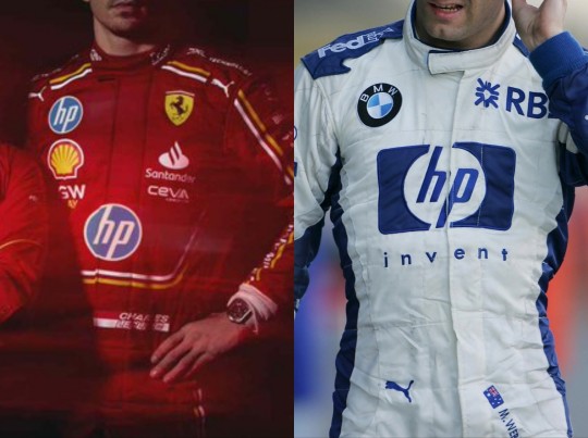
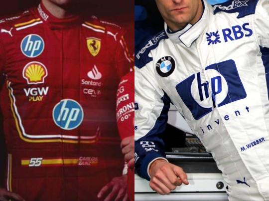

You can have a lot of logos without it looking cluttered. But for some reason Ferrari is like, yeah let's put three small HP logos in completely different places, then people will certainly know our title sponsor is HP!
32 notes
·
View notes


Text
all I'm seeing is clips from Take That's tour and I've still got to wait over a month before my show 😭😭
1 note
·
View note

Text
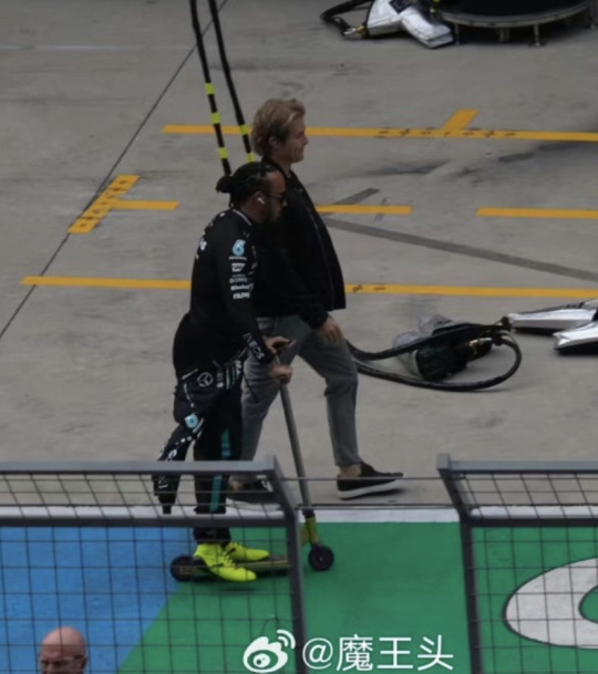
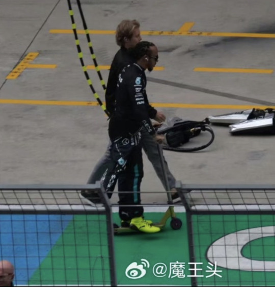
lewis hamilton scooters past nico rosberg at shanghai grand prix 2024


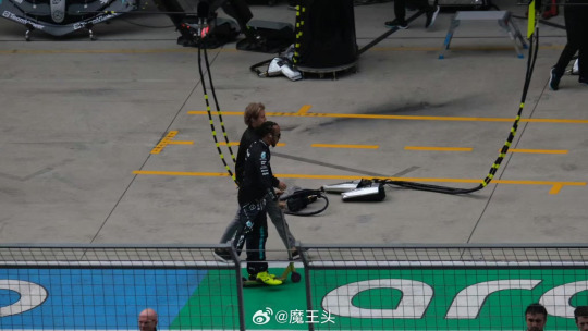

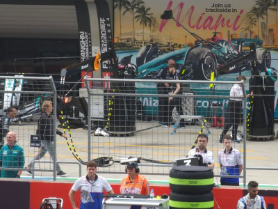

credits: (x) from weibo and @yuzuchupachups
465 notes
·
View notes
Text
you’re stuck living with your icon for a month have fun
420K notes
·
View notes
Text
this may or may not be a fantasy writing exercise for me. please reblog
16K notes
·
View notes
Text
getting surgery to give me a second head so i can tell twice as many lies as usual
2K notes
·
View notes
Note
me when I catch you


ME when I catch YOU
2 notes
·
View notes
Note
I KNEW the Ferrari Miami shirts reminded me of something, definitely Uptown Girl video extras
I get it stuck in my head everytime I see them😢
1 note
·
View note
Text
can you tell me you love me very much please
36K notes
·
View notes
Text
have an important client meeting rn but I think he may have forgotten about me
1 note
·
View note