
s3791650
🍎
Immersive Video Environments using Design Psychology ฅ^•ﻌ•^ฅ◞ ̑̑
10 posts
Don't wanna be here? Send us removal request.
Last Seen Blogs

milo-for-the-king
What the hell am I supposed to put here?

xenaskywalker
i don't even know how to read

starvingzombie
NIAL SPENCER ART

shireyishunjian
湿热一瞬间 / shireyishunjian - 众筹互免分享

iromyy
Tighe Jewellery Studio Perth for Engagement Rings
Text
Week 9
This week I also took the previous video test and adapted it with sound. The chosen sound for this piece was a ‘chillwave’ composition I found from freesound.org by XHALE303 (https://freesound.org/people/XHALE303/sounds/464746/)
youtube
Personally for me with the chosen track makes the use of yellow become more apparent to me, yellow here embodying a sense of distance and eerieness for me still except this distance and feeling of increase in space seems amplified by the chosen track.
youtube
I also began developing my liminal colour palette and started this process by quite physically and visually moving along the colour wheel. Again, while the tempo of the squares move at the same rate as the previous test I find that paired together with the audio (which has a seemingly increased bpm from the last track), they seem to be moving faster.
The track used in this test: https://freesound.org/people/5P4C3_C4173T/sounds/347501/
I also did try and run the video test with the squares moving quicker in the timeframe however, without audio alone to me I felt that the motion was too overwhelming and colour became lost due to the increase in motion.
!! As for the colour transition, I do feel like it is moving through a different colour space however, emotionally I don’t feel too attached to the current colour palette of this work and definitely want to redevelop in time for assignment 2 but also keep developing it for assignment 3. Perhaps displaying these two works side by side will help me more explicitly develop a narrative and colour connections between the works.
youtube
Psychology of signals:
Salience: when one aspect is more noticeable amongst the rest
Signalling theory: i.e. peacocks are flashy and not necessarily ideal visually for running away from predators but perhaps their flashy display suggest an abundance of strength, stamina, intelligence etc. >>> somewhat materialistic
our brains take on foreground and background contrast
Honest vs dishonest signals
i.e. plants sending seductive visuals of nectar for pollination vs creatures sending fake threatening signals of toxicity to scare predators for self preservation
Colour modulation can also have utility and not appeal to aesthetic purposes purely i.e. the ripening of a fruit from green to yellow*** think about if modulating colours in my work has any utility value...via colour mapping and emotion?

Disrupting perception:
Camouflage - nothing of value, no utility, foreground and background signals are confused, background becomes more apparent, foreground merges into background i.e. chameleons
0 notes
Text
Week 8
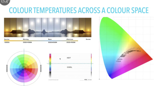
Colour temperature:
Linked to multi-sensory experiences, when creating work it is important to remember that screens and any video work produced with colour will sit within the cool/middle of the day blue light range (3500K-6500K). Noon, the time at which we experience the most cool light also happens to be the time where human function and coordination peaks. At this time cortisol, the chemical which helps us focus produces rapidly and when we use our phones at night, we are affected by blue light, continuing to produce cortisol and disrupting our circadian rhythms.

Colour temperature and colour space:
By playing with the yellow and hot colour palette I have so far, I would theorise that since the colour palette is warm it is able to generate that sort of nostalgia and since the colour palette is warm, not as much cortisol would be produced to fully engage the audience’s attention but enough to keep them interested and mentally occupied. I also did begin to play with shades of black which is considered a cool colour so perhaps modulating with both the warm and cool palettes accordingly may keep the attention span/engagement of the audience I want to satisfyingly (colour harmony !!)

I also found it interesting that physiological factors affect how we perceive and receive light as well i.e. the amount of vitamin d/melanin that is able to be absorbed by how fair or dark we are.
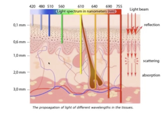
Cooler colours of light also penetrates less layers of our skin than that of warmer colours. Warmer colours like red are also processed more quickly by the human eye therefore this may have something to do with how the colour is able to penetrate through more deeply through our skin.
Digital eye strain and photosensitivity: It is important to be wary of photosensitivity and creating epilepsy-safe works using trigger warnings if I intend to use flashing (especially if they are of more than 3 flashes per second) in my work. It is also worth noting that works with visual aberrations i.e. zebra-patterned (although this occurs naturally in zebras for the sake of predators...) people generally turn away from and do not really prefer to process, at least not for too long.
This may cause digital eye strain which is often caused by screen glares, poor lighting*, uncorrected vision problems etc.
*while poor lighting is a very physical asset that causes digital eye strain, this may also be translated visually also by how much light is replicated on screen to simulate a physical experience or provide the audience with a certain kind of ambience.

>>> Rental ganglion cells produce melanopsin protein which senses blue light
Using the Paletteon website, I began to try and modulate my first colour palette. What I noticed is how the smaller squares impact the background colour quite drastically and serves as a note to self that using smaller shapes within the background could really impact the way my piece is perceived and what sort of emotions arise out of that. As the smaller shapes shift from darker hues to more vibrantly coloured ones, I find that I feel more energetically awake but in a transient way before that feeling settles to being more stable and somewhat calm again. This made me think about how emotions can change within seconds and I should keep in mind what sort of emotion I am trying to generate and how that can be dependant on how slow this transition is (in seconds).
I also realised that simply from varying use of squares, with colours alone I am reminded of a that sort of backroom/uneasy but also nostalgic feeling even though there are no distinct shapes to tell me that it has anything to do with that sort of concept.
0 notes
Text
Week 7
This week I began compiling ideas I’ve been spewing in the past weeks into a video test and created the first following work:
youtube
https://youtu.be/U1RWgRPzah8
I find that I am able to achieve a sort of liminality with this endless loop sequence because of how there is neither a starting or an ending point, like liminal space it is transient and exists between two bounds.
In wanting to convey the pre-liminal and post-liminal phases I could try methods like slowing down the rate at which the squares are passing (especially for the pre-liminal phase I feel like this could embody a more stable sense of space and moment as opposed to liminal space/liminality...)
As for the post-liminal space, I want to experiment with the concept of vaporwave and take influence from the vaporwave sonic elements also. Visually with the video test, I may want to try play with more colours and perhaps depth however, with that in mind, it is also important that colour value and my emotional attachments to these colours don’t get lost as well.
With wanting to go about conveying the pre-liminal (chillwave), liminal (synthwave) and post-liminal (vaporwave) in an orderly fashion, I think the best way to approach this visually would be through a multi-channel work.
0 notes
Text
Week 6
Responding to A1 feedback:
PDF:
“These are potentially 3 frames that you could explore. Perhaps you could at least frame your written work to communicate that you intend to explore all 3, but your focus for this phase of your work is transition? Separation and Incorporation as known elements outside of the frame and yet still influencing your current focus on transition might help locate the work so that it is not in a vacuum or isolation. We can discuss this perhaps more soon”
The idea of looking at communicating the pre-liminal, liminal and post-liminal space definitely did not cross my mind - with my current idea of transforming something like a backroom to a nightclub mainly through the use of colours this could most definitely be interesting and dare I say feasible. My main task would then be to focus on how I intend to clearly get across that transition and transitional state and do that through colour solely...
A physical example of moving through the three states: “For example, practicing the piano can seem laborious and yet when entering into liminal states where the mind is simultaneously focused on motor memory whilst the passive or receptive experience is focus on memory of harmonic pattern, the brain/mind integrates higher order function. It can be a difficult process, but a greater and more nuanced understanding of 'harmony' and 'colour' emerges from it. No one wants to work to achieve this state. Everyone wants enlightenment without the journey there. “
Words and emotions I associate with the 3 states
pre-liminal: familiar, nostalgic?
post-liminal: odd, eerie, transient/fleeting, heading towards unfamiliar
post-liminal: euphoric, trance, unknown, confusing?, enlightenment
Colours attached to these states: “how emotions can form these colours”
post-liminal: black is one of them...?
Technical Research: should aim to discuss and demonstrate information and data that forms the foundation of your production design. Of course you may reference elements of your methods for production design but it should stop there in this section
2d and 3d: “I think the wording of this is problematic. I dont agree that 3D elements may explicitly help to embody a liminal space necessarily. What I mean by this is that the idea of liminal space, in the context we are discussing, is largely an internal experience. Yes, a certain environment may present itself in a way that is conducive to creating or facilitating a liminal experience, this much is true. You do go on to state that you intend to conduct and experiment on this hypothesis that 3d elements may, but how? Viewing 3D assets within a 2D frame? Perhaps.. Motion/Movement can trigger certain classic visceral reactions and response... hmm.. more discussion and thought needed here. Something else to consider which we can discuss more is the idea that colour itself is a dimension... In that it can elicit some kind of spatially referenced neurological response or reaction ie does this colour feel more spacious or less spacious than another colour”
“Yes. Patterns that modulate. In 2D. In 3D. Modulate between 2D and 3D... We're getting somewhere. This information is relevant to technical research if you were to dive deeper. Aim for this in A2“
Sound design:
9AM in Calabasas - 808 DEAD: “This one feels like its roots are in vaporwave territory. especially with regards to vocal treatment. In the previous track (Joji), the vocals are very vivid and sit on top of environmental sound design. This track the vocals sit way back. In a way we are not as aware of their meaning for that reason. Arguably, the production on the vocals is more liminal. The phaser towards the middle/end of the track is very vaporwave. This aspect of sound modulation works as a modulator of the harmonics. I found this, which might be a good resource for you https://online.ucpress.edu/jpms/article/33/1/70/116330/Reconstructed-NostalgiaAesthetic-Commonalities-and”
Reconstructed Nostalgia: Aesthetic Commonalities and Self-Soothing in Chillwave, Synthwave, and Vaporwave
- does this genre/any of these sub-genres fit into the pre-liminal, liminal or post-liminal space
“Although these genres certainly approach nostalgia in different ways, they each rely on imagery that evokes nostalgic feelings or memories in a form of collective, imaginative self-soothing. The memories evoked, however, tend to rely on unrealistic depictions of reality and center on times and places that have perhaps only existed in the listener’s imagination.”
“These fictional situations may have ties to popular culture of the past; for instance, much of the synthwave visual and musical style references 1980s sci-fi movies.“
- I find it interesting that much of synthwave has ties to 1980s sci-fi movies. I think tied together with the concept of nostalgia, sure science has us quite grounded? and in the pre-liminal maybe but its with the idea of fiction that creates a sort of grey area with impossible situations
“the specific, personal nostalgia becomes merged, in real-time, into a past which the listener already knows never to have existed.”
“Listeners collectively embrace the chillwave, synthwave, and vaporwave reinterpretations of these eras, often relying, in some part, on their own memories, but ultimately creating something that is simultaneously nostalgic and new.“
- look into sci-fi aesthetics?
>>> adding to this, Nova’s ‘Not Around’
Chillwave - pre-liminal ... maybe even liminal >> hypnagogic, transitional

“In chillwave, the vacation, summer, and vintage-related themes are certainly more realistic than those of other genres along the nostalgia genre continuum“
>> I also find it interesting how here in this reference image the colour scheme is befitting of a yellow monochromatic colour scheme similar to one found in backrooms but the emotion/vibe it gives out is completely different - could be completely different depending on what soundtrack i use?

chillwave - using cooler tones? desaturating warmer colours?
Synthwave - liminal?
>> the Californian palm tree aesthetic is also present with synthwave perhaps in a more stylised and animated manner
Vaporwave - starkly different to chillwae and synthwave aesthetically
“As Born and Haworth state, vaporwave engages with “technological imaginaries of the present and recent past…through ironic remediations of sounds, images, and practices characteristic of earlier phases of the internet, the historicity of the net becomes focal for vaporwave aesthetics.”
“Chillwave, synthwave, and vaporwave each highlight a different form of this reconstructed nostalgia while sharing similar pop culture iconography. While chillwave and synthwave certainly share a predilection for images of Californian sunsets and imagery reminiscent of that of the ‘80s, synthwave tends also to posit impossible scenarios, potentially involving science-fiction themes. Vaporwave likewise follows the tendency for impossible scenarios, although pushed to surreal and bizarre lengths and often involving ironic references to consumerist imagery of the 1990s. Subgenres of vaporwave, such as mallsoft, highlight the links between consumerism and vaporwave, often to an absurd degree, while vaporwave highlights links to Asian culture through the use of samples from Japanese city pop. All of these are related by the individual listener’s willingness to accept the impossibilities (as well as the elements of truth) in the “reconstructed nostalgia” inherent in this music on the nostalgia genre continuum. This reinterpretation of cultural memory acts not only as a musical element in several of these genres, but also as a key structural feature in understanding how this music is heard by listeners.“
Perhaps by deconstructing elements of chillwave, synthwave and vaporwave in playing around with the pre-liminal, liminal and post-liminal stages I could create a more sycnhronous and flowing piece that transitions more smoothly between the phasess (as opposed to also considering the trance/psytrance music genre...this idea may still be used in perhaps the post-liminalm stages of my work however...? should focus be drawn to vaporwave instead?)
Blog:
Your writings on your blog addressing colour management through various software programs relates to your technical research and production design. This level of information communication is at a higher level and should be included in your PDF 2.0 >>> is this in reference to the stuff I made for HME?
0 notes
Text
Week 5
COLOUR WORKFLOW:
As humans we see colour as the amount of wavelength light that is reflected back to our retina’s cone cells. Digital cameras on the other hand have completely different sensors and colour space (RGB/HSL/HSLUV)
We understand and experience colour in a natural and subconscious way as colour intricately weaves into literally everything we are surrounded by. Colour is more apparent stylistically digitally (personally I feel like we are more conditioned to appreciate colour when it is digital than when we perceive it in real life).
I also think that human perception of colour seems to be more temporary and fleeting (quite literally, if we think about concepts like forbidden colours and those sorts of colour perception tests) whilst we are able to maintain and hold these colours digitally for longer (hence why we probably appreciate colour digitally more often).
In terms of colour palette I am thinking about revising my colour palette to being more muted and monochromatic (looking at hues of green and yellow specifically) to generate more eerie/dingy backroom sort of vibes before transitioning to a brighter vaporwave and nightclub-inspired colour palette to play with the viewer’s perception and understanding of liminal space.
>>> How/Where are you working on/developing ways of experimenting with colour palettes/contrast/relationships/modulations? Consider this question from both a static perspective and motion design/moving image/video perspective
Static: analysing liminal space images - seeing if any colours stand out to me and debunking why
Moving images: gifs transitioning between colour palettes I plan to use with focus drawn to transitioning colours and then bringing this into a progressive 3d space to see if the same sort of emotions and values apply
>>> Emotions
Questions I want to be considering regarding emotion:
- in those transitional colour stages what do i feel? do i feel sad to be detaching to one colour thats passing or am i excited to meet new colours ahead?
- what about in a more collective sense where I am shifting between two colour palettes?
- is shifting between two colour palettes too overwhelming? would it be worthwhile to focus on creating more nuanced and smaller colour shifts?
*VIDEO WORKFLOW:
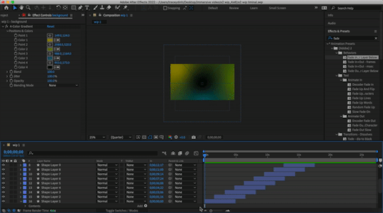
Through a 1920 x 1080 screen space I will be using motion graphics namely an endless zoom to create an immersive experience through liminal spaces. This will be through a colour palette of muted greens, yellows and greys before transitioning to a more vibrant pink, purple colour palette. After Effects will be my main mode of creating this piece.
To draw on progress as mentioned in the colour workflow, I will first test creating colour shifts i.e. muted yellow to a muted green that melt into one another and seeing what sort of emotions evoke for me out of this. I will then take this into the 3d and endless zoom space to see if the specific emotions still evoke and are retained.
More examples I found this week that exhibit a driving sense of immersion, colour whilst toying with liminal space:
Flying Lotus Performance:
Flying Lotus’ performance utilises a lot of entrancing motion graphics that match up to the sound design of their song which I find extremely satisfying. I am also impressed by how much they could create within a small cubic space and given the liminal and space restraint I want to see what sort of patterns and using colour I could develop (using the endless zoom technique also*)
I particularly find 3:34 interesting, seeing the illusion of the mandala ‘fly’ out at the audience whilst still maintaining the cubic space. I would like to see how with the endless zoom I am able to play with (3d) perspective also.
youtube
An art piece I see on my way to work each week (I will take a better picture of this I promise...)
Ultimately, this piece utilises colour as its driving force, there is a small divot/box in the centre of the piece also where the colour sort of folds into this little shadowed space. I think this is interesting how with only using shadow and colour, it was able to create a liminal space.
*SOUND DESIGN:
- green, pink, brown layered noises (refer to how I’m using this in another project)
- psytrance as a genre/techno rave
- slow and reverbed songs i.e. Joji
- have audio match and reflect motion of the video and colours also
_____________________________
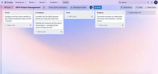
Project Management:
https://trello.com/b/qGlPAPkv/dpiv-project-management
1 note
·
View note
Text
Week 4
Responding to A1 feedback:
Firstly, I am really appreciative towards the feedback I received this week regarding A1. From feedback I was suggested to look into the following:
Consider an immersive vs an interactive experience
Interactive: If i were to create an interactive experience i.e. a simulated game (like ‘The Stanley Parable’ which Kevin so kindly referred me to). Tied to this concept is also the idea of impossible architecture and perspective-shifting which really disorients the viewer/player and something I want to definitely look into.
Architecturally, something about using hallways is also quite disorienting and weirdly hypnagogic. Not only using hallways but moving through similar spaces also amplifies the experience of a liminal space in my opinion - which is exactly what ‘Superliminal’ does (which was also referred to in Kevin’s feedback to my A1 document.)
- Superliminal also makes beautiful and intriguing use of colour palettes that often range from monochrome to analogous and I want to look into this further
Alongside hallways, backrooms seem to pop up a lot when talking about liminal spaces - I suppose like hallways, they are empty, feel some sort of cosy and familiar but also distant and terrifying at the same time, like what Shiqi mentioned. How could I intertwine these dichotomies into a singular work with the use of colour?
Immersive: If i were to create an immersive experience, I think the idea of endless zooms could be an interesting approach, maybe moving through different backrooms and hallways that transition in colour palettes subtly (or not subtly?)
Examples of infinite/endless zooms:
Limitless Intro (2011)
youtube
A personal favourite of mine: https://zoomquilt2.com/
I think the factor of tension could definitely play into this notion of liminal space and I might be able to develop a colour palette based on that particular feeling.
I also vaguely created a liminal space as a work in progress for one of my classes last semester that went unused so maybe revisiting that concept in this project could be interesting.
youtube
Colour palette revisions:
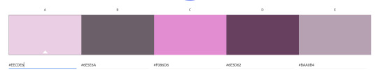
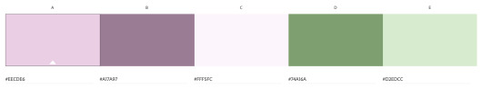
Yiran also suggested I look into muting the colour palettes a little bit and I most definitely agree, I think with the extended research and reflecting I’ve been able to do on the project so far from feedback I want to be using a colour palette that is perhaps something like (or at least to start off with):
The existing colour palettes from my A1 document could definitely be useful if I wanted to elicit a shift in emotion/state though.
>> Personally reflecting on these colour palettes they feel closed in and quite muggy, somewhat damp
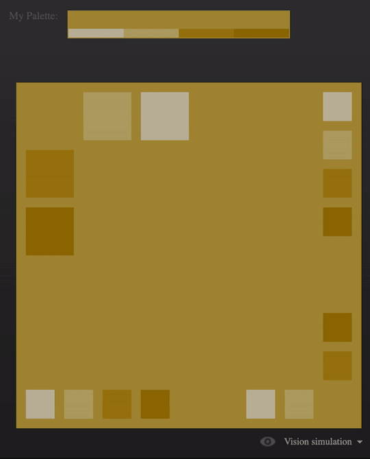
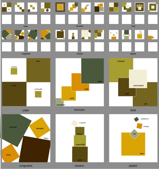
Black squares activity:
Regarding colour palettes for the 6 categories (order, increase, bold, congested, tension and playful) I’ve decided to try and play with both the new colour schemes from this week’s blog and also from A1.
I didn’t realise what I wrote earlier about tension may have much correlation to this activity so it was very interesting to work through.
0 notes
Text
Liminal Space activity
Looking at a different liminal space each week and dissecting it
Refer to subreddit r/LiminalSpaces
Week 4 Liminal space:
https://www.reddit.com/r/LiminalSpace/comments/tjj6ma/i_went_to_an_old_titan_missile_silo_and_the/
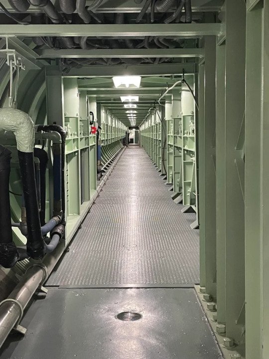
The first thing I noted with this liminal space was how much I liked the green/sage colour. (Dare I say it might be my favourite colour...maybe that’s why I gravitated towards it for this week’s liminal space). I also associated the colour with the feeling of being safe and secure. I know for a fact that if I were to change the colour of the sage to being any other colour, I definitely would not feel this safe in the space. Perhaps the thin-looking rickety metal and janky pipework which provides a stark contrast to safety is made up for by the warmness and security I feel in the sage? May this be why it is considered a liminal space? A transitional state between safety and danger?
Week 5 Liminal Space:
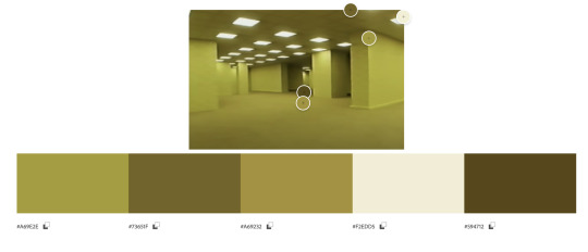
https://www.youtube.com/watch?v=H4dGpz6cnHo
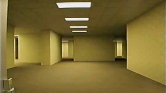
With such heavy influence from the backrooms being drawn to my project, I think it is only fair that I do a deeper analysis on it this week. Straight off the bat, the emotion I get from it is unsettled (funnily enough even though the room is yellow and commercially associated with positive emotions) I think this is because of the lack of texture and detailing on the walls, the sense of emptiness (compared to week 4′s liminal space) amplifying that unsettling feeling. Also from a horror standpoint, a series of walls and hallways I personally associate with nothing short of a bad ending. I think it is also the hue of yellow that had been chosen had it been a hue that was brighter I think the tonality of the piece would have altered completely.

0 notes
Text
Week 3
4 colour palettes + 4 emotions
Emotion 1: Amused

Monochromatic:

Analogous:
Complimentary:

Emotion 2: Peckish
Monochromatic:

Analogous:
Complimentary: (this one is starting to like smoked salmon and greens to me and is making me hungrier right now >:C)
Emotion 3: Frazzled
Monochromatic:
Analogous:
Complimentary: I didn’t realise how similar this colour palette was to the complimentary colour palette for the emotion of amused - I can’t exactly say that frazzled and amused are complimentary emotions but both definitely lay on opposite ends of the spectrum. Maybe they may be more similar than I thought to take notice of

Emotion 4: Sentimental
Monochromatic:
Analogous:

Complimentary:
I find it interesting that the complimentary colours of these 3/4 emotions gravitate towards a yellow-green. Peckish, frazzled and sentimental I can’t necessarily attribute as being similar on an emotional level - nor attribute them to a positive or negative valence. I find it interesting how the colour palette of the emotion frazzled is particularly vibrant also.
Pixel Art activity
Original image:

For this activity, I recoloured the image of the girl to have the complimentary colour palette of the emotion frazzled. The first thing I noticed was that she definitely looks like she belongs in the show ‘Monster High’ now which is funny because I believe the show is about zombies and undead dolls which makes sense because the after recolourisation how she definitely looks more sickly, her complexion off and unoxygenated. In regards to colour congruencies and health also, she seems a lot more unnatural and making her seem undead also.


Personally, for me, the purple tones also amplify her sickly appearance. As for association to emotion, the emotion opposite to frazzled would be somewhere near tirelessness or being inexhaustible which I personally think juxtaposes her appearance completely.
Infographic activity
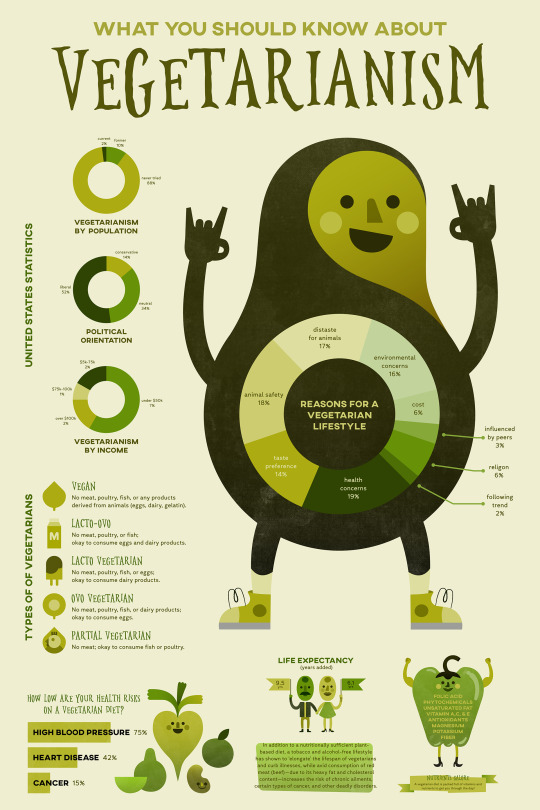
https://www.behance.net/gallery/59893615/What-You-Should-Know-About-Vegetarianism-(Infographic)/modules/462262171
My first impression of this infographic is that it is monochromatic and utilising green to portray its topic on vegetarianism is quite fitting. Important text also seems to be in a darker green/near black. Some of the text on green is a little bit illegible however i.e. taste preference category on the pie chart
The infographic’s colour palette:
Pretend you are now the designer working up some new colour choices in the face of having to accommodate new contextual factors, how might you colour this project if…
1. You had to demonstrate the worst possible data visualisation colour practices
I feel like the essence of green is essential to the infographic and its theme so colours to strip away the vegetarianism aspect of the infographic i.e. maybe using pinks and browns (specific to this infographic that could also suggest the colours of meat and create incongruences so to demonstrate the worst possible data visualisation that could be something to consider)
Something similar to this colour palette mayhaps:
2. You had to force yourself to use as few different colours as possible? (around 3 or 4)
To create a sound visual I think the monochromatic green colour scheme is visually salient however, they aren’t necessarily eye-catching so maybe including pops of orange or yellow here and there (for pieces of information deemed interesting or important). Therefore I think shifting to an analogous colour scheme leaves more room for colour interpretation without shifting visual salience too drastically.

0 notes
Text
Week 2
Notes from class:
Luminance - light source itself (intensity of omitted light) - measureable
Illumnance - quality of light hitting a source i.e. desk - measureable
Brightness - subjective measure of luminance and illuminance, when light falls on the cones and rods of our retinas
It is worth playing with layers with regard for context and changing that should be at the forefront of the project (think about challenging this!)
Provocations integrating: where does one colour end and another start? where does happiness end and joy begin

Emerging colour order: black/white > red (fastest to be processed by the eyes and brain, also less energetically processed)

An amalgamation of colours may be overwhelming in a pleasurable way or a clashing/unorganised way
visual salience: e. where’s wally
Colour is always contextual and always changes, going back to the class activity we did on https://color.hailpixel.com/ in the discord group chat I put down the concept of being clear-headed vs cloud-minded as the following

However, the day after when I came back to this I envisioned the colour of being cloud-minded as more of a muddy green like the following:

Readings:
Comparative study of colour effects on cognitive performance in real world and VR environments
Key takeaways:
- immersive VR environments’ success lies in effectively being able to activate human emotions and behaviours
- Colour accounts for ~70-80% of visual information and is highly influential
- Immersion, presence and interactivity are key in creating a functioning VR system
The first instance I thought upon reading this study was how VR has been used for pain management to treat burn patients via ‘SnowWorld’, a highly appropriate environment that directs the patient’s attention away/distracts them during medical procedures (the visuals are also heavy on whites and blues, cool colours as opposed to warm ones)

> Virtual Reality as an Adjunctive Non-pharmacologic Analgesic for Acute Burn Pain During Medical Procedures
Presence in VR can also mean making use of the tactile and olfactory senses
> Virtual reality and stimulation of touch and smell for inducing relaxation: A randomized controlled trial
As for immersion and colour outside of the VR aspect, my mind was drawn to the Scribble stylus pen (essentially the same way you would be able to Shazam a song you hear with the stylus you would be able to obtain the colour in its exact hue by tapping onto the object itself)
Does pink pacify prisoners?
An experiment conducted by Alexander Schauss put 153 men into a room and made them look at coloured cards, one being blue and the other Baker-Miller pink/drunk tank pink (a shade of pink that supposedly calms us down) - reportedly from this up to 26% lost their strength looking at the drunk tank pink card compared to the blue one. This fascination was also taken up by an American football team which painted the locker rooms of visiting teams pink (in hopes that it would weaken how well they played that day) and influencer Kendall Jenner who painted her room claiming that it was ‘scientifically’ proven to calm us down and also suppress our appetites. However, no later research proves this to be the case, rather I think colour and colour psychology while it can be generalised depends and changes from person to person (with regards to cultural influences).
> I think this relates back to the colour picker activity in class and makes it important to note that our thoughts and perception of colour changes and is impacted so much by our mental disposition at the current time.
Colour contrast considerations for UX designers
Designing for experiences to be enjoyed by the widest range of people possible:
- run your colour choices through one of the many colour contrast accessibility evaluation tools i.e https://webaim.org/resources/contrastchecker/ (should pass the 4:5:1 contrast ratio)
Exceptions:
- Large text (defined as 14 point and bold or larger, or 18 point or larger) must have a contrast ratio of at least 3:1
- Incidental text/images of text, that are pure decoration and serve no user purpose do not have to meet colour contrast requirements
- Brand logos do not have to meet colour contrast requirements.
- soft-proofing on Adobe programs via ‘Colour Universal Design’ (CUD)
It is important to acknowledge that there are different types of colourblindness and colour sensitivities !!
Colour management with Adobe CC apps
When media comes from lots of different sources, and is passed between different processes, inaccuracies can be introduced into the colour information every step of the way. Even footage from a single camera that’s edited on a single system can still experience these issues, as different creative applications interpret colour differently
As images move through your workflow, you want a colour space that is as easy to manage as possible, but also isn’t restricted too much by a small gamut.
Premiere Pro:
1. Confirm that you have GPU acceleration enabled (File > Project Setting > General > Video Rendering and Playback)
2. Enable Display Colour Management (Preferences > General)
Media Encoder:
1. Enable GPU acceleration (Preferences > General > Video Rendering)
2. Enable Display Colour Management (Preferences > General)
After Effects:
1. Open the project settings colour tab (File>Project Settings>Colour)
2. Choose Rec. 709 Gamma 2.4 from the list
--
After the working space is set, we’ll need to enable display colour management.
1. Bring your current composition viewer into focus (click on it – it will have a thin blue outline)
2. View Menu > Use Display Colour Management
Photoshop:
1. Launch Photoshop – a document does not need to be open
2. Edit > Colour Settings
3. Ensure the Settings dropdown is set to the Default for your locale (North America, Europe, Japan). This will configure the following settings.
Illustrator:
1. File > New
2. Choose one of the Film & Video presets, HDTV 1080 for example
3. Under the Advanced Options, ensure Colour Mode is set to RGB Colour
4. Click Create – the new document opens
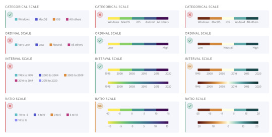
Colour for data visualisation:
Categorical: non-numeric meaning, visually distinct

Sequential: have numeric meaning, visually connected - use these for ordinal and interval scales. It’s also acceptable to use these for ratio scales. Do not use these for categorical scales.
Diverging: have numeric meaning, palettes are a pair of 2 gradations of colours that meet in the centre - use these for ordinal and ratio scales, especially when there is a meaningful middle value. These may also be used for interval scales. Do not use these for categorical scales.

The Stroop Effect:
The Stroop Effect describes itself as a psychological process where there is a “delay in reaction time between congruent (harmonious) and incongruent (disharmonious) stimuli”
I found this concept interesting because my earliest exposure to the Stroop Effect was on a kids’ game I played back when I was younger called ‘Moshi Monsters’ in a time-based quiz where I had to distinguish colour from the word displayed on screen, so to be revisiting the concept again in university is interesting.
> A profoundly similar concept to the Stroop effect may be the inverted control functions on certain video games (I believe Call of Duty amongst a lot of FPS games offer this control - in regards to the motion of locking on aim)
The video game Fireboy and Watergirl also comes to mind, where one is expected to switch between playing two characters simultaneously to escape a room and switch between congruent and incongruent stimuli
0 notes
Text
Week 1 Homework/Readings
NOTES:
youtube
I found Hanson’s use of the blue and black/white and gold dress dilemma as a way to perceive colour very interesting, the mind easily tricked into perceiving a range of different colours (some which don’t even exist at all...) but different colours when paired up together and shown under different colours under the colour spectrum may have their properties altered completely different as to how we would perceive them.
Hanson’s presentation also mentions that we require less energy to to excite a sense of brightness with the colour green (as opposed to red or blue) and got me thinking this may be why we are so many of us are attuned to nature and find it so relaxing.
The Human Visual System
- Chromatic aberration results as an inability of the eye to focus between two (or more?) colours on opposite ends of the spectrum i.e. red and blue --> this creates a false sense of depth
Stereopsis: the ability to perceive objects in 3D
Chromostereopsis: the perception of depth based on colour rather than the physical distance between objects
- Our eyes process motion through a series of quick short steps (’saccades’)
The funny thing about magenta
- Spoiler: the colour magenta doesn’t actually exist ):
- Naturally on the colour wheel red and purple are placed next to each other and fade into one another but on a colour spectrum they are on opposing ends


- ‘Magenta’ doesn’t have a distinguishing wavelength to differentiate itself from the other colours on the colour spectrum because it doesn’t exist on the light spectrum
- We have three photoreceptors that namely allow us to see the colours red, blue and green
- We see the colour magenta because our brain doesn’t like green which is magenta’s complementary colour being placed between purple and red
Impossible colours: our vision’s incomplete palette
(just when I thought it ended with magenta...)
Opponent colours:
Red - Green
Blue - Yellow
Black - White
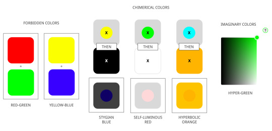
Impossible colour: a colour that is a mix of the three sets of opponent colours perceived by our cone cells i.e. you can’t have a colour that is red-green, blue-yellow, black-white)
Forbidden colours: colours our eyes cannot perceive because of the way the cone cells work
Chimerical colours: (refer to the tests in Andrew Hanson’s presentation) the colour created (stygian blue, self-luminous red, hyperbolic orange) after looking at two colours in succession, experiencing fatigue in the eyes which changes our sensitivity to colour
Imaginary colours: cannot be produced by a physical light source and outside the colour spectrum (no physical object can attain the colour)
Chimerical/Impossible colours wiki
- Any additive mixture of two real colours is also a real colour.
- By mixing any three colours, one can therefore create any colour contained in the triangle they describe—this is called the gamut formed by those three colours, which are called primary colours. Any colours outside of this triangle cannot be obtained by mixing the chosen primaries.
- When defining primaries, the goal is often to leave as many real colours in the gamut as possible
- Since the region of real colors is not a triangle (see illustration), it is not possible to pick three real colors that span the whole region. The gamut can be increased by selecting more than three real primary colors, but since the region of real colors is not a polygon, there will always be some colors at the edge left out. Therefore, one selects colors outside of the region of real colors as primary colors; in other words, imaginary or fictitious primary colors

Chimerical colours:
Stygian: simultaneously dark and impossibly saturated - staring at bright yellow causes a dark blue afterimage then on looking at black, the blue is seen as blue against the black, also as dark as the black.
Self-luminous: mimics glowing effect - staring at green causes a red afterimage, then on looking at white, the red is seen against the white and may seem to be brighter than the white.
Hyperbolic: impossibly highly saturated - staring at bright cyan causes an orange afterimage, then on looking at orange, the resulting orange afterimage seen against the orange background may cause an orange colour purer than the purest orange colour that can be made by any normally-seen light.
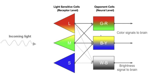
Opponent Process Theory:
Ewald Hering a German physiologist proposed that colour is viewed “based on a system of opposing colours” (refer more to ‘Impossible colours’ reading above)
Trichromatic Process Theory
Proposed by Thomas Young that colour vision works actively through three different photoreceptor cells, this theory was later revisited by researcher Hermann von Helmholtz who attributed wavelengths to each of the photoreceptor cells.
- short-wavelength cone receptors (blue)
- medium-wavelength cone receptors (green)
- long-wavelength cone receptors (red)

This was through colour-matching experiments which proved participants needed three wavelengths to match any colour (which they could not do with two or little wavelengths) and later became known as the Young-Helmholtz theory of colour vision
To sum it up:
Opponent process theory: Colour vision at the neural level
The trichromatic theory: Colour vision at the receptor level
Both of these theories are necessary to fully describe the intricacies of human colour vision.
Qualia wiki
“Individual instances of subjective, conscious experiences” >>> sense experiences rather than properties
Examples: the taste of wine, redness of sky, hearing C# played by a pipe organ etc.
>> The way we all individually perceive a colour is a form of qualia??
Arguments like the inverted spectrum argument and zombie argument question the plausibility of qualia
Valence wiki
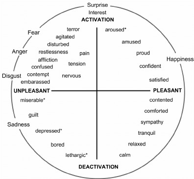
Valence: the affective quality referring to the intrinsic “good”-ness or “bad”-ness of an event, object or situation. The term also caters to emotion i.e. the feeling of joy is considered to be of positive valence whilst anger is considered to be of negative valence. This idea was also touched on in one of my studios last semester via the Circumplex model of emotion.
Overall impression from this week’s readings:
Wow, colour is definitely more complex on both a scientific and psychological level. What we see if more than what meets the eye (quite literally). I am interested in playing with the idea of perception and tricking the eyes into seeing different colours and maybe playing into this with the physical and digital space (how this may be manipulated, maybe even blended) as Cy suggested in the first lesson of this course
0 notes