
qualitytutorials
Quality Tutorials for Artists
What makes Quality Tutorials
different from any other
tutorial blog or source?
We filter the tutorials we post,
not every tutorial is helpful,
many teach bad or
incorrect habits. Our goal is to post tutorials that have reliable information.
225 posts
Don't wanna be here? Send us removal request.
Last Seen Blogs
elaizzzzzswift
made-of-starlight

delde
Delde's blog
grapehat-blog
all hail queen lorde
laurascardigan
laura

un-touch-able
Unbetitelt
Photo

I tag all of you!
Happy New Years!!
Feel free to read the accompanying blog post: https://artres.xyz/post/a-new-year-for-creating/
OH ALSO, THANK YOU GUYS SO MUCH FOR 22K!! YOU GUYS INSPIRE ME EVERYDAY! ❤️
More useful articles and resources / support Art-Res | my art tumblr
1K notes
·
View notes
Text
http://www.elfwood.com/farp/figure/williamlibodyconstruction.html
http://www.youtube.com/watch?v=QMF5TtlFqzQ
http://www.youtube.com/watch?v=7L0AunTyz7I
http://www.youtube.com/watch?v=7z2J_ot9J00
http://www.youtube.com/watch?v=OZwscBIk4Ng
http://ethician.deviantart.com/art/Figure-Set-1-95316448
http://prrb.tumblr.com/post/30177790499/shrimp-method#
http://rynnay.tumblr.com/post/11779375693/just-an-easy-trick-i-learned-a-few-years-ago-that
http://fatpeopleart.tumblr.com/post/25373451849/varying-your-body-types
http://majnouna.deviantart.com/art/Guide-to-Movement1-Flexibility-66104159
http://dimespin.tumblr.com/post/22050152776/eyecager-the-secret-to-composition-exasperated
http://www.itchy-animation.co.uk/light.htm
http://www.furaffinity.net/view/4098394/
http://www.zvork.fr/vls/
http://farm8.staticflickr.com/7063/6959484393_1737eb7d55_o.jpg
http://www.creativebloq.com/digital-art/speed-painting-12-fantasy-tutorials-1233120
http://www.imaginefx.com/02287754332977434531/portrait-speedpainting.html
http://mayhemandmuse.com/wp-content/uploads/2012/05/girl-floating-jellyfish-magic-glow-digital-art-photoshop-painting.jpg
http://www.imaginefx.com/02287754333250766838/tutorial.pdf
http://www.imaginefx.com/02287754331901200066/tutorial.pdf
35 notes
·
View notes
Photo
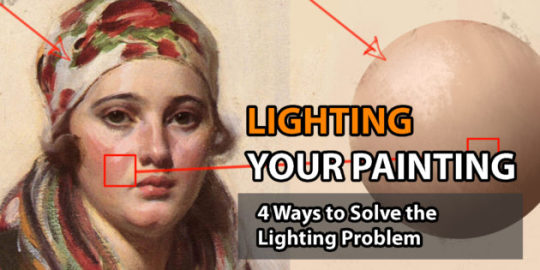
Lighting your Painting: 4 Ways to Solve the Lighting Problem
Fundamentals of Painting
“Most of the time when we are painting, we get so overwhelmed with all the info, which is why practicing the lighting fundamentals beforehand will be beneficial for future work. This will be a pretty lengthy article, but it is pretty comprehensive in terms of necessary fundamentals.
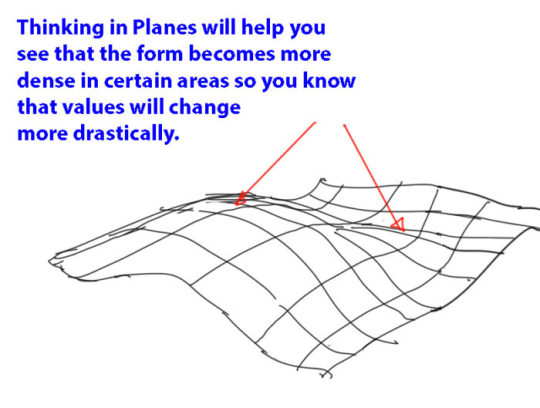
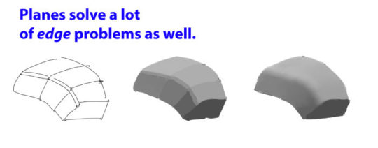
Fundamental #1: Importance of the Plane
When painting and using light, you need to switch from the form build-up approach to thinking about the right plane structure to make the right lighting decisions.
If you can simplify the elements into the proper planes you will understand the structure better and you will be able to assign the right values (when lighting).

Fundamental #2: Light Properties
There are some consideration to make when thinking about lighting. I will try my best to explain some of properties and explain how the lights affect the values and colors of a scene.
Light-Shadow Ratio: The light-shadow ratio determines how much of a contrast there is between light and shadow. A higher contrast is created due to sunlight, and a lower contrast due to overcast weather for example. This is caused by different intensities in light.
Value Keys: Value keying is mainly a design technique used to adjust the value scale while maintaining the light-shadow ratio. Depending on the light situation we have a specific value key in the scene.
Value Compression: Value compression is needed, because we as painters can´t get the full range of light into our paintings. We need to decide, if we want to expose for the light side or shadow side and sacrifice the values on the other side
Light Color: The first thing to understand about light is that it constantly changes it´s wavelengths, therefore changing it´s color. To simplify the process just identify the light as a warm or cold light.
Shading Components
Fundamental #3: Light Set-up
Now that we know how values and colors and affected by light, let´s look at how to set up lighting situations. These lighting situations are always used, and can be divided into natural and artificial light:
Light Types: There are only 3 basic light types you need to know to light your scene. Key Light, Fill Light and Rim Light.
Light Sources: There are only so many light sources that exist. Knowing about them will help you identifying them in any given reference and use them creatively.
Global Illumination: The characteristics of global illumination is the use of bounced/reflected light. It is used to calculate where reflected light is coming from, so we know which planes receive what light in any given scene. You need to treat it as a diffuse light source. It is most effective when there are a lot of shadows.
Fundamental #4: Material Behaviour
Many Material renders disregard the properties of Light. The reason we have learned about light in the first place is to convey materials in different lighting conditions and make them congruent to the scene. Let´s look at the materials and how light interacts with different surfaces.

Learn how to think about shapes, value, color and edges and understand it to apply the knowledge of physics to adjust your values and colors. A proper artist knows both the mechanics of painting and of physics.”
For full explanations complete with image examples, go to the article.
9K notes
·
View notes
Text
How I Approach Color

I got this sweet message with some very real questions about color! Here is where I try to answer:
Looking at the following pieces, you’ll notice (at the core) it’s an interplay between warm/cool, complimentary colors, or primary colors. Here’s that in order:


But of course there’s a lot more happening than these fundamentals. At least, that’s what it looks like. But really I’m just repeating the same principles of warm/cool, complimentary, and primary colors (color theory) in smaller, more hushed ways throughout the whole painting! This makes it harmonious, but interesting! Let me explain and show through deconstruction:
1. Basic division of primary colors:

2. Smaller divisions of primary colors:
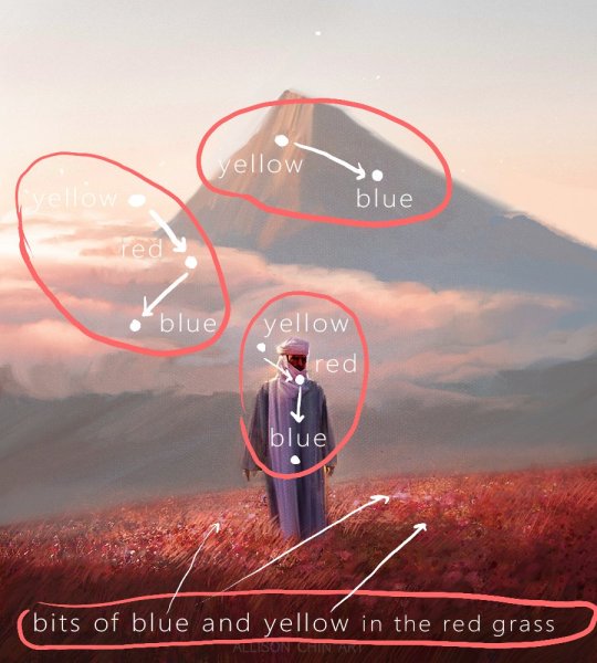
3. Smaller divisions of primary-color-relationships (it just keeps happening):

At the core, we are repeating the same core principle of contrasting primary colors, but with varying degrees of contrast and subtlety as we add more detail.
Indulging in the midtones:
Everyone’s all about those highlights and shadows, but great color treats the midtones just as lovingly. In this piece, you’ll notice bits of what seems to be blues/purples within all the green foliage:
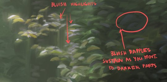
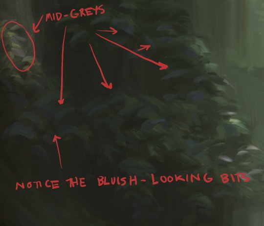
Really, if you color-dropped them, it is just grey. The simplest way to tap into these greys is to just move your color pick to the left and a few degrees towards it’s complimentary color. Now dapple it all over the leaves and rocks and forms! See what it does to your piece.
Midtones aren’t as explicit, but they are certainly felt. It can differentiate mature color to immature color, goodness to greatness, etc. Do allow yourself permission to camp out here longer!
Final:
There’ a whole other half to color that says, “Well, why did you choose to make the sky teal with yellow? Why is the sunset purple this time, etc?” This is all your feelings, your intuitions, your personality, your intention, etc. It really is the large majority of why you choose a color.
It is just as important as the technical stuff, but I can’t really teach you to have a certain taste. I can just urge you to not neglect this part about color (all the FEELS) because otherwise things will turn out hollow. Allow yourself permission to care about the feelings and the technical stuff, don’t shame one over the other, and appreciate the growth in both.
I can only encourage you to keep actualizing your tastes and personality through your art. Repeatedly. This will become more clear and refined for you, and I’m sure you will notice it growing with you as well.
Thanks again for your sweetness and forcing me to reflect and come to my own thoughts about color!
Here are some other resources that say things in a way better than I could:
http://nicholaskole.tumblr.com/post/154595028192/hi-first-off-your-art-is-literally-eye-candy
http://justinoaksford.tumblr.com/post/122948396404/notes-for-an-anon-who-asks-hey-justin-thanks
-Allison
SHOP | TWITTER | FACEBOOK| TUMBLR | INSTAGRAM
5K notes
·
View notes
Note
I think This Tutorial in particular will help demonstrate what you mean.
Jeff your work is very realistic in terms of the proportions of the characters that you realize. My question is, you are using photo references when you work? if the answer is yes, could you tell me how to use them in the best way? Thank you so much!
Photo refs are important, but there’s nothing more boring than seeing a 80-100% accurate copy of a photo. Use them to study but when it comes to the piece I only use elements from it that I find interesting or unexpected.
120 notes
·
View notes
Photo
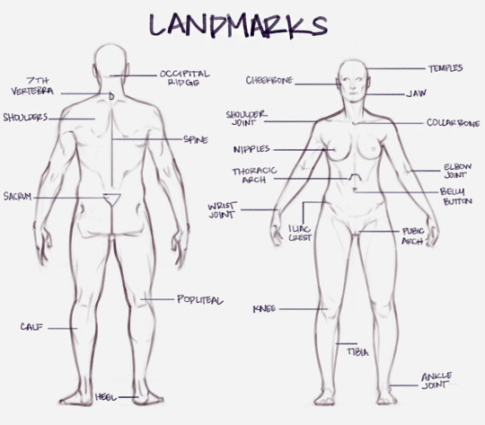
Important surface landmarks to help with proportions. While they vary from person to person, it can be useful to remember these general measurements! [From my Patreon]
516 notes
·
View notes
Text
good artist tips
there’s always gonna be someone better than you. try to work less on comparing yourself to their work and instead learning from them and turning envy into a personal challenge for your own stuff. i know its hard, trust me.
the best way to get better at art is to practice. there is no special trick to improving, no secret method. practice makes perfect is a tired old saying that im sure you dont want to hear but unfortunately, its true.
draw as much as you are able to. i wont say draw every day!!! because i know that there are folks that dont have this sort of luxury, whether it be because of physical or mental restrictions, or simply because they dont have time. draw whenever you can and have the strength to. try not to be too upset if you miss a day or a week or even months. shit happens, do the best you are able to.
if you get bored or stuck, try another way. change mediums if you can, flip the canvas, do something weird that you wouldnt normally do. sometimes this is the best way to un-stick yourself from art block.
dont be afraid to ask for help. this is so important! its ok to ask for assistance from other artists you admire (given that they have time to give pointers.) even if asking for help is straight up asking for a redline of your work, its ok to ask for it. improvement doesnt come without outside assistance, more often than not.
references are 100% a legitimate resource. i’m not really sure where the idea came from that real artists dont use references, but its not true. every renaissance painter used references in the form of in-house models. disney artists use references of animals and people to correctly model and then correctly exaggerate their designs. you cant learn to draw the world around you without actually studying it. use references, even if its just google searching.
your art is not an island. you will pick up styles from other people like tape picks up pet hair. its inevitable, and its not something that should be seen as a negative. artists inspire other artists. use your discretion, and study what you like about another artist’s work. every artist’s style is a mashup of a hundred other artists. its ok, experiment.
youre not going to make masterpieces all the time. youre gonna suck more often than not. but youre putting effort into something you enjoy and in the process you are getting better, slowly but surely. you arent going to see your stuff improve overnight, be patient.
please be kind to yourself. you are making a unique form of artistic expression, regardless whether you see it that way or not. youre doing fine, please keep going and pat yourself on the back for getting this far.
83K notes
·
View notes
Text
As a female martial artist, when I see artists draw female characters preparing to do any sort of martial arts, and they’re wearing any bra other than a hardcore high-impact sports bra (especially if they’re decently endowed), I’m like…their titty gonna fall out. It straight gonna fall out. Seen it happen. It’s a real problem. Lots of movement and impact–you gotta make the proper adjustments. Some ladies even wear two sports bras, like the yoga kind and then the running kind. Definitely not anything low-cut cuz…that titty? Gonna fall out.
27K notes
·
View notes


Text
Trying to draw buildings

401K notes
·
View notes
Note
Hey there! I'm an aspiring artist, just starting out. Seeing your work inspires me, but it times it can make me feel self conscious about my own art. I'm younger and have less experience, and I was wondering if you have any pictures of some of your older works. I'd love to see how your art has progressed over the years :)
Let’s take a walk down memory lane, shall we?
This work is ten years old! It’s pretty much my first digital work.

As much as it makes my toes curl, you can still see a lot of my really art old in my deviantart gallery. I purposely keep it up there for anyone who’d like to see my progression.
As much as I can’t stand looking at it (and I really, really don’t like it) I’m not going to start saying how shitty it is. I know that we’re all at different levels and some people may be far beyond this and some people may still be trying to reach this point.
No matter how good you get, you’ll probably always feel a little self conscious. My work still pales in comparison (in my mind) to that of my peers. But I always try and keep a damper on those negative thoughts, they don’t help me. My work is my own and I have to embrace that. Your work is valid, regardless of whatever everyone else is doing.
DON’T LET ANYONE TELL YOU DIFFERENT.
#spreading some good vibes#inspiration#new artist#young artist#inexperienced#how to start#new to art#tips#advice#motivation#art block
487 notes
·
View notes
Photo
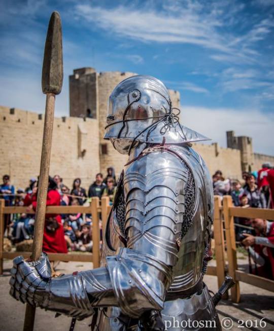
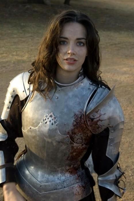


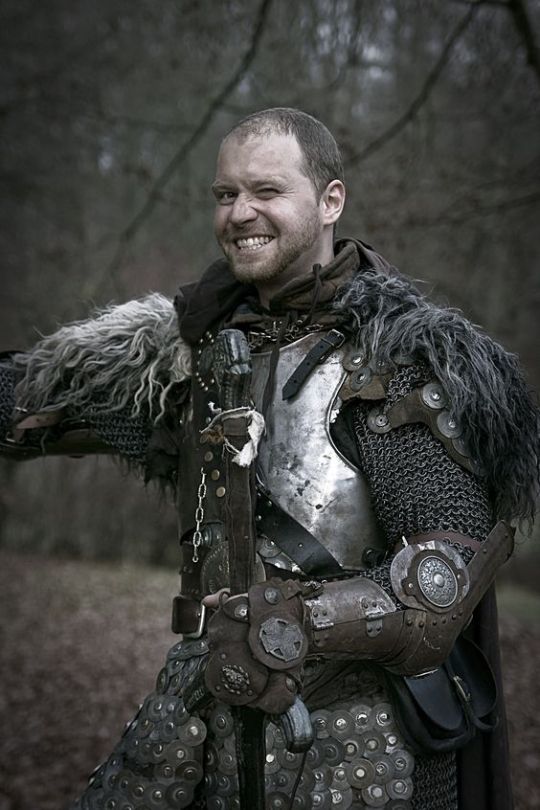
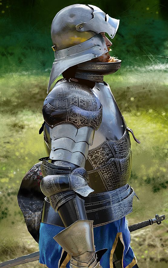

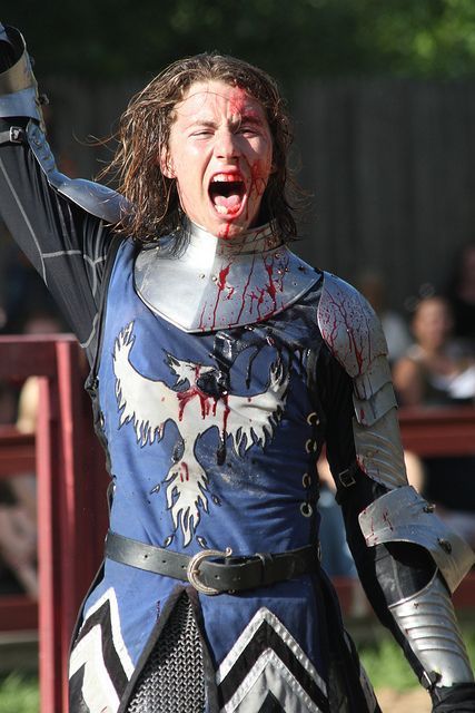

Armor references pulled from; Part 1 Part 2 (There’s more images in both, so check them out!)
Art tutorials; 1 and 2
320 notes
·
View notes
Photo

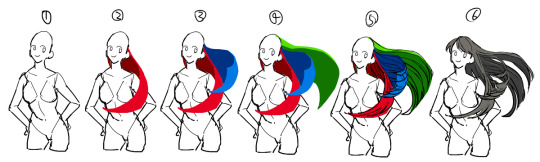
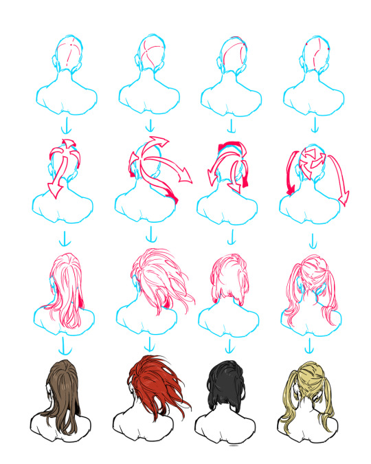


[pixiv] [part 2]
200K notes
·
View notes
Photo


Alright people, especially you artists:
@psych2go showed me this site called Copypants, and its function is to basically track pictures you’ve uploaded. It also does what’s explained in the pictures above.
I know that there are artists who are hesitant to post their works because they’re scared it’ll get stolen, but with this site I’m hoping that we can see more art. Please check out the site http://copypants.com/
22K notes
·
View notes
Photo
art by YONG (seobibaby)
3K notes
·
View notes
Photo
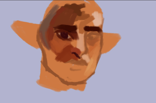
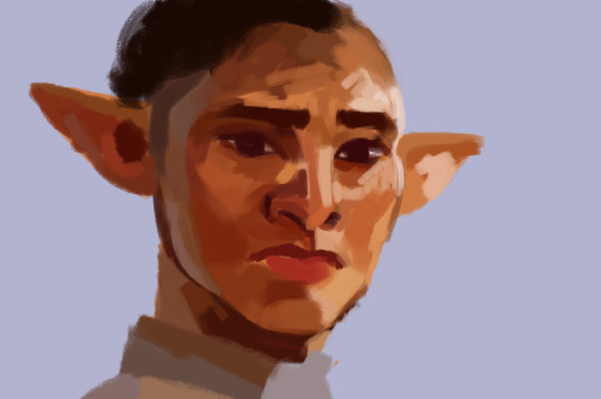
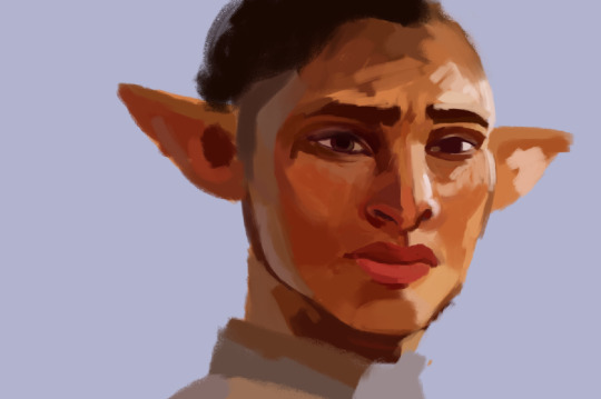
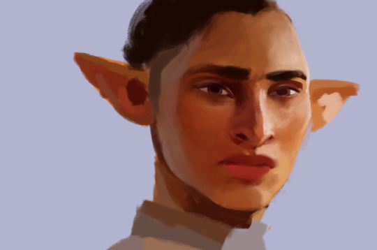
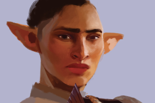

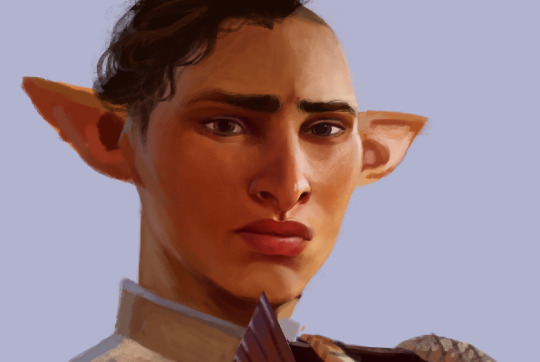
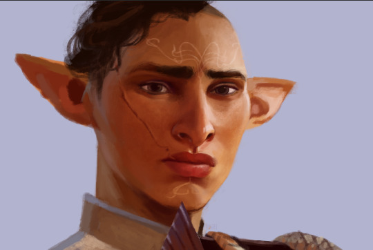
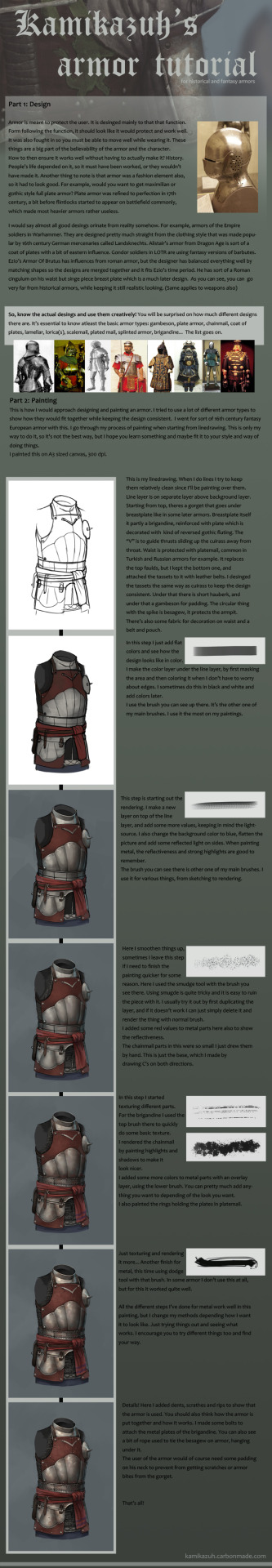
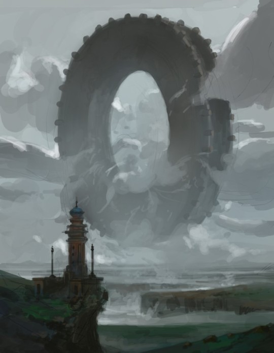
progress shots hey ¯\_(ツ)_/¯
#digital painting#illustration#digital#tutorial#process#step by step#face#human#elf#dragon age#lighting#semi realism#style#stylized
142 notes
·
View notes
Photo
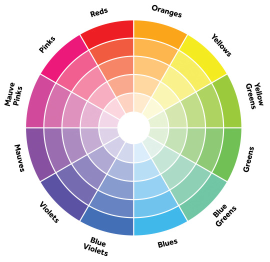
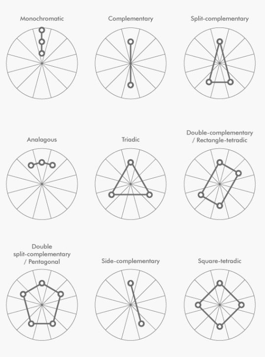
A simple guide to picking a great color palette. No matter what the colors are, using colors that are certain distances from each other on the color wheel result in a great contrast of colors. The simple color schemes shown above are used in the most popular logos, posters, websites, paintings, and even movies and television.
#color wheel#contrast#complementary#color#colour#colour wheel#palette#palet#color scheme#colour scheme
270K notes
·
View notes