Link
The concept behind Inari Type shows the development of typography, as it highlights that there’s more to a typeface than the details, forms and shapes. There can be an underlying meaning or concept-driven into each letterform that expresses more about the designer’s background or passions. Typography is becoming a medium that can stand on its own, moving away from the initial purpose of expressing the written or spoken language. This is shown through the way Inari Type has incorporated its exploration in their identity and culture. By doing this, it brings awareness to Japanese-Brazilian culture while enabling people to interact and create with to entwine their own story with them.

(extract from the article)
The phrase ‘non- digital mediums’ suggests that they want to capture organic aspects of their traditions to highlight they play a massive part of their culture. By combining them into a digital outlet, it helps to express more of their culture to a wider audience to help educate more about their rich heritage.
The phrase ‘ink flow’ suggests they value the tradition that comes with their diverse culture, as they carefully incorporated their research into their outcome. By doing this, it implies that they want to create an accurate representation of their identity and culture to help more understand their roots, which is the main aim of the type foundry.
1 note
·
View note
Link
From my last post, I have continued researching the process behind making designing typefaces and typography in general. I found another article by It’s Nice That that explores the recent release of Referenz Grotesk, a typeface designed to pay homage to the heritage of the ‘Stuttgart School’. I have documented the crucial points from the article while noting down my thoughts from the extracts I have collected.
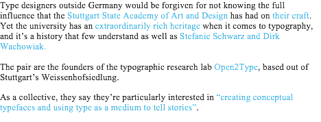
The phrase ‘medium’ suggests that the Open2Type collective uses typefaces as a method to amply stories to everyday people that would be oblivious to. They provide a platform to the unknown or untold tale, helping to communicate different voices to a broad audience, educating more on wider issues. By using typefaces as the medium, it ensures more people will become aware of the story told, as we continuously see and use them within our daily tasks that it would be normal to come across a font detailing a deeper meaning.
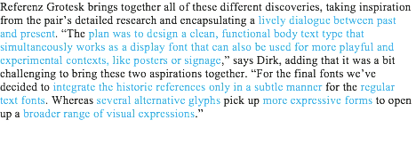
The use of the word ‘dialogue’ highlights that both the past and present work hand in hand in the design Refernz Grotesk. By incorporating old specimens from leading figures into a functional digital typeface, it allows the type designers of today to bring new life into the past through experimental visuals, helping to ensure the influential heritage of the Stuttgart School remains with the new generation.
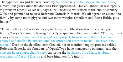
Final Evaluation:
The concept behind Referenz Grotesk is interesting because it captures the legacy and heritage of the ‘Stuttgart School’ in the medium it heavily influenced, typography, which adds to the impact they had in modern design within and outside Germany. The typeface itself is a testament of the influence, as it directly references crucial figures work, showcasing the talents found and produced in the academy. By using these, references it helps to provide them with a new life for new generations to learn from and experiment with to continue showcasing the heritage of the Stuttgart School. It implies that typography can have an immense impact that moves away from being an outlet for the spoken and written language.
The fact that the typeface is fully functional as well as playful, suggests the level of thought that went into the design process. By creating to this style, it ensures the longevity of the typeface, as it's flexible enough to work in corporate settings as well as experimental expressions, ensuring that new generations will be able to use it regardless of the demand of the industry.
I think the typeface works because it sums up the rich typographic history of the school in three designs. They have successfully combined shapes and styles into a functional form that works to current technology that enables experimentation while showcasing Stuttgart School finest designers.
1 note
·
View note
Link
For my first project, into my last year at university, I have decided to approach the field of type design to try to expand my knowledge on the process and the ways typography is changing. When researching into this topic, I came across this article by It’s Nice That where they explore the recent project from Typelab to sent typefaces into space as a way of communicating human culture and history. I have documented by notes and analysis by highlighting key points from the extracts I have collected below.

The extract suggests that the Typelab is pioneering space for newcomers in the industry to help provide them with a platform to expand their work, encouraging more to support the designers. However, it highlights that the digital platform is developing further by becoming a type foundry that built for budding creators across the globe. The company is growing with the times and filling a gap in the market, as the same fonts, created hundreds of years ago, are still consumed today, creating the same visuals over and over again. We, as designers, want new and fresh fonts that are unique to clients or brands.
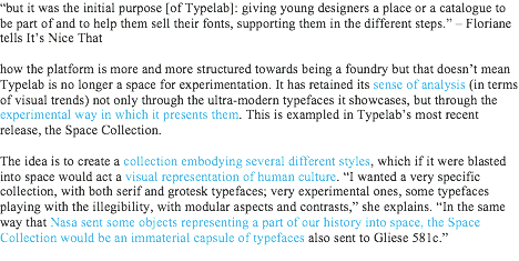
The concept is all about capturing the essence of human culture through a capsule of typefaces that express the variety of groups within the umbrella term, typeface. By resembling the Nasa launch, it adds greater emphasis on our culture, as the company is one of the key figures in our understanding of outer space. The history and legacy of the company would be linked, to the Space Collection, due to the vast similarities. This would help to add to the heritage stored in the capsule.

The phrase ‘cultural references’ suggests a typeface is heavily influenced, by the culture at the time. They can detail the desirable style of lettering and how the designer created them if only we looked closer at them. A typeface in itself is a time capsule that can be reflected and learnt from if only we looked past its usage.

The statement suggests the collection takes on a wider perspective into our culture by showcasing the work of international designers, as a way of creating an accurate glance at our society.
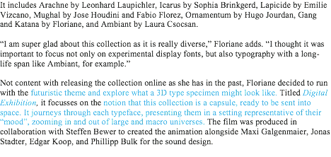
The futuristic theme was a great way at capturing the idea of the project, as it treats each typeface like its own planet or universe, helping to capture the emotion tied behind the design. By personifying each typeface, the viewer can delve into their imagination and mould the meaning or story to their heart's content. The visuals are easy to understand and take away, regardless of their technical knowledge of design.

The statement highlights that the needs of brands and consumers are altering to become more digital and experimental with motion as well as typography. It implies that the way we use and create typography is changing, rather than producing typefaces for printer presses, we desire flexible fonts for all uses. The development of technology has increased the need for digital outlets, as it ensures every part of a brand's audience will be targeted effectively. By combining an experimental style with motion and typography, it breaks the visual chaos from competing brands to ensure that more consumers are aware of the other options on the market.
Final Evaluation:
The concept behind the Space Collection is exciting as it opens up new ways that we could use and create typography. It highlights that the industry is no longer satisfied with typefaces working to only print mediums. With the technological advances, it makes sense to push type design into motion to fit with the changing requirements from consumers and brands. By following this direction, it ensures that the industry stays relevant and in touch with the current development of technology, helping to keep the demand for new typefaces.
In my opinion, I believe the addition of motion helps to add to the hidden stories and heritage behind a typeface, as it’s challenging to decode a typeface without the knowledge of type design’s extensive history. Consumers would not be aware of the difference between a serif or sans serif typeface. By adding movement, it creates visuals that aid the understanding of the hidden meaning, as it produces a visual language that any viewer can breakdown easily.
1 note
·
View note
Video
A brand identity concept the Birmingham Design Festival’s 2021 campaign, based on the concept of freedom. A mock-up of how there social media will interact with their audience.
0 notes
Text
Researching Oliver Bonas’ Competitors (part 2)
I realised after posting my research I forgot to explore The White Company as one of Oliver Bonas’ competitors. So I decided to solve this problem by creating a new post, that not only explores The White Company but also expands my research further.
Competitor 4:

(Source:https://www.thewhitecompany.com/uk/)
The White Company is a retailer of linens, home decor, dinnerware and furniture, based in England. They focus on producing mostly neutral coloured products. In my opinion, I believe they aren’t a major competitor because The White Company has a different focus compared to Oliver Bonas. They focus on creating elegant, neutral coloured products that are of the highest quality but at an affordable cost. Whereas Oliver Bonas is focused on creating luxurious items that have, bold colours and patterns to create joyful moments and a cause for optimism.
The layout of the website is similar to Anthropologie and Oliver Bonas. They all have a minimal navigation bar and the top section of the website. The white space around this area helps to ensure that the viewer can take in all the information presented. However, the logo is boxed off, separating it from the rest of the top section of the website. This creates a frame around the logo which acts as a focal point to immediately draw viewers to the brand and what they have to offer.
The bar above the logo and the search options area put me off the minimal design because it’s not aligned with the navigation bar. This makes the design feel unbalanced taking away from the elegance of the brand. This implies that The White Company doesn’t have a keen eye for detail as they didn’t pick on this mistake. To fix this I would move the elements to align with the start and end of the navigation bar to produce a consistent design to showcase the focus of the brand, elegance.
Unlike the other websites, they showcase their newest offers/options underneath the navigation bar. By doing this it ensures that the viewer is immediately aware of the potential advantages of shopping with the brand. This could be the encouragement needed for customers to shop with the brand as there is more of an incentive to do so. For each offer, they have boxed the information in a light grey box which helps to contrast with the white background and the elements of black. This helps to emphasise the key information, making it easier to navigate through the website to the areas they require. They have also changed the colour of the information to a dark grey. This produces a strong contrast between the other information presented, helping to emphasise the offers and options. By considering the background and colour of the font it implies that this is the main focal point of the website as a lot of elements where considered to help bring more attention to them.
The main graphic on their website helps the viewer visualise using the candles as it shows the environment they work best in, which is home. I think the meaning behind the image is to highlight that home isn’t complete without a White Company candle. My favourite part of the graphic is the white gift tag because the colour of the tag creates a strong contrast between the image, emphasising the offer on candles and fragrances. I think the positioning of the tag is perfect because it’s directly centred against the image while being off centre compared to the website. By not fitting with the regular alignment it helps to catch your attention, making you want to explore the graphic further.
The first impression I get from looking at this website is that the brand is very minimal and elegant. The layout of the website and the style of their products suggests that the brand loves stripping back on colour as well as details to create greater attention to the quality of their products. This implies that The White Company is more focused on creating high-quality products then decorative features. They would rather have a simple and elegant product then over-dressing it to fit with other brands.
The website uses a serif and sans serif typeface to contrast with each other. By using this combination it implies that the brand is well-established and professional. This suggests that the brand looks trustworthy, creating more comfort to the viewer, that their money is being well-spent. Another benefit of this combination is that it helps to define job roles for both typefaces, making it easy to distinguish the information presented. This makes navigating the website easier.
Development:
I decided to continue my research into Oliver Bonas’ competitors by exploring how they sell their candles. I wanted to investigate if brands used narrative to add meaning to both the product and packaging. I would be breaking down the language used in each of the descriptions. By doing this I would gain a better understanding of how I would need to accurately communicate my message to ensure that the product is marketed to the correct target audience.
I decided to look into all four of their competitors by breaking down their cheapest to most expensive candles. I felt the language would vary depending on the price point because with a bigger price the language would need to justify the cost to the viewer. Also, I will be focusing on the packaging used for each candle to gain a better understanding of the potential options I could use to approach this brief.
The White Company:
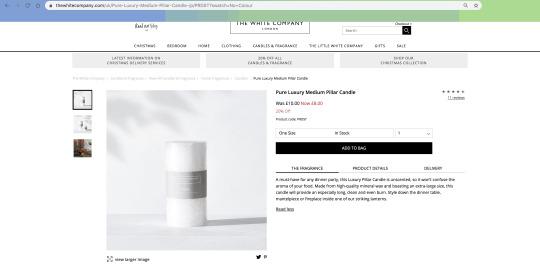
(Source: https://www.thewhitecompany.com/uk/Pure-Luxury-Medium-Pillar-Candle-/p/PRDST?swatch=No+Colour)
This is ‘Pure Luxury Medium Pillar Candle,’ which is one of their cheapest candles they sell. From the photos, the candle looks like it’s wrapped in either white paper. The brand is displayed through a grey label on top of the white wrapping. I think they did this style of packaging because the range is called ‘Pure’ so they wanted to showcase the actual product without overdressing it with decorations. I believe it works with the range name but I would take off the paper as I think it takes away from the focus of the range. When I think of the word ‘pure’ I see raw materials and the bare product with no unnecessary packaging. This would suit the name more in my mind but I’m assuming they wrap it in paper to guarantee to their customers that the product is new and without any damage.
The label design is perfect because the minimal style fits with the imagery of the word ‘pure’. When thinking about the word you see very simple, bare and natural objects or products. The design has only the necessary information that the viewer requires, which is the name of the collection, the scent of the candle and the company behind it. By nailing the design it sets the stage for the product and gives an accurate first impression of what the user can expect. The use of the colour grey creates a strong contrast between the white wrapping paper. This emphasises the name of the collection ensuring the viewer is immediately aware of the product they are holding. The texture of the paper looks quite glossy. This texture could make the product feel luxurious and one of a kind. This fits with the brand as they focus on creating quality products at an affordable price. However, this could be the reason people buy this particular candle. This is because of the answers I received from my target audience interviews. The answers showed that the feel and interaction is the main selling point because it allows them to gain a better understanding of the product to make an informed decision.
The candle is unscented to avoid masking the smell of food. This is a clever idea as it would be overpowering if the scents of food mixed with another powerful smell. It ensures that the users would not be put off by their food. This candle has a specific time and place for the use which highlights that candles have specific purposes to fit with the scent and atmosphere of it. This highlights that I need to consider if the candles I’m designing will have a specific time or purpose as this will be crucial to the scent and how I would communicate the meaning behind them.
--------------------------------
‘A must-have for any dinner party, this Luxury Pillar Candle is unscented, so it won’t confuse the aroma of your food. Made from high-quality mineral wax and boasting an extra-large size, this candle will provide an especially long, clean and even burn. Style down the dinner table, mantelpiece or fireplace inside one of our striking lanterns.’ - extracted from The White Company.
The phrase ‘must-have’ suggests the importance of the product and the urgency to get it. The word ‘must’ implies that it has to be a part of your household, highlighting that the product adds the final touch to your home.
The use of the word ‘aroma’ suggests that it should be used to compliment pleasant-smelling food. It creates delightful imagery of home cooking, making you feel warm and happy. If this word wasn’t used it wouldn’t have created such a powerful image that brings back fond memories of families dinners and celebrations. Nor would it express how elegant the brand/products are. This word ensures that The White Company creates a consistent image that showcases its focus as a brand as it resembles the language used throughout their website.
I believe 'style down the dinner table, mantelpiece or fireplace’ creates a vivid image that seals the deal on the sale of the candle. The use of the list of three suggests the different places that this candle would suit. It helps the customer visualise how they would use it and how it would integrate with their home. By providing them with three potential locations it implies that the product is multi-functional, justifying the purchase of it. The use of the phrase ‘style down’ suggests the simplicity of the product, implying it will not be difficult to find a location where it will fit in.
I think the language used is very descriptive as it creates several images of how the product would fit in your lifestyle, highlighting the simplicity of the product. The wording used is simple and not overly complicated. This suggests that the brand gets straight to the point as they haven’t overly described how it will benefit their lives or selling them the brand story. It shows that they rather focus on the actual product than anything else.
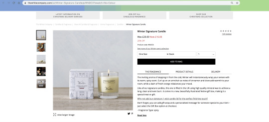
(Source: https://www.thewhitecompany.com/uk/Winter-Signature-Candle/p/WNDCX?swatch=No+Colour)
This is the ‘Winter Signature Candle,’ which is one of the middle-range options they sell. From the photos, the candle is in a glass jar with an illustrated outer packaging. The illustration looks to be a storefront during the Christmas rush, shown through the scattered placement of Christmas decorations in the windows. This suggests the brand associates winter with the Christmas season. The placement of the ‘Winter’ label on the outer packaging is in the perfect position to mimic storefront signage. By placing the label here it suggests that the storefront is the embodiment of the candle. This is how the brand visualises the candle, the late minute rush to buy presents for your friends and family. The happiness and jolly feel you get when decorating for the season. This is the candle. However, the placement of the label helps to draw customers to the product as the box surrounding the body copy creates a focal point. This helps to lead customers to the product and the meaning behind it.
The label design on the packaging uses two different typefaces to emphasise the product name and the scent. The product name is indicated through the use of a script font. This creates a personal touch to the product as it feels like the brand hand wrote the product name. However, the scent is indicated through the use of a simple sans serif. This helps to contrast the detailed script font, emphasising both pieces of information presented. This contrast ensures that the viewer is fully aware of the scent and the name of the product. By adding a block of colour underneath both pieces of information it acts it further. However, the label design changes for the candle holder, as the design becomes very minimal, with only the brand’s logo and the product name presented. I think the brand has done this because it keeps the way they normally brand their products. From briefly looking at their other ranges, they typically just have the logo and product name on their actual product, whereas the outer packaging holds all the information relating to it. By displaying all the information about the said product on the packaging, it allows the viewer to fully understand how to use it before purchasing it.
The scent of the candle is cinnamon, clove and orange. This combination creates warmness as you can visualise smelling the cinnamon and the spice that comes along with it. With this scent, it feels like winter as it makes you want to curl up on the sofa and be cosy. I feel like this candle is designed for this season in mind as the warmness created won’t be needed in the warmer months. This highlights that I need to consider the season that I indent the candles, I’m designing, need to be used in. This is because the scent and the feeling created will be specific to that time so I must carefully design with that in mind. I could create a neutral scent but will it create a powerful emotion like this candle?
--------------------------------
‘The inviting aroma of stepping in from the cold, Winter will instantaneously wrap your senses with its warm, spicy scent. Curl up on an armchair as notes of cinnamon and clove add warmth to your room, while a dash of fresh orange rebalances your mood.
Like all our signature candles, this one is filled in the UK using high quality mineral wax to achieve a long, clean and even burn. It comes in a new, beautifully illustrated festive gift box, making it a special treat or gift.’ - extracted from The White Company’s website.
--------------------------------
The word ‘inviting’ suggests the candle creates a welcoming feeling to your home. It implies that it creates a pleasant moment that melts the winter blues away. By using the word ‘aroma’ it emphasises the meaning behind the word ‘inviting’. This ensures that the viewer can visualise the fragrance and imagine vividly how it would interact in their home.
The phrase ‘wrap your senses’ creates the visual of being cosy and warm after a long day out in the cold. This imagery lets the viewer visualise the warmth the candle would create and how they would feel after smelling it.
I believe the statement, ‘curl up on an armchair,’ creates a vivid image that seals the deal on purchasing the candle. It creates an image that we all desire after a long day at work, but the added descriptions of being warm and cosy makes you want that feeling more. This is clever as it creates a visual we all know very well, that it’s easy to imagine using a White Company’s candle the next time you do so.
The use of the phrase ‘rebalances your mood’ suggests the candle will make you feel relaxed and in control of your day. It implies it warms the blues of everyday life and the winter weather, making you feel on top of everything.
The language is very descriptive at setting the scene of how the product would better your home and your day. It creates visuals that we all want after a long day, implying the brand understands their audience’s needs and wants from their products. However, it does feel different to the cheaper candle as I feel there is more language used at describing how it would be used within your home. Also, the length of the description has increased. This suggests that with a larger price more needs to be said to encourage customers to buy the said product as the brand needs to justify the cost of it. Although, the longer description could be because of the more detailed scent and packaging that comes along with the product.
Cath Kidston:

(Source: https://www.cathkidston.com/candles-and-diffusers/gardeners-club-set-of-5-hedgehog-tea-lights-1035901)
This is the ‘Gardener’s Club Set of 5 Hedgehog Tea Lights,’ which is one of the cheapest options they sell. From the photo, the set looks like it doesn’t come with any packaging. This wouldn’t make sense as it would make taking their product home difficult, as there is nothing to stop them from getting damaged on the journey. I think they left out the packaging on their website to showcase the products more as nothing will distract from the details of the candles. This allows the customer to see all the details and make a rational decision about the gift set. However, I explored the website further and realised they do show the product in packaging, but it doesn’t show on the page explaining it fully. From the small photo, it indicates that the gift set comes in a clear plastic box with an illustrative background. This simple packaging solution allows the product to be the main focus when a customer interacts with it, letting them fully focus on the product without after any distractions.
I think the idea of this candle is clever because it adds a playful touch to the Christmas season. I see this being a very simple decoration that people could place in their homes. However, I think that this product isn’t used for its indented purpose as the hedgehog seems too precious to hurt. I would feel awful for actually using the candle as I would have to watch the hedgehog melt away with time. For this reason, I would probably just keep it as a decoration for the season and reuse them every year.
There isn’t a description of the scent that comes with the candles. This highlights that the fragrance isn’t the main feature of this set. This implies that the candles are more decorations as a key feature of a candle is the fragrance created when it burns. This is the main reason people buy candles. I’m assuming the scent would either be quite neutral or resemble elements of nature to link back to the hedgehog theme.
--------------------------------
‘Shine a light with Christmas candles. This set of five adorable tea lights is inspired by the hedgehog stars of our Gardener's Club print, and we've given them the Christmas treatment with Santa hats and presents’ - extracted from their website.
The phrase ‘shine a light with Christmas candles,’ suggests that these candles with brightening up your home from the blues of the holidays. The word ‘light’ implies that the holiday needs something to bring cheer and happiness into our lives with the rush to be prepared for the big day.
The phrase ‘inspired by the hedgehog stars of our Gardener's Club print’ highlights that this range is a part of a bigger collection that the brand has. This suggests the Santa hat and present are only featured to make the range sellable during the Christmas season. Therefore, the main purpose of this range is to support their print and the products that use it. By making the print holiday-ready it will bring more attention to the rest of the gardener’s club print. This will increase the sale of their main collection.
The language used is descriptive towards the product but it doesn’t set the scene of how the product would fit within your home. The text extracted from the website describes the candles and sort of explains the background behind the product. This extract isn't persuading me into purchasing the range. I think Cath Kidston has done this as they want the product itself to encourage you to buy from the brand. By letting the product speak it lets the viewer make a rational decision on if they need it or not, without being persuaded by a sale pitch from the brand.
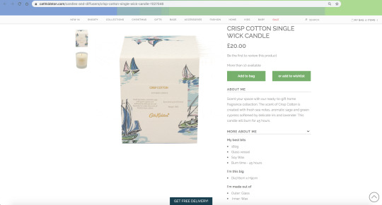
(Source: https://www.cathkidston.com/candles-and-diffusers/crisp-cotton-single-wick-candle-1027046)
This is the ‘Crisp Cotton Single Wick Candle,’ which is one of their more expensive options. From the photos, the candle is in a glass holder with an illustrated outer packaging. The illustrations are based on sailboats and the sea, implying the scent is somehow relating to both. The illustrations resemble watercolour paintings because there's a grainy texture running through each drawing. This implies the outer packaging is made using a textured material, creating a rough feel to it. This could pay homage to the sea as the texture resembles the movement created from the waves. However, this texture could be the result of a poor quality image. This is suggested through the outer packaging image stretching and distorting on the right side of the box. This implies that Cath Kidston doesn't proof check their website accurately. Websites are crucial to brands as shopping has become more online-based, so if a customer views this poor quality they might be put off shopping with the brand. The website is an outlet of a brand, it must reflect the values and the focus, consistently to link to all communications. This will suggest how the brand operates and express themselves accurately to fit with what they say they do.
The label design on the outer packaging is located directly in the centre. This position works because our eyes naturally move towards this direction. This ensures that the viewer can take in all the information relating to the product, allowing them to make a rational decision on whether to purchase the candle. The brand has used colour effectively because they have highlighted the most crucial parts of the information presented. They have foil embossed the candle name and the brand's logo in bright gold colour, creating a strong contrast between the body copy. This contrast helps to emphasise the most important pieces of information, ensuring that the customer navigates the design effectively. However, the layout of the body copy puts me off the label design. The right-hand side makes the design feel unbalanced as there is significantly less body copy. This takes away from the clear minimal design and the look of the brand. I think if they aligned the 'weight 180g' sentence with the last line of the left-hand body copy as well as, aligning the 'burn time' sentence with either, the centre or start of the left-hand body copy, it would feel more balanced in my mind. The way they originally spaced out both sentences helped but something felt off with the layout the more I look at it.
The scent of the candle is sea notes, sage, cypress, iris and lavender. This combination creates a feeling of freshness and relaxation. This shown through the elements of iris and sea notes. This implies a damp and earthy smell, suggesting a natural smelling candle. This could create an atmosphere of being outside while being in the comfort of your home. I originally couldn't see the link between cotton scent and the sea until I research further into the materials used for the sails. I think this subtle link is clever because it adds meaning to the illustrations as well as linking back to the scent. By having elements that fully link together it helps to build a consistent design that suggests the brand creates thoroughly thought out products.
--------------------------------
‘Scent your space with our ready-to-gift home fragrance collection. The scent of Crisp Cotton is created with fresh sea notes, aromatic sage and green cypress softened by delicate iris and lavender. This candle will burn for 45 hours,’- extracted from their website
The phrase 'scent your space' catches my attention because it effectively uses alliteration. The repetition creates an 's' sound which suggests a soft and calm atmosphere, implying that the candle has this effect on you and your home. The benefit of using this type of language is that the sound created makes it difficult to forget, making the reader focus on this particular section of the text. By using this as the starter of the description, it ensures that the customer is fully engaged. Another example of alliteration is presented, in the description through the phrase 'crisp cotton.' By including another example of this type of language, it creates a focal point for customers to be reengaged to the description.
The phrase 'fresh sea notes' suggests the natural feel to the scent, implying the direct link to the packaging and the name of the actual product. The word 'sea' implies that the aroma will refresh our minds and our senses, as we naturally feel relaxed when staring or being near to the sea.
The phrase 'softened by delicate iris' catches my attention every time I read the description. The word 'softened' suggests that the scent soothes your mind and senses, implying how relaxing the candle makes you feel. The word 'delicate' highlights how fragile the flower used is, implying the level of detail Cath Kidston is willing to put into their candle range.
The language used is very descriptive as it goes into detail on the scent and the elements that make it up. However, this description differs from the cheaper option, as it uses more persuasive language to ensure engagement with the customer. This type of language is used to sell products or sevrices. This suggests that the brand wants to encourage customers to try out their more expensive option rather than the cheaper one. I think the brand has changed the style of language used as the cheaper option is more of a seasonal item, so encouraging customers to try out an expensive option will, in the long run, make them more willing to shop with them in the future.
Laura Ashley:

(Source: https://www.lauraashley.com/en-gb/en/laura-ashley-kitchen-blackberry-candle/3730629)
This is the 'Laura Ashley Kitchen Blackberry Candle,' which is one of their cheaper options. The photos show that the candle is contained in a transparent jam jar with a closable lid. This type of packaging works well because it's easier to envision this candle sitting in it's intended space, as the style reflects the normal items typically found there. To me, this candle resembles the typical jars and pots found within a kitchen. By using a jam jar as the packaging I think it would be easier to reuse the item, as you can use it for storage, once the wax burns out. This is a clever idea because it allows the users to not waste the packaging once the candle burns out.
The label design on the outer packaging is located directly in the centre, ensuring that the viewer is immediately aware of the candle name and it's intended use, as our eyes naturally gravitate towards this position. The label is surrounded by negative space, which helps to emphasise the design. Space creates more areas to draw viewers to the product while letting the design elements breathe, giving you time to take in the information presented. This ensures the viewer is immediately aware of the candle's name and it's intended purpose. By adding a coloured background and a frame around the label it creates a focal point, as the shape of the label is different in comparison to the illustrative background. The label is more visually dominant, capturing the viewer's attention and interest, ensuring that they will explore the product.
The illustrations behind the label are leaves and berries, highlighting how natural the candle is. They could suggest how natural smelling the scent is or the feeling the candle creates around your home.
The scent of the candle is blackberry but it is very vague on if there are other defining aromas created. When thinking about blackberries, the freshness and the sweetness of the fruit first comes to mind. This aroma suggests that the candles create the beauty of nature in the comfort of your home
--------------------------------
‘Our Kitchen Fragrance range is designed to bring kitchen garden scents to your home, no matter where you are. This candle is presented in a classic preserve jar, and is scented with mouthwatering blackberry,’ - extracted from their website.
The repetition of the word 'kitchen' in the first sentence reminds the viewer of the intended location of the candle, ensuring the viewer is fully aware of the purpose of the product. This single word repetition could be a mistake as Laura Ashley didn't full proof check the description. However, this type of repetition can draw viewers' attention to a certain part of the body copy, while hammering a message/ point to the viewer.
The phrase 'kitchen garden' suggest the candle relates to the idea of having an area to grow plants for domestic use. The scent of the candle could be a plant that people often grow in their garden to cook with. This adds meaning to the candle, as it has a reason for being located within your kitchen.
The phrase 'mouthwatering blackberry' suggests how realistic the scent is. This implies the candle brings to life the realistic delicious aromas of the berry, making you want to eat the fruit in real life.
The language used is descriptive, as it showcases the purpose and adds meaning to the candle. The description effectively uses repetition to engage the viewer's attention, ensuring they are taking in the information presented. However, I think the description doesn't fully persuade me to purchase the candle, as I feel it is still vague on the scent. The scent brings alive the realistic smells of a kitchen garden and blackberries. But it doesn't suggest how I would feel or how it would benefit my home, which many of the descriptions does effectively. This is important as it implies how that particular candle is needed in your home, persuading the viewer it's something they require.

(Source: https://www.lauraashley.com/en-gb/en/citronella-extra-large-cream-candle/3725974)
This is the 'Citronella Extra Large Cream Candle,' which is one of their more expensive options. The photos show that the candle comes in a creamy ceramic dish. There isn't any evidence of outer packaging on the product, which would not be a good idea because if the dish is made from ceramic, it would be highly fragile, making it difficult to transport home. So having packaging for the product would ensure that the candle is fully protected. However, Laura Ashley may have avoided including the packaging to fully showcase the product without anything distracting the viewer. This ensures that they can engage with the product and make a rational decision on whether they need it or not.
There is no label design visible on the dish. This can be a good thing because of the minimal style of the product fits with the luxurious feel of the brand, helping to link the products with the company's focus. This ensures consistency with their messaging and the products they produce. Also, it lets the viewer focus on the quality and touch of the physical product, implying they want to persuade customers to buy from them using their products alone, not fancy branding. However, without a label design, it means the customer will become unaware of the name of the product or brand that makes it during the usage time. After use it would be difficult to rebuy the product, meaning the customers may shop with other brands, which prevents building customer loyalty and a relationship with them.
I would hope there is some information about the candle hidden at the base of the dish, to ensure the brand is known to the customer at least.
The scent of the candle is citronella, which is a naturally occurring insect repellent, as it's a type of lemongrass. This suggests that this type of candle is perfect for hot summers when bugs are more likely to attack. However, it would be useful for the indoors in bug-prone areas to ward them off. This implies that this type of candle is multi-functional, suggesting value for money.
--------------------------------
‘Let the zesty scent of our Citronella Candle in classic cream become your scent of summer. Perfect for outdoor get togethers, or a pretty addition to interior looks, this candle is extra large for a longer burning time,’ - extracted from their website.
The phrases 'citronella candle' catches your attention immediately because of the effective use of alliteration. By using alliteration in the first sentence, it helps to engage the viewer with the product, as the sound created gets stuck in their heads. The alliteration creates a 'c' sound that suggests a harshness, abruptness and authority. The candle is implied to be important as it effectively helps to prevent bug attacks indoors and outdoors. By also, using alliteration on the product name, it helps to ensure that customers will remember it after reading the description.
However, the description uses another example of alliteration, to describe the colour of the product. The phrase used is 'classic cream,' which suggests the colour never goes out of style, so it will fit with most spaces and locations. By following an example of alliteration with another, ensures that the viewer is fully paying attention to the product and the description.
The phrase 'your scent of summer' suggest the season the candle is intended to be used, adding meaning to the fragrance of the product. The phrase catches your attention, as it's another example of allieration. However, it creates an 's' sound that suggests smoothness and quietness. The candle is highlighted to create a relaxing atmosphere, with it's even finished.
The language used is very descriptive as it effectively portrays how and when to use the product. It helps the customer to visualise the product in their space, letting them make a rational decision on whether they need it or not. However, the description differs from the cheaper option, as there is more persuasive language to describe the product. By using this language it encourages the customers to buy products, suggesting Laura Ashley wants their customers to try out their more expensive options.
Evaluation:
I decided to look into the language used in product descriptions, of Oliver Bonas' competitors, to understand how they communicate with their audience. By understanding this element, I can better approach how to describe the collection I create, as I know how the market and other brands approach this. The description is the main part of the candle as it adds the meaning to the product that ultimately makes the customer want to purchase the product.
From looking into these four brands I have learnt that descriptive language is the most important element. By creating a vivid image of how the candle fits within your space, it encourages customers to purchase the product, as they can visualise it within their own space. Also, persuasive language is useful in the description, as it can ensure engagement with the audience while providing, the final sale points to seal the deal.
I have found that if the packaging reflects the focus of the brand and links to the scent it adds more meaning to the physical product. It makes every element link together, creating a consistent outlet of the brand that the audience can fully engage with. This is the main aspect I need to focus on when designing the collection, as this will ensure it ties together with the brand while creating something unique to other candle collections.
2 notes
·
View notes
Text
Researching Oliver Bonas’ Competitors
Before I start anything I needed to understand the brand I’m designing for. So I decided to look at the competitors of Oliver Bonas to get a better understanding of the market. This will help guide how I design the packaging as I will see how to effectively make the product unique to the market and other similar brands.
I found a website called Owler that detailed some of the competitors. It crowdsources competitive insights by supplying news alerts, company profiles, and polls. This suggests a lot of the information presented are opinions from large groups of people. This could mean the information is not as reliable in comparison to statistics/fact given from the brand. This put me off believing the information presented as well as the fact I knew none of the brands mentioned, even after researching into them. So I decided to continue researching to find a more reliable source.

(Source: https://www.owler.com/company/oliverbonas#:~:targetText=The%20top%2010%20competitors%20in,between%20their%20estimated%20574%20employees.)
I found a website called Glassdoor, that detailed potential competitors. It is a job and recruiting site that offers reviews, salary insights, interview questions from people on the inside. When I first looked at the brands it made me question if I should focus more on independent brands as Oliver Bonas is considered this. I very ensured if this was accurate or not after the previous website.
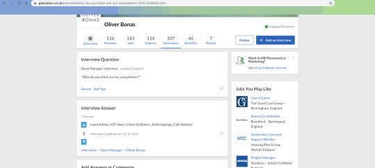
(Source:https://www.glassdoor.co.uk/Interview/Who-do-you-think-are-our-competitors-QTN_1049452.htm)
I was struggling to define their competitors so I asked one of my lecturers if I needed to focus more on independent or mainstream brands. He suggested looking at both to gain a better understanding of the whole market as well as dive into more luxury candle makers. This would help me understand how to effectively use a narrative between a product and the packaging. By seeing how existing brands create this it would help guide how I approach and design my products and packaging.
When talking to my lecturer we came up with a list of their competitors which are Laura Ashley, Anthropologie, Cath Kidson and The White Company. We both felt these brands were direct competitors to Oliver Bonas because they sell similar products to them at varying price ranges. The expectation being Selfridges as they handpick the luxurious candle companies they showcase. By looking at Selfridges I could explore how high-end products are marketed and how effective their narrative is to create a product that’s worth buying. This was very useful as I felt more confident in what I needed to research. I had a clear starting point to start diving into this brief. By looking at affordable and high-end candles I can explore how different types of brands approach this to find the best direction for Oliver Bonas.
Development:
Following on from the conversation I had with my lecturer I decided I should explore each brand’s website to get a better understanding of each. This would help to suggest which brand is more alike to Oliver Bonas. By understanding this I would be able to find what makes the brand unique from all the rest. I started by looking at the brand I’m designing to get a better idea of what I’m looking for in the other websites.

(Source:https://www.oliverbonas.com/)
This is how Oliver Bonas’ website likes. They have a very minimal style that’s easy to understand as every part of their website has its own space. There is a large amount of white space between the name of the website and navigation bar, which helps to emphasise each element. This allows the viewer to take in the information presented without feeling overwhelmed. It also creates focal points that allows the viewer to be drawn into the brand and what it has to offer.
The first impression you get from looking at the website is that the brand is colourful, playful, expressive and simple. The illustrations on the mugs express that playfulness while the woman next to it highlights the functionality of their fashion/brand. This suggests that Oliver Bonas’ focus is being joyful and expressive. These are points I need to consider when looking at their potential competitors.
The website uses two sans serif typefaces to contrast each other, creating a modern look to the brand. This is due to the fact, we normally associate contrasting typefaces with a serif and a sans serif. By creating a modern look to the brand helps to showcase that they are on trend with what their audience wants while ensuring every aspect of the brand is easy to navigate through. It also ensures the brand fits with its market as other brands have a simplicity san serif look to them. By looking similar to other brands it helps to draw new customers in as the similarities will get noticed. But the downside is that it’s hard to make their voice heard and break away from other brands.
Competitor 1:
(Source:https://www.anthropologie.com/en-gb/?ref=logo)
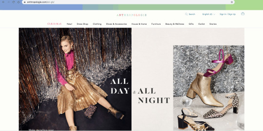
This is Anthropologie’s website. They are an American clothing retailer that offers an assortment of clothing, jewellery, home furniture, decoration, beauty and gifts. In my opinion, I believe they are Oliver Bonas’ direct competitor because they offer similar products and a similar website presence. Their website has the same structure of a centralised name with the navigation bar below it and two main graphics that immediately catch your attention. There’s also a large amount of white space to separate each element, letting the viewer take in the information presented. The similarities make Oliver Bonas feel like they’re trying to be Anthropologie on a budget. By ‘budget’ I mean that they want to create the same quality of products but at a lower price point.
However, Anthropologie’s website has a few differences as they incorporate moving elements into their layout. The word ‘Christmas’ changes as the letters switch between lower and upper case. The movement captures the excitement of the holidays as the letters look like they’re bouncing up and down with exhilaration. This creates a focal point that will immediately catch the viewer’s attention making them explore the website further. Also, the word Anthropologie appears to be written when first opening the website. This adds a personal touch to the website as it feels like the brand is signing their name on the website like you would with a card. And lastly, they have more pops of colour then Oliver Bonas. Colour has been used on the word Christmas, Anthropologie and search option on the right. This helps to separate key parts of the website creating an easy to navigate interface, as it highlights the most important elements the viewer would need to use.
The first impression I get from their website is that the brand is very glamorous, professional, colourful and luxurious. The details of her skirt suggest how high quality the clothing is while the pops of vibrant pinks and gold highlight how expressive the brand is. This implies that Anthropologie’s focus is on having high-quality products that are bold and expressive for the holiday season.
The website uses a serif and sans serif typefaces to contrast each other. This is a classic combination where it’s all most impossible to mess up. By using this combination it makes the brand look like it’s well-established and professional. Another benefit of this combination is the fact it clearly defines the roles of each typeface used helping to create readable and easy to use the website.
Competitor 2:
(Source:https://www.lauraashley.com/en-gb)
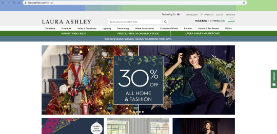
This is Laura Ashley’s website. They are a British textile design company that sells furniture, lighting, home accessories and fashion. In my opinion, I believe that they are more focused on textiles which come across in their ranges of homeware and fashion through the use of different materials/fabrics. For this reason, I don’t see them as a major competitor as they have a completely different focus compared to Oliver Bonas. They create high-quality bespoke furniture and textiles while Oliver Bonas produces playful luxurious products on a budget.
The layout of the top part of the website with the navigation bar looks crowded, as there isn’t a lot of white space between all the elements. By spacing out that section more it would help the viewer navigate through the information presented and take in information easier. However, the contrast between the green and the blue bars, underneath the main navigation bar, helps to immediately pull your eyes to the top part of the website. This makes the viewer explore the offers and the variety of products they have. This ensures that the viewer is fully aware of the brand and what they can expect from them.
There is a clear structure because the top section and the photos below it align with each other. By aligning these elements it ensures that each aspect has a proper place within the design, helping to create balance and readability. This ensures that the information presented can be absorbed by the viewer. My favourite part of the structure is the ‘30% off’ square that’s directly centred. This is the perfect position because our eyes natural gravity towards the centre, so it acts as a focal point that draws viewers’ to the brand and what they have to offer.
The first impression I get from looking at this website is that the brand is targeted an older audience. Their target audience is suggested because of the layout of the website. It’s rather crowded and lacks white space where it’s needed. Most fashion brands have a clearer and simplified layout to enable smoother interaction with their customers. However, I feel that the brand comes across as high-end because of the detailing of the ornaments on the bannister. This suggests they pay attention to the finer details of their products to ensure they are of the highest quality.
I think they use one main typeface but alters between different weights to create roles for each font. This helps to make the descriptions of products and the overall structure of the website easier to navigate through as they can define what style of the font means what. This will allow them to take in their desired information easily.
Competitor 3:
(Source:https://www.cathkidston.com/)
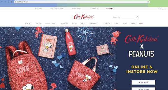
This is the Cath Kidston’s website. They are a British International chain retailer store based in England, that offers a variety of home furnishings. In my opinion, I believe they are more focused on bags and clothing which is shown through their wide selection of both. For this reason, I don’t see them as a major competitor because they have a different focus compared to Oliver Bonas. They have a clear love for the use of patterns as they used throughout all their collections, while Oliver Bonas' experiment with bold colours and patterns to create luxurious products on a budget.
The layout of the website is similar to Anthropologie and Oliver Bonas. They all have a minimal navigation bar and the top section of the website. This helps to provide enough space for each element to breathe while allowing the viewer to take in the information presented. However, Cath Kidston has spaced out their logo more, in comparison to the other brands. It looks like the logo is perfectly centred, which ensures that the viewer is immediately drawn to the brand as our eyes naturally gravitate towards this position. The amount of white space around the logo helps to emphasise the brand while providing focal points for the viewers to be drawn into the website.
The section above the logo makes the website feel unbalanced because it looks off in comparison to the logo and the navigation bar. They are both centred while the top section is leaning more on the left-hand side. However, it could feel like this because of the lack of options on the top section in comparison to the navigation bar. This mistake takes away from the clear minimal style the brand is portraying, implying they don’t have attention to the details that other brands have. To fix this I would either space out the options on the top section so it’s aligned with the navigation bar.
Unlike the other websites, Cath Kidston has one main graphic below the navigation bar. This suggests that the collection is the newest range they have. This ensures that the audience is aware of the types of collections/collaborations they have, implying that this is a main focus of the ranges that they sell. The colours used are perfect because the pinks and the blues create a strong contrast that emphasises the products bringing them to the viewers’ attention. The pop of yellow used for the call to action (ONLINE & IN-STORE NOW) helps to immediately catch your attention leading you towards the products and making the viewer explore the brand. By adding the playful illustrations around the products it creates several focal points to help guide viewers to the products and the collaboration.
The first impression I get from looking at the website is that the brand is simple yet colourful and playful. The collaboration with Peanuts suggest the brand’s playful side because of the memories Snoopy has created, it brings you back to when you were younger laughing at the adventures and mischief he always got himself into. The colours of the products showcased in the main graphic shows that the brand loves being expressive and experimenting with contrasting colours palettes.
I think the website uses two sans serif typefaces, creating a modern feel to the brand. This type of combination is relatively new. By creating a modern look to the brand as it implies that they are on trend with other brands and the market they are in.
Evaluation:
By looking at the potential competitors of Oliver Bonas I understand the brand more because I can compare the differences of other brands and see what makes them so unique. From this research, I have found the brand resembles Anthropologie because they have similar ways of presenting themselves on their website. This can be useful as the similarities could pull potential customers in, while the smaller prices could make them stay with Oliver Bonas. However, it would make it difficult to stand out from the similarities, because they would need to emphasise and push the differences more without being too obvious or too pushy.
I decided to look at their websites and compare them because they are our first impressions of a brand after their physical store. By understanding how they communicate and present themselves online I can learn how I could create products accurately to suit the given brand. This is because I can explore how they describe and communicate the message behind the product. This is the next step in my research into competitors. I will explore Oliver Bonas’ and Anthropologie’s candle collections to compare the differences/similarities to their approach of marketing a candle.
1 note
·
View note
Text
Live Project Module
For this module, the focus is on applying my knowledge and skills to an external, professional brief. The briefs on offer were external clients, communicating through my lecturers or competition briefs run by YCN. I decided to choose the Fedrigoni x Oliver Bonas' brief by YCN, that focuses on designing the outer packaging of 4 candles, including label designs and the name of the range. I chose this brief because I wanted to challenge myself by getting outside my comfort zone as I’ve never considered packaging design before. So I felt it would interesting to try something new.
0 notes
Text
Magazine Cover Analysis
To better understand the furniture that comes with magazine covers, I chose three designs that caught my attention. I plan on exploring the positioning of the masthead right down to the barcode on each of the examples. I will compare the positioning and styles of all three as well.
Examples:
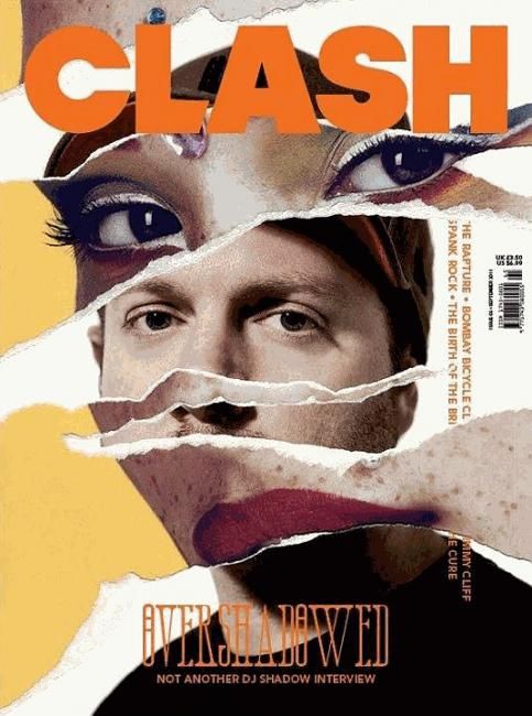
The masthead is the word ‘Clash’, shown through the bolder and larger font. Its located at the top in the centre. This is a perfect position because of our eyes natural moves towards the centre, ensuring the viewer will become aware of the publication’s name.
The cover lines are located on the right-hand side, next to the barcode and the prices. By having the text in a horizontal position it means the reader has to focus on each statement to find the articles inside the magazine. This creates a contrast between the other elements of text, helping to emphasise the cover lines, implying the importance of said information.
The main cover lines are ‘OVERSHADOWED NOT ANOTHER DJ SHADOW INTERVIEW’. The central positioning helps to emphasise the importance of the statements, implying to the reader that this is the main article in the magazine. It is one of the only readable statements on the cover so it must be vital for the reader to know. Also, the use of the larger font on the word ‘overshadowed’ helps to draw the viewer to the statement, encouraging to find out more about the article.
There is no strapline evident on the cover. Typically this is located underneath the masthead in a smaller font.
The master image is a collage of several photographs. They make up a portrait mixing different sets of eyes and lips on top of a mysterious male figure. This style is very eye-catching because as a viewer you want to know who featured in the design and the meaning behind it. This could be a great way to subtly hint at the exclusive interviews inside without. making it too obvious.
The barcode and prices are located on the edge on the right-hand side. This could because the designer didn’t want these elements to get in the way of the subject matter. This ensures that the viewer will not get detracted and concentrate on the subject matter.
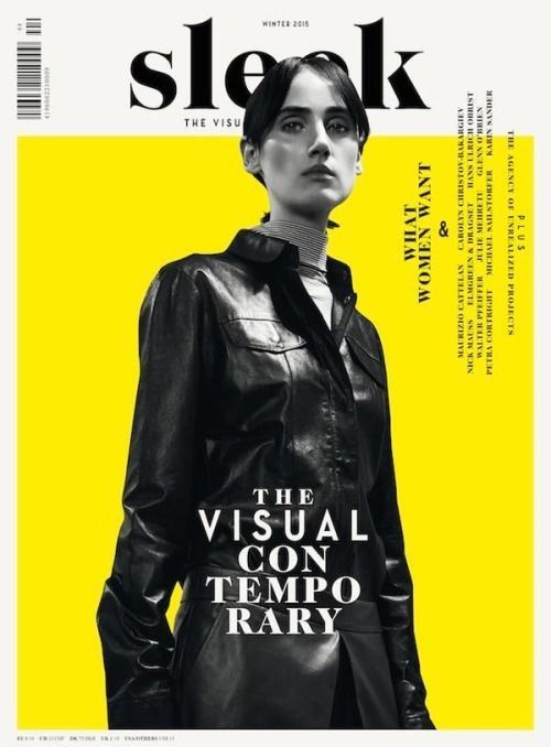
The masthead is located in the centre at the top of the cover. It is hidden behind the master image which helps to draw more attention to the magazine itself. This is due to the level of mystery that comes with the publication’s name being hidden as it’s up to the reader to piece together the name for themselves. It draws their attention further making them want to find out more.
I think the strapline is ‘the visual’ which is half shown underneath the master image. I’m assuming this is the strapline because they are typically located underneath the masthead in a smaller font. However, it doesn’t introduce the magazine or give details about the contents inside. I think the statement ‘the visual contemporary’ feels more like a strapline but goes against typically positioning of it.
The cover lines are located on the right-hand side on the edge. It’s positioned in a horizontal format but it’s rotated in an incorrect orientation. By doing this it makes the reader interact with the magazine as they have to rotate and turn the publication to read what articles are inside.
The barcode is located on the left side of the cover. It is positioned away from the main content, which implies that this element isn’t important to the reader.
The price isn’t located anywhere on the cover. This could be located on the back to avoid the reader being distracted by elements that aren't needed for them to know.
The master image is a portrait of a female figure in black and white. This creates a strong contrast between the yellow square behind her and the overall background of the cover. This helps to emphasise her, showing that she’s a crucial part of this publication. The image implies that the magazine is focusing on females in society as the cover only shows a woman. This is backed up through the cover lines positioned beside her.
The issue number is located above the masthead in a smaller less visible font. This could suggest the number is still an important feature to the magazine but less so compared to the masthead and the strapline.

The cover has two mastheads. One is located on the left-hand side while the rest is positioned on the edge on the right-hand side. ‘Feld’ is the main masthead because it has a larger font size. ‘Hommes’ is most likely a separate publication that the overall company creates. So ‘Feld’ is the focal point that draws the viewer to the publication, then leads their eyes to the topic and the cover lines.
The positioning of the mastheads is perfect because it encourages the viewer to explore everything presented as the text is positioned in a similar way we naturally read (left to right). So it helps to make us bounce from each piece of information naturally.
The price and the website is located underneath the masthead in a smaller less visible font. This suggests that information isn’t as informative as the cover lines and the strapline.
The strapline is typically located underneath the masthead. However, its located underneath the cover lines in a larger bolder font (’für den weg nach oben: ein ganzes heft übers wachsen’). By positioning it underneath the cover lines it allows the topics to engage with the audience first then it introduces the magazine last.
The cover lines are located underneath the price/website and the masthead. They’re categorised the subjects and described them briefly underneath. By doing this it clearly shows the reader what’s inside the magazine in a simple and digestible way for them to understand.
The barcode is located underneath the cover lines and the strapline. It’s aligned in the same position as the masthead. By aligning it to the title of the publication it creates a consistent design, suggesting professionalism and respectability.
The master image is a portrait of a male figure. His face is quite dark in comparison to the background, helping to create a contrast between them. This helps to emphasise his features suggesting he is the main focus of the magazine. His eyes are looking up, which creates a focal point for the viewer. It leads them in and guides them to the main strapline that’s overlaid on the photograph.
‘Wachsen’ means to grow. This could be a strapline line as it introduces the audience to what the magazine is potentially about. By making it transparent it ensures it doesn’t distract from the master image and the meaning behind it.
Evaluation
From looking at these covers I have learnt that most of the technical terms can be positioned in different ways depending on the publication and the way they communicate with their audience. By altering the location of the cover lines or the strapline it makes the reader fully engage with the information presented to figure out the key information they need to take away. I have found the best way to interact with the reader is changing the orientation of any information as they have to physically move and rotate the magazine to find out what it says.
1 note
·
View note
Text
Ideation
I started by reviewing different publications and noting down features that caught my eye. I did this to gain ideas on what makes up a publication, to help guide the direction of this brief. From this activity, I have learnt that style, layout, typography and imagery plays a massive part in a publication. The way everything is presented is another way to communicate with the audience. It shows the opinions and thoughts of the writer while entertaining the reader to keep reading the articles.
I studied several publications ranging from different styles to gain a better idea of the direction I can potentially use. Below are my notes and thoughts on each of them I explored.
Lost Places - Ally Standings
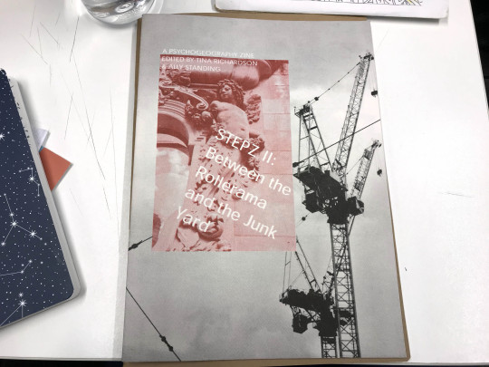
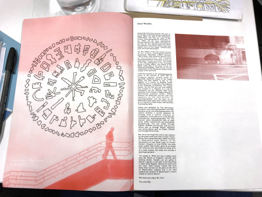

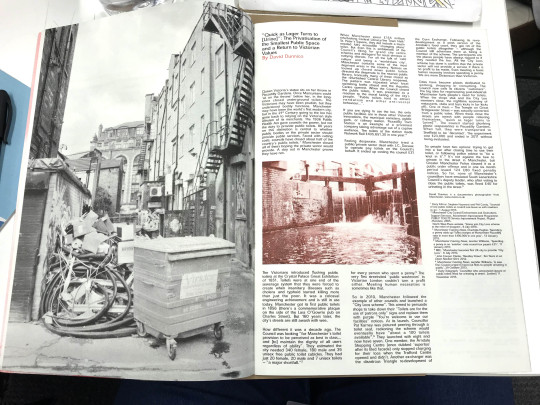
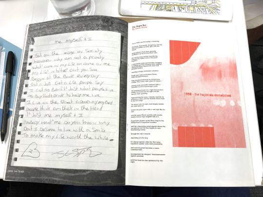
Risograph Style - creates a rough and worn-out texture. This helps to reflect the subject matter and submerge the viewer into the topic of urban areas and junkyards.
A monochrome colour scheme with an accent colour - This creates a strong contrast that emphasises and guide readers the most important. information.
The layout of text and image - positioned images and text in close proximity to each other helps to highlight that they are connected or have a close relationship with each other. This creates order and structure to the articles without affecting the flow of reading.
Images taking up pages - allows the image to have the space it needs to fully engage with the audience without getting in the way of the readability of the content.
White space used effectively - each page has a clear and easy to understand layout as everything has its own place. It also allows the reader to have time to take in all the information presented to them.
Unknown zine
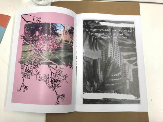

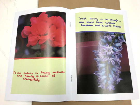


Uses white space effectively - this space emphasises the image helping to guide the viewer’s eyes straight to the subject matter. It allows them to focus and take in the meaning of the image presented.
Collage style - visually engaging. It makes the viewer fully explore the imagery to uncover meaning. Each piece tells a story that explores the urban landscape and the nature it lacks.
Text overlaps image - it adds meaning to all the imagery. The purpose is to suggest the beauty and the importance of nature in urban areas. This is shown through flowers imposed on city landscapes.
Mix Media (e.g. risograph, collage, ink etc.) - helps to keep the viewer is engaged with the zine as each piece tells its own story.
Illustration style - black and white ink drawings. They contrast with the imagery, helping to create focal points for the viewer to explore.
Now and Then - Ellie Hawkins, Macy Garwood and Katerina Scourse
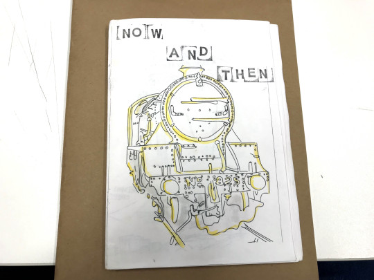

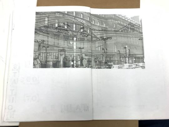


Illustration style - very simple as they capture the main features of a scene but still leaving room for your imagination. The yellow highlight helps to guide the viewer’s eye around the image to all the focal points. In addition, it helps to immediately draw their focus to the scenes they’re depicting.
Hand rendered style - everything’s made by hand from the drawings, writing to stamp typography. It adds a personal touch to the zine and the story it’s depicting.
Evaluation
By doing this activity I have narrowed down elements and styles from publications that catches my eye. This will help guide the layout and the overall style of what I create further down the line.
The elements I liked from the publications I looked at:
Hand rendered elements
Mix media - elements of paint/ink on top of images
Breaking up large amounts of text with images
Clear and concise grid systems
White space
Experimenting with overlapping text
Spacing and enlarging images
2 notes
·
View notes
Text
Editorial Brief Summary
For the first brief back, I have to create a 16-page publication that addresses one of these contextual themes; consumerism, gender, global issues or the Anthropocene. I have to produce 1500 word written piece in response to my chosen topic while accurately using the Harvard Reference System, including a reference list and list of images. I will also be creating image assets (photography or illustration) where possible.
I have chosen to respond to the Anthropocene because I'm interested in climate change and global warming. I think it's a current subject as numerous strikes have taken place globally to get governments to do more for the environment.
2 notes
·
View notes
Text
Pitecao

A screenshot from Pitecao’s portfolio (https://ptitecao.com/projects)
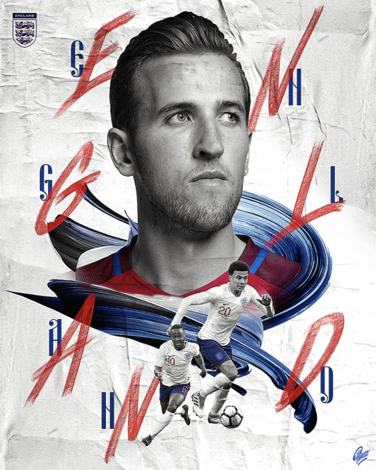
Pitecao is a freelance graphic designer who combined her passion for sports with her job. She has worked with local and international clients such as ESPN, Fanatics, FIBA and Adobe.
Pitecao was asked by Sportsnet.ca to create a series of 16 NHL hockey players as a promotional piece for their digital platform. Below are two examples of the gifs she made.


The promotional piece uses an image of a hockey player with their surname scattered around them. The image acts as the focal point that draws the viewer to the piece leading them to the type and the movement it has.
Each letter has been broken into sharp-angled pieces. This could suggest the movement of a hockey player as they move in sharp and precise motions at fast speeds.
A white line outlines the shape of the letters. The top and bottom parts are formed using triangles coloured to represent the team. The movement created is subtle and slow. This could suggest the grace that comes with ice hockey. This movement emphasises the player’s name in a way that’s visually interesting. It makes you concentrate on the movement and consider the importance of the player for his team.
Each of the letters has a light drop shadow. The shadow is created from sharp geometric shapes, formed from lines. This emphasises the letter, suggesting the key focus of this promotional piece is the player. It helps to narrow down what the viewer should be focusing on.
The background colour is usually one of the team’s colours with a grainy and blurry texture to it. This texture helps to emphasise the foreground because of the contrast created by both textures. The foreground has a smooth looking texture compared to the background. This helps to emphasise the player making him the subject matter of this promotional piece.
Both gifs are different in colour wise but they have one colour in common, which is white. It creates a strong contrast that emphasises the movement of the letters. In addition, it's used on the Sportsnet logo in the bottom right-hand corner. The contrast from the background helps to suggest the company responsible for the promotional pieces. By incorporating their logo it would help their viewers become aware of their hockey coverage. This could increase the following of this sports service.
Other examples of Pitecao’s work:

Evaluation
Pitecao has a very defined style. She used lots of imagery, shapes, lines, patterns and sharp contrasting colours. By finding her work it helped me figure out what my festival visual style could be. I’ve been struggling to define my style so finding her work has been very useful. Her work will act as a style guide when I’m making my potential pieces if necessary.
Her style helped to inspire a potential animation for teams attending my festival. The focus of the animation will be its logo. I plan to animate moving lines and shapes around the logo. However, this is rather similar to the gifs above. So to make it my own I plan to include all the players’ names, or jersey numbers to move around the logo. This would bring attention to all players on the team rather than just a few, helping to build hype for the team.
0 notes
Text
Exploring my festival’s location

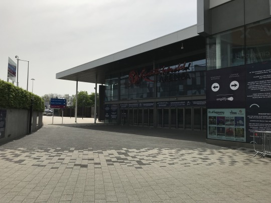
Resort World Arena

Outside NEC
My festival will be held in Resort World Arena and NEC. I choose both these sites because I felt the close proximity would help my audience interact with the games as well as the fan fair. They can jump between both sites easily. In addition, they would only need to travel to one place then walk between the NEC and the arena. This suits my target audience because I’m expecting families and people of all ages, so they would most likely drive and catch the train. Both sites have accessible parking and a train station close by.
I wanted to gather images of both sites and apply my festival’s branding to the surroundings. This will portray the potential experience my festival would have. So I recently visited both on the 23rd April using the train to get a feel for what my audience would see and experience.
These are some of the images I collected:

This is the view as your coming down from the walkway leading you into NEC. I was thinking I could create my own banner and Photoshop it onto this image. It will welcome my audience as well as hopefully building their excitement for the event.
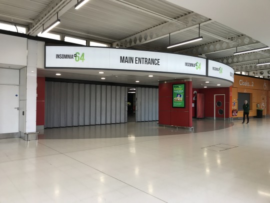
This is an image of hall 2. I felt I could experiment with applying my fan fair branding to the banner above. This would suggest what my festival would look like as well as what my audience could experience.
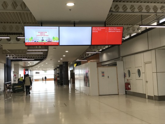
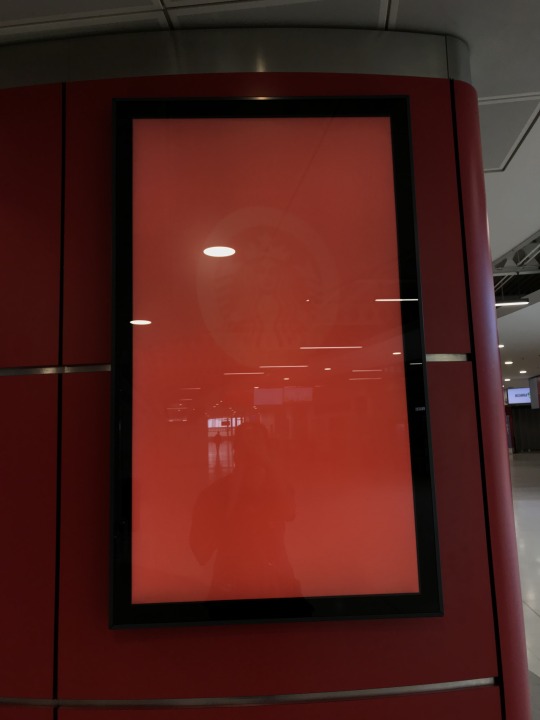
This is an example of NEC’s wayfinding. They use mainly signs on tv monitors as well as a few flat graphic signs surrounding the halls. I could potentially create a sign for the tv monitors that directs my audience to the correct halls.

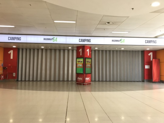

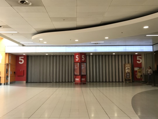


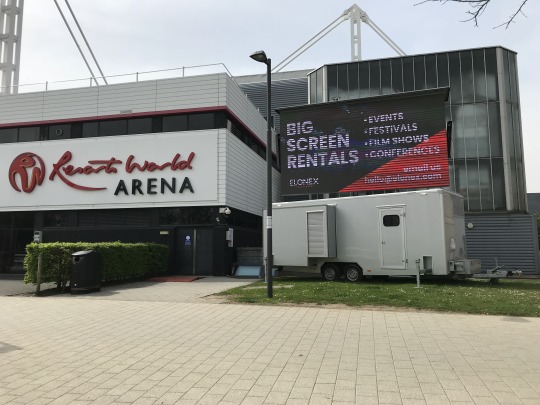
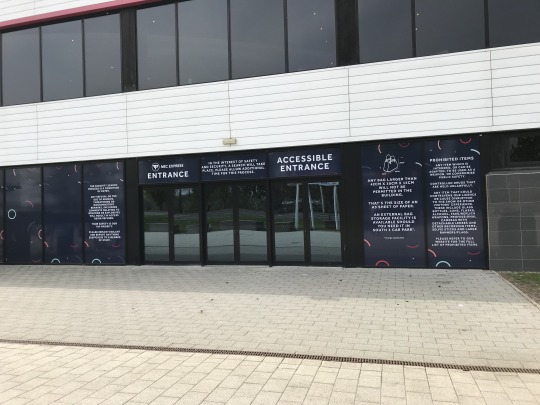
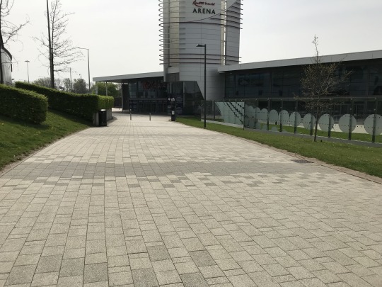
I took several images at a low angle so I could experiment with environmental graphics. I wanted to experiment with using the surrounding as signs because I felt having a sign that doesn’t really fit with it’s surrounding wouldn’t feel right. I wanted to create a consistent and immersive experience for my audience.

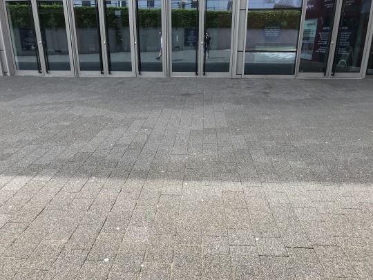

This map is located inside NEC. I haven’t decided whether to create a full-blown map or just the halls where my events will take place. This map could help me figure out the layout of the NEC if I was to create an interior of the halls. I could include landmark points around the halls, to further help my audience navigate around my festival. This points could be the Subway, the Wetherspoons and the Starbucks located around the halls.
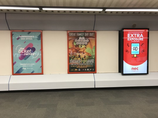
As your walking from the NEC to the train station there are several posters lining the way. I could create a series of posters that are positioned along the walkway to further advertise my festival.
Evaluation
When visiting both locations I took photos of the signs, halls and touch points that I could apply my own branding too. I did this because it helped narrow down what I could create as it implied what I could use from the actual space. My trip suggested I needed to create posters, signs and moving adverts that can work in multiple places around both locations.
I decided to focus on local advertising because this is where the majority of my audience’s time will be spent here. I want it to feel immersive, consistent as well as exciting.
From visiting the NEC and Resort World Arena it helped me gain a better understanding of the space I’m using. Some of the halls were being cleared out so I got to see a peek at how big space is. By seeing the space it made me realise using the whole of NEC for my fan fair was a terrible idea. The halls are much larger than how they’re depicted on the map. I’m now thinking of using only three or two halls as well as the arena. This change means I will need to alter my schedule completely.
What I plan to do next:
Experiment with poster designs
Experiment with moving adverts/trailers
Create signs to navigate between the NEC and Resort World Arena
Experiment with digital signs?
Rework my schedule to work around three halls
Decide on my map and start sketching out layouts - help with schedule planning
Create a fan fair logo and a visual identity that works with my festival branding
Decide if I’m making an app and social media posts!
0 notes
Text
London Letters by Lucy Loves This
During a recent visit to London, I brought a series of pull out maps of popular neighbourhoods in the city, to use as research for this project.
The box contains 26 letters that explore where to eat, drink and explore in an area of London. The purpose of the map is to provide newcomers with the hidden gems of the city while Londoners can embrace a different and artistic point of view.


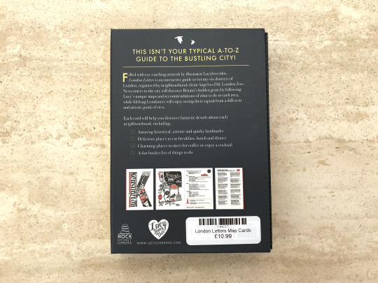
From just looking at the packaging, you can tell the designer considered the size of the maps. They aren’t too small that the information is hard to read but they aren’t too big that it’s hard to carry around the city. They are roughly A6 sized so they can easily fit into pockets and bags. By having a box for all the maps it ensures that they won’t get damaged when exploring London or get lost in bags. In addition, the packaging makes it feel like something that needs to be displayed on a shelf. On the side of the box, it has the name of the series of maps, resembling the design of a book. The hard and sturdy material used helps to portray the resemblance to a hard book cover.
The packaging has a dark grey background with pops of white and yellow. This creates a strong contrast that emphasises the name and the purpose of the maps to the viewer, ensuring they are aware of the key pieces of information. In addition, the packaging has contrasting typography. The name of the product uses a sans serif font while the description uses a serif font. By using different fonts it helps to create defined roles for each, allowing them to stand out as individual pieces of information. In addition, the contrast helps to create a visual hierarchy. The reader will immediately become aware of the key information, which is the name of the product. This is due to London Letters being larger and having a thicker weight compared to the summary of the product.
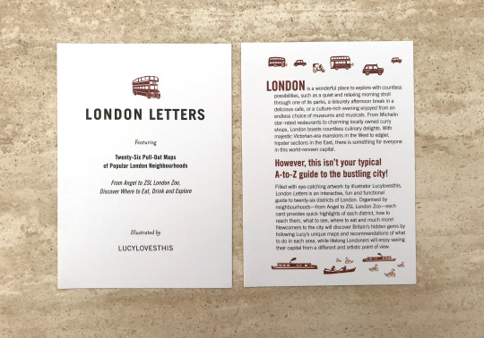
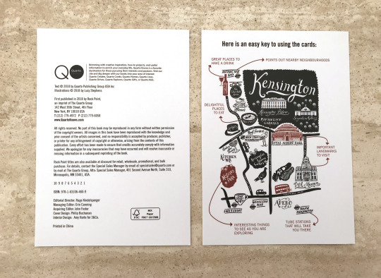
When you first open the packaging you have a few cards that introduce the product and how to use them. The introduction card uses a different typeface for the body copy (that looks like Helvetica Neue Light) and header. There is no clear visual identity because the maps alter between three different typefaces. This could confuse the viewer on the roles of all the typefaces and whether the important presented from them is important.
The key for the maps is unlike any typical key. It’s doesn’t use the typical symbols for restaurants, transport and landmarks. Instead, it explains the illustration and what each area of the maps actually means. The design of the maps and the key are visually interesting which ensures engagement with the audience.
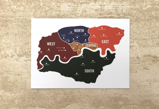
In addition, to the introduction and the key for the maps, this map was also included. This is a map of the different areas of London, it corresponds with the coloured patterns that run on the side of each map. It breakdowns which part of London each neighbourhood is situated in. This is a clever idea because it helps the viewer to visual what areas are close by so they can plan their day out accordingly.

The coloured patterns on the maps

The front cover of the map is the first letter of the neighbourhood. It combines different aspects of the area. By doing this it gives the viewer a greater sense of what to expect and what they could experience when visiting the area. In addition, the design is very visually interesting so it ensures the viewer's engagement with the area. This is due to the level of detail in the letter. It creates several focal points that draw the viewer’s attention to it immediately.
The use of a white background creates a strong contrast between the black and blue found in the letter and the pattern running alongside the map. This helps to emphasise the subject matter for the viewers ensuring they know what the first neighbourhood is about.

The map itself is visually interesting because of the detailed illustrations found on it. The illustrations help the viewer visualise the attractions of the area and what they can expect from the neighbourhood. They also make the map feel less static as it creates a greater sense of the atmosphere. The illustrations suggest the neighbourhood is very lively and has a large amount of nature and wildlife.
The map does feel harder to interpret compared to the key. The illustrations are in close proximity to each other so it is hard to tell what’s what. But having both the map and the key side to side does help to breakdown the map faster.
The information on the side uses visual hierarchy perfectly. The use of different fonts for the sub-headings, locations and the addresses helps the viewer navigate through the information and breakdown the key points. The contrast between the bold and italic fonts helps to define the roles and the information they present.
The hints of blue in the bullet points link back to the colour scheme of the map. This creates clear links to the area Angel is located in and back to the map of London.
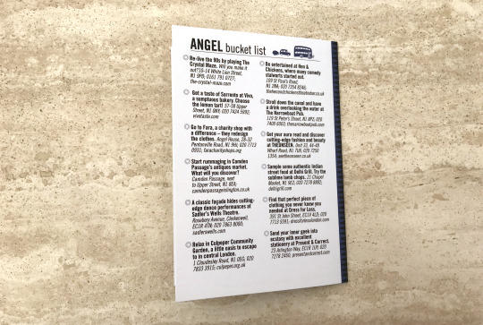
The last page of the map is a bucket list for Angel. It’s laid out in two equal columns with short bullet-pointed statements and the locations for each attraction. The statements use a bold font while the location uses an italic font (same typeface). This helps to define the roles and present what information is important. The bolder statements catch your eye first then leads the viewer to more information about it.
The design on the back page is very simple. There’s no fancy imagery or complicated layouts. There are two simple illustrations on the title of the page but they aren’t overly large. They feel like they’ve been pushed to the side so that the viewer is fully aware of the main focus. The information is just surrounded by plenty of white space which lets the viewer know the importance of the list. This is due to our natural associated with large amounts of white spaces.
Evaluation
I felt these maps was interesting because of the focus on typography and the illustrations. Both these features caught my attention and made me want to explore them further. I also felt this could be an interesting solution to my festival. I don’t intend to make 26 maps as I don’t have that amount of information nor would it be helpful to my audience. I thought I create 8 maps for each team appearing in my festival. So each map would be the same expect the information would be focused on activities and events based around each team. Therefore, if there was a meet and greet for a certain team or player they would be listed on the team’s map. I felt this could be a solution to my map because it would clearly divide the information to what specifically relates to my audience’s interest, ensuring engagement with the map and the festival. This idea sounds great but if games overrun the schedule would fall apart. My audience would be confused and lost if the information wasn’t relayed to them immediately. So I’m leaning towards making my map digital. It would offer live updates to the games and the schedule. My audience would be fully aware of any changes to the events. The app would also offer first access to events and activities as well as opportunities to interact with teams and players. This idea needs more work as I’m unsure how the interface would look or how I would create this. This is something I need to explore further.
I plan to sketch up layouts and how my app could look like. In addition, I plan to start considering how my map would actually look using my location’s map to gain the basic shape of the buildings.
1 note
·
View note
Text
Berlin Ephemera
I recently went to Berlin with my university while I was there I collected several leaflets and booklets that I felt was interesting and could be useful when designing my festival’s visual identity. They don’t have direct links to the theme of my festival but the format and the size of them will help guide me when creating printed assets if I choose to go down this path.
Below are some of the most influential ephemera.
Leaflet 1

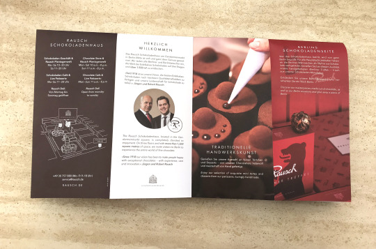
This leaflet contains both German and English. Without looking at the translation you assume it's for a department store because of the glossy image on the front cover. There’s a specific texture only on the building, suggesting luxurious and high-end products as well as services.
When looking further at the leaflet you find that the building is actually a chocolate and souvenir store. It has the vision of making people happy with exceptional chocolate.
The map in the bottom image is interesting because of the use of 3D. It creates a great sense of the environment around the store while clearly labelling the locations of their other businesses. The simple line work keeps to the simplicity of the leaflet. Everything has a defined position and size. Everything is readable and easy to navigate.
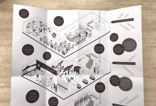

However, the main reason I collected this leaflet was the floor plan of the building. The simple black and white 3D illustration caught my eye because it’s very rare when a floor plan is this detailed and yet easy to understand. With each part of the building, we’re shown how you could interact with the environment. This is a clever feature because it subtly suggests the experience we could have when shopping. It builds up hype and curiosity of the viewer, making them want to experience the store for themselves.
The circular labels help the viewer make sense of the map. It also creates focal points that draw the viewers’ attention and leads them to the main subject matter, the floor plan. The right side of the map feels a little too much but that’s due to the English translations and streets of the locations (I think).
Overall, the map is quite easy to navigate due to a large amount of white space. This helps to separate and space out the information making it easy to digest. The illustration style is simple but detailed, making the floor plan visually interesting to explore.
I could use this style by having a minimal look to my brand. To do this I would keep to the same grid system throughout as well as having stripped back illustrations and simple annotations.
Leaflet 2
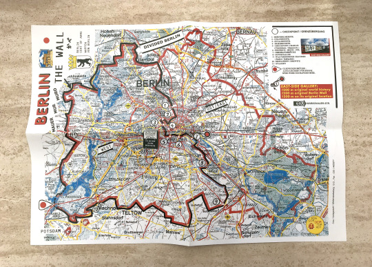
This leaflet depicts the Berlin Wall and the history behind it. I found this near the East Side Gallery. I brought it because of the style of the map and the way they laid out the history behind it.
The size of the map is A3 but once folded down it becomes A5. I felt the size of it was rather strange because it seems too large to carry around the city. Instead, the size of the map suggests it’s for decoration or ephemera. In addition, the map is in a lo-fi style because of the low quality of the textures and type. It’s quite blurry on some of the cites and areas. To make this they probably scanned a regular map of the city and drawn onto of it.
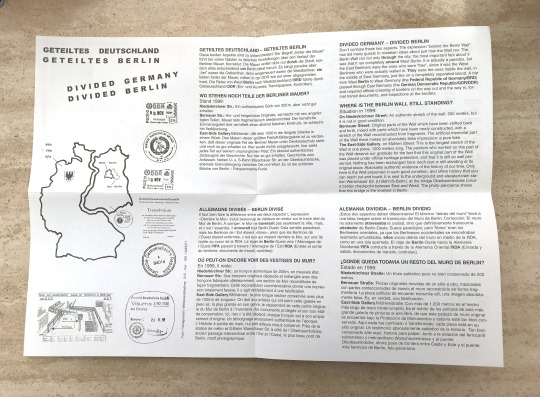
The information is split into four languages which help to make the subject approachable for people from different countries.
The paragraphs are perfectly aligned and equal in width. This helps to create a balanced design that’s easy to navigate. The use of a different font for the subheading and key points indicates the key pieces of information. It also introduces the reader to the subject matter. By doing this it helps the reader to navigate because they are aware of what’s the key points are and what they need to take away from the leaflet.
This format won’t be useful for my festival because the purpose of my map is to guide my audience around rather than being decoration or ephemera. So it will need to be smaller and accessible for my audience. However, I can learn from this map that aligned and equal paragraphs create a consistent design which the reader can easily navigate through. In addition, white space is key to a readable and balanced design. These are points I need to consider when creating my own map.
Leaflet 3

This leaflet is a program for Yaam Berlin which is a riverside beach club. The club offers basketball and volleyball courts as well as a bar and live music. The program offers the lineup of live music in March.
I got this leaflet because of the front cover. The use of yellow, gold and black creates a visually interesting cover, due to the strong contrast of colours. In addition, the patterns on the cover also caught my eye. Some of the shapes look like they were made using watercolour. This is suggested through the blurry and uneven colours. By adding hand-rendered elements to the design it helps to make the club stand out from the rest. It also highlights the experience is unlike any other place.
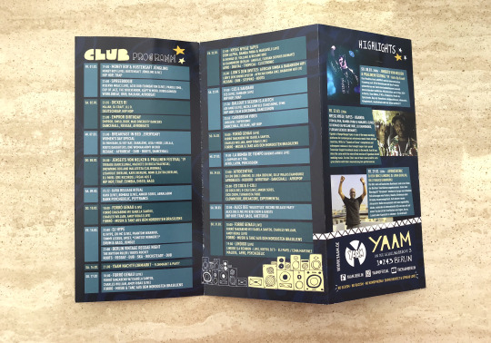
The inside of the leaflet is even more visually interesting. The patterned design is replaced by a blend of blues which helps to emphasise the schedule and the other visuals. The contrast suggests that they are the key pieces of information the audience needs to take in.
On the inside, it becomes evident the brand uses a lot of hand rendered illustrations and type. This creates consistency with the design of the front cover highlighting the brand’s visual identity is presented in this way.
The schedule is blocked out in rows and columns of colour that alters in a consistent pattern. The use of colour guides people to the main focus of the design which makes it easier to navigate through the leaflet. Each row and column is equal in width and space. This helps to create a balanced design that’s not too overwhelming for the viewer.
The size of the leaflet seems more accessible than the Berlin map. This is because it’s a suitable size to carry around the city and throw in your bag. This suggests the purpose of the leaflet is to guide people on the activities of the club rather than being hung up on walls. This is definitely a more useful size for my audience to carry around a festival.
This leaflet was useful in suggesting ways to keep a consistent design throughout the covers and the content. This was shown through the use of hand rendered illustrations and type that could be found in and outside. By doing this it made the club look professional and well established, which builds trust in their audience and making them want to go there.
I could use this style by having a defined look to my festival and sticking to it through every communication with my audience. This is definitely something I need to work on. I have confirmed my logo and typefaces for my brand but I haven’t quite figured out the style and tone of voice. I plan to look at how the NHL and EIHL communicates with their audience and use this as a guide for my brand.
Leaflet 4

This leaflet is a schedule and a guide to the events at the Haus der Kulturen der Welt, which is a national centre for the presentation and discussion of international contemporary arts. It specialises in non-European cultures and societies. The leaflet has a corporate feel to it because the layout is clean and crisp. It reminds me of a magazine structure as the images are positioned onto the next page with captions alongside them. This highlights the visual identity of the centre, suggesting that the centre is professional and well established. The type on the front cover caught my eye. The sharp angles on the letters and the contrast of blue and white create a visually interesting design. It emphasises the subject matter of the leaflet. However, the phrase ‘MRZ’ makes zero sense to me. The rest of the abbreviations have clear links to the actual word (‘HKW’ is short for the centre and ‘APR 2019′ stands for the month it focuses on). None of the names of events has links to the phrase.



The amount of words spread across this leaflet is more than what my festival will have. This style won’t fit a fast moving sport like hockey because it takes away from the atmosphere and excitement people would be feeling in the stands.
I choose this leaflet because of the layout. I know I won’t have this level of text on any of my communications but I wanted to see how to effectively layout information in a way that’s clear and easy to navigate. This felt like the best example because this level of information won’t be easy to design in a way that’s interesting for the viewer. It needs to spaced out and easy to navigate through to ensure that the viewer stays focus on the subject matter. These are points that are crucial to any information as the viewer needs to be able to understand what’s being presented to them.
I could use this style by laying out my information in defined columns that are equally spaced and sized with plenty of white space around it. This would ensure that no matter the amount of my information it will be easy to navigate.
Evaluation
From my ephemera, I have learnt a lot on layout, format and size which will be useful when creating my own map and other forms of communications (e.g. posters) that will be printed.
The main points I have learnt are:
The size of the printed matter needs to relate to the purpose of it. If it’s a map it needs to be accessible and easy to carry around. But if it’s a poster or wall art it can be any size as there are no limits to either.
The grid system is important. If columns of text are equal in width and space it ensures that every element has a place in the overall design. The design would be visually pleasing. This won’t work for every message but it does for this festival.
The style of the printed matter needs to be consistent. If there are hand-rendered elements they need to be evident in the rest of it. But if the colour blue is the brand colour it needs to be evident in all communications to create a clear link to the brand.
The type hierarchy is important. The use of other fonts for headers and sub-headers are vital because of it breakdowns the information and highlights what each section is about. This helps the viewer navigate through the body of information easily.
I need to work on defining the style of my brand as well as, for deciding on whether my map will be printed or digital. When deciding both I need to keep in mind my audience is a mixture of both young and old so it needs to suit both.
0 notes
Text
Friendship Four Tournament Analysis
I decided to explore this event because it’s one of the only ice hockey festivals I can find held in the UK. I aim to figure out how they communicate with their audiences and how they promote the tournament. So I can gain an understanding of what I could do with my own festival.
Friendship Four is the only college tournament that runs outside of North America. The aim of the two-day tournament is to strengthen the cultural, economic and academic relationships between Northern Ireland and America. They use ammeter sports to showcase the talent of up and coming players but it also brings communities together to revitalise their ties.
Friendship Four has increased in popularity, with games now shown live on TV in the US and Canada. The teams are competing to win the Belpot Trophy but all the games count towards the teams’ league standing, expect a hard-hitting and fast-paced hockey in all the matches.
Friendship Four Logo

The colour scheme of the logo is a dark blue, turquoise and white. The use of the different shades of blue suggests a cold environment which could link back to ice hockey. However, blue also has connotations of reliability, trust, coolness and peacefulness. This suggests that Friendship Four is a safe and well-built tournament that embraces the best of amateur ice hockey.
The words ‘Friendship Four’ is emphasised by the two shades of blue outlining the lettering. The contrast between the two shades of blue creates a hierarchy as it clearly defines the main focus of the logo. This helps guide the viewer to the key piece of information.
The logo uses a silhouette of a stadium and a hockey player. By including these features people would be aware of where the event is taking place as well as hinting at the topic to those that may not have heard of it before.
The silhouette of the stadium could be paying homage to the SSE Arena in Belfast where the tournament takes places. This could be a subtle hint to the city itself and to the location of the tournament.
This logo changes to fit the year beside the word ‘Belfast’. By including this feature it helps to emphasise the date of the event. It adds a sense of excitement because it only shows part of the date so it could be used to build up to the announcement of the full information. However, this could be used to differentiate from the previous years. They may do because each year (so far) different teams play in the schedule so it could help to show the progression of the tournament.
Advert for the 2018 Friendship Four Tournament
I found an example of how they communicate using moving images. It’s unclear whether this would have been streamed during television programmes or in-between online shows.
The advert was posted to the Belfast Giants Youtube Channel. By using this channel it helps to spread the word faster because the team has a big following on the platform. This would ensure die-hard fans would become aware of the event and hopefully be persuaded in going.
Example: https://www.youtube.com/watch?v=lG7PF6aQokE)
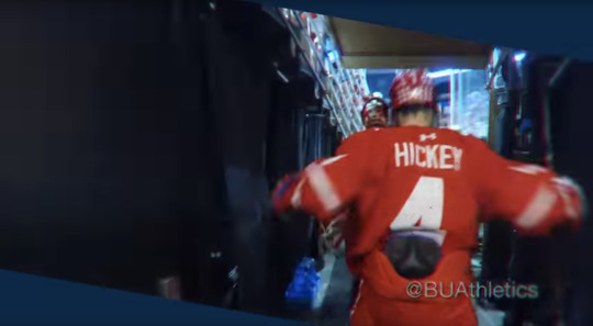
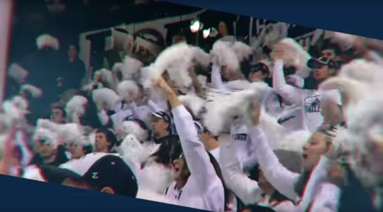

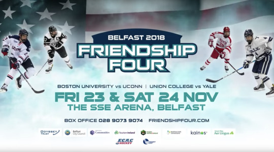
Stills from Friendship Four advert
The advert starts off with highlights from last year. Players and teams are shown celebrating after their team's scores. Throughout the advert small captions of the phrase ‘book now’, the teams involved and the date can be found in the bottom left-hand corner.
The same colour scheme in the logo can be found throughout the video. The colour of the background is dark blue while the caption shape is a turquoise. In addition, the caption font is the same as the logo. This creates a consistent visual identity for the tournament. By having a consistent identity it helps to suggest that the event is well organised and trustworthy. This would give their audience the confidence to attend the event and bring along family as well as friends.
By showing the players and the fans celebrating it hints at the possible atmosphere the viewer could experience. Both of these scenes suggest an energetic and interactive environment. This suggests that the Friendship Four will showcase competitive college hockey that’s engaging and exciting for both the players and fans.
Throughout, the advert a narrator commentates on the tournament while detailing the key information the viewer needs to know. The phrase that stood out was ‘coolest college tournament’ because of the alliteration used. By including such a rememberable phrase it ensures that the viewers’ attention is focused on the key points about to be presented. It also provides them with a sense of what to expect from the tournament. In addition, the narrator repeats the date and location several times. By doing this it emphasises the main take away points the viewer needs to know and remember.
The small captions in the bottom left-hand corner move with every new piece of information. It moves out of the frame and jumps back into frame with a new caption. By adding this movement it creates an advert that’s visually interesting for the audience. This ensures they engage with the information and take it in. However, the size of the shape changes depending on the caption. When ‘book now’ and the dates are being displayed the shape and the font size looks larger, compared to when the colleges are being shown. This creates a hierarchy that helps the audience would become aware of the main information that they need to take away.
The video footage is an angled shape. I think they did this to create a dynamic and unique outlook for their tournament. By doing this it makes the event more rememberable compared to similar tournaments. In addition, I think the shape suggests the movement that will occur during the two days. The shape is angled and sharp this could be paying homage to how hockey players skate because they need to fast but also precise.
The footage has a grainy texture and some parts have a 3D red and blue effect. The texture could be used to suggest the footage is from the previous year. We associate this texture with old film and photos. I think the 3D red and blue effect could be used to bring in more of the event’s colour scheme into the footage. However, the blur to the effect could be used to highlight the fast-paced movement viewers will see if they attend the two-day festival.
The way the advert ends is clever because it summarises all the information given. This helps to draw the viewers’ attention to the main take away points and what they could do next if they’re interested. They included contact information and the sponsors of the event. Therefore, if they want to find out more they can.
And lastly, the design of the end scene hints to what the event is all about. By including a segment of the American flag the viewer immediately becomes aware of the purpose of the event, which is to build stronger links to North America using ice hockey.
Highlight Reel from 2018 - The Legacy
I also found a highlight reel for the 2018 tournament. It was posted in February this year on the Belfast Giant Youtube channel. This video acts as a promotion for this year’s tournament because it builds up the hype and portrays what the audience can expect from this year’s lineup. It’s unclear if the video was shown elsewhere other than Youtube.
Source: https://www.youtube.com/watch?v=yHs6h1nZta8




Stills from the highlight reel of the 2018 tournament
The highlight reel starts off with an opening sequence that sets the scene in Belfast. To then begin showing snippets from the first and second games followed by interviews from the Lord Mayor of Belfast, commissioner and department heads about their thoughts of the event. After we’re shown the other side of the tournament, the educating school children about hockey. This is followed by interviews from players and coaches about the interaction. To then continue showing highlighting from the other two games.
The opening sequence features a time lapse of a landscape with the word Belfast rising up as it fades in. This transitions to another time lapse of people walking and a shot of the stadium. This helps to show the audience more of the location which helps them get a sense of the city. By making the word ‘Belfast’ move it helps to create a strong visually interesting start to the video. This would draw the audience’s focus making them continue watching. The time-lapse elements also help to create a strong opener to the video. They suggest that Belfast is a fast-moving city similar to the tournament, highlighting more about the host city.
The highlights from the matches act as a promotion of what this year’s tournament would look and feel. This would show the audience what they could experience in the hope of persuading them to attend the event.
The highlight reel has several interviews that show both sides of the event. They show key figures (such as the Lord Mayor and the commissioner) and hockey players who took part in the event. By showing both the players and organisers we gain a better understanding of the purpose and the experience that could be gained from going to the event. We see both sides of the tournament. We find that the event isn’t just about winning a trophy but educating future hockey players and experiencing the culture of Belfast.
There is a movement around the scenes of the speakers. The text slides and fades into place. The movement helps the video to engage more with the audience and keep their focus on what makes the event what it is.
However, the font used looks different from the advert and the logo. This creates an unclear identity for the tournament which can confuse the audience and make the event harder to recognise.
Friendship Four Ticket Design
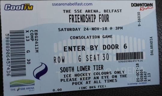
An example of the ticket design
The ticket does achieve its purpose of showing the consumer to their seat and where they need to enter through but it could be a tiny bit easier to navigate through the information. There’s quite a lot of information on the ticket. Below are points I think they need to consider next time:
No clear links to the logo or colour palette.
No element of Friendship Four Branding
Focuses a lot on the sponsors for the game - their logo covers the majority of the ticket.
Very crowded - could have used a better type hierarchy. It gets very confusing especially on the part under ‘South lower tier’. For the rules and safety advice, they could have used a thinner typeface or changed the size of it to show the importance compared to the rest. Could have also spaced out the information more - easier to navigate through the information.
Unclear what the wave or the towered lines mean behind the ‘consolation game’ and ‘enter by door 6′ - could be the branding for the stadium
Merchandise (old example)
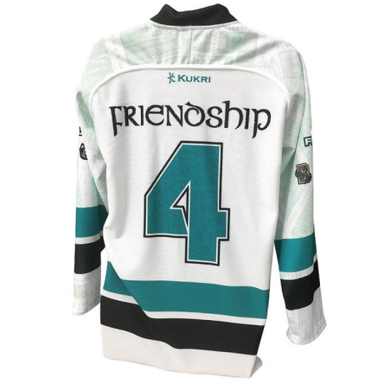

Source: https://www.belfastgiants.kukrisports.com/teamshop/belfastgiantsshop/retrieveProdNg?prodId=443168
I wanted to find examples of how the brand merchandise but all I could find was an example from 2015. This is a youth hockey jersey they sell for the event which can be found on the Belfast Giant’s website. By using their website it ensures that the tournament is more likely to be heard about by people who are interested in hockey. This ensures fans from the city or in the UK attend the game. In addition, the tournament takes place in the stadium that hosts the Belfast Giants it makes sense to use their website.
I think this product incorporates the tournament’s branding more because there are noticeable links to it. The logo and the colour palette are the centres of the jersey which is the perfect place for both to be noticed by the audience. Our eyes naturally gravitate to the centre so we’ll immediately know what the products for.
The jersey also incorporates the college teams that are playing. This links back to the event because it shows the lineup and what to expect from it. In addition, it pays homage to the teams and ensures the people attending know exactly who's playing.
In the shoulder and sleeve design, it looks like they incorporate a map of Belfast. This could pay homage to the host city and the location of the event. By including this it suggests the community and the heritage of the city. In addition, it makes the jersey more visually interesting. I don’t think any jerseys incorporate maps as well as the team branding. So it gives a unique touch to the tournament and product.
Ticket prices from 2018
Single game tickets
Adult = £15
Child = £5
Concession (students and over 65s) = £10
Weekend tickets
Adult = £50
Concession (students and over 65s) = £30
Evaluation
Overall, I think the idea behind Friendship Four is clever because they use amateur sports to build and strengthen ties with North America. It uses something everyone’s interested in, sports, to bring together different culture and people together. In addition, it allows the British audience to watch talent of up and coming hockey players that may be drafted into the NHL. I also feel the event is reasonably priced considering the stadium size and the teams attending.
However, I feel the branding of the tournaments needs a bit of work. I think they need to have more consistency in the ticket design, the type used in moving adverts and how they incorporate the colour scheme as well as the logo. The event doesn’t really have a defined design style like the NHL All-Star Games 2019. I know both events are completely different as one has a larger budget and a bigger following than the other. But the consistency and the way the All-Star Games incorporated the theme as well as the logo into every aspect was amazingly done. I don’t expect that level from the Friendship Four I just think they need to define their identity more and continuously use it throughout all their communications.
This festival was useful to look further into because I gained an understanding of how a festival about ice hockey communicates with their audience in the UK. I also have seen what I need to work on which is how to brand my festival and how to keep to it. In addition, I gained an idea of the possible prices I could charge for my event. This will help guide me during the next few weeks of what I need to work on to achieve my deliverables.
0 notes
Text
How the NHL All Star Game was advertised? (Part 2)
After posting my analysis of the All-Star Game I found more examples of the motion graphics they used to market the event. This time I want to explore the graphics used for the title sequence for the event.
Below are stills from the title sequence from https://www.nhl.com/video/2019-nhl-all-star-game-recap/t-285593610/c-65385503


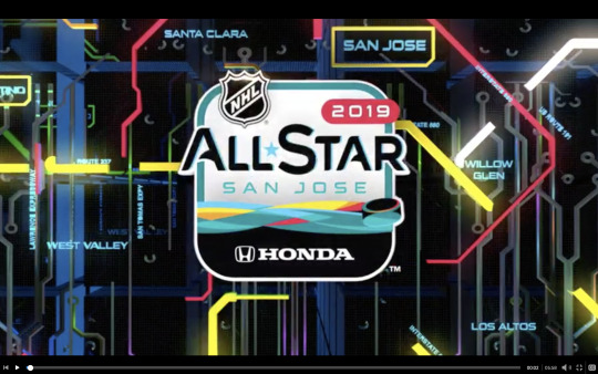
The sequence starts off moving through what looks like a server or a circuit board to get to the All-Star San Jose logo. While moving the star from the logo flies into place and the logo glows. Around it, paths of colour that resemble a map move around the logo.
The opening sequence seems to be mainly based on the camera movement. Your moved forward and then it tilts up to reveal the logo. Slowly the camera moves closer to it to then fade to white and starts the recap footage. By using this movement it helps to make the sequence more engaging as it locks your focus onto the movement which leads the viewer to the subject matter.
I think the sequence takes place in a server or circuit board because of the patterns used and the way they move. It creates an advanced atmosphere that suggests technology. In addition, in the first and second, still, the logo is shown in a high angle which makes it look like it’s broken into several pieces. This resembles the data stream that comes with technology and apps. The movement the viewer experiences could suggest the process of the ‘app’ coming together as we showed the logo in different angles and the way it pulls together to create the final logo.
By using a server or circuit board setting it helps to link to the overall style of the event. This creates a consistent visual branding which helps to suggest to the audience how organised and well put together the game is. This could encourage more fans to come to the event.
I think the movements of the star was probably created using keyframes in the 3D option in After Effects. The effects used were probably x, y and z-axes. I think this because the star looks like it flips which couldn’t be created with the regular rotation keyframes. By using 3D effects it helps to create an engaging opening sequence while suggesting the technology aspect of the game. The setting makes it feel like it’s in a server so the movement makes the logo feel like it’s alive or coming together.
The names around the coloured paths make them feel like streets, districts and neighbourhoods in San Jose. This could be a subtle homage to the host city that showcases more than just Silicon Valley. By doing this it lets regular people relate to the event that may not be a part of the Valley. It gives the game a personal connection with the city, the team (Sharks), the people and the fans. In addition, it suggests the location of San Jose and the event itself. It allows people to visualise both.
To create the movement of the coloured lines in the last two stills I think either trim paths or stroke was used in After Effects. The lines move like they’re being drawn which helps to create several focal points for viewers. I know for a fact that trim paths and stroke create a being drawn effect to shapes. I think this movement is effective because it links to the city but also adds a personal touch to the event that people can relate to.
Evaluation
Overall, the opening sequence for the All-Star Game is very engaging because of the movement of the camera and the small details within the logo and the background. It helps to keep the viewer watching and exploring the design.
The main purpose of this sequence is to introduce the event and hint at the experience it has to offer. The large emphasis on technology hints to what the game is based on (Silicon Valley) but it could also highlight the new tracking technology for players and pucks that were tested at the event based on an article by APNews.
From watching the opening sequence I have learnt that:
I need to consider the use of a camera as it creates an engaging experience which could lead to the reveal of my logo.
I need to ensure that the theme of the sequence links directly to my festival - creates a consistent visual branding and hints at how to organise my event is
I need to consider the background - will it have moving features or will it be static?
I need to use the same colours for the sequence - creates a consistent visual branding
I need to consider the movement of my logo - will it move or will it all be done using a camera?
I will consider these points when creating an opening sequence for my event. However, I need to keep in mind what my festival is about to ensure I don’t just copy the style of the All-Star Game. To do this I plan to rewrite the brief and highlight the key points of my festival so I can reference it when needs are. I will also write out the similarities and differences between both events so I can see for myself what makes my festival different from what’s already been done. It will also remind me during the process of designing my festival what I need to point out when marketing and advertising.
0 notes
Text
Ice Hockey in the UK
Considering the whole purpose of my festival is to encourage more people to watch or get involved with the sport, I needed to understand the following for it in the UK.

https://www.theguardian.com/global/2018/sep/23/get-your-skates-on-the-rise-of-british-ice-hockey
I found this article while researching information about the British league (Elite Ice Hockey League). It details the reasons and opinions on the sport as well as interviewing a manager for one of the teams in the league.

Extract from the article
I found this introduction to the article interesting because of the statement ‘In terms of live attendances, it has become the most-watched indoor sport in Britain, according to the EIHL, and the third most popular winter sport, after football and rugby’. I found this interesting because you don’t hear about the sport at all unless you follow it yourself. So to read that it’s become the most watched indoor sport is mind-blowing. Personally, I would have expected football to be the most watched considering the large following it has and how much it’s involved in our culture.
The main points I got from this article is the views of fans in the UK. I needed to understand the reasoning and their opinions on the sport to ensure I fully understand my audience. This will ensure that I communicate with them accurately as they are part of my audience I’m trying to persuade to come to my festival. Alongside new and North American fans.
I highlighted the keywords that I felt truly described how fans react to hockey. From all the keywords I highlighted it suggest that the energy and skills that take place are the reason watch and stay with the sport. However, the price of tickets is a major factor too. EIHL has very affordable tickets, unlike the Premier League. By knowing these opinions it will help drive how I communicate and market my festival to my audience. This is because I understand the pull factors towards this sport so I know how to continue to grow ice hockey.
Evaluation
Overall, ice hockey is gaining popularity because of the atmosphere and excitement each game brings. This needs to be evident in my branding to encourage new and old fans to come to my festival. But I also need to keep in mind the pricing for my event. It needs to be affordable but also covers the cost for the event (fictionally). I planned to offer family tickets alongside regular ones. This is because from my experience of watching live ice hockey everyone of all ages watches the game so I wanted to encourage that in the UK.
This article was useful because it allowed me to understand part of my audience. Instead of just solely basing my communication and festival on my own experience with ice hockey and others around me. This means I cover all aspects of my audience which will ensure I accurately communicate with them.
0 notes