
Last Seen Blogs

sebastiandb3
egal ob dick oder dünn ob alt ob jung sex bleibt

faaanuel
Fanuel
gr8rainbowpunk
A Hoe Named Idol

jarrrrgh
(づ ̄ ³ ̄)づ

n-inna-n
Alone in the world
Text
Enjoy the rivalry...
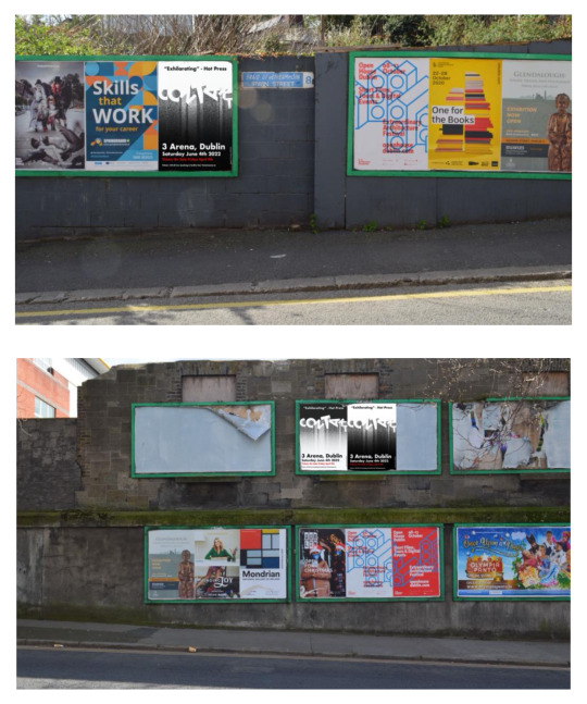
We are now less than 24 hours away from the delayed tournament's start, following the postponing of EURO2020. Despite starting a year late owing to the pandemic, the tournament retains its original name and will begin tomorrow night in Rome.
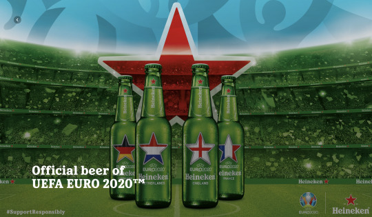
Heineken has been a sponsor of UEFA competitions for some years, and their marketing effort leading up to this tournament drew my attention. I probed a little more after seeing an advertisement on television and went to the website. Heineken, one of the tournament's official sponsors, has issued a limited edition bottle with national flags on it. All of the qualifying nations are represented, including Ireland, who was defeated in a playoff semi-final by Slovakia.
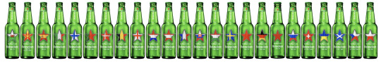
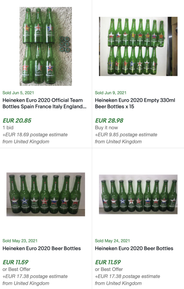
The bottles come in a range of quantity packs, the largest of which being a box containing 20 bottles. I knew these would be popular among football fans and bottle collectors right away. A short search on eBay revealed a plethora of empty bottle auctions. This came as no surprise to me. Limited edition bottles of this stature would create a demand in areas where the product was not sold or where it was soon sold out. Heineken's limited edition bottles have been on the market since April of this year. The prices people have paid for these empty limited edition bottles are listed below.
ALWAYS DRINK RESPONSIBLY
0 notes
Text
Inspiring Photography
Images have become a critical component of engagement. On smart gadgets and screens, we see various facets of digital media every day. I've always had a strong fascination in imagery. Sports photography is my favorite type of photography. I adore the raw emotion of a time-stamped snapshot, both the joy and the sorrow.
Stephen McCarthy's work is recognizable to me as a follower of Irish domestic football and a frequent visitor to Sportsfile's website. Stephen is a well-known photographer as a result of his international press photography achievement.
Stephen came in second place for his photograph "Home Training" recently.

Despite missing out on first place in 2017, Stephen did not miss out on the important first prize in 2018. The shot "Steaming Scrum" by McCarthy took first place. The image has now become iconic, and Guinness has utilized it in their advertisements.

The British & Irish Lions and Maori All Blacks engage during a match at Rotorua International Stadium in Rotorua, New Zealand. ‘Steaming Scrum’ shot by Stephen McCarthy.
Follow Stephen on Twitter -
Simply type Stephen's name into the search field to get his photographs on sportsfile quickly. Stephen recently photographed a favorite image, which you can see here.
0 notes
Text
Spotlight on an Illustrator
I've noticed that when I pick up publications, newspapers, or go online, I'm drawn to illustrations more than any other type of content. Dan Leydon is an illustrator I've only lately discovered, but I really enjoy his work.
Dan has designed for a variety of companies, including BT Sports, ESPN, and Nike, to mention a few. Dan's work is around sports, which appeals to me because I enjoy sports as well, particularly football.
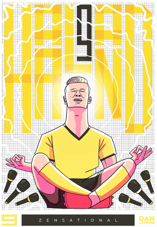
An illustration of Borussia Dortmund and Norwegian attacker Erling Haaland is just one of many exceptional illustrations by Dan Leydon.
Sligo, Ireland is where he is based. Dan has a sizable social media following across a variety of channels. Dan uses Giphy to generate eye-catching GIFs; visit the link below to see his extensive collection.
Dan has a beautifully maintained website that includes a shop where you can buy some of his work. There are links to social media platforms like as Twitter, Instagram, and Bēhance where you can learn more about and follow his work.
0 notes
Text
Interactive Packaging
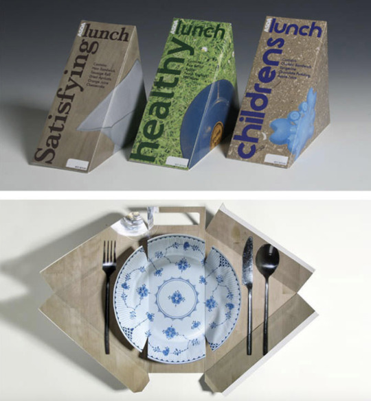
Companies employ interactive packaging as a brilliant marketing strategy. I've gathered three recent instances of interactive packaging that I find very appealing.
The new sandwich package from ASDA comes first. When you open the package, you'll find a play simulating a clean surface on which to enjoy your meal, complete with silverware for added effect.
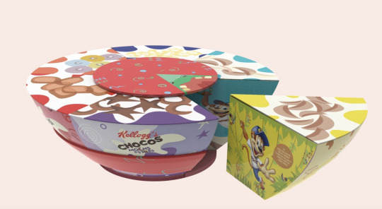
Following that is a clever design from Kellogg's. Kellogg's multipacks, which come in a rectangle shape and smaller packaging sizes, are well-known. The variety pack is designed to look like a Kellogg's cereal dish. If you're not sure which cereal to choose, you can use the ingenious wheel that sits flush to the top of the container to help you select.
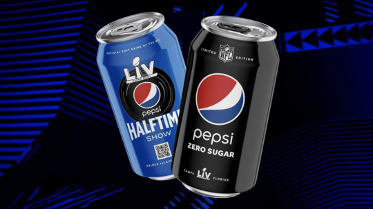
Pepsi just began incorporating QR codes into their goods. Pepsi puts a lot of focus on reaching out to sports fans. For the Super Bowl in America in 2021. It was Pepsi's tenth year as a sponsor of the most important sporting event on the American calendar.
As part of the promotion for Pepsi's 10th year as the sponsor of the Super Bowl Halftime Show, the brand unveiled a special website, PepsiHalftime.com, with behind-the-scenes videos and an augmented reality (AR) experience on Instagram. QR codes on the website and specially marked cans of Pepsi can be scanned with a smartphone camera to see an AR selfie lens in the photo-sharing app. -
Incorporating QR codes onto things is something we're going to see a lot more of in the future.
0 notes
Text
YouTube Thumbnails
Since I first discovered YouTube in 2007, the quality of the content I watch has risen considerably. Some of my favorite channels have evolved as well, with recent modest adjustments to thumbnails serving as inspiration for this blog article.
Camera quality has resulted in the ability to create better content, and some creators have taken use of this possibility better than others. The Minimalists is my favorite YouTube channel. Every upload catches my eye; the content is always nicely lit, filmed, and delivered. The Minimalists may be familiar to some because to the popularity of two of their documentaries on Netflix. Matt D'Avella captured both Minimalism and Less is Now; I also watch Matt's channel because his camera work is inspiring.
I'd like to draw attention to their channel's thumbnails. Some content authors stick to a template and don't change it. The Minimalists YouTube channel weaves together different designs on a regular basis.

Short films with white and yellow type were given a year ago, dividing up the content but in such a way that reading both the colored text individually piqued interest in the upload. The episodes, which can be listened to on Spotify, have a black rectangle with white lettering and a border around it, simple and effective, after all, they are minimalists.

Six months later, there was a difference; I really enjoyed this style. In a blue scale effect, the thumbnails divide effortlessly with Josh and Ryan. The content conversation's theme appears to be stock footage, and the participation is now all visual, with no words. The message's media can be determined by reading the upload description.

Another shift occurred just last month. This time, the divided theme resembles a little backslash. A new content delivery concept signaled a shift in focus for the shorter themes. Ryan is the subject of the thumbnails on both ends. A broken speech bubble with the episode number is accompanied by a low opacity box.
I love how they keep things fresh; it keeps me from being tired with the visual component of watching the program as a regular viewer. And if that wasn't enough to keep me coming back, none of the Minimalists' uploads contain commercials because, as they put it, "advertisements suck."
If you're interested in learning more about minimalism, I highly recommend this channel. There are no advertisements, but there are plenty of interesting debates on a variety of issues.
Here's a link to "Let's Talk About Less," one of the channel's sub episodes. In this sort of production, text writing complements the upload and emphasizes the points inside the upload; I think it visually effective.
youtube
0 notes
Text
Missing Live Football
We all miss that one thing during the present pandemic, something we may have taken for granted. You may probably expect a wide range of responses if you ask someone what they miss the most. Live football is the thing I miss the most. First and foremost, I adore Ireland's domestic league. The second league I adore and follow faithfully is Italy's Serie A, which I have followed since I was a child. I've had the good fortune of attending the Derby Della Mole in Turin. When travel and society reopen, my first plan is to return to Italy to watch a top-flight match. Many people would rush to Rome or Milan, but my preference is Turin.
While reading a story on Roma today, my mind wandered back to a game I saw between Torino and AS Roma in August 2018.
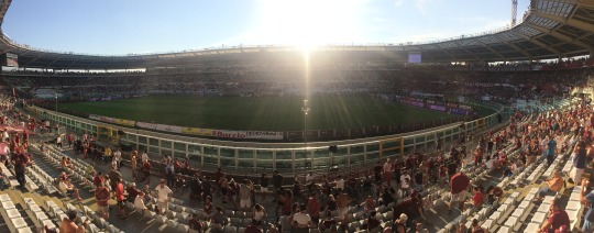
It had been an excruciatingly hot afternoon, and by halftime, as the sun began to set beneath the main stand, I was able to observe the action from a more pleasant vantage point, with the sun no longer blinding and stinging.
VAR is a hot topic among football fans these days; some embrace it, while others despise it. This was my first encounter with Video Assisting Referees, and it wasn't a nice one, as Torino had a goal ruled out barely, unfairly, after seeing the footage later that evening. The true drama didn't start until later in the game. In the 89th minute, Justin Kluivert, who had been introduced late as a substitute, teed up experienced Bosnian International Edin Džeko to side volley a late winner, sending the Roma fans berserk. Džeko would have been unconcerned about the booking he received when he ascended the advertising hoarding to applaud the raucous away crowd, ripping his shirt off in the process.

Torino begin the second half in the image above (photo is author's own.) The Serie A YouTube channel is one of my favorites, which I save and check on a regular basis. I appreciate the information and follow up with match highlights on a regular basis.
Highlights from the August 2018 game are shown in the video above. The video is from the YouTube channel of Serie A. There is a link provided below -
0 notes
Text
A Different Football Magazine
Growing up, football magazines were a big deal for me, and I especially liked Match and Shoot. A pre-season edition of Shoot magazine included a free sticker book and two packs of stickers, introducing me to the world of Panini stickers.
As I grew older, my increased internet usage drove me away from print publications, and I stopped buying both shoot and match magazines, which coincided with Shoot's demise.
Through Readly, I came upon a football magazine this week. Readly is a magazine subscription service akin to Spotify and Apple Music. As I scanned through the sports section, remembering magazines I used to read on a weekly basis, an artwork of Pele caught my eye; however, the logo in the left upper corner was unfamiliar.

8by8 The magazine the beautiful game deserves
As Readly's free trial piqued my interest, I clicked on the magazine and read the first few pages. The magazine had a distinct feel from the publications I had previously appreciated. I hadn't bought a hardcopy magazine in a long time, and I came upon this one by accident when researching for a magazine idea in college.
The magazine's layout is simple, the images are stunning, and the writing are both informative and casual.
The combination of imagery and text is not typical of a football magazine.
The magazine's concentration on design overshadows the written pieces and information. It's easy to lose track of time admiring the artwork.

The graphics are impressive, but I quickly lost track of what the publisher was attempting to convey. Rather than reading a football magazine, I felt like I was at an art exhibition. Perhaps that is the objective of the 8by8 magazine tagline, "the magazine, the beautiful game deserves."
To discover more on 8by8 Magazine, you can visit the website by clicking on the link below.
0 notes
Text
Emotions in Photography
We can capture a moment in time using photography. People can now express themselves in a range of emotions thanks to the growth of social media. Instagram is a technology that has provided users with a plethora of options.
I am not currently a user of Instagram, but I am passionate about photography. I routinely visit Sportsfile and INPHO, two Irish sports photography organizations with journalism as their primary focus.
Another source of inspiration for me is Getty Images. I thought Getty would provide some inspiration for a recent college assignment in which the aim was to compel the four various feelings of Anger, Joy, Danger, and Safe.
I focused on people for Joy and Anger, and these are the two shots I loved best —
Despite sitting in the rain in the first photograph, I enjoy the rebellious expression of joy.
I could connect to the second image; we can all become irritated by an email, or just technology in general, when things don't go our way.
Safe and Dangerous to get some ideas, I looked through pictures of animals —
Cats are my favourite animal, and this image of a cat sheltering beneath a couch conveyed a sense of security to me.
Although deer appear to be brave animals, this can be their undoing when they stare down oncoming vehicles on tiny roadways. For that reason, deer have always given me a sense of danger.
0 notes
Text
Music Poster
A music poster I created for an assignment, based on minimal electronic music.

I made my base in Illustrator. I kept thinking about using metallic sand in the design. With my artist base established and my decision to produce the poster in Illustrator, the concept was becoming more obvious in my mind. I made this by typing “C” in Futura font and then going to Effect – 3D – Extrude and Bevel. I made the letter "C" have an isometric top position. Then I copied the C to make O, then O to make N, and so on until I had CONTAKT. I then rotated each one into place before grouping them together. By going to Effect – Texture – Grain and picking graphic pen in the drawings panel, I was able to adjust the appearance. This approach gave my text a thorough examination appearing in a long sphere shape.
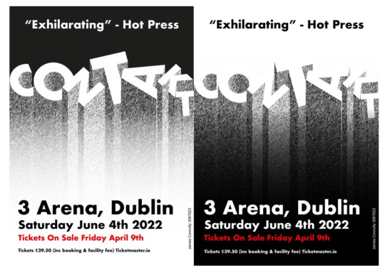
The final product. I wanted to mix things up with the gradients to produce two choices; I'd seen this done previously, where a design was developed in multiple variations, sometimes even more than two.
I photographed billboards near my home and developed mock-ups of how the poster might appear on them. To get feedback, I distributed the billboard photographs to friends without including my name or student number. I inquired as to which of the advertisements appeared to be unrealistic or photo-shopped. While some people choose my poster, the overall number was high enough to prevent them from labeling it as photoshopped or unrealistic. I did this without telling them anything, so it was satisfying to see everyone choose a different poster.
0 notes
Text
Teeth Whitening In Photoshop
Teeth whitening kits have grown very popular. Everyone wants to look their best as more people upload selfies online or appear in their friends' social media posts. Another option is to use Photoshop to whiten those molars.
I learned how to do so last week in a class tutorial. Here's the before photograph, which was created with the help of a stock photo.
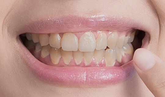
I was able to color grab the teeth color prior to alteration by using a masking technique and toggling with hue, saturation layers.
For a first attempt, the result is satisfactory. They don't appear to be as fake as some people's photographs on the internet, in my opinion.

Avoiding brushing over the gums while masking the teeth was a challenge. Inverting the mask provided for greater precision when zooming in close to the teeth and cleaning carefully.

Brushing your teeth on a regular basis is, of course, the most natural way to keep them clean, and it also helps to avoid gum disease. Visit the link provided below to learn more about dental health or to read more about it.
0 notes
Text
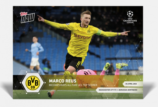
Topps NFT
Topps is an American firm that makes collectibles and chewing gum, among other things. Topps has always been associated with trading cards for me. I'm on Topps' email list because I like to stay up to date on new items, even if I haven't bought anything in a long time. Topps' many trading cards in various sports have always appealed to me in terms of design.
I go to the website on a daily basis to look at the UEFA Champions League section. Topps' promotion of milestone cards, such as Marco Reus becoming Borussia Dortmund's all-time Champions League scorer, is brilliant. Many die-hard Dortmund fans would be interested in this piece of history, especially if they are also passionate card collectors.

Topps just announced that they will begin selling baseball cards as NFTs. Topps is skillfully adjusting to the NFT market after the success of NBA Topshot. I'm confident the demand will be similar to the success of NBA Topshot.
So, what exactly are NFTs? I found a YouTube video that explains everything in a very simple manner. NFT stands for Non Fungible Token, and numerous art forms have sold for astronomical sums of money on the internet. Here's the greatest way to describe NFT...
youtube
At the time of writing, the most expensive NBA Topshot is
LeBron James (2019-20 dunk)
Sold for $208,000 in February 2021
Set: Cosmic / Serial number: 29
You can view the top 30 in the link
https://hoopshype.com/lists/the-most-expensive-top-shot-moment-of-each-nba-star/
0 notes
Text
Double Exposure In Photoshop
I experimented with double exposure in Photoshop today. I needed two black and white photos, so I went to Unsplash to find them.
While there are no hard and fast rules when it comes to double exposure, a trend has emerged in which one effect blends into another. While the double exposure blends the photos together, I decided for a more sliced looking final image for my double exposure.
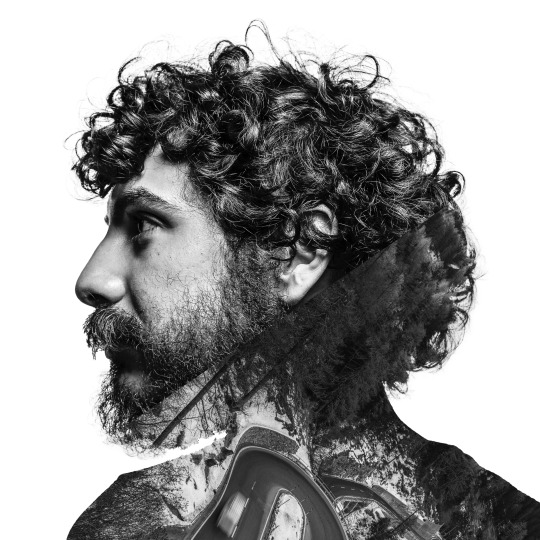
The landscape photo's line is purposefully apparent, having been flipped to reflect two triangles within the image. The smooth progression from the subject's head to his neck, and finally his body, creates a pleasing effect. The most significant parts of the subject are kept in focus rather than being lightly brushed away to reveal the landscape.
0 notes
Text
Glitching in Photoshop
The U Are Alive painting, which used to be just off Camden Street in Dublin 2, was the inspiration for this blog post. The mural, while preserving the motto 'u are alive,' evolves over time in diverse forms. The glitch version of the mural was extremely popular. The majority of the time I passed by the artwork, someone was either taking a selfie with it or photographing it.

This Photoshop approach begins with layer duplication and smart object conversion. Then convert your portrait to a black-and-white photograph. Duplicate once more. Untick the box to turn off the R channel in the layer style's blending options. Now you can move the layer to the right or left. Mine was shifted to the left. Remove the image from the top layer and flatten it. Select pixelate, mezzepoint, and long lines from the Filter menu, then click OK. Reduce the opacity to anywhere between 25 and 35, I went with 29. Select soft light in blend mode. Once more, flatten the image.
Create the outline you want to distort with the marquee tool and slide it left or right (while holding down control) to get the glitch effect.
0 notes
Text
Programme Cover Art
While the Irish national football squad is undergoing a transformation, a piece of the match day experience has undergone its own transformation. Many matchday publications have gone digital, and some football clubs, particularly international teams, have placed a greater focus on digital products, with many giving a free alternative.
I prefer to continue purchasing physical copies for the simple reason that I am a collector of national team memorabilia. Digital options, especially free ones, are fantastic. I enjoy comparing the material of other clubs. It has been widely speculated that the physical match day publication is on its way out; I sincerely hope this is not the case.
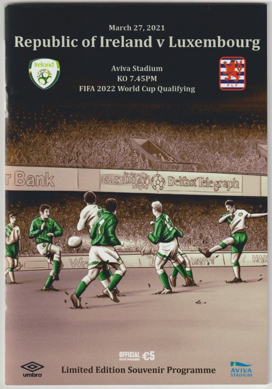
My most recent addition to my collection arrived in the mail just today. The cover features Alan McLoughlin's spectacular goal in a 1-1 draw in Windsor Park in 1993, which secured Ireland's place in the World Cup in the United States of America in 1994. Unfortunately, the cover of the magazine coincided with one of the worst results that Irish football fans have seen in a long time.
The artist behind the recent front covers is Barry Masterson, and the Ireland program is now a beautiful must-have piece of art. Many clubs use diverse front cover designs; Ireland's is one of the few that uses a hand drawn concept that is then translated into digital art.
My preferred match day publication is the concept that Barry has enforced since joining the FAI as a programme contributor.
To view more of Barry's work, you can visit https://barrymasterson.com
To see the complete collection and witness the transition prior to this method of front cover design on FAI match programmes, you can visit https://www.dbapublications.ie/product-category/fai-programmes/
0 notes
Text
Content Aware Fill
I enjoy learning from others and finding new ways to use what I've learned. This week in a class lab, I learned how to use content aware fill to entirely remove people and objects from a photograph in Photoshop. Unsplash contributed a stock image, which we subsequently altered by deleting the subject.
The image below before it was manipulated.

The subject was first chosen using the selection tool. I found the hair and in between the legs to be difficult to select, so zooming in helped me refine the selection. The photo can then be altered by using the content aware fill tool after expanding the selection. The silhouette of the individual could still be seen after eliminating him.

To improve the deletion of the subject, I used the clone stamp. Taking parts of the water around the visible outline and pasting over to show a smooth deletion.

The final result was satisfactory. I will get better with more practice.
0 notes
Text
United Similarity
Center Design has created a bold, dynamic look for drinks brand United Sodas which aims to "completely reinvent soda into a high-quality, fun, better-for-you beverage with modern flavours delivered right to your door". - Creative Boom
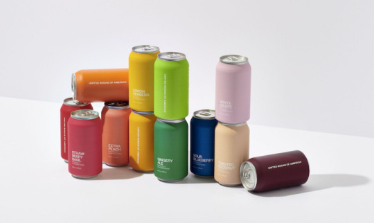
I had never heard of United Sodas of America until I saw this article on www.creativeboom.com, and I immediately thought of Benetton because of the name and usage of color. I continued my investigation by visiting the website, which offers a really pleasant user experience that is both simple and well-organized. The scroll option is incredibly ingenious in that it takes the user on a tour through the various cans before revealing more information as they scroll down. As a keen viewer of basic design, the cans' minimalism gave me an invigorating thrill.
The sodas' branding reminded me of Austin Kleon's best-selling book "Steal Like an Artist." United Colors of Benetton has long been a part of Benetton's marketing strategy. Despite the fact that the items are radically different, the familiarity of the United Colors emphasizes the resemblance, and the use of color cements the relationship.
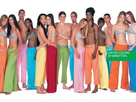
The can's design piques my interest and makes me want to buy it. I believe that sometimes a simple, "straight to the point" kind of branding is just as appealing as a more elaborate design. In general, I like what United Sodas has accomplished.
Scroll the website in the link below -
0 notes
Text
"Ah ye can't say that..."
It's a revolving issue of debate or, more often than not, a furious disagreement, yet we all have different perspectives on free speech. The pandemic that has engulfed the globe since early 2020 has shone a spotlight on the issue like never before. We can sift through a plethora of situations that have brought free speech to the forefront, and we've been all too aware of it because to being cooped up at home, glued to our computers.
Last week, I was scrolling through Piers Morgan's twitter page after a friend pointed me to Piers' strange and hilarious response to a Jedward joke. It appears that statues, like free speech, are still under siege.

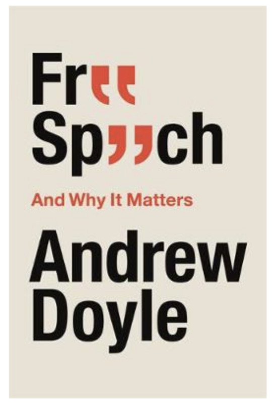
A book cover caught my eye as I moved upwards through more nonsense. I was amazed by the book title's simplicity and clean minimalist look. Piers recommended a book on Twitter. I like it when catchphrases and letters are substituted by things that still have meaning, and this book achieved just that.
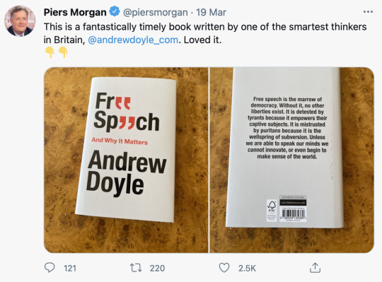
This book design exemplifies the phrase "less is more," as it is simple and conveys the idea just through text, with the subtle creative use of red inverted commas on the front to marry the e letters of both phrases catching the eye. I was inspired by the book cover to learn more about the author and check out some of his social media accounts.
The cover design below that intrigued me to research the author -
0 notes