
jdillons-blog
Special Topics '18:
Typeface Design
DILLON STURTEVANT
independent student typeface design
20 posts
Don't wanna be here? Send us removal request.
Last Seen Blogs
spicyinkwell
Art & Other Dangerous Hobbies

michtig
Interdit -18ans
cheqkmateivf
CheQKmate
thespookysideshowman
Spooky Pillow
Text
Post-Mortem for Panza
PROCESS
I’ve continued my combo of working in Glyphs, getting feedback at Type Thursday events and in one on one meetings with people to get this typeface across the finish line. The design is ~finished~ and the specimen is 90% there. Proud to say there are numbers, diacritics, punctuation, and full latin support. Still only one weight and style, however :) but overall the type design has progressed beyond what I’d hoped.
The specimen book is going to be risograph printed at Cold Cube Press (link) here in Seattle. Very excited to see how the design translates to the textured look of the risograph — in fluo-pink and yellow ink. For the design of the specimen book there was both the desire to show the typeface in a variety of point sizes and use-cases, but also to amplify the inherent playfulness of the font with large expressive spreads and color palette. The basic recipe is to show letters wrapped up in each others’ arms in expressive ways, and show its use in body type settings as well.
FINAL SOLUTION
In the end, I ended up with usable typeface with full Latin support and all the characters you could type on a keyboard (there are more glyphs to build out eventually — like copyright symbols, foreign currencies, and so on). The design is, as I’ve described, “an eccentric workhorse” and performs well from display down to body type use.
The specimen is a playful illustration of different sizes and settings of the typeface, and serves as a personality piece in its own right.
NEXT STEPS
First, I would love to finish the kerning pairs, and build out the full Unicode glyph set and finish the kerning pairs. Then — I’d love to build out more weights and styles for the design. I’d start with working on a bolder weight before I went straight into something more challenging like italics, or a condensed or expanded styles.
Then? Another typeface. Something with a totally different personality.
And there are a few things I would do differently going into another typeface design. First, I would keep better copies of my sketches, both digitally or in notebooks. I would ideally have a small notebook completely dedicated to the new typeface idea. I could then better track the ups, downs, and changes of the work as it approached its final form. I would also (depending on the design) spend more time refining and testing different vertical metrics before deciding on one and going ahead. I don’t have any issues with Panza’s vertical metrics, but I think I breezed through that portion, and got a little lucky on gut instinct. Those relationships are critically important to the unique character of each typeface.
There will naturally be a lot less exploratory time in the next type design process that I go through because I will know the program a lot better and will work more efficiently, and more quickly understand things like optical adjustments needed and other similar decisions, and just the opportunities and pitfalls inherent in the relationships between each piece of the alphabet.
0 notes
Text
Typeface Design: Spring Week 4 Progress Report
Research & Discovery: Describe salient points of your research as it relates to your project. What have you learned & discovered?
I am mostly out of the research phase of this project — but in my reevaluation of my letterforms (and now the numbers and punctuation) I have really been focused on finessing the metrics as a way to polish the “master” and bring the family into even truer unity. This is a hugely important final touch.
As I’ve been combing through all of the playful type specimens I can find from foundries I love all over the world/internet I’ve been picking up on a few key points to go into my booklet design: 1) Have a lot of fun with it, because that is a contagious feeling 2) Make sure your use-cases and examples breezily tie in to the concept 3) Anything goes, so don’t steer away from outside-the-box ideas. You can do practically anything with the type, as long as you are intentional about showing its range and usefulness.
I need to be saving my overlaps (learned this while talking my work through with an alumni at Take It or Leave It) as this is a key step towards making your type variable, or just building out more weights in the first place.
Process: Document the process you have done so far.
I have stayed pretty much right on track with this project so far.
Week 1: Went full-bore on the rest of my capital letters and finished first drafts of all the remaining ones that day/week. (Working in Glyphs)
Week 2: Polished the capital letters, and also built out more punctuation. Worked spacing on the fly — set some body type, and am overall pretty happy with how the spacing is looking so far, same feeling for when I see it printed. Still working in Glyphs on the type design, and using InDesign to test the exported .OTF. Felt on track so I started on the NUMBERS (!!! which was only a “maybe” on my timeline). Went to TypeThursday, and was on deck to present if someone dropped off, but unfortunately no one did. Still had a nice evening.
Week 3: Continued to work the numbers. So difficult, haha. The 6 was a real pain in the neck — and still is :) . Began researching and creating a bank of imagery to make a moodboard for the type specimen, and began scribbling out ideas for an approach. Fell behind on punctuation in lieu of making the numbers. I think it’ll be worth it!!
Solution: Mid-project reflections. What is working? What needs assistance or more work? Are you on the right track, do you need to adjust your course/approach/timeline/ expectations? Should you re-evaluate and revise your project?
I think it’s time to kill my precious baby display version (also the original version) of the lowercase a. It’s been super popular with people, but it’s just not fitting in. It will go to my design vaults and someday in the future a client will need a logo with a lowercase a and — bam — i’ll have this beautiful misfit ready for the job. But it’s time to put it to bed as far as Panza Grotesk is concerned.
Punctuation timeline needs to be pushed further into the quarter, and will take some hours to make up the time ‚ but again, I think it’ll be worth to have a full set of numbers as well. I can make this work.
Had some GREAT feedback on approaches to the type specimen over the week. Excited for Week 4 and beyond to shift my main focus over to that work, should be a lot of fun.
Overall I’m in good shape. I just have to finish very strong.
Next steps: Think about the steps needed to complete your project. What will you tackle next? If you need to revise your project: What are some scheduled milestones you can work towards as mini goals for the remainder of this project?
Tomorrow in class I’ll be going all-in on the specimen for the full day. I am going to use a combination of “sanchismos” (funny little saying and proverbs spoken by Sancho Panza in Don Quixote) and the origin story of this typeface concept as the content for my specimen booklet. It’ll be like a small storybook, and I’ll make sure to really let the type have a full range of playfulness on the page. Feeling very energized about this stage after talking it over with some alumni and classmates over the last week. Tomorrow I also want to write down an action plan for printing and materials for the booklet.
Finishing the numbers, and the whole typeface, by next week is a HUGE milestone to hit. Wish me luck!
0 notes
Text
Special Topics Spring ‘19: Return to Typeface Design
Project Overview:
This spring I plan on returning to the typeface I had been designing in fall quarter special topics. By the end of that quarter I had a full lowercase alphabet, 75% of punctuation done, spacing was relatively close to done, and I had about 25% of the capital letters drafted. By the end of this spring’s special topics I plan on having the capitals built out, spacing work done, punctuation finished, numbers (if I am running ahead of schedule), and a type specimen to showcase the design and to present at portshowlio.
Tools/Skills:
List the specific tools you will use:
Glyphs, Indesign
List the skills you think you will use:
Type design, layout, typography, branding, visual design
In the broader picture of your portfolio, how would this project showcase your technical skills, conceptual thinking, design process, and/or problem solving abilities?
This project will be a way to showcase a few key things; my bigger picture conceptual thinking (conceiving of a new typeface, knowledge of audience/reception, my intent behind the design, and outlining a basis for the decision making process); my willingness to dig deep into work from the past in and work towards recontextualizing, reinventing, and working with powerful thinking that has come before; my willingness to take on a new program — Glyphs — which will be valuable in bespoke type work, type customization, and wordmarks in future work; boldness in taking on a challenging project in uncharted territory with thoroughness and curiosity; and also show my layout work and sense of brand/identity communication in the type specimen piece.
My goal is handle type like an expert, and to be able to do bespoke type work for clients. Attempting to design a typeface is a great way to take my typography skills and knowledge to the next level through the framework of a concrete goal.
Problem or Project Goal:
Does your project need a concept or does it have a specific problem to solve?
This project has a specific design problem to solve — a body of letters, numbers, and punctuation that family together and accomplish the conceptual goal.
Are there any hurdles you can think of for this project that needs outside help and/or resources?
The whole type design process is all hurdles :D and in particular the math and other technical knowledge needed to export the .otf files with proper metrics to display correctly across different software is something I will likely need to get outside help on doing correctly. The design itself could always use more expert eyes on it — both type designers, and just keen-eyed intelligent professionals. I plan on continuing to bring my work in for critique at TypeThursday events in Seattle.
What do you hope to achieve?
To make something that I am proud of and showcases my design thinking well, which I can use in my portfolio. To continue working towards handling type like an expert, and to be able to do bespoke type work for clients. Package the whole project and my thinking in a successful way.
Research Set Up:
What resources would be good to help you brainstorm, research your topic?
I will continue reading the books I’ve been referencing throughout the project, watching tutorials, and studying typefaces in detail with specific questions in mind.
Who/where could you go for feedback, assistance, technical help?
I’ve already met with a local type designer Aaron Bell who was super helpful in terms of understanding Glyphs more, and gave me good tips and strategies to use while building out a type family. I plan on continuing going to TypeThursday events. I have reached out to Jeff Barlow to ask for some feedback on the design, and I plan on reaching out to other type experts in the area.
Demographics:
Who are the target audience, users, personas, etc.?
Fellow designers, type nerds, potential clients, and hiring managers are my audience.
What media streams might be used for your project?
When the project is finished I could share the final specimen on dribbble, behance, my own website, instagram (even though it’s not the best for sharing work), and then try to get the actual typeface into a community foundry or other online type distribution channel (there’s one I already have my eye on — The League of Moveable Type).
Process:
Think about the steps needed to complete your project. What are some scheduled milestones you can work towards as mini goals for this project?
1. Finishing the capital letters*
2. Finesse the spacing and kerning pairs*
3. Numbers!
4. Finish punctuation*
5. Use Glyphs plugins to quickly build out diacritics
6. Print Type Specimen*
7. Web type specimen (with more process thinking included)*
*These are my primary goals. If time runs short, numbers and diacritics will be first on the chopping block (for now).
Proposed timeline:
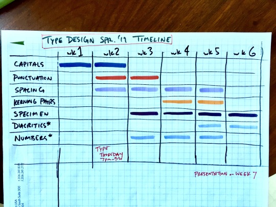
0 notes
Text
Domino Video Final Presentation
Well, since my choice was finish or die on this project — I graded myself at “mostly dead” by the time final presentation day rolled around. The rendering time alone buried the possibility of a 100% finished product on Monday morning, but I am very very close to having this project complete. I am not even close to bummed out about that because I’m proud of how everything has gone in this work considering what a gargantuan task I set myself up for. I’ve linked my slide deck for the final below, which outlines where I’ve ended up on the Domino video. The edit that I presented Monday morning is currently taking forever to upload online, but I will update this post with that link as soon as it’s ready. Current goal — have the project done and playing on the big TV in the crit area on the morning of April 1st.

https://docs.google.com/presentation/d/1CzQ5l-wXXWaiGnUvimsRcsCXoT_DdeYQwks2FPrNa3g/edit?usp=sharing
0 notes
Text
Mae Testing Clips/Final Video
Maria and I compiled a collection of exhibits from our testing footage of the Mae prototype that best illustrated the concepts we were working with and the problems we had to solve. We specifically focused on 3 key areas — pause lengths, confirmations, and error states. In the video below you’ll see some examples of high and low points of dealing with all 3 of these concerns while running people through our test scripts. You can also get a good sense of what the tests looked like for us.
We had a physical prop of Mae on the table next to test user. We alternated between having the lights off and illuminating Mae from within (much more like an actual use-case scenario) and keeping the lights and having me hold up a print out to simulate what the user would see projected on the walls and ceiling around them. In reality Mae would project the whole sky and a large number of the most recognizable stars and constellations would be highlighted and labeled for the user to refer to. We needed to narrow the scope significantly for our test, so the print-out “projection” showed just Big Dipper/Ursa Major and Ursa Minor.
Next to the Mae prop, we had a bluetooth speaker connected to Maria’s computer so we could simulate realistic responses from our physical prototype. From the computer we ran a python program called SayWizard which allowed us to assign each keyboard key (36 in all) a pre-loaded response in a “robot” voice much like Amazon’s Alexa. By narrowing the scope of the test we were able to simulate a pretty convincing interaction between Mae and the user using just 36 responses. Maria ran Mae’s voice while I ran her projection. I was very happy with the response we got from testers as to the effectiveness of this simulation, and I think the tests speak to this well. Next quarter Maria will be pushing this project even further, and I will stay on board to help organize some filmed tests with some real kids. Excited to see this project keep going! Here’s the video below.
youtube
0 notes
Text
Green Lake Park Wayfinding
More fun new design territory this quarter has been in our Environmental graphics class with Lori Peck. Our final assignment was to create a new wayfinding system for Green Lake Park. Icons set are always a fun challenge.
This hugely popular park is in sore need of an update to its signage system. I split the park into 3 main sections based on where the parking and primary landmarks are — the first containing the
Bathhouse Theater, the second the Community Center, and the last the Aqua Theater and Small Craft Center. Each third of the park was assigned a color, and all signage that section of the park would be indicated as such with a strip of that color along the top of any signage. This is to help people orient themselves wherever they may begin their day at Green Lake Park. Signage pertaining to the entire park (like Path Rules and Park Map) would have a strip of all three colors in a row. I chose Calibre for the type, which is based on street signage in Berlin. I used angular forms to unify the iconography and visual language of the new look for Green Lake Park, and I kept my icons,
whenever possible, to the most macro element possible to get the message across in order to unfiy the set and simplify the visual language. For example: only a fishhook is needed to signify fishing,
and just a tee and golf ball to signify the pitch n’ putt area. The colors used —Forest Green, Vermilion, Deep Blue, Dark Grey, and Sandstone — were chosen for their opportunities to create contrast between fore and background elements, as well as to give a warm, neighborly sense of trust and to echo natural tones.
My proposal for the Aqua Theater space would be to produce a lenticular mural (painted on the front surface of each stair in the grandstand) of an abstracted silhouette of the Aqua Follies synchronized
swimmers. From the water the full image would be clearly visible, keeping the famed performers — for whom the whole Aqua Theater was built in the first place — enshrined for posterity in the
venue they once called home. And my public art proposal for the park is outlined below:
Location: South of East Beach, just to the West of the Ball fields in the open area there — close by the loop where there are some park benches and picnnic tables. (And throughout the park, see below)
Materials: Concrete, chicken wire, mirror and re-bar
Concept: Walking meditation labyrinth, like the ones often found in monastery gardens. These paths are often used to perform a calming walking meditation. This historical idea would be augmented with whimsical touches like mirror columns between the labyrinth paths to create a sense of distorted space, bouncing light, and hidden entrances. Throughout the park and in the labyrinth would also be chicken-wire sculptures of different animals.
Visuals for all of these can be found in the slide deck below:
https://docs.google.com/presentation/d/1KtvFA80EF8xh7L_U3Ln2Bta-u8JWXP50gs4KOZ3zJT0/edit?usp=sharing
0 notes
Text
Special Topics Midterm Pivot
Exciting changes afoot in mine and Maria’s special topics project. As we have moved more and more towards voice design as the most exciting thread to follow in our work, we kept coming up against a bit of wall with how huge and complex the healthcare world can be. Voice design is already a completely territory for us, so after hashing out a bunch of ideas we came to the conclusion that we could get more out of this project by focusing on working within voice design in a more manageable space. So we decided to expand Maria and Judilee’s first After Effects/UX project for Erik into a more fully fleshed out voice interaction prototype.
The project in question is Mae. Mae is a interactive toy for kids that projects the night sky onto the walls and ceiling and will teach you about the stars and constellations. Here is a little introductory video for Mae that Judilee and Maria made during January and February.
vimeo
And here’s a video of Maria and I explaining our midterm pivot towards building out a voice prototype for Mae.
youtube
0 notes
Text
Orbita
As Maria and I researched around UX in healthcare we got very interested in reading about the voice interaction work going on at Boston Children’s Hospital. The company responsible for the work was Boston-based Orbita. The more we looked into Orbita the more fascinated we became with the type of solutions they were working on. Voice interaction design is still a pretty fledgling field, and they seemed to really be leading outside of the titanic presences of Amazon/Google. What Orbita does is provide a platform which organizations can use to create their own voice products tailored to their specific needs. Whether it’s something as “straightforward” (nothing in voice design, in my experience, is particularly straightforward) as a health-related survey for patients, or a interactive portal in hospital rooms for doctors to take verbal notes or create patient reports. It was still a little obtuse to us how the platform and partnership with Orbita worked on the ground, so we got in touch with them about a free trial run of their product, as we thought it might be something we could use in our work.
Shortly after reaching out to them we had scheduled a video conference with the West coast sales rep, Matthew, and one of the founders of the company, Alpesh. They were both incredible kind to take the time to talk with us, and very accommodating with our questions. We expressed our interest in the platform, and explained our student status and talked through a bit of what we had in mind for the project. They have promised us a sandbox version of the platform to play around with, which is very exciting. This is certainly one of my peak moments of just asking for access to tools or services as a student, and having it work out excellently. I will miss that perk of being a student when I graduate! As they walked us through the platform one of the most promising aspects of the service is the way you can design an interaction piece that is deployed across multiple platforms at once. Basically you can create a voice-based survey, but the product will simultaneously build out a visual version as well for use on a tablet, phone, desktop, or whatever visual interaction paradigm you might want to deploy your survey on.
This was a great lesson in never being afraid of just asking after something. I’m excited at the potential of using this service for our solution. We’ll see if it works well in our process, and I will keep you updated.
0 notes
Text
Ocean Animation
I had a few different theories about how I might tackle the “Moonlit Ocean” environment I needed to create for the “Domino” video. In the end I went with a bunch of the cues I picked up from this tutorial: https://www.youtube.com/watch?v=AEbLfkrEC7g. Through a pretty brilliant combination of turbulent displace, fractal noise, and time warping, (among many other smaller maneuvers) you can create a relatively realistic ocean surface which is then dropped in as a comp and flattened out into z-space as a 3d layer. A little softening along the horizon line with a feather-masked solid layer, and some fractal noise fog over the water surface pretty soon creates an ocean! I did a bunch of tweaking to the original tutorial to make it work for my video. The color palette had to change to match the moonlit scene. The movement had to be slower and more serene. The time-warping idea he had — basically making the ocean move faster the further it stretched to the horizon — was really smart, but his execution I thougt was little offhand, so I ended up spending more time, creating more masks, and finessing the different speeds until no visible demarcation between the time-masks could be seen (or as close to undetectable as I could get it). Then I used some particle effects to break uup a shape layer into a field of stars, added more star layers, and had them twinkle and rotate using a combination of turbulent displace and fractal noise (and more fractal noise clouds/fog). The moon was an illustration I made and then glowed and fractal-noised (can you tell how much I love this effect yet?) to make more “realistic”. Below is a clip of the first version of the comp, before I added in the actor. Then below that is the same scene, but with some more color work, effects, light layers, and the actor plus practical set fully keyed out with camera movement.
youtube
youtube
0 notes
Text
‘Domino’ Green Screen Shoot
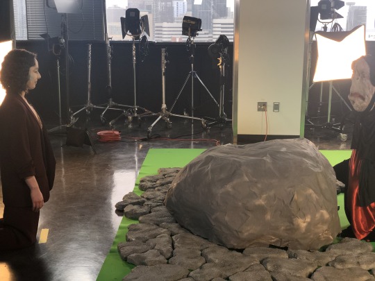
The green screen shoot was, at least for now, a success! To be honest i was pretty apprehensive about how this was going to pan out. I felt like I couldn’t do enough research on how to properly set up and light a green screen set, especially one of the size we were looking at. I had hoped to do a bunch of test shooting and lighting tests in the studio but a few factor made that not happen. Factor 1: time! There is a ton of other work to be done this quarter, and the combination of other work commitments and availability of the photo studio (and the time involved in setting up lights and the green screen) made it pretty difficult to set aside a good 4 hours to test out lighting techniques. Factor 2: Camera. I’m not going to be the camera op/DP on this project, thankfully, because that’s one more steep learning curve I’d have to slog my way up. Jess Clark, who works at Watts Media with my co-producer/co-director on this project Ali El-Gasseir, will be shooting this on a Canon C200. I’m stoked to be using this camera (and with Jess)! We should be getting some cinematic quality footage. The camera, however, is only available for the day of the shoot. Factor 3: Coordinating schedules with the crew. Ideally the whole crew would come in to look at the space and do some test shots and brainstorming, but it’s sometimes so incredibly hard to get a group of people together, especially when you aren’t paying them.
So we went in to the shoot day planning on winging it in a well-researched way. I had hoped to have my collaborator Ali on set to act as co-director, and a grip to focus on the lighting. Instead what happened was my dear friend Ali’s wife/my friend Eva went into labor the night before the shoot, and I was never able to nail down a grip. So it was a crazy day, and thank god Jess was there and absolutely crushed it as a DP/collaborator, while I ran around like crazy adjusting set pieces, directing the shoot, tweaking lights, and making some choices on the fly reacting to certain unforeseen restrictions and challenges. We made it through! In fact it was a blast, and I cannot wait to start to working with this footage (fingers crossed that pulling the green screen will work out, and my novice colorist skills will be up to the task of working with raw footage).
0 notes
Text
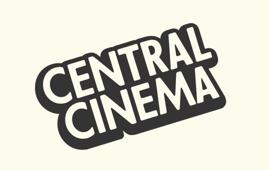
Central Cinema Logo Design
This quarter in Jill’s branding class Mitchell and I are working on a branding project for my neighborhood’s beloved independent second-run movie theater/event space Central Cinema. I have a lot of love for this place, so I’ve been really excited to dig in to this project. Throughout the program we have done lots of minor branding for a number projects, but it’s been eye-opening to get into a “real” branding process. Working with the other Central Cinema teams we crafted a creative brief and have done a number of exercises bringing us to well-researched and grounded understanding of the Central Cinema brand. A highlight was coming up with the three tonal characteristics of the brand and then, as a group, bringing in a collection of imagery and hanging it up on the wall. From there, we did group voting with little stickers to indicate a “yes” or “no” vote and we narrowed down a wide field of available imagery to determine some base material with which to start to honing in on some design choices. We came up with “Casual, Geeky, and Nostalgic” as our three main tones for the brand.
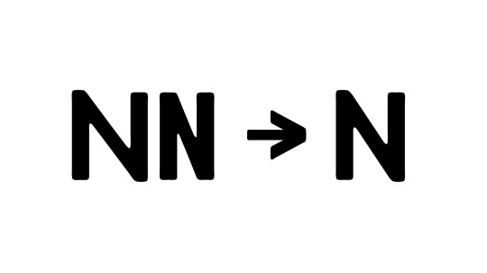
We also began working on a logo. Here is probably our final design below. We ended up using an experiemtnal typeface called Futura Passata. It is an all-caps design based on two different widths of a woodcut version of the Renner classic. We relied in the stacked Ns as the spine of our logo design, and found that the two available widths of the N were both not working. We liked the little diamond shape created by the stacked Ns but the wider N made it too much of a gaping, distracting hole in the middle, and the thinner Ns stood out too much in their condensed-ness. Below is an illustration of the middle-width N that I adapetd in Glyphs and then exported to create our custom versino of the typeface. I think the logo is working, excited to see it in context.
0 notes
Text
After Effects: ‘Domino’ Music Video
My initial plan for Erik’s after effects class this quarter was to take the first half of the quarter to pursue an independent music video project and then do the hololens assignment for the second half. My initial pitch was to create the animated assets for the video (which included a couple different 2.5d environments, as well as some rotoscoped pieces and other motion work). When I presented my intial pitch (which I’ve linked to below, as well as the treatment) I got the tough love encouragement I’ve come to expect from Erik — who encouraged me to take the whole quarter to complete the entire video. I believe the exact words were “Finish or Die.” And so now I head into a pretty massive undertaking, determined to finish or die. Obviously finishing is preferable. Why is this project so huge? Well it’s going to involve doing a full green screen film shoot with two actors and a practical set. I have never done this kind of work before, but it has been a dream of mine for sure! Very excited and a bit daunted by what lies ahead, but I’m glad to be tackling this kind of challenge in school while I can. The good news — the concept, storyboards, and treatment are all ready to go. Lots of compositing and animating (and shooting, and production design, and lighting research, and chroma key research, and MORE to go).
Pitch deck:
https://docs.google.com/presentation/d/178eIr480GHhMo0VT4fqZErnKsV78uA7Ti_pt_5kjavY/edit?usp=sharing
Treatment:
https://docs.google.com/presentation/d/1F412n20MZuFMvrM3a9HWZaffuywbXCkPgswOUbdOa8M/edit?usp=sharing
0 notes
Text
Special Topics Beginnings
This quarter in special topics Maria and I are planning on working on a UX solution in the healthcare space, specifically in patient-facing technology. Inspired by the open-ended, research heavy beginning of the Amazon design sprint, we thought we’d let our initial research help us pinpoint a more pressing problem rather than “choose” a problem to solve without doing the requisite thinking/searching beforehand. Below is our initial pitch document. We could still very much make a pivot at some point this quarter, but we feel like we have a robust starting point here.
HEALTHCARE UX PROJECT
Team
Maria Randall & Dillon Sturtevant
Project Statement
This is a UX project exploring problems and opportunities in the world of patient-facing healthcare technology.
Audience:
Healthcare patients.
Goal:
To build a comprehensive understanding of our user through a research-dominant process that explores multimodal solutions, proven UX patterns and best practices, and a working backwards approach. The focus of the project will be on process and research— with the goal of broadening our UX approach and techniques, and applying those to a solution.
Deliverables:
We will deliver a proof of concept of our solution (most likely a prototype of some kind) and present the research and techniques we used to understand our user and react to their needs.
Learning Objectives:
Fill in gaps in our UI/UX knowledge, and spend time researching the world of UX design and current trends/thinking/best practices. Become more fluent in the user research process. Explore multimodal solutions.

0 notes
Text
Amazon Design Sprint
This quarter had a pretty auspicious beginning with our intensive 2.5 day design challenge with a team of designers from Amazon. So I signed an NDA for this workshop, so I won’t be able to go into too many specifics, but there were some good higher level takeaways from this experience worth diving into.
It never ceases to amaze me how uniform and systematized a corporate design structure can be. A whole problem solving approach can be concentrated into a mode of operating that can be deployed through the ranks with surprising ease (at least from the outside). It made me think a lot about group work dynamic within design, and how it’s a challenge to work both efficiently but also at the same time encourage an expansive freedom to make room for outside the box thinking from any level of the team. Their are very different pro/con sets between a smaller agency style approach vs a a more rigid corporate approach.
The basic gist of this challenge was to incorporate an introductory understanding the Amazon design ethos and the tools/products/systems available within the greater Amazon toolset to solve a problem our teams pinpointed in the area of trust and social good. Again, at the risk of going into any detail — our team (Tat, Lexi, and myself — and our coach Mae) ended up leveraging the ever-growing Amazon logistics engine and the breadth of opportunities provided by Amazon Web Services as our two main tools form the Amazon ecosystem. A company like Amazon has the budget and capabilities to tackle HUGE problems in the world, and I look forward to any opportunity they take to make full use of this. They are still at heart an investor-driven business, and it’s hard to escape ROI in any conversation about bold moves in the public space. I am super proud of the thinking our team did in our 2.5 flurry of activity. Tat and Lexi were great to work with, and I truly think that with another week or more of teasing out the details, our pitch was an idea that I would have a huge positive impact on vulnerable populations in the world, and would certainly go far in terms of getting more of the general public and Amazon customers to place good-hearted trust in the behemoth that Amazon continues to grow into.
0 notes
Text
The Closing Stretch
Last week I presented my typeface for critique at Type Thursday. It’s been a long time coming — I remember trying to imagine what that would be like early in the summer, and can’t believe it finally happened. It was mostly the same crew as last month but a couple new folks as well. Met one woman named Iskra who has been a lettering designer in the area for a long time — another man whom I didn’t get to meet but based on his feedback seemed to have a lot of experience.
Overall I got a very positive and encouraging feedback on my work so far — so much so that after making a few tweaks this week I am focusing solely on spacing and then setting my type specimen going in to the last few weeks of the quarter. Ahead of schedule! And very happy about that.
0 notes
Text
Status Report: Things are Pretty Good!
Last night at Type Thursday I presented my relatively polished lowercase alphabet at the group critique. It went way better than I was expecting. The crew had some great points about a few moments in the a, g, and also the n — but overall the response was very positive about where I’m at! The personality was clear and enjoyable was the primary feedback I got.
Now on to spacing and punctuation! I would love to get the numbers done as well but that is almost a whole other alphabet and will likely have to wait for next quarter. Next week I’ll share details of some of my key letterforms.
0 notes
Text
Progress Report
Most important update—I’m having a blast with this project and am wishing I could just be working on it for most of the week! Currently at 21 out of 26 characters, which is technically behind where I’d hoped to be at this point, but I think I’m in good shape. It was a little tough to come up with my benchmarks in the beginning of the quarter since this is my first crack at a typeface design, and so was just making inexperienced conjectures about reasonable goals — but I’m happy with how it’s been going and where I’m at. What’s been great about moving into the Glyphs app phase of the project is the ease with which I can repeat (i.e. copy and paste) and adapt form elements that occur often.
Also a big positive is the ability to open up my “inspiration” faces in the app and toggle back to certain letterforms and even compare fonts in a separate window. As I spent time with the “y” the other day I was pretty amazed at the diversity I found in Venus vs Gill sans vs Johnston (and I looked at some newer typefaces with similar mission statements to mine — like Apercu and Akkurat).
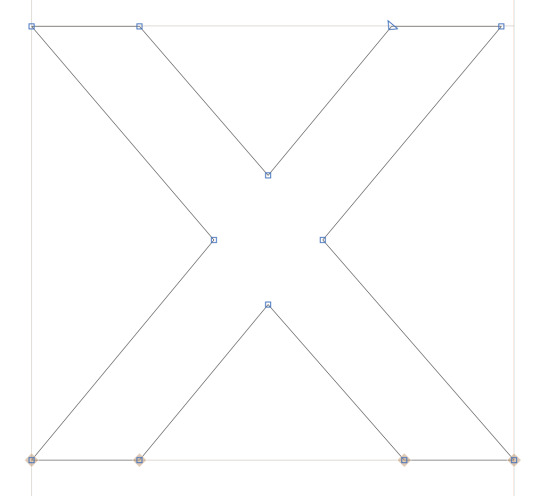
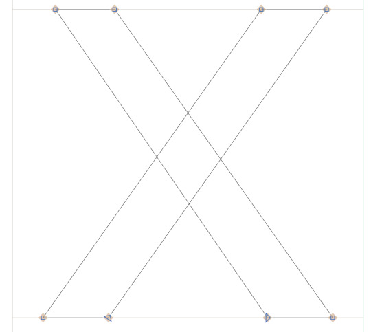
Thursday morning I cranked out my “straight” letters - wvxyz. Lots of parallel-ish rectangular strokes. An interesting amount of diversity as I dissected “x” from a few of other typefaces I had on hand — and one really fascinating discovery in particular. I assumed the lowercase x was nearly universally symmetrical in grotesques (left to right, I already understood the optical fixes needed for top and bottom halves) — but was fascinated to find that the lower x in Gill was not so. The upper right stem did not reach all the way to the same horizontal reach to match the bottom as the left side of the letter did. Also the upper left stem tapered to a thinner stroke, whereas all the other 3 terminals were the same thickness.
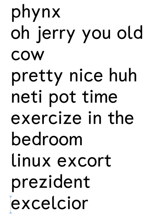
Most of the other x’s i looked at had the expected symmetries and optical corrections — but I decided to take some cue from Gill and taper the upper left terminal of my x in a similar way. Below the Gill x is top and my x is below. And then below that here’s some words (a poem??) that I TYPED IN THE LETTERS I DREW! So exciting. Lots and lots of work to go.
0 notes