Last Seen Blogs
sexchangedotcom
oh, is there concrete all around

youknowmewellmarimokun
You know me well Marimo kun
nicolereallyhot
nicolereallyhot

idhagman
Untitled

anveyegres
librum prodigiosum
Text
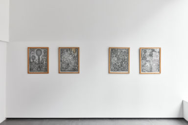
Visiting Artist - Christiane Blattmann
Christiane Blattmann is a German artist currently based in Brussels and is a founder of the ‘Montez Press’. Blattmann’s works are inspired by the study of architecture and fine art which are consistently represented throughout her pieces as she works to combine the two through sculpture and installations. During the time Blattmann studied fine art and architecture she was heavily influenced by her professor who was a painter. Another major influence is theatre and stage design, which you can see throughout the expressive bold works, which more so reflect Blattmann’s thoughts, often classed as ‘thinking figures’. Blattmann’s works are peculiar and intended to challenge the ‘normal’ of everyday life in our environment.
Space and its connection with physical elements is an important aspect of Blattmann’s works, this is most visually seen in her sculptures. ‘Basket Augurs 2019’ reflects this aspect, the vertical and horizontal space and surface encounter one another suggesting more about Blattmann’s considerations to the creation of space as well as the sculptures individually.

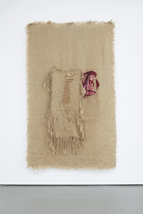
In this piece, like the rest in this project, the main medium used is hessian, a woven fabric originating from the jute plant. This material by itself has its own intricate details and textures that Blattmann strikes to expose throughout a process of deconstructing the longitudinal threads and warp. The act of deconstructing the fabric in some ways makes the material look like there is more. The deconstructing of part of the fabric creates a different textural and visual appearance that could definitely relate to biological forms, that are often seen in Blattmann’s works. Blattmann adds to the hessian, layering the material rattan with latex, which Blattmann physically twists and manipulates into recognisable imagery of human and bird body parts. From this point the piece has transformed from something completely abstract to a visual piece that reflects its own change through artistic processes like the deconstructing and layering while also depicting imagery of the everyday, perhaps a combination of abstract and realism in its own way, finally resulting in a piece that consists of multiple layers of fabrics, that are now not the mediums used for the piece but are an actual object, that has a relationship with Blattmann. This also happens to be my favourite piece from the exhibition because of the ambiguous imagery that is not so recognisable compared to the other pieces. I have interpreted it personally, using my imagination to engage with the piece and I have found something comfortable about the way the imagery is hidden behind the damaged fabrics, like I can reveal the rest in my mind, making my own connection with the piece.
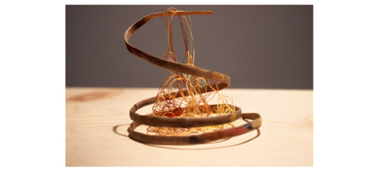
Blattmann depicts recognisable imagery within various pieces in this project. They are of bird parts, heads, beeks and wings. Blattmann was influenced by the Ancient Greek story ‘The birds’, a story about an Athenian who saw a relationship between birds and gods. Because of a bird’s ability to fly, the Athenian therefore thought that the species could communicate with the gods that are in the sky. Eventually, in the story the Athenian magically turns into a bird-man, god figure, which Blattmann displays in these pieces through sections of imagery that relate to both humans and birds. For example, in this piece below, from the project, she depicts human hands and bird wings.
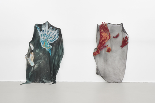
I like how the materials Blattmann uses in the works are of natural components which create a contrasting connection with the flesh-like imagery. The various materials and imagery somewhat complement each other as they are both natural and of our environment. This is further reinforced by the colours shown in the pieces. Blattmann leaves the hessian fabric its natural colour, brown, which relates to many organic forms in our environment while also making the imagery of the god figure bright red and textured like the insides of birds and humans, and their muscles.
The pieces in this project mostly relate through their mediums with minimal colours. I think this helps the viewer find a connection with the pieces and Blattmann’s own artistic intentions.
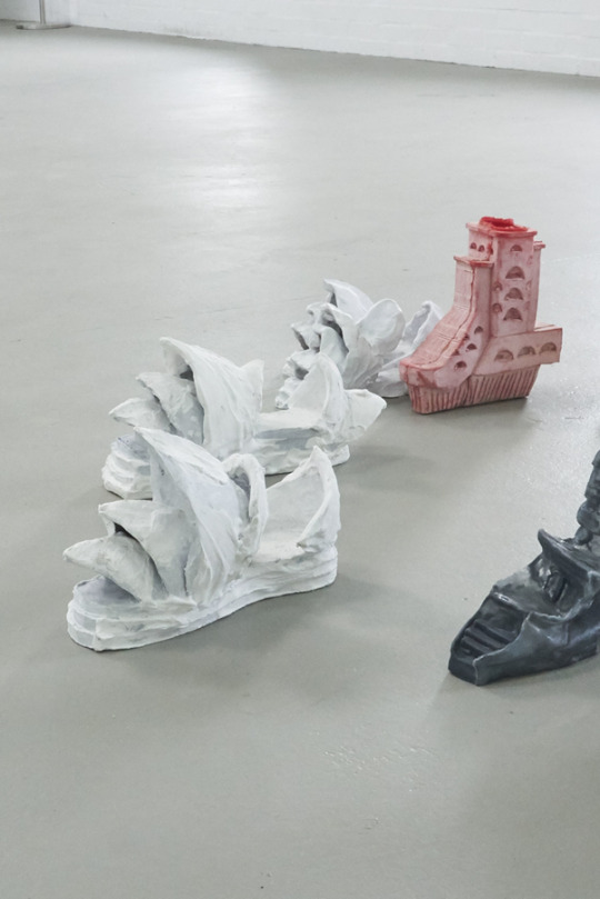
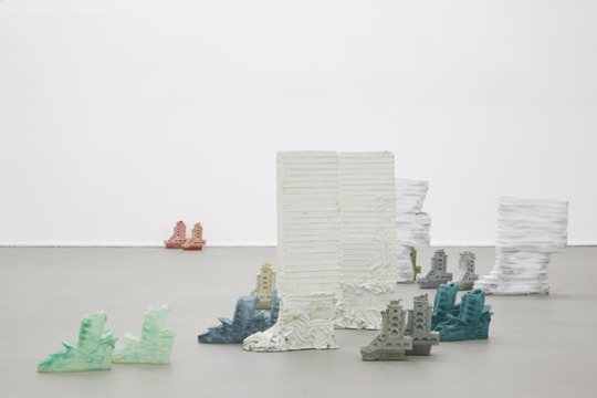
Also in this exhibition Blattmann combines her interests in architecture and fashion, creating shoes out of silicone, plaster, latex and ceramics. The sculptures are both shoes and buildings, with the style of the shoe relating to a building. For example, the sculpture ‘High rise boots 2017’ has the base of a shoe/boot but the upper part of the boot is a model of a skyscraper building. Additionally some of the shoes are inspired by certain landmarks from around the world; this has inspired an idea to create sculptures out of the many shoes I have collected as a child, while backpacking around the world and possibly link them to the landmarks of that country or more so the amazing, unique fashions and designs of that culture.
0 notes
Text
Visiting Artist - Rafail Lozana- Hemmer youtube recording
Rafael Lozano-Hemmer is a Mexican artist who combines science and art to create bold and purposeful pieces. Lozano-Hemmer is interested in making pieces that involve the public and observe the unexpected, “best public art comes from being out of control”. Some of Lozano-Hemmer’s works recognise social and political issues that have happened and are happening, some create awareness and intend on provoking change while other works honour and act as a memorial. I think Lozano-Hemmer’s works are brave as they often address topical matters and verbalise thoughts that hierarchies do not want to hear.
Throughout the recorded artist talk Rafael Lozano-Hemmer talked about a number of his early and most recent works. For this blog I am going to write about the works that I like and admire, and how Lozano-Hemmer’s works develop.
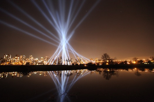
Some of Lozano-Hemmer’s first works started developing using light projections and sound. The project ‘Vectorial Elevation, 1998’ was an interactive projection in Mexico City's Zócalo Square. Lozano-Hemmer created this project to celebrate the start of a new century and allow people to express their messages creatively and freely. It was of multiple search lights that changed design every 10 seconds for numerous days, where the compositions depended entirely on the general public of the world. Lozano-Hemmer created a website that anyone could use for free, to create their own design. The webpage was a visualisation of all the lights in the area and their location. The lights could be redirected to form the chosen arrangement. The website automatically sent the designs straight to the lights, and the lights replicated each new design. 800,000 people from 89 countries participated and their individual designs are all photographed and personally labelled. I have never really been interested in light projections, mainly because I do not find them aesthetically pleasing. However, I think the idea behind this piece is very thoughtful and heart-warming, it has brought people together socially to see the art but also for people to communicate to one another about the possible participation. I like how the project encouraged creativity from the general public, the difference in every individual design is incredible and fascinating. Lozano-Hemmer also stated that the location the lights were placed, around a shopping centre, was important because it changed its occupation by interrupting commercial space, that takes up so much of our environment already and also has a restrictive atmosphere that somewhat mutes people’s natural, expressive behaviour. I also see importance in this, especially as a young person growing up in a world that has even more commercial space, that is only continuing to develop. This work has definitely taught me not to just look at, and research art that I like visually.
Lozano-Hemmer has continued to use light projection as a form of art in pieces similar to ‘Vectorial Elevation’ depending on the public to participate. Lozano-Hemmer’s websites are developed using new technology to make it easier for the public to involve themselves. Another way in which Lozano-Hemmer’s light projecting works have developed is through pieces that combine light and sound.
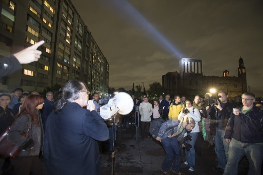
For example, the piece ‘Voz Alta, 2008’ meaning loud voice was a light projection triggered by a person's voice talking into a microphone. The piece is dedicated to the victims of the Tlatelolco massacre that happened on 2nd October 1968 where “around 300 students were shot at by police and military forces” while they were peacefully marching in a protest. The idea of the piece was for the public to freely comment and express what they wanted about the massacre and related issues through a loud microphone for people to hear, which would trigger a bright searchlight, mimicking the sound waves as light, which was projected onto the building the ministry of foreign affairs. The comments from the public were also played on the radio which was linked up to the microphone so that they were able to be listened to by people who were not close enough to hear from outside. Lozano-Hemmer’s idea of combining sound and light was inspired by an illustration of a volcano with a speaker on the top of it, from a poem in 1926 written by Ramon Alva de Canal. The futurist poem was about the development of technology and how it would one day be able to “project the voice of intellectuals”. I think that Lozano-Hemmer successfully made the thought in this poem actually happen and created a platform for those who wanted to speak about the devastating incident, allowing them to find some justice that they deserve. Lozano-Hemmer’s use of a light physically brightens these sad moments, it also attracts the public to this space and hopefully provides awareness of the matter.
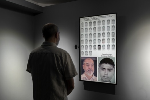
In my opinion I think think that Lozano-Hemmer’s projection works are so powerful and meaningful and I think it is a shame that they are not timeless as pieces. Although it would be near impossible to keep them running constantly I wish that they were so that they could continue bringing people together. In reality we need this encouragement. In some ways one of Lozano-Hemmer’s recent pieces ‘Level of confidence, 2015’ is created by technology still but it is duplicated for others to purchase and be put anywhere to still be used. In this case it is actually helping identifying individuals that could be one of the 43 students that were kidnapped and apparently killed by corrupt police. There has been no forensic evidence to support they are dead, so many are still being searched for. I think it is inspiring that Lozano-Hemmer uses art to actually help in dreadful matters like these. As much as I love ‘meaningless’ art, artists like Lozano-Hemmer make you realise how art could contribute so much more to world wide issues.
Despite the fact I think most of Lozano-Hemmer’s works are necessary and needed in our society, there is a concerning amount of energy, technology and industrial machines used in the works. For instance, Lozano-Hemmer’s piece ‘Voz Alta’ was run every night for three weeks and compared to many of Lozano-Hemmer’s other works this is a minimal amount of electricity used but over the course of three week it adds up to a lot. I hope that Lozano-Hemmer can find a way to carry on using energy, technology and industrial machines in his works but in a sustainable way that will not affect our environment.
0 notes
Text
Curation research
The word curator comes from the Latin word curare, meaning to take care. So artists are the creators, but they need to be nurtured and also challenged. This highlights the importance of collaboration - the curator as a junction-maker or as both a catalyst and a sparring partner for artists.
According to the curator Hans Ulrich Obrist curating means at least four things. It means to preserve, in the sense of safeguarding the heritage of art. It means to be the selector of new work. It means to connect to art history. And it means displaying or arranging the work. Curation is, therefore, an editing process - mixing art and science. It requires a genuine mission with a clearly defined voice and an understanding of your audience and community
(The Guardian, 2014).
The curator may need to take account of local or global perspectives when reaching out to the public - art exhibitions should also challenge the public.
The theme of an exhibition serves as a way for the public to connect with the art as well as a way to discover something new that comes from the juxtaposition of the artworks exhibited - a well curated exhibition can foster a conversation between the pieces that may not have existed before. There is an alchemy in placing one work of art near another.
0 notes
Text
Visiting Artist Cecilia Vicuña youtube recording
Cecilia Vicuña was born and raised in Chile. From an early age Vicuña had been creating art, primarily abstract paintings, but after the the violent military coup against President Salvador Allende in 1973 Vicuña started creatings works that approach topics of human rights, ecological destruction and cultural homogenisation (the decrease in cultural diversity through popularisation). Vicuña describes her work as it “dwells in the not yet, the future potential of the unformed” where audio and language interact to generate new meanings, the works are sensitive, powerful and feminist.
Below are images of some of Vicuña’s works labeled as they are on Vicuña’s website, that vary in style and meaning.
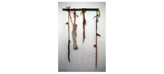
‘Quipus’
Installation
object
For this blog I am going to write about some of Cecilia Vicuña impressive works that address human rights, which Vicuña discusses in the lecture recording.
Firstly I want to talk about how Vicuña works promote the naked body and somewhat question and criticize the obvious of why women and people with femine body parts wear a whole lot more clothes than men. While the content may also address topics of feminism and the natural body of women, Vicuña would nearly always writes poems naked and publishes naked images of herself on the covers. Vicuña stated that she had grown up around the view, that being naked is liberating and not negative, to this day it helps her create. This is influenced by her mothers views on being naked, “she believed that clothes were detrimental for everybody”. Throughout Vicuña works you can see this view is has become her own and is often depicted within the works. However, society has always reacted differently to this view which consequently has been the cause of why many of her older works are not documented. Vicuña poems were censored, ridiculed and marginalized, Vicuña poems were not in many bookstores, if any. Recently, to Vicuña surprise while looking at images of protest in Chile people were holding banners with phrases on them that Vicuña had written in her poems. It is incredible that some have resurfaced and are being accepted unlike in the past. I am interested in this aspect of her work because there are still so many issues around the exposure of naked bodies and parts, especially with women, in other parts of the world. It is so ironic how is it not accepted for a women to be topless or if they are there is a need to cover their nipples when men can show any part of their torso including their nipples, which are the same on a woman's body.
In this painting, made in 1971, Vicuña depicts imagery and scenes of what the world should be like if it was equal and free from discrimination, it reflects the social and polital landscape of the time and the uprising of people fighting for change. The painting is a landscape of diversity with true and natural depictions of women’s naked bodies, that are and were continually discouraged and humiliated by society. It also presents famous women of this time like Janis Joplin who is a large figure in the painting and also shown half naked highlighting and possibly praising Joplin’s feminist activism. Another important female and large figure in this piece is Angela Davis. Vicuña paints Davis coming out of a prison, whereas in reality at that time Davis was not in prison. This illustrates Vicuña’s and many others’ criticisms of the government of America over their wrongful criminalisation. The imagery could more so be symbolising the acts of racist discrimation and the need to stop this. Another aspect of the painting that supports female rights and comments on the social and political demand for equal rights is imagery of women protesting. In the recording Vicuña stated that the imagery also related to the problems women were facing with no change in Chile, that has one of the largest violent femicide rates in the world, under a conservative government. Vicuña paints these women expressing their natural bodies, holding banners with phrases like “down with capitalism” and the reclaiming of the phrase “sisters of the precious blood unite” that was about the congregation of nuns that persecuted girls. Other parts of the painting suggest imagery of people that are gender fluid and homosexual which was only just starting to be accepted.
I think this painting is a fantastic depiction and actual reality, that supports everything, that should not be discriminated against. I think the style of the painting having attributes of realism almost mocks realism, that in no way actually reflects true society. I like how the painting promotes and accepts women generally, and as equal, while also flattering their natural bodies. Looking at this painting from 1971, in the year 2022 is actually quite shocking and disappointing as most aspects that the painting is addressing, from 50 years ago, have still not greatly improved or been accepted by all. The painting most importantly addresses ‘issues’ in our society that should not even be issues, Vicuña creates a world that I would rather be in.
Vicuña’s works do not necessarily influence my practice but they inspire me to be a more active feminist. Vicuña’s works visualise what is possible and create awareness of the change society needs to make; it should inspire everyone. Some of Vicuña’s other works also inform people on ancient forms of language which I think is important and fascinating.
0 notes
Text
Visiting Artist - Anna Zacharoff
Anna Zacharoff is an artist from Stockholm currently exploring painting and sculpture in Brussels. Zacharoff’s works visually depicts sea creatures through unique techniques and in faint colours. Zacharoff’s works are inspired by interests in marine life and fishing.
I am going to write about Zacharoff’s exhibition in Norway, ‘POINTING WITH THE WHOLE FLAT HAND’. Zacharoff presents a selection of paintings that are dedicated to Goldfish and their original breed and habitat. Zacharoff is interested in the history of goldfish and how they went from being treasured and seen as good fortune to common ‘dumb’ house pets. Zacharoff displays the paintings in this exhibition on white walls (white cube), paintings on each of walls surround the viewer to capture the ongoing natural movement of the fish. For each painting Zacharoff mostly focuses on capturing the form and structure of the goldfish; Zacharoff uses negative space and minimal soft brush strokes that are a variation of light and dark shades to generate dimensions of the creatures’ structure. Zacharoff paints the fish from various angles and vantage points, which she depicts by reducing or adding colour and imagery to show how the fishes’ scales reflect light and visually disrupt the natural orange colour of the fish. Within the paintings Zacharoff also paints limited splashes of paint and lines trailing from the imagery; these are colours of greens, blues and browns and are possibly used to hint to the viewer aspects of the ocean like seaweed and bubbles. This suggests that the theme of plain backgrounds and white walls is intentional by Zacharoff, to reflect the ongoing vast space of the ocean. This idea is further reinforced by the layer of pebbles, below the all the paintings, which I assume is meant to act as sand, like at the bottom of the ocean. Additionally, research into this exhibition suggests that Zacharoff could be commenting on the question, whether or not it is good or bad to keep a goldfish, with a 3 second memory, in a tank/bowl. And whether it is “imprisonment” or act of containment for safety . And so therefore, I think the display of the exhibition and the encircling continuous imagery of fish swimming randomly in any direction, almost mock the way fish move within a goldfish bowl and It perhaps overwhelms the viewer and encourages empathy for the fish that are trapped. This could possibly be arguing against the normalised idea of having fish in tanks and bowls. I believe Zacharoff wants the audience to acknowledge the history of the goldfish and what we, in the modern day, do not know about them before they were put in aquariums and in fish tanks/bowls in our homes only seen as pets.


I like how Zacharoff paints the goldfish individually with no other life around them. I think it is successful in seeking attention and generating simple questions like: why a goldfish? Or what is so important about this creature? Why is it being singled out? This will eventually inform the viewer that goldfish have their own history. I also like that the paintings of the fish reflect the transpacey of water and how that causes their scales to also become sem-transparent in the light, to camouflage. I think beyond Zackaroff’s interest in marine life, this could be symbolising something deeper or be suggesting there is a story behind everything which becomes noticeable like you can see it through the thing (transparency) when you actually know about it. I like how the the minimal imagery and brush strokes look so fluid like the ocean ,and effortlessly done but in reality the use of negative space and minimal imagery can be difficult methods to succeed with. Although I prefer art that is maximalist compared to minimalist works like Zacharoff’s, I enjoy being able to challenge myself and use my imagination to mentally visualise the ocean in the blank spaces of her works. It is almost like the painting can become a personal experience through my own visual explorations amongst the artist’s own imagery.
I do not particularly have an interest in marine life or painting it so I cannot say my work relates to Zacharoff’s in that way. However, I am interested in other types of animals like horses which I generally express through photography and painting. When I have previously painted horses, for example ,this piece below, I have similarly used unnatural colours and soft brush strokes with less dense imagery and detail. This piece, like the rest, also does not have a background but similarly, I have used colour to slightly indicate surroundings.

The development of my surreal/psychedelic practice relates to Zacharoff’s new works of making the canvas itself become a sculpture. Recently in my museum project I have experimented with making parts of my drawings 3D, using clay to create the sculptures,placing it on to the drawing so it comes out of the page.
0 notes
Text
Visiting Artist - Lara Almarcegui
“Wastelands are the only places in the city that remain without definition.”
The works of Spanish artist Lara Almarcegui, examine processes of contemporary transformation situated around political, social and economic changes in society. Almarcegui wants the works to highlight what slips from the general public’s notice and the importance in questioning the use and present state of construction in these forgotten outer edge spaces of a city, no one seems to care about. Lara Almarcegui works are inspired by a haunting active relationship she has with places. Almarcegui’s works focus on the connection between urban renewal and decay usually through huge installations composed of construction materials, mineral extractions, alongside concerning statistics and factual evidence of materials used and each locations, things happening by chance. Almarcegui’s works investigate the components that make up our physical reality regarding the ever changing global landscape. The works have been successful in provoking responses, managing to conserve some areas from complete abandonment and destruction.
Lara Almarcegui participated in several biennial shows, including the Liverpool Biennial in 2004 and the Athens Biennial in 2009.

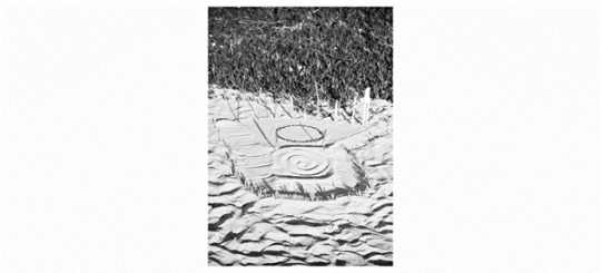
This piece addresses a list of the weights of the rocks that form the mountain range, calculated with the help of IGME (The Instituto Geológico y Minero de España (Spanish Geological Survey)) in the period between eighty to twenty million years ago when the Iberic peninsula crashed into continental Europe.
The project ‘Construction rubble’ at Secession Vienna presents large mounds of construction materials, displayed how they would be on a construction site. The piles of materials, chalk, concrete, wood, brick, terrazzo, steel, polystyrene and glass have been measured to the exact quantities that would be needed to build the exhibition space, creating an interior landscape. As the installation preserves the moment, by visually reflecting the abstracts of that space, perhaps it could also be reflecting the destruction of the space and therefore through ambiguous interpretations of the work Almarcegui comments on the continuous evolution of urban environment. The piece is showing Almarcegui’s interests in waste lands being the only places in the cities that are not ‘proper’, where actions are not predictable. I think the use of real sized heaps of materials has an impact in making the audience responsible for its fate, almost intimidatingly encouraging the viewer to do something about this issue.
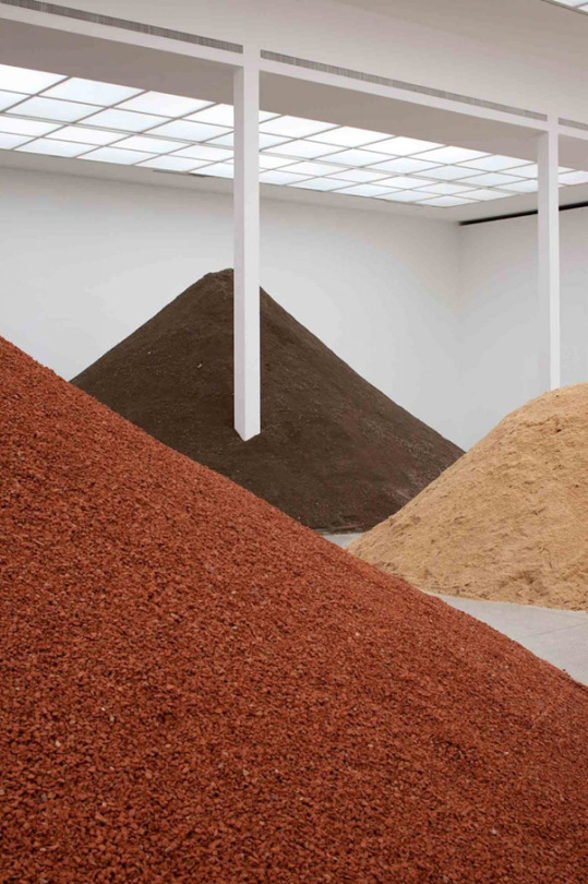
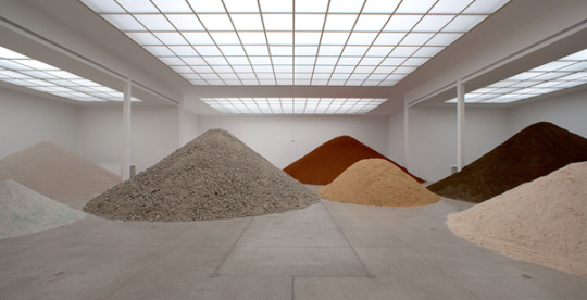
I think the way Lara Almarcegui displays ‘Construction rubble’ in this exhibition, on a realistic scale, of the intense volume of materials which instantly towers over the viewer, automatically making the viewer shocked and question the artist’s concerns and messages. Therefore, I think Almarcegui decision to display works in exhibitions works really well to portray its concept, the pieces are perhaps non avoidable unlike the place it is about. Initially looking at Lara Almarcegui’s works focussing on the appearance, I was not interested at all but it seemed so unattractive that I was actually intrigued to understand why and what it was about. I now understand that actually the simplicity of it is a great way of creating no distractions and instantly portrays the point it is intended to get across. I admire that Lara Almarcegui uses art to visually channel important sentiments that are actually perhaps necessary, significant to the environment, Almarcegui defies the act of people ignoring the spaces and I think it is seriously powerful. I think it would be impressive and even more powerful if Almarcegui photographed up to date images of the natural (unpredictable) change in the same specific spaces that were able to be preserved because of Almarcegui.
Lara Almarcegui’s work does relate to some of my previous practices focussing on abandoned places. Similarly its natural state/unpredictable shifts, and likewise I have been drawn to using the ‘leftover’ materials as a subject matter within photography. However, like Almarcegui I have not yet gathered and used the materials raw. Although Almarcegui’s art does not inspire my practice specifically, researching the works has made me think about similar types of locations no one thinks about and how they may be important to me.
0 notes
Text
Visiting Arts - LJMU MA Fine Art – Part 1
For this blog I am going to write how a piece of work from these artists, Vincent Quirk, Simone Schofield, Mary Hennessy Jones, inspires me the most or how it relates to my practice.
Vincent Quirk’s practice is inspired by his past traumas and nightmares. Quirk is also influenced by boardgames and body horror movies; you can see this influence is clearly depicted in his works through the dark, distressing imagery that is directed by his subconscious. Quirk’s works are my favourite from this lecture as they relate to my practice the most through the inspiration of nightmares and trauma. I really enjoyed listening to Quirk talk about his works and researching them. It is really interesting to see how Quirk portrays nightmares and how they are of a different style to my own and other artists’ works that explore the same theme.
Vincent Quirk
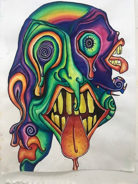
my own work
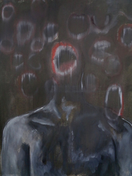
This piece by Quirk, ‘Untitled, 2020’ is an oil painting inspired by a number of Quirk’s nightmares from the first Covid lockdown and the feelings of anxiety and fear which Quick was faced with at this time. The piece also has influences from horror movies and 80s/90s pop culture. I like how this piece, similar to other works by Quirk, is bleak and shadowy in terms of colour and how this reinforces the atmosphere of a nightmare. It makes it very easy for the viewer to empathise with the true nature of a nightmare and feelings of anxiety and fear that the artist felt because of the pandemic. It is interesting to see how Quirk depicts his nightmares as dark and gloomy with minimal colour, compared to my depictions of my own nightmares that are bright and colourful, so I can confront them by making them less negative and more positive. Another difference in the way we reflect our nightmares is that most of Quirk’s works, like this one, are sections of imagery that are less clear and in this case blurred. Quirk’s pieces are more ambiguous and abstract, perhaps to imitate how one remembers a dream partially, in fragments. Similarly, the imagery in my work is of fragments, however it is hard edged, clear and outlined in pen. I also choose to further manipulate the imagery I see in my nightmares by distorting it through a surreal/psychedelic style whereas, I believe that Quirk looks to portray the imagery more realistically to visualisations from the nightmares. I first started creating works that were inspired by dreams and nightmares after the first lock down because I noticed my nightmares and dreams were becoming more vivid and memorable to draw from. I think it is fascinating that around this same time Quirk created this piece also influenced by the pandemic. It has made me wonder how aspects of our environment similarly influence artists.
Simone Schofield’s artworks range in style, idea and mediums. Schofield’s earlier works focused on themes like nature and grief while Schofield’s later works address the health concerns from the consumption of sugar, while other works explore the combination of pop art and minimalism.
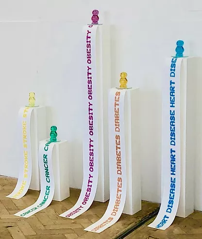
Schofield’s ‘Jelly Baby project, 2020’ is a collection of work consisting of multiple sculptures of jelly babies that are filled with sweets and pills. The purpose of this project was to create awareness around the danger of sugar and how it can seriously affect the human body, which is “represented by the pills” inside the ‘sweets’. Although the visual content of this work does not relate to any of my own works, the idea of it does. My piece on animal welfare was about how the production of different clothing items harms animals. Similarly, I made an installation of a casually dressed mannequin, attired in commonly worn clothes like jeans and leather shoes, to best represent the mass scale in which they are produced and therefore how often it must be harming specific animals. Each item of clothing had a plaque attached to it which consisted of information and facts about how the production of the item harmed an animal or animals. I think there is a similarity in how myself and Schofield approached and presented our works, through a sort of realism. An installation that is of visual representations that relate to the product we are creating awareness about, in my case the specific items of clothing and in Schofield’s it is the sculptures of jelly babies, and their relation to sugar. One of Schofield’s works in this collection uses text, the piece is of five jelly babies placed on individual stands, long thin banners of text are hanging off the stands coming from underneath the jelly babies. Each banner repeats a different word/disease that links to the effects of sugar consumption, for example, one reads diabetes. I think Schofield’s use of text is really straight forward but effective; the act of reading the words repeatedly is powerful, it almost forces the viewer to relate the diseases to the sweet, automatically making the viewer put off. This has really inspired me to think about how I could develop my piece by using a repetition of words, perhaps the way in which the animals were harmed, or repeated images of animals being harmed in these productions, to create ways of shocking the audience to provoke change.


Mary Hennessy Jones is an artist who explores many themes, which are usually related to her personal life and have a deeper meaning than what is initially seen in the works.
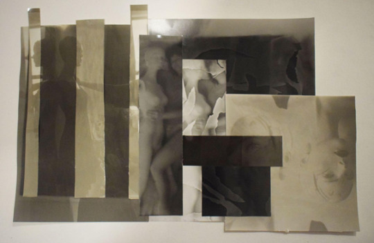
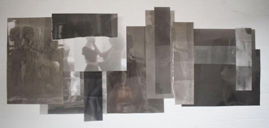
Jones’s piece ‘Am I in this place or is this place in me?, 2019’ caught my eye initially because it is a large black and white piece made up of lots of individual pieces, similar to recent works of my own ‘Fragments of dreams, 2022’ because it has the same idea of multiple pieces making one. Jones’s piece is inspired by her interest in how a place you have been to before can hold a certain memory to it and therefore a feeling as well. This piece was an investigation into whether Jones could return to a personal place and “see it completely anew”. In this case Jones went back to a beach she had gone to as a child, stuck with the memory of it being “bleak”, because there was nothing much to do, but to Jones’s surprise it had changed, now describing it as “exhilarating”. Jones started drawing and filming scenes of the landscape and from this created a photomontage which then developed into a collagraph (a collage of materials with various textures glued on to a printing plate) on plates. Jones went on to creating monoprints of the same imagery, on Japanese paper. I think these pieces are a wonderful interpretation of the landscape. Jones has captured the imagery through the contrast of black and white while also creating texture, through collage, to depict depth. I think the depth in this is collagraph is definitely what draws me to the piece. I think it does inform the viewer there is a deeper meaning to the piece and that there is a connection between the location and the artist. Furthermore, because the piece is black and white I think it also immediately creates this deep, emotional atmosphere. I also feel like it concentrates on Jones’s previous feeling towards the location because it is in black and white and for me that instantly relates to a more depressing atmosphere. Perhaps if it had more colour, not necessarily really bright colours, it would further display Jones’s newer emotions towards the location, which is important aspect of this work. Because of this I feel like Jones’s question, of whether it is possible, after a new visit, for your memories and feelings to change towards a place you have previously been to, is not possible. I think the title of this piece, ‘Am I in this place or is this place in me?’, also questions this possibility and poses the idea that is possible to an extent, due to new positive memories and feelings pushing the old ones back, but they are never truly replaced.
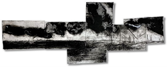
My piece ‘Fragments of dreams’ is a collage of ‘failed’ film prints that create a somewhat real depiction of a dream’s foggy imagery and repetition. Like Jones’s collagraph it is inspired by a film I created for my museum project. I was interested in experimenting with the test strips and ‘failed’ prints because of their variation in exposure and shape. I knew that layering these sections of prints would create a landscape of depth, contrast and texture which would express the atmosphere of a dream, similarly to how Jones uses texture to create depth. Unlike Jones’s piece, I used black and white imagery to highlight how the image content created emotions, so it would not distract from the performances and scenes. I think Jones’s piece, ‘Am I in this place or is this place in me?’ also relates my work, ‘Fragments of dreams’ through their development of reconstruction. My piece also started off as singular images that had been through their own processes (developing them in the darkroom) to eventually form a collage with fluid imagery, like Jones’s collagraph. I liked the results of printing on Japanese paper because of the texture it creates. I am inspired to consider experimenting with it when I start printing again.
I have really enjoyed listening to these MA students and having an insight into what that course is like. I was disappointed I missed the previous MA student talk because I think it would have been really influential like this one.
0 notes
Text
Visiting artist - Shwetal A Patel
Shwetal Patel works between Mumbai and Kochi in India as an art practitioner and curator. Patel is a founding officer of India’s first perennial festival of visual arts, The Kochi - Muziris Biennale inaugurated in December 2012. Patel is also co-founder of the Florence & London based emerging talent and craft initiative - The Creative Archives.
For this blog I have chosen to discuss one of Patel’s great achievements as an artist, his part in the Kochi-Muziris Biennale.
This huge international exhibition runs every two years to celebrate various intriguing pieces of art in all forms from many different artists. Patel first came to this project through making collaborations and networks with artists from his time at university in London. Through a musical collaboration Patel met artist Bose Krishnamachari who is also one of the co-founders of Kochi-Muziris Biennale. In the 2000s Patel proposed the idea of an art biennale alongside Bose Krishnamachari to the Government of India after patel's interest in Biennale’s grew around at this time due to the experiences Patel had while visiting Biennale’s in other places. For Patel this project would be challenging as although Patel's artistic experience before this project was still very diverse Patel had no actual biennale-making experience. Patel used his experiences from visiting art exhibitions and going to the Venice Biennale to help contribute in the Kochi-Muziris Biennale.
When curating a Biennale Patel explained that there are many considerations especially now after the COVID pandemic. Health and safety risks are key for staff, participating artists and audiences as well as considering the international viewers. Other considerations for an international exhibition is that different cultures tend to display artwork differently; out in the region where this event takes place there is a range of different spaces to exhibit, both indoor and outdoor for different mediums that require different spaces.
Patel also has to take into account how the local community engage with the Biennale and now through the experience of planning the Biennale over several years, Patel has discovered the local community are the starting point for these projects and are therefore very important to the mission.
To bring the project closer to the local people the Biennale foundation runs an all-year-round programme providing activities for children and students to engage with. The mayor of Kochi and government of Kerala provides support for this foundation.
The many artists participating in the Biennale often make work responding to the site and venues, and connect with the history of India and the Fort Kochi region. Patel encourages the artist to not only produce pieces of art but to experiment on learn from one another, to create a friendly community across the socio political and cultural region. Patel considers the artworks in the Biennale to be a “long conversation” that unravels over the duration of the Biennale.
Following the Kochi-Muziris Biennale Patel was involved in the first edition of Oslo Biennalen. Patel stated his approach to this event was different to the Kochi-Muziris Biennale saying “the practices that emerge in Kochi are by necessity distinct to that of Oslo and although the contexts vary, the underlying practice emphasises innovation and, above all, flexibility. Context alone does not determine practice”.
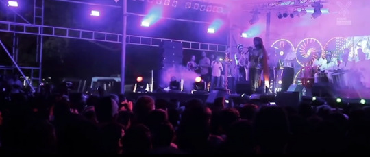
From looking at some of the videos off the Biennale I can see how big an event it is. I think it looks really enjoyable and fun with a great creative atmosphere, full of wonderful and unique pieces of art alongside sculptures and quirky performances. I would really like to go and experience this event in India and delve into all the different concepts, contexts and methods these artists use. I think it would be a great inspiration for any artist and also a great experience that anyone could go and appreciate. This artist’s lecture has inspired me to look into Biennales and the artist and artwork involved for inspiration for my own practice and projects. Looking at some of the considerations Patel had to take into account has also opened my eyes to what I might need to consider if I was to ever exhibit my work with others.
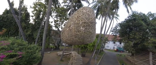
Images from Kochi-Muziris Biennale
0 notes
Text
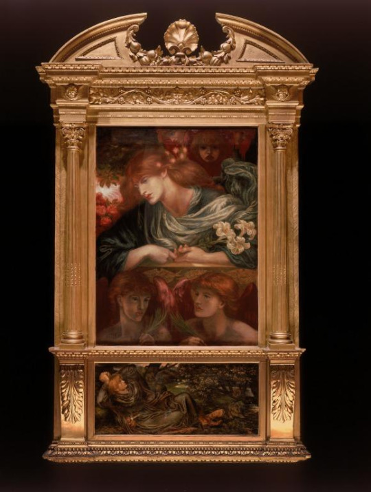
Lady Lever Art Gallery Visit
For this Tuesday’s lecture we went to the Lady Lever art gallery. Following last semester's lectures on the Pre-Raphaelite art movement, it was good to actually see numerous works from this movement in the gallery, including the well known piece by Dante Gabriel Rossetti, ‘The Blessed Damozel’. The painting is inspired by the first verse of the poem ‘The Blessed Damozel’ written by Rossetti himself. The poem is a story of a romantic relationship between a man and woman. The woman dies young and leaves her partner behind hoping that they will reunite in their afterlives. This is depicted by imagery of the woman in heaven (gold bars) looking down on her partner, longing for them to be together again. This piece is Pre-Raphaelite because it depicts a relationship with death, an aspect of real life that was not usually welcomed in art at this time; it is also by Rossetti one of the founders of this movement. I am not a fan of this type of art because it is realism and I prefer art that depicts something other than what I see in everyday life, but it was really interesting to look at in person. I could really appreciate the detail of this painting.
0 notes
Text
Visiting artist - Joanna Zielińska
Zielinski has explored writing as one of her multimedia practices, while also being an art historian, curator and performance curator with work centered on theatre, performance, performative literature, and visual arts.
Zielinski is also interested in encouraging discussion on the identity and activity of the 21st-century museums. This approach is less about physical space and more to do with the idea of community and the influence of new media.
In 2020 Zielinski wrote an interesting essay for the website ‘Glossary of common knowledge’ all about the importance of ‘empathy’ as a term, and feeling within all forms of art, and the various thoughts Zielinski has on ‘empathy’ while referring to many other writers’ opinions on this word, and its connection to art. Through analysing text from another essay, by Beverly Weber, discussing the difference between empathy and sympathy Zielinski examines how ‘things’ become emotional and the deeper relationship between ‘empathy’ and ‘imaginative projection’, the ability to project ideas from one's imagination into reality, and how possibly empathy is perceived differently by people because it is almost created individually in one's mind, questioning whether the other person can really, correctly empathise with the other’s’ feeling.
To continue with this point Zielinski analyses a sculpture by Judith Scott expressing that art can be used as a tool to even encourage empathy, of a way to perhaps understand or relate others when it’s just not possible. Scott was born (1943) with Down’s syndrome and suffered with undiagnosed deafness for years, in 1986, Scott was forced into an institution for disabled children for 35 years. During this time Scott, over weeks and months, collected materials, creating multi-layered cocoon like sculptures to generate an abstract language as an alternative way to communicate due to her disabilities. Zielinski proposes in this written piece that Scott’s sculptures prove “the ability of art to function as a means to facilitate empathy”.
I think that Zielinski is therefore trying to conclude that art forms become a language mechanism that aid the imagination to an experience/feeling portrayed in that piece which ultimately suggests without empathy what is art? It is a piece with no connection to the viewer, lacking that magnetic force that draws one to a piece of art. I think this piece of writing is very subjective and articulate about ‘empathy’ and how art forms use and relate to and around this word. I have never really thought deeply about how a viewer and artists use empathy to connect to one another on a level, as a way of communicating about more than what the artist is trying to relate. Zielinski’s text has made me think about the different perceptions the communication can create in one’s mind purely through their own imagination and how that creates an emotion and feeling as to why they may like or dislike a piece of art.
Zielinski has also written for the magazine, Mousse in 2021, with a piece called ‘The Upside-Down World of Patrick Van Caeckenbergh’. This piece explains, analyses and understands a project by the artist Patrick Van Caeckenbergh. The project is very much scientifically inspired and combined with the artist’s personal complex beliefs and ideas about change and society, it creates works that almost reflect on global problems. Additionally the project expresses different and ‘weird’ perspectives on reality.
Zielinski also discusses the struggle Caeckenbergh has faced throughout his practice, feeling like he does not belong in the art industry or the science world. As this piece is about an artist’s project and works Zielinski writes a clear depiction of the works and how the artist has been influenced by scientific aspects without initially intending to make art.
The Upside-Down World of Patrick Van Caeckenbergh
As an up and coming artist I have not yet been interested in writing as a medium. Exploring and researching Zielinski’s written pieces has been interesting and increased my knowledge on the topics I have explored. By reading these well written pieces, particularly the piece on the artist Patrick Van Caeckenbergh, I have examined and learnt how Zielinski as an artist has written unbiasedly about another artist (Patrick Van Caeckenbergh) and their works, which I hope will help me in the future when I am writing about artists and their works.
0 notes
Text
Visiting artist - Pádraic E. Moore
Pádraic E. Moore is a writer, curator and an art historian. Moore’s practice is shaped by the belief that art can be a different, psychical way to interact in a world that is so caught up in technology. Moore’s curatorial methodology is accurate but subjective and is well versed by acknowledgement of the artist’s individual position.
I have decided to research one of Pádraic E. Moore’s recent curatorial exhibitions called ‘The Great Invocation, 2021’ this is inspired by the historical mantra, ‘The Great Invocation’ by British writer Alice Bailey, written in 1945 as a spirit guide/world prayer to assist and promote hope, peace and love to people, at the end of WW2, such a self-destructive time for humanity. Moore was inspired to base his exhibition of ‘The Great Invocation’ because he found the idea that a mantra could perhaps save the world from self destruction to be “very compelling”; that something ‘received’ from the spiritual dimension in times where it is suggested that people sought help from their religions, while some seeing spirits as evil, was circulated globally as a healing purpose to humanity. In the exhibition Moore aims to generate a new invocation for everyone to approach the 21st century, through the optimistic art that is displayed, as well as being realistic around how far humanity has come and what it is actually like in the present day. I think Moore is trying to present this part of history within art, but more so the conceptual theme of spiritual optimism within the exhibition and how in the past, present and future something so uncertain being the spiritual realm still helps and inspires people.
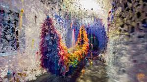
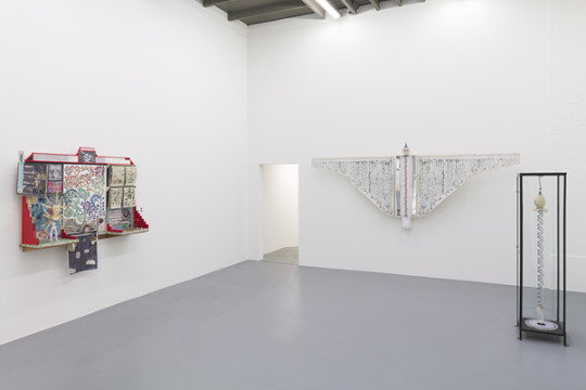
Artists featured in this exhibition are Tessel M. Bauduin, Mikala Dwyer, Madge Gill, Bertus Jonkers, Jan Kervezee, Marc Lamy, Léo Luccioni, Ruchama Noorda, Sharon van Overmeiren, Ewoud van Rijn, Linder Sterling, Emma Talbot and Suzanne Treister. These artists all explore themes relating to the subject of spirits. Some of these artists explore mysterious demenours of the conscious form and mind. For example, Marc Lamy explores this through intense detailed automatic ink drawings inspired by mental hallucinations. Other artists from this exhibition like, Sharon van Overmeiren delve into aspects of religious beliefs centred on specific elements and objects that can be natural or supernatural, providing a deep symbolic meaning, creating a relationship with a person. As well as this, there is a performance piece by Ruchama Noorda and a lecture by Tessel M. Bauduin.
Moore has created an international exhibition of this group by bringing together artists from different generations and backgrounds which displays diversity, however the exhibition seemingly has a Eurocentric gaze, this is often a problem that art curators have when they create an international exhibition. Many of the works displayed in this exhibition that are by international artists, not from Europe, have had their work displayed in a very much European way in a gallery, Garage Rotterdam established as a medium sized exhibition space for high quality contemporary art, suggesting Moore has decided to present the works in a similar type of space with white cubes (on white walls to eliminate distraction); this is a modern way of displaying art that was founded in the 20th century.
Therefore, I think that Moore could have considered how different societies and cultures look at art, which is not always just in galleries and museums. Perhaps he could have exhibited the works differently, maybe more appropriately with images of the art in the space/country where they were created in order to highlight this interesting difference. I do also appreciate that would take a lot of time and may not even be possible, but it would shed light on something I think should be credited; however, difference is not always welcomed and this could have wrongly created further issues which Moore is most likely trying to avoid as the exhibition is about appreciating the artists and their immaculate works.
Through my own research into art curating and Moore’s exhibitions, essays and lectures I think Moore has been a junction maker between artists and has given equal opportunities to many different artists, always exploring new themes and concepts. Moore has exhibited art from the past that is preserved, meaning Moore is guarding and respecting the heritage of these pieces allowing the public to still be able to appreciate the art psychically. Through my research into Moore’s works I like how the themes, titles and contents are unusual and unique managing to provide a way for the public to connect with art, as well as seeing, experiencing and discovering something new and challenging conventional narrative. I really like the works shown in the exhibition ‘ The Great Invocation’ as the works all have an aspect of psychedelia and surrealism. The works individually display a similar/linkable concept but through very different approaches and mediums. I think how Moore chose to display the individual works with their different variations in size, colour, medium and space but also grouping them together and thereby transforming the pieces because they are displayed together so that they complemented and highlighted each other was very interesting.
Researching into curating and how Moore personally exhibits works has shed light on a lot of aspects I will have to consider when producing my online museum for my current project. It has inspired me to think about what different styles of work I can incorporate while also choosing the right ones to perhaps connect with other pieces of art rather than having pieces that could ‘outshine others’. I also need a clear understanding of the audience and community, taking into account global and local perspectives. Looking through Moore’s exhibitions and all the artists’ works has given me a lot of inspiration for my own project and how I might take some of their works and involve them in my museum of peculiar sentiments. For example, the automatic drawings by Madge Gill have stood out to me, to include in my museum. I am really interested in automatic drawings as I often use the drawing technique to visualize imagery from my imagination and dreams. I like how the style and imagery from Gill’s drawings are like a psychical insight into Gill’s mind, a way of expressing their reality, fragments of what the imagery actually looks like in Gill’s mind. The works are perhaps peculiar and abnormal to me and other audiences whereas for Gill it is their “normal”.

Marc Lamy’s works
0 notes
Text
Visiting artist - Rosa-Johan Uddoh
Rosa-Johan Uddoh is an all-embracing artist; Uddoh’s works are mainly influenced by black feminist practices which explore styles of performance art, writing and multimedia installation which Uddoh has presented in many solo presentations/exhibitions.
Alongside this Uddoh also works in the creative industry as a performance lecturer at Central Saint Martins, UAL. While working towards “radical self love” Uddoh’s works delve into the effects celebrities, in British popular culture, have on self formation as well as objects and places. Furthermore, Uddoh’s works explore themes that impact on our communities, doing this through collaborations with children, activists and other artists. Uddoh values collaborations and sees them as key to some of her works, as they allow her to portray a group approach and opinions of others, that are equally important but most likely would not be heard otherwise.
I have chosen to write about Uddoh’s project ‘practice makes perfect’ and critically analyse in depth the piece called ‘ Breaking Point’ because when I was initially looking through Uddoh’s works I was drawn to this project most of all. Because initially, I was confused and questioned why there where multiple cutouts of one person/figure from renaissance art? What was and is it all about?
This piece was inspired by the current circumstances of Covid 19 where Uddoh faced a challenge around her usual practice; performance was going to be difficult under the circumstances of lockdowns and social distancing. This inspired Uddoh to think differently, “performance as the subject” rather than as a medium.
Considering interests and influences Uddoh thought back to the first performance she took part in as Balthazar, in a nativity play at school and how important the nativity is to British culture, as well as how the experience of this and other past performances shaped who Uddoh is today. This further influenced Uddoh to research into the figure of Balthazar. Uddoh found around 150 ‘Balthazars’ throughout European art history which Uddoh grouped in terms of friends and relations to create a collage.
Uddoh wanted to portray them as individuals with relations rather than the “the black character” behind the Christian symbol; by grouping the figures together as the actual people that posed for the paintings or inspired the imagery she was able to do this.
Uddoh saw importance in the subject (Balthazar) because of him being the only black traditional figure, in which white artists and their patrons first constructed ‘blackness’.
Through my own research into the figure of Balthazar in art history, paintings from this era show discrimination towards black African people and express racism. Renaissance art depicted the three kings as representations of the three known continents at that time, one king representing Europe, one Asia and the other, Balthazar, representing Africa.
Before the late 15th century, some European artists refused to correctly paint the king as black African and would indirectly depict Balthazar through displaying the subject with a black attendant or with stereotypical visualisations. For example, in the painting The Adoration of the Magi by Franco dei Russi,1470s, the artist paints a black attendant riding a camel behind three white ‘kings’ (shown by wearing crowns) whereas the other kings are riding horses. In addition, stereotypical symbols like turbans are commonly used to depict Balthazar and identify people of eastern, southern and Mediterranean cultures. Racial connotations towards Balthazar and the black African race are suggested In many paintings of the three kings, as the other kings representing different continents and cultures are racially and stereotypically defined. Additionally, none of the paintings acknowledge that medieval Africa and Europe were far more diverse in language, race and religion. This means that the racialised paintings after medieval times are not excused by the lack of knowledge and experience. By the late 15th century Balthazar was more commonly depicted as a black African man through painting his correct skin tone rather than using symbols.
Through my research into the history of Balthazar and within art history, Uddoh’s exploration into childhood education and popular ideas surrounding Balthazar within the nativity in ‘practice makes perfect’ signifies a huge problem with history and in my option history that we, talking as a British citizen are taught at school. I do not recall in my childhood ever being taught that Balthazar was a black African man and in nativities. even now, it is rare that props and decorations still do not correctly depict Balthazar as a black African man. I think a problem Uddoh is highlighting through this work is that a major significant black African man of history and religion, which was rare and therefore is perhaps even more important especially in today's world, is not being shown or expressed in the correct way through iconography, and in some cases is not at all shown which is wrong and utterly disappointing. Because of this I like and admire how Uddoh has created a piece on this theme that gives the right significance to Balthazar and black African culture which it deserves. This piece shines a light on the juxtaposition of paintings within art history that seemingly portray a positive imagery when in actual fact show an inaccurate history of African European relationships.
Through learning about symbols in renaissance and medieval art in my art history lectures it has enabled me to look deeper into the symbols that were used to depict Balthazar and have a better understanding of what they mean. Also for my current project on museums I am starting to think about collaborating with other people from my course in various years, the way Uddoh has collaborated with other artist and children mainly through performance and video installation has made me think how I can similarly collab like that with photography, my chosen medium for this project. I am influenced to try create a short film with peers and have them collaborate psychically performing and empathizing with my work rather than just letting me display something of theirs beside mine. Uddoh’s work has influenced me to endeavour to portray and respect different cultures, genders and religions and beliefs accurately and appropriately.
0 notes
Text
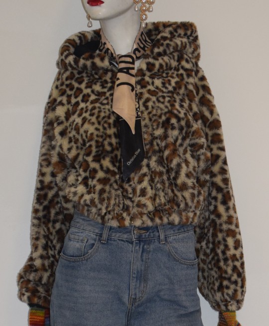
3D project- Animal welfare within fashion
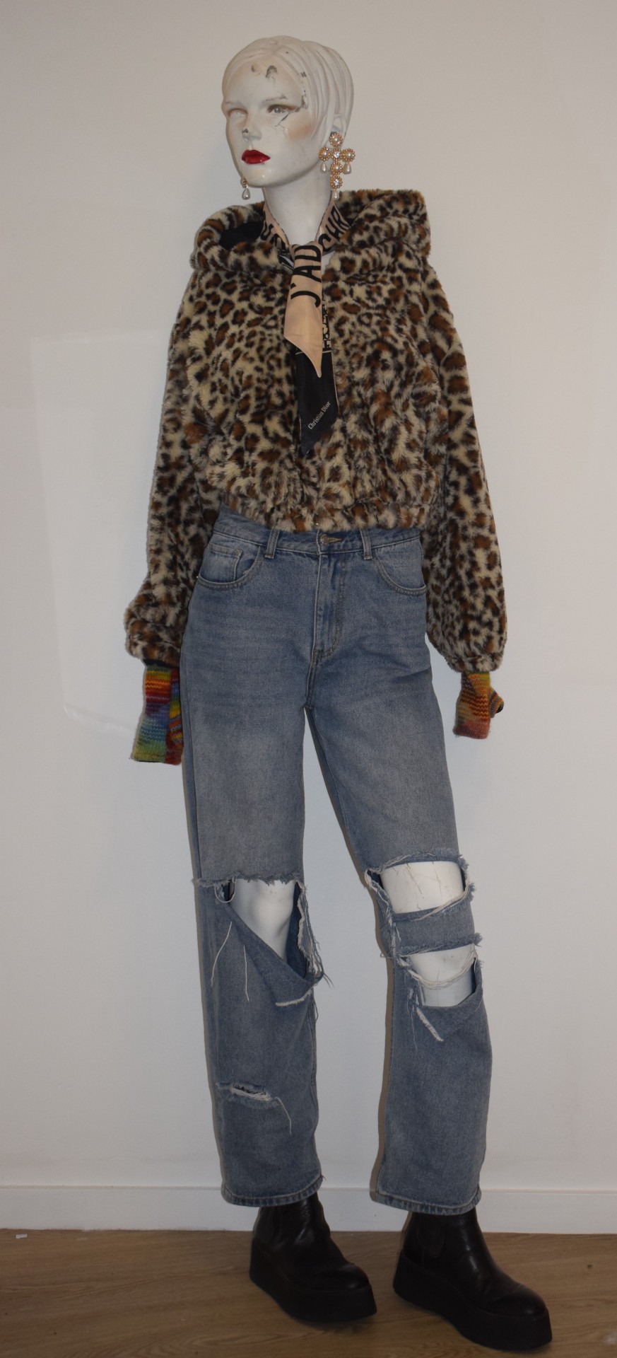
How the production of casual, everyday clothes, harm animals.
0 notes
Text
3D project - Animal welfare within fashion- Makeup

Animal testing for makeup is done to determine how toxic and dangerous the product is, to see if there are any side effects like skin or eye irritation so the product is safe for humans. However, it is no longer a requirement in the USA to test on animals but they do insist on full testing for premarket approval. Most companies still believe animal testing is the the only way to test their products to ensure they are safe, while many argue that animal testing is pointless as different species respond to chemicals differently. European makeup brands, after animal testing was banned, have successfully proved that there are animal free tests which are cheaper, showing that they unnecessary and cruel. This has encouraged other countries like the USA to phase out animal testing.
One hundred million animals are used every year in this industry, suffering under tests like these.
Guinea pigs, rabbits and rats are shaved and smothered with products for up to three months so that any reactions can be observed. Some rabbits repeatedly go through the abuse of testing for up to ninety days as it has been proved that rabbits can withstand the initial testing.
Rats are also forced to eat and inhale active ingredients. Some may be pregnant meaning their is a possibility that their young may die or be born with deformities.
Mice are put under the same abuse as rats, rabbits and guinea pigs but directly focussing all the tests on their ears.
All the animal tests are performed without any pain relief and after the animals have been tested on they are typically killed, if they have not already died from the severe injuries that they have incurred from the tests.
Many companies may claim their products are not tested on animals through using the leaping bunny logo (free from animal testing), but it is often found their products might come from overseas factories where the product or components have been tested on animals. Consequently, many companies get away with this using this symbol as it only indicates that the final product, and not the entire production process, is free from animal testing.
1 note
·
View note
Text
3D project - Animal welfare within fashion- Pearls

Pearls are commonly used in jewellery and found inside two types of molluscs, saltwater oysters and freshwater mussels. A pearl is an ulcer formed from thousands of layers of nacre, made from aragonite. Nacre is generated when a parasite, sand dust, or a small stone, infiltrates an oyster or mussel. The reaction causes stress to the oyster or mussel which results in the molluscs leaking an iridescent discharge, nacre. Research suggests only one in ten thousand mollusk produces pearls; because of this the pearl harvesters invented a new, cheaper way, pearl farming - the exploitation of these molluscs.
Pearl farming is an act of physically opening each oyster shell to insert a reactor into them. Freshwater pearls are created by inserting the mantle tissue of another mussel. Whereas oysters in salt water are inserted with beads and oyster tissue. Farmers stress the marine animal further to create more nacre quicker by constantly changing the temperature of the water, suspending them in water in a cage, washing their shells and moving them around in different waters. When the beads are extracted one-third of the oysters are reused and forced through the same cruel process. The rest are killed and discarded.
Millions of molluscs’ lives are lost for a piece of jewellery. There are alternative ways of naturally sourcing pearls and there are fake and imitation pearls everywhere; the use of pearls can no longer be justified.
1 note
·
View note
Text
3D project - Animal welfare within fashion- Silk

Silk is a luxurious material created by an insect called Bombyx mori, a moth native to China. Over sixty countries have various silk farms where this cruel production is carried out, accounting for the tens of millions of silk worms and moths that are killed every year.
The natural process from silk worm to moth, is the worm producing a silk in a thread-like form to build a cocoon for itself as it transitions to a moth. It then chews its way out of the cocoon destroying the length of silk thread. For the production of silk to work it requires the silk to still be in cocoon form so none of the threads are damaged. So that the cocoon is easy to unravel without snapping the thread they are boiled or roasted at about 100 degrees for over two hours. This means that the silk worm inside the cocoon is also boiled or roasted alive, suffering a painful death, never actually leaving the cocoon. Some people argue that silkworms do not feel anything as they are developing anyway. However, it is proven that they have a neurological system and can feel pain, meaning the production of silk is essentially murdering the silk worms and therefore is cruel and inhumane.
To visualise the amount of silk worms that are killed in this industry for such a small product, consider a silk scarf needs around one pound of silk, meaning about three thousand cocoons are needed resulting in thousands of silkworms being killed.
Silk farms do not just stop there. They also breed huge numbers of silkworms to sustain the industry. The cruelty from this lies in the fact after the moths lay their eggs they are crushed to death so that their bodies can be examined for potential diseases that may affect their egg production for silk, which is a waste of time, money and space to the farms. If there is disease found in the mother moth their eggs are also crushed and destroyed. Lastly male moths are also killed or discarded after they have been forced to mate numerous times.
1 note
·
View note
Text
3D project - Animal welfare within fashion- Fur
Fur is commonly used in fashion, it is expensive and seen as a luxurious material. Animals such as foxes, lynx, sable, chinchilla, mink, raccoons and beavers are commonly killed for their fur. Countries like Finland, Denmark, Austria, Ireland, Canada and China have huge fur industries, along with the USA as there are no laws regulating the keeping or killing of cage-raised fur-bearing animals.
One hundred million animals each year die in the fur industry, some born into it and others are trapped or hunted to join it. If they are not killed straight away, perhaps the best option for the animal, they can be forced to live in confined spaces, often stacked wire cages providing no flooring or protection from weather. The animals are brutally killed much earlier than their life expectancy by gas, strangulation, suffocation, poison, neck breaking or anal electrocution.
Some fur industries catch wild animals rather than breed them for fur. They use steel jaw traps that rapidly clamp down on their legs with excessive force, usually cutting to the bone. Conibear traps are also used to instantly kill the animals by crushing their necks with ninety pounds of pressure per square inch. Another common way of specifically trapping/killing aquatic animals for fur, is setting the traps near and in waterways, taking up to twenty agonising minutes to drown them. The animals that are captured and have not already been killed instantly by the traps can suffer for days, sustaining painful injuries and psychological traumas like shock, dehydration, frostbite, gangrene, blood loss and attacks by predators. When the trapped animals are found they are usually suffocated or strangled to death.
The methods used are cheap and prevent damage to the precious fur.
Some species like Karakul lambs are specifically bred in the fur industry. The lambs produce fur called astrakhan. It is a unique, highly prized curly fur that begins to unwind and straighten within three days of birth. The lambs are either slaughtered 1-2 days from birth or even while still in the womb, so that the hide (broadtail) can be exceptionally smooth. The mother gives birth to around three lambs and then her throat is slit and her stomach is sliced open to remove any developing foetus, usually thirty days before its due. Four million Karakul lambs are slaughtered for their fur every year.
1 note
·
View note