
glitchibo
It do be like that sometimes
I don't know what I am doing here
107 posts
Don't wanna be here? Send us removal request.
Last Seen Blogs

glennsonny
Glenn & Sonny
wyngarde
𝐁𝐨𝐲𝐬 𝐃𝐨𝐧'𝐭 𝐂𝐫𝐲
allaboutbeauty101ph
All About Beauty 101

skinnytwiggy
Skinny Twiggy

theacedumbass
Im Totally Writing My Fic Rn
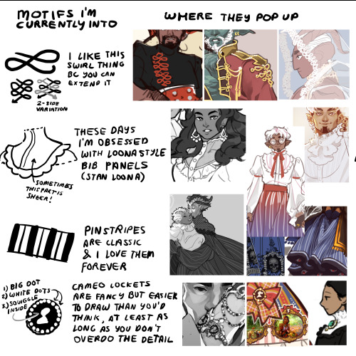
Text
hot artists don't gatekeep
I've been resource gathering for YEARS so now I am going to share my dragons hoard
Floorplanner. Design and furnish a house for you to use for having a consistent background in your comic or anything! Free, you need an account, easy to use, and you can save multiple houses.
Comparing Heights. Input the heights of characters to see what the different is between them. Great for keeping consistency. Free.
Magma. Draw online with friends in real time. Great for practice or hanging out. Free, paid plan available, account preferred.
Smithsonian Open Access. Loads of free images. Free.
SketchDaily. Lots of pose references, massive library, is set on a timer so you can practice quick figure drawing. Free.
SculptGL. A sculpting tool which I am yet to master, but you should be able to make whatever 3d object you like with it. free.
Pexels. Free stock images. And the search engine is actually pretty good at pulling up what you want.
Figurosity. Great pose references, diverse body types, lots of "how to draw" videos directly on the site, the models are 3d and you can rotate the angle, but you can't make custom poses or edit body proportions. Free, account option, paid plans available.
Line of Action. More drawing references, this one also has a focus on expressions, hands/feet, animals, landscapes. Free.
Animal Photo. You pose a 3d skull model and select an animal species, and they give you a bunch of photo references for that animal at that angle. Super handy. Free.
Height Weight Chart. You ever see an OC listed as having a certain weight but then they look Wildly different than the number suggests? Well here's a site to avoid that! It shows real people at different weights and heights to give you a better idea of what these abstract numbers all look like. Free to use.
164K notes
·
View notes


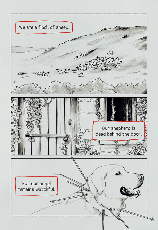
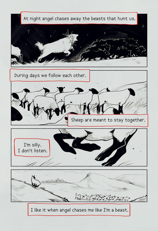
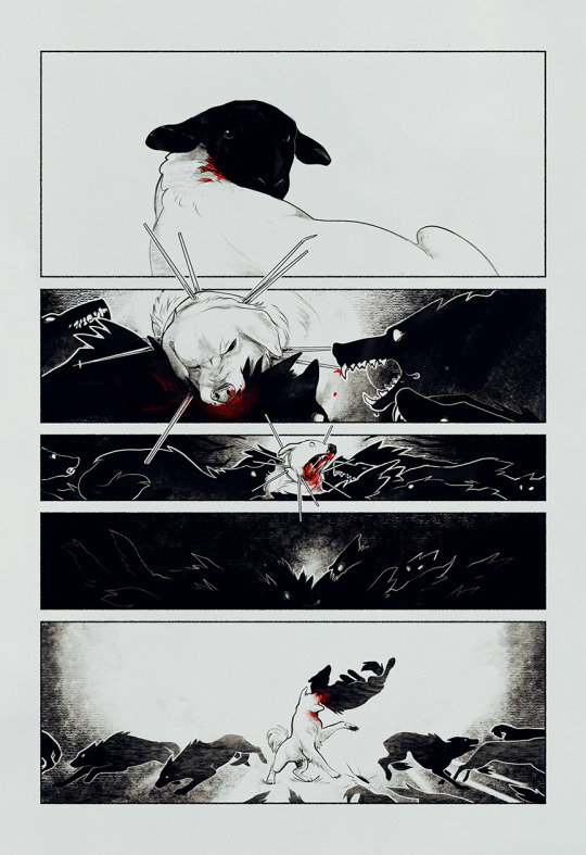
Text


the 10 page pitch preview i made for my original comic, Hunky-Dory:) if you want to follow the process and read more, i'm uploading it as i go to patreon.com/jadenvargen !
8K notes
·
View notes
Note
I have noticed that in your artwork, some areas will be really rendered out, while the rest will have a gradient over it or just basic block shadows. I assume its to pull the eye towards a specific area of the piece, but whenever I try it, it looks like I forgot to finish the painting - any tips or tricks for that? Because I am honestly jealous of how you play with the level of detail
ogh idk how to explain it anon I've just simply been practicing it a lot until I got stuff I liked looking at ;u; but I'll try to explain if I can:
my professor back in uni always told me that when it comes to making quick concept illustrations to show to a client or audience you want to be able to make something that looks cohesive enough from 5ft away!
so I've always been trying to make it so that whenever I draw smth the level and scaling of details remain consistent.

Detail, as I look at it, come in a spectrum- for pieces where I emphasize details on certain areas while leaving the rest as gradients as you've mentioned I tend to do it in a way where both the less AND the more detailed parts fall within a certain threshold: again, I want them to look cohesive from a distance while still emphasizing what I want viewers to look at!
What I've noticed with my work is that, barring certain pieces where I did do this kind of stuff on purpose (I love doing designs where it's like! Solid black with gold filigree! The contrast is delicious to me), typically the farther the types of details are from each other on the spectrum the more likely one of them is to look unfinished especially when sitting next to each other.
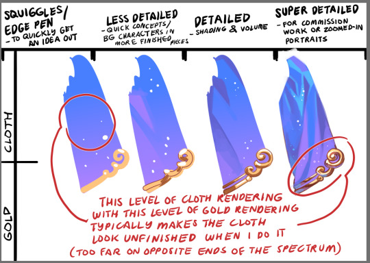
Even then, when doing solid colors like black, you can still notice whether or not I've decided to make an effort in emphasizing or finishing the silhouette, and can change the feel of the piece depending on how I approach it!
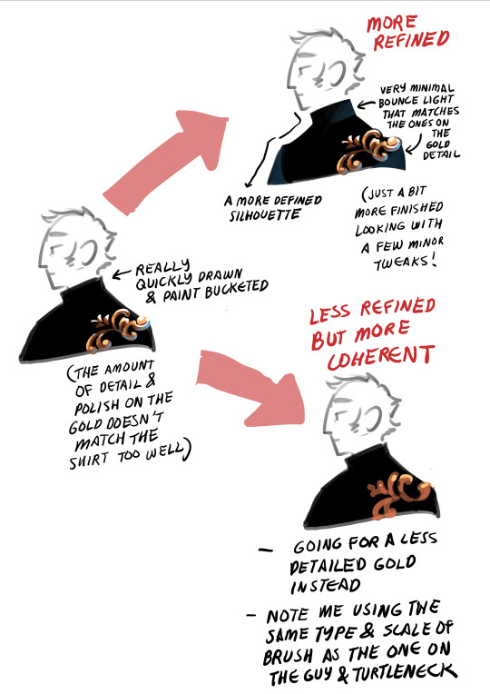
idk if that helps but I hope it does? ;u;
1K notes
·
View notes
Text

I am not familiar with Minecraft. I’ve attempted to look this up on the net, but have found no results. Would you mind elaborating?
286 notes
·
View notes
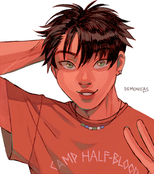
Text
Me, I'm the pal >:D
lil sketchies for a convo with a Disco Elysium pal. Outfit swap.
437 notes
·
View notes
Note
Hey there! Long time lover of your art, and my curiosity got the better of me. I've checked your FAQ but I'm dying to know if you have any tips/tricks for how to render gold. No matter which style you draw it in, whether more painterly or simplified (like for Étienne & Benoît), your gold accents always feel like they have the crucial elements of both warmth and the like. reflectiveness?? ITS THE GOOD STUFF either way
OGH THIS IS GONNA BE A BIT HARD TO EXPLAIN BECAUSE it's a lot of accumulated studies but I'll try ;u;
FIRST OFF: I feel like I have to say that these are all just shortcuts- I've learned just enough about gold to be able to convey the illusion of gold on what I draw, in the fastest way I could do it, for quickly putting the ideas in my head on paper, but this is by no means a comprehensive guide!
If you really want to study the physics of it all, the way it would work with different materials and styles, then I highly suggest doing a lot of self-studies!
Even when painting smth new- if it's really something I want to work hard on, I tend to have gold references open on the side so I can look at them and figure out how they work!
Ok, so moving on:
I like to look for references because the type of gold/material is going to affect the reflectivity and the way I'd shade it, but by default I love doing the more chrome-y type of material on my stuff bc it reads the best as gold, yanno? Unless of course the thing I'm doing calls for more matte/textured types...

Then depending on the colors surrounding the gold item, as well as the colors on the gold item, I can figure out the colors I want to use!
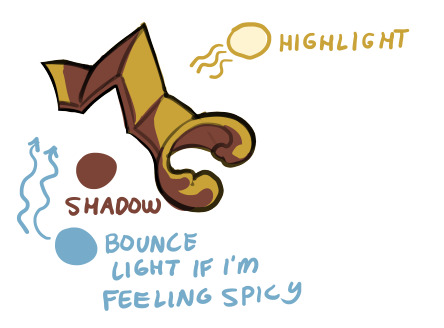
By default though I like using a sort of yellow or yellow-orange with deep browns for the gold itself, light cream/white for the highlights and light blue for the bounce light (which is actually the simulation of an effect where the blue sky's color bounces off the ground and up onto your item!)

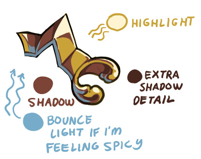
I feel like the 'warmth' that you are seeing is the interaction between the reds and yellows of the gold, contrasted and made much warmer with the blue bounce light!
It's hard to see on the next one, but I airbrushed the Highlight color on an Overlay (sometimes an Addition) layer, which helps add a glow!
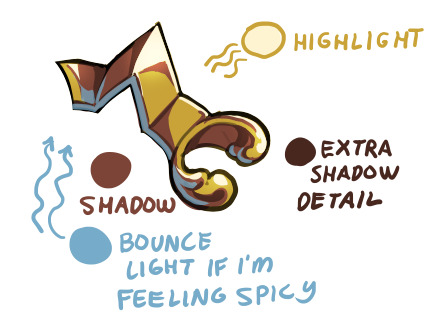
For the Genshin style mockups I had to do some research because the specific way of shading gold that the MHY artists utilize usually go for less saturated, lighter yellows and browns, and not everything is shaded chrome-like!

You can see my attempts to mimic the flatter shading on these parts of Etienne's outfit:

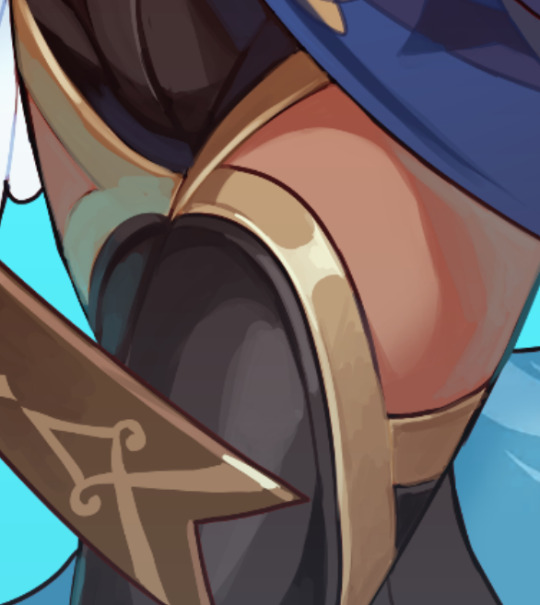
and then return to my more usual shading methods on these next parts, which were more in line with the shading on the red box in the examples above!
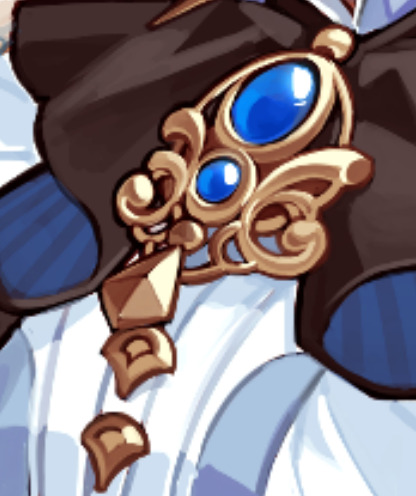
it's a bit long, but I hope you find what you were looking for in here somewhere! ;u;
489 notes
·
View notes
Note
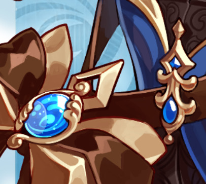
Perhaps weird question - how do you draw line patterns on characters' clothes? For example the gold filigree in Azemgoose's gown? Or more specifically how do you make them feel so organic and balanced? I tried to add such patterns to my own designs but they feel stiff and not evenly detailed, if that makes sense. Do you have a specific fashion era to reference them? (I assume at this point you draw them from your head but it had to have started somewhere) :0
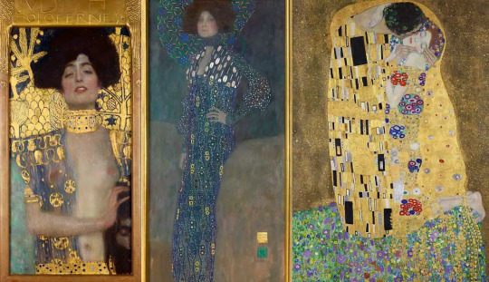
OH I'm glad you see them that way! It took a lot of trial-and-error, but I take much and more of my inspiration from Alphonse Mucha, Gustav Klimt and elements of Baroque Architecture. (just the mainstream stuff though, I'm not gonna pretend to be an expert lol)
Long post ahead!
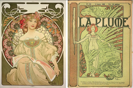
The main thing/takeaway I got from these is that having a decent amount of detail and not getting them to look busy involves reminding yourself that there are, in fact, patterns in nature, and any random piece of filigree that you want to place will have some sort of underlying structure, which will help you visually balance things out!
I also find that having straight lines contrast with curves do wonders to the composition.
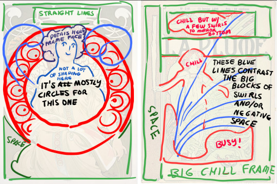
(Here's a link to a post I keep remembering and coming back to whenever I try to study Mucha's works, reblogged a while back from Becca Burns! It's a really nice way to break things apart.)
Not only that, but having clusters of detail and spacing them out involves also looking at the negative space- basically you want your eyes to rest in places. You'll notice this more or less in how these artists leave out so much shading/detail on the flesh of the models on the pics up top, as well as on some of the backgrounds or outside the frames/borders, which end up serving as the 'wide open space' your eyes can settle on.


Even on stuff like these buildings you can see how the gold details settle on some of the windows and roofs but most everything else is kept white or otherwise neutral to have them details really pop!
Keeping a mental or even physical database of little details you can come back to when you're drawing on the fly also helps- here's some I've ended up coming back to time and time again!

620 notes
·
View notes
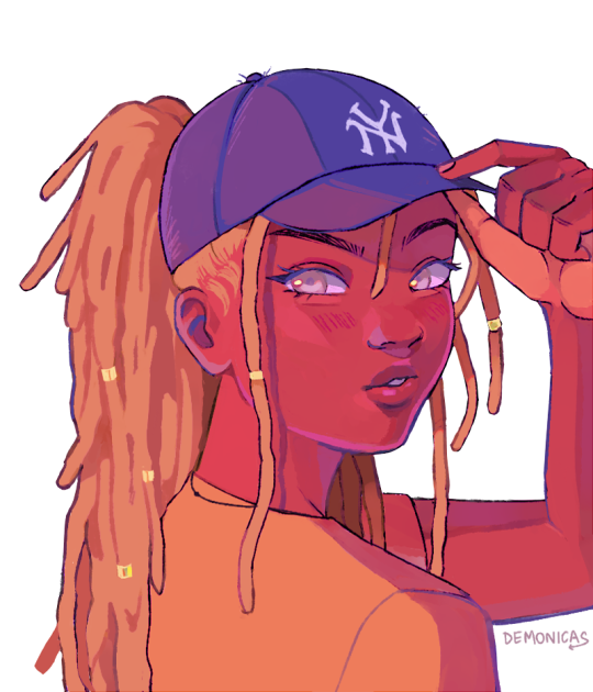
Text
Eats this

Done for @glitchibo of their OC Tyla!
I have a speedpaint of this but atm I'm mostly just testing out some CSP features/editing stuff.
9 notes
·
View notes


Photo

From different breeds of chickens, the natural colors of egg shells, so lovely! <3
62K notes
·
View notes
Text
Your periodic reminder that in people who have been subject to threats and punishment for having emotional responses or ‘inappropriate’ facial expressions, panic attacks look different.
They may look like the person has become calmer and less involved, dismissive, even. Some people become intensely subservient and silent. Some become catatonic.
Panic doesn’t always involve screaming, crying, and obvious signs of distress. It involves an extreme form of the person’s fear response – which can be altered by circumstance, ability, and what they’ve learnt to fear.
Which is to say, it’s not your place to decide someone isn’t having a panic attack, when they’ve told you that’s what’s happening.
109K notes
·
View notes
Text
is there an artist that you like the entirety of their discography
60K notes
·
View notes


Note
Where did you learn how to rig from?
there's a ton of references online now for it! in particular I started with the videos and resources from this document here and looked up related video searches on the sidebar from there on out!
The main issue with Live2d is that it's very, how do I say this- it's the opposite of intuitive where?? it forces you to build up a subconscious intuition the more you work with it? like a slow, 2-steps-forward 1-step-back sort of forward shuffle.
I actually had to re-rig my catboy's face multiple times, even starting from scratch, and finding out that it went so much easier every time I retried it, taking much less steps, and I started to notice things I didn't before- little things that legit make or break the rigging process ;u; it's crazy and I can't explain all of it if I tried without confusing myself in the process gkbjesbjk
the best thing to do would be to check out the tutorials on the doc and maybe even related videos and see if you can figure out how the program works by looking at different perspectives!
386 notes
·
View notes
Text
Yes, i would absolutely love to wake up at 3AM to go to the bathroom, only to scare myself shitless by my purchase. I'll buy 5.
i don’t even like mandela catalogue particularly all that much but seeing the plush of the intruder thing sends me into hysterics
2K notes
·
View notes