f-rainbow-x
rainbow
i am mujigaeart on ig an my true kpop sideblog is lovevirous
1148 posts
Don't wanna be here? Send us removal request.
Last Seen Blogs

zakariajohnsson-blog
Zakaria Johnsson
kikipizzadelivery-blog
kiki♥
crypticfayble
Fable🐦⬛

kalagrantha-blog
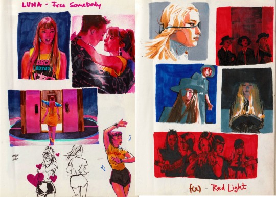
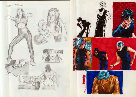
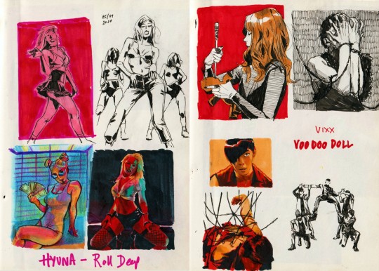
Untitled

Text


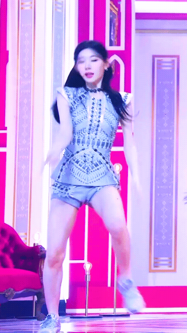
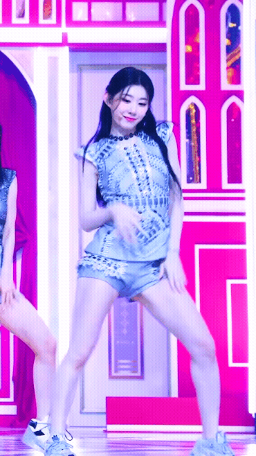


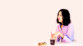
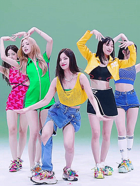
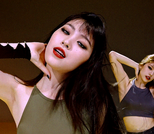
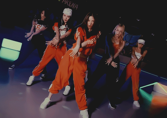
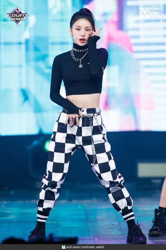
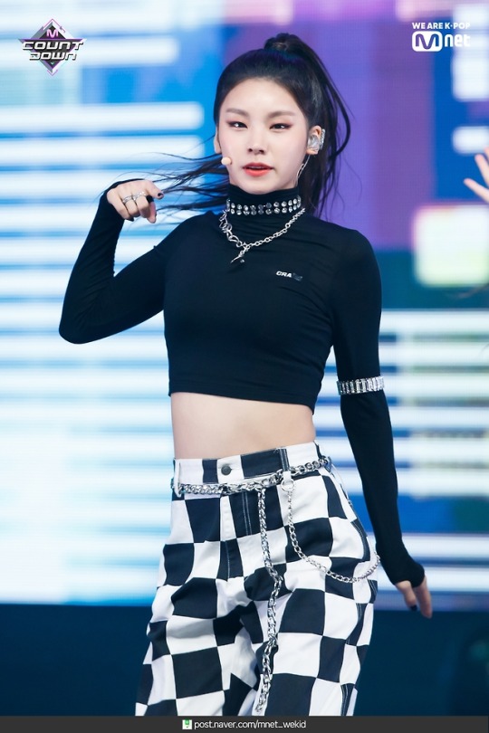
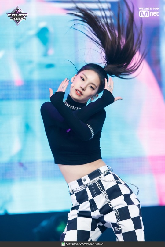
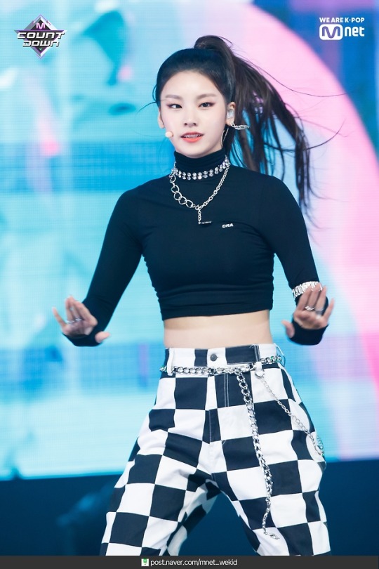
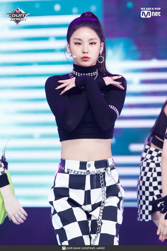
Chaeryeong - sneakers
|itzy|
20 notes
·
View notes


Photo
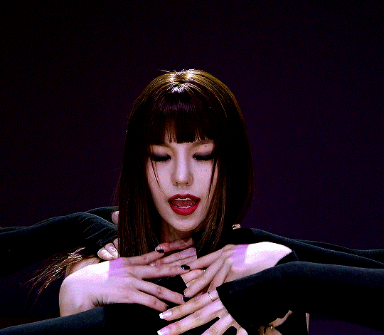

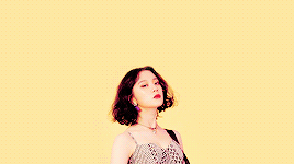
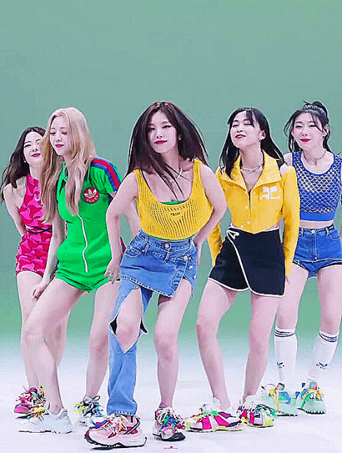
YEJI & RYUJIN - [MIX & MAX] Spotlight
787 notes
·
View notes
Photo
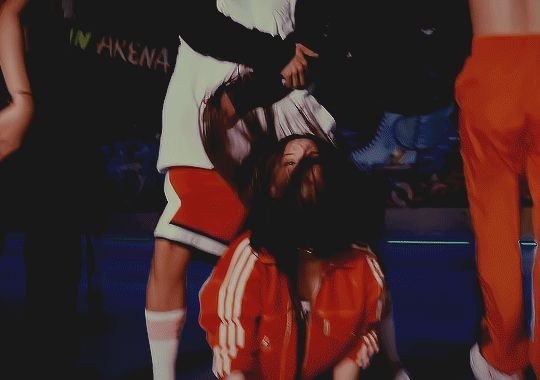


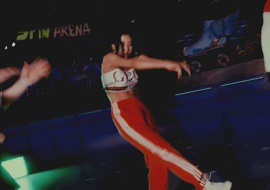
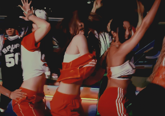


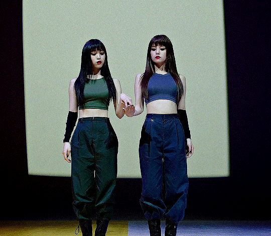
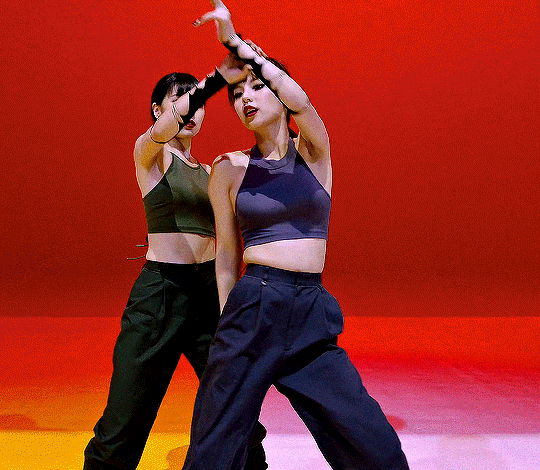
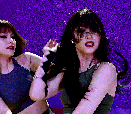
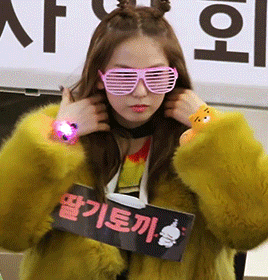
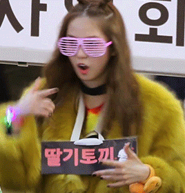
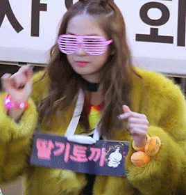
yujin x seungyeon ‘halle berry’ dance cover.
124 notes
·
View notes


Photo
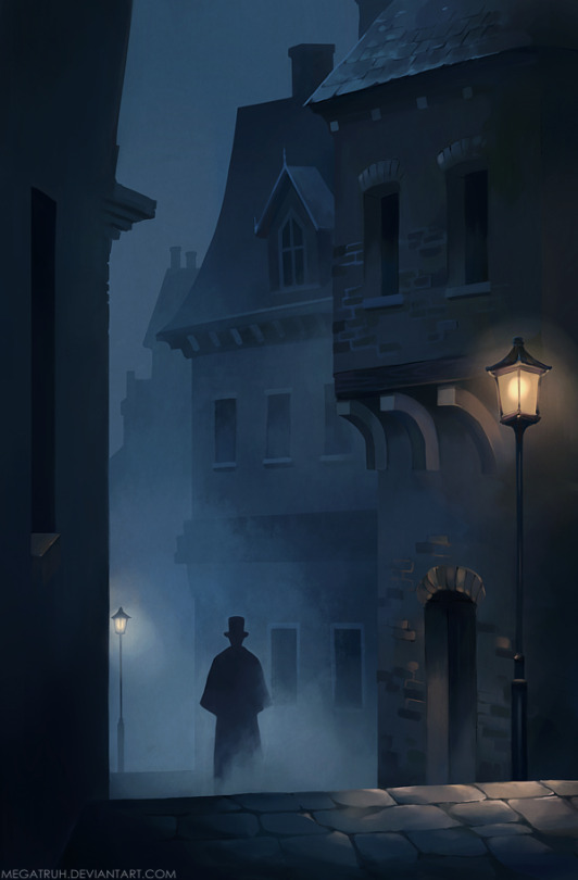
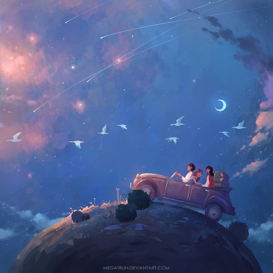

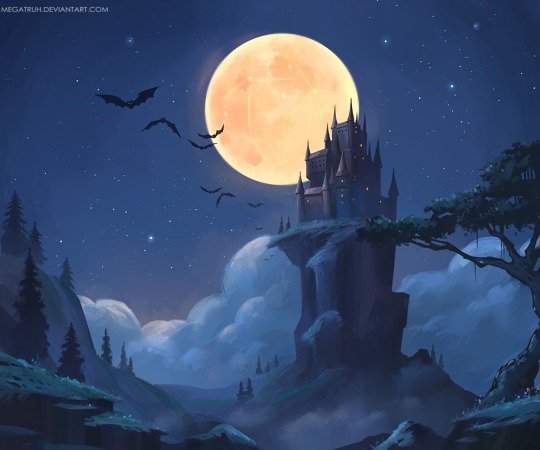

Niken Anindita - https://nikenanindita.wordpress.com - http://www.pixiv.net/member.php?id=2130339 - http://megatruh.tumblr.com - http://society6.com/megatruh
2K notes
·
View notes


Text
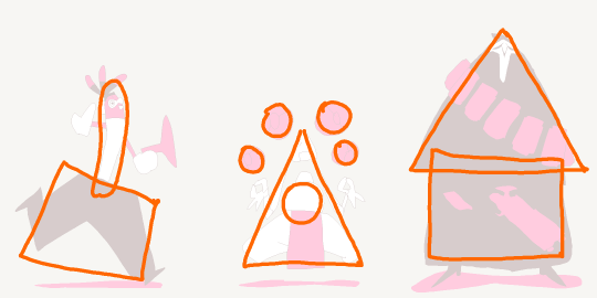
Character Design Tips
Some people have asked how I went about drawing the Overwatch cast, so I threw together a list of things I think about when designing characters: shapes, silhouettes, colors, and inspiration.
1. Shapes
There are three basic shapes in my toolbox: round, box, and triangle. If I follow my intuition, each shape conveys a personality. For example:
Round = charismatic, harmless, endearing
Box = reliable, uniform, traditional
Triangle = cunning, dynamic, competent (downward pointing more aggressive)

Shapes can also be combined for more complex characters
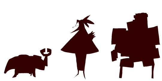
2. Silhouettes
Block in the character. If I can still recognize who it is, then it has a strong, readable silhouette.
3. Color
Sometimes less is more. Limit the palette for unity and impact. When working with three colors, keep the 60-30-10 rule in mind. Pick one color to make up about 60% of the character, a second color to make up about 30%, and the last color is about 10%.
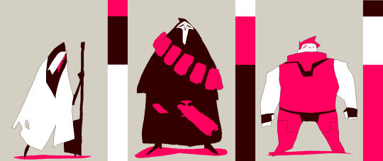
When working with just two colors, use the 70-30 rule. One color is about 70%, the second is about 30%.

4. Inspiration
Designs come to mind easier when I’m listening to music, or when I have a mental image of something in mind. For example, I was listening to Klezmer music when drawing Reaper, and I was thinking of a chicken when I was drawing Lucio. It can take a while to warm up, so a good source of inspiration is important to stay motivated.
Beyond that, it’s up to you!
[If you want to see the specific artists I drew influence from, click here to see my influence map.]
18K notes
·
View notes
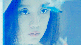
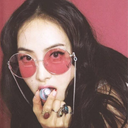
Photo
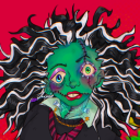
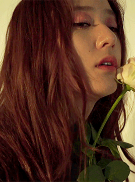
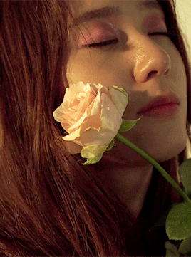
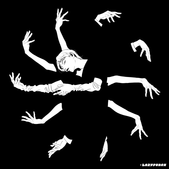
I’m beautiful, this crazy “me” that is
1K notes
·
View notes