cmaidaartworkblog
Where I Post My Artwork
sideblog of buthisskeletonisbackwards
197 posts
Last active 2 hours ago
Don't wanna be here? Send us removal request.
Last Seen Blogs

wonderfullyweird13x
I'd Rather Be At The Pub!

thirdpartyflightbookingwebsite
Untitled

tiredlysighing
eternal.

indiasbesthomes
Discover India's Best Homes

merlinsacademyhq-blog
Merlins Academy HQ
Text
youtube
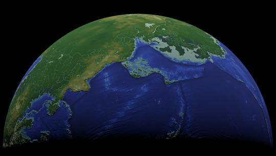
Among many other questions on the various sites I posted my latest mapmaking project to, a couple people asked how I created the heightmaps for the Ayrum commission, and so I made a video going over some of my methods in a minor example project. Enjoy!
#Photopea#digital painting#video tutorial#screen recording#showing my work#rendering elevation and bathymetry#mapmaking#Christopher Maida Artwork#Youtube
6 notes
·
View notes
Text


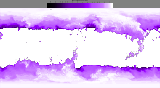
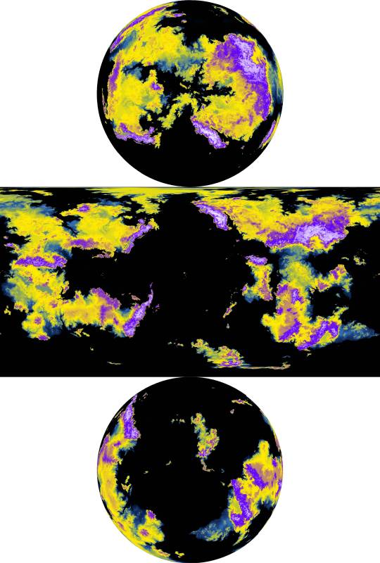
Once I had enough high-resolution climate data to work with, the final part of the Climate phase was the creation of maps with discrete climate zones, which I produced in both the Trewartha classification scheme, left, and the Köppen classification scheme, right.

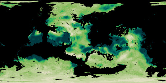

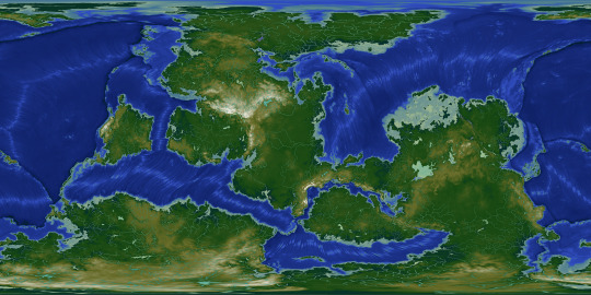
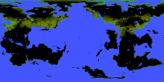
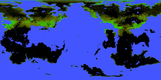
The final phase of the Ayrum mapmaking project was to create realistic satellite style maps, which began with mapping out soil colors and the ground cover of vegetation generally and tree-analogues specifically.
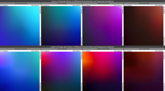
Once I knew where the plants belonged, I then determined what colors they'd be in the conditions they're adapted for, as seen in the maps, and under seasonal variation, with the chart showing how plants with certain adaptations react to seasonal changes in those conditions.

In these gifs we see the ground plants and tree canopies changing colors as the Solstices and Equinoxes expose them to greater or lesser rainfall and harsher or milder temperatures than what they're adapted for. Neither of these gifs provide a true image of what the surface looks like from space, but rather of the in-person appearance of whatever plants may be present.

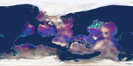
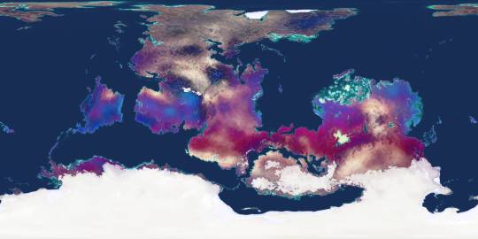
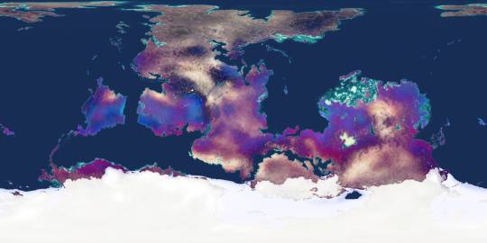
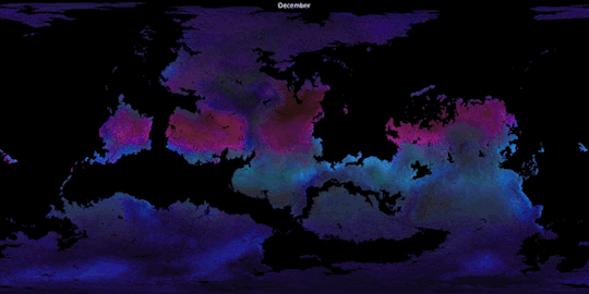
Finally, using the vegetation density maps as raster masks for the seasonal plant color maps, and layering those with the snow-and-ice maps over the soil color map, we now have a much truer image of Ayrum's surface as of its (Northern) Winter, Spring, Summer, and Autumn months.
#Ayrum#mapmaking#digital painting#imaginary maps#imaginary climate zone maps#Trewartha climate scheme#Koppen climage scheme#worldbuilding#commission#major project#seasonal data sequence#imaginary soil color maps#imaginary vegetation maps#vegetation extent#vegetation color#satellite-style maps#Photopea#Christopher Maida Artwork
49 notes
·
View notes
Text
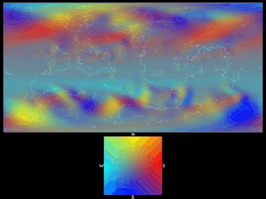
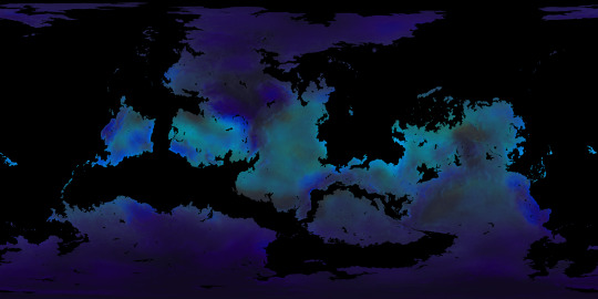
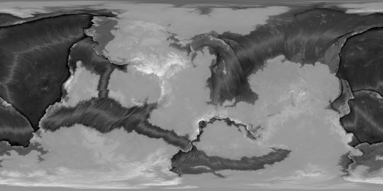
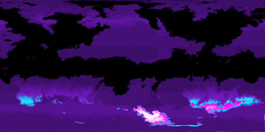
Precipitation was the next dataset that I refined from the lower-resolution Panoply version, which started with applying the wind data (as seen above, I only combined and color-coded WBP's datasets and added a coastline overlay to produce this) to the elevation data in order to create detailed rain shadows.

Once I found the rain shadows and highlights (or the Orographic effect), I was able to apply those to the preexisting Precipitation dataset, and also make the continental interiors a little rainier and then apply a color gradient to the greyscale maps.

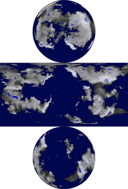
With the monthly precipitation established it was then possible to create an Annual Total precipitation map, revealing where the more consistently dry regions are.

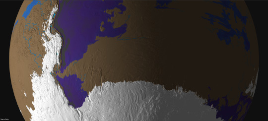
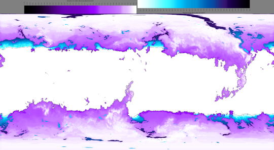
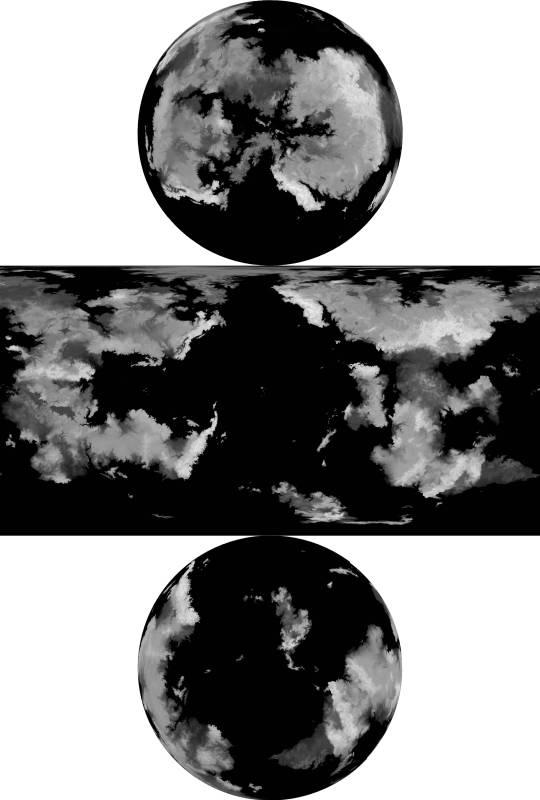
Combining the monthly precipitation and temperature data (to wildly oversimplify) also allowed for monthly snow and ice depth maps, which were pretty consistent with Nikolai Lofving Hersfeldt's datasets. As you can see, Ayrum's high obliquity precludes year-round frozen poles.
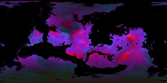
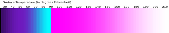
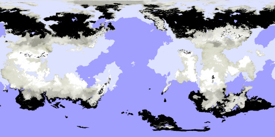
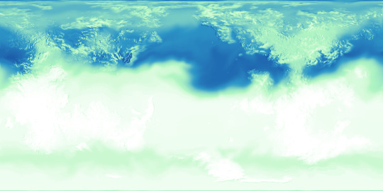
The next phase of the Ayrum project was climate, which I'll introduce with the resource that made my work possible in the first place: these datasets created by Nikolai Lofving Hersfeldt, who runs WorldBuildingPasta and shared all of this with my client and me via Panoply. These were tremendously helpful and I wouldn't be able to achieve a fraction of the final detail without them.

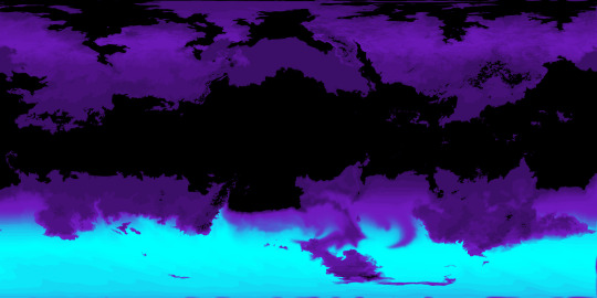
My own adjustment to this data begins with Surface Temperature, which came down to correcting the coastlines (I mistakenly sent in a version of the elevation map that resulted in continental shelves appearing above sea level), refining the effects of elevation, and adding a color gradient.

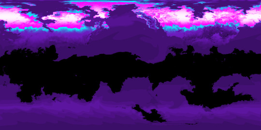
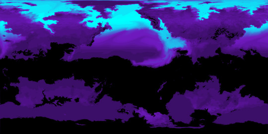
I was then able to combine this data into Annual Minimum, Average, and Maximum temperature maps, seen below, which was pretty useful too.
One use for the Annual Average map, for example, was providing a baseline to compare each month's data against, seen in the sequence above.

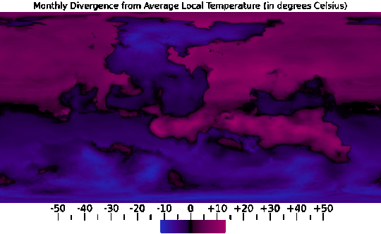
And from the Annual Minimum and Maximum maps, I was able to create a map that presents the overall range of temperatures throughout the year, which does a good job of showing just how extreme the conditions are in higher latitudes and further inland.
#Ayrum#mapmaking#imaginary maps#imaginary climate maps#precipitation#wind direction#worldbuilding#commission#major project#monthly data sequence#snow and ice depth#WorldBuildingPasta#Photopea#Christopher Maida Artwork
25 notes
·
View notes
Text
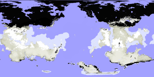
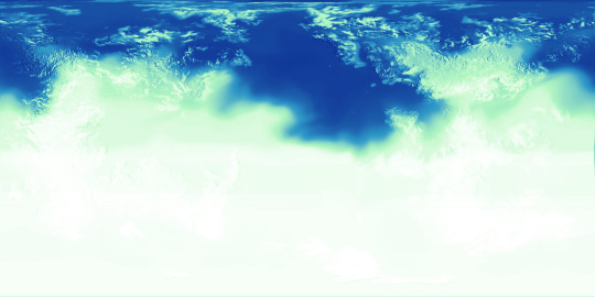
The next phase of the Ayrum project was climate, which I'll introduce with the resource that made my work possible in the first place: these datasets created by Nikolai Lofving Hersfeldt, who runs WorldBuildingPasta and shared all of this with my client and me via Panoply. These were tremendously helpful and I wouldn't be able to achieve a fraction of the final detail without them.
My own adjustment to this data begins with Surface Temperature, which came down to correcting the coastlines (I mistakenly sent in a version of the elevation map that resulted in continental shelves appearing above sea level), refining the effects of elevation, and adding a color gradient.
I was then able to combine this data into Annual Minimum, Average, and Maximum temperature maps, seen above, which was pretty useful too.
One use for the Annual Average map, for example, was providing a baseline to compare each month's data against, seen in the sequence above.
And from the Annual Minimum and Maximum maps, I was able to create a map that presents the overall range of temperatures throughout the year, which does a good job of showing just how extreme the conditions are in higher latitudes and further inland.
#digital painting#imaginary climate maps#mapmaking#imaginary maps#Ayrum#Photopea#worldbuilding#commission#long term project#Surface Temperature maps#monthly data sequence#WorldBuildingPasta#Panoply#Christopher Maida Artwork
25 notes
·
View notes
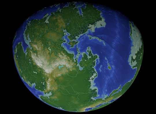
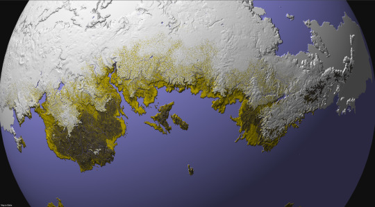
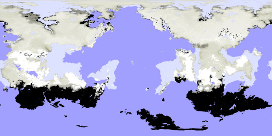
Text


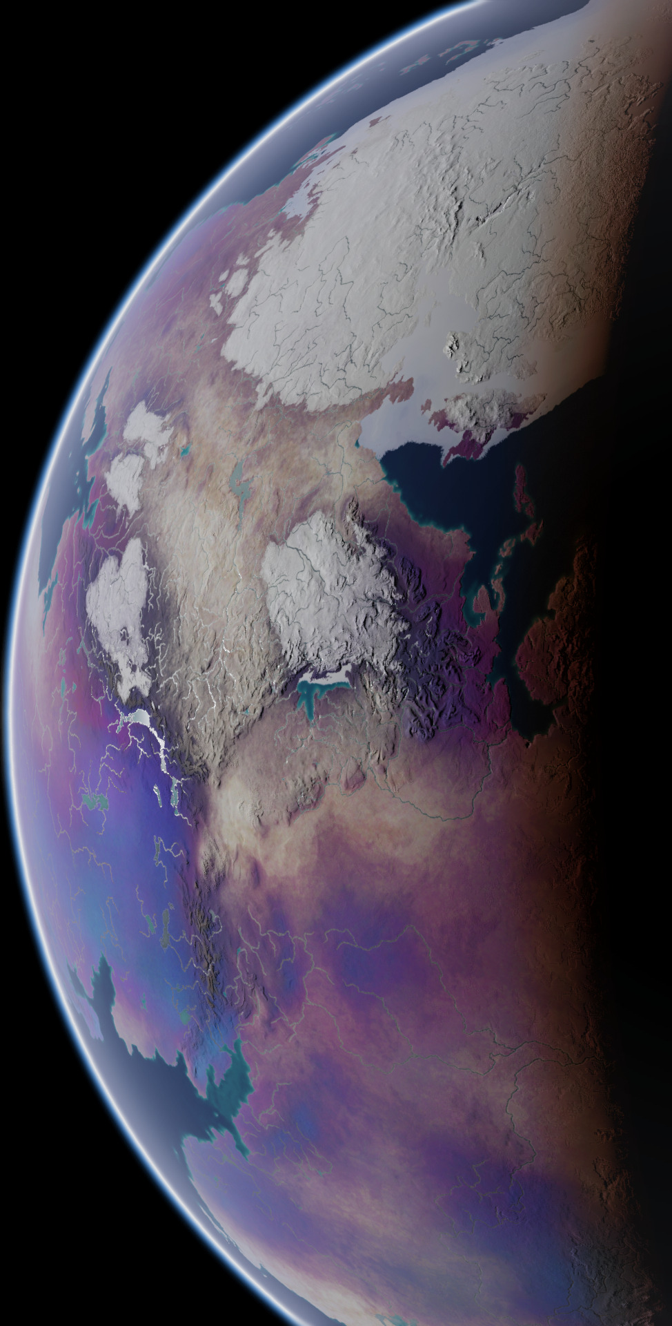


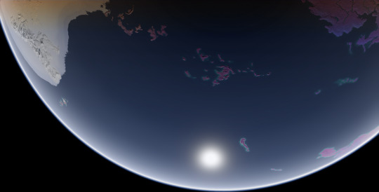

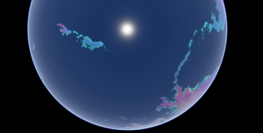
These screenshots I took in Blender are the final product of a commission I worked on for over a year, of my client's planet Ayrum. These represent the planet as it appears at the Northern Spring Equinox, at various angles and different times of day. This project had multiple phases and produced many maps and figures, so I'll be making multiple posts about it over the course of multiple days, working from the earliest results up to the images used in these screenshots.
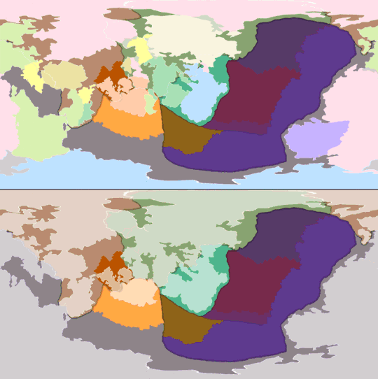
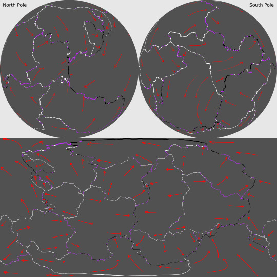
First, the tectonic history sequence, covering about 600 million years of activity. The colors of continental crust in the gif's top half represent which plate it will belong to in the end, and the colors used in the bottom half represent what plates they belong to at the time
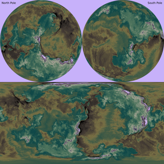
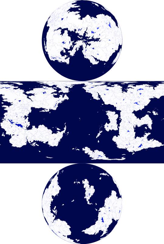
With the tectonic history settled, it's easier to determine what the topography should look like. The two greyscale elevation maps start from the lowest trench depth and from sea level respectively, and the color-graded elevation map has dry land differentiated from bodies of water.


Dipping into Blender once again, with some screenshots where I used the color-graded elevation map as the image texture and the greyscale elevation map as the displacement texture, to emphasize the topography. This will be all for today, but there is much more to come.
These maps were made for the user @umbrace-ramble, to whom I am very thankful for this commission and all the experience it inspired me to gain.
Rendered in Photopea with the aid of Blender,
screenshots taken in Blender,
November 2022-January 2024
#mapmaking#worldbuilding#first posts of many#commission#Blender#digital painting#Photopea#plate tectonics#topography#elevation#bathymetry#imaginary tectonic timeline#imaginary geology#long term project#Christopher Maida Artwork
100 notes
·
View notes
Text


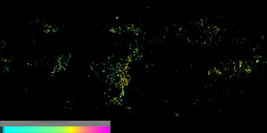
Results from the Flocking #paleostream
Geosterbergia, Archocyrtus, Titanophoneus and Besanosaurus
In addition I fulfilled two more wishes for people who donated the Paleocene Kickstarter, Cotylorhynchus and Cervifurca.
426 notes
·
View notes
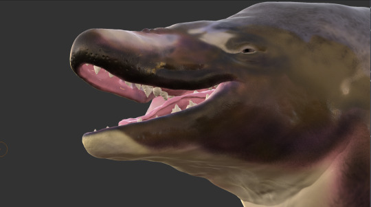
Text

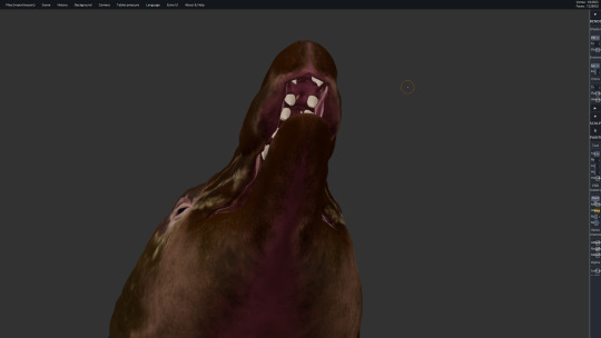

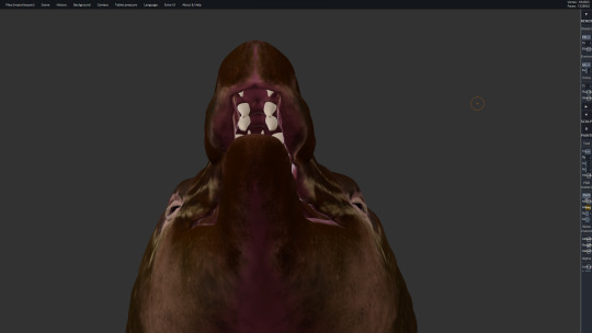
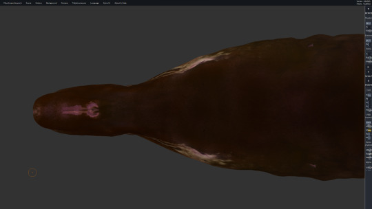
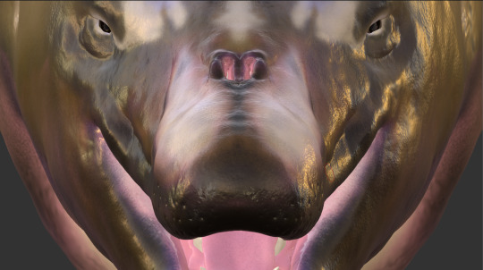
*Another* Archaeocete bust update that I posted to Twitter but forgot about sharing here, this time its my Georgiacetus render, redone this year to improve on the version I did in 2020.
This one also got some additional mass packed on the bones and some new colors applied to it, compared to the original, and I hope someday to make a physical, life-size version of this piece, however long it takes to get to that point.
Like B. cetoides, this ancient whale was also first found in the Southeastern U.S., but in Georgia instead, and its postcranial skeleton is rather disarticulated and incomplete. The earliest fossils of Georgiacetus vogtlensis are about 5 million years older than the first Basilosaurs, with a much more basal body plan: a larger and better developed pelvis, suggesting prominent legs (which would have been the main source of propulsion since it lacked flukes), a shorter torso and tail, and an altogether smaller body size (estimated to between 10 and 20 feet long). With the scarcity of postcranial material for this genus (such as limbs, certain vertebra, all but the tip of the tail, most of the ribs), our estimation of the animal is informed by fossil material from other, better represented Protocetids. Like the later appearing Basilosaurids, however, Georgiacetus's pelvis was not fused to its vertebrae, and their skulls are visually pretty similar.
This mesh was rendered in Sculptfab and SculptGL, with these screenshots being taken in the latter program.
#Georgiacetus vogtlensis#Georgiacetus#Archaeoceti#Protocetidae#Cetacea#North American Prehistory#Paleoart#Digital Sculpture#Sculptfab#SculptGL#Prehistoric Life#Whale Evolution#Christopher Maida Artwork
45 notes
·
View notes
Text


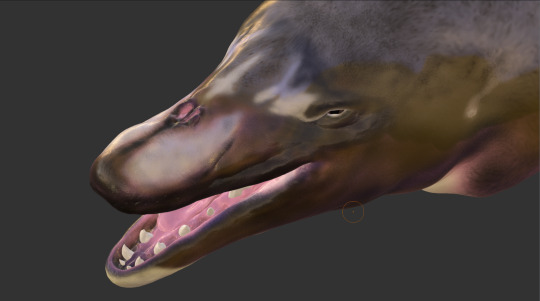
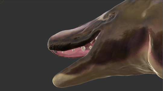

I shared this to Twitter like a month ago but forgot to share it here, this is an update to my Basilosaurus bust that I first rendered in 2017-18, which I then remeshed and repainted between last year and this year. Compared to the original render, this one has all its teeth, the skull more closely matches the fossil material, the face is fleshier, and the coloration, while similar to the original version, has been redone from scratch with new brushes and patterns.
Basilosaurus cetoides was an Archaeocete whose fossils were first found in Louisiana, which, during the Eocene epoch, lay partially beneath the Gulf of Mexico. It had a long, narrow body that reached up to 66 feet long, a proportionally small head featuring multiple kinds of teeth, and vestigial hind limbs. Members of this genus are also known from northern Africa and other regions that were once submerged beneath the Tethys Sea, and also from Peru and possibly even New Zealand, a wide geographical range that demonstrates its success as a top predator in the oceans of the Late Eocene.
This mesh was rendered in Sculptfab and SculptGL, with these screenshots being taken in the latter program.
#Basilosaurus cetoides#Basilosaurus#Archaeocete#Cetacea#Paleoart#Digital Sculpture#Sculptfab#SculptGL#Prehistoric Life#North American Prehistory#Whale Evolution#Christopher Maida Artwork
42 notes
·
View notes
Text
Regarding commissions
Hey all, if you’re already on my waiting list you needn’t worry, but once I finish the last of those commissions (by this Summer, optimistically) I’ll be taking a break from mapmaking for a year or more. I do love my work but it is also very tedious, time consuming, and at times very confusing for someone like me who has only a rough understanding of the geological, astronomical, and climatological processes I aim to visualize. There are also so many personal projects I’ve been wanting to get back to, and as such I will not be taking any new commissions for a while, though I will be fulfilling all the projects currently on my waiting list, however long it takes.
10 notes
·
View notes
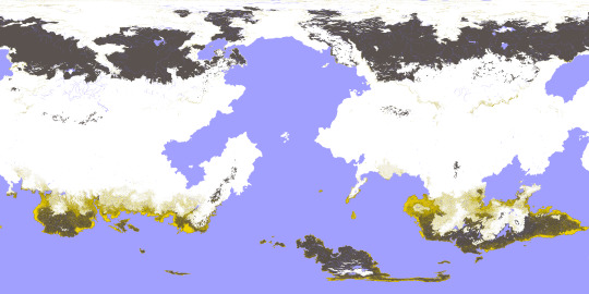
Text
This third series of maps for @jayrockin‘s “Runaway to the Stars” project represent the planet their Bugferret alien species calls home, a cold, seasonless world with much of its water held up in immense ice sheets and extensive cave systems. As such, a great deal of this world’s oceanic crust is exposed to the air, concentrating what little seawater remains at the subduction trenches and other extremely old, low-lying portions of crust.
First, the planet’s plate tectonics, with the plate boundaries defined in white (for divergent boundaries), black (for convergent boundaries), and purple (for transform boundaries) and the directions of drift marked by red arrows, in Equirectangular Projection and Poles-Centered perspective.
The maps below show the planet’s elevation data, first in grayscale with no color gradient applied, in Equirectangular Projection and Poles-Centered perspective;

then with the color gradient applied, also in Equirectangular Projection and Poles-Centered perspective;
and then with the color gradient once again removed but now showing the planet’s liquid water, in Equirectangular Projection only.

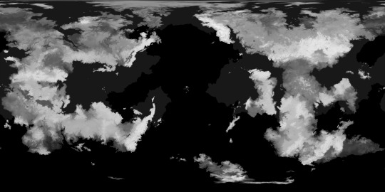
The second phase of this commission focused on the planet’s ice sheets and the liquid water hidden beneath it them.
First, there’s the raw elevation data for the ice in relation to “sea level” -with no contiguous ocean to define this, it is instead defined as 200 meters above the average continental shelf’s edges, correlating to Earth’s own sea level-, along with a key, in Equirectangular Projection;

then, the same data with a color gradient applied;
and again, this time also showing how many meters of ice sit atop the subglacial bodies of water;
and lastly, the thickness of the ice over land as well as water, first in grayscale;

and then with a color gradient applied.

The thickest point in Earth’s own ice sheets is 4,776 meters deep, just a fraction of the Bugferret planet’s maximum of 18,000 meters between the top of the ice sheet and the trench-sea hidden beneath it.
The map below shows the volcanic activity on this planet. Volcanoes marked in pink have erupted in the past millennium, and those marked in white have erupted in the past 300 years Looking back to the ice-cover map that also shows the subglacial water, you can see how some of those lakes are caused by recent eruptions, as are the few ice-free mountain peaks in the higher latitudes.

Lastly, the third phase of this project mapped out the cave systems, expanded tremendously both by modern Bugferret activity and previous eons of dissolution and upheaval by organisms more comparable to fungi, plants, and burrowing detritivores.
The first map below shows all of the major caverns combined into one layer, color-coded by vertical position in relation to the so-called sea level, instead of depth beneath the local surface.
I mapped out these caves in four overlapping layers, here color-coded to represent the tallness of a given chamber. The first of these layers contains those caves closest to the surface;

a bit further beneath the surface;

further down still;

and the lowest layer of all, with its shallowest caves sitting no less than 8,500 meters beneath their local surface.

All the caves shown here can be accessed from the surface, either directly or in connection to other caves, even if the connecting passages are too narrow to be visible at this resolution. Some of these connections can be fully seen or at least suggested in the cross section below, showing the vertical positions of the caverns beneath a mountain range, or a small slice thereof.

This cross section is shown again with a map that marks its location, and that also includes the ice sheets, subglacial and exposed liquid water, and combined caves.

These maps were all created in Photopea. My reddit post dedicated to this project, wherein you can see the highest resolution versions of these images, is linked here.
2022
#runaway to the stars#mapmaking#imaginary maps#worldbuilding#commission#digital painting#photopea#Bugferrets#fictional planets#elevation map#color gradients#ice maps#liquid water map#cave systems#major project#alien planet#Christopher Maida Artwork
60 notes
·
View notes
Photo
Some months ago, I created a series of maps and diagrams for @iguanodont‘s Birdbug worldbuilding project, representing the planet inhabited by their original species and its planetological data. This isn’t the first time I mapped out this planet, as I was also commissioned by Ripley back in 2020 back when I didn’t have nearly as much experience and knowledge as I do now. Two years later, I’ve been commissioned once again to revisit this world and its peculiarities.
This first map (in Equirectangular projection and poles-centered perspective) depicts the elevation for this planet, with a color gradient applied to the data.
Here is the same elevation data, presented without the color gradient.
This time, the elevation is presented with bodies of liquid water included, such as rivers, oceans, and lakes.
and in this one, the water is isolated from the other data, against a white background
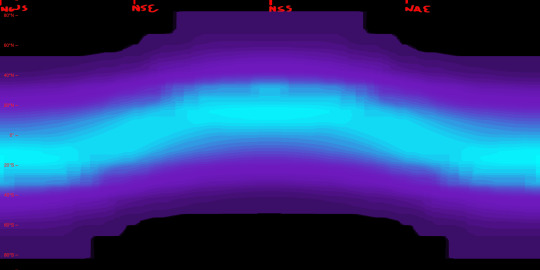
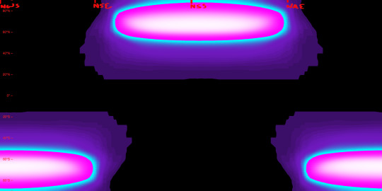
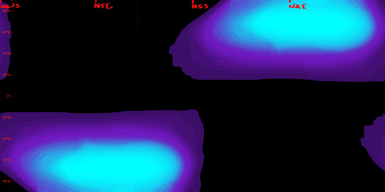
Next, there are the surface temperatures that occur on this planet, the key to which is shown above. The four maps below show the seasonal temperatures for land and sea, in order of Northern Spring Equinox, Northern Summer Solstice, Northern Autumn Equinox, and Northern Winter Solstice.
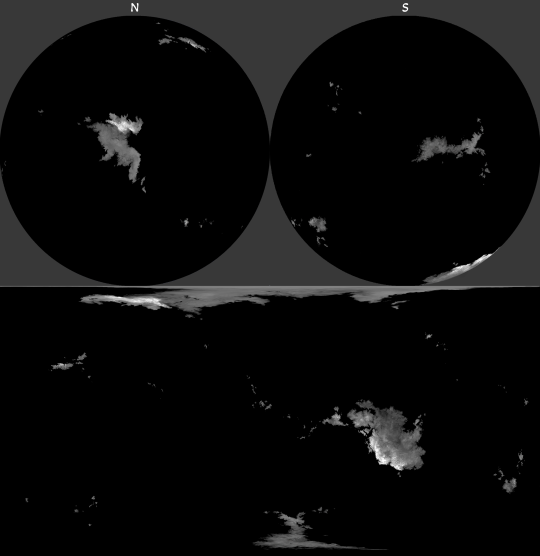
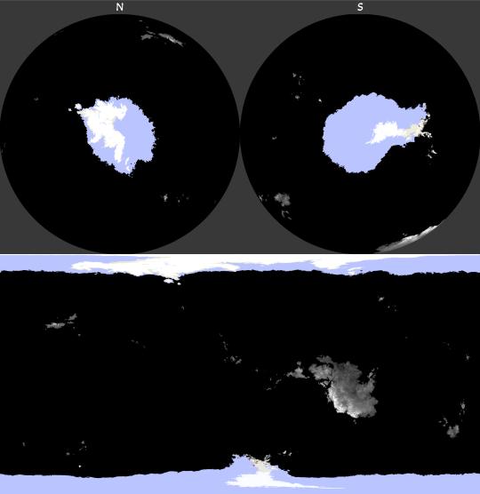
Correlating closely to the above data is the snow and ice cover, which is fairly extensive on this planet owing to its high obliquity and distance from its star. Land ice only occurs where the snow falls and is compacted year-round, but snow and sea ice can be much more seasonal.
Seasonal precipitation levels were another important phase of this project, and the below diagram shows those levels for a given latitude (y-axis) on a given date (x-axis), with a key attached.
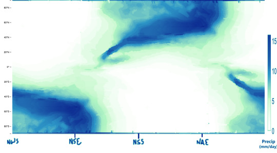
My reference for creating the above graphic is the figure below, which comes from a 2019 paper by A.H. Lobo and S. Bordoni titled “Atmospheric Dynamics of High Obliquity Planets”, and shows Earth’s precipitation levels compared to those of a planet with an 85° obliquity.
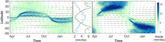
The following maps can now be better understood in light of these diagrams and keys.
-Northern Spring Equinox
-Northern Summer Solstice
-Northern Autumn Equinox

-Northern Winter Solstice
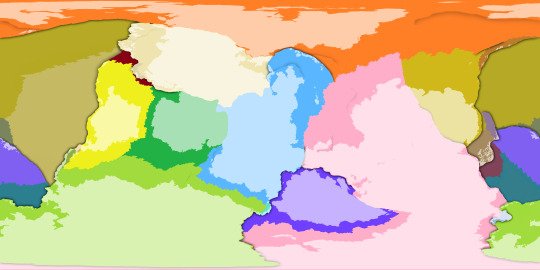
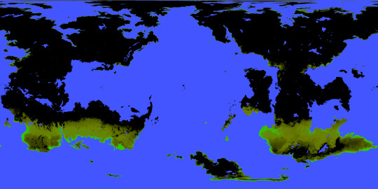
I was also tasked with mapping out the extent and density of this planet’s vegetation (or at least its alien equivalent), and from this you can see how wildly it varies by season, with very few year-round holdings. Precipitation is a major factor in where it is possible for plants to flourish, but snow cover and the extreme temperature swings limit it too. Near either pole, for example, within the space of a year temperatures soar far above Earth’s upper limits and also plummet below freezing; if either extreme were to be the annual norm for a region, some plants might adapt to those conditions, but because of the wild fluctuation any adaptations to one extreme would leave plants especially vulnerable to the other. These regions, then, remain barren regardless of rainfall or brief windows of mild temperatures, while areas with less wide temperature ranges allow for at least brief periods of flourishing.

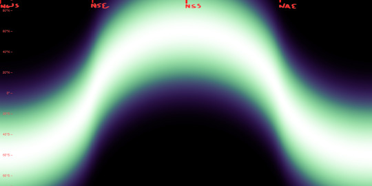
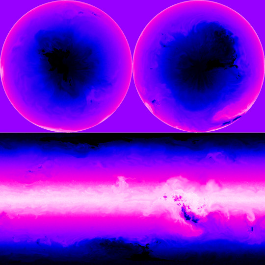
Determining the surface temperatures for this planet required a lot of background work. The first piece of the puzzle for this was knowing the number of daily hours of sunlight for a given latitude and date, which is exemplified first in this diagram for Earth:
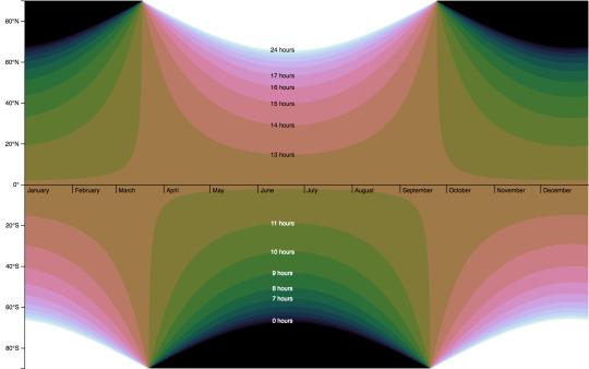
and then for the Birdbug planet, below. Since this planet rotates on an axis of 60 degrees, there are many more latitudes within range of either pole that experience periods of sunlight and darkness lasting longer than a day. The higher the latitude, the longer this period lasts, with the poles themselves experiencing either condition for half a year at a time.
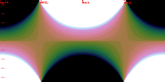
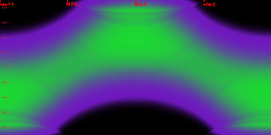
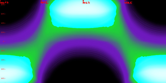
Another important factor is the height to which the sun is seen to rise (more scientifically, the angle at which the sun’s light hits parts of the planet’s surface), seen here first for Earth and then for the Birdbug planet. In these diagrams, white represents the sun reaching the zenith of the sky (meeting the surface at a 90° angle), and black represents the sun failing to appear above the horizon (meeting at an angle of 0° or below), while shades of green and purple stand in for angles between those extremes. For Earth and the Birdbug planet alike, the sun reaches the zenith within the bounds of either planet’s Tropic circles of latitude, and fails to rise at all only within the Polar circles of latitude; the difference in obliquity means that the Birdbug planet’s key circles of latitude are flipped compared to Earth’s.
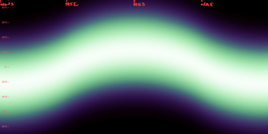
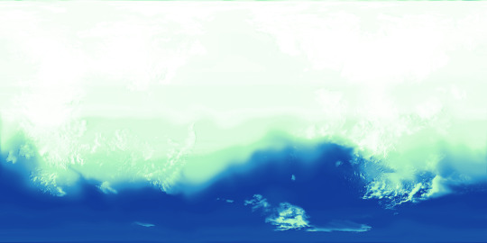
The duration of sunlight and the angle at which that sunlight is reaches the planet’s surface determine a planet’s Insolation, that is, the amount of solar energy it receives. The first image below is a preexisting diagram of Earth’s Insolation, where it is measured in watts per square meter. The next two images are my own attempts at replicating this data for Earth, and then for the Birdbug planet.
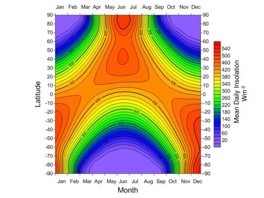
As seen in the diagrams above, Insolation on the Birdbug planet differs from Earth not only in its latitudinal distribution, but also in its sheer intensity at the higher latitudes. Compared to Earth there are twice as many latitudes for which the sun is shining longer than one rotational period, and many of those latitudes see the sun shine at a direct or nearly direct angle, whereas the Polar circles of latitude on Earth see the sun shine much more obliquely.
Below, we can see the data that all the above figures were instrumental in finding: that is, surface temperatures. The first image is a preexisting figure that measures Earth’s mean surface temperatures by date and latitude, and below that is my attempt at replicating the data by my own process.
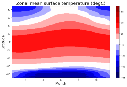
This is done not by just copying the seasonal Insolation data, but by also factoring in the yearly average for each latitude.
Above, we see the temperatures of the land by date and latitude, and below, we see the temperatures at the surface of the sea, which lag behind the land temperatures and remain comparatively mild.
Lastly, here’s an image I created to combine the snow and ice cover as well as the vegetation extent and density, as of the Northern Spring Equinox. This, along with the elevation map also seen here, is what I uploaded to maptoglobe.com in order to produce the screenshot at the top of this post.
These maps and figures (except for the preexisting ones) were all created in Photopea. Higher resolution versions of many of these images can be seen in my dedicated Reddit posts, linked below:
reddit post one, reddit post two
2022
#mapmaking#imaginary maps#worldbuilding#major project#imaginary planetology#elevation#waterways#river systems#surface temperatures#ice and snow cover#sea ice#precipitation#vegetation#Insolation#high obliquity planets#explanatory diagrams#digital rendering#Photopea#Birdbug worldbuilding project#Birgs#Birgworld#2022#digital painting#extremely long post#Christopher Maida Artwork
616 notes
·
View notes
Photo
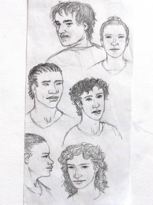
I’m expecting a pretty limited audience for this one but exactly one person I follow was already happy to see these, so here are my sketches of the members of the Undersiders, in their civilian identities, from the online serial “Worm” by Wildbow/John C. McCrae. I read the entire series back in 2015-16, and now I’m reading it again for the first time since then : )
From top-left to bottom-right, there’s Rachel Lindt/Bitch/Hellhound, Lisa Wilbourn/Sarah Livsey/Tattletale, Brian Laborn/Grue, Alec/Jean-Paul Vasil/Regent, Aisha Laborn/Imp, and Taylor Hebert/Skitter.
One of these days I might color this in, and draw their in-costume portraits as well.
Mechanical pencil on a blank piece of receipt paper,
2022
#Parahumans#Wildbow#John McCrae#Worm#civilian identities of supervillians#Undersiders#Bitch/Hellhound#Tattletale#Grue#Regent#Imp#Skitter#Rachel Lindt#Lisa Wilbourn#Brian Laborn#Alec#Aisha Laborn#Taylor Hebert#character portraits#portrait sketches#mechanical pencil#small drawings#faces#Christopher Maida Artwork
164 notes
·
View notes
Text
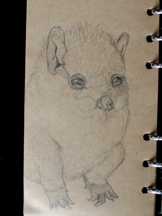


Some fun spec evo sketches for y'all: Furbies reimagined as some kind of armless, large-eared, predator-eyed monotremes. If real they would be one of God's gravest mistakes, but since I made these up I must acknowledge them as one of my own 😔
53 notes
·
View notes
Text
Some fun spec evo sketches for y'all: Furbies reimagined as some kind of armless, large-eared, predator-eyed monotremes. If real they would be one of God's gravest mistakes, but since I made these up I must acknowledge them as one of my own 😔
#Furby#Furbies#rough sketches#monotremes#creature design#speculative evolution#christopher maida artwork
53 notes
·
View notes
Photo
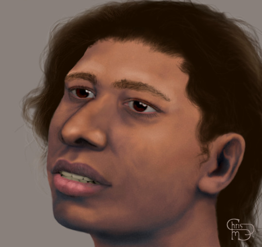
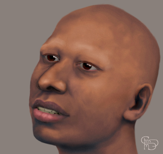


A reconstruction of the skull found at the French rock shelter of Abri Pataud, belonging to a late teenage girl who lived and died about 20,600 years ago. Digitally painted in Photopea, over the skull photographed by wikigraphist Sémhur. 2022
#facial reconstruction#French prehistory#Early European Modern Humans#Anatomically Modern Humans#Abri Pataud#paleoanthropology#life restoration of skull#fossil reconstruction#digital painting#Photopea#credit to original photographer#digitally painted portrait#Christopher Maida Artwork
11 notes
·
View notes
Photo


Just getting around to posting these now that it's been weeks since I sent them in, but here's my second series of maps for @jayrockin‘s Runaway to the Stars project! This is the home planet of their Avian species of aliens, and being predominantly ocean-covered and having an obliquity of only 11 degrees, these factors result in a somewhat more stable, less seasonally variable climate than we see on Earth. Every image here is helpfully (hopefully) captioned, but for a quick summary, these maps represent the elevation data (with and without a color gradient and water systems); the seasonal ice extent (limited to the Equinoxes and an Annual Average since the Winter and Summer sea-ice extents aren’t that different and there’s very little land ice outside the poles); and maps showing the Average Annual Temperature, Total Annual Precipitation, a combination of the two along with a key, and, finally, a map broken down into distinct zones based on temperature and precipitation, ice cover, mountains, seasonality, and Continentality vs Oceanity, based loosely on the Trewartha climate classification system.
Digital Painting (Photopea)
2022
Higher resolution copies of these maps can be found in my Reddit post about this : )
#Mapmaking#Imaginary Maps#imaginary planetology#imaginary geography#worldbuilding#alien planet#Runaway to the Stars#diagrams#major project#commissioned works#fictional planets#seasonal ice extent#climate zones#climate map#temperature map#precipitation map#digital painting#Photopea#Christopher Maida Artwork
27 notes
·
View notes
Photo
Just found these photos from the planning phase! Lots of overlapping shapes going on in this one, so the way I made sure their anatomy and poses were legit was to draw them (mostly) alone on opposite faces of the sketchbook page, then hold it up to my window so the light shining thru would combine the two images :)

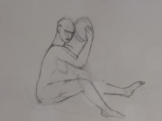


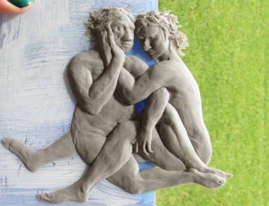
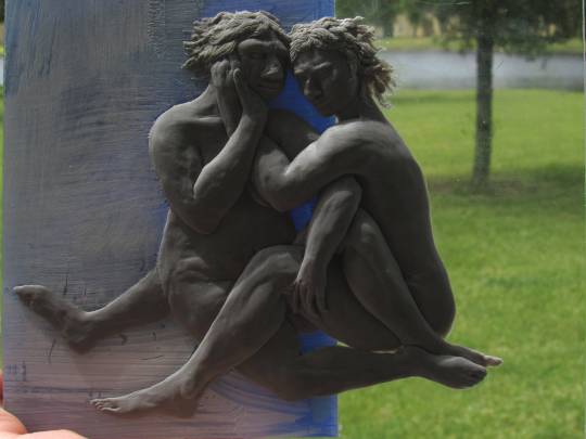
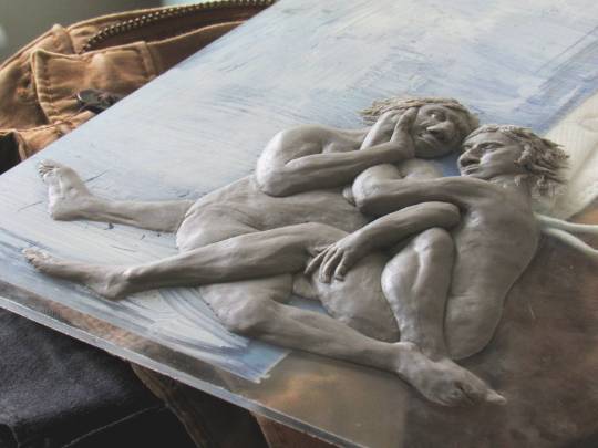

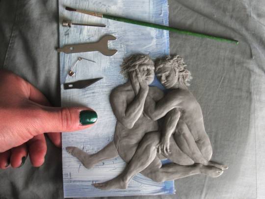
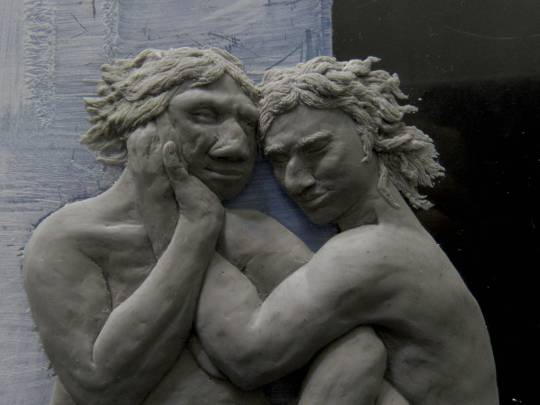
I started this only weeks ago, but I’ve been wanting to render this subject for some years now; a Neanderthal woman and Anatomically Modern Human woman seated and comfortably tangled up together, similar *and* dissimilar in many ways, but above all else very much in love.
At some point this is meant to be one painting in a triptych depicting this couple and their lives together in Paleolithic Europe, but for now it takes the form of a very tiny high-relief sculpture made of clay on scrap plexiglass, lacking the environment or props that the later painting will feature.
Traditional sculpture (high-relief, medium Super Sculpey on plexiglass)
2022
40 notes
·
View notes